|
|
Software features of Nokia S40 5th Edition
Table of contents:
- Core functionality changes
- Interface layout
- Phonebook
- Messaging
- Email
- Call log
- Settings
- Connectivity
- Gallery
- Media
- Organiser
- WEB
- PC synchronization
- Brief conclusion
Nokia’s developers have skipped over the fourth edition of S40 platform – we didn’t see it debut and never will, since this number is considered “unlucky” in some Eastern regions. The transition from the 3rd edition enhanced by Feature Pack 2 to the 5th edition doesn’t seem to be introducing any groundbreaking innovations into the system, for example, it still doesn’t feature multitasking abilities for Java-applications. However in other respects, the fifth edition is one of the market’s finest platforms to date. Speaking of its major improvements, we should mention the revamp of the music player, so now it is merged with the video player and extends core functionality.
Just like we always do, here is a thing for you to take note of – some features listed in this write-up have much to do with hardware, as well as software. For instance, some phones may not come with an Infrared port or FM-radio module. Bear this in mind, and look for reviews on specific devices. This article is the breakdown of the platform’s functionality, which is composed so as not to go over the same thing again in our reviews.
Our comprehensive review on the platform’s previous version can be found here:
Core functionality changes
The first and the foremost change is the support for the umbrella profile - Java JSR-248, which is here with the mission to standardize Java classes on various devices, to be more specific, this platform version comprises of the following Java API:
- JSR-82, Bluetooth version1.1 with OBEX protocol support;
- Mobile Media API (JSR-135);
- JSR-172, web-applications and services, includes Remote Procedure Package;
- JSR-177, Security and Trust Services API, including SATSA-CRYPTO, which allows using data encryption in applications;
- JSR-234, support for 3D sound and music in applications;
- Java MIDP 2.1.
Also, the platform comes equipped with Flash Lite 2.1, whilst the previous edition sported version 2.0.
Interface-wise, the new fifth edition doesn’t break significant new ground; the most popular display resolution is still QVGA.
Back to the table of contents >>>
Interface layout
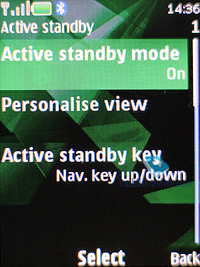
The handsets based off of the S40 5th edition (just like the S40 3rd edition powered phones) come armed with the capacity to alter the appearance of standby screens. Specifically, you can choose between Active Standby, standard looks with fast access assigned to the navigation key, and the GoTo feature (left soft-key). The wallpaper and font color of the standby screen are also manageable – as a matter of fact, for some high-contrast photos, changing font type is the only way to distinguish the text laid over them. Functions can be bound up with directions of the navigation key in a common fashion; icons may be either visible or hidden (if Active Standby is activated, they are permanently hidden; the upward direction of the navigation key gets disabled.
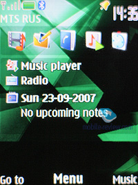
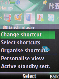
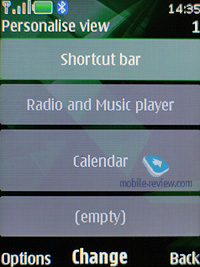
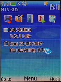
The Active Standby mode is very similar to the desktop found on smartphones nowadays – while active, the display is divided into several zones (shortcuts toolbar, media player and radio status, date and upcoming events and notes). No doubt, all power users will appreciate this feature, as it allows reading relevant information on the screen outright. You can also arrange the zones on the vertical axis, which adds to the interface’s flexibility.
Once the display falls into standby mode, it gets occupied by the clock, missed calls and received messages indicators – all of these events are tied up with tiny icons and numbers, i.e. if you have 3 missed calls, you will see a corresponding icon and “3”. The fifth edition features a caller ID picture for every missed call (provided that you have one registered in the phonebook).
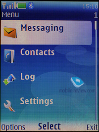
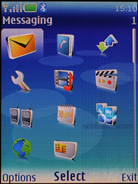
The main menu can be viewed in one of four ways: list (5 items of the main menu), grid (12 icons), grid with labels (9 icons), and tabs. The first three types are well known for being embedded in the previous models, while the last one is of certain interest to us. The top of the screen holds a toolbar containing menu items and corresponding notes. You can use horizontal directional buttons on the navi-key to move through the menu – the contents of a highlighted item are shown in a vertical pop-up bar. It’s worth noting, that with this lay-out, navigation gets easier, as you see all available menu options.
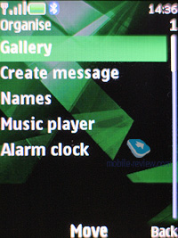
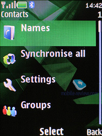
All the sub-menus contain vertical lists with tiny thumbnails placed next to each menu item – this allows making the font smaller and thus displaying more lines on the screen. Thanks to the icons, the design looks very appealing, since its appearance make the menus straightforward and easy to manage.
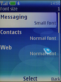
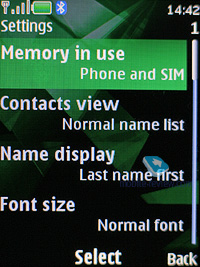
You can set custom font-sizes for Messages, Contacts, and Web (small, normal and large), it doesn’t seem to make any difference, however, for the most part, lines will fit on the display,depending on the size you have picked. Even the maximum font size doesn't make it too bold, so the fonts remain delicate enough.

You can use the number shortcuts and voice commands for fast navigation. While voice recognition is available only for several preset functions, no special training and voice tag recording is required. Just say the name of the desired item, and the device will bring it up. Generally, voice recognition is speaker independent, and the same goes for the phonebook. Should you be heavier on your phone’s voice dialing features, you will see how the handset evolves, i.e. the recognition quality steadily increases over time. Nevertheless, it has some drawbacks as well: considerable number of errors when having a lengthy contact list, or different languages. The settings contain the option for changing the recognition language, regardless of what active interface language you currently have.
The fifth edition also sports predictive text input (T9) system, but in spite of the promises to include an enhanced version, which would offer various matches for a single word, the T9 found in S40 5th edition still has only one possible variant on offer (displayed on the screen). If you need to type in various languages, it is not be a big deal, since the handset supports switching languages on the go.
Themes – using the themes, you can alter not only font color, the icon style of the main menu and wallpapers, but also the background picture of each sub-menu, which is quite interesting. All themes are very well detailed, so that you might even spend some time picking the most fitting option.
Back to the table of contents >>>
Phonebook
Up to 1000 names, which is the maximum possible capacity, can be saved in the phone's memory. The amount of data submitted to entries makes no difference at all – the limit of 1000 contacts can’t possibly go up or down.
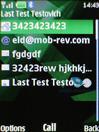
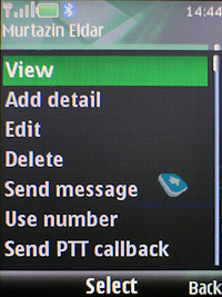
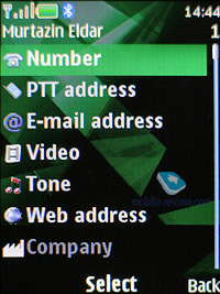
Each contact may have up to five assigned phone numbers of the following types: general, mobile, home, office, fax and video – for 3G networks. The first entered number becomes the default one and can be then edited to your liking. When entering data for the first time, you can submit only the first name, last name and one general number, and then edit other fields from the menu. Many will find this way of entering data inconvenient; however, I’m most positive some of you only set one telephone number for most contacts.
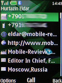
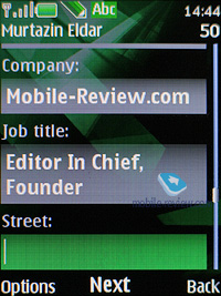
Additionally, you can enter e-mail, homepage, mail addresses, text note, company and job title. Among all other fields available for filling in is, User ID – it is the identifier for the presence service. Generally speaking, it’s some kind of ICQ, which gives you a warning of the user’s availability at every given moment. There is also Push to Talk address, yet only a few will find it essential in light of the poor popularity of the technology. If you think we are going to wind up our story right at this point, you’re greatly mistaken, since there are more informative fields available for filling in, like Formal name and Nickname. You can enter Birthday date as well, however, it will be up to you to save it in the calendar and create an event, as Nokia’s handsets can’t do it automatically, unlike phones from Siemens and Sony Ericsson.
Already filled sections are highlighted in grey, so you will be aware of entered information right at the first glance. The system won’t allow you to duplicate entries by creating a new contact with the same name – instead, it will allow you to replace the existing item. Nonetheless, this limitation fades away once the phone gets synchronized with a PC. But, keep in mind that if you do have identical entries, this is more likely to give you some trouble with voice dialing.
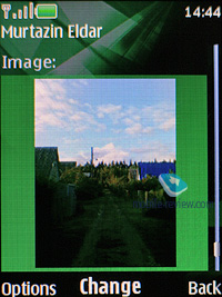
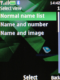
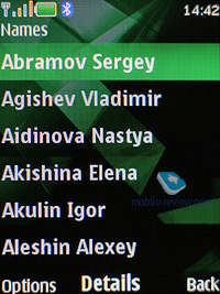
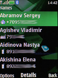
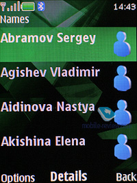
You can bind up any contact with an image or a video clip. Priority-wise, video clips are higher than pictures therefore they will be played back instead of a photo on all occasions (each name can have both a picture and a video clip assigned). However, when viewing details on a contact, you won't see its picture outright, for it resides in its own section. On the other hand, in the general list you can have caller IDs and contacts names paired up - in this mode, the thumbnail is smallish and gives a little notion of the actual image. Other view modes are quite common - only names, names with the general number. The general list can display contacts stored on a SIM card and the phone’s internal memory.
On an outgoing call, the image gets reduced to a small thumbnail, whilst on incoming calls, it occupies the entire screen. Contact’s name is displayed next to the number type icon.
Each contact can be bound up with a personal ring tone (any file) – in case you choose a video clip instead of picture, the sound will be taken from the clip, rather than from a music file.
And traditionally, the buttons 2-9 are for speed dialing.
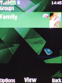
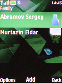
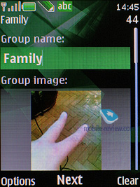
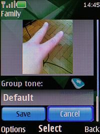
There are no preset groups available in this phone, thus you’ll have to create them yourself. The great edge of this system is that you can create up 25 contact groups. Each of them can be customized with a personal tune and an image. The photo, set for a certain group member, has the higher priority and will be displayed instead of the picture applied to the group. One and the same entry can be a member of various groups.
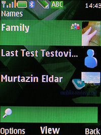
In the general list of entries, groups are displayed in one line with stand-alone contacts, yet marked with their own icons. Searching is performed in group names and separate contacts at the same time. This layout may seem confusing at first, but later on you realize all its advantages, as you don’t have to look up for a special item on the menu to access the groups list (besides, it’s accessible only from the main menu, using the soft-key or shortcut numbers, you’ll get to the list itself without any options available).

Search in the general list can be performed by entering several letters – it doesn’t cause any hardships and works as it always does. Pressing the “*” button results in switching to entries on a foreign language (in case you have contacts both in Russian and English, for example). When browsing the phonebook, pushing “#” key calls up the detailed view featuring the general number – to access full data on a contact use the corresponding menu (two presses). All entries may be sorted either by first or last names.

MS Outlook synch module of the fifth edition is far more tuned than that found on the earlier systems. Most of the fields synchronize correctly – and this goes for First Name and Last Name fields as well. From the phonebook menu you are at liberty to send any entry as a Business Card to another device with the aid of an SMS, MMS or a wireless protocol.
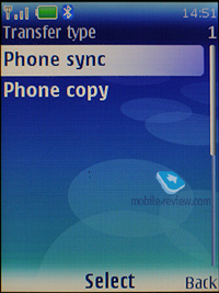
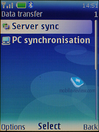
On the face of it, there is no way for beaming the entire phonebook to another device – even if you select all contacts, the context menu won’t offer you this option. However, using the Settings – Connectivity – Data Transfer tab you will be able to do that, the handset supports synchronization (add all, replace all), apart from the contact list you can transfer notes and calendar events.
Back to the table of contents >>>
Messaging
You can always change the input language while typing in any menu, this solution is identical to the one applied on Nokia smartphones and is quite handy.
The phone supports Nokia Smart Messaging standard, which allows sending and receiving ring tones and simple black and white pictures from compatible phones. Apart from Nokia phones, this standard is also supported by Samsung, LG and some new Motorola phones. Unfortunately, the company's policy limits the users, since the alternative standard - EMS, which is more popular nowadays, and allows sending not only melodies and pictures, but formatting text as well, is missing here.
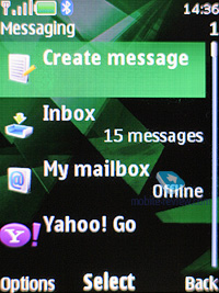
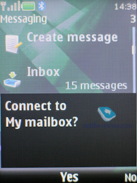
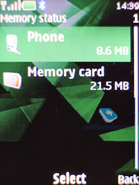
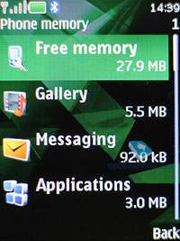
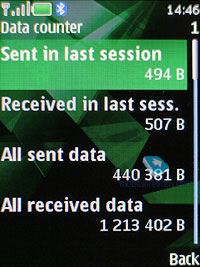
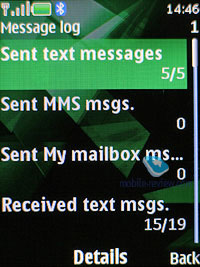
All messages regardless of type (SMS/MMS) are stored in the Inbox folder, the manufacturer claims that Email messages are saved in the same folder, though in practice, they aren’t. Messages themselves are kept in the dynamic memory; this means that at best you will have nearly 500 short messages stored. Resettable message counters (sent and received) are also onboard.
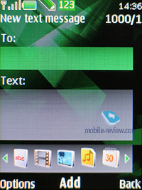
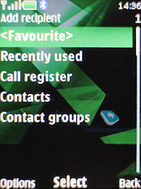
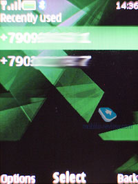
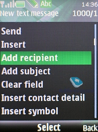
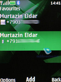
When sending a message, you can pick phone numbers not only from the phonebook, but also from recent calls list, calls log or select a group. On top of that, there is the Favorites list, where you can put the numbers you use more often.
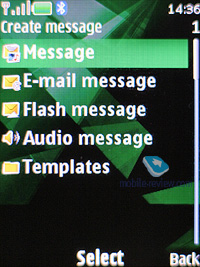
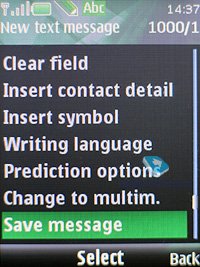
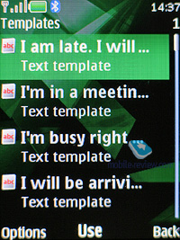
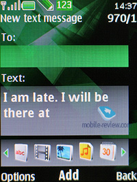
Unlike the previous models, the messaging interfaces for SMS and MMS have been merged, so now it makes no difference what you are intending to compose. Depending on the content you throw into your new message, it remains a text-based message, or morphs into an MMS. This is a very smart approach, for it doesn’t make you think how you are going to write a message, and probably will win over more users to the MMS standard. As for this message type, no significant improvements have been made. Any message can be 300 Kb maximum. With its MMS 1.2, the platform presents pretty good implementation of MMS technology, so you won’t experience any hardships with composing these messages. All images taken with the phone’s camera are cropped automatically to fit in your multimedia message (maximum – 640x480, or 128x160 pixels). If the image’s size doesn’t exceed 300 Kb or a tad less, you can send it with no further editing in the message body.
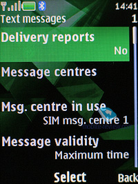
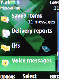
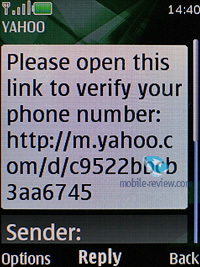
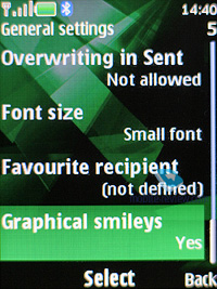
The rest of the features in the messaging department are standard - smiles (converted from the text in received messages) and long messages. You can have your messages automatically replaced in the Sent folder on memory overflow (the oldest messages are deleted one after another). Delivery reports are stored in a separate folder, which is handy. CB-messages have their own folder, providing channel number settings on top of its main function.
Flash messages - a kind of short message, shows only on the recipient's screen, but not saved into the phone's memory (they can be saved forcibly).
While in standby mode, the phone doesn’t indicate sender name and displays only the total number of incoming messages - to view the name you will need to get into the detailed message view.
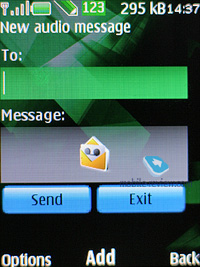
Voice Message – an MMS variation, when you record a voice message, lasting up to 3 minutes 6 seconds (maximum duration), and then send outright.
Back to the table of contents >>>
Email
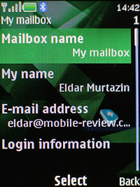
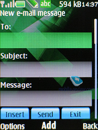
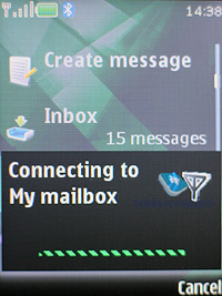
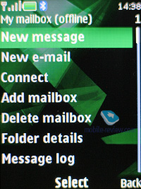
The handset shows off a bundled Email client, capable of handling APOP/POP3/SMTP/IMAP4 protocols. The application is Java based, and takes nearly 3-4 seconds to start up. The very fact that the client is a separate program implies that it requires a dedicated menu tree, and special folders. Apart from the already par-for-the-course Inbox, Outbox and Sent, there are three more directories, which contain sorted mail. Regrettably, no custom folders are allowed here. For unwanted mail, the system offers you a folder going by the name of Spam, holding all letters filtered according to your personal settings. Taking into account of how many spam messages you might receive daily, utility of such feature is somewhere between slim and nil. Anyway, the mail client here is meant for occasional usage on the run, and it’s not worth the hassle of making up the rules for anti-spam tools.
As for encodings for Russian language, the system features a couple of them, and by default it is the standard Windows 1251. You can also take advantage of personal encoding for any message (UTF8, KOI-8R, Windows 1251), which is very useful, no doubt about that. The client ensures support for any attachment types; on top of that you can browse handset’s storage from within this application.
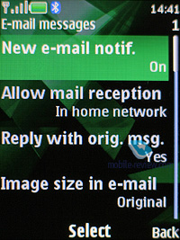
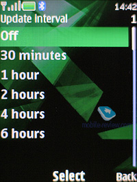
The settings for incoming and outgoing mail are separated from each other. You can cap the number of received messages (no more than 150), retrieve only headlines of letters, and delete messages from the server once they have been uploaded onto your phone. Any received message cannot exceed 300 Kb in size, which is too little for the majority of consumers.
Back to the table of contents >>>
Call log
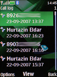
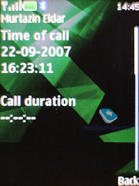
The platform presents you with three lists – incoming, missed and outgoing calls, with every list having the capacity of 20 entries. On top of that, all these lists feature call date and time, which is pretty convenient. While at the standby screen, press the pick up key for the general call list – this is far more convenient than the list of recently dialed numbers found in the 3rd edition based handsets.
In detailed call view, you can also see its duration.

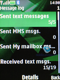
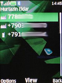
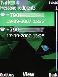
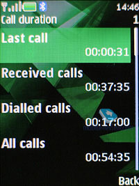
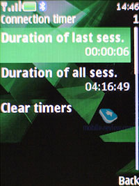
The Call Log also has the menu with all numbers you have messages to, and message\call\data counters.
Back to the table of contents >>>
Settings
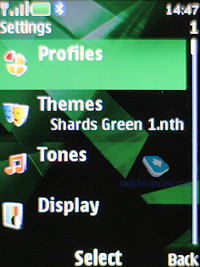
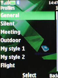
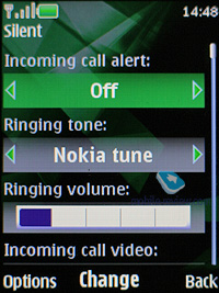
The profiles may be activated from this menu or toggled by pressing the On/Off button. Each profile may be activated for a designated period of time and after this, the phone turns back to the default state. Sound alerts may be adjusted for all the events, including calls from group members. You can also easily set whether a contact’s video will work in this profile or not. All in all, the profiles implementation on Nokia’s phones is one of the best on the market to date. Also you can assign various sounds to unfolding/sliding open/twisting (for sliders, clamshells and rotate-phones) and shutting (this fashion-savvy element which was proven by Korean makers is applied here as well) actions of your phone. The handset houses five pre-installed profiles and two user-adjustable ones; however, each of these profiles can be set up in any desired fashion and even renamed.
The phone is empowered with the automatic key lock; you can also set a safety pin number so that no one else could use your phone. There is now the possibility to adjust enhancement settings, for example, to choose a profile that will kick in when the battery charger is plugged in. This is a quite nifty feature that allows you to customize your phone even further.

You can enable the Flight Mode dialog window on handset’s start up, however by default, this prompt is turned off. In fact, you might never need that, since the profile with exactly the same settings can be found in the list of standard profiles.
You can always opt for the analog clock, when choosing the display’s screensaver. Also, you are free to run a slideshow composed of your own photos, so that they will change each at designated intervals.
Back to the table of contents >>>
Connectivity
This sub-menu retains all the settings related to Bluetooth, Infrared, packed data (GPRS, EDGE) and data transfer.
The Infrared offers you only on/off option without extra settings being available.
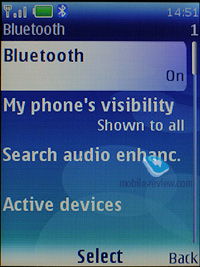
Yet, the Bluetooth settings are far more complicated – the handset may be visible for other devices, hidden or available for a designated time span. For connected devices, there is auto-pairing mode, when the handset will keep on trying to establish a connection with another device without notifying you. But, when it’s not able to do so, the handset starts looping on the corresponding message, which pops up every 3 minutes. Quite annoying, if I must say anything about it.
USB connectivity settings have two modes, which are USB Mass Storage (memory card) and PC Sync (synchronization with PC).
Within the Data Transfer menu, you can seamlessly adjust synchronization with PC, remote server (for an ordinary user such feature isn’t of much use). Moreover, this menu holds profile settings for sending the entire contacts list, and organizer entries to another device via Bluetooth.

Configuration. S40 5th edition continues the approach that made its first appearance in the third edition, where various settings for services were gathered in one place. At first, it might feel unusual, but later on, you will certainly come to like it. And on top of that, it saves a lot of time, since you don’t need to browse countless sub-menus to set up, generally the same parameters for applications – everything can be adjusted in one menu and then used in any app. From this menu, you are allowed to configure the following programs:
- Web
- Multimedia messaging
- Synchronization
- Push to Talk
- Instant Messaging
- E-mail
- Streaming
- Access point
At that, it’s important to stress that several applications can be set up in a different way and that’s not prohibited. A good example of that, is the standard Email client, which retains more settings than the Configurations item does. It’s worth repeating that such settings depositary proves to be very fetching, and is more likely to become widely adopted in the future.
Back to the table of contents >>>
Gallery
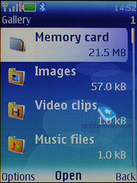
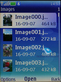
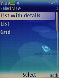
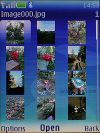
The folders with various files are stocked here - all of them have titles matching their contents. You can view the folders as a list, list with labels or as icons. Any multimedia file, including video can be viewed in full-screen (landscape) mode. All data received via Bluetooth is stored in the “Received” folder, and in case the phone cannot provide enough memory, gets redirected to the memory card automatically. There are no caps on size of received files, they can even take up more than phone’s available memory (the earlier models could not handle such incoming files).
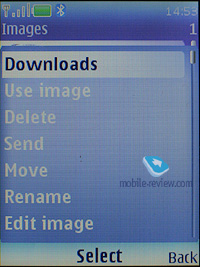
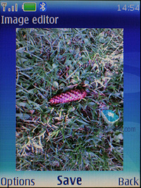
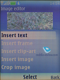
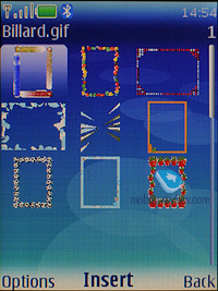
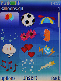
There is a basic image editor coming included with the fifth edition, which allows you to scale pictures, crop them, add own text fields, small clip-arts or frames, in other words the very minimum you might need for your edit-it-all mood.
Back to the table of contents >>>
Media
All the settings concerning the multimedia front of the fifth edition are stored here. We aren’t going to dwell on the camera module in this article, as it varies on different devices, therefore should you need a more definitive review on the camera – look for the model you need in our Reviews section.
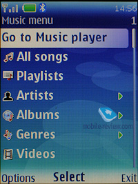
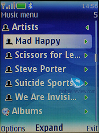
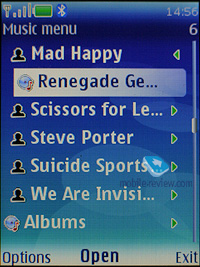
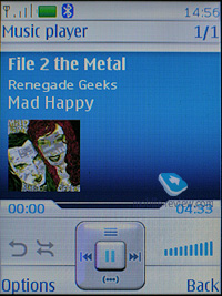
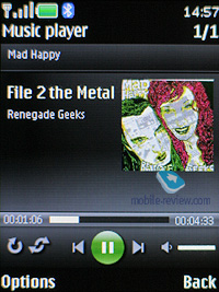
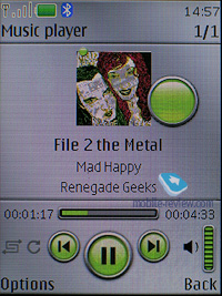
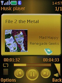
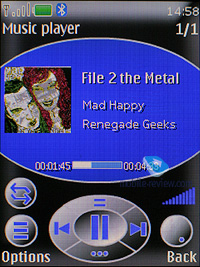
Music player. In the fifth edition, the player has seen some very significant changes, so now it includes skins and a somewhat different menu tree. However, this is just the evolution of the concept the third edition Feature Pack 2 built upon. Functionality-wise, this player is now in line with Walkman 2.0, except for extra pedometer-related smarts, since the latter is still missing in Nokia’s S40-powered handsets.
One of the items on the change list is the fact that from now on, the player deals with video content as well as audio files, which brings about a very amusing situation, when by minimizing the player while watching a video, you remove the picture from the display, even though the sound keeps going out from the loudspeaker or earphones like before. It shouldn’t be considered as a mistake made by the programmers, since it looks more like a feature, but I have certain doubts about its usability, and on top of that, other handsets don’t have this kind of background video playback.
The display shows you data on artist, album, and even album art, if it is in the current track’s tag. The navigation pad does pretty much standard things (jumping between tracks, fast forward, and stop). The progressive fast forward feature has finally made it to this player, however when you only start skipping forward, it goes at a 5 second step.
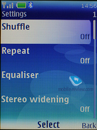
The playback modes available with the fifth edition’s player are: sequential, random, repeat one track/all tracks.
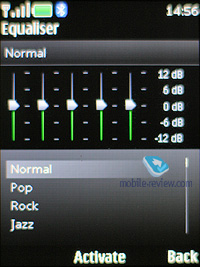
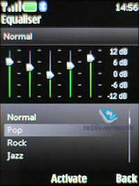
Outside the player is the Stereo Widening feature. There seven five-band equalizers with 5 presets (Normal, Pop, Rock, Jazz, Classical) and two user-manageable setups.
The music library can be categorized with the help of the following filters:
- All tracks – every song stored in the phone.
- Artists – tracks sorted by artist.
- Albums – shows songs depending on album.
- Genres – classic, rock and so on.
- Composers – filters your media content by composers.
- Track lists. Another set of filters, including Favorites (you can throw any track onto this list either while it’s playing or when browsing categories), Most popular and Recent tracks, Recently added and My tracks. A very interesting set of filters that might be quite useful.
Your own playlists may be composed on a PC or on your handset. Unlike the previous edition, with the fifth version you can pick either stand-alone tracks to add them onto your playlist, or entire albums or all tracks by a specific artist, etc, which is obviously really handy.
Music upload – a stand-alone item in the menu, that includes only a link to Nokia’s site for the time being, and once the Nokia Recommendation service gets online, it will lead right into it. Apart from AAC, eAAC, eAAC+ and MP3, Nokia’s player also supports WMA format. You can also beam sound to a wireless Bluetooth-powered headset, or skip forward/backward wirelessly.
Stereo Widening – allows extending the stereo base. The effect is dependant on hardware specifications.
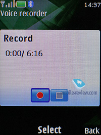
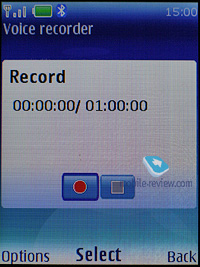
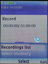
Whilst using the Voice recorder, you are to observe the limit of 60 minutes per one recording. On the bright side, it is enabled during calls. The user is free to choose the place of storage (either phone memory or memory card), but can’t set titles of each recording – the handset strictly defines them as a label and number. Unlike handsets by other manufacturers, a recording’s title here doesn’t feature the phone number of your contact, and this is quite frustrating.
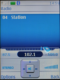
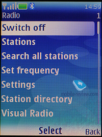
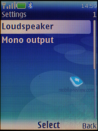
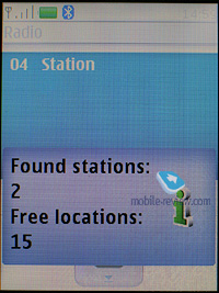
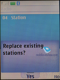
Radio. The inbuilt FM-receiver works only with a headset connected, which doubles as an aerial. The fifth edition slide supports Visual Radio that allows displaying graphics and text during a broadcast. Even though this service isn’t all the rage here, in Russia, the system still comes with this ability. Frequency and station name can be submitted manually, the handset’s memory is good for 20 channels, also there is auto-tuning and RDS. Radio signal can be sent to the loudspeaker. The interface is similar to that utilized by the music player, and the quality of broadcasts doesn’t disappoint.
You can toggle between all saved stations with the help of the number pad – some sort of fast number navigation.
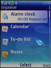
Organiser
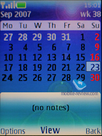
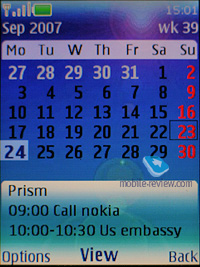
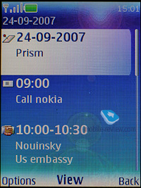
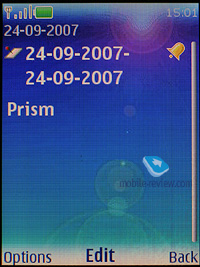
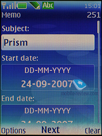
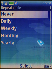
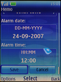
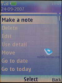
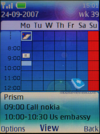
You can submit up to 1000 entries, though the final number strongly depends on the length of each note; automatic cleaning up is onboard (time-wise). Monthly, weekly (with hourly grid) views are available in the Calendar. The handset offers five different event types: meeting, call, birthday, memo, and note. Each event, regardless of its type, can have an alert configured, and be recurrent. While in monthly view, the bottom area features up to three appointments for a selected day.
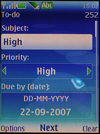
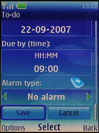
The To-do list enables you to make up events with three types of priority (high, normal and low), set due date and time for each event.
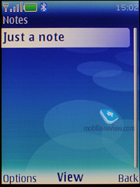
Notes - each note may contain up to 3000 characters. That is more than enough even for the most demanding user. Various font-sizes are supported, just like for messages.
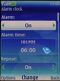
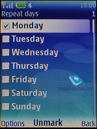
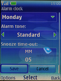
The alarm clock allows setting both single and recurrent alerts, which may trigger on certain week-days. Any tune, or a radio (just need to plug a headset in) can serve as a signal. Snooze time-out also adjustable.
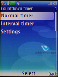
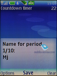
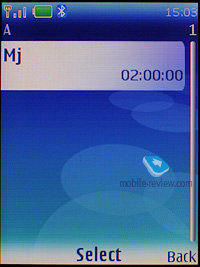
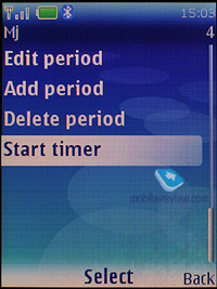
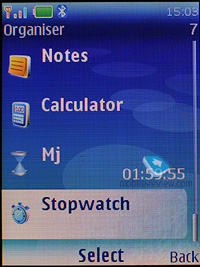
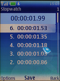
Also the organiser contains a countdown timer, a stopwatch which allows getting intermediate values. Both apps can work in the background mode.
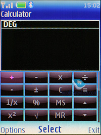
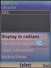
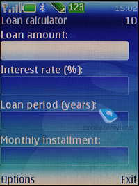
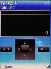
The calculator, apart from its default mode, also has a scientific mode as well, and the mode for calculating your interest in your investment activities.
Java. Maximum size of a JAR file makes 1 Mb, heap size cannot exceed 2 Mb. Java-powered applications are not capable of working in background mode, which is the greatest drawback of the entire software shell.
Back to the table of contents >>>
WEB
The platform retains WAP 2.0 browser, allowing you to view xHTML-pages. It also can fill in data fields automatically, and save images found on the page you are currently browsing. But in any event, it is quite weak when it comes to opposing third-party solutions.
Back to the table of contents >>>
PC synchronization
Your handset running on the fifth edition will come with the Nokia PC Suite software kit, which includes a whole range of applications that allow you to synchronize organizer data and phonebook with MS Outlook, Lotus, upload tunes, logos, wallpapers and games.
Handsets running on this platform version: S40 5th Ed.: 6555, 7500 Prism, 6267
S40 5th Edition Feature Pack 1
The first update pack for the fifth edition is already available from Nokia’s site for developers, no word, however, on how it differs from the original release. Furthermore, some models on the list marked as “Fifth edition based” are featured as having Feature Pack 1 onboard as well. After looking through a ton of Nokia’s documents, we found only one thing worth mentioning - Feature Pack 1’s multitasking abilities. And we don’t really think we know what Nokia means by this word – neither the Nokia 6500 Classic prototype, nor the Nokia 7900 Prism prototype could offer us the ability to run a number of user’s applications at a time, like Sony Ericsson-branded phones did. We will greatly appreciate any help in this matter – if you know what exactly sets Feature Pack 1 apart from the original fifth edition, please, let us know. Thank you in advance.
Handsets running on this platform version: S40 5th Ed. FP1: 6301, 5610, 5310, 7900 Prism, 6500 Classic, 6500 Slide
Back to the table of contents >>>
What next?
The conclusions we made in our review on the S40 3rd edition a year ago still hold true. Nokia’s major task for today is deeper integration of S40 platform, with its elder sibling – S60. Obviously, they can’t make them identical functionality-wise, but many features will keep popping up in S40. This way, pretty soon we will see the standard libraries for GPS over Bluetooth support. This literally means the system’s ability to handle external receivers. Multitasking for Java-applications and default apps also makes one of the top-priority areas for the company (similarly to Sony Ericsson’s products).
Brief conclusion
For the time being, S40 fifth edition is one of the most fetching platforms on the market, offering very flexible user settings. At the same time, it has its own flaws and often not-very-consistent menu layouts, but as we know, nothing is perfect. But, let us note that even in spite of that, the fifth edition is one of the market’s best offerings both thanks to Nokia’s strength and the feature pack it retains.
But the toughest competition will unfold between Sony Ericsson’s A200 and Nokia’s 5th edition. And, in light of the full compatibility of Java apps between these two platforms, they seem like the best way to go for developers. Motorola’s solutions are quite interesting as well; however they can’t boast such a great pack of goodies in terms of interface, even though the company is currently doing its best in this field. Samsung is also taking the interface to the top position on its priority list, but having some trumps up its sleeve (Living World and MegaSearch), the company seems to be lagging behind when it comes to core functionality. Technically, the way Java is implemented in Samsung-branded phones feels like 5-6 years old, which severely restricts the functionality of its solutions, doing them no justice. At present, the gap is pretty much tiny, but if they won’t manage to do a major leap up during this year, it will turn into an abyss that will throw Samsung back.
That being said, S40 5th edition is one of the market’s finest offerings, which will make its way to most Nokia-branded phones, becoming the most widely adopted platform across the market.
Related links:
Back to the table of contents >>>
Eldar Murtazin ([email protected])
Translated by Oleg Kononosov ([email protected])
Published — 13 September 2007
Have something to add?! Write us... [email protected]
|
News:
[ 31-07 16:21 ]Sir Jony Ive: Apple Isn't In It For The Money
[ 31-07 13:34 ]Video: Nokia Designer Interviews
[ 31-07 13:10 ]RIM To Layoff 3,000 More Employees
[ 30-07 20:59 ]Video: iPhone 5 Housing Shown Off
[ 30-07 19:12 ]Android Fortunes Decline In U.S.
[ 25-07 16:18 ]Why Apple Is Suing Samsung?
[ 25-07 15:53 ]A Few Choice Quotes About Apple ... By Samsung
[ 23-07 20:25 ]Russian iOS Hacker Calls It A Day
[ 23-07 17:40 ]Video: It's Still Not Out, But Galaxy Note 10.1 Gets An Ad
[ 19-07 19:10 ]Another Loss For Nokia: $1 Billion Down In Q2
[ 19-07 17:22 ]British Judge Orders Apple To Run Ads Saying Samsung Did Not Copy Them
[ 19-07 16:57 ]iPhone 5 To Feature Nano-SIM Cards
[ 18-07 14:20 ]What The iPad Could Have Looked Like ...
[ 18-07 13:25 ]App Store Hack Is Still Going Strong Despite Apple's Best Efforts
[ 13-07 12:34 ]Infographic: The (Hypothetical) Sale Of RIM
[ 13-07 11:10 ]Video: iPhone Hacker Makes In-App Purchases Free
[ 12-07 19:50 ]iPhone 5 Images Leak Again
[ 12-07 17:51 ]Android Takes 50%+ Of U.S. And Europe
[ 11-07 16:02 ]Apple Involved In 60% Of Patent Suits
[ 11-07 13:14 ]Video: Kindle Fire Gets A Jelly Bean
Subscribe
|

