Software features of S40 3d Edition
Review of GSM-handset Nokia 6131. Part 1 >>>
Review of GSM-handset Nokia 6131. Part 2 >>>
All manufacturers are trying to make their solutions look and feel alike in software, so it’s no wonder that majority of handsets show off pretty much the same functionality. In Nokia’s case a couple of up-to-date models are powered by S40 3rd edition platform and in light of the abovementioned trends, we’ve decided to come up with a special review on software features of this shell in order to get rid of the necessity to copy/paste the same paragraphs countless times. This article includes description of basic functions, while the reviews of concrete phones will be focused on special capabilities. For example, on Nokia 6233 the phonebook can carry only 500 contacts, whereas all other models boast 1000 entries and more – in similar cases we will be covering such peculiarities, otherwise feel free to peek in this review.
At that it’s important to keep in mind that some models might lack bluetooth, Infrared, radio, etc. – all these functions are device-dependent. Pictures featured in this articles were taken on Nokia 6233, Nokia 6131, armed with QVGA screens – in fact displays with smaller resolution provide worse quality, so respective shots will be placed into reviews. I really do hope that this material will give you in-depth answers regarding software features of S40 3rd edition platform.
Interface lay-out
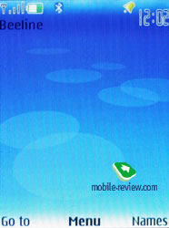
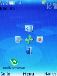
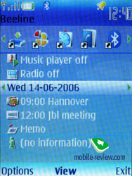
Handsets based off the S40 3rd edition are equipped with the capacity to alter appearance of standby screens – namely, you can choose between Active Standby, standard outlook with fast access assigned to the navigation key and GoTo feature (left soft-key). Wallpaper and font color of the standby screen are also manageable – as a matter of fact for some contrast photos changing font type is the only way to distinguish text laid onto them. Functions are bound up with declinations of navigation key in a common fashion; icons may be either visible or hidden (at activated Active Standby they are permanently hidden, upward declination gets disabled).
 
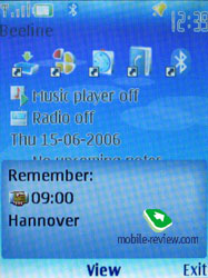
Active Standby mode is very similar to desktop found on smartphones (Today) – while active, the display is divided into several zones (shortcuts toolbar, media player and radio status, date and upcoming events, notes). No doubt all power users will appreciate this feature, as it allows reading relevant information on the screen outright.
 
Once the display falls into standby mode, it gets taken up by clock, missed calls and received messages indicators – all these events are tied up with a tiny icons and numbers, i.e. if you have 3 missed calls, you will see a corresponding icon and “3”.
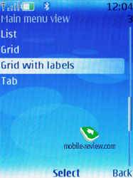
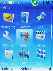
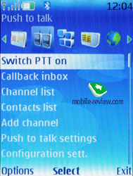
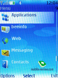
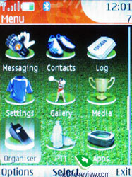
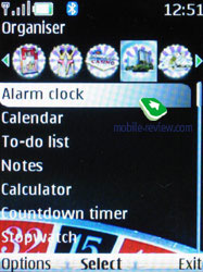
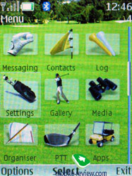
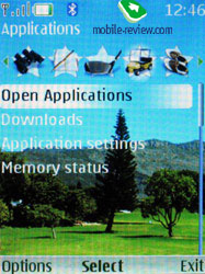
The main menu can be represented in one of the four ways: list (5 items of the main menu are shown), grid (12 icons), grid with labels (9 icons), and tabs. The first three types are well known for being embedded in the previous models, while the last one is of a certain interest. The top of the screen holds toolbar containing menu items and corresponding notes. You can use horizontal deviations to move throughout the menu – contents of a highlighted item are shown in a vertical line. It’s worth noting, with this lay-out navigation gets easier, as you see all available menu options.


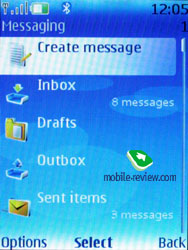
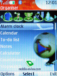
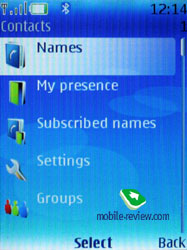
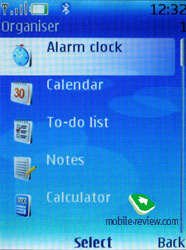
All the sub-menus contain vertical lists with tiny thumbnails placed next to each item – this allows making the font smaller and thus displaying more lines on the screen. Owing to the icons the design looks very appealing, as in this way the menus are quite straightforward and easy-to-manage.

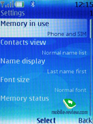
You can set special font-size for Messages, Contacts, and WEB (small, normal and big). At first sight the font size changes insensibly, however more lines fit the display depending on it. Even the maximum font size doesn't make it too bold, it still remains delicate.
You can use number sequences and voice commands for fast navigation. Recognition is available only for several preset functions; however no special training and voice tag recording are required. Just pronounce the name of a desired item and the device will bring it up. In general voice recognition is speaker independent, and the same goes for the phonebook. Although, when applied in the contact list, this function is not as simple for names uncustomary in Europe, for instance Finnish ones (however, it could seem there would be no problems). No issues appear when dealing with usual English names, which are recognized in a split second. However my name made the device think for some time, and only on rare occasions it offered me a correct result. Sometimes while listening to the recorded tag, you will surely smile, since the phone tends to mangle ordinary names in a very hilarious way. On frequent voice dialing usage you will see how the handset evolves, i.e. the recognition quality steadily increases. Nevertheless they are some drawbacks as well: considerable amount of errors when having a lengthy contacts list or mixed languages. The settings contain the option for changing recognition language regardless of active interface language.
The 6131 is a predictive text input (T9) enabled handset, but in spite of promises to include an enhanced version, which would advice various matches for a single word, the T9 found in S40 3rd edition shell still has only one possible variant to offer (displayed on the screen). Should you need to type in various languages, it won’t be a big deal, since the handset fully supports fast switching of languages on the go.
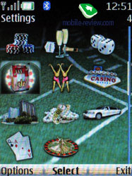
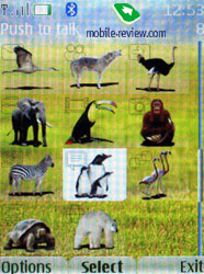
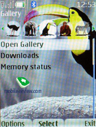
Themes – using the themes, you can alter not only font color, icons style of the main menu, wallpapers, but also background picture of each sub-menu, which is quite appealing. All themes are drawn very well, so that you even might stumble over the right choice.


Phonebook. Up to 1000 names, which is the maximum possible number, can be saved into the phone's memory. Amount of data submitted to entries makes no difference – the total of 1000 contacts is invariable.
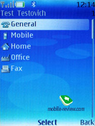
Each contact may have up to five assigned phone numbers of the following types: main, mobile, home, office, fax, video – for 3G networks. The first entered number becomes a default one and can be then edited to your liking. When entering data for the first time, you can submit only first name, last name and one general number, and the rest of editing can be performed from the corresponding menu. Many will find this way of entering data inconvenient; however, I’m most positive some of you set only one telephone number for each contact. Both groups will be right, and considering that all Nokia phones come with such phonebook, it should cause no problems.


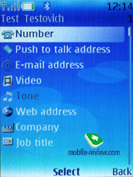
As additional information to each number, you can enter e-mail, homepage, mail addresses, text note, company and job title. Among all other fields free to fill in, the option of USER ID deserves a few words – it is the identifier for the presence service. On the whole it’s some kind of ICQ, which gives you warning of this user being available at the given moment.
There is also Push to Talk address, yet only a few will find it essential in light of poor popularity of the technology. If you think we are going to wind up our story on data fields, you’re greatly mistaken, since there are a number of more fetching fields available for filling in, like Formal name and Nickname. You an enter birthday date as well, however it will be up to you to save it in the calendar and create an event, as the Nokia’s handsets doesn’t provide such feature unlike phones by Siemens and Sony Ericsson.

Already filled sections are highlighted in grey, so you will be aware of entered information right at the first glance. The phone won’t allow you to duplicate entries by creating a new contact with the same name – instead the 6131 will offer you to replace the existing item. Nonetheless this limitation fades away once the phone gets synchronized with a PC. But keep in mind that if you do have identical entries, this is more likely to cause nuisances with voice dialing.
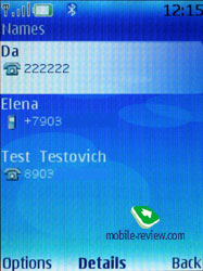
You can bind up any contact with an image or a video clip. Priority-wise video clip is higher than picture therefore it will be played back instead of a photo on all occasions (each name can have both and video clip assigned). However, when viewing details on the contact, you won't see the picture outright, as it resides in its own section. On the other hand, in the general list you can enable pairing of a contacts and a corresponding image. In this mode the icon is rather small and gives a little notion of the actual image. Other view modes are quite common - only names, names with the general number. The general list can display contacts stored on SIM-card and bundled phone’s memory.
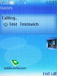
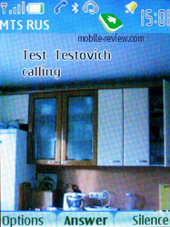
On outgoing call the image gets reduced to a small thumbnail, while at incoming call it occupies the entire screen. Contact’s name is displayed next to number type icon.
 
Each contact can be bound up with a personal ring tone (any file) – in case you choose video clip instead of picture, the sound will be taken from the clip, rather than from a music file.
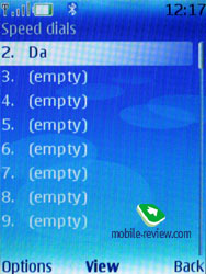
And traditionally buttons 2-9 stand for speed dialing.

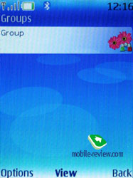
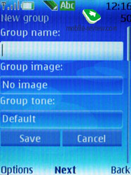
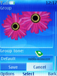
There are no preset groups available in this phone, thus you’ll have to create them yourself. The great advantage of this model is that you can create up 25 contact groups. Each of them can have personal tune and image set. The photo, bound up with a certain group member entry, has the highest priority and will be displayed instead of the picture applied to the group. One entry can be a member of various groups.
 

In the general list of entries groups are displayed in one raw with single entries, but marked with their own icons. Search is executed in both group names and stand alone contacts at the same time. This arrangement can be confusing for the first time, but later on you realize all the advantages, as you don’t have to look up for a special item on the menu to access the groups list (besides, it’s accessible only from the main menu, using the soft-key or shortcut numbers, you’ll get to the list itself without any options).
Search in the general list can be executed by entering several letters – it doesn’t cause any nuisances and works as it always does. Pressing the “*” button results in fast switching to entries on a foreign language (in case you have contacts in both Russian and English languages for example). When browsing the phonebook, pushing “#” key calls up detailed view featuring the general number – to access full data on a contact use the corresponding menu (two presses). All entries may be sorted either by first or last names.
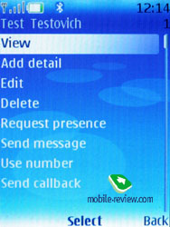
MS Outlook synch module of the 6131 is far more tuned than that found on the earlier models. Most of the fields synchronize correctly – this goes for First Name and Last Name fields as well. From the phonebook menu you are at liberty to send any entry as a Business Card to another device with the aid of a SMS, MMS or a wireless protocol.
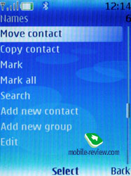
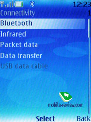
At a glance there is no way for sending the entire phonebook off – even if you select all contacts, the context menu won’t offer the corresponding item. However using Settings – Connectivity – Data transfer tab it is more than just possible, the handset supports synchronization (add all, replace all), apart from contact list you can transfer notes and calendar events.
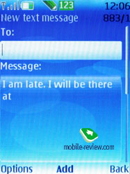
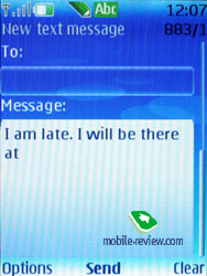
Messages. You can always change input language while typing in any menu, this solution is identical to the one applied on Nokia smartphones and is quite handy.

The phone supports Nokia Smart Messaging standard, this allows sending and receiving ring tones and simple black and white pictures from the compatible phones. Apart from Nokia phones this standard is also supported by Samsung, LG part of the new Motorola's phones. Unfortunately the company's policy is limiting the users, since alternative standard - EMS, which is more spread nowadays and allows sending not only melodies and pictures, but formatting text, is missing here.


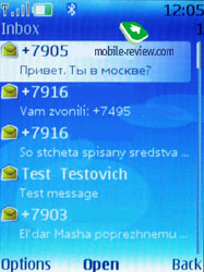
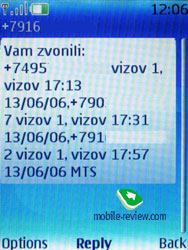
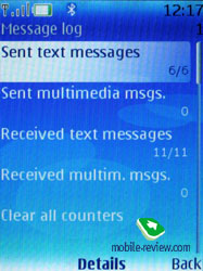
All messages without regard to type (SMS/MMS) are stored in Inbox, the manufacturer claims that eMail messages are saved in the same folder, though in practice they aren’t. Messages themselves are kept in the dynamic memory; this means that at best you will have nearly 500 short messages there. Resetable messages counters (sent and received) are also onboard.
When sending a message off you can pick a telephone number not only from the phonebook but also from recent calls, calls log or select a group.
The rest of the messaging characteristics are standard - emotion icons (converted from the text in the received messages), merged messages. You can have your messages automatically replaced in the Sent folder at memory overflow (the oldest messages are deleted one after another). Delivery reports are stored in a separate folder, which is handy. CB-messages have their own folder, providing channel numbers settings on top of its main function.
Flash messages are some kind of short messages, which are only shown on the recipient's screen, but not saved into the phone's memory (they can be saved forcibly).
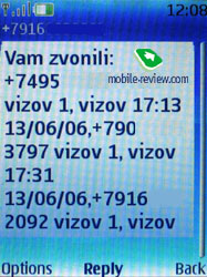
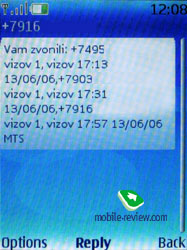
While in standby mode, the phone doesn’t indicate sender and displays only total amount of incoming messages - to view the name you will need to bring up the message.
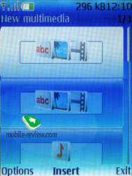
MMS. Each message can be up to 300 Kb big. On the MMS front the 6131 does well: MMS 1.2 implemented into the handset doesn’t cause any problems. Snaps taken with the built-in camera get scaled automatically so that they could be attached to a message (maximum size 640х480 pixels); if a shot is 300 Kb in size or less, it can be sent off immediately without additional transformations being required.

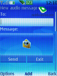
Voice Message – a kind of MMS, when you record a voice message, lasting up to 3 minutes 6 seconds (maximum duration), and then send at once. This is a simplified kind of MMS made for the mass usage.

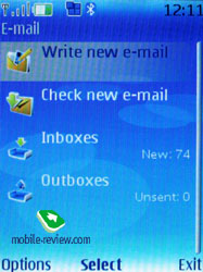
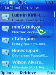
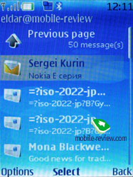
E-Mail. The handset shows off a bundled eMail client, capable of handling APOP/POP3/SMTP/IMAP4 protocols. The application bases on Java and takes nearly 3-4 seconds to start up. The very fact that the client is a separate program implies that it requires a dedicated menu tree and special folders. Apart from standard ones Inbox, Outbox, Sent, there are three more folders, which contain sorted mail. Regrettably, no custom folders are allowed here. For unwanted mail the handset offers you a folder going by the name of Spam, holding all letters filtered in accordance with your personal settings. Taking account of how many spam messages you might receive daily, utility of such feature is somewhere between slim and nil. Anyways the mail client here is meant for occasional usage on the run, and it’s not worth the hassle of making up the rules for anti-spam tools.


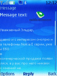
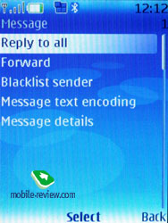
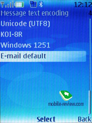
As for codings for Russian languages, there are a couple of them, by default it is standard Windows 1251. You can also take advantage of picking personal coding for any message (UTF8, KOI-8R, Windows 1251), that’s very useful, no doubt of that. The client ensures support for any attachment types; on top of that you can browse handset’s storage right from this application.
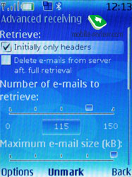
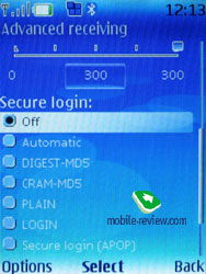
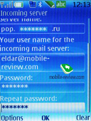
Settings of incoming and outgoing mail are separated from each other. You can cap the amount of received messages (not more than 150), retrieve only headlines of letters, and delete messages from the server once uploading to the phone has been completed. Any received message cannot exceed 300 Kb in size, which is too little for majority of consumers. But if you turn a blind eye to that, the client looks very promising, at least the way it is developing in makes it more capable with every released version.
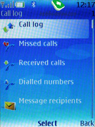
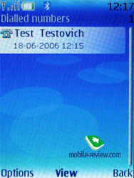
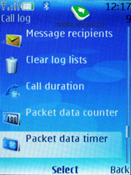
Call logs. There are three lists in the phone. Each list may contain up to 20 entries. It might seem pretty standard, but the best thing about the logs is that date and time of a call are displayed in the list outright. Pressing the Call button in the standby mode will call up the list of last dialed numbers. That is inconvenient sometimes and majority of this handset’s rivals have either a merged list or provide fast switching from one list to another. Here you need to remember where the necessary number is, in which list and then choose it, which is not so comfortable.
General call log can be accessed only from the main menu; as a rule that requires not less than 3 presses – it might prove unhandy in certain circumstances as we do make calls, but receive a lot of them too.
 
 
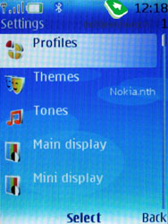
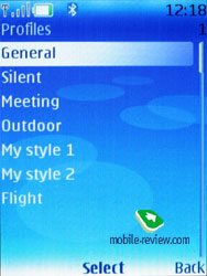
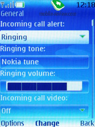
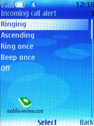
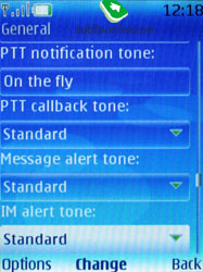
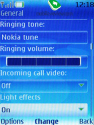
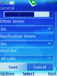
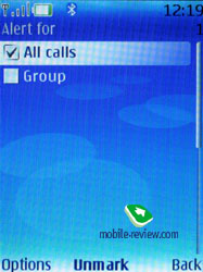
Settings. Profiles may be activated from this menu or switched by pressing On/Off button. Each profile may be activated for a period of time and after which phone turns to the default one. Sound alerts may be adjusted for all the events. You can also easily check if a preset video will work in this profile or not. All in all, profiles implementation on Nokia’s phones is one of the best on the market. Also you can assign various sound to unfolding/sliding open/twisting (for sliders, clamshells and rotate-phones) and closure (this fashion element tested by Korean makers is applied here as well).


The handset houses five pre-installed profiles and two user-adjustable ones; however each of these profiles can be set up in any desired fashion and even renamed.
The phone is empowered with the automatic key lock; you can also set a safety pin number so that no one else could use your phone. There is now a possibility to set "accessories behavior”, for example, to choose a profile that will be activated when the battery charger is on. This is an interesting phone's feature, as from now on you can attune the phone according with your wish and necessities.
You can always enable dialog window regarding Flight Mode activation on handset’s start up, by default this prompt is turned off. In fact you might never need that, since the profile with exactly the same settings can be found in the list of standard profiles.
Connectivity. This sub-menu retains all settings related to Bluetooth, Infrared, packed data (GPRS, EDGE) and data transfer.
Infrared offers you only on/off option without extra settings being available.
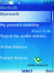
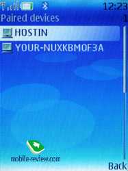
Yet Bluetooth settings are far more complicated – the handset may be visible for other devices, hidden or available for a set time span. For connected devices there is auto-pairing mode, when the handset will keep on trying to establish connection with another device without notifying you. But when it’s not able to do so, the handset starts looping on corresponding message, which pops up every 3 minutes. Quite annoying, if anything I have to say about it.
 

USB connectivity proposes two modes, which are USB Mass Storage (memory card) and PC Sync (synchronization with PC).
Within Data Transfer menu one can easily adjust synchronization with PC, remote server (for an ordinary user such feature isn’t of much use). Moreover this menu holds profile settings for sending the entire contacts list, organizer entries to another device via bluetooth.
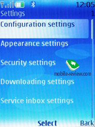
Configuration. The S40 of 3rd edition has been loaded with a new concept, which implies that a whole lot of settings for various services are stored in one place. At first it might feel unusual, but later on you will certainly come to like it. And on top of that it saves a lot of time, since you don’t need to browse countless sub-menus to set up generally the same parameters for applications – everything can be adjusted in one menu and then used in any app. From this menu you are allowed to configure the following programs:
- Web;
- Multimedia messaging;
- Synchronization;
- Push to Talk;
- Instant Messaging;
- E-mail;
- Streaming;
- Access point;
At that it’s important to stress that several applications can be set up in a different way and that’s not prohibited. A good example of that is the standard eMail client, which retains more settings than Configurations item does. It’s worth repeating that such settings depositary proves to be very fetching and is more likely to become widely adopted in the future.
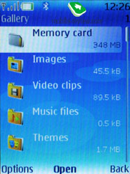
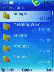
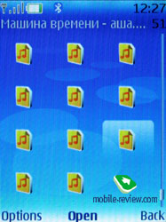
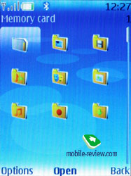
Gallery. The folders with various files are stocked here - all of them have titles matching their contents. You can view the folders as a list, list with labels or as icons. Any multimedia file, including video can be viewed in full-screen (horizontal lay-out). All data received via bluetooth is stored in “Received” folder, and in case the phone cannot provide enough memory, get redirected to memory card automatically. There are no caps on size of received files, they can even take up more than phone’s available memory (the earlier models could not handle such incoming files).
 
 
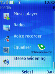
Media. All the settings concerned with the multimedia possibilities of the phone are stored here. We aren’t going to dwell on camera module in this article, as it varies on different devices, therefore should you need a more definitive review on camera – cast a glance over the required model.
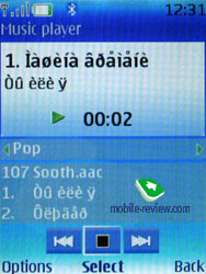
Media player of the 6131 is a music player actually used on Nokia 6230i (which lacked almost all advanced features) - it supports mp3 files with various bit rate, even with the high ones (also eAAC and a number of other formats). You can also rewind files in a preset interval (both forwards and backwards). In fact, quality-wise it hits the segment’s top, no noises as such (however, bass is not very noticeable), even when playing back through a loudspeaker. And the loudspeaker quality is really of some interest, since it handles mp3 files with easy, yet polyphonic melodies come out dull.
 
Stereo Widening – allows extending the base. The effect is dependant on hardware specifications.
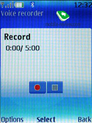
The dictaphone observes the limit of 60 minutes per one recording and is enabled during calls. The user is free to choose storage place (either phone memory or memory card), but can’t set titles of his own – the handset strictly defines them as label and number. Unlike handsets by other manufacturers a recording’s title here doesn’t feature the telephone number of your interlocutor and that’s quite frustrating.

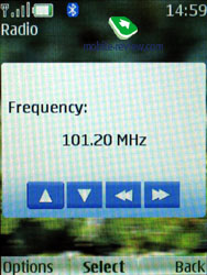
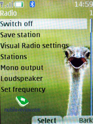
Radio. The device allows saving up to 20 FM radio stations with assigned text labels. The function is similar to that found on other phones by Nokia - pressing the button on a headset switches the stations. Even though the radio is capable of working in the speakerphone mode, a headset is still essential as it doubles as an antenna. The radio can also serve as an alert for the alarm clock, but again a plugged in headset is a must. No possibility to record radio broadcasting to the memory card is provided on the 6131. The self-developed feature, Visual Radio is also onboard.
 
By pressing numeric keys you can switch between saved radio stations – in other words it’s a kind of fast navigation feature.
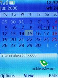
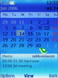
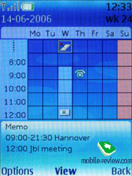
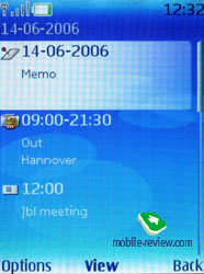
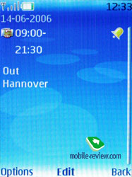
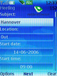
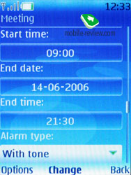
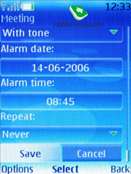
Organizer. You can submit up to 1000 entries, though the final number strongly depends on length of each note; automatic cleaning up is onboard (time-wise). Monthly, weekly (with hourly grid) views are available in the Calendar. The handset offers five various types of events: meeting, call, birthday, memo, and note. Each event regardless of its type can have an alert configured, and be recurrent. While in monthly view the bottom area features up to three appointments for a selected day.


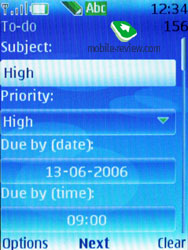
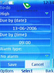
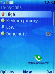
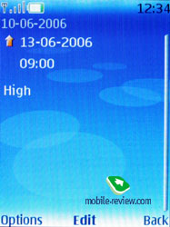
The To-do list enables you to make up events with three types of priority (high, normal and low), setting due date and time for each event.
 
 
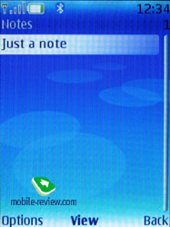
Notes - each note may contain up to 3000 characters. That is more than enough even for the most demanding user. Two font-sizes are supported like in messages.

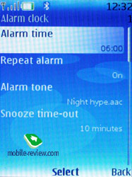
The alarm clock allows setting both single and recurrent alerts, which may trigger on certain week-days. Any tune or a radio sound (just need to plug a headset in) can serve as a signal. The time span for Snooze is also adjustable.
 
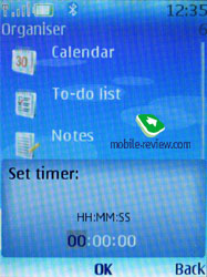
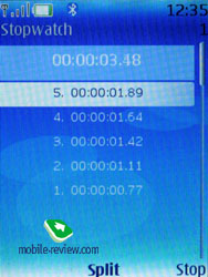
Also the organizer contains a countdown timer, a stopwatch which allows getting intermediate values. Both apps can work background mode.
 
Java. Maximum size of a JAR file makes 1 Mb, heap size cannot exceed 2 Mb. Java-powered applications are not capable of working in background mode, which the greatest drawback of the entire software shell.
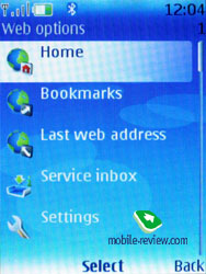
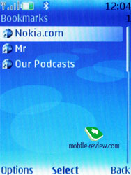
WEB. The browser of the 2.0 version allows viewing xHTML pages. Nothing special to say about it.
 
 
Synchronization with PC. The Nokia PC Suite software is included into the kit. That is a complete software kit helping not only in synchronization of the organizer and the phone book with MS Outlook, Lotus, but also downloading melodies, logos, wallpapers, games to the phone.
An in-depth review of Nokia PC Suite can be found here>>>
Short summary
For the time being S40 3rd edition appears to be one of the most powerful and flexible platforms on the market. At the same time it retains a number of shortcomings and sometimes illogical layout of certain menus – nevertheless nothing is perfect. But regardless of that, the S40 can be rightfully placed among the market’s best proposals owing both to Nokia’s position and applied software solutions. A major leap forward is coming up with the next edition, when Java engine will be gotten better and several applications will receive more adjustable options.
Review of GSM-handset Nokia 6131. Part 1 >>>
Review of GSM-handset Nokia 6131. Part 2 >>>
Eldar Murtazin (eldar@mobile-review.com)
Translated by Oleg Kononosov (oleg.kononosov@mobile-review.com)
Published — 27 July 2006
Have something to add?! Write us... eldar@mobile-review.com
|
