Software features of Nokia S40 6th Edition
Table of contents:
- What’s new in the 6th edition
- Interface layout
- Phonebook
- Messaging
- Email
- Call log
- Settings
- Connectivity
- Gallery
- Media
- Organizer
- Web
- Maps
- PC Synchronization
- Conclusion
Just like we always do, here is a thing for you to take note of – some features listed in this write-up have much to do with hardware, as well as software. For instance, some phones may not come with an Infrared port or FM-radio module. Bear this in mind, and look for reviews on specific devices. This article is the breakdown of the platform’s functionality, which is composed so as not to go over the same thing again in our reviews.
You can find our in-depth review of the S40’s previous edition here:
All features were reviewed, and screenshots taken on the first phone to run S40 6th edition – the Nokia 7510 Supernova.
What’s new in the 6th edition
The change log of the 6th edition is pretty lengthy, so in this preface we are going to cover the most vital of them and leave the rest for specific parts of this review. It’s important to emphasize that a number of features have been around since the fifth edition of the platform – for instance, certain views of the phonebook, transition effects and some other bits and pieces that are all attributes of S40 6th edition, in fact, are employed on some other phones too. However it’s only in the 6th edition that they have made it into the platform’s default feature pack.
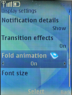
- Transition effects were the cornerstone of S60 FP2 update and they did a great job adding new flavors to the user interface. So now feature phones can benefit from this feature, as they have added one effect that makes pop-up windows with notifications appear on the screen smoothly. While these special effects are eye-candy, occasionally they seem somewhat sluggish due to the CPU’s insufficient speed;
- Full-fledged support for Flash Lite 3 that allows running games and various animated swf files, including time- and date-conscious wallpapers;
- Support for WiFi that extends beyond VoIP – data connections are now available too
- Enhanced phonebook, revamped email client;
- New browser building upon WebKit open source project;
- Maps application integrated into the platform, although its an older version compared to the app found in S60-powered devices;
- Support for new Java APIs - JSR-179 Location API, JSR-205 – Wireless Messaging API;
- OMA Message 1.3;
- Horizontal scrolling of lists in the user interface;
- Themes now apply to radio application and multimedia player;
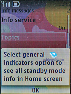
- New UI elements – pop-up windows;
Actually, it’d take us much longer than that to list all additions and tweaks introduced with the new edition of the platform, so we are going to stop right here. There are several reasons why the release of the sixth edition is very crucial to the entire world of S40 – first of all, it indicates that all successful ideas of S60 are going to get carried over to the “junior” platform. This way, the sixth edition comes preinstalled with transition effects, an open source browser, Flash Lite, and Maps. Although there is no way these two platforms will merge any time soon – they’ll just get a great deal closer, but that’s about it. In fact, all new features and ideas will be implemented in S60 first and then spread down to S40-based devices. As of today, in terms of features these two platforms are a year away from each other, which isn’t all that much in the context of the mobile phone market.
Back to the table of contents >>>
Interface layout
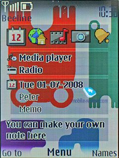
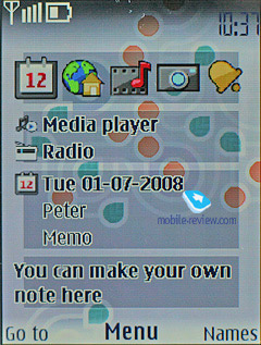
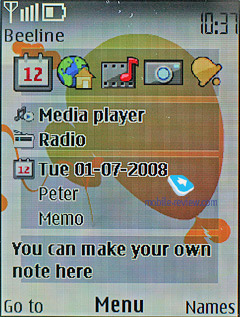
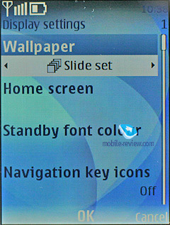
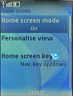
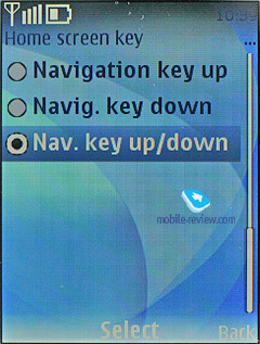
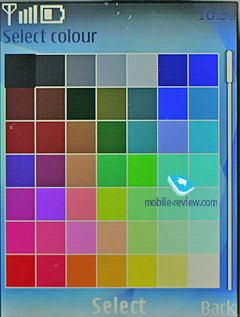
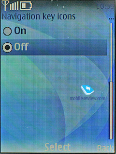
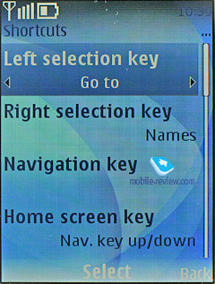
The handsets based off of the S40 5th edition (just like the S40 3rd edition powered phones) come armed with the capacity to alter the appearance of standby screens. Specifically, you can choose between Active Standby, standard looks with fast access assigned to the navigation key, and the GoTo feature (left soft-key). The wallpaper and font color of the standby screen are also manageable – as a matter of fact, for some high-contrast photos, changing font type is the only way to distinguish the text laid over them. Functions can be bound up with directions of the navigation key in a common fashion; icons may be either visible or hidden (if Active Standby is activated, they are permanently hidden; the upward direction of the navigation key gets disabled.
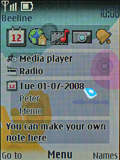
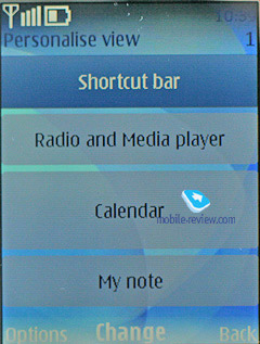
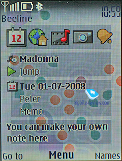
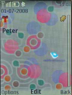
The Active Standby mode is very similar to the desktop found on smartphones nowadays – while active, the display is divided into several zones (shortcuts toolbar, media player and radio status, date and upcoming events and notes). No doubt, all power users will appreciate this feature, as it allows reading relevant information on the screen outright. You can also arrange the zones on the vertical axis, which adds to the interface’s flexibility.
As far as the user interface is concerned, the main difference of the sixth edition from previous versions of the platform is that you can scroll item lists sideways in all menus. Now when using Active standby you can manage both player and radio this way and scroll through tracks and frequencies respectively. Previously this feature was available only with the calendar, where you could jump between days right at the standby screen. From now on, all menus and sub-menus that deal with lists house horizontal arrows, which make for faster navigation.
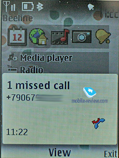
Once the display falls into standby mode, it gets occupied by the clock, missed calls and received messages indicators – all of these events are tied up with tiny icons and numbers, i.e. if you have 3 missed calls, you will see a corresponding icon and “3”. The sixth edition features a caller ID picture for every missed call (provided that you have one registered in the phonebook).
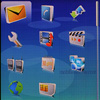
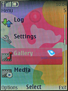
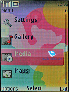
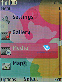
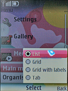
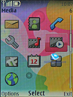
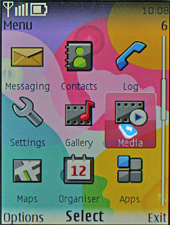
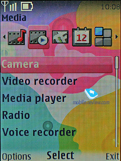
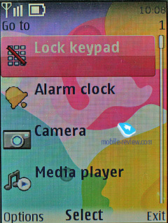
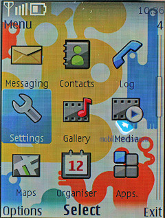
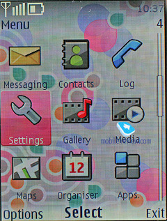
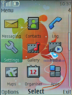
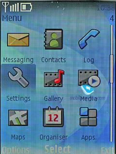
The main menu can be viewed in one of four ways: list (5 items of the main menu), grid (12 icons), grid with labels (9 icons), and tabs. The first three types are well known for being embedded in the previous models, while the last one is of certain interest to us. The top of the screen holds a toolbar containing menu items and corresponding notes. You can use horizontal directional buttons on the navi-key to move through the menu – the contents of a highlighted item are shown in a vertical pop-up bar. It’s worth noting, that with this lay-out, navigation gets easier, as you see all available menu options. All items on the main menu may be sorted, or arranged however you please.
All the sub-menus contain vertical lists with tiny thumbnails placed next to each menu item – this allows making the font smaller and thus displaying more lines on the screen. Thanks to the icons, the design looks very appealing, since its appearance make the menus straightforward and easy to manage.
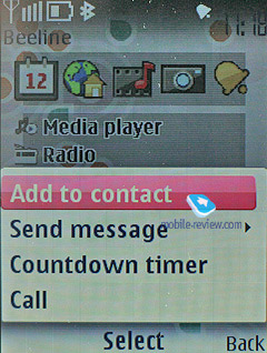
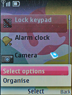
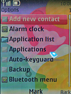
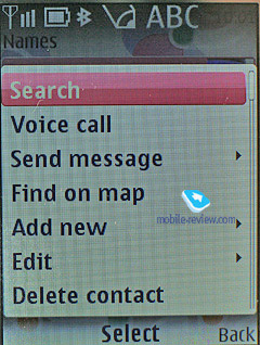
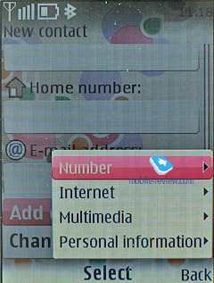
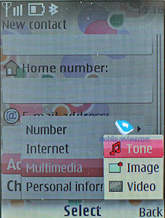
Some applications and features of the sixth edition, such as the phonebook, now feature pop-up menus that don’t refresh the content but appear on top of it. So, once you have picked the required option in it you will go back to the screen you were managing a second ago. All in all, it’s a nice improvement over the previous version of S40.
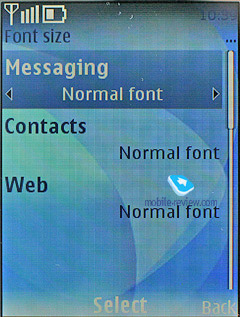
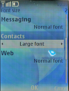
You can set custom font-sizes for Messages, Contacts, and Web (small, normal and large), it doesn’t seem to make any difference, however, for the most part, lines will fit on the display,depending on the size you have picked. Even the maximum font size doesn't make it too bold, so the fonts remain delicate enough.
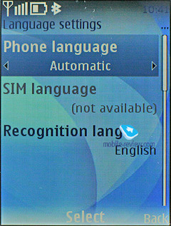
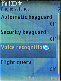
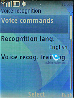
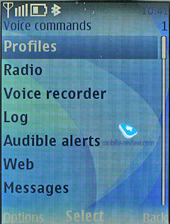
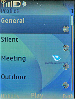
You can use the number shortcuts and voice commands for fast navigation. While voice recognition is available only for several preset functions, no special training and voice tag recording is required. Just say the name of the desired item, and the device will bring it up. Generally, voice recognition is speaker independent, and the same goes for the phonebook. Should you be heavier on your phone’s voice dialing features, you will see how the handset evolves, i.e. the recognition quality steadily increases over time. Nevertheless, it has some drawbacks as well: considerable number of errors when having a lengthy contact list, or different languages. The settings contain the option for changing the recognition language, regardless of what active interface language you currently have.
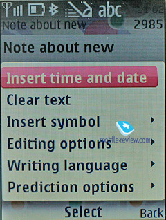
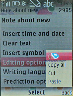
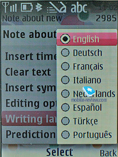
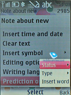
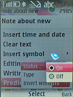
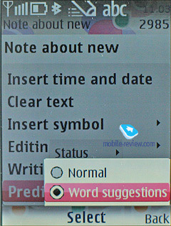
The sixth edition also sports predictive text input (T9) system. Also you can opt for the Word Suggestion feature, which is pretty much self-explanatory. But what’s really important is that now T9 works in all menus and features throughout the phone. If you need to type in various languages, it is not a big deal, since the handset supports switching languages on the go. The sixth edition also allows copying fragments of text or individual words – it saves all such snippets in the buffer and enables the user to insert them in any application afterwards. For instance we managed to copy text for a text message and paste it into a note on the standby screen.
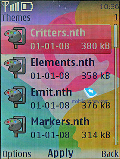
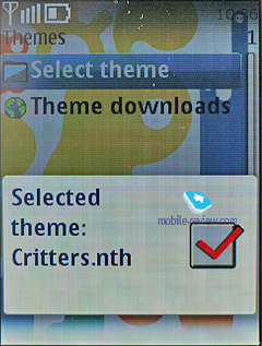
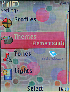
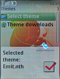
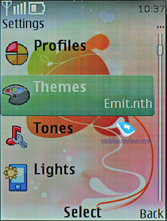
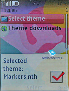
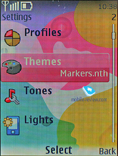
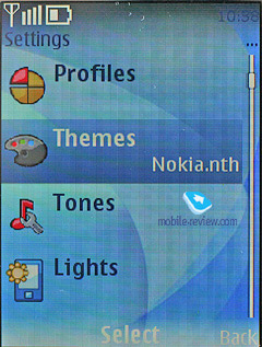
Themes – using the themes, you can alter not only font color, the icon style of the main menu and wallpapers, but also the background picture of each sub-menu, which is quite interesting. All themes are very well detailed, so that you might even spend some time picking the most fitting option. The sixth edition improves upon the previous version of S40 by extending themes to the player and radio applications, so that now they are parts of one big theme you apply in the settings. But you can also opt to forgo this feature and the player will revert back to its default theme.
Other things of note include increased font size in most modes, so that it reads much better now. This also holds true for the standby screen – that is, now the battery indicator and status icons are almost two times bigger and you no longer need to peer at the display to read them. Comparing two phones that use the same screen resolution, for example QVGA, the one running sixth edition will come out on top, no contest. But as screen resolutions increase the fonts here will become similar to those seen on phones running previous editions of S40.
Back to the table of contents >>>
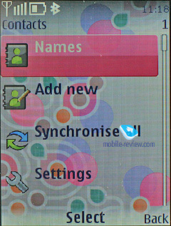
Phonebook
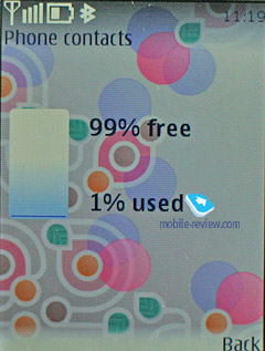
Up to 1000 names, which is the maximum possible capacity, can be saved in the phone's memory. The amount of data submitted to entries makes no difference at all – the limit of 1000 contacts can’t possibly go up or down.
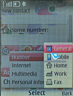
Each contact may have up to five assigned phone numbers of the following types: general, mobile, home, office, fax and video – for 3G networks. The first entered number becomes the default one and can be then edited to your liking.
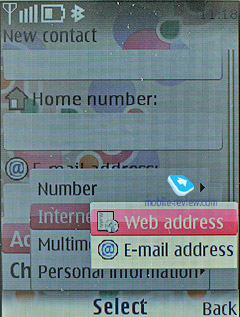
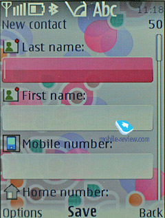
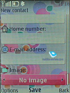
While previous versions of S40 offered the user only a few fields when creating a contact – that is, first name, last name and one number – and the rest could be filled in later on, the sixth edition shows a few more: mobile number, email address and picture selection.

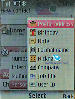
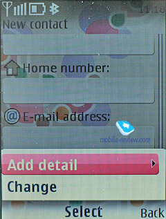
Additionally, you can enter e-mail, homepage, mail addresses, text note, company and job title. Among all other fields available for filling in is, User ID – it is the identifier for the presence service. Generally speaking, it’s some kind of ICQ, which gives you a warning of the user’s availability at every given moment. If you think we are going to wind up our story right at this point, you’re greatly mistaken, since there are more informative fields available for filling in, like Formal name and Nickname. You can enter Birthday date as well and it will pop up in the calendar as a new event automatically.
Already filled sections are highlighted in grey, so you will be aware of entered information right at the first glance. The system won’t allow you to duplicate entries by creating a new contact with the same name – instead, it will allow you to replace the existing item. Nonetheless, this limitation fades away once the phone gets synchronized with a PC. But, keep in mind that if you do have identical entries, this is more likely to give you some trouble with voice dialing.
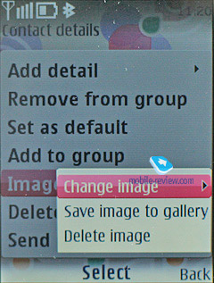
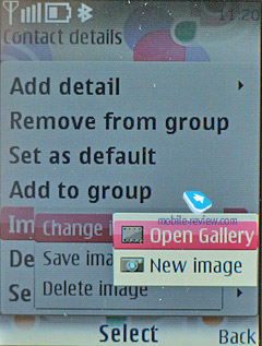
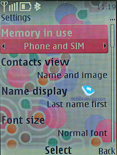
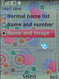
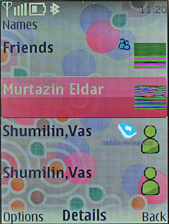
You can bind up any contact with an image or a video clip. Priority-wise, video clips are higher than pictures therefore they will be played back instead of a photo on all occasions (each name can have both a picture and a video clip assigned). When viewing details on a contact, you will see its picture outright, although previously it resided in its own section. In the general list you can have caller IDs and contacts names paired up - in this mode, the thumbnail is smallish and gives a little notion of the actual image. Other view modes are quite common - only names, names with the general number. The general list can display contacts stored on a SIM card and the phone’s internal memory.
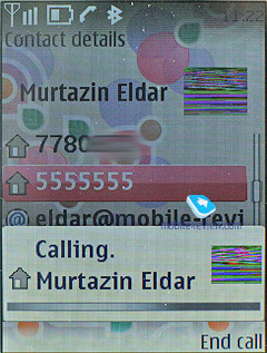
On an outgoing call, the image gets reduced to a small thumbnail, whilst on incoming calls, it occupies the entire screen. Contact’s name is displayed next to the number type icon and full phone number.

Each contact can be bound up with a personal ring tone (any file) – in case you choose a video clip instead of picture, the sound will be taken from the clip, rather than from a music file.
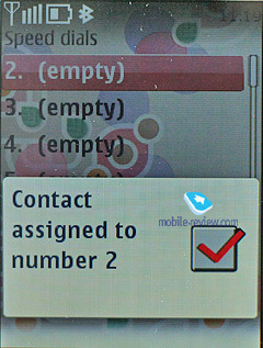
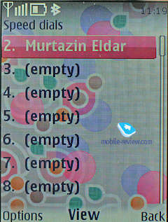
And traditionally, the buttons 2-9 are for speed dialing.
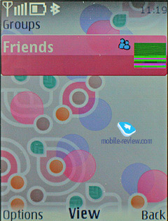
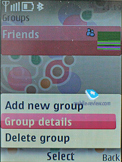
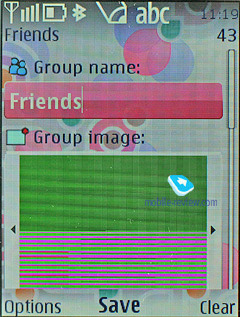
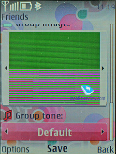
There are no preset groups available in this phone, thus you’ll have to create them yourself. The great edge of this system is that you can create up 25 contact groups. Each of them can be customized with a personal tune and an image. The photo, set for a certain group member, has the higher priority and will be displayed instead of the picture applied to the group. One and the same entry can be a member of various groups.
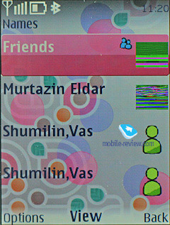
In the general list of entries, groups are displayed in one line with stand-alone contacts, yet marked with their own icons. Searching is performed in group names and separate contacts at the same time. This layout may seem confusing at first, but later on you realize all its advantages, as you don’t have to look up for a special item on the menu to access the groups list (besides, it’s accessible only from the main menu, using the soft-key or shortcut numbers, you’ll get to the list itself).
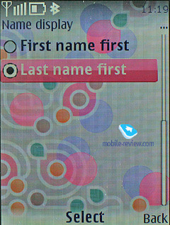
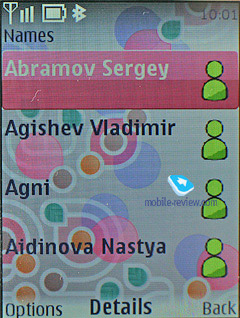
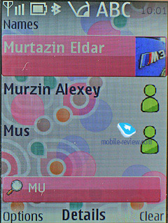
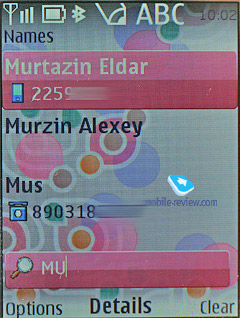
Search in the general list can be performed by entering several letters – it doesn’t cause any hardships and works as it always does. Pressing the “*” button results in switching to entries on a foreign language (in case you have contacts both in Russian and English, for example). When browsing the phonebook, pushing “#” key calls up the detailed view featuring the general number – to access full data on a contact use the corresponding menu (two presses). All entries may be sorted either by first or last names.
MS Outlook synch module of the sixth edition is far more tuned than that found on the earlier systems. Most of the fields synchronize correctly – and this goes for First Name and Last Name fields as well. From the phonebook menu you are at liberty to send any entry as a Business Card to another device with the aid of an SMS, MMS or a wireless protocol. Unlike the previous edition, here you can choose between sending away the entire entry or name and main number only.
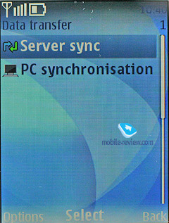
On the face of it, there is no way for beaming the entire phonebook to another device – even if you select all contacts, the context menu won’t offer you this option. However, using the Settings – Connectivity – Data Transfer tab you will be able to do that, the handset supports synchronization (add all, replace all), apart from the contact list you can transfer notes and calendar events.
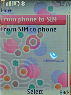
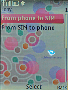
The 6th edition fully supports contact transfers between internal memory and SIM-cards and vice versa.
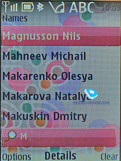
You can also type in a couple of letters into the search field and then select all contacts starting with these letters.
Back to the table of contents >>>
Messaging
You can always change the input language while typing in any menu, this solution is identical to the one applied on Nokia smartphones and is quite handy.
The phone supports Nokia Smart Messaging standard, which allows sending and receiving ring tones and simple black and white pictures from compatible phones. Apart from Nokia phones, this standard is also supported by Samsung, LG and some new Motorola phones. Unfortunately, the company's policy limits the users, since the alternative standard - EMS, which is more popular nowadays, and allows sending not only melodies and pictures, but formatting text as well, is missing here.
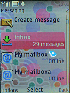
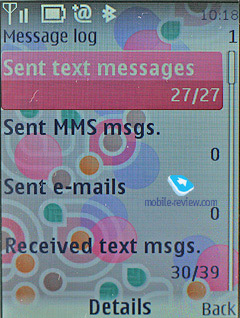
All messages regardless of type (SMS/MMS) are stored in the Inbox folder. Messages themselves are kept in the dynamic memory; this means that at best you will have nearly 500 short messages stored. Resettable message counters (sent and received) are also onboard.

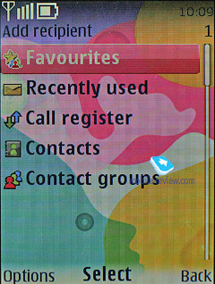
When sending a message, you can pick phone numbers not only from the phonebook, but also from recent calls list, calls log or select a group. On top of that, there is the Favorites list, where you can put the numbers you use more often.
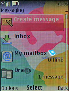
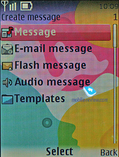
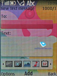
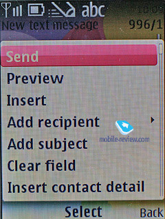
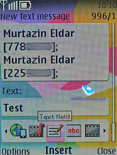
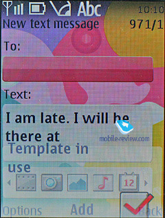
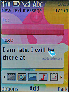
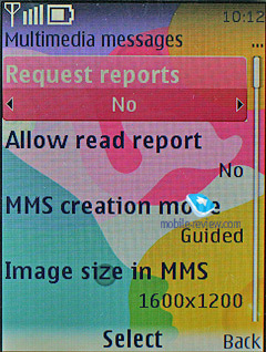
The messaging interfaces for SMS and MMS have been merged, so now it makes no difference what you are intending to compose. Depending on the content you throw into your new message, it remains a text-based message, or morphs into an MMS. This is a very smart approach, for it doesn’t make you think how you are going to write a message, and probably will win over more users to the MMS standard. As for this message type, no significant improvements have been made. Any message can be up to 600 Kb big. With its OMA MMS 1.3, the platform presents pretty good implementation of MMS technology, so you won’t experience any hardships with composing these messages. All images taken with the phone’s camera are cropped automatically to fit in your multimedia message (maximum – 1600x1200). If the image’s size doesn’t exceed 300 Kb or a tad less, you can send it with no further editing in the message body.
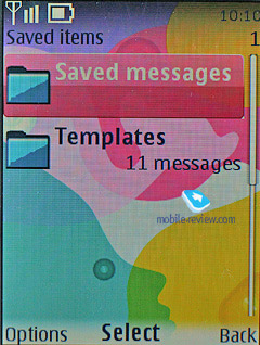
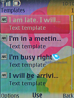
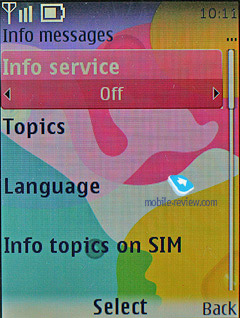
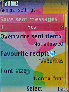
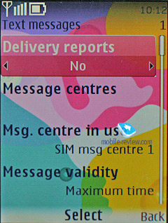
The rest of the features in the messaging department are standard - smiles (converted from the text in received messages) and long messages. You can have your messages automatically replaced in the Sent folder on memory overflow (the oldest messages are deleted one after another). Delivery reports are stored in a separate folder, which is handy. CB-messages have their own folder, providing channel number settings on top of its main function.
Flash messages - a kind of short message, shows only on the recipient's screen, but not saved into the phone's memory (they can be saved forcibly).
While in standby mode, the phone indicates sender’s name.
Voice Message – an MMS variation, when you record a voice message, lasting up to 3 minutes 6 seconds (maximum duration), and then send outright.
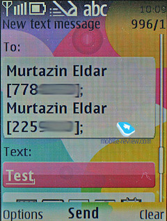
When composing a message the phone number field has text input enabled, so that you have to type in first letters of a contact name and tap the center button to make the handset look for matching entries.
Back to the table of contents >>>
Email
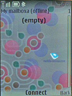
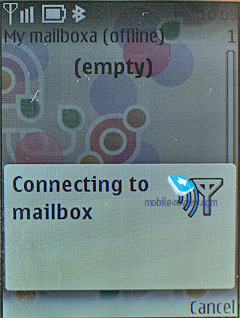
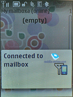
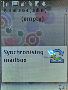
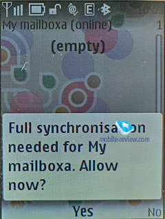
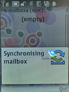
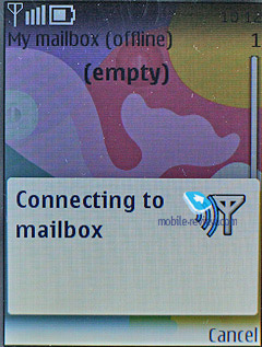
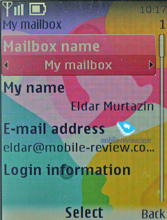
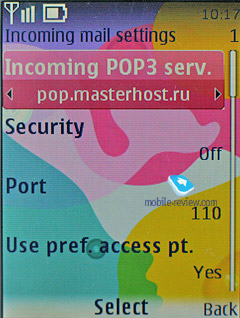
The handset shows off a bundled Email client, capable of handling APOP/POP3/SMTP/IMAP4 protocols. Now there is also a mail wizard that will guide you through all vital settings and parameters in a very unobtrusive way. As for encodings for Russian language, the system features a couple of them, and by default it is the standard Windows 1251. You can also take advantage of personal encoding for any message (UTF8, KOI-8R, Windows 1251), which is very useful, no doubt about that. The client ensures support for any attachment types; on top of that you can browse handset’s storage from within this application.
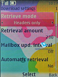
The settings for incoming and outgoing mail are separated from each other. You can cap the number of received messages (no more than 150), retrieve only headlines of letters, and delete messages from the server once they have been uploaded onto your phone. Any received message cannot exceed 600 Kb in size, which is too little for the majority of consumers.
Unfortunately, while the mail client built into the sixth edition improves upon its predecessor, it’s no breakthrough.
Back to the table of contents >>>
Call log
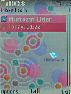
The platform presents you with three lists – incoming, missed and outgoing calls, with every list having the capacity of 20 entries. On top of that, all these lists feature call date and time, which is pretty convenient. While at the standby screen, press the pick up key for the general call list (although you won’t be able to jump to other logs from there).
In detailed call view, you can also see its duration.
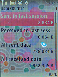
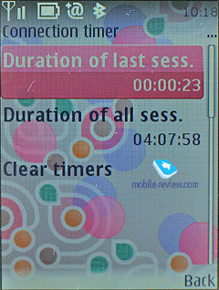
The Call Log also has the menu with all numbers you have messages to, and message\call\data counters.

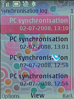
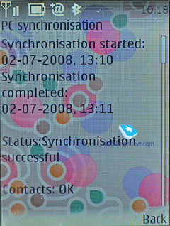
Another log sports all synch sessions you have had with the phone.
Back to the table of contents >>>
Settings
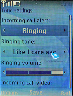
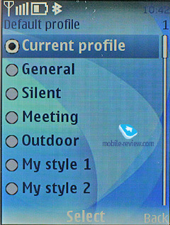
The profiles may be activated from this menu or toggled by pressing the On/Off button. Each profile may be activated for a designated period of time and after this, the phone turns back to the default state. Sound alerts may be adjusted for all the events, including calls from group members. You can also easily set whether a contact’s video will work in this profile or not. All in all, the profiles implementation on Nokia’s phones is one of the best on the market to date. The handset houses five pre-installed profiles and two user-adjustable ones; however, each of these profiles can be set up in any desired fashion and even renamed.
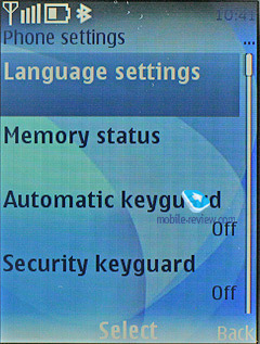
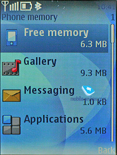
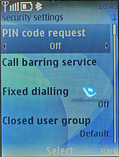
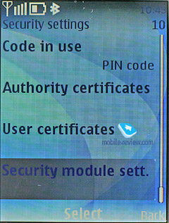
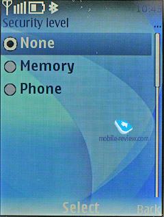
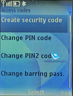
The phone is empowered with the automatic key lock; you can also set a safety pin number so that no one else could use your phone. Furthermore, you can protect your phone’s internal memory and memory card with passwords separately.
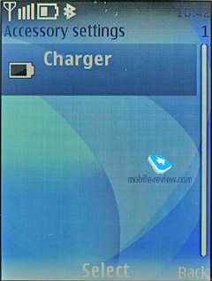
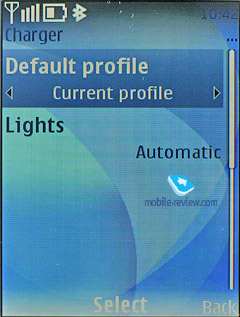
There is a possibility to adjust enhancement settings, for example, to choose a profile that will kick in when the battery charger is plugged in. This is a quite nifty feature that allows you to customize your phone even further.
You can enable the Flight Mode dialog window on handset’s start up, however by default, this prompt is turned off. In fact, you might never need that, since the profile with exactly the same settings can be found in the list of standard profiles.
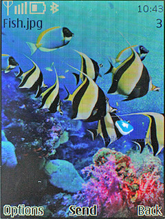
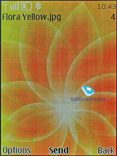
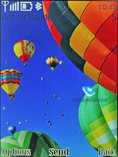
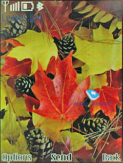
You can always opt for a slideshow composed of your own photos, so that they will change each at designated intervals.
Transition effects – a self-explanatory feature that adds animation to pop-up menus and dialog boxes and long lists.
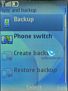
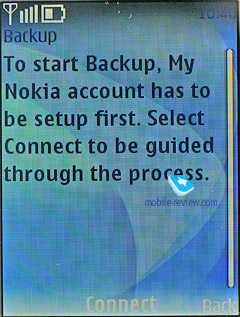
BackUp – this feature allows storing a back-up copy of user data on a remote server, but for this service to work you will need a free subscription to MyNokia (in certain regions, including Russia it’s not available).
Create BackUp – in spite of its resembling title, this feature makes a local back-up copy of your data and moves it to the memory card. You can also select what data you actually want to backup:
- Settings;
- Contacts;
- Messages;
- Bookmarks;
- Calendar;
- Gallery;
- Applications and games.
The downside to this application is that it creates only one archive, meaning that you won’t be able to back up data several times and then use particular system builds for various purposes.
Back to the table of contents >>>
Connectivity
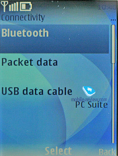
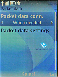
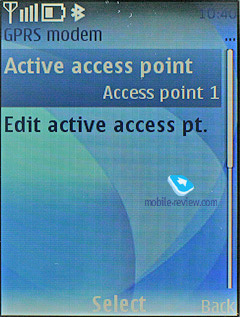
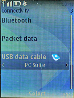
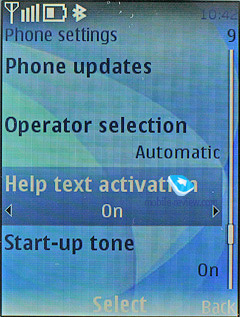
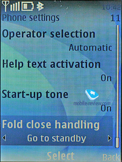
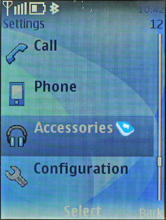
This sub-menu retains all the settings related to Bluetooth, WiFi, packed data (GPRS, EDGE) and data transfer.
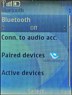
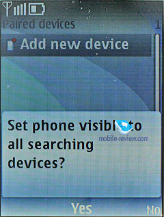
Yet, the Bluetooth settings are far more complicated – the handset may be visible for other devices, hidden or available for a designated time span. For connected devices, there is auto-pairing mode, when the handset will keep on trying to establish a connection with another device without notifying you. Coupled devices are now displayed as a separate folder in any menu, which is pretty convenient.
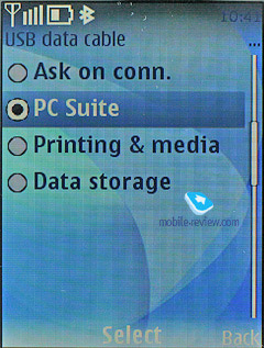
USB connectivity settings have two modes, which are USB Mass Storage (memory card), PC Sync (synchronization with PC), and Print&Media.
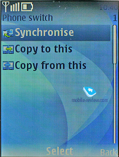
Within the Data Transfer menu, you can seamlessly adjust synchronization with PC, remote server (for an ordinary user such feature isn’t of much use). Moreover, this menu holds profile settings for sending the entire contacts list, and organizer entries to another device via Bluetooth.
WiFi connectivity in the sixth edition of S40 may be used both for data sessions and VoIP telephony. In the latter case, however, you will need some settings from your carrier, since this client can’t be configured as you please. Other than that all settings are pretty standard, and it also supports WEP2.
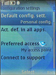
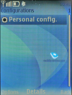
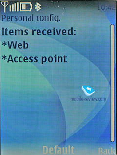
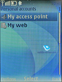
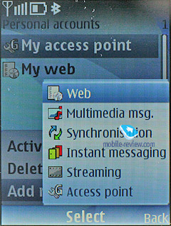
Configuration. From this menu, you are allowed to configure the following programs:
- Web
- Multimedia messaging
- Synchronization
- Push to Talk
- Instant Messaging
- E-mail
- Streaming
- Access point
At that, it’s important to stress that several applications can be set up in a different way and that’s not prohibited. A good example of that, is the standard Email client, which retains more settings than the Configurations item does. It’s worth repeating that such settings depositary proves to be very fetching.
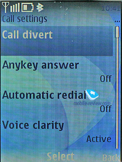
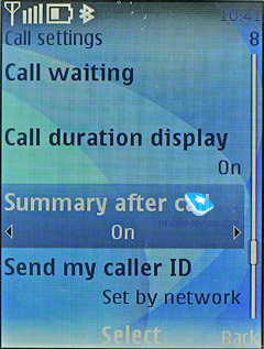
Calls. All phones employ the Voice Clarity technology that enhances call quality in areas with pure reception – in a way, it’s an equalizer that negates outside noise. You can also enable in-call timer and after-call note on duration.
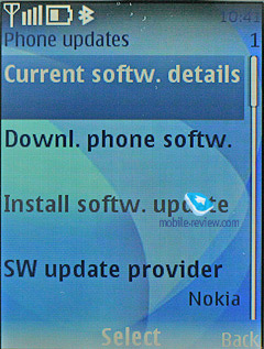
Software update. This item serves for auto upload of new firmware versions, in other words, it’s what they call “over-the-air update”. You can opt for scheduled check-ups and also choose the service provider (for some it may be different from Nokia).
Back to the table of contents >>>
Gallery
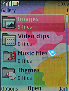
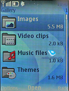
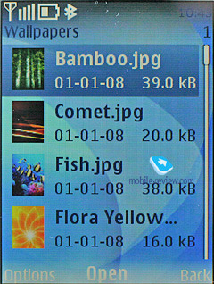
The folders with various files are stocked here - all of them have titles matching their contents. You can view the folders as a list, list with labels or as icons. Any multimedia file, including video can be viewed in full-screen (landscape) mode. All data received via Bluetooth is stored in the “Received” folder, and in case the phone cannot provide enough memory, gets redirected to the memory card automatically. There are no caps on the size of received file.
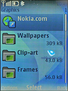
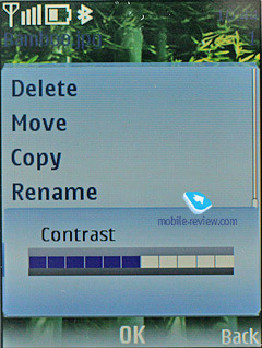
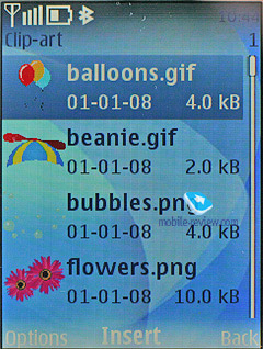
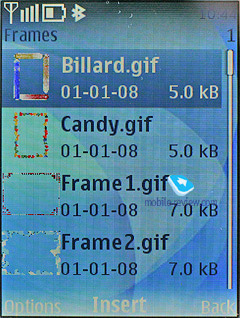
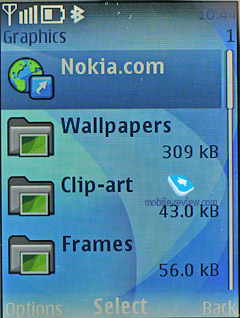
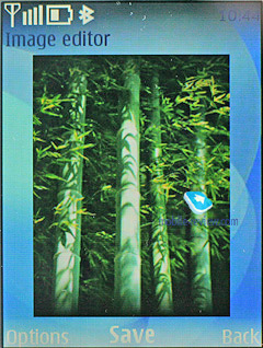
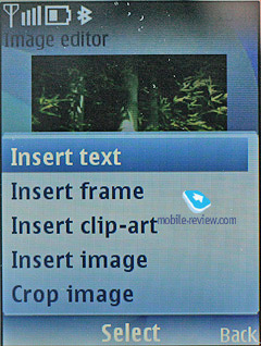
There is a basic image editor coming included with the sixth edition, which allows you to scale pictures, crop them, add own text fields, small clip-arts or frames, in other words the very minimum you might need for your edit-it-all mood.
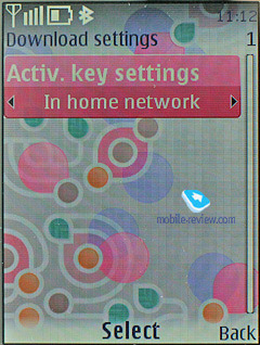
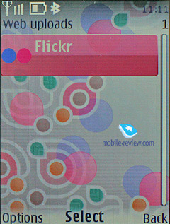
The sixth edition also introduces online sharing of photos into the default feature pack – by default the system will use Flikr, but the service provider may vary.
Back to the table of contents >>>
Media
All the settings concerning the multimedia front of the sixth edition are stored here. We aren’t going to dwell on the camera module in this article, as it varies on different devices, therefore should you need a more definitive review on the camera – look for the model you need in our Reviews section.
Music player. The player found in the sixth edition copies most features of the one available with 5th edition, but now it comes with support for two codecs: WMA Video 9, WMA Audio 10. The player deals with video content as well as audio files, which brings about a very amusing situation, when by minimizing the player while watching a video, you remove the picture from the display, even though the sound keeps going out from the loudspeaker or earphones like before. It shouldn’t be considered as a mistake made by the programmers, since it looks more like a feature, but I have certain doubts about its usability, and on top of that, other handsets don’t have this kind of background video playback.
The display shows you data on artist, album, and even album art, if it is in the current track’s tag. The navigation pad does pretty much standard things (jumping between tracks, fast forward, and stop). The progressive fast forward feature has finally made it to this player, however when you only start skipping forward, it goes at a 5 second step.
The playback modes available with the sixth edition’s player are: sequential, random, repeat one track/all tracks.
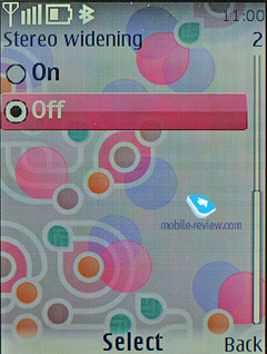
Outside the player is the Stereo Widening feature. There seven five-band equalizers with 5 presets (Normal, Pop, Rock, Jazz, Classical) and two user-manageable setups.
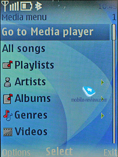
The music library can be categorized with the help of the following filters:
- All tracks – every song stored in the phone.
- Artists – tracks sorted by artist.
- Albums – shows songs depending on album.
- Genres – classic, rock and so on.
- Composers – filters your media content by composers.
- Track lists. Another set of filters, including Favorites (you can throw any track onto this list either while it’s playing or when browsing categories), Most popular and Recent tracks, Recently added and My tracks. A very interesting set of filters that might be quite useful.
Your own playlists may be composed on a PC or on your handset. Unlike the previous edition, with the sixth version you can pick either stand-alone tracks to add them onto your playlist, or entire albums or all tracks by a specific artist, etc, which is obviously really handy.
Music upload – a stand-alone item in the menu, that includes only a link to Nokia’s site for the time being, and once the Nokia Recommendation service gets online, it will lead right into it. Apart from AAC, eAAC, eAAC+ and MP3, Nokia’s player also supports WMA format. You can also beam sound to a wireless Bluetooth-powered headset, or skip forward/backward wirelessly.
Stereo Widening – allows extending the stereo base. The effect is dependant on hardware specifications.

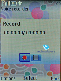
Whilst using the Voice recorder, you are to observe the limit of 60 minutes per one recording. On the bright side, it is enabled during calls. The user is free to choose the place of storage (either phone memory or memory card), but can’t set titles of each recording – the handset strictly defines them as a label and number. Unlike handsets by other manufacturers, a recording’s title here doesn’t feature the phone number of your contact, and this is quite frustrating.

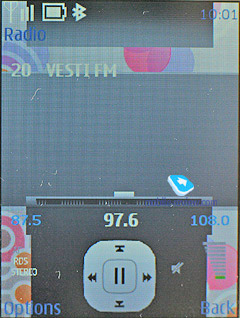
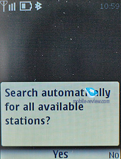
Radio. The inbuilt FM-receiver works only with a headset connected, which doubles as an aerial. The sixth edition supports Visual Radio that allows displaying graphics and text during a broadcast. Even though this service isn’t all the rage here, in Russia, the system still comes with this ability. Frequency and station name can be submitted manually, the handset’s memory is good for 50 channels, also there is auto-tuning and RDS. Radio signal can be sent to the loudspeaker. The interface is similar to that utilized by the music player, and the quality of broadcasts doesn’t disappoint.
You can toggle between all saved stations with the help of the number pad – a sort of shortcut number navigation.

Back to the table of contents >>>
Organizer
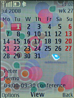
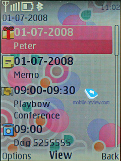
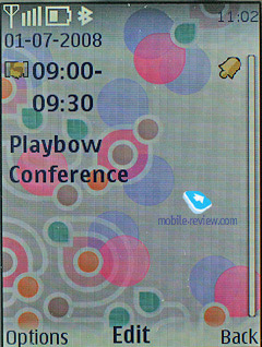
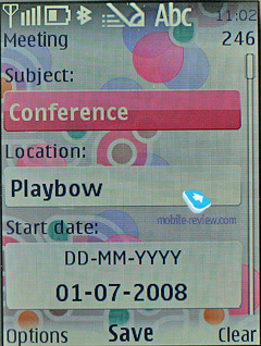
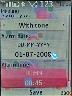
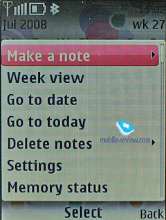
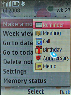
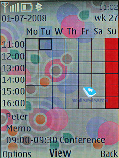
You can submit up to 1000 entries, though the final number strongly depends on the length of each note; automatic cleaning up is onboard (time-wise). Monthly, weekly (with hourly grid) views are available in the Calendar. The handset offers five different event types: meeting, call, birthday, memo, and note. Each event, regardless of its type, can have an alert configured, and be recurrent. While in monthly view, the bottom area features up to three appointments for a selected day.
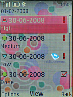
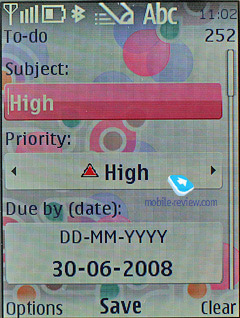
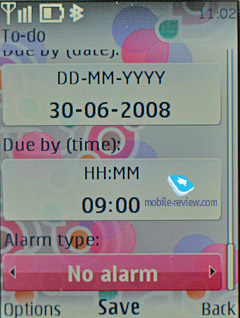
The To-do list enables you to make up events with three types of priority (high, normal and low), set due date and time for each event.
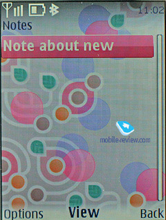
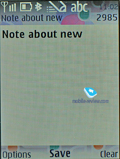
Notes - each note may contain up to 3000 characters. That is more than enough even for the most demanding user. Various font-sizes are supported, just like for messages.
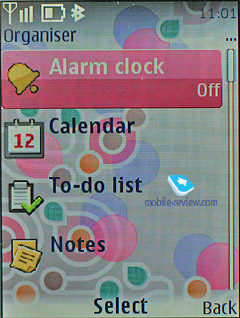
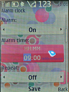
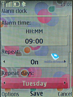
The alarm clock allows setting both single and recurrent alerts, which may trigger on certain week-days. Any tune, or a radio (just need to plug a headset in) can serve as a signal. Snooze time-out also adjustable.

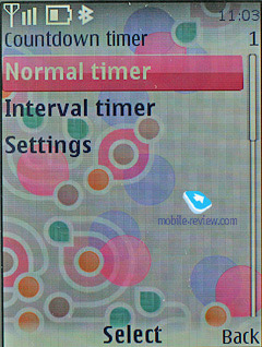
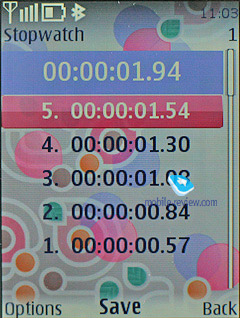
Also the organiser contains a countdown timer, a stopwatch which allows getting intermediate values. Both apps can work in the background mode.
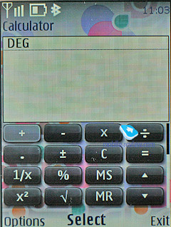
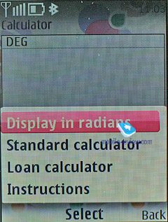
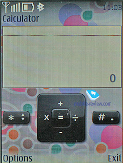
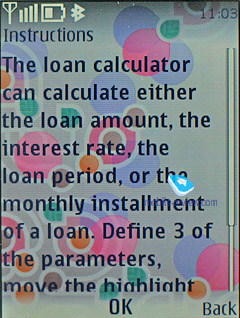
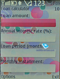
The calculator, apart from its default mode, also has a scientific mode as well, and the mode for calculating your interest in your investment activities.

Back to the table of contents >>>
Web
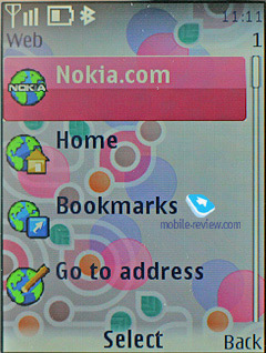
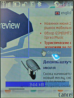
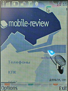
The new browser builds upon WebKit open source project which is quite popular with other manufacturers and is currently used by Nokia in its S60 devices, and Apple doesn’t shun it either in its fabulous iPhone. This browser supports AJAX, although it view of pretty miniscule displays of feature phones, you won’t be able to enjoy games with it (or your experience will be far from passable). But for other services, this AJAX support, along with Flash, is a saving grace.
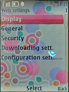
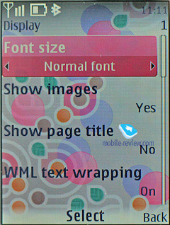
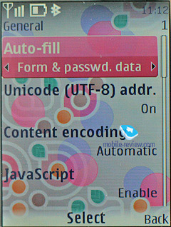
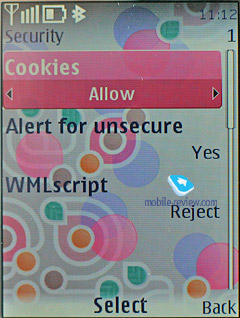
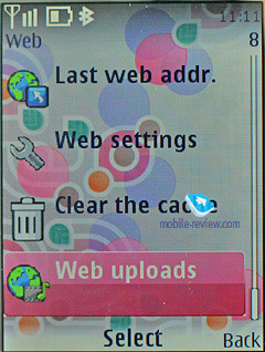
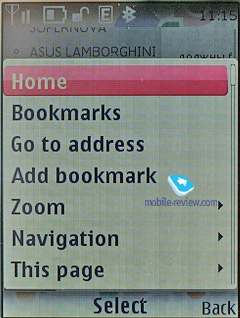
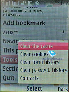
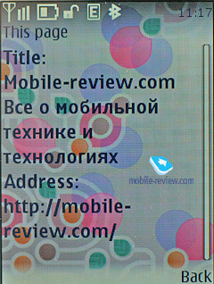
The browser’s menu hasn’t change much since the fifth edition, although now it also features “Web Upload” item for getting your images onto Flikr’s servers or wherever. The main flavor is inside. For instance, you can opt not to see the page title, also the browser can save cookies and logins/passwords automatically and change page encoding.
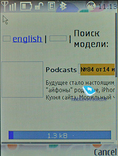
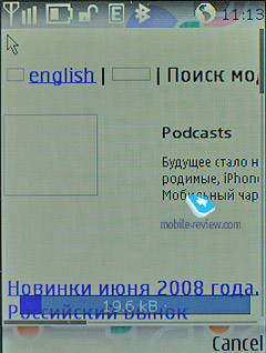
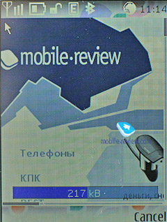
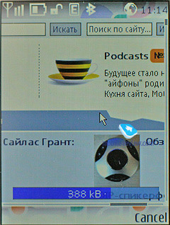
When loading a page the browser shows a progress bard at the bottom that also features the total amount of data it has downloaded so far, so that should you return to that page it, most of its parts will be taken from the cache file.
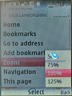
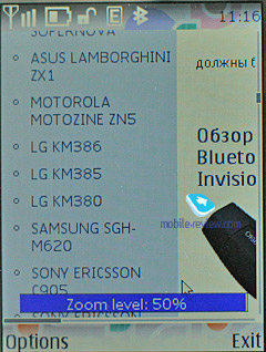
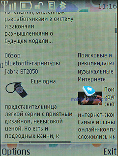
Moving around webpages is very easy with this browser, plus you can go for its zoom feature, but it’s no dynamic, so you can only see pages at 50, 75, 100 or 125 percent of their real size, more importantly it will take the browser around 3-4 seconds to zoom in/out on a small page and just shy of 10 seconds to deal with a 400-600 Kb one. If there are any addresses or phones available you can add them into your phonebook or mail them. There is still no way you can check up addresses spotted in the web browser using the sixth edition’s maps, but it will come along down the road.
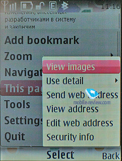
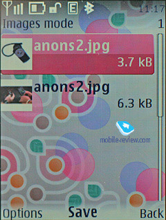
The “View images” option doesn’t work as we’d expect it to – on some pages the browser will display all images available and on the others it will omit a good portion of pictures. We haven’t managed to find the source of this issue or any method behind this selectivity.
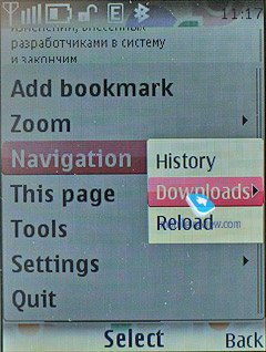
When downloading files the phone always checks their certificates and also shows estimated time and size. The bad thing, though, is that once it has finished downloading files it goes back to the main menu, instead of the page you were browsing before that.
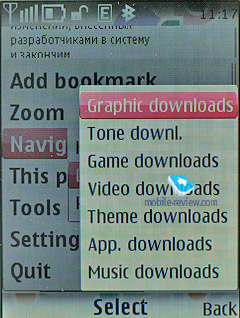
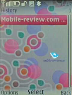
The History menu in this browser is no bells and whistles – a couple of text links and that’s about it. There is also a special section that allows downloading content from Nokia, but it’s nothing special either.

Wrapping it all up, this browser allows for PC-esque web surfing experience, but it doesn’t look like a clear winner – Opera Mini trumps it on my fronts and as of today offers a more powerful feature pack. So while this browser excels the one found in the fifth edition, it's not the ultimate solution. But on the other hand, it’s a significant improvement over the previous versions with some really strong features – and make no mistake about that, more feats and abilities will come along shortly.
Back to the table of contents >>>
Maps
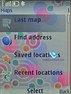
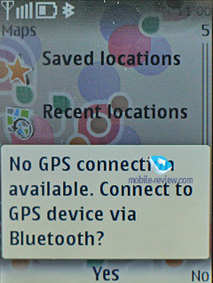
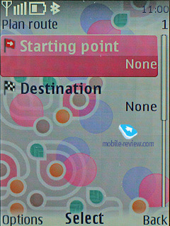
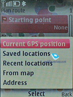
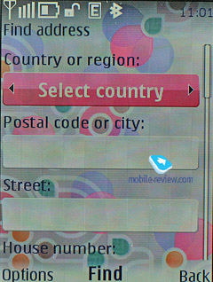
Maps are coming to S40 in the same way they are currently available with S60-powered devices, however, they are pretty much pointless on devices with no inbuilt GPS receivers, as we really doubt you will go to all the trouble of connecting an external GPS module. However, solutions carrying a GPS receiver on board can squeeze a lot out of Nokia’s native application, thankfully, its functionality and design are the same as those found in S60. But the maps available in the sixth edition of S40 are more like version one of the S60 maps, even though the latter platform already boasts Maps 2.0
Back to the table of contents >>>
PC Synchronization
Your handset running on the sixth edition will come with the Nokia PC Suite software kit, which includes a whole range of applications that allow you to synchronize organizer data and phonebook with MS Outlook, Lotus, upload tunes, logos, wallpapers and games.
Back to the table of contents >>>
Conclusion
The sixth edition of S40 improves upon the previous version of the platform on several major accounts, plus it signifies the tendency for convergence between S40 and S60, where the ultimate goal is to unify the user experience. All in all, it’s an extremely strong move that will make some difference down the road. But don’t think that all upcoming phones will run the 6th edition of S40 – some will utilize the previous version too.
As far as the S40 6th edition’s competition goes, not much has changed since it’s still rivaled by Sony Ericsson’s A200. Going for the latter are its ability to multitask and jump between running applications on the fly. Also these two platforms have a lot in common in terms of basic functionality; furthermore, A200 sports transition effects for various menus and the truth is it does a better job on this front. These days neither Sony Ericsson nor Nokia holds the upper hand when it comes to platforms for feature phones; but it seems that despite their identical functionality, S40 6th edition will get ahead of A200 a little, since Nokia laid great foundation for its future platforms with the fifth edition of S40. On top of that, the postponed release of Sony Ericsson’s A300 will allow Nokia to enrich the core functoinality of S40 even further with no tight deadlines to meet. But anyway, as of today S40 6th edition can only be rivaled by A200, but doesn’t look like a clear winner in this competition at that.
Related links:
Back to the table of contents >>>
Eldar Murtazin (eldar@mobile-review.com)
Translated by Oleg Kononosov (oleg.kononosov@mobile-review.com)
Published — 09 July 2008
Have something to add?! Write us... eldar@mobile-review.com
|
