S60 3rd edition Feature Pack 2
Table of contents:
- Preface
- User Interface
- Multimedia menu
- Contacts
- Call Log
- Messaging
- Calendar
- Profiles
- Music
- Photos
- Nokia Maps 2.0
- Search – version 4.0
- Video centre
- Browser
- Applications
- Tools
- Settings
- Installations
- Conclusion
Preface
A year ago we looked into the major changes brought about in the Feature Pack 2, as Nokia showcased this much-hyped update at 3GSM Congress in Barcelona. Back then the company’s staff claimed first FP2-powered offerings would debut and shortly after that, being slated for spring – that’s exactly how it came to pass, although with a delay of one year. Twelve months later, and still in Barcelona, we witnessed the first product running the FP2 – the Nokia N78. Drawing parallels with the world of touchscreen-enabled devices, we shouldn’t be off assuming that S60-based devices with touch-sensitive displays will be announced in a year's time, or, at least, will hit the market no sooner than that.
Such a long development time is largely due to the issues concerning the integration between certain features and making all their gears spin together. But is the final product worth all the effort they have put into it? The answer couldn’t be more definitive – yes. The Feature Pack 2 continues the evolution of the S60, as it is not much of a revolution, really. On the other hand, it packs in all core features and stand-alone applications that have been popping up throughout this year, stepping up the system's basic functionality. Since the year to come will have this version of the S60 as the engine for most products, we thought that just listing all improvements over the FP1 wouldn’t be quite enough, that’s why we are presenting you with an in-depth review with breakdowns on every core feature, so that we won’t have to go back to the basics in our smartphone reviews.
Back to the table of contents >>>
User Interface
The S60 has always been walking a path of its own, and unlike the mass market offerings running the S40, aims at tech-savvy users in the first place. At some point in time, as the sales of S60-powered devices kept soaring up, they finally got to the mass-market, which provoked a decline in the average owner’s expertise in that new users seemed to get befuddled with the interface, menu categorization and so on. The FP2 signifies the first deliberate attempt to get the user interfaces of the S60 and S40 closer, figure out a guideline that would suit them both. In the future these two platforms will be borrowing core features and specific apps from each other. This way, the S40 is set to pick up Nokia Maps down the road.
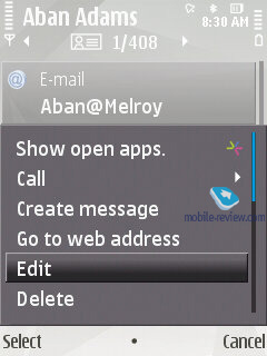
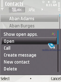
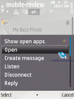
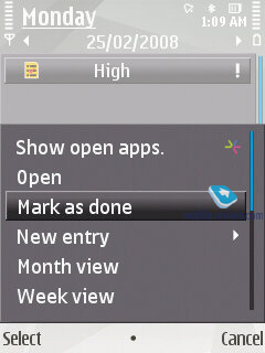
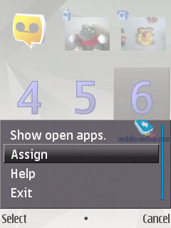
Three-button interface. Up until the FP2 all devices had only two captioned soft-keys, while now there are three of them, with the key in the middle usually serving for item selection (OK, Select functions). In some sub-menus its functions may vary, but this is all another attempt to get the devices to be more user-friendly. This interface layout doesn’t have a huge impact on the ease of use, at least for those who already familiar with the S60.
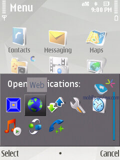
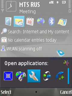
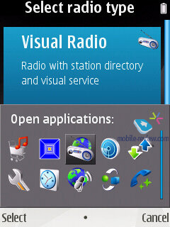
Open applications is accessed not only with a long-press of Menu button, but also by tapping the left soft-key. The inclusion of this menu item plainly indicates that the vendor wants to highlight its solutions being multitasking-enabled, since many users are unaware of such ability on their devices, no matter how odd that sounds. Horizontally arranged thumbnails in this task manager add some visual appeal to the interface layout as well. You can terminate any given application by pushing the C button.

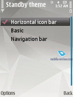
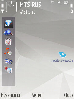
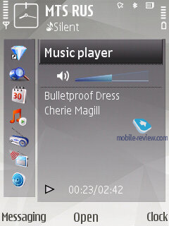
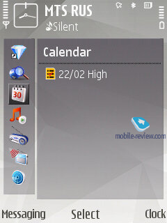
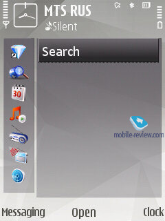
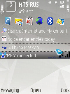
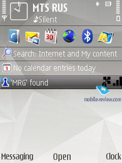
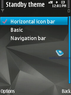
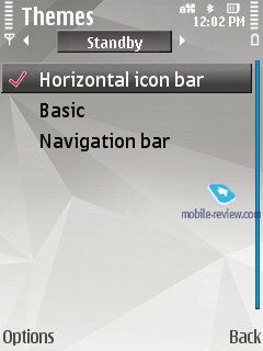
Active Standby. The interface of the Active Standby screen has received a lot of tweaking – application shortcuts now may be laid out not only horizontally, but vertically as well. Upon selection of a shortcut (only for the vertical view) the window on the right fills up with various options that have something to do with the picked application. RSS/Atom feeds can now be enabled at the bottom of the main screen. Overall, such layout saves a great deal of time when looking for a particular menu item.

The third way to view the standby screen is the no-frills mode, when you are presented only with captions to the soft-keys and no other extras.
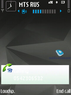
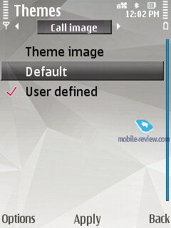
Caller ID. No need to use FSCaller anymore – now the image assigned to a contact is displayed full-screen both on incoming and outgoing calls.
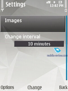
Wallpaper and screensaver. The user can go for any set of pictures, making them appear on the screen as a slide-show, this feature is available for both the screensaver and wallpaper.
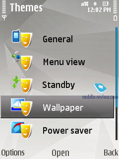
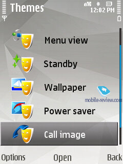
Menu animation. When entering sub-menus or switching between menu trees, the FP2 presents you with some eye-candy animation, like snowflake, dancing on the screen or just an invisible hand turning over the pages. Menu animation can be enabled in the Themes menu, the user isn’t allowed to set a specific effect for each menu, but I doubt this ability will be craved for.
Icon animation. All items in the menu can get much more pleasant to look at, when Icon animation is enabled. The effects pool depends on the theme you are in, as well as your device.
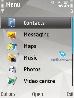
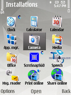
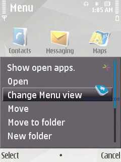
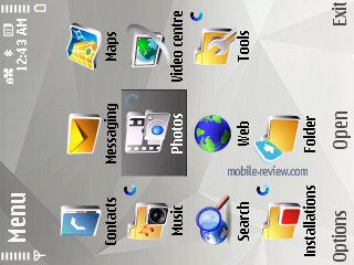
Menu layout. It is not the first time we critique the roster of items found in different menus of the S60 – often enough it doesn’t make sense and there seems to be no method to it. For instance, if the standard Calendar app is housed in Office applications in one device, rest assured you will find it somewhere else with your next Nokia-branded smartphone. Basically, we don’t need to list all these missteps in terms of the menu layout – every user that has had experience with the S60 products know that all too well, when he had to change his habits and wonder about his new phone, trying to locate the applications he needed. The FP2 now employs the rule that the main menu should comprise of no more than 12 icons (3x4 grid). The menu categorization is now a tad better, although it still suffers from a couple of glitches. For example, the Nokia N78 has its office applications stuffed in the Installations menu, where nobody will ever look for them. The company has a lot of work to do here, and that’s not done in a week.
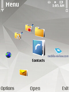
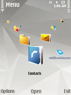
The main menu’s default view is grid, but you can also go for the list view, as well as two wheel-style appearances (Horseshoe, V-shaped).
“V- Shaped” groups all the icons in a wedge, so when moving through the list the one in the centre always changes. “Horse Shoe Wheel” mode is a round-shaped menu view - if there are some sub-items in a menu available they are displayed at once but going into them is impossible until you enter the corresponding menu item. These two types of menu layouts are of no interest in light of the missing JogDial, as the logics behind these wheel-type views is that you can scroll through them with a navi-wheel, rotating joystick or a sensor built into the joystick; and if that’s not the case, such menu views seem to be somewhat of out place.
The user is free to crate own folders in the main and all sub-menus, as well as move any items to them, adjusting the system to his/her needs this way
Back to the table of contents >>>
Multimedia menu
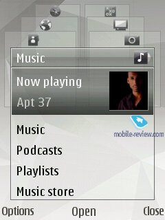
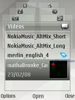
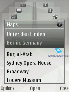
The honor of being the first model to carry the multimedia menu onboard belongs to the Nokia N95, where calling it up required you to push the upper slide to reveal the music controls. But unlike the Nokia N81, the N95’s menu was sort of a quick launch bar. Starting with the Nokia N81 the multimedia menu is going one level up – you press a dedicated button and find yourself in a wheel-shaped menu, where every tab features kindred functions. You can navigate through these tabs with the help of the navi-key or the numeric keypad. This menu type will be available not with all FP2-powered devices, but rather those from the Nseries range.
Video, multimedia menu (7,2 mb, mpg) >>>
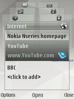
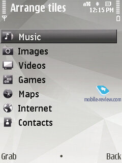
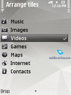
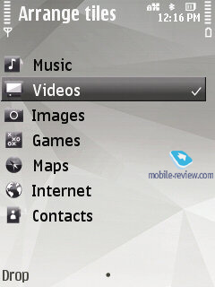
The current version sports only six pages, whose order of appearance may be easily varied – by the default, the first tab you see is all about music (with this tab on, you can check out your library, start random playback of your tracks or view podcasts). The Games tab proposes exactly the same options as the N-Gage section. The Gallery allows you to view your last captured shot and calls up the Album. You can submit some entries to the Contacts tab, so it acts like a speed dial menu, which may come in handy on certain occasions. Internet – links to your favorite pages, Maps – points of interests and locations.
It doesn’t take a rocket scientist to notice that there are a whole lot of functions typical of stand-alone apps duplicated in the FP2 – in the multimedia menu you can add new bookmarks, but the browser can serve the same purposes as well. You can throw some contacts into this menu, but adding them to the list of Fast dial makes more sense. Ergonomics-wise, this menu is a complete blank, bringing nothing new to the table. It is just another way to display the phone’s contents, and that’s about it. Let’s call it a “contemporary” way.
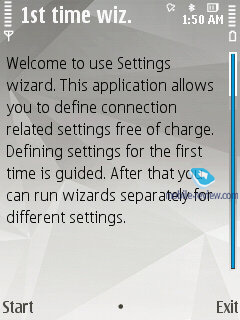
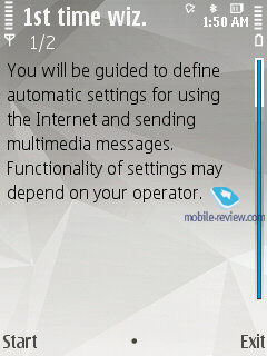
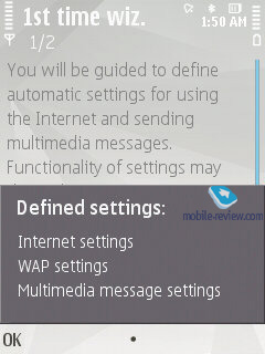
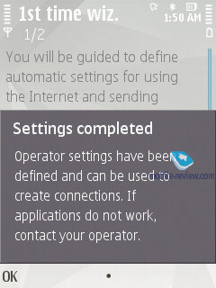
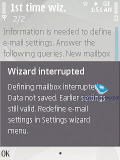
Settings wizard. Upon the system’s first start up you will be presented with the Welcome application that allows looking through an interactive guide (which is more of an ad, than a real thing), setting up GPRS, MMS, Internet for your carrier, beam data from another phone (Transfer), including application settings.

Back to the table of contents >>>
Contacts
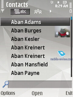
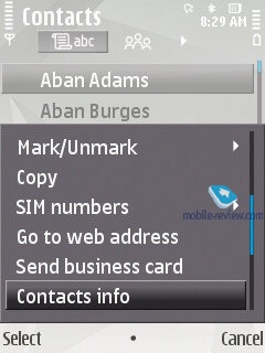
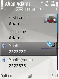
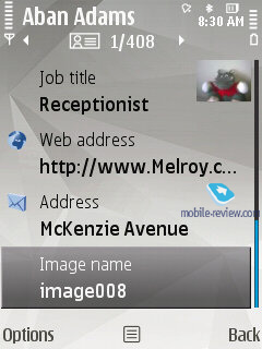
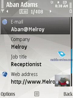
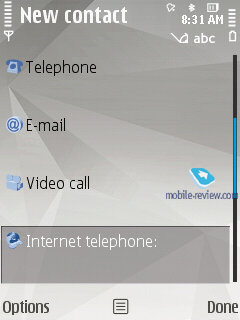
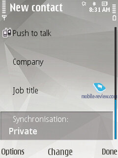
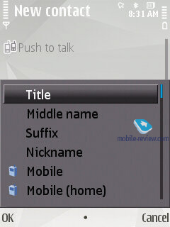
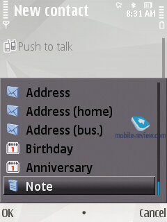
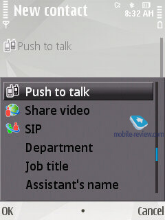
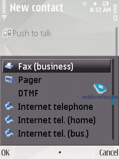
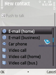
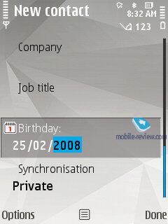
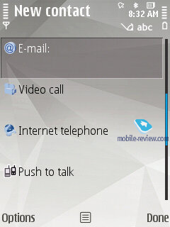
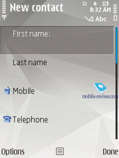
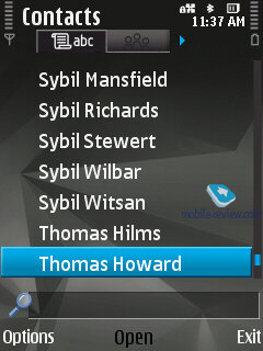
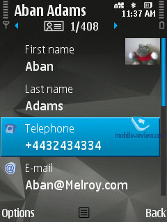
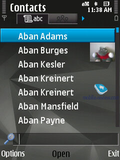
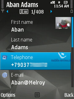
The phonebook found in the FP2 allows for a nearly unlimited number of entries with the available memory volume being your only limitation. For each contact you can submit First and Last names (two fields), Company Name, Job Title, Phone Number, Mobile Phone, Fax, Email Address. If you still don’t feel content with the default fields, you add any number of new fields (including address, email address, web page and so on). Every entry can be expanded with a lengthy text note and an image that will be displayed upon an incoming call (full-screen). Finally, you can rename any of the available fields, for example, transform Job title into Birthday and back. In the general list you can search for contacts by typing in full names, rather than first letters alone. Also displayed in the general list are thumbnails of photos assigned to contacts (when hovering over a specific entry).
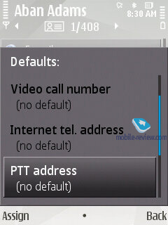
For every contact on the list you can setup default phone numbers and email addresses, meaning that if you will have 5-6 numbers in one entry, one of them will be automatically dialed whenever you want to make a call – this way, you will be able to submit phone numbers as you go and then pick the most frequently used ones.
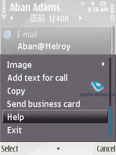
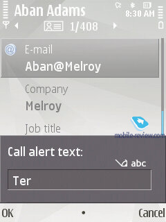
Call alerts can be personalized for every contact. The general list may feature entries stored on your SIM-card as well; the list can also be sorted by First or Last name.
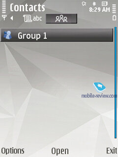
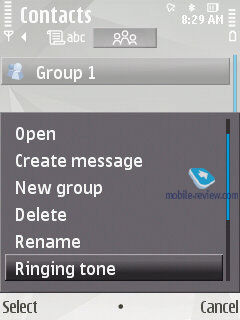
The FP2 offers contact groups, whose ring tones can be customized as well. What is more, any given contact can be assigned to a couple of groups at a time.
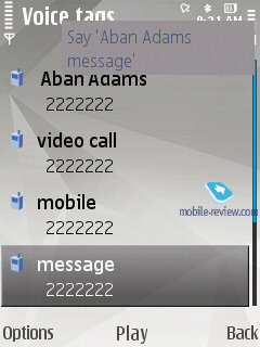
Voice dialing requires no prior training or voice tags – the system figures out what names are written in English and adjusts to the pronunciation of an average person (voice recognition works for other languages as well). Should you run into some problems with voice dialing, you can always switch into the learn mode, so that the system could adjust to your individual voice features. The phonebook’s menu packs in a handful of tooltips no how to use the voice dialing. For example, it hints that in order to make a video call, you will need to speak out the name and add “video” at the end.
The contact list has nothing against showing duplicated entries or copying of an already existing contact.
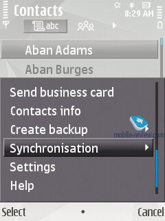
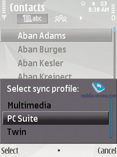
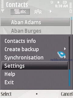
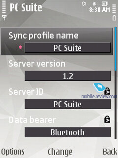
You can create a backup of the contact list either on the memory card or in the handset’s internal memory. For PC synchn purposes the FP2 employs PC Sync, which painlessly synchronizes contacts with MS Outlook and other applications. You can also go for local synchronization over Bluetooth with another phone or mobile device.
Back to the table of contents >>>
Call Log
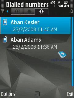
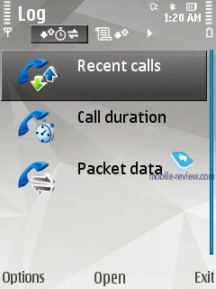
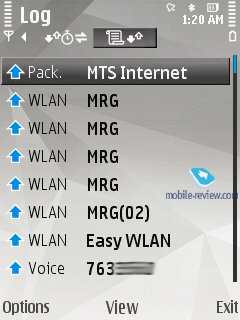
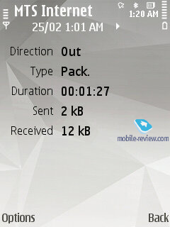
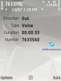
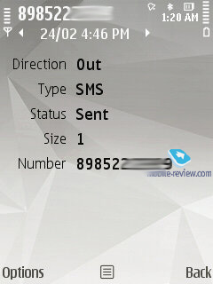
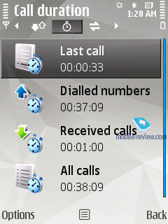
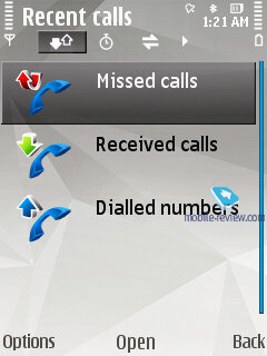
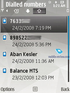
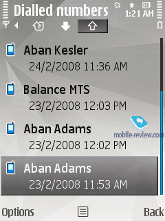
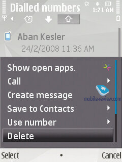
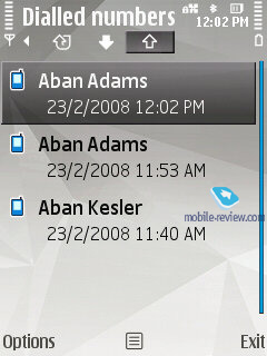
This menu allows the user to browse missed, incoming and outgoing calls; what is more, it is up to you to set how long these entries will be kept intact (by default – one month). Every entry in these lists has the following information attached: call type (voice or data), duration, date, time and phone number (if identified). Calls can also be filtered by type (data, GPRS, voice, incoming etc). On top of that this menu keeps track of total calls duration and cost. During calls you will see call duration displayed on the screen.
Back to the table of contents >>>
Messaging
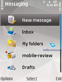
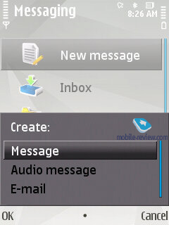
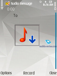
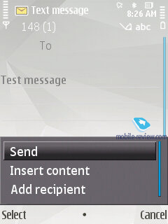
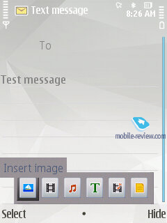
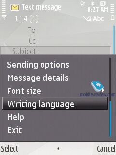
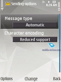
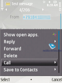
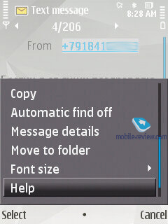
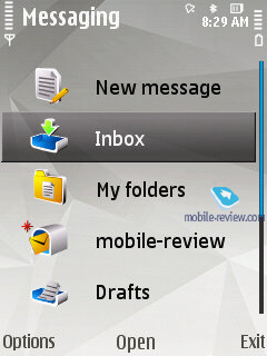
The system now has only one stand-alone message type - Audio Messages (some sort of MMS), whereas both SMS and MMS messages are composed from the same menu item (Message). Depending on whether it is only text or text and multimedia you are putting in, the system will automatically figure out the format it should send your message in. With the help of the context-sensitive menu you can throw in various types of content, in this case the message type will change automatically.
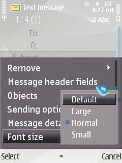
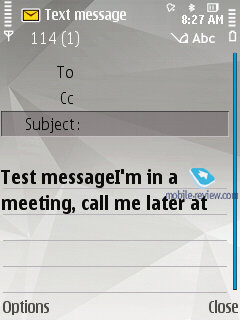
The user is also enabled to tweak the font size (Large, Normal, Small), altering how text looks on the screen, as this option has nothing to do with the message itself, just the way you see it.
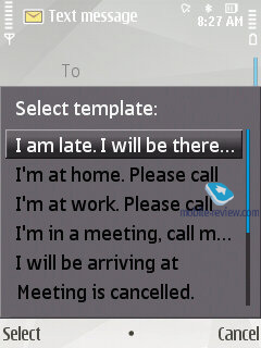
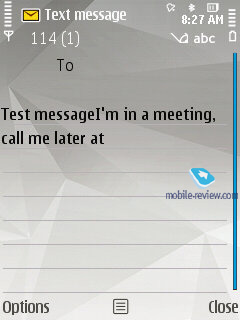
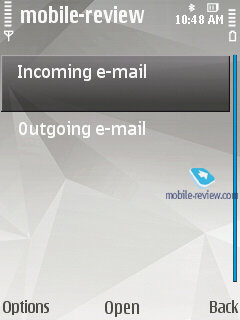
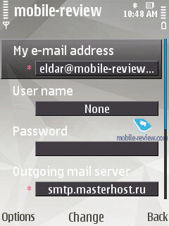
Apart from short messages, you can also take advantage of email (POP3/IMAP4/SMTP/MIME2). Moreover, the user is allowed to make up templates for all message types – the system comes preinstalled with 10 for SMS.
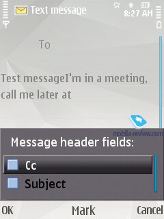
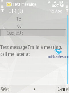
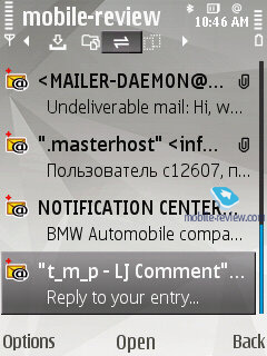
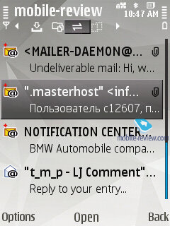
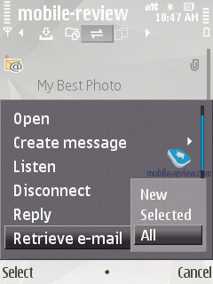
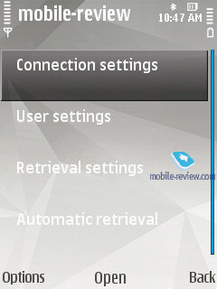
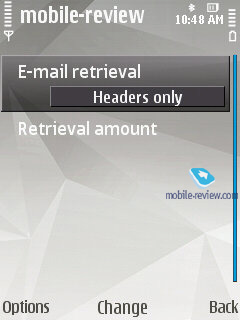
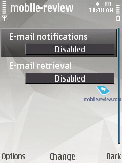
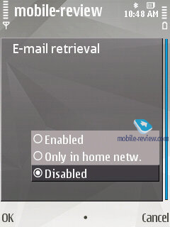
Composing an email letter, the user can decide whether “Subject”, “Cc”, “Bcc” fields will be displayed or not. Additionally, the client now features “Priority” field (Low, Normal, High). A substantial improvement of this version of the mail client is the ability to attach any files, including those that are not supported by the device. The system can automatically monitor up to two mail boxes for new messages, on top of that the user can setup the email retrieval time (day, time). You can also set whether you want to have whole messages uploaded or only certain parts (limit set in Kb), or you want to retrieve headers only. The FP2 supports Push Mail (only via IMAP IDLE).
The Inbox folder contains all messages received on the device (merged list), as well as files beamed from other devices over Bluetooth or Infrared (if available, of course).
Back to the table of contents >>>
Calendar
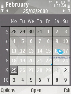
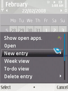
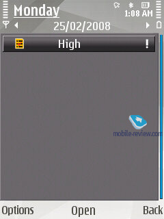
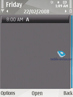
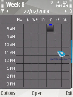
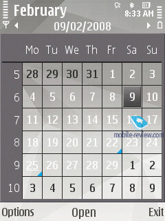
There are several calendar views available – month (days with arranged events are marked with triangles in the bottom right corner), week (shows days broken down into hours), and finally, day (hourly view as well). While in the month view, if you hover over the date with some appointments assigned, you will be able to have a quick look at them, as they will appear in a pop-up window.
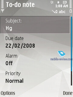
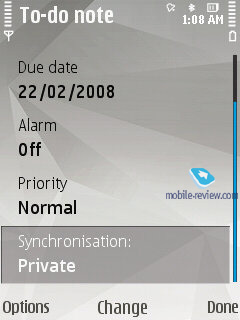
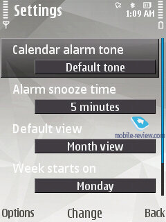
The FP2 supports four event types: Meeting, To-Do, Anniversary and Memo. For every event you can setup an alarm tone (may be repeatable too). Some entries may be marked as Private, meaning that they won’t be synchronized upon a PC connection. All in all, the organizer’s settings pool is nothing to write home about – it relies more on your database of events and appointments stored on PC.
Back to the table of contents >>>
Profiles
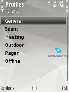
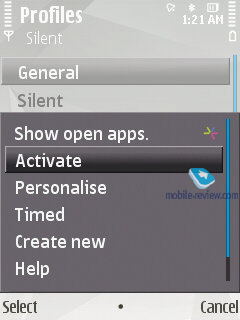
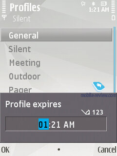
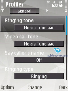
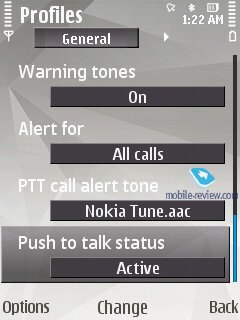
Much like the S40, the S60 Feature Pack 2 allows you to active a profile for a certain time span, so when it expires the handset will toggle back to the main profile, which may come in handy at times. Like you would expect from the S60, profiles enable you to tune all settings that have something to do with audio: volume, ring time, message alerts, calendar tones, vibro alert etc. Unlike other manufacturers, Nokia doesn’t offer the ability to swap themes via profiles.

Back to the table of contents >>>
Music
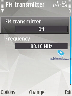
The Music menu packs in all features that have something to do with the system’s audio department. By default these are: music player, Nokia Music Store, Podcasting, Radio, for selected models - FM Transmit (hardware-based feat).

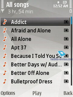
Music player. The following formats are supported: AAC, AAC+, eAAC, eAAC+, MP3, MP4, M4A, WMA, Mobile XMF, SP-MIDI, AMR (NB-AMR), MIDI Tones (poly 64), RealAudio 7,8,10, True tones (WB-AMR), WAV. MP3-files with various bit rates, including VBR, are seamlessly played back by the FP2. Upon synchronization with Windows Media Player 11 and higher, you can take advantage of protected DRM-files (Janus DRM).
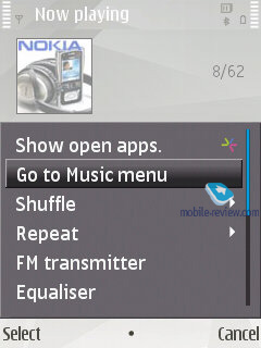
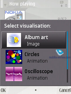
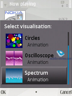
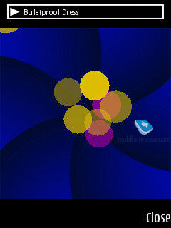
The player interface found in the FP2 sports a run-of-the-mill design, but still we feel like giving it a close-up. First, it boasts full-fledged support for Album Arts, thumbnails of images shown on the display are quite large at that; and then you can turn on one of the three visual effects, the FP2 will display the visualization you’ve picked in the full-screen mode. It makes no sense at all, though, and what is more important, constantly glowing backlighting knocks the battery time down.
Track title and artist are displayed on the screen, as well as player controls. Progressive fast-forward feature is enabled in the FP2.

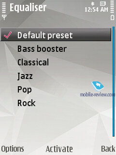
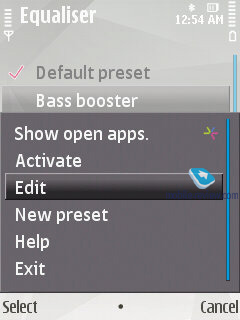
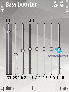
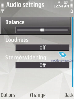
Equalizers. As the equalizer settings are modified, the handset’s sonic experience changes considerably. Each of the 6 pre-installed equalizers feature 8 bands and is fully user-manageable. The lists of presets are as follows - Bass Booster, Classical, Jazz, Pop, Rock. In the Sound Settings you can adjust sound balance, Stereo Widening and Loudness.
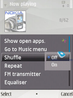
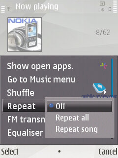
The handset has random and repeat (all or one track) playback modes onboard. While at the standby screen the display is filled up with data on currently playing song.
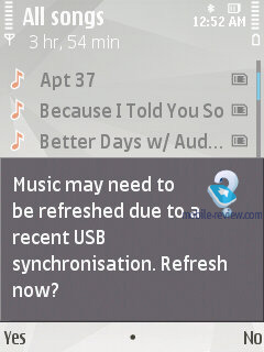
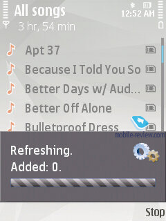
Calling up the Music Menu allows you to browse all tracks, playlists (including those that are composed automatically, like recently added tracks etc), sort the library by artists, albums, genres and composers. The music library (or the track list) gets updated automatically on every successful synchronization attempt with a PC via Nokia PC Suite, and in case you use a memory card with pre-loaded tracks, this won’t happen.
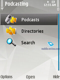
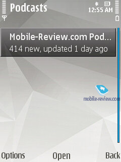
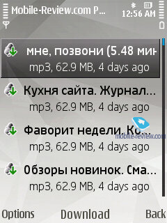
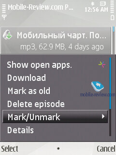
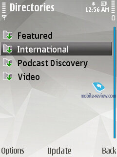
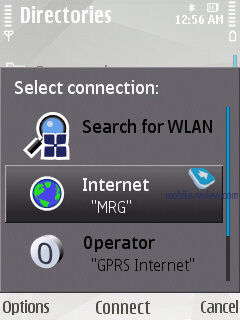
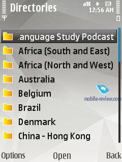
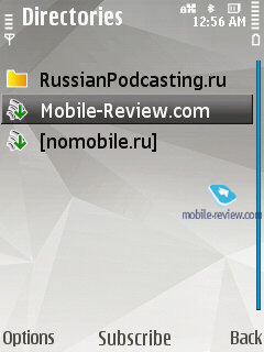
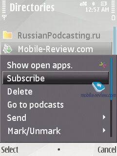
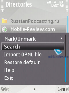
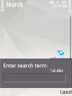
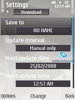
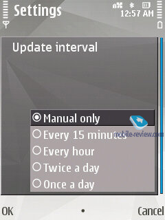
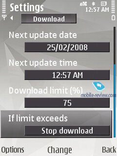
Podcasting – podcasts are now integrated right into the music player, whereas previously they were singled out in a separate application. You can access podcasts either from the player’s menu or launch the application separately, which will unlock access to the library, Nokia’s podcast catalogue, search, synchronization settings and so on. You can also choose to get the podcasts you are subscribed uploaded automatically (within the home network or via some specific access point). All in all, this app is a breeze to get around and quite useful at that.
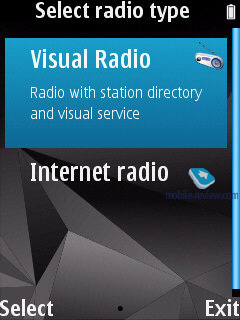
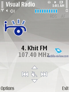
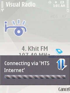
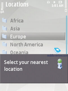
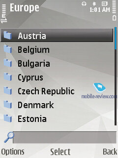
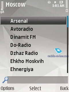
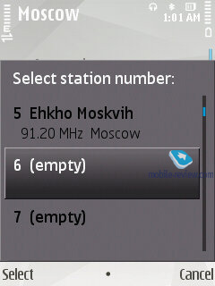
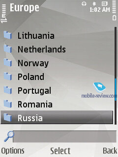
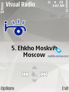
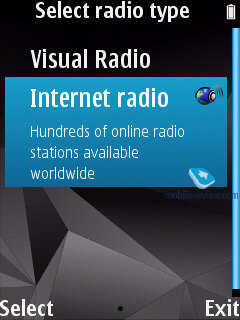
Visual Radio – not only does this radio allow listening to music, but also browsing all related content, like texts and images that are uploaded from the Web (though, not all radio stations work with this feature). Also, as you would expect, this item features the standard radio application with a no-frills interface and the ability to save up to 50 stations (with unique names). No other things of note about it, though.
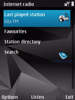
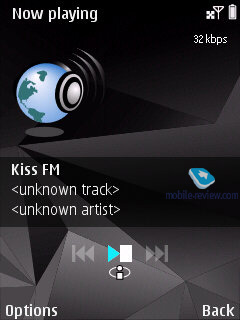
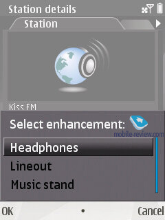
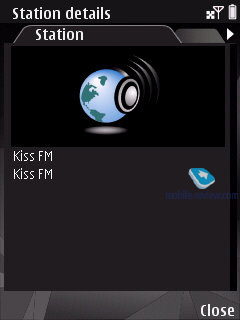
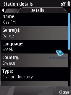
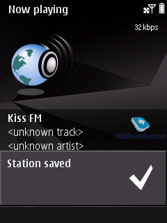
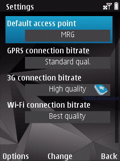
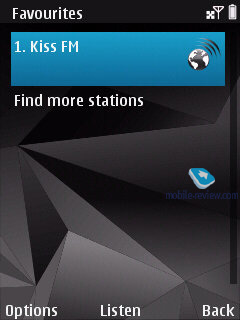
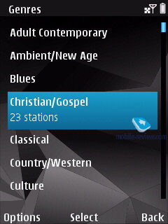
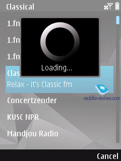
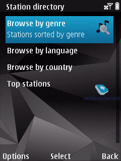
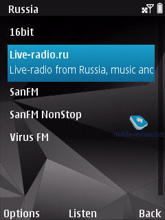
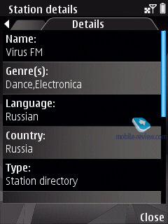
Internet Radio – a real internet radio that utilizes Wi-Fi for loading the stream. It features a catalogue with radio stations, search, and the ability to tune in to a user-specified station. Its quality here is pretty good; what is more, with the FP2 you can opt to listen to Internet Radio in the loudspeaker mode (most handsets pack in speakers powerful enough for this, and their quality is nothing we would want to complain about either).

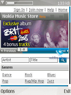
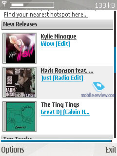
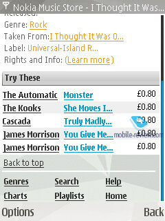
Music store – allows accessing Nokia Music Store buying tracks, albums and uploading them onto your device.

Back to the table of contents >>>
Photos
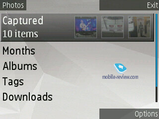
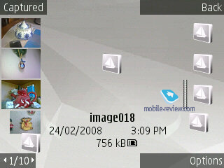
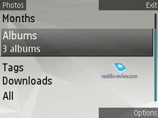
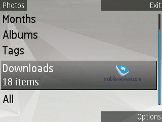
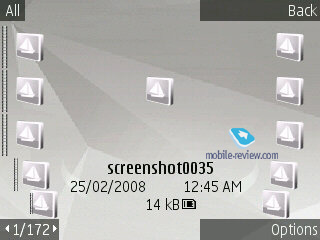
This application has come to replace the Gallery application, having video and images as its primary field of expertise. Its home screen features the content filter displayed in the landscape mode, here are the items available with it:
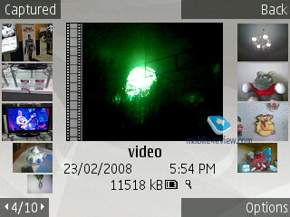
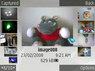
- Captured – photos/videos captured with the built-in camera, the number in brackets stands for the total number of shots. Sitting on the right are three thumbnails of images that are changed on the fly. But dig a little deeper and you will find the same old Gallery featuring exactly identical layout.


- Months – filters the content by month and year. Inside you pick the date and then jump into the Gallery.
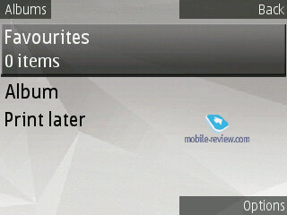
- Albums - by default there are only two albums: Favorites and Print later, but you can always create any number of custom albums. Moreover, all shots you make can be automatically thrown into a specified album.


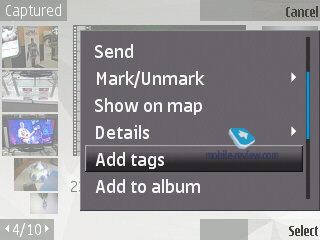
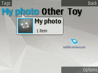
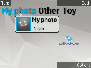
- Tags - You can add tags to your video and photos – this menu sports an array of tags, navigating which you will see how many shots you have taken in each of these categories, then you can view these pictures by selecting the tag.


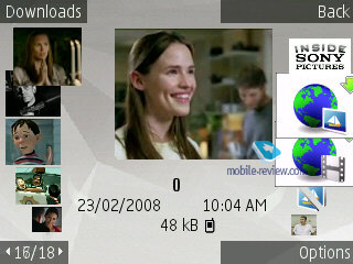
- Downloads - This is the place where all uploaded images end up in, including those that were automatically saved in the Video center for channels.


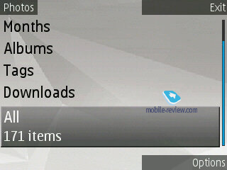
- All – a self-explanatory item, displays all photos and videos you have in the phone.


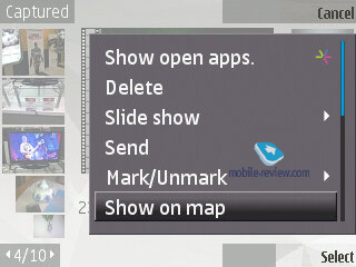
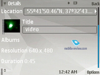
When shooting with the built-in camera, you can enable the geo-tracking mode, when coordinates of the place a picture or a video were captured at are attached to their tags, so that you can check them out on the map using the “Show on map” option. You can also tack a tag on any file, or throw it into an album of your choice. The FP2 sports the Tag Manager, which is an intuitive and easy way to edit them.


Slide-show mode – you can pick music, transition effect, slide-show speed.

Image editor – a very basic editor that allows for some entry-level editing (including cliparts etc).


Any image can be assigned to a phonebook entry or set as the wallpaper for outgoing calls or wallpaper for the home screen.
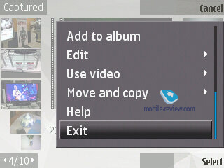
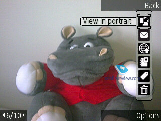
For handsets with no motion sensor onboard and thus no ability to rotate the picture automatically, the FP2 packs in an option for doing this manually. As far as other options are concerned, you can send files with a message, email letter, over Bluetooth, or release it on an online service, like Ovi.
Compared to the version of Gallery found in the FP1-powered devices, the new application is speedier. The philosophy behind this all-in-one application seems somewhat like the gallery app found in Sony Ericsson’s A200 platform due to its similar suite of features and implementation.
Back to the table of contents >>>
Nokia Maps 2.0
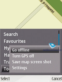
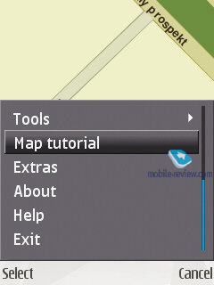
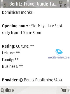
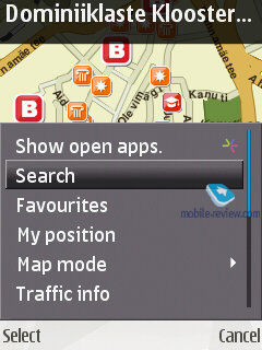
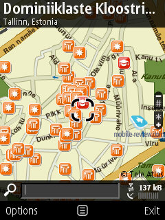
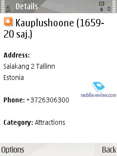
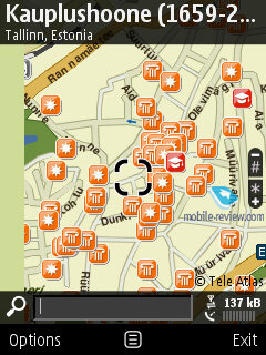
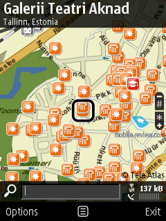
The second version of Nokia Maps can be seamlessly installed on FP1-powered devices as well, and what’s more, this application is free. In case you have already purchased the navigation package and the license hasn’t expired yet, it will do for the version 2.0 as well. The new version packs in some fundamental changes, below we’ll try to list the most essential ones:
- Updated application for uploading maps to PC, new maps of regions, more city maps.
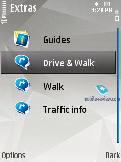
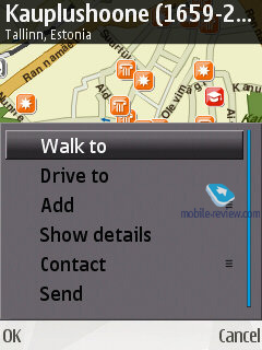
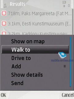
- Pedestrian mode – new mode of navigation, where the route is calculated in a way similar to car navigation. The manufacturer stipulates that detailed views of many maps now include city parks, pedestrian zones and so on, which, in theory, should boost the application's prowess on this front.
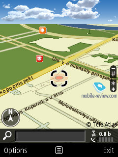
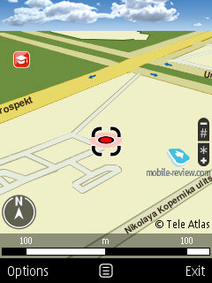
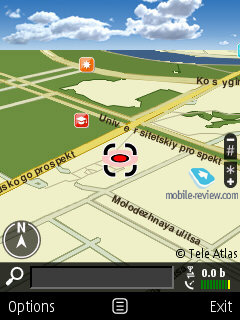
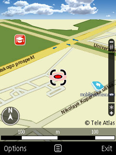
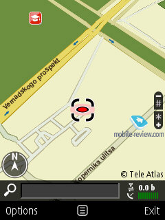
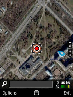
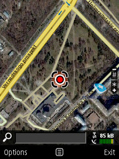
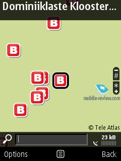
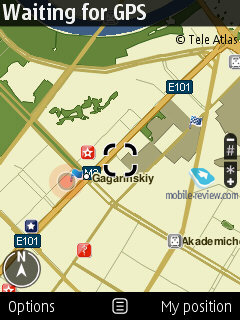
- New map views – in addition to the standard 2D and 3D overviews, the application now sports the satellite mode, much like the one utilized in Google Maps. There is also the hybrid mode, where images from satellites are laid over the road maps, which is a great way to figure out where you are at and where to go.
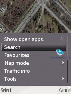
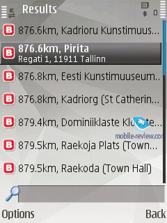
- The standby mode now features a quick search window for locating streets and other objects, like POI, cities etc.
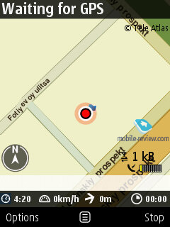
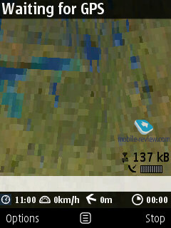
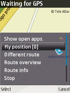
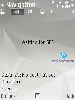
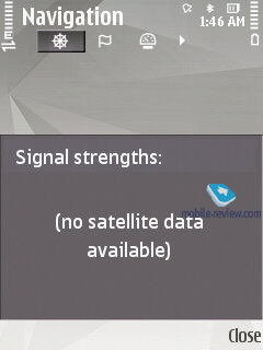
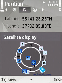
- The window with the status of available satellites has been omitted in favor of a dedicated indicator housed in the bottom right corner of the screen. It does the job pretty well, since, after all, the satellite status was more of a gimmick, and very few people actually needed it. But if you are one of them, just call up the GPS settings, where this info is still available.
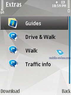
- Real time traffic information. Users in select cities and countries can benefit from the new service providing real time data on traffic jams, roadblocks and other obstacles on your way; regrettably this feature is disabled in Russia, although it is a nice feat to have around while in Europe. Nevertheless, it is not free, since it is an add-on to the application’s functionality.
- Ability to create routes with stopovers.
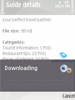
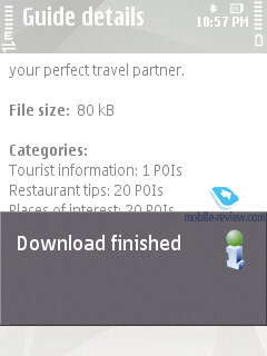
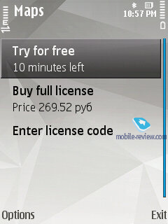
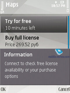
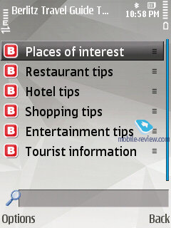
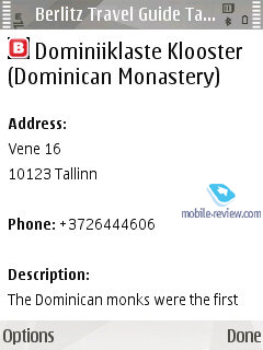
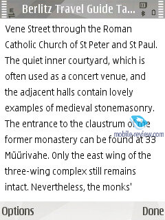
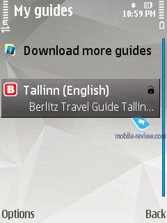
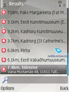
- City guides – multimedia handbooks containing primarily textual data. Purchased separately.
- The paid version features voice guided navigation and in-car navigation. The interface has undergone a revamp, so that now it looks more like other similar applications, and has definitely gained from these changes usability-wise. For 17 European cities subway is also accounted for in route planning.
All up, Nokia Maps 2.0 is a treat to use – the application has become more user-friendly and intuitive, especially as far as zooming is concerned. Plus, since its core module is free and it also comes with A-GPS, it is safe to say that as of today Nokia Maps is above competition on the market. Even more, we could well say that this application is now setting the bar for everyone else. All new versions of the application will be available for manual download, since it is not hardwired to the FP2.
Back to the table of contents >>>
Search – version 4.0
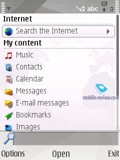
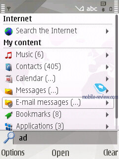
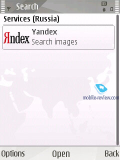
The utility marries the local search abilities and browsing. Furthermore, the search engine used in the FP2 may vary by country – for Russia it is Yandex.ru. Generally, you can pick a search engine you like manually or keep the default one – Yahoo. The reason behind this differentiation between regions is that the maker deems local search engines better tweaked for respective countries.
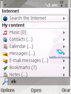
Local search is performed in all categories, which are:
- Music
- Contacts
- Calendar
- Messages (including message body)
- Email (headline and message body)
- Bookmarks
- Images
- Video
- Points of interest
- Applications
- Notes
Video, search 4.0 (22,9 mb, mpg) >>>
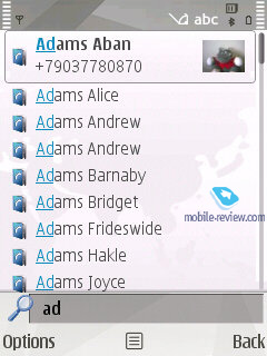
All you need to do is punch in first letters of a word and the FP2 will instantly display how many matches it could find in every section, which is really handy. For the time being, Samsung-branded devices come with a quite similar feature onboard; however their search engine is somewhat less sophisticated, even though the abilities are pretty much in line with Nokia’s search.

Back to the table of contents >>>
Video centre
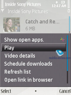
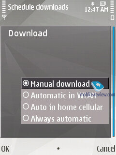
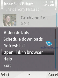
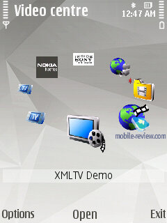
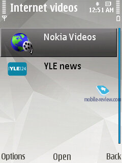
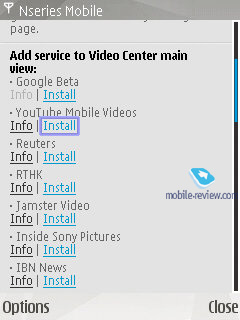
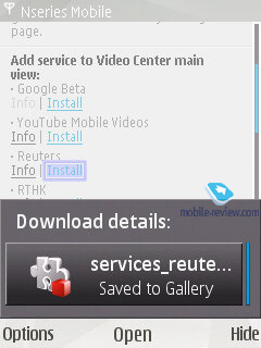
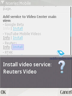
With this application you can access more than two dozens of video streams from various providers, including YouTube. For the streams you are already subscribed to you can setup scheduled downloads, adjust connection settings (home cellular, manual, WLAN hot spot). All downloaded clips are saved in the handset’s memory, allowing the user to watch them as many times as he wants without having to re-upload them.
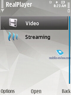
By default video files are played back with RealPlayer, whose suite of features covers the basic and will fit most users’ need. The player packs in support for playlists (mp3- or mp4-files, playlist format – M3U) and enables you to beam them to another device via Bluetooth. The S60 FP2’s player deals with the following file formats: WMA, RealAudio Voice, RealAudio7, RealAudio8, MP3, AAC, Real Audio, WAV, Nokia Ring Tones, AMR, AMR-WB, AMR-NB, AU, MIDI, H.263, JPEG, JPEG2000, EXIF 2.2, GIF 87/89, PNG, BMP (W-BMP), MBM, MPEG-4, eAAC+. The user can pick one of the preinstalled equalizers or just go for his own setup.


Back to the table of contents >>>
Browser
All devices based on the FP2 come pre-installed with Nokia Browser 2.0. Read our in-depth impressions of it here:
Back to the table of contents >>>
Applications
The suite of default applications may vary from phone to phone, but as a rule the following applications are always in place:
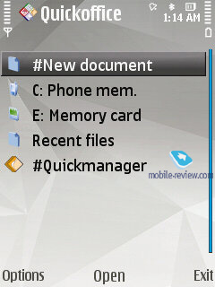
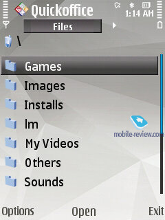
QuickOffice comes in its shrunk edition. Specifically, with the version found in the FP2 you won’t be able to edit office documents. To go beyond the Read Only mode you will need to pay extra money.
Adobe PDF – allows reading PDF-files, no complaints about the application.
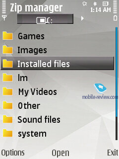
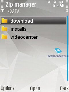
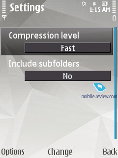
ZIP – enables you to extract files from archives or create new archives.

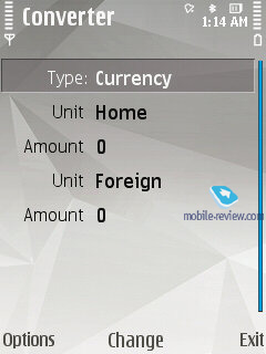
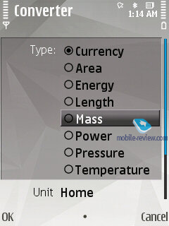
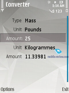
Converter – converts currencies, energy, length etc.

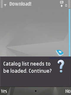
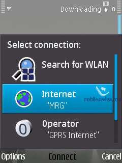
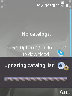
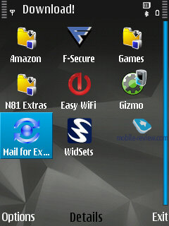
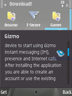
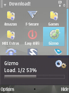
Downloads! –catalog list with software, allows uploading new applications onto the device.
Back to the table of contents >>>
Tools
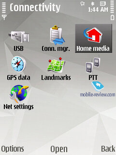
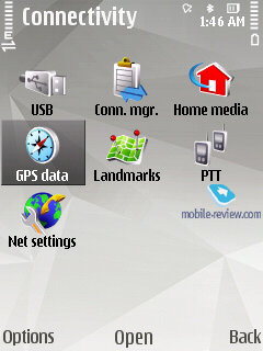
Connectivity
This menu plays host to all settings that have something to do with the system’s connectivity options, including modem and Bluetooth.

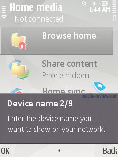
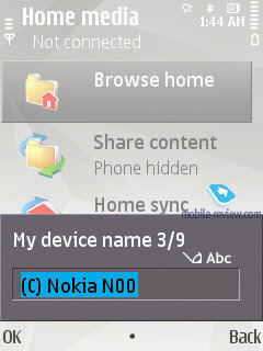
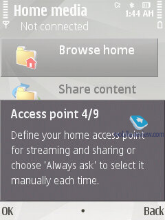
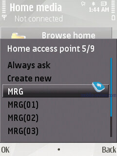
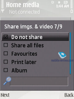
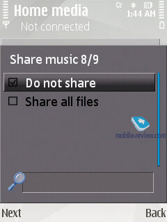
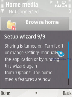
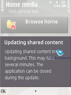
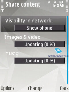
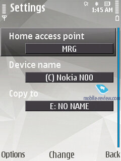
Wi-Fi. The FP2 comes armed with Wi-Fi (IEEE 802.11 g) support. All security standards are supported: WEP , WPA , WPA 2, with other advanced settings available. The device supports Universal PnP standard (UPnP), which is the successor to the wired standard PnP. With its help, along with Wi-Fi, you can send slides to a TV, music to a stereo system, and photos to a printer. In a certain sense UPnP is like an add-on to the infrastructure (Wi-Fi, for example) in the form of Bluetooth-esque services, so this looks more like a software upgrade. The sales package includes Home Media Server, which allows connecting your FP2-enabled phone through home Wi-Fi networks to a desktop PC.
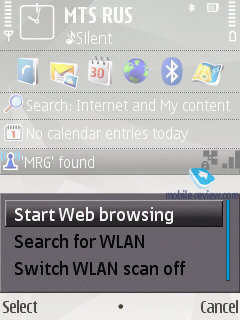
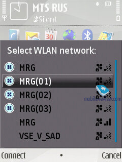
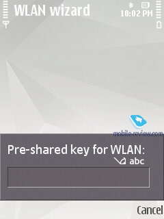
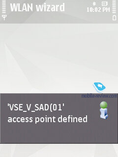
The FP2 also sports the Wi-Fi wizard that will search and if needed tap into these networks in the background mode. Unlike all previous software versions, the wizard here first checks whether a connection is possible only then adds a new access point onto the list. The system offers you to group up access points (just like in the UIQ). Whenever an access point is unavailable, the system will automatically try to connect to other hot spots on the list

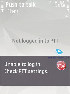
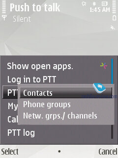
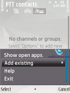
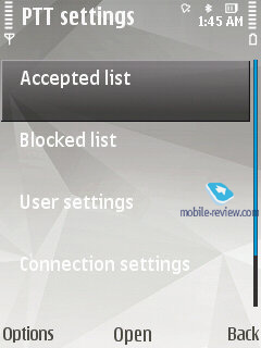
PTT – Push to Talk, these settings are nothing to write home about. The contact list features all entries from the phonebook for which an PTT address has been submitted, also you can create groups and make new contacts here.
Bluetooth. The FP2 comes with Bluetooth v2.0, with support for EDR. The following profiles are supported:
- A2DP
- AVCRP
- BIP-ImagePush
- DUN-GW
- FT-Server
- HandsFree-AG (1.0)
- Headset-AG
- OBEX
- OPP-Client
- OPP-Server
- SIM Access-Server
The average speed you can get with the FP2’s Bluetooth connection is around 100 Kb/s. Also, there is a new option that allows putting other devices on the black list, so that all connection requests from them will be turned down automatically.
Connection Manager – displays all currently active connections (you can break up any of them).
Sync – offers PC synch settings (over cable, Infrared or Bluetooth).
USB – the FP2 enables USB 2.0 speeds, plus upon connection you will be asked to pick the mode (PC Suite, File Transfer Image Transfer).
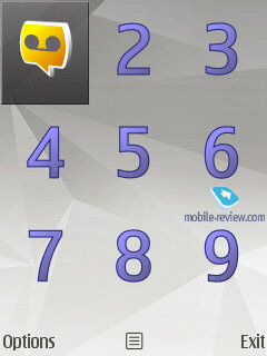
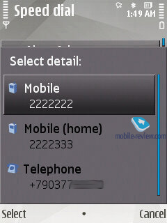
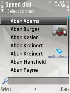
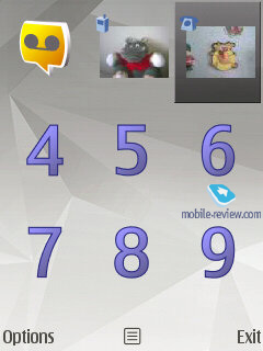
Speed dial – setup speed dial numbers for the numeric keypad.

Voice commands – setup voice commands for a preset pool of menu items, no prior voice training is required.
File manager – a no-frills file manager that allows copying, moving and deleting files both on the memory card and in the phone’s internal storage.
Device manager – SyncML synchronization.
Memory – memory card status (free memory etc).
Data Transfer – this application allows transferring the phonebook, calendar and a handful of other things from Nokia-branded devices to your handset, which is a good way to go when you are migrating to a new phone and don’t want to lose your personal data (especially when you don’t employ your desktop PC for these purposes).
Tutorial – a self-explanatory application which familiarizes the user with the FP2’s core features, buttons and options. On top of that it packs in a demo with all the basics covered and demonstrated.
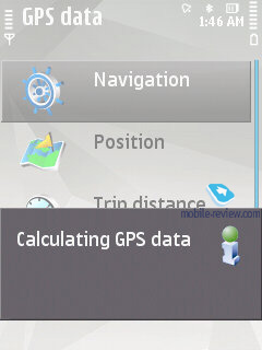
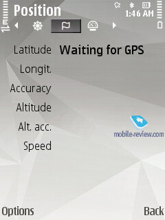
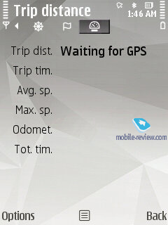
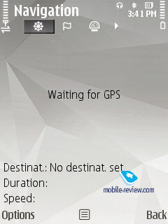
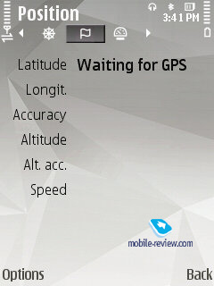
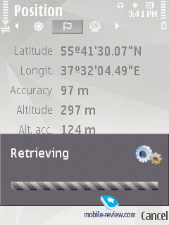
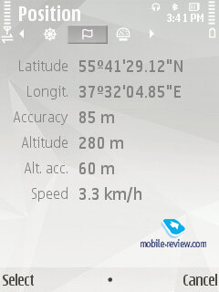
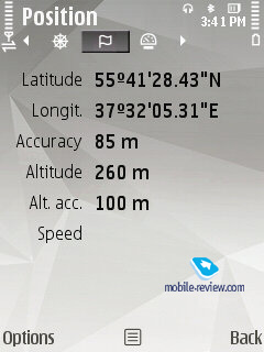
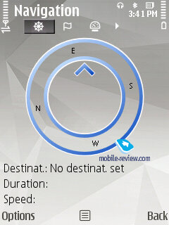
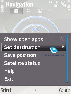
GPS Data. Allows figuring out your current location; this application can deal with data acquired from your cellular network and an external Bluetooth GPS receiver. You can also set destinations, save them and set landmarks.
Back to the table of contents >>>
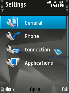
Settings
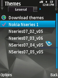
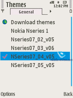
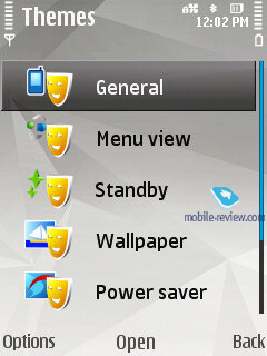
Themes. Here not only can you change the screen’s wallpaper, but also tune and tweak sounds and icons. As a rule, each phone comes pre-installed with an assortment of themes.
Apart from the preferred user interface language, you can pick the language to texting. Also adjustable are shortcuts bound to the navigation button and soft-keys, display brightness and backlight timeout.
Settings for GPRS data, security, time and date, auto-lock.
Now the NSeries solutions (this feature was formerly available with some Eseries-branded models) also pack in the remote device lock ability – for this feature to kick in you simply need to send an SMS containing a code word or phrase to the phone. Obviously, the device will need to have your SIM-card installed, meaning that to make some use of this new feat you will also have to lock the keypad with a password, so that your phone will stay on as long as the battery remains in place. It would be interesting to see this functionality go together with Samusng’s Mobile Tracker functionality, which ensures that even if your SIM-card has been removed, you will still get an SMS (with some other phone) containing the number of the card currently installed in the handset. This way, blocking access to all data on the phone would be a cinch to do, as swapping SIM-cards wouldn’t change a thing.

Remote Drive – provides the ability to setup network drives and access them via WiFi, EDGE, 3G as if it was the phone’s built-in storage space. These drives are identified by file managers as stand-alone sections. Unfortunately, as it stands today, whenever you try to access the network, the system retrieves the status of all remote drives regardless of whether you need them or not. So when it happens to be unavailable (in case your home PC is off), the handset will notify you that it can’t connect to these drives, which may be irritating at times; but other than that, this feature very promising.
Back to the table of contents >>>
Installations
In order not to puzzle themselves where to stuff all applications that couldn’t fit in any other section, Nokia put them all here, which is quite random and not always makes sense.
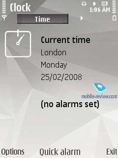
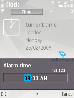
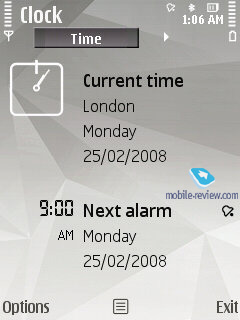
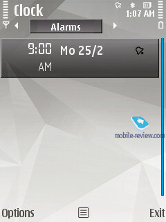
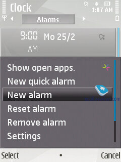
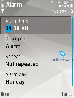
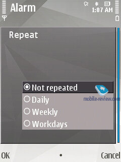
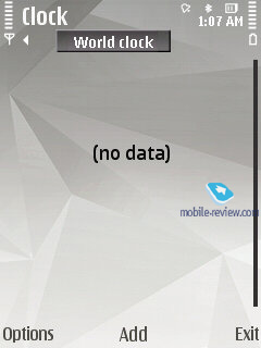
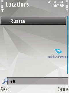
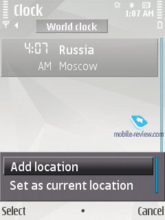
Clock and Alarm. The FP2 now ships with Quick Alarm feature, when you just set time and the alarm clock will trigger once. Another option you can go for is repeating alarms that can't go off on specific days, though (you can choose only between work days/weekends). The Clock menu now features World Time too (third tab) – you can throw any number of cities around the globe on this list.
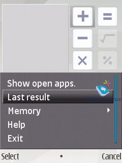
Calculator. Nothing to write home about here, only the most basic features are available.

Application manager allows installing or deleting applications to/from the handset’s built-in storage or memory card.
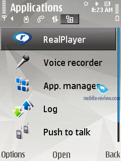
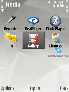
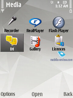
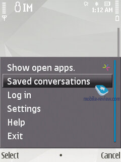
Media – this menu hosts Voice recorder, Flash Player, RealPlayer, IM, Licenses.

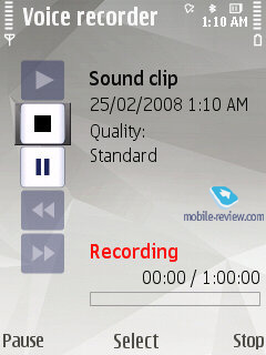
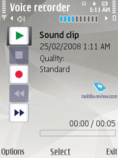
Voice recorder – previously clip duration was limited to only one minute and that was a bit of a mystery, since there was no reasonable explanation of such a strict cap; on top of that third-party apps helping to cope with such inconvenience were quite expensive. In the FP2-powered devices this letdown has finally been dealt with, so now you can record sound clips up to 1 hour long (stored either on the memory card or in the handset’s internal storage) and stuff the entire storage space with them if you like.
IM – instant messaging.
Active Keys – list of digital keys stored on the device that are essential for accessing protected content.
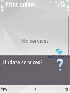
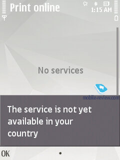
Print Online – enables the user to have his/her snaps printed, the service is available only in select regions and is provided by Nokia itself.
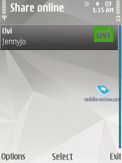
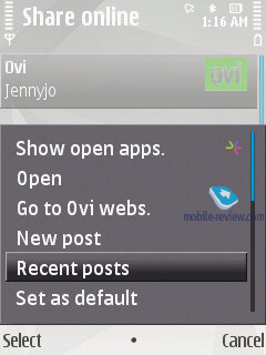
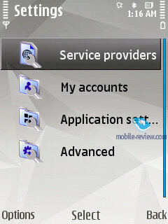
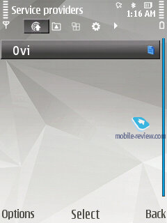
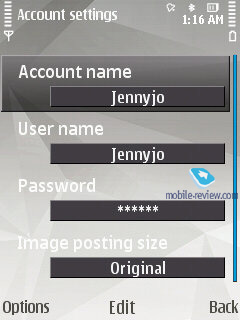
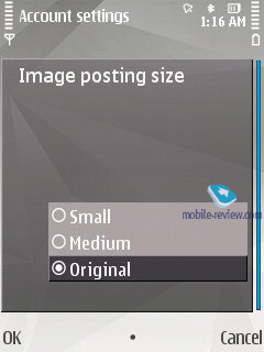
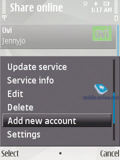
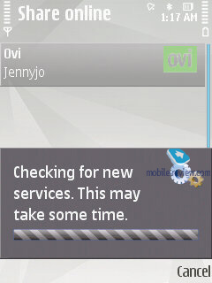
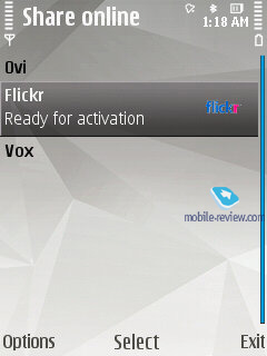
Share online – allows uploading photos, video and other content to web pages, including Flikr, OVI, and a handful of other services (this list is subject to change).
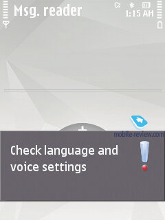
Message Reader – this application reads messages and emails aloud.

Profiles in the FP2 allow adjusting your handset’s settings to best fit the environment you are in, i.e. ring tone volume, tune along with other sound settings. On top of that you can opt to have some profile activated for a certain interval of time and once it expires, the handset will toggle back to the last used profile.
This menu also allows accessing some other applications, specifically notes, text files (created by the user) and converter.
Back to the table of contents >>>
Conclusion
The update to the S60 3rd edition in the form of the FP2 is more than just a skin-deep revamp - on the contrary, it brings about a thorough overhaul of both the interface and device philosophy. By packing in the latest versions of Maps 2.0, Search 4.0, Photos application (which is more of an add-on over the standard Gallery), providing access to OVI’s online services as well as support for the N-Gage and tacking on the multimedia menu (primarily for the NSeries), Nokia has raised the bar for similar solutions on the market. The out-of-the-box functionality of the FP2 is extremely rich and frees the user from the necessity to install extra software in order to do most things he might ever need with his phone – all relevant applications are already onboard.
As far as the FP2’s letdowns go, we couldn’t overlook its relatively weak PIM functionality (Calendar, for one). While its support for vCalendar 2.0 enables you to get data on meetings and confirm them via messages, the bundled Calendar application is more on the spartan side feature-wise. In this case, the maker sticks to the notion that mobile phones serve as terminals, whereas the user’s main data base with contacts and schedules are stored on his PC. I suppose this approach has every right to exist, but more punch out of the box wouldn’t go amiss either.
On the other hand, the mail client has undergone little to no change at all – basically, that’s the next application that has to be refurbished in a big way, thankfully there is a good benchmark to look after, a third party application that is widely considered as the best way to go by many owners of the S60 smartphones.
Animation utilized in the menu doesn’t make much difference, although it delivers some new experience, making the handset more fun to navigate through. The platform’s potential can’t be underestimated, this way the FP2 will be the primary offering in the S60 smartphone segment in 2008-2009; the next update is still quite far off, on top of that it will advance in a couple of fields at once – networking, personal mobile phone-based data services and thus totally different selection of services, plus step-by-step simplifications of the interface along with making it more flamboyant and smooth overall. These are the two foremost fields of interest as far as the S60’s development goes.
That said, based on the FP2’s core functionality, there is no doubt that today it is one of the market’s most powerful smartphone platforms that will remain unrivaled in the near term, as no other player can offer similar punch right out of the box.
Related links:
Back to the table of contents >>>
Eldar Murtazin (eldar@mobile-review.com)
Translated by Oleg Kononosov (oleg.kononosov@mobile-review.com)
Published — 16 March 2008
Have something to add?! Write us... eldar@mobile-review.com
|
