|
|
Review GSM smartphone Sony Ericsson W950i
Sony Ericsson
W950i live photos>>>
Review Sony
Ericsson W950i part 2>>>
Until very recent times Sony Ericsson has been producing smartphones
only within the bounds of P line-up – the devices belonging to this
product line possess maximum functionality, and as a rule claim
leading positions in this market share. At the same time, in contrast
to Nokia, the company didn’t make any attempts to vary its product
line of smartphones, as production facilities were strictly limited.
Early in 2006, the situation fundamentally changed and the manufacturer
has been widening the line-up from that point on – Sony
Ericsson M600i was the first sign, armed with a QWERTY-keyboard
and uncommon two-position buttons; a bit later on, the company featured
W950i, which possessed in the same shell, but with a number of differences.
These two handsets are powered by Symbian 9.1 and have a UIQ 3.0-like
user interface applied.

We reviewed capabilities of UIQ 3.0 in details in the article devoted
to Sony Ericsson P990 and
won’t repeat ourselves to the letter here, though we will note that
UIQ has initially featured the possibility of managing a device
both single handedly and using touchscreen. Even though the ergonomics
of Sony Ericsson P990i, as compared to the previous models, was
lower, it still could be operated with the help of only single hand,
W950i represents a completely different category of handsets powered
by UIQ, and aimed at being worked with on journeys, where you are
forced to use it single handedly. This distinction in kind between
W950i and the senior model makes all the difference in terms of
ergonomics and device managing.

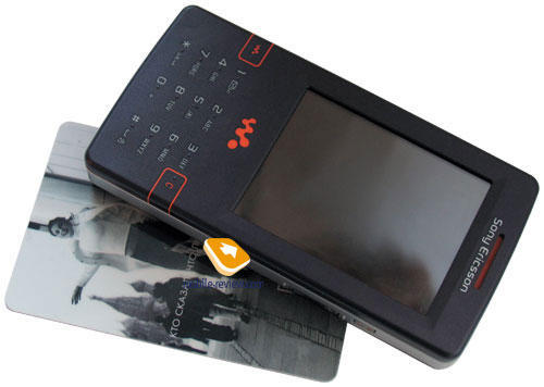
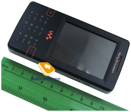
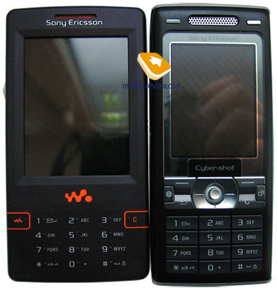
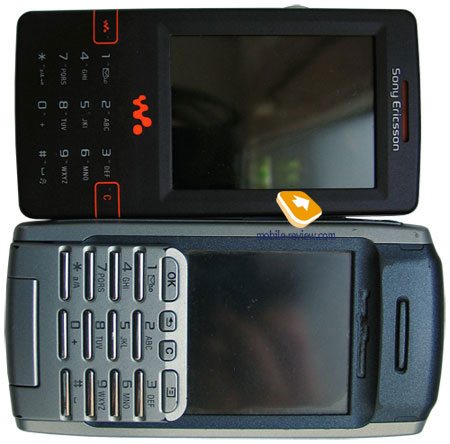
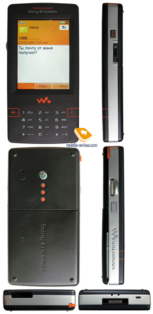
Measuring 106х54х15 mm, the smartphone can claim the title of a
“slim” handset, in the manner of the latest tendencies. Many complain
about the phone being too wide, but it’s not quite right. As a matter
of fact, it’s wider than all other handsets, which set the pace
in this field, by a centimeter or so. This difference is needed
only in order to make sure that the phone will exactly fit your
palm and rest against it – otherwise you won’t be able to deal with
JogDial properly and won’t fully experience all advantages of managing
this device single handedly. Pay attention to the fact that almost
all models, equipped with a scroll wheel, have always been wide
– this regards the first models by Sony as well (Z7’s width is 50
mm). Sufficient width is essential for a device of this kind, so
it will perfectly fit your hand – actually, Sony Ericsson W950i
width could have been shortened to the measurements of a standard
bar phone: the space, left inside the handset and some ways for
improvement modules arrangement provide this possibility. As a comparison
one can remember that the width of devices representing P line-up
exceeds 50 mm. The handset’s weight is 112 grams – not so much for
a product of this class.

The handset fits both left and right hands, though the way all
managing capabilities are organized, makes it clear that on the
whole the phone is aimed at right-handers. In this case the device
resides in left palm, and thumb is on JogDial button. This control
function is equal to the same one, featured in Sony Ericsson P990i,
there is a possibility of scrolling and pressing this key, however
additional degrees of freedom, like it was in Sony
Ericsson P910i, Sony Ericsson
P900i are absent here. But basically this device doesn’t need
this, as the software maximally corresponds with the incorporated
controls, what makes it even handier. A bit lower than JogDial’s
button one can find the Return key, which leads to a higher menu
level or to the stand-by mode.


The device doesn’t possess common keys for accepting of ending
a call, nevertheless all there functions can be performed via JogDial
or context menus on the screen. You can easily move your finger
to the screen and press popping up icons. The developers didn’t
mean you to work with the phone without touching the screen in most
of the cases (the only exception is Today screen and the media player).
I should note, that it’s an easy way of organizing a menu – the
most frequently used items can be accessed in one touch, at the
same time in order to perform all other functions you’ll have to
use the touchscreen, and this seems to be quite logical
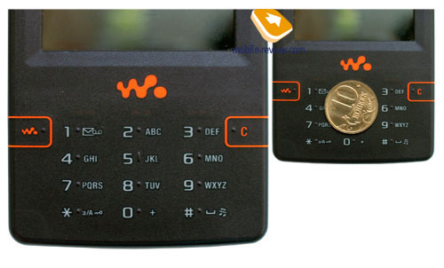
This phone is the very first model, where the manufacturer incorporated
a new type of keyboard – to be precise, touch keys. Even though
this concept isn’t something new, as it has been already used in
digital cameras for quite a while, where developers have to reckon
with a certain thickness of applied buttons. Keys’ contacts are
integrated into substrate, which is covered with a soft layer made
of various materials (as a rule, it’s a polymer film). On the surface,
the buttons can be made either relief or flush. In W950i all buttons
are flushed up, however there is a small relief dot near each key
in order to make them easier to find. You can readily manage the
device without looking at the keyboard after you’ve gotten used
to it.

Analogously to digital cameras, many might have the question whether
the polymeric surface will wear through, as it’s a quite common
occurrence in case one uses a camera very often. However we couldn’t
get an affirmative answer – the surface possesses considerable hardness
to resist key presses made with sharp objects. Yet the developers
state that everything is up to the user – in case message typing
is performed via the keyboard rather than the touchsceen, the rupture
life decreases dramatically. And for those, who prefer using the
touchsceen, this parameter will be much better. From the aesthetic
point of view, the keyboard is interesting, though in practice it
can give a lot of trouble.
As to my opinion, the keyboard will start wearing off after a year
or year and a half of intensive usage, in case the user won’t resort
to touchscreen for entering data. Though this only my guess rather
than facts, obtained in the course of service tests. Those, who
prefer screen-typing and use JogDial to the full, are more likely
to extend the keyboard’s rupture life up to two years at worst.
Owing to the buttons’ design, they have a small gap, that’s why
one may experience certain difficulties with typing long messages,
at the same time there are no problems with inputing a telephone
number or short texts. The keyboard’s backlight is white and well-distinguished
in all environments.

Absence of standard keys for accepting and ending calls is caused
by the desire of warding the keyboard against frequent presses.
It will be extremely interesting to examine failure statistics of
the touchkeyboard, incorporated into W950i as times goes by.
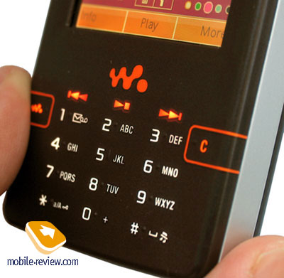
Among additional keys featured on the front panel, we need to note
the button for calling up the media player and also the “C” key.
Below the screen itself one can find three music buttons, which
are essential for this handset since it’s positioned as a music
device.
Before continuing the review of the other technical solutions,
let us rest our gaze on the design of this phone. For many orange
color of Walkman line-up has become an annoying factor – some people
prefer purchasing solutions by other manufacturers in order not
to see this design ever again. Though Sony Ericsson has analyzed
this issue in short period of time and don’t offer such screaming
shells anymore, as in case of Sony Ericsson W800i. The models have
obtained more common appearance, as orange color is only applied
to a few keys and parts, but not to the entire body now. The same
can be seen in W950i case – the abovementioned color is used only
to paint certain buttons, loudspeaker’s grate, but the device itself
is painted in a dark color, in some ways reminding of Sony Ericsson
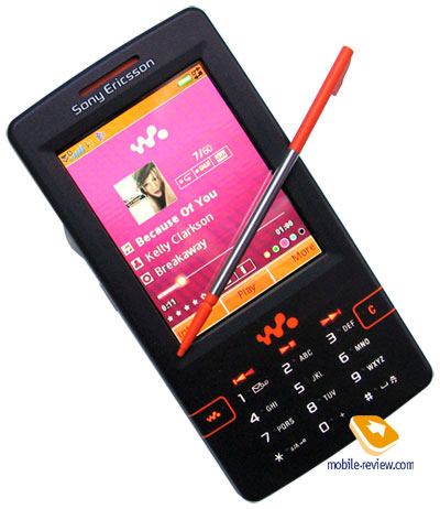
W810i. The brightest orange spot in this phone is the stylus; however
it’s put away most of times. The side panels have silvery framings,
which only make the impression of the shell’s minor thickness even
stronger. The manufacturer is not intending to offer other color
solutions for this device at the time being.
The model features a TFT QVGA display (240х320 pixel) with the
diagonal of 2.6 inches. The screen doesn’t fade in the sun and what
is more, provides a vivid picture with good color rendering (up
to 262 K colors); therefore the phone leaves a favorable impression.
Keeping in mind the fact, a number of functions require touching
the screen, one could have expected an additional protective substrate,
and an upgrade of Sony Ericsson P990i technology. Though the developers
didn’t incorporate something like this into this handset, that’s
why you should consider purchasing some screen protectors, since
when touching the screen your fingers leave prints. Key and screen
locks are also very essential in this device, as you can randomly
press some buttons, while carrying the handset in your pocket (this
function is realized on the software level with no separate key
performing it is located on the body). I will emphasize that the
device should not be transported in one place with keys and any
other hard objects, since small thickness and exposure of the screen
may result in damaging it; moreover the touchsceen isn’t intended
for being carried along with any other items.

The stylus, included in the kit, is quite handy; however this only
factor one can get upset with is orange color, applied to some parts
of this item. Fastening of the stylus is well-made – it’s firmly
fixed in the slot.

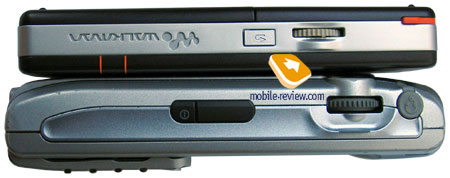
The right side of the handset holds the music key, which can be
set up for bringing up either the radio or the media player, similarly
to the other products of Walkman line-up. Here one will discover
the double-key for adjusting volume, although it’s not used frequently,
since the device features JogDial, where you can easily change volume
when working in any mode. At the same time this key can be of some
use, when it comes to rewinding– in fact there is no other way of
performing this function in this phone. By the way, this button
is also used for switching between radio stations.
At bottom there is a Fast Port interface connector, therefore the
model supports all available accessories. The microphone is also
located here. Finally, one will find the holes for applying a strap
at this end of the shell.

The upper part features the power key (which is also used for changing
profiles when at the stand-by screen) and IrDA port.
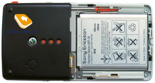
The rear cover doesn’t have any gap at all – behind it you will
find the battery. This model has a lithium-polymeric one with the
capacity of 900 mAh (BST-33) onboard. According to the manufacturer’s
statement, it can provide up to 340 hours of life time in stand-by
mode and 7.5 hours of talk time. In the conditions of Moscow networks,
the charge on the battery lasted for about 2 day, at that we had
around 1 hour of talk time, up to 6 hours of listening to mp3 tracks,
2 hours of radio work, seldom file transmissions via Bluetooth and
up to 20 minutes of e-mail check combined with web browsing. Non-stop
playback of mp3 tracks with the default headset, which is included
in the kit, plugged in (maximum volume) lasted for 13.5 hours. I
will only note, that this test was carried out with the network
capabilities turned on (Flight profile wasn’t used). This is a very
good result for a smartphone, as it finishes very close to other
representatives of Walkman line-up. There are no other models on
the market at present, which are capable of offering such long-lasting
battery and a comparable storage size. What’s more important, even
not all introduced mp3-players can compete with this handset in
terms of life time, though the manufacturer states only 10 hours
of work in playback mode. Full recharge time of the device is around
2 hours.

In the most intensive mode of usage, the charge on the batter will
last for 1 day – during this time span you can not only listen to
music without taking a break, but also check mail and browse Internet
pages on regular basis. Taking into consideration that the majority
of users don’t exploit capabilities of the device to this extent,
we can talk about average life time of around two days, but it depends
on every given case. Those, who don’t aim at listening to music
and using other functions too often, the device will offer 2-3 days
of life time. From my point of view, three days in this mode can
be readily reached, but in this case, purchase of this device loses
any meaning.
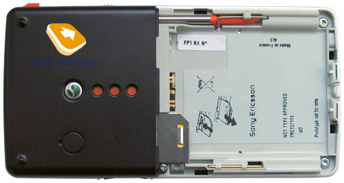
The fastening of SIM-card in this model is quite unusual, as it's
inserted in the slot, located in the upper part of the battery module.
In order to take the card out, you will need to pull a metallic
catch, which draws out a half of the card – then you just hock it
and finish the rest of the work. The entire process is not as easy
as in common devices, though it can be gotten used to. At that I
can’t say this phone is handy for people, who often swap SIM-cards.

In this paragraph we didn’t cover the device’s storage; however
this information is of great interest in this model. The handset
is not armed with two memory cards slots; it appears that the developers
considered these as waste of space with 4 Gb of built-in flash memory.
In fact this is one of the first models on the market, featuring
such considerable flash storage size. You could name low energy
consumption rate, as compared to the built-in hard drives, as an
advantage of this handset, though while looking at this issue from
the position of a consumer, one should take into consideration not
only applied technology for storing data, but also its reliability
and cost. And here flash memory is riding high. Taking an opportunity,
I would like to say, that I can hardly imagine a user, who would
be guided by storage type when choosing a device – what the real
people are interested in is how many tracks they will be able to
store and uploading speed, but on no account technologies.
Files’ uploading is carried out via USB-connection, which features
version 2.0 support. When connected to a PC, the smartphone is recognized
as a USB Mass Storage, thus the user obtains access to all folders
except the system ones. One of the options is modem connection –
having chosen this one, you will assign the handset to work as a
wireless modem.
Menu
Many of UIQ 3.0 capabilities are equal to Sony Ericsson P990i ones,
this regards both certain applications and the concept on the whole.
At that the device seems to be easier to run – this is provided
by several slight changes in the interface’s appearance, plain menu
segmentation and policy of arming the device with only the most
necessary options. Below we will use description of several functions,
taken from P990i review – this is made for convenience, as you won’t
need to search for them. In the beginning we will cover options
that has changed and those, which have not.
 
 
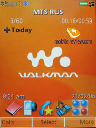
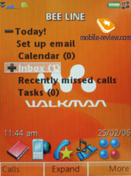
Today window, owing to the flip’s absence, features excellent functionality.
In the upper part you will discover “Today” title, on the left –
a small “plus”, which relates to the possibility of opening the
list. Having pressed JogDial key, you will be shown the opened menu,
which contains all recent unread e-mail messages, SMS, calendar
entries, tasks and missed calls, Each of these items, in its turn,
may be examined – in this case in the appearing lists you will see
titles of messages and notes. Thus this allows not only reading
short notes quickly, but also opening them, and moreover there is
no need in the touchsceen or the keyboard – everything is performed
single handedly, using JogDial.

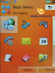
At the bottom one can find a bar, featuring applications’ icons
– you can also add some shortcuts of your own, as the only item
that always stays the same is the right icon, calling up the main
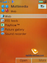
menu. From now on, the main menu holds screen keys Open, More, which
extend capabilities of hardware control elements.
Status bar. The UIQ 3.0’s peculiarity is the status
bar, which is shown in all standard applications and menu. It represents
a part of the display and shows icons corresponding with the events
or work modes, being currently on. This is where an envelope signifying
a new message is shown (besides a pop-up alert, if it is possible
in the current application), and Bluetooth activity (due to the
constant presence of the bar, the developers refused a separate
light indicator responsible for Bluetooth by way of a light diode
like in the P900/P910). There number of variants described in the
UIQ 3.0 and corresponding icons is not great; however, they cover
all the main events. Here is the list of icons shown available through
UIQ:
- Call and Internet connection status,
- Signal level, GPRS connection
- Battery level
- Bluetooth status
- IrDA status
- Missed calls (only a corresponding icon, not the number)
- Icons showing that incoming calls are restricted
- Reminder of SMS memory overfilling
- New message
- Mute mode indicator
- Virtual keypad indicator (for modes with text input available)
The left corner of the status bar shows an up arrow, it allows
a pop-up menu. As a rule, it shows the launch of standard applications.
They are hidden behind the New entry, and then you can select a
call, message, contact, meeting, task, note, sound record. This
is a comfortable way to launch a necessary application by two stylus
touches. Also here you can see time, adjust sound for all events
(both volume and select a melody). Finally, this very menu contains
all the connections, which are launched in one touch, and this is
undoubtedly a plus (now you do not need to call the control panel
and launch Bluetooth and IrDA from there).
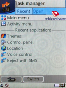
Task manager. Two arrows directed towards each
other are shown in a status bar to the right; this is a task manager
icon. Using old UIQ versions, previous models really lacked such
a capability, now you can call a list of last run applications and
run them again from here. The device uses preemptive multitasking.

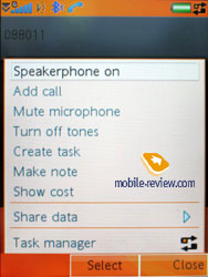
Menu of the current application. Each application
has a context menu of its own, which is brought up by tapping at
the upper part of the screen with the stylus.
Text input. The device offers three ways of typing
text: the first one is recognition of hand-written characters; it
hasn’t been changed at all, as compared to P-series. The second
is the onscreen keyboard – you’re at liberty to switch different
layouts, e.g. from Russian to English and vice versa. In the third
place data can be entered via the standard keyboard, here you can
use the predicative input system, Т9.
Text in all pre-installed applications can be zoomed – on default
Medium size is set. Making the size smaller doesn’t result in unreadable
fonts – on the contrary, they are still easily read, but the screen
will contain a few text lines more. The same regards the increased
size, however here one could expect a more considerable increase;
anyway the fonts become even more recognizable, though they don’t
differ too much from the ones of the standard size.
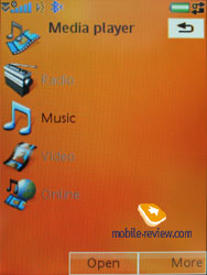
Music capabilities. Let us start describing the
handset’s functionality with this very aspect, as it’s the main
reason why the device materialized. Sony Ericsson W950i is the first
device equipped with 4 Gb of flash memory, and moreover, the first
smartphone coming from Walkman line-up. Starting from these peculiarities
we may consider it as the top model of Walkman product line.
For a start you need to upload your own music collection to the
device, in order to perform this, use Disc2Phone application – it
copies all files to the folder, containing music. Besides, this
program may be applied to moving contents of your CDs, since all
files stored on compact-disks are automatically converted into MP3.
In case you want to set up the music collection on your own, you
will just require copying files to any folder, or creating a new
one. Nesting level doesn’t affect a thing here, as the device check
the memory without your help. Having finished copying, you will
need to update the music library – this is performed via a special
function – the handset locates all files and folders, and then gets
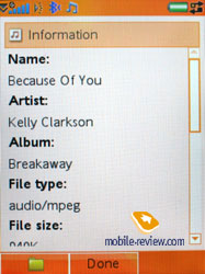
the necessary data from ID3-tags. Supported audio formats - MP3,
AAC, AAC+, E-AAC+, WAV and m4a. There are no limitations on bit
rates; you can also upload files with VBR.
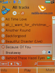
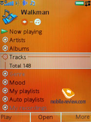
In the music library, all saved tracks are classified by the following
characteristics:
- Artists – the application displays general list of artists
in alphabetical order, one can conduct a fast search here;
- Albums – sorting by albums’ titles, search function is available
as well;
- Tracks –general list of all tracks, sorting is conducted by
tracks’ titles or ID3 tags;
- Genre – sorting, which uses various music styles, like Hip
Hop, Jazz, Blues as criteria.
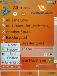
- Mood – there are five types of mood available (None, Happy,
Sad, Relaxed, Energetic). This an additional parameter that can
be manually set by user, so the sorting may be applied to both
the general list or particular mood lists;
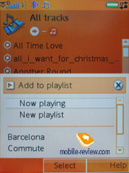
- My playlists – these are playlists, made up by user, that can
be created both on the device and on PC, while viewing contents
of the flash memory in USB Mass Storage mode; the handset also
locates then when updates the library;
- Auto playlists – this option is familiar to many Windows Media
Player users; here you can set certain criteria, which will be
used for dynamic creation of playlists. E.g. you can choose genre,
then state personal rating of tracks value (not less than 5 start
for example), and enter a key word – a playlist, featuring the
listed parameters will be instantly created.
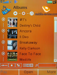
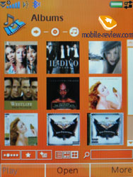
As you seen, the media player’s capabilities are maximally closed
to the players, intended for desktops. However there is an additional
option here - viewing Albums, which can be browsed in the appearance
of: only titles; titles with pictures (vertical list), pictures
only (3x3 grid). Switching between the appearances is performed
in one touch.


The ergonomics of a thoroughly renovated player is considerable,
as all functions can be performed single handedly (we are talking
about the playback mode); when playing back a playlist or an album,
JogDial scrolling shows general tracks list in a pop up window,
so you can quickly switch between them. The media player can work
in the background mode as well – in this case you will see only
current song’s title on the main screen.
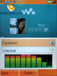
Preset equalizers with 9 levels for each can be highlighted as
additional settings. Custom equalizers can be created as well. Equalizers
don’t affect the sound that much, but at least they’re not making
it worse, like it happens on few other phones. There hasn’t been
any significant improvement in this term comparing to previous models.
Color appearance can be changed automatically in playback mode,
it’s substrate that changes the color. You can choose the color
manually. Repeat mode together with Shuffle are present, that’s
logical.
HPM-70 headphones are shipped with the handset, they are using
Fast Port interface connector, meanwhile on the cord you will find
3.5mm jack for typical headphones. The quality of the headphones
is one of the best on the market, although they are slightly yield
to the ones in Nokia N91. On the other hand, rubber wrap is more
comfortable, they will suit most consumers, they’re fine for daily
use.
Sound quality is the most subjective parameter that raises most
hardened arguments. In Sony Ericsson W950i sound quality is better
than in Walkman series phones, and I have no idea how to explain
it. The sound was compared with the help of same files and headphones
against SE P990i, and it was just better, more saturated. The difference
is not critical, but it is noticeable. The manufacturer is not commenting
weather changes were made in W950i’s construction in order to improve
the sound quality. Judging by our experience, they were after all.
The playback quality of this model can be compared with best mp3
players.
W950i parity over other mp3 players is because of presence of sensor
screen, it makes easier to control. The manufacturer highlighted
that this phone is not allied with any of the existing music services
on the web, the user can choose the one he likes. You just have
to download the files on your PC and after move them to the device.
For example, Sony’s music shop offers this style, and so do many
others. The phone supports DRM OMA v1.0, its enough for current
content. As to the copyright protection, Sony Ericsson is in a very
interesting position, which is diametrically opposed to Sony’s and
Nokia’s paradigm. In fact it was stated that the platform is open
for anyone. This means that custom applications for integration
with any music service, web-shop can be created, this also means
that protected content can be downloaded alongside with non-protected,
and this can be done over the air too. The ideology of this device
is targeted for easier use of files, songs. The user has freedom
in not only downloading the files, but send them via IrDA, Bluetooth,
email or MMS. Playlists can be sent the same way. The copyright
owner should worry about protecting his content himself. SonyEricsson’s
product is not making copyright owner’s life easier, but it’s not
making it harder either. This is a pretty logical move and it will
find support from those who are used to free manipulation with their
files, that were bought some time ago this or that way.
One of the phone’s advantages is support of A2DP profile for Bluetooth,
this allows listening to music through wireless Bluetooth headphones.
The phone can work for about 6.5-8 hours (constant playback, no
other tasks or applications running) in this mode.
The phone is missing such accessory as Remote Control, Bluetooth
headset is used instead, you can play, pause and switch songs with
its help. Everything is pretty standard and nicely working. You
can use other headsets produced by other manufacturers too.
Review Sony
Ericsson W950i part 2>>>
Eldar Murtazin (eldar@mobile-review.com)
Translated by Alexandr "Lexx" Zavoloka
(lexx@frag.su)
Published — 13 March 2006
Have something to add?! Write us... eldar@mobile-review.com
|
News:
[ 31-07 16:21 ]Sir Jony Ive: Apple Isn't In It For The Money
[ 31-07 13:34 ]Video: Nokia Designer Interviews
[ 31-07 13:10 ]RIM To Layoff 3,000 More Employees
[ 30-07 20:59 ]Video: iPhone 5 Housing Shown Off
[ 30-07 19:12 ]Android Fortunes Decline In U.S.
[ 25-07 16:18 ]Why Apple Is Suing Samsung?
[ 25-07 15:53 ]A Few Choice Quotes About Apple ... By Samsung
[ 23-07 20:25 ]Russian iOS Hacker Calls It A Day
[ 23-07 17:40 ]Video: It's Still Not Out, But Galaxy Note 10.1 Gets An Ad
[ 19-07 19:10 ]Another Loss For Nokia: $1 Billion Down In Q2
[ 19-07 17:22 ]British Judge Orders Apple To Run Ads Saying Samsung Did Not Copy Them
[ 19-07 16:57 ]iPhone 5 To Feature Nano-SIM Cards
[ 18-07 14:20 ]What The iPad Could Have Looked Like ...
[ 18-07 13:25 ]App Store Hack Is Still Going Strong Despite Apple's Best Efforts
[ 13-07 12:34 ]Infographic: The (Hypothetical) Sale Of RIM
[ 13-07 11:10 ]Video: iPhone Hacker Makes In-App Purchases Free
[ 12-07 19:50 ]iPhone 5 Images Leak Again
[ 12-07 17:51 ]Android Takes 50%+ Of U.S. And Europe
[ 11-07 16:02 ]Apple Involved In 60% Of Patent Suits
[ 11-07 13:14 ]Video: Kindle Fire Gets A Jelly Bean
Subscribe
|
