Review Sony Ericsson P900
Standard kit:
- Smartphone
- Battery Li-Pol 1000 mAh
- Charger
- Desktop charger
- Memory Stick Duo 32 Mb
- Data cable
- Manual
- CD with software
- Extra stylus
Sony
Ericsson P900, live pictures
We decided to publish this review after a recent leak
of information from Sony Ericsson. One of their sites published
an article devoted to the P900 with a large amount of photos
and screenshots. Taking into account that our review was prepared
already several months ago, and the fact that the article
was written in French, we decided to ease the life for everyone
else and print our very own review. Now you can read the actual
P900 review – right here on Mobile Review.com!
Many rumours have frequently circulated about the P900
Smartphone. Initially, it was known as the P810 and shortly
thereafter re-named due to reasons of marketing to P900, which
will be the official name that the Smartphone is going to
be introduced on the market. At first sight, the differences
between the P800 and the P900 are not that considerable, which
gives the feeling of convenience to those already familiar
with the P800 and the Symbian/UIQ system. The release of the
P900 bears resemblance to Sony Ericsson’s release of the T68i,
when the former Ericsson T68m was reintroduced as an enhanced
model, where the new phone based on the same platform offered
a revised software and modified design. Regarding the P900
the company obviously decided to repeat the procedure; the
platform is the same, and it has only had slight changes.
Overall, what we have is a revised version of the P800.

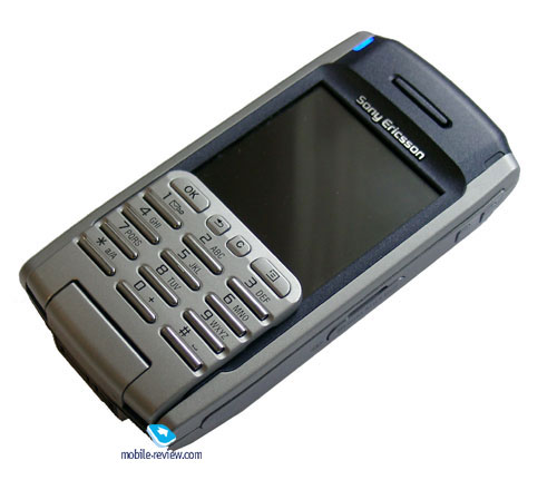
The design of the phone became more ascetic, and the combination
of dark and silver plastic strengthens this impression. According
to its exterior, this model supposedly would fit in the business
class category unlike its predecessor which was originally
made in frivolous colors.
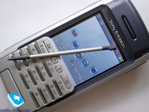
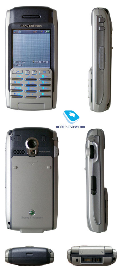
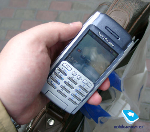
Two service indicators are placed on each side of the speaker
– the network indicator is on the right and the bluetooth
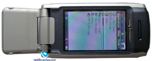
indicator is on the left. The screen looks deeply placed in
the phone’s case, especially when you use a virtual keypad.
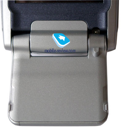
The keypad could be removed as in the previous model.


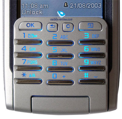
All keys are chromium-plated and are stretched across the
keypad and casing and feel much more comfortable than those
on the P800. Traditionally you can use smartphone-applications
both in the closed and open keypad-modes. When the keypad
closes, the picture of the screen automatically adjusts to
a smaller, fitting resolution. But let’s move on to the control
parts.

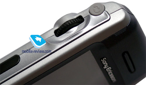
IrDA is placed on the left-hand side. The on/off-switch
is located next to it. You can see a five-directional JogDial
above it which reacts to pressure in/away/towards you and
scrolling up/down, and helps to simplify menu navigation,
especially in closed mode where you don’t necessarily need
to use the stylus. A handsfree connector is also located above
it, and is covered by a rubber cap which is conveniently fastened
to the phone.

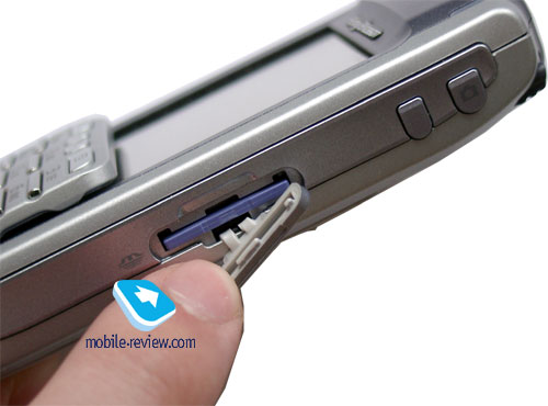
A Memory Stick Duo card slot is placed on the right-hand
side of the phone, where both a key to instantly access the
web browser and a special CAM-key to activate the digital
camera can be found.

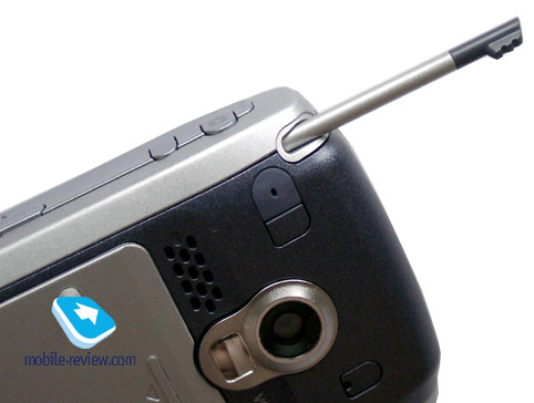
A place for the stylus to be inserted into the phone when
not used is located on the right side of the phone. It serves
its purpose much better than on the P800 and looks more exclusive.
On the other hand, it is in fact too light and is not very
comfortable to use.


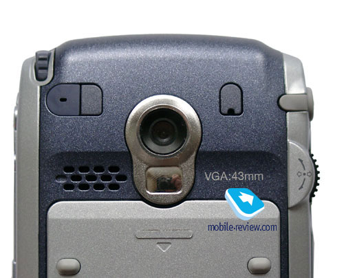
The digital VGA-camera is placed on the back cover of the
phone. According to the developers, since the P800 the quality
of the lens has been improved and so has the quality of pictures.
True or false? You tell us! The pictures of the P900 currently
shown is taken with - yep, you guessed it – a true P900.

A small mirror to assist you when taking pictures of yourself
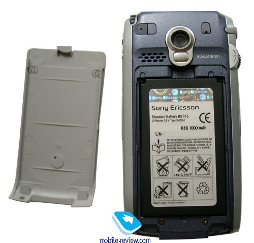
is located under the camera. The battery is hidden beneath
the back cover. It has rubber lugs which fix the phone on
the table to prevent it from sliding and the cover from scratches,
which feels very welcome. The back cover has a small horizontal
and vertical backlash. After several weeks of usage the phone
begins to creak when holding it which isn’t really that irritating
but do indeed appear after some time.

The case is entirely made of plastic – no metal used there.
I doubt that the cover will begin to peel off, unless handling
the device in a harsh manner, but if you don’t simply throw
your handset on the table when you get home, you probably
won’t have any problems with the casing.
You can see some holes on the left from camera, which indicates
the location of the speaker. It’s used to playback sounds
and to improve the quality. The speaker is capable of a loud
volume, and speakerphone function has been improved. I should
point out to you that it’s fully my own opinion, because comparisons
with the P800 showed that they are almost identical in terms
of sound volume. A wonderful impression from the P900 sounds
volume is strengthened by the original melodies. Those who
made them are very creative people, and i.e. I liked such
melodies as Ring,
ring, ring or Hello.
You can also try out and listen to three examples of these
ringtones (mp3 files) here,
here and
here.

The system connector is located on the bottom of the phone,
and is the same as on the phones of earlier SE models. It’s
possible to connect a data adapter or handsfree, whatever
which has the same connector type.
A few words about the battery: The handset is equipped
with the BST-15 - the same battery as in the P800. Operating
time hasn’t been changed considerably, though the screen was
improved. On average the phone operates about 2 days in case
of 30 minutes of talking and up to 35-45 minutes of using
other functions. If you constantly use bluetooth, operating
time will reduce to one day. Total time of recharging is a
little bit longer than two hours.
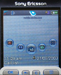
The screen has a resolution of 208х320 pixels 42*64 mm)
and has a colour-support up to 65K. The visible part of the
screen in closed mode will be 208х208 pixels. The phone has
a high screen quality though it’s not so good in sunlight,
but the information still remains quite readable. Taking into
account that the screen is placed deep into the phone, it
seems to be very large. In my opinion, the display can be
compared with the screens of Nokia 6600 and Siemens SX1 in
terms of picture quality.


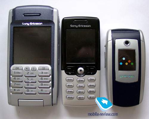
The dimension of the smartphone are lesser than that of
the P800: 117х57х27 mm. The phone weighs 130 g. It’s 28 g.
lighter than its predecessor. Overall, there are no problems
how to wear the smartphone - it can be easily put in the pocket
of your jacket.

Part 2>>>
Part 3>>>
Eldar Murtazin (eldar@mobile-review.com)
Translated by Maria Sennikova (maria@mobile-review.com)
Text editor: Tommy Kellerman (Tommy.Kellerman@kama.se)
Published — 1 October 2003
Have something to add?! Write us... eldar@mobile-review.com
|
