|
|
Review of GSM/UMTS-handset Samsung G800
Live photos of Samsung G800
Table of contents:
- Positioning
- Design, size, controls
- Display
- Keypad
- Battery
- USB, Bluetooth, connectivity options
- Memory, memory card
- Performance
- Camera
- Menu
- WAP
- MP3-player
- Impressions
Sales package
- Handset
- Battery
- Wired stereo-headset
- USB data cable
- Software CD
- microSD memory card (1 Gb, size and availability vary by region)
- User Guide
Positioning
The Samsung G800 comes in as the company’s new flagship, designed to clash with the Nokia N95. And there is more than one reason to believe that it actually is. For instance, the Samsung G600, which was Samsung’s first handset to pack a 5 Mpix camera with even more modest dimensions, wasn’t crowned the range’s undisputed flagship. Ridiculous as it is, the Samsung G600 will be extremely popular in terms of sales, while from the company’s POV the G800 will always be the flagship. The reason, in my opinion, is that the Samsung G800 can actually be positioned for the same price point as the Nokia N95. Samsung didn’t have a product in this segment, although they had never expected it to be a wild success. Sort of ‘premium class’ from Samsung.

It took the G800 a long while to get to the market, since its development was initiated back in 2006. Over this time span, its design saw a number of shape changes, the materials it was made of got replaced and its looks was revised a couple of times. Few know that at the same time the company had had a bunch of models in the works, destined to struggle against the Nokia N95, however by September 2007 the Nokia N95 was such an outrageous success that struggling against it made sense no longer. Even though these days the company’s representatives may deny any sort of connection between these devices, there are still too many facts pointing at the original rivalry – display diagonal and so on. Regrettably, G810 hasn’t made it – it was a more diminutive version if the G800 packing WiFi and a couple of software tweaks. Technically, the company has chosen to lay the first bricks for the success of the offerings to come and give up on battling against the Nokia N95.

Many might wonder why would we put the Nokia N95 and the Samsung G800 up against one another, for these are two completely different solutions philosophy-wise, with the former being a smartphone, and the latter – a feature phone. At a glance, all they have in common are size and a 5 Mpix camera onboard. Taking the seat of the manufacturer in this, the G800 comes in as a similarly-priced answer to the Nokia N96, the reason being that Samsung needs an offering in this price bracket. What are its strong sides and what Samsung will be focusing on? Apparently, the camera quality and all its abilities – that’s pretty clear. However, the Nokia N95’s centerpiece comprises all technologies it comes packaged with, and its camera is only one of the many, and by no means the highlight of this solution.


Anticipating some of our conclusions, I should say that because of a number of omissions they made while the Samsung G800 was still in the works, this phone is now nothing but a niche product. This doesn’t necessarily mean it is not an interesting solution, the fact of the matter is that it target a very narrow audience, primarily men with their hearts lost to chunky and reliable handsets.
Back to the table of contents >>>
Design, size, controls
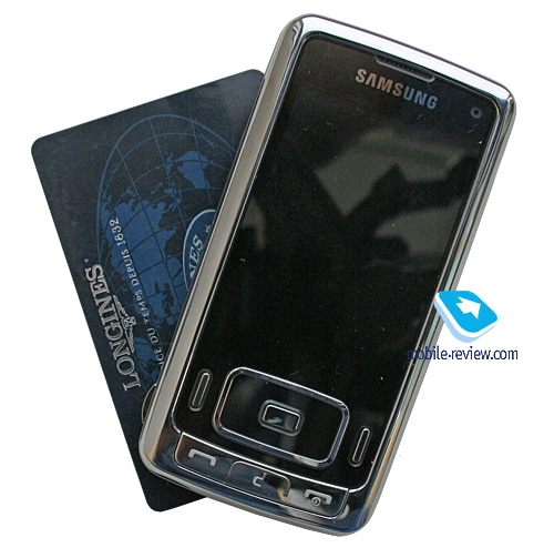
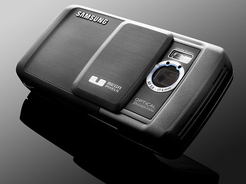
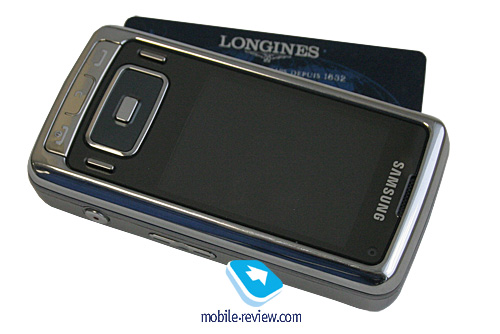
When it all began, Samsung was banking on soft-touch plastic, which was getting all the rage back then, solid build quality and pretty much par for the course dark-blue hues. The underside of the G800 had leather-like textured plastic with a distinctive pattern. However it wasn’t until recently when they revamped it and early in September the G800 was boasting a wholly different looks. The old design version of the handset is pictured below.


What’s the reason behind this move? I suppose, several factors had a hind in that. First, it comes as no surprise that the Nokia N95’s build quality is not stellar – the plastic goes off pretty quickly and this irritates the owners of, let’s be honest, not the cheapest handset around. And that’s when Samsung decides to highlight that the G800’s quality and feel will never ever be questioned. Another reason is nothing out of the ordinary – the big picture of the market has changed, and since the Samsung G800 now targets men, obviously they should love some characteristic materials, like metal, which brings about the change in the handset’s color scheme, which is now all silver. This is a slim chance that the company will roll out new color swatches, but the best outcome we can hope for is some carrier getting a black-finished phone. It seems very unlikely that we will ever see festive flavors like blue, red or light blue.

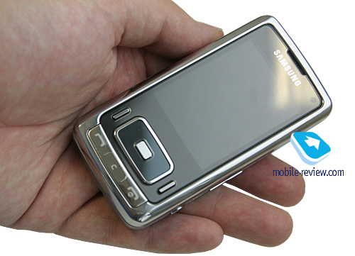
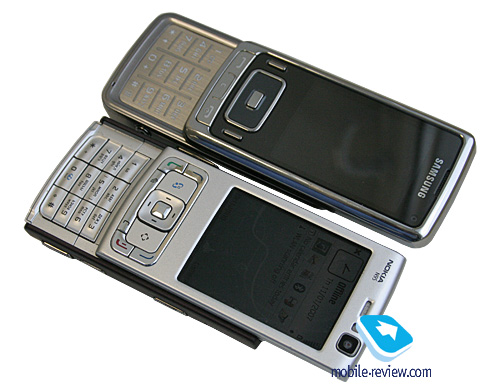
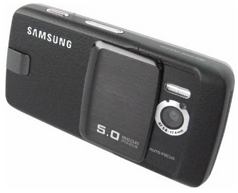
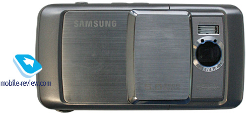
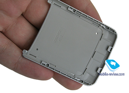
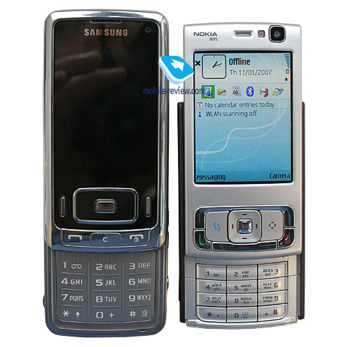
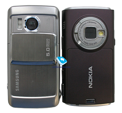
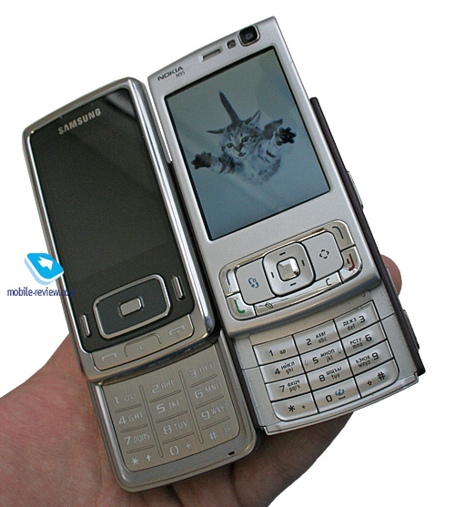
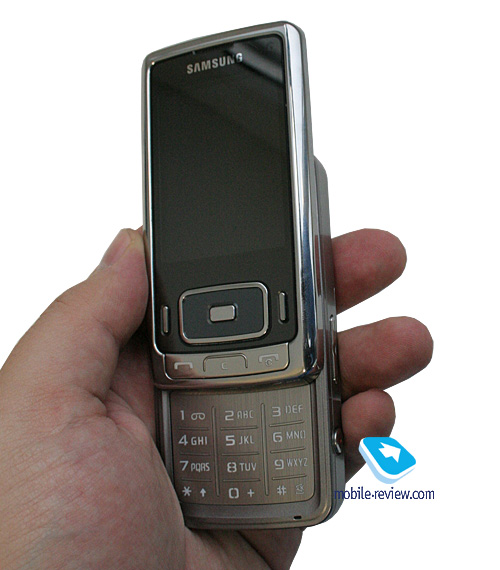
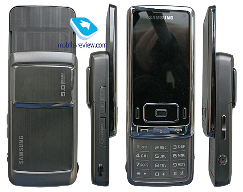
Looking at one of the Samsung G800’s photos, you won’t be able to get rid of “it is so Sony Ericsson” feeling, however Samsung’s deign is a winner in this sense, since its latest and greatest solution looks more like a digital camera. Like it or not, but you imagination will shrink the handset’s dimensions down to those of the average phone, but in fact the Samsung G800 is pretty big, and it’s not only about its physical parameters, which are, by and large, in line with the Nokia N95. It appears to be a bulky phone and feels like one. Measuring up at 101x51.1x18 mm it weights 146 grams, while the official spec sheet, for some reason, claims its weight at 134 grams, but that was the previous edition with no metal details. If you give it a bit of thought, the handset has metal only in its front fascia’s farming, the lens cover and the plate on the back, which is similar to what we saw with the Sony Ericsson T650i, where a metal slab was sitting on a plastic base, serving as its battery cover. The G800’s chassis is made of plastic, but there is plenty of it, so if you compare the G800 with other offerings available, it will look clunky, thanks to its plastic parts.


Another thing of note is that the dimensions claimed by the company are not exactly precise. It all started with the Samsung X820, when they measured its thickness in the slimmer part of its profile – these days, Samsung simply ignores all protruding parts in its offerings when it comes to measuring dimensions. This way, for the Samsung G800 this means that the lens shutter, which in fact adds 4 mm to its girth, has been overlooked. To my mind, this method is unacceptable, for it confuses all end-users.
Video, size and looks of the device (mpg, 20,3 mb) >>>


The metal parts on the underside of the G800 are so LG Shine, being well-polished and extremely prone to scratches. You will get the lens shutter covered in scuffs in about a week, which will manifest themselves only on closer examinations. And while holding the phone in your hands, they won’t catch attention of anyone who is one meter away from you.
The build quality is solid, so the G800 makes an impression of a truly durable phone, which you won’t be too worried about after accidentally dropping it. It is all thanks to its size and the materials used. As far as I am concerned, it is a pretty much perfect solution for tall and big men – the G800 will suit them very well.

The spring loaded mechanism is not exactly smooth, which is a tradeoff for its clumpy casing. There is no thumbrest on the G800, so your finger will always end up pushing the middle of the display, which is probably the most convenient way to zip the phone open.

The handset’s top houses two loudspeakers, slightly recessed into the casing and covered by metal grills. Basically, it is an interesting element of the G800's design, which seems to be out of place here, however, due to the fact there is almost no way you can spot them – so deep do they sit in their respective slots. It would make more sense if they mounted them on the surface, like on the Nokia N81.
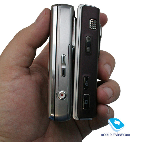
The left-hand side hosts a socket for charger, headset (new type that has already become the standard interface connector), a memory expansion slot for microSD cards is also here. Both sockets are covered by plastic flaps, linked up with the casing. Positioned more towards the bottom is a lanyard eyelet, however I can hardly image a person who will carry the G800 around his or her neck/arm.

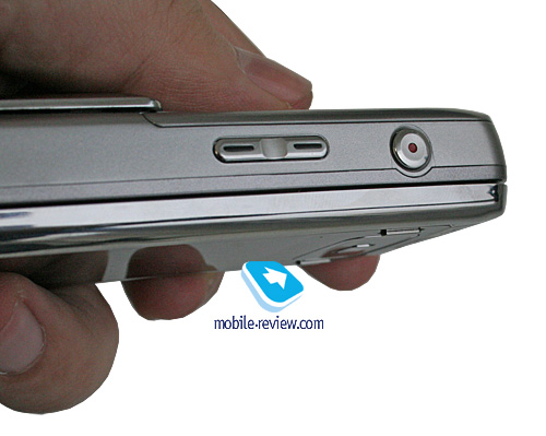
Flipping over to the right flank, there is a dedicated camera button alongside a volume rocker, doubling as a zoom key while shooting.

Back to the table of contents >>>
Display
The display utilized by the G800 comes in with the resolution of 240x320-pixels (36x49 mm), measures 2,4 inches from corner to corner, employs the TFT technology and shows up to 262 K colors. The picture on it looks fine and is pretty vivid, with color reproduction being pretty much sun-resistant, even though it gets washed out in overly lit environments.
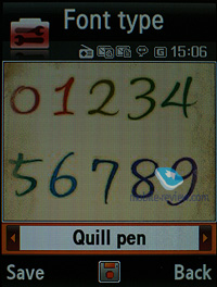
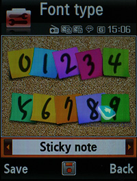
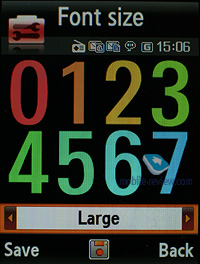
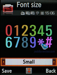
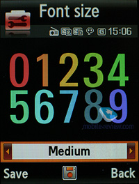
This screen can easily accommodate up to 8 text and 3 service lines, and the font size is above average, compared with other handsets. Large diagonal and legible font of the G800 make it look like a phone designed for people with weak eyes, and there is no irony to it – the today’s market has so few offerings for these people, since this segment has been ditched by many makers.
While 8 lines of text can be easily squeezed into the screen in most applications, like Messaging, the line count in the browser can average 15-20 – it all depends on the front size you have applied.
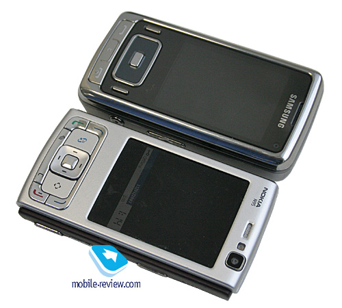
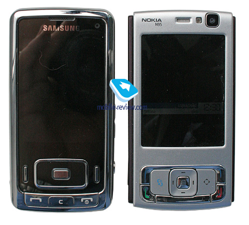
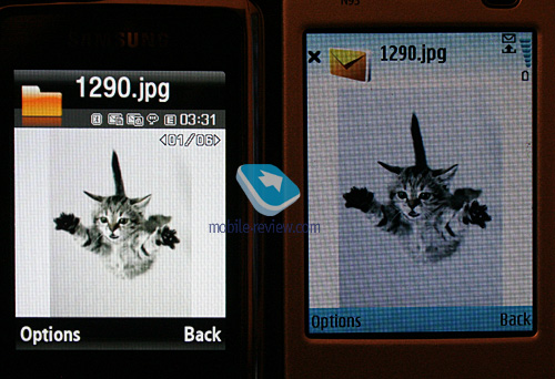
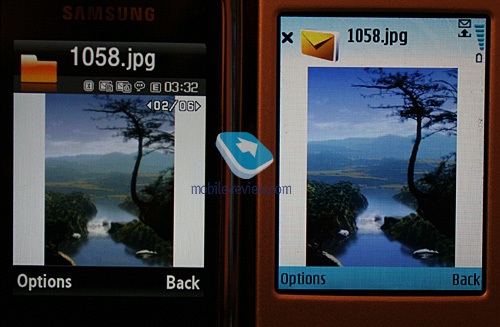
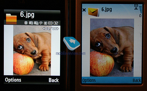
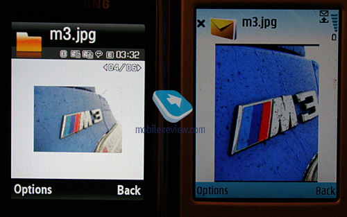
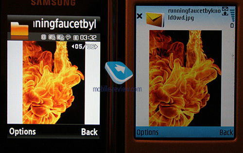
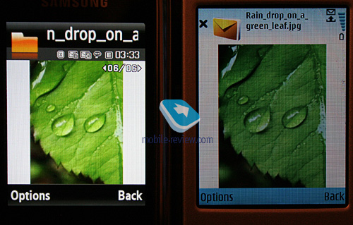
The images below give you an idea of how the G800’s display compares with the Nokia N95. Basically, the Samsung’s unit is way ahead thanks to its picture quality and brightness, making the N95 look lackluster and dim.


Back to the table of contents >>>
Keypad
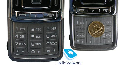
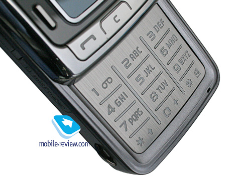
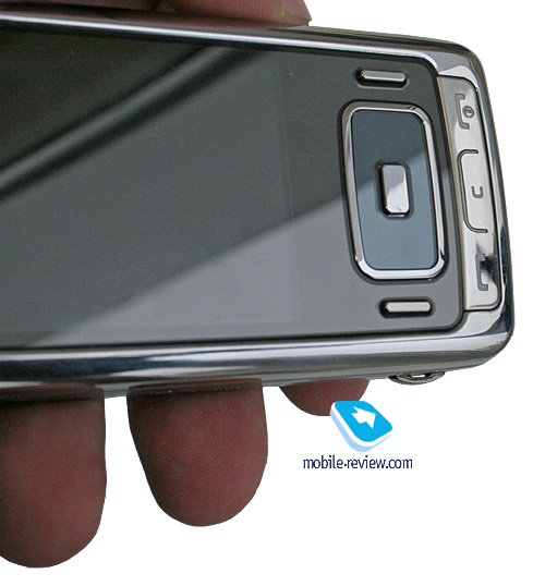
This device retains no touch-sensitive keypad, which is another proof of the good trend now manifesting itself in the company’s range. Being this wide, the G800 provides more than enough space for functional keys and navigation pad, rendering them very easy to use. The RAZR-esque number pad is made of a metal slab, making for relatively short travel, however thanks to the size of each button over there, this keypad is a cinch to handle. All keys are well-lit in white. For that matter, the G800 also comes with an option for programming keypad light time, for want of an ambient light sensor. With this at your disposal you can, say, disable the keypad backlighting during daytime, which is not also convenient, since we always find ourselves in environments with poor light conditions, like subway etc.


Back to the table of contents >>>
Battery
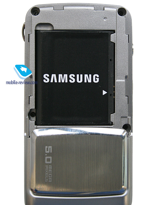
Surprisingly, the handset utilizes a 960 mAh Li-Ion cell, even though there is much leftover space for an even more capable battery. The maker G800’s cell as being good for up to 250 hours of standby and 2,5 hours of talk time. Within European networks the phone lasted around 2,5 days (one hour of calls total and regular use of its alarm clock). At the same time, in Moscow it managed to stay online for 2 days at 1,5 hours of calls. That’s why the G800 will stay up and running for at least 2 days with average load, however under certain circumstances you might squeeze up to 3 days of operation out of it. It takes the handset 1,5 hours to charge from empty to full. No higher-capacity cells are available for this model.

Back to the table of contents >>>
USB, Bluetooth, connectivity options
Bluetooth. The model supports various profiles, such as Headset, Handsfree, Serial Port, Dial Up Networking, File Transfer, Object Push, Basic Printing, A2DP. EDR-enabled Bluetooth 2.0 is onboard. Headset management doesn’t allow us to have any quibbles with it, everything is standard here.
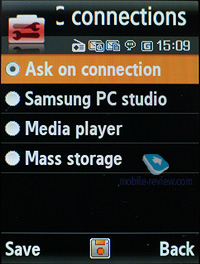
USB-connection. In the menu you may select one of three modes: Media, Mass Storage, Samsung PC Studio. No Modem mode available with the G800, there is even no such option in PC Studio. I hope it will come along a bit later.
While in the USB Mass Storage mode, the G800 shows up on the desktop without requiring you to install any additional drivers, so right after plugging in it’s ready to work. Data connection speeds top out at 2000-2200 Kb/s.
You won’t be able to use the G800’s Bluetooth connectivity along with USB – it will require you to disable Bluetooth regardless of its status (connected and transferring data or not), which is very awkward.
When connected to a PC via USB, the G800 automatically recharges itself.
HSDPA allows for extreme data speeds in UMTS networks – up to 3.6 Mb/s. There is also EDGE class 10 for GSM.
Back to the table of contents >>>
Memory, memory card
The phone ships with 160 Mb of onboard memory – this storage space, give or take, is available to the user right out of the box. The memory card (hot-swappable) is displayed as a separate section, so you can’t access both memory types at a time. The G800 also comes with a file manager, enabling you to copy files to/from the memory card. In our test the handset had no problems handling a 2 Gb microSD memory card, whereas a 4 Gb unit remained unidentified. Probably, support for higher-capacity cards will be added with new firmware versions.
Back to the table of contents >>>
Performance
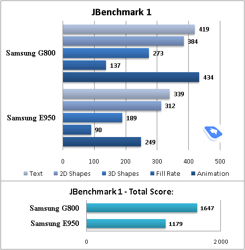
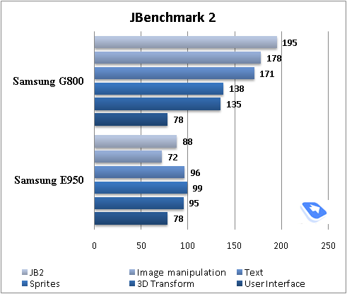
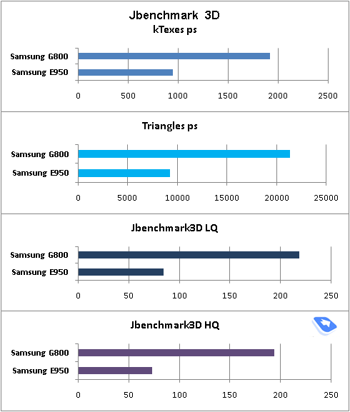
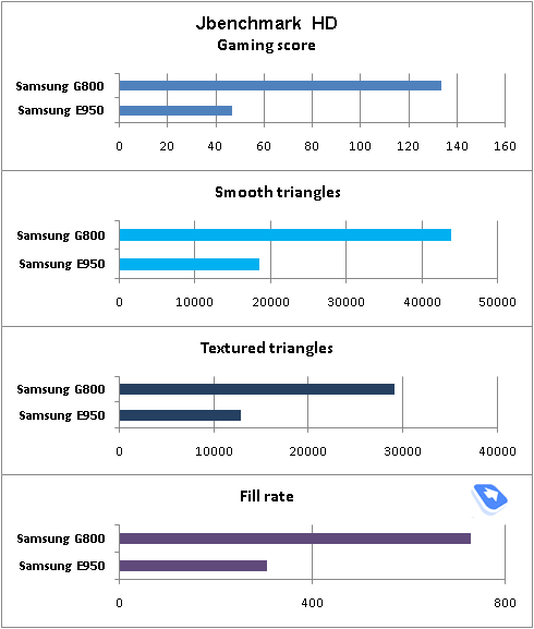
Compared to other GSM-models, Samsung’s 3G handsets are somewhat better performers; however they aren’t too far ahead. Generally, Samsung is chasing the market on this front, for its devices come with slower CPUs and no full Java support. As it stands today, new applications can be uploaded only over the air (wap).


Back to the table of contents >>>
Camera
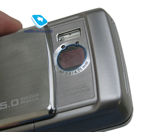
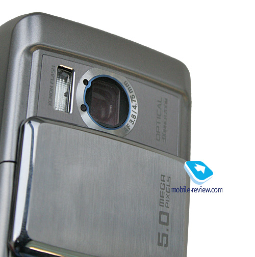
As a matter of fact, this device’s centerpiece is its camera – the G800 is even designed to look like an ordinary digital compact and, judging by its looks and size, Samsung has succeeded. The phone enjoys a 1/3.2-inch CMOS-matrix with x3 optical zoom. The lens is placed right under the cover, which can be slid down to launch the camera application. Furthermore, the G800 dumps the now-dated LED flash in favor of a Xenon-based unit.


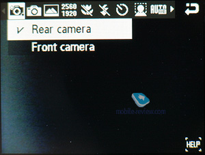
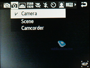
Let’s see what the user gains will all these innovations, but before we move on to this, we should run down the camera’s main settings.
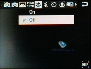
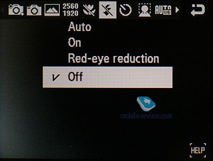
The G800’s camera utilizes a pretty much conventional viewfinder screen with no icons displayed by default, but you can always enable them from the menu. Also you can engage the grid; some may find it lovely for building composite images. n fact, the camera has kept all the settings and abilities of the previous offerings like the Samsung G600. Nevertheless, they have made several refreshing touches like the Auto Panorama mode and Face Detection.
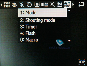
Among the amenities is the ability to quickly call up various features with the help of the number pad – the menu, options, video recording, single shot mode, gallery are all just a click away from you. So if you are into snapping everything around you, these shortcuts are incredibly helpful. It is quite another matter, though, that zipping the slider open in this very case is not particularly comfortable – in the Samsung G600 it was essential so as to actually enable the camera, mounted on the inner side of the top slide.
Punching the navigation button toggles modes (macro, flash etc). Below we are breaking down the camera’s most essential settings.
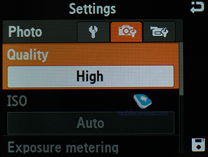
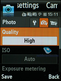
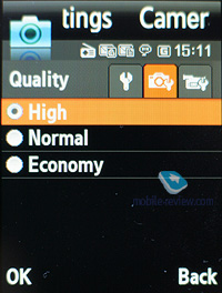
There are three quality settings available: Normal, Fine, SuperFine, using the best possible level seems to be the best way to go – the difference between these settings is quite remarkable, especially if you are going to view snaps on PC.


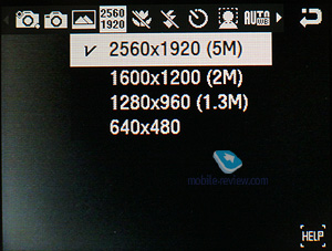
The camera supports the following image resolutions:
- 2560x1920 pixels;
- 1600x1200 pixels;
- 1280x960 pixels;
- 640x480 pixels;

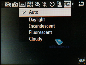
The camera comes with autofocus abilities; however there are no settings for adjusting it. The G800 also packs a new mode – Face Detection, when the camera (obviously) detects someone’s face while shooting (portrait mode) and then it tweaks all parameters to take a better shot. Nevertheless, we didn’t find the shots taken with Face Detection enabled to be any different from the standard mode. The white balance is set to the default option when you open it for the first time, but it can also be managed manually, the following options are available: Daylight, Incandescent, Fluorescent, Cloudy, Sunset. This variety of settings is more likely to appeal to those who just can’t help playing around with all these bars and options, and would fit a digital camera better, rather than a headset, where the philosophy is somewhat difference (take it out and shoot).


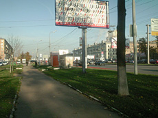
The shutter and zoom sounds may be disabled. The G800 comes with x12 zoom (x3 optical and x4 digital). In my opinion, the optical zoom feature it packs doesn’t provide its shots with some sort of a cutting edge, although it will come in handy when you will be shooting not-so-distant objects. See for yourself – there are two shots below, one taken with no zoom, and the other one – with both optical and digital zooms set to the maximum.
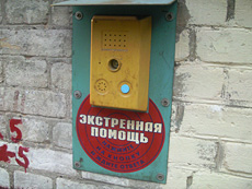
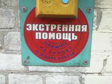
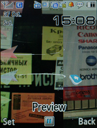
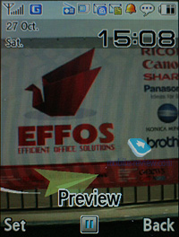
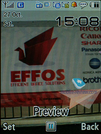
Here we took a picture of an alarm-signal panel from one meter away. Optical zoom x2, then x3, and then the G800’s digital zoom kicks in. As you see, the phone’s optical zoom comes in handy in this particular situation. Zoom step – 0.25.
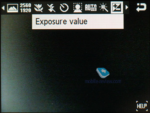
The image brightness can be adjusted on a -2 to +2 scale – the default value is 0. In the settings you can also tweak your shot’s sharpness, but since it is a mere filter, playing around with this variable is not a good idea, for the quality won’t change a great deal, while it will have a really hard time editing it on a PC (some details always get smeared up with this filter on).
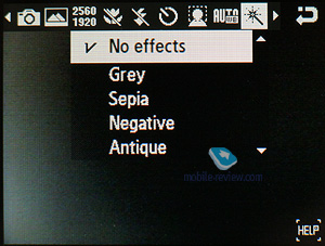
The camera also allows you to employ various effects while shooting: Negative, Sepia, Grey, Antique, Watercolour. Taking into account the bundled picture editor, which proposes just the same feature pack, “spoiling” the initial photo with effects seems quite pointless.
 |
 |
| (+) maximize, 2560x1920, JPEG |
(+) maximize, 2560x1920, JPEG |
 |
 |
| (+) maximize, 2560x1920, JPEG |
(+) maximize, 2560x1920, JPEG |
 |
 |
| (+) maximize, 2560x1920, JPEG |
(+) maximize, 2560x1920, JPEG |
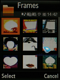
There is a whole lot of image frames coming with the G600, but they shrink the image size down to 320x240 pixels once you apply one of them.
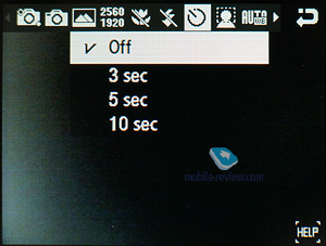
The settings also enable you to set default name, customize sensitivity (Auto, ISO 50, ISO 100, ISO 200, ISO 400). Personally, I recommend that you use the Auto mode, since it performs quite well and gets the right settings in most cases. On top of that there is no visible difference between the abovementioned sensitivity levels in normal environments – there is no way you can spot changes produced by lower/higher sensitivity in that case. If you would like to take a group photo of your friends, but don’t want to be left out, set a Timer (3, 5 or 10 seconds).
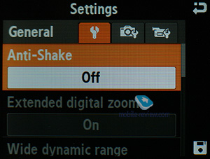
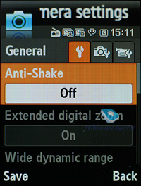
The optical stabilizer allows you to avoid getting blurred shots when your hands are shaking a little. And the truth is, this gimmick works and it does a fantastic job – compare the shots taken with the Nokia N95 and the Samsung G800 while we were in the subway. The benefits of having this stabilizer onboard require no further proof.
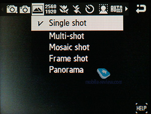
The Mosaic mode downgrades resolution to the lowest possible (the resulting image makes 320x240 pixels in size), so that you could get a grid consisting of 4 pieces (2x2). Generally speaking, it’s a mode for days when you feel like taking some fancy shots.
While in the Multi shot mode, the camera snaps really fast, which makes it possible to get 6 pictures at a time (everything happens is an eyewink), in case this is not what you’re looking for, there is a slower mode as well (gap between shots – one second or a bit less). The modes with 9 and 15 pictures taken in rapid succession are also available. I’ve already said this and will repeat it again: this feature works fine for photo-finishes at tournaments etc., but in real life it won’t be of much use – if you happen to shake the while shooting in this mode, most of the shots will get blurry. The image resolution in this mode switches to 320x240 pixels.
The Panorama mode found in the G800, unlike the Samsung G600 and other phones available on the market, is automatic. This means you just pick the number of pieces you will be splicing together – 3, 4, 5 or 6 shots. Then you point the camera at the first object and take a picture. After that, you don’t need adjust this image to fit the previous one, all you need to do is move the camera to the right, so the phone will make another shot automatically. However the resulting image is not always flawless – if someone happens to pass by in front of the lens, get ready to start the whole thing all over again. We would love to have the option of stitching all images together manually as well, like with the Samsung G600.
Depending of how many pieces you have chosen, your panorama’s resolution will differ.
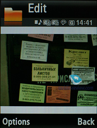
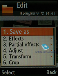
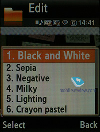
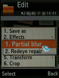
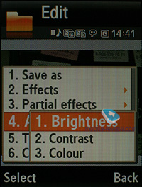
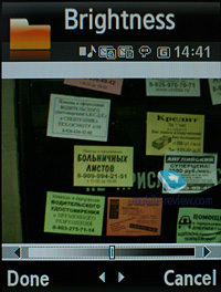
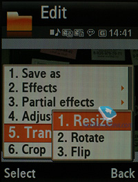
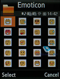
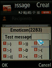
All photos are stored in the Album, where you can view detailed data on every picture. Any image found in the Album can be assigned to a contact in the phonebook or set as a wallpaper outright. The slide-show mode and a basic editor (allows applying emoticons, frames and special effects) are at your disposal in the G800.
Facing the G800 off against the Samsung G600 leads to some unexpected results. It would seem that the better module found in the Samsung G800 should be a better performer in this competition – I suppose you won’t argue that a camera with optical zoom onboard has a better lens? But I don’t believe one attribute alone can be used to make the final judgment on image or lens quality, so we put these two cameras to the test.
| Samsung G800 |
Samsung G600 |
 |
 |
| (+) maximize, 2560x1920, JPEG |
(+) maximize, 2560x1920, JPEG |
 |
 |
| (+) maximize, 2560x1920, JPEG |
(+) maximize, 2560x1920, JPEG |
 |
 |
| (+) maximize, 2560x1920, JPEG |
(+) maximize, 2560x1920, JPEG |
 |
 |
| (+) maximize, 2560x1920, JPEG |
(+) maximize, 2560x1920, JPEG |
And the result was quite amazing. First, the Samsung G800 isn’t a quantum leap ahead of the Samsung G600. Both cameras are pretty much in the same weight category. However, in the author’s humble opinion, the Samsung G600’s colors are more vivid and closer to the real life. Another thing of note, the Samsung G800’s snaps come out noisy, which doesn’t make for a stellar image perception.
Our next goal was a comparison between the G800’s snaps with the Nokia N95’s, which has been around for quite a while and already become the benchmark for this type of tests. Let’s take a look at the images, no comments for the time being.
| Samsung G800 |
Nokia N95 |
 |
 |
| (+) maximize, 2560x1920, JPEG |
(+) maximize, 2560x1920, JPEG |
 |
 |
| (+) maximize, 2560x1920, JPEG |
(+) maximize, 2560x1920, JPEG |
 |
 |
| (+) maximize, 2560x1920, JPEG |
(+) maximize, 2560x1920, JPEG |
 |
 |
| (+) maximize, 2560x1920, JPEG |
(+) maximize, 2560x1920, JPEG |
 |
 |
| (+) maximize, 2560x1920, JPEG |
(+) maximize, 2560x1920, JPEG |
 |
 |
| (+) maximize, 2560x1920, JPEG |
(+) maximize, 2560x1920, JPEG |
 |
 |
| (+) maximize, 2560x1920, JPEG |
(+) maximize, 2560x1920, JPEG |
 |
 |
| (+) maximize, 2560x1920, JPEG |
(+) maximize, 2560x1920, JPEG |
 |
 |
| (+) maximize, 2560x1920, JPEG |
(+) maximize, 2560x1920, JPEG |
 |
 |
| (+) maximize, 2560x1920, JPEG |
(+) maximize, 2560x1920, JPEG |
 |
 |
| (+) maximize, 2560x1920, JPEG |
(+) maximize, 2560x1920, JPEG |
 |
 |
| (+) maximize, 2560x1920, JPEG |
(+) maximize, 2560x1920, JPEG |
 |
 |
| (+) maximize, 2560x1920, JPEG |
(+) maximize, 2560x1920, JPEG |
 |
 |
| (+) maximize, 2560x1920, JPEG |
(+) maximize, 2560x1920, JPEG |
 |
 |
| (+) maximize, 2560x1920, JPEG |
(+) maximize, 2560x1920, JPEG |
 |
 |
| (+) maximize, 2560x1920, JPEG |
(+) maximize, 2560x1920, JPEG |
 |
 |
| (+) maximize, 2560x1920, JPEG |
(+) maximize, 2560x1920, JPEG |
 |
 |
| (+) maximize, 2560x1920, JPEG |
(+) maximize, 2560x1920, JPEG |
 |
 |
| (+) maximize, 2560x1920, JPEG |
(+) maximize, 2560x1920, JPEG |
 |
 |
| (+) maximize, 2560x1920, JPEG |
(+) maximize, 2560x1920, JPEG |
 |
 |
| (+) maximize, 2560x1920, JPEG |
(+) maximize, 2560x1920, JPEG |
 |
 |
| (+) maximize, 2560x1920, JPEG |
(+) maximize, 2560x1920, JPEG |
 |
 |
| (+) maximize, 2560x1920, JPEG |
(+) maximize, 2560x1920, JPEG |
 |
 |
| (+) maximize, 2560x1920, JPEG |
(+) maximize, 2560x1920, JPEG |
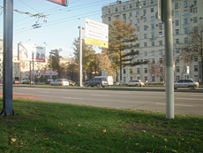
Quality-wise, the Samsung G800 stands closer to the Samsung G600, however on a sunny day your shots will be pretty much comparable. Its camera’s greatest letdowns are noises, which blur some tiny details, especially when shooting in poor light conditions. The camera handles details very well – for example the letters on the billboard are sharper. At the same time, the G800’s gamma is a bit on the wrong side – the sky is painted in a different color. All up, it turns out that Samsung still falls flat in the image processing department, while hardware-wise it is pretty much up to par. This is even more shocking, seeing all this experience Samsung has carried over from the field of home appliances and digital compacts, where it employs high-resolution models and has a couple of imaging-related innovations under its belt. Apparently, the way Samsung’s divisions communicate leaves much to be desired, which eventually leads to this point.
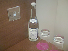
We were also curious about the G800’s xenon flash and what it really could do. Not much, really. It shares the main problem with the Sony Ericsson K800, when it isn’t of much use at short- and long- ranges. In the case of the Samsung G800, it doesn’t always handle the flash in a proper fashion, so occasionally you might wish it was disabled. Look at the image of a bottle and you’ll get the idea.
Now, wrapping it all up, we only have a couple of snaps taken in the macro mode left. Effective macro mode distance – 10 cm. The optical zoom won’t kick in in this case, which is no surprise. The image quality you get with the G800 in the macro mode is quite average, definitely not perfect – as of today, the best macro-mode performer out there is the Sony Ericsson K850i, no other phone can really stand up to it.
Video recording
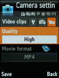
The handset records video in mpeg4 format at the top resolution settings, on top of that in the options you can either enable or disable sound. All the settings here aren’t too much different from the single shot mode – three quality settings, yet new resolutions plus a bunch of effects. Max resolution – 320x240 (15 FPS), which makes the G800 one of the market leaders as far as the video recording department is concerned.
So if all today’s imaging-inclined solutions (except for Sony Ericsson’s solutions, however) comes with VGA video recording, it is very odd why would they need to cap the G800 in this sense, especially when the G600 sports VGA resolution for its video clips.
Video example (mp4, 0,9 mb) >>>
Video example (mp4, 1,3 mb) >>>
Back to the table of contents >>>
Menu
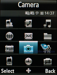
The main menu is viewed as a grid (3x4). All sub-menus have horizontal lists - in the case of there being a sub-menu, you will see a pop-up list on the right of the highlighted item. You see which items are stored underneath, and once you press OK button, you will get there. When you lean the navigation key either left or right, you will be able to access the corresponding item immediately. Ergonomics of such solution is unquestionable, as you will have to make at least one key-press less. Also you can disable this view mode, so then the G800’s menu becomes just like any other menu system.
While surfing the menus you can take advantage of last item memorization in every sub-menu and the main menu. The Handset will “remember” which function you addressed last time, and will highlight it automatically next time you enter the same menu item. For example, if you had selected call list in main menu and done some operations in it, then the next time you enter main menu you will have it highlighted in first place. But that’s not all; once you access it again you will see that sub-menu item which was addressed last will be highlighted too. It seems to be a simple thing, but it is not present in handsets produced by any other manufacturer.
When hovering over one or another item in the list you will see it highlighted, and font size (which is big already) will be increased.
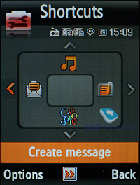
Shortcut number navigation is supported, but there are more ways to navigate the menu available in the G800. You can bind four different applications from the list, offered by manufacturer (you will not be able to bind java applications). There is no quick launch menu available in the G800 (uMenu).
Video, menu and user interface (mpg, 30,3 mb) >>>
Themes. The G800, unlike the Samsung E950, doesn’t allow you to pick own themes and tweak them – you can only use only the default themes.
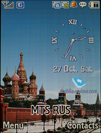
uWorld (formerly known as Living World). This is a selection of personal wallpapers for each country (major cities might get unique wallpapers in the future, though it is not quite evident). When you will be in Moscow you will see Kremlin wharf and triumphal arch in case you’re in Paris, as for London – house of parliaments, and so on. Besides graphical assignation manufacturer decided to modify wallpaper depending on time of day: in the morning you see sun, and in the evening you see blinding lights of Kremlin wharf, cars will have their headlights turned on.
Time is not the only event that can be morphed into graphics. For example network reception level: good signal – sky is blue, no signal or weak one – sky is covered with clouds. At first you don’t pay much attention to this tiny feature, but after a month you will look on the sky instead of the standard bar, information reads instantly.
For new messages, missed events, or alarm clocks there is a special way of displaying, and which is powered with standard, traditional pop-up window with text. In daytime, such events will be demonstrated with help of airplane that will fly through the sky, and in the evening that would be fireworks. Color will change according to event type. At a glance this system looks kind of complicated, especially during its description, but in reality it is crystal clear and understandable.
When dialing a number you will see a small image with main theme displayed and animation of the dialed number.
Phonebook
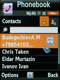
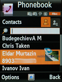
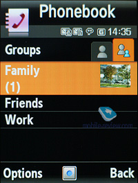
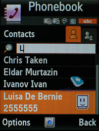
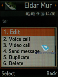
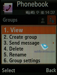
Contacts can be accessed by pressing right soft key; you will see a list that contains all entries from both SIM-card and phone’s memory. The second tab comprises contact groups, so that you can switch to them in no time. If there is an assigned image, its thumbnail will be shown in the list – when scrolling though your contact list, a thumbnail will be shown only for a currently selected entry, and if there is none set, the G800 will use a default smilie.
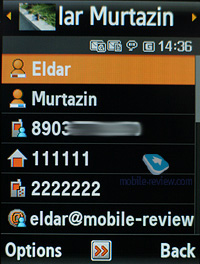
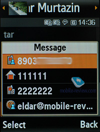
The field beneath the name is the default number, which can be picked manually from the list of submitted numbers for a particular contact. Quick name search by first letters is supported; there can be up to twenty of those, for any language. Once you press OK key you will go into detailed view of the selected entry. There you will see a thumbnail, if any. It can be an image, a photo or a video clip. Each entry can have up to 5 phone numbers of different types (mobile, office, home, fax other), one of them will be main number (by default it is the first one you entered). All fields are locked.
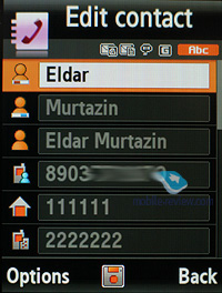
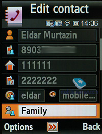
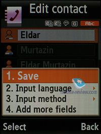
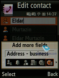
There are two lines for First Name and Last Name (search is performed only by the former), these fields get merged when displayed in the general list, and First Name comes first. For example Eldar Murtazin will be shown only in this order. Length of each field is 20 characters for any supported input language. You can also switch languages on the fly when entering a name.
All entries, regardless of language, are sorted out in the following way – all contacts with headings made in a local language (Russian, for example) go first and then those with names in English. This is rather convenient and handy list sorting system. Taking into account fast language switch option during the search, it’s clear that no language will spoil the experience of working with this phone. The list can’t be sorted by first or last name, which is a letdown, characterizing Gumi’s products.
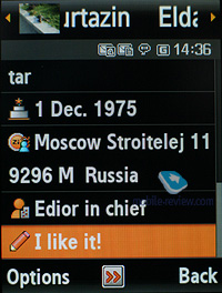
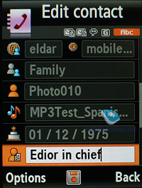
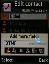
But let us return to the information entered for a contact. Apart from phone numbers, e-mail address (there may be several of them), a little text memo can be submitted on top of all that. Any music file (including MP3) can be picked as a ring tone for a contact. Three caller groups are provided by default with the possibility for creating any number of additional groups, setting a personal melody and image for each (by default there are three groups). SMS alerts are not customizable.
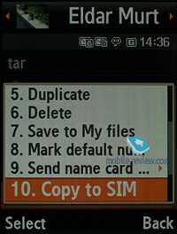
The phonebook is capable of holding up to 1000 contacts with filled in data fields. Even if all the available blanks are not used, the cap won’t get any bigger and will still make one thousand. It is possible to specify in the settings where all new numbers should be kept by default. There is also an option for moving entries from the SIM-card, although the reverse action is denied. According to the developers, PC (MS Outlook in particular) is best for data synchronization with the G800. Any contact in the form of SMS/MMS, mail message or other text file can be quickly sent through Bluetooth to another device. There are no problems with sending, and the phonebook entry gets beamed to another device, where it is read without any trouble.
The phonebook may contain a business card as well, though its structure copies all the fields found in a regular contact in the phone book.
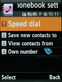
There can be up to eight numbers in the fast dial list; separate numbers tied up with a single contact may appear on this list as well. The chosen entry (not of the phone number type) is displayed on the buttons as the subtitle.
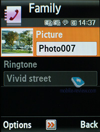
You can create any number of caller groups, assign up to 20 contacts and customize them with a picture and tune.
On an incoming call, caller ID picture occupies not the entire screen, but only a part of it. However, it still takes up a considerable area. This isn’t great, given the display’s stellar specifications.
Call log
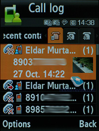
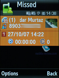
Each of the given lists contains up to 30 phone numbers. There is a combined list of all the last calls with an icon indicating call type. Pressing the navi-pad horizontally, you can switch quickly between the lists. The date and time of the calls with a special note on duration are displayed in the extended view for separate entries. Calls from/to one number are grouped up, so that the number standing next to the call specifies total number of calls made. In order to access duration data you will need to call up detailed information on desired item. As always, the overall time of the calls and their cost can be viewed in this menu (in the case that the service has been enabled).
For individual numbers you can arrange a black list, which will reject all calls coming from these contacts.
Messaging
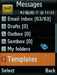
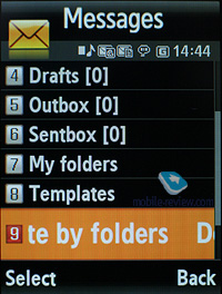
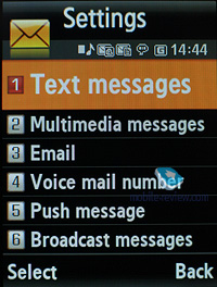
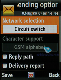
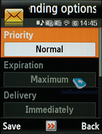
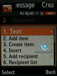
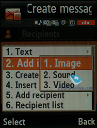
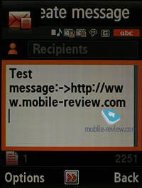
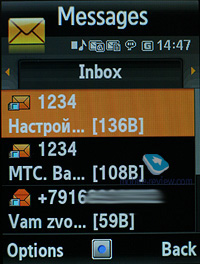
Much like other makers, over at Samsung they have forgone that artificial division into SMS-MMS types – you just start composing a message, and only then, depending on the contents, it is attributed to SMS or MMS. The menu still holds an option for switching message into MMS mode (for example when you need to send only text, but to an e-mail address, without calling up the bundled client).
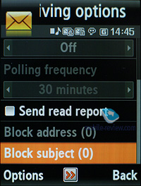
The phone memory can hold up to as many as 500 messages; the handset supports EMS standard compatible with Nokia Smart Messaging. T9 text input comes in handy and is easy to use. While choosing recipient, you can either select a telephone number from your contacts or pick one from the call lists or groups. All messages are manageable, this means you are at liberty to move a certain number to your black list, in order to make sure all messages coming from that phone number will be deleted automatically; possibility for moving messages to any own folder is also at your disposal. For e-mail you can move not only addresses to the blacklist, but unwanted subjects as well.
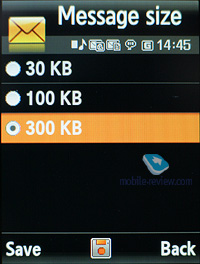
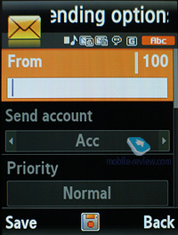
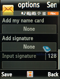
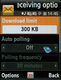
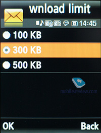
There are no size restrictions set on received messages, though an outgoing message’s size is limited to 295 KB. As for additional services available with the G800, message rejection and message retrieval type options are onboard. All messages are stored in general dynamic memory, the same goes for e-mails.
Also there is a useful function for sending SOS-messages – when activated, should you find yourself in an emergency, after pressing the volume key four times, the message «I am in emergency. Please help me» will be sent to contacts submitted earlier, all incoming calls from these numbers upon sending the emergency message will be picked up automatically. Recipients (not more than 5), as well as number of Repeats may be set up manually, while text of the SOS-message is not customizable.
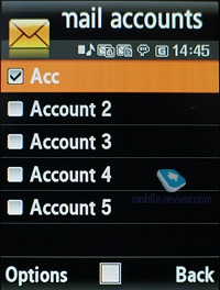
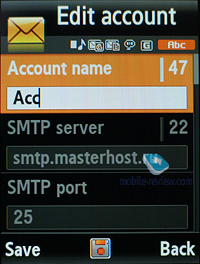
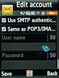
The bundled mail client is standard in all its components – 5 accounts and the maximum of 100 incoming messages; attachments are also handled by the phone, though there are also several caps – there’s no way you can receive a file more than 500 Kb big, or send one with size exceeding 300 kb. Received files can be viewed via the bundled browser. The G800 doesn't support html in emails, which breaks formatting of most letters you receive, so they become really awkward to read. The mail client found in Samsung-branded phones is now falling behind those embedded in Nokia’s and Sony Ericsson’s solutions.
Organizer
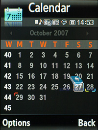
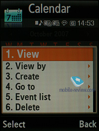
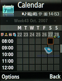
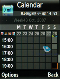
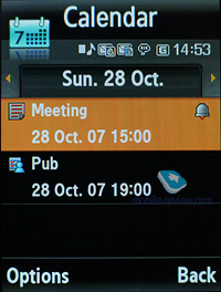
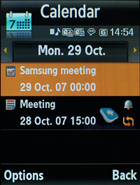
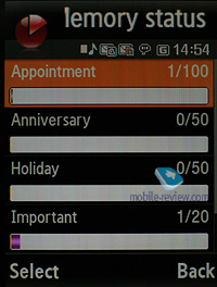
The phone’s memory can store as many as 100 events of one type – meeting. There are other event types as well, like anniversary and holiday, with the maximum capability of 50 events for each type. The G800 can also hold up to 20 high-priority events and the same number of private entries.
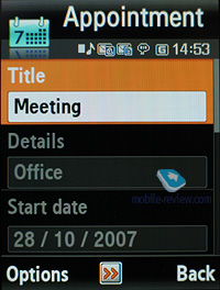
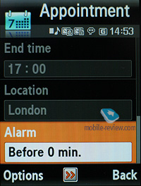
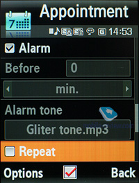
Day and time as well as end time of an event are indicated for each entry. Alert signal and its duration can be adjusted to your liking; repeatable events are available for setting up (repeat time is also manageable as well as the exceptions). The weekly and the monthly calendar views are very convenient with each type of the event having its own color.
Speaking of the organizer’s shortcomings, I cannot overlook the fact that when typing date and time for an event, the end time doesn’t change, which badly hurts its ease of use – other manufacturers make the due time shift automatically (by default any event takes one hour).
Applications
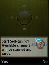
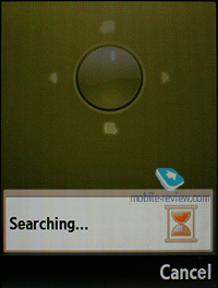
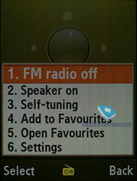
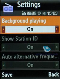
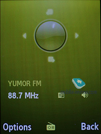
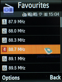
FM-radio. You can store up to 20 radio stations in the memory; the range of available frequencies is 87.5-108 MHz. Also, you can enjoy auto-tuning, but particular channels cannot have own names attached – they are always shown as the frequency numbers. The radio can work in handsfree mode, plus it enables you to set it up as an alarm clock, but regardless of how you are going to use it, a plugged-in headset is a must, since it doubles as an antenna. The radio implementation is fine, although it doesn’t pick up all stations equally well, but on balance, it is quite competent in comparison to other vendors’ offerings. The radio can be minimized.
RDS here displays only the station’s name in the general list, no advanced options available.
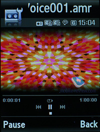
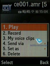
Voice recorder. You can record up to several hours of voice memos with the number of files being unlimited. Basically, limitations on recording duration are set by the user himself, though length of a single recording cannot exceed 1 hour. All the files are stored in a separate folder in the memory bank. The recorder performs well during lectures, conferences and presentations – I could even say that it is a partial substitute for a digital tape recorder.
Image editor. A basic picture editor, which allows transforming images by using a variety of tools.
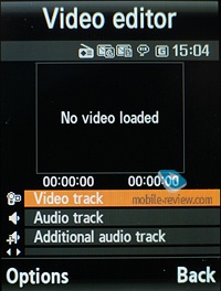
Video editor. Allows editing video clips and overlaying of sound tracks. The most basic of editors makes its first appearance with the G800.

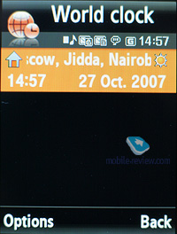
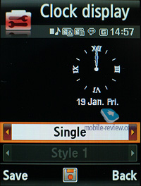
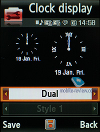
World time is displayed for two chosen cities.

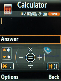
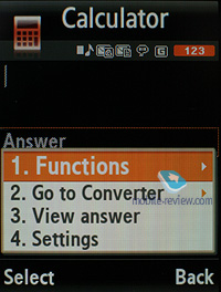
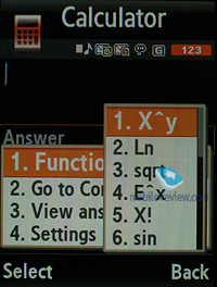
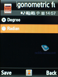
Calculator It divides, multiplies, subtracts and adds and does several more things – quite enough for a mobile calculator.
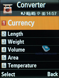
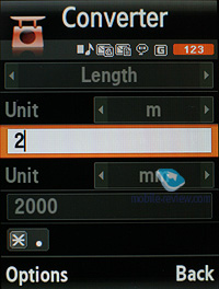
With the converter, you can operate with different units of measurements as well as with a number of currencies.
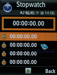
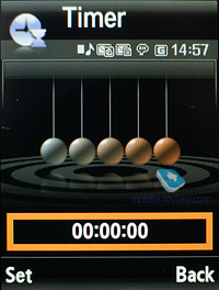
Countdown time and stopwatch have no bells and whistles.
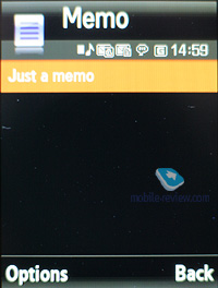
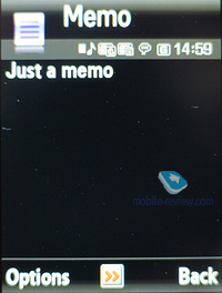
Memo – standard text notes.
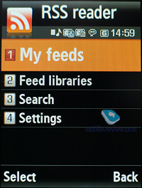
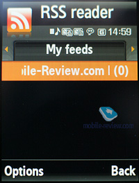
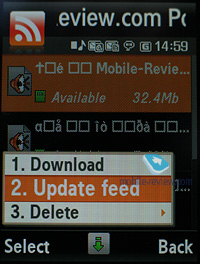
RSS Reader. This is a stand-alone utility for RSS feeds. However, it would make more sense if the RSS Reader was bound up with the web-browser, but this is not the case with the G800. This way, RSS links are not picked up by the browser, or sent directly to the application. You will need to manually submit a channel address in this app to subscribe, or enter a web address and let the application try to find an RSS channel on it.
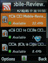
While uploading your news feed, the G800 can upload text, as well as video and audio files, and it is up to you to set the size limit (by default – 5 Mb per file). Regrettably, there are no scheduled feed updates available, thus you will need to refresh the feed manually every time you need hot news.
Obviously with this application Samsung is having a first go at this field, and the truth is, it is not really functional or appealing the way it is in the G800. Similar solutions found in the phone from other makers pack more punch and are easier to manage..
Java World. The handset comes pre-installed with 6 games, of which 2 are fully functional (Bobby Carrot, Time Rider II), and four are demo-versions (limited by time or levels). These demos are quite fetching, these can be Asphalt 2 Urban GT, Midnight Pool, Minigolf, Tetris and so on.
The memory volume assigned for Java-applications is unlimited, at that you can remove any of the pre-installed games and upload new over the air (via WAP). Heap size can’t exceed 2 Mb, while the application can’t go over 1 Mb.
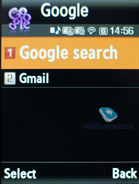
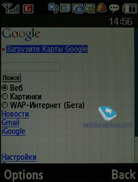
Google. A stand-alone menu item for accessing Google search and GMail. Generally, the same things are available with handsets from other manufacturers, except for a dedicated menu item. In my judgement, this is nothing more but a marketing trick, however I can’t see anyone shouting “I have Google in my phone!” Who might find this feature essential in a phone?!
Back to the table of contents >>>
WAP
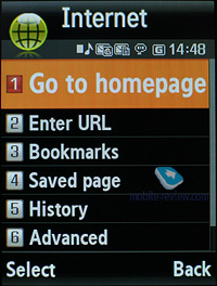
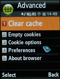
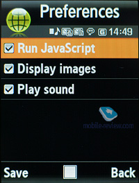
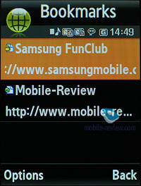
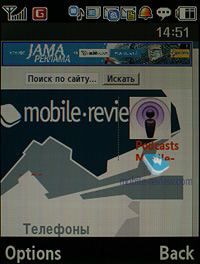
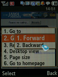
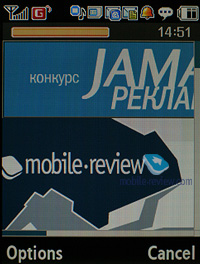
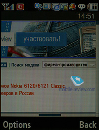
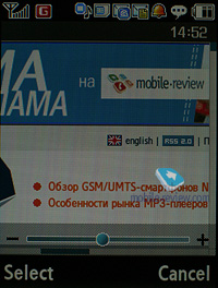
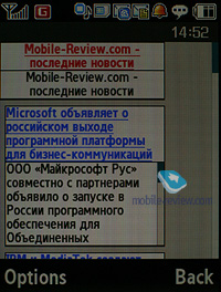
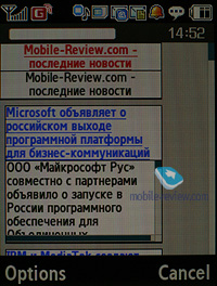
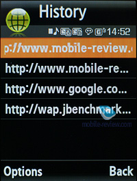
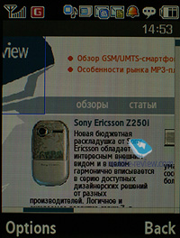
The handset comes with a wap-browser version 2.0 (NetFront 3.4), where apart from JavaScript support, fonts scaling (three types), Smart-Fit (single-column view), full-screen mode (all controls are hidden), page caching, they have embedded a new feature – on-screen ‘mouse’ pointer. Much like Nokia’s S60-powered handsets and Opera Mini, you can view pages with a tiny navigation window displayed. The browser itself packs a lot of goods under the hood and will be appreciated by most users.
Video, browser (mpg, 19,7 mb) >>>
Unlike the previous models, which used Picsel Viewer for browsing office documents, the G800 employs the bundled browser for these purposes. What we really like about it is that the user can perform local search within a document (any language). While it is a tad sluggish compared to Picsel Viewer, it is still pretty easy to handle. Personally, I couldn’t make up my mind on which solution I liked better – both of them have their strengths and weaknesses.
Back to the table of contents >>>
MP3-player
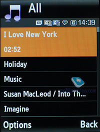
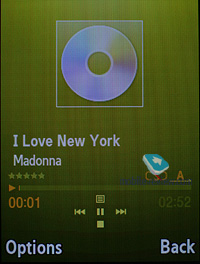
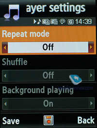
The integrated mp3 player, supporting random, sequential and cyclic playback, is available on the phone. Mp3 files can be uploaded onto the handset both directly over Bluetooth and through the synch application or Windows Media Player. There are no limitations placed on tags and names of music files. Bitrates are also not something that really matters – the handset easily deals with all available formats and supports WMA, AAC, eAAC, eAAC+.
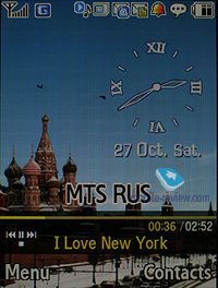
The title of the currently played back track is displayed as well as the number of the remaining tracks. No equalizer is embedded in the G800. Your tracks can be played through the stereo headset as well as the speakerphone. The volume bar has 10 scales on it. And of course the user can make up their own playlists. Player can work in minimized mode – in this case the display will show current track title and music controls, which is a good thing.
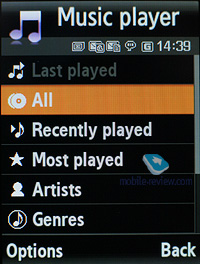
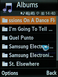
The player boasts the following filters: all tracks, recently players, most popular, artists, albums, genres and composers. The G800 also sports Album Arts support.
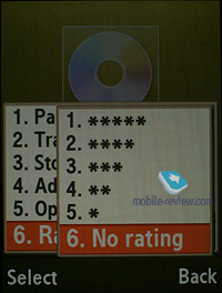
Speaking of new options, the player has obtained the rating system, enabling you to award any track with one to five stars. The maker has driven the integration with Windows Media Player as deep as it has never been before; actually, this manager also sports the rating system.

The bundled headset doesn’t have a jack for plugging in own earphones, yet provides quite adequate sonic experience. Generally speaking, as a music-minded solution, the G800 comes close to Sony Ericsson’s Walkman range, especially as far as the first generation is concerned.
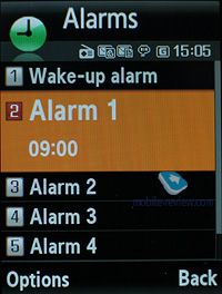
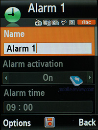
Alarm clock. The handset comes equipped with four alarm clocks, each of them can go off on certain weekdays. You can also pick one of the five tunes, or turn to MP3 tracks. In settings it is possible to enable auto power-up when any event triggers.
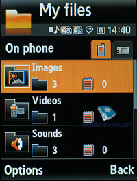
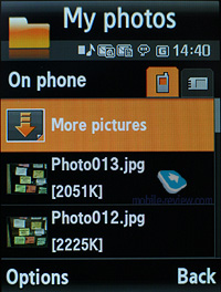
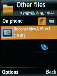
File Manager (My files). That’s the place to search for all files such as music, pictures, video and sounds. Any uploaded file gets stored here. The disadvantage is that files sometimes are not displayed in the list immediately - in that case you will need to leave the menu and enter it again.
Files and folders can be viewed either as a list or thumbnails. You can mark any number of files. The handset supports Move, Copy and Delete operations, as well as various types of sorting (by type, name or size).
Memory card’s file structure is a slightly different story, as it can be accessed through the main menu, where each item features “Memory card” option.

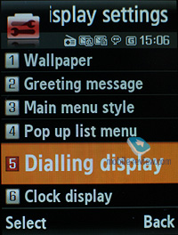
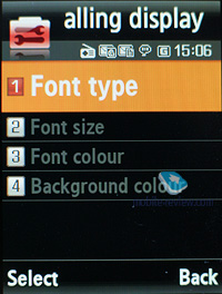
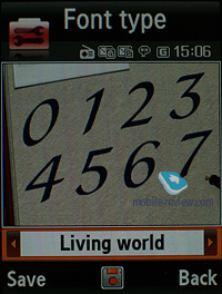
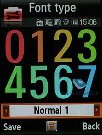
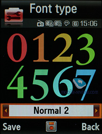
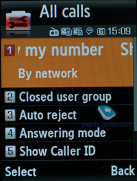
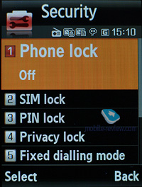
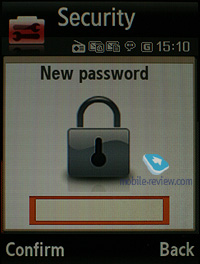
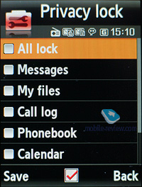
Settings. Traditionally this item boasts a standard set of options inside like password protection of selected sections (messages, short messages, organizer, etc.), backlighting duration and brightness, dialing display settings (no custom animations are available, one is assigned to the default theme – uWorld).
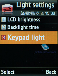
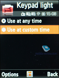
Keypad light – there are three options at your disposal, one of them is Night mode, implying that backlighting will be active only between 5:00 PM and 9:00 AM and disabled during daytime. If you come to think of it, this feature is nothing more but an illusive replacement for ambient light indicator, which Motorola’s handsets are armed with.
Profiles – the G800 comes with a fully functional system of profiles, including Flight Mode. Every profile is customizable – you can pick ring tone, incoming message alert and adjust the volume level.
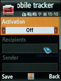
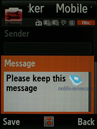
Mobile Tracker – submit a phone number, where notifications will be sent to in case SIM-card was changed – that message will contain number of the SIM-card being used with the handset. This section is protected with password, so that no one other than you or someone else who knows the password could disable the Tracker. Should your device have the SIM-card switched once, the specified number will receive one message instantly, and one more each time a new card is plugged in. A fetching feature which can prove to be of much help in case the handset is lost or stolen.
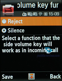
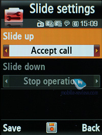
Slide action settings item features options which can be assigned to opening and closing. In other words, they determine whether the slider is active or not.
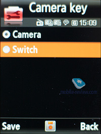
The camera button can be set to toggle between applications while at the standby screen – this doesn’t mean the G800 supports multitasking. That’s just because, like any other Samsung-branded 3G handset, the G800 provides one-touch access to messaging and calls.
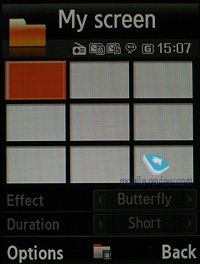
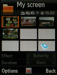
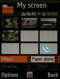
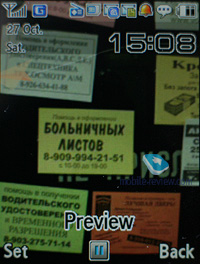
Apart from the standard set of wallpapers for the standby screen, you can make up animated wallpapers of your own, and it doesn’t take a rocket scientist to create one. All you need are 9 snaps, then you adjust time spans between different frames and transition effects (there is a slew of them available, like Butterfly, Paper place etc). And the animation you get is pretty amusing; it will work on the standby screen as long as the display is on.
Video, user-created animated wallpapers (mpg, 17,4 mb) >>>
Back to the table of contents >>>
Impressions
The reception quality put up by the G800 is in line with other Samsung-branded devices. The ringtone volume is quite decent, as it can be heard in various environments. The silent alert is average strength-wise, no significant improvements have been made here.
The G800 is certainly a mixed bag. While it really resembles today’s digital compacts design-wise and claims that it can shoot just as well (xenon flash, image stabilizer, optical zoom), its real picture quality is pretty much identical to the more affordable Samsung G600. It turns out the only thing going for the G800 is its advertising campaign. But will they be able to get it popular? I don’t think so. While the G800 goes for about as much money as the Nokia N95, the latter sports a number of trumps – that is, WiFi, GPS-receiver and its smartphone functionality with more punch on offer, which makes it not an imaging-centric solution, but a mobile powerhouse.
The main problem with the Samsung G800 is that this device is pretty late to the market – Samsung’s attempt to create an imaging-heavy flagship is quite interesting, however they have bumped into the fact that they can’t back it up with a real leap up in terns of quality. That’s why you might wonder why would someone need to drag along a huge phone that is no better than its slender sibling (the G600), yet retails for more? While these two phones are pretty much identical functionality-wise, the price gap between the G600 and the G800 makes around 130-140 USD – the latter starts shipping late in November for 750-850 USD.
The Samsung G800 has neither direct nor indirect rivals from other brands, being a mere niche-aimed solution. This phone should end up on your short-list if only you are a man fond of unusual things and don’t want to be “like everyone else”, yet with no particular interest in superb image quality or extra abilities.
Speaking of promising features, there are user-manageable wallpapers available with the G800. But The rest of the feature pack found in this phone is mostly standard Samsung fare. On top of that, some of its abilities have been downgraded when compared to the previous models (no handset-wide search, for example).
Related links:
Back to the table of contents >>>
Eldar Murtazin (eldar@mobile-review.com)
Translated by Oleg Kononosov (oleg.kononosov@mobile-review.com)
Published — 31 October 2007
Have something to add?! Write us... eldar@mobile-review.com
|
News:
[ 31-07 16:21 ]Sir Jony Ive: Apple Isn't In It For The Money
[ 31-07 13:34 ]Video: Nokia Designer Interviews
[ 31-07 13:10 ]RIM To Layoff 3,000 More Employees
[ 30-07 20:59 ]Video: iPhone 5 Housing Shown Off
[ 30-07 19:12 ]Android Fortunes Decline In U.S.
[ 25-07 16:18 ]Why Apple Is Suing Samsung?
[ 25-07 15:53 ]A Few Choice Quotes About Apple ... By Samsung
[ 23-07 20:25 ]Russian iOS Hacker Calls It A Day
[ 23-07 17:40 ]Video: It's Still Not Out, But Galaxy Note 10.1 Gets An Ad
[ 19-07 19:10 ]Another Loss For Nokia: $1 Billion Down In Q2
[ 19-07 17:22 ]British Judge Orders Apple To Run Ads Saying Samsung Did Not Copy Them
[ 19-07 16:57 ]iPhone 5 To Feature Nano-SIM Cards
[ 18-07 14:20 ]What The iPad Could Have Looked Like ...
[ 18-07 13:25 ]App Store Hack Is Still Going Strong Despite Apple's Best Efforts
[ 13-07 12:34 ]Infographic: The (Hypothetical) Sale Of RIM
[ 13-07 11:10 ]Video: iPhone Hacker Makes In-App Purchases Free
[ 12-07 19:50 ]iPhone 5 Images Leak Again
[ 12-07 17:51 ]Android Takes 50%+ Of U.S. And Europe
[ 11-07 16:02 ]Apple Involved In 60% Of Patent Suits
[ 11-07 13:14 ]Video: Kindle Fire Gets A Jelly Bean
Subscribe
|
