Symbian^3 – Main Applications and Features
Contents:
- Preface
- Interface
- Home screen
- Contacts and Phonebook
- Call Log
- Messaging
- Calendar
- Profiles
- Music
- Photo
- Video
- Video Editor
- Search
- Applications
- Settings
- Browser
- Conclusion
Preface
In October of 2008 you could read the article about S60 5th edition, which was the first Nokia experience in touchscreen phones segment without taking into account dead end trends in the past. S^3 will be released in September of 2010, almost two years after its predecessor. The Symbian Foundation treats it as the intermediate link before S^4 is launched at the beginning of 2011. That is if the deadline stays unchanged. The release time for S^3 was postponed several times, because Nokia did not invest enough into the platform development as resources were allocated to other projects, first of all, the services. Unfortunately, the speed of development for Symbian is the slowest on the market and the key task here was to eliminate the mistakes from the first Nokia OS for touchscreen models. Let's look at specific details:
- One click operation. Many current models require clicking on the field, choosing it and then clicking again to perform an action. Now two clicks were replaced by one as it is the case in the majority of modern OS.
- Gestures support in the better part of applications – home screen, gallery, video, etc. It is hardly a breakthrough as similar functionality is to be expected from the modern phones and they usually offer it. Once again Symbian will be playing a catch up game with the rest of the field.
- Faster UI due to hardware acceleration for better lists scrolling, content download, etc. This just brings the phones in line with the modern market requirements.
- Better use of RAM – see above. Again this is a mere correction of mistakes.
- Additional home screens for widgets and an opportunity to install one widget several times (for example, to have weather forecasts for different cities). Yet again, we see nothing new here as Android offers five home screens, while Bada has up to ten of them, and the majority of Samsung handsets feature no less than three home screens.
- Updated design of the music player.
- HDMI support with the display of multimedia information on supported devices (if the latter have the necessary slot).
- Integration of the music store with radio when you can learn the name of the performer and add it to the shopping cart, which is not a revolution.
May be I overlooked something, for example, old-fashioned menu icons or arbitrary breakdown of applications by folders and sections, but S^3 has no other significant differences.
(Features review of S^3 is based on Nokia N8 and we do not mention the software issues or bugs of any particular firmware. All drawbacks described here are inherent shortcomings of the platform and do not depend on the software version or the phone model).
Back to the table of contents >>>
Interface
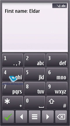
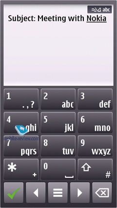
Unlike S60 5th Edition you can choose any straightforward feature with one tap. If the field allows the editing of data the keypad appears instantly and you can implement the necessary changes.

You can scroll through any list using the scroll bar on the left; on top of that, the faster you slide across it, the faster it will go. In case there is no text whatsoever (such as in the Contacts menu, Messaging, etc), you can tap at the bottom of the screen to scroll it down and vice versa.
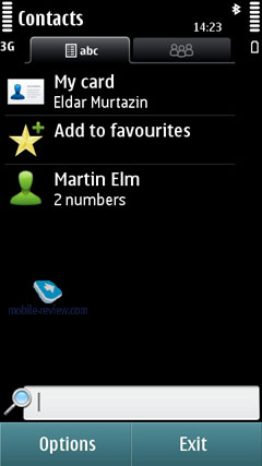
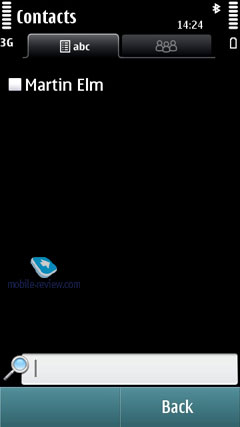
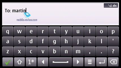
In lists with names you can search by first letter - for example, if you need to jump right to someone with "Murtazin" in the entry's last name, simply pull up the thumbboard and tap "M", the phone will draw up a list with all matching contacts pretty quickly. Then, should you need to punch in the second letter, you will be offered a reworked list, in that it'll contain only letters that follow "M" in the entries the phone has already found. All in all, over our quality time with the system I've grown to like this search engine, as usually it doesn't take more than one or two taps to locate the contact you need. The system puts contacts whose names are written in the interface's primary language on top. The best thing about this contact list is that it allows searching only among the first letters that you do have among your contacts, so you won't be stuck with the entire alphabet on your hands.

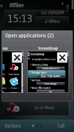
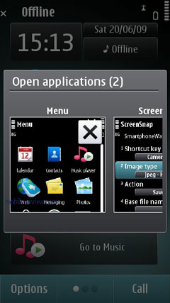
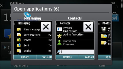
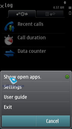
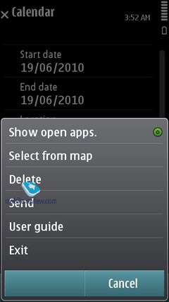
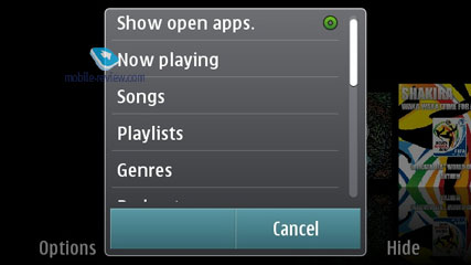
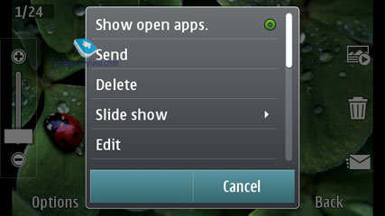
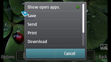
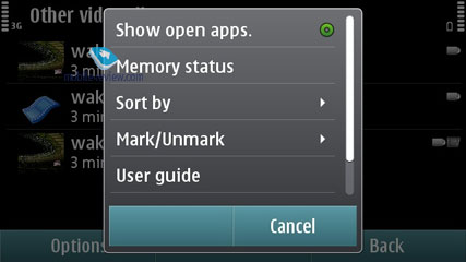
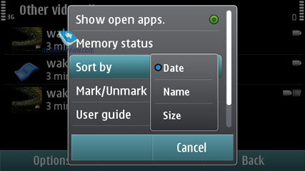
To call up the list showing all open applications, tap and hold the central button, or just pick this item in all Options menus around the phone. Jumping between these apps is done by hitting the central key again or simply by touching the thumbnail you need on the screen.


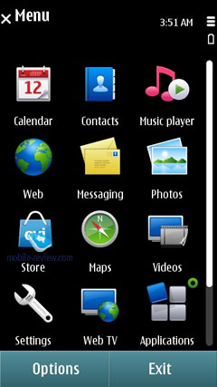
All menu items where you have some applications running in the background are displayed with a notable dot in the top right corner.
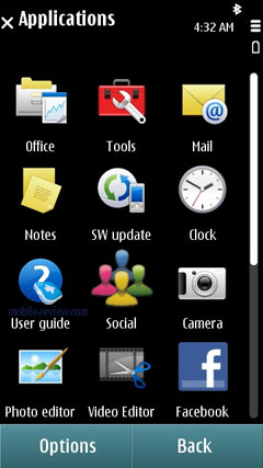
You are free to sort any item found in the main menu, as well as choose the view you like - a grid or a plain list. Regrettably, while you can create new folders in the menu and move any application into them, there is no way to assign custom icons to them. You can transfer the applications you have to these folders.

Animation effects used in the main menu depend entirely on the theme you are currently using. The icons remain unchanged from the previous version, which can hardly be considered as a way forward. They look outdated and the first thing you are likely to do when you will start using S^3 is to find and download a nice looking theme offered by the third parties.
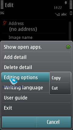
You can copy and paste text in all menus, meaning that you will be able to paste text fragments into any field. To select a word all you need to do is swipe you finger across it, which is actually the reason why you can't scroll by dragging the page up and down with your finger tapping the middle - the phone thinks you are trying to select a text fragment.
Back to the table of contents >>>
Home screen
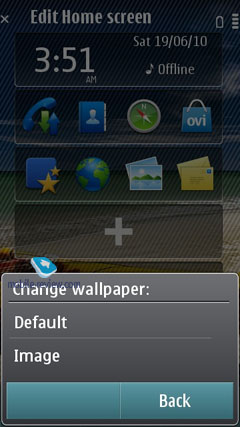
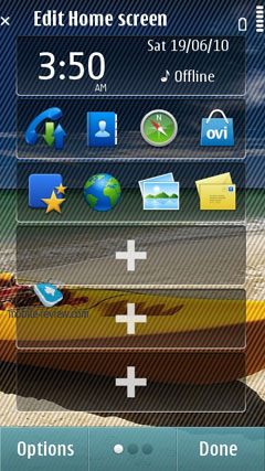
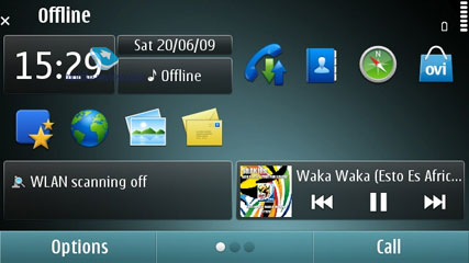
In the standby mode you can access three home screens and switch between them by scrolling. This feature is new for S^3, but has been already used in almost all touchscreen models from Samsung, LG and Android handsets with the number of home screens ranging between five and ten. In S^3 you can choose wallpapers for every home screen.
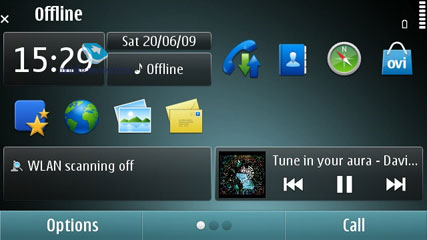
The working surface hosts the widgets, which appeared on Nokia N97 for the first time and now become the integral part of the platform and are available for all models. One widget can be located on different screens and this is the only difference. Below I describe the way they work.
The screen has areas for shortcuts, links to access applications and features or information on weather, text messages, mail, RSS and so on. One home screen can have up to 6 widgets.
In the standby mode the widgets use the network connection and are updated. You can always have access to the current weather, stocks quotes and updated RSS. You can disable the updates, if you are in roaming.
The main issue with widgets is that useful information for online ones is given only in two lines. When you use the e-mail widget you can see just the last two messages, which makes no sense. The companies supporting the use of widgets have come to the solution when you have no more than one or two widgets on the home screen to provide the maximum amount of data (Twitter, Facebook and e-mail). Only then widgets become really useful.
Contacts widgets (scrollable) are useful as well as the applications list and weather. All network widgets cannot be used on a daily basis, they serve as shortcuts and not the independent applications, which makes it pointless to waste traffic on them (weather and currency exchange rates are necessary and may be you can find one more couple of handy widgets, but that is all).
The idea of the home screen in Symbian looks a bit simplistic and definitely loses out to Android and Bada.
Caller ID picture. The S^3 manages to render a huge caller ID picture on the screen when receiving a call, along with several keys for very basic interactions with the phone while in a call. During the talk time the caller picture becomes smaller and is shown in one line with its name, which looks quite stylish.
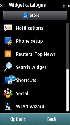
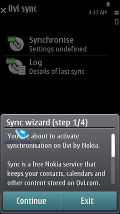
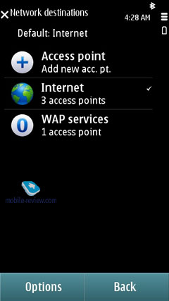
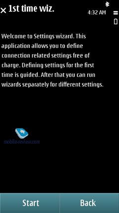
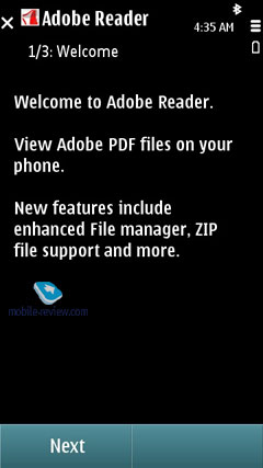
Settings Wizard. On the system's first boot you will be presented with the Welcome application that will walk you through an interactive guide (which is more of an ad, really), setting up GPRS, MMS, Internet for your carrier, transfer data from another phone (Transfer), including application settings.
Back to the table of contents >>>
Contacts and Phonebook
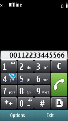
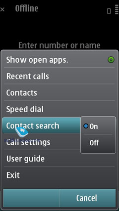
In the standby mode you just have to choose the letter and the phone will offer the first phonebook entries with this letter and the wrong names will be filtered out. This useful name search during calling was introduced in Eseries, but is now available for the whole platform.
The dedicated social networks key was added and the phone may choose the name in Facebook or Twitter and immediately displays the latest events and entries there. This feature works only through Nokia server (you will need to have an account), which is a kind of an intermediary. The same solution was implemented in Bada, but the number of the social networks on offer is considerably lower for Symbian, at least for the time being.
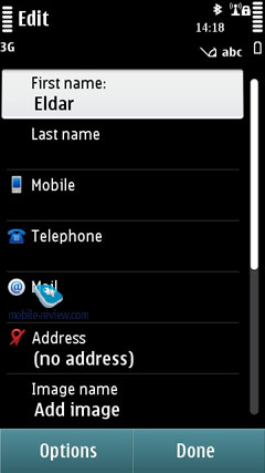
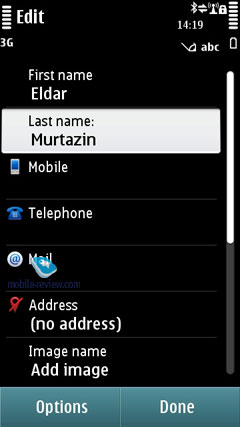
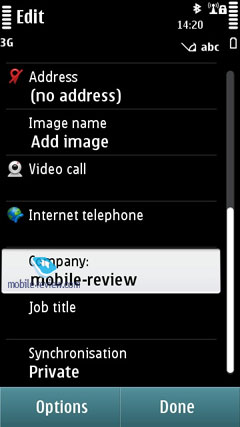
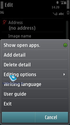
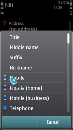
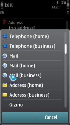
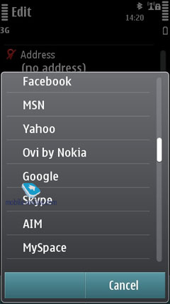
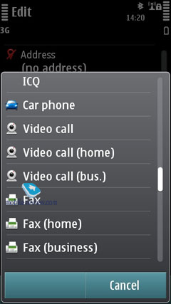
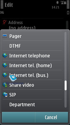
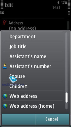
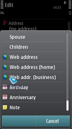
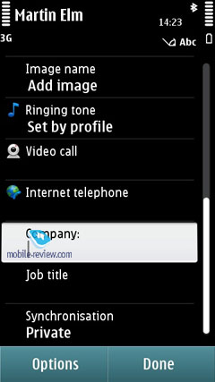
The phonebook allows for a nearly unlimited number of entries with the available memory volume being your only limitation. For each contact you can submit First and Last names (two fields), Company Name, Job Title, Phone Number, Mobile Phone, Fax, Email Address. If you still don't feel content with the default fields, you may add any number of new fields (including address, email address, web page, etc). Every entry can be expanded with a lengthy text note and an image that will be displayed upon an incoming call (full-screen). Finally, you can rename any of the available fields; for example, transform Job title into Birthday and back. In the general list you can search for contacts by typing in full names, rather than first letters alone. Also displayed in the general list are thumbnails of photos assigned to contacts (when hovering over a specific entry).
For every contact on the list you can setup default phone numbers and email addresses, meaning that if you have 5-6 numbers in one entry, one of them will be automatically dialed whenever you want to make a call - this way, you will be able to submit phone numbers as you go and then pick the most frequently used ones.
Call alerts can be personalized for every contact. The general list may feature entries stored on your SIM-card as well; the list can also be sorted by First or Last name.
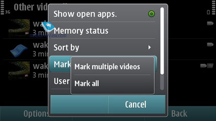
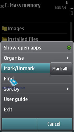
It also offers contact groups, which ring tones can be customized as well. What is more, any given contact can be assigned to a couple of groups at a time. In any list (calls, messages, etc.) you can choose all entries from the menu or check the necessary ones.
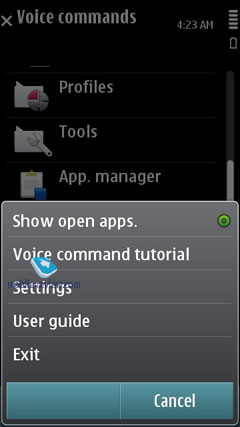
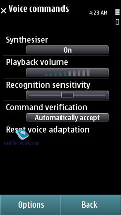
Voice dialing requires no prior training or voice tags - the system figures out what names are written in English and adjusts to the pronunciation of an average person (voice recognition works for other languages as well). Should you run into some problems with voice dialing, you can always switch into the learn mode, so that the system could adjust to your individual voice features. The phonebook's menu packs in a handful of tooltips on how to use the voice dialing. For example, it hints that in order to make a video call, you will need to speak out the name and add "video" at the end.
The contact list has nothing against showing duplicated entries or copying of an already existing contact.
You can create a backup of the contact list either on the memory card or in the handset's internal memory. For PC synchronization PC Sync is used, which painlessly synchronizes contacts with MS Outlook and other applications. You can also go for local synchronization over Bluetooth with another phone or mobile device.
Back to the table of contents >>>
Call Log
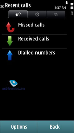
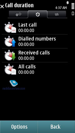
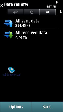
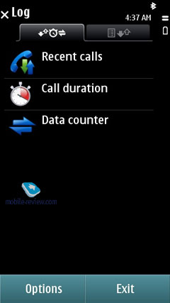
This menu allows the user to browse missed, incoming and outgoing calls; what is more, it is up to you to set how long these entries will be kept intact (by default - one month). Every entry in these lists has the following information attached: call type (voice or data), duration, date, time and phone number (if identified). Calls can also be filtered by type (data, GPRS, voice, incoming, outgoing, etc). On top of that this menu keeps track of total calls duration and cost. During calls you will see call duration displayed on the screen. As soon as you hang up, the phone will show you call's total duration (this feature can be disabled).
Back to the table of contents >>>
Messaging
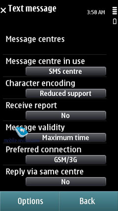
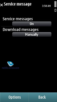
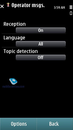
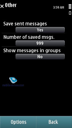
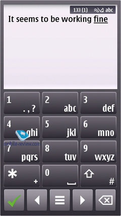
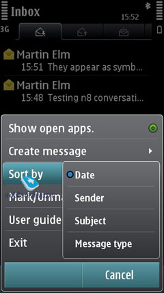
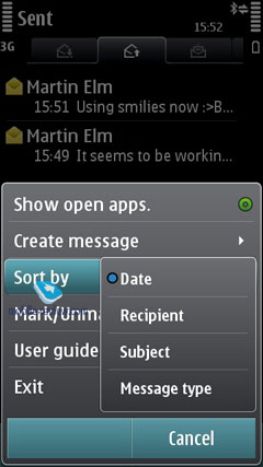
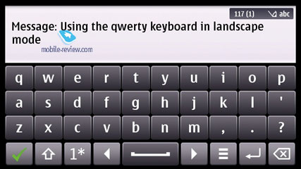
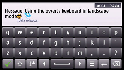
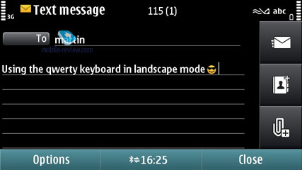
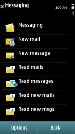
The system now has only one stand-alone message type - Audio Messages (some sort of MMS), whereas both SMS and MMS messages are composed from the same menu item (Message). Depending on whether it is only text or text and multimedia you are putting in, the system will automatically figure out the format it should send your message in. With the help of the context-sensitive menu you can throw in various types of content, in this case the message type will change automatically.
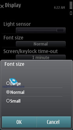
The user is also enabled to tweak the font size (Large, Normal, Small), altering how text looks on the screen, but this option has nothing to do with the message itself, just the way you see it.
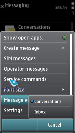
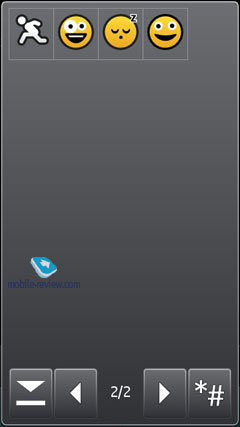
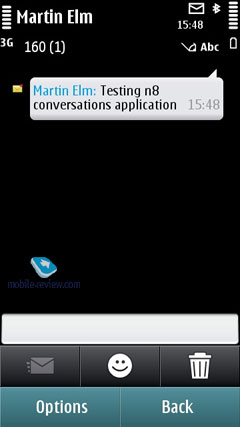
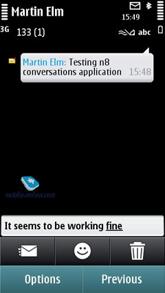
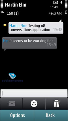
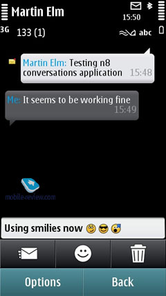
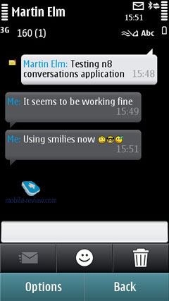
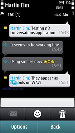
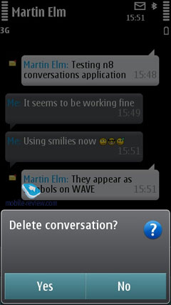
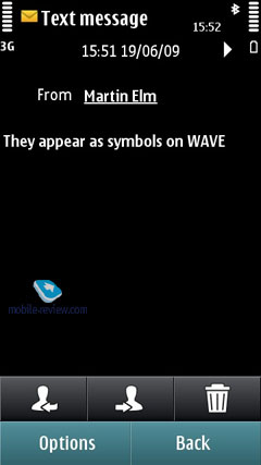
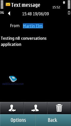
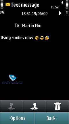
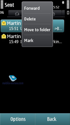
One new feature was added here and now you can choose the messages display mode – traditional or chat (Conversations). In the chat mode you can delete separate entries and handle them in general (save, forward, etc.)
Apart from short messages, you can also take advantage of email (POP3/IMAP4/SMTP/MIME2). Moreover, the user is allowed to make up templates for all message types - the system comes preinstalled with 11 for SMS.
Mail client supports HTML, which is an additional version of Nokia Email Client and this solution is enough for the majority of users.
Composing an email letter, the user can decide whether "Subject", "Cc", "Bcc" fields will be displayed or not (choice is available for every field). Additionally, the client now features "Priority" field (Low, Normal, and High). To the body of the message you can attach any files, including those that are not supported by the device. The system can automatically monitor mail boxes for new messages, on top of that the user can setup the email retrieval time (day, time). You can also set whether you want to have whole messages uploaded or only certain parts (limit set in Kb), or you want to retrieve headers only. Push Mail (only via IMAP IDLE) is supported. On top of that, you can pick the folders on an IMAP server you will need to synchronize with your phone.
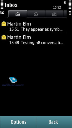
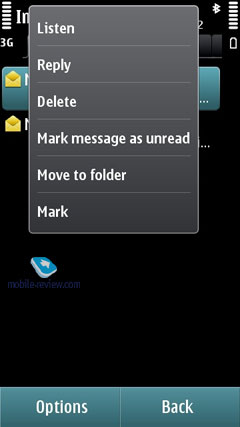
The Inbox folder contains all messages received on the device (merged list), as well as files received from other devices over Bluetooth. There are also separate folders for every email account you have on the phone. Moreover, all letters are sorted by day, which is quite convenient, and are presented in the rolled out thread.
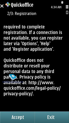
Sync Mail support was added as well and all messages in this account will be synchronized with your device. In general the mail uses Nokia Messaging servers to provide Push features. Viewing and editing of office files on Nokia phones are available with the help of preinstalled and fully functional QuickOffice.
Mail client can also boast IM functions (IM+) with the following supported standards – OVi Chat, Yahoo, AIM, Windows Live, Gtalk and MySpace.


Back to the table of contents >>>
Calendar
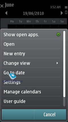
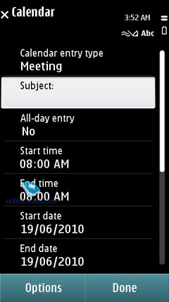
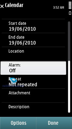
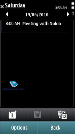
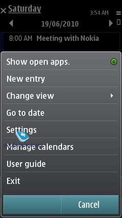
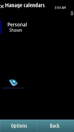
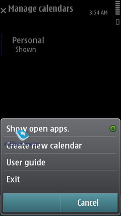
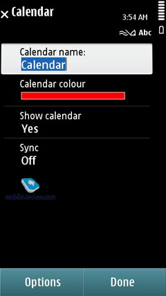
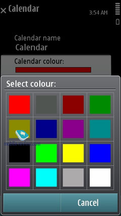
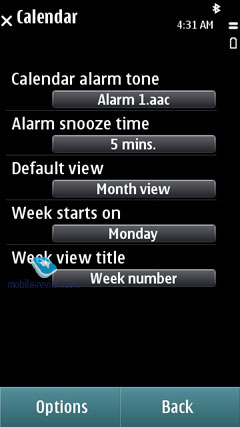
Calendar functions have been boosted by an option to merge several calendars in one location (it can be OVi Calendar or any other calendar you have and they are highlighted in color). You can create your own calendar and disable its synchronization with the server (this is done via SyncML as the calendar has no tools for quick synchronization adjustment with network resources). You can now choose the location on the map as well (OVi Maps).
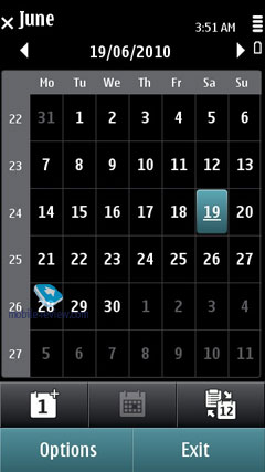
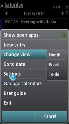
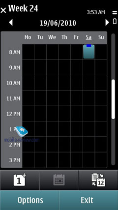
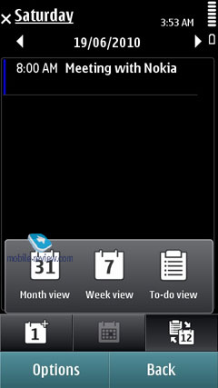
There are several calendar views available - month (days with arranged events are marked with triangles in the bottom right corner), week (shows days broken down into hours), and finally, day (hourly view as well).
In the weekly mode you see tips only for one selected event.
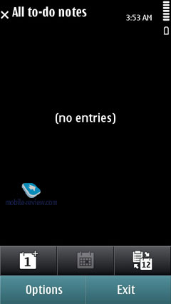
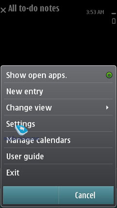
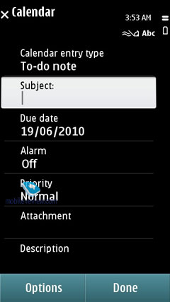
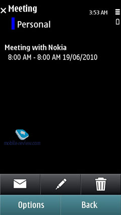
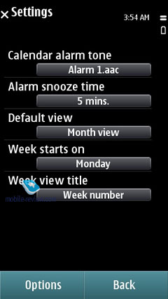
Two event types are supported: Meeting and To-Do. For every event you can setup an alarm tone (may be repeatable too). For To-Do list you can view all events from one location. Some entries may be marked as Private, meaning that they won't be synchronized upon a PC connection. All in all, the organizer's settings pool is nothing to write home about, but they are quite convenient for an average user. Also, it seamlessly synchronizes with MS Outlook.
Back to the table of contents >>>
Profiles
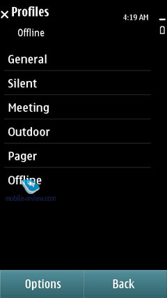
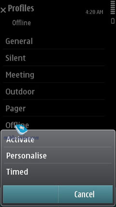
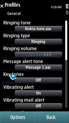
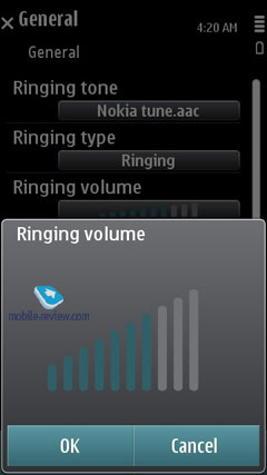
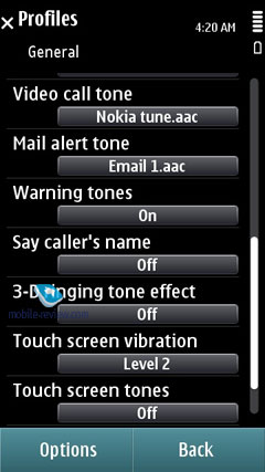
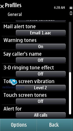
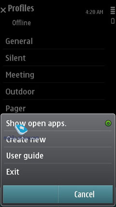
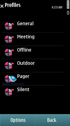
Users can activate a profile for the next 24 hours, so when it expires the handset will toggle back to the main profile, which may come in handy at times. Traditionally, profiles enable you to tune all settings that have something to do with audio: volume, ring tones, signals for messages and the calendar, vibro, etc.
Back to the table of contents >>>
Music
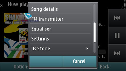
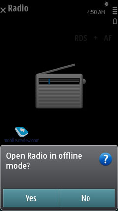
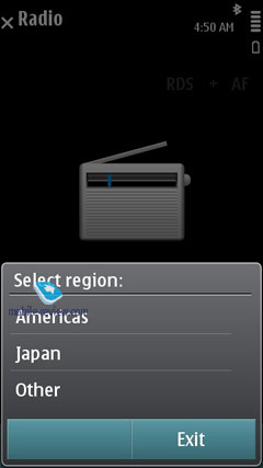
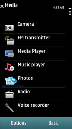
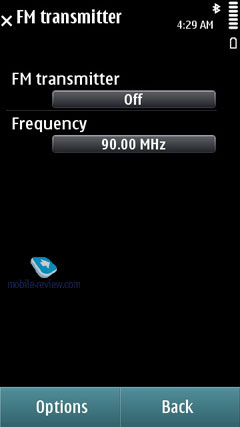
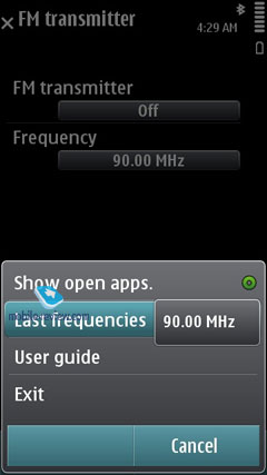
This section sports all features that have something to do with the phone's music department, including by default Music Player, Nokia Music Store, Podcasting, Radio, for some models – FM Transmitter (this depends on hardware of the particular model).
Music Player. Unlike the previous Symbian versions, which employed Media Player, from this version and onwards we will have Fusion Player (Nokia product labeled as … Nokia Music Player). Its difference is that it combines not only the music player but Video Center (it will not be offered as a standalone application any more) as well. Due to some reason the first models on S^3 have the separate Video section, though it is a part of the player. This solution was made to allow the continuity with older models in terms of main menu 12 icons.
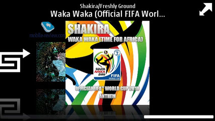
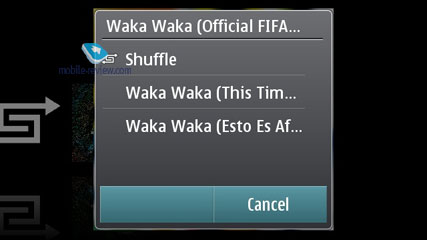
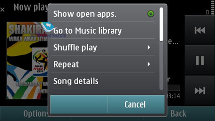
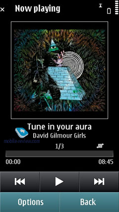
The player has a thoroughly reworked interface. It supports both the horizontal and vertical modes. The horizontal mode was definitely borrowed from Apple iPhone as it was introduced there for the first time. You can see the album covers and the list of tracks if you tap on an album. The list can be scrolled down horizontally and the tracks without tags are given under Untitled cover. In the vertical mode the album covers are also displayed – they are shown at the top of the screen with the lower part given to the tracks list. The initial list you see when entering the player is the list of performers and albums arranged in traditional Nokia style. If you press and hold you can open a popup menu to add a track or album to the playlist, delete music files or search in Nokia music store.


Unfortunately, Symbian clings to continuity here as well and the visualization is the second action and complements the usual list typical of older models. In terms of ergonomics Album Art menu just repeats the usual list, which also has albums covers. It looks beautiful, but to access the menu you need one extra action. As a result the daily phone user will have a problem, that to choose an album from the general menu is quicker than to enter albums menu and browse them there.
Home screen supports a widget with player controls keys. It's a pity that unlike the other OS here you have to place such a widget on a home screen and it does not appear automatically during the music playback. Album covers search is available only for the first letters. In the horizontal mode you have to drag the scroll box at the bottom of the screen and in the vertical mode the letters are displayed automatically (but search does not work at the time). In fact, you cannot call it a search function as it just shows the location in your music collection (letterwise).


The following formats are supported: MP3, WMA, AAC, eAAC, eAAC+, AMR-NB, AMR-WB, E-AC-3, and AC-3. For mp3 files different bitrates are supported, including VBR. During the synchronization with Windows Media Player 11 and higher you can use protected DRM files (WM DRM, OMA DRM 2.0).
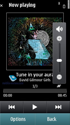
The title track and the author are displayed on the screen alongside with the controls. Forward rewinding is available. During the playback the player looks like its counterparts in the previous versions of Symbian.
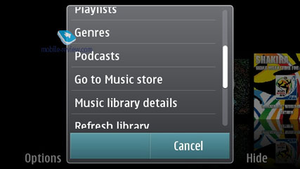
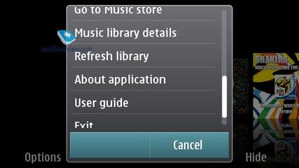
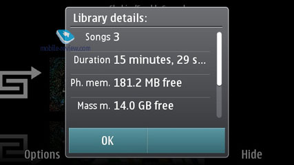
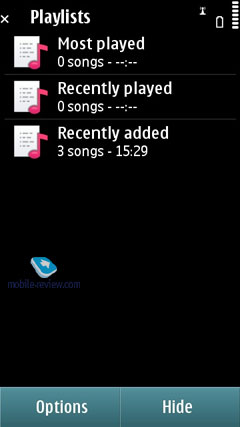
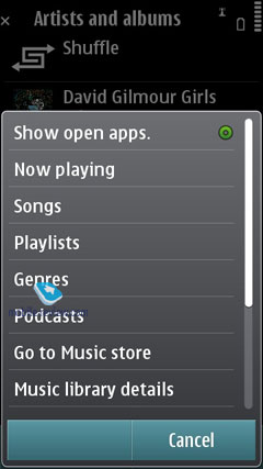
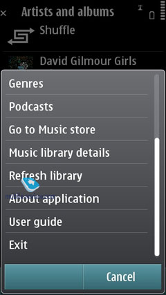
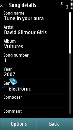
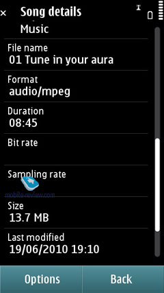
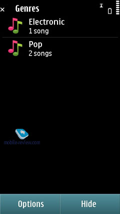
Bringing up the Music Menu allows you to browse all tracks, playlists (there are automatic ones – recently added, never played, etc.) and sort the library by artists, albums, genres and composers. The music library (or the track list) gets updated automatically on every successful synchronization with a PC via OVi Suite except if you use a memory card with pre-loaded tracks. It's worth noting, amongst all the other features, the Library Detail feature.

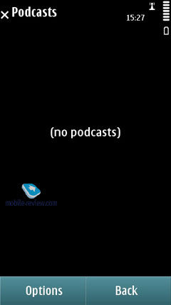
Podcasting – podcasts are an integral part of the music player, not a standalone program the way it was before. You can access the podcasts using the player menu, or you can still launch them as a separate application to gain access to the library, Nokia podcast catalog, search, synchronization setup, etc. The podcasts can be downloaded automatically; one can have different preferences for various connectivity options – i.e. the home network, specific hotspots, or setup access filters. The application is handy and quite useful in general.

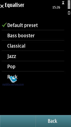
Equalizers. When the equalizer settings are modified the audio experience varies considerably. Every one of the 6 pre-installed equalizers features 8 bands and is fully user-manageable, save for the default settings. The list of presets is as follows – Bass Booster, Classical, Jazz, Pop, Rock. In the Sound Settings you can adjust sound balance, Stereo Widening and Loudness.

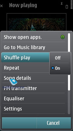
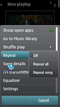
The handset has random and repeat (all or one track) playback modes.
Music store – allows you to access the OVI Music Store to buy tracks, albums and download them to your device.
Back to the table of contents >>>
Photo
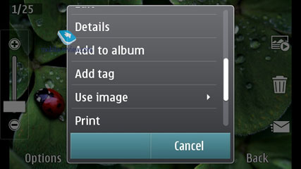
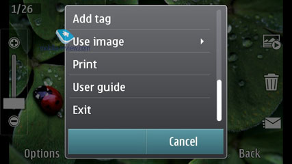
Pretty much, the application resembles the one in older devices; it distinguishes between still images and motion video (the latter is displayed in the main list, though). One can also create albums to sort the pictures or even add notes to them.
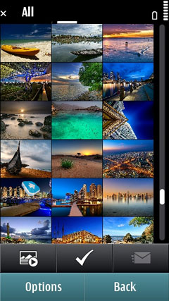
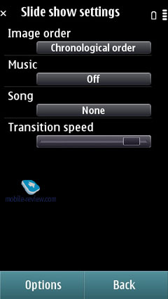
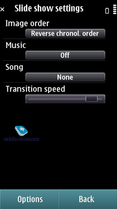
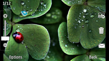
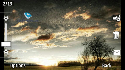
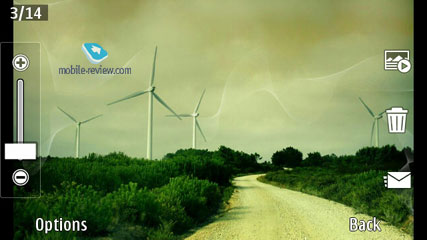
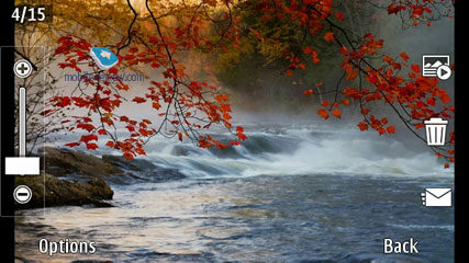
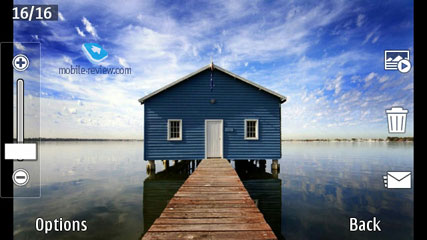
In the thumbnail mode you can select a particular image – and the name of the file pops up. A single tap opens the file. The slideshow functionality is very basic, background music, just scrolling the images. Both the portrait and landscape orientations can be used. Zooming works fast for small files thanks to the ruler display, pinch-to-zoom is supported. When zoomed in, one can use the finger to navigate around the picture; any file can be uploaded to the Web using the OVi service.


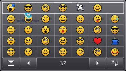
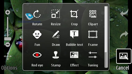
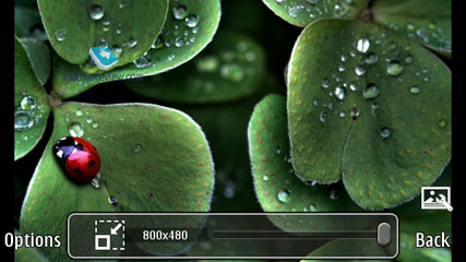
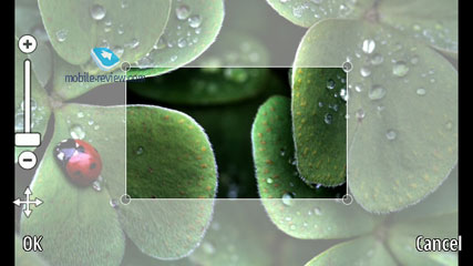
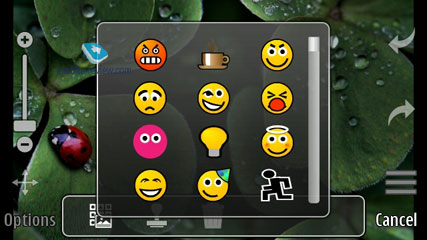
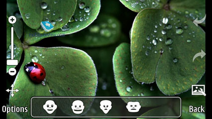
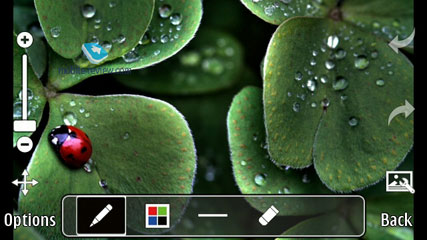
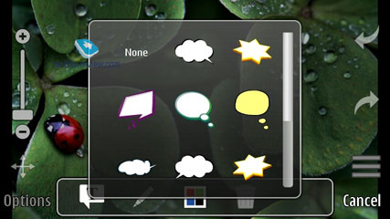
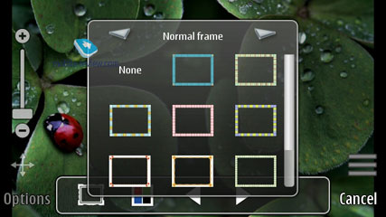
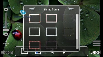
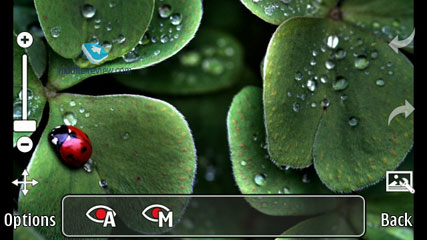
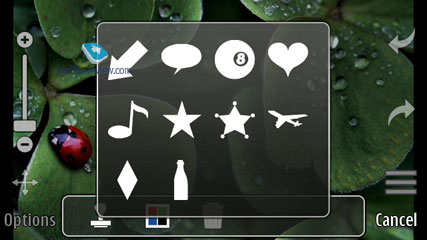
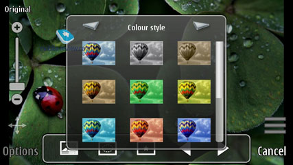
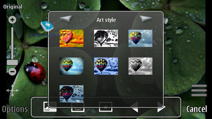
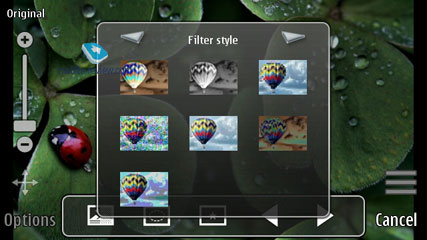
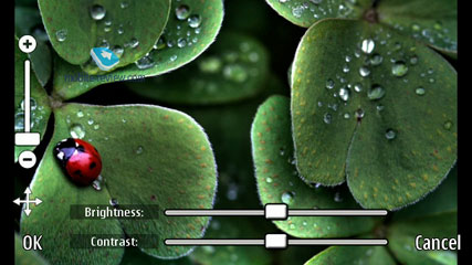
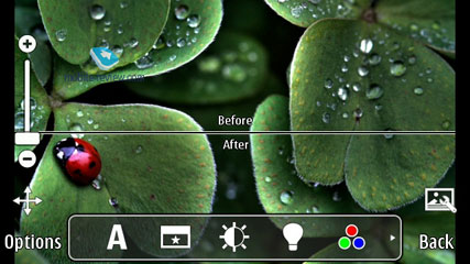
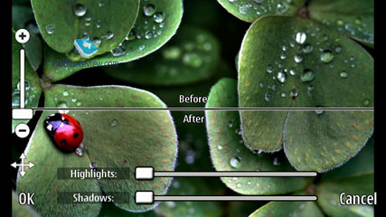
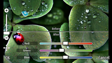
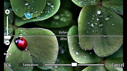
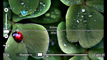
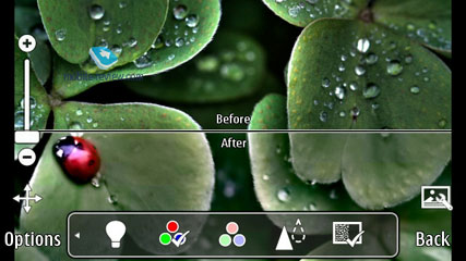
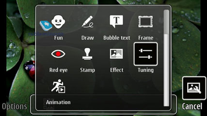
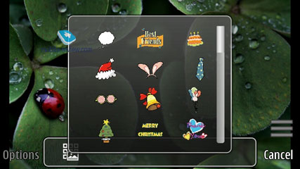
The built-in picture editor allows one to add text, clip art, and emoticons, apply various effects, change the size of the pictures and photographs. The editor has been updated; it looks interesting.


Back to the table of contents >>>
Video
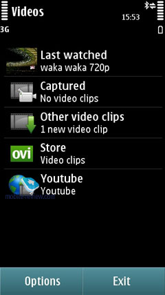
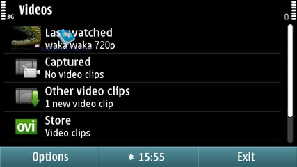
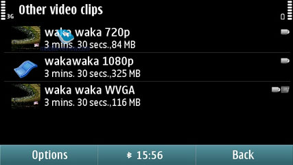
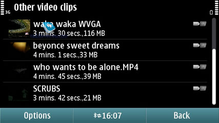
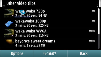
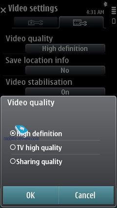
Video is a standalone section, although if taken with the built-in camera, it appears in Photo, too. The general list is comprised of categories, such as Last Viewed, Videos Taken, Other, YouTube, Ovi Store (for downloading and buying video at OVi Store). Phones with an integrated DVB-H tuner have an extra category called TV where the available broadcast channels are collected. TV recording is not supported (we couldn't find such functionality in one of the first models).


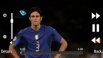
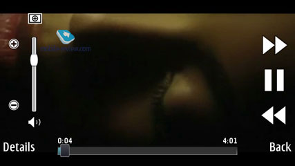
During the playback, one can change the geometry of the clip or crop the image to get rid of the black stripes on the screen edges. You can use a scroll slider – just drag it to the desired position in the movie and the playback will start from that particular moment.


The list of supported codecs is as follows: H.264, MPEG-4, VC-1, Sorenson Spark VGA 15 кадров в секунду, Real video 10 QVGA 30 frames per second. For stream feeds: H.264, Flash Lite 4, Flash 10 for video, On2 VP6, Sorenson Spark.
Unconverted DivX/XVid video is not supported; one has to buy a separate player with the necessary license for that. The reason for that is that such codecs need to be paid for, which increases the producer's costs (Samsung/LG have those built in the majority of their flagship models).


Video can be watched on external devices using the HDMI port (if the phone has one). There is also support for Dolby Digital Plus if external audio devices are connected (5+1); when the device itself is used, Dolby Mobile is not available for video or music, though.


Back to the table of contents >>>
Video Editor
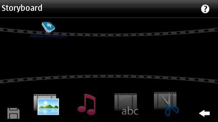
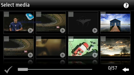
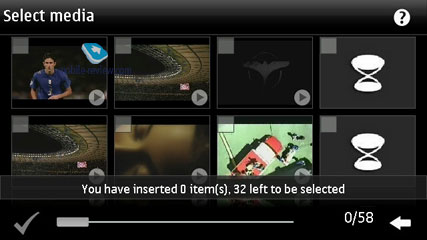
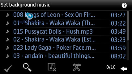
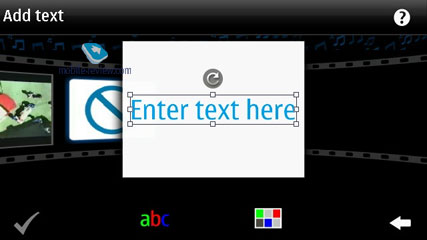
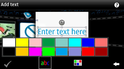
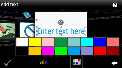
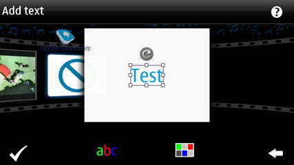
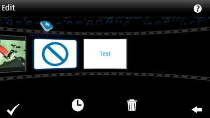
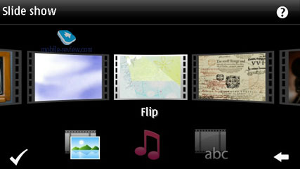
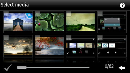
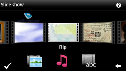
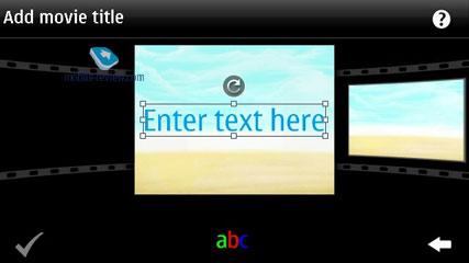
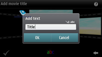
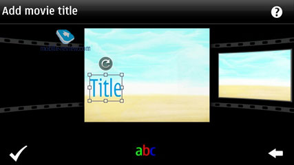
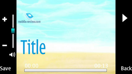
One can use the application to edit video, add subtitles and special effects, combine several clips, insert photos or create slideshows from selected pictures. It is a nice piece of software that is powerful enough for one not to use a desktop computer for the basic needs.


Back to the table of contents >>>
Search
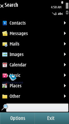
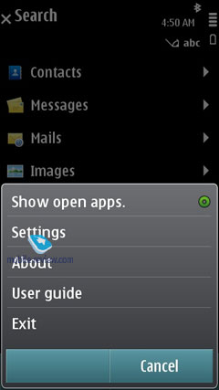
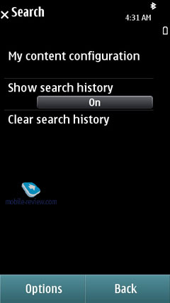
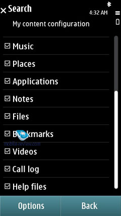
A separate utility in the menu before, it is now integrated into the phone. It marries the local search abilities and browsing. Furthermore, the search engine used in the 5th edition may vary by country – for Russia it is Yandex.ru. Generally, you can pick a search engine you like manually or keep the default one – Yahoo. The reason behind this differentiation between regions is that the maker deems local search engines better tweaked for respective countries.
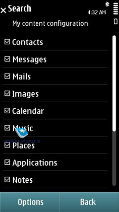
Local search is performed in all categories, which are:
- Music
- Contacts
- Calendar
- Messages (including message body)
- Email (headline and message body)
- Bookmarks
- Images
- Video
- POI
- Applications
- Notes
All you need to do is punch in first letters of a word and the 5th edition will instantly display how many matches it could find in every section, which is really handy. For the time being, Samsung-branded devices come with a quite similar feature onboard; however their search engine is somewhat less sophisticated, even though the abilities are pretty much in line with Nokia's search.
Back to the table of contents >>>
Applications
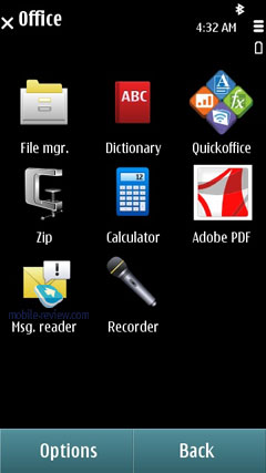
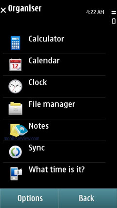
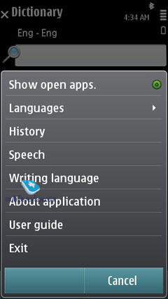
Converter – converts currencies, energy, length etc.
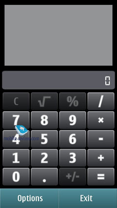
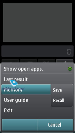
Calculator – Nothing to write home about here, only the most basic features are available.
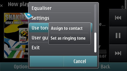
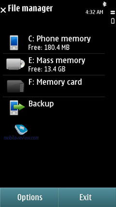
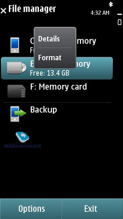
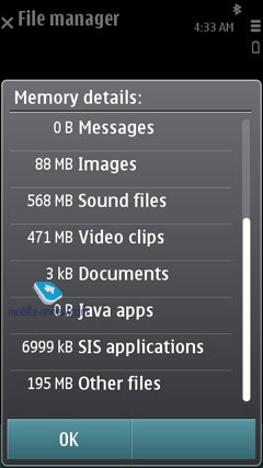
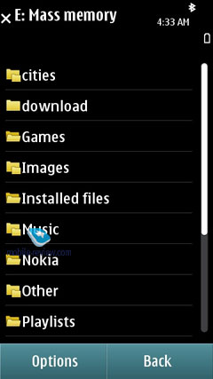
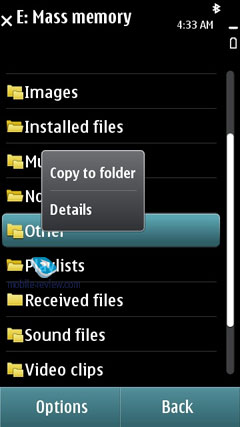
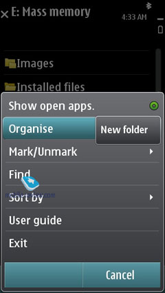
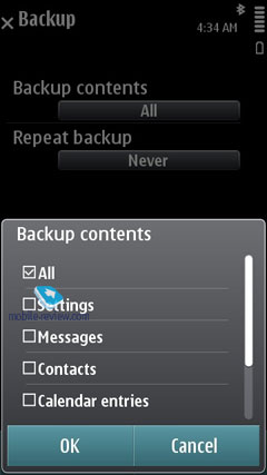
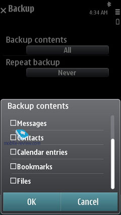
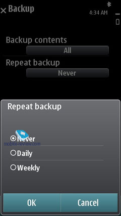
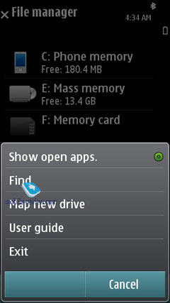
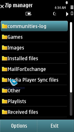
File manager – a no-frills file manager that allows copying, moving and deleting files both on the memory card and in the phone's internal storage. The platform also allows the user to store all essential phone data (such as SMS messages) on the memory card. On top of that, you can setup scheduled backups.
Device manager – SyncML synchronization.
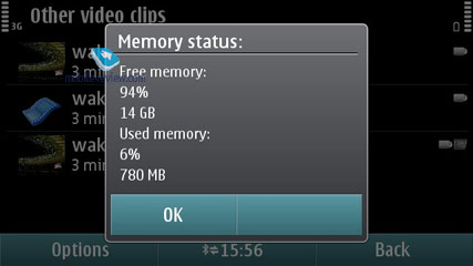
Memory – memory card status (free memory etc).
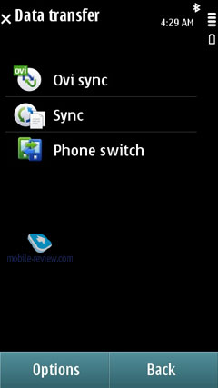
Data Transfer – this application allows transferring the phonebook, calendar and a handful of other things from Nokia-branded devices to your handset, which is a good way to go when you are migrating to a new phone and don't want to lose your personal data (especially when you don't employ your desktop PC for these purposes).
Help – a self-explanatory application which familiarizes the user with device core features, buttons and options.
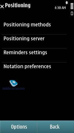
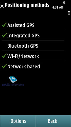
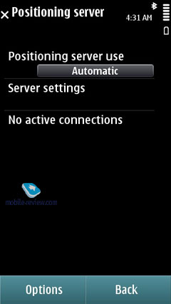
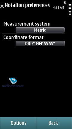
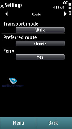
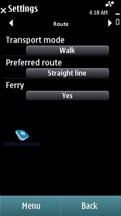
GPS Data. Allows figuring out your current location; this application can deal with data acquired from your cellular network and an external Bluetooth GPS receiver. You can also set destinations, save them and set landmarks.
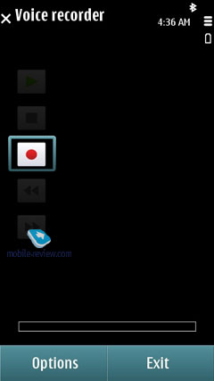
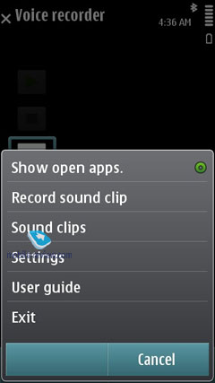
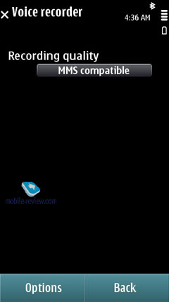
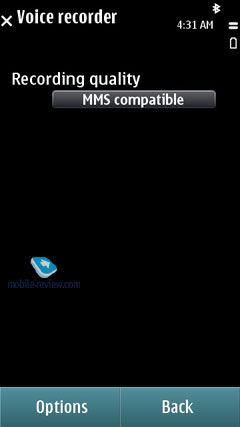
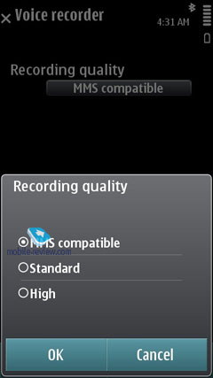
Voice Recorder. You can record sound clips up to 1 hour long (stored either on the memory card or in the handset's internal storage) and stuff the entire storage space with them if you like.

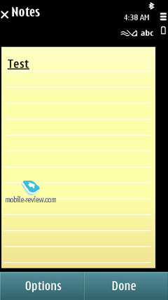
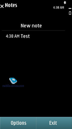
Notes – no-frills text notes.
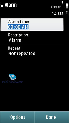
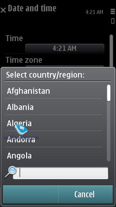
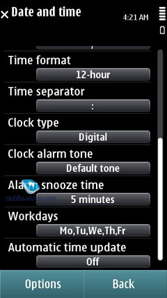
Clock – allows setting up current date and time, as well as alarm clocks. Also you can access this menu by tapping on the clock found on the standby screen.
Back to the table of contents >>>
Settings
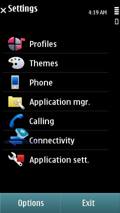
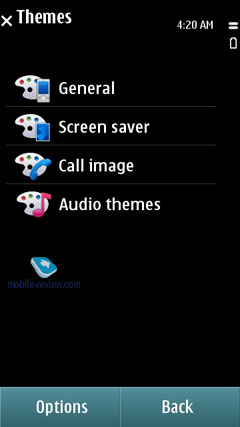
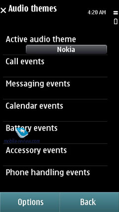
Themes. Here not only can you change the screen's wallpaper, but also tune and tweak sounds and icons. As a rule, each phone comes pre-installed with an assortment of themes.
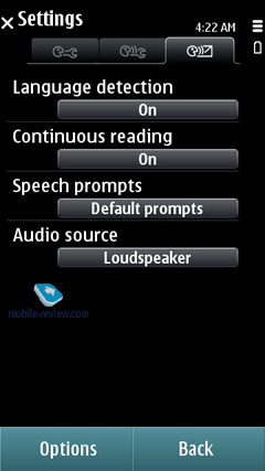
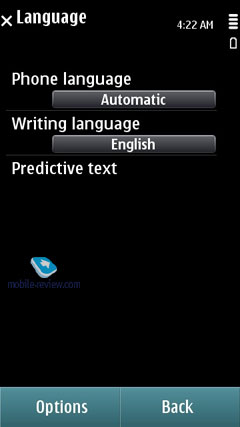
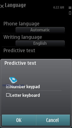
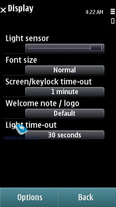
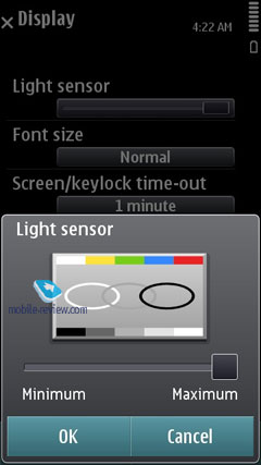
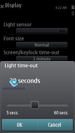
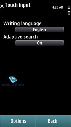
Apart from the preferred user interface language, you can pick the language to texting. Also adjustable are shortcuts bound to the navigation button and soft-keys, display brightness and backlight timeout.
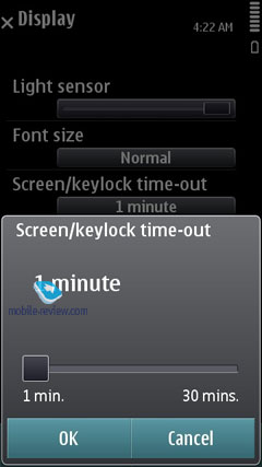
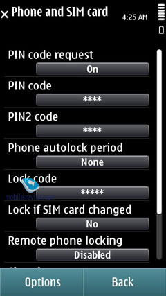
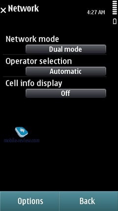
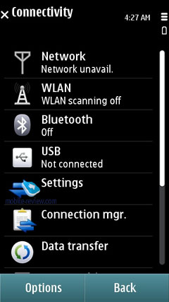
Settings for GPRS data, security, time and date, auto-lock.
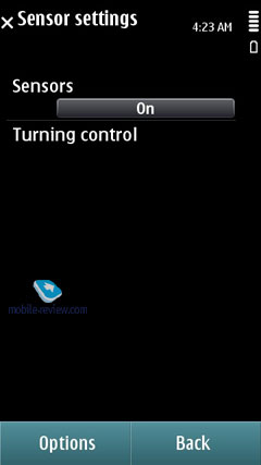
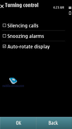
There is an option for disabling screen's auto-rotation that works in all menus by default. Plus you can opt to twiddle with "Turning controls" (that allow you to mute an incoming call by turning the phone face-down etc).
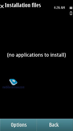
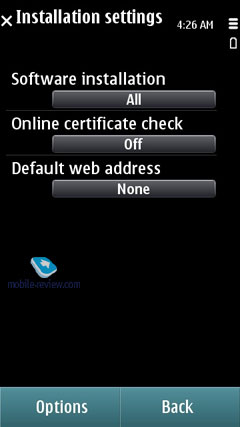
Installations. In order not to puzzle themselves where to stuff all applications that couldn't fit in any other section, Nokia put them all here, which is quite random and not always makes sense.
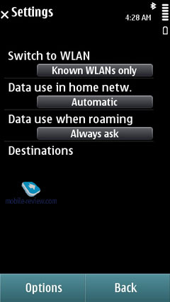
The system's WiFi settings now allow you to filter networks and throw the ones you don't need out of the list.
Back to the table of contents >>>
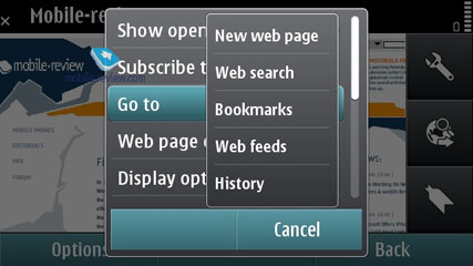
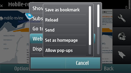
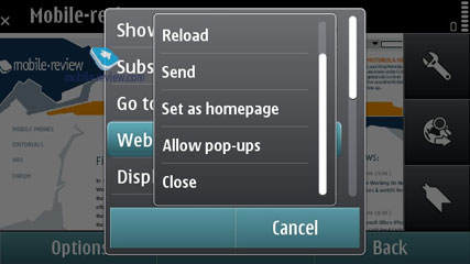
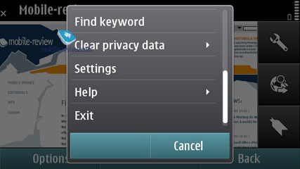
Browser
Unfortunately, the browser hasn't undergone any significant changes. Many earlier problems were related to the insufficient RAM size, which was increased in the S^3 products yet still isn't enough. Based on that observation, one can say that the browser problems remain pretty much the same, especially if one takes into account the fact that web pages are growing in size, too.


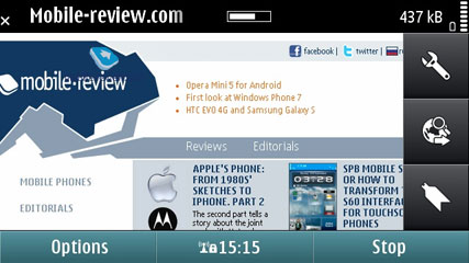
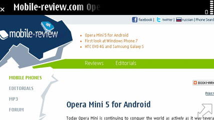
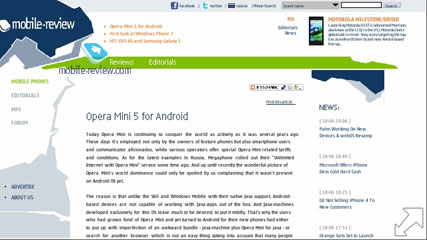
The browser runs on the same WebKit as Safari, but features a wholly different design – tapping the tap twice will zoom in on the page (you can call up the zoom bar as well or use pinch-to-zoom). But when you get to pages bigger than 500 Kb, it takes some time to render pages – a couple of seconds on average, but the picture starts jumping around, which do it no justice.


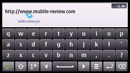
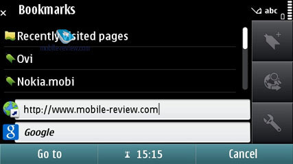
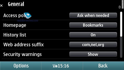
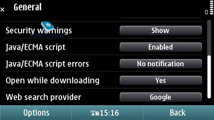
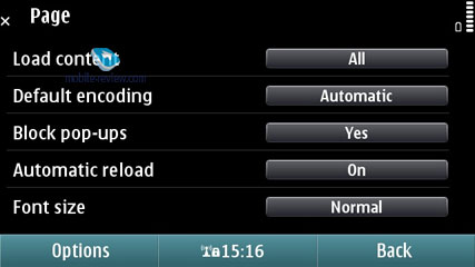
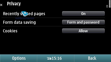
The browser stores the list of websites you visited earlier (although you can disable this feature) and when punching in a new address it offers you matching names. You can also edit domain names, so that they'll appear in a list as well.


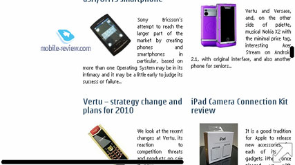
The Favorites menu is without any bells and whistles whatsoever. When loading a webpage, a sizable chunk of the screen is occupied by huge buttons on the right, but you can always opt to hide them and view all pages in full-screen mode. I didn't quite like this mode as much as Safari's full-screen setup – they'd be better off with some more options for experienced users. The browser allows scrolling through the page's content with care fingers, page navigator is available in the menu. If you have already stowed the buttons away, you can bring them back up by clicking on the white rectangular.
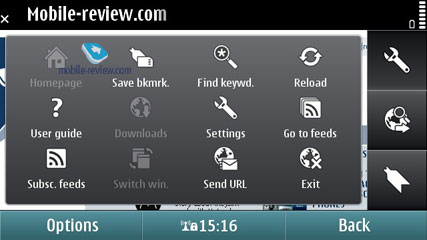
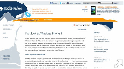
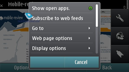
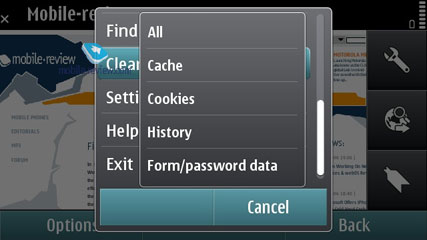
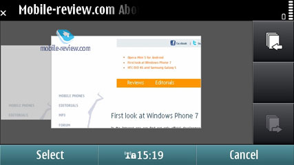
On top of that, you can open links in new tabs in jump between them on the go. The browser offers a visualized history (meaning that all pages in there have small thumbnails next to them). It also allows viewing all images available on the page in one list. Plus there is a wealth of small, but useful features, that is, the browser can store you logins and password, as well as cookies, can search through any page and highlight results (which comes in handy especially when you have small fonts enabled).


The browser turned out to be very good at handling RSS feeds – it automatically detected all available feeds on our web-page and offered us to save them in a separate list. Also, you can setup automatic feed updates.
On balance, though, our quality time with the browser wasn't all that gratifying – if we had only some S40-based browser on our plate, then we'd call our app a perfect solution for mobile browsing. But with Apple's Safari out there, this browser doesn't look all that appealing any more. It's usable, no doubt about that, but it has got some issues with page formatting.
I can't but repeat my conclusion made two years ago. Apple's browser literally destroys one from Nokia in terms of ease-of-use and overall performance. Furthermore, I'd even take the risk of saying that these are two completely different leagues. Even the much-touted Flash support doesn't help. The easiest way to make sure is this – fire up YouTube (not its mobile version!) and see how it goes when you tap into a WiFi network. Some clips are a please to watch, whereas with you'll experience enormous freeze-ups and lags, which get frustrating at times. Pages with Adobe Flash 3.0 are handled without any problems. But passing tests with flying colors and dealing with real-life, non-optimized web-pages are two different tasks altogether.
Unfortunately, my biggest disappointment about S^3 is its browser – it seems as if the developers that designed this platform didn't have a hand in it, as the decided to run with some sub-par solution instead. So, our verdict is this – the browser is quite usable, but it doesn't offer the same level of comfort as Safari.
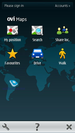
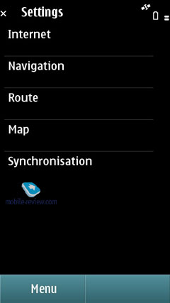
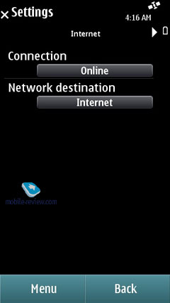
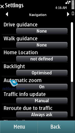
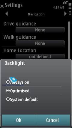
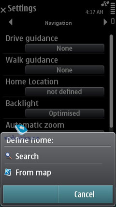
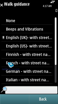
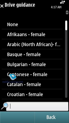
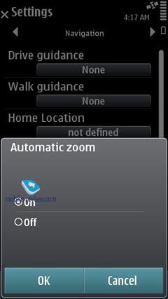
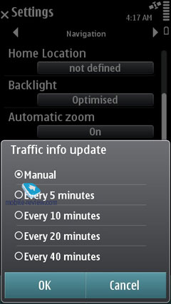
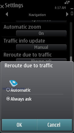
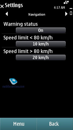
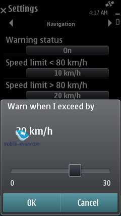
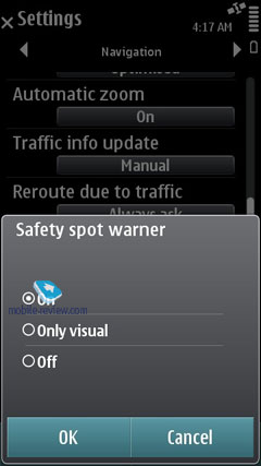
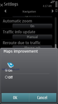
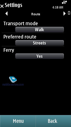
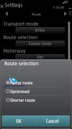
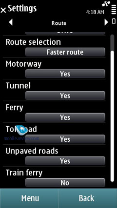
Navigation. The latest version of OVi Maps is being used. It is integrated into all Nokia products.
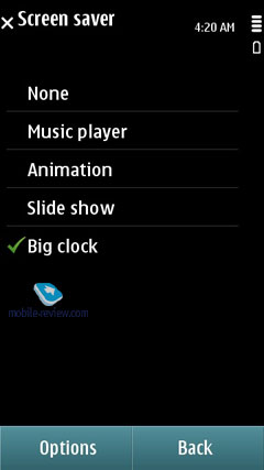
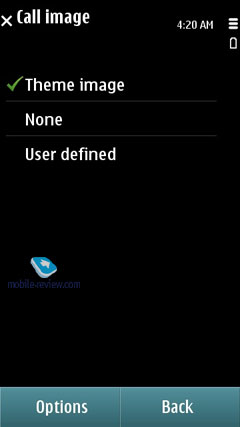
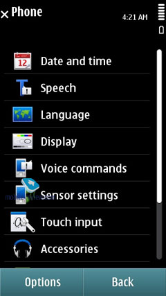
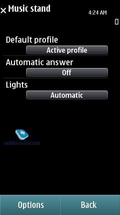
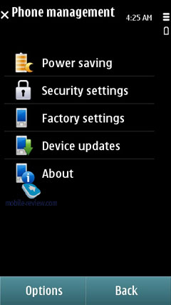
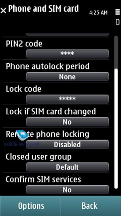
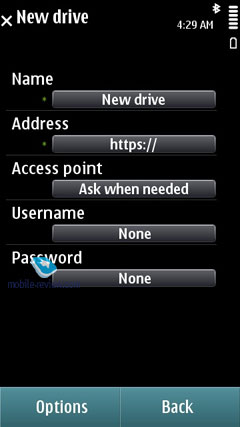
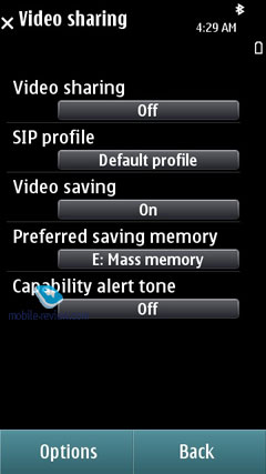
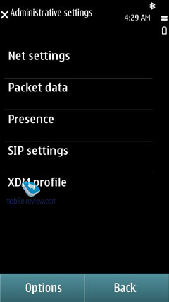
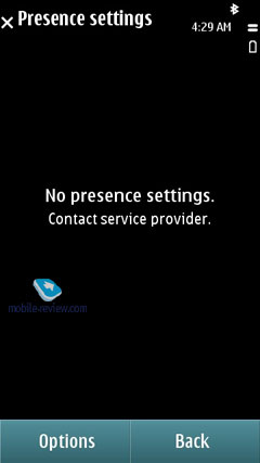
Another screenshots:
Back to the table of contents >>>
Conclusion
A lot of effort has been put in the S^3 to optimize the code and its work speed. Compared to the fifth edition of the S60 platform, everything appears several times faster, which is a great advantage. In addition, the increased RAM size allows one to run a dozen of applications and keep them active in the memory after that, which is another advantage.
As for the disadvantages, the S^3 is none other than an evolutionary development of S60 5th edition with a few minor features added (e.g. an updated player, single tap, pinch-to-zoom, HDMI output, several widget desktops). The situation is analogous to the Android updates from version 2.0 to 2.2 through 2.1, which happened within half a year or slightly more than that. What was added is a new gallery with support for geo-tags (version 2.1) plus minor updates to other functions, as well as extra speed in version 2.2. It took Symbian about two years to do exactly the same.
Unfortunately, the browser didn't undergo any significant changes and yet remains Symbian's weak spot, as well as the icon appearance, interface and its animation. The widgets and the way the desktops are organized are both beneath criticism, too. The developers must have concentrated on the unsuccessful Nokia N97 experience overlooking more fruitful solutions. Does the interface bring anything new to the market? No it doesn't. Are there any comparative advantages? There are none. For example, by adopting the idea of a video editor from the Samsung i8910, Nokia did add extra functionality to the S^3. Yet that is a single example of such successful adoption, there's hardly any other to mention. Improving the music player to the level of 2007's Apple iPhone can't be considered an advantage; it's an attempt to catch up with the competitor but not to claim the leadership.
I can come up with many other such attempts. Yet the final conclusion will remain the same. The S^3 appears an intermediate version of the platform unfortunately, one that has been delayed several times. What is presented in the end, has been available in other OS' for a long time, Symbian is just trying to catch up with the competition (e.g. the newly released social services in the phonebook could be seen in the N97 prototypes two years ago). For the Nokia fans who are satisfied with S60 5th edition it is a great improvement (it's faster, more stable, adds some new features), but for the whole market the platform comes out outdated, both in terms of its interface and many inbuilt software capabilities. It is functionally inferior to iOS 4 (e.g. in terms of games, social services, interface, e-mail functionality, amount of third-party software), Android (e.g. in terms of interface, extra phonebook and calendar features), Bada (e.g. in terms of interface, Social Hub functionality, etc.). Unfortunately, the number of updates in this version of Symbian is not enough to qualify for its own name; Nokia used to call such updates Feature Packs. Now the company is trying to make a splash since it is lacking resources and that is all it's got. All the effort has been put into S^4. However, taking into account the fact that the latter is based on S^3 to some extent, the company won't be able to build a new platform from scratch. Nokia is also dissipating its energy on MeeGo, which doesn't leave much chance for improving the services and platforms. All those observations put together provide the necessary justification for the meager Symbian update that we have.
The S^3 platform is a real gift to the competition from Nokia itself. Products based on S^3 will be widely advertized and have huge sales, which should have an impact on the product generations to come after them. Let me explain that. Having bought a phone with the outdated interface, the customers will soon get acquainted with the alternative interfaces and OS functionalities. And Symbian will only lose from such comparison, even in the low-end. There's no need even to mention the new Android version due at the end of the year. The new Symbian is inferior to the already existing solutions.
In addition to the traditional forum discussion option, we have prepared a questionnaire, in which you can personally evaluate the level of improvement in S^3. I believe it to be an objective measure of whether the new Symbian platform is bliss or miss. The Symbian and Nokia people will have an opportunity to get your feedback and draw conclusions otherwise unavailable to them due to their firm belief that the Nokia name can be selling products for years by itself, without having to make major improvements to those. It will also be a measure of how objective our editing team and I personally are. That is why I would like to kindly ask you to spend five minutes to answer the questionnaire and write a few lines on the forum. I don't ask for that often but will appreciate your time and opinion. Thank you in advance.
Tomorrow read The Second Look at Nokia N8 - the Detailed Flight Characteristics.
Symbian S^3 Capabilities and your Impression of the OS, the Questionnaire >>>
Here is where you can discuss this on our Forum >>>
Back to the table of contents >>>
Related links
Eldar Murtazin (eldar@mobile-review.com)
 Twitter Twitter
 Livejournal Livejournal
Translated by Maxim Antonenko (maxantonenko@ukr.net), Oleg Kononosov (oleg.kononosov@mobile-review.com), Olexandr Nikolaychuk (meiam@inbox.com)
Published — 23 June 2010
Have something to add?! Write us... eldar@mobile-review.com
|
