Software Features of Nokia S40 6th Edition Lite
Nokia decided to move all budget models to S40 6th Edition. It had to be quick, but there were delays connected with manufacturing. First models Nokia C1-01, C1-02 and C2-00 appeared at the start of 2011. All entry level models will feature S40 6th Edition Lite. The main difference is in support of lower resolution screens (128х160). The platform is unlikely to proliferate as even entry level handsets are getting QVGA screens now, which makes possible the ordinary version of S40 6Th Edition. It is only the question of time. It happens that S40 6th Edition is a temporary solution. Nokia merely had no time to launch models with this version and it will lose out to higher resolution screens soon.
You can find our detailed review of the S40's previous edition here:
Contents:
- Difference from S40 6th Edition
- Interface
- Phonebook
- Messages
- E-mail
- Calls List
- Settings
- Connectivity
- Gallery
- Media
- Organizer
- Web
- Conclusions
Difference from S40 6th Edition
All changes are associated with an inferior screen resolution. For example, in themes music player and radio remained the same to avoid compatibility with themes for QVGA screens. As these models will be cheap Voice Clarity was dropped as a second microphone is not going to be an option. The same happened to be a voice dial. There will be no video for names in a phonebook due to screen resolution. The majority of menus were changed to fit screen requirements, so now we have no small font option in messages and phonebook as only standard and large will be available. Lite is indeed a stripped down version of S40 6th Edition for accessible models.
Back to the table of contents >>>
Interface
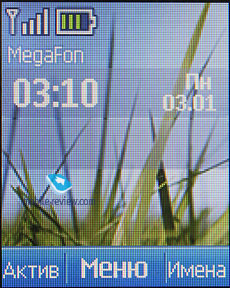
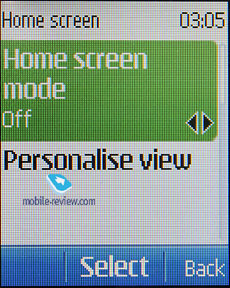
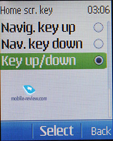
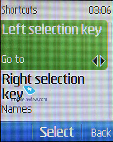
Handsets based on S40 6th Edition (similarly to S40 3rd Edition) can have different screen options on standby. Among other things you can go for Active Standby, traditional display with quick access via the navigation key plus GoTo (left soft key). On standby we can choose wallpapers and font color. For some photos a particular font is the best solution to show text against the contrast picture. As always you can set features for the navigation key. Icons can be displayed on screen or be hidden (when Active Standby is on they are not displayed, but all directions are operational apart from the movement up).
Active Standby mode is very similar to the desktop found on smartphones nowadays – while active, the display is divided into several zones (shortcuts toolbar, media player and radio status, date and upcoming events and notes). No doubt, all power users will appreciate this feature, as it allows reading relevant information on the screen outright. You can also arrange the zones on the vertical axis, which adds to the interface's flexibility.
The main difference of S40 6th Edition in terms of interface is the support of horizontal movements in all menus. If you have the list with elements, containing let's say, tracks, you can browse it with horizontal movements, while you do not have to activate the list itself. In Active Standby a player and radio are managed this way. In the first instance you browse tracks, while in the second one you move around frequencies. Before this element was used only in a calendar for browsing days on standby. In all menus and submenus where you can select lists horizontal arrows were added. The speed of work in particular menus increased. Whenever you need the confirmation press ОК.
Once the display falls into standby mode, it gets occupied by the clock, missed calls and received messages indicators – all of these events are tied up with tiny icons and numbers, i.e. if you have 3 missed calls, you will see a corresponding icon and "3". The fifth edition features a caller ID picture for every missed call (provided that you have one registered in the phonebook).
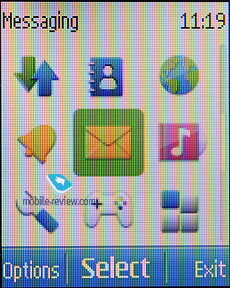
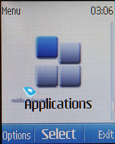
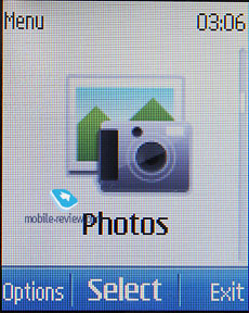
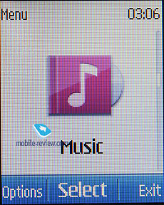
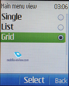
The main menu has four display variants – list (4 items of the main menu on screen), matrix (9 icons on screen) and one icon. Main menu lists can be filtered and sorted in any order you prefer.

In all submenus lists are vertical and have smaller icons near to every list, more dense font to show more lines. The move seems logical. Courtesy of icons the design looks nice with an intuitive and classy menu.
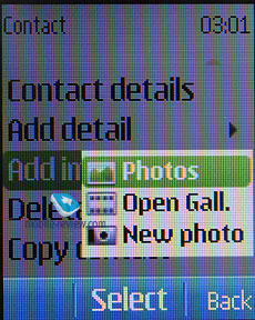
Some applications and features of the sixth edition, such as the phonebook, now feature pop-up menus that don't refresh the content but appear on top of it. So, once you have picked the required option in it you will go back to the screen you were managing a second ago. All in all, it's a nice improvement over the previous version of S40
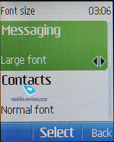
You can set custom font-sizes for Messages and Contacts (normal and large). It doesn't seem to make any difference, however, for the most part, lines will fit on the display, depending on the size you have picked.
In the menu we get fast navigation via numerical sequences.
The sixth edition also sports predictive text input (T9) system. Also you can opt for the Word Suggestion feature, which is pretty much self-explanatory. But what's really important is that now T9 works in all menus and features throughout the phone. If you need to type in various languages, it is not a big deal, since the handset supports switching languages on the go. The sixth edition also allows copying fragments of text or individual words – it saves all such snippets in the buffer and enables the user to insert them in any application afterwards. For instance we managed to copy text for a text message and paste it into a note on the standby screen.
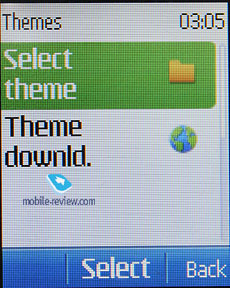
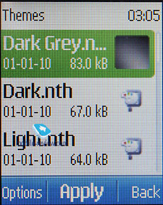
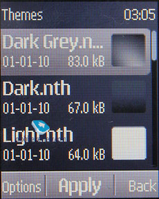
Themes – using the themes, you can alter not only font color, the icon style of the main menu and wallpapers, but also the background picture of each sub-menu, which is quite interesting. In comparison with 6th Edition a theme does not affect a music radio cover and the radio display is not changed too. The goal of this decision is to avoid conflicts between apps and themes developed for screens with bigger resolution.
Interface changes include boosted font size in the majority of modes to read the text easier. The same can be said about the screen on standby. For example, icons for battery and modes are almost two times bigger and you do not have to strain your eyes now.
Back to the table of contents >>>
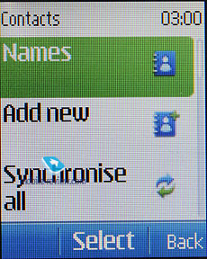
Phonebook
The phone's memory stores up to 1000 names. There is no difference how much information you store for a name. The overall limit remains the same whether you complete all fields or just several.
Each contact may have up to five assigned phone numbers of the following types: general, mobile, home, office and fax. The first entered number becomes the default one and can be then edited to your liking.
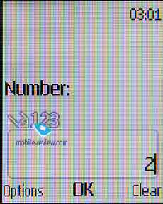
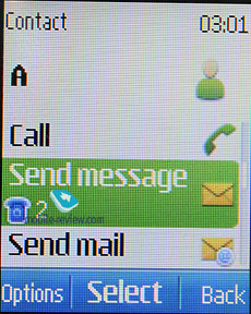
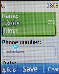
While previous versions of S40 offered the user only a few fields when creating a contact – that is, first name, last name and one number – and the rest could be filled in later on, the sixth edition shows a few more: mobile number, email address and picture selection.
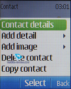
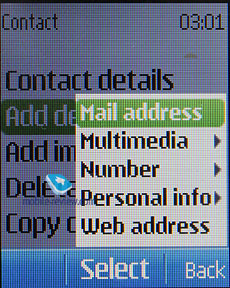
Additionally, you can enter e-mail, homepage, mail addresses, text note, company and job title. Among all other fields available for filling in is, User ID – it is the identifier for the presence service. Generally speaking, it's some kind of ICQ, which gives you a warning of the user's availability at every given moment. If you think we are going to wind up our story right at this point, you're greatly mistaken, since there are more informative fields available for filling in, like Formal name and Nickname. You can enter Birthday date as well and it will pop up in the calendar as a new event automatically.
Already filled sections are highlighted in grey, so you will be aware of entered information right at the first glance. The system won't allow you to duplicate entries by creating a new contact with the same name – instead, it will allow you to replace the existing item. Nonetheless, this limitation fades away once the phone gets synchronized with a PC. But, keep in mind that if you do have identical entries, this is more likely to give you some trouble with voice dialing.
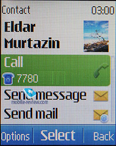
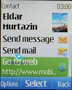
You can bind up any contact with an image, but not a video clip. When viewing details on a contact, you will see its picture outright, although previously it resided in its own section. In the general list you can have caller IDs and contacts names paired up - in this mode, the thumbnail is smallish and gives a little notion of the actual image. Other view modes are quite common - only names, names with the general number. The general list can display contacts stored on a SIM card and the phone's internal memory.
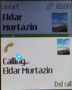
On an outgoing call, the image gets reduced to a small thumbnail, whilst on incoming calls, it occupies the entire screen. Contact's name is displayed next to the number type icon and full phone number.
Each contact can be bound up with a personal ring tone (any file) – in case you choose a video clip instead of picture, the sound will be taken from the clip, rather than from a music file.
And traditionally, the buttons 2-9 are for speed dialing.
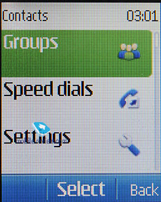
There are no preset groups available in this phone, thus you'll have to create them yourself. The great edge of this system is that you can create up 25 contact groups. Each of them can be customized with a personal tune and an image. The photo, set for a certain group member, has the higher priority and will be displayed instead of the picture applied to the group. One and the same entry can be a member of various groups.
In the general list of entries, groups are displayed in one line with stand-alone contacts, yet marked with their own icons. Searching is performed in group names and separate contacts at the same time. This layout may seem confusing at first, but later on you realize all its advantages, as you don't have to look up for a special item on the menu to access the groups list (besides, it's accessible only from the main menu, using the soft-key or shortcut numbers, you'll get to the list itself).
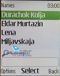
Search in the general list can be performed by entering several letters – it doesn't cause any hardships and works as it always does. Pressing the "*" button results in switching to entries on a foreign language (in case you have contacts both in Russian and English, for example). When browsing the phonebook, pushing "#" key calls up the detailed view featuring the general number – to access full data on a contact use the corresponding menu (two presses). All entries may be sorted either by first or last names.
MS Outlook synch module of the sixth edition is far more tuned than that found on the earlier systems. Most of the fields synchronize correctly – and this goes for First Name and Last Name fields as well. From the phonebook menu you are at liberty to send any entry as a Business Card to another device with the aid of an SMS, MMS or a wireless protocol. Unlike the previous edition, here you can choose between sending away the entire entry or name and main number only.
On the face of it, there is no way for beaming the entire phonebook to another device – even if you select all contacts, the context menu won't offer you this option. However, using the Settings – Connectivity – Data Transfer tab you will be able to do that, the handset supports synchronization (add all, replace all), apart from the contact list you can transfer notes and calendar events.
This edition fully supports contact transfers between internal memory and SIM-cards and vice versa.
You can also type in a couple of letters into the search field and then select all contacts starting with these letters.
Back to the table of contents >>>
Messages
You can always change the input language while typing in any menu, this solution is identical to the one applied on Nokia smartphones and is quite handy.
The phone supports Nokia Smart Messaging standard, which allows sending and receiving ring tones and simple black and white pictures from compatible phones. Apart from Nokia phones, this standard is also supported by Samsung, LG and some new Motorola phones. Unfortunately, the company's policy limits the users, since the alternative standard - EMS, which is more popular nowadays, and allows sending not only melodies and pictures, but formatting text as well, is missing here.
All messages regardless of type (SMS/MMS) are stored in the Inbox folder. Messages themselves are kept in the dynamic memory; this means that at best you will have nearly 500 short messages stored. Resettable message counters (sent and received) are also onboard.
When sending a message, you can pick phone numbers not only from the phonebook, but also from recent calls list, calls log or select a group. On top of that, there is the Favorites list, where you can put the numbers you use more often.
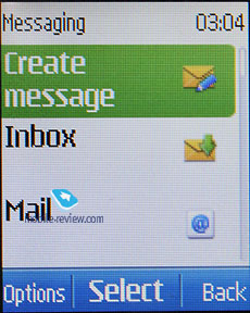
The messaging interfaces for SMS and MMS have been merged, so now it makes no difference what you are intending to compose. Depending on the content you throw into your new message, it remains a text-based message, or morphs into an MMS. This is a very smart approach, for it doesn't make you think how you are going to write a message, and probably will win over more users to the MMS standard. As for this message type, no significant improvements have been made. Any message can be up to 600 Kb big. With its OMA MMS 1.3, the platform presents pretty good implementation of MMS technology, so you won't experience any hardships with composing these messages.
The rest of the features in the messaging department are standard - smiles (converted from the text in received messages) and long messages. You can have your messages automatically replaced in the Sent folder on memory overflow (the oldest messages are deleted one after another). Delivery reports are stored in a separate folder, which is handy. CB-messages have their own folder, providing channel number settings on top of its main function.
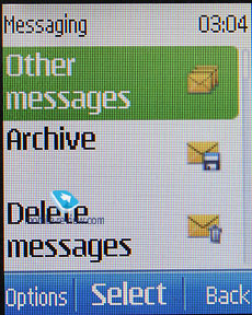
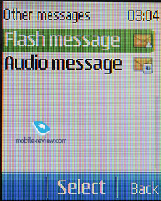
Flash messages - a kind of short message, shows only on the recipient's screen, but not saved into the phone's memory (they can be saved forcibly).
While in standby mode, the phone indicates sender's name.
Voice Messages – an MMS variation, when you record a voice message, lasting up to 3 minutes 6 seconds (maximum duration), and then send outright.
When composing a message the phone number field has text input enabled, so that you have to type in first letters of a contact name and tap the center button to make the handset look for matching entries.
Back to the table of contents >>>
E-mail
A handset has an inbuilt e-mail client, which handles APOP/POP3/SMTP/IMAP4 protocols. A mail installation wizard can set all required parameters in several steps. If you don't have an e-mail address the phone will offer to get one from OVI.com. It can also find account settings online. It works well for popular mail services and you don't have to put them in manually.
From the mail section you can save a message to a calendar, notes, events, etc. A part of a message can be used to create a contact.
Different encodings for Russian are available. Windows 1251 is used by default. Any message can be handled with UTF-8, KOI8-R or Windows-1251. All files can be used as attachments and from the client you can access the phone's files structure.
The settings for incoming and outgoing mail are separated from each other. You can cap the number of received messages (no more than 150), retrieve only headlines of letters, and delete messages from the server once they have been uploaded onto your phone. Any received message cannot exceed 600 Kb in size, which is too little for the majority of consumers.
The mail app improved, but it is hardly a breakthrough.
Back to the table of contents >>>
Calls List
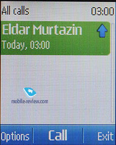
The platform presents you with three lists – incoming, missed and outgoing calls, with every list having the capacity of 20 entries. On top of that, all these lists feature call date and time, which is pretty convenient. While at the standby screen, press the pick up key for the general call list (although you won't be able to jump to other logs from there).

In detailed call view, you can also see its duration.
The Call Log also has the menu with all numbers you have sent messages to, and message\call\data counters.
In this section you have a log for positioning. It is represented by all locations for a given time.
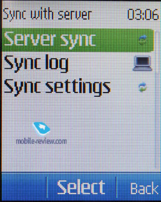
Another log sports all synch sessions you have had with the phone.
Back to the table of contents >>>
Settings
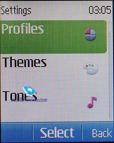
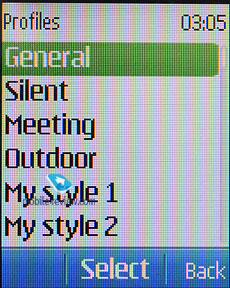
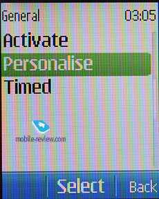
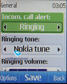
The profiles may be activated from this menu (but it cannot be done by pressing the On/Off button). Each profile may be activated for a designated period of time and after this, the phone turns back to the default state. Sound alerts may be adjusted for all the events, including calls from group members. You can also easily set whether a contact's video will work in this profile or not. All in all, the profiles implementation on Nokia's phones is one of the best on the market to date. The handset houses five pre-installed profiles and two user-adjustable ones; however, each of these profiles can be set up in any desired fashion and even renamed.
The phone is empowered with the automatic key lock; you can also set a safety pin number so that no one else could use your phone. Furthermore, you can protect your phone's internal memory and memory card with passwords separately.
There is a possibility to adjust enhancement settings, for example, to choose a profile that will kick in when the battery charger is plugged in. This is quite a clever feature that allows you to customize your phone even further.
You can enable the Flight Mode dialog window on handset's start up, however by default, this prompt is turned off. In fact, you might never need that, since the profile with exactly the same settings can be found in the list of standard profiles.
You can always opt for a slideshow composed of your own photos, so that they will change each at designated intervals.
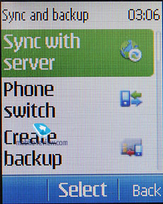
BackUp stores user data on a remote server. This feature requires free subscription for MyNokia, but it is not available in certain countries, so it is obviously not for everybody.
Create BackUp – in spite of its resembling title, this feature makes a local back-up copy of your data and moves it to the memory card. You can also select what data you actually want to backup:
- Settings;
- Contacts;
- Messages;
- Bookmarks;
- Calendar;
- Gallery;
- Applications and games.
The downside to this application is that it creates only one archive, meaning that you won't be able to back up data several times and then use particular system builds for various purposes.
Back to the table of contents >>>
Connectivity
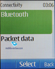
This sub-menu retains all the settings related to Bluetooth, packed data (GPRS, EDGE) and data transfer.
Yet, the Bluetooth settings are far more complicated – the handset may be visible for other devices, hidden or available for a designated time span. For connected devices, there is auto-pairing mode, when the handset will keep on trying to establish a connection with another device without notifying you. Coupled devices are now displayed as a separate folder in any menu, which is pretty convenient.
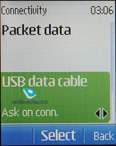
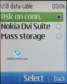
USB connectivity settings have two modes, which are USB Mass Storage (memory card), and Nokia OVI Suite (synchronization with PC).
In Data Transfer section you can set up synchronization parameters for PCs and remote servers. Rank and file users who do not deal with corporate networks will not find this option attractive. At the same time here you can customize a profile to transfer all contacts and organizer entries to another device via Bluetooth.
Configuration. From this menu, you are allowed to configure the following programs:
- Web
- Multimedia messaging
- Synchronization
- Push to Talk
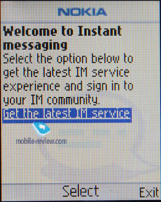
- Instant Messaging
- E-mail
- Streaming
- Access point
At that, it's important to stress that several applications can be set up in a different way and that's not prohibited. A good example of that, is the standard Email client, which retains more settings than the Configurations item does. It's worth repeating that such settings depositary proves to be very fetching.
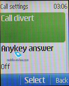
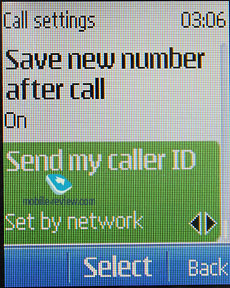
Calls. Here you can display information about the duration of a call once it has ended.
Software update. This item serves for auto upload of new firmware versions, in other words, it's what they call "over-the-air update". You can opt for scheduled check-ups and also choose the service provider (for some it may be different from Nokia).
Back to the table of contents >>>
Gallery
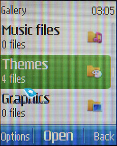
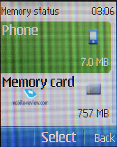
The folders with various files are stocked here - all of them have titles matching their contents. You can view the folders as a list, list with labels or as icons. Any multimedia file, including video can be viewed in full-screen (landscape) mode. All data received via Bluetooth is stored in the "Received" folder, and in case the phone cannot provide enough memory, gets redirected to the memory card automatically. There are no caps on the size of received file.
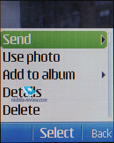
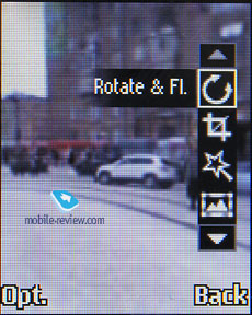
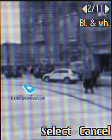
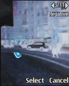
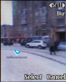
There is a basic image editor coming included with the sixth edition, which allows you to scale pictures, crop them, add own text fields, small clip-arts or frames, in other words the very minimum you might need for your edit-it-all mood. Some people may benefit from these features. The editor looks differently and is more convenient than before. All changes are immediately displayed on the screen.
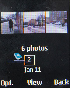
In the Gallery a file manager was added, which is not visible in separate menu sections. Here you can view content from the phone or card memory. In Pictures you have a Timeline filtering (this is an addition) and My Albums section allows adding separate pictures to albums. It is pleasant to choose shots in series. Select the first and the last pictures and you are done. This is really excellent for model without a touchscreen.
Upload of images is a standard option now. Flickr is used by default, but different models may offer various services.
Music and video form another section of the Gallery to access the list of music filters.
Back to the table of contents >>>
Media
All the settings concerning the multimedia front of the sixth edition are stored here. We aren't going to dwell on the camera module in this article, as it varies on different devices, therefore should you need a more definitive review on the camera – look for the model you need in our Reviews section.
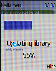
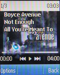
Music player. The player found in the sixth edition copies most features of the one available with 5th edition, but now it comes with support for two codecs: WMA Video 9, WMA Audio 10. The player deals with video content as well as audio files, which brings about a very amusing situation, when by minimizing the player while watching a video, you remove the picture from the display, even though the sound keeps going out from the loudspeaker or earphones like before. It shouldn't be considered as a mistake made by the programmers, since it looks more like a feature, but I have certain doubts about its usability, and on top of that, other handsets don't have this kind of background video playback.
The display shows you data on artist, album, and even album art, if it is in the current track's tag. The navigation key is associated with standard features (random playback, rewind and pause). Fast forward option was added here, but initially tracks are rewound at a standard rate of 5 seconds.
The playback modes available with the sixth edition's player are: sequential, random, repeat one track/all tracks.
Outside the player is the Stereo Widening feature. There seven five-band equalizers with 5 presets (Normal, Pop, Rock, Jazz, Classical) and two user-manageable setups.
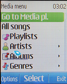
The music library can be categorized with the help of the following filters:
- All tracks – every song stored in the phone.
- Artists – tracks sorted by artist.
- Albums – shows songs depending on album.
- Genres – classic, rock and so on.
- Composers – filters your media content by composers.
- Track lists.
Another set of filters, including Favorites (you can throw any track onto this list either while it's playing or when browsing categories), Most popular and Recent tracks, Recently added and My tracks. A very interesting set of filters that might be quite useful.
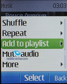
Your own playlists may be composed on a PC or on your handset. Unlike the previous edition, with the sixth version you can pick either stand-alone tracks to add them onto your playlist, or entire albums or all tracks by a specific artist, etc, which is obviously really handy.
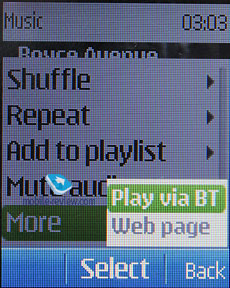
Music upload – a stand-alone item in the menu, that includes only a link to Nokia's site for the time being, and once the Nokia Recommendation service gets online, it will lead right into it. Apart from AAC, eAAC, eAAC+ and MP3, Nokia's player also supports WMA format. You can also beam sound to a wireless Bluetooth-powered headset, or skip forward/backward wirelessly.
Stereo Widening – allows extending the stereo base. The effect is dependant on hardware specifications
Whilst using the Dictaphone, you are to observe the limit of 60 minutes per one recording. On the bright side, it is enabled during calls. The user is free to choose the place of storage (either phone memory or memory card), but can't set titles of each recording – the handset strictly defines them as a label and number. Unlike handsets by other manufacturers, a recording's title here doesn't feature the phone number of your contact, and this is quite frustrating.
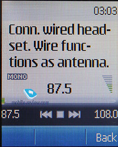
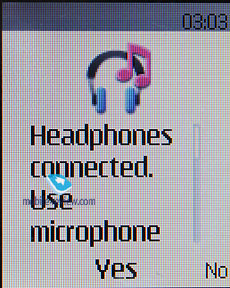
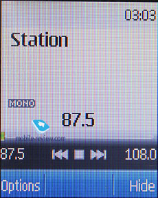
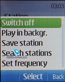
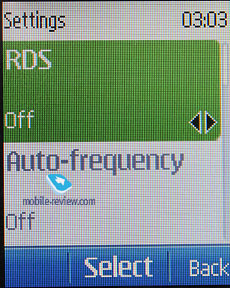
Radio. The model remembers up to 50 FM radio stations and gives them text names. This feature is similar to other Nokia models. You can switch between saved radio stations by pressing a headset button. Radio may work in the hands free mode, but you need a headset as an antenna. A radio signal can be used as an alarm, but once again you need a headset. Radio recording is supported. RDS shows names of radio stations.
You can toggle between all saved stations with the help of the number pad – a sort of shortcut number navigation.

Back to the table of contents >>>
Organizer
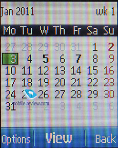
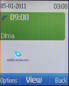
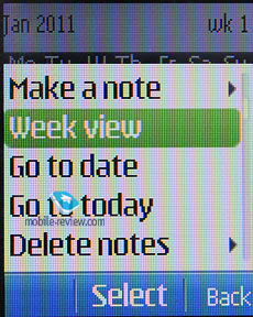
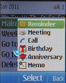
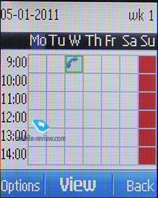
Users can add up to 1000 entries depending on their length. Old entries can be automatically deleted taking into account the time of recording. You can view a calendar for a month, week with hours breakdown together with fast transfer to the entered date. Up to 5 types of events (meeting, call, birthday, alert and note) can be added with alerts for every type. Events can be repeated.
The To-do list enables you to make up events with three types of priority (high, normal and low), set due date and time for each event.
Notes - each note may contain up to 3000 characters. That is more than enough even for the most demanding user.
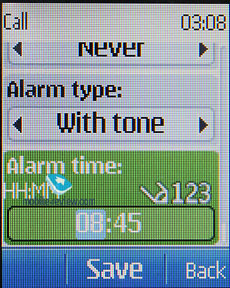
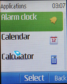
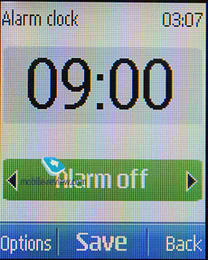
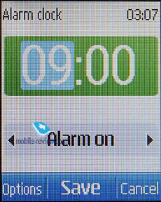
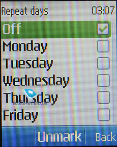
The alarm clock allows setting both single and recurrent alerts, which may trigger on certain week-days. Any tune, or a radio (you just need to plug a headset in) can serve as a signal. Snooze time-out is also adjustable.
Also the organiser contains a countdown timer, a stopwatch which allows getting intermediate values. Both apps can work in the background mode.
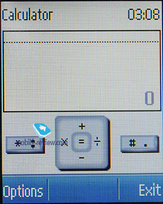
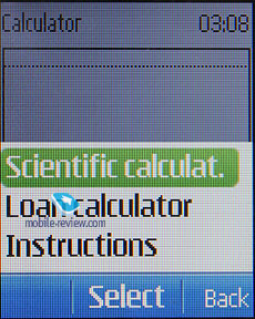
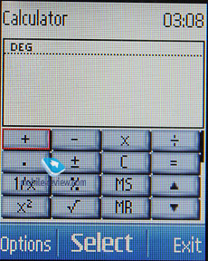
The calculator, apart from its default mode, also has a scientific mode as well, and the mode for calculating your interest in your investment activities.

Back to the table of contents >>>
Web
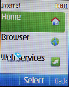
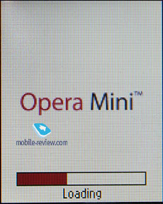
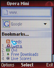
In this version the standard Nokia browser was ditched in favor of Opera Mini. The rationale is that the standard browser cannot work with the low screen resolution, while Opera Mini can easily deal with the issue. The solution is predictable inconvenient for network navigation.
Back to the table of contents >>>
Conclusions
If we compare the features of a Lite version with an ordinary S40 6th Edition we have to say it is clear step backward. Nevertheless, it easily beats S30 and has an advantage for smaller screens. It is an advantage, because S40 6th Lite Edition will be installed in accessible models.
Unfortunately, this platform will be temporary as Nokia took it too long. Screens with the resolution of 128х160 are becoming things of the past, while this platform was created specifically for them. Even in very cheap handsets we will see more QVGA screens. They would benefit more from S40 6th Edition. It also means that S30 came to the end of the road and will be superseded by S40 6th Lite Edition until mid 2012.
Do you want to talk about this? Please, go to our Forum and let your opinion be known to the author and everybody else.
Back to the table of contents >>>
Related links
Eldar Murtazin (eldar@mobile-review.com)
 Twitter Twitter
 Livejournal Livejournal
Translated by Maxim Antonenko (maxantonenko@ukr.net)
Published — 03 March 2011
Have something to add?! Write us... eldar@mobile-review.com
|
