|
|
Review of GSM/UMTS-smartphone Sony Ericsson W960i
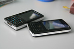
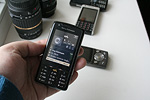
Live photos of Sony Ericsson W960i
Table of contents:
- Positioning
- Design, size, controls
- Display
- Keypad
- Battery
- USB, Bluetooth, WiFi
- Memory
- Performance
- Hardware specifications
- Localization quality
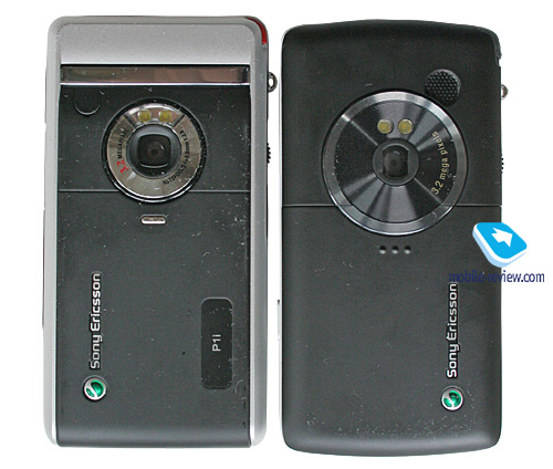
- Sony Ericsson W960i vs Sony Ericsson P1i
- Interface
- Music department
- Camera
- Some other features, themes, web-browser
- Competition
- Impressions
Sales package
- Handset
- Battery (BST-33)
- Stereo Bluetooth-headset (HBH-DS220)
- Wired stereo headset (HPM-70)
- USB data cable
- Charger
- User Guide
- Carrying pouch
Positioning
Over at Sony Ericsson they live in a happy delusion, popular with some other makers as well, that consumers are very straightforward in their thoughts and motives. Specifically, if there was a music-playing handset last year, then this year those who went for the original phone will set their eyes on the updated version. And will never ever consider similar phones, even those offered by the same manufacturer. But in truth, this paradigm just radiates naivety, for the users seek not some particular feature (music, camera or something like this) alone, but the best possible mix of price, brand and punch they get for the money. Furthermore, the majority of users do not care about having some particular label on their phones – be it Walkman or even nothing – more importantly, it must be affordable, look classy and work properly. This is where some problems begin.

Back in 2006 the market saw a duo – the Sony Ericsson M600i and the Sony Ericsson W950i, where the former focused on communications and QWERTY-powered texting, the latter was a music-inclined flagship. Now, in 2007, nothing has changed, but this time around the duo comprises the Sony Ericsson P1i and Sony Ericsson W960i. But unlike the previous year, they have decided not to go down the same path when the two phones look more like twins, so that the M600i’s poor sales led to a substantial price drop for the W950i and, virtually, the downfall of the music-heavy offering as well. So for this debut they have exercised a more elaborated approach, making distinctions between the two pretty apparent. Below we will definitely take a closer look at them, and for now let us only note that it is the first time Sony Ericsson has coated the touch-sensitive display in a protective plastic layer. In fact, they were determined to come up with a music-minded phone with finger-based navigation, just like the much-hyped Apple iPhone. But the result finds itself somewhere in between two worlds. Just to make everyone sleep well, we do appreciate its being in the company’s line-up, but the finger-based device management system is somewhat inferior to that found in the Sony Ericsson P1i, even though the display is better protected.
It feels that the company actually does realize this, so that’s the reason why they have decided to kill two birds with one stone by throwing a wireless Bluetooth-headset into the package. First, they manage to boost the technology and corresponding accessories, and then they add more out-of-the-box value to the handset. All in all, the package you get with the W960i is pretty decent and for many this will be the first experience of utilizing such accessories.
Judged as a sequel to the Sony Ericsson W950i, this new phone has the right to exist, but when facing off against the Sony Ericsson P1i for the place in a consumer’s pocket, the music-playing flagship doesn’t get the thumbs up.
Back to the table of contents >>>
Design, size, controls
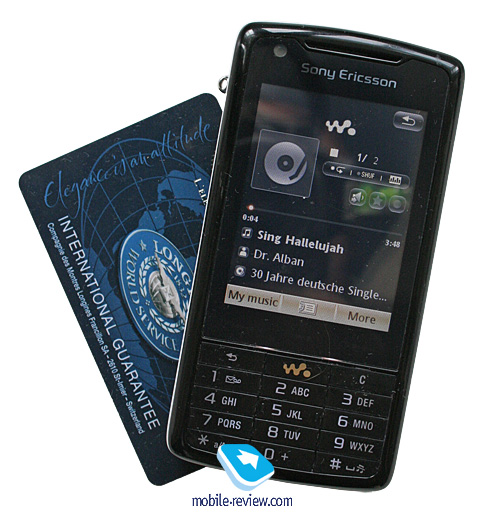
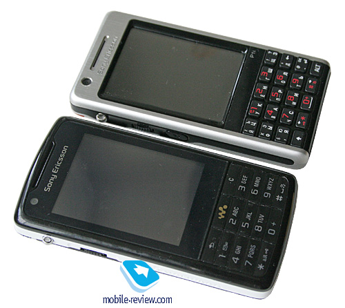
The model comes in one single color scheme – Vinyl Black, where the front fascia is composed of black glossy plastic, which is extremely prone to fingerprints and grease. Furthermore, it has been covered with a protective plastic screen, which surely doesn’t make for a less smudgy looks. Unlike the P1i the display found in the W960i is not recessed into the casing, on the contrary, it sits flush with the surroundings. The side plates employ white matte plastic – frankly speaking, the color mix is pretty much bog-standard. The rear is made of black soft-touch plastic, and feels velvety.

Judged on its materials alone, the W960i seems to be pretty decent, but looking at the way they are combined in here, we are not particularly pleased. Let’s put it this way - it looks prosy. Altogether it leaves an impression of a cheap phone, and it definitely doesn’t stand in one line with the previous offerings from Sony Ericsson for this price-bracket design-wise. It even somewhat reminded us of the Sony Ericsson T300i (released long ago, there was a story with plastic supplies for this phone) in terms of the plastic it utilizes.

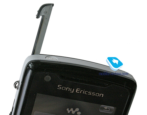
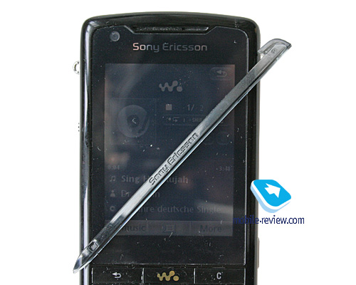
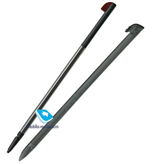
The W960i’s plastic stylus makes this impression even stronger – in fact, it would do for, well, toy phones, but decidedly not for a top of the line model. The early editions of the handset featured styluses with even stronger toy feel to them, and while it is better now, it’s still made of plastic. Curiously, similar stylus had been found only in Sony Ericsson P800i, but they dumped it eventually. Why would they need to bring it in again, given all this negative feedback? I feel somewhat befuddled. Perhaps they have had several generations of managers and marketers changed, so now the experience of the past years is gone.


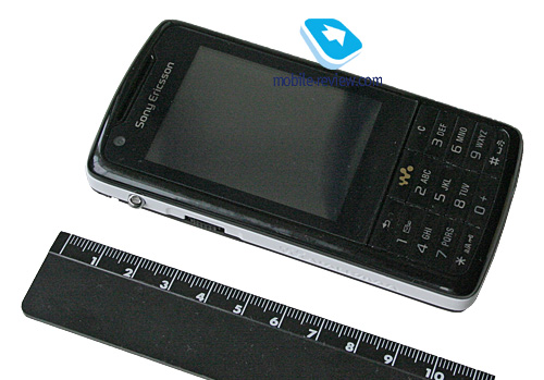
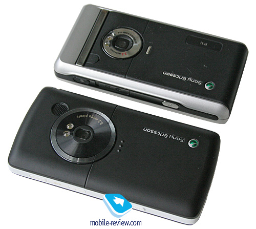
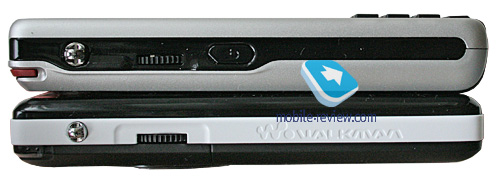
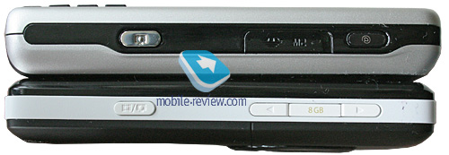
Measuring up at 109x55x16 mm and weighing in at 119 grams, it is almost no different from the P1i, meaning that you can carry it as you please. It would seem that the same controls layout is a pretty much consistent solution for the W960i, but not this time – the maker has turned the things upside down on this front. The left-hand side no longer houses the Return button, since it has moved to the front plate. In fact, this new layout will prove convenient only if you don’t really need the JogDial, since when separated, these two control elements are pretty much useless. Basically, this JogDial+Return couple is designed to let you manage the device with only one hand. But in the case of the W960i, this is no longer possible. In other words, everyone who has been using Sony Ericsson’s solutions for years (the P-series, or the M600i and the W950i) can well kiss their previous experience goodbye – it doesn’t make any sense in the new model. Being a seasoned user of Sony Ericsson-branded phones, I can say that not only is it fiddly and awkward to use, such layout delivers a knock-out blow to the handset’s ergonomics. Obviously, my reflexes tell me that I shall find this key somewhere around the JogDial, but it is not there anymore. We could easily overlook this letdown, if only new users were able to handle the W960i single-handedly. However, even they have to use both hands to move about the device.

I have no idea who was responsible for the W960i’s ergonomics, but the solutions they made are devastating. If it was some second-rate manufacturer, and this was his first go at employing this design, we would appreciate that. But for a company with this much experience and development history, this approach seems to be more of a premeditated suicide. It is a very odd, inconsistent move that I can find no explanation of.


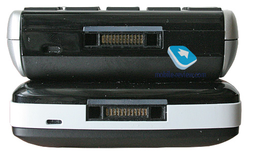
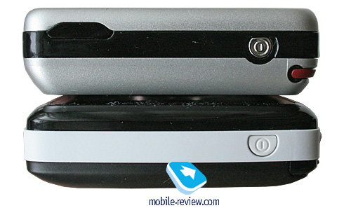
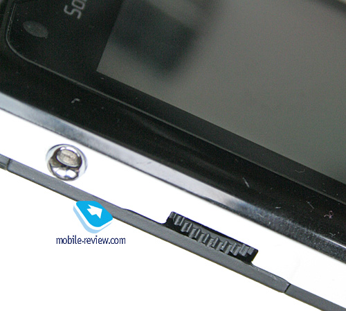
The right-hand side now features two volume control keys (the P1i has the network shortcut button, that can be programmed to access other features), and the dedicated camera button. The top end plays host to the power key, and flipping over to the W960i’s bottom end, you will find the service indicator, which isn’t the best possible place for it, except for when the phone is on a table in front of you. The SIM-card slot beneath the battery has no special traits to it, in contrast to the M600i/W950i, which used a couple of runners.


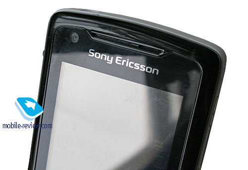
Above the display sits the forward-facing VGA camera for video calls in 3G networks.

Back to the table of contents >>>
Display
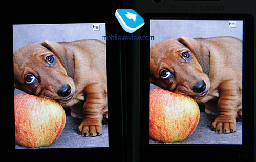
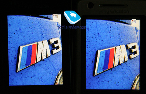
The W960i and the P1i enjoy the same display type, at least that’s what occurs to you when looking at their specs. It is a QVGA resolution (240x320 pixels) display measuring 2,6 inches from corner to corner (39x53 mm), 262 K colors. Comparison of one and the same image displayed tells us that the brightness and contrast parameters are even. However, the W960i’s performance is marred by the protective glass, which slightly reduces the picture’s brightness and somewhat distorts the colors, but this doesn’t make all the difference in real life situations.


The screen can hold up to 14 text and 3 service lines. Information is fairly legible; fonts can be adjusted to your liking. The W960i does well in the sun, when indoors it outputs crisp and color-saturated picture. Yet setting it against displays with smaller diagonal, you will surely notice that its image quality is inferior – even the Samsung D900i puts up a richer picture (or the Motorola Z8).
Back to the table of contents >>>
Keypad
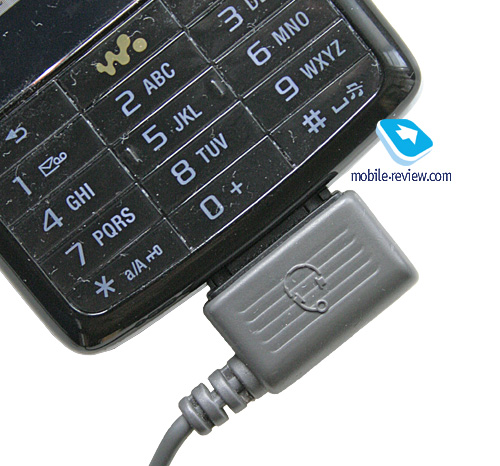
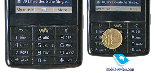
The W960i comes with a conventional number pad with cramped button, but thanks to their size and the area they occupy, this keypad is a cinch to type with, even though, to my liking, these buttons could use some deeper travel. There is the dedicated Walkman key for starting up the player, and right above the number pad there are three touch-sensitive keys just like on the W950i. All buttons are lit in pretty dim white, which is still enough for most environments.

Back to the table of contents >>>
Battery
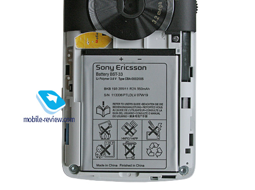
The handset comes included with BST-33 battery (Li-Pol, 950 mAh) which doesn’t differ from other smartphones from the company. The maker quotes the battery life at 5-9 hours and up to 330 hours for talk and standby times respectively. In conditions of Moscow networks, the handset lasted for about 2 days, at one hour of calls, up to 6 hours of music playback, 2 hours of radio, rare file transfers over Bluetooth and up to 20 minutes of mail checks, web browsing. It takes the W960i about 2 hours to charge up from empty to full. It doesn’t differ a bit from the Sony Ericsson P1i in the sense of battery life.

In the most intensive usage mode, the charge on the battery lasts for 1 day – during this time span not only can you listen to music without taking a break, but also check mail and browse Internet pages on a regular basis. Taking into consideration that the majority of users don’t employ capabilities of the device to this extent, the battery life will average two days or so, but it depends on every given case. Those, who don’t aim at listening to music or using other functions too often, the device will offer 2-3 days of online time. From my point of view, three days at this pace aren’t too hard to achieve, but in this case, going for this device doesn’t make any sense
Back to the table of contents >>>
USB, Bluetooth, WiFi
USB. Files are transferred onto the W960i via USB-connection with 2.0 Full Speed version (12 Mbps) supported. Upon connection to a PC the smartphone is displayed as a USB Mass Storage, which allows the user to see all sections, saving for system folders. Another way to pair up the W960i with your PC via USB is Modem mode, when the smartphone starts acting as a wireless modem.
Bluetooth. The W960i comes equipped with EDR-enabled Bluetooth 2.0 and allows for up to 16 devices on the list. The following profiles are supported:
- Dial-Up Networking Profile
- Generic Access Profile
- Generic Object Exchange Profile
- Object Push Profile
- Serial Port Profile
- Handsfree Profile
- Headset Profile
- Synchronization Profile
- Basic Image Profile
- File Transfer Profile
- HID (host) Profile
- Stereo Advanced Audio Distribution Profile
- Advanced Audio/Video Remote Conference Profile
The Bluetooth implementation is, as always though, nothing to complain about, we encountered no issues with handling this type of connections. The data speed on Bluetooth connection makes 50-60 Kbit/s.
WiFi. The handset shows off support for 802.11b (11 mbps), enabling you to connect to two access points and has nothing against pairing up with hotspots. Going online through WiFi allows all preinstalled applications that have something to do with Internet connections to start up and operate properly. The inbuilt WiFi makes checking mail, surfing web a very gratifying experience. The smartphone can use network connections established on other devices (while being connected to them via cable or Bluetooth). WiFi didn’t deliver any hardships; listing extra options, we can’t overlook the possibility of saving settings for certain networks.
The following authentication profiles are supported:
- WEP
- Shared WEP
- Dynamic WEP
- WPA Personal and WPA2 Personal
- WPA Enterprise and WPA2 Enterprise
VoIP. Sony Ericsson hasn’t come up with a standard VoIP solution, yet has polished and prepared all the required libraries, which makes it possible for third-party companies to develop custom applications. They can utilize WiFi connection for VoIP calls, support on-the-go switching to another network connection, if WiFi signal suddenly breaks down, also there are codecs available for improved sound quality and so on. An example of such client is the software by OptiMobile.
Back to the table of contents >>>
Memory
The phone comes with 256 Mb of flash memory with 128 Mb being user-manageable (Disk C or the internal memory). And Disk D, in its turn, is a flash-powered 8 Gb storage drive, identified as removable drive in the USB Mass Storage mode.
Back to the table of contents >>>
Performance
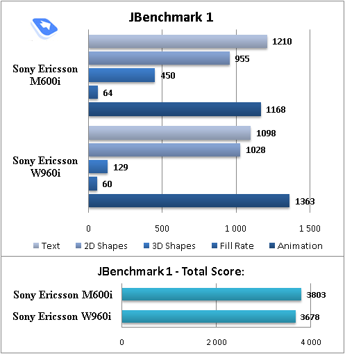
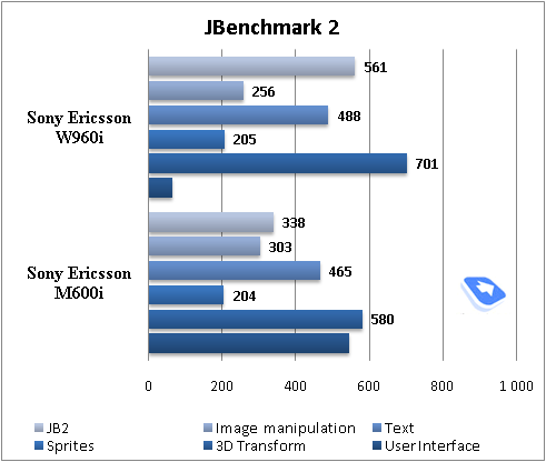
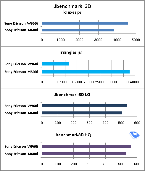
The model runs on the same hardware chassis as the previous Sony Ericsson’s offerings, meaning that it is powered by ARM9 processor, whose frequency tops out at 220 MHz (though in real-life it runs at 180 MHz). In fact the CPU is the system’s greatest headache, that doesn’t allow going for even better performance. This doesn’t necessarily mean that the W960i is sluggish – by no means. The handset is on par with S60 smartphones, entering or exiting items takes about 1-2 seconds. The increased memory bank has had a positive impact on the stability of the device, rather than on its overall speed.


Back to the table of contents >>>
Hardware specifications
- Codename: Maria
- OS: Symbian 9.1, UIQ 3.0
- CPU: ARM9, 220 Mhz (real clock rate – 180 Mhz)
- RAM volume: 128 Mb, after start-up around 70 Mb available
- Flash memory volume: 256 Mb (95 Mb occupied by the system, up to 160 Mb available for user-data)
- Built-in memory volume: 8 Gb
The memory puts the following limitations on the data entries:
- Contacts – 2000 entries
- Calendar – 1000 entries
- Notes – 500 entries
- Tasks – 500 entries
- Email – up to 1000 letters
- Bookmarks – up to 500 entries
Back to the table of contents >>>
Localization quality
As it has always been the case for UIQ devices, you can upload extra language packs from PC so as to change the menu language. Regrettably, no leap forward has been made on this front since the release of the Sony Ericsson M600i – specifically, the mail client features only partial localization (some folders are given in Russian, while others are still in English). Not all terms and captions have adequate translation, or they have simply changed their initial meaning.
Back on the upside, the on-screen keyboard can easily switch between two languages (with Russian interface activated).
Back to the table of contents >>>
Sony Ericsson W960i vs Sony Ericsson P1i
A very important point here is to find out what are the benefits of having the W960i instead of the P1i. Even though there is a ton of tiny differences, there is only a handful of major traits worth highlighting:


| |
Sony Ericsson P1i |
Sony Ericsson W960i |
| Size, weight |
106x55x17 mm, 124 g |
109x55x16 mm, 119 g |
| Display protection |
No |
Plastic layer on top of the display |
| Return key |
On the side-plate next to the JogDial |
On the front plate |
| Stylus |
Metal with a plastic tip |
Plastic |
| Memory |
160 Mb of inbuilt memory, M2 memory cards up to 4 Gb |
160 Mb of inbuilt memory, 8 Gb flash memory, no memory cards support |
| Music player |
2.x for UIQ |
3.x UIQ Touch |
Back to the table of contents >>>
Interface
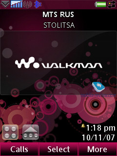
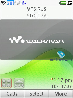
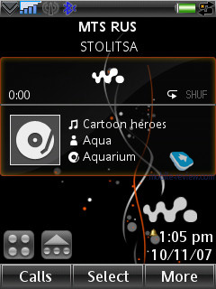
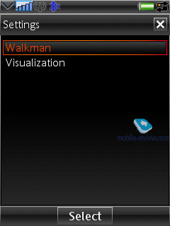
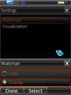
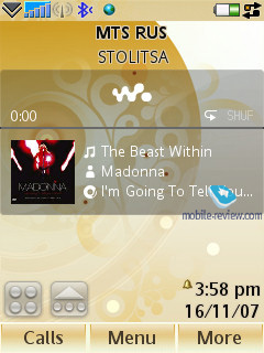
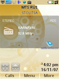
Unlike the previous models, now you can choose the default display view – either the standard Today or the Walkman edition. In the latter case two extra icons for accessing the menu and the shortcuts beneath pop up, while the main area of the screen is occupied by info on artist, current album and the Album Art. This same zone is also used for information on your current radio station.
The Today screen is a joy to use. In the upper part of the screen you will discover “Today” title, on the left – a small “plus”, which means the ability to expand this item. Having pressed JogDial key you will see the menu containing all recent unread e-mail messages, SMS, calendar entries, tasks and missed calls. Each of these items can be examined separately and the pop-up lists will show titles of messages and notes. Not only does this allow you to soar through your messages and notes, you will also be able to open them, and moreover there is no need in the touchsceen or the keypad in this case – everything is performed single handedly, using the JogDial.
The shortcuts bar with 5 thumbnails has been extended with two more lines, though by default they are hidden – to see all shortcuts, you will have to open the list. You are free to assign shortcuts to any application (including custom apps), file (be it a photo, recording or something), telephone number, or new SMS, email, some particular radio station etc. These shortcuts are gratifying indeed and do a great job enhancing the device’s functionality.

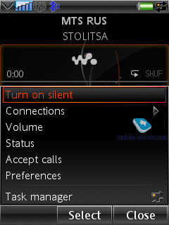
Task manager. Two arrows pointing at each other are displayed in the status bar on the right; this is the task manager icon. The previous models running on older UIQ versions really lacked such ability, and now you can call a list of recent applications and launch them again from here. The device employs preemptive multitasking.
Text input. The device offers three ways of texting: the first one is recognition of hand-written characters; it hasn’t been changed at all, compared to the P-series. The second is the on-screen keyboard – you’re at liberty to switch between different layouts, e.g. from Russian to English and vice versa. In the third place data can be entered via the standard keyboard, here you can use the text prediction system, T9.
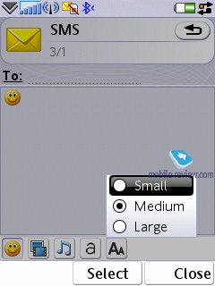
Text in all pre-installed applications can be zoomed in/out – by default they employ Medium font size. Making fonts smaller doesn’t result in illegible text – on the contrary, it is still quite easy to read, yet the W960i manages to squeeze some more lines into the display The same goes for the increased size, however here we expected to see a more substantial growth; anyway the font becomes even more recognizable, though it doesn’t differ too much from the standard size.
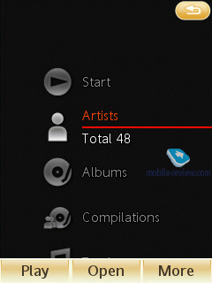
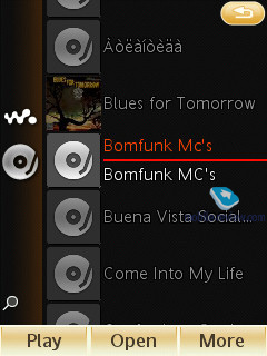
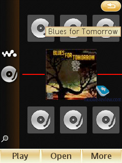
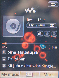
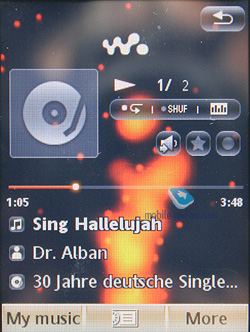
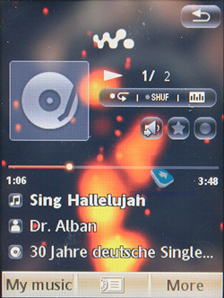
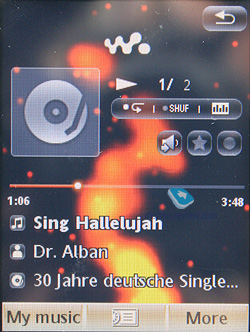
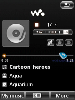
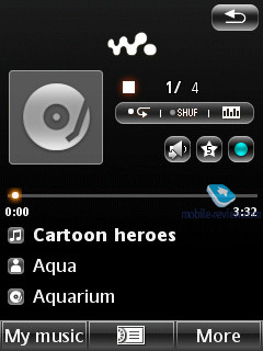
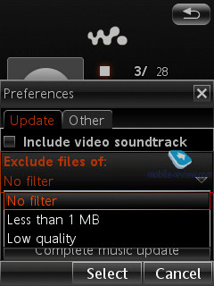
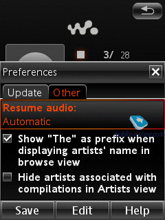
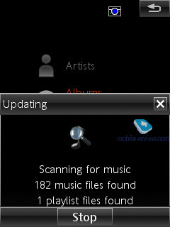
Music department. The handset makes use of the Walkman 3.x Touch player for UIQ 3.0. It seems the W960i’s developers have lost sleep over the iPhone’s hype, and thus decided to bring about finger-based player management. But the truth is, the implementation of this concept found in the W960i leaves much to be desired. The major niggle is with the lists design, when you can’t scroll through a length list of track titles or album arts with your finger, so you have to use the JogDial. Curiously, the stylus-less navigation works out perfectly when you have only a handful of albums (5-6), so they all fit on one page. But should you music library be of greater size, it gets much more awkward to handle.
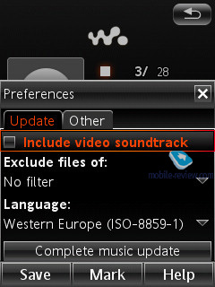
Supported audio formats – MP3, AAC, AAC+, E-AAC+, WAV and m4a. No limits on the bitrate of mp3-files should be observed, you can also upload VBR-tracks.
The handset comes packaged with HPM-70 headphones, which employ the Fast Port slot. On the plus side, it supports A2DP-profile for Bluetooth, which provides for connectivity between the phone and a wireless headset. Set in this mode, the W960i keeps itself up and running for about 6,5-7 hours straight (loop playback, no other tasks or applications running).
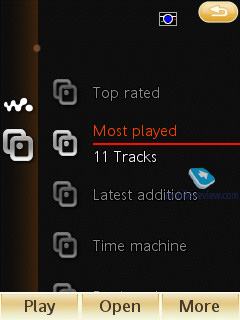
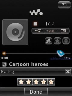
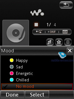
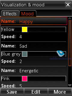
Apart from the Artist, Genre, Album and Playlist filters, the W960i offers a bunch of new settings, specifically mood-dependant playback, which is some sort of a rating, that you can set up manually for every song. Another new filter is called Time Machine, which allows you to playback tracks of some specific year. Other categories are: Most player, Latest Additions, Top Rated. The amenities you get with the player include the bookmarks, meaning that you can bookmark any place within a track, which will come in handy for audio-books fans.
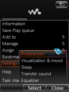
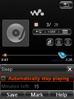
There are four visual effects available with the W960i’s player, which have been embedded just for the sake of it, being of no real use. The player also can turn itself off automatically.
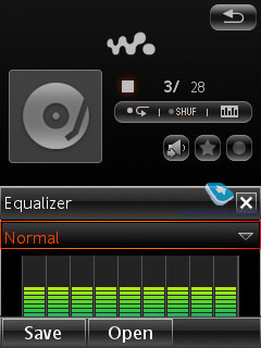
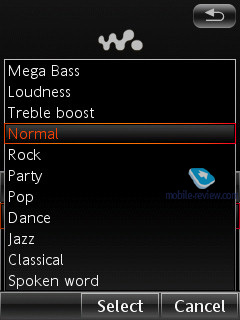
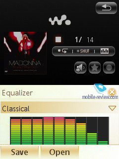
The W960i comes with 11 equalizers, which do make the difference in the way your music will sound, but the sonic experience here is what you would normally expect from UIQ-smartphones, so nothing to shout about. Compared to the Sony Ericsson P1i, the W960i is a tad louder, but isn’t a better performer overall. The major differences between the two lie in the software and the built-in player’s abilities.
What we liked about the W960i’s player is the list of currently playing tracks, where you can throw flies as you go, and even save it as a playlist, which is quite handy.
Software-wise, this version of the Walkman player is one of the best we’ve seen, but at the same time, it delivers no breakthrough in terms of sonic experience. In fact, with no dedicated audio chips on offer, Sony Ericsson risks ending up on the skirts of the market.
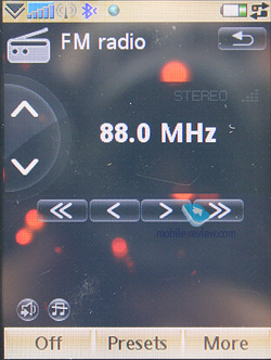
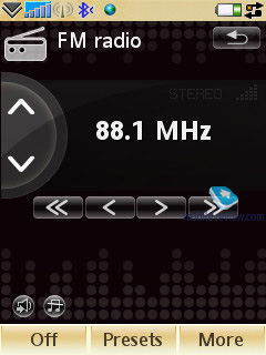
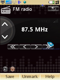
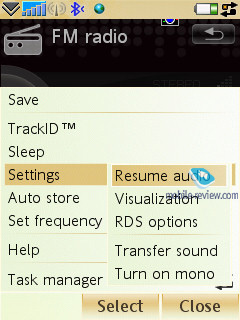
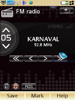
FM-radio will start up only with a headset plugged in (comes in the package), this radio enjoys stereo sound technology. The implementation quality is comparable with the Sony Ericsson P990i, meaning that there is nothing new brought to the table. The user can store up to 20 stations in the handset’s memory, opt for auto-tuning, or take advantage of RDS. More importantly, for RDS you can set up automatic launch of news blocks on traffic jams or hottest news. For such broadcasts you can modify the volume level in the settings, making them more audible. Sony Ericsson equips its handsets with one of the most sensitive radio modules – we managed to track about 20 channels without hitting 100 MHz, while the rivals put up 10-15 across the entire frequency range.
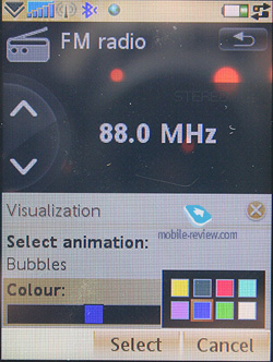
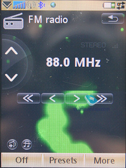
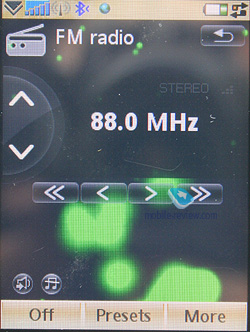
Now the radio comes with the auto turn-off feature. Also you can pick some visualization effects, and unlike those available for the player, here you can select their colors as well.
TrackID. Allows recording a short clip of a track and then retrieve the artist and song title via the TrackID service – it has been around on the previous offerings from the company, now it is available with the W960i as well.
Games. The phone comes preinstalled with one or two entertainment applications, by default these are NightClub Empire and QuadraPop.
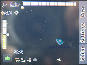
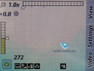
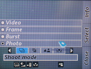
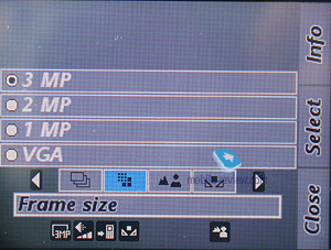
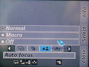
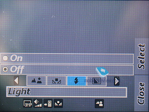
Camera. The model doesn’t belong to the CyberShot camp, nevertheless comes in packing a 3,2 Mpix camera, which is getting to be par for the course for Sony Ericsson’s mid and top ranges. This camera boasts auto-focus ability as well as the LED flash, and speaking of the interface, it is a standard UIQ 3.0 fare, matching that of the Sony Ericsson P990i.


Snaps can be taken in the following resolutions:
- QXGA (2048x1536)
- UXGA (1600x1200)
- SXGA (1280x960)
- VGA (640x480)
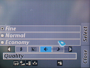
Traditionally there are three quality settings (all shots have 18-bit color depth):
Effective distance for the Macro mode is 10-50 cm.
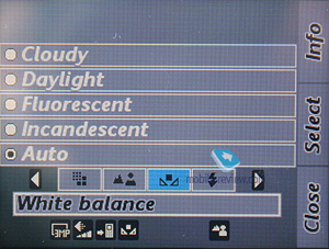
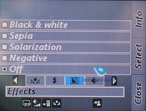
Also, you can use such effects as Black&White, Sepia, Solarization, Negative, - go for the multi-shot mode, apply frames, alter white balance settings, turn to digital zoom (x3, SmartZoom feature – as you zoom in the picture gets smaller).


The handset doesn’t pack the BestPic feature, which normally characterizes the CyberShot series.
 |
 |
| (+) maximize, 2048x1536, JPEG |
(+) maximize, 2048x1536, JPEG |
 |
 |
| (+) maximize, 2048x1536, JPEG |
(+) maximize, 2048x1536, JPEG |
 |
 |
| (+) maximize, 2048x1536, JPEG |
(+) maximize, 2048x1536, JPEG |
 |
 |
| (+) maximize, 2048x1536, JPEG |
(+) maximize, 2048x1536, JPEG |
 |
 |
| (+) maximize, 2048x1536, JPEG |
(+) maximize, 2048x1536, JPEG |
 |
 |
| (+) maximize, 2048x1536, JPEG |
(+) maximize, 2048x1536, JPEG |
 |
 |
| (+) maximize, 2048x1536, JPEG |
(+) maximize, 2048x1536, JPEG |
 |
 |
| (+) maximize, 2048x1536, JPEG |
(+) maximize, 2048x1536, JPEG |
Video. There are several resolutions supported, below we are giving samples of two of them (captured in mpeg).
Video example (1,76, 3gp) >>>
Video example (1,92, 3gp) >>>
The video recording quality lives up to the brand yet lags behind some Nokia-branded offerings. If you are after a decent video department, this is not the right way to go.
The W960i also feature s business card scanner, an application that recognizes data written on a business card and transfers it into the Contact list. This program works only for English, though, and doesn’t do particularly great job reading the cards, which places it in line with other similar applications.
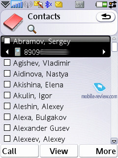
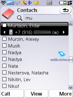
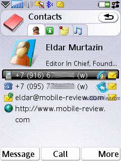
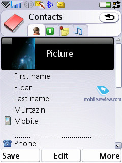
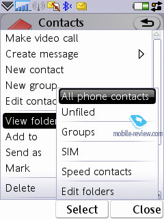
Contacts. All entries in the phonebook are organized in a familiar way: at first the general list is displayed, and once you’ve selected a certain contact, you are offered the default number, set for this entry. The list doesn’t show entries, located on SIM/USIM-cards, nevertheless you’re still able to handle them via the phonebook’s menu – copy them to both the handset’s memory and memory card. But since the external memory card can serve as storage for contacts archives, there is no need in saving contacts to SIM/USIM-cards, especially since entry structure gets damages in that case.
Search in the general list may be performed by the index letters or several letters (the line at the top of the screen is a search field). Sorting of entries in two different languages is carried out in a standard manner: contacts in English are followed by entries made in the other language. It’s better to create all contacts in one certain language, otherwise you’ll have a rough time finding them.
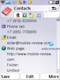
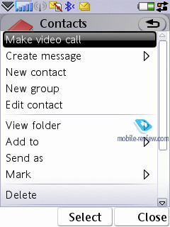
Every contact can contain any number of various phone numbers – the first entered is set as the default number. Extra entries above those, which are available in the standard view, can be added via the menu. You can view all phone numbers assigned to the selected entry by scrolling through them with directional buttons; right here you’ll get extra information on the contact, like e-mail address etc.
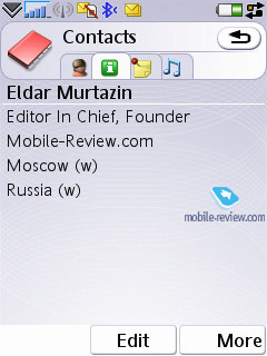
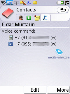
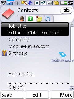
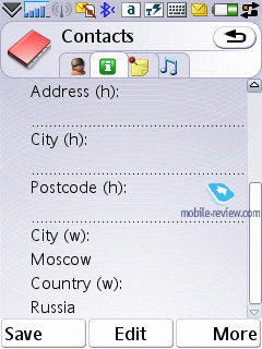
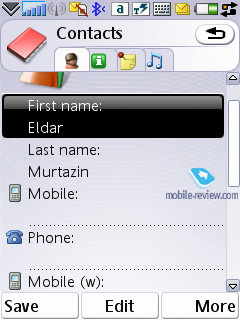
Despite the common manner of UIQ 3.0 implementation, the developers of Sony Ericsson have embedded four tabs in the contact editing mode, against three default ones. The first one holds all functions related to phone numbers editing, choosing category, or, if you like, groups. The distinctive feature here is that one and the same entry can be assigned to several categories at a time (may prove useful when dealing with bulk mailing). The second tab contains date of birth, status in company, position, address (several fields), and work address. The third tab is just a text note, attached to a contact, while the fourth tab provides data on voice commands (applied to phone numbers) and personal ring tone (in case you’ve set a group ring tone, on inbound call it will be replaced by an individual tune, since the latter has a higher priority). As you can see, the only option differing from the standard set is the tab with a text note.
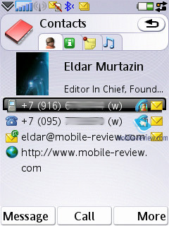
When viewing an entry you can initiate creation of a new message for the selected number in one touch (in the pop-up window you should choose the type: SMS or MMS), and in case you have picked an e-mail address, the built-in mail client automatically starts up.
An IM-client is integrated into Contacts, from here you can examine your contact’s status and launch a respective application (it’s a non-standard UIQ implementation).
A built-in contact manager is also available in the handset – it allows the user to send selected entries (categories) to other devices over Bluetooth, also the phone supports vCard 2.1 standard. This way, you can receive entries from other devices exactly in a similar fashion.
The full-fledged support for SyncML (new title of OMA DataSync) allows synchronizing data with every device, that can deal with this standard (no matter whether it's PC, PDA or a handset).
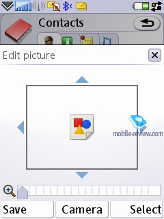
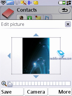
The photos, applied to contacts in the phonebook can be displayed in various modes (tile, stretch), which makes for better picture quality in various modes
The quality of the phonebook found in the W960i is fairly good and will satisfy even the most demanding user. Integration with the built-in applications is next to the deepest possible, which makes the smartphone even easier to use. Even when working single handedly, you won't experience any difficulties with scrolling through the list, choosing a number and dialing it.
Holding the numeric keys down activates the search function in the phonebook, which can be done by several letters. As an addition, you can set up to 9 numbers for speed dialing, which will be followed by the matching names and photos (if any) on the display. The dialing process is carried out in the following manner: first you choose a number (at this moment the contact’s name, assigned to this button pops up) and then press the call key. When at the standby screen, switching between dialing a number (numeric keys) and fast dialing numbers is done in one touch by pressing the corresponding icon.
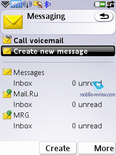
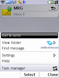
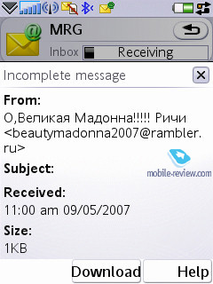
Messaging. All incoming messages, saving for e-mails, are stored in one folder – Inbox. This also goes for the files, received through Bluetooth (the device supports all formats, even those it can’t recognize). The data, located in Inbox can be later on saved in any other folder – the handset ensures unlimited access to the file system (except for the system folders). The user also can create own at liberty to create own folders and sort messages in them. When entering the Messaging menu, by default you’re shown the general folder, by using horizontal scrolling you will switch between files, and pressing OK key selects a particular folder and allows viewing the message list.
The root of Messaging menu features the list of all mail accounts where they are display as separate entries in the Inbox folder – e.g. if you have three of these, they will be displayed in order of appearance.
The Inbox folder also offers type of each message (SMS, MMS, Beam) – you see a respective image next to each item.
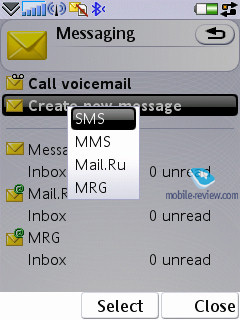
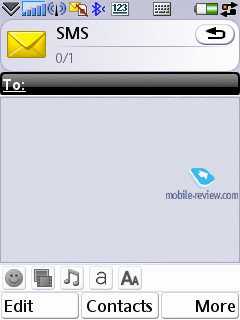
You can also start composing a new message technically from any menu, which features a phone number – just choose the type you need (SMS/MMS) and start texting. Though under the name of SMS you will surprisingly discover EMS messages as well. As a matter of fact, the can’t decide message of which type he creates – if you type only text, the device will take this message for an SMS, and EMS is used in cases when you use not only smiles, but ring tones, images and formatted text (this has nothing to do with zooming in/out). This standard is fully supported in the handset, just like we have come to expect from it.
The concatenated messages are listed as one, when typing they are displayed in a standard manner e.g. 1/2. I would like to stress that the refined T9 system, which analyzes the entered words and offers their probable ending, does a fantastic job (the system is organized similarly to that found in Motorola’s handsets). Another amenity is that the device saves entire messages (they are stored in the dynamic memory, though I didn’t manage to figure out its size, these are NOT Draft messages). When you start typing a word, which was featured in the previous messages, you will be offered either to pick it from the list, or continue typing. Once you’ve entered some word that differs from the saved message the rest of the optional text disappears. In fact it’s the best way to store temporary messages, which you don’t want to store in the Draft folder. Among other traits we shall note on-the-go letter case switch – first letter is always capital, though you can turn this option off. Also text smiles can be displayed as corresponding icons in the ordinary messages.
Any message can be sent to a number of contacts at a time, all you need to do in this case is tick the required entries or certain numbers of a contact. Bulk mailing can be performed for groups as well. When answering a received message you can choose between SMS/MMS (though the list doesn’t include reply with an email option).
MMS-message creation - one of the best things about it is that several tabs are available here, with which you can choose the time-out between pages and create templates of your own. Besides the standard files (graphics, video, images, music etc.) a message can contain a hand-written sketch made on the touch-screen (Scribble). All other options are run-of-the-mill here – choosing contacts at the recipient window is similar to SMS-messages, though MMS also features reading report in addition to the standard delivery report.
For all types of messages, including e-mail, you can perform a search by fragments of text – the window displays search results and provides for the possibility of switching to a certain message outright. We couldn’t find any limitations on a message’s size – these will be set by operators or the manufacturer, depending on the given region.
The handset provides full-fledged support for OTA reception of MMS settings, mail client, GRPS. All received settings are saved in respective sections.
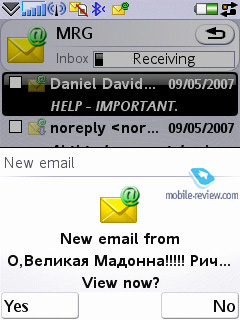
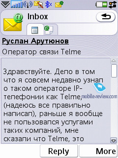
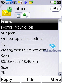
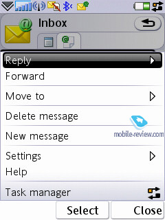
Email client. It has undergone no serious changes compared with the Sony Ericsson P990i, the only difference is that the Push Mail item is now featured in the menu. The W960i can deal with several mail boxes, moreover UIQ is capable of working with practically all standards presented in the today’s market. Below is the list of all standards supported by the W960i:
- POP3
- IMAP (IMAP Idle, IMAP Remote folders)
- SMTP
- MIME
- MHTML
- Push mail.
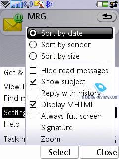
All settings of the mail client are easy to adjust – you set whether it should upload entire messages or only headlines (optionally, it can download a certain part of messages, not exceeding certain size set in Kb). You can also setup how many messages will be stored in the Inbox folder at a time – once this number is reached, uploading will be paused automatically. There is also an option for scheduled mail checks.
By default UIQ uses Latin 1 character set. The developers can also add other character sets, and Sony Ericsson will also feature local character sets for some regions (1251 is also on that list).
All attachments are handled by the mail client with ease– they can be uploaded and then saved. If an attachment uses a format, supported by the smartphone, it may be opened (and what is more this attachment receives a corresponding icon). There are no restrictions on file size – none that you should observe.
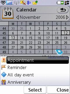
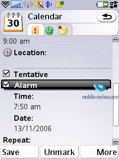
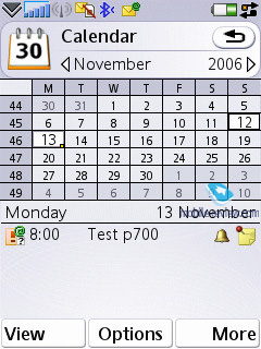
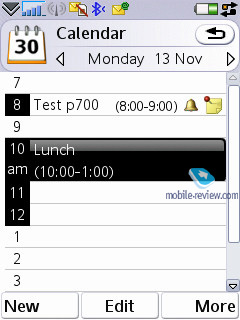
Organizer. The calendar provides not only the conventional month and day views, but also the week mode. In this appearance a week is presented as two columns with the weekdays filled in them, where each square features scheduled events. This mode is rather handy and allows the user to quickly estimate how busy he is during the week to come. When number of events for a particular day exceeds five, not all of them get listed outright.
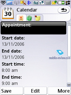
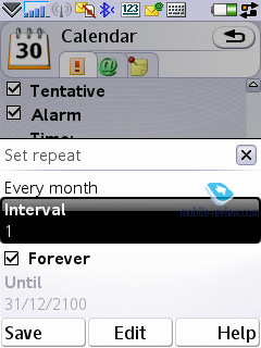
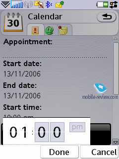
In the month-view all dates with scheduled events, are marked with corresponding icons put to the right of the number. There are four types of events – appointments, reminders, anniversaries, all-day events. Any event may be recurrent, also for each of them you can pick up a certain alarm tone.
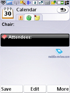
The organizer supports vCalendar, version 1.0, with support for team work via iCalendar. In real-life this means the possibility of sending requests for a meeting, using the mail client. Your vis-a-vis may reply with a refusal, in case date and time don’t suit him, or accept the appointment. In the latter case the message saved in the Inbox folder is automatically redirected to the Oraganiser and shown in the calendar as a stand-alone event. You’re also at liberty to check the request status while the recipient is pondering over his reply.
Though the function seems to be somewhat new right now, soon enough, say, in six months’ time, it may become relevant for small third-party developers and all the leading manufacturers.
Among the standard functions, sending a calendar event to other devices via Bluetooth is available here. Naturally, the handset supports reception of such messages as well, which, after you look through them, are saved in the calendar.
To-Do list. All entries in the Organizer and To-Do list are inter-transferable within the bounds of these two sections. Much like in the Organizer, the user can create a backup copy of the To-Do list on the memory card. You can create any number of categories, which all entries will be sorted by. The priority may vary from 1 to 3 (low, normal, high), also you can set start and due dates, alarm tone (choosing the tone is up to the user, since he can apply any signal).
You can sort the general list by categories, completion status (list of completed tasks may be hidden), due date and priority. The To-Do list supports SyncML and seamlessly synchronizes with MS Outlook. The user can also send particular entries to any device using Bluetooth, as well as a standard message’s body.
Alarm Clocks. This function works exactly in the same way as in the previous models – you are enabled to set up several alarm clocks to go off on at different times, and adjust reoccurrence settings for particular days, apply any desired ring tone.
Flight Mode. Similarly to other smartphones, the handset can work with the radio part disabled – in this mode Bluetooth is not available either. Unfortunately, SIM-less operation is not possible with the W960i.
Connections manager. One of the things characterizing UIQ 3.0 is that the device can run several connections, requiring different network services at once (e.g. mail upload via an Internet account and a connection for sending and receiving MMS-messages). This ability is called “multi-homing”. The following standards can play the role of the gates: GSM data call (CSD), GSM High Speed data call (HSCSD), Packet data (GPRS), Bluetooth, WLAN.
From the menu (the line with an arrow in the status bar at the bottom) you can check connection time, amount of incoming and outgoing data, current connection status, number of applications, using specific connections at the given moment. You can also cut off or link up any connection from this menu.
The capability for several applications to work with one and the same connection at once cannot be overestimated, since it creates a real multitasking environment, where one can simultaneously watch streaming video, check mail boxes and send messages. It’s important to realize though, that the only limiting factor is bandwidth – in case the user tries to execute several applications requiring high data speeds, this will result in system failure or very slow operation of the device. Certainly there are some pre-set priorities for various applications, integrated into the device, though we haven’t figured them out so far.
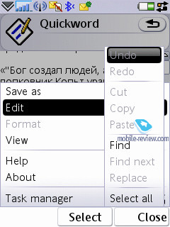
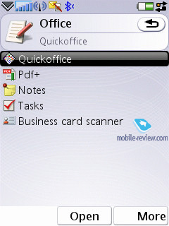
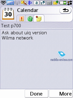
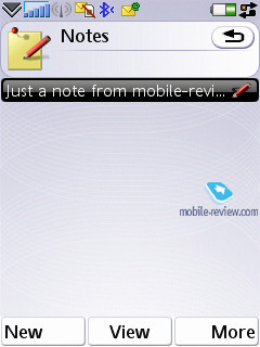
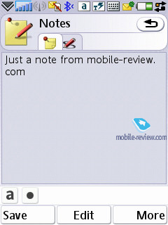
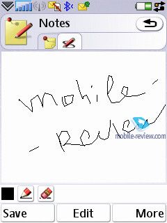
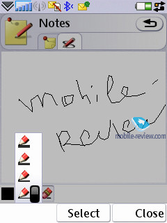
Office applications. This section holds all office applications; by default there are four of them (except for the organizer, which is a standard program). The first item on the menu features Notes, which can be either text (typed with any method you like, txt extension is also supported) or scribbled.
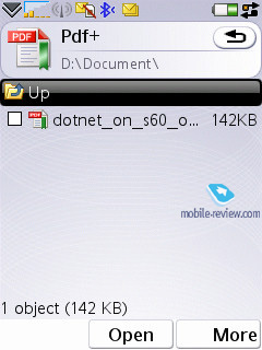
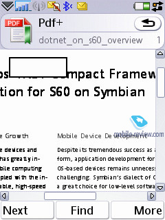
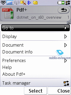
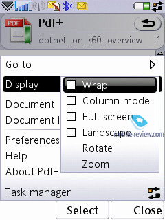
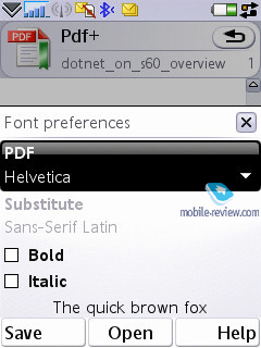
The second application is going by the name of PDF+, and as its title implies, it servers as a PDF reader. You can view these documents either in portrait or landscape mode. Actually, this application has been available for various versions of OS, including platform 60, for several years now. Nokia has also installed this program on a number of its devices. On the whole PDF+ works pretty fast, and seamlessly deals with files both in English and documents, written in various encodings (though as applied to pdf, the very word of “encoding” feels somewhat out of place). This app also retails separately for around 25 USD.
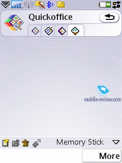
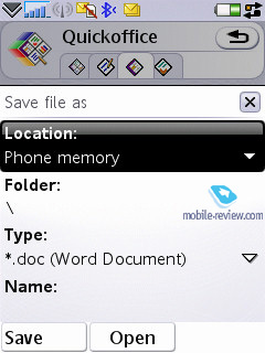
QuickOffice – another third-party application, which has been selected by UIQ as a default app for the third edition and comes along with the standard package (there is a version for the previous UIQ editions available, retails for 50 USD). The program itself is an editor, which recognizes is and capable of opening and editing MS Word, Excel, PowerPoint documents.
We won’t dwell on QuickOffice here, but will make a short note, that the resources of any mobile device are strictly limited. Complicated types of formatting, used by desktop computers, are frequently not saved in files, edited on smartphones (this goes not only for QuickOffice, but all other devices powered by Windows Mobile as well).
Back to the table of contents >>>
Some other features, themes, web-browser
Calculator – self-explanatory application, nothing special in it.
Voice – A sound recorder, which allows making voice notes (only when in standby mode), you are also at liberty to choose the format, which all recordings will be made in. This application offers a very intuitive and straightforward interface. A recording’s length is limited by nothing but the volume of free memory left on the handset.
Picture gallery – the application displays thumbnails of pictures and allows you to toggle into the full-screen mode. No visible changes have occurred in this program, though now you can send an MMS-message containing the image you are currently browsing.
Picture editor – a simple editor, which allows for basic image editing.
MusicDJ – a default application for Sony Ericsson has finally made its way to the smartphones – this app lets you mix a number of tracks into one.
Unit converter – converts various units into other measuring systems.
Stopwatch – supports intermediate results tracking and listing.
Countdown – time is set in hours and minutes, when the designated time span runs out, the devices triggers a sound alarm.
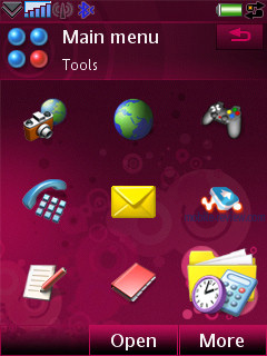
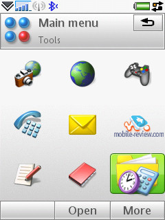
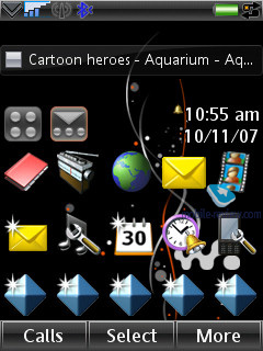
Themes are one of the major parts of the new UIQ –not only do they modify the appearance of windows and colors, but also shape-change particular menus and icons, so this allows making up totally refined looks of the interface. Further more, you can adjust not only graphics, but also sounds of screen taps and various events.
The handset comes equipped with Opera 8 as its default web-browser. These days this is the best browser you can possibly find for this device type, the only counterpart is S60’s browser version two. It can work both in portrait and landscape modes, supports cookies, and scales pages to fit them into the display size. I won’t describe all features of this application here, as there will be a dedicated write-up on this application.
Storage Wizard – is a default application for UIQ 3.0, offering memory distribution status in the device.
File manager allows viewing user’s folders. It supports multi-selection of files or folders, as well as deletion and copying; also you can send a number of files to other devices via Bluetooth. The manager’s capabilities are quite conventional.
RSS Feeds. It’s an RSS reader, which successfully copes with its main function. You may add any channels on your own, and also update all feeds in one touch. Everything is plain and straightforward here – those, who haven’t used this technology before, will become fond of it with the help of this handset.
Back to the table of contents >>>
Competition
At first we wanted to make a detailed comparison of the rivaling models to disclose all their pros and cons, but eventually we realized that given that narrow niche the Sony Ericsson W960i settles down in, these breakdowns were of no real use. Take, for example, the Nokia N81 8 Gb, which is the Finnish maker’s flagship for the six months to come – with its comparable price tag, it will enjoy a more pushy advertising campaign and better bundled services (NGage for gaming, blogging, etc). Also, there is a memory card-enabled edition with support for high-capacity cards (the P1i’s specs claim it works with up to 4 Gb, but it can handle 8 Gb as well, however no cards of this size are available at the moment).
Looking for a better solution? The Nokia N95 8Gb might be the way to go. Although, it ships with a better camera and sits on the shelves with a heftier price tag. By the way, the Sony Ericsson W960i is roughly in one price-bracket with the Nokia N95 8 Gb and the Nokia N81 8 Gb, however Nokia’s solutions are all-round better performers.
Back to the table of contents >>>
Impressions
The volume produced by the 40-chord speaker proves to be sufficient for most environments, and it won’t fall flat anywhere, so you will always hear your W960i ring. The vibro alert is average volume-wise, but thanks to the casing’s thickness you will easily feel it.
Obviously the developers have put too much effort into morphing a touch-screen based smartphone into a feature phone, but somewhere along the way they forgot to cut its price. So they have boosted it with a couple of accessories, but even on this front it is not all sunshine and rainbows. This way, the Sony Ericsson W960i will retail for roughly 765 USD, but due to some certification issues it won’t ship with a Bluetooth-headset in the box in Russia. And in Europe it will come in with a price tag of 500-550 Euro, which isn’t the best offer out there either. In fact, you can get some more capable S60-powered solutions by Nokia for the same money right now.
On balance, the W960i employs a decent and generally right idea with odd implementation. Who might fall for this device? Those who have already spent some time the Sony Ericsson W950i won’t like the new ergonomics. Basically, old and loyal users have been literally dumped with this phone, for it brings nothing new for them. The W960i resides somewhere outside the company’s mainstream, and aims at a new audience. It is quite another matter, though, that having used this model, you are likely to lose all interest in other Sony Ericsson’s offerings, so this device is more of anti-PR for the brand.
The way it is positioned (as the flagship of the company’s music-inclined offerings) doesn’t seem particularly justified, for its centerpiece, the music department is in line with other UIQ-based devices, like the Sony Ericsson P1i. The Nokia N81 delivers substantially better sonic experience, even with fewer settings on offer. Sony Ericsson’s real music-minded flagship is the Sony Ericsson W910i, but this model ships with some other abilities and settings. All up, there is not much going for the W960i. This model fails as the company’s music-heavy flagship, and there is no real explanation of what has affected the developers to this extent, so that they have come up with a product like this. A few more models designed in the same fashion should be enough to get the brand’s loyal consumers to switch over to Nokia’s solutions, which have more of Sony Ericsson’s spirit today than Sony Ericsson itself. Obviously, the fate knows what irony is, so let’s wait and see how the story will develop.
Back to the table of contents >>>
Eldar Murtazin (eldar@mobile-review.com)
Translated by Oleg Kononosov (oleg.kononosov@mobile-review.com)
Published — 22 October 2007
Have something to add?! Write us... eldar@mobile-review.com
|
News:
[ 31-07 16:21 ]Sir Jony Ive: Apple Isn't In It For The Money
[ 31-07 13:34 ]Video: Nokia Designer Interviews
[ 31-07 13:10 ]RIM To Layoff 3,000 More Employees
[ 30-07 20:59 ]Video: iPhone 5 Housing Shown Off
[ 30-07 19:12 ]Android Fortunes Decline In U.S.
[ 25-07 16:18 ]Why Apple Is Suing Samsung?
[ 25-07 15:53 ]A Few Choice Quotes About Apple ... By Samsung
[ 23-07 20:25 ]Russian iOS Hacker Calls It A Day
[ 23-07 17:40 ]Video: It's Still Not Out, But Galaxy Note 10.1 Gets An Ad
[ 19-07 19:10 ]Another Loss For Nokia: $1 Billion Down In Q2
[ 19-07 17:22 ]British Judge Orders Apple To Run Ads Saying Samsung Did Not Copy Them
[ 19-07 16:57 ]iPhone 5 To Feature Nano-SIM Cards
[ 18-07 14:20 ]What The iPad Could Have Looked Like ...
[ 18-07 13:25 ]App Store Hack Is Still Going Strong Despite Apple's Best Efforts
[ 13-07 12:34 ]Infographic: The (Hypothetical) Sale Of RIM
[ 13-07 11:10 ]Video: iPhone Hacker Makes In-App Purchases Free
[ 12-07 19:50 ]iPhone 5 Images Leak Again
[ 12-07 17:51 ]Android Takes 50%+ Of U.S. And Europe
[ 11-07 16:02 ]Apple Involved In 60% Of Patent Suits
[ 11-07 13:14 ]Video: Kindle Fire Gets A Jelly Bean
Subscribe
|
