|
|
Review of GSM/UMTS-handset Sony Ericsson W880i
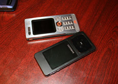
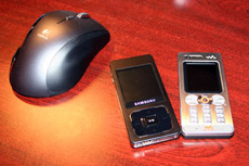
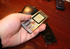
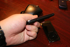
Live photos of Sony Ericsson W880i
Sales package:
- Handset
- Battery
- М2 memory card (1 Gb)
- USB data cable
- CD with software
- Wired stereo-headset HPM-75
- Charger
- User Guide
The launch of the AI handset didn’t come as a big surprise for the market – the first hints about it were leaked back in the second half of 2006, as well as the first enigmatic photos, that didn’t give a solid idea of what the product actually was. Up until the official announcement, which took place on February, 6, the most information-hungry readers of our portal had already had some thoughts on the new arrival’s specifications and features. For the first time Sony Ericsson held a preliminary press conference (in January), where it unveiled the model’s index without revealing its looks. This is yet another touch characterizing the spot the company puts the W880i on.


Looking at Sony Ericsson W880i as a solely “slim” phone wouldn’t make much sense – this handset has a lot of concepts backing it up, and its curves and shapes have been called up by the compact-phones fever that is raging on the market at present. The goal the designers set off to reach wasn’t something run-of-the-mill – since to come up with an iconic product for a concrete audience can’t be simple. In other words a handset for those ready to fork out a lot of money for a handset, willing to demonstrate and brag about own status, and looking for a decent feature pack apart from design, price and brand. A zero-risk strategy that always works out if you take the right course. So they took a slim casing as one of the constituents, and crammed into it the music flagship of ordinary phones range itself (not among smartphones). That is: having taken Sony Ericsson W850i, without cutting off much of its functionality the maker squeezed it in an utterly compact casing. This approach might seem offbeat, but it is vitally important, so as to launch all-round new solutions in future, when amount of various modules inside will keep constantly increasing whereas the handsets’ won’t be getting bulkier. In this regard Sony Ericsson W880i is the first sign, which gives new technologies a go (we are not speaking here about new “slim” releases for Sony Ericsson – definitely there will be some – K-series flagships is out point).

Now let us try to make up an image of a potential Sony Ericsson W880i’s buyers to get a general idea of what this handset is all about and what developers charged it with. The target audience for the W880i may be defined as young people, both women and men, at the age of 25 and older, with higher-than-average income. It may be that they already own a stand-alone music player, so such experience isn’t something new for them. Music sessions for these people happen occasionally – in trips or while away on business or on a vacation. Sounds strange, but a music-capable device for this group serves for emphasizing of the owner’s status and as a rule iPod Nano fits best in this position. The members of this target audience don’t use public conveyances for the most part and prefer going about their business by car, hence they spend most of their time in-doors.

Another group the handset focuses on is enterprise consumers, those who already own a gadget for work but would love to put in their pocket a fashion handset (to show off their status) with a lot of technological talents (music). To put it simply all they want is purchase a phone for soul’s sake. It is another remarkable audience that overlaps the one mentioned previously in the sense of lifestyle.
This device is by no means aimed at techi – they already have Sony Ericsson W850i within their reach and also a number of impending gadgets. The goal of Sony Ericsson W880i is becoming a mass offering for the top fashion-conscious price-bracket. When I was thinking of identical products released in the past, I got one on my mind, specifically Nokia 8210, which was much akin to the handset reviewed today in terms of target audience, positioning and everything else. And the success of Nokia 8210 proves that such offerings actually do appeal to potential consumers. So what is it that Sony Ericsson W880i is going to win the place in our hands and hearts?
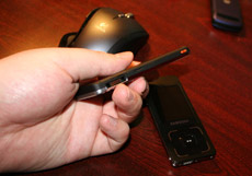
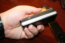
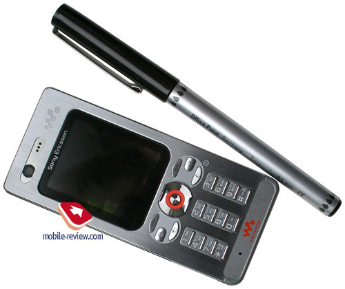
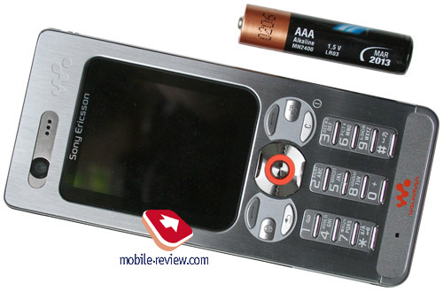
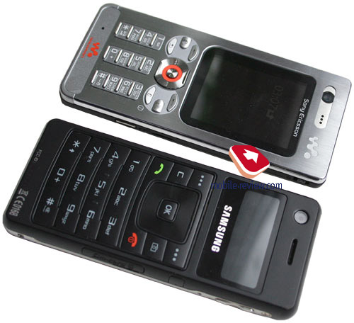
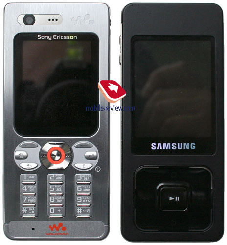
First off, size. In all booklets that have something to do with the handset, you will find one thing they hype up most of all – the fact that the W880i comes in only 9.4 mm thick, which is the current all-time record for the company and besides one of the market’s thinnest offerings. The phone measures in at 103x47x9.4 mm – this candy-bar shaped handset utilizes classical sides ratio and doesn’t look and feel too tall or wide (Samsung U100 is a classic example in this case – a slim monoblock successor to Samsung X820 that has been steamrollered one more time). The handset readily slips into a breast pocket and keeps low profile while in jeans, which has both positive and negative side about it, but rest assured the W880i is not a burden. The phone weighs in at 73 grams (71 without a memory card).


The market hasn’t seen too many phones this small to date – there some proposals by VK Mobile, sold under Fly trademark on the Russian market. But they are definitely not an option due to being unknown to the most of the audience. For example, in May, 2006 the VK2020 had a very aggressive advertising campaign in France, with the advent of a new virtual operator the handset was retailed at a price of 0 Euro. Nonetheless the sales ended up on a mediocre level, in spite of tons of advertisements at rail-road stations and magazines.

Dimensions-wise the W880i is rivaled by Samsung P310, which measures 86x54x8.5 mm, yet it has other aims in terms of functionality, thus it doesn’t fit in this role. We would rather give this title to Samsung F300, which measures a slim 103.5x44x9.4 mm.


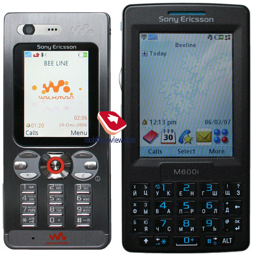
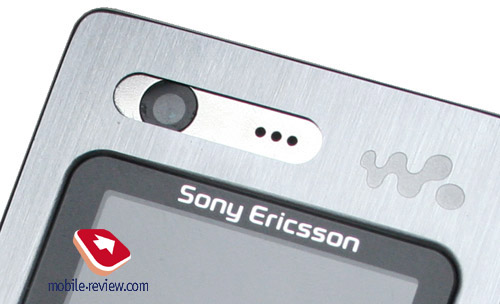
The handset’s design is no stranger to Sony Ericsson’s style and is easily recognizable. In many ways Sony Ericsson W880i is modeled after the P990i – narrow buttons, location of the forward-facing camera and general resemblance in curves.

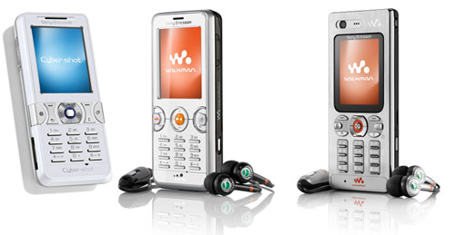
Being a music flagship and a top fashion-conscious solution this handset was to be followed by some replicas for the lower price-brackets, and here they are: Sony Ericsson W610i, Sony Ericsson K550i. Over there skinny buttons look somewhat out of place, but it is not only about keys – rounded out soft-keys layout is another thing that these models share, so all in all we witness how a new type of products emerges in the company’s range.

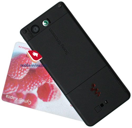
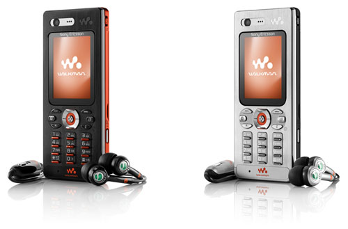
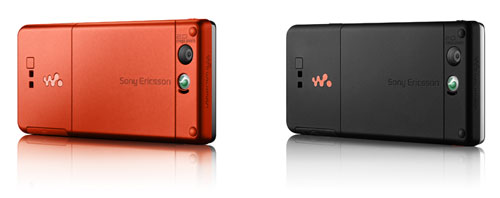
The W880i comes in two trims - Steel Silver and Flame Black. In the former variant the faceplate is made of silverfish brushed metal, whereas the sides and the rear face utilize black-colored soft-touch plastic, preventing the device from sliding down on ramps The other color solutions enjoys black front panel and orange back plate, and while keys are finished in orange, they are still backlit in white.


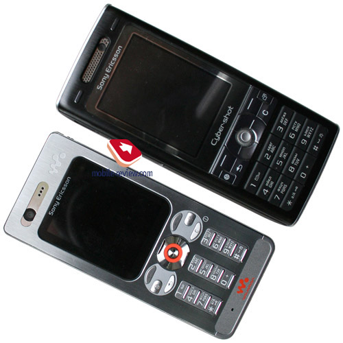
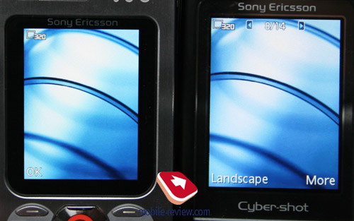
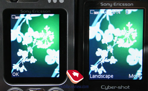
The build quality was never an issue with the W880i – I didn’t stumble upon any creaks even when I gripped it firmly in hands, gaps between details were not spotted either. The front panel plays host to a VGA camera for video calls within UMTS-networks, which is located right on top of the display – measuring 1.8 inches diagonally and being capable of 262 K colors (TFT) it employs QVGA resolutions (240x320 pixels) and accommodates up to 8 text and 3 service lines. The picture quality output by the screen was admirable indeed – I couldn’t find a single flaw with it; all colors there appear bright and vivid. Occasionally I felt it could use a bit more of real estate, though – it does look small, no doubt about that. Also, unlike Sony Ericsson K790i/K800i you won’t find a protective layer here that guards the display from extra portions of sunlight, which means that it does worse in the sun than its K-labeled sibling.


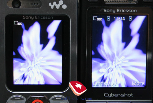
I was really excited to check out how different one and the same image looked on W880i’s and K800i’s displays, as while they share the spec sheet, the K800i boasts a diagonal of 2 inches. And the fact of the matter is, the larger the diagonal is, the more appealing the screen looks, even though the picture quality proves to be the same for either display – take a look for yourself.


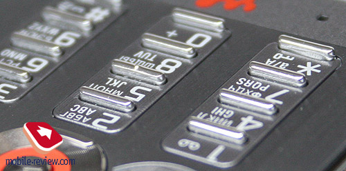
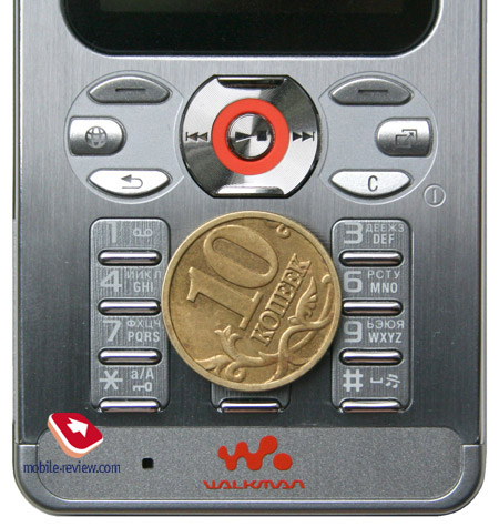
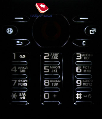
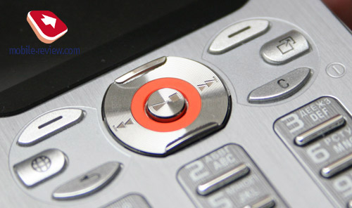
Now onto the keypad - this is in fact what puts many people off when they have a glimpse of the phone. Tiny casing size forces developers to apply unusual solutions, which have materialized in the form of narrow keys raised above the surface a tad higher than we have gotten used to. Thanks to this novelty handling the keypad is relatively convenient, even though typing long SMS message is still far from breeze-like experience. The keypad presents you with average ergonomics – it won’t be much of a hassle, since it looks much worse that it performs in practice. All buttons are evenly lit in white, which makes for easy texting in various environments.


The four-way navigational key is edged with ridges located on top and at the bottom, thus overall it is easy to work with. All in all the keypad leaves only positive feelings – I have no serious niggles with it.


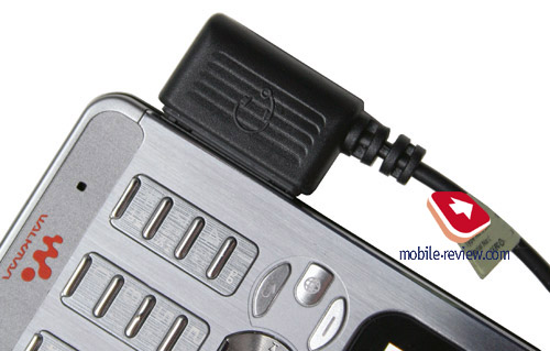
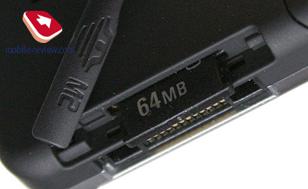
The interface socket Fast Port has moved to the left-hand side of the phone, which is another consequence of employing such design. This slot is not covered by a flap and thus is always wide open. Another thing of note is that right beneath it is hot swap-enabled M2 memory expansion slot (that deals with any size of memory cards, in current firmware the cap is 8 Gb), that can be accessed only with a disconnected headset.


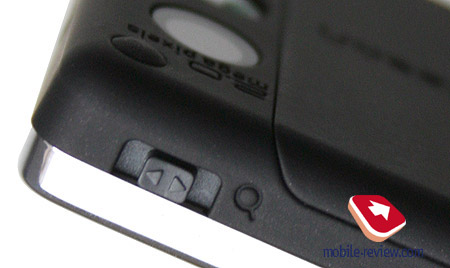
The dedicated music key is positioned more towards the top end on the same side – pressing it instantly calls up the music player, however the button sinks inwards, so pushing it might turn out to be a struggle. On the right side is a camera shortcut key, as well as volume controls (zoom in/out in shooting mode), but this time around it doesn’t makes use of already familiar and beloved rocker setup – it is a slider, which seems skinny and unhandy on the face of it. Nonetheless handling it in real life was never an issue – you just need to slide the finger across the side and that's it. The only letdown here is absence of tactile feedback, which confuses a little in the first place. At the same time in music playback mode holding this key doesn’t adjust volume level, but navigates through tracks instead, much like the previous models. However it is not the best solution out there – you end up changing volume step-by-step. Twofold purpose of this key is more of a relic nowadays and on top of that the W880i lack FM radio transmitter.

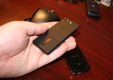
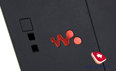
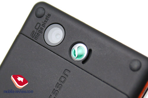
The rear side houses the company’s logo and the speaker’s grill located right next to it. The speaker itself is nothing to shout about – it is average in terms of both quality and volume provided. In hands free mode while set at full blast it starts creaking, and be sure you will note that. Completing the back panel’s interior is a lens of 2 Mpix camera, typical for most of the company’s offerings.


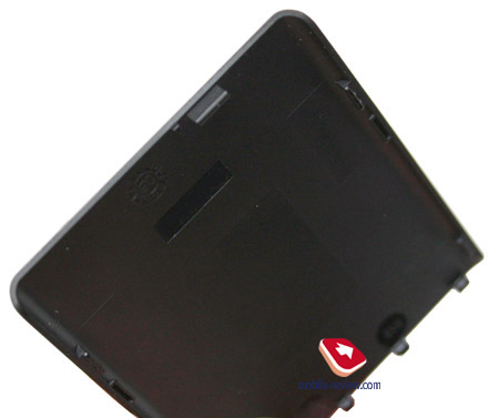
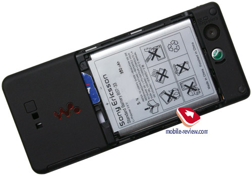
The back cover doesn’t expose any gap and be easily hooked with fingernails. Detaching it reveals SIM-card socket and a 950 mAh Li-Pol battery (BST-33). The battery’s type, as well as its capacity, has never been seen before in this class – I guess you remember that Samsung F300 has a built-in battery that frees a bit of space inside the handset; however the W880i makes use of a pretty much standard battery. Incidentally, you won’t succeed in swapping SIM-card without taking the battery off.


The lifetime for the W880i is quoted at 425 hours of standby, 6.5 hours of talk time, and up to 20 hours of music playback. In conditions of Moscow networks the handset lasted about 3 days at 1 hour of calls, with about 30 minutes of Bluetooth usage, and 2 hours of music playback a day. As you might have already guessed what judgment we have for the W880i, we give it the highest possible mark here – these figures are outstanding for a model this small. But that’s not all – we decided to put it head-to-head against stand-alone music players and see what the W880i has got. For Apple iPod Nano 1G playback time makes up about 10-12 hours, while the 2G can keep itself up and running for 25 hours, and iPod Video is capable of 12 hours. It is remarkable that the W880i’s specifications don’t look unpretentious even when surrounded by such giants – this is the record holder among handsets and a device that can put up some competition for dedicated players. We squeezed a long 18.5 hours of music playback out of it (default headphones, full blast, random playback).
In pursuit of a skinny casing they had to leave out Infrared connectivity. As for the missing radio transmitter, it is not a technical issue, but rather the unwillingness to create an exact replica of Sony Ericsson W850i for the time being.
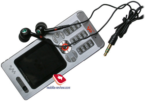
The handset comes boxed with HPM-75 stereo-headset, which is a revamped edition of the HPM-70. Subjectively, they felt pretty much the same, when it came to wearing them, but the sound quality got a notable boost (I checked the earphones with the W850i and liked them more than the default ones).

Menu
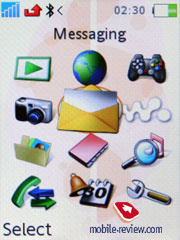
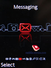
A typical latest-generation solution by Sony Ericsson – in terms of software it is almost an exact replica of Sony Ericsson W850i. The main menu pops up before you as a grid consisting of 12 icons (one of the themes also features horizontally laid out menu). Shortcut number navigation is on the W880i’s spec sheet as well – you can assign shortcuts to most menu items, that the handset comes pre-installed with, whereas own applications or files can’t be set up for one-touch access.
 
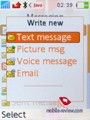
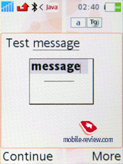
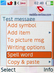
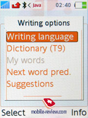
Text input has remained on the same comfort level, so, pressing the "#" key brings out a list of the available languages and you can easily switch between them while typing.
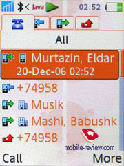
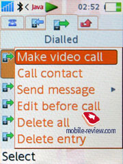
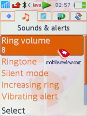
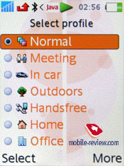
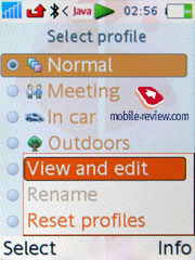
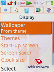
Besides traditional vertically arranged sub-menus, the maker has provided subject-based horizontal tabs. It means that while viewing a list of the dialed numbers, one can see not only the dialed numbers but in the same time (by leaning the joystick horizontally) switch between missed and received call tabs. In the phone menu this kind of navigation is provided anywhere it's possible and it makes for much better usage experience. The menu ergonomics is quite high in this phone. I also have to note that such horizontal tabs appear in Phonebook, Settings and other menu items as well.
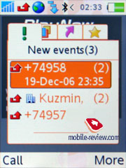
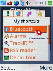
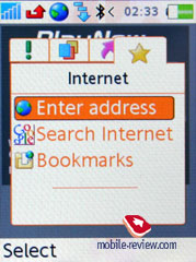
Expansion of Activity Menu functionality is the result of addition of the fourth tab. The first three ones display various events, like missed calls, memos, messages – actually all this can be found in the first tab. One can disable Activity Menu for these events as well – in this case pop up windows, reminding of a certain event type will appear on the screen. The third tab features the shortcuts, which you should set up yourself. And the added fourth one contains links to the most frequently used applications and resources – and the top of this list is claimed by Google search. To tell the truth, the way Google trade mark affects consumers can be compared to voodoo conjuration. That’s why this search engine is used by several other manufacturers as well.
 
 
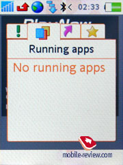
The second tab is the most interesting, since it appears to be some kind of a task manager, featuring the list of all currently running applications. User is able to have up to eight Java-applications launched (in fact there are no severe caps, yet the RAM cannot bear more than 8) simultaneously and switch between them. This may come in handy, in case you use an ICQ-esque mobile client, which should be constantly online, and at the same time want to play a Java-game. Up to now counterparts of this solution by other manufacturers haven't been announced
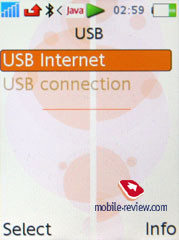
On USB connection you’ll be forced to choose whether files on memory card will be accessed or not (data transfer mode). In the former case, the device shuts down, so you’re able to browse memory card and in the latter one you are offered various USB settings for accessing the network – basically the handset transforms into a modem. As far as I remember similar implementation of this function was featured only in Motorola ROKR E2, where you could use USB Ethernet (though the main point here and there is the same).
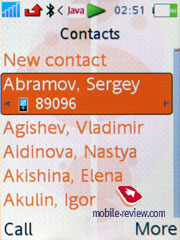
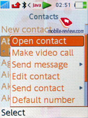
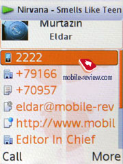
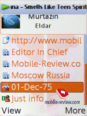
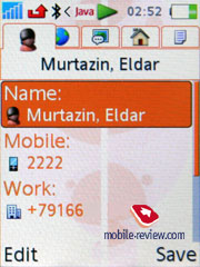
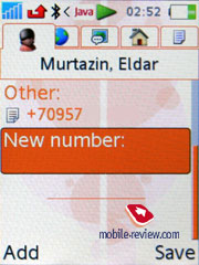
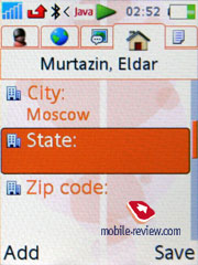
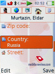
Phonebook. Up to 1000 contacts with fully filled in fields can be stored in the phonebook, but number of phone numbers is limited to 2500. This means that despite the ability to assign up to 5 phone numbers to one contact, you cannot go over 2500 entries. This is enough even for the most active users, as only few have more than 500 entries in their phonebooks.


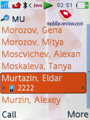
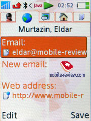
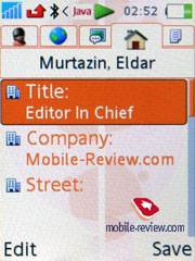
As mentioned above, several phone numbers can be submitted for one contact, as well as address, email, IM number, other contact information. In settings you can select the required fields, they will be available, meanwhile the useless ones will not be presented. Contacts can be sorted by fields, including name and surname, but only one input field. Unlike previous models, this time we have dynamics on - handset automatically sorts the list after changes.


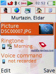
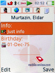
It is possible to assign custom ring tone and photo to each contact. On incoming call the image and ring tone will be used. Date of birth field can be synchronized with Organizer, at that you will have a chance to set how many days prior to the event the handset should warn you.
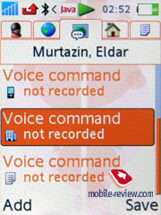
When you are typing in information, you can scroll between tabs, in the first one you enter phone numbers, categorize them by types. On the whole the organization of this process reminds of Outlook, and it means comfort in the first place. Voice tags can be added for required phone numbers, names, there can be up to 40 of them. Voice dialing remained the way it was many months ago, it starts looking archaic with all these voice independent recognition software being implemented by the competitors.
The company still follows its traditional beliefs that SIM-card is used only in case of emergency, that’s why the only way to see its contents is to go into special option in the menu. SIM contacts are not displayed in the general list.
You can create a back-up copy of all entries in phonebook, which will be stored on the memory card, so that you will have the ability to restore them afterwards.
Contact Groups serve only for mass SMS sending, since it is impossible to bind custom ringtone or photo for Group.
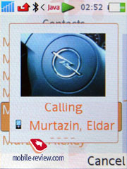
Any video clip may be used as caller ID for any entry in the phonebook
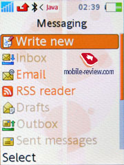
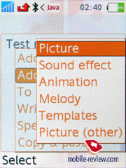
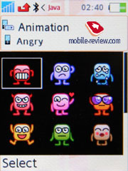
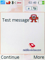
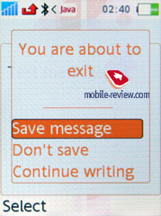
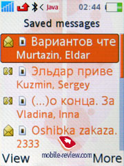
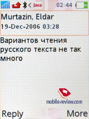
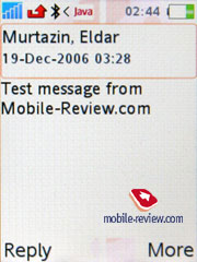
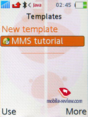
Messaging. All tools used for managing messages are standard, there are some templates available and you can come up with some more of your own. Phone’s memory together with SIM-card is used for storing messages. Chat function is supported. On the whole everything is just like in any other phone from this company. Only emoticons icons have changed – now they look much more attractive.


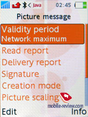
The MMS implementation is great as always, you can literally create video clips, there are lots of settings and this is one of those things that gives SE’s product a cutting edgeover competitors.
 
E-Mail client can send and receive e-mails, all sorts of encodings are supported. The emails can be stored on memory card.
In email settings you can setup separate password for SMTP-accounts, this is very convenient. The settings are flexible, support for almost all encodings, and not only Unicode has been added. Attachments that are supported by the phone are presented as icons in an email’s body. The phone doesn’t recognize office files or PDF, but they can be stored in any directory. The limit for outgoing/incoming email size is set by operator. Emails with 6-7 Mb attachments can be sent without any hassles. The phone supports Push Mail standard. Naturally send & receive process is carried out in background mode.
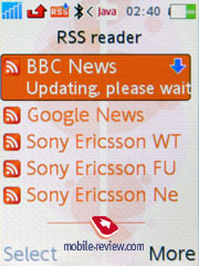
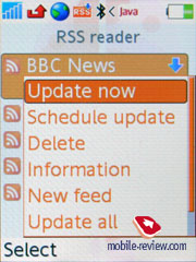
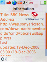
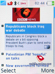
RSS Feed. The settings for this item are really simple - you just specify the title for feed and its address. The phone will connect and download it without your assistance. You can update only one item, or the whole feed at once. Capabilities of built-in browser are used for displaying the feeds. Feeds may be updated on schedule.
 
 
Call list. Up to 30 records can be stored in the general list, all with date and time. Icon that stands for call type (missed/received/dialed) is shown next to each entry. Besides this additional icon identifies if this phone number is present in the phone book or SIM-card. The list of missed calls can be viewed separately and stores up to 10 entries. In this menu you can also see the cost and length of all outgoing calls and last call. Navigating through the lists works with the help of tabs and this does save much time.
 
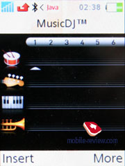
Entertainment. Photos, music files can be accessed from this menu. MusicDJ function is rather interesting, even though it is a niche solution and there is not much of a chance that this feature will be highly demanded. In the editor you can create ring tones and edit up to four bands.

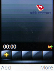
Advanced version of MusicDJ is called VideoDJ, it allows editing not only music files, but also adding images and signs. The resulting file is recorded in .3GP file which can be sent by MMS or Email, or just transferred to another phone.

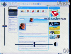
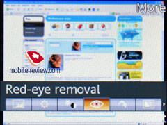
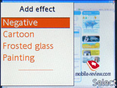
PhotoDJ has kept the name but had its inners completely revamped. The manufacturer has partly removed the shroud handing over the impending CyberShot projects, which will feature this editor by default. Now tell us, how often do you draw with your handset or create own pictures? The answer for most will be as clear as it only could be – never. At the same time getting rid of red-eyes effect, adjusting a shot’s brightness, contrast, sharpness, overlaying some effects, might well come in handy on certain occasions, but to do that you frequently have to wait the moment when you get photos uploaded to a PC. The new PhotoDJ looks to make performing these most basic actions as easy as it has never been before, enhance the handset with the ability to carry out these operations on the go. This move is definitely a big plus for Sony Ericsson and will be followed by other companies; and Nokia will be in the first rows (such functionality will get to its phones due out in the second half of 2007).
 

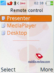
Remote control – ability to control other devices via the phone’s Bluetooth connectivity. It is standard for all phones made by Sony Ericsson

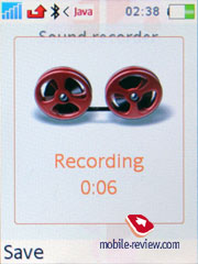
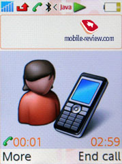
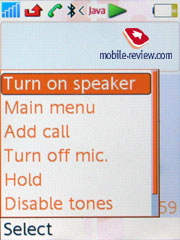
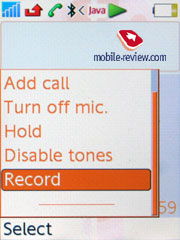
The sound can be recorded by Sound Recorder - it allows making clips that can be later used as ring tones. Phone calls can be recorded too, this is done from context menu, no time limits are set for the Sound Recorder.

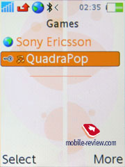
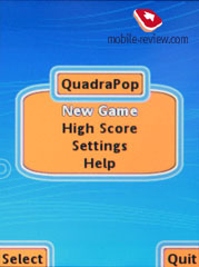
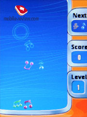
Games – the handset plays host only to one game – a tetris-esque QuadraPop.
 
 
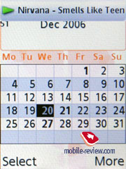
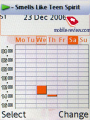
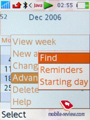
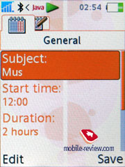
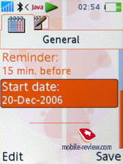
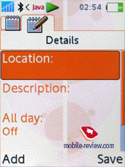
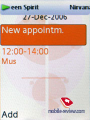
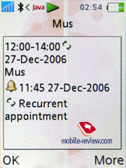
Organizer. Organizer keeps a lot of functions underneath. Let’s get Calendar out of the way first. There are three view modes embedded in the W880’s calendar: weekly, monthly and daily. The last option displays the list of all events and memos, in two others you will see highlighted time or day. You can switch to required day and year, or month. So everything is pretty simple, just as the schedule input is. You get the ability to name the event, define the place where it will take place, set length and setup the reminder (before or right at the start of the event). Recurrent events support is also onboard. Types of reoccurrence: daily, monthly, yearly. Reminders work even if the phone is turned off as well, unless you disable this function.


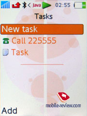
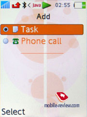
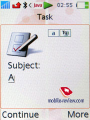
To do list in this phone is quite ascetic. There are only two types of events: phone call and reminder. On the other hand, this is really enough, simplicity has its own advantages.
 

The phone has full-fledged search, set up for calendar: you specify the search line (word or part of it) and after a while you will see all events that match this criteria. The function is quite speedy even if the organizer has more than 100 entries; fast switch to the event from the search window is supported.
The phone features transfer of schedule to various devices (Bluetooth). Choose the required interval (day, week or month) and send all entries. I’d like to point out that the device should support PIM function in order to open and display this data properly. Data can be received in the same way, with the help of desktop or office PC without any additional software.
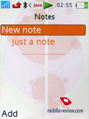
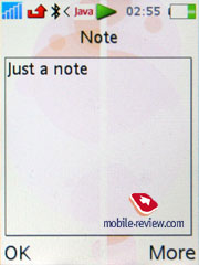
Notes. The phone supports notes entry, though they are limited in length. The name of the note you see on the list will be first word entered. This is not always convenient since you will have to think of the first word that would tell you what the note is all about.
 
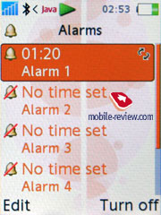
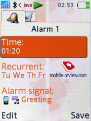
Alarm Clock. Now you have access to five alarm clocks, and each of them can be set up manually. They can work in definite week days. Besides the ring tone for alarm clock you can select small note and picture, they will be displayed when alarm clock goes on. Any music file can be assigned as the alarm tone.
 
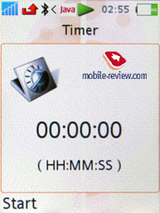
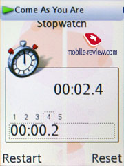
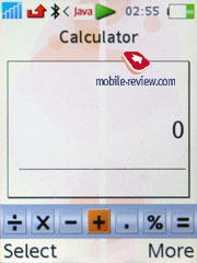
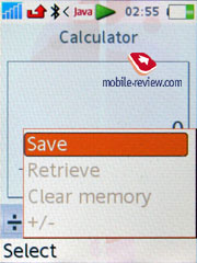
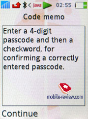
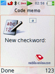
Stopwatch/Countdown. Here everything is quite standard, although the same can be said of the stopwatch that has intermediate times function. The phone has special application for storing secret codes, which was a huge success in previous models, well, standard calculator is onboard too.


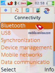
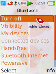
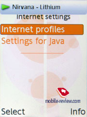
Connectivity. All connectivity settings for the phone can be setup from here, starting from WAP and GPRS (the EDGE settings are same) to Bluetooth and Synchronization. I will not describe the standard options, they are kind of standard in the first place, and everything works fine. I’d like to highlight stable Bluetooth operation - no problems were encountered, synchronization with other devices runs smoothly, all profiles (including A2DP, which is stereo sound via Bluetooth) are supported. EDR-enabled Bluetooth version is 2.0.
 
 
Local and Remote synchronization can be setup from the same menu. The phone supports HID profile which allows using it as Remote control for PC and other devices.
The following Bluetooth profiles are supported:
- Dial-up networking profile
- Generic Access profile
- Generic Object Exchange Profile
- Object Push Profile
- Serial Port Profile
- Handsfree Profile
- Headset Profile
- Synchronization Profile
- Basic Imaging Profile
- File Transfer Profile
- HID Profile
- SyncML OBEX binding
- JSR-82 Java API
- A2DP
WAP. The browser owns separate menu item, the version is 2.0, it supports secured connections which is quite important in case you are using electronic transactions. New wallpapers, themes and ring tones can be downloaded right away – all this is available at the original web-site.
Standard browser for Sony Ericsson phones is NetFront, which supports single-column web pages display and HTML. One of the best things about it, is the ability to create folders with files and bookmarks. The browser is considered to be one of the market’s best offerings, but limited phone resources do it no favors. On the whole those using Internet constantly should consider buying PDA or laptop, since full-fledged Internet access is not an ultimate must-have for this device type. At the same time RSS Feeds support is great, it allows using the phone for reading news, announcements and articles on the go in a convenient fashion.
HTML pages that contain advanced formatting or exceed 500kb in their size will not be displayed. On the whole standard browser is all fine, but usage of Opera Mini is preferable, since it has got way more to offer.
Settings. This menu stores all settings related to the phone’s operation. In the stand by mode clock can be displayed at the bottom (on or off), you an also alter the font size, in case you select big letters it will be easy to see what time it is, but the font itself becomes a tad transparent. There isn’t anything to add, all the rest is standard.
 

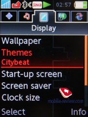
The themes allow for altering not only the interface appearance, but the main menu layout as well.
 
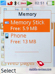
File manager, memory size. The user has 20 MB of available memory, add empty M2 memory card to that too. Here all data (photos, videos, applications) can be stored. The remaining memory is occupied by preinstalled applications, which cannot be wiped. Part of memory is dedicated to phonebook, call lists, etc.
 
 
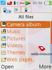
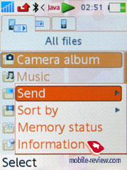
The phone has a basic file manager, with its help files can be sorted by various folders, custom directories can be created in phone’s memory, files can be moved there as well. With or without cable the phone can become a perfect storage, there are no problems with recording your own files, even if they cannot be opened by the phone.
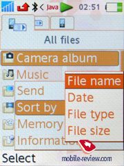
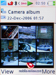
Traditional file sorting includes the following options: date, type and size. The Image Gallery has new setting called Timeline, after you activate it you will see a bar on which months will be shown. And in lists you will see photos that were made during this or that month. You can make the list more detailed by pressing the same key twice, in that case you will see days instead of months, meaning that photos will be sorted in the following structure: list of images made on October 3rd, for example. This is a good way to wander around tons of images.
 
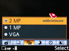
Camera. The device is equipped with a 2 MP camera with a CMOS matrix without auto-focus. The device supports three possible resolutions - 1632x1224, 1280x960, 640x480 pixels. Two types of data compression, Normal and Fine, are at your disposal. The majority of the photos represented are in the Fine quality. The photos differ in size almost two times depending on the resolution. Thus a photo in the Normal mode takes about 300 KB when the Fine quality gives 500-600 KB. Saving the photo takes the same time not depending on the case, that is about 1-2 seconds, and that is quite well for such a file size. If to take several photos one after another (not a Burst mode but just successively) then you'll notice slightly slowing writing speed (to 3-4 seconds). According to subjective feelings the device buffer is expected for 2 MB of memory.


The camera settings look the following way:
- Shutter sound. You can choose on of the three shutter sounds but not turn the sound off.
- White balance. A possibility to choose between an automatic mode or Incandescent, Fluorescent, Daylight.
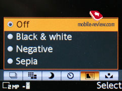
- Effects. Several effects may be applied to the photos, they are Negative, Solarize, Sepia, Black & White.
- Timer is activated for a certain time period for self shooting.
- Night mode is for shooting in the dark. Noises raise on a photo, exposition is increased (you shouldn't move the device in order not to get a blurry photo).
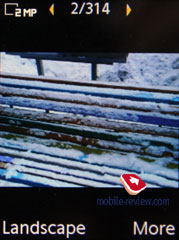
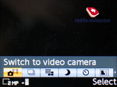
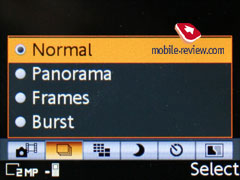
- Shooting mode. Normal mode, that is taking usual photos. A multiple mode (Burst 4) allows taking four photos for a series. Landscape is a very interesting mode that allows taking rather unordinary photos, has no rivals for the moment. The last mode is taking photos with frames, photo resolution decreases automatically.
The screen serves as a viewfinder when in the shooting mode. The picture moves very smoothly and everything is clearly seen. Number keys help in switching between various functions and shooting parameters quickly that greatly speeds up the process of shooting.
 |
 |
(+)
maximize, 1632x1224, JPEG |
(+)
maximize, 1632x1224, JPEG |
 |
 |
(+)
maximize, 1632x1224, JPEG |
(+)
maximize, 1632x1224, JPEG |
 |
 |
(+)
maximize, 1632x1224, JPEG |
(+)
maximize, 1632x1224, JPEG |
 |
 |
(+)
maximize, 1632x1224, JPEG |
(+)
maximize, 1632x1224, JPEG |
 |
 |
(+)
maximize, 1632x1224, JPEG |
(+)
maximize, 1632x1224, JPEG |
 |
 |
(+)
maximize, 1632x1224, JPEG |
(+)
maximize, 1632x1224, JPEG |
Video may be recorded in two resolutions (176x144, 128x96), file format is 3GP. Clip duration may be limited (up to 10 seconds) or unlimited. The quality of the clips is average and obviously inferior to many top models.
Sample video (3gp, 528Kb)>>>
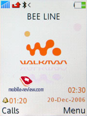
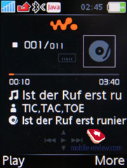
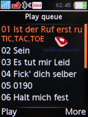
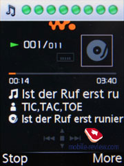
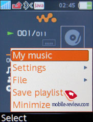
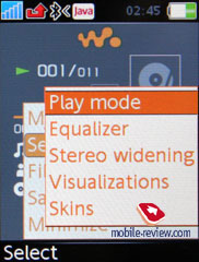
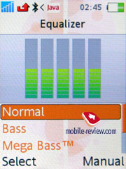
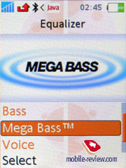
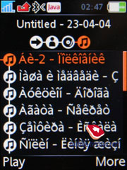
Walkman version 2.0 player. It is the second handset in the company’s range to carry Walkman 2.0 player – the first was the W850i. First change was cosmetic, but it’s obvious: interface color is black, not orange. Changing color was a good idea, interface looks interesting. Player can be accessed from stand by mode by pressing orange Walkman key. Pressing it again will minimize player.


Player was reworked not only in range of interface, there are also changes in playback algorithm, or it’s just a subjective effect affection. Playback quality is different from other models except for Sony Ericsson W850i.
For a start you need to upload your own music collection to the device, in order to perform this, use Disc2Phone application – it copies all files to the folder, containing music. Besides, this program may be applied to moving contents of your CDs, since all files stored on compact-disks are automatically converted into MP3. In case you want to set up the music collection on your own, you will just require copying files to any folder, or creating a new one. Nesting level doesn’t affect a thing here, as the device checks the memory without your help. Having finished copying data, you will need to update the music library – this is performed via a special function – the handset locates all files and folders, and then gets the necessary data from ID3-tags. Supported audio formats - MP3, AAC, AAC+, E-AAC+, WAV, WMA and m4a. There are no limitations on bit rates; you can also upload files with VBR. The company recommends using files with 192 Kbit/s bit rate.
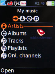
In the music library, all saved tracks are classified by the following characteristics:
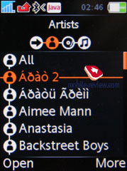
- Artists – the application displays general list of artists in alphabetical order, one can conduct a fast search here;
- Albums – sorting by albums’ titles, search function is available as well;
- Tracks –general list of all tracks, sorting is conducted by tracks’ titles or ID3 tags;
- Genre – sorting, which uses various music styles, like Hip Hop, Jazz, Blues as criteria;
- My playlists – these are playlists, made up by user, that can be created both on the device and on PC, while viewing contents of the flash memory in USB Mass Storage mode; the handset also locates then when updates the library.
The difference from the W950i is lesser interface flexibility, there’s no genre search, and neither there are automatic playlists or rating of metadata of files (sorting files according to your mood). This difference is explained by one simple truth – the W950i is a smartphone.
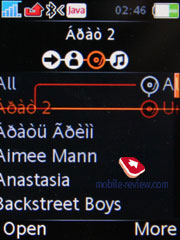
Horizontal shifts between different tabs allow viewing not only album, but also artists list and songs. All navigation can be done via one or few touches, and on each list you can use search by first or several letters.
 
 
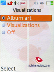
In playback mode you can select whether corresponding image will be displayed (matching album) or Visualization (sort of screensaver that acts in tact with sound). Repeat of a single and all songs can be enabled, as well as Shuffle mode. Rewinding is progressive, if you hold the button, steps change.
There’s demo playback mode, that way player will play first few seconds of each song.
HPM-75 headphones are shipped with the handset, they are using Fast Port interface connector, meanwhile on the cord you will find 3.5mm jack for typical headphones. The quality of the headphones is one of the best on the market, although they slightly yield to the ones coming boxed with Nokia N91. On the other hand, rubber fittings are more comfortable, as they will suit most consumers, and feel better in day-to-day use.
Phone supports OMA DRM 2.0, which makes it compatible with almost all online shops that sell music. Manufacturer included Online channels menu item, here you can add different online shops. Depending on your operator and weather phone is sold by one or not, links in that menu may vary. New links can be downloaded with help of your operator, but that’s possible only in few countries including Russia, but this will not be actual in upcoming years. An important fact is that download service works in minimized mode, you can order music without exiting player.
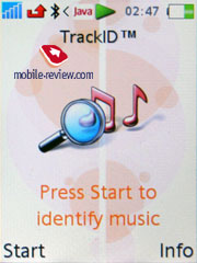
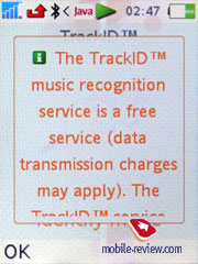
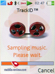
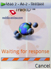
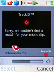
TrackID. Just like in Sony Ericsson W850i this handset has TrackID service, that’s when you can find out song’s title when listening to it on radio or recording it via microphone. Usually it takes around 3-4 seconds for length, later on file gets transferred to server GraceNote, where it interacts with huge data base. Unlike other models in W880i you can not only get song title, but also buy it. Service is interesting due to momentum, instant and impulsive ability of buying that song you were looking for. It’s hard to say something else about this service. The attempt to boost popularity of this service is natural – the manufacturer has even granted it an own menu item.


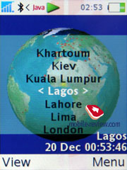
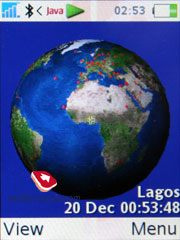
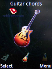
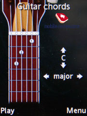
Applications. The handset carries two applications onboard – Music Mate, which comes in handy when you want to learn more about playing on some musical instruments, and World Time.
 
 
Performance. The model puts up nothing special in terms of performance for the handsets of the company’s latest generation, yet it does better than most of other offerings available on the market.
| Jbenchmark 1 SE W880 |
Jbenchmark 1 SE K800 |
| Date |
2/6/07 |
| Model name |
SE W880i |
| Firmware version |
r1jc002 |
|
|
| Jbenchmark 1 |
1.1.1 |
|
|
| Version |
|
|
|
| Total Score: |
7250 |
|
|
| Details: |
|
| Text |
2374 |
| 2D Shapes |
1961 |
| 3D Shapes |
790 |
| Fill Rate |
552 |
| Animation |
1573 |
|
|
| Screen Width |
240 |
| Screen Height |
262 |
| Color Screen |
true |
| Number of Colors |
65536 |
| Double Buffer |
true |
| Total Memory |
1572800 |
| Free Memory |
495232 |
|
|
| MicroEdition Configuration |
CLDC-1.1 |
| MicroEdition Profiles: |
MIDP-2.0 |
| Microedition Platform: |
r1jc002 |
| Microedition Encoding: |
ISO-8859-1 |
| Microedition Locale |
en |
|
| Date |
2/6/07 |
| Model name |
SE K800i |
| Firmware version |
|
|
|
| Jbenchmark 1 |
1.1.1 |
|
|
| Version |
|
|
|
| Total Score: |
8489 |
|
|
| Details: |
|
| Text |
3252 |
| 2D Shapes |
2032 |
| 3D Shapes |
855 |
| Fill Rate |
597 |
| Animation |
1803 |
|
|
| Screen Width |
240 |
| Screen Height |
262 |
| Color Screen |
true |
| Number of Colors |
65536 |
| Double Buffer |
true |
| Total Memory |
1572800 |
| Free Memory |
495232 |
|
|
| MicroEdition Configuration |
CLDC-1.1 |
| MicroEdition Profiles: |
MIDP-2.0 |
| Microedition Platform: |
|
| Microedition Encoding: |
ISO-8859-1 |
| Microedition Locale |
en |
|
| Jbenchmark 2 SE W880 |
Jbenchmark 2 SE K800 |
| Version |
2.1.1 |
|
|
| Total Score: |
1108 |
|
|
| Details: |
|
| Image Manipulation |
378 |
| Text |
636 |
| Sprites |
560 |
| 3D Transform |
619 |
| User Interface |
20050 |
|
|
| Screen (canvas) Width |
240 |
| Screen (canvas) Height |
262 |
| Color Screen |
true |
| Number of Colors |
65536 |
| JPEG Support |
true |
| Transparency (Alpha Level) |
256 |
| Double Buffer |
true |
| Total Memory |
1572800 |
| Free Memory |
647616 |
|
|
| MicroEdition Configuration |
CLDC-1.1 |
| MicroEdition Profiles: |
MIDP 2.0 |
| Microedition Platform: |
r1jc002 |
| Microedition Encoding: |
ISO-8859-1 |
| Microedition Locale |
en |
|
| Version |
2.1.1 |
|
|
| Total Score: |
374 |
|
|
| Details: |
|
| Image Manipulation |
401 |
| Text |
714 |
| Sprites |
571 |
| 3D Transform |
703 |
| User Interface |
63 |
|
|
| Screen (canvas) Width |
240 |
| Screen (canvas) Height |
262 |
| Color Screen |
true |
| Number of Colors |
65536 |
| JPEG Support |
true |
| Transparency (Alpha Level) |
256 |
| Double Buffer |
true |
| Total Memory |
1572800 |
| Free Memory |
647616 |
|
|
| MicroEdition Configuration |
CLDC-1.1 |
| MicroEdition Profiles: |
MIDP 2.0 |
| Microedition Platform: |
|
| Microedition Encoding: |
ISO-8859-1 |
| Microedition Locale |
en |
|
| Jbenchmark 3D SE W880 |
Jbenchmark 3D SE K800 |
| Perfomance |
|
| Jbenchmark3D HQ: |
174 |
| Jbenchmark3D LQ: |
318 |
| Triangles ps: |
34051 |
| kTexes ps: |
47 |
|
|
| version: |
3.1.0 |
|
|
| Screen(canvas)width: |
240 |
| Screen(canvas)height: |
320 |
|
|
| 3D Subsystem: |
|
| M3G Version: |
1.1 |
| Antialaising: |
false |
| True color: |
false |
| Dithering: |
false |
| Mipmapping: |
true |
| Perspective correction: |
true |
| Local camera lighting: |
false |
| Max lights: |
8 |
| Max Viewport dimensions: |
1024 |
| Max Texture Dimensions: |
256 |
| Max Sprite Crop Dimensions: |
1024 |
| Max Transforms Per Vertex: |
3 |
| Number of Texture Units: |
2 |
|
|
| Other properties |
|
| Color Screen |
true |
| Number of colors |
65536 |
| Transparency (alpha level) |
256 |
| Double buffer |
true |
| Total memory: |
1572800 |
| Free memory: |
1408224 |
|
|
| MicroEdition Configuration |
CLDC-1.1 |
| MicroEdition Profiles: |
MIDP 2.0 |
| Microedition Platform: |
r1jc002 |
| Microedition Encoding: |
ISO-8859-1 |
| Microedition Locale |
en |
| Microedition Communication ports: |
usb1 |
| Microedition Hostname: |
null |
|
| Perfomance |
|
| Jbenchmark3D HQ: |
187 |
| Jbenchmark3D LQ: |
332 |
| Triangles ps: |
28922 |
| kTexes ps: |
1510000 |
|
|
| version: |
3.1.0 |
|
|
| Screen(canvas)width: |
240 |
| Screen(canvas)height: |
320 |
|
|
| 3D Subsystem: |
|
| M3G Version: |
1.1 |
| Antialaising: |
false |
| True color: |
false |
| Dithering: |
false |
| Mipmapping: |
true |
| Perspective correction: |
true |
| Local camera lighting: |
false |
| Max lights: |
8 |
| Max Viewport dimensions: |
1024 |
| Max Texture Dimensions: |
256 |
| Max Sprite Crop Dimensions: |
1024 |
| Max Transforms Per Vertex: |
3 |
| Number of Texture Units: |
2 |
|
|
| Other properties |
|
| Color Screen |
true |
| Number of colors |
65536 |
| Transparency (alpha level) |
256 |
| Double buffer |
true |
| Total memory: |
1572800 |
| Free memory: |
1408224 |
|
|
| MicroEdition Configuration |
CLDC-1.1 |
| MicroEdition Profiles: |
MIDP 2.0 |
| Microedition Platform: |
|
| Microedition Encoding: |
ISO-8859-1 |
| Microedition Locale |
en |
| Microedition Communication ports: |
usb1 |
| Microedition Hostname: |
null |
|
| Jbenchmark HD SE W880 |
Jbenchmark HD SE K800 |
| Version |
4.0.3 |
|
|
| Rendering Quality |
|
| Bilinear filtering: |
71% |
| Trilinear Filtering: |
Failed/Not supported |
| Perspective correction: |
Failrule (60%) |
| Z-buffer depth: |
14 bit or higher |
|
|
| Perfomance |
|
| Smooth triangles: |
44030 |
| Textured triangles: |
27233 |
| Fill rate: |
26 kTexels |
| Gaming: |
6 (0.2 fps) |
|
|
|
|
| 3D Subsystem: |
|
| M3G Version: |
1.1 |
| Antialaising: |
false |
| True color: |
false |
| Dithering: |
false |
| Mipmapping: |
true |
| Perspective correction: |
true |
| Local camera lighting: |
false |
| Max lights: |
8 |
| Max Viewport dimensions: |
1024 |
| Max Texture Dimensions: |
1024 |
| Max Sprite Crop Dimensions: |
1024 |
| Max Transforms Per Vertex: |
3 |
| Number of Texture Units: |
2 |
|
|
| Other properties |
|
| Microedition Platform: |
r1jc002 |
| Number of colors |
65536 |
| Transparency (alpha level) |
256 |
| Double buffer |
true |
|
|
|
|
|
|
| MicroEdition Configuration |
CLDC-1.1 |
| MicroEdition Profiles: |
MIDP 2.0 |
| CLDC (JSR 30, 139) |
1.1 |
| Encoding: |
ISO-8859-1 |
| Locale |
en |
| Total memory: |
1572800 |
| Free memory: |
1368416 |
| MIDP (JSR 37, 118, 271) |
2 |
| Form width: |
238 |
| Form height: |
225 |
| Canvas Width: |
240 |
| Canvas Height: |
262 |
| Fullcanvas Width: |
240 |
| Fullcanvas Height: |
320 |
| Canvas doublebuffered: |
true |
| Color: |
true |
| Colors: |
65536 |
| Alpha levels: |
256 |
|
|
| FC (JSR 75) |
1 |
| PIM (JSR 75) |
1 |
|
|
| Bluetooth (JSR 82) |
1 |
| Connected inquiry: |
true |
| Connected inquiry scan: |
false |
| Connected page: |
true |
| Connected page scan: |
true |
| Master switch: |
true |
| Connected inquiry scan: |
false |
|
|
| OBEX (JSR 82) |
|
| WMA (JSR 120, 205) |
2 |
| Smsc |
N/A |
|
|
| MMAPI (JSR 135) |
1.2 |
| Snapshots encodings: |
encoding=jpeg |
| Video capture: |
true |
| Video encodings: |
h263, 176x144 |
| Streamable contents: |
none |
| Mixing: |
true |
| Recording: |
true |
| Audio encodings: |
amr, amr-nb |
| Audio capture: |
true |
|
|
| Web Parser (JSR 172): |
1 |
| WEB RPC (JSR 172): |
no |
| SATSA (JSR 177): |
no |
| Location (JSR 179) |
no |
| SIP (JSR 180): |
no |
|
|
| JTWI (JSR 185) |
1 |
| CHAPI (JSR 211): |
no |
| SVG (JSR 226): |
no |
| AMMS (JSR 234): |
1 |
| Global (JSR 234): |
no |
|
| Version |
4.0.3 |
|
|
| Rendering Quality |
|
| Bilinear filtering: |
76% (Failure) |
| Trilinear Filtering: |
Failed/Not supported |
| Perspective correction: |
58% (Failure) |
| Z-buffer depth: |
14bit (Success) |
|
|
| Perfomance |
|
| Smooth triangles: |
40608 |
| Textured triangles: |
27412 |
| Fill rate: |
1171747 kTexels |
| Gaming: |
108 (3.6 fps) |
|
|
|
|
| 3D Subsystem: |
|
| M3G Version: |
1.1 |
| Antialaising: |
false |
| True color: |
false |
| Dithering: |
false |
| Mipmapping: |
true |
| Perspective correction: |
true |
| Local camera lighting: |
false |
| Max lights: |
8 |
| Max Viewport dimensions: |
1024 |
| Max Texture Dimensions: |
1024 |
| Max Sprite Crop Dimensions: |
1024 |
| Max Transforms Per Vertex: |
3 |
| Number of Texture Units: |
2 |
|
|
| Other properties |
|
| Microedition Platform: |
|
| Number of colors |
65536 |
| Transparency (alpha level) |
256 |
| Double buffer |
true |
|
|
|
|
|
|
| MicroEdition Configuration |
CLDC-1.1 |
| MicroEdition Profiles: |
MIDP 2.0 |
| CLDC (JSR 30, 139) |
1.1 |
| Encoding: |
ISO-8859-1 |
| Locale |
en |
| Total memory: |
1572800 |
| Free memory: |
1368416 |
| MIDP (JSR 37, 118, 271) |
2 |
| Form width: |
238 |
| Form height: |
225 |
| Canvas Width: |
240 |
| Canvas Height: |
262 |
| Fullcanvas Width: |
240 |
| Fullcanvas Height: |
320 |
| Canvas doublebuffered: |
true |
| Color: |
true |
| Colors: |
65536 |
| Alpha levels: |
256 |
|
|
| FC (JSR 75) |
1 |
| PIM (JSR 75) |
1 |
|
|
| Bluetooth (JSR 82) |
1 |
| Connected inquiry: |
true |
| Connected inquiry scan: |
false |
| Connected page: |
true |
| Connected page scan: |
true |
| Master switch: |
true |
| Connected inquiry scan: |
false |
|
|
| OBEX (JSR 82) |
|
| WMA (JSR 120, 205) |
2 |
| Smsc |
N/A |
|
|
| MMAPI (JSR 135) |
1.2 |
| Snapshots encodings: |
encoding=jpeg |
| Video capture: |
true |
| Video encodings: |
h263, 176x144 |
| Streamable contents: |
none |
| Mixing: |
true |
| Recording: |
true |
| Audio encodings: |
amr, amr-nb |
| Audio capture: |
true |
|
|
| Web Parser (JSR 172): |
1 |
| WEB RPC (JSR 172): |
no |
| SATSA (JSR 177): |
no |
| Location (JSR 179) |
no |
| SIP (JSR 180): |
no |
|
|
| JTWI (JSR 185) |
1 |
| CHAPI (JSR 211): |
no |
| SVG (JSR 226): |
no |
| AMMS (JSR 234): |
1 |
| Global (JSR 234): |
no |
|
Impressions
Despite the polyphony having 40 chords in the W880, the handset does not provide a breakthrough in sounding of mp3 tunes compared to other Sony Ericsson branded phones. The speaker is average volume-wise and sounds pretty good, however its sonic merits fall flat while on the street – in fact the volume level offered by the W880 usually proves to be below required, but it is still more than we have come to expect from such minimalist design. On many mp3 tracks at full blast the speaker starts creaking, which is a price to pay for barely-there dimensions. The silent alert’s strength is a little weaker than average, which makes it hard to feel, especially when the phone is in your jacket’s pocket. The reception part is on the same level with that of other products by the Sony Ericsson – in other words, it’s very fine.


The handset doesn’t have any direct rivals, since the fashion market is overrun by other “slim” solutions – clamshells in the first place. A candy-bar bearing the same signatures is offered by Fly, but due to the brand being unknown to the broad masses, it is not an option. Motorola-branded models like the SLVR, SLVR L7e, fall short of the W880 in the sense of both functionality and size. One might recall Samsung’s proposals, like the already released into the wild Samsung P310, and the upcoming Samsung F300 – the latter is much akin to the W880 in dimensions and positioning (both are music-heavy solutions). But with its price tag being more or less in a line with the F300, Sony Ericsson’s offering shows off a number of evident draws, such as almost twice as long playback time, a sole, yet large display working for all functions, Walkman 2.0, multi-tasking, proper Java handling and a few more. The big letdown of this handset is seemingly the missing FM-radio alone. It hasn’t been incorporated into the W880 not due to some technical reasons – the upside is that by doing so they would be able to launch an updated edition, boasting this feature onboard, in 7-8 months’ time.
As for its indirect rivals, any fashion solution would count, but functionality is the field where the W880 trumps them all. In other words, over at Sony Ericsson they have decided to stick to their beliefs – a product should be fetching not only from the design standpoint, being a feature packed device is vital as well. Sony Ericsson W880 reminded me of the much hyped up on its release Nokia 8210. That device was small, skinny and came in various color schemes, which all made for its popularity with both women and men. The product became a signature of its time, many girls were dreaming of such a lovely present, and men were not put off by its tiny dimensions. In Sony Ericsson W880i’s case we deal with a similarly “charged” product – in terms of technology talent and fashion aspects. Does the future hold the role of an iconic product for Sony Ericsson W880i in Sony Ericsson’s range and in the marker on the whole? Absolutely, yes, in spite of lack of anything cutting edge about it, saving for, maybe, its very pocketable size.
The model is due out in the end of March at a price of not less than 400 Euro, for the Russian market it will make up about 560-630 USD at the first stage. In a nutshell, its price curve will be identical to what we saw with Sony Ericsson W850i – it will get off to a start on the same level and work its way down the price ladder in pretty much the same fashion.
The model causes commotion among both women and men – it does catch everyone’s eyes. No one among those, who had a chance to play around with it, has remained indifferent and cold to it, the W880i is a portion of candies for your eyes. Back on the negative side, I have to note that not each and everyone will like its keypad, but it is a size-related drawback. Personally, I found it generally fine – not as inconvenient or crude as it might seem. It is clear that texters and people with big hands should look elsewhere right away. Ring tones volume is another flaw – while on the street, you will barely hear it, especially in winter, when you have warm clothes on. Whether these shortcomings are outweighed by its attractions – the decision is yours. This model is a sort of a milestone, which means that it will be successful and demanded on the market.
Eldar Murtazin (eldar@mobile-review.com)
Translated by Oleg Kononosov (oleg.kononosov@mobile-review.com)
Published — 07 February 2007
Have something to add?! Write us... eldar@mobile-review.com
|
News:
[ 31-07 16:21 ]Sir Jony Ive: Apple Isn't In It For The Money
[ 31-07 13:34 ]Video: Nokia Designer Interviews
[ 31-07 13:10 ]RIM To Layoff 3,000 More Employees
[ 30-07 20:59 ]Video: iPhone 5 Housing Shown Off
[ 30-07 19:12 ]Android Fortunes Decline In U.S.
[ 25-07 16:18 ]Why Apple Is Suing Samsung?
[ 25-07 15:53 ]A Few Choice Quotes About Apple ... By Samsung
[ 23-07 20:25 ]Russian iOS Hacker Calls It A Day
[ 23-07 17:40 ]Video: It's Still Not Out, But Galaxy Note 10.1 Gets An Ad
[ 19-07 19:10 ]Another Loss For Nokia: $1 Billion Down In Q2
[ 19-07 17:22 ]British Judge Orders Apple To Run Ads Saying Samsung Did Not Copy Them
[ 19-07 16:57 ]iPhone 5 To Feature Nano-SIM Cards
[ 18-07 14:20 ]What The iPad Could Have Looked Like ...
[ 18-07 13:25 ]App Store Hack Is Still Going Strong Despite Apple's Best Efforts
[ 13-07 12:34 ]Infographic: The (Hypothetical) Sale Of RIM
[ 13-07 11:10 ]Video: iPhone Hacker Makes In-App Purchases Free
[ 12-07 19:50 ]iPhone 5 Images Leak Again
[ 12-07 17:51 ]Android Takes 50%+ Of U.S. And Europe
[ 11-07 16:02 ]Apple Involved In 60% Of Patent Suits
[ 11-07 13:14 ]Video: Kindle Fire Gets A Jelly Bean
Subscribe
|
