|
|
Review of GSM/UMTS-smartphone Sony Ericsson G900
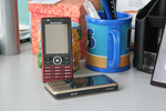
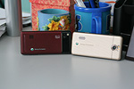
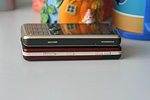
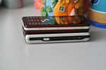
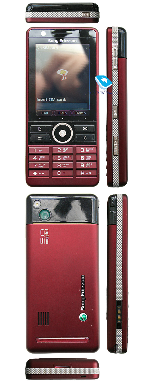
Live photos of Sony Ericsson G900
Table of contents:
- Positioning
- Design, size, controls
- Display
- Keypad
- Battery
- USB, Bluetooth
- Memory
- Performance
- Camera
- Interface - panels
- User Interface, Standard Applications
- Music Department
- Games
- Contacts
- Messaging
- Organizer
- Some Other Features, Themes, Web-browser
- Impressions
Sales package
- Handset
- Charger
- Wired stereo-headset
- USB data cable
- Software CD
- Spare stylus
- User Guide
Positioning
In our review on the Sony Ericsson G700 we pondered over why this device family had come along and who it targeted. I see no reason why we should repeat the same thing over again; so what we’d be really interested to do here is take a good look at the Sony Ericsson G900 through the lenses of its younger brother. By tacking on a tad better camera, Wi-Fi and trimming the casing a wee bit (making it more expensive), the maker hasn’t pushed its price tag to the skies – in fact, extra 50 Euro (compared to the G700) will buy you a brand new G900. This nothing, which it may seem at a glance, is quite important after all, since it shows what the price increment for upcoming UIQ-powered devices from Sony Ericsson will be. The G700/G900 opens the refurbished range of UIQ smartphones – the models to come won’t be this unsophisticated and will also boast various form-factors. Before we jump into 2009 the market will see at least 6 more devices of this breed, while in the year of 2009 they will complete this line-up, and by then it will feature ten offerings or so. Sounds interesting, right? But what the Sony Ericsson G900 is then?


Basically, one of entry-level UIQ-smartphones, an add-on to the G700 exclusively for those who can’t do without WiFi. I want to stress this again – all senior offerings in this line-up will be significantly different from these two. To be more precise, the G700/G900 has no widget panels, no custom applications, no enhanced player and also lacks a couple of other fascinating features. It is sort of a transition between feature phones and smartphones. I’m sincerely hooked by the products that will come to replace the G700/G900 in 6 months’ time – they won’t be much of a revolution, but nor is the G700/G900. These are two do-it-all solutions for the mass market (decent punch for little money) rather than those looking for a powerhouse in a svelte casing. But even in this capacity these phones (note, I don’t call them “smartphones” on purpose) will be extremely popular and widely adopted, far beyond just “successful”. And once you come to understand this, you will see why the lack of EDGE won’t mar their performance on the market.
Back to the table of contents >>>
Design, size, controls
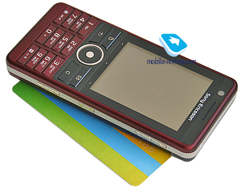
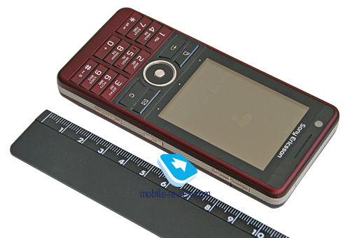
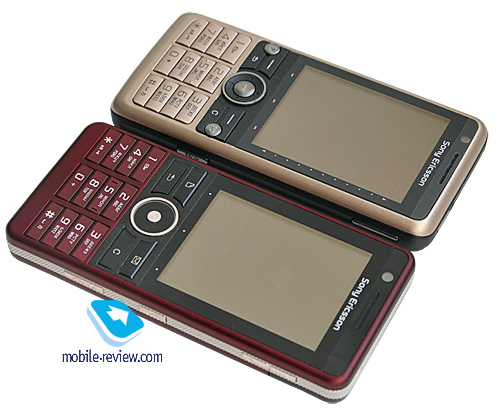
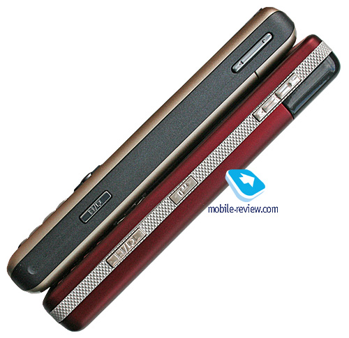
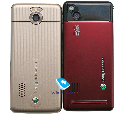
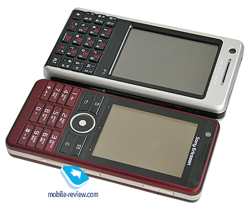
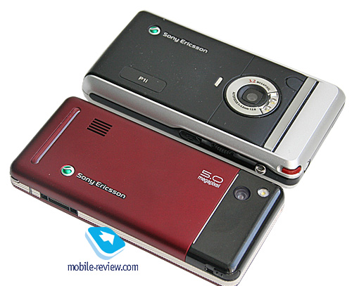
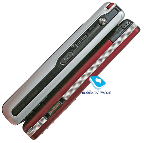
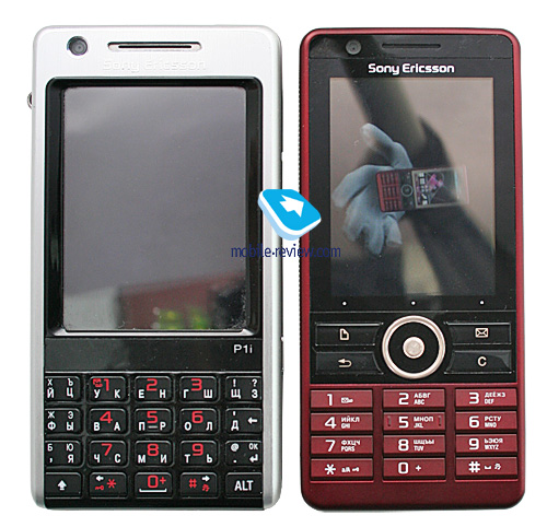
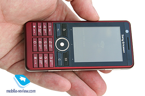
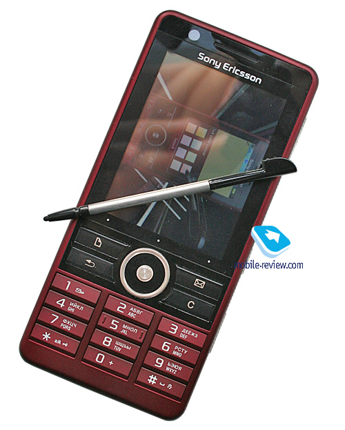
Smartphones have long been considered bulkier than feature phones, but this paradigm has been changing as of late, and the margins between them are getting slimmer with the Sony Ericsson G900, which conforms with the trend at 106x49x13 mm, and 99 grams (while the Sony Ericsson P1i measured 106x55x17mm). This phone, which is the name we will be using for the G900 throughout this review for convenience, readily slips into just about any pocket, thanks to its decent proportions.


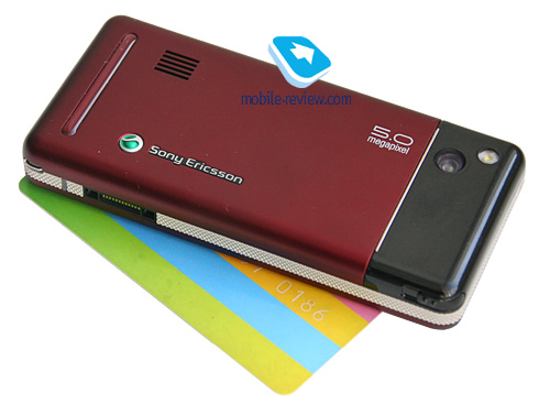
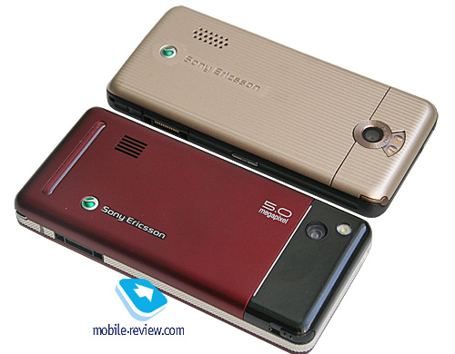
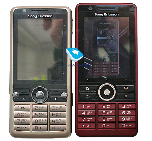
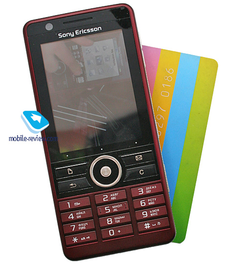
The G900 is a robustly build handset with tight-fitting parts. On the upside, its plastic is more expensive than that in the G700. In the sense of design, the G900 is vaguely similar to the Sony Ericsson T610i that also enjoyed the mix of glossy plastic and matte plates. At times it may seem that the handset’s rear is all metal, all thanks to how it is outfitted. But in reality it is quite ordinary plastic.

Video - comparing size and outlook of handset. User Interface (wmv, 32,2 mb) >>>
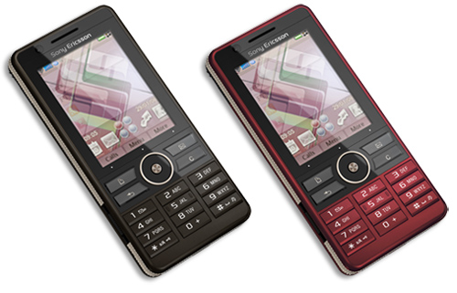
The handset comes in a choice of two colors - Dark Red, Dark Brown. I find both of them appealing, although the former is more high-profile.

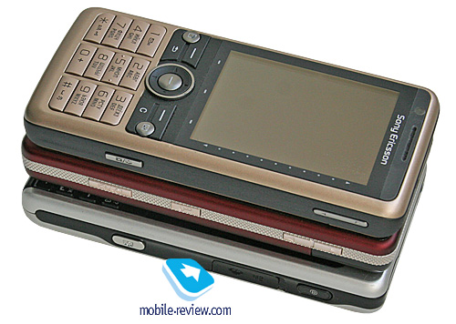
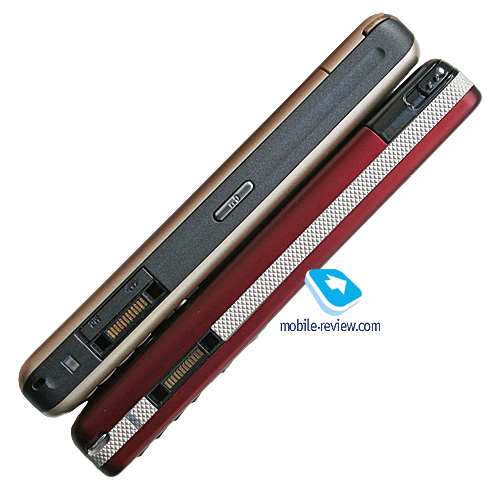
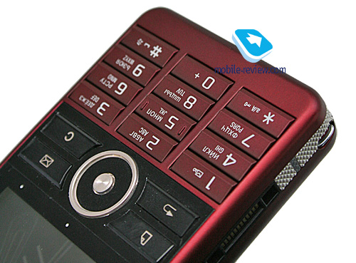
The M2 memory expansion slot is housed on the left-hand spine, sitting underneath the battery compartment cover; this setup still allows for hot-swapping, although it lacks the degree of comfort you get with the G700. The G900’s sides are textured, so that the handset won’t slip out of your hands. Interestingly, the phone’s plastic is crafted in the way to mimic metal.

The left hand side also plays host to a standard Fast Port connector used for headsets, chargers, and data cables. Also nested on the left is the G900’s signature light indicator, notifying you of any missed events, like calls or messages.

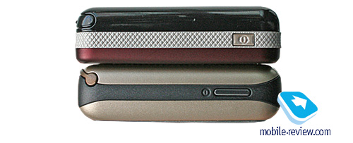
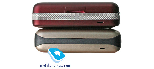
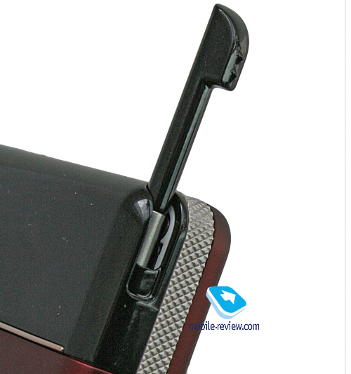
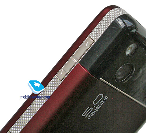
Perched on the top is the power button, along with the stylus silo. The bottom edge of the G900 is devoid of controls, or any other elements, save for the microphone slot. Flipping over to the right side, you will find the dedicated camera button, as well as the volume rocker and keypad locker.


Back to the table of contents >>>
Display
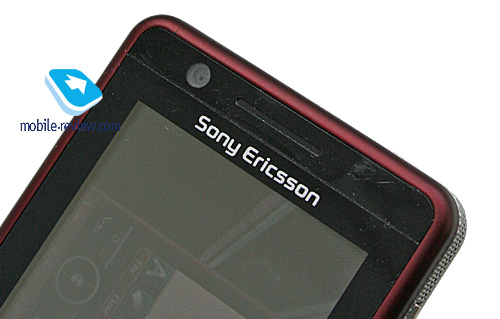
The G900 packs in a 2.4-inch display (in contrast to the P1i's 2.6 inches), sporting a resolution of 240x320 pixels, and showing up to 262 K colors (TFT). Its specs are pretty much par for the course, as far as today’s phones are concerned, but it boasts one distinctive forte – it is touch-sensitive. The screen is covered by a special abuse-resistant plastic layer, similar to what they used in the Sony Ericsson W960i. In view of the G900’s touch-based navigation, this is a nice thing to have, plus with this protective screen installed, you can expect the display to be less of a fingerprint-magnet – smudges and dirt from hands aren’t all that discernible on the handset’s display (not least thanks to the screen’s dark-gray fame).

The G900’s picture quality is nothing we would complain about – adequately bright and contrast, no faded colors whatsoever. The display can accommodate up to 14 text and 3 service lines, fonts are adjustable. It doesn’t lose much of its readability while in the sun.
Back to the table of contents >>>
Keypad
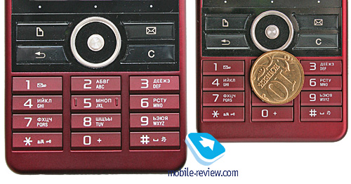
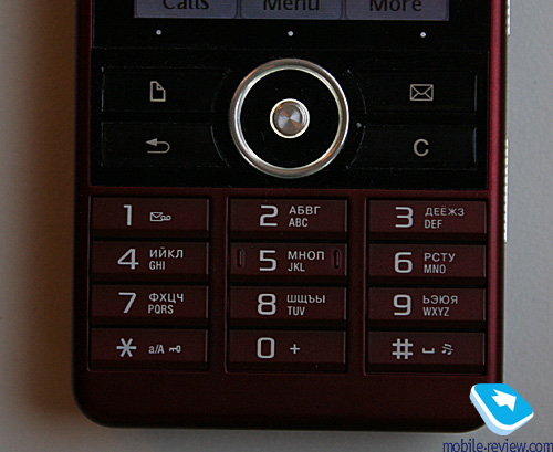
The G900’s numeric keypad is quite a treat to handle – the buttons are of conventional size, and have an appropriate travel distance. Its keypad seems somewhat handier than that of the G700. Local editions of the handset will feature two rows of tiny markings on every key. Since the markings are so titchy, with the backlight on you won't be able to discern what's what in the sun, although, they are very easy to read in the dark.


The navigation cluster is also a snap to use, the same goes for the navigation pad. Beneath the display there are three dots, but there are no soft-keys, so your only option is to tap the screen – and in this sense the G900 is inferior to its younger brother that still houses mechanical soft-keys.

The handset comes with two shortcuts to notes and messages.
Back to the table of contents >>>
Battery
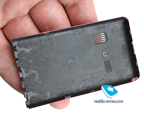
The back cover doesn’t slide off, like in the majority of phones, but should be rather pulled up. This design ensures that it will never loosen up whatsoever.

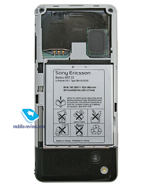
The G900 makes use of a standard Li-Pol 950 mAh cell (BST-33) with a rated battery life of 12 hours talk time and 380 hours standby. In Moscow the handset lasted for about 2 days, at one hour of calls, up to 6 hours of music playback, 2 hours of radio, rare file transfers over Bluetooth and up to 20 minutes of mail and web browsing. It takes the G900 about 2 hours to charge up from empty to full. It doesn’t differ a bit from the Sony Ericsson P1i in the sense of battery time.

Even when we were extremely heavy on its features, the G900 stayed up and running for at least a day – not only did we have numerous music-sessions, we also checked mail and browsed web very often. But since the majority of users won’t employ the capabilities of the device to this extent, it is safe to say the G900 will offer you around two days of online time in most scenarios. Those, who don’t plan on listening to music and using other functions too often, the device will enjoy 2-3 days of operation off a single charge.
There is no way you can install a higher-capacity cell into the G900 – its battery compartment simply has no leftover space for that.
Back to the table of contents >>>
USB, Bluetooth
USB. Files can be transferred to the G900 via USB-connection (2.0 Full Speed supported – up to 12 Mbps). When connected to a PC, the smartphone is displayed as a USB Mass Storage, which allows the user to see all its sections, barring system folders. Another way to pair up the G900 with your PC via USB is the Modem mode, when the smartphone starts acting as a wireless modem. The handset also starts recharging itself when you plug it into a PC. Data transfer speeds top out at 600-900 Kb/s
Bluetooth. The G900 comes equipped with EDR-enabled Bluetooth 2.0 and allows for up to 16 devices on the list. The following profiles are supported:
- Dial-Up Networking Profile
- Generic Access Profile
- Generic Object Exchange Profile
- Object Push Profile
- Serial Port Profile
- Handsfree Profile
- Headset Profile
- Synchronization Profile
- Basic Image Profile
- File Transfer Profile
- HID (host) Profile
- Stereo Advanced Audio Distribution Profile
- Advanced Audio/Video Remote Conference Profile
The Bluetooth implementation is, as always though, nothing to complain about, we encountered no issues with handling this type of connections.
Back to the table of contents >>>
Memory
There is no memory card packaged with the G900 – the manufacturer has used all the methods at its disposal to knock the handset's price down as low as possible. The phone supports memory cards of any size (we tested a 4 Gb unit, and got a green light from it). The memory expansion slot is housed on the left-hand side, covered by a rubber flap, meaning that you can easily swap cards on the fly.
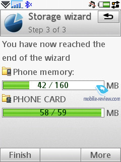
The handset ships with 128 Mb of RAM onboard, although after the first start up this shrinks to around 89 Mb. The G900 boasts 256 Mb of inbuilt storage, with 150 Mb available to the user (this may vary by region).
Back to the table of contents >>>
Performance
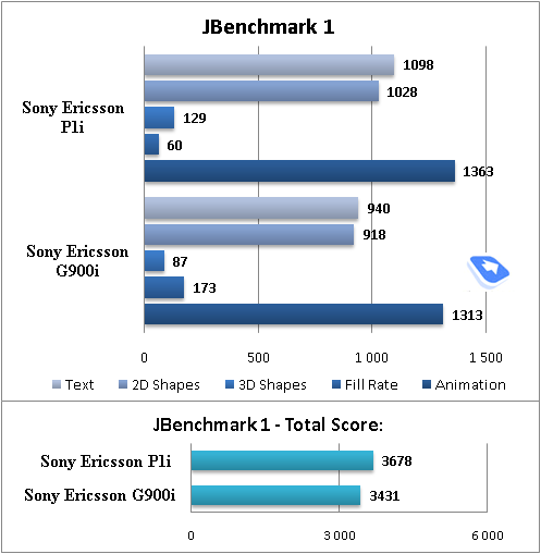
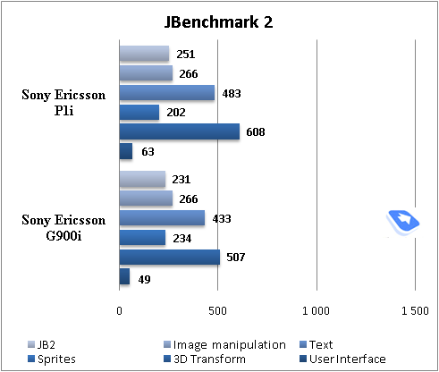
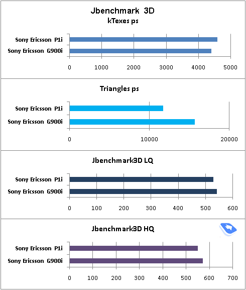
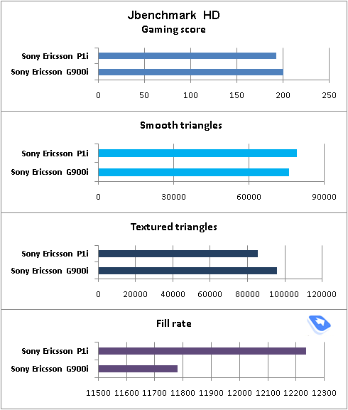
The model runs the same hardware platform as previous Sony Ericsson’s offerings, meaning that it is powered by the ARM9 processor, whose clock rate tops out at 220 MHz (though in real-life it runs at 180 MHz). In fact the CPU is the system’s greatest failing, in that it doesn’t allow it to be an even better performer. This doesn’t necessarily mean that the G900 is sluggish – by no means. The handset is on par with S60 smartphones, with most interactions taking 1 to 2 seconds.
Compared to the Sony Ericsson P1i, the newcomer’s interface has gotten somewhat speedier – we prefer to attribute this improvement to optimization of its software, as we see no other credible reason. At the same time, its scores in our tests are no different from the P1i.


Back to the table of contents >>>
Camera
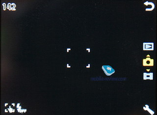
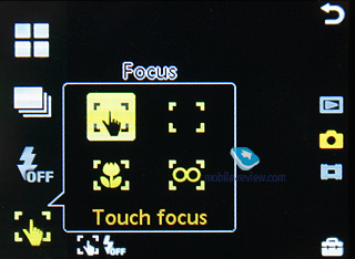
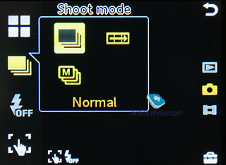
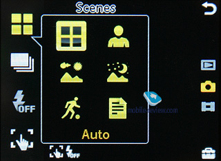
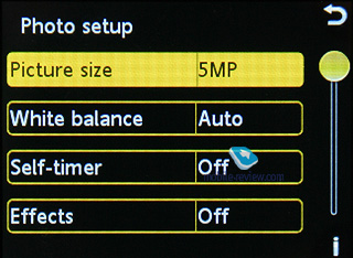
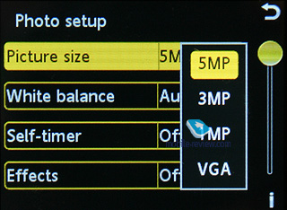
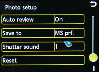
The G900 comes armed with a 5 Mpix autofocus-less camera and a LED flash. The application’s interface has been thoroughly refurbished, so that now it somewhat reminds of the Cyber Shot products, and on top of that, is tweaked for touch-based navigation, with large and very tappable thumbnails for settings. Regrettably, the G900’s image quality is nothing to write home about. One of its distinctive features is the ability to focus on any object you see by tapping it on the display.
The following resolution settings are available:
- 5M (2592x1944)
- QXGA (2048x1536)
- SXGA (1280x960)
- VGA (640x480)
Three image quality levels are available (all images have 18-bit colors):


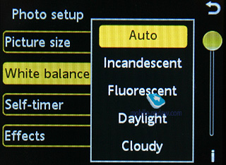
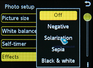
Also, you can use such effects as Black&White, Sepia, Solarization, Negative, - or go for the multi-shot or panorama mode, apply frame, alter white balance settings, turn to digital zoom (x3, SmartZoom feature).
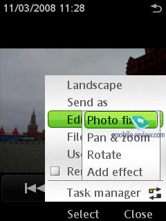
The handset packs in the PhotoFix feature, which is in fact a very basic image editor with some pre-installed filters.
Video. The G900 can record video in several resolutions (maximum settings – QVGA at 30 FPS).
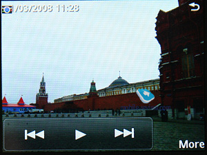
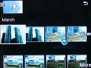
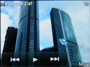
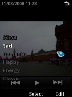
Media. The G900, much like Sony Ericsson’s latest and greatest offerings, (with the K850i in first place) allows the user to switch to the gallery right from the camera application. In this section, the screen is filled up with semi-transparent controls, forward/back buttons, and the slideshow start key. However, the G900’s slideshow is different from what we normally see – it is the A200’s trademark Xpict Story feature, where you pick one of the four moods or the silent setup. Depending on the mood you have chosen, the phone will present you with different tunes and transition effects – needless to say that no other manufacturer has anything similar on offer at the moment.


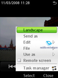
The image editor is nothing to write home about – you can apply various effects, scale the picture, and so forth. The G900 also supports tags for photos, which you can add yourself. One of the options available to you allows sending a photo directly to your personal blog (Blogger.com). Other features of note include Remote Screen, where the G900 beams an image to another device over Bluetooth, which then shows it on its screen, yet doesn’t save in own memory.
Back to the table of contents >>>
Interface (panels)
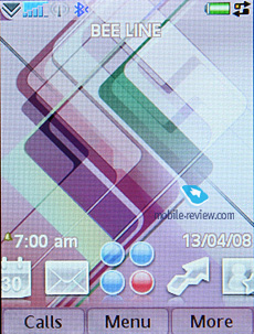
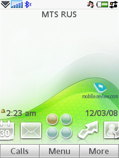
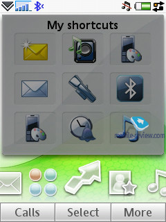
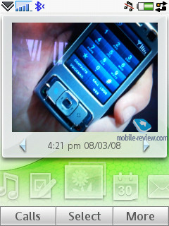
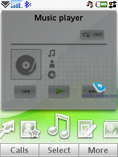
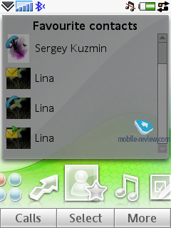
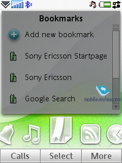
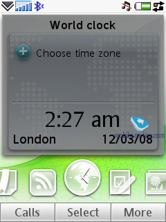
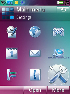
Starting with the Sony Ericsson P1i, Sony Ericsson has been gradually enhancing the interface of UIQ solutions, and one of the areas they have been doing this is the standby screen. That is, now it houses a quick launch bar with shortcuts, however, the G700/G900 takes this idea one step further by introducing so-called panels. By “panels”, they mean a variety of applications that can be tacked on the standby screen, optimized for finger navigation.
How does this work? It’s all straightforward and intuitive – by default, the screen features a bar with five thumbnails in it, with the menu icon in the centre. You can tap any of these icons, calling up a corresponding panel, or scroll through the bar by sweeping your fingers from left to right (one item per swipe, no so smooth scrolling, which isn't good as far as animation goes).
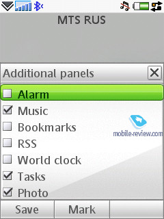
Let’s see what panels you can link on the standby screen. By the way, you can dismiss specific panels if you don’t need them:
- Alarm
- Music
- Bookmarks
- RSS
- World time
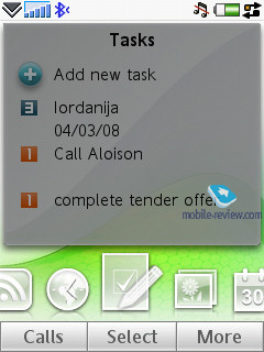
- Tasks
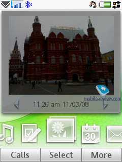
- Photo
However, there are four main panels that can’t be removed from the screen:
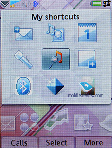
- My shortcuts
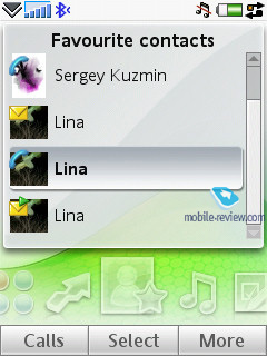
- Favorite contacts
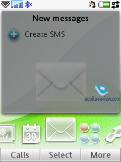
- Messages
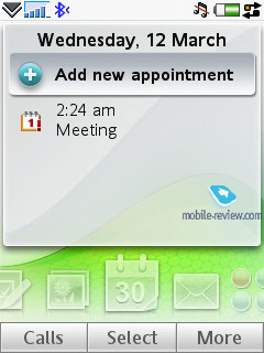
- Organizer
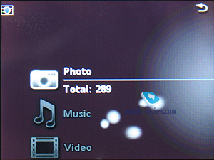
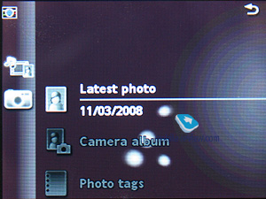
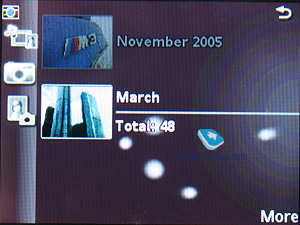
The potential of these panels is stunning – having setup them once, you might not bring the handset’s menu up ever again. For favourite contacts, not only can you choose entries, but also select call type, and message type (which is a completely new option). The panels that have something to do with dates show all info you might need for today, like tasks and meetings. The Photo panel allows you to view your latest shot, and listing of your gallery. Unfortunately you can only switch to full-screen mode for the current image, meaning that you won’t be able to browse through your gallery this way.
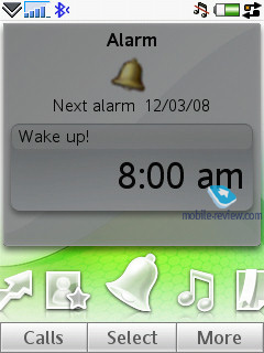
The Messages panel shows the list of latest SMS/MMS messages, as well as emails. In RSS, you will see headlines from all the feeds you are subscribed to. The Alarm allows you to setup the G900’s alarm clock on the go.
The main goal of the panels is to make the G900’s UI more flexible and intuitive, as well as allowing for finger navigation. The closest alternative we can think of is the HTC Touch’s UI. However, while there are some similarities between them, the implementation of the underlying idea in Sony Ericsson’s solution is totally different – it allows for deeper personalization, although its animation isn't what we would call eye candy.
They have also left the P1i-esque standby screen intact – look for the “Business” option in the menu, and basically it is what we will be focusing on (along with the G900’s other standard features) below.
Back to the table of contents >>>
Interface, standard applications
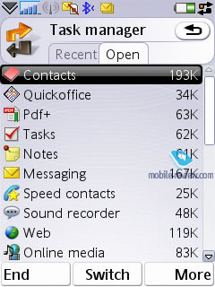
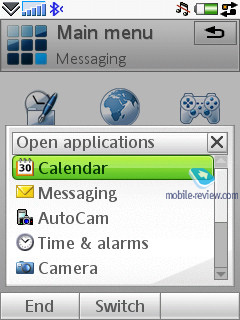
Making the UI less sophisticated doesn’t necessarily mean they need to drop already existing features – the standby screen is further proof of that. However, there are some exceptions; that is, they have dumped the Task Manager in the G900, and provided the Open Applications list instead. You can still terminate any application with it, but there is no way to view the list of your recent applications or the amount of memory they use. It is a deliberate down-grade of the phone’s functionality, aimed to make it friendlier towards the average user. And as far as techy users go, it won’t be much of a problem for them to find something similar to the Task Manager.
The Business menu is basically what the user interface looked like on the Sony Ericsson P1i. The standby screen features “Today” at the top and a cross underneath, meaning that there is a list to be expanded. Pressing it unfolds a menu with information on unread messages, emails, calendar entries, and missed calls. Each item can be expanded even further, providing a detailed list of messages or other entries. Not only does this allow you to look through short messages, you can also examine them. However, without a JogDial this layout is obviously behind the panels in terms of usability.
The shortcuts bar with 5 thumbnails has been extended with two extra lines, though by default they are hidden – to see all shortcuts, you will have to open the list. You are free to assign shortcuts to any application (including custom apps), file (be it a photo, recording or something else), phone number, new SMS, email, a particular radio station etc. These shortcuts are gratifying indeed, and do great job of enhancing the device’s functionality.
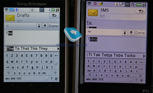
Text input. The device offers three ways of inputing text: the first one is handwriting recognition; it hasn’t been changed at all from the P-series. The second is the on-screen keyboard – you’re at liberty to switch between different layouts, e.g. from Russian to English and vice versa. The size of the on-screen keyboard has gone up, so that now you can text with your bare fingers as well. Third, data can be entered via the standard keyboard, here you can use the text prediction system, T9.

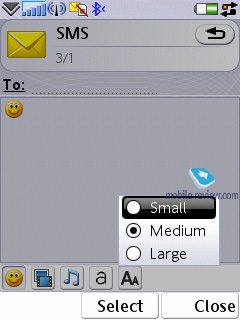
Text in all pre-installed applications can be zoomed in/out – by default they employ Medium size. Making fonts smaller doesn’t result in illegible text – on the contrary, it is still quite easy to read, yet the G900i manages to squeeze some more lines into the display. The same goes for the increased size, however, we expected to see a substantial increase; anyway the fonts become even more recognizable, though they don’t differ too much from those of the standard sized fonts.
Back to the table of contents >>>
Music department
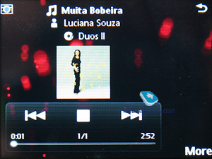
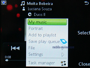
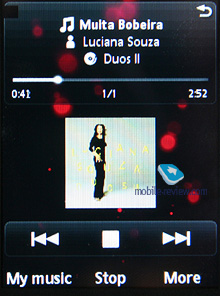
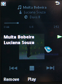
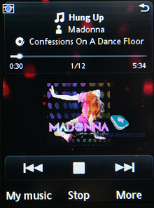
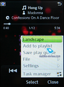
The G900 is a do-it-all device, so the manufacturer has decided not to get too fancy with music here. At the same time, its sound quality is pretty much in line with that of the Sony Ericsson W960i, although its player is much more spartan feature-wise. The G900 also packs in the Multimedia menu – if you try to open a music file from any other menu, the phone will start up the universal player rather than its dedicated music player.
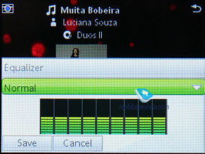
The settings pool here is pretty shallow and only includes playback mode (random, sequential), tags encoding (solves the old problem with tags in Russian), and equalizers (11 bands plus MegaBass). Supported audio formats – MP3, AAC, AAC+, E-AAC+, WAV, and m4a. There are no limits on the bitrate of mp3-files, and you can also upload VBR-tracks.
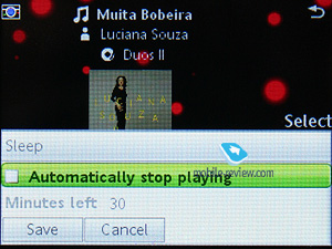
The G900 sports the progressive fast forward feature and semi-transparent controls (both for the music and video players); supports Album Art, and auto playlists (like recently added tracks, most popular, and Time Machine). Other things of note include the “Sleep” feature, where you leave the phone playing music for the next 30 minutes and then it automatically turns off.


The G900’s retail package contains the HPM-62 headset with Fast Port connector. The quality of the headphones the device comes with is quite average since it is not a music centric device. On the plus side, it supports the A2DP-profile for Bluetooth, which allows for connectivity between the phone and a wireless headset. Set to this mode, the G900 keeps itself up and running for about 6,5-7 hours straight (loop playback, no other tasks or applications running).
The phone doesn’t come with such a remote accessory (which can be purchased separately), though its job is done by a Bluetooth headset – with it you can start/stop playback, skip within tracks, and adjust volume level. Everything is quite par for the course – it handles headsets by other manufacturers as well.
If you don’t consider the lack of extra settings and abilities in the player as a serious omission, than the G900 easily holds its own compared to the Walkman range in terms of sound-quality.
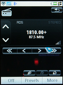
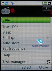
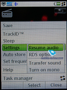
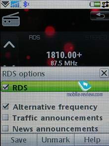
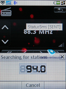
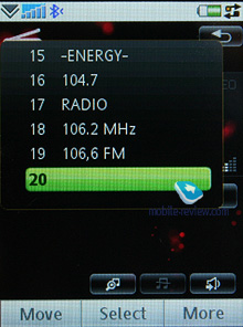
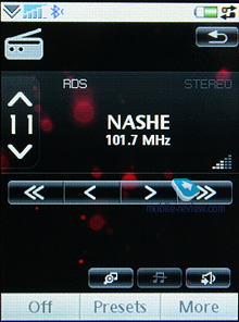
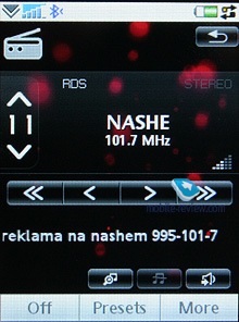
FM-radio. This will start up only with a headset plugged in (comes in the package), and features stereo sound technology. The quality is comparable with the Sony Ericsson P1i, meaning that there is nothing new brought to the table. The user can store up to 20 stations in the handset’s memory, opt for auto-tuning, or take advantage of the RDS. More importantly, for RDS you can set up the automatic launch of news blocks on things like traffic jams or the latest news. For such blocks you can modify the volume level in the settings, making them more audible. Sony Ericsson equips its handsets with one of the most sensitive radio modules – we managed to track about 20 channels without hitting 100 MHz, whilst rivals found 10-15 across the entire frequency range.
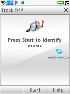
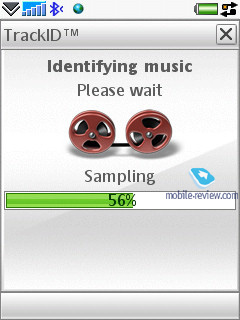
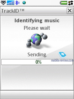
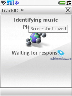
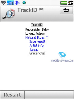
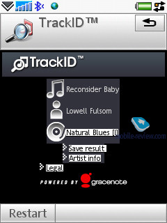
TrackID. Allows recording of a short clip of some track (with the voice recorder or radio) and then via the TrackID service retrieves the artist and song title.
Back to the table of contents >>>
Games
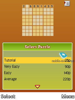
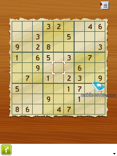
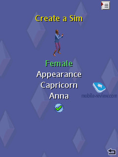
The phone comes pre-installed with one or two games – Sudoku, Sims2 or a 3D racing game.
Back to the table of contents >>>
Contacts
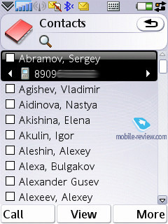
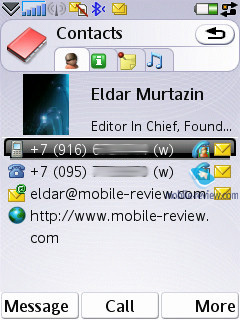
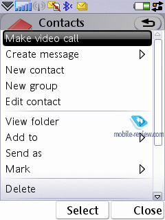
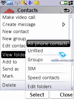
All entries in the phonebook are organized in a familiar way: at first the general list is displayed, and once you’ve selected a certain contact, you are offered a default number, set for this entry. The list doesn’t show entries, located on SIM/USIM-cards, nevertheless you’re still able to handle them via the phonebook’s menu – copy them to both the handset’s memory and memory card. But since the external memory card can serve as storage for contacts archives, there is no need in saving contacts to SIM/USIM-cards, especially taking into account entries’ structure is damaged in that case.
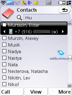
Search in the general list may be conducted by the first or several letters (the line above is a full-fledged search field). Sorting of entries in two different languages is carried out in a standard manner: contacts in English are followed by entries made in the other language. It’s better to create all contacts in one certain language, otherwise you’ll have a rough time finding them.
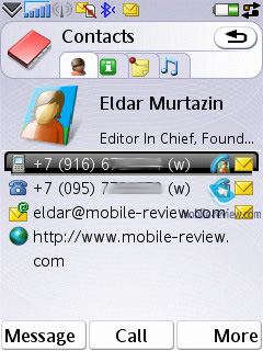
Each particular contact can contain any number of various numbers – the first entered is set as the default number. Extra entries above those, which are available in the standard view, can be added via the menu. The general list displays details on particular numbers via horizontal scrolling; right here you’ll get extra information on the contact, like e-mail address etc.
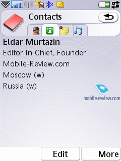
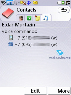
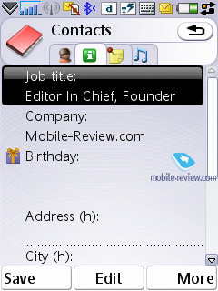
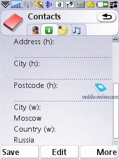
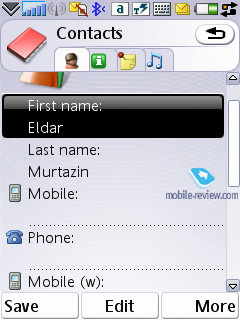
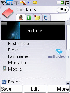
Despite the common manner of UIQ 3.0 implementation, the developers of Sony Ericsson have embedded four tabs in the contact editing mode, against three default ones. The first holds functions related to phone numbers editing, choosing category, or, if you like, groups. The distinctive feature here is that one and the same entry can be assigned to several categories at a time (may prove useful when dealing with bulk mailing). The second tab contains date of birth, status in company, position, address (several fields), and work address. The third tab is just a text note, attached to a contact, while the fourth provides data on voice commands (applied to phone numbers) and personal ring tone (in case you’ve set a group ring tone, on inbound call it will be replaced by an individual tune, since the latter has a higher priority). As you can see, the only option differing from the standard set is the tab with a text note.
When viewing an entry you can initiate creation of a new message for the selected number in one touch (in the pop-up window you should choose the type: SMS or MMS), and in case you have picked an e-mail address, the built-in mail client automatically starts up. And owing to the fact that three keys double as shortcuts here, the device feels much better in operation.
An IM-client is integrated into Contacts, from here you can examine your interlocutor’s status and launch a respective application (it’s a non-standard UIQ implementation).
A built-in contact manager is also available in the handset – it allows the user to send the selected entries (categories) to other devices over Bluetooth, also the phone supports the vCard 2.1 standard. This way, you can receive entries from other devices in a similar fashion.
The full-fledged support for SyncML (new title of OMA DataSync) allows synchronizing data with every device that can deal with this standard (no matter whether it's PC, PDA or a handset).
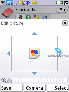
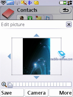
Photos, assigned to contacts in the phonebook can be tiled, stretched.
The quality of the phonebook is fairly good and will satisfy even the most demanding user. Integration with the built-in applications is next to the deepest possible, which makes the smartphone even easier to use. Even when working single handedly, you won't experience any difficulties with scrolling through the list, choosing a number and dialing it.
Holding the numeric keys down activates search in the phonebook, which can be conducted by several letters. As an addition, you can set up to 9 numbers for speed dialing, which will be followed by the matching names and photos (if any) on the display. The dialing process is carried out in the following manner: first you choose a number (at this moment contact’s name, assigned to this button pops up) and then press the call key. When at the standby screen, switching between dialing a number (numeric keys) and fast dialing numbers is done in one touch by pressing the corresponding icon.
Speed dial for 9 numbers is also enabled on the G900.
Back to the table of contents >>>
Messaging
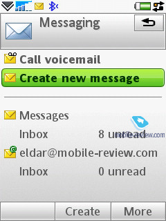
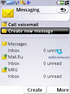
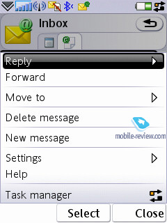
All incoming messages, except for e-mails, are stored in one folder – Inbox. This also applies for files received through Bluetooth (the device supports all formats, even those it can’t recognize). The data located in Inbox can be saved later on in any other folder – the handset ensures unlimited access to the file system (except for the system folders). In return, the user is at liberty to create their own folders and sort messages in them. When entering the Messaging menu, by default you’re shown the general folder, by using horizontal scrolling you will switch between files, and pressing OK key selects a particular folder and allows you to view the message list.
The root of the Messaging menu features the list of all mail accounts separately under the Inbox folder – e.g. if you have three of these, they will be displayed in order of appearance.
The Inbox folder also displays each message type (SMS, MMS, Beam) – you see the respective icon next to each item.
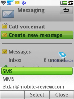
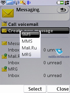
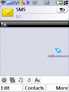
You can also find the option to create a new message from practically any menu, which features a phone number –just choose the needed type (SMS/MMS) and start texting. Though under the name of SMS you will surprisingly discover EMS messages as well. As a matter of fact, the user is barred from deciding which message type to create – if you type only text, the device will view this message as an SMS, and EMS is used in cases when you use not only smiles, but ring tones, images and formatted text (this doesn’t include the Zoom function). This standard is fully supported in the handset, just like we have come to expect from it.
Concatenated messages are listed as one, when typing they are displayed in a standard manner e.g. 1/2. I would like to stress that the refined T9 system, which analyses the entered words and offers their probable ending, does a fantastic job (the system is organized in a similar fashion to that found in Motorola’s handsets). Another amenity is that the device saves entire messages (they are stored in the dynamic memory, though I didn’t manage to figure out its size, these are NOT Draft messages). When you start inputting a word, which was featured in the previous messages, you will be offered either to choose it, or continue typing. Once you’ve entered the only word that differs from the saved message the rest of the optional text disappears. In fact it’s the best way to store temporary messages, which you don’t want to store in the Draft folder. Among other traits we shall note is the on-the-go register switch – the first letter is always a capital, though you can turn this option off. Also, text smilies can be displayed as their respective icons in ordinary messages.
A message can be sent to multiple of contacts at once, all you need to do in this case is select the required entries or multiple numbers for a single contact. Bulk mailing can be performed for groups as well. When replying to a received message you can choose between SMS/MMS (the list doesn’t include the option to reply via email).
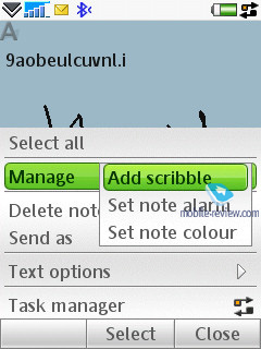
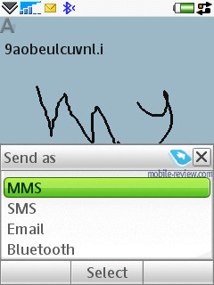
MMS-message creation - one of the best things about it is that several tabs are available here, through which you can choose the time-out between the pages and create templates of your own. Besides the standard files (graphics, video, images, music etc.) a message can contain a hand-written sketch made with the help of the touch-screen (Scribble). The rest of the options are run-of-the-mill here – choosing contacts is similar to SMS-messages, though MMS also features a reading report in addition to the standard delivery report.
For all types of messages, including e-mail, you can perform a search using fragments of text – the window displays search results and provides for the possibility of switching to a certain message outright. We couldn’t find any limitations on a message’s size – these will be set by operators or the manufacturer, depending on the given region.
The handset provides full-fledged support for OTA reception of MMS settings, mail client, and GRPS. All received settings are saved in the relevant sections.
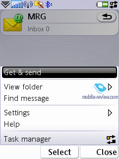
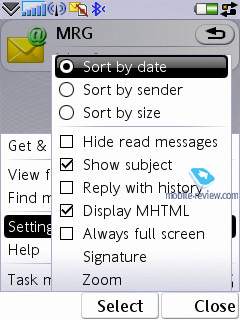
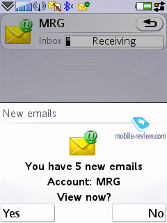
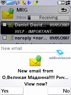
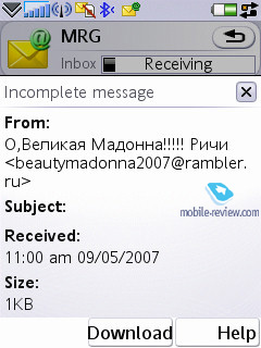
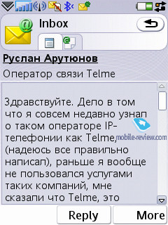
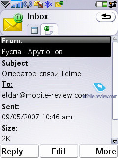
Email client. It has undergone no serious changes compared with the Sony Ericsson G900, the only difference is that the Push Mail item has become standard and is featured in the menu. The G900 can deal with several mail boxes, moreover UIQ is capable of working with practically all standards presented in today’s market. The following standards are supported by the OS:
- POP3
- IMAP (IMAP Idle, IMAP Remote folders)
- SMTP
- MIME
- MHTML
- Push mail.
All the email settings are easy to adjust – you set whether it should download entire messages or only headlines (as an option it can download a certain part of messages, not exceeding a certain size, set in Kb). There is also the ability to set how many messages the Inbox folder can hold at any one time– once this number is reached, downloading will be paused automatically. There is also an option for checking mail boxes at certain times.
By default UIQ uses the Latin 1 character set, though the developers can add other character sets. Thus Sony Ericsson will also feature local character sets for some regions (1251 is also on that list).
All attachments are handled by the mail client with ease– they can be downloaded and then saved. If an attachment uses a format, supported by the smartphone, it may be opened (and what is more the attachment receives a corresponding icon). There are no restrictions on file size – none that you should notice anyway.
Back to the table of contents >>>
Organizer
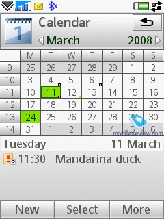
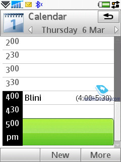
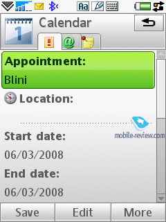
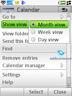
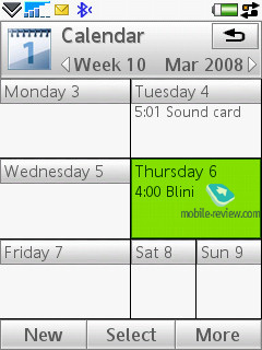
The calendar provides not only the conventional monthly and daily views, but also a weekly mode. In this mode a week is presented as two columns composed of the various days, where each square features scheduled events. This mode is rather handy and allows the user to quickly estimate how busy he is during the week to come. When the number of events for a particular day exceeds five not all of them get listed outright.
In the month-view all dates, for which there are scheduled events, are marked with corresponding icons to the right of the number. There are four types of events –appointments, reminders, anniversaries, and all-day events. All events can be set to be repeatable, and for each of them you can pick a specific alarm tone.
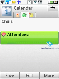
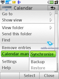
The organizer supports vCalendar, version 1.0, in that the developers have incorporated support for team work via iCalendar. In practical terms this offers the possibility of sending a request for a meeting using the mail client. The recipient may reply with a refusal, in case the date and time don’t suit him, or accept the appointment. In the latter case the message, saved in the Inbox folder is automatically redirected to the Oraganiser and shown in the calendar as a stand-alone event. You can also check the request status while the recipient is pondering over the message.
Among the standard functions, sending calendar’s event to other devices via Infrared or Bluetooth is available here. Naturally, the handset supports reception of such messages as well, which, after being looked through, are saved in the calendar.

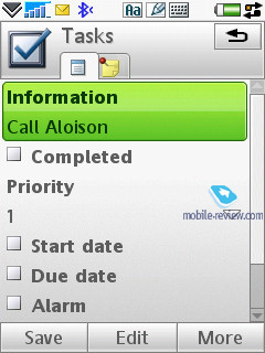
To-Do list. All entries in the Organizer and To-Do list are inter-transferable within the bounds of these two sections. Much like the Organizer, the user can create a backup copy of the To-Do list on the external memory card. You can create any number of categories, which are used to sort entries with. The priority may vary from 1 to 3 (low, normal, high), and you can also set start and end dates, and the alarm tone (tone choice is user defined).
You can sort the general list by categories, completion status (list of completed tasks may be hidden), due date and priority. The To-Do list supports SyncML amd synchronizes with MS Outlook without any hardships. The user can also send particular entries to any device using Bluetooth, as well as a standard message’s body.

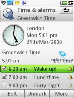
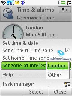
Alarm Clocks. This function works exactly in the same way as in previous models – you are able to set up several alarm clocks to go off at different times, and you can set alarms to be repeatable for particular days and apply different ring alarm tones.
Flight Mode. Similar to other smartphones, the handset can function with the radio components disabled – in this mode Bluetooth is also unavailable. Unfortunately the handset does not work without a SIM card inserted.
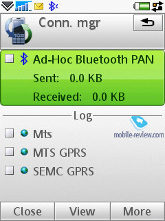
Connections manager. One of the things characterizing UIQ 3.0 is that the device can run several connections, requiring different network services, at once e.g. downloading of mail via an Internet account and a connection for sending and receiving MMS-messages. This capability was named “multi-homing”. The following standards are supported: GSM data call (CSD), GSM High Speed data call (HSCSD), Packet data (GPRS), Bluetooth, and WLAN.

From the menu (the line with an arrow in the status bar at the bottom) you can check connection time; the amount of incoming and outgoing data; current connection status; the number of running applications employing a particular connection at the given moment. You can also disconnect or initiate a connection from this menu.
The capability for several applications to work with the same connection at once cannot be overestimated, since it creates a real multitasking environment, where one can simultaneously watch streaming video, check mail boxes and send messages. It’s important to realize though that the only limiting factor is bandwidth – in case the user tries to execute several applications requiring high data speeds, this will result in system failure or very poor performance. Certainly there are some pre-set priorities for various applications, integrated into the device, though we couldn’t figure them out.
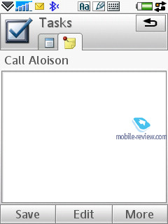
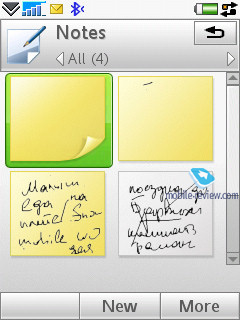
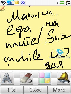
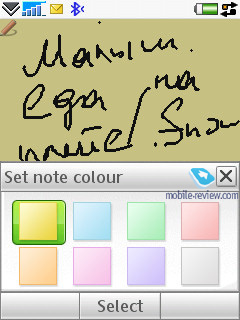
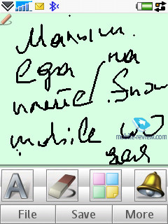
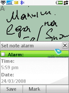
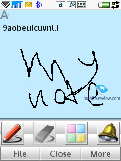
Office applications. This section holds all the office applications; by default there are four of them (except for the organizer, which is a standard program). The first item on the menu is Notes, which can be either text (typed using the user’s method of choice; txt extension is also supported) or scribbled.
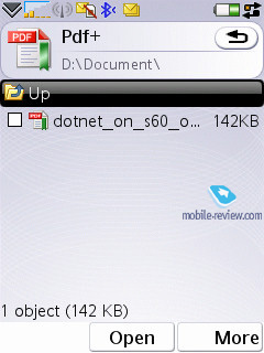
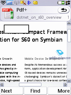
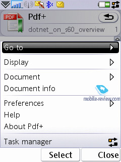
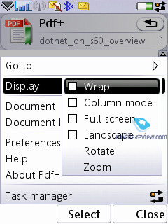
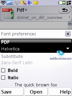
The second application is PDF+, and as its title implies, it servers as a PDF reader. You can view these documents both in standard and landscape modes. Actually this application has been available for various operating systems, including S60, for several years now, and Nokia has installed this program on a number of its devices. On the whole PDF+ works pretty fast, and seamlessly deals with files both in English and documents written in various character sets (though as applied to pdf, the term “character set” feels out of place). This app retails for around 25 USD.
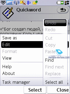
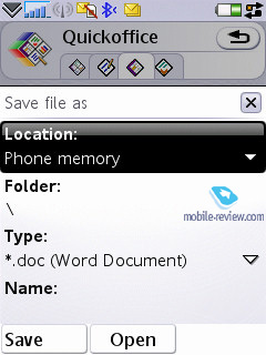
QuickOffice – another third-party application, which was selected by UIQ as a default app for the third edition and comes as part of the standard package (there is a version for the previous editions of UIQ, which sells for 50 USD). The program itself is an editor, which recognizes and is capable of opening and editing MS Word, Excel, and PowerPoint documents.
We won’t dwell on QuickOffice, though we will make a short note that the resources of any mobile device are strictly limited. Complicated types of formatting, used by desktop computers, are frequently not saved in files edited on smartphones (this goes not only for QuickOffice, but all devices powered by Windows Mobile as well).
Back to the table of contents >>>
Some Other Features, Themes, Web-browser
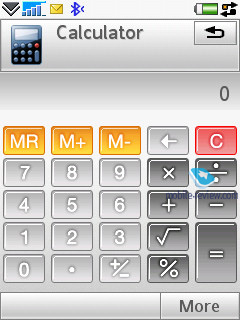
Calculator – self-explanatory application, nothing special in it.

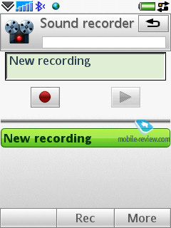
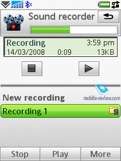
Voice – A sound recorder, which allows making voice notes (only when in standby mode), and you can choose the format, which all recordings will be made in. This application offers a very handy and simple interface. The recording is limited by nothing save the amount of free memory left on the handset.
Picture gallery – this application displays thumbnails of pictures with the ability to quickly switch to full-screen mode. No visible changes have occurred in this program, though now you can send a MMS-message containing the currently viewed image.
Picture editor – a simple editor, which allows performing basic operations with images.
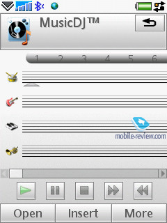
MusicDJ – a default application for Sony Ericsson has finally made its way to the smartphones – this app lets you mix a number of tracks.

Unit converter – converts various units into other systems.

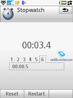
Stopwatch – self-explanatory application.
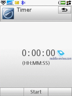
Countdown – time is set in hours and minutes, and upon reaching the set time, the devices triggers a sound alarm.

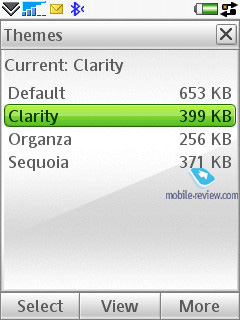
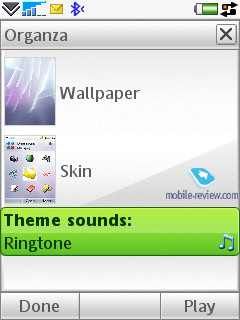
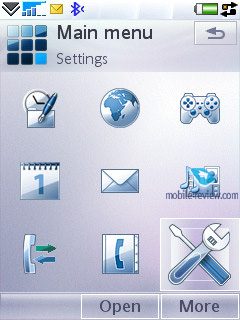
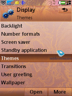
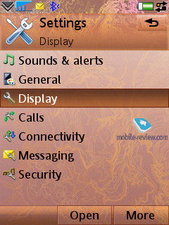
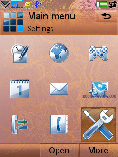
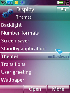
Themes are one of the major parts of the new UIQ –not only do they modify the appearance of windows and colours, but they also modify particular menus and icons, thus allowing for refinement of the interface. You can also change various sound effects, such as screen taps.

The handset comes equipped with Opera 8 for the default web-browser. At present this is the best browser available for this kind of device, the only challenger is S60’s browser version two. It can work in both portrait and landscape modes, supports cookies, and scales pages to fit them in the handset’s display. I won’t describe all the features of this application here, as we will devote a special article to it.
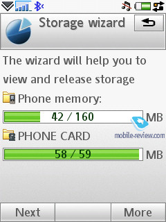
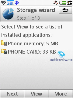
Storage Wizard - is a default application for UIQ 3.0, which offers an overview of the memory status.

File manager - allows viewing folders on the handset. It supports multi-selection of files or folders as well as deletion and copying; you can also send a number of files to other devices via Bluetooth. The file manager’s capabilities are quite conventional and there really isn’t anything that stands out here.
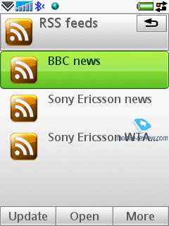
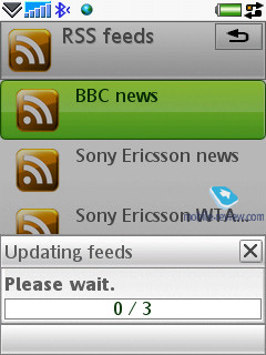
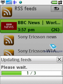
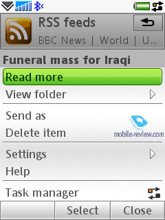
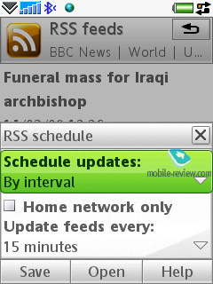
RSS Feeds - It’s an RSS reader, which successfully copes with its main function. You may add any feeds of your own, and update all feeds with one touch. Everything is plain and straightforward here – those who haven’t used this technology before will become fond of it through this handset.

Flashlight. You can activate the G900’s flashlight for a minute or turn on the SOS mode.
Back to the table of contents >>>
Impressions
Despite having only one loudspeaker onboard, the G900’s ring tones are pretty loud, actually above the market’s average volume level, being in line with the Sony Ericsson P1i, so it is very hard to miss a call with this phone in your pocket. The G900 is living proof that even a sole speaker can sound very well. The vibro alert isn’t strong enough though, and you might not feel it on certain occasions.
The Sony Ericsson G900 is set to arrive in late June 2008; its price will revolve around the 350 Euro mark, which is 50 Euro steeper than the G700. Its megapixel count doesn’t put it far ahead, although it does bring an added benefit in the form of the business card scanner (application), however it works poorly (or doesn’t work at all) for Russian and some other languages. The G900 is a phone to look for, since it’s one of the finest offerings in terms of the price/quality ratio. On top of that it is going to be around for quite a while, at least 1,5 years, meaning that in a year’s time it will become one of the most affordable touchscreen device on the market. On balance, it is a definitely worth a glance or even two.
Back to the table of contents >>>
Eldar Murtazin (eldar@mobile-review.com)
Translated by Oleg Kononosov (oleg.kononosov@mobile-review.com)
Published — 18 April 2008
Have something to add?! Write us... eldar@mobile-review.com
|
News:
[ 31-07 16:21 ]Sir Jony Ive: Apple Isn't In It For The Money
[ 31-07 13:34 ]Video: Nokia Designer Interviews
[ 31-07 13:10 ]RIM To Layoff 3,000 More Employees
[ 30-07 20:59 ]Video: iPhone 5 Housing Shown Off
[ 30-07 19:12 ]Android Fortunes Decline In U.S.
[ 25-07 16:18 ]Why Apple Is Suing Samsung?
[ 25-07 15:53 ]A Few Choice Quotes About Apple ... By Samsung
[ 23-07 20:25 ]Russian iOS Hacker Calls It A Day
[ 23-07 17:40 ]Video: It's Still Not Out, But Galaxy Note 10.1 Gets An Ad
[ 19-07 19:10 ]Another Loss For Nokia: $1 Billion Down In Q2
[ 19-07 17:22 ]British Judge Orders Apple To Run Ads Saying Samsung Did Not Copy Them
[ 19-07 16:57 ]iPhone 5 To Feature Nano-SIM Cards
[ 18-07 14:20 ]What The iPad Could Have Looked Like ...
[ 18-07 13:25 ]App Store Hack Is Still Going Strong Despite Apple's Best Efforts
[ 13-07 12:34 ]Infographic: The (Hypothetical) Sale Of RIM
[ 13-07 11:10 ]Video: iPhone Hacker Makes In-App Purchases Free
[ 12-07 19:50 ]iPhone 5 Images Leak Again
[ 12-07 17:51 ]Android Takes 50%+ Of U.S. And Europe
[ 11-07 16:02 ]Apple Involved In 60% Of Patent Suits
[ 11-07 13:14 ]Video: Kindle Fire Gets A Jelly Bean
Subscribe
|
