|
|
Review of GSM-handset Samsung P310
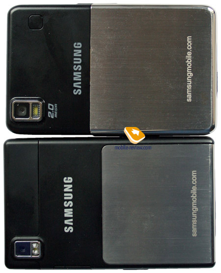
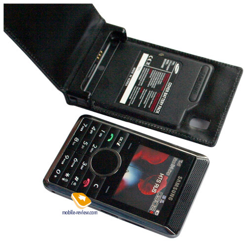
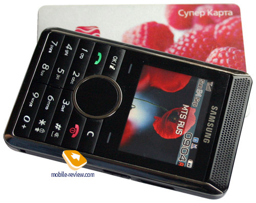
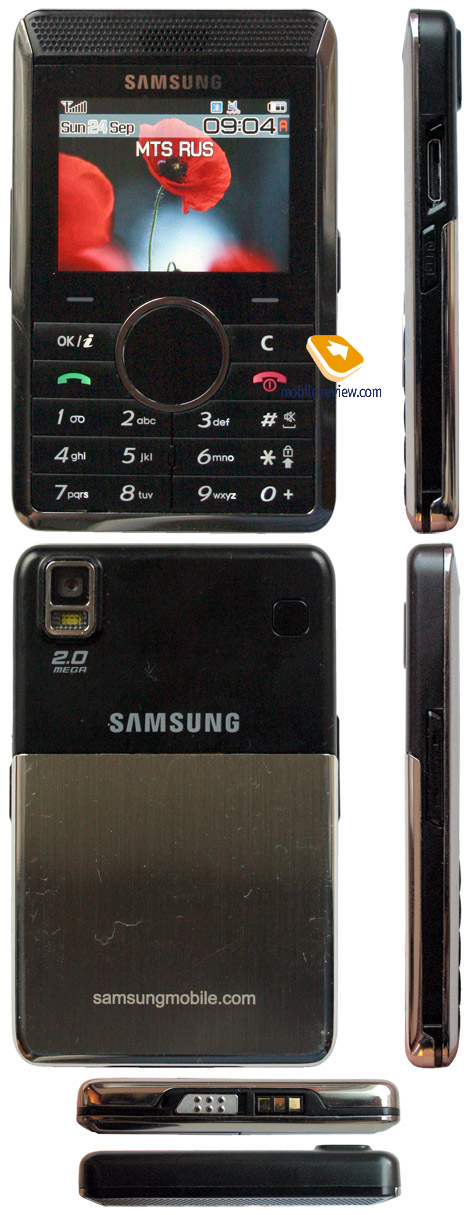
Live pictures of Samsung P310
Sales package:
- Handset
- Battery
- Charger
- User guide
- USB cable
- Wired headset
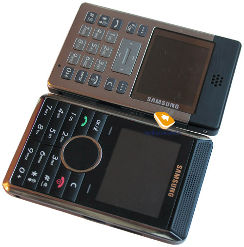
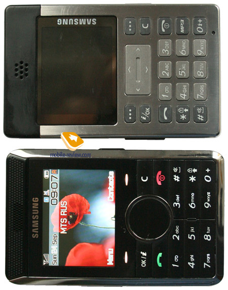
Samsung P300 was the first handset in Samsung’s line-up of calculators, sorry, my bad, credit-card-sized phones. As you might have already guessed, this informal alias was assigned to the handset for its strong resemblance to calculators. On the Russian market, however, the P300 officially got a personal name - Platinum that was to give an idea of the device’s positioning as a high-priced prime solution. Though that codename has proven to be somewhat indistinct and actually it means nothing - thereupon one would hardly find it anywhere but in Samsung’s adverts. The P310’s personal name spot is still vacant, but the handset is likely to get one in a couple months after hitting the selves. Why they don’t just come to nickname it “Card Phone”, which is used within the company – is obscure, even though that would fit the P310’s gist best.

The device is by no means aimed at the mass market - the sales of Samsung P300 that turned out moderate even for its segment, have proven this fact. As a solution targeted at a narrow male-only audience, so to speak bohemia, the device definitely was a success. It’s the thinnest society class, where consumers either don’t care about the brand or the pick a solution carrying not the market’s best company’s name onboard just to challenge others and have an own image-fitting handset around. Lack of clarity in preferences is a result of missing specific aims when these people buy new devices – in fact the phone’s target audience readily overlooks all functions but calls. Personally, I haven’t met anyone among business-users with the P300 in hands.
Development of a whole Card Phone range is regarded by Samsung as a unique course, as these products don’t have any rivals among other manufacturers’ offerings and therefore might serve for amplifying the company’s image. Such approach proves to be worthy, when you come up with something relatively new for the industry, as Motorola did with its world’s first clamshells or recent “slim” handsets trend. An exotic yet non- charismatic solution barely fits the position of an iconic-product and even if it is considered to be the one, that is provoked either by the lack of market understanding or the ambitions of certain managers. Add the intension of boosting the handset with some of the company’s latest off-beat “features” to the primordial wrong market appraisal and you will get a really fulminating mix.
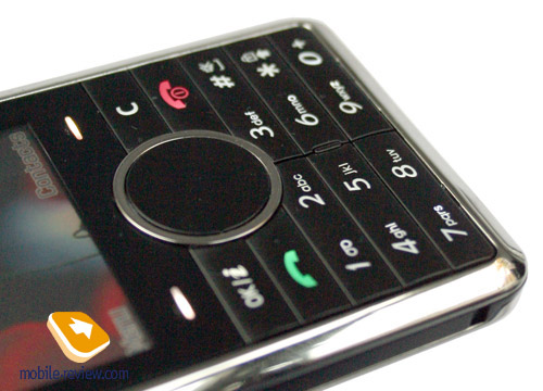
For example, having embedded touch-sensitive keys in Samsung E900, over at Samsung they only gave this technology a trial and haven’t applied it for mass solutions, especially for their controls due to such keys being less comfortable and having some serious drawbacks. In Samsung P310 there hasn’t been any vital necessity in making two soft-keys touch sensitive – there is just enough space to squeeze ordinary buttons. The reason everything has gone sensor buttons’ ways is a tribute to fashion, that’s all - as a matter of fact the P310 aims at a very scanty audience. If only the E900 managed to become a bestseller (which is doubtful), then the touch-sensitive buttons would be the right solution for the P310 and act in its favor. Yet nowadays everything seems to be completely the opposite.

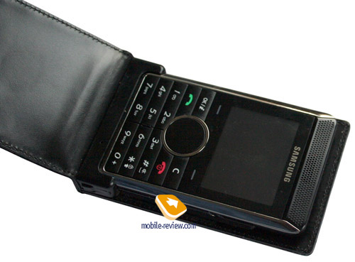
The touch-sensitive buttons are mounted beneath the display, so that you will definitely be keeping on unwittingly running over the display’s edge on every press, although fingerprints are mostly invisible, therefore it doesn’t bring about any troubles. But the way the sensor works is rather fancy: in stand-by mode the touch-sensitive buttons doesn’t always respond to the touch and so you have to push the key a couple of times to make it react. My attempt to find a replacement for the soft-keys resulted in a failure – these buttons take part in most interactions with the P310. Such behavior of the soft-keys and exhausting push-it-again’s, do frustrate a lot; it appears the handset’s ergonomics was missing on the developers’ to-do list.
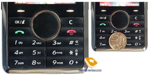
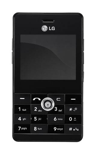
Also keep in mind unique layout of controls that are arranged in three lines here, with the «0» being located on the right along with “#” and “*”. Though you might be able to master it in a couple of weeks – at least I succeeded in that. The users having Samsung P300 in their pockets are unlikely to update their gadget, but in case they do, they will have to realize that the layout of controls on these devises is different. The dedicated MP3 key has disappeared, reducing the total number of buttons to 18, “#” and “*” keys have been moved from the left side to the right.

The keypad itself, on the contrary, has gotten easier to use, even though the keys here are bulky and border each other. They are easy to push, thus dialing a number is mostly a breeze. The white backlighting is well-visible in different environments. The four-way navigation pad abuts the OK key mounted on the left.
Video, outlook, comparison with Samsung P300 (wmv, 41.3 Mb)>>>


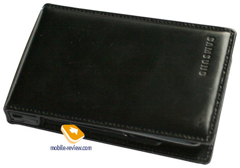
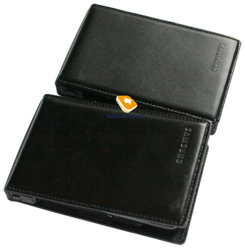
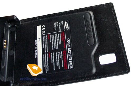
The P310’s design will remain a secret for everyone but the handset’s owners, as the sales package includes leather case, doubling as a secondary battery. The device always resides in that soft-cover, which enables others to see only the wrapping rather than the device itself. But what should be counted as a critical mistake of the company’s marketologists is lack of differences between the leather casings for the P310 and the P300 – in a nutshell, nothing is pushing consumers towards upgrading their P300’s with brand-new gadgets. In fact, why should they, if the outlook remains the same? Of course the device can be operated without the leather casing, but that causes lots of troubles - from the reduced lifetime to the uncomfortable way of carrying.


It would be great to see a vast variety of designs for the leather casing, such as stampings, cutouts and trims. Unfortunately the model lacks all that and thus has nothing to do with the looks of a small wallet.
The main drawback of Samsung P300 had been short lifetime on intensive use of its connectivity features, and missing extra battery – all this was taken account of, so the P310 has ended up with an increased by 200 mAh in-casing battery (800 mAh Li-Pol, while the main battery is 550 mAh Li-Pol). This has lead to thickening of the casing (to be precise by 2 mm), but this doesn’t make all the difference while holding the P310 in hands. In return the lifetime in stand-by mode has been boosted by 20%, which is huge.


Without the leather casing the P310 tips the scales at just 75 grams, however when weighted in the casing, it turns out to be 150 grams heavy, which is not too comfortable for such small device – be sure, you will feel its weight. The phone measures 86х54х8.5 mm in size.

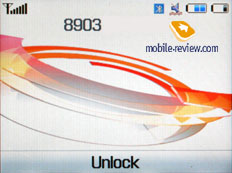
To the developers’ credit be it said, status of both batteries is displayed on the main screen – the indicator on the right stands for the handset’s battery, while the one on the left displays how good the battery embedded in the casing is. I don’t know the real sequence of discharging, though on the display the scale on the handset’s battery bar vanishes first, then – the casing battery’s scale, then ¬– the handset’s one again and so on. Occasionally, the P310 notifies you that two scales have gone off the handset’s battery, whereas the secondary battery is full. But in a couple of minutes the figures get re-calculated and one scale disappears in both of status bars.

The clip in the casing has undergone some changes as well – from now on the device is fixed only with one latch and does not dangle around. Rubberized pads are placed on the interior of the casing, preventing the P310 from touching the leather. The casing also has the holes for the camera lens and flash, allowing for managing the camera without taking the casing off.
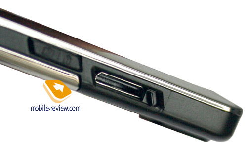
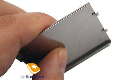
The handset’s design blends with the latest trends – black varnished plastic and a chromium-plated rim edging it. The battery cover is made of metal, whereas all other elements – of plastic. The left plate houses volume rocker switch, while the right side features socket for charger and headset. Unlike the P300 this slot is covered with a sliding flap, which is quite good in use. There you will also find a dedicated keypad-lock key that serves as a shutter shortcut button too. However not everything is smooth with that key - it always locks buttons except for long-time presses, which start up camera application. But there is no way you can take another snap without using the sensor keys, as the second click locks the keyboard and there is nothing you can do about that – no matter how long you hold the key.

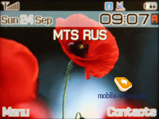
The model makes use of a QVGA display (320х240 pixels, 1.9 inches, 29х38 mm), with landscape orientation. The picture outputted by the screen is very crisp and visible even in the sun, as it is powered by the TFT technology (262 K colors). Up to four text and three service lines can be displayed at a time. Due to unusual orientation, the display delivers really good experience when it comes to reading texts, nevertheless navigation through the menus is not all that good (fewer options are displayed on the lists).

The lens of a 2 Mpix camera, as well as a flash module is mounted on the rear. The camera found on the P310 matches that used in Samsung X820 and other latest company’s models spec-wise.

The lower rim holds the jack for plugging in the casing and latch of the battery cover (no gap). The leather casing from the P300 doesn’t get along with the P310 – even though the jacks are alike, the device cannot identify it and doesn’t fit in the slot.
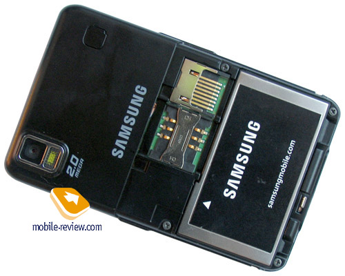
Removing the back cover reveals 600 mAh Li-Ion battery along with SIM-card slot situated next to microSD memory cards slot. When the phone is on you can change the card in case you have the appropriate skills, but doing that with a detached battery is much easier.


The manufacturer claims that the device manages to offer talk and standby times up to around 6 hours and 300 hours respectively on a single full charge. In conditions of Moscow networks the device lasted 3 days on average at 30 minutes of calls, and other functions being inactive. At the same time should you be heavy on what the P310 brings to the table, it will put up 2 days of lifetime. Without the leather casing, the device remains good for about a day at 20-30 minutes of calls. Full charging time of the both batteries makes about 3.5 hours.
Menu
Samsung E900 was developed in Gumi R&D centre (Agere chipset), as result it is almost identical with such handsets as Samsung X820, Samsung D840 – the only difference that should be taken account of is landscape screen orientation
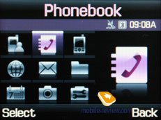
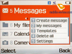
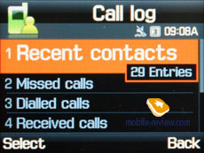
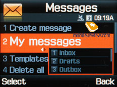
Interface follows up the style of recent models, there are two high-contrast themes available, but that’s about it. Main menu can be displayed as grid (3x3) or as a list. All sub-menus have horizontal lists, in case there’s a third-level menu, you will see a pop-up window on the right of the highlighted item. You see which items are stored underneath, and once you press OK button – you will get there. In case you lean navigation leftwards or rightwards, you will be able to access corresponding item at once. Ergonomics of such solution is evident, at least one key-press gets saved every time you navigate the menus, and this is interesting solution developed by Samsung.
 
Another pleasant interface addition which is unique for Samsung phones is memorization of position in each sub-menu and main menu. Handset will “remember” which function you addressed last time, and will highlight it automatically next time you enter same menu item. For example you selected call list in main menu, done some operations in it, and next time you enter main menu you will have it highlighted in first place. But that’s not all; once you access it again you will see that sub-menu item which was addressed last will be highlighted too. It seems to be a simple thing, but it is not present in handsets produced by any other manufacturer.
When selecting one or another item in the list you will see it highlighted, and font size (which is big already) will be increased.
Shortcut number navigation is supported, but that’s not all options of menu navigation. You can bind three different applications from the list, offered by manufacturer (you will not be able to bind java applications). Leaning navi-key up will always activate My Menu, this is horizontal scroll with list of items. This list is identical to the one for simple shortcuts.
We should also mention Simple Search function, when you dial numbers and later on select Name search from options menu. In case handset finds a match in terms of letters (this means combination of letters with digits), then it will show a record in the phone book. Unusual feature which reminds me a little of a normal smartphone search prototype.
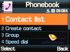
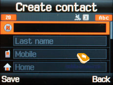
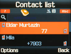
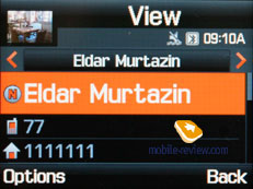
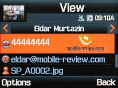
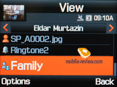
Phonebook. Contacts can be accessed by pressing right soft key, you will see a list that contains all entries from both SIM-card and phone’s memory. By default first name is highlighted, and you will see phone number in service text line (SIM-card entries are displayed with corresponding icon). Fast name search by first letters is supported; there can be up to twenty of those, for any language. Once you press OK key you will go into detailed view of selected entry. There you will see a thumbnail in case there had been one assigned. It can be an image, a photo or a video clip. Each entry can have up to 5 phone numbers of different types (cellular, office, home, fax other), one of them will be main one (by default it is the first one you entered). All fields are fixed.


There are two lines for First Name and Last Name (search is conducted only by first field), fields get summed when displayed, Name comes first. For example Eldar Murtazin will be shown only in this order. Length of each field is 20 characters for any supported input language. You can also switch languages on the go when entering a name.
All entries, without regard to language, are sorted out under the algorithm – all contacts with headings made in a local language (Russian, for example) go first and then those with names in English. This is rather convenient and handy list sorting system. Taking into account fast language switch option during the search, it’s clear that no language will spoil the experience of working with this phone.
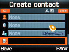
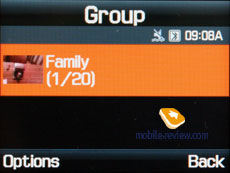
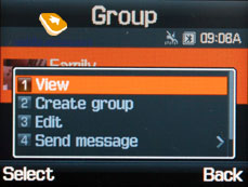
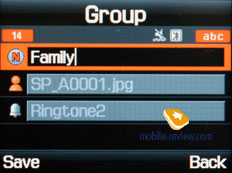
But let us return to the information entered for a contact. Apart from phone numbers, e-mail address (there may be several of them), a little text memo can be submitted on top of all that. Any music file as well as composed MP3's can be picked as a ring tone for a contact. Three caller groups are provided by default with the possibility for creating any number of additional groups, selecting a personal melody and image for each. SMS alerts are also customizable.
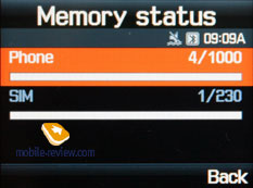
The phonebook is capable of holding up to 1000 contacts with filled in data fields. Even if all the available blanks are not used, the cap won’t get any bigger and will still make one thousand. It is possible to set in the settings where all new numbers should be kept by default. There is also an option for moving entries from the SIM-card although the vice versa action is denied. According to the developers, PC (MS Outlook in particular) is best for data synchronization with the D900. Any contact in the form of SMS/MMS, mail message or other text file can be quickly sent through Bluetooth to another device. There are no problems with sending and the phonebook entry being transmitted to another device, where it is read without any trouble.
The phonebook may contain a business card as well, though its structure copies all the fields applied to a regular contact in the phone book.
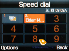
There can be up to eight numbers in the fast dial list; separate numbers tied up with a single contact may appear on this list as well. The subtitle of the chosen entry (not of the phone number type) is displayed on the buttons.

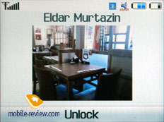
When receiving a call, a picture occupies not the entire screen, but only a part of it, however it still takes up a considerable area. At that only contact’s name gets displayed, while the number type remains hidden.

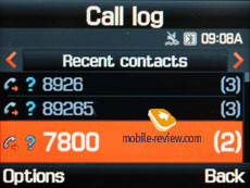
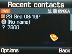
Call lists. Each of the given lists contains up to 30 phone numbers. There is a combined list of all the last calls with an icon indicating a call type. Deflecting the navi-pad horizontally, you can switch quickly from one list to another. The date and the time of a call without special note of duration are displayed in extended view for separate entries. Calls from/to one number are summarized, so that a number standing next to the call specifies total amount of calls made. In order to access duration data you will need to call up detailed information on desired item. As always, the overall time of the calls and their prices can be viewed in this menu (in case the service has been enabled).
 

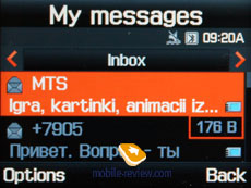
Messages. Working with various types of messages is implemented through separate submenus. Let us begin with short messages. The phone memory can hold up to 200 messages simultaneously; the handset supports EMS standard compatible with Nokia Smart Messaging. T9 text input capability comes in handy and is easy to use. When at choosing recipient window, you can either select a telephone number from your contacts or pick one from the call lists or groups. All messages are manageable, this means you are at liberty to move a certain number to your black list, in order to make sure all messages coming from that phone number will be deleted automatically; possibility for moving messages to any own folder is also at your disposal. For e-mail you can move not only addresses to the blacklist, but unwanted subjects as well.


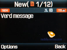
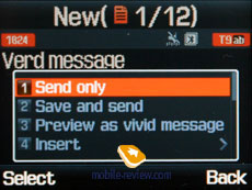
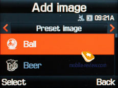
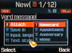
One of the options on the menu is Vivid Message, which allows viewing a message in 3D mode – the handset converts frequently used words to graphics, for example having typed “Kiss you”, you will see lips, blowing kisses. On the face of it, a simple algorithm that allows manifesting your imagination.
SOS Message is a new feature to the Samsung’s arsenal – here you need to submit telephone numbers that will receive messages with user-customizable text. To send such message all you have got to do is press the side key four times. However how useful this function is in light of missing GPS-receiver and coordinates tracking, is a big question; generally speaking, it’s nothing more but an addition to Mobile Tracker.
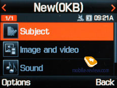
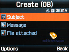
MMS. Interface for creating multimedia messages is pleasant to use, you can instantly save them in different folders. There is limitation formessage size (295kb), meanwhile incoming messages are not limited at all (though they may take up not more than the reserved memory volume). As for additional settings – there is option to disable advertisement reception, select weather messages be received during roaming or home network stay. Messages are stored in a separate memory block (3.1mb), same goes for email.

The bundled mail client is standard in all its components – 5 accounts and the maximum of 100 incoming messages; attachments are also handled by the phone, though there are also several caps – there’s no way you can receive a file more than 3 Mb in size, or send one with size exceeding 300 kb.

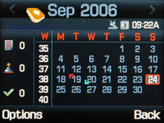
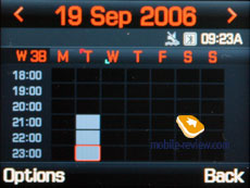
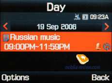
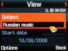
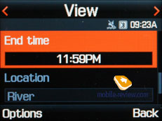
Planner. There can be up to 400 different events of four types (4x100) - meeting, affair, anniversary and others. The day and the time as well as end time of the even are indicated for each entry. Alert signal, as well as its duration can be adjusted according to your liking; repeatable events are available for setting up (at that repetition time is also adjustable as well as exclusion dates). The weekly and the monthly calendar views are very convenient with each type of the event having its own color.


Speaking about the organizer’s shortcomings, I cannot overlook the fact that when typing date and time for an event, the end time doesn’t change, which badly hurts ease of use – other manufacturers make the due time shift automatically (by default an event takes one hour).
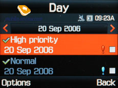
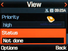
Tasks – a standard list of tasks with the possibility of stating priority. Maximum capacity of this section is 100 entries.
 
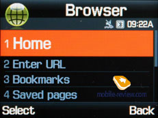
WAP. There is a wap-browser ver. 2.0, similar to that carried by some phones by Nokia and Sony Ericsson, using http protocol. The browser automatically offers you standard prefixes and endings of the entered addresses. Although it’s packed with features, it would make more sense if you replace it with Opera Mini.
 
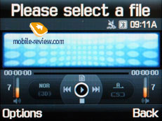
Applications. MP3 player. An integrated mp3 player, supporting random track playback, sequential and cyclic, is available on the phone. Mp3 files can be uploaded to the phone both directly through Bluetooth and through a synchronization application. There are no limitations, placed on tags and names of music files. The user is armed with nearly 80 Mb of storage for filling up with music and other apps and other content.
 
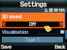
The title of the played back track is displayed as well as the number of the remaining tracks. The equalizer doesn’t make much sense, as there is no precise adjustment of audio controls (only a possibility to choose from classic, rock, jazz and normal sounding). The tracks can be played through the stereo headset as well as through the speakerphone. The volume bar has 10 scales on it. And of course user can make up playlists of his own. Player can work in minimized mode.
As for shortcomings, maximal number of playlists cannot exceed four. All music on memory card should be stored in a proper folder, sub-directories are not supported, root folders are not supported either. This is a series disadvantage for those who have big capacity memory cards, since it is not that convenient to drop all music into one folder.
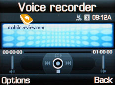
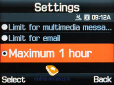
Voice recorder. You can record up to several hours of voice memos with the number of files being unlimited. Basically, limitations on recording durations are set by user himself, though length of a single recording cannot exceed 1 hour. All the files are stored in a separate folder in the memory bank. The recorder performs well during lectures, conferences and presentations – I could even say that it is a partial substitute for a digital tape recorder.
 
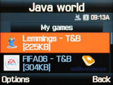
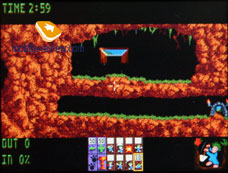
Java World. The handset carries only try&buy games – no full-version games are available on the P310. New applications can be uploaded over the air or via Bluetooth from other devices (JAD-file is required), at that a JAR-file cannot exceed 1 Mb in size. Volume of memory reserved for Java-based applications makes 4 Mb.
 

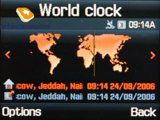
World time is displayed for two chosen cities.

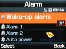
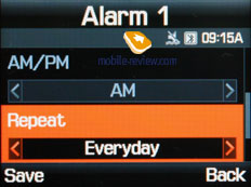
Alarm clock. The phone is equipped with three alarm clocks. One is meant for mornings and can be set for selected weekdays as well as for weekends. For each of the alarm clocks there is a selection of five tunes, though necessity of them is questionable, as mp3 tracks can be used there as well. It is up to user to set up whether the phone will turn on automatically in the time of the event or not. Specific weekdays cannot be picked – the alarm clock triggers off only once or on all days.
 
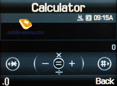
Calculator. It divides, multiplies, subtracts and adds and does several more things – quite enough for a mobile calculator.

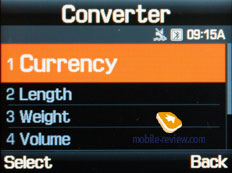
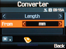
With еру Converter, you can operate with different units of measurements as well as with a number of currencies.
 
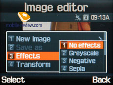
Image editor. A basic picture editor, which allows transforming images by using a variety tools.
 
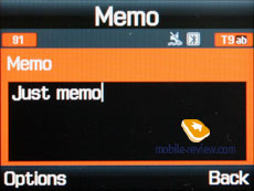
Memo – standard text notes.

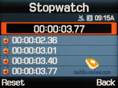
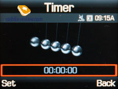
Countdown timer and Stopwatch should be familiar to most users as well.
 
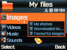
File Manager (My files). That’s the place to search for all files such as music, pictures, video and sounds. Any uploaded file gets stored here. The disadvantage is that files sometimes are not displayed in the list immediately - in that case you will need to leave the menu and enter it again.

Files and folders can be viewed either as a list or as thumbnails. You can select any amount of files. The handset supports Move, Copy and Delete operations, as well as various types of sorting (by type, name or size)
Memory card’s file structure is a slightly different story, as it can be accessed through the main menu, where each item features “Memory card” option.
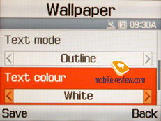
Settings. This item boasts a standard set of options inside - font color in the standby mode, password protection of selected sections (messages, short messages, organizer, etc.), backlighting duration and brightness, dialing display. Calling up Security item allows protecting certain functions and menus with password.
 

Backlighting duration – there are three options at your disposal, one of them is Night mode , implying that backlighting will be active only between 5:00 PM and 9:00 AM and disabled during daylight. If you come and think of it, this feature nothing more but an illusive replacement for illumination indicator, which Motorola’s handsets are armed with.
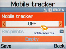
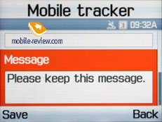
Mobile Tracker – submit a phone number, where notifications will be sent to in case SIM-card was changed – that message will contain number of the SIM-card being used with the handset. This section is protected with password, so that no one other than you or someone else who knows the password could disable the Tracker. Should your device have the SIM-card switched once, the specified number will receive one message instantly, and one more each time a new card is plugged in. A fetching feature which can prove to be of much help in case the handset is lost or stolen.
 
Flight mode – you can disable network part of handset.
The handset lacks profiles system and offers only adjustable events settings, which makes it look like it came from the past – for example, newest Samsung’s 3G devices have profiles onboard (though many other functions have disappeared). The P310 has got many vibrating alert modes and tunes in its sleeve, everything here works without any limitations, but what really frustrates me is inability to set an own tune for incoming SMS-message or e-mail – you are enabled to choose only from 10 pre-installed simple tunes found on the handset. On the other hand, ring tones are adjustable for contact groups, stand-alone entries in the phonebook and even for the alarm clock; therefore it’s somewhat obscure why not all alerts are customizable.
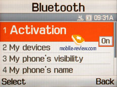
Bluetooth. The handset supports various profiles, namely, Headset, Handsfree, Serial Port, Dial Up Networking, File Transfer, Object Push. The Bluetooth realization is not ideal, troubles with headsets having only a Headset profile appear pretty often, and speakerphone is handled in improper way sometimes either. In general the Bluetooth found on the D900 is comparable to that on Nokia’s phones, but worse than on Sony Ericsson.

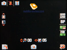
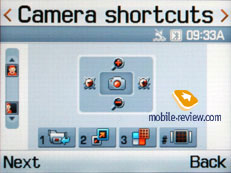
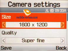
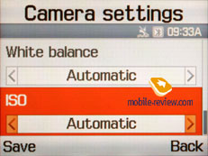
Camera. Samsung P310 has a 2 Mpix camera with CMOS matrix (similar to that of X820).The camera interface is standard for the company’s products - you can rotate an image vertically, turn off the shutter sound. Image compression quality is adjusted from the menu - Super Fine, Fine, Normal, Low. The ISO value may vary from 100 to 1600, but the default value is handier. White balance has several levels, and Auto is set by default.


Image taken in maximal resolution gets processed in 2 seconds (1600x1200 pixels). The handset’s camera can boast neither auto-focus nor macro mode. Considering the camera quality, it would be better to take snaps only in sunny weather; when shooting against the sun, as the camera focuses on the brightest spots of the image. Exposition determining system does its best when the objects have contrasting parts – e.g. posters. The model equals to Nokia N70 in terms of image quality, as hardware specifications of both devices coincide. At the same time, the photos taken by these handsets are worse than those by Sony Ericsson K750 or Nokia N90.
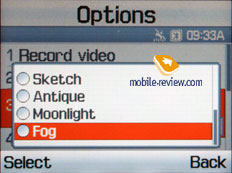
The device supports such effects as Gray scale, Negative, Sepia, Emboss, Sketch, Antique, Moonlight, Fog.
Also there is a possibility to take 6, 9 or 15 photos in a series; you can set two types of speed for each case (normal and high). Finally, the device supports matrix photos (2x2, 3x3).
 
 
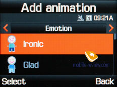
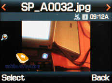
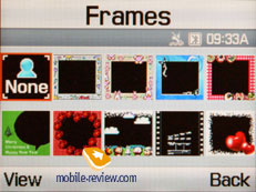
The photos are kept in the album, where you may view the data on a certain photo (not above the photo as in previous models). The list itself features the handset’s name a thumbnail next to it. Any photo may be assigned to a name in the phone book or set as wallpaper right from the album menu. There are also a slide show mode, a basic editor that allows adding emotion icons, applying frames and effects to the photos.
 |
 |
(+)
maximize, 1600x1200, JPEG |
(+)
maximize, 1600x1200, JPEG |
 |
 |
(+)
maximize, 1600x1200, JPEG |
(+)
maximize, 1600x1200, JPEG |
 |
 |
(+)
maximize, 1600x1200, JPEG |
(+)
maximize, 1600x1200, JPEG |
 |
 |
(+)
maximize, 1600x1200, JPEG |
(+)
maximize, 1600x1200, JPEG |
 |
 |
(+)
maximize, 1600x1200, JPEG |
(+)
maximize, 1600x1200, JPEG |
 |
 |
(+)
maximize, 1600x1200, JPEG |
(+)
maximize, 1600x1200, JPEG |
 |
 |
(+)
maximize, 1600x1200, JPEG |
(+)
maximize, 1600x1200, JPEG |
 |
 |
(+)
maximize, 1600x1200, JPEG |
(+)
maximize, 1600x1200, JPEG |
 |
 |
(+)
maximize, 1600x1200, JPEG |
(+)
maximize, 1600x1200, JPEG |
 |
 |
(+)
maximize, 1600x1200, JPEG |
(+)
maximize, 1600x1200, JPEG |
 |
 |
(+)
maximize, 1600x1200, JPEG |
(+)
maximize, 1600x1200, JPEG |
 |
 |
(+)
maximize, 1600x1200, JPEG |
(+)
maximize, 1600x1200, JPEG |
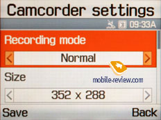
The phone records 3GP video and you may choose whether it will be recorded with or without sound. All the settings are comparable with those for photos, the same 4-graded quality bar, but the resolutions are different. The maximal resolution is 355x288 pixels.

There is no limit on the duration of the record – it’s more about how much storage you have available. Though when speaking about MMS mode, the videos do have cap, which makes 100 Kb
Video sample 1 (mp4, 3.1 Mb)>>>
Video sample 2 (mp4, 1.2 Mb)>>>
PC Synchronization. You can synchronize your data with help of data cable or Bluetooth. Easy Studio 3.0 can be downloaded from the company’s web-site.
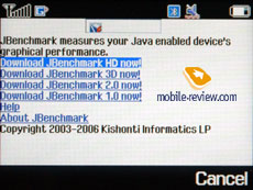
Performance. This is a typical handset by Samsung and average in the sense world performance standards.
| Jbenchmark 1 |
1.1.1 |
|
|
| Version |
|
|
|
| Total Score: |
1374 |
|
|
| Details: |
|
| Text |
425 |
| 2D Shapes |
345 |
| 3D Shapes |
226 |
| Fill Rate |
109 |
| Animation |
269 |
|
|
| Screen Width |
320 |
| Screen Height |
186 |
| Color Screen |
true |
| Number of Colors |
65536 |
| Double Buffer |
true |
| Total Memory |
4194280 |
| Free Memory |
3192460 |
|
|
| MicroEdition Configuration |
CLDC-1.1 |
| MicroEdition Profiles: |
MIDP-2.0 |
| Microedition Platform: |
SGH-P310 |
| Microedition Encoding: |
ISO-8859-1 |
| Microedition Locale |
en-US |
| Jbenchmark 2 |
|
|
|
| Version |
2.1.1 |
|
|
| Total Score: |
92 |
|
|
| Details: |
|
| Image Manipulation |
72 |
| Text |
122 |
| Sprites |
79 |
| 3D Transform |
101 |
| User Interface |
91 |
|
|
| Screen (canvas) Width |
320 |
| Screen (canvas) Height |
186 |
| Color Screen |
true |
| Number of Colors |
65536 |
| JPEG Support |
true |
| Transparency (Alpha Level) |
256 |
| Double Buffer |
true |
| Total Memory |
4194276 |
| Free Memory |
3742112 |
|
|
| MicroEdition Configuration |
CLDC-1.1 |
| MicroEdition Profiles: |
MIDP 2.0 |
| Microedition Platform: |
SGH-P310 |
| Microedition Encoding: |
ISO-8859-1 |
| Microedition Locale |
en-US |
| Jbenchmark3D |
|
| Perfomance |
|
| Jbenchmark3D HQ: |
57 |
| Jbenchmark3D LQ: |
94 |
| Triangles ps: |
8180 |
| kTexes ps: |
453 |
|
|
| version: |
3.1.0 |
|
|
| Screen(canvas)width: |
320 |
| Screen(canvas)height: |
240 |
|
|
| 3D Subsystem: |
|
| M3G Version: |
1 |
| Antialaising: |
false |
| True color: |
false |
| Dithering: |
false |
| Mipmapping: |
true |
| Perspective correction: |
true |
| Local camera lighting: |
false |
| Max lights: |
8 |
| Max Viewport dimensions: |
1024 |
| Max Texture Dimensions: |
256 |
| Max Sprite Crop Dimensions: |
1024 |
| Max Transforms Per Vertex: |
3 |
| Number of Texture Units: |
2 |
|
|
| Other properties |
|
| Color Screen |
true |
| Number of colors |
65536 |
| Transparency (alpha level) |
256 |
| Double buffer |
true |
| Total memory: |
4194276 |
| Free memory: |
3121300 |
|
|
| MicroEdition Configuration |
CLDC-1.1 |
| MicroEdition Profiles: |
MIDP 2.0 |
| Microedition Platform: |
SGH-P310 |
| Microedition Encoding: |
ISO-8859-1 |
| Microedition Locale |
en-US |
| Microedition Communication ports: |
null |
| Microedition Hostname: |
|
Video player. MPEG4 format (audio AAC) is supported; maximum possible bit rate makes 1.5 Mbps. The handset supports various resolutions up to CIF, however capturing in QVGA resolution (at 30 frames per second) is somewhat better. No extra features are enabled in these player, unless you call rewinding and full-screen mode (by pressing “1” key, the picture can be rotated in two directions) the ones.
Picsel Viewer. One of the best things about the P310, similartly the D600, is Picsel Viewer. To put it shortly, Picsel Viewer is an application that is capable of opening MS Office files (for instance, MS Word, Excel, PowerPoint), Adobe Acrobat (PDF), graphical and video formats on the phone. All the pressure of the technology is its fast action, opening a 20 MB PDF file will take about a couple of seconds, then you can quickly scroll pages, scale them, rotate. No editing capabilities, only viewing, but that is enough sometimes, especially considering there is no need in extra converting for the mobile phone.
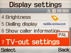
Apart from viewing data on the screen, an image may be sent to external sources, for instance, a TV-set, projector. A TV-OUT cable is not included into the package. One end of the cable is a miniUSB connector and another one is three "tulips" for connecting to external sources. I had a TV-set as an external source. Plug all the cables in and connect the phone. And here it is! The menu is shown on the TV screen, moving along the phone menu you see your actions on the screen. Besides Picsel Viewer documents, you can view any standard applications, full-screen video (pixels are seen too much for 3GP files, the resolution is still improper), photos, play games if you like to. A TV-set not only represents the picture but reproduces the sound from the phone.
Impressions
The model delivers good connection quality, which is typical for all up-to-date handsets. The loudspeaker outputs clear and penetrating sound. The volume of the 64-chord polyphony is average, while mp3 tunes are loud enough to make the handset literally blow you away even on a busy street. The power of the silent alert is average or slightly higher than that, although such portable device could barely offer more
 
 
In the sense of functionality the P310 performs as most up-to-date devices do, it might seem its main trump is very compact out-of-the-casing dimensions; however it appears to be almost impossible to squeeze something out of the handset without that accessory. The keypad’s ergonomics isn’t too good due to its layout; the touch-sensitive keys are likely to give you a hard time as well. Having occasionally left the device near my notebook, I noticed that it literally came to life - warm air from the cooler affected the keypad, so the sensor buttons got activated and “loaded” the phonebook (right soft-key). I believe in winter, it’s going to work in a completely opposite way, so that one would hardly make the P310 do something.
The possibility to expand the handset’s storage volume with memory cards looks fetching; however the target audience won’t use the P310 as a MP3-player for sure. The fact of the matter here is that the owners of the P310 are interested in calling alone, apart from having a rare and fresh-looking handset around.
Samsung P310 costs about 500-600 USD in Russia, in case, of course, the distributors don’t decide to get more margin. This handset will be demanded only by a tiny audience, which moves it to the list of “niche solutions”. The truth is I’m surprised how a company like Samsung can be so consistent in promoting solutions that are destined for failure (the P300 has been advertised so heavily, that I’m wondering whether it has done something about its sales or it has just slipped by). The advent of «exclusive» «calculators» in gold (gold-plated casing) is only a matter of time as well as the shifting of such models to the middle price-bracket (downgraded P300 for stylish students). By forming the Card Phone range, the manufacturer is trying to develop a unique solution. And this task have been perfectly implemented, no doubt about that – the resulting solution is really a unique one. But this originality seems to be somewhat out of place, doesn’t it? In my opinion the aim of the most companies is not to manufacture unusual devices alone, but also to develop easy-to-manage handsets with shaped ergonomics. Sales of Serene, developed in cooperation with B&O, also demonstrate how wrong Samsung’s current route is. Roughly speaking, one can seamlessly sell a bunch of really bad products at any rate, and given enough recourse to set up an aggressive advertising campaign, he will sell much more than “a bunch”. The company has been shaking with fever lately – the quest for an own face has seemingly taken more time than it was meant to, so that Samsung starts experiencing pressure coming from other manufacturers, especially in Europe. For Samsung this means a vital need to figure out the right mix of form-factor, design and functionality as soon as possible. But on the other hand, meeting the requirements of minor audiences makes some sense as well.
The model doesn’t have any direct rivals, as none of European manufacturers tends to develop similar niche products. However LG’s permanent course, that implies following in the footsteps of the leader, has pushed the company towards coming up with an identical solution going by the name of LG KE800 from the Black Label line-up. It features thicker casing (about 10mm) and longer lifetime, good keypad ergonomics. Other specifications are more or less the same, saving for missing casing with an extra battery. Unlike the P310, this model is scheduled to begin shipping only in the end of November. Nonetheless, such a late call and distrust of European consumers in LG brand are to act against the KE800. Even the launch of the Black Label line-up has not helped the company in building up a new name – users still prefer being over-cautious when it comes to forecasting this player’s future of on the market.

Eldar Murtazin (eldar@mobile-review.com)
Translated by Ilya Baranov (oleg.kononosov@mobile-review.com)
Published — 26 October 2006
Have something to add?! Write us... eldar@mobile-review.com
|
News:
[ 31-07 16:21 ]Sir Jony Ive: Apple Isn't In It For The Money
[ 31-07 13:34 ]Video: Nokia Designer Interviews
[ 31-07 13:10 ]RIM To Layoff 3,000 More Employees
[ 30-07 20:59 ]Video: iPhone 5 Housing Shown Off
[ 30-07 19:12 ]Android Fortunes Decline In U.S.
[ 25-07 16:18 ]Why Apple Is Suing Samsung?
[ 25-07 15:53 ]A Few Choice Quotes About Apple ... By Samsung
[ 23-07 20:25 ]Russian iOS Hacker Calls It A Day
[ 23-07 17:40 ]Video: It's Still Not Out, But Galaxy Note 10.1 Gets An Ad
[ 19-07 19:10 ]Another Loss For Nokia: $1 Billion Down In Q2
[ 19-07 17:22 ]British Judge Orders Apple To Run Ads Saying Samsung Did Not Copy Them
[ 19-07 16:57 ]iPhone 5 To Feature Nano-SIM Cards
[ 18-07 14:20 ]What The iPad Could Have Looked Like ...
[ 18-07 13:25 ]App Store Hack Is Still Going Strong Despite Apple's Best Efforts
[ 13-07 12:34 ]Infographic: The (Hypothetical) Sale Of RIM
[ 13-07 11:10 ]Video: iPhone Hacker Makes In-App Purchases Free
[ 12-07 19:50 ]iPhone 5 Images Leak Again
[ 12-07 17:51 ]Android Takes 50%+ Of U.S. And Europe
[ 11-07 16:02 ]Apple Involved In 60% Of Patent Suits
[ 11-07 13:14 ]Video: Kindle Fire Gets A Jelly Bean
Subscribe
|
