|
|
Review of GSM-handset Samsung F300 (Ultra Music)
Live photos of Samsung F300
Sales package:
- Handset
- Charger
- User Guide
- USB data cable
- Wired stereo-headset with 3.5 mm jack
- CD with software
In fact Samsung totally revised its market strategy early in 2006 – already in February they had a shaped and plain agenda allowing to initiate development of a range of all-round new solutions, arriving in the market not as concept-models, though, yet not as mass-products either. Most of the niche-aimed offerings have something to do with music department, where the company can afford experimenting and afford it in a big way – up to the mid of 2007 you shouldn’t expect a straight and refined line-up of music phones to emerge, however even now we can enjoy some fetching solutions in a couple of models such as Samsung X830 and Samsung F300.

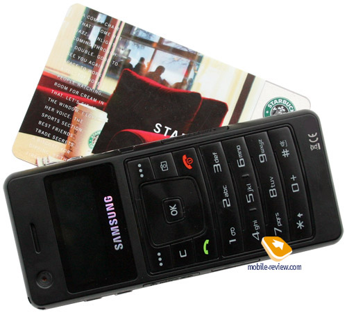
Model Samsung F300 goes by the alias of Ultra Music, meant to stress its prowess in music department. Tiny casing’s dimensions and a feature-packed interface (for a size this small) count in favor of this fact. But what is really unique about the F300 is its double-face design housing two displays embedded in the front and rear respectively. Being the very first handset to offer such functionality, the F300 launches a whole new trend that will soon become widely spread on candy-bars (the lay-out may vary though), especially on music-tailored ones.


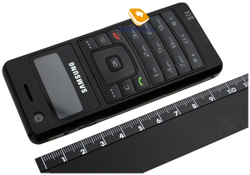
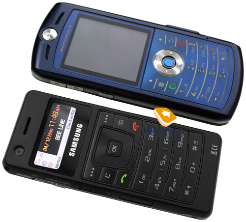
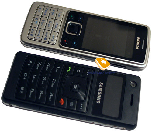
The pursuit of slim-and-sleek curves and shapes of handsets has brought to live numerous top-notch approaches and tricks that might pop up in the upcoming models as well. The F300’s thickness is 9.4 mm which is a world of difference compared to the thinnest-ever 6.9 mm of Samsung X820. However this phone has its height evenly spread throughout the casing, so that there are no parts that would stick out, whereas the X820 houses a camera module has is approximately 1 cm deep. Measuring 103.5х44х9.4 mm and weighting only 78 this phone feels nearly like Nokia 6300 (even though the latter offering is slightly thicker) and the next slim Walkman-branded gadget by Sony Ericsson. Having such portable dimensions, the F300 will readily jump into anywhere; on top of that it is relatively lightweight and comes with good ease-of-use characteristics, boasting standard width, acceptable height that allows you fingers to get a good grip on it. Furthermore, the F300 doesn’t feel weightless – on the contrary, you may rest assured that the phone will give you a nice feeling of something heavy in your hands, yet there is nothing bad about it.


Since such compact casing should retain loads of controls and details, the manufacturer went in for some unusual approaches. First, they left out a detachable battery – this thing is now literally built in the casing, not enabling the user to replace it on his/her own. The market has already seen this construction in a number of other proposals, and even though users expressed serious concerns upon its practicality, all these fears have never come true. The life time of this battery surpasses the still-looks-good time span with interest, especially for such offering as the F300.
Second, tight layout of controls had brought about the need in applying reinforced plastic and metal skeleton that shows through on the bottom end and the sides, making you think of its as a pencil-box supporting the rest of the details. For example Nokia 6300 utilizes an opposite solution – the middle is made of plastic, while the frontplate, as well as the battery cover enjoy all the benefits of metal. Both designs proved comparable level of protection, but in the end its all about thickness, where the pencil-box design does better by reducing overall height.


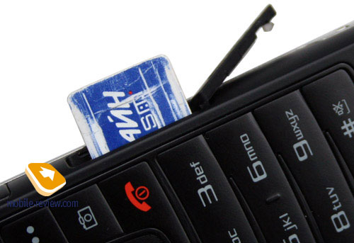
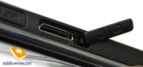
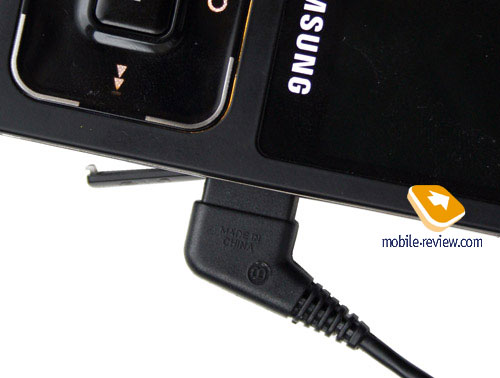
In the third place, since the battery section has gone missing, the SIM-card bed is now mounted in the side, covered by a flap attached to the casing – the good thing is that you are free to extract the card and swap it for the other one even on a working device, and if that’s the case, the F300 will just reboot and accept all settings and data stored on the new SIM-card. On the opposite side plate you will find to protected sockets – one for charger and headset and the other one for MicroSD memory cards (as usual, hot-swap is enabled)

Speaking about the quality of the flaps used on the F300, we have nothing to complain about here, as there is seemingly no way they will get loose with time.


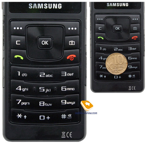
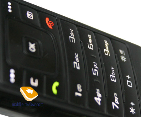
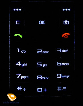
It’s near to impossible to squeeze a full-size keypad in a device this small, but over at Samsung they have surprisingly managed to do so by cutting the main display in height. The keypad itself is handy for it offers bulky numeric keys arranged in horizontal rows, they buttons provide moderate click sensation, yet they are don’t employ touch-sensitive technology. If the buttons’ size was smaller here, it would be really challenging to make use of the keypad, however Samsung hasn’t let us down and hasn’t overdone at either extreme. The four-way navigation key retains shaggy surface. All keys are evenly lit in blue, making them visible in various environments.


Absence of the battery slot has forced to company to engrave all certification marks on the front under the keypad – I’m very curious to find out what way they will think of to stick Russian certification marks on the casing and whether they will do it at all (since it’s a paper sticker)
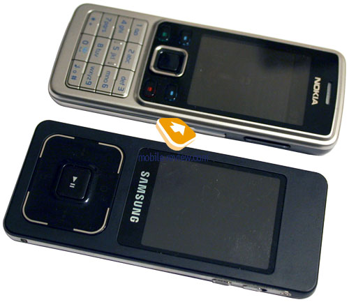
The main square-shaped display would perfectly do as a fold-phone’s external screen, yet it looks strange on a candy-bar. On the other hand, its specifications are something to talk about – 1.4 inches, a resolution of 176х65 pixels (33х12 mm), TFT technology and 262 K colors. Both images and text look bright and crisp here, no problems, but makes all the difference is the capacity – the screen can hold only two text lines or two menu items at a time, even though the font resolution is great. So grading its functionality, we are ought to give it “low” when it comes to standard features like SMS, camera etc. And it would be a crucial and fatal drawback, if the F300 didn’t have another display measuring 2.1” diagonally on the opposite side – in most cases you can switch to this secondary screen, for example when viewing short messages. No about, ergonomics-wise this proves to be somewhat troublesome, but it’s a kind of way-out, allowing you to have all features enabled on such tiny device.

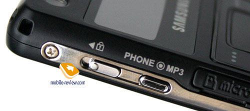
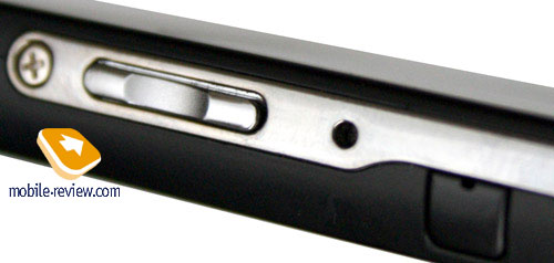
All we have got to say now is that switching the screens is done with the help of a dedicated key found on the side plate, where you will see two-way key lock button as well. The right side houses volume rocker key, while the top left corner features holes for a carrying strap. On the bottom end you will find the built-in microphone located next to a socket vitally important for an extra battery implemented into a leather casing, similarly to Samsung P300/P310. This battery won’t come included with the handset, and what is more, it’s still unclear whether it will be retailed at all, so don’t pin your hopes on it at any rate.

Another point of interest here is that since there is no detachable battery in the F300, you won’t be able to reboot it manually should you stumble upon critical software bugs, however here we should give a credit to the developers for arming the handset with RESET button located on the right side.

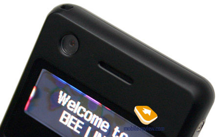
Above the screen one will find a camera lens, which would be taken as UMTS-support by many, while the camera itself would be dubbed as a tool for video calls. In fact it’s a 2 Mpix camera (no 3G support here) mounted this only because the interface for handling it is displayed on the other side, although nothing will stay on you way should you want to make a self-portrait.

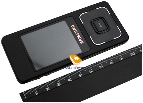
The F300’s design, when speaking about it as a phone, is nothing new, except for the shell’s dimensions and minor thickness. The very unique ratio between the display and the keypad is surely an eye-picker, but overall the handset looks like any other product. At the same time the opposite side is similar to a closed slider or Apple-branded players – which is pretty much a fiction, since putting an iPod and Samsung F300 face to face, you won’t see a striking resemblance, but the feeling that they do share something won’t let you go.

Similarly to Samsung X830 this model will come in various trims with the black color scheme arriving in the market first (a part of the plastic used sports soft-touch surface). Then the market will get Festival Orange, Scarlet Red, Pure White and Universal Blue.
The music-face of the phone is remarkable for its huge screen showing off a diagonal of 2,1” and a resolution of 176х220 pixels (33х42 mm). This display shows up to 262 K colors and up to 8 text lines at a time. Due to the fact this screen originates for the previous generation, its being put into a slim casing brings about certain difficulties – should you push it a little you will see ripples spreading across the surface, but this is unlikely to damage the device or do something worse, so you might be able to turn a blind eye to it, after all.

The picture quality provided by the display is good, but all the standard settings, that we have gotten used to on other handsets, have gone missing – i.e. there are no wallpapers, the outlook makes use of a single style and thus looks very similar to music players, rather than phones. The screen does well in the sun, even though the colors usually fade to a certain extent. This very display houses status bars as well, but it’s impossible to make or handle a call using it.
The touch-sensitive button allows managing all modes when the handset acts as a player – on top of that, this key retains a hardware play/pause button. Left and right keys stand for rewinding, the one at the bottom - for canceling actions or moving one level up in the menu, while the key on the top is the Menu button. Not all lists can be navigated through with the help of the above-mentioned controls alone – some times, the side-mounted volume key steps into the action. Such mess in only a few menus reveals crude interface lay-out – total integration is still on the way, so there is nothing to wonder about.
And the last but not the least – the built-in 720 mAh Li-Ion battery. As the manufacturer claims, it can put up about 155 hours of standby and 2.5 hours of talk time respectively. The lifetime is the sticking point for all slim devices, and this one isn’t an exception. We should note that this handset lasts for one day at 2-3 hours of music playback and radio, up to 1 hour of calls and few SMS. Should you be calling up the phone and music modes back and forth too often, the battery won’t be happy with that either. Power users are likely to end up with less than one day of life time on their hands, while the rest of the audience should be aiming at one day of operation only. When we attempted to have the F300 around as a calls-only gadget (one hour of talk time), we squeezed about 2 days of stable operation. It takes the handset more than 2 hours to charge from empty to full.
Menu
This unusual and tiny main display has brought about the necessity to re-work the interface, lay-out of some items and empower users with dual-face mode. At the same time the platform the F300 runs on is the very familiar Gumi’s development (hardware-wise Agere/SkyWorks). The handset carries 128 Mb onboard with slightly above 100 Mb being user-manageable, at that this value can be expanded with a memory card of any volume
So let us take a closer look at the interface lay-out of the phone-face with occasional references to the possibility of switching to the bigger screen, and then move onto the music part.
The entire interface found on the F300 has been revamped in a way to fit the screen’s low resolution, that’s why the status bar with all its properties has been move to the left, while the main part of the display is taken up by your carrier’s name, date and time. All phone-related functions make use only of this very display – for example it’s impossible to make a call using the screen on the rear, so eventually it turns out to be a kind of data display. It can show list of phone numbers for a contact, allow you to read a message, but actions are to be performed via the keypad and consequentially via the tiny display. The usability of such approach is exceedingly low, as on incoming call a caller’s image looks more like a thumbnails with number and name being scrolled through on the right. To prevent the handset from scaling images, the manufacturer disabled use of pictures with a resolution topping the minimal one for the phonebook – an already existing snap cannot be transformed either.

Similarly to all Utra-dubbed devices, the main screen (the screen itself, rather standby mode) can be altered with the help of two skins – black and white. The main menu retains horizontal layout, where you see a line of icons with one of them being highlighted. Sub-menus are viewed as vertically arranged lists, though the display cannot accommodate more than two items at a time. Memorization of position in each sub-menu and main menu is onboard. Handset will “remember” which function you addressed last time, and will highlight it automatically next time you enter same menu item. For example you selected call list in main menu, done some operations in it, and next time you enter main menu you will have it highlighted in first place.
 
Shortcut number navigation is supported, but that’s not all options of menu navigation. You can bind four different applications from the list, offered by manufacturer (you will not be able to bind java applications).
The F300 is the first handset to house fast number search on dialing – when typing a number from the standby screen, the phone will offer you a list of matching phone numbers of contacts from the phonebook. Up until now this handy feature was found only on smartphones.
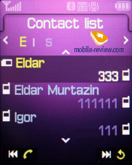
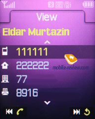
Phonebook. Contacts can be accessed by pressing right soft key, you will see a list that contains all entries from both SIM-card and phone’s memory. However it’s not even a list with the search line and one contact being displayed on the screen. Fast name search by first letters is supported; there can be up to twenty of those, for any language. Once you press OK key you will go into detailed view of selected entry. There you will see a thumbnail in case there had been one assigned. It can be an image, a photo (240x320 pixels at best). Each entry can have up to 5 phone numbers of different types (cellular, office, home, fax other), one of them will be main one (by default it is the first one you entered). All fields are fixed.


There are two lines for First Name and Last Name (search is conducted only by first field), fields get summed when displayed, Name comes first. For example Eldar Murtazin will be shown only in this order. Length of each field is 20 characters for any supported input language. You can also switch languages on the go when entering a name.
All entries, without regard to language, are sorted out under the algorithm – all contacts with headings made in a local language (Russian, for example) go first and then those with names in English. This is rather convenient and handy list sorting system. Taking into account fast language switch option during the search, it’s clear that no language will spoil the experience of working with this phone.
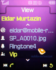
But let us return to the information entered for a contact. Apart from phone numbers, e-mail address, a little text memo can be submitted on top of all that. Any music file as well as composed MP3's can be picked as a ring tone for a contact. Three caller groups are provided by default with the possibility for creating any number of additional groups, selecting a personal melody and image for each. A group can accommodate not more than 20 contacts
 

The phonebook is capable of holding up to 1000 contacts with filled in data fields. Even if all the available blanks are not used, the cap won’t get any bigger and will still make one thousand. It is possible to set in the settings where all new numbers should be kept by default. There is also an option for moving entries from the SIM-card although the vice versa action is denied. According to the developers, PC (MS Outlook in particular) is best for data synchronization with the D900. Any contact in the form of SMS/MMS, mail message or other text file can be quickly sent through Bluetooth to another device. There are no problems with sending and the phonebook entry being transmitted to another device, where it is read without any trouble.
The phonebook may contain a business card as well, though its structure copies all the fields applied to a regular contact in the phone book.
There can be up to eight numbers in the fast dial list; separate numbers tied up with a single contact may appear on this list as well. The subtitle of the chosen entry (not of the phone number type) is displayed on the buttons.

While viewing the phonebook you can switch over to the big screen, where you can navigate only using the horizontal bar, since keypad input is not enabled for this mode. You can check out a detailed view of a contact and even dial a number, but in the latter case the handset will automatically return back to its phone-face.
 

Call lists. Each of the given lists contains up to 30 phone numbers. There is a combined list of all the last calls with an icon indicating a call type. The date and the time of a call without special note of duration are displayed in extended view for separate entries. Calls from/to one number are summarized, so that a number standing next to the call specifies total amount of calls made. In order to access duration data you will need to call up detailed information on desired item. As always, the overall time of the calls and their prices can be viewed in this menu (in case the service has been enabled).
 
Messages. Working with various types of messages is implemented through separate submenus. Let us begin with short messages. The phone memory can hold up to 200 messages simultaneously; the handset supports EMS standard compatible with Nokia Smart Messaging. T9 text input capability comes in handy and is easy to use. When at choosing recipient window, you can either select a telephone number from your contacts or pick one from the call lists or groups. All messages are manageable, this means you are at liberty to move a certain number to your black list, in order to make sure all messages coming from that phone number will be deleted automatically; possibility for moving messages to any own folder is also at your disposal. For e-mail you can move not only addresses to the blacklist, but unwanted subjects as well.


MMS. Interface for creating multimedia messages is pleasant to use, you can instantly save them in different folders. There is limitation for message size (295kb), meanwhile incoming messages are not limited at all (though they may take up not more than the reserved memory volume). As for additional settings – there is option to disable advertisement reception, select weather messages be received during roaming or home network stay. Messages are stored in a separate memory block (3 Mb).
 
 
SOS Message is a new feature to the Samsung’s arsenal – here you need to submit telephone numbers that will receive messages with user-customizable text. To send such message all you have got to do is press the side key four times. However how useful this function is in light of missing GPS-receiver and coordinates tracking, is a big question; generally speaking, it’s nothing more but an addition to Mobile Tracker.
While working with messages, you can easily go for the bigger screen to view messages without being able to edit them or something. Though, MMS messages cannot be transferred to the big screen.

Planner. There can be up to 300 different events of four types (3x100) - meeting, affair, anniversary. The day and the time as well as end time of the even are indicated for each entry. Alert signal, as well as its duration can be adjusted according to your liking; repeatable events are available for setting up (at that repetition time is also adjustable as well as exclusion dates). The weekly and the monthly calendar views are disabled, but for some reason that doesn’t make me wonder.


Speaking about the organizer’s shortcomings, I cannot overlook the fact that when typing date and time for an event, the end time doesn’t change, which badly hurts ease of use – other manufacturers make the due time shift automatically (by default an event takes one hour).
Tasks – a standard list of tasks with the possibility of stating priority.
 
WAP. There is a wap-browser ver. 2.0 (NF 3.2), similar to that carried by some phones by Nokia and Sony Ericsson, using http protocol. The browser automatically offers you standard prefixes and endings of the entered addresses.
Keeping in mind how low the display’s resolution is, the wap-browser in the F300 is impossible to use and is implemented just for the sake of it.

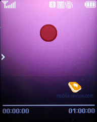
Приложения. Voice recorder. You can record up to several hours of voice memos with the number of files being unlimited. Basically, limitations on recording durations are set by user himself, though length of a single recording cannot exceed 1 hour. All the files are stored in a separate folder in the memory bank. The recorder performs well during lectures, conferences and presentations – I could even say that it is a partial substitute for a digital tape recorder.

World time is displayed for chosen cities, no world map for the F300, though

Alarm clock. The phone is equipped with three alarm clocks. One is meant for mornings and can be set for selected workdays, however the other two boast the same feature (no specific days, though). For each of the alarm clocks there is a selection of five tunes, though necessity of them is questionable, as mp3 tracks can be used there as well. It is up to user to set up whether the phone will turn on automatically in the time of the event or not.
 

Countdown timer and Stopwatch should be familiar to most users as well.
 
Memo – standard text notes.

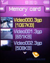
File Manager (My files). That’s the place to search for all files such as music, pictures, video and sounds. Any uploaded file gets stored here. The disadvantage is that files sometimes are not displayed in the list immediately - in that case you will need to leave the menu and enter it again.
 

Files and folders can be viewed either as a list or as thumbnails. You can select any amount of files. The handset supports Move, Copy and Delete operations, as well as various types of sorting (by type, name or size)
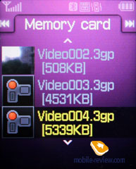
Memory card’s file structure is a slightly different story, as it can be accessed through the main menu, where each item features “Memory card” option.
Settings. This item boasts password protection of selected sections (messages, short messages, organizer, etc.), backlighting duration and brightness, dialing display.
 
The side-mounted key can be set to decline an incoming call or automatically send the caller a message, whose text is user-manageable.
 
Backlighting duration – there are three options at your disposal, one of them is Night mode , implying that backlighting will be active only between 5:00 PM and 9:00 AM and disabled during daylight. If you come and think of it, this feature nothing more but an illusive replacement for illumination indicator, which Motorola’s handsets are armed with.
Mobile Tracker – submit a phone number, where notifications will be sent to in case SIM-card was changed – that message will contain number of the SIM-card being used with the handset. This section is protected with password, so that no one other than you or someone else who knows the password could disable the Tracker. Should your device have the SIM-card switched once, the specified number will receive one message instantly, and one more each time a new card is plugged in. A fetching feature which can prove to be of much help in case the handset is lost or stolen.
Flight mode – you can disable network part of handset.
The handset lacks profiles system and offers only adjustable events settings, which makes it look like it came from the past – for example, newest Samsung’s 3G devices have profiles onboard (though many other functions have disappeared). The P310 has got many vibrating alert modes and tunes in its sleeve, everything here works without any limitations, but what really frustrates me is inability to set an own tune for incoming SMS-message or e-mail – you are enabled to choose only from 10 pre-installed simple tunes found on the handset. On the other hand, ring tones are adjustable for contact groups, stand-alone entries in the phonebook and even for the alarm clock; therefore it’s somewhat obscure why not all alerts are customizable.
 
Bluetooth. The handset supports various profiles, namely, Headset, Handsfree, Serial Port, Dial Up Networking, File Transfer, Object Push, A2DP. The Bluetooth realization is not ideal, troubles with headsets having only a Headset profile appear pretty often, and speakerphone is handled in improper way sometimes either. In general the Bluetooth found on the F300 is comparable to that on Nokia’s phones, but worse than on Sony Ericsson. The handset handles stereo Bluetooth-handsets in a convenient fashion, or better to say, it lives up to its class (in other words – average sound quality).
Music
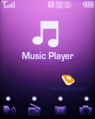
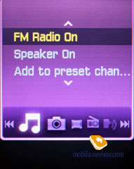
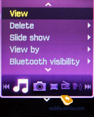
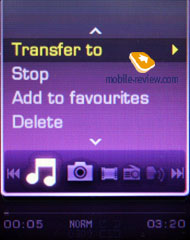
In the music-mode you get access to a number of functions arranged in a horizontal menu with the selected item being highlighted. The menu’s looks doesn’t change a bit throughout all trees and items, at that it can be navigated through only with the help of the touch-sensitive button and the side-mounted volume control key. The contextual menu, called up by pressing the button Up, always houses a horizontal bar with menu items, so that you can switch between applications right there. Now onto close-ups of each item.

Sound recorder. Duration cap makes up 1 hour – basically, it is the same Sound recorder found in the main menu.
 
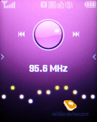
Radio. Works only with a headset plugged in; no auto tuning available though – you are forced to track all stations manually and then save them in the memory. Speaking about the radio’s quality, we cannot overlook the fact that it’s considerably worse than that of its analogues manufactured by other companies – the first thing you stumble upon is fewer radio stations available. On the other hand, those stations that eventually get detected by the F300 can be listened to with pleasure, as the sound is quite good. But the fact is, in Moscow out of 21 stations picked up by a Sony Ericsson-branded handset, the F300 got only 3. That’s why we have all the right to say that the radio here is just for the sake of it.
 
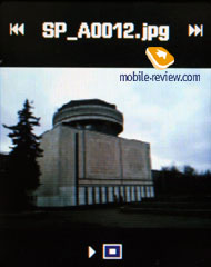
Images and video. A kind of an album, where you can view either particular images or initiate a full-screen slide-show, so that you will end up having only positive impressions. Support for MPEG4 (audio AAC) files with maximum bitrate of 1.5 Mbps is onboard. The F300 can handle clips recorded only in resolution up to CIF, but QVGA (30 FPS) ones make more sense. And that’s about it – the player boasts no special or unique settings, rewind feature works only at a set pitch (about 5 seconds), image on the display can be turned into full-screen mode.


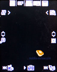
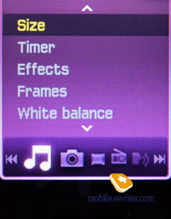
Camera. Generally speaking, nothing is an impediment should you want to manage the camera on the phone-face of the F300, but it won’t bee very convenient since the camera lens will be starring at you. So what does make sense is taking snaps with the help of the big screen – thankfully, all camera’s features are available there as well. The camera module incorporated into the F300 provides a maximum resolution of 2 Mpix.


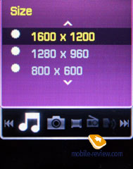
The interface layout for the F300 is no different from other Samsung-labeled products – you are free to switch picture into landscape mode, turn off shutter sound. Unlike other models, though, snaps quality is always at maximum and cannot be adjusted via the menu. The following resolutions are supported:
- 1600x1200;
- 1280x960;
- 800x600;
- 320x240.
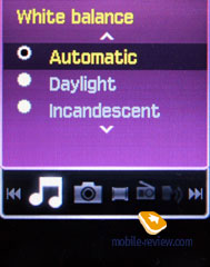
You are also at liberty to apply various overlays (special effects), alter white balance and take the advantage of the digital zoom. Frankly speaking for a device this slim, the camera perform quite well, therefore I don’t have any serious complaints about it.
 |
 |
(+)
maximize, 1600x1200, JPEG |
(+)
maximize, 1600x1200, JPEG |
 |
 |
(+)
maximize, 1600x1200, JPEG |
(+)
maximize, 1600x1200, JPEG |
 |
 |
(+)
maximize, 1600x1200, JPEG |
(+)
maximize, 1600x1200, JPEG |
 |
 |
(+)
maximize, 1600x1200, JPEG |
(+)
maximize, 1600x1200, JPEG |
 |
 |
(+)
maximize, 1600x1200, JPEG |
(+)
maximize, 1600x1200, JPEG |
 |
 |
(+)
maximize, 1600x1200, JPEG |
(+)
maximize, 1600x1200, JPEG |
 |
|
(+)
maximize, 1600x1200, JPEG |
|
Video is recording in 3GP format with the resolution topping out at 240x320 pixels, but 176х144, 128х96 pixels are also available. All video clips are average quality-wise, no wonders here.
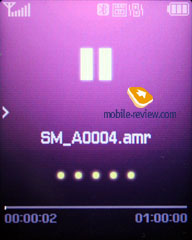
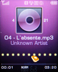
Music player. Even though this solution is called Ultra Music, the manufacturer hasn’t put great efforts into revamping the music applications, thus it isn’t too much different from other handsets. Newsworthy things include support for Album Art, displayed on the display in course of playback, at the same time listing is disable in the F300 – only play-lists are allowed, at that to draw some you will need to go back to the main display.
 
Music can be transferred to the F300 via Bluetooth or USB data cable – while utilizing Bluetooth capabilities you can see the entire file structure, the very process will be a real pain, as even 500 Mb take a while to upload (speed – about 40 Kb/s). But when you plug in the data cable, the surprises start popping up – the F300 supports both USB Mass Storage and Media Transfer Protocol (for the memory card), using MTP you can send music to the device directly from Windows Media Player via USB 2.0 (speed – about 400 Kb/s), whereas PC Studio grants you two times worse data connection (USB 1.1).
While receiving files, the handset can handle calls as well, but occasionally they can reset data transfer. On the whole MTP does well on the F300, even though the player refuses to copy some files reasoning with missing support for the file type on the handset, whereas Bluetooth beams these files in a convenient fashion and on top of that, playback doesn’t cause any problems either. The shortcomings include inability to copy music to the handset’s memory directly – every time you will need a “third-party”. Such limitation seemingly originate from the necessity to store all files in Music folder – on other devices tracks stored outside this directory are not recognized by the phone.
The following audio formats are supported - mp3, AAC, e-AAC, e-AAC+, WMA. Apart form the traditionally enabled OMA DRM version 1, the F300 now houses support for Windows DRM. However many will take it as a drawback, rather than an advantage, especially on the Russian market. But on the other hand, if your music library stored on PC is categorized in Windows Media Player with DRM, it is the only way to listen to music on devices other than your PC.
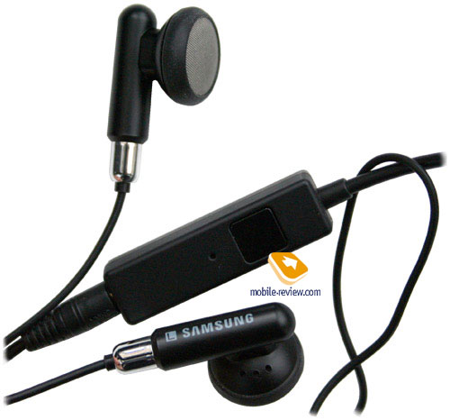
Music can be played back through either the wired headset coming included with the handset or a wireless Bluetooth-powered headset (A2DP).
Using the Hold button you can lock the keypad, which is really handy.
Even though the equalizers found on the F300 are non-adjustable, they are many instead - Normal, Rock, Bass, Bass&Treble, Live, Dance, Pop, Full treble, Club, Party, Large Hall, Soft, Soft Rock. Shuffle and various repeat modes are supported, which cannot be said about special effects, although you still can take advantage of fade and stereo widening.
Quality-wise the F300 performs on an average level – it won’t feel like something totally new or a breakthrough, and rather acts any other Samsung-branded device or mid-range flash-players. In terms of ease of use, there are some flaws as well: since you are unable to manage play lists on the F300, you will be always bound up with Windows Media Player – to me it’s a kind of hassle, as the handset stops being a stand-alone device and pretty much depends on availability of a Windows-powered PC.
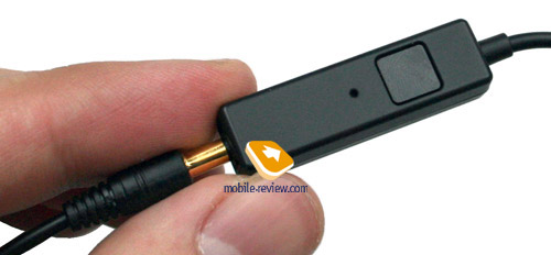
One of the best things about the F300 and all the upcoming music phones is 3.5 mm jack stereo-headset coming in one box with the handset – this trend originates from the Walkman range, but in its turn Samsung offers simpler headset, which can be seamlessly replaced with your own headphones to boost sound quality considerably.


Imperssions
The handset delivers good reception quality, which is on a par with other modern phones, though. However there is a small cloud on the horizon, as occasionally we experience unwanted noises during calls, but we attributed that to the tiny dimensions of the casing and windy weather. The volume of the 64-chord polyphony is above average, which makes the F300 stand out against the background of other Samsung models. As for the silent alert, it’s average or slightly above that strength-wise.
It’s really hard to judge the F300 in an objective way, as the first thing coming across your mind when you see it for the first time is “WOW – it’s so slim and solid! And look, there are displays” But some hours into usage, and you will notice that common functions, reading and making up SMS-messages are hard to deal with and on top of that the F300 lacks some extra features (for example I really don’t need this stopwatch, but sometimes could really use the help of a calculator). If only the handset had two big-enough displays, everything would be much easier and I wouldn’t have any reason to blame the device. However this would be fatal for the F300’s lifetime, which is quite tiny already and, to tell the truth, is close to the very bottom level.
When though of as a music handset, the F300 is quite weak and yields not only to stand-alone players, but music players embedded in other phones as well – like those found on Nokia-labeled device, not to mention Sony Ericsson’s products. The reason why they called it Ultra Music might be dual-face design, but, honestly, it leaves much to be desired in the condition it is now. Being retailed for 450-500 and schedule for release in January the F300 aims at “see-and-buy” sales, as it would be strange if a solution of this kind generated profit in a different way. The handset is truly uncommon and strange-looking even for the niche it resides in. No doubt, there will be people falling in love with the F300’s looks, but there won’t be many of them. The market volume for this handset will be on same level with Samsung P300/P310, in other words, somewhere between slim and nil.
With the release of another Walkman-branded solution in January, which sports comparable dimensions and fundamentally better specs, Samsung F300 will lose even the slightest change of holding on the shelves for a little while even if it outdoes the Sony Ericsson’s offering price-wise. On top of that the market will see the launch of Nokia 6300 pretty much on the same date – it’s that so fabulous, but will appeal to men for sure and get a part of the audience as well. All in all Samsung F300 is a good experiment, but being a commercial model with bright future is probably not his role.
Related links:
Eldar Murtazin (eldar@mobile-review.com)
Translated by Oleg Kononosov (oleg.kononosov@mobile-review.com)
Published — 14 December 2006
Have something to add?! Write us... eldar@mobile-review.com
|
News:
[ 31-07 16:21 ]Sir Jony Ive: Apple Isn't In It For The Money
[ 31-07 13:34 ]Video: Nokia Designer Interviews
[ 31-07 13:10 ]RIM To Layoff 3,000 More Employees
[ 30-07 20:59 ]Video: iPhone 5 Housing Shown Off
[ 30-07 19:12 ]Android Fortunes Decline In U.S.
[ 25-07 16:18 ]Why Apple Is Suing Samsung?
[ 25-07 15:53 ]A Few Choice Quotes About Apple ... By Samsung
[ 23-07 20:25 ]Russian iOS Hacker Calls It A Day
[ 23-07 17:40 ]Video: It's Still Not Out, But Galaxy Note 10.1 Gets An Ad
[ 19-07 19:10 ]Another Loss For Nokia: $1 Billion Down In Q2
[ 19-07 17:22 ]British Judge Orders Apple To Run Ads Saying Samsung Did Not Copy Them
[ 19-07 16:57 ]iPhone 5 To Feature Nano-SIM Cards
[ 18-07 14:20 ]What The iPad Could Have Looked Like ...
[ 18-07 13:25 ]App Store Hack Is Still Going Strong Despite Apple's Best Efforts
[ 13-07 12:34 ]Infographic: The (Hypothetical) Sale Of RIM
[ 13-07 11:10 ]Video: iPhone Hacker Makes In-App Purchases Free
[ 12-07 19:50 ]iPhone 5 Images Leak Again
[ 12-07 17:51 ]Android Takes 50%+ Of U.S. And Europe
[ 11-07 16:02 ]Apple Involved In 60% Of Patent Suits
[ 11-07 13:14 ]Video: Kindle Fire Gets A Jelly Bean
Subscribe
|
