|
|
Review GSM phone Samsung Serene or a joint product with
Bang&Olufsen
Samsung
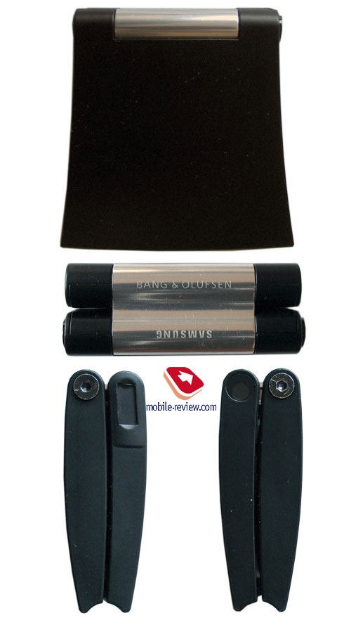
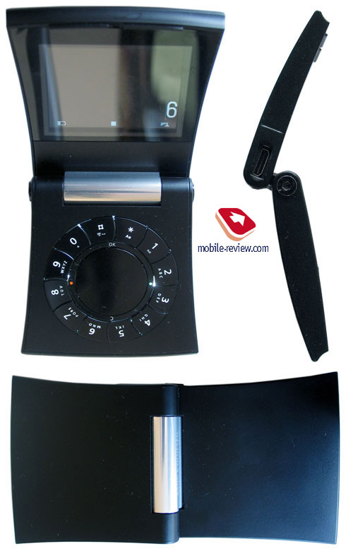
Serene. Live pictures
Samsung
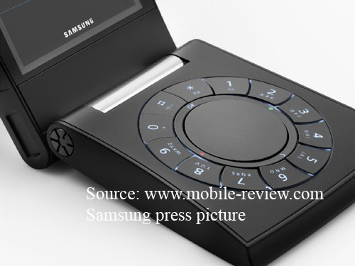
Serene. Press pictures
About a month ago Samsung announced the collaboration with Bang&Olufsen, in result a new mobile phone will come out. In this tandem Samsung is responsible for technical filling of the product, and design, the number and selection of functions, menu appearance falls on Bang&Olufsen .
Any reader acquainted with Bang&Olufsen’s products knows not
through hearsay they are attractive in design, which often crosses
the whole ergonomics. Technically the models often can’t reach the
level of similar solutions by other makers, and thus can’t be called
top in every aspect. They are close to the leaders, but following
the general concept some capabilities are refused consciously, they
are cut. Good reputation of the brand Bang&Olufsen in exclusive
segment allows taking great extra charge, so Bang&Olufsen is
very expensive. First, the customer searches for a confirmation
for his status and no functionality in products of the brand. Bang&Olufsen’s
products are not mass.
Having decided on the collaboration, the companies tried to sketch a future customer of a product under a code name of Serene. Samsung's aim was to create a direct rival for Nokia's premium phones, and namely Nokia 8800, ready for the official announcement at that moment. Korean marketing specialists saw a potential customer of Serene as a 28 aged or elder man with higher than average income and active life position. From the very beginning it was clear the product should be extremely different from all the solutions on the market, and first refuse all the analogies with Nokia's products. The form-factor was obvious, a clamshell shape, which brought success to Samsung, slider would have been of great interest, but already it had been used by Nokia.
Metal was not appropriate for the main material, and both Samsung and Bang&Olufsen had no experience of applying it to mobile phones. The solution is soft velvety plastic, which Samsung coped with about a year ago, and then started using actively. Also Samsung brought in one of the best company's QVGA screen of today, hardware platform identical to the latest company's models and corresponding software.
Very soon Bang&Olufsen formed its vision of the product. Considering the partner's outline, the company representatives decided the final solution should be the maximum easy to use, and besides exterior garishness, which is a corporate feature of B&O, possess extra unique functions. And here the experience of the two partners helped again, the device combines a cellular phone and a DECT-device (B&O lays emphasis on DECT-products, particularly, BeoCom 6000). Also automatic opening mechanism for the body was added (a feature by Samsung).

In the course of developing Serene various design solutions were
tested, and developers tried to turn the restrictions of the element
base into advantages of the end product. Considering those many
produced or shown Samsung’s clamshells, we can say the task that
B&O designers faced was hard. Something unique should have been
created. And as it usually happens, the solution came from the adjoining
field; inspiration was taken from a powder-box shape. The idea of
the device is close to exclusive cosmetics and thus a corresponding
shape a la powder-box was advantageous. But the only thing is the
initial target group changed completely. The shape dictates its
rules – the product is typically for women and will suit a lady’s
hand bag, her arms, but not a pocket of a man’s jacket (we do not
take any deviations of a normal sexual orientation into consideration).
Still the companies try to position it as a men’s solution, the
inertness of the made decisions tells upon. All official photos
picture a man holding the phone, none of them shows it in a woman’s
hands. It will be interesting to watch the companies promoting the
device on the market for men audience. The inertness of the consumer
will hardly allow changing the stereotypes. At the same time, the
model accidentally created is very suitable for the target group
represented by 25-40 year-old women, who do not lack money and need
to prove their status in society. The product is close to the ideal
for this group.


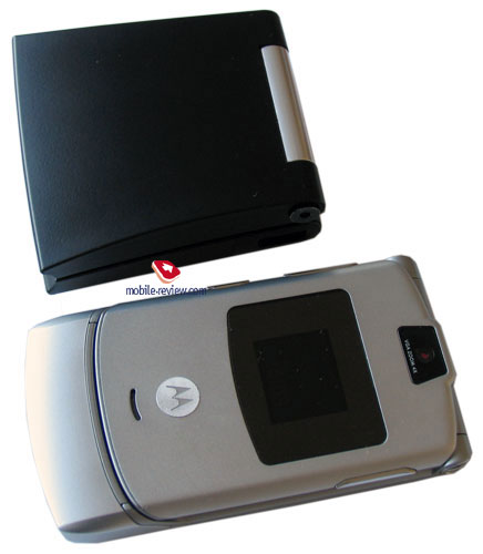
The phone has a trapezium shape, and the size forms 69.7x64.7x23.9
mm (we got the thickness of 67 mm but not officially announced 64.7),
at the weight of 115 grams. The device is wide which prevents from
comfortable carrying it closed in a hand; however during a conversation
you’ll find it comfortable to clasp the device with your arm. Women
of average height with miniature hands told they felt discomfort
when holding the phone in their hands. It is too wide for them.
I advise to hold the phone for some time, and listen to yourself
and your feelings of the handset’s size.
The surface is like covered with a dull lacquer, it has a slightly
observable texture, which makes the phone even more interesting.
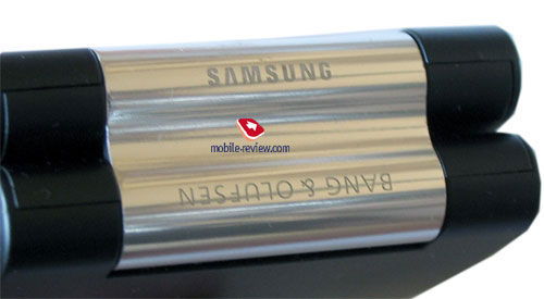
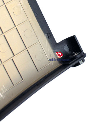
The rotary hinge is hidden behind a nickel-plated insertion, if
looking at it from the edge, you’ll see the names of the manufacturing
companies. That is curious, when the phone is open, only the title
“Bang&Olufsen” is seen, the name of the Korean maker is closed
with the bottom end. We can mock like the feature of the construction
shows who the master of the house is, but really the inscriptions
are unnoticeable even from the distance of an outstretched arm,
since they are drawn with a pale paint. When the device is closed,
and you take the phone in your arms, you’ll see both inscriptions.


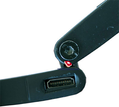
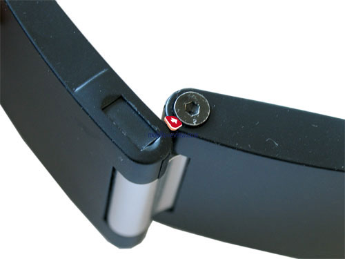
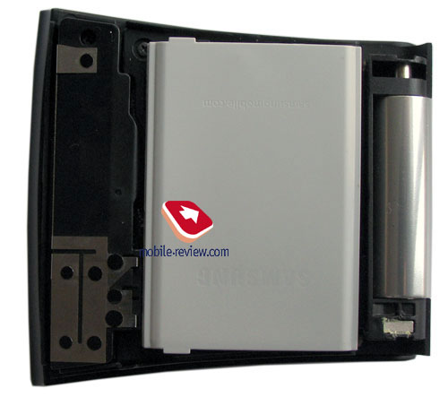
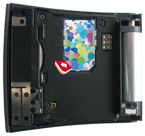
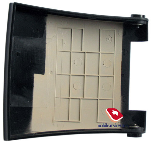
The phone esthetics foresees no external screen; placing such a screen into an end body of the device would be a brilliant idea, however, that was not included into the task. No control elements are placed outside, only a charger connector is placed on the left side surface (it is an interface connector by the way, however, a cable for synchronization is absent). The connector is closed with a sliding shutter. A VGA-camera lens is on the right side, this is also dictated by the wish not to touch the completeness of the body shape. The camera resolution was chosen intentionally; technically such a product did not allow integrating a megapixel camera, though no such a necessity existed. And here we again meet the principle of reasonableness by B&O. Why to integrate a high resolution camera, if a user mainly watches photos on the screen? And if the device lacks such a screen, why to trouble engineers asking them to find room for a megapixel module? The B&O concept means a completed image, and no bothers from outside, the company designers won't put up with any users' interference. So, a by-product of such a statement is the absence of a megapixel camera, which means no sending photos to a PC and back. That means data transmission to the phone from a PC, various content like pictures, melodies and so on. The developers would like to ignore the capability at all, and would close the phone for user's interference, but the time dictates a necessity for synchronization, and thus, it remained nominally. Why nominally? Nominally, because MP3 and AAC files supported by Samsung's platform were refused, and the whole number of supported formats was greatly reduced. That is all done to prevent a user from destroying a complete image of the product. That means the headband is in B&O style, a call is preset by the same company, and so on. I may exaggerate the problem in some way, but still it remains in this phone. Screws are placed on sides; you can unscrew them with a screwdriver included into the kit. First they were hexagonal, but fairly considered, they were replaced with more common ones, since not always you will find such a screwdriver, when replacing a SIM -card is necessary (then you can use a usual screwdriver or a knife).


Opening the screws, you see they are slightly spring-loaded and
jump out of the grooves. You need to pull the cover and it will
open. The battery compartment is inside. The battery itself is 800
mAh Li-Ion. According to the manufacturer, it can provide up to
2 hours in talk mode and about 180 hours of standby time. In London
the device averagely worked for about 3 days in case of an hour
of talks and minimum of other functions (automatic opening off).
When the opening mechanism is on, the battery life will depend on
the number of calls and how frequently you will open the phone manually.
About 1.5 days the phone worked in Moscow in the same use conditions.


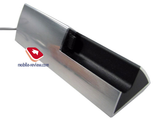
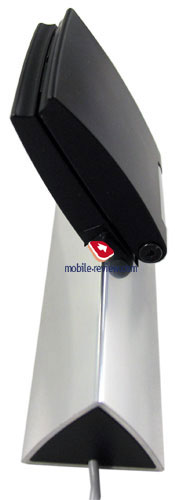
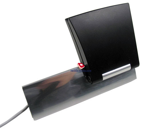
A desktop charger is included into the kit. It looks like a silvery
rest. The majority of users will charge the device at home or at
work, so battery life won’t be a problem for them. We should give
B&O its due, the device and the charger match perfectly.


In your hands the device can also get open and closed automatically, all you need is pressing the cover in a necessary direction. The handset opens slowly, making a pleasant mechanic buzz, which is not very loud. You can open it manually, which will tell on the opening mechanism in no way. The experience of other Samsung phones shows, opening mechanisms breaks are seldom and most often are caused by the user's wish to fight with the phone (for instance, sharply close it while it opens, and then see the result, several times repeated this procedure will cause damage).
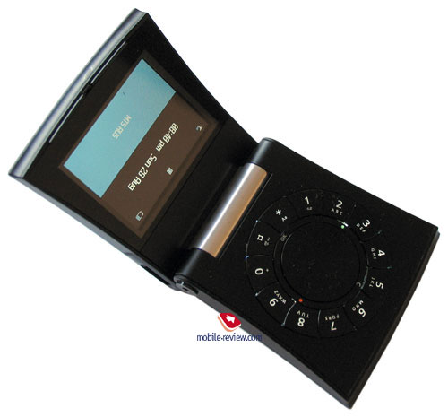
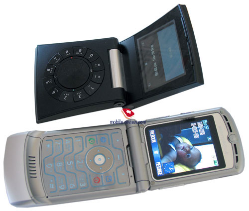
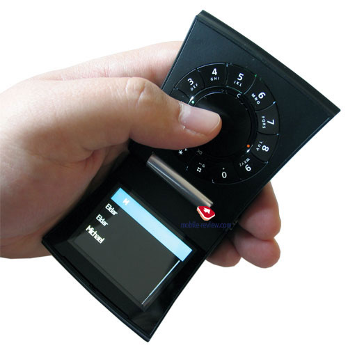
Opening the device, you face the first unusual thing – the screen
shows a picture rotated from the round keypad. I can’t even judge
what is more unusual, the round keypad or the screen disposition.
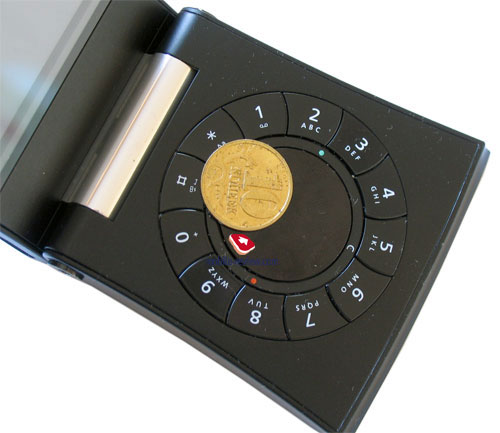
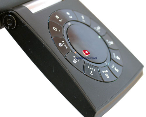
The appearance of the round keypad is typical for designer’s products,
the more unusual and uncustomary the product looks, the higher salary
the designer gets, and his reputation grows. As for me, the ergonomics
really suffers from it, and users have to get used to such disposition
of the buttons. As a well-known saying tells “With time a man gets
used to everything”, and this keypad allows getting used to it. However,
I can’t call it extremely comfortable. Though, it is still not as
uncomfortable as the one in Siemens SX1 (placed on both sides of
the screen), mainly it is on the same level with Nokia 3650.

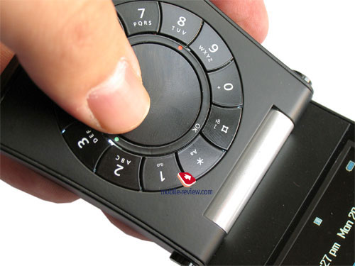
The keys have white backlight, which is well seen in various conditions. The feedback is short, however, they are comfortable to press. A mobile ring is placed in the center of the round keypad, it acts as a joystick. Round motions allow browsing lists, and some actions have strictly fixed directions. In a vertical line Ok button is placed (exactly, pressing the round in this place), and C or back. In a horizontal line – traditional call and cancel buttons. Control using the round raises no cavils and seems comfortable. A similar round could have been seen in Samsung X810.


As the makers decided, the device should be placed only with the
screen down. You hold the phone, and its screen is closer to you.
Then you can better place your finger on the control round. In the
settings you can find a special desktop mode, then the picture rotates
to a normal position and the device can be used differently. The
problem is you can’t activate this mode fast; you have to enter
the menu. The second problem is when closing you cancel this mode,
and will have to enter the menu to turn it on again.

You can get used to the screen disposition and the way of working
with the phone. The disadvantage is that you always close the screen
partly, since you hold the device. In general, the whole work in
various modes is unusual. For instance, in a photo mode you hold
the open phone parallel to the plane from you (resembles a caught
butterfly).
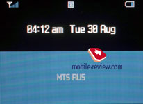
The screen deserves a special talk. It is QVGA (320x240 pixels, 43x32 mm, 2.1” ), shows up to 262K ( TFT ). The phone interface was consciously simplified for showing only three colours. The main colour is black, the mat looks this way, and the fonts are white. Menu drawings and a selection bar are pale blue. The combination of bright colours and contrasts makes an effect of a clear very beautiful picture. Big font size adds to the effect, the screen is well-read in all conditions including in the sun (sometimes a dull covering of the protective glass flashes). Colour pictures will appear only if you download them via WAP, or that can be your photos with the integrated camera. Using own pictures as wall-papers is forbidden to prevent from breaking the phone concept. This conscious restriction of user's capabilities really disappoints. And that is the very stage you understand that is a beautiful phone for calls with poor ergonomics and no revelations should be expected from it if not considering the design.

Menu
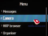
As we have mentioned before, the whole interface is kept in two
colour solutions, which makes it stylish, though monotonous. Entering
the main menu is possible by pressing OK button, rotating the
round in standby mode calls a list of phone numbers. The menu supports
number navigation, which often allows escaping the use of the navi
round.

All the menu levels are lists, where some extra information can
be provided, for instance, the number of photos; it slides in the
same line. This animation looks perfectly and varies the phone greatly.
Due to little functions the menu navigation brings no problems even
in a usual manner.
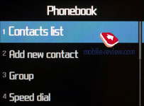
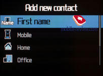
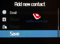
Phonebook. You can store about 1000 names in the
phone’s memory, a set of several fields is available for each entry
(name, mobile phone, home phone, work phone, e-mail address, group,
personal picture – here you can choose any picture including a photo).
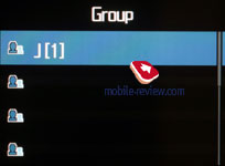
Totally about 10 groups are available in the phone, they only serve
for mass mailing, since no other application can be found for them.


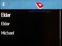
General list supports search by the first letter, and by the way,
the search uses indexes. Then on the top of the screen you see alphabet
and move along it. Having chosen a necessary letter, you skip to
the first entry starting with this letter.
The vCard standard is supported, which allows transmitting entries
to the phone from other device using Bluetooth. The phonebook is
of an extremely low level, no peculiarities, only minimalism.
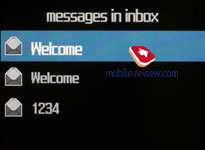
Messages. Phone memory allows keeping about 200
SMS, and EMS standard is not supported. You can add a calendar,
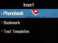
a to-do list, a phonebook entry or a text template. Nothing peculiar.


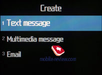
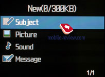
MMS standard is fully supported, you can attach photos, and the
size of a message shouldn’t exceed 295 KB. And a total bank of memory
forming 3.7 MB is provided for MMS (that is dynamically shared with
e-mail). The interface for creating messages looks pleasantly.

E-mail client works with POP3/SMTP accounts, and the message is
typically limited to 300 KB. Only recognizable by the phone formats
are supported for attachments.
Personal folders can be created for storing messages of all the
types, which happens to be the only improvement as compared with
original models by Samsung.
Camera.
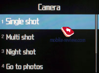
The camera lens placed on the end makes holding the device like an exotic butterfly directing it from you. The camera is VGA, which allows taking photos of 640x480 pixels, also available – 320x240, 160x120 pixels. The last resolution is applied when taking a photo to show it at a call. For photos four compression types are applicable - Super Fine, Fine, Normal , Economy. During the shooting you can regulate the picture brightness. In fact, there are no effects as such, only turning a white and black mode. In the speed mode you can get series of 6, 9 or 15 photos. Night mode is also present.


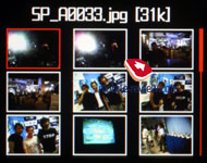
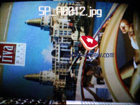
The picture quality on the screen turned out to be not bad though
doesn’t raise any special delight. Viewing the photos line thumbs,
at pressure the menu appears where you can select full screen image.
The photos received you can send to another device via Bluetooth,
and set it as a headband for a name in the phonebook. You can’t
create wall-papers of them, video is not recorded.
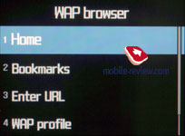
WAP- browser is quite customary for Samsung's phones. It supports 1.2.1 standard and is compatible with version 2. No peculiarities in the work, except for MP3 download is not supported, melodies downloaded via the browser can't be set as a call melody, which is a serious constraint.

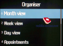
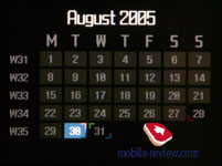
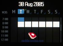
Organizer is viewed both in a monthly and a weekly mode, besides you can view all events for a selected day. Recurrent
events are supported, you can set a signal (only select of preset
melodies), set the time for events. Available various types of events
(anniversary, meeting, task – the last type allows setting a fulfillment
sign). Also usual text memos are available. About 100 events can
be saved for each type of the event, which is summed up to 400 organizer
entries.


Library. Here all photos are kept, as well as
melodies, and other files. The phone has about 27 MB of memory onboard,
which is dynamically distributed among all applications.
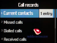
Call lists. About 20 phone numbers are specified
in each list. Also a general list of the last calls is present;
here an icon signifies the call type. By a horizontal deviation
of the navi button you quickly switch between the lists. With a
detailed view, you can see date and time of a call, though its duration
is not specified. Traditionally, total call duration and their cost
(if the service is adjusted) can be seen from this very menu.

Applications. This holds various business functions.
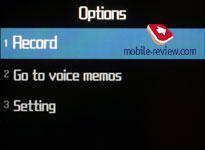
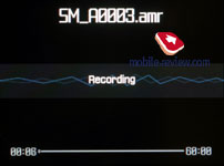
In particular here you will find a dictaphone working only in standby
mode, records are made as AMR with the maximum duration of 1 hour.


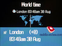
World time function differs in no way, no peculiarities.

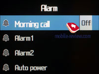
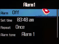
Alarm clock. Totally the phone offers three alarm clocks, one of
them is morning and can be set for certain week-days, however, that
is also typical of the two others. For each of the five alarm clocks
you can select of 5 melodies. The settings allow specifying whether
the phone will turn on automatically or not at the event.


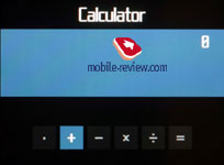
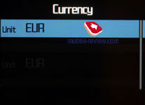
Calculator, currency converter is plain and clear.


Settings. Of necessary settings we should mention
a capability to select GSM1900 diapason manually, as well as date
and time settings. Opening the phone can be accompanied with answering
the call; automatic opening can be off by your wish. A picture on
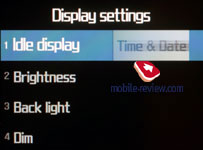
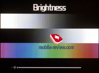
the display can be rotated into a desktop mode. For the screen brightness
and backlighting work time are adjusted, no other settings.


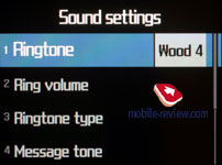
No profiles are provided in the phone, all the sound settings are
specified in this menu. The melody set is middling, they are comparatively
not bad, but the impossibility to set own uploaded melodies really
irritates. Feels like several years back. Besides, such a necessary
function as vibracall working simultaneously with a call melody
is also forgotten, only vibra then a call. For messages you can
select one of the 10 preset signals.

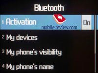
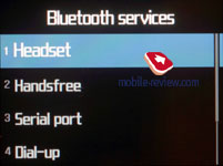
The Bluetooth version is 1.1, all the standard for Samsung phones
profiles are supported Headset, HandsFree, Object Push, File Transfer,
Serial Port, Dial-UP. This phone is quite enough for working with
headsets, as well as for simple connection to speakerphone kits
in a car.
But we shouldn't expect stable work of all the advanced functions considering the chip of the first version (they are translation of the address book, stable connection with PC, PDA and other phones in any conditions). Here we observe no qualitative improvements, so the model is on the level of other Samsung's phones.


Impressions
The connection quality rouses no cavils. The sound is clear and loud. The volume of the 64-tones polyphonic call is a bit above average, so it is heard in a not very noisy street, well heard indoors. The melody set is not very numerous. Unfortunately, you can't set personal melodies. The power of the vibra is average and feels not always.


This device is extremely uninteresting for people using other functions
besides calls. Principally Java support is absent. Then uploading
new applications will be plain and easy, but playing downloaded games
using the round navigation seems impossible. That will result in
users’ complaints.
The concept completeness artificially constrains colours on the
screen capable of much more. The same may be said about music and
images. Some times the phone looks extremely archaic – the manufacturer
cut everything they could. In the end we have a device that will
be interesting to people who got used to showing their status with
such devices not bothering about their functionality and any application
to real use. The phone audience is small, but inside it will be
very popular mainly due to its price.
The phone positioning is strange, first it was intended for men,
and while developing it turned out into a women model. It is a typical
glamour device which raises direct associations with Nokia 7280/7350
only.
On the market it will appear in the end of November, and by the
way will be available in two versions. The first version includes
the phone and a desktop charger; it will be promoted via official
company distributors. The second version by B&O will in addition
include a DECT-phone and a docking station BeoCom 6000. The kit
BeoCom 6000 appeared in 2001 on the market and then cost about 500
USD. Now the model is out of popularity and is almost absent in
free sale. Technically it is outdated, and the design is on the
level of 4-year-old models. That time was enough for other makers
like Siemens to make a giant leap in the DECT area. They represented
new functions, colour screens and integrated cameras. The Serene’s
drawback is it will only work with B&O’s basic station, no other
will suit (which is a clever approach for B&O to promote its
products). At the same time you can’t use the device is a mobile
and a DECT phone. Only one mode is workable at a time unit. That
crosses over the sense of the integrated DECT solution. In the end
of 2006 Samsung will introduce a new solution that will work in
both networks GSM and DECT simultaneously. It will also be capable
of switching calls to internal DECT phones. That is a principally
new class of solutions, still now the features represented are useless.
Retail networks will want 1000 Euros for the Samsung's kit. At the same time in B&O's shops it will cost about 1100 Euros with a DECT -handset included. As for me, one should select a DECT phone following his preferences, since little fashion is hidden in an outdated phone (and it's not very honourable to help the company realize its warehouse stocks).
The model will be interesting as a fashion solution for women only calling or even more receiving calls. If the price matters nothing, and the society is used to estimating not only this lady's dresses but accessories as well, then the model will match her image perfectly. All the others will hardly find it interesting. We can surely say this is an example of how the principle of selling expensive devices with exclusive design works. You need to make something having no copies in design, set a high price and certain stable sales are guaranteed. In this segment customers do not realize or even do not allow a thought their device is not “the best from the best” in all respects. There are plenty of examples of such behaviour.
P.S. We can't call the experience with Serene negative for Samsung. The company got extra experience, PR support (see how many glossy magazines highlight this device), a capability to correct its model line. In 2006 at least two premium class products will be launched, they will exceed Serene in the class. And here is when the main struggle of the premium segment makers starts.
Eldar Murtazin (eldar@mobile-review.com)
Translated by Maria Mitina (maria.mitina@mobile-review.com)
Published — 5 October 2005
Have something to add?! Write us... eldar@mobile-review.com
|
News:
[ 31-07 16:21 ]Sir Jony Ive: Apple Isn't In It For The Money
[ 31-07 13:34 ]Video: Nokia Designer Interviews
[ 31-07 13:10 ]RIM To Layoff 3,000 More Employees
[ 30-07 20:59 ]Video: iPhone 5 Housing Shown Off
[ 30-07 19:12 ]Android Fortunes Decline In U.S.
[ 25-07 16:18 ]Why Apple Is Suing Samsung?
[ 25-07 15:53 ]A Few Choice Quotes About Apple ... By Samsung
[ 23-07 20:25 ]Russian iOS Hacker Calls It A Day
[ 23-07 17:40 ]Video: It's Still Not Out, But Galaxy Note 10.1 Gets An Ad
[ 19-07 19:10 ]Another Loss For Nokia: $1 Billion Down In Q2
[ 19-07 17:22 ]British Judge Orders Apple To Run Ads Saying Samsung Did Not Copy Them
[ 19-07 16:57 ]iPhone 5 To Feature Nano-SIM Cards
[ 18-07 14:20 ]What The iPad Could Have Looked Like ...
[ 18-07 13:25 ]App Store Hack Is Still Going Strong Despite Apple's Best Efforts
[ 13-07 12:34 ]Infographic: The (Hypothetical) Sale Of RIM
[ 13-07 11:10 ]Video: iPhone Hacker Makes In-App Purchases Free
[ 12-07 19:50 ]iPhone 5 Images Leak Again
[ 12-07 17:51 ]Android Takes 50%+ Of U.S. And Europe
[ 11-07 16:02 ]Apple Involved In 60% Of Patent Suits
[ 11-07 13:14 ]Video: Kindle Fire Gets A Jelly Bean
Subscribe
|
