|
|
Review of a GSM-handset Samsung D900. A begging King
Live photos of Samsung D900
Review of Samsung D900’s 3 Mpix camera
Standard kit:
- Handset
- Charger
- Wire stereo-headset
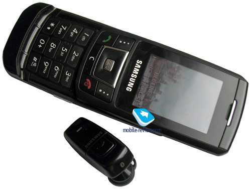
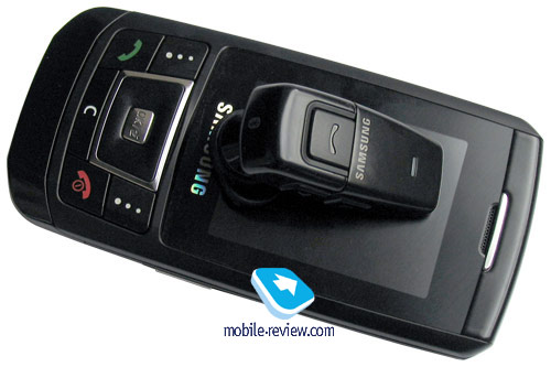
- Bluetooth-headset Samsung WEP200 and charger (depends on region)
- User’s Guide
- Disk with software
- TV Out cable (depends on region)
- USB-cable (depends on region)
- microSD 256 Mb memory card (storage size and availability depend on region)
Recently Samsung was having hard time, as it was losing its positions in Europe, whilst looking for product class that could have become successful just like it had been in past years. The breakthrough was introduction of Samsung D500, a handset that was pleasant in all aspects, it also gave impulse for development of all subsequent product line-up, it became its forefather. Samsung D500 was successful and had no competitors on the whole, in case we take its form-factor and novelty into consideration. For the first time handset had so many successful constituents, which made it popular. Model Samsung D600 which was released afterwards did not become a big hit for the market, although it did have some unique features (Picsel Browser, TV Out). Sales were based on success of Samsung D500 in first place, just like any successor of such bestseller, model became quite popular.

It was logical to suppose that company shall not stop on evolving this direction and will introduce another flagship for its line-up. However deciding which model will take this position was hard, and this took Samsung quite a while, problems arose with identifying handsets, as they were too similar to each other, and differences were minimal. Approximately similar release term was also stating that Samsung has no single flagship model, it has more than one of those. This means that there will be flagship-model for GSM market and same flagship for 3G networks, similar model with slightly improved specification and different title – intermediate model before annual update. That’s not all, design of all solutions is maximally similar, handsets are hard to differ one from another. This is a series marketing mistake, at least in my opinion it should not have been done.
Uncertainty of actions inside Samsung can be seen with naked eye, first model had Samsung D870 index, later on it was transferred into flagship status, and after official announcement, without focusing on the action itself, model’s name got changed.


In case marketing games cover mass consumer in least term, it affects mostly those who care a lot about new products in this segment, several other peculiarities of this model will directly affect its perception. Recently those who have no special liking of Samsung handsets says a lot about design similarities of models in the line-up, their nearness. In reality company had been using simple principle: successful design of top-class handsets will steadily be transferred into lower price segments. This allowed getting a handset that would look top-class for smaller amount of money. Being one of this strategy’s key elements, it provided high sales for Samsung in middle segment.
Casting on the market had influenced negatively on observance of its own principles of promoting products, it seems that for the first time ever company decided to cheat on them. By placing a bet on exclusively black color for top-solutions manufacturer limited itself in different positioning of handsets – they look alike when they’re on one shelve. But that’s not all, that’s only half of the problem, asit was possible to build different handsets in terms of outlook, make its design key point of difference.
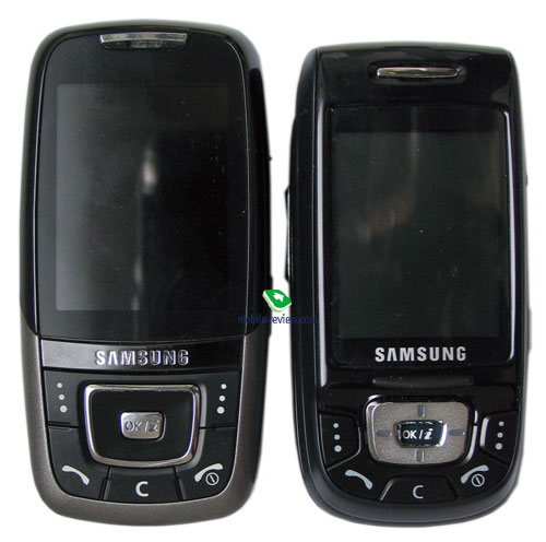
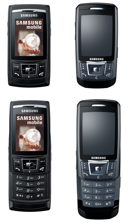
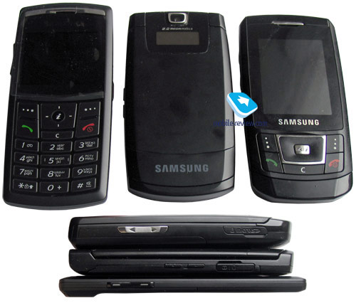
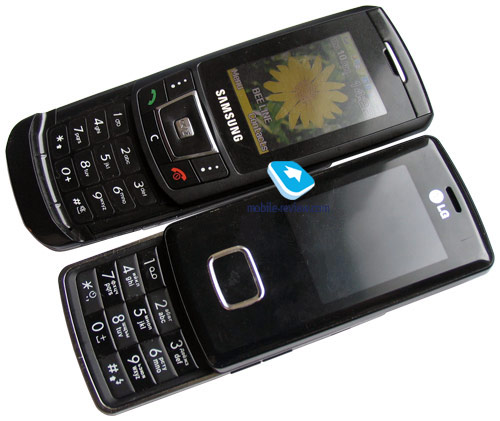
Let’s play a game in which you will try to find 10 differences between outlook of Samsung D840 (this model had been released one month earlier than Samsung D900) and line-ups flagship. There are several difference, but usually you don’t pay much attention to them, and see it only when you focus maximally on it. As a matter of fact, Samsung D840 belongs to Ultra Edition series too, however its case thickness is not mentioned.

Samsung’s whip is big number of models and as inevitability design elements intersection, which devaluates different models, makes its attractiveness lower. Let’s look at flagship products by other companies: Nokia 6233 and Sony Ericsson K800i for example. These handsets are strongly different from all other models in their line-ups, they don’t look alike, although you can clearly state which manufacturer stands behind each model. In this case we see uniqueness and own face present, in case with Samsung you have to look deeply into handset in order to read its index or perceive its difference from other products, this is a disadvantage. It is true that this model is identified as Samsung product, but a person who is not much into mobile phone market will unlikely recognize which model this is, or the fact that it is flagship.
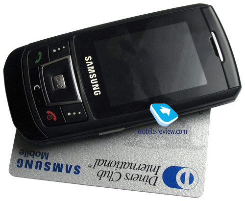
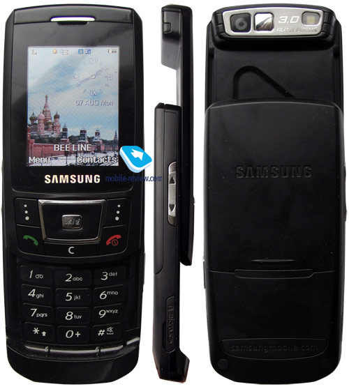
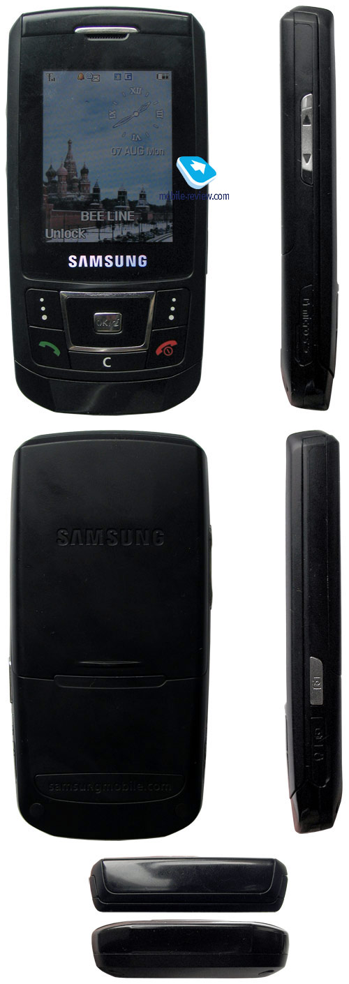
Handset’s design is strict, there’s no eclectic, black color is diluted by silver insertions. Framing around display is glossy, just like lower part of front panel; meanwhile case itself is made of mate soft touch plastic. This is not a single meaning combination, a feeling of slight color dissonance is present. On the other hand, difference in material’s texture creates attention zone right on the keypad (function keys).


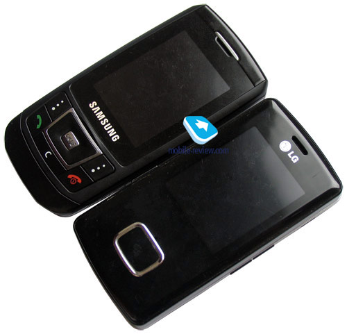
Handsets thickness is 12.9mm which is typical for modern day solutions, handset is positioned as “slim” and is part of Ultra Edition, this is fashion tribute. Handsets size is 103.5x51x12.9 mm, weight – 83 grams (manufacturer states 93 grams for some unknown reason). When compared to LG Chocolate – there is no much difference between two handsets, their size is approximately the same. Handset can be carried the way you like, there are no limitations, it will suit you in terms of size so that it can be carried inside jeans pocket or shirt’s ones.
Video – comparing size and outlook of handset (wmv, 2.3 mb)>>>


Insignificant weight of handset is explained by refusal of using metallic parts in the case, it is made fully out of plastic. Assemblage quality is at good level, there’s no backlash of two panels, everything is all right. Front panel is easily soiled, it carries markings from cheek, you can see them clearly outdoors, though they are not that evident indoors.
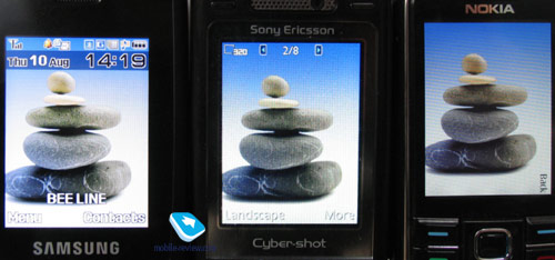
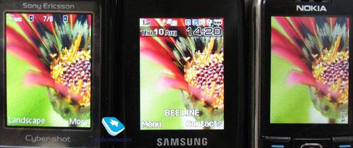
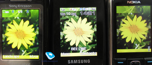
A display installed in this model is great, it has QVGA resolution (240x320 pixels, 33x44 mm), diagonal is 2.1 inches. Display is able to show up to 262k colors (TFT), which are lively and colorful. Up to 8 text lines can fit it, with 4 lines reserved for service needs. This model is clearly superior over Nokia 6233 and Sony Ericsson K800i in terms of display. In some modes it is possible to display up to 12 text lines. Information stays readable outdoors.


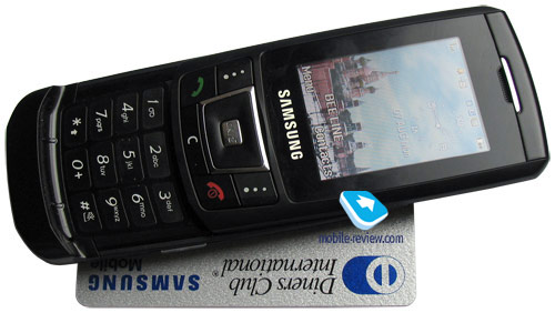
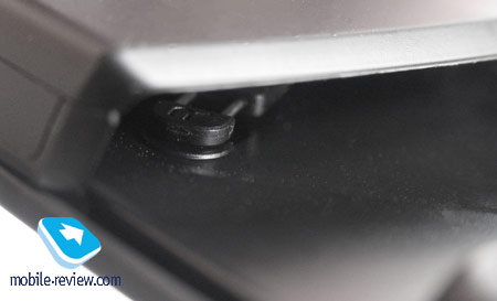
Slider has auto-opening mechanism, it is easy to open handset with one had. You will see prop, on which your thumb will be placed easily. You can see the spring that opens handset on the other side of handset.


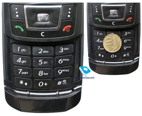
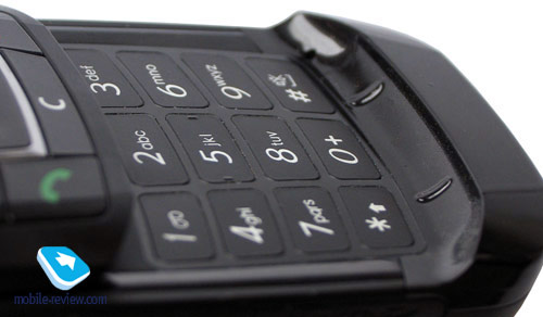
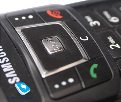
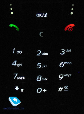
Numeric keypad has white backlighting, it is equally spread and is nicely seen in different conditions. Keys are average in terms of size, they have small key depression, but this does not cause much problem, on the whole keypad is average in terms of ergonomics. Soft keys, controversially to numeric keys are big and comfortable to work with.


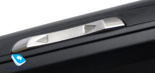
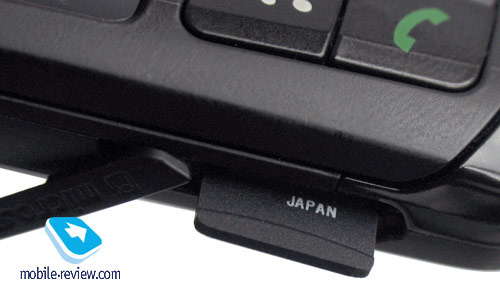
Joined volume adjustment key is located on left side, microSD card slot is below. Handset supports hot swap. Camera button is located on right side, just like jack for connecting charger or headset.


Back cover hides battery section underneath, it has no backlash. Battery is Li-Ion type with 800 mAh capacity (this is another point according to which this is not a “slim” series handset, as those have batteries with capacity limited to 630 mAh). Samsung states that this battery will allow handset to work up to 260 hours in stand by mode and around 6.5 hours if you talk. Handset worked for around 3 days in average in Europe, with one hour spent for phone calls, besides only alarm clock was used. At same time in Moscow handset worked for around 2 days with 1.5 hours spent for phone calls. The drawn conclusion sounds like this: handset will work at least 2 days with average load, but 3 days are possible too (minimal load). It takes around 1.5 hours for handset to fully charge up. There is no improved capacity battery available for this model.
Menu
Model had been developed in R&D centre Suwon and is similar to Samsung D600, let’s say it had evolved from this handset. We see usage of Philips chipsets (Nexperia 6100), processor’s frequency is identical too – 104 Mhz ARM9. Processor and its realization but several limitations on phone’s performance, you won’t see much of delays and freeze-ups in interface, but when taking pictures you will see that some time is required to save those (there will be 2-3 seconds after the shot is actually made till it will be saved). The reason for that is processor itself, it just cannot render photo any quicker. Another limitation is Java, especially in terms of games. Handsets performance is typical for previous generation devices, but not the current one. For example Nokia 6233 and Sony Ericsson K800i have ARM9 processors with 224 Mhz frequency. I’d like to repeat myself again, and say that for current functionality of interface, available amount of computational power will be enough, but this is one of last models of its generation. In future we should except introduction of new models formation, that use ARM9 with 224 Mhz frequency (transfer to Nexperia 7xxx, usage of other music possibilities).
Interface standardization becomes more and more important issue for Samsung, most functions can be found in handsets developed in both Suwon and Gumi. For example Mobile Tracker feature was first introduced in Samsung D830 (Gumi), but we can see it in D900 too. Suwon interface is always more preferable, as differences in small details usually conduct overall perception of handset. For example in Suwon handsets we can see names in phone book sorted by name or surname according to our preference. At same time this feature was “forgotten” in Samsung X820, Samsung D830. That’s not all differences, slightly different menu style and presence of several interesting moments should be noted too.
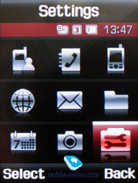
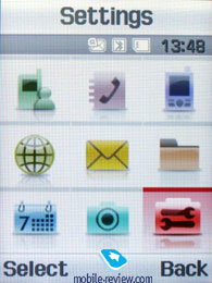
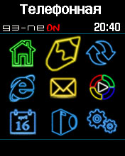
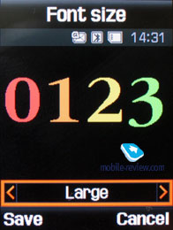
Interface is made in style of recent models, there are two themes (white and black) they are high contrast, but that’s about it. Unlike most models on today’s market (for example Nokia and Sony Ericsson), modification of whole menu style with help of themes is not supported. Thumbnails modification is a taboo, which limits users with selection that manufacturer had made. On other hand platform used for Samsung D900 can be modified according to your needs by some advanced users. Such examples can be seen in Samsung D500 Neon Edition (you can see menu screenshot here), as well as modification of menu and possibilities of Samsung D600. It is interesting that guys from forum.samsungpro.ru are trying to transfer firmware and main part of Samsung D900 on such model as Samsung D600. I think there’s nothing impossible in that, and soon such possibility will be discovered. With Samsung D900 becoming more and more wide-spread, it will become actively modified, you will see unofficial patches and firmware released. Manufacturer is a lot more inert than independent developers.
 

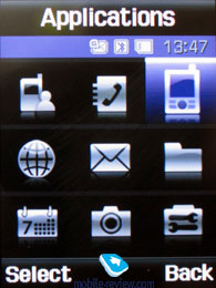
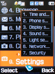
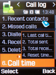
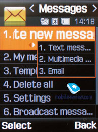
Main menu can be introduced as icon matrix (3x3) or as list. All sub-menus have horizontal lists, in case there’s sub-menu, you will see pop-up list on the right of highlighted item. You see which items are stored underneath, and once you press OK button – you will get there. In case you lean navigation key on the right or on the left, you will be able to access corresponding item at once. Ergonomics of such solution is evident, at least one key-press will be saved, and this is interesting solution developed by Samsung.
Video demonstrating how menu operates (wmv, 1.4 mb)>>>
 
Another pleasant interface addition which is unique for Samsung phones is memorization of position in each sub-menu and main menu. Handset will “remember” which function you addressed last time, and will highlight it automatically next time you enter same menu item. For example you selected call list in main menu, done some operations in it, and next time you enter main menu you will have it highlighted in first place. But that’s not all; once you access it again you will see that sub-menu item which was addressed last will be highlighted too. It seems to be a simple thing, but it is not present in handsets produced by any other manufacturer.
When selecting one or another item in the list you will see it highlighted, and font size (which is big already) will be increased.
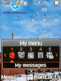
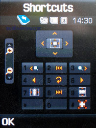
Fast numeric keypad navigation is supported, but that’s not all options of menu navigation. You can bind three different applications from the list, offered by manufacturer (you will not be able to bind java applications). Leaning navi-key up will always activate My Menu, this is horizontal scroll with list of items. This list is identical to one for simple shortcuts. Handset also offers Advanced Shortcuts (you have to disable fast dial feature for that, otherwise this feature is blocked). Once you hold the button you will be able to perform several actions, like converting one unit into other, or start dialing SMS-message to this number, add event to selected date or setup alarm clock. In each case you have to use correct number format (for calendar it is date, for alarm clock – time). You will see hints on display that will tell you on which side you will get certain feature. This function is pretty interesting and makes your life better.
Video, dialing number and “My Menu” (wmv, 1.5 mb)>>>
Video demonstrating Advanced Shortcuts feature (wmv, 884 kb)>>>

Increase of model functionality forces inevitable need of creating new solutions in terms of interface, Samsung’s approach in this area is different from other manufacturers, company is trying not to make its products complicated, which sometimes causes serious issues and hurts ergonomics. For example WAP profile settings are done separately from Java settings, even though they match each other in most cases. There are a lot of examples of this kind. This makes an impression of weak integration, which is typical for Samsung phones on the whole. On other hand, company is developing its interfaces in interesting direction, and Samsung D900 is a verification of that, it introduced Living World feature.
Living World. Until recent times all information about events in handsets has been carrying text style only. No matter what information it was a new message or banal time display, in any case we’ve seen text and, possibly, an icon (analogue clock – first approach to graphic display). Of course we can state that even first handsets had graphics displayed in status bar (battery meter, different event icons), but saying that these solutions were interesting or unusual would not be true at all.
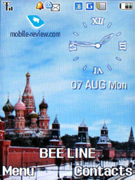
For the first time ever for a mobile phone we can see that Samsung D900 has managed to present beginning of new era – graphical interface. Settings of which depend on user’s location. It’s nto a secret that handset can identify user’s location including city and country, what should prevent manufacturers from using this information?
First step in this approach was creating own sets of wallpapers for each country (in future we can hope for seeing customized wallpapers for towns, but this is not so evident). When you will be in Moscow you will see Kremlin wharf and triumphal arch in case you’re in Paris, as for London – house of parliaments, and so on. One image is assigned to each country; they are all located in a special theme. User can change his location via menu, wallpaper will be changed automatically then.

Besides graphical assignation manufacturer decided to modify wallpaper depending on time of day: in the morning you see sun, and in the evening you see blinding lights of Kremlin wharf, cars will have their headlights turned on. An interesting addition to interface, but that’s not all, there are more interface improvements.
Time is not the only event that can be transferred into graphical approach. For example network reception level: good signal – sky is blue, no signal or weak one – sky is covered with clouds. At first you don’t pay much attention to this small feature, but after a month you will look on the sky instead of standard bar, information can be acquired instantly.
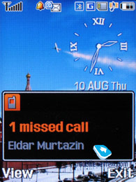
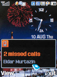
That’s not all surprises stored in Living World. For new messages, missed events or alarm clocks there is a special way of displaying, which is powered with standard, traditional pop-up window with text. In daytime such events will be demonstrated with help of airplane that will fly through the sky, and in the evening that would be fireworks. Color will change according to event type. At a glance this system looks kind of complicated, especially during its description, but in reality it is crystal clear and understandable.
Video: new message in Living World (wmv, 1.4 Mb))>>>
 
Initially handset has support of such countries as: United Kingdom, Germany, Italy, France, Netherlands, Sweden, Russia, Spain. Later on Austria, Belgium, Croatia, Denmark, Czech Republic, Finland, Latvia, Lithuania, Norway, Poland, Portugal, Romania, Serbia, Slovakia, Slovenia, Switzerland, Ukraine and Uzbekistan were added.
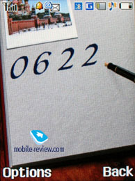
When dialing a number you will see a small image with main theme display and animation of the dialed number.

Work done by Samsung is brilliant, this is first step to creating graphical interactive interfaces, this approach has not been developed at all until today, and company is putting great effort in attempt to perform a breakthrough in near future. Living World feature is one of additional functions that make the handset more attractive and unusual. Company is trying to make its handsets diversified with such functionality, take Vivid Message feature that was introduced recently (more details in Messages section).

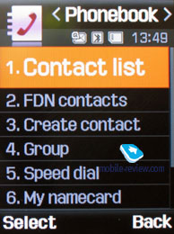
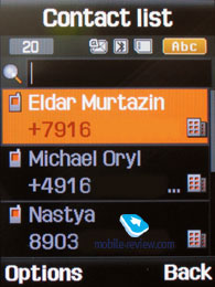
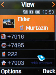
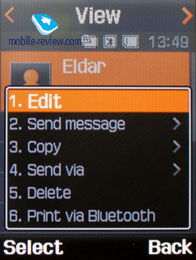
Phonebook. Contacts can be accessed by pressing right soft key, you will see a list that contains all entries from both SIM-card and phone’s memory. By default first name is highlighted, and you will see phone number in service text line (SIM-card entries are displayed with corresponding icon). Fast name search by first letters is supported; there can be up to twenty of those, for any language. Once you press OK key you will go into detailed view of selected entry. There you will see a thumbnail in case there had been one assigned. It can be an image, a photo or a video clip. Each entry can have up to 5 phone numbers of different types (cellular, office, home, fax other), one of them will be main one (by default it is the first one you entered). All fields are fixed.


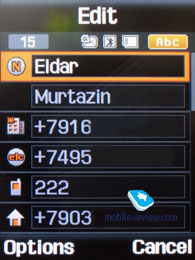
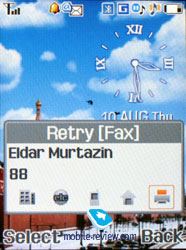
There are two lines for First Name and Last Name (search is conducted only by first field), fields get summed when displayed, Name comes first. For example Eldar Murtazin will be shown only in this order. Length of each field is 20 characters for any supported input language. You can also switch languages on the go when entering a name.
All entries, without regard to language, are sorted out under the algorithm – all contacts with headings made in a local language (Russian, for example) go first and then those with names in English. This is rather convenient and handy list sorting system. Taking into account fast language switch option during the search, it’s clear that no language will spoil the experience of working with this phone.
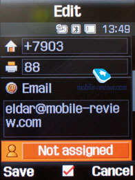
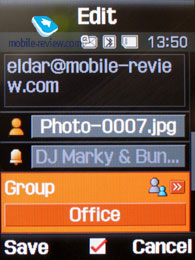
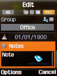
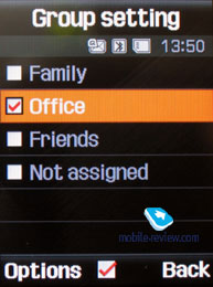
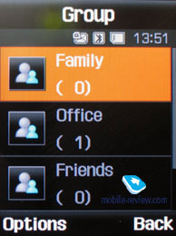
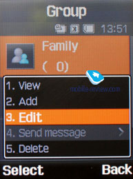
But let us return to the information entered for a contact. Apart from phone numbers, e-mail address (there may be several of them), a little text memo can be submitted on top of all that. Any music file as well as composed MP3's can be picked as a ring tone for a contact. Three caller groups are provided by default with the possibility for creating any number of additional groups, selecting a personal melody and image for each (by default there are three groups). SMS alerts are also customizable.
The phonebook is capable of holding up to 1000 contacts with filled in data fields. Even if all the available blanks are not used, the cap won’t get any bigger and will still make one thousand. It is possible to set in the settings where all new numbers should be kept by default. There is also an option for moving entries from the SIM-card although the vice versa action is denied. According to the developers, PC (MS Outlook in particular) is best for data synchronization with the D900. Any contact in the form of SMS/MMS, mail message or other text file can be quickly sent through Bluetooth to another device. There are no problems with sending and the phonebook entry being transmitted to another device, where it is read without any trouble.
The phonebook may contain a business card as well, though its structure copies all the fields applied to a regular contact in the phone book.
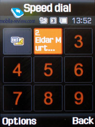
There can be up to eight numbers in the fast dial list; separate numbers tied up with a single contact may appear on this list as well. The subtitle of the chosen entry (not of the phone number type) is displayed on the buttons.
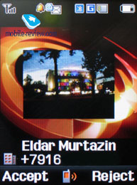
When receiving a call, a picture occupies not the entire screen, but only a part of it, however it still takes up a considerable area.

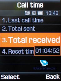
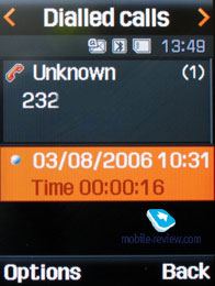
Call lists. Each of the given lists contains up to 30 phone numbers. There is a combined list of all the last calls with an icon indicating a call type. Deflecting the navi-pad horizontally, you can switch quickly from one list to another. The date and the time of a call without special note of duration are displayed in extended view for separate entries. Calls from/to one number are summarized, so that a number standing next to the call specifies total amount of calls made. In order to access duration data you will need to call up detailed information on desired item. As always, the overall time of the calls and their prices can be viewed in this menu (in case the service has been enabled).
 

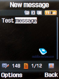
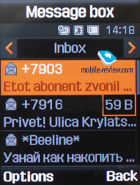
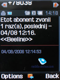
Messages. Working with various types of messages is implemented through separate submenus. Let us begin with short messages. The phone memory can hold up to 200 messages simultaneously; the handset supports EMS standard compatible with Nokia Smart Messaging. T9 text input capability comes in handy and is easy to use. When at choosing recipient window, you can either select a telephone number from your contacts or pick one from the call lists or groups. All messages are manageable, this means you are at liberty to move a certain number to your black list, in order to make sure all messages coming from that phone number will be deleted automatically; possibility for moving messages to any own folder is also at your disposal. For e-mail you can move not only addresses to the blacklist, but unwanted subjects as well.


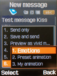
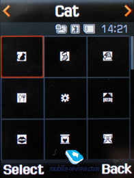
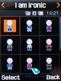
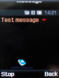
One of the options on the menu is Vivid Message, which allows viewing a message in 3D mode – the handset converts frequently used words to graphics, for example having typed “Kiss you”, you will see lips, blowing kisses. On the face of it, a simple algorithm that allows manifesting your imagination.

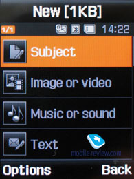
MMS. The interface for multimedia messages looks quite good; the messages can be saved in several folders right away after receiving or drawing up. There are no size restrictions on received messages, though an outgoing message’s size is limited 295 KB. As for additional services available with the D900, advertising messages rejection and message receiving type options are onboard. All messages are stored in general dynamic memory, the same goes for e-mails.
 
 
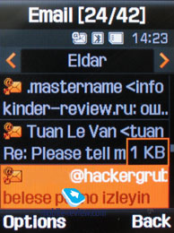
The bundled mail client is standard in all its components – 5 accounts and the maximum of 100 incoming messages; attachments are also handled by the phone, though there are also several caps – there’s no way you can receive a file more than 5 Mb in size, or send one with size exceeding 300 kb.
 
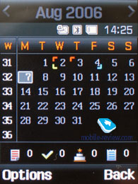
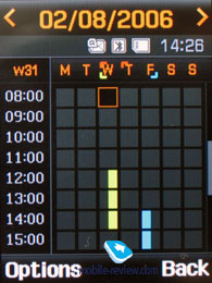
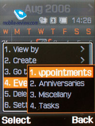
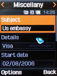
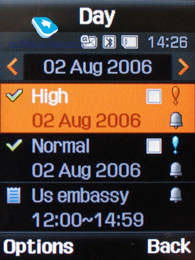
Planner. There can be up to 400 different events of four types (4x100) - meeting, affair, anniversary and others. The day and the time as well as end time of the even are indicated for each entry. Alert signal, as well as its duration can be adjusted according to your liking; repeatable events are available for setting up (at that repetition time is also adjustable as well as exclusion dates). The weekly and the monthly calendar views are very convenient with each type of the event having its own color.
 
 
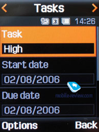
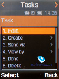
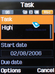
Tasks – a standard list of tasks with the possibility of stating priority. Maximum capacity of this section is 20 entries.
 
 
Speaking about the organizer’s shortcoming, I cannot overlook the fact that when typing date and time for an event, the end time doesn’t change, which badly hurts ease of use – other manufacturers make the due time shift automatically (by default an event takes one hour).
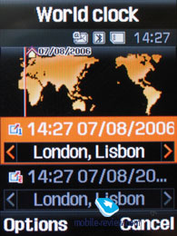
World time is displayed for two chosen cities.

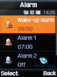
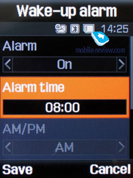
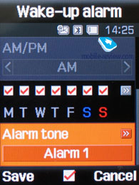
Alarm clock. The phone is equipped with three alarm clocks. One is meant for mornings and can be set for selected weekdays as well as for weekends. For each of the alarm clocks there is a selection of five tunes, though necessity of them is questionable, as mp3 tracks can be used there as well. It is up to user to set up whether the phone will turn on automatically in the time of the event or not.
 

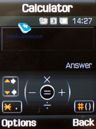
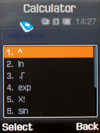
Calculator. It divides, multiplies, subtracts and adds and does several more things – quite enough for a mobile calculator.
 
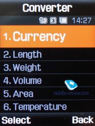
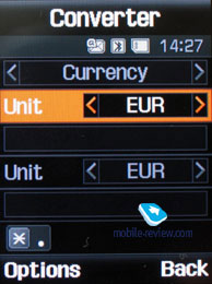
With a converter, you can operate with different units of measurements as well as with a number of currencies.
 
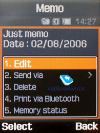
Memo – standard text notes.
 
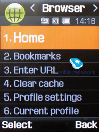
WAP. There is a wap-browser ver. 2.0, similar to that carried by some phones by Nokia and Sony Ericsson, using http protocol. The browser automatically offers you standard prefixes and endings of the entered addresses. Although it’s packed with features, it would make more sense if you replace it with Opera Mini. On top of that it doesn’t support loading big pages, so that its area of application gets reduced to something located between slim and nil, as it will handle only wap-pages, while real Internet page will remain off-limits to it.
 
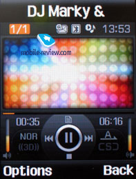
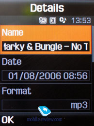
Applications. MP3 player. An integrated mp3 player, supporting random track playback, sequential and cyclic, is available on the phone. Mp3 files can be uploaded to the phone both directly through Bluetooth and through a synchronization application. There are no limitations, placed on tags and names of music files. The user is armed with nearly 80 Mb of storage (and memory cards) for filling up with music and other apps and other content.
Video, MP3-player in operation (wmv, 1.1 Mb)>>>
 
 
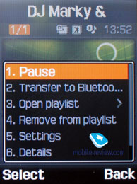
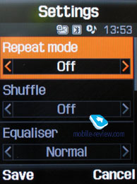
The title of the played back track is displayed as well as the number of the remaining tracks. The equalizer doesn’t make much sense, as there is no precise adjustment of audio controls (only a possibility to choose from classic, rock, jazz and normal sounding). The tracks can be played through the stereo headset as well as through the speakerphone. The volume bar has 10 scales on it. And of course user can make up playlists of his own. Player can work in minimized mode.
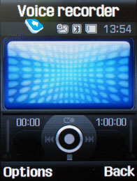
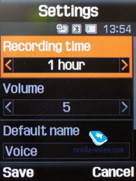
Voice recorder. You can record up to several hours of voice memos with the number of files being unlimited. Basically, limitations on recording durations are set by user himself, though length of a single recording cannot exceed 1 hour. All the files are stored in a separate folder in the memory bank. The recorder performs well during lectures, conferences and presentations – I could even say that it is a partial substitute for a digital tape recorder.
 
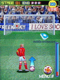
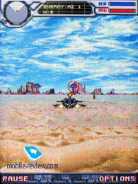
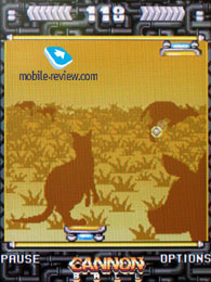
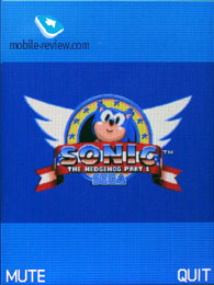
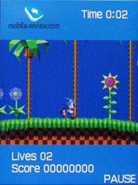
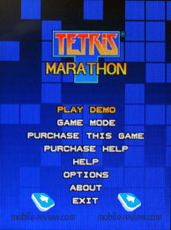
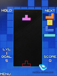
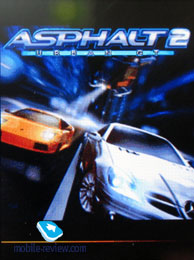
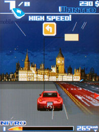
Java World. The D900 carries 7 pre-installed games – 4 full versions (Freekick, Forgotten Warrior, ArchAngel, Cannon Ball) and 3 demos (limitation on levels or time). Demo versions look pretty interesting, as there can be Asphalt 2 Urban GT, Sonic and so on. Since the model belongs to Suwon’s nest, it doesn’t have support for usual methods of uploading Java via Bluetooth or cable (requires a look-up in service settings and activation, though malfunctions will occur from time to time). JAR-file cannot exceed 1 Mb in size (at that uploading via wap is limited to 500 Kb). Memory assigned to storing Java-based applications makes 4 Mb and taking account of already pre-installed apps, I doubt new games or programs will squeeze into 500-600 Kb. However you’re at liberty to delete any of the default games.


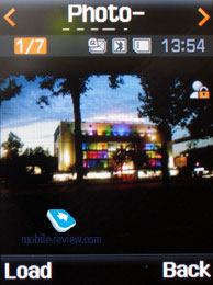
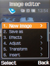
Image editor. A basic picture editor, which allows transforming images by using a variety tools.
 
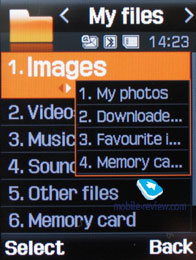
File Manager (My files). That’s the place to search for all files such as music, pictures, video and sounds. Any uploaded file gets stored here. The disadvantage is that files sometimes are not displayed in the list immediately - in that case you will need to leave the menu and enter it again.
 
Files and folders can be viewed either as a list or as thumbnails. You can select any amount of files. The handset supports Move, Copy and Delete operations, as well as various types of sorting (by type, name or size)
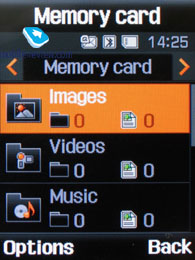
Memory card’s file structure is a slightly different story, as it can be accessed through the main menu, where each item features “Memory card” option.
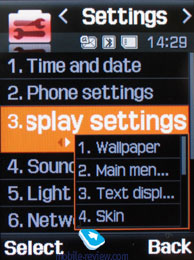
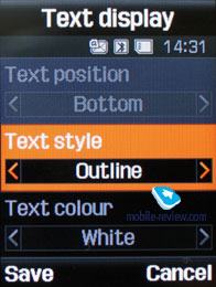
Settings. This item boasts a standard set of options inside - font color in the standby mode, password protection of selected sections (messages, short messages, organizer, etc.), backlighting duration and brightness, dialing display (no custom animations are available, one is assigned to the default theme – Living World). Calling up Security item allows protecting certain functions and menus with password.
 
 
Backlighting duration –there are three options at your disposal, one of them is Night mode , implying that backlighting will be active only between 5:00 PM and 9:00 AM and disabled during daylight. If you come and think of it, this feature nothing more but an illusive replacement for illumination indicator, which Motorola’s handsets are armed with.
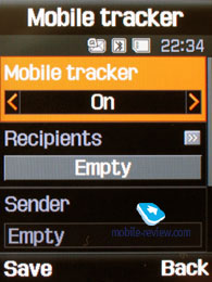
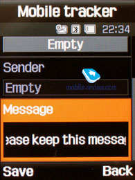
Mobile Tracker – submit a phone number, where notifications will be sent to in case SIM-card was changed – that message will contain number of the SIM-card being used with the handset. This section is protected with password, so that no one other than you or someone else who knows the password could disable the Tracker. Should your device have the SIM-card switched once, the specified number will receive one message instantly, and one more each time a new card is plugged in. A fetching feature which can prove to be of much help in case the handset is lost or stolen.
 
Flight mode – you can disable network part of handset.
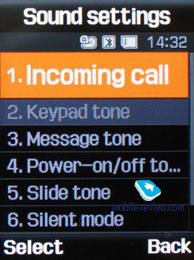
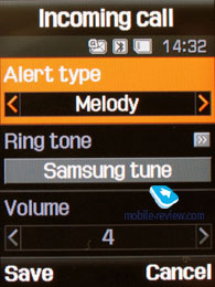
The handset lacks profiles system and offers only adjustable events settings, which makes it look like it came from the past – for example, newest Samsung’s 3G devices have profiles onboard (though many other functions have disappeared). The D900 has got many vibrating alert modes and tunes in its sleeve, everything here works without any limitations, but what really frustrates me is inability to set an own tune for incoming SMS-message or e-mail – you are enabled to choose only from 10 pre-installed simple tunes found on the handset. On the other hand, ring tones are adjustable for contact groups, stand-alone entries in the phonebook and even for the alarm clock; therefore it’s somewhat obscure why not all alerts are customizable.
 
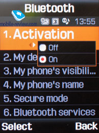
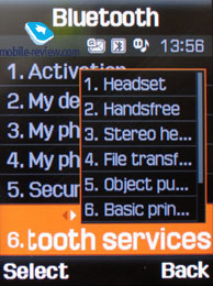
Bluetooth. The handset supports various profiles, namely, Headset, Handsfree, Serial Port, Dial Up Networking, File Transfer, Object Push. The Bluetooth realization is not ideal, troubles with headsets having only a Headset profile appear pretty often, and speakerphone is handled in improper way sometimes either. In general the Bluetooth found on the D900 is comparable to that on Nokia’s phones, but worse than on Sony Ericsson.
 
USB-connectivity. The menu enables you to pick one of the three available modes: Modem, Mass Storage, Pictbridge. While in USB Mass Storage, the D900 shows up on the desktop without having to install any additional drivers, so right after plugging it’s ready to work. However USB 1.1 isn’t inspiring at all when using big memory cards, so in that case using card readers would make sense.
Voice Clarity – an equalizer-like feature, which allows boosting voice quality in some conditions (on unstable connection). By default this option is turned on.
Slide settings item features options which can be assigned to opening and closing, in other words they determine whether the slider is active or not.
Reject call with SMS – such function is still uncommon on ordinary phones, while Symbian-based smartphones have been boasting it for quite a while already. The point here is quite simple, however: you create a message and when you reject an incoming call for some reasons, this SMS will be sent to the caller’s number automatically. But all in all, the feature is a high profile one, relevant to a very limited amount of users.
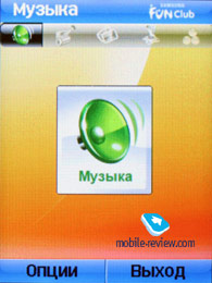
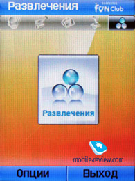
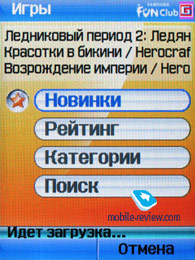
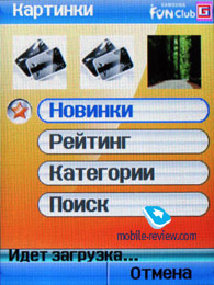
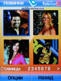
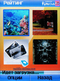
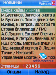
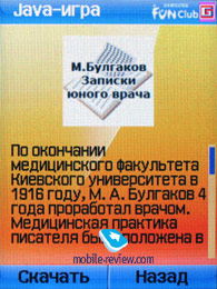
Samsung Fun Club browser. Model D900 is the second device to include a Java-application empowering you with access to iFree services, namely Samsung Fun Club. It’s just one press away while you’re in standby mode – push “OK” and the program will start up. The concept and the way it’s implemented are meant for Russia only – handsets in other regions won’t have it on board.
 
The application’s home screen contains 5 tabs – music, video, pictures, games and entertainment. Despite the promising title, the amount of free content is miserable; one could even say there is none at all. Apart from hackneyed pictures, there are MP3 tracks and clips available as well, which will cost you a coin: 2 USD for video, 3 USD for a game and “only” 99 cents for a tune. Personally I find it absolutely clear that over at i-Free they have found a perfect way for distributing their catalogues for free, but it seems the company hasn’t taken account of the Russian law, ordering to state all prices in national currency.


Another frustrating thing about the application is absence of any hint that all content upload services available through Samsung Fun Club are not free. Generally speaking, you won’t find any content taken from original Samsung Fun Club. It’s a dating service running on i-Free’s base and content made up by this provider. To my surprise, a call to so-called “support service” turned out to be charged, at that the voice on the other end seemingly didn’t know much about Samsung even. There you will be assisted only in case of issues with uploading only.
For getting a better idea of i-Free specialization, I called at their official page http://www.i-free.ru/. Surprisingly, I found out that this site was a magnet for ads and other banners – I counted about ten erotic pictures alternated with kittens, which amused me very much. It seems that even the administrators of this all-round “marvelous” site couldn’t stand watching so many nude bodies.
The high-flown words telling you that “the provided content is tuned and developed specially for running on handsets manufactured by Samsung and get regularly updated by means of synchronization with the server” in reality mean that the application proposes not all pictures but only the ones fitting size limits, the same holds true for games etc. So this “technology” is nothing more but a hackneyed filter.
Why a provider like i-Free is running this service? It’s pretty obvious – just another way of making money, but what really makes me wonder, is Samsung’s intention. By cooperating with i-Free it places itself in the same boat with distributors of explicit content and might blow up its image in this way. Personally, I don’t think many will be pleased to make a call to the service centre and find out that it’s not free. Apparently, Samsung and i-Free consider consumers to be unsophisticated users unable to deal with something like that.
When purchasing not the cheapest phone, usually you don’t expect to get a free catalogue full of ads along with the handset. Even though some content is for adults only, the manufacturer doesn’t care to notify users of that. Moreover, the application cannot be deleted, as it’s a part of the system, so it can’t be helped. In the end such respectless treatment of users might lead to giving up on Samsung’s handsets (maybe I’m running to an extreme a little, but after my friend’s balance got had been reduced by 15 USD in 9 minutes, he gave me nearly the same comment on that).
On the whole, impunity of content providers in our country has passed all bounds. I don’t want to say there should be no freedom in choosing, on the contrary, I greatly appreciate it. But I truly don’t understand how many periodicals can deliberately post double pages containing explicit content (recently there was a major technological leap up – they covered some scenes with icons). On top of that, the target audience includes not adults, but teenagers instead – spreading such culture has already led to sorrowful results, as Russia has been in top three countries with biggest amount of stolen handsets for quite a while now. Other aspects are not getting better either; all in all it’s just another way of duping the society and the youth in particular.
As for the browser itself, I couldn’t squeeze much of use out of it. I will appreciate it, if you would spend 5 minutes answering a question about this function.
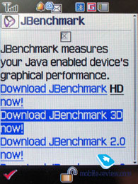
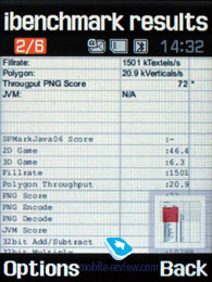
Performance. Unlike Gumi’s handsets, the D900 doesn’t support 3D packets, so we had been forced to measure its performance using Jbenchmark version one and two only, which turned out to be on the same level with Samsung-branded phones and devices released roughly two years ago. At least, it’s good to know that some things remain the same over the years. But, irony aside, facts are facts and according to them Samsung embeds worst Java engine in its phones, and regrettably in case of the D900, company has “outdone” itself.
| Jbenchmark 1 |
|
|
|
| Total Score: |
1584 |
|
|
| Details: |
|
| Text |
442 |
| 2D Shapes |
429 |
| 3D Shapes |
243 |
| Fill Rate |
148 |
| Animation |
322 |
|
|
| Screen Width |
240 |
| Screen Height |
286 |
| Color Screen |
true |
| Number of Colors |
65536 |
| Double Buffer |
true |
| Total Memory |
921600 |
| Free Memory |
530452 |
|
|
| MicroEdition Configuration |
CLDC-1.1 |
| MicroEdition Profiles: |
MIDP-2.0 |
| Microedition Platform: |
j2me |
| Microedition Encoding: |
ISO-8859-1 |
| Microedition Locale |
en-US |
| Jbenchmark 2 |
|
|
|
| Version |
2.1.1 |
|
|
| Total Score: |
97 |
|
|
| Details: |
|
| Image Manipulation |
75 |
| Text |
176 |
| Sprites |
64 |
| 3D Transform |
131 |
| User Interface |
77 |
|
|
| Screen (canvas) Width |
240 |
| Screen (canvas) Height |
286 |
| Color Screen |
true |
| Number of Colors |
65536 |
| JPEG Support |
true |
| Transparency (Alpha Level) |
256 |
| Double Buffer |
true |
| Total Memory |
921600 |
| Free Memory |
542648 |
|
|
| MicroEdition Configuration |
CLDC-1.1 |
| MicroEdition Profiles: |
MIDP 2.0 |
| Microedition Platform: |
j2me |
| Microedition Encoding: |
ISO-8859-1 |
| Microedition Locale |
en-US |
| JBenchmark3D |
|
| Perfomance |
|
| Jbenchmark3D HQ: |
87 |
| Jbenchmark3D LQ: |
132 |
| Triangles ps: |
10792 |
| kTexes ps: |
722 |
|
|
| version: |
3.1.0 |
|
|
| Screen(canvas)width: |
220 |
| Screen(canvas)height: |
176 |
|
|
| 3D Subsystem: |
|
| M3G Version: |
1 |
| Antialaising: |
false |
| True color: |
false |
| Dithering: |
false |
| Mipmapping: |
true |
| Perspective correction: |
true |
| Local camera lighting: |
false |
| Max lights: |
8 |
| Max Viewport dimensions: |
1024 |
| Max Texture Dimensions: |
256 |
| Max Sprite Crop Dimensions: |
1024 |
| Max Transforms Per Vertex: |
3 |
| Number of Texture Units: |
2 |
|
|
| Other properties |
|
| Color Screen |
true |
| Number of colors |
65536 |
| Transparency (alpha level) |
256 |
| Double buffer |
true |
| Total memory: |
4194276 |
| Free memory: |
3357872 |
|
|
| MicroEdition Configuration |
CLDC-1.1 |
| MicroEdition Profiles: |
MIDP 2.0 |
| Microedition Platform: |
j2me |
| Microedition Encoding: |
ISO-8859-1 |
| Microedition Locale |
en-US |
| Microedition Communication ports: |
null |
| Microedition Hostname: |
|
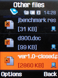
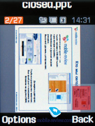
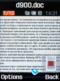
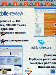
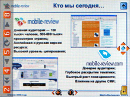
Picsel Viewer. One of the best things about the D900, similartly the D600, is Picsel Viewer. To put it shortly, Picsel Viewer is an application that is capable of opening MS Office files (for instance, MS Word, Excel, PowerPoint), Adobe Acrobat (PDF), graphical and video formats on the phone. All the pressure of the technology is its fast action, opening a 20 MB PDF file will take about a couple of seconds, then you can quickly scroll pages, scale them, rotate. No editing capabilities, only viewing, but that is enough sometimes, especially considering there is no need in extra converting for the mobile phone.
Video, working with Picsel Viewer (wmv, 2.1 Mb)>>>


Apart from viewing data on the screen, an image may be sent to external sources, for instance, a TV-set, projector. A TV-OUT cable is not included into the package. One end of the cable is a miniUSB connector and another one is three "tulips" for connecting to external sources. I had a TV-set as an external source. Plug all the cables in and connect the phone. And here it is! The menu is shown on the TV screen, moving along the phone menu you see your actions on the screen. Besides Picsel Viewer documents, you can view any standard applications, full-screen video (pixels are seen too much for 3GP files, the resolution is still improper), photos, play games if you like to. A TV-set not only represents the picture but reproduces the sound from the phone.
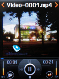
Video player. MPEG4 format (audio AAC) is supported, maximum possible bit rate makes 1.5 Mbps. The handset supports various resolutions up to CIF, however capturing in QVGA resolution (at 30 frames per second) is somewhat better. No extra features are enabled in these player, unless you call rewinding and full-screen mode (by pressing “1” key, the picture can be rotated in two directions) the ones.

Impressions
The communication quality delivered by the D900 matches that of other Samsung-branded devices and gives cause for no gripes. Overall ring tones volume as compared to Samsung D600 is slightly lower – in this respect the latest offspring reminds of Samsung D500. The vibrating alert is average strength-wise and features no fundamental enhancements.
In terms of software the handset retains a number of caps which would do for a previous generation device rather than for a today’s phone. For example, on an outgoing call the image assigned to the dialed contact is not shown at all and when receiving a call it takes up only a certain area on the screen. Absence of uploading Java over the air feature has nothing to do with political decisions – in fact, it results from poorness of implementation of Java engine in the D900 (disabled 3D applications, limited amount of memory). As for the bundled wap-browser, it has remained almost untouched, so it’s not even a question whether to install Opera Mini instead or not. However outdated technical features are not always that bad – DRM is still version 1 and it is one of the best things about the phone.
“A begging King” might prove to be the right slogan for this Samsung’s model; as a matter of fact it reveals the D900’s inconsistency. On one hand, it’s a true line-up’s flagship showing off a couple of fetching findings – it’s almost impossible to underestimate Living World or interface improvements. For example should you fail to reach someone, the phone will call up the contact’s name and scrollable list of assigned telephone numbers – a really credible feature resembling that found on Sony Ericsson’s latest devices, but in its turn Samsung went even further and extended it beyond the phonebook, so that this function works when dialing a number from the list of recent calls.

Judging by functionality, it’s evident that Samsung has made an attempt to raise a new, much more user-friendly device out of an old platform. Naturally all manufacturers are developing this concept and Samsung is at the front line, but due to dissociation of the company’s actions, many appealing features can’t work as a single whole. However, all other things being equal, it appears to be an attractive solution.
So far the market has seen only a few phones carrying a 3 Mpix camera, on top of that Nokia N80 is the only slider (apart from the D900) incorporating that technology, but this device has different goals and aims at different audience. Even though the D900 provides good quality, it can hardly be called the best available (it yields to Sony Ericsson K800i/K790i, Nokia N93). Basically the Samsung D600’s case, when we compared it with handsets by other manufacturers, repeats here, so it’s not a big surprise at all.
Functionality-wise, being a flagship Samsung D900 can’t withstand competition with Sony Ericsson K800i or Nokia 6233 (without regard for a terrific camera). When it comes to design and form-factor, the models doesn’t have any rivals at hand – similar Nokia’s slider will be released only in the beginning of 2007. The time gap is huge, thus by that moment Samsung’s handset will have already achieved good sale rates and earned favorable perception on the market. So the competition is more likely to take place between the company’s own solutions, since model Joy, which will get announced in the near future, will pack 3G support and video capturing in VGA resolution at 30 frames per second in the same design. And taking account of the 40 Euro price difference, Samsung D900’s position of the flagship is going to be significantly disturbed. Nevertheless Russian users can console themselves with the fact the Joy might not make it to Russia, as there are no 3G networks available here. Correspondingly, this model’s grey market will establish shortly after release.
For the Russian market, Samsung D900 is the company’s first experience in package amplification. Presence of a bluetooth-headset is meant for emphasizing premium segment, where the models comes from. However mediocre quality of the bundled headset evokes completely opposite thoughts. The only comforting thing about it is the fact that even without this headset the price wouldn’t change too much – actually I tend to regard it as a “free” gadget shipped with the model. If that’s the case, this headset is more than enough.
The standard kit includes a 256 Mb memory card as well, though the reasons, which made the company pick exactly this size, are somewhat obscure. As we can see nowadays, majority of manufacturers are shipping either a memory card with the lowest capacity (64 Mb) or a bulky one (512 Mb). In the D900’s case many might face the dilemma – throwing away a card of this size is not easy, but on the other hand its capacity is not enough for those keen on photography and music. All in all, a strange choice.
The retailers will offer the D900 at the price of 550-600 USD on the release, which is not cheap, but the same situation took place when its predecessors were launched. European supplies might feature different package, as the wholesale price for this handset makes nearly 350-370 Euro, while the end-users can purchase it today for 370-380 Euro. Undoubtedly the D900 will grab the title of the segment’s bestseller, but unlike Samsung D500 that will require more efforts and the leadership won’t be as overwhelming as it used to be. Releases of less expensive models featuring pretty much the same design at the end of this year can damage perception of this handset, since some consider it as fashion solution. In a nutshell, we have an appealing device on our hands, not without shortcomings, but at the same time retaining a number of attractions.
Review of Samsung D900’s 3 Mpix camera
Eldar Murtazin (eldar@mobile-review.com)
Translated by Oleg Kononosov (oleg.kononosov@mobile-review.com), Alexandr "Lexx" Zavoloka (alexander.zavoloka@mobile-review.com)
Published — 25 August 2006
Have something to add?! Write us... eldar@mobile-review.com
|
News:
[ 31-07 16:21 ]Sir Jony Ive: Apple Isn't In It For The Money
[ 31-07 13:34 ]Video: Nokia Designer Interviews
[ 31-07 13:10 ]RIM To Layoff 3,000 More Employees
[ 30-07 20:59 ]Video: iPhone 5 Housing Shown Off
[ 30-07 19:12 ]Android Fortunes Decline In U.S.
[ 25-07 16:18 ]Why Apple Is Suing Samsung?
[ 25-07 15:53 ]A Few Choice Quotes About Apple ... By Samsung
[ 23-07 20:25 ]Russian iOS Hacker Calls It A Day
[ 23-07 17:40 ]Video: It's Still Not Out, But Galaxy Note 10.1 Gets An Ad
[ 19-07 19:10 ]Another Loss For Nokia: $1 Billion Down In Q2
[ 19-07 17:22 ]British Judge Orders Apple To Run Ads Saying Samsung Did Not Copy Them
[ 19-07 16:57 ]iPhone 5 To Feature Nano-SIM Cards
[ 18-07 14:20 ]What The iPad Could Have Looked Like ...
[ 18-07 13:25 ]App Store Hack Is Still Going Strong Despite Apple's Best Efforts
[ 13-07 12:34 ]Infographic: The (Hypothetical) Sale Of RIM
[ 13-07 11:10 ]Video: iPhone Hacker Makes In-App Purchases Free
[ 12-07 19:50 ]iPhone 5 Images Leak Again
[ 12-07 17:51 ]Android Takes 50%+ Of U.S. And Europe
[ 11-07 16:02 ]Apple Involved In 60% Of Patent Suits
[ 11-07 13:14 ]Video: Kindle Fire Gets A Jelly Bean
Subscribe
|
