|
|
Review of GSM/UMTS-smartphone Nokia N76
Sales package:
- Handset
- Battery
- Charger
- USB data cable
- CD with software
- User Guide
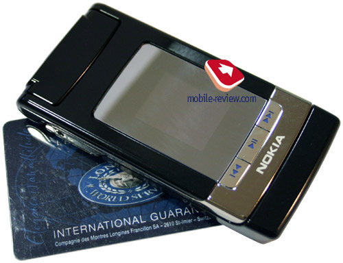
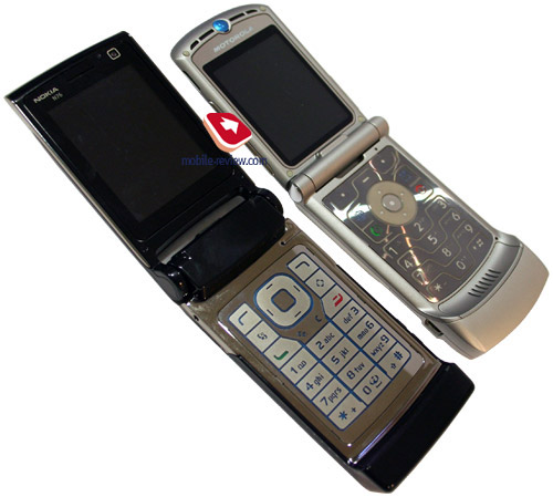
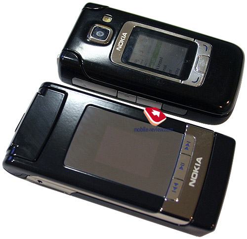
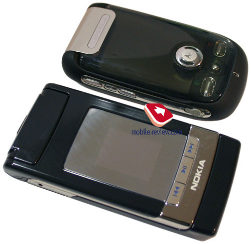
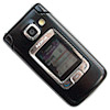
Eventually, Nokia just could not resist it and joined the race where the top prize is “slimmest phone ever” – at a glance its new model utilizes many curves and shapes of the this market’s icon - Motorola RAZR, but as you might have already guessed, its pluses are lying in a slightly different field, since the N76 is in fact a smartphone running Symbian OS augmented with S60 3rd edition FP1. Speaking about why we suppose the RAZR was on the head designer’s table at the time when he was sketching out Nokia N76 – a metal keypad is here, along with dents at the bottom and other bits and pieces giving away its origin.


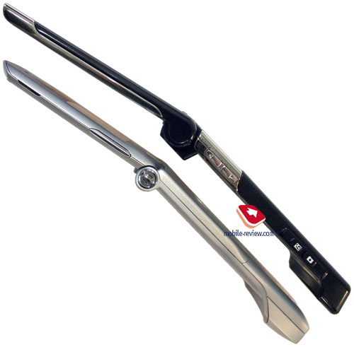
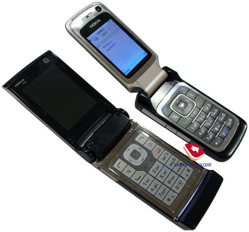
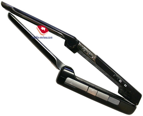
As a matter of fact, the company has managed to squeeze the hardware of the N76 into a casing only 13.7 mm deep, not due to cutting-edge alterations to the chassis; basically they have made it taller. Generally speaking Nokia 6290 is an exact replica of Nokia N76 – there aren’t many differences to dwell upon. While the 6290 measures 94x50x20.8 mm, the N76 presents us with 106.5x52x13.7 mm, meaning that it is a tad wider, almost 1 cm taller and all this for being reasonably thin.


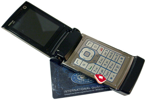
The handset is easy to hold in hands with the clam closed and it does leave a very strong impression – after all, it is a feature-packed smartphone with a whole lot of attractiveness inside. But otherwise eye-candy phone lacks ease of use – trying to flip it open reveals that not everything is about sunshine and rainbows there. The flip action is somewhat clunky due to the hinge lack auto-spring mechanism, so that the clam freezes half way up, and that is not all – the casing’s width and design don’t allow for opening the handset single-handedly, so you always end up using both hands


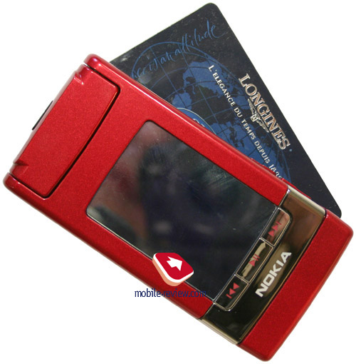
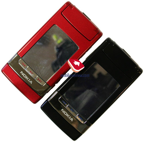
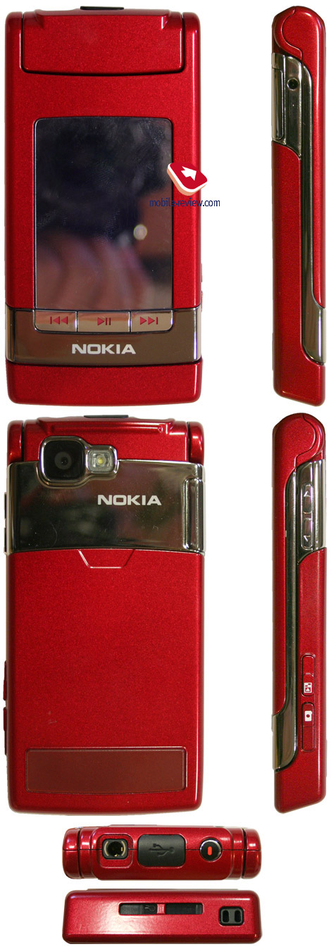
Trims available with the N76 are apparently aimed at the fashion conscious audience – these are the classic black and so popular among women red


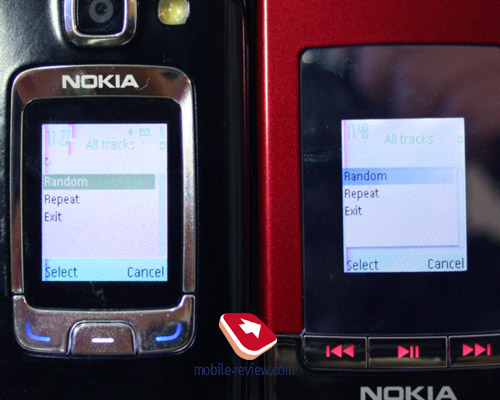
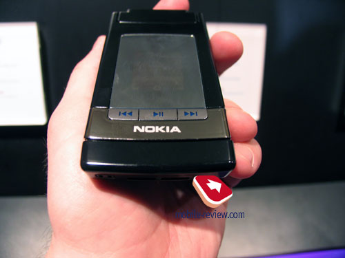
Another newsworthy drawback is glossy finishing of the casing, along with the mirror-like surface of the front plate. The phone collects much gunk within the very first minutes of playing around with it, so rubbing down is something you should get ready to do regularly. Because of the mirror-finished framing the external display seems to be a tad dimmer than that found on Nokia 6290.


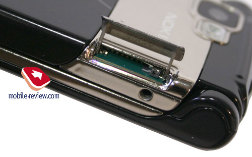
The left side houses microSD memory cards socket, covered by a drop-out flap – even though it looks splendid and promises no issues with getting to the socket itself, taking out the card is not always convenient, as your hands aren’t likely to fit in the tiny space around the socket. Next to the memory expansion slot is charger socket, which is an altogether strange design.

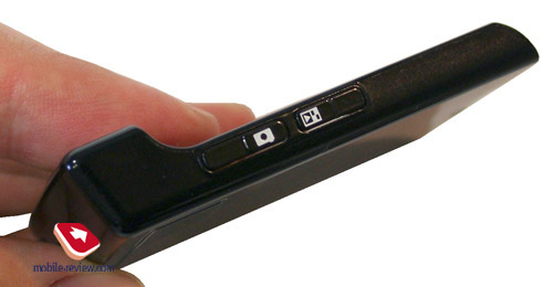
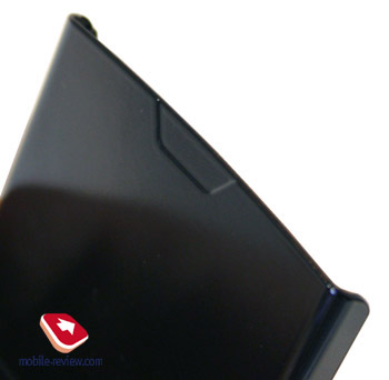
The dedicated camera button sits on the right, as well as gallery shortcut key, similar to those found on senior Nseries models. Volume rocker switch, doubling as zoom in/out button while shooting, accompanies the above controls on the right side.

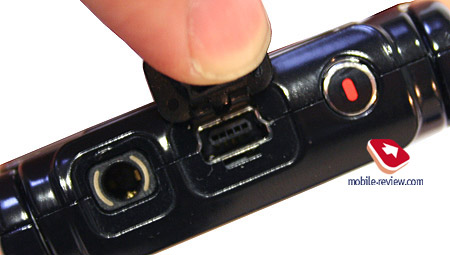
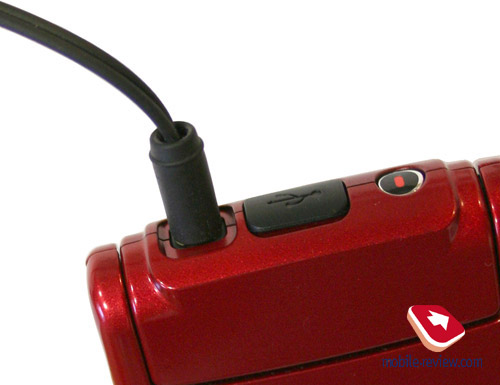
On the top end you will find a rubber-flap-covered miniUSB slot, as well as the power button and 3.5 mm audio jack. The N76 comes included with the HS-43 headset, which is different from the HS-42 found in the box with Nokia 5300, however this difference regards the jack they link up to – the former utilizes 3.5 mm, while the latter gadget asks for 2.5 mm.


The bottom rim is occupied by the speaker playing back ring tones and engaging when handsfree mode is activated.
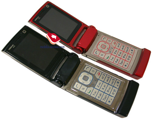
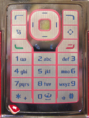
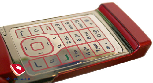
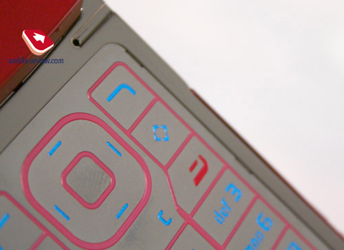
The keypad is made of metal with the framings between the buttons differing depending on the handset’s trim – on a red-colored phone they are red and on a black one – black respectively. In terms of ergonomics the numberpad is average, since keys offer barely-there feedback, but deliver pleasant tactile feelings thanks to their ribbed surface. Unlike Nokia 6290, this model still has the Pencil key on it. All keys are lit in blue (for the black trim and red – for the other color scheme); no issues with poor backlighting of certain symbols were spotted.


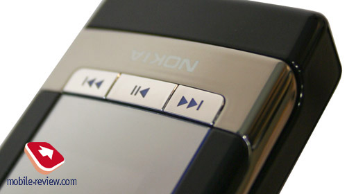
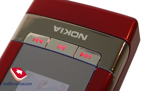
On the top half under the external display is a trio of function keys, lit in either black or red (it’s all up to the trim you own).


Often I stumble upon comments that Nokia N76 is entirely made of metal – but that is not the whole truth, as metal is applied only to the keypad, while almost each and every detail of the casing utilizes glossy plastic. To remove the battery cover you will have to flip the phone open and then pull the bottom part over. Speaking about the plastic quality, it is quite thick, which made me wonder a little. While the plastic used in the N76 is very good, it gets soiled in no time and sometimes reminds me of a fingerprint database.


Since we have started comparing these two handsets, then another place where the N76 falls short of Nokia 6290 is battery life. Nokia N76 utilizes a 700 mAh battery (BL-4B); as the manufacturer claims it can keep the phone up and running for up to 200 hours in standby mode and provides about 2 hours 45 minutes of talk time. A curious fact – for Nokia 6290 carrying a 950 mAh BL-5F onboard, the maker says 240 hours of lifetime in standby mode is its utmost limit. Keeping in mind that it would be a hastiness to take for granted what manufacturer claims regarding battery life, let us try to look into the real battery life put up by Nokia N76, or, better to say, how much worse it will be. Examining capacity of two batteries point-blank, then the gap will make up 35 percent, at that in normal conditions on average load Nokia 6290 manages to keep itself alive for about 2 days. Taking account of nonlinearity of charge wearing out, we can rightfully state that Nokia N76 is a handset that will require you to plug in the charge every evening, of course, if you are actually going to use it.


In music playback mode, as the maker assures, the N76 lasts up to 8 hours, but in practice it works for 4-5 hours depending on your current preferences, volume and type of headphones.
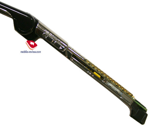
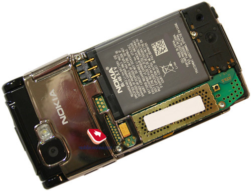
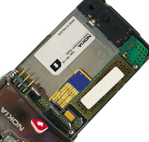
The N76 is remarkable for being the first Nokia-branded model to have a reversed battery contacts layout.
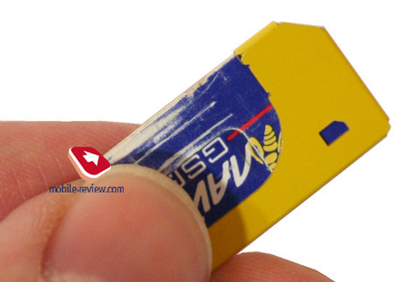
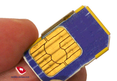
The SIM card bed placed beneath the battery is another point of interest, being in fact a yellow tray where you put the card into. With it detached you can see how thin the keypad’s plate is, and basically what keeps the N76 in one piece - metal chassis of the handset.


The N76’s internal display is similar to that found in Nokia N75, measuring up at 2.4” diagonally, while Nokia 6290 falls only marginally short of its fabulous brother-in-arms by putting up 2.2”. To me the screen embedded in Nokia N76 is somewhat crisper, more vivid and color-filled. Sporting a resolution of 240x320 pixels and 16 mln colors, it does well in the sun.
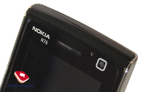
The internal screen is topped by an earpiece as well as a forward-facing camera for video calls within 3G networks, and an ambient light sensor.

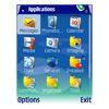
Software-wise these two models are completely identical, the only difference is possibility to go into landscape mode on the internal display. Support for A2DP profile is currently missing.
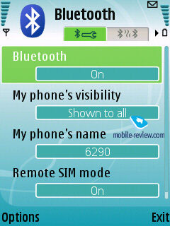
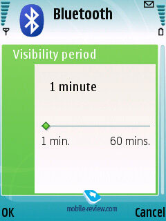
Bluetooth. The smartphone carries EDR-enabled Bluetooth 2.0 onboard, as well as the following profiles:
- BIP-ImagePush;
- DUN-GW;
- FT-Server;
- HandsFree-AG (1.0);
- Headset-AG;
- OBEX;
- OPP-Client;
- OPP-Server;
- SIM Access-Server.
Regrettably, there is no A2DP profile here, meaning that there is no way to transfer stereo-sound to a wireless headset. And we are truly eager to find out the origin of the gossips about the 6290 supporting this profile. Genreally, Nokia Mobile Phones’s solutions powered by the S60 are getting this profile on the board later than Nseries-branded smartphones.
 
An average Bluetooth data connection makes it to the level of 100 Kb/s.
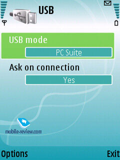
USB. The 6290 houses the miniUSB-socket (no charging-over-the-cable is available, though), on C connection you are free to pick from USB Mass Storage, PC Suite, and Modem mode. With USB ver 2.0 in its pocket, the handset presents you with about 800 Kb/s in USB Mass Storage mode.

External screen interface - Cover UI
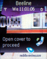
Ever since its very first fold phones Nokia has been trying to squeeze as much out of the external screen as possible by putting on it every last thing they could. The N76’s external screen, similarly to that found on the 6290, measures 22x28 mm (1.36”) in size at a resolution of 128x160 pixels. Just a few years ago such kind of screen was typical for all ordinary phones – the one found here display is smaller in size but this fact has no impact on the resolution used. It really plays into the company’s hands, helping it to bring about one of the strongest solutions in the world of mobile phones, so called, Cover User Interface. The screen utilizes TFT-technology and displays up to 262 K colors, having no issues with handling the sunlight in a convenient fashion. The screen accommodates 6 text lines and 2 service lines.
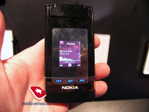
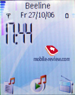
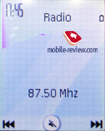
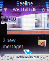
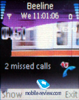
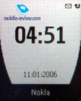
Now let us take a closer look at what is so special about Nokia N76’s external screen, since we have endowed Cover UI with the title of “strongest solution” out there. While at the standby screen you can see all service indicators, time and 3 icons serving as captions for the outer buttons (there are three of them respectively). The right button allows calling up radio, having started up the radio, the keys on the right and on the left will enable you to scroll through stations. The middle button in standby mode acts as a dedicated player key, bringing up the corresponding application, pressing the left key selects playlists grouped by artist, genre or draws up the list of the most frequently used files etc. To navigate through the list you should use the side volume control key, which is quite intuitive and probably won’t cause any hardships for you.
 

But this is the point when we are wrapping our story about the external screen’s features up. With a long press of the left soft-key the phone starts reading out all messages you have, while the pushing the button on the right actives voice dialing (which requires a plugged in headset, as with the microphone inside it is impossible to dial numbers due to the clam being closed).
 

The list of missed calls can be checked out without the bother of flipping the phone open. It is quite pleasant that the external screen may be used for looking through text messages as well. Should the massage contain any attachments, the device will suggest you to open it for the N76 isn’t something magical and won’t allow browsing attachments with the clam closed. As for functions we use countless times daily, the handset handles them in closed condition in most cases, which does come in handy occasionally.
 
While speaking on the phone, people around you can see black-and-white picture of the handset on the external screen. I have no right to judge whether it is good or not, but it is a matter of fact that you cannot remain inconspicuous while having a phone conversation. So do not use this phone to share your secrets with someone or to imitate a call – it just won’t work out!

With the help of the settings you can modify brightness and dress up the external screen in any way you like (making it fresh and smooth with some pictures or animation, for instance). It is worth mentioning that while setting up the picture you can easily cut it. The device itself suggests you how to make the picture fit in the display. While in standby mode the screen dims and falls into power-saving mode. The settings enable you to set the digital watch as screensaver – if that’s the case they will be on the screen all the time.
All the functions that have been mentioned above seem quite simple but it is only Nokia among all other companies who has been able to implement them – which is a really good thing about Nokia’s products, scheduled for release in 2007.
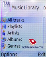
The music player the N76 is armed with turns out to be considerably superior to that found on Nokia 6290, for it offers you much more flexible settings including visualization effects, support for Album Arts.
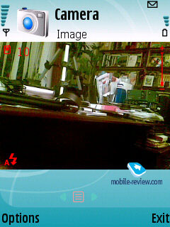
Camera. Just like many S60-powered devices, the N76 houses a 2 Mpix CMOS-camera manufactured by Toshiba. But unless you are in great lighting conditions, the shots will keep going out noisy and blurry and regrettably the LED flash here doesn’t save the day.
Unlike Nokia 6290 the fabulous N76 boasts landscape shooting mode with the clam closed, which is another benefit of having the camera on the rear.
 
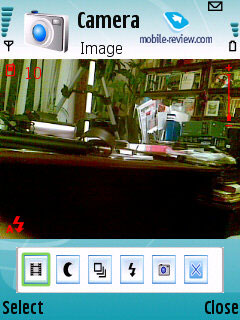
Using the settings you can pick one of the following image resolutions – 1600x1200, 1152x764, 640x480 and 320x240 pixels. The pictures quality varies from High to Basic, with Normal as a happy medium. Such shooting modes as single shot, multi-shot, self-timer (10, 20 or 30 seconds) are also available. You can also make use of the night mode, white balance settings (Sunny, Incandescent, Fluorescent). The Sepia, Black&White, Negative overlays help you to alter color settings. As it was mentioned above the flash utilizes LED technology. Digital Zoom can be activated by leaning the navigation key, but in the end you won’t be happy with it, as the bundled editor gives you an opportunity to zoom in the picture in the view mode with the better image quality.
 |
 |
(+)
maximize, 1600x1200, JPEG |
(+)
maximize, 1600x1200, JPEG |
 |
 |
(+)
maximize, 1600x1200, JPEG |
(+)
maximize, 1600x1200, JPEG |
 |
 |
(+)
maximize, 1600x1200, JPEG |
(+)
maximize, 1600x1200, JPEG |
 |
 |
(+)
maximize, 1600x1200, JPEG |
(+)
maximize, 1600x1200, JPEG |
 |
 |
(+)
maximize, 1600x1200, JPEG |
(+)
maximize, 1600x1200, JPEG |
 |
 |
(+)
maximize, 1600x1200, JPEG |
(+)
maximize, 1600x1200, JPEG |
Video is recorded in quite mediocre quality. The 320x240, 176x144 and 128x96 pixels resolutions at 15 FPS are available, the N76 saves all clips in .3GP files, and some of them may have the sound turned off – it’s up to you to decide. As for the time limit, they are non-existent now, except the MMS-mode.
Video sample 1 (mp4, 2.1 Mb)>>>
Video sample 2 (mp4, 1.4 Mb)>>>
Video sample 3 (mp4, 632 Kb)>>>
Video sample 4 (mp4, 996 Kb)>>>
Impressions
Apart from the battery life and absence of stereo-speakers, Nokia 6290 and Nokia N76 are twins. I should mention it that the design of the senior solution is different and one could hardly make a mistake about that – Nokia N76 is positioned as a fashion solution, with vivid trims speaking in favor of this assumption, specifically red and black color schemes. Overall the handset looks pretty stylish and will surely appeal to many; to me this is what the company is betting on – to draw attention of those who have struck Nokia 6290 off their short-lists for some reasons.
Getting down to the N76’s flaws, I have to name its ergonomics in the first place – as a matter of fact it’s the most awkward folder of all I have got my hands on over the past few years, flipping it open is a real pain. Also, I do not like the casing’s being a true magnet for gunk and mediocre battery life. It turns out that this very handset has fashion conscious users as its target audience, but does it really need S60 platform? Simple – it doesn’t, however those picking the N76 will get it as a makeweight to the stylish design, even being not aware of it on some occasions. And this might let the handset down, as glamorous buyers (girls) are likely to overlook what it has to offer.
On the one hand Nokia N76 sports prowess in the music department (presence of standard 3.5 mm audio jack, more advanced player that that of Nokia 6290), at that the manufacturer himself tried to put the music abilities of the phone into the limelight by etching corresponding captions on the dedicated music keys located under the external display. But on the other hand I could hardly endow it with the title “music centric” offering – far-below-average lifetime in music layback mode (4-5 hours is very and very insufficient) just won’t let me do it.
The model is arriving in the market in March, two or three weeks after Nokia 6290 at a tax-free price of 390 Euro, the changes made to the sales package are almost non-existent and include only presence of USB data cable DKE-2. The company is looking forward to benefiting from the top-notch design, since these are otherwise two identical offerings. However there are – on one handset buttons on the front cover are dubbed as music tailored, whereas on the other phone they simply lack captions. All in all, consumers will have a hard time deciding which of these models to go for.
P.S. As for the handset’s hardware and some software-related highlights, they were covered in the review on Nokia 6290, so I strongly recommend that you read it.
Related link:
Eldar Murtazin (eldar@mobile-review.com)
Translated by Oleg Kononosov (oleg.kononosov@mobile-review.com)
Published — 13 January 2007
Have something to add?! Write us... eldar@mobile-review.com
|
News:
[ 31-07 16:21 ]Sir Jony Ive: Apple Isn't In It For The Money
[ 31-07 13:34 ]Video: Nokia Designer Interviews
[ 31-07 13:10 ]RIM To Layoff 3,000 More Employees
[ 30-07 20:59 ]Video: iPhone 5 Housing Shown Off
[ 30-07 19:12 ]Android Fortunes Decline In U.S.
[ 25-07 16:18 ]Why Apple Is Suing Samsung?
[ 25-07 15:53 ]A Few Choice Quotes About Apple ... By Samsung
[ 23-07 20:25 ]Russian iOS Hacker Calls It A Day
[ 23-07 17:40 ]Video: It's Still Not Out, But Galaxy Note 10.1 Gets An Ad
[ 19-07 19:10 ]Another Loss For Nokia: $1 Billion Down In Q2
[ 19-07 17:22 ]British Judge Orders Apple To Run Ads Saying Samsung Did Not Copy Them
[ 19-07 16:57 ]iPhone 5 To Feature Nano-SIM Cards
[ 18-07 14:20 ]What The iPad Could Have Looked Like ...
[ 18-07 13:25 ]App Store Hack Is Still Going Strong Despite Apple's Best Efforts
[ 13-07 12:34 ]Infographic: The (Hypothetical) Sale Of RIM
[ 13-07 11:10 ]Video: iPhone Hacker Makes In-App Purchases Free
[ 12-07 19:50 ]iPhone 5 Images Leak Again
[ 12-07 17:51 ]Android Takes 50%+ Of U.S. And Europe
[ 11-07 16:02 ]Apple Involved In 60% Of Patent Suits
[ 11-07 13:14 ]Video: Kindle Fire Gets A Jelly Bean
Subscribe
|
