|
|
Review of GSM/UMTS-communicator Nokia E90
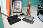
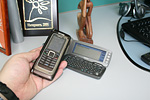
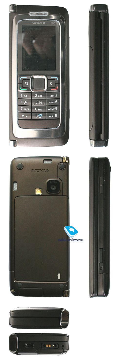
Live photos of Nokia E90
Sales package:
- Nokia E90 Communicator
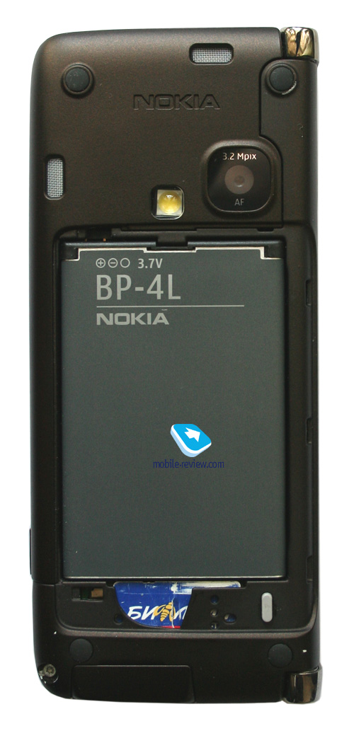
- 1500 mAh Li-Pol battery (BP-4L)
- Wired stereo-headset (HS-47)
- Charger(AC-4)
- USB data cable (DKE-2)
- 512 Mb microSD memory card
- User Guide
- DVD ROM with software
The word “communicator” was made up by Nokia and identified a whole family or devices armed with QWERTY-keyboard. That didn’t hamper other manufacturers in their attempts to position their solutions after this device and name their products in a resembling way. It quite another matter, though, that back then those were pretty unsophisticated devices that were miles behind Nokia’s communicators in terms of capabilities. One could recall a Motorola-branded communicator – model A100, which was a basic device for typing SMS messages. By acting in this vein, the companies unintentionally disclosed the gap between own affairs and the developments of the market’s best company, which started on a long-term outlook. Because communicators were always the eye-catches and hype-generators, however meagre battery life, huge size, super-functionality as it seemed to most users and the heftiest price tags out there put many off. When the phone market was only emerging, such products occasionally ended up in the category of status phones (effect of price), enterprise solutions, though were used in the way they were meant to by few. What was for the reason for such behavior of consumers?

The explanation lies in the fact that not only do you need to create an interesting product, you should also make sure that it arrives in the market on time and the consumers are ready for uptake. In the 90-ies, there were very few enthusiasts able to master communicators and with their minds set up for shelling out a lot of money, and the fact is, back then network services were still not enough developed. I will allow myself to give a frivolous example – while early in the 90-ies e-mail was available not to just about any employee and companies, today it is something par for the course. Today’s life is impossible without e-mail – the stories of particular people that try to forgo it only affirm this suggestion. Now imagine that you launch a product meant primarily for handling e-mails, working with texts and so on. Most deem it, if not a nonsense, but definitely a waste of money. Corporations have long decision-making time, on top of that executives are equipped with laptops, and then with intranet-enabled notebooks, that provide for connectivity in a hotel room or in headquarters in wherever. I shall remind you that at that point Wi-Fi and technologies of this kind is non-existent, and in Business Lounge of respectable airports Ethernet-cable for connecting notebooks appears only in the mid 90-ies. The product classified as a communicator exists outside the environment, and occupies a little space in it, specifically owing to techi, those who are ready to sacrifice much for a gadget like that. First Nokia-branded communicators based off GEOS operating system and had nothing up their sleeves except for more petite dimensions compared to laptops (just as powerful, yet more portable with slightly shrank functionality – that’s the way they were promoted). The advent of various PDAs and Psion stifled the communicator range’s success to even greater extent. We could say that the line of communicators has always been a niche solution for Nokia.

Then you come to ask a logical question – why would they need to throw away money on development of non-mass-market devices and shift from one concept to another several times (switch from GEOS to Symbian, release of platform 80, then forgoing it in favor of S60 in Nokia E90)? The answer breaks no new ground, though. The company was waiting the ecosystem for these products to emerge. In truth, Nokia aimed at the market of sub-notebooks and like devices, although no such market existed, that was the problem. In view of absence of previous user experience, needs in network applications, those devices could not win the mass market. A device or application torn from the context of user experience is doomed to a failure. Remember Apple’s Newton – first of a kind, yet unsuccessful, since it was unclear what it was made for?


With the growth of the handset market, sales of various communicators increased in value, but it wasn’t a breakthrough per se. Those models remained niche-aimed. The turnaround in the situation, probably, is springing up right in our faces now, as Nokia has made a sharp turn and come up with a new communicator concept. Nokia E90 signalizes complete refusal of all groundwork made for platform 80, it is now shut down and will see no further devices employing it. Consequentially, the software, both system applications that came pre-installed with the previous models, and third-party programs, won’t be available for Nokia E90. It would have been a huge loss, if only the company had decided to start on a new branch of the operating system tree or interface (platform), but Nokia bases off well-known S60 platform, meaning that all applications written for S60 3rd edition will have no problems with starting up on this device. A smart way to address all the issues. Those who have been feeling nostalgic for the times of Psion V may finally put their minds to rest, as Nokia E90 no longer shares anything in common with the Psion line – this product’s root come from a wholly different area. Here I’m acting somewhat against my conscience, as ideologically, Symbian and Series 60, and then S60 are descended from Psion, though Psion’s code has never been used in Series 60.

The core idea of Nokia E90 lies in compatibility, both in terms of hardware and software, with current S60-based smartphones. After all, it is an S60 3rd edition Feature Pack 1 solution. The concept of Nokia E90 is unique in a way – the developers have adopted the best from both words and crossed in one devices standard S60 smartphones and the communicator range. All previous communicators with the clam closed had interface of platform 40 or ordinary phone counterparts – integration of the interface with the communicator mode, when the device was open, didn’t run deep (phonebook, organizer – that was about it). Nokia E90 brings about some fundamental improvements – both standard and third-party applications work in closed (phone mode, or better to say, smartphone), and flipped open modes. A simple example – you launch the browser and start viewing pages on the outer screen, then decide to write a quick reply on a forum, flick open the communicator and see exactly the same page, yet scaled up to fit the bigger resolution of the main display. You can fold the device open and closed, switching between the screens, as many times as you won’t – there is nothing wrong with that.

The uniqueness of this approach becomes evident when you glance over the concepts of Windows Mobile smartphones; it’s not worth comparing it with Symbian-solutions – a wholly different class in the sense of both capabilities and philosophy. The need in a QWERTY-keyboard on devices running on Windows Mobile is pretty clear and the implementation is nothing out of the ordinary – side-slider design and one display. When closed, all controls are laid out vertically, either a number pad or an on-screen thumbboard are available, zipping the device open swaps the display orientation to landscape.
In Nokia E90 this issue, thanks to the two displays, is settled in a coherent way: the flip-closed device is orientated always vertically, when open – horizontally. In other words either of the screens is hard wired to a certain mode. From the standpoint of ergonomics, it would seem there is no breakthrough, the necessity of flipping the device open, spending some time on that, is still there. But imagine that you are about to watch video on a Windows Mobile-communicator. You won’t have to flick it open, but turn it sideways – definitely – as well as rotate picture via the menu (for the most part this is done automatically). Nokia E90 offers a much more straightforward and easier idea – you want to watch video clips in decent quality? – unfold the device and watch it. The manufacturer encourages more active use of the communicator mode, which is missing on Windows Mobile-devices, meaning that their concept has no educational constituent, it is taken for granted that the user is a professional and knows without any hints what to do. A number of researches say that the user turns to a communicator’s features more often as long as he has to flip it open rather than keeps using it in one mode. It is obvious that the cause-effect relation might have been broken here, but the surveys of focus-groups showed that this is the way for novices to master expanded functionality of such devices step-by-step.
Applications are displayed perfectly on both the external and internal screens, being scaled up or down to fill either of the displays. In settings you can enabled the option when upon quitting the communicator mode (flicking it closed) the application would get minimized (not terminated by minimized!) instead of being shown on the outer display. Thus you will see a standard standby screen – one could come up with numerous applications for this option, which is in fact a great opportunity for advanced users.
Form-factor and keyboard.
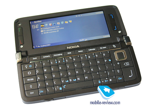
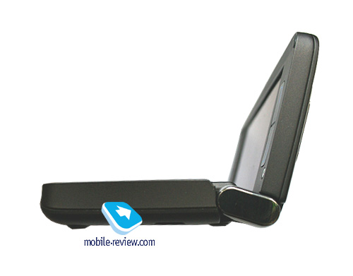
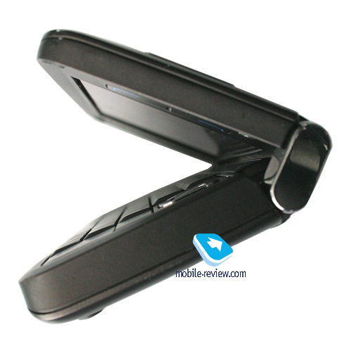
Nokia-branded communicators were one of the first devices to feature full thumbboards, petite dimensions and folder type design. The advantage of this form-factor is obvious – it is vastly reminiscent of usual notebooks, which creates deja vu effect for consumers. None of the vendors has released devices sporting such design – there is only a handful of models not too far off from it, but that’s all. An obvious strength is the ability to fold back the top part with the display and get access to the keyboard. The flip-open Nokia 9500 provided a 120-degree angle, which was most adequate when the communicator was on a table and you were punching in a text. In Nokia 9300/9300i they forwent that trait, and enabled the user to set the halves at any angle, up to 180 degrees. At that there was no position, in which the device would have fixed the halves.
Nokia E90 features a hinge that holds the halves in two setups, but the former offers an angle of 100 degrees, which feels not particularly comfortable on a table. The engineers picked this way so as to secure the same 120-130 degrees when you work with device on your knees, where uneven surface make for the same experience. Locking the device in this position is required to make sure that when a train or plane starts jolting, it wouldn’t go all the way down to the second position. Some don’t hesitate to attribute this trait to the E90’s shortcomings, but this makes no sense – between the 100- and 180-degree setups you can bend it to any angle you want and then it is more likely to stay in this condition (if anything, you have to shake it so hard, that managing the communicator becomes impossible). The E90 snaps into two fixed positions with a click, which is a nice thing about the device.


The design of the side-mounted hinges indicates that all wires are embedded into them – in this respect the device has become more robust as well.
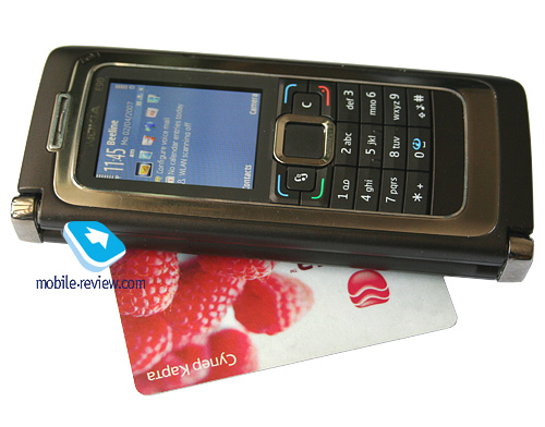
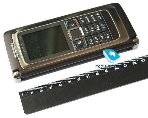
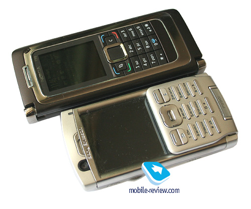
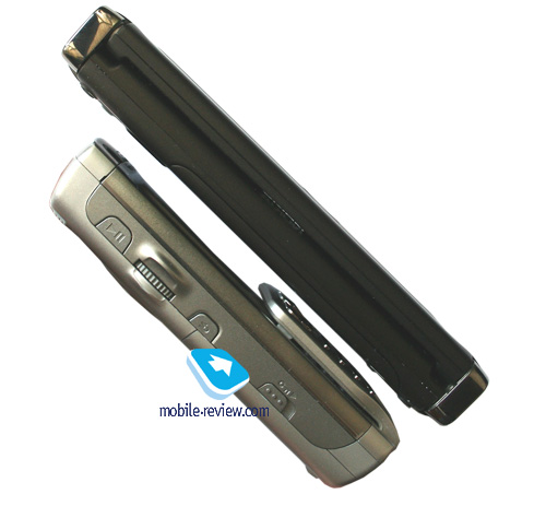
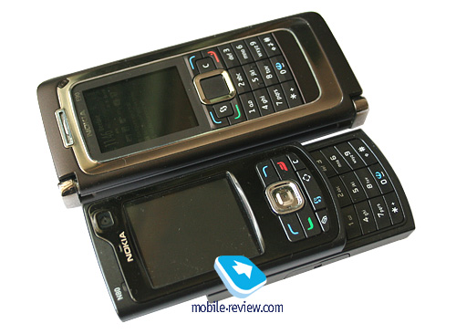
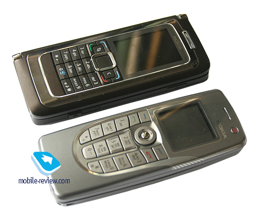
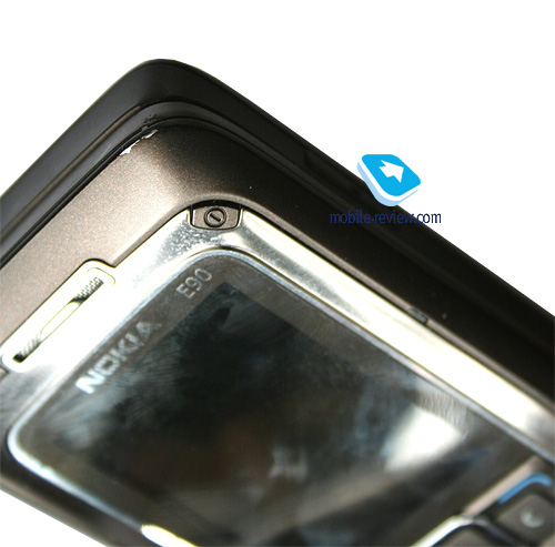
Flipping the device open with one hand is possible, but due to its being relatively heavy, you should use both hands. The E90 weighs in at 210 grams, compared to Nokia 9300i’s 172 grams. At that they have left the dimensions almost untouched – 132x57x20 mm against 132x51x21 mm. The casing is shaped in rectangular design, it is widen and because of that Nokia E90 visually feels clumsier. The materials used only strengthen your confidence in that, with the metal edging of the outside and metal battery cover.


I can’t complain about having small hands or being weak, but several times Nokia E90 ended up going down in a free fall upon my attempts to flick it up single-handedly or getting it out of my pocket. After the edge received some beating in this way, it revealed metal rim underneath the damaged finish. So it is safe to state that in terms of durability this device does very well. However not so hurting, yet continuous physical pressure may lead to abrasion of paint. But it is not as crucial as it used to be on the previous devices, where plastic was the dominating material, exposed to wear and tear. Nokia E90 shows off better coating quality.

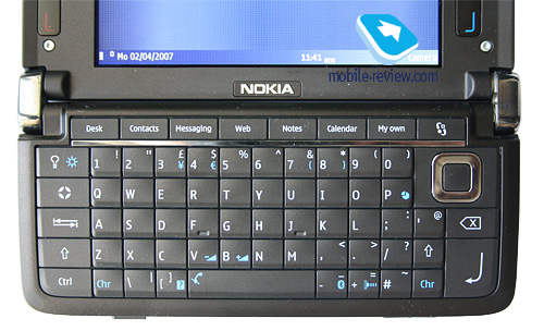
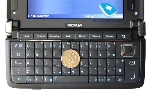
The keyboard is one of the device’s centerpieces, as so much depends on its implementation here. Switching from Nokia 9300i to Nokia E90 feels like a real pain – it seems that the keys are more protruding, just as big, but have no feedback, which doesn’t let you feel every key-press and makes you always look at the display to figure out whether you actually pushed the desired button. There is no logical explanation of such short travel of the buttons – before they managed to provide fair tactile feedback. Let me be honest – I’d spent two weeks on getting used, and only after this period punching in texts was almost a breeze; even though the letdowns didn’t go away, they were no longer a big focus.
The handset traditionally features preset combinations of keys for handling texts (copy, select, paste and so on), quick start up of certain applications. The hardware keys in the top row allow launching default applications, there is also a GPS button mounted and two customizable keys.

Localized edition will sport two lines of symbols on the keys – there is enough space to cram the in. All buttons are lit in not very bright white, which is still well-visible and comfortable to use. The backlighting can be activated with the help of a dedicated key.
Listing crucial shortcomings, we can’t overlook absence of a joystick, which seemed appropriate in Nokia 9300i, though the E90 has a run-of-the-mill navigation button. The reason – new browser, which is easy enough to navigate without a joystick, and the aim at decreasing the number of broken joysticks, regardless of the fact that previously it wasn’t a major problem. When faced off, a joystick and standard keys, the latter come out on top.
Color schemes, controls, displays
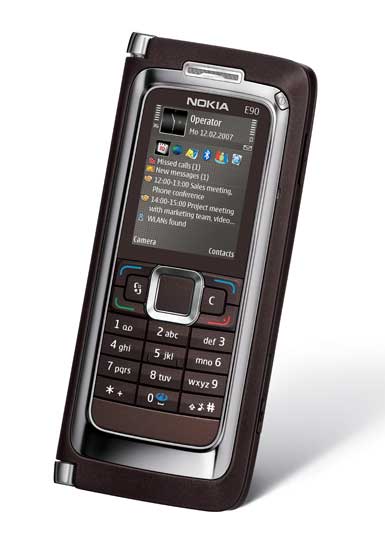
The model comes in two colors – brown and red. Either of the variations has the casing’s edging in its own way, while the main set of keys remains dark-brown. To me, one should count on wide availability of the red trim, as it is going to be a very highly tailored proposition. The share of women, potential buyers of this model here, is not too big, and in corporate purchases they will give the top priority to the default color scheme. However, specially for the enterprise segment, the company is planning on launching two extra trims – black and silver.


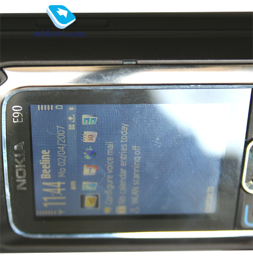
The layout of controls and display, with the clam closed, is standard. The outer screen sports QVGA resolution (240x320 pixels) and 16 million colors. The external sensor automatically tweaks backlighting level so as to make it fit the environment best, similar sensor works for the internal display as well. The picture quality the external screen puts up is good, yet turns out to be interior to other offerings by the company, being affected by insufficient brightness, which can’t be adjusted manually and therefore is one of the device’s drawbacks. On the other hand, this is a quality thing that plays a secondary role for the most part and its performance is not what everything is about. In the sun the display gets washed out, nevertheless the picture remains readable in most cases. Technically, it may be considered the main display, since you come to manage it when calling or reading messages. Regrettably, in many work modes the font size is relatively small, what is more, when reading mail all columns are so crammed that it is impossible to read anything. And this is what makes you sway towards using the communicator mode even more often.

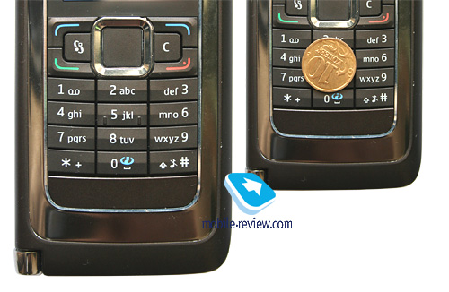
The number pad feels familiar from ordinary handsets – bulky and well-spaced buttons, yet not very impressive ergonomics due to lack of travel. While it is not as mediocre as the internal thumbboard, this keypad is obviously average or slightly worse than that. There is no dedicated Edit key, that used to be a must on the previous S60-devices. However this brings about no drawbacks – handling texts is much more simple in communicator mode anyway.

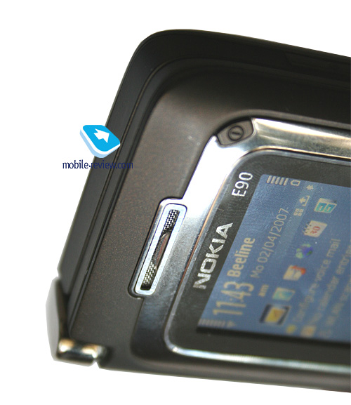
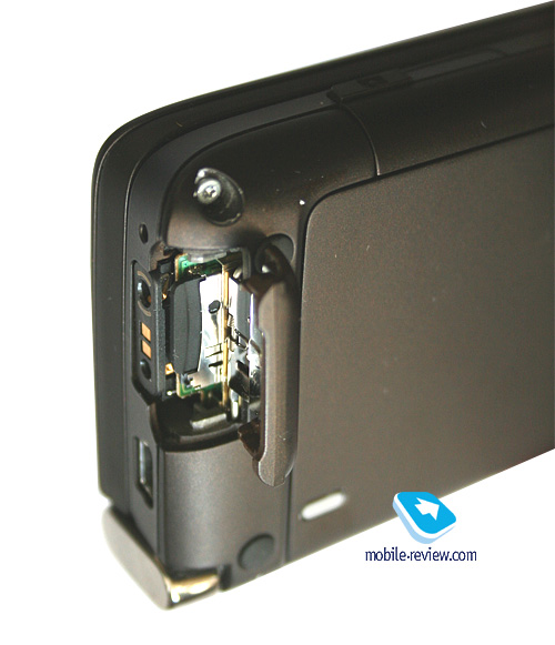
Topping the outer display is the power button that doubles as the profiles switch while at the standby screen. The loudspeaker sits underneath a metal grill, which looks pretty stylish. All the primary sockets are situated on the bottom end – specifically the miniUSB-slot (no charging upon cable connection – it is par for the course), charger socket and the 2,5 mm audio jack. Right here you will also find the microSD memory expansion slot covered with a fold-out flap. The socket is convenient to handle and is hotswap-ready.


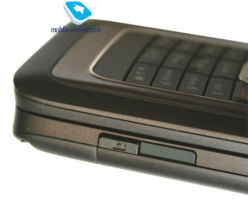
The right-hand side holds the dedicated camera key, PTT button and Infrared window. The side-mounted buttons are quite stiff and prove to be if not a pain, then definitely a challenge to use. Keep in mind the device’s weight to complete the picture.

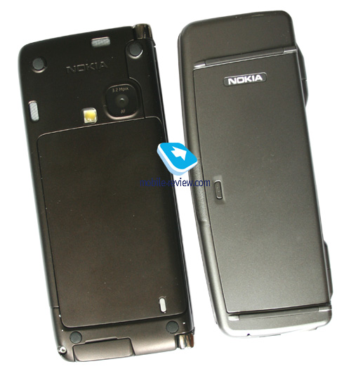
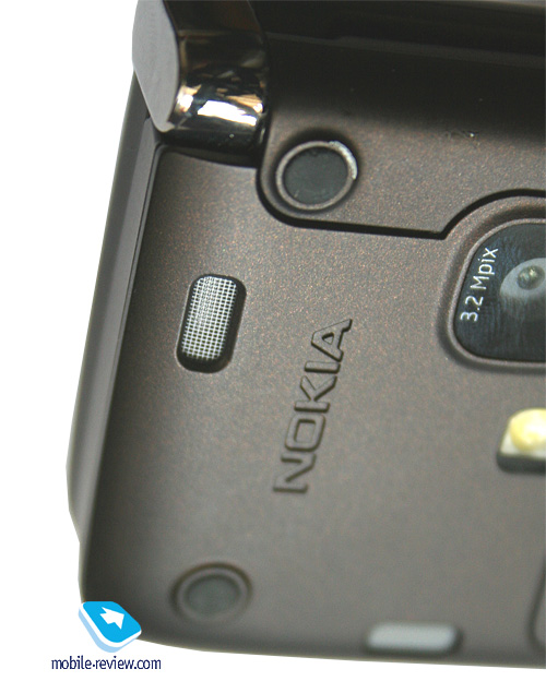
The back cover plays host to the stereo-speakers which are, much like the main one, hidden under metal grills. These two are of superb quality, producing rich and loud sound. Their sonic merits become even more obvious if you put the device (open or closed) on a table or any other flat and hard surface. The overall volume increases in this case because the handset has rubber pads on the rear preventing the casing from touch the surface it lies on and, at the same time, bringing the resonance effect along.

Finally, the rear also sports a 3.2 Mpix CMOS-camera identical to the one found in Nokia N93. The LED flash is located nearby.
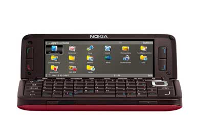
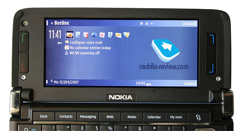
Now we are moving on to the device’s most exciting part – the internal display. Its resolution makes up 800x352 pixels, which represents an improvement over the previous standard 640x200 matrixes (it used to be one of the constant specs of the communicators). The shift to S60 marks the possibility of installing new display types on the communicators, boasting even bigger resolution and not always standard geometry. Speaking of the picture quality – it is as close to perfect as a display could ever get, with saturated colors and sharp details. Video may be watched in full-screen mode (16:9), more importantly, in most cases you won’t even have to re-convert it (as it was with Nokia N93 as well). The display can show up to 16 million colors and has nothing against being in the sun (TFT). The screen’s specifications are ideal for handling text documents, browsing web-pages and so on – in this aspect Nokia E90 has no counterparts among smartphones today.


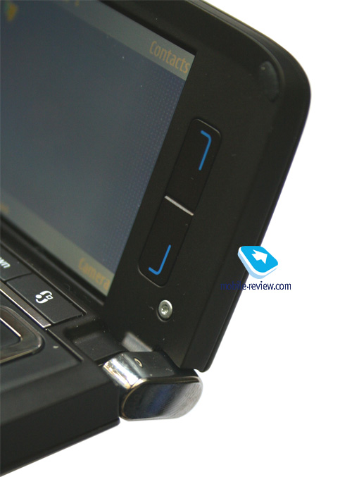
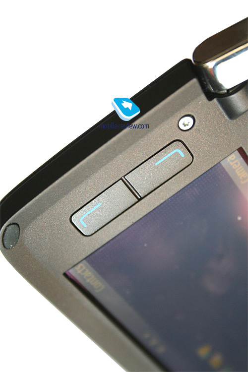
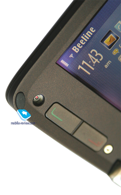
Flanking the display are two pairs of keys, one of which is adopted from S60 devices – soft-keys, and the other one comprises pick/hand up buttons. Next to the inner display is the CIF-camera for video conferencing within 3G networks.


Battery life
Nokia E90 utilizes a 1500 mAh Li-Pol battery (BP-4L), which is the most capacious unit for such products these days (in this generation only Nokia E61i can flaunt an identical cell). For comparison: Nokia 9300i employs a 1100 mAh unit (BP-6M). The increased capacity is chiefly due to more power-hungry displays, whose specs have been considerably enhanced at the cost of shorter battery life. If we are to compare the talk/standby times, both handsets will do equally well, which means that most of the extra power is consumer by the bigger internal display.

The maker claims that in standby mode the E90 can work up to 260 hours, while its talk time makes up 5 hours at best. Great numbers, especially on the paper, though in real life the battery life proves to be shorter by a wide margin. Over a month of quality time with the device, I managed to try it out in different roles, so the list of usage modes and respective figures is as follows:
- Active. About an hour of calls a day, something like 10-15 messages, around 20 e-mails, Wi-Fi, occasionally Bluetooth. The phone stays online from 9 AM to 8-9 PM but then asks for some juice. Such usage profile is characteristic for enterprise users. On the other hand, having a charger at hand, be it at home or work, has become par for the course, and for Nokia E90 it is a kind of way-out.
- Voice. For this part of the audience, buying Nokia E90 is a great way to emphasize own status, these people don’t intend to use the whole package of its capabilities and aim more at voice calls. At one hour of calls a day, a few messages and minimal use of the communicator mode, it lasts for about 1,5 days. In the end, it is not too far off from everyday charging.
- WEB-oriented. People that can’t imagine their lives or jobs without the Net and spend at least 1,5-3 hours a day on surfing via both GPRS/EDGE and Wi-Fi. It is strange that while this mode is the top priority for the communicator, it puts up the shortest battery life figures in it – about 7-8 hours at 10 messages and 20 minutes of call thrown in for good measure. Apparently, we are speaking about the communicator mode, since with the clam closed the battery life increases by 10-15 percent. Though I can’t think of users who would do that.
- GPS-navigation. I want to make a note here that for this device the GPS-navigation feature is somewhat useless, but on the whole in this mode it lives for about 2,5-3 hours.
- Music aficionados. I refuse to believe that this will be one of most widely used departments of this device, but with the enabled radio part (yet without any other activities), it puts up 12 hours of music playback. It is quite another matter, though, that as long as you run other applications, the lifetime again comes to one day.
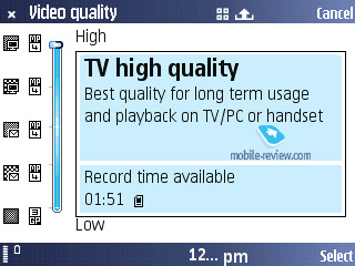
- Video. At top quality and resolution settings, you can record about an hour of video, then the battery goes down to its limit. Though watching video will not be equally power-hungry – displayed in full-screen and in good quality it will exhaust the battery in 2,5 hours (on average – 2 hours or a tad less).
The list of usage profiles could be expanded, but it won’t make any sense, as all data indicates one day of battery life – no matter what you have in mind, your combination of most popular features is more likely to drain the battery in one day. There are no more capacious batteries for this model. It takes the E90 about 2 hours and 15 minutes to charge up from empty to full. Obviously one of the disappointments is the missing desktop charger, like the one Nokia 9300i came boxed with.
Technical specifications of Nokia E90
Hardware-wise the model is almost a replica of Nokia N95 with two-processor OMAP2420 chipset, the main CPU – ARM11 running at 332 MHz, and 2D/3D-accelerator, whose power is used for video recording. Total RAM volume makes up 128 Mb, though for user applications there is only 80 Mb available. The inbuilt flash-memory (NAND) is 256 Mb, out of which about 120 Mb are user-manageable, this size can be easily augmented with microSD cards of up to 2Gb.
Bluetooth.
The smartphone sports EDR-enabled Bluetooth 2.0 and support for the following profiles:
- BIP-ImagePush;
- DUN-GW;
- FT-Server;
- HandsFree-AG (1.0);
- Headset-AG;
- OBEX;
- OPP-Client;
- OPP-Server;
- SIM Access-Server.
It a shame, though, as it doesn’t have A2DP, which means that the E90 can’t beam sound to a wireless headset.
USB.
The E90 houses the miniUSB-socket (no charging-over-the-cable is available, though), on C connection you are free to pick from USB Mass Storage, PC Suite, and Modem or Printer (unlimited number of paired printers) modse. With USB ver 2.0 in its pocket, the handset presents you with about 800 Kb/s in USB Mass Storage mode.
Java.
No limits are set on application size or heap.
Performance.
We were expecting Nokia E90’s performance to be dependant on selected mode, in other words, that it would put up uneven numbers in phone and communicator mode, as the different resolutions of the two displays demand different resources.
Much to our surprise, nothing like that actually happened – results of all JBenchmark tests are identical for either mode. At that, faced off against the figures of Nokia E61i, Nokia N95, Nokia E90 ended up beaten by a wide margin, being three or four times weaker. For example, in the 3D test Nokia E90 put up 340 points in HQ and 356 in LQ (Nokia N95 – 1145 and 1012 respectively). In the second version of the kit, the gap made up 151 and 522 points. These vastly strange results can be explained only with one thing – from the very beginning the device models all interfaces for the inner display. In other words, the main conclusion we could draw on Nokia E90’s circuitry is quite a sensation: such ability to quickly switch between the modes is acquired through being initially tailored to handle the internal display and cropping the interface to fit the external screen. Roughly speaking, this process should look this way; if you do possess any information on how it all really works on Nokia E90, your letters or posts on our forum will be more than welcome. Thank you in advance.
Subjectively, the device’s performance is up to the typical level of S60-smartpohnes in phone more and is a tad lagging behind in communicator mode. In the latter mode, at times its takes the picture some time to pop up on the display; changing modes takes some time. At the same time, comparing the E90 with S80-powered solutions, it is safe to say that Nokia E90 is at least not second to them, and in some operation exceeds them speed-wise.
Camera.
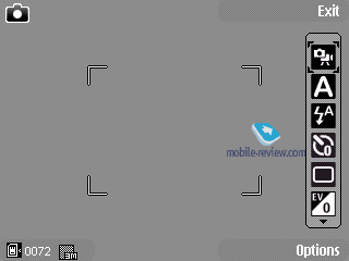
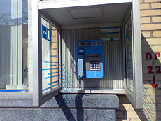
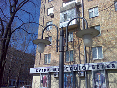
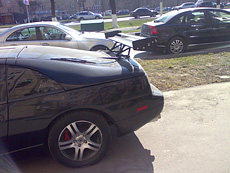
We have been brainwashed for a long time that a business-handset, especially in Eseries doesn’t need to have a camera onboard. However the latest trend implies that imaging capabilities should be incorporated in such phones and that’s how come Nokia E90 ended up with a 3,2 Mpix CMOS-matrix. The quality of shots you get is excellent and pretty much in line with Nokia N93i, Nokia N73. In fact, in this aspect the E90 has turned out to be a really competent offering. On the downside the camera has no shutter and thus picks up smudge with ease. I should emphasize that the camera module used here is different from the one we see in the already existing devices, even though it allows acquiring snaps just as good.
The camera settings are as follows, you can pick one of the 4 resolutions:
- Print 3M – Large
- Print 2M – Large
- Print/e-mail 0.8M – Small
- Multimedia message 0.3M


The maker doesn’t quote real resolutions of snaps, so we take this duty in our own hands. The following resolutions are set in these modes: 2048x1536, 1600x1200, 1024x768, 640x480 pixels. At that picture size averages 1 Mb, 600-700 Kb, 250-300 Kb and 75-100 Kb. You can’t adjust picture quality settings.
The handset utilizes digital zoom topping out at x20, at that you should differentiate “normal” and “enhanced” zoom – the latter allows reaching the maximum zoom index, yet artifacts become discernible. When using standard digital zoom, though, these artifacts are not all that striking. And since you can perform just the same zoom-in in any graphics editor, using it while shooting is not the best idea.
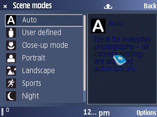
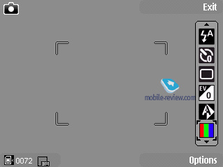
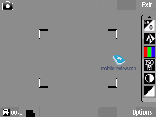
The shooting modes include one user-manageable mode, auto and macro. Other options feature portrait, landscape, night, night portrait, sport.
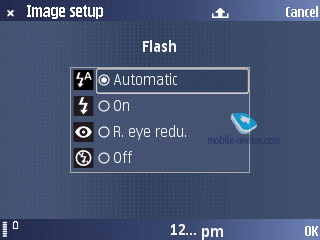
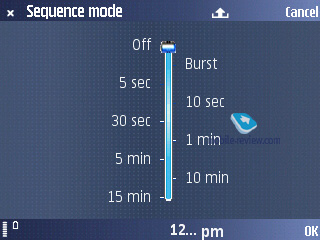
The flash can be set to trigger off automatically, turned off, or work in red-eye reduction mode. The self-time can be programmed to go off in 2, 10 and 20 seconds. The handset can take snaps in rapid successions (three at a time), which might come in handy should you work with quickly moving objects. The function is intended to be Sony Ericsson’s Best Pic counterpart, yet as it stands now, it offers less flexibility.
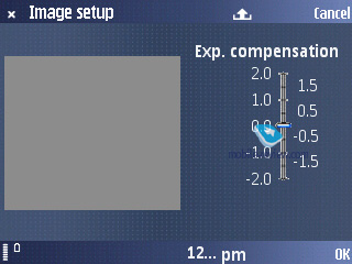
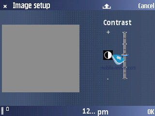
Exposure compensation – this feature is interesting for some specific environments, when it will provide for better and sharper shots. It can be modified on a -2 - +2 bar with a 0,5 step.
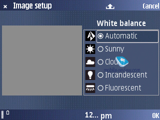
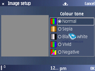
White balance – Auto, Sunny, Cloudy, Incandescent, Fluorescent. Overlays available are Sepia, Black&White, Negative, Vivid.
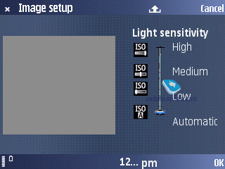
The ISO value is set to Auto by default, while other options may be selected manually, much like some cameras the vendor has set ranges rather then concrete values. In other words, when you choose low ISO, these may be values from 60 to 200 etc. This is all another step towards the mass market, an attempt to isolate the users from all technical nuances.
 |
 |
| (+) maximize, 2048x1536, JPEG |
(+) maximize, 2048x1536, JPEG |
 |
 |
| (+) maximize, 2048x1536, JPEG |
(+) maximize, 2048x1536, JPEG |
 |
 |
| (+) maximize, 2048x1536, JPEG |
(+) maximize, 2048x1536, JPEG |
 |
 |
| (+) maximize, 2048x1536, JPEG |
(+) maximize, 2048x1536, JPEG |
 |
 |
| (+) maximize, 2048x1536, JPEG |
(+) maximize, 2048x1536, JPEG |
 |
 |
| (+) maximize, 2048x1536, JPEG |
(+) maximize, 2048x1536, JPEG |
 |
 |
| (+) maximize, 2048x1536, JPEG |
(+) maximize, 2048x1536, JPEG |
 |
 |
| (+) maximize, 2048x1536, JPEG |
(+) maximize, 2048x1536, JPEG |
 |
 |
| (+) maximize, 2048x1536, JPEG |
(+) maximize, 2048x1536, JPEG |
 |
 |
| (+) maximize, 2048x1536, JPEG |
(+) maximize, 2048x1536, JPEG |
 |
 |
| (+) maximize, 2048x1536, JPEG |
(+) maximize, 2048x1536, JPEG |
 |
 |
| (+) maximize, 2048x1536, JPEG |
(+) maximize, 2048x1536, JPEG |
 |
 |
| (+) maximize, 2048x1536, JPEG |
(+) maximize, 2048x1536, JPEG |
 |
 |
| (+) maximize, 2048x1536, JPEG |
(+) maximize, 2048x1536, JPEG |
 |
 |
| (+) maximize, 2048x1536, JPEG |
(+) maximize, 2048x1536, JPEG |
 |
 |
| (+) maximize, 2048x1536, JPEG |
(+) maximize, 2048x1536, JPEG |
 |
 |
| (+) maximize, 2048x1536, JPEG |
(+) maximize, 2048x1536, JPEG |
 |
 |
| (+) maximize, 2048x1536, JPEG |
(+) maximize, 2048x1536, JPEG |
 |
 |
| (+) maximize, 2048x1536, JPEG |
(+) maximize, 2048x1536, JPEG |
 |
 |
| (+) maximize, 2048x1536, JPEG |
(+) maximize, 2048x1536, JPEG |
 |
 |
| (+) maximize, 2048x1536, JPEG |
(+) maximize, 2048x1536, JPEG |
 |
 |
| (+) maximize, 2048x1536, JPEG |
(+) maximize, 2048x1536, JPEG |
 |
 |
| (+) maximize, 2048x1536, JPEG |
(+) maximize, 2048x1536, JPEG |
 |
 |
| (+) maximize, 2048x1536, JPEG |
(+) maximize, 2048x1536, JPEG |
 |
 |
| (+) maximize, 2048x1536, JPEG |
(+) maximize, 2048x1536, JPEG |
 |
 |
| (+) maximize, 2048x1536, JPEG |
(+) maximize, 2048x1536, JPEG |
 |
 |
| (+) maximize, 2048x1536, JPEG |
(+) maximize, 2048x1536, JPEG |
 |
 |
| (+) maximize, 2048x1536, JPEG |
(+) maximize, 2048x1536, JPEG |
 |
 |
| (+) maximize, 2048x1536, JPEG |
(+) maximize, 2048x1536, JPEG |
 |
 |
| (+) maximize, 2048x1536, JPEG |
(+) maximize, 2048x1536, JPEG |
 |
 |
| (+) maximize, 2048x1536, JPEG |
(+) maximize, 2048x1536, JPEG |
 |
 |
| (+) maximize, 2048x1536, JPEG |
(+) maximize, 2048x1536, JPEG |
 |
 |
| (+) maximize, 2048x1536, JPEG |
(+) maximize, 2048x1536, JPEG |
 |
 |
| (+) maximize, 2048x1536, JPEG |
(+) maximize, 2048x1536, JPEG |
 |
 |
| (+) maximize, 2048x1536, JPEG |
(+) maximize, 2048x1536, JPEG |
 |
 |
| (+) maximize, 2048x1536, JPEG |
(+) maximize, 2048x1536, JPEG |
Video.
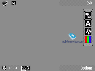
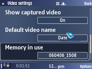
The handset is capable of shooting video in a number of quality modes, with the best one putting up 30 frames per second at 640x480 (VGA resolution). But you always can reduce the FPS rate to 15 or get the resolution lower. All clips are captured in MPEG4, at that you can record sound simultaneously. While shooting you can take advantage either of the optical or digital zoom (up to x8 in this mode). Also, the optical stabilizer gets engaged, preventing the video from adopting trembling of the device. It seemed to me, that this function is just fine – after long shooting sessions there are no traces of camera’s slight movements left in the video clip. You can turn off sound recording, in case you don’t need it.
There are settings for white balance and various digital effects, just like those for stills. The Scene modes selection is confined to Auto and Night modes.


Interface and standard applications

The model is a typical S60 Feature Pack 1 affair, with the phone part having no alterations compared to the previous solutions. So, to learn more about the standard functions, you should better read the following articles:
Series 60 3rd Edition
S60 3d Edition Feature Pack 1
And here we would like to focus on the device’s highlights, and spotlight specific features. Speaking of the interface, I would particularly like to point at support for various menu views.
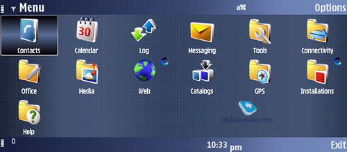
The company added two new menu views in addition to grid and vertical lists, like in Nokia 6290. “V-Wheel” groups all the icons in a wedge, when moving through the list of icons the one in the centre always changes. In “Horse Shoe Wheel” mode is a circle-styled menu layout, so if there are some sub-items in a menu available they are displayed at once but going into them is disabled unless you enter the required menu item. These two types of menu are of no interest in light of the missing JogDial, for the logical structure of circle-shaped menus is usually assigned to a navi-wheel or swiveling joystick and if that’s not the case, such menu views seem to be somewhat of out place, just like in the 6290.
It is a shame, though, that it is not possible to pick separate menu styles for each display – you will always end up with one layout for both screens. And if on the smaller display circle-shaped menus seems more or less adequate, on the big screen they don’t look properly.
Basically, we could say that being the first S60 representative in the communicator range, Nokia E90 doesn’t offer considerable differentiation throughout its modes, but they are working on it. See for yourself – Active Standby while in the communicator mode has more quick launch icons for applications (up to 8, while the phone mode can put up only 6 at best).
The changes brought about by the brilliant internal display and its decent resolution, are different (from S60) view modes in default applications. For example in the Calendar, not only do you see the whole month, but also, for any highlighted date, on the right you will be offered complete list of scheduled tasks. All lists in Gallery or File Manager are arranged vertically and the space on the right is occupied by the preview window that allows having a glimpse of the file’s contents. It is very straightforward and easy to use, such solution increases legibility of the interface, brings it as close to desktop PCs, as it has never been before.
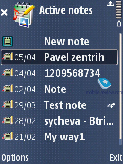
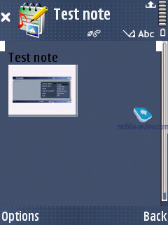
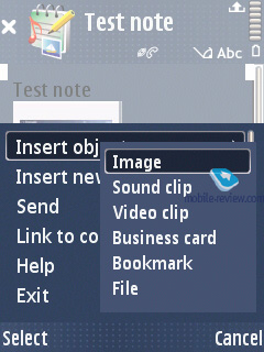
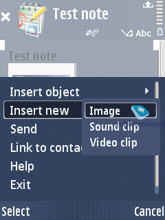
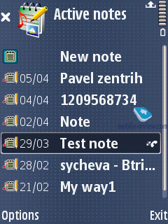
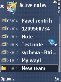
Active Notes. The difference setting it apart from run-of-the-mill notes built into the previous handsets is really striking. They have adopted the concept of MMS messages, which means you are allowed to add various objects onto the blank – from text and contacts to snaps, voice recordings etc. A note can be put on the handset’s standby mode, but there isn’t much of a novelty about this option. This function gains a whole lot of points thanks to the ability to set a link to a particular note for any contact found in the phonebook (and enable displaying notes during a call). Just imaging – you have prepared a note with everything you are going to talk about during a call, bind it up with a number and that’s all – when you receive a call from that number or make a call yourself, that note automatically pops up on the display. A fetching feature that is worth getting used to. Whether it will become craved-for in handsets is to be determined yet, but the very idea is quite interesting.
Voice features. Text to speech (TTS). In the E90 they have applied text-to-speech technology, that enables you to listen to all your text messages and emails by pressing and holding the left soft-key. And it’s not only message that gets pronounced, there’s also sender’s name. In case there’s no such entry in the phone book, you will hear “Message from unrecognized number” phrase. System can pronounce numbers quite nicely, and here this solution was probably ergonomics-based. And it’s true, it is kind of hard to listen to a set of digits, you will not memorize phone number, and in case you will, it will not do any good either. A sort of positive simplification of the sound interface.
In TTS settings you can select language in which this application will work with, a wise solution. A lot of users set English as their Menu language, at same time they prefer reading messages in their native language. Other text recognition applications do not have such settings, and they’re strictly attached to menu language, this is definitely a disadvantage for them. For example some Samsung products are missing Russian voice pack, and as result there’s no voice dialing at all.
One of the best things about this algorithm is its modular concept; this means that its packets can be downloaded separately from main software. There is several language packs shipped in the sales package. As a rule, such files with voice packs are stored on memory card. Our sample had the following languages:
- Dutch, voice Ingrid;
- English (UK), voice Ellen;
- French, voice Marie;
- German, voice Nicole;
- Italian, voice Silvia;
- Portuguese, voice Isabel;
- Spanish, voice Lara.
Each language pack is about 1.86mb big. As you have guessed, there can be several voices for every language, for example, a male voice, or female or childish (it’s not a trivial case for realization, as it may seem at first sight). This means that user will be able to choose the voice that will cast messages or exercises. A pretty neat addition that makes TTS functionality even bigger.
As for additional voice settings, you can select volume and speed. Speed can be adjusted from 1 to 10, in this case 1 will be very slow and 10 will remind you of a tongue-twister, as a result you will not be able to comprehend it at all.
Speaker-independent voice-dialing is quite good - you can dial any number from the phone book without having to train the phone with voice tags or whatever.
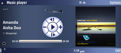
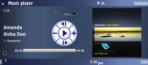
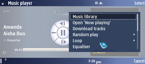
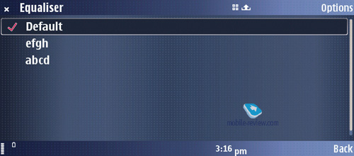
Music player. Album Arts are supported, at that the player boasts standard interface. By and large, for a non-music-minded solution, the player in the E90 is pretty decent with the sonic experience provided being typical for S60 (in line with Nokia 3250, but generally, very average). Disabled A2DP-profile, available equalizers and standard music library lay out – that’s about it. The music players seems to be a quite adequate extra in the E90, meaning that occasional music sessions will be okay, though it doesn’t have what it takes to replace a stand-alone music player.


FM-radio. The E90 packs support for Visual Radio, while the FM-radio module itself is nothing out of the ordinary – no traits or issues, good reception quality. This is the first offering of such class to feature radio onboard, which is definitely a step forward.
Nokia Search. With this utility you can perform a local search in all folder contents found on the handset and memory card. At that you are at liberty to involve all the folders or stick your hands into certain categories (contacts list, notes, calendar notes, SMS, e-mail). The search is conducted by name, where you can use both letters and numbers. Such substitute-symbols as “?” for replacing only one and “*” for any number of symbols are also available. “Space” is used to separate two words and inverted commas – to search a concrete phrase.
The app comes in handy when searching for some phone numbers. You should put only a few digits and all matching variants appear on the screen. Using the option “Previous results” you can easily return to preceding results of the search.
And furthermore, it is very speedy - the results pop up on the screen in a few seconds after submitting the query.
Wi-Fi. There is a connection wizard to make sure that everything runs fine – it is accessible at the standby screen and allows you to quickly track all networks available, connect to them (WEP, WPA, WPA2 security protocols are supported).
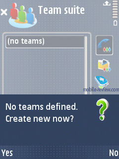
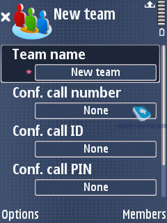
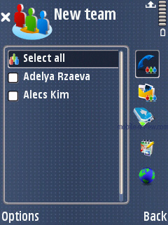
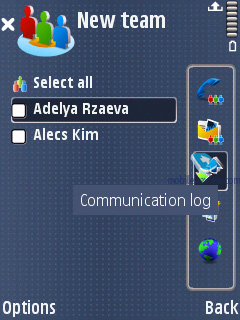
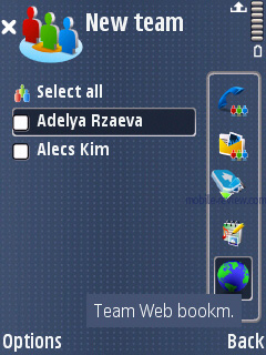
Team Suite. The spotlighted application, which is, as of today, unique to this model alone. Having launched it, you see the list of teams, which you compose yourself and fill with contacts from the standard phonebook. For every team you can create group messages, hold conference-calls in one touch, initiate Push to Talk sessions. Speaking of its extra abilities – your colleagues are enabled to view communication logs, and there is a catalogue of links for a particular team. This application is an add-on over default functionality, with other phones; the same effect is achieved through more time-consuming actions and nothing more than that. The E90 offers a more gratifying way of doing that, especially to those who really care for such functionality.
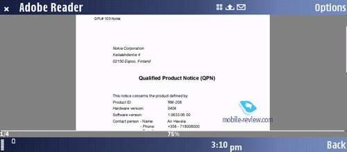
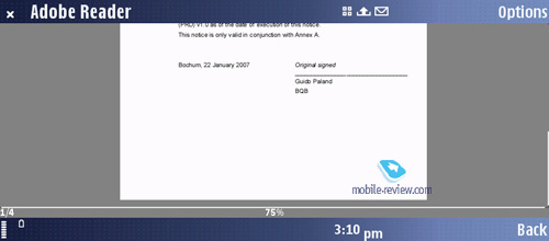
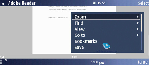
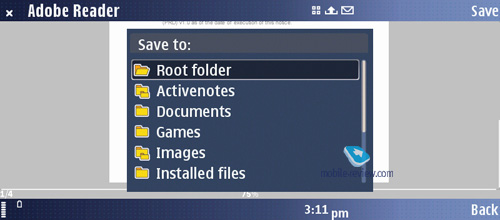
Adobe PDF. A run-of-the-mill reader of Adobe PDF documents – installed on majority of models running on Symbian and other operating systems.


Quick Office. Probably, the most crucial change that many don’t pay necessary attention to, which is unfair. Unlike the entire range of S80 products, for S60 they have decided on using Quick Office (my eyes won’t go round if Nokia buys out this developer) as the default office software kit. Most products get a free version installed, that does not allow the users to edit office documents (for example, Nokia N95 is one of them), however Nokia E90 hasn’t had this ability cut. Although this software isn’t idea, it delivers the same capabilities as Windows Mobile.
ZIP. Another well-known utility for handing archives, creating compressed files etc.
Barcode Reader. This application can be installed on just about any S60-based smartphone; it allows reading codes from products packing. Nevertheless finds little application in real-life, on top of that, its quality leaves much to be desired.
WEB-browser. Honestly, I don’t want to bother you with another description of what operates as standard browser version 2.0. Saving for the display that makes navigation a much easier affair and allows you to view most resources without having to scroll horizontally, it hasn’t undergone any makeovers. A comprehensive review of the browser can be found here
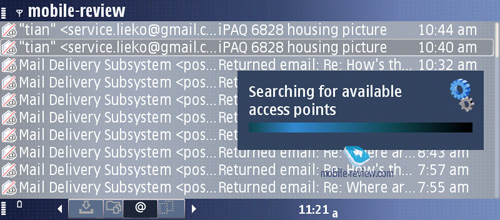
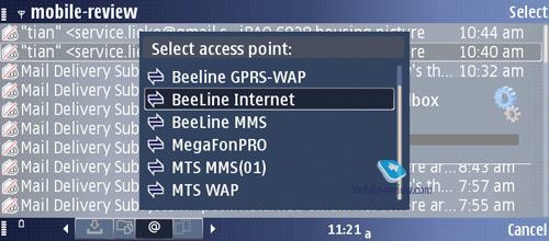
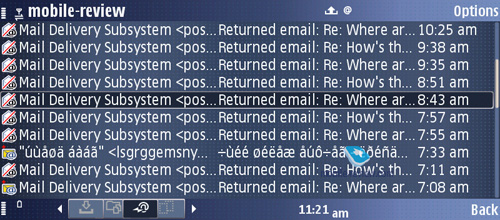
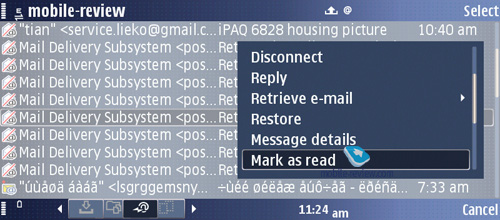
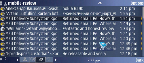
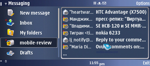
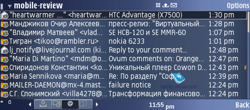
Built-in mail client. The E90 retains the same client as all other Eseries devices, at that all attachments are opened in Quick Office, Flash Player, or the built-in browser. In fact, there are no limits set on size of sent or received file. Regrettably, today, when using Exchange Server, there is no way to create own hierarchy of folders in the client, but they promise to add this feature in future. The handset also boats support for Intellisync 8.0, which brings its functionality to the level of Windows Mobile devices, however, special tweaking and tuning is required. Also, for Nokia E90 there is a BlackBerry-client available. Wrapping it all up, in terms of email, today it is one of Nokia’s best offerings, especially in view of a full QWERTY-keyboard.


GPS-navigation. For a communicator, addition of GPS-receiver appears to be a soft of running-in of future technologies, attempt to keep up with the times, rather than a vital need. It is really interesting to read on various resources articles praising Nokia E90’s navigation front, conclusions that in this sense it is on a par with Nokia N95 and thanks to a bigger internal screen looks preferable for checking maps. It is good and smooth, if only all this refers to artificial environment of Nokia E90 – in a pocket of its tester. In real life, the limitations of Nokia E90’s GPS-navigation use outweigh its undisputable draws.
This department is powered by Nokia Maps (Smart2Go) software.
I don’t feel like going the same way again, reviewing the same abilities of the navigation software. I shall only note that voice-based navigation for in-car use is available only for a fee. The antenna is mounted underneath the keyboard, almost under the dedicated GPS application button. Subjectively, the cold-start time is a tad higher than that on Nokia N95, not to mention Nokia 6110. We didn’t do special tests, but when I was navigating simultaneously with Nokia N95, Nokia E90 and one more device in Munich, Nokia E90 was the slowest starter. At the same time, the navigation capabilities were up to other contenders; the only difference – after tunnels and dead space, Nokia E90 required more time to detect satellites, which automatically affected navigation quality. But even with that said, don’t think of this as the main letdown of the E90’s navigation department.
Imagine that you put the flip-open communicator on the panel board of your car, as this is the best way to make use of its huge primary display. And this will turn out to be dangerous for the handset, for there are no means for getting it firmly mounted on one place. Using the smaller display doesn’t make any sense – no bright backlighting provided. Or, you can turn to voice tips, but to do that you need to have Nokia E90 in your shirt pocket, which is not that easy either. Taking account of meagre battery life in navigation mode, the picture we get in the end is not all sunshine and rainbows.
It would be natural to assume that GPS-navigation will work out while walking. Indeed, but then you will really need to stock up with some extra batteries. And then you come to realize that the only things you can do is check city map in good quality, locate yourself on this map, and figure out where you head for. I doubt this type of navigation will cater for many. A partial way-out is use of an external GPS-receiver, with which you will do away with the battery life issue, though this doesn’t seem adequate or economically sound.
Comparison with Nokia 9300i
Exclusively for the previous owners of Nokia 9300i, which fit in the image of Nokia E90’s target audience best, I shall make a small face-off:
- Build quality is better in Nokia E90 but for that it’s heavier
- Full integration of the phone mode with communicator in Nokia E90
- Two decent displays in Nokia E90
- Thumbboard ergonomics is more preferable in Nokia 9300i
- Battery life numbers are comparable, though Nokia E90 lacks a cradle, desk charger
- Nokia E90 has got its display resolution boosted – from 640x420 in the previous models to 800x352
- Soft-keys flanking the display
- Support for UMTS-networks in Nokia E90 (HSDPA)
- Camera
- Enhanced music department
We could have concluded the list with more items, but briefly speaking, in spite of all missteps with the ergonomics, Nokia E90 looks like a winner here, being a device playing in a league of its own, superior in terms of both positioning and quality – a player of another league.
Impressions
On the reception front the handset does fine – everything is up to any today’s offerings. In the phone mode you hear what they say on the other end well, but it is a real pain to keep the phone in line with your ear for long sessions, you arm gets tired faster. All in all we have no grips with the E90’s reception quality. The inbuilt silent alert is not particularly strong, so its presence is rather a step towards those who craved for this feature in the past models. When in a belt base, the handset doesn’t produce enough vibration, so you will barely feel it. At the same time, the volume of ring tones is quite sufficient – the E90 notifies you with that equally well both in- and outdoors.
The concept of Nokia E90 was stated back when the first communicator Nokia 9000 saw release in 1996 – this is a device for handling email and browsing web pages. It is remarkable that many solutions created for the first communicator were then transferred onto all current Nokia-branded smartphones. Actually, this is such an exciting topic, that we will definitely release a dedicate article telling the story of communicators. The reason why we couldn’t squeeze it in here is that in this case it would’ve passed unnoticed.
At the same time for models retailed for about 800 Euro, the company is planning on using the “all-in-one” concept to its fullest by offering the most comprehensive suite of features. To some extent, our readers, and those who visit other resources, have already note the cross-points between this device and Nokia N95’s idea. But the conclusions they made, that these two are rivals on the market, are far from the truth – target audiences almost don’t overlap. Indeed, Nokia E90 looks fetching primarily to the enterprise segment, those who have mail and web-applications handling as their usual activities. Going for this device with the desire to get a “do-it-all” solution is not justified – ergonomics doesn’t live up to this bar and the hefty price tag can’t be helped. In this regard we feel confident to say that Nokia E90 will remain, much like its predecessors, a niche-aimed proposition, without any chances to reach Nokia N95’s popularity. Such solutions can’t be called “for the mass market” at all.
It is also interesting that promotion of S60-based smartphones as “multimedia computers” looks very artificial for almost all products, except for Nokia E90. Here the form-factor matches what we have come to expect from a portable PC, which is a big plus.
Release of Nokia E90 marks a new stage in the development of the communicator range – in a year’s time we will see at least one more device in this segment with slightly pared down functionality (missing GPS, for example), yet improved ergonomics. Starting from the next year, we can expect that the line of communicators will be getting more attention of both developers and consumers, since these devices will be offering greater quality of web browsing, email handling, while still being nearly beyond competition. The position of communicators on the market is very unique – they have no direct rivals. Only if we overlook many aspects, HTC TyTN may qualify as one, but in the end it is weaker in many ways, from camera to latent advantages in software. Though the main difference lies in the philosophy – those who buy HTC TyTN would hardly consider Nokia E90, as these are two different universes.
Bottom line. For its potential target audience, Nokia E90 is a very balanced and reasonably priced solution. It has no counterparts that have made it to the market, therefrom follows its low price flexibility and most improbable price shifts (if only the enterprise audience really doesn’t like it).
Eldar Murtazin (eldar@mobile-review.com)
Translated by Oleg Kononosov (oleg.kononosov@mobile-review.com)
Published — 1 May 2007
Have something to add?! Write us... eldar@mobile-review.com
|
News:
[ 31-07 16:21 ]Sir Jony Ive: Apple Isn't In It For The Money
[ 31-07 13:34 ]Video: Nokia Designer Interviews
[ 31-07 13:10 ]RIM To Layoff 3,000 More Employees
[ 30-07 20:59 ]Video: iPhone 5 Housing Shown Off
[ 30-07 19:12 ]Android Fortunes Decline In U.S.
[ 25-07 16:18 ]Why Apple Is Suing Samsung?
[ 25-07 15:53 ]A Few Choice Quotes About Apple ... By Samsung
[ 23-07 20:25 ]Russian iOS Hacker Calls It A Day
[ 23-07 17:40 ]Video: It's Still Not Out, But Galaxy Note 10.1 Gets An Ad
[ 19-07 19:10 ]Another Loss For Nokia: $1 Billion Down In Q2
[ 19-07 17:22 ]British Judge Orders Apple To Run Ads Saying Samsung Did Not Copy Them
[ 19-07 16:57 ]iPhone 5 To Feature Nano-SIM Cards
[ 18-07 14:20 ]What The iPad Could Have Looked Like ...
[ 18-07 13:25 ]App Store Hack Is Still Going Strong Despite Apple's Best Efforts
[ 13-07 12:34 ]Infographic: The (Hypothetical) Sale Of RIM
[ 13-07 11:10 ]Video: iPhone Hacker Makes In-App Purchases Free
[ 12-07 19:50 ]iPhone 5 Images Leak Again
[ 12-07 17:51 ]Android Takes 50%+ Of U.S. And Europe
[ 11-07 16:02 ]Apple Involved In 60% Of Patent Suits
[ 11-07 13:14 ]Video: Kindle Fire Gets A Jelly Bean
Subscribe
|
