|
|
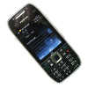
Review of GSM/UMTS-smartphone Nokia E72
Table of Contents:
- Positioning
- Design, Size, Controls
- Display
- Keypad
- Battery
- Memory
- Performance
- USB, Bluetooth
- Camera
- Software
- Nokia E72 vs Nokia E71
- Impressions
Sales package:
- Handset
- Charger (AC-8)
- 4 Gb microSD memory card
- USB data cable CA-101D
- Wired stereo-headset (WH-601)
- 1500 mAh battery Li-Pol (BP-4L)
- Wrist strap, leather case
- Cleaning cloth
- User Giude
Positioning
By the summer of 2009 the Nokia E71 had become the best selling QWERTY-armed phone in the world - basically, no other device could even reach it in terms of sales. The main foundation of the E71's success was the fact that it wasn't positioned exclusively as an enterprise solution - to many it also was a fashionable accessory with some business smarts inside. Nokia managed to strike the right balance between these elements, hence the result. All in all, one could easily name the Nokia E71 among the most successful QWERTY-phones in history, and there wouldn't be even a little bit of exaggeration. In some markets, including Russia, this phone has technically created the market for QWERTY-enabled handsets, boosting the demand to previously unseen heights.
Another factor contributing to the stability of the E71's sales is that its price hasn't changed much over this year - at this point it retails for 80 to 85 percent of its original price, depending on the market. One would think that after a year on the market, it'd lose some ground, but it's holding up. While Nokia had its update planned already back when the E71 only saw release, they did realize that the presence of the E71 wouldn't leave it a chance. So they faced a tough dilemma and after some deliberation they opted not to hold back the debut of the E72 anymore. However sending the E71's price through they floor would be foolish to say the least, so that's why we'll see two phones separated by a 50-70 Euro gap on most markets. For any other phone market, having two nearly identical offerings together would have been a fatal setup, but Nokia will see a different result.
Basically, the E71's user group is composed of youth and businessmen - I'm intentionally omitting the group of celebrities, as in their behavior and age they are pretty close to the youth.
While for the former group, changing the device wouldn't be a sound decision, and very few will actually venture to do so, the other part of the audience values functionality over style. And that's exactly how some users will eventually decide to switch their E71 for the brand-new E72m - this trend will be especially prominent among those who have already replaced their E71 with… Nokia E71. There are people who have! But anyway, there won't be many consumers who'll decide to go for the new version of the phone. Most of the E72's sales will be generated by new users, those who didn't buy the original E71 for some reason (had an active contract, needed a better camera or something else). Sales-wise, the Nokia E71 vs E72 ratio will be around 2:1, which is justified from the standpoint of price.

At the same time, the E72 is one of the most technologically advanced solutions among thumbboard-enabled devices. No other phone makers will be able to roll out anything even close to it in the near future - neither in terms functionality nor price and positioning. In essence, the Nokia E71 has created a new niche on the market (fashion- and business-savvy devices at the same time), and the E72 is just another addition to this class. BlackBerry exercises a similar way of positioning, to a certain extent, however the bulk of their sales is generated in the US, since their European branch is no match to Nokia.
Back to the table of contents >>>
Design, Size, Controls
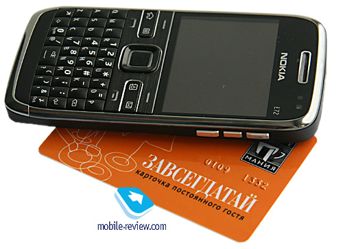
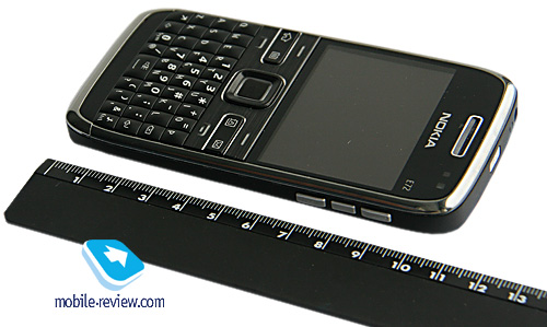
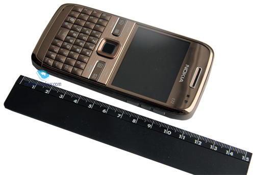
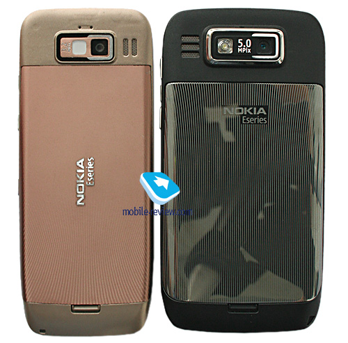
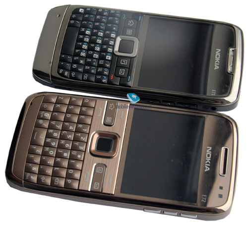
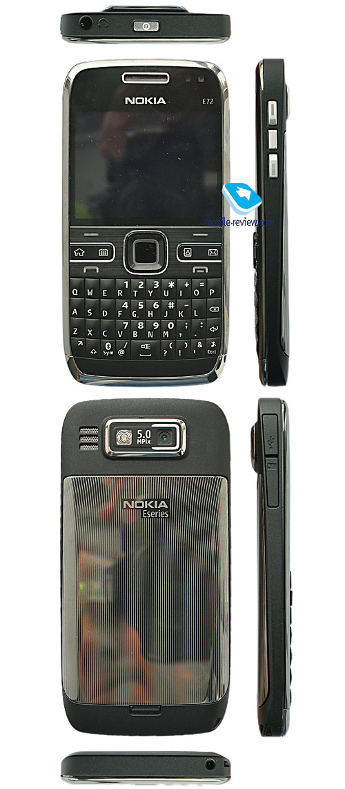
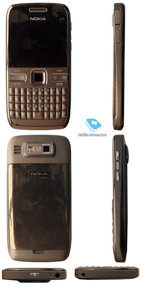
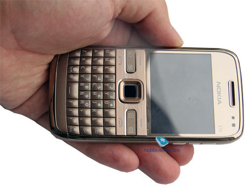
It feels as if the motto of the E72 designers was "just make it the same". Indeed, it seems they have done everything possible to keep the E71's shapes and size intact, while making improvements to certain elements. The phone measures 114 x 59.5 x 10.1 mm (against the E71's 114 x 57 x 10 mm) and weights 128 grams, which is exactly 1g heavier than the E71. The E72 seems like it was carved specifically to fit into a shirt pocket, let alone a purse of something along these lines.
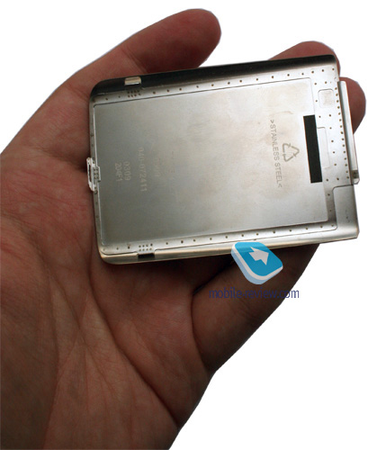
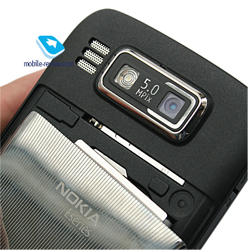
The E71's trademark details, such as a chromed metal strip running around the casing, metal battery cover, haven't gone anywhere, but some things have changed drastically. First thing you come across is the 3.5mm audio jack on the top end, which is a big stride forward compared to the E71's 2mm slot. On top of that the E72 boasts an audio chip, much like most of Nokia's other state-of-the-art offerings, allowing for superior sound quality - compared to the E71, the E72 is miles ahead on this front.


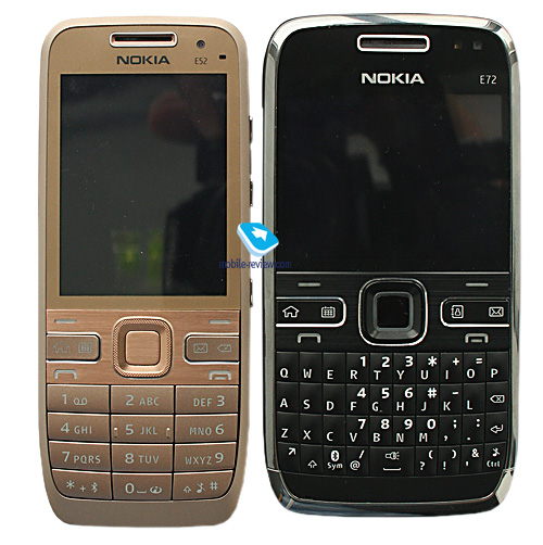
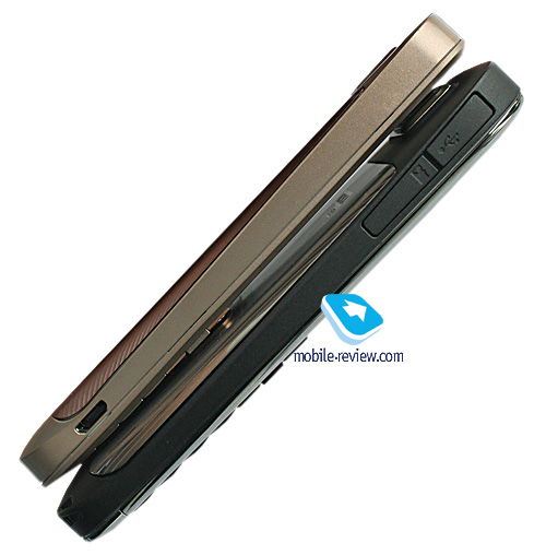
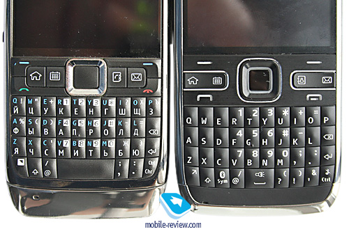
Nokia E72 vs Nokia E52:


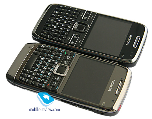
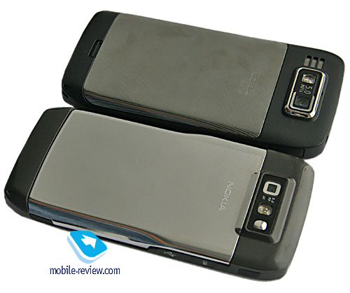
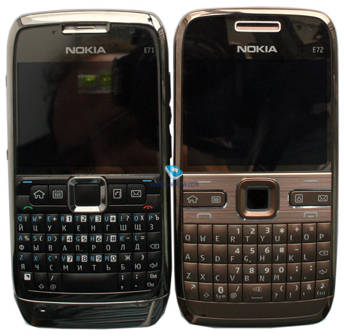
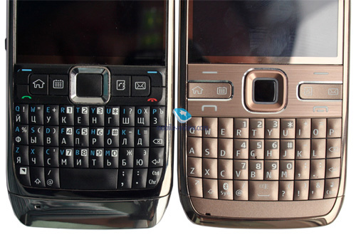
Nokia E72 vs Nokia E71:


Also here is the power button, whose color has been changed from red to silver - even though the early prototypes of the E72 had red buttons, the new variant goes well together with the casing.


The E72 will be available in three colors - Zodium black, Metal grey and Topaz brown. While I do like all three versions, I really think it could have used a white edition too, as it looked stunning with the E71.


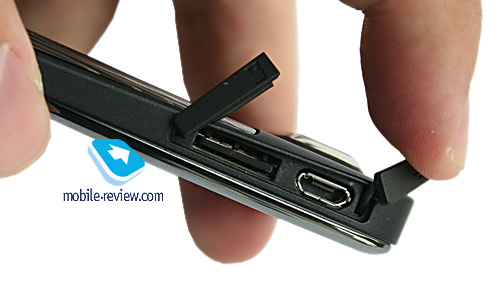
Housed on the left-hand side is the memory card slot along with the microUSB socket. The Nokia E72 doesn't have rubber stubs - instead there are a several plastic flaps linked to the casing. Personally, I didn't experience any problems with the E71's plugs, but some users tended to tear them off, so Nokia decided to change this element.

On the right there are two volume buttons as well as the Voice key. At the bottom there is the lanyard eyelet and 2mm charger slot.
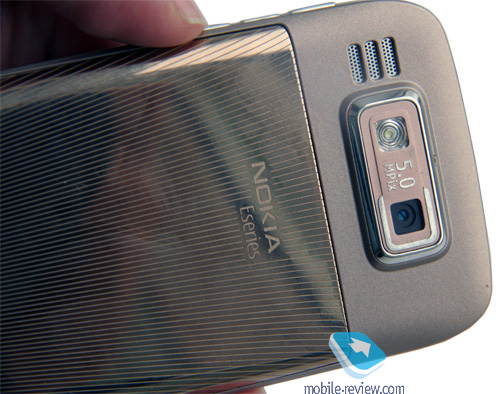
Another thing that has changed is the loudspeaker grill that has been moved from the top end to the back side. It'd seem that this relocation would make the E72's ringtones sound worse, but thanks to the fact that the camera module protrudes from the casing a bit, it sounds even a tad better.

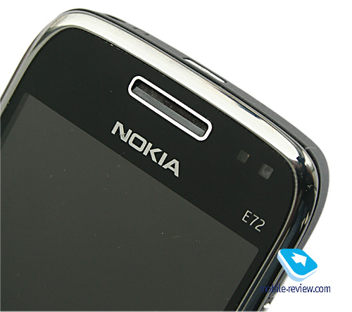
The Nokia E72's display is housed under a cover glass, and sitting right on top of it are the forward-facing camera plus the ambient light sensor (manages the backlight level of the screen and keypad).

Back to the table of contents >>>
Display
The E72 employs exactly the same display as its predecessor, although due the fact that the ambient light sensor works in a slightly different manner, it may seem that Nokia have done something about it. The E72 utilizes a 2.36-inch QVGA display (320x240 pixels, 48x36mm), capable of up to 16 million colors. It manages to output a pretty decent picture quality-wise that remains readable in various environments (it doesn't fade away in the sun at that, all thanks to the mirror underlayer).

On balance, the E72 packs in a likable display and we are pretty much content with it. It can accommodate up to 8 text and 3 service lines (with some modes allowing for up to 14 text lines).
Back to the table of contents >>>
Keypad
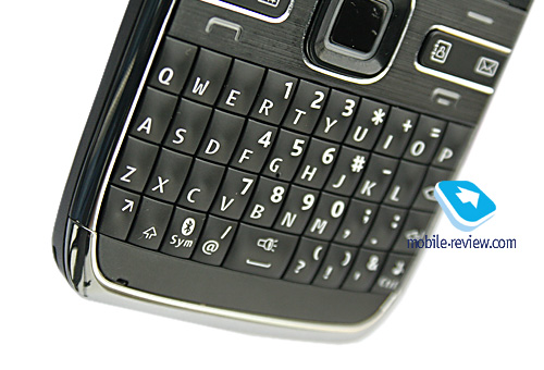
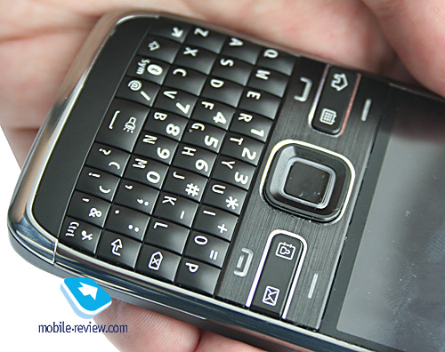
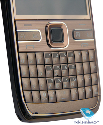
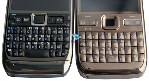
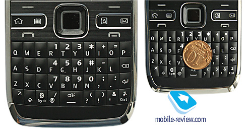
One would think that Nokia would utilize the same kind of keypad in the E72 as in the E71, but instead they opted to run with the Nokia E63's thumbboard, as some users consider it the most comfortable of the two. Although my opinion is that it's more about personal preferences and experience - I can't find anything to complain about with either of them.


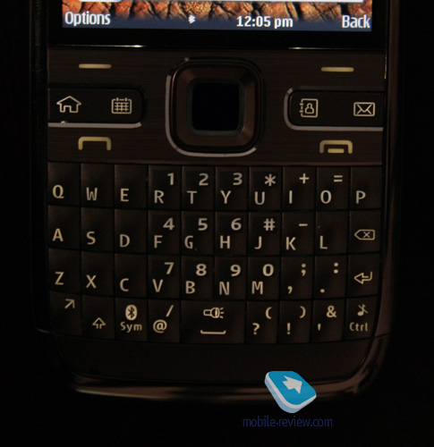
Now let's take a closer look at what has been changed. First and foremost, the bottom row has been expanded with two new buttons, meaning that the E72 is very close to the E63 in terms of thumbboard layout. At the same time, the E72's casing width and button shape are identical to those of the E71 - they are a tad bigger (and higher), which should make for better experience.


All buttons are lit in white. Now for the functional buttons. The E72's trademark feature is a 4-button setup (including the Menu button) that allows for one-click access to the calendar, phonebook and mail applications. On top of that there are actually two ways to press each of these keys - long-press and a short click. This way, with a short press you will jump into the phonebook's general list of entries, the mailbox or monthly view of calendar. However when you tap and hold these keys, you will be able to create a new contact, entry in calendar or email. Punching these keys one more time will get you back to the main menu.

Furthermore, you can even reprogram these buttons to access custom applications or features.
The E72's navigation button is pretty comfortable to use; also it has a service LED built inside. The good thing about it is that it is fully customizable - you can setup event notifications and other options. Unfortunately there is no way to disable it during night time (since it glows a little too bright in the dark).
One of the novelties found in the E72 is the optical joystick built into the OK button - many Samsung-branded phones used a similar solution, although it wasn't particularly handy because of how many misclicks it allowed. Unfortunately, the E72 isn't much better. But, it is possible to get used to it, plus this joystick is what one can only wish for when it comes to web surfing. In my opinion, one of the E72's drawbacks is that it doesn't allow the user to disable this joystick everywhere but in browser and certain applications, as it's definitely useless for menu browsing.

We decided to compare how E72 fared against it fellow sibling in terms of texting speed. So, we offered ten people to type the same phrase in two languages and then compared speed and number of errors (although on this front it was a draw, so we omitted this parameter from the chart).
| |
Nokia E71 |
Nokia E72 |
| Texting speed (in Russian), average, seconds |
18.4 |
19 |
| Texting speed (in English), average, seconds |
17.2 |
16.3 |
| Comments |
Worse feedback |
Superior feedback, unusual layout |
No surprises there - the results were exactly what we had expected. The E71 and E72 offer comparable texting speed, and the difference came down to tenths of a second. While some commented about the E71 having worse tactile feedback, I'd say this was due to their lack of experience with its thumbboard.
Back to the table of contents >>>
Battery
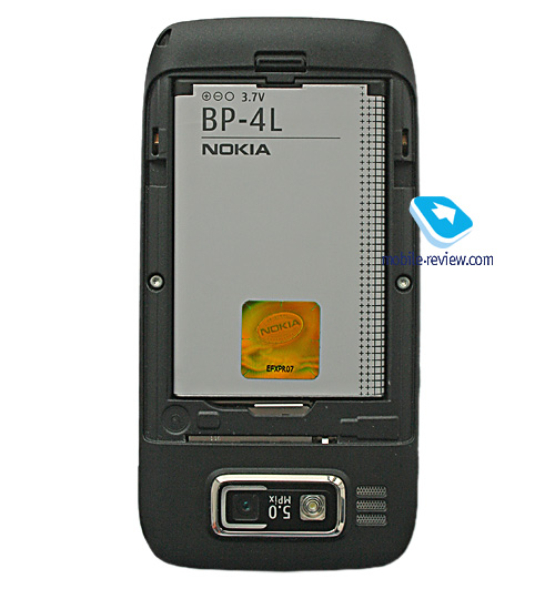
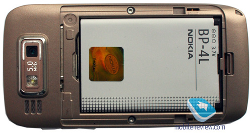
The handset utilizes a 1500 mAh Li-Pol battery (BP-4L), same as in the Nokia E71. The E72 is rated for 12.5 hours of talk time (GSM) and 20 days of standby. Music time - up to 37.5 hours.


The handset's battery life averaged 5 days in our tests, when we used the E72 for about two hours of calls, a dozen or two snaps, several minutes of video, and around an hour of music/radio. It takes the E72 around 1.5 hours to charge from empty to full.
If you forgo EDGE/GPRS data completely, the E72 will offer you even longer hours. Basically, with average use you will get a minimum of 4 days of use out of it. What else can we say - the E72 is unmatched on this front; what's more, despite sharing the same battery type, the E72 improves upon the E71's performance by 15-20 percent (not only thanks to its smaller display but also some software enhancements).
Below is our chart of battery times we managed to squeeze out of the E72:
- GPS-navigation - 6.5 hours
- Video playback - 7 hours 50 minutes
- WEB-surfing (EDGE) - 5 hours
- Music (in earphones) - 32 hours
- Wi-Fi (non-stop data upload) - 8 hours for non-stop data transfer, 110 hours of standby (according to Nokia)
Back to the table of contents >>>
Memory
The device comes equipped with 128 Mb of RAM, after first launch you will get around 70 Mb of free memory at your disposal, which is enough for running a dozen applications and browsing "heavy" web-pages - the word "slow-down" is definitely not in the E72's vocabulary.
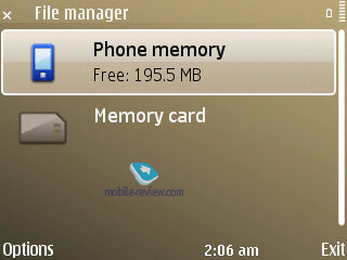
The user almost has 250 Mb of storage available, where any data can be stored.
The E72 deals with microSD memory cards (hot-swappable), the phone comes packaged with a 4Gb unit. There are no restrictions as far as memory card's size is concerned - our handset easily identified a 32Gb card.
Back to the table of contents >>>
Performance
I used to speak favorably of the Nokia E71 for its speedy interface and various improvements over the Nokia E61i, and now it's time for another round of praise. Compared to the E71, the Nokia E72 has a faster CPU (ARM11) running at 600 Mhz against the E71's 369 Mhz. In fact, you don't even need to know this, as the effects of this upgrade can be seen everywhere in the phone.
Back to the table of contents >>>
USB, Bluetooth
USB. Using the USB settings you can choose one of the following modes:
- Data Transfer (Mass Storage USB) – memory cards is available, no drivers required, as your OS identifies the handset automatically.
- PC Suite – used for device management via Nokia PC Suite, enables all features of the phone, data backup etc.
- Image Print – no explanation required.
The E72’s data transfer speeds top out at 2 Mb/s.
Bluetooth. The phone comes with Bluetooth v2.0, with support for EDR. The following profiles are supported:
- A2DP
- AVCRP
- BIP-ImagePush
- DUN-GW
- FT-Server
- HandsFree-AG (1.0)
- Headset-AG
- OBEX
- OPP-Client
- OPP-Server
- SIM Access-Server
The top speed you can get with the E72’s Bluetooth connection is around 100 Kb/s. We also tested its A2DP profile in pair with the Sony Ericsson DS970 headset, which worked just fine – we managed our play list, skipped within tracks and adjusted volume seamlessly, however we couldn’t make current track’s title show up on the headset's display.
Wi-Fi. This handset comes armed with Wi-Fi (IEEE 802.11 g) support. All security standards are supported, including WEP , WPA , WPA 2, with other advanced settings available. Unlike the NSeries, the E72 doesn’t support Universal PnP (UPnP). Although, it boasts the WiFi Wizard, which can search and tap into available networks in the background mode.
Unlike the E72 doesn't have an IrDA port.
Back to the table of contents >>>
Camera
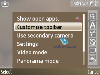
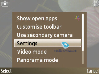
The E72 comes bundled with a 5 MP CMOS module with autofocus - all in all, it's identical to other latest and greatest phones from Nokia, such as the 6720 Classic. Focusing in done with the help of the optical joystick.

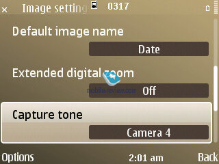
The camera settings are as follows:
- 5x digital zoom
- F = 4.7 mm
- Focus range - 10 cm to infinity
- Macromode - 10 cm to 50 cm
- Scenes - automatic, user defined, close-up, portrait, landscape, sport, night
- Geotags (may be disabled)
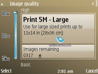
The E72's top resolution is Print 5M-Large, which stands for 2592x1944 pixels and image size of 2Mb. There are other resolutions as well:
- Print 3M – Medium (2048x1536 pixels)
- Print 2 M- Medium (1600x1200 pixels)
- E-mail 0.8 M – Med. (1024x768 pixels)
- MMS 0.3 M – Small (640x480 pixels)


It takes the E72 around 3-4 seconds to save a shot in any of the above resolutions if you have enabled the after-shoot view. Or 1-2 seconds in case you are ready to take another snap right after that (in the latter case all images are saved from the buffer).
Nokia E72 vs Nokia E71:
| Nokia E72 |
Nokia E71 |
 |
 |
| (+) enlarge, 2592x1944, JPEG |
(+) enlarge, 2048x1536, JPEG |
 |
 |
| (+) enlarge, 2592x1944, JPEG |
(+) enlarge, 2048x1536, JPEG |
 |
 |
| (+) enlarge, 2592x1944, JPEG |
(+) enlarge, 2048x1536, JPEG |
 |
 |
| (+) enlarge, 2592x1944, JPEG |
(+) enlarge, 2048x1536, JPEG |
 |
 |
| (+) enlarge, 2592x1944, JPEG |
(+) enlarge, 2048x1536, JPEG |
Overlays. Since you can apply just the same overlays and effects in any graphics editor, using them while shooting is probably not the best idea. Available overlays are Sepia, Black&White, Negative.
Exposure compensation . This feature comes in handy in some specific environments, where it makes for considerably better and sharper shots. It can be modified on a -2 - +2 scale with a 0.33 step.
White balance. The E72's auto white balance does a pretty good job on its own, but if you feel the need to play around with settings, there are Sunny, Cloudy, Incandescent, Fluorescent available as well.
 |
 |
| (+) enlarge, 2592x1944, JPEG |
(+) enlarge, 2592x1944, JPEG |
 |
 |
| (+) enlarge, 2592x1944, JPEG |
(+) enlarge, 2592x1944, JPEG |
 |
 |
| (+) enlarge, 2592x1944, JPEG |
(+) enlarge, 2592x1944, JPEG |
 |
 |
| (+) enlarge, 2592x1944, JPEG |
(+) enlarge, 2592x1944, JPEG |
 |
 |
| (+) enlarge, 2592x1944, JPEG |
(+) enlarge, 2592x1944, JPEG |
 |
 |
| (+) enlarge, 2592x1944, JPEG |
(+) enlarge, 2592x1944, JPEG |
 |
 |
| (+) enlarge, 2592x1944, JPEG |
(+) enlarge, 2592x1944, JPEG |
 |
 |
| (+) enlarge, 2592x1944, JPEG |
(+) enlarge, 2592x1944, JPEG |
Video recording. When recording video with E72, there are considerably fewer settings, than in the still image mode. There is a software image stabilizer that was first introduced in the Nokia N80. You can adjust the white balance, choosing from Automatic, Sun, Cloudy, Incandescent, Fluorescent. The overlay pool includes Sepia, Black&White, Negative. There are only two shooting modes - auto or night mode. Maximum resolution - 640x480 pixels (mpeg4), you can also mute sound, although there is no way you can adjust the E72's FPS, which is locked at 15. The handset allows recording videos until you run out of free memory.
Back to the table of contents >>>
Software
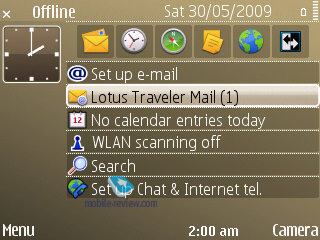
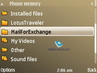
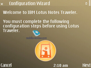
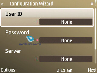
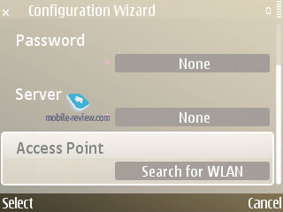
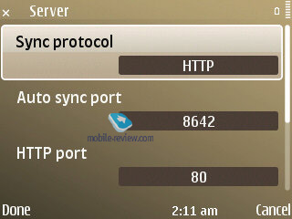
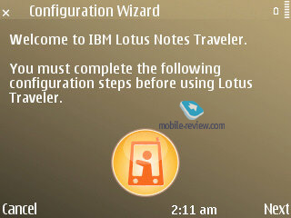
As far as software is concerned, the E72 is almost no different from the E52. It comes packaged with Lotus Traveler, which many enterprise users will find quite useful.
The ESeries devices have always been worlds apart from other S60-powered devices in the way of software. Some apps and options that were tested on these phones in the first place are now becoming par for the course in the rest of the company’s portfolio, but some still remain the trademark features of the ESeries. The E72 is next to identical to the Nokia E71 in terms of core features, but it also packs in a whole lot of small enhancements, which are pretty difficult to spot for those who have never used Nokia's Eseries before.


Let's run through all major changes in the standard functionality - if you want to learn more about the core functionality of the Eseries, read our dedicated article on the FP2 linked below.
Back to the table of contents >>>
Mail client
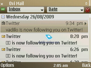
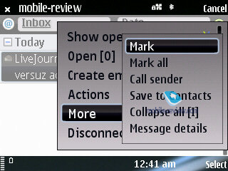
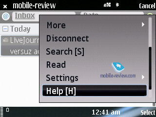
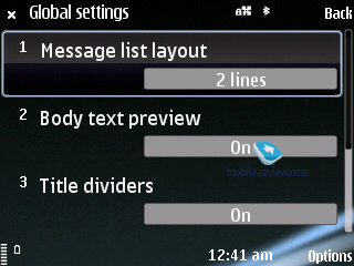
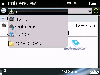
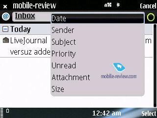
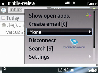
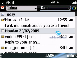
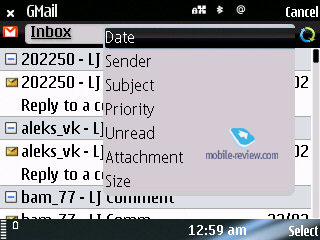
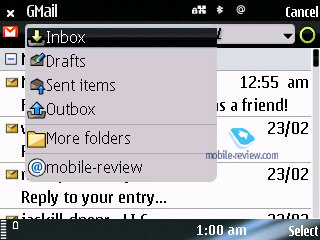
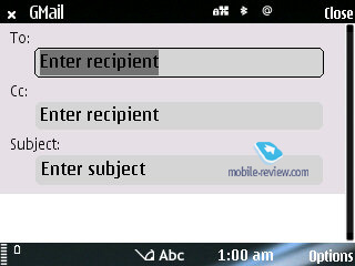
The phone utilizes Nokia Mail version 2.0 client, identical to the one found in the E75, although the major difference highlighted by Nokia is html support in letters. But in reality there are other details that are worth talking about.
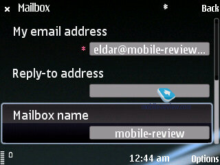
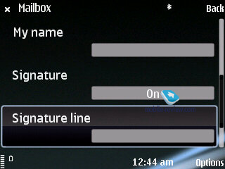
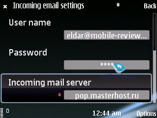
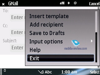
The mail wizard will take your though all necessary steps required to setup a new account. In case you use a well-known service, such as Gmail or Yahoo, all you'll need to do is enter your mail address and password - and that's it, you're all set.
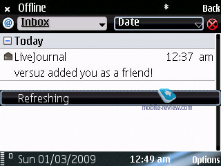
When connected to your mail box, the E72 shows a matching splash screen as well as a special icon in the top right. Unfortunately, there are no other indicators in this client (such as the number of letters or delivery process), nor does it allow the user to upload only selected entries. But while it may seem ascetic, this mail client is still superior to that found in other Nokia-branded phones.
The default feature pack is nothing to write home about. One thing of note, though, is that all links now have the Play icon next to them, allowing the user to open them in a new window or use Intranet.


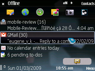
But the most interesting thing about it is how this client handles html. These letters get opened in a new window, using the browser's engine and that's the point where all the trouble with character encodings (other than Unicode) being. For example the standby screen shows latest letters and first lines picked out of them. Letters in Russian, as a rule, are displayed correctly, but there is a chance that it'll get twisted in the html view and vice versa. Unfortunately Nokia haven't done their homework and haven't solved their old localization problems. Many applications and features suffer from poor translation and character encoding issues. For example this mail client doesn't allow to pick character encoding, which is a huge drawback for many regions utilizing non-Latin alphabets.
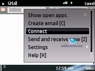
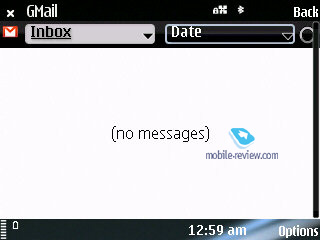
Online mail services work in an even more twisted way on the E72 - for example, if you open a letter in html via Gmail, you won't notice anything out of the ordinary, same goes for previewing it in the mail client; but as soon as you open this letter in the browser as html, the character encoding will crumple.
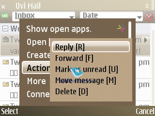
The QWERTY-orientation of the E72's mail client also manifests in the form of shortcuts on the keyboard. But while they are very handy, other apps found in the E72 lack this feature, which is a pity. For example, one would expect to find them in the organizer, but there are none.


The mail client supports POP3/IMAP, remote synchronization and other par-for-the-course features. But unfortunately, the above-mentioned drawbacks will probably make you not want to employ it as you main mail client, especially if you're a sophisticated user. Had it not been for all the hype Nokia created around this client, I wouldn't have anything against it, but in all honestly, they should have come up with something more interesting for enterprise users.
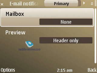
Apart from that the E72 boats Push-esque functionality when the service automatically checks for new mail and sends it to your phone - while one could argue that the way it's implemented in the E72 is far from ideal, the ordinary consumer will be more than happy with this feat.


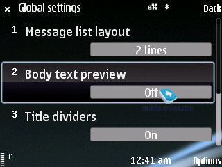
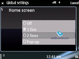
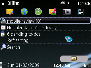
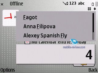
Desktop. The desktop mode has been revamped a little - now at the bottom there are three icons standing for missed calls, messages and voice mail. If there are no events at hand, the corresponding icon will vanish. Clicking on each thumbnail will make a pop-up with extra information appear on the screen. Compared to the E71, the setup found in the E72 is somewhat different: for example, it doesn't show any info from SMS other than sender's name or number.
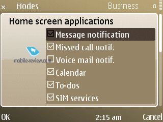
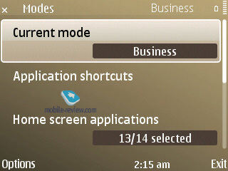
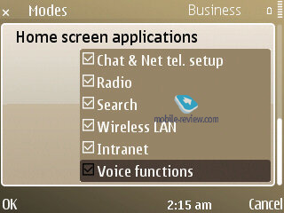
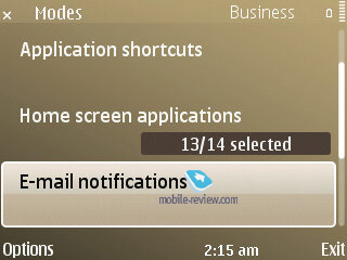
There is also an option to tack up to 14 apps on to the desktop, which is extremely handy - add two Mode screens and the number of applications you can have at your fingertips gets even bigger
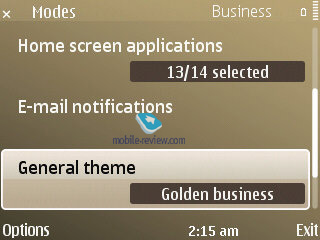
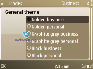
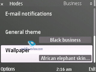
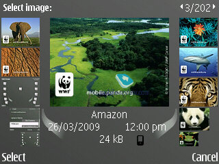
Mode. In a nutshell, it's a mobile version of the latest PC craze - virtual desktops. That is, you make up a couple of screens, where various themes, pictures, applications, plug-ins and other essentials are housed/used. And then you can swap between them in one touch, so that it's always easy to jump between your setup for work with mail and notifications brought up on the main screen and the home setup with a different theme applied (without your company's logo or colors) and player controls lined up on the screen instead of email notifications. It takes the E72 around 6-7 seconds to jump between modes.


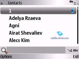
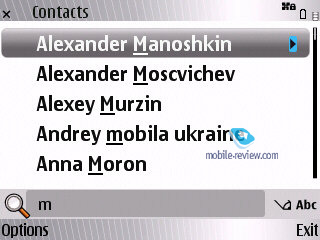
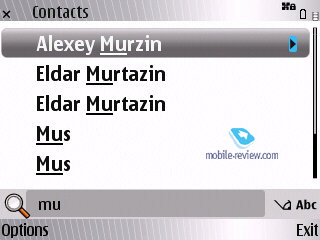
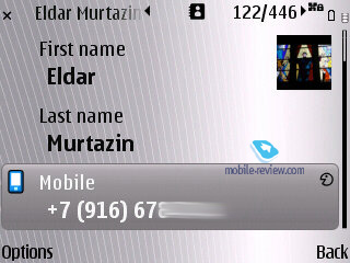
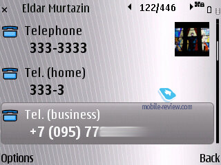
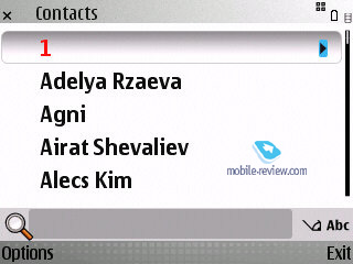
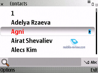
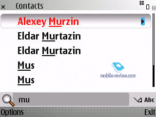
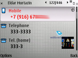
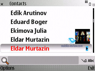
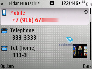
Phonebook. While at the standby screen you can type in any letter from the thumbboard and the phone will instantly look-up all contacts in the phonebook that have with this letter in either first or last names. The same method works in the contact list too.
Contact groups have been given a major boost too - now you can submit a number for voice conferences, a password and also a PIN-code. Enterprise users, who use conference calls a lot, will surely appreciate this new ability. Plus you can select a ring tone for any contact group in the E72 (but not a picture, regrettably).


With groups you can also make use of "Call to many" feature, which will allow the E72 to set up a conference call on its own; on top of that the handset allows for bulk mailing.
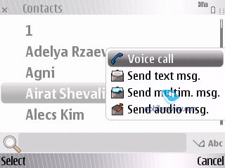
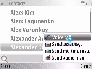
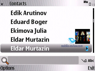
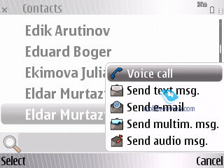
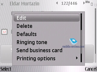
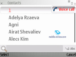
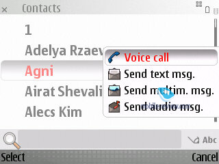
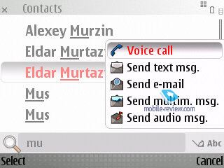
Regrettably, there are no other views available for the phonebook - for instance, you can't make the E72 show contacts coupled with at least one phone number. At the same time it allows calling up a drop-out menu by selecting a contact and pressing the navigation button right - it'll let you make a call or send a message without leaving the phonebook menu. On top of that this list is context-sensitive, meaning that its options will change depending on what types of phone numbers are available for the contact in question.
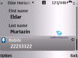
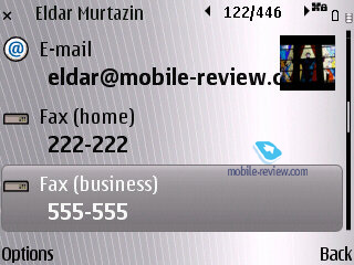
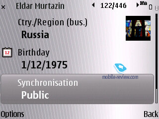
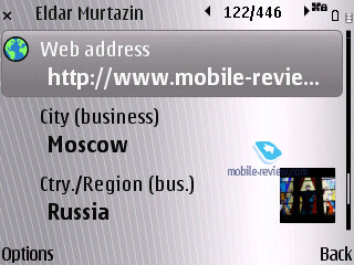
The roster of fields you get to fill when creating or editing a contact hasn't changed much, but the E72 manages to offer a better address field setup and also BlackBerry PIN as a default option.


Calender. The Calendar application hasn't changed a bit since its last iteration; in fact the only thing that's different is its layout, when the E72 shows both the calendar and events scheduled for the current day. In case there are too many entries, the E72 will show only their total number with no extra information. When using the weekly view of calendar, all events are displayed just like in MS Outlook, plus there are some pop-up tips scattered across the screen. All in all, while pleasant, none of these changes are groundbreaking.
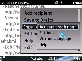
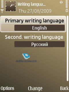
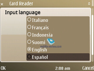
Text input. The E72 allows to choose two input languages: main and secondary (this feature was available in Motorola's phones before). This feature allows you to switch between language while typing, which is very handy. The T9 mode works in a slightly different way as a result - it "guesses" words in two languages simultaneously, which may feel awkward at first, but fairly easy to get used to.

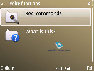
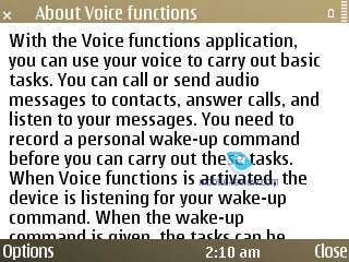
Voice Functions. Surprisingly, one of the major updates found in the E52, as well as in the Nokia E72 was completely overlooked by the vast majority of journalists. In reality, though, the E72 sports some very unique features in this department - those who spend a lot of time on the phone while driving will definitely appreciate them.


The E72 retains all the standard voice dial functionality: tapping and holding the Call key brings up the voice dial menu, the built-in app handles all names stored in the contact list with ease, plus there is Voice aid. So, what's the big deal about it?
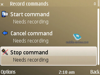
The Applications menu features Voice Functions icon. Tap on it, and the app will offer you to record three commands with your voice: Start, Stop, and Cancel. You can record them in any language, just make sure you repeat each of them three times. Then, minimize Voice Functions and take a closer look at the standby screen, that now sports a new icon tagged as "Start Voice Functions". In essence, it's similar to Sony Ericsson's Magic Word - now you need to say the key word to activate Voice Control. In my case, it was "Start Voice Functions" - easy, right?
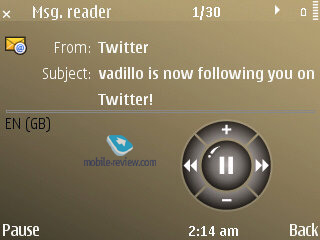
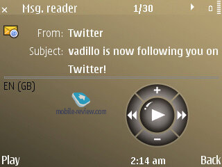
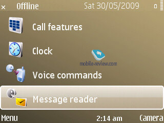
Say it, and the phone is ready to go - you can ask it to dial a number from the contact list, read out a message or a letter (with the help of Message Reader that all owners of the E71 know very well), plus it allows you to navigate through your message boxes.
If you don't want the E72 to read all messages for you, just get it to find the entry in the phone book you need and then tell it to read mail or SMS. Furthermore, you'll have the option to reply by making a call or MMS (voice message). All that can be done without even touching the phone. Sometimes, when the E72 can't make out who you're talking about, just cancel the last action and start over.
Apparently, this application was designed for in-car use - think a bout it, it works without a headset, activates the speaker phone automatically (and it can't be disabled), so that it becomes next to impossible to make calls when holding the phone next to your ear. On top of that, it's not advisable to keep this feature on for a very long time, as it's incredibly power-hungry.
To test the E72's voice functions I had it dial my friend's number and then asked to read out all messages from him, picked one and recorded an MMS reply. During the first five minutes I was somewhat confused, the phone kept repeating all commands into the headset and offered various tips, but in the next several minutes I got used to it and did everything I intended without any hiccups.
Nokia have officially become the first phone maker to offer phone-wide integration of voice features you had before and the quality of the resulting product is more than satisfactory. I think that this system will keep evolving, as it's got a lot of potential. By the way, there is also Talking Theme that allows you to navigate through the main menu without touching the phone - the phone will inform you what section you are in, and read out messages/names if necessary.


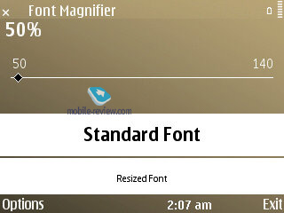
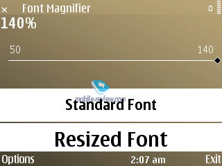
Font Magnifier. This application from Nokia Beta Labs has finally become a part of the standard feature pack, as many users have come to like it. In a word, it allows you to alter the font size in menus, which is a handy feat to have around.


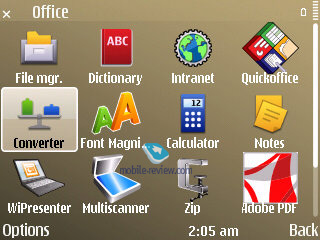
Office applications. Enterprise users will surely appreciate the E72's Intranet application, which comprises the settings of VPN-client.
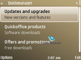
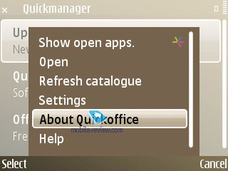
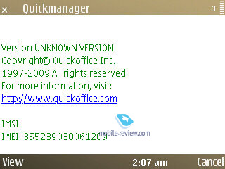
Microsoft Office documents are still handled by QuickOffice, which is a pity (although many will be content with what it has to offer). The E72 ships with version 5.3, which can be updated to 6.2 free of charge. The good thing about it is that not only does it allow to read office documents, but also edit them.
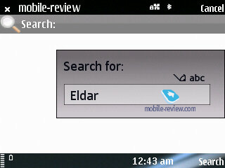
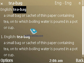
Also there is a ZIP archiver, dictionary and PDF reading tool. The Search 4.0 app can be linked directly on the main screen. The dictionary allows not only viewing words' definitions, but also listening to their pronunciation Advanced Call Manager application allows turning your phone into an answering machine and sort all contacts into lists (black and white lists).


Data encyption. Another change of note - the E72's ability to encrypt data both on the memory card (microSD of any size) and the handset's internal memory. And this saves you a whole lot of trouble should you smartphone end up in some villain's hands, who does know how to break a standard password. On the other hand, if you forget the password yourself, you won't be able to recover the data, which will be a pity, but all systems of this kind have this glitch.
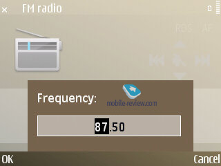
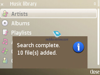
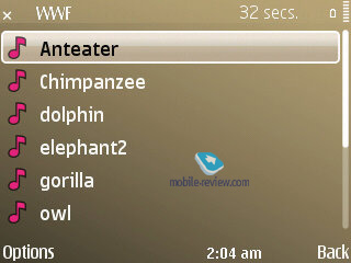
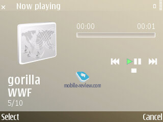
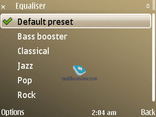
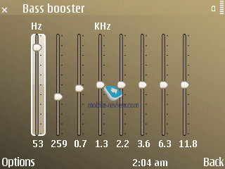
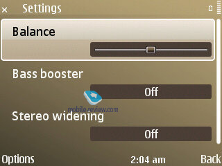
Music department. Since the E72 is almost an exact copy of the Nokia 5730 XpressMusic, it packs in a dedicated audio chip, meaning that it surpasses all previous Eseries-branded phones on this front, plus the E72's standard 3.5 mm audio jack allows the user to utilize a pair of custom earphones.


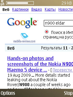
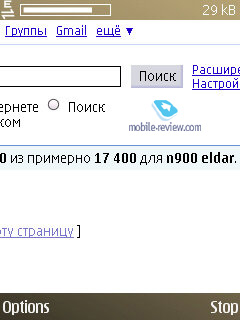
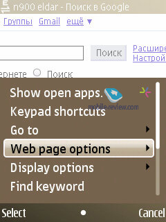
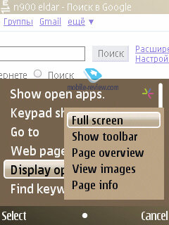
S60 browser. Without any fuss or special announcements Nokia have updated the browser to version 7.1, finally making all their S60-based phones without touchscreens similar to their touchscreen-enabled siblings in terms of browser functionality. So what's the difference? The E72's browser renders pages considerably faster, can handle much more complex pages, plus the user can now setup the toolbar popup and arrange all shortcuts in the way you like.
Maps. The E72 makes use of Nokia Maps 3, and comes bundled with a compass used for navigation. Plus the sales package includes life-time subscription to pedestrian navigation services and a 10-day subscription to voice-guided car navigation.


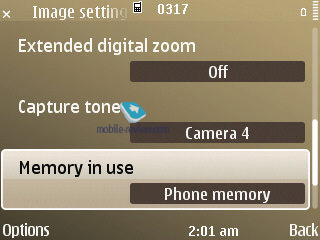
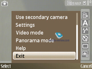
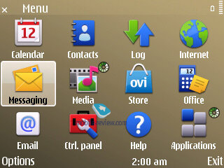
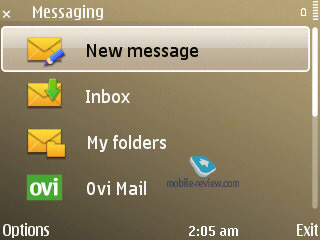
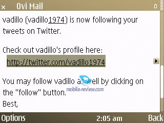
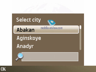
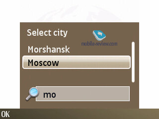
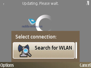
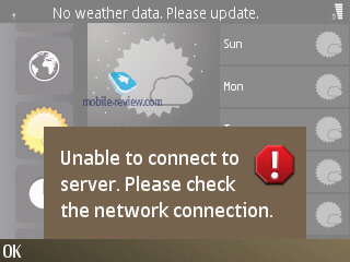
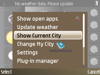
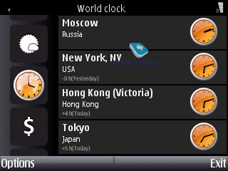
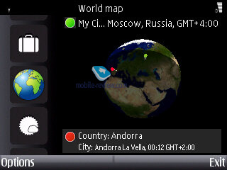
Screenshots:


Back to the table of contents >>>
Nokia E72 vs Nokia E71
Many won't bother looking past the E72's looks and therefore won't find too many differences between it and the E71. But in reality there are so many enhancements and alterations, that the E72 may well be considered a completely new phone.
| |
Nokia E71 |
Nokia E72 |
| Size, weight (mm, g) |
114x57x10, 127 |
114x59.5x10.1, 128 |
| Display |
2.36 inches, TFT, 16 million colors, cover "glass" |
2.36 inches, TFT, 16 million colors, cover "glass" |
| Battery |
Li-Pol, 1500 mAh |
Li-Pol, 1500 mAh |
| Memory |
128 Mb RAM (70 Mb after first boot), 110 Mb of storage, microSD cards supported |
128 Mb RAM (70 Mb after first boot), 250 Mb of storage, microSD cards supported |
| CPU |
ARM 11, 369 Mhz |
ARM 11, 600 Mhz |
| Bluetooth |
2.0 |
2.0 |
| Camera |
3.2 MP |
5 MP |
| WiFi |
Yes |
Yes |
| Версия S60 |
S60 3rd Edition FP1 |
S60 3rd Edition FP2 |
| Data Encryption |
Yes |
Yes |
| VoIP |
2.3 |
3.0 |
| Enhanced calendar, phonebook |
Yes |
Yes |
| GPS |
Built-in |
Built-in, plus electronic compass |
| FM-radio |
Yes |
Yes |
| Nokia OSS Browser |
Yes |
Yes |
| HSDPA/HSUPA |
Yes/No |
Yes/Yes |
| Texting speed |
Same |
Same |
| Audio jack |
2 mm |
3.5 mm |
| Home Media (uPnP) |
No |
Yes |
| Optical joystick |
No |
Yes |
| Full version of QuickOffice |
No |
Yes |
The Nokia E72 trumps its predecessor in every aspect, while retaining all its advantages. The only moot point is the E72's thumbboard, but it's to get used to.
Back to the table of contents >>>
Impressions
As far as call quality goes, we couldn't find any differences between the E71 and E72. However their ring tones do sound differently because of the relocated speakerphone in the E72; let me put it this way: the E72 sounded a bit muffled in my pocket, but was louder when put face-up on a table. All in all, nothing to worry about. The vibro alert hasn't changed a bit.
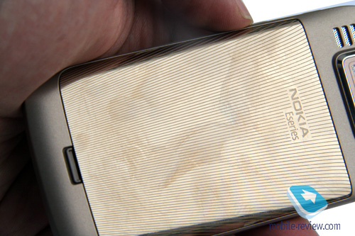
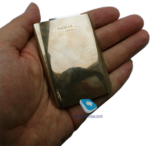
The E72 sports a different battery cover design, although it's not much of an improvement compared to the previous one - they are both pretty reliable.
As for other aspects, the E72 has become a lot speedier, and got a big 20-percent boost in terms of battery endurance (compared to the E71). Much of the credit here goes to the FP2. Its camera, while not astonishing, trumps the Nokia E71 hands-down as well.
The phone also employs Noise Cancelation system, which is implemented in the form of two microphones - each analyzes environment sounds and blocks outside noise. In the E72 this feature works fairly well, as opposed to the E52, where its software setup is far from perfect (although Nokia will fix this in new firmware versions).
On balance, the Nokia E72 is a very appealing phone - being an update of the E71 it packs in a plethora of enhancements and improvements of most core features, and if you can't decide which one to choose, definitely go for the E72, unless you're in the market for a cheaper solution. The E72 retails for around 350 Euro, which is the same watermark that the E71's kicked off at. In my opinion, if you're looking for a QWERTY-enabled solution, the only options you have these days are the E71 and E72, since everything else require you to compromise to a certain extent.
Back to the table of contents >>>
Related links:
Eldar Murtazin ([email protected])
Translated by Oleg Kononosov ([email protected])
Published — 20 September 2009
Have something to add?! Write us... [email protected]
|
News:
[ 31-07 16:21 ]Sir Jony Ive: Apple Isn't In It For The Money
[ 31-07 13:34 ]Video: Nokia Designer Interviews
[ 31-07 13:10 ]RIM To Layoff 3,000 More Employees
[ 30-07 20:59 ]Video: iPhone 5 Housing Shown Off
[ 30-07 19:12 ]Android Fortunes Decline In U.S.
[ 25-07 16:18 ]Why Apple Is Suing Samsung?
[ 25-07 15:53 ]A Few Choice Quotes About Apple ... By Samsung
[ 23-07 20:25 ]Russian iOS Hacker Calls It A Day
[ 23-07 17:40 ]Video: It's Still Not Out, But Galaxy Note 10.1 Gets An Ad
[ 19-07 19:10 ]Another Loss For Nokia: $1 Billion Down In Q2
[ 19-07 17:22 ]British Judge Orders Apple To Run Ads Saying Samsung Did Not Copy Them
[ 19-07 16:57 ]iPhone 5 To Feature Nano-SIM Cards
[ 18-07 14:20 ]What The iPad Could Have Looked Like ...
[ 18-07 13:25 ]App Store Hack Is Still Going Strong Despite Apple's Best Efforts
[ 13-07 12:34 ]Infographic: The (Hypothetical) Sale Of RIM
[ 13-07 11:10 ]Video: iPhone Hacker Makes In-App Purchases Free
[ 12-07 19:50 ]iPhone 5 Images Leak Again
[ 12-07 17:51 ]Android Takes 50%+ Of U.S. And Europe
[ 11-07 16:02 ]Apple Involved In 60% Of Patent Suits
[ 11-07 13:14 ]Video: Kindle Fire Gets A Jelly Bean
Subscribe
|
