|
|
Review of GSM/UMTS-smartphone Motorola Z8
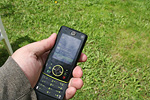
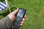
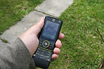
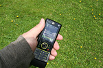
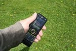
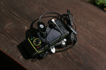
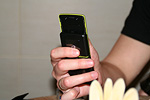
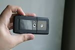
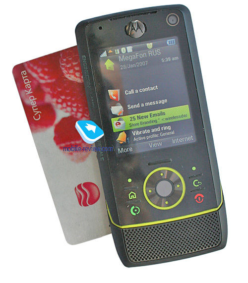
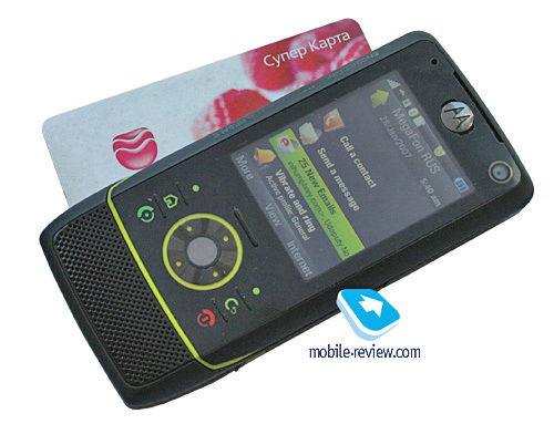
Live photos of Motorola Z8
Table of contents:
- Positioning of the handset, place in the line-up
- New form factor - «kick slider», design
- Controls, keypad
- Instant On
- Battery
- Display
- Memory, memory card. CPU, chipset
- Performance
- USB, Bluetooth
- Camera
- Localization quality
- UIQ 3.1 vs UIQ 3.0
- Interface features, differences from UIQ in Sony Ericsson
- Interface, text input
- Music department
- Games
- Contacts
- Messaging
- Email client
- Organizer
- To-Do list
- Alarm Clocks
- Flight Mode
- Connections manager
- Office applications
- Some other features, themes, web-browser
- Impressions
Sales package:
- Handset
- microSD 512 Mb memory card (availability and size vary by region)
- Battery
- Charger
- miniUSB cable
- Bluetooth stereo-headset Motorola S9 (may be replaced with a wired headset)
- CD with software
- User Guide
Positioning of the handset, place in the line-up
Motorola Z8 has been made up as the pioneer of a new line-up within Motorola’s range. In the past the company had Symbian-powered products, such as Motorola A920, Motorola A925, Motorola A1000. So seemingly there is no way for this product to claim first-of-a-kind title, yet it is still very unique. Up until the release and official introduction, even over at Motorola they were hotly debating positioning of the model, and whether it was worth launching at all, or they would have been better off with presenting an updated version right away. The handset’s fate, indeed, was going very uneasy ways.

Even its codename reveals a hidden irony – they called it Espoo. People familiar with the market of telecommunications have already seen this city’s name in Nokia’s press-releases numerous times, it is the place where some of the company’s major divisions have their headquarters. The challenge put into the name indicates that Motorola is truly serious about struggling for the smartphone market and has elaborated own strategy, but it is all about?

Positioning of the line’s first model, following the common sense, should usher in a new letter that would reveal the product’s novelty. On the other hand, Motorola’s range of today is not in the position to add new indexes, the products are few, and the consumers have got used to the indexing system. Initially the Z-range was bound to be associated with its pioneer – the RIZR Z3. That is, all the following models would have got own index, while keeping the RIZR prefix. And though this solution looks fair enough, it turned out to be a failure already with the Z3 and Z6. The latter shared so many design cues with the former, yet was so unlike it functionality-wise that they decided to set them apart and underscore the difference artificially. The model was dubbed as a music-driven handset and received the ROKR name afterwards (even though until that moment only ROKR E2 and ROKR E6 had had such privilege). On the official announcement at 3GSM Congress in Barcelona back in February 2007, Espoo went by the name of MOTORIZR Z8. Then, late in May in London, they re-launched this product, this time around as the MOTO Z8. Apart from new prefix (while the index remained unchanged), the model also got a nickname – “multimedia monster”.

This is where we are coming close to the essence of this device and those to come; the company intends to use Symbian-based UIQ products as multimedia-heavy phones. Symbian ensures core functionality on par with that of Nokia and Sony Ericsson, while differentiation can be brought about by the means of design, interface, radio module, and, finally, retail package. You can learn more details on the company’s range segmentation and intentions in a dedicated article.

Being the first product to embrace this concept, the MOTO Z8 is worth looking at, thankfully already now we can figure out which of the handset’s strengths are put into the limelight and what departments will be boosted in the forthcoming models.
Back to the table of contents >>>
New form factor - «kick slider», design
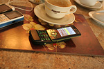
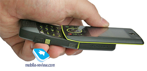
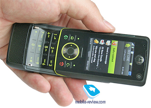
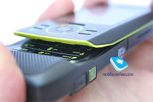
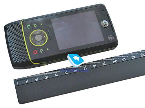
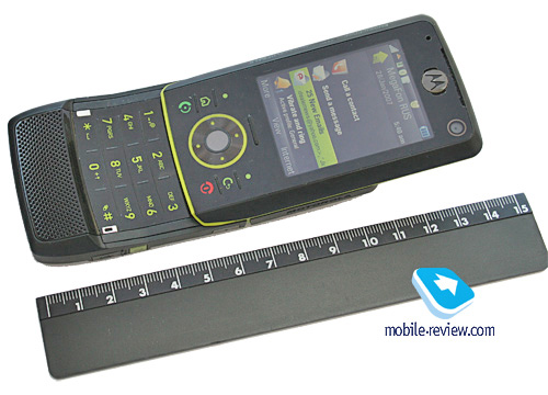
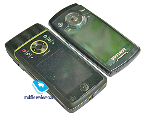
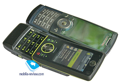
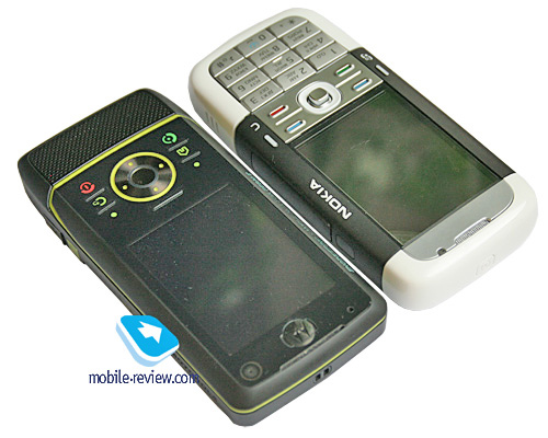
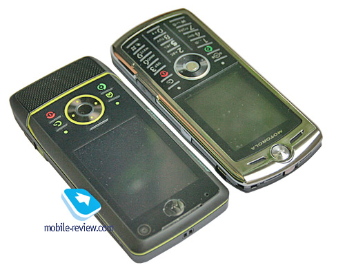
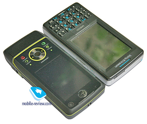
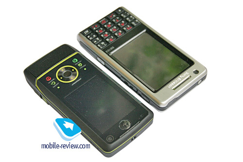
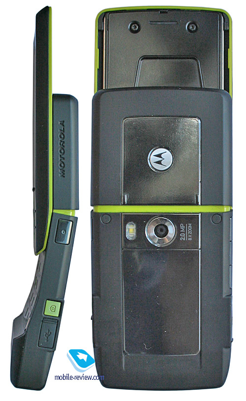
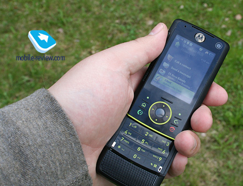
The unique trait of this product is the form-factor it is housed in – none of handsets has ever sported this design. Technically, it is a conventional slider with typical dimensions and weight – 109x50x15 mm, 112 grams. But when gliding open, the handset moves in a curve, achieving fit-to-face profile, which is due to the joint inside the slider mechanism, so that when you open it, it goes like any other slider up to the certain point and then “breaks”. This doesn’t deliver any hardships with flicking the Z8 open or closed; opened up, the slides bend when pressed, but by no means when simply held in hands.


Beneath the display is the thumbgrip for sliding the phone open, however it feels fiddly; you finger ends up on the screen and in this case, opening the Z8 becomes a breeze. Moreover, shutting the handset with this ridge doesn’t seem possible, again, you lay finger onto the display and it slides down smoothly. The sliding action in the Z8 is not feather-light, yet not very stiff – just handy. It actually is different from conventional sliders, but it is more about the feel, in the end you come to grips with really fast.


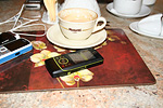
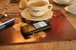
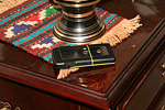
The model’s design has much visual appeal; the neon green-painted insets are just some flashy eye-grabbers. The combinations of various materials are well-matched, the handset looks offbeat, and offers some sort of challenge coming from inside. With the backlighting on, it is easy to notice that all components are keyed to each other, making the Z8 is really unusual-looking gadget. In this age of craze for design copycats, the uniqueness of the Z8 is the thing to praise, so rare it is.
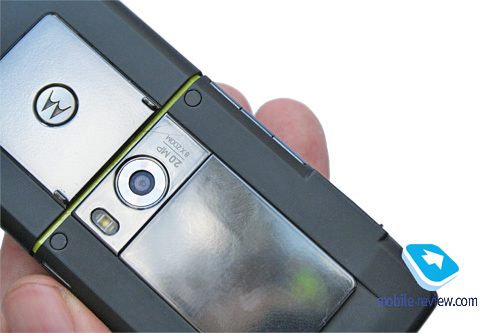
The front fascia houses a black plastic framing around the display. The plastic the spines are clad in utilizes soft touch finish, with the rear boasts two mirror-like insets, made of plastic as well. The mix of materials is sublime; the handset sports about 6 types of plastic, which some kind of a record. The Z8 will come only in one color scheme.
Back to the table of contents >>>
Controls, keypad
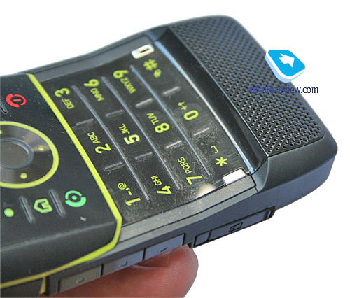
The functional keys and the number pad can be proud of being the first controls to offer thin plastic; its two-plate design (on the top and on the numeric keys respectively) features black coating and glossy finish. The need of forging standard materials, like a metal slab, is due to the number pad being crooked and on top of that it matches the opened casing’s curve to some extent. From the aesthetics standpoint, this solution is interesting, yet when it comes to ease of use, it falls flat.

The first thing you come across is the surface which doubles as the glossy fingerprints magnet, picking up grease from your hands. In this regard, the handset itself is very smudge-prone, having the face plate on the front and mirror surface on the back.
The other thing, probably the most important, is wrong presses that happen to the functional keys while navigating through menus. For example, you punch the joystick and then instead of entering the highlighted menu, you get back to the standby screen or go one level up. The reason is quite evident – the slab the keys sit on, redistributes pressure onto the adjacent areas and by pushing one key, as it seems, you touch the one next to it (technically, you do everything in the right way, yet the result differs from your expectations). This keypad takes some getting used to, at first number of wrong key-presses is substantial, then it drops down, however will never disappear once and for all.
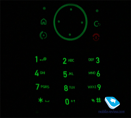
All keys are lit in green, which is well-visible in various environments, yet have nothing to complain about here.

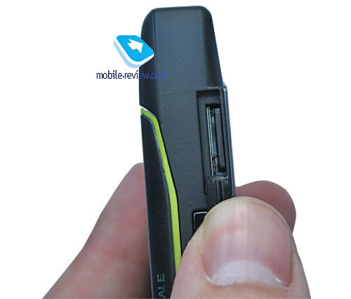
The left-hand side is home to the volume rocker and the dedicated video call key, as well as the memory expansion slot, covered with a rubber flap. On the right spine is the camera shortcut button and the multimedia key enabling one-touch access to music on the Z8. Right here is the minuUSB socket hidden under a rubber flap.

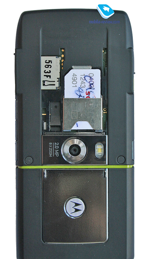
Flipping over to the rear, you will find the lens of the Z8’s 2 Mpix camera and the LED flash.

Back to the table of contents >>>
Instant On
The battery section on the maker’s page features Instant On technology, and on the face of it, this has something to do with the battery alone. Yet in practice it turns out to be not this simple and prosy. Thanks to this technology this handset and those to come will sport fundamentally different circuit design, difference in software-related behavior of Motorola’s UIQ-smartphones from other makers.
Let us start with some walking around. How long does it take a Symbian-smartphone to boot-up? On average it comes to 25-30 seconds for S60 3rd edition FP1, while for Sony Ericsson P1i this time makes up 30-40 seconds. Motorola Z8 does it in 20-25 seconds. It is not too far ahead and seemingly there is nothing to shout about. But give it a go and try to resume playback of the track you were listening before shutting down one of the above smartphones in one touch. 3-5 more seconds, whereas Motorola Z8 kicks in instantly. What’s the secret of this speed? In Motorola’s technological solution.
Regrettably, there is no white paper on Instant On technology available in open sources, so what you are about to read has been gathered piece by piece with the help of various resources and in some places our theory may differ from the way the things are implemented in the Motorola Z8. But this is the best description for want of other sources and to me it looks very close that what the Z8 really has inside.
In the 90ies, Motorola joined in the race for creation of new types of RAM and flash memory for various devices, including cellular phones. In 2000 the company showcased its promising development – MRAM, which is a type of memory tailored to mobile devices, having some advantages over the existing solutions. Specifically, this memory type is energy-independent, can be used for instant boot-up of the operating system and applications on cold-start likewise. When not engaged, it doesn’t require energy to keep data, which places in it line with flash memory. Meanwhile, this memory type has unlimited number of read/write cycles and is strong against external shocks. In terms of read speed it is second only to the SRAM and ends up in one row with the existing memory technologies.
The intended application for the MRAM are areas, where low power consumption rates and permanent data storage are really needed, these may be various sensors on military airplanes, vehicles etc. Formally, the military applications were the first areas where the MRAM starts knocking out the SRAM, that was backed up by external batteries. It is not a surprise that batteries may go out of action, and then information is lost, though that’s not the case with the MRAM. In future, for multifunctional devices retaining RAM and ROM with device drives, will be better off with one memory type, for example the MRAM. It may be programmed really fast and can serve several tests at one.
Some time later Motorola’s division in charge of this direction got singled out into Freescale and the development kept low profile for some time, as no public discussions on the MRAM’s prospect were taking place. In July, 2006 the company introduced the first commercial 4 Mb MRAM chip (25 USD for one), which was another turn in this technology’s development. Today it is deemed one of the most far-reaching technologies, and they predict that it will replace all existing types of memory in various devices. But it is not all sunshine and rainbows, as other technologies are getting stronger and better (for example, the similar FPRAM), but MRAM has what it takes.
For the time being there are no high-capacity MRAM chips, anyhow, their price would be too pricey for use as the only memory type, even with the benefits in speed it brings in mind. That’s why Motorola has picked another way by coming up with a cross-solution where one of the memory components is an MRAM chip (4 Mb or maybe bigger), while the rest of memory is built on standard technologies utilized by other makers. So, what’s the catch?
The MRAM module doesn’t allow saving the entire RAM, which means there is no win in booting speed. Obviously, this fact doesn’t get along with what we said above. But this is not pure MRAM today either. In this memory type the system stores only the most vital data on standard applications, recent device’s state, used links, media files etc. That is, after booting up the smartphone all this information becomes accessible outright. With time, as the MRAM chips will grow up in volume, devices with minimal boot-up time might emerge, but this will happen as soon as the MRAM wholly replaces the standard memory.
Another technical change owing to MRAM memory was “deep sleep” mode or an iteration of Hybernate that is available in desktops. Technically, the Motorola Z8 doesn’t shut down even when you push the power button. The turn-off screensaver, dark display – all this indicates only one thing – the operating system’s main module was unloaded from the memory. When starting up the handset it will get loaded again. The main memory array stores the device’s state upon shut-down, then this state is restored from the file on the disk – on boot-up you can see «D_EXE.C Started» line on the display.
Formally, the memory structure the Motorola Z8 doesn’t boost it with a substantial advantage over the today’s UIQ-powered smartphones (the benefits are subtle in most situations). Speed’s what the CPU’s high frequency is responsible for, however the Task list is always available exactly owing to this memory architecture. You can reset the handset, but the list of applications will still be within reach, and all of them will start up pretty fast. Already mentioned media player launches almost instantly with the last used track playing.
As you see you gain in small things, yet often they are what does make the difference. It is safe to say to that Motorola Z8 tops other available models in this aspect. At the same time, browsing the menu, swapping between resource-heavy applications is not speedier than other smartphones – the CPU and the memory volume have much to do with that.
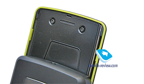
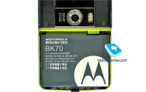
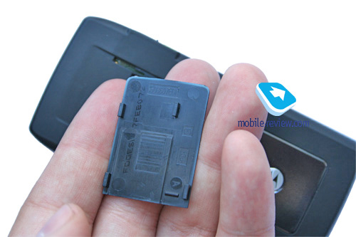
The battery is put in a separate compartment, and that’s why swapping SIM-card on the go is not much of a problem – you don’t need to reset the handset (it is a unique feature for smartphones, first introduced by Motorola).
On the downside, soft reset can be done only by taking the battery out of the slot. The memory architecture saves the day only if the disk cache doesn’t contain an application that made you detach the battery. Otherwise the handset falls into infinite cycle of resets and the only wayout is hard reset and wiping the disk cache. The manufacturer has considered these situations to be almost improbable and thus hasn’t equipped the Z8 with a hardware reset button. For the first time this key was forgone in the Motorola A1000, back then the company fell under the criticism and already in the Motorola A1010 they returned it. For Motorola Z8 there is a special key combination, which is the secret of the company’s engineers as of yet, however I suppose it will become available to users even before this year ends.
In our experiments we tortured the Motorola Z8 with loads of various applications, including beta versions. And it didn’t take us long to get the Z8 into the reset cycle. At the same time, after wiping the memory, this situation didn’t repeat ever again (the application in charge refused to install either).
As it stands now, the MRAM in Motorola Z8 appears to be a go, rather than a competitive advantage. Hence the company’s unwillingness to advertise this technology, which otherwise would unveil the direction where its upcoming products are heading. At the turn of 2008, or already in 2009 with the advent of high-capacity MRAM chips, it will become possible to make up M-Instant systems, in other words, devices with really short boot-up times. Motorola is likely to be at the frontier, offering such devices. At any rate, the concept for 2007-2008 banks exactly on the speed, interactions between the interface and the user, and the MRAM is one of the essentials.
We didn’t cover the battery and how it does in conjunction with Instant On technology. Basically, there is nothing disappointing about it, the sleep mode has no negative affect on the battery life, but more on this in the battery section.
Back to the table of contents >>>
Battery
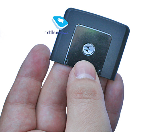
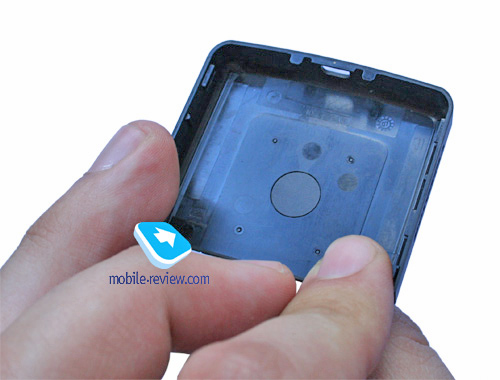
The cover at the top of the handset firmly seals the battery. The Z8 comes installed with a 1030 mAh unit (Li-Ion), the maker rates the battery life for 5 hours worth of talk time and 380 hours of standby. In conditions of Moscow networks, the handset lasted for about 2 days, at one hour of calls, up to 6 hours of music playback, occasional file transfers over Bluetooth and up to 20 minutes of mail checks, web browsing. It takes the Z8 about 2 hours to charge up from empty to full. It doesn’t differ a bit from the Sony Ericsson P1i in the sense of battery life.


In the most intensive usage mode, the charge on the batter lives for 1 day – during this time span not only can you listen to music without taking a break, but also check mail and browse Internet pages on regular basis. Taking into consideration that the majority of users don’t employ capabilities of the device to this extent, we can talk about average battery time of around two days, but it depends on the given case. Those, who don’t aim at listening to music and using other functions too often, the device will offer 2-3 days of battery life. From my point of view, three days, at this pace aren’t too hard to achieve, but in this case, purchase of this device loses any meaning.
The best time we squeezed out of the Z8 in music playback mode made up 12 hours (maximum volume, random playback from the memory card).
Back to the table of contents >>>
Display
Another attraction of this product is its display. The TFT matrix capable of 16 million colors and measuring 2.2 inches from corner to corner puts up a very sharp and vibrant picture. Among all smartphones, the MOTO Z8’s display is top of the heap, being second to none.
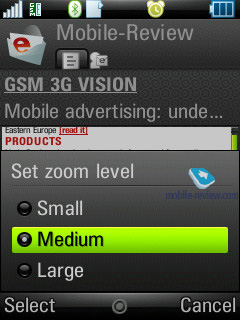
The screen’s resolution makes up 240x320 pixels, which allows it to display at least 9 text and 3 service lines. The handset features adjustable font size (three levels), yet the default value is fine and makes for legible information on the display.
In the sun, though, it gets slightly washed out, but it is not a big deal, as after putting it at a small angle, everything gets back to normal.

Back to the table of contents >>>
Memory, memory card. CPU, chipset
The model bases off TI OMAP 2420 chipset, which implies ARM11 CPU running at 300 Mhz. The RAM volume for the Z8 accounts for about 50 Mb, while user data can take up about 70-72 Mb (the vendor claims 90 Mb, yet a certain part is occupied by applications and pre-installed content).
The RAM size is extremely small and is pretty much in line with the previous generation representatives, for example the Sony Ericsson M600i (32 Mb). One of the possible explanations is that the Z8 is an all-MRAM fare, but then the handset’s price would be really costly, and there would be no gains in view of such mediocre size. Thus, it is clear that probably they have implemented standard NAND-memory.
The mircoSD memory expansion slot is hot-swappable. At that the Z8 supports memory cards with up to 32 Gb onboard. In theory these cards can be designed, but will make it to market not earlier than the end of 2009. By then the Z8 will have already got dated. This year will see 4 Gb units, which suit this handset best. Hence, tacking on support for high-capacity cards, the company only gives this technology a go, in order to amplify all the following devices of this line-up with that. In the context of this particular product, the MOTO Z8, this feature is not worth looking at.
Back to the table of contents >>>
Performance
Thanks to its unique memory architecture and tiny volume of RAM onboard, all the handset’s strengths have been reduced to nothing, as the tests rate its performance on the level of typical solutions. In terms of interface, the Z8 seems quite speedy, being on par with other offerings, but with many applications running, especially if these are third-party programs, the Z8 gets somewhat sluggish. By and large the model is nothing special for the current generation of devices, yet already lags behind Nokia’s impending offerings. On the other hand, a handful of functions sport instant boot-up feature, for example, our favorite throughout this review so far, the music player, and that’s what the Z8’s attractions are all about.
Back to the table of contents >>>
USB, Bluetooth
USB. Files are transferred onto the Z8 via USB-connection with 2.0 Full Speed version (12 Mbps) supported. Upon connection to a PC the smartphone is displayed as a USB Mass Storage, at that the system displays only the memory card, providing no access to the handset’s memory. Another way to pair up the Z8 with your PC via USB is Modem mode, when the smartphone starts acting as a wireless modem (drivers required).
Bluetooth. The Z8 comes equipped with EDR-enabled Bluetooth 2.0 and allows for up to 16 devices on the list. The following profiles are supported:
- Dial-Up Networking Profile
- Generic Access Profile
- Generic Object Exchange Profile
- Object Push Profile
- Serial Port Profile
- Handsfree Profile
- Headset Profile
- Synchronization Profile
- Basic Image Profile
- File Transfer Profile
- HID (host) Profile
- Stereo Advanced Audio Distribution Profile
- Advanced Audio/Video Remote Conference Profile
The Bluetooth implementation is, as always though, nothing to complain about, we encountered no issues with handling this type of connections. On the downside, the standard timed visibility over Bluetooth is still some sort of a barrier; the handset can’t stay in always-visible mode. The Z8 comes packaged (not for all regions) with a Bluetooth stereo-headset Motorola S9.
Back to the table of contents >>>
Camera
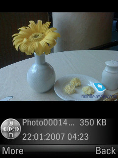
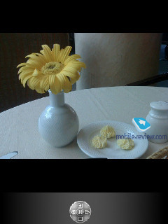
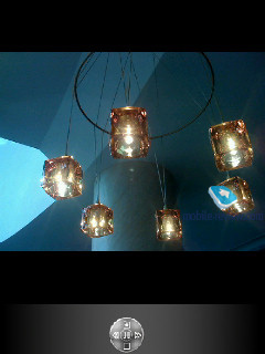
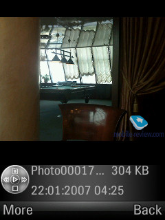
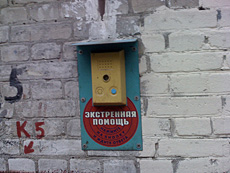
The bundled 2 Mpix camera shows off CMOS-sensor and LED flash. Quality-wise it performs on an average level, so there are no pleasant surprises to look for. Camera application can be launched only with the slider closed – if that’s the case, punching the side dedicated button starts up the viewfinder mode. And slid-open, the Z8 boots up the forward-facing VGA camera.
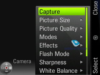
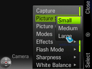
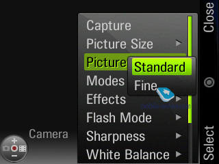
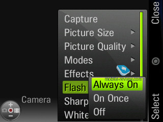
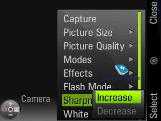
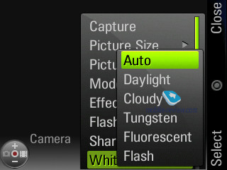
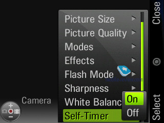
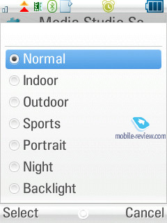
Three shot resolutions are available – Large (2MP), Medium (1.3 MP), Small (480x640). Two levels of compression are at your disposal. Other settings allow turning off the shutter sound, vary exposure from -2 to +2, selecting a lighting type (auto, sunny, cloudy, indoors, office). Self-timer feature is also enabled.


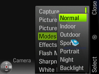
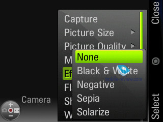
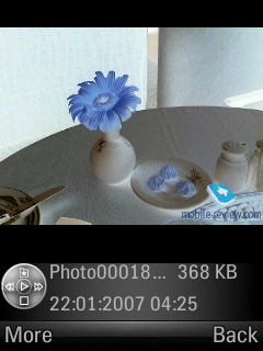
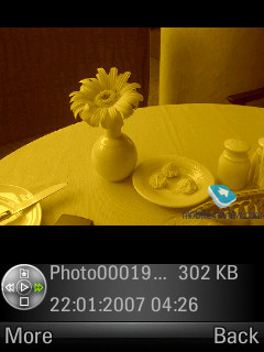
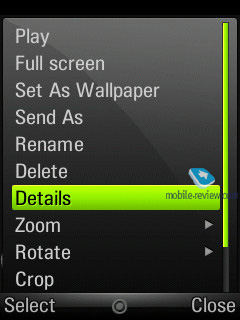
Best results are achieved in bright sun light, whereas in other cases color saturation is far from sufficient. A fetching peculiarity is that a photo is shown in full-screen mode when managing with the camera, while the tips are semitransparent. You can change lighting settings by pressing the navigation button vertically, as well as select various effects (Black&White, Negative, Sepia, Solarize). Digital zoom (up to x8) is at your disposal. The Z8 also boasts multi-shot mode.
 |
 |
| (+) maximize, 1600x1200, JPEG |
(+) maximize, 1600x1200, JPEG |
 |
 |
| (+) maximize, 1600x1200, JPEG |
(+) maximize, 1600x1200, JPEG |
 |
 |
| (+) maximize, 1600x1200, JPEG |
(+) maximize, 1600x1200, JPEG |
 |
 |
| (+) maximize, 1600x1200, JPEG |
(+) maximize, 1600x1200, JPEG |
 |
 |
| (+) maximize, 1600x1200, JPEG |
(+) maximize, 1600x1200, JPEG |
 |
 |
| (+) maximize, 1600x1200, JPEG |
(+) maximize, 1600x1200, JPEG |
 |
 |
| (+) maximize, 1600x1200, JPEG |
(+) maximize, 1600x1200, JPEG |
 |
 |
| (+) maximize, 1600x1200, JPEG |
(+) maximize, 1600x1200, JPEG |
 |
 |
| (+) maximize, 1600x1200, JPEG |
(+) maximize, 1600x1200, JPEG |
 |
 |
| (+) maximize, 1600x1200, JPEG |
(+) maximize, 1600x1200, JPEG |
 |
 |
| (+) maximize, 1600x1200, JPEG |
(+) maximize, 1600x1200, JPEG |
 |
 |
| (+) maximize, 1600x1200, JPEG |
(+) maximize, 1600x1200, JPEG |
 |
 |
| (+) maximize, 1600x1200, JPEG |
(+) maximize, 1600x1200, JPEG |
 |
 |
| (+) maximize, 1600x1200, JPEG |
(+) maximize, 1600x1200, JPEG |
 |
 |
| (+) maximize, 1600x1200, JPEG |
(+) maximize, 1600x1200, JPEG |
 |
 |
| (+) maximize, 1600x1200, JPEG |
(+) maximize, 1600x1200, JPEG |
 |
 |
| (+) maximize, 1600x1200, JPEG |
(+) maximize, 1600x1200, JPEG |
 |
 |
| (+) maximize, 1600x1200, JPEG |
(+) maximize, 1600x1200, JPEG |
 |
 |
| (+) maximize, 1600x1200, JPEG |
(+) maximize, 1600x1200, JPEG |
 |
 |
| (+) maximize, 1600x1200, JPEG |
(+) maximize, 1600x1200, JPEG |

Below are the samples of overlays (Black&White, Negative, Sepia, Solarize).
When shooting video, you can pick one of the two qualities – good and best. Clip duration is unlimited on the Z8. Available resolutions – SQCIF, QCIF, QVGA at 15 frames per second. Video turns out to be average quality-wise; you can also disable the sound.
Video sample 1 (3gp, 0.6мб) >>>
Video sample 2 (3gp, 0.9мб) >>>
Video sample 3 (3gp, 0.5мб) >>>
Video sample 4 (3gp, 0.7мб) >>>
Back to the table of contents >>>
Localization quality
As it has always been the case for UIQ devices, you can upload extra language packs from PC so as to change the menu language. But unlike Sony Ericsson’s solutions, the Z8 puts up somewhat better localization, albeit not perfect. There are some not very clear abbreviations, many terms are controversial. However, taking account of the S60-based solutions, we can’t say they do much better – the Z8’s localization quality is neither better nor worse than that offered by other manufacturers.
Back to the table of contents >>>
UIQ 3.1 vs UIQ 3.0
The MOTO Z8 is the first smartphone to feature UIQ 3.1, so let is take a look at what’s new and different from UIQ functionality. The development kit for UIQ 3.0 arrived in the market in 2005, while already in 2006 the market saw releases of first UIQ 3.0 powered devices.
Most substantial differences between UIQ versions:
Symbian 9.2 UIQ 3.1 – Symbian 9.1 UIQ 3.0
Backwards compatibility with all applications for UIQ 3.0, if only the program doesn’t engage the abilities of UIQ 3.1. UIQ 3.0 SDK will do here as well.
Softkey Style. UIQ 3.1 embraces different layout of soft-keys, forgoing the Cancel button (which can still be embedded, like in the Motorola Z8). Apart from orientation towards the three buttons placed underneath the display, some of that have been defaulted to different actions. Here is a brief change log:
- The left soft-key is used solely for actions with positive effects (Save, Execute, Accept), while the right one – for negative (Cancel, Back, No);
- The one in the centre is called Action Key and also serves for positive actions, if there are only two options offered, its caption turns into an icon, while the action it performs is the same action as the left soft-key;
- The C button can be used for quitting applications and folders, when browsing the menu, rather than solely for deleting text;
- The action assigned to the Action Key always comes first in the context menu, everywhere where it makes sense.
Clear key. Deleted texts or does the same job as the right soft-button, if you are not editing text.
SVG. Support for SVG 1.2.
Task list. Can be called up by tapping and holding the menu button, always contains some menu items, recently used applications.
Support for animated application icons in the main menu.
Java. Now some more JSR classes are supported:
- · JSR-177 Security and Trust Services
API SATSA-CRYPTO - Provides a general purpose cryptography API for use in MIDlet suites allowing operations such as message digest, digital signature verification, encryption an decryption
SATSA-APDU - The APDU optional package might not be supported on all UIQ 3.1 based devices but only those where the phone manufacturer has added support. The SDK provides a reference implementation that can only communicate with the Sun Java Card emulator and currently doesn't support PKCS#15 certificate parsing.
- JSR-205 Wireless Messaging API 2.0 - The JSR 205 package is a extension of JSR 120 an API allowing MIDlet suites to send and receive SMS and MMS messages from the GSM network along with receiving of Cell broadcast messages.
- JSR-211 Content Handler API - The Content handling package provides a execution model to allow MIDlet suites and non native java application to register them selves as content handlers for various contents types. The package allows content handlers to be invoked and get a response, register as a handler, query registrations, respond to invocation request.
- JSR-234 AMMS Camera capability - The AMS add the Camera capability to the 234 package, giving MIDlet suite control over advanced features of an on-board smart phone camera such as Exposure, Flash, Focus and Zoom.
Back to the table of contents >>>
Interface features, differences from UIQ in Sony Ericsson
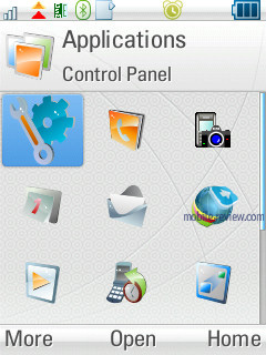
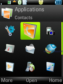
Motorola does realize that when presenting a product running on a standard platform, they should throw in some sort of flavor for good measure, so as to shape up the device’s own unique face. It took Windows Mobile makers years to come to grips with that, but here the company already knows what consumers want. We won’t focus on all the facelifts, such as revamped icons, the Z8 sports and will rather take a closer look at the feature that sets this handset apart from Sony Ericsson’s products.
I shall remind you that the MOTO Z8 has no touch-sensitive display, therefore while possible, the Today screen doesn’t seem interesting.
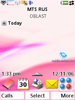
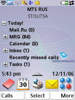
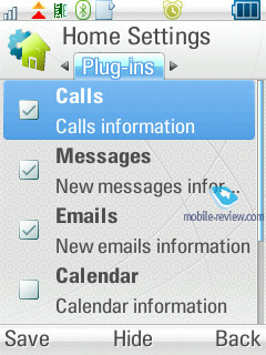
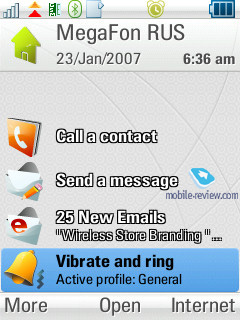
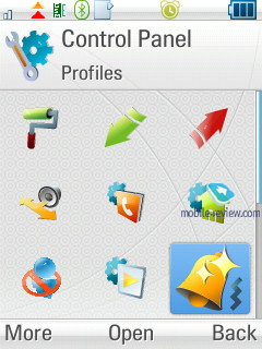
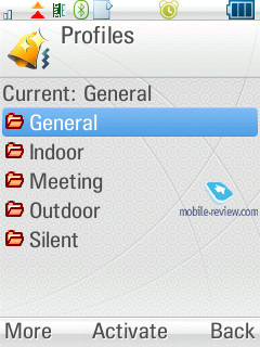
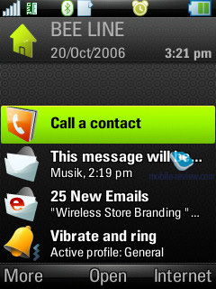
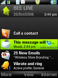
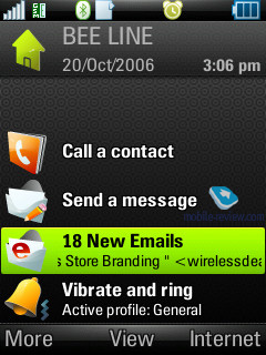
Motorola’s developers have refined this standard ability and come up with a system of plug-ins for the home screen. There are 7 options available, allowing you to display information on calls, email, calendar and currently playing track, active profile selection and settings. The screen can’t accommodate more than 5 plug-ins at a time, so you have to forgo some in favor of the others.

Upon receiving a new message, you are offered the sender’s name and first line, then goes the second message removes the text line, so that you end up with to phone numbers displayed, the Z8 can show up to three notifications of this kind. This is a quite handy solution, yet it is a shame that you can vary the layout and move it on the screen.
Other interface-related traits include the top left corner which displays your operator’s logo (if available on the SIM-card) – an unusual and appealing option.
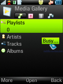
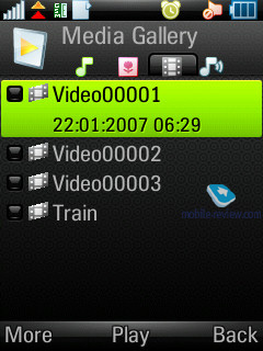
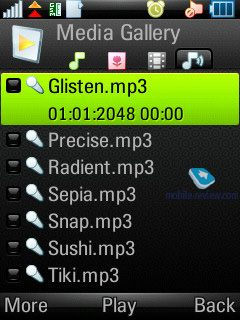
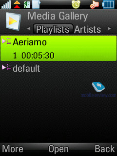
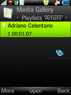
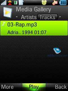
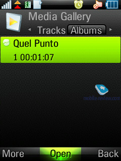
The media library is another thing of note. Its tabbed interface features four tabs, each standing for own content type. This way, the first one sports music, i.e. tracks, playlists, artists, etc. The second tab is dedicated to images stored on the Z8. The next tab holds video clip, and the last, fourth, tab comprises ring tones. Everything is very straightforward and consistent. Such categorization has been brought about by its availability on other products, including those running P2K.
All applications starting up on Sony Ericsson’s UIQ 3.0 smartphones, can be installed on the Z8, yet there are some exceptions to this rule, which have much to do with particular affiliation with Sony Ericsson’s devices (they don’t pass compatibility test, or certificates are invalid).
Back to the table of contents >>>
Interface, text input
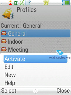
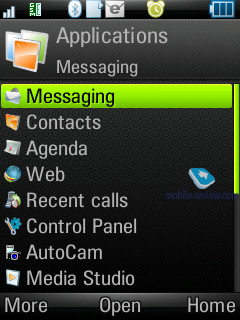
The handset houses well-familiar UIQ interface, whose only chrematistic feature is the Task list, which always holds 5 recent applications, to bring it up tap and hold the Home button. Menu navigation was never and issue – everything is very straightforward and easy to use, if you have had the experience of handing a smartphone powered by Symbian. This device hasn’t avoided the latest and greatest trends of cramming all settings into the respective menu item and context menus. In other words, set up your Z8 wherever you see fit.
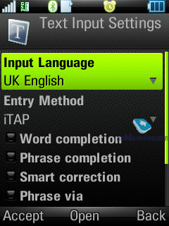
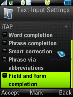
When texting, you can take advantage of the predictive iTAP dictionary, beside, so far it is the most sophisticated solution tailored to touch-display less handsets. Apart from automatic words memorization, the phone can also save whole phrases and sentences on its own, as well as rectify all your spelling mistakes without needing you to interfere. The system also sports full language package, meaning that you can enable predictive text input if there is a respective menu language in the Z8. On the face of it, it hasn’t undergone any vital refinements, besides only active texters will figure where these changes truly are. All in all, this text input implementation is a big step forward, even though we still missed a touch screen.
Back to the table of contents >>>
Music department
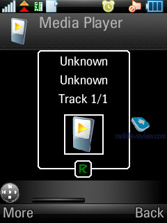
The music player is utterly reminiscent of Sony Ericsson’s solutions, offering sorting by tracks, album, artist, supporting album art and progressive fast forward. One-touch availability of the player is ensured by the side-mounted button; on top of that you can beam sound wirelessly onto a Bluetooth stereo-headset in adequate quality. While in handsfree mode, the Z8 also does fine, providing tidy sonic experience, even though having a sole loud speaker. Supported audio formats – MP3, AAC, AAC+, E-AAC+, WAV and m4a. No limits on the bitrate of mp3-files should be observed, you can also upload VBR-tracks. The handset’s music department may be put in one line with ordinary Walkman phones, which is not that bad at all – on the contrary, quite good.
The headset you get out of the box is average quality-wise, yet is adequately loud and will do for non-music-conscious users. Regrettably, miniUSB-3,5mm adapter didn’t get along with this handset, as we kept hearing strange noises and clicking sounds. We couldn’t figure out the roots of the problem, though, as we tried out a couple of adapters and stumbled upon the same issue with all of them (some European countries still barely know what these adapters are).
The maker underscores the solution’s multimedia focus, but do keep in mind, that it is rather a marketing trick, rather than a reality. Its music department is on par with other UIQ-smartphones, and the retail package, due to the cheap headset, is not very attractive.
Video playback. The vendor proudly claims the Z8 is able to playback QVGA video (240x320 pixels) at 30 FPS. Though I don’t quite catch it, what they are so proud of, as most smartphones allow doing just the same thing these days. Undoubtedly, the display’s quality brings the Z8 to a somewhat different level, but the diagonal is what makes the difference as well, and this is where the MOTO Z8 falls short of several offerings, like the Nokia N95. Watching video on a huge screen is always a more gratifying experience, so the handset’s diagonal outweighs the ability for video playback or resolution. Back to the player, its feature pack is quite ordinary, as it allows watching movies in full-screen mode (landscape orientation), skipping within clips, pausing playback etc. In view of the stereotyped nature of UIQ, that’s what we have come to expect. By the way, for some regions the handset will come included with adapted version of “The Bourne identity”, similar approaches were witnessed across the market, applied by maker for the sake of promotion of their flagship offerings.
Back to the table of contents >>>
Games
Perhaps, we would be better off calling this section Game, since the Z8 plays host only to one game. But this is a milestone product, so we should better give its entertainment department a close-up. In the short time, Nokia is re-igniting N-Gage brand for S60 devices, while Sony Ericsson is going to put up similar functionality for UIQ-based solutions. And make no mistake about that, this area will become all the rage for mobile phones, and Motorola won’t get off the road, so the upcoming devices of this series (different index with the same gist) will support some games, which will allow Motorola to add gaming merits to the multimedia abilities it offers today. Indeed, platform standardization brings own benefits.
Attempts to fit in major trends of today, that Motorola is making, are uncovered, this way the MOTO Z8 has a special edition going by the name of the Z8s that comes with a set-box for recording BSkyB and CNN broadcasts that can be watched on the smartphone afterwards. Which means that this model has all the rights to claim the title of mobile TV-enabled - Motorola couldn’t resist. It is clear, that this has nothing to do with the real mobile TV, yet the company’s marketing department couldn’t be happier with such easy and cheap solution. However, there is almost no way for it to become sought-after.
Back let’s back to the game – it is called Vibe and in fact offers you to play a 3D tetris. And the truth is, it is quite a time-eater, since you have to move the sphere below rather than the figures themselves.
Back to the table of contents >>>
Contacts
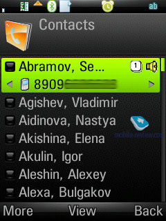
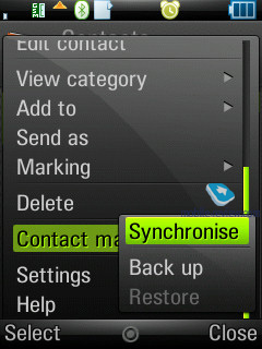
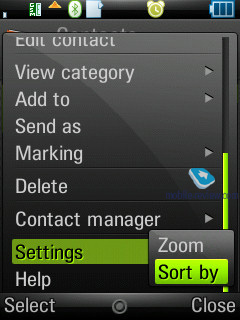
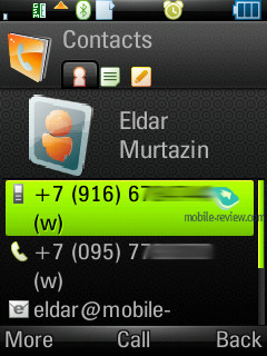
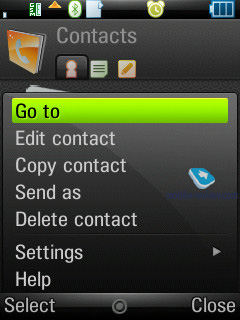
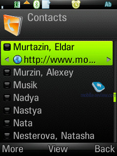
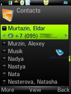
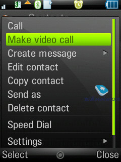
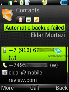
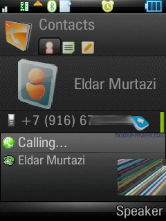
All entries in the phonebook are organized in a familiar way: at first the general list is displayed, and once you’ve selected a certain contact, you are offered a default number, set for this entry. The list doesn’t show entries, located on SIM/USIM-cards, nevertheless you’re still able to handle them via the phonebook’s menu – copy them to both the handset’s memory and memory card. But since the external memory card can serve as storage for contacts archives, there is no need in saving contacts to SIM/USIM-cards, especially taking into account entries’ structure is damaged in that case.
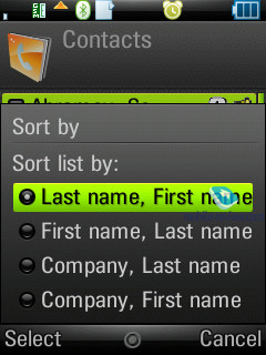
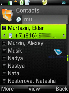
Search in the general list may be conducted by the first or several letters (the line above is a full-fledged search field). Sorting of entries in two different languages is carried out in a standard manner: contacts in English are followed by entries made in the other language. It’s better to create all contacts in one certain language, otherwise you’ll have a rough time finding them.
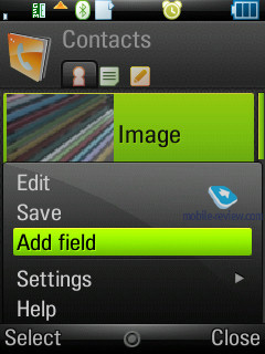
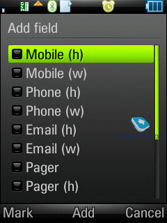
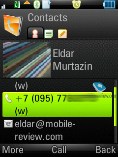
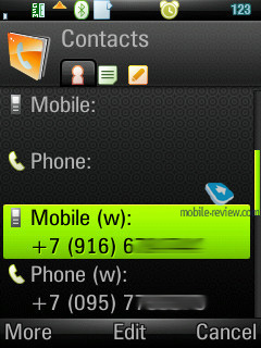
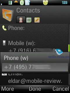
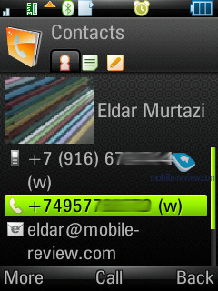
Each particular contact can contain any number of various numbers – the first entered is set as the default number. Extra entries above those, which are available in the standard view, can be added via the menu. The general list displays details on particular numbers via horizontal scrolling; right here you’ll get extra information on the contact, like e-mail address etc.
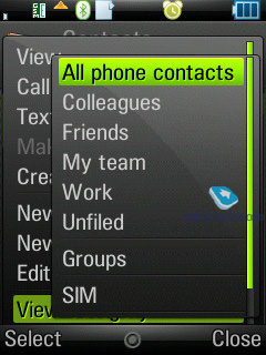
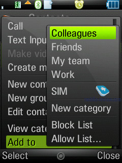
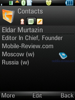
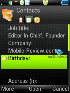
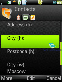
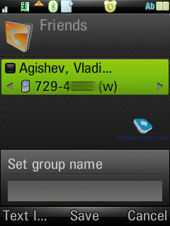
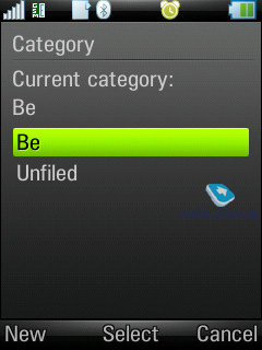
The phonebook’s contact editing mode sports for tabs. The first holds functions related to phone numbers editing, choosing category, or, if you like, groups. The distinctive feature here is that one and the same entry can be assigned to several categories at a time (may prove useful when dealing with bulk mailing). The second tab contains date of birth, status in company, position, address (several fields), and work address. The third tab is just a text note, attached to a contact, while the fourth provides data on voice commands (applied to phone numbers) and personal ring tone (in case you’ve set a group ring tone, on inbound call it will be replaced by an individual tune, since the latter has a higher priority).
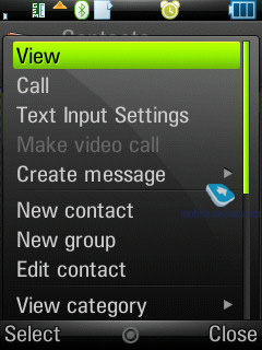
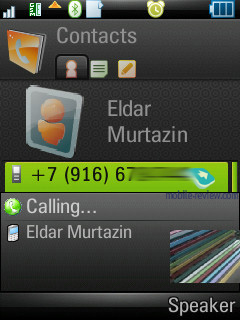
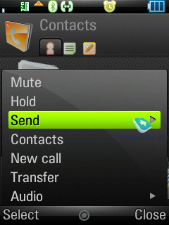
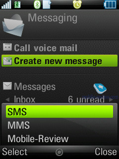
When viewing an entry you can initiate creation of a new message for the selected number in one touch (in the pop-up window you should choose the type: SMS or MMS), and in case you have picked an e-mail address, the built-in mail client automatically starts up.
The IM-client is integrated into Contacts, from here you can examine your interlocutor’s status and launch a respective application.
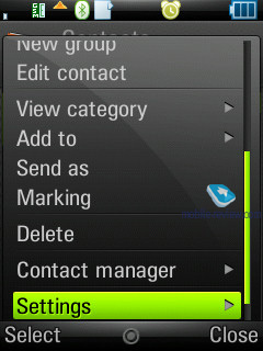
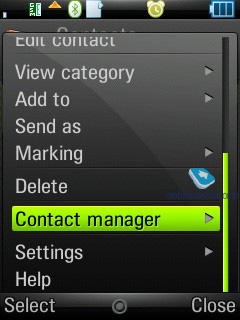
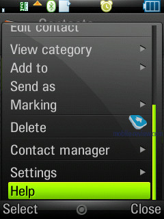
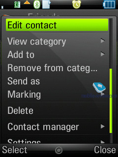
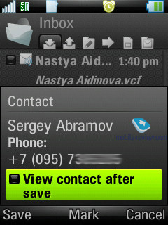
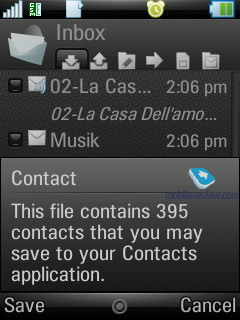
The built-in contact manager is also available in the handset – it allows the user to send the selected entries (categories) to other devices over Bluetooth, also the phone supports vCard 2.1 standard. This way, you can receive entries from other devices exactly in a similar fashion.
The full-fledged support for SyncML (new title of OMA DataSync) allows synchronizing data with every device, that can deal with this standard (no matter whether it's PC, PDA or a handset).
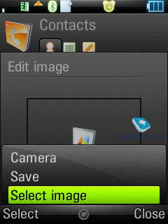
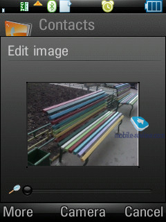
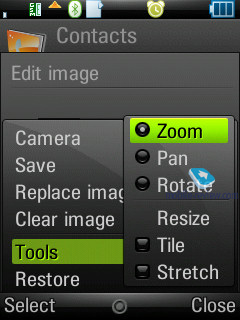
The photos, applied to contacts in the phonebook can be displayed in various modes (tile, stretch), which makes for better picture quality in various modes
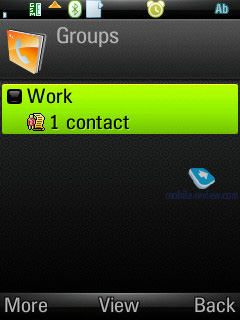
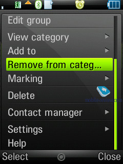
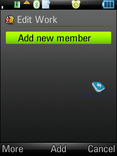
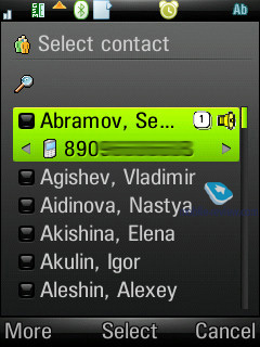
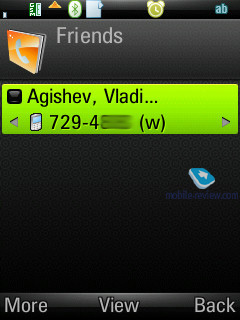
Contact groups allow sorting all entries by throwing them into one or several groups at once. You can send a message or email to the whole group.
Like any other phonebook does, this one sports so-called white and black lists, which allow you to either enabled or disable calls from certain numbers or groups of contacts.
Holding the numeric keys down activates search in the phonebook, which can be conducted by several letters. As an addition, you can set up to 9 numbers for speed dialing, which will be followed by the matching names and photos (if any) on the display. The dialing process is carried out in the following manner: first you choose a number (at this moment contact’s name, assigned to this button pops up) and then press the call key. When at the standby screen, switching between dialing a number (numeric keys) and fast dialing numbers is done in one touch by pressing the corresponding icon.
Speed dial feature is available for 9 numbers. Not only can you set speed dial number, but also adjust it to send a message to the number enabled for speed dial, which is a nice addition to the standard functionality.
Back to the table of contents >>>
Messaging
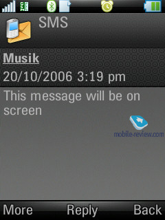
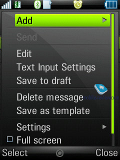
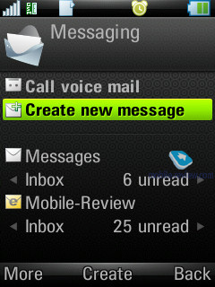
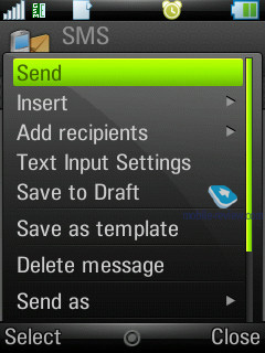
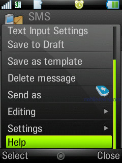
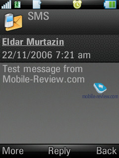
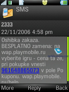
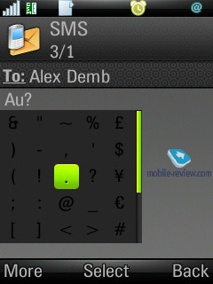
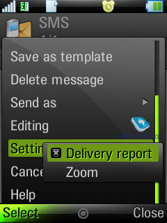
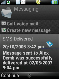
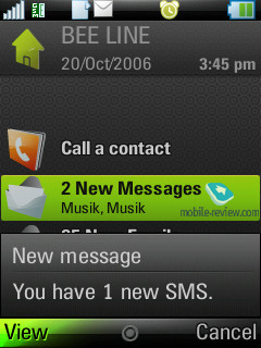
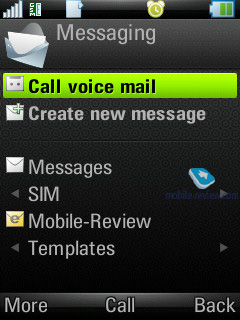
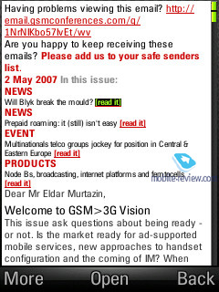
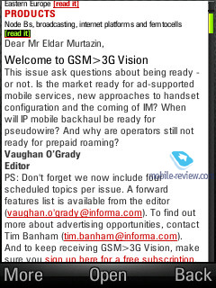
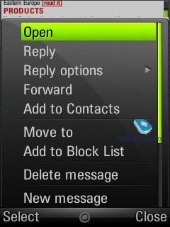
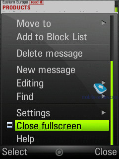
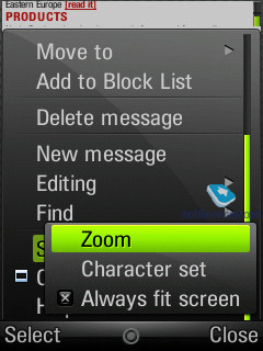
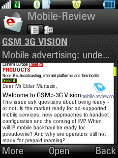
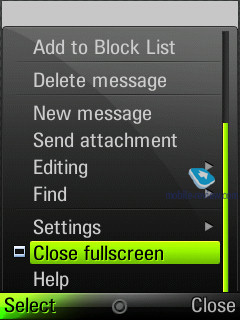
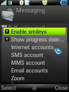
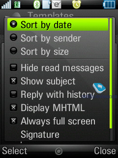
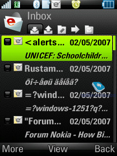
Speaking of the Z8’s characteristic features, you can view a message in full-screen mode, this option is now available for both SMS/MMS-messages and emails, whereas previously you could turn to it only in the browser. Delivery notification can be set up for every message manually, though you would be better off choosing this option in the SMS profile, so that all reports will be delivered automatically for all messages, and do away with this once and for all.
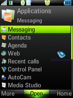
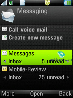
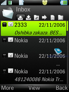
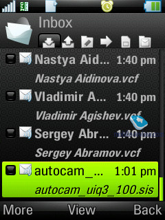
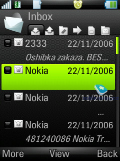
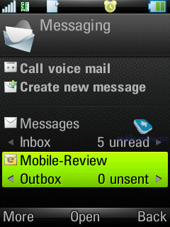
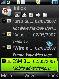
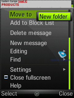
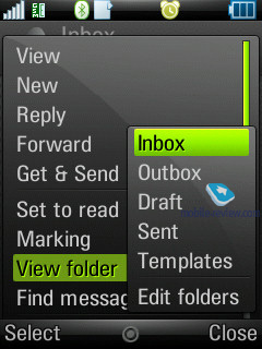
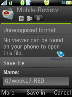
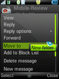
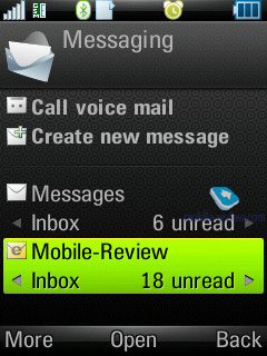
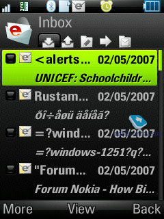
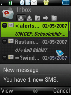
All incoming messages, saving for e-mails, are stored in one folder – Inbox. This also goes for the files, received through IrDA and Bluetooth (the device supports all formats, even those it can’t recognize). The data, located in Inbox can be later on saved in any other folder – the handset ensures unlimited access to the file system (except for the system folders). In return, the user is at liberty to create own folders and sort messages in them. When entering Messaging menu, by default you’re shown the general folder, by using horizontal scrolling you will switch between files, and pressing OK key selects a particular folder and allows viewing the message list.
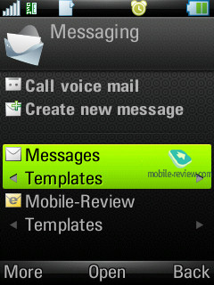
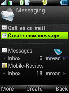
The root of Messaging menu features the list of all mail accounts separately under Inbox folder – e.g. if you have three of these, they will be displayed in order of appearance.
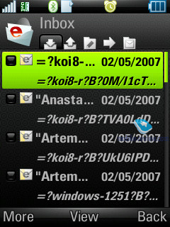
Inbox folder also offers type of each message (SMS, MMS, Beam) – you see a respective image next to each item.
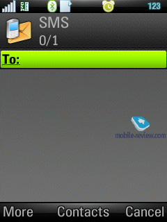
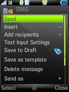
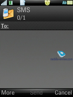
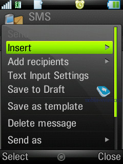
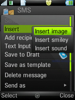
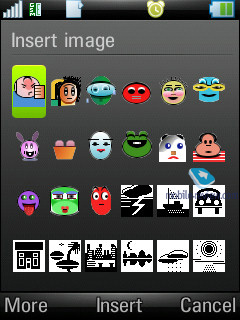
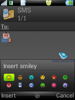
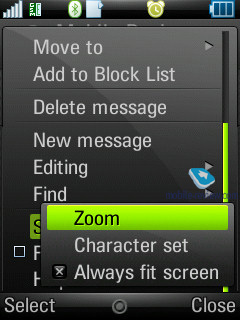
You can also call up creation of a new message option practically from any menu, which features a phone number –just choose the need type (SMS/MMS) and start texting. Though under SMS you will surprisingly discover EMS messages as well. As a matter of fact, the user is isolated from deciding which message type in particular he creates – if you type only text, the device will take this message for an SMS, and EMS is used in cases when you use not only smiles, but ring tones, images and formatted text (this doesn’t relate to Zoom function). This standard is fully supported in the handset, just like we have come to expect from it.
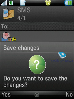
The concatenated messages are listed as one, when typing they are displayed in a standard manner e.g. 1/2. Also text smiles can be displayed as respective icons in the ordinary messages.
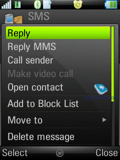
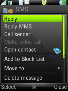
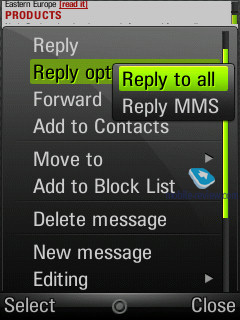
A particular message can be sent to a number of contacts at once, all you need to do in this case is check the required entries or certain numbers of a contact. Bulk mailing can be performed for groups as well. When answering a received message you can choose between SMS/MMS (though the list doesn’t include reply with an email).
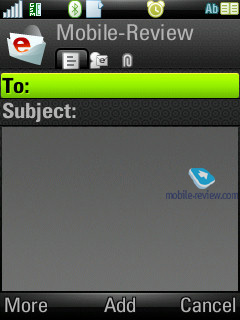
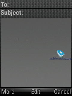
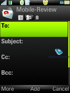
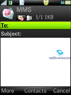
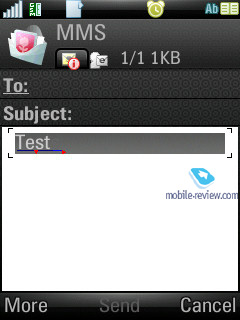
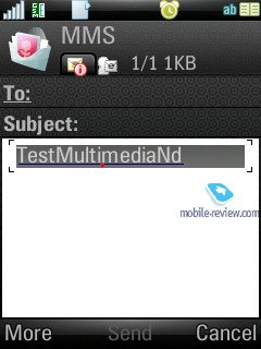
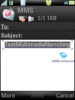
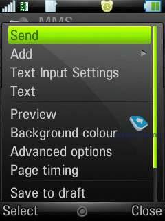
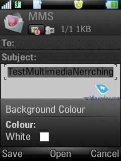
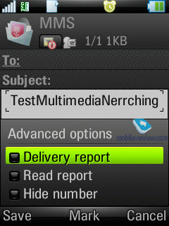
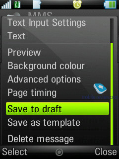
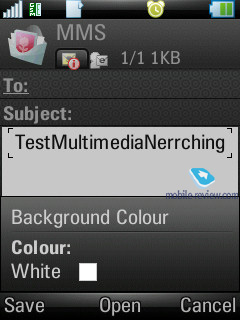
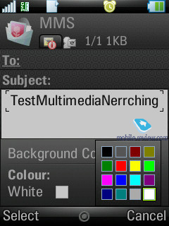
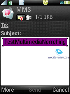
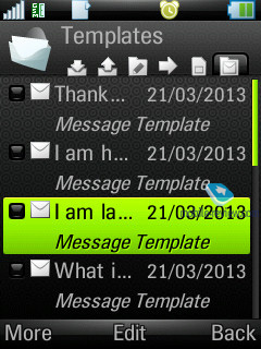
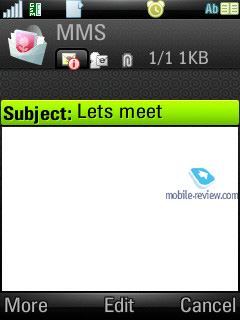
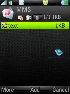
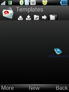
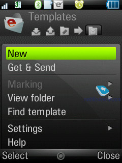
MMS-message creation - one of the best things about it is that several tabs are available here, via which you can choose the time-out between the pages and create templates of your own. Besides the standard files (graphics, video, images, music etc.) a message can contain a hand-written sketch made with the help of the touch-screen (Scribble). All other options are run-of-the-mill here – choosing contacts at the recipient window is similar to SMS-messages, though MMS also features reading report in addition to the standard delivery report.
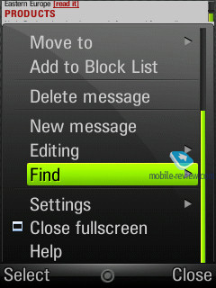
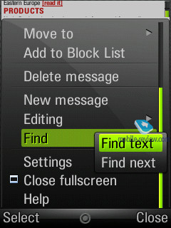
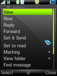
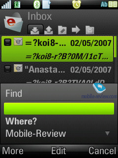
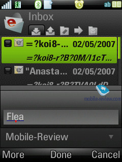
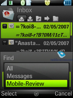
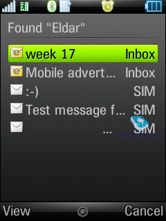
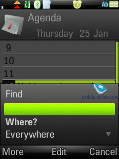
For all types of messages, including e-mail, you can perform a search by fragments of text – the window displays search results and provides for the possibility of switching to a certain message outright. We couldn’t find any limitations on a message’s size – these will be set by operators or the manufacturer, depending on the given region.
The handset provides full-fledged support for OTA reception of MMS settings, mail client, GRPS. All received settings are saved in respective sections.
Back to the table of contents >>>
Email client
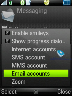
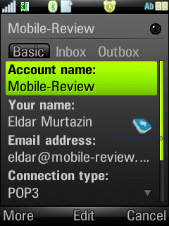
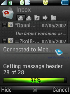
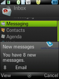
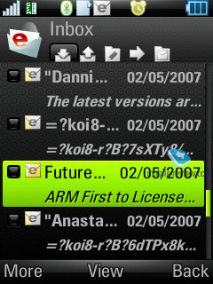
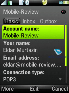
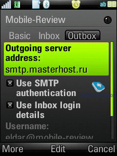
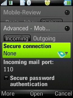
It has undergone no serious changes, the only difference is that the Push Mail item has become standard and is featured in the menu. The Z8 can deal with several mail boxes, moreover UIQ is capable of working with practically all standards presented in the today’s market. What follows is all standards supported by the OS:
- POP3
- IMAP (IMAP Idle, IMAP Remote folders)
- SMTP
- MIME
- MHTML
- Push mail.
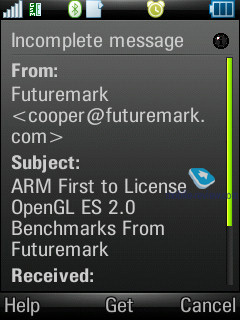
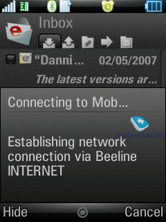
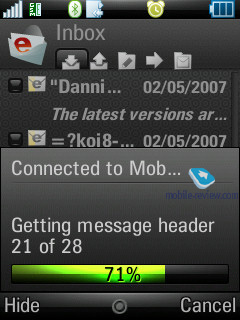
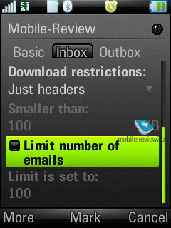
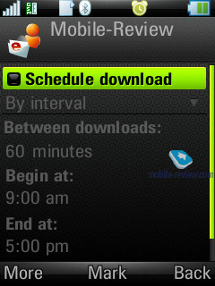
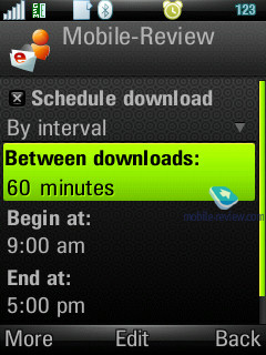
All settings of the mail client are easy to adjust – you set whether it should upload entire messages or only headlines (as an option, it can download a certain part of messages, not exceeding certain size set in Kb). There is also a possibility of setting how many messages Inbox folder can hold at a time – once this number is reached, uploading will be paused automatically. There is also an option for checking mail boxes at certain time spans.
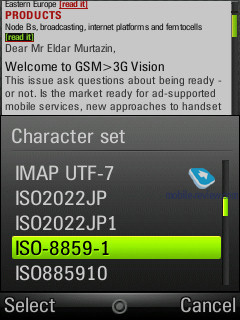
By default UIQ uses Latin 1 character set, the user can pick preferred encoding for every letter manually.
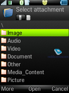
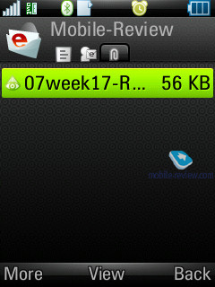
All attachments are handled by the mail client with ease– they can be uploaded and then saved. If an attachment uses a format, supported by the smartphone, it may be opened (and what is more the attachment receives a corresponding icon). There are no restrictions on file size – none that you should observe.
Back to the table of contents >>>
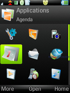
Organizer
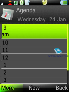
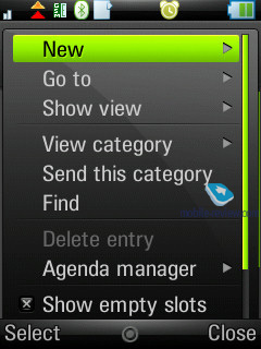
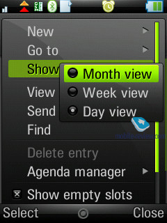
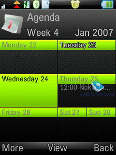
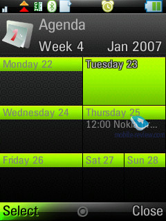
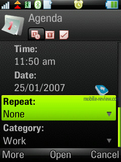
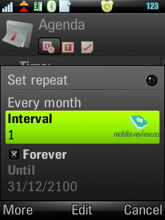
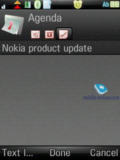
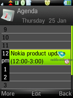
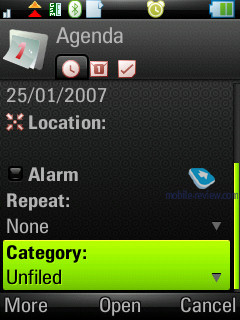
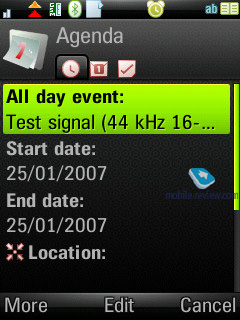
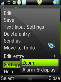
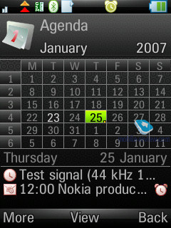
The calendar provides not only the conventional monthly and daily views, but also weekly mode. In this appearance a week is presented as two columns with respective days filled in them, where each square features scheduled events. This mode is rather handy and allows the user to quickly estimate how busy he is during the week to come. When number of events for a particular day exceeds five, not all of them get listed outright.
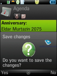
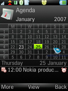
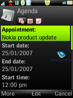
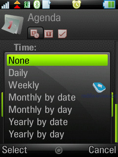
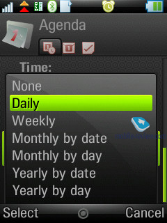
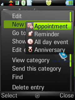
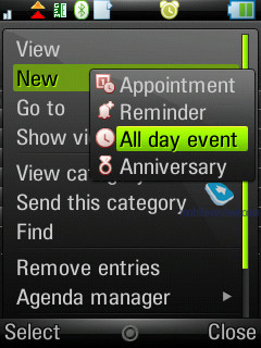
In the month-view all dates which events are scheduled for, are marked with corresponding icons put to the right of the number. There are four types of events o –appointments, reminders, anniversaries, all-day events. All events may be set to be repeatable, for each of them you can pick up a certain alarm tone.
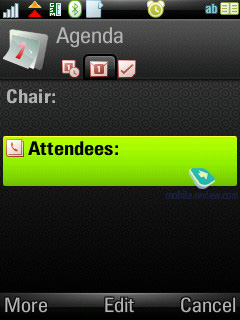
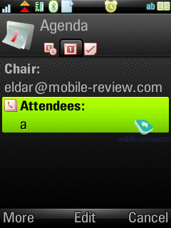
The organizer supports vCalendar, version 1.0, at that the developers have incorporated support for team work via iCalendar. In real-life this means the possibility of sending a request for a meeting, using the mail client. Your vis-a-vis may reply with a refusal, in case date and time don’t suit him, or accept the appointment. In the latter case the message, saved in Inbox folder is automatically redirected to the Oraganiser and shown in the calendar as a stand-alone event.
You’re also at liberty to check the request status while the recipient is pondering over the message.
Though the function seems to be somewhat new right now, soon enough, say, in half a year, it may become relevant for small third-party developers and all the leading manufacturers.
Among the standard functions, sending calendar’s event to other devices via Bluetooth is available here. Naturally, the handset supports reception of such messages as well, which, after being looked through, are saved in the calendar.
Back to the table of contents >>>
To-Do list
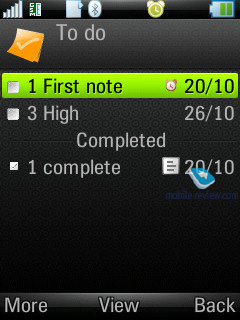
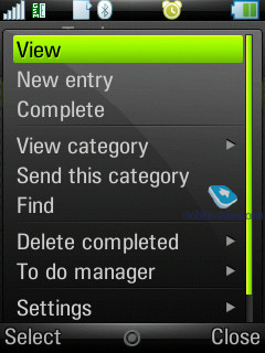
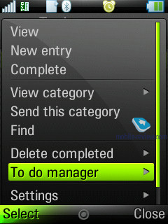
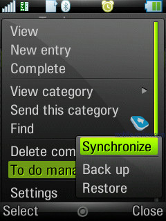
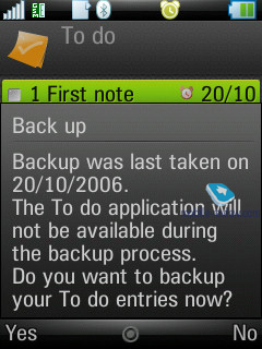
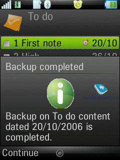
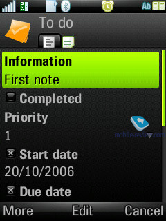
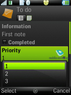
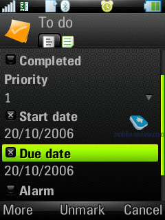
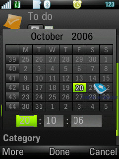
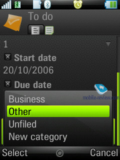
All entries in the Organizer and To-Do list are inter-transferable within the bounds of these two sections. Much like the Organizer, the user can create a backup copy of the To-Do list on the external memory card. You can create any number of categories, which all entries will be sorted by. The priority may vary from 1 to 3 (low, normal, high), also you can set start and due dates, alarm tone (choosing the tone is up to the user, since he can apply any signal).
You can sort the general list by categories, completion status (list of completed tasks may be hidden), due date and priority. The To-Do list supports SyncML amd synchronizes with MS Outlook without any hardships. The user can also send particular entries to any device using Bluetooth, as well as a standard message’s body.
Alarm Clocks
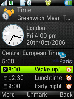
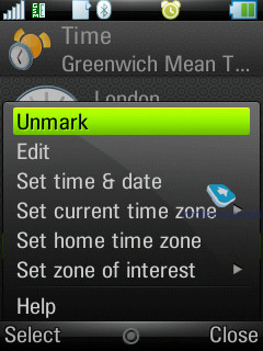
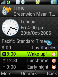
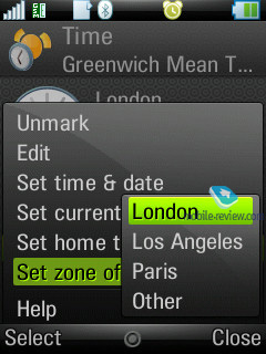
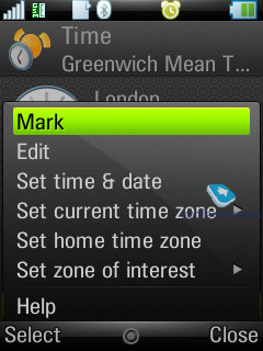
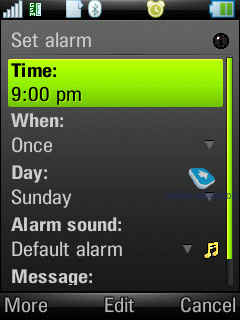
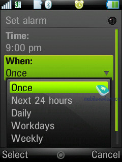
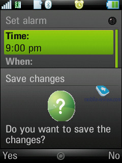
Not much has changed in this department – you are enabled to set up several alarm clocks to go off on at different time, at that you can adjust reoccurrence for particular days and apply any desired ring tone.
Flight Mode
Similarly to other smartphones, the handset can work with the network part disabled – in this mode Bluetooth becomes unavailable either. Unfortunately, SIM-less operation is not possible with the Z8.
Connections manager
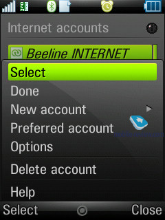
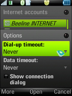
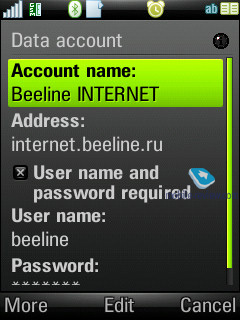
One of the things characterizing UIQ is that the device can run several connections, requiring different network services at once (e.g. uploading of mail via an Internet account and a connection for sending and receiving MMS-messages). This capability was named “multi-homing”. The following standards can play the role of the gates: GSM data call (CSD), GSM High Speed data call (HSCSD), Packet data (GPRS), Bluetooth.
From the menu (the line with an arrow in the status bar at the bottom) you can check connection time, amount incoming and outgoing data, current connection status, number of applications, using a particular connection at the given moment. You can also cut off or link up any connection from this menu.
Office applications
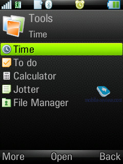
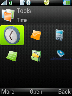
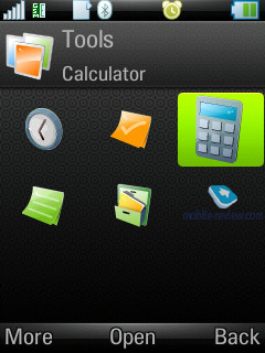
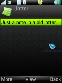
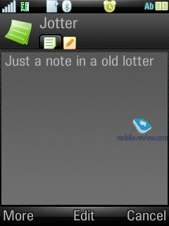
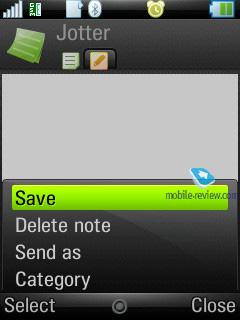
This section holds all office applications; by default there are four of them (except for the organizer, which is a standard program). The first item on the menu features Notes, which can be either text (type with any desirable method, txt extension is also supported) or scribbled.
The second application is going by the name of PDF+, and as its title implies, it servers as a PDF reader. You can view these documents both in standard and landscape modes. Actually, this application has been available for various versions of OS, including platform 60, for several years now. Nokia has also installed this program on a number of its devices. On the whole PDF+ works pretty fast, and seamlessly deals with files both in English and documents, written in various character sets (though as applied to pdf, the word of “character set” feels out of place). This app also retails for around 25 USD.
QuickOffice – another third-party application, which was selected by UIQ as a default app for the third edition and comes along with the standard package (there is a version for the previous editions if UIQ available, sells for 50 USD). The program itself is an editor, which recognizes is and capable of opening and editing MS Word, Excel, PowerPoint documents.
We won’t dwell on QuickOffice, though will make a short note, that the resources of any mobile device are strictly limited. Complicated types of formatting, used by desktop computers, are frequently not saved in files, edited on smartphones (this goes not only for QuickOffice, but all other devices powered by Windows Mobile as well).
Back to the table of contents >>>
Some other features, themes, web-browser
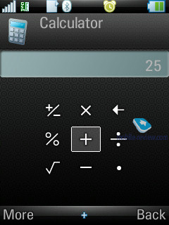
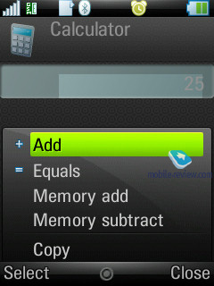
Calculator – self-explanatory application, nothing special in it.
Voice – A sound recorder, which allows making voice notes (only when in standby mode). This application offers a very handy and straightforward interface. The recording is limited by nothing but the volume of free memory left on the handset.
Picture editor – a simple editor, which allows performing basic operations with images.
Stopwatch – supports intermediate results tracking and listing.
Countdown – time is set in hours and minutes, upon reaching the set time, the devices triggers a sound alarm.
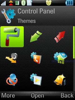
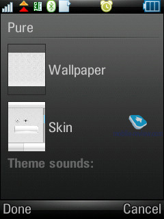
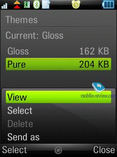
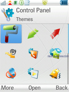
Themes are one of the major parts of the new UIQ –not only do they modify the appearance of windows and colors, but also shape-change particular menus and icons, thus this allows making up totally refined looks of the interface. At that you can adjust not only appearance, but also sounds of screen taps and various events.
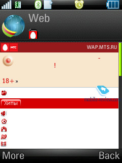
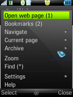
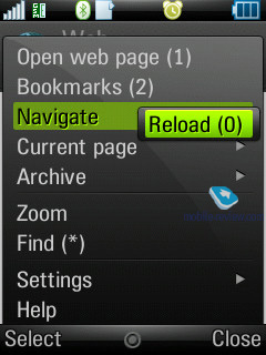
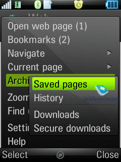
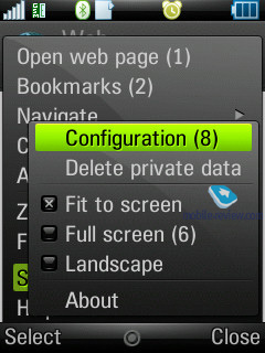
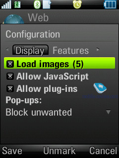
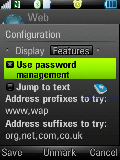
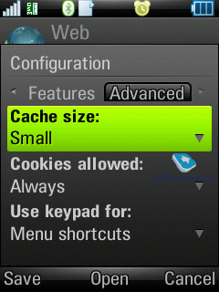
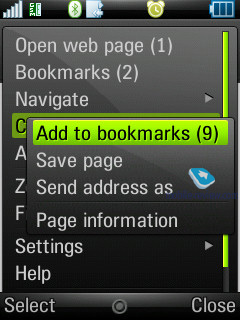
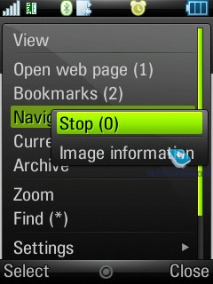
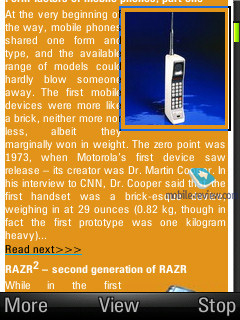
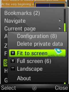
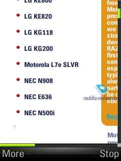
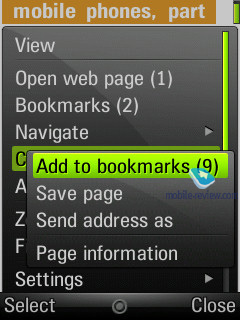
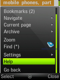
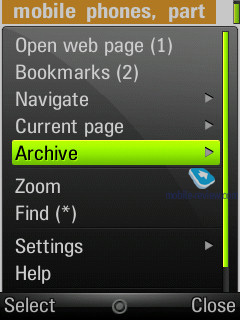
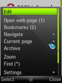
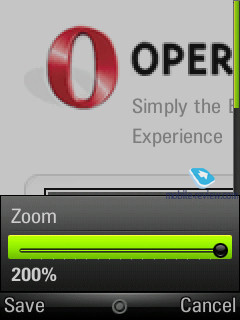
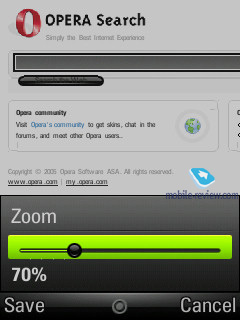
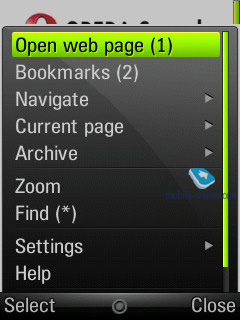
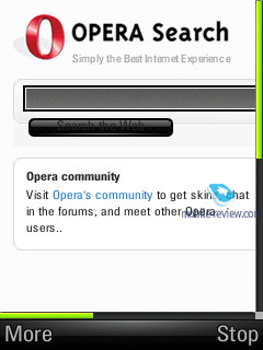
The handset comes equipped with Opera 8.5 as the default web-browser. At present this is the best browser available for this kind of devices, the only counterpart is S60’s browser version two. It doesn’t make any difference between working in portrait and landscape modes, supports cookies, can scale pages to fit them into the screen, display the original page “as is”, retains password manager and a lot more.
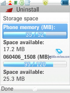
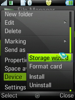
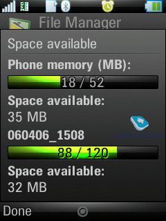
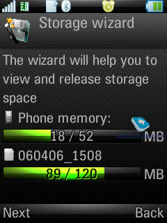
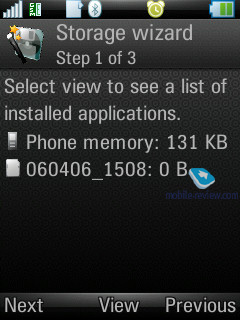
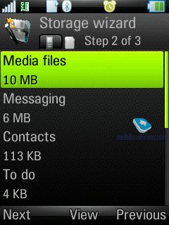
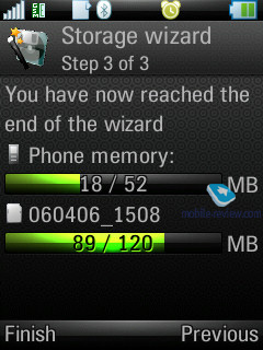
Storage Wizard – is a default application for UIQ 3.0, offering memory distribution status in the device.
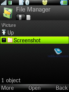
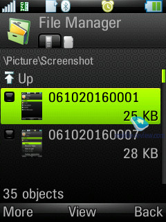
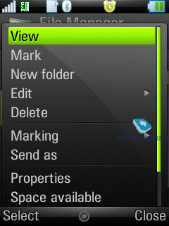
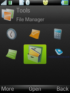
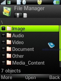
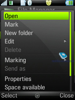
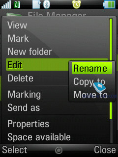
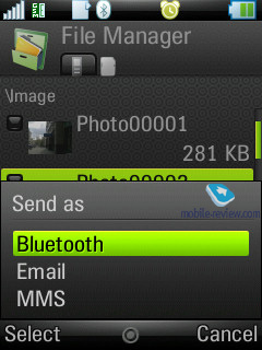
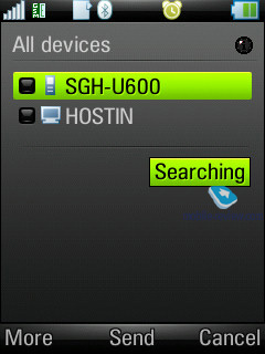
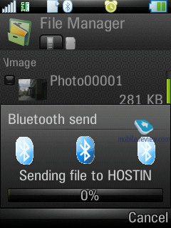
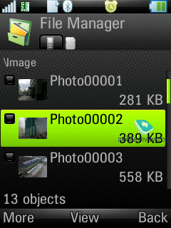
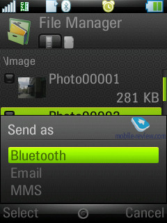
File manager allows viewing the user folders. It supports multi-selection of files or folders at a time, as well as deletion and copying; also you can send a number of files to other devices via Bluetooth.
Impressions
Sounds odd, but the Z8 doesn’t have any kind of direct competition. What is the reason? This handset offers queer, unique design, and this does it justice. On the other hand, it lacks radio, can’t boast top-of-the-line camera, in other words, proposes a basic suite of features with slightly modified standby screen and omitted touch screen. For example, the Sony Ericsson P1i retailing for the same sum of money, yet arriving in the market a tad later, has clear advantages over the overpriced Motorola’s offering. But we need to face off devices belonging to one type, and then S60-powered models step onto the scene.
In view of today’s variety of Nokia’s range, everyone can go and pick up a handset to his/her own liking. We won’t put some specific models head to head here, since the Z8 has no direct rivals, so we will just list out its traits.
- One of the most vibrant and bright displays;
- Unique form-factor, fresh design;
- A number of improvements to UIQ 3.1 standard interface;
- Enhanced iTAP text input system
That’s about the Z8’s draws; other specs are nothing out of the ordinary. For instance, the Nokia 5700 trumps it in music, even being an average-sounding solution. And default headphones have much to do with that. Basically, examples abound – the Z8’s major attractions and novelty give nothing to the consumer, it is rather the groundwork for the company’s future efforts. In this regard, the MOTO Z8 is merely first device of its kind. Until the end of 2007, we will see the successor to this phone with new color choices, enhanced specifications (camera, memory, interface speed), which automatically makes the MOTO Z8 nothing but a king for a day. There is no way the device will become sought-after, and, the truth is, the maker himself doesn’t think this model’s life cycle will be long enough. The year 2008 will see 7-8 Motorola-branded models running UIQ – the company is really getting serious about this area.
In June the MOTO Z8 boxed with the S9 wireless headset (retails for 100-110 USD) will go for about 650-700 USD. The Russian market, seemingly, will get the retail package without this headset; however this is unlikely to affect the price in any way, due to the customs fees here being substantially higher. The Z8 is a really appealing product, yet only for those keen on such things. Unquestionably, it is destined to turn into a milestone, being the first model of this class, but we buy phones to use them after all, don’t we? That is why we would be better off waiting until the end of this year and grab a more fetching offering for about the same money. With that said, this handset’s target audience will include techi and partly the youth greedy for flashy novelties.
Back to the table of contents >>>
Eldar Murtazin ([email protected])
Translated by Oleg Kononosov ([email protected])
Published — 31 May 2007
Have something to add?! Write us... [email protected]
|
News:
[ 31-07 16:21 ]Sir Jony Ive: Apple Isn't In It For The Money
[ 31-07 13:34 ]Video: Nokia Designer Interviews
[ 31-07 13:10 ]RIM To Layoff 3,000 More Employees
[ 30-07 20:59 ]Video: iPhone 5 Housing Shown Off
[ 30-07 19:12 ]Android Fortunes Decline In U.S.
[ 25-07 16:18 ]Why Apple Is Suing Samsung?
[ 25-07 15:53 ]A Few Choice Quotes About Apple ... By Samsung
[ 23-07 20:25 ]Russian iOS Hacker Calls It A Day
[ 23-07 17:40 ]Video: It's Still Not Out, But Galaxy Note 10.1 Gets An Ad
[ 19-07 19:10 ]Another Loss For Nokia: $1 Billion Down In Q2
[ 19-07 17:22 ]British Judge Orders Apple To Run Ads Saying Samsung Did Not Copy Them
[ 19-07 16:57 ]iPhone 5 To Feature Nano-SIM Cards
[ 18-07 14:20 ]What The iPad Could Have Looked Like ...
[ 18-07 13:25 ]App Store Hack Is Still Going Strong Despite Apple's Best Efforts
[ 13-07 12:34 ]Infographic: The (Hypothetical) Sale Of RIM
[ 13-07 11:10 ]Video: iPhone Hacker Makes In-App Purchases Free
[ 12-07 19:50 ]iPhone 5 Images Leak Again
[ 12-07 17:51 ]Android Takes 50%+ Of U.S. And Europe
[ 11-07 16:02 ]Apple Involved In 60% Of Patent Suits
[ 11-07 13:14 ]Video: Kindle Fire Gets A Jelly Bean
Subscribe
|
