|
|
Review of GSM/UMTS-smartphone Motorola MOTO Z10
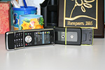
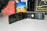
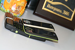
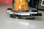
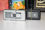
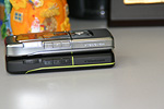
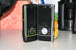
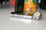
Live photos of Motorola Z10
Table of contents:
- Positioning
- Design, size, controls
- Display
- Keypad
- Battery
- Memory, Memory card, CPU, chipset
- Performance
- USB, Bluetooth
- Camera
- Interface, text input
- Music department
- Contacts
- Messaging
- Email client
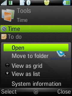
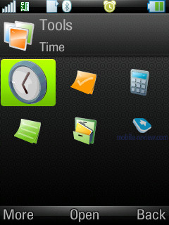
- Organizer
- Tasks
- Alarm clocks
- Flight Mode
- Connection manager
- Office applications
- Some Other Features, Themes, Web-browser
- Photo and Video Editor
- Shozu
- Impressions
Sales package:
- Handset
- 1 Gb microSD memory card (size and availability vary by region)
- Battery
- Charger
- miniUSB data cable
- Wired stereo-headset
- Software CD
- User Guide
Positioning
The MOTO Z10 is merely an upgrade to the MOTO Z8 with no substantial differences in design or functionality. When the MOTO Z8 was preparing for its debut, they had some serious arguments at Motorola whether it was worth launching it at all, or whether it would be better to roll out the Z10, even if a tad later. The entire change log is no longer than a handful of improvements – a 3.2 MP camera (against the Z8’s 2 MP unit) and an application for uploading multimedia content to online blogs and other resources, plus video and image editors. Other new features and skin-deep improvements can easily be overlooked.


The MOTO Z8’s positioning as a “multimedia monster” for video, music and imaging turned out a flop – consumers couldn’t discern all these capabilities behind the phone’s quirky form-factor. While it was running UIQ, it didn’t boast a touch-sensitive screen and couldn’t stand up to Nokia-branded solutions positioned at this price point in terms of its camera. No doubt it did appeal to some, but overall it was more of a disappointment; what it packed under the hood didn’t quite meet the expectations of the market.
The kick-slider mechanism failed to spark a craze either – for the most part, it was unappreciated and frequently ignored. That’s why the Z8 took a backseat against the backdrop of high-profile announcements from other manufacturers.

The launch of the Z10 was pretty much predefined, and what’s more, they originally planned to release late in 2007 (in October or November). As is usually the case with Motorola they couldn’t meet the deadline, so the Z10’s launch slipped into Q2 2008. Motorola is trying to position its new product as an imagining-centric solution, however, in my opinion, that’s not the best idea, now that the Nokia N82 and Sony Ericsson C902 and others are in the forefront of the market. It turns out that Motorola is touting a 3.2 MP device whereas the mass-market is already enjoying 5 MP cameraphones with even better specs. The reason behind this is that Motorola is now working on new models equipped with decent camera modules; however, they need to maintain their sales with something available today.


It wouldn’t be right to view the Motorola Z10 as a mass-market device – it will settle down in a very narrow niche, and that’s about it. It will generally appeal to those who aren’t bent on touch-sensitive displays, but wouldn’t mind having all features of a smartphone in their pocket. If you already own the Motorola Z8, then going for this next iteration will make little sense since you won’t get much in terms of extra functionality.
Back to the table of contents >>>
Design, size, controls
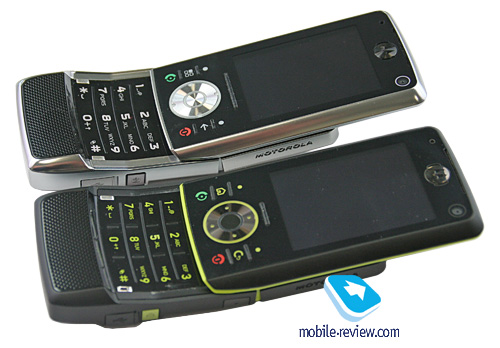
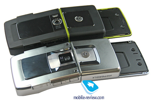
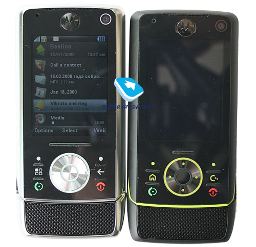
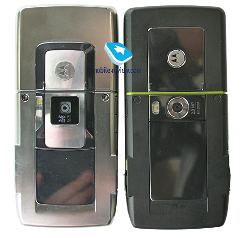
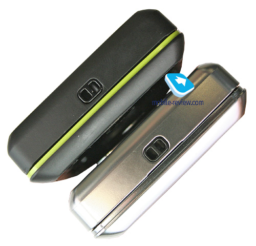
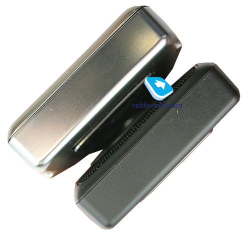
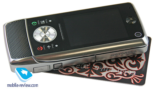
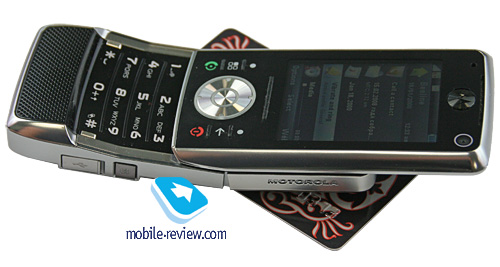
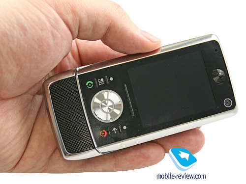
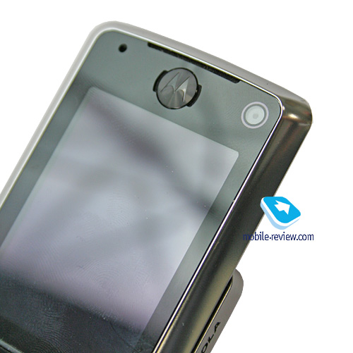
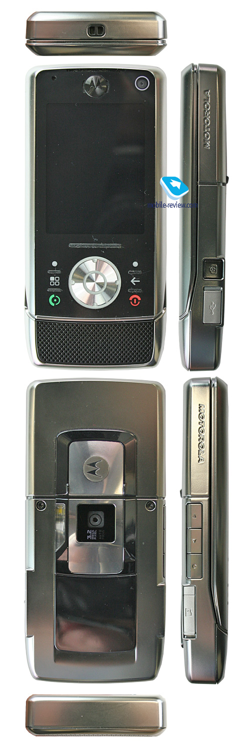
The Z10’s casing sports some metallic accents, hence its silverish color, which is what this season is all about. Actually, Motorola was the first maker to come up with this approach to design (remember the Motorola L9 or Motorola Z6?). By the way, the Z10 has its roots in those times and apparently had to debut much earlier. Drawing parallels with the now-long-in-the-tooth Z8, the Z10 is more of a no-nonsense design, less of a gaudy accessory with neon colors all over it. Although it lost some of its visual appeal along the way too, so now flip-closed it looks more like other devices.


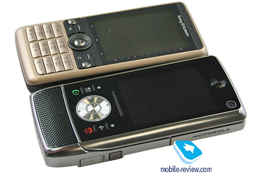
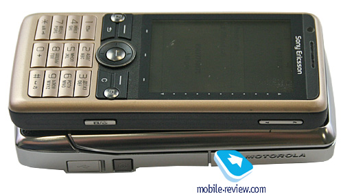
The handset measures up at 109x50x15.5 mm (against the Z8’s 109x50x15 mm, while the part with the camera module is 16.5 mm thick) and weighs 115 grams, which is pretty much in line with the Nokia N82’s 112x50.2x17.3 mm. But it is important to realize that generally, the slider-type form-factor allows creating portable and miniscule solutions, but the Z10 certainly comes from a different breed.


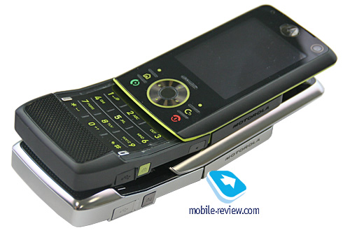
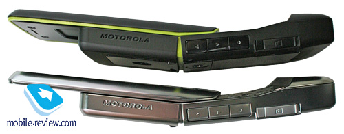
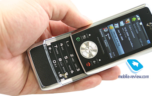
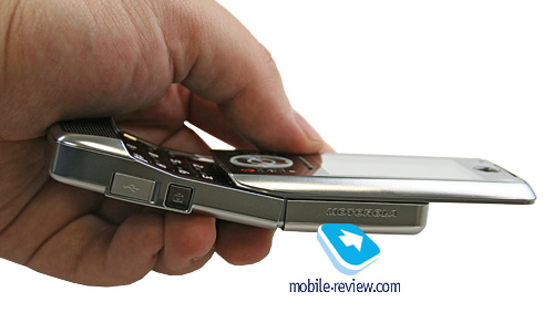
When gliding open, the handset moves in a curve, achieving the fit-to-face profile, which is due to the joint inside the slider mechanism, so that when you open it, it goes like any other slider up to a certain point and then “snaps” in two. This doesn’t deliver any hardships with flicking the Z10 open or closed; opened up, the slides bend when pressed, yet maintain the fit-to-face profile when you just hold the phone in hands.


Beneath the display is the thumbgrip for sliding the phone open, compared to the Z8 it has gotten wider and thus a tad handier. The sliding action in the Z10 is not feather-light, yet not very stiff. It is actually different from conventional sliders, but it is more about the feel, you will get a hang of it in no time.

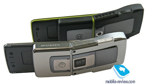
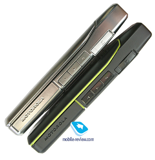
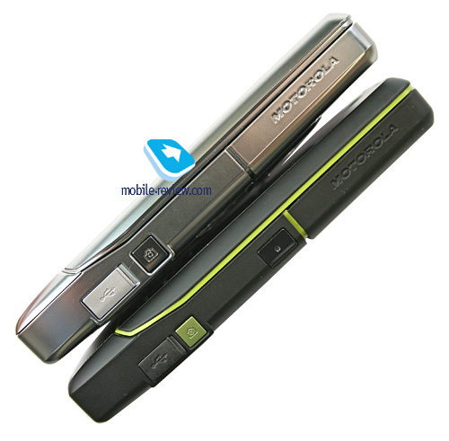
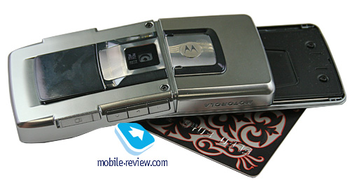
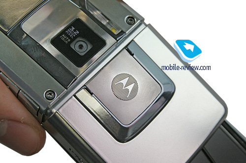
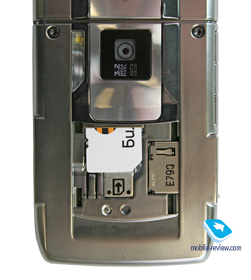
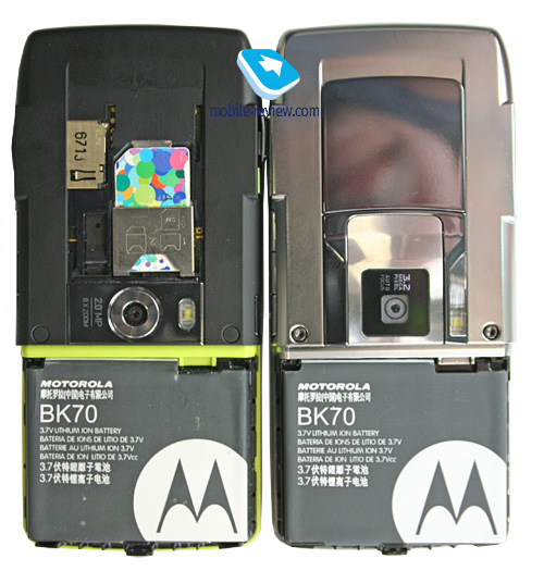
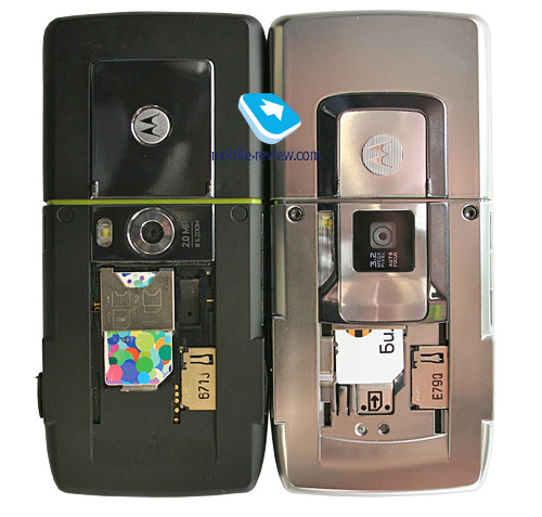
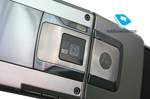
The left-hand side is home to the volume rocker and the dedicated video call key, as well as the memory expansion slot, covered with a rubber flap. On the right spine is the camera shortcut button (no dedicated music key on the Z10). Right here is the minuUSB socket hidden under a rubber flap. Flipping over to the rear, you will find the lens of the Z10’s 3.2 Mpix camera and the LED flash.

Back to the table of contents >>>
Display
The Z10 puts out a very sharp and vibrant picture with its 2.2. inch TFT screen capable of 16 million colours. The screen resolution is 240x320 pixels, which allows it to display at least 9 text and 3 service lines. The handset features adjustable font sizes (three levels); the default setup is fine and makes for legible text and menus.
In the sun, though, it gets slightly washed out, but it’s not a big deal, as it can be seen normally by putting the handset at a slight angle .
Back to the table of contents >>>
Keypad
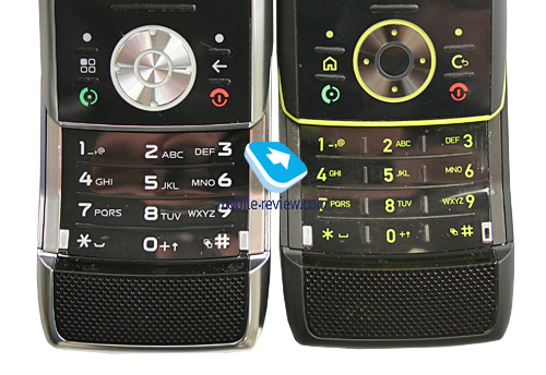
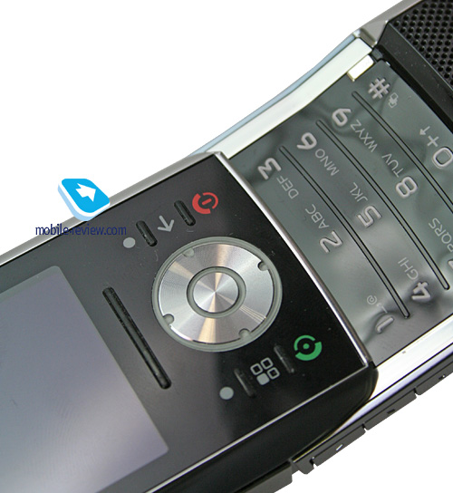
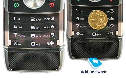
The first thing you come across when looking at the Z10’s keypad is that the main menu icon has changed – now it is a standard UIQ icon instead of a house. Also, the C key has been replaced with an arrow. But the gist is still the same – these buttons serve exactly the same purposes as before.

While the Z8’s functional keys suffered from occasional misclicks, as they there pretty much close together, the Z10 deals with the problem by providing shorter, yet more tactile ridges between the buttons, so that now you can work with the keypad even without looking at it. Misclicks are almost gone, which is also a good thing.


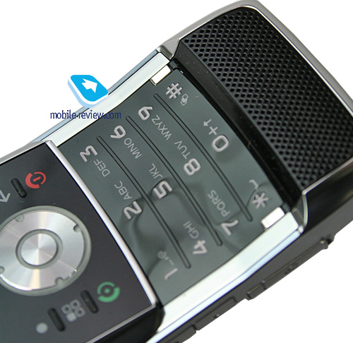
The number pad is made of a plastic slab that is bent in the way to match the casing’s curves. The buttons are stiff, some are really hard to press and give no tactile feedback. What is more, using this keypad outdoors in winter is a major pain, it starts feeling like a solid rock, literally. Compared with the Z8, this keypad is stiffer and I didn’t like it at all.

All buttons are lit in white, which is well-visible in various environments.
Back to the table of contents >>>
Battery
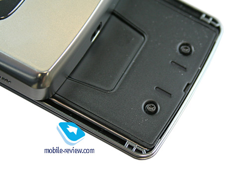
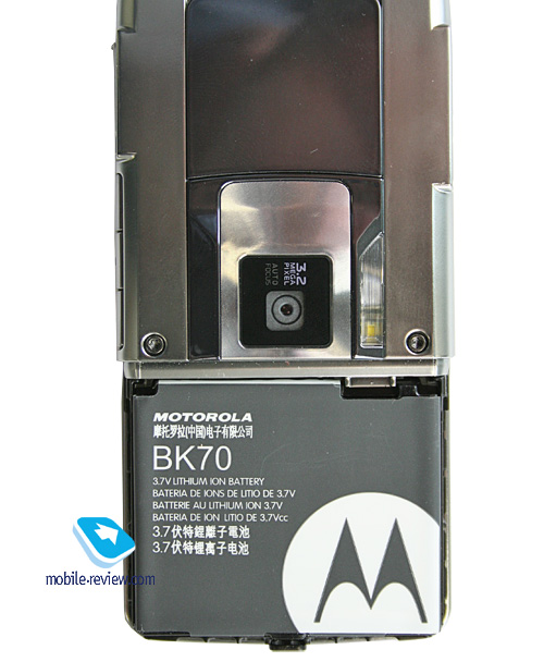
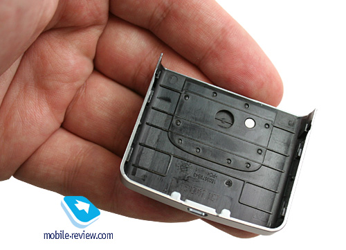
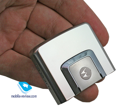
The cover at the top of the handset firmly seals the battery. The Z10 comes installed with a 1030 mAh unit (Li-Ion), the maker rates the battery life for 5 hours worth of talk time and 380 hours of standby. In Moscow, the handset lasted for about 2 days, at one hour of calls, up to 6 hours of music playback, occasional file transfers over Bluetooth and up to 20 minutes of mail, web browsing. It takes the Z10 about 2 hours to charge up from empty to full. It doesn’t differ a bit from the Motorola Z8 in the sense of battery life.


We squeezed 11 hours worth of music out of it with tunes playing at full blast in wired earphones.
Video playback time – 4.5 hours (QVGA, 25 FPS).
Back to the table of contents >>>
Memory, Memory card, CPU, chipset
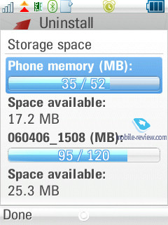
The model is based off the TI OMAP 2420 chipset, coming with the ARM11 CPU running at 300 Mhz. The Z10 ships with around 50 Mb, while user data can take up about 70-72 Mb (the vendor claims it is 90 Mb, but a certain portion is used up by applications and pre-installed content).
The amount of RAM is extremely small and is pretty much in line with what we saw from the previous generation of devices, for example the Sony Ericsson M600i (32 Mb). One possible explanation is that the Z10 is an all-MRAM fare, but then the handset would be more expensive, and there would be no benefit to such a small amount of RAM. Thus, it is clear that they have probably used standard NAND-memory.
The mircoSD memory expansion slot is hot-swappable; the Z10 supports up to 32 Gb memory cards.
Back to the table of contents >>>
Performance
Due to its unique memory architecture and the tiny volume of RAM onboard, all the handset’s strengths have been negated, as the tests rate its performance on the same level as some low-end solutions. In terms of the interface, the Z10 seems quite speedy, being on par with other products, but if there are a lot of applications running, especially if these are third-party programs, the Z10 becomes somewhat sluggish. By and large the model is nothing special as far as the current generation of handsets goes, but it already lags behind Nokia’s products. On the other hand, a handful of functions sport an instant start-up feature, for example, our favourite throughout this review so far has been the music player, which is what the Z10’s main attraction is.
Back to the table of contents >>>
USB, Bluetooth
USB. Files can be transferred to the Z10 via USB-connection (2.0 Full Speed supported – up to 12 Mbps). When connected to a PC, the smartphone is displayed as a USB Mass Storage, and the system displays only the memory card, providing no access to the handset’s memory. Another way to pair up the Z10 with your PC via USB is Modem mode, when the smartphone starts acting as a wireless modem (drivers required).
Bluetooth. The Z10 comes equipped with EDR-enabled Bluetooth 2.0 and allows for up to 16 devices on the list. The following profiles are supported:
- Dial-Up Networking Profile
- Generic Access Profile
- Generic Object Exchange Profile
- Object Push Profile
- Serial Port Profile
- Handsfree Profile
- Headset Profile
- Synchronization Profile
- Basic Image Profile
- File Transfer Profile
- HID (host) Profile
- Stereo Advanced Audio Distribution Profile
- Advanced Audio/Video Remote Conference Profile
The Bluetooth implementation is, as always though, nothing to complain about, we encountered no issues with handling this type of connections. On the downside, the standard timed visibility over Bluetooth is still some sort of a barrier; the handset can’t stay in always-visible mode. The Z10 comes packaged (not for all regions) with a Bluetooth stereo-headset Motorola S9.
Back to the table of contents >>>
Camera
The bundled 3.2 Mpix autofocus-enabled camera shows off CMOS-sensor and LED flash. Quality-wise it is pretty mediocre, and there are no pleasant surprises to look for. Camera application can be launched only with the slider closed – if that’s the case, punching the side-mounted dedicated button starts up the viewfinder mode. And slid-open, the Z10 boots up the forward-facing VGA camera.

Three image resolutions are available – Large (3MP), Medium (2 MP), Small (480x640). Two levels of compression are at your disposal, and other settings allow turning off the shutter sound; vary exposure from -2 to +2, and selecting the lighting type (auto, sunny, cloudy, indoors, office). The handset also features a self-timer.
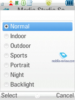
Best results are achieved when shooting in bright sunlight, whereas in other cases the color saturation is far from satisfactory. The good thing about the U9’s camera is that photos are shown in full-screen mode when working with the camera, while icons and captions are semitransparent. You can change the lighting settings by pressing the navigation button up or down, as well as select various effects (Black&White, Negative, Sepia, Solarize). There is a x8 digital zoom at your disposal, and a multi-shot mode.
 |
 |
| (+) maximize, 2048х1536, JPEG |
(+) maximize, 2048х1536, JPEG |
 |
 |
| (+) maximize, 2048х1536, JPEG |
(+) maximize, 2048х1536, JPEG |
 |
 |
| (+) maximize, 2048х1536, JPEG |
(+) maximize, 2048х1536, JPEG |
 |
 |
| (+) maximize, 2048х1536, JPEG |
(+) maximize, 2048х1536, JPEG |
 |
 |
| (+) maximize, 2048х1536, JPEG |
(+) maximize, 2048х1536, JPEG |
 |
 |
| (+) maximize, 2048х1536, JPEG |
(+) maximize, 2048х1536, JPEG |
 |
 |
| (+) maximize, 2048х1536, JPEG |
(+) maximize, 2048х1536, JPEG |
 |
 |
| (+) maximize, 2048х1536, JPEG |
(+) maximize, 2048х1536, JPEG |
 |
 |
| (+) maximize, 2048х1536, JPEG |
(+) maximize, 2048х1536, JPEG |
 |
 |
| (+) maximize, 2048х1536, JPEG |
(+) maximize, 2048х1536, JPEG |
 |
 |
| (+) maximize, 2048х1536, JPEG |
(+) maximize, 2048х1536, JPEG |
For video shooting, the Z10 offers two quality settings – best and good, three resolutions to choose from (SQCIF, QCIF, QVGA), 30 FPS, and absolutely no limits on clip length. But the truth is, its video is quite average as far as quality goes.
Back to the table of contents >>>
Interface, text input
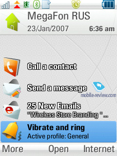
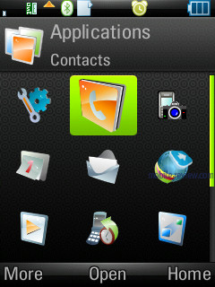
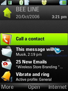
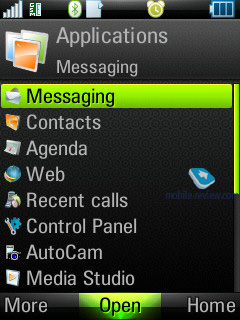
The handset houses a very familiar UIQ interface, its only characteristic feature in the Z10 is the Task list, which always holds 5 recent applications - to bring it up tap and hold the Home button. Menu navigation was never an issue with this phone – everything is very straightforward and easy to move about if you have had some experience with a smartphone powered by Symbian before. This device hasn’t avoided the latest and greatest trend of cramming all the settings into the respective menu item, while context-sensitive menus can provide you with exactly the same options. In other words, set up your Z10 wherever you see fit.
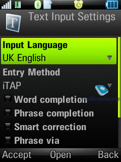
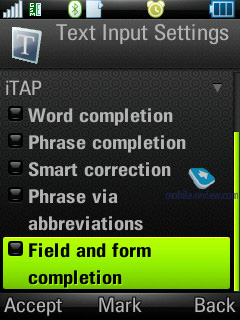
When texting, you can take advantage of the predictive iTAP dictionary, so far it is the most sophisticated solution tailored for non-touch screen handsets. Apart from automatic word memorization, the phone can also save whole phrases and sentences without asking you, as well as rectify all your spelling mistakes without interference from you. The system also sports a full language package, meaning that as long as the Z10 allows you to select an interface language; you will have predictive text input with it as well. All in all, this text input system is a big step forward, even though we still missed a touch screen.
Back to the table of contents >>>
Music department
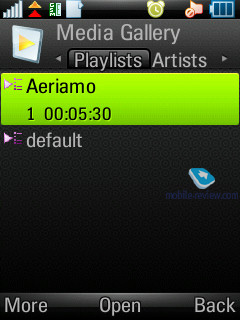
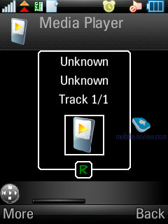
The music player is reminiscent of what’s found in Sony Ericsson’s solutions, with the ability to sort by tracks, album, and artist, and support for album art and progressive fast forward. One-touch availability of the player is enabled by the side-mounted button; on top of that you can beam sound wirelessly onto a Bluetooth stereo-headset with an adequate level of sound quality. While in handsfree mode the Z10 also does fine, providing a decent audio experience, despite only having a single speaker. Supported audio formats include – MP3, AAC, AAC+, E-AAC+, WAV and m4a. There is no limit on the bitrate of mp3 files, and you can upload VBR tracks. The handset’s music functionality may be compared with that of an ordinary Walkman phone, which is not that bad at all, in fact it’s quite good.
The headset you get in the box is of average quality, but is loud enough and will do for non-music-conscious users. Regrettably a miniUSB-3.5mm adapter wasn’t included with this handset as we kept hearing strange noises and clicking sounds. We couldn’t figure out the root of the problem though, and we tried out a couple of adapters and stumbled upon the same issue with all of them (some European countries still barely know what these adapters are).
The manufacturer underscores the handset’s multimedia focus, but do keep in mind, that it is a marketing ploy rather than anything of consequence. Its music department is on par with other UIQ-smartphones, but the retail package, due to the cheap headset, is not very attractive.
Video playback. The vendor proudly claims the Z10 can playback QVGA video (240x320 pixels) at 30 FPS – we checked, it can.
Games. The Z10 comes installed with only one game – 3D Rally.
Back to the table of contents >>>
Contacts
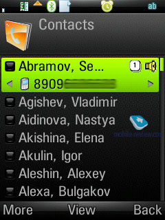
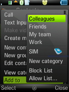
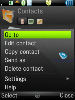
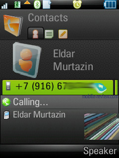
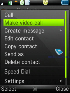
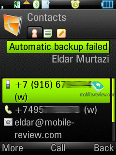
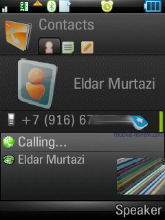
All entries in the phonebook are organized in a familiar way: at first the general list is displayed, and once you’ve selected a certain contact, you are offered a default number, set for this entry. The list doesn’t show entries, located on SIM/USIM-cards, nevertheless you’re still able to handle them via the phonebook’s menu – copy them to both the handset’s memory and memory card. But since the external memory card can serve as storage for contacts archives, there is no need in saving contacts to SIM/USIM-cards, especially taking into account entries’ structure is damaged in that case.
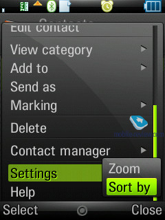
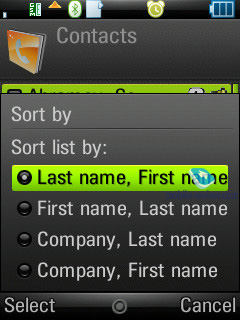
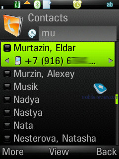
Search in the general list may be conducted by the first or several letters (the line above is a full-fledged search field). Sorting of entries in two different languages is carried out in a standard manner: contacts in English are followed by entries made in the other language. It’s better to create all contacts in one certain language, otherwise you’ll have a rough time finding them.
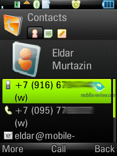
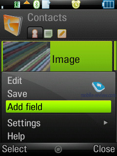
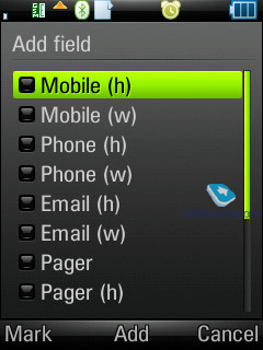
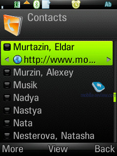
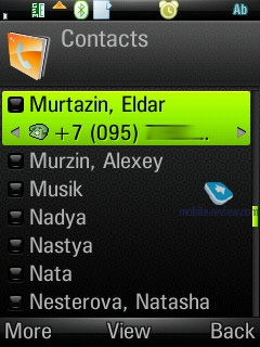
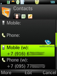
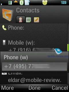
Each particular contact can contain any number of various numbers – the first entered is set as the default number. Extra entries above those, which are available in the standard view, can be added via the menu. The general list displays details on particular numbers via horizontal scrolling; right here you’ll get extra information on the contact, like e-mail address etc.
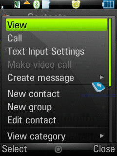
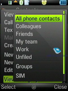
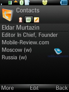
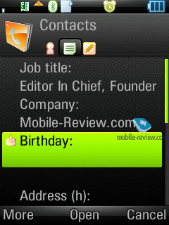
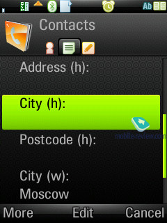
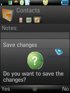
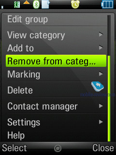
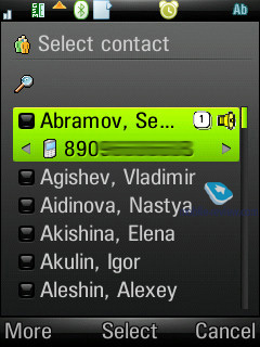
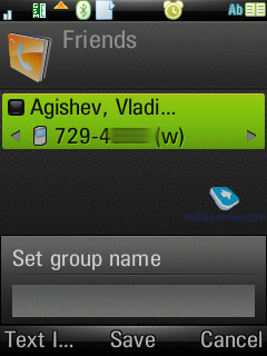
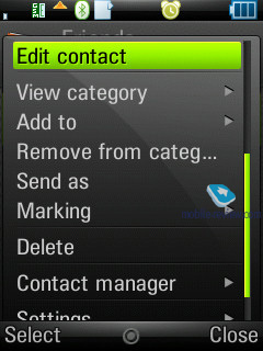
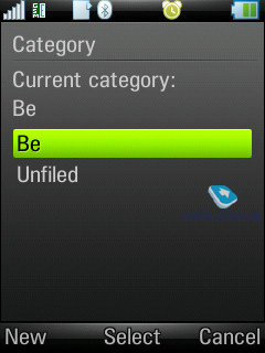
The Z10 comes with four tabs in the contact edit window. The first holds functions related to phone numbers editing, choosing category, or, if you like, groups. The distinctive feature here is that one and the same entry can be assigned to several categories at a time (may prove useful when dealing with bulk mailing). The second tab contains date of birth, status in company, position, address (several fields), and work address. The third tab is just a text note, attached to a contact, while the fourth provides data on voice commands (applied to phone numbers) and personal ring tone (in case you’ve set a group ring tone, on inbound call it will be replaced by an individual tune, since the latter has a higher priority).
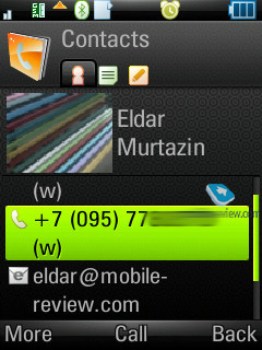
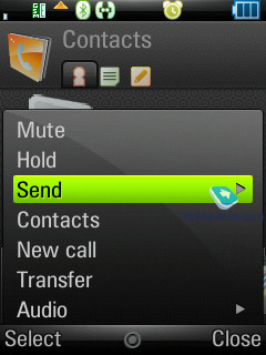
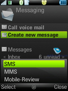
When viewing an entry you can initiate creation of a new message for the selected number in one touch (in the pop-up window you should choose the type: SMS or MMS), and in case you have picked an e-mail address, the built-in mail client automatically starts up.
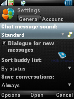
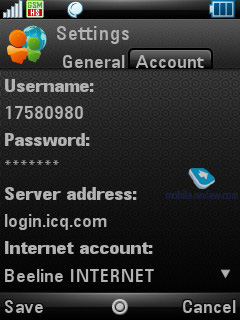
An IM-client is integrated into Contacts, from here you can examine your interlocutor’s status and launch a respective application.

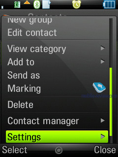
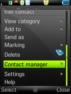
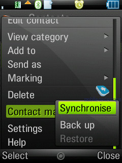
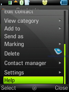
A built-in contact manager is also available in the handset – it allows the user to send the selected entries (categories) to other devices over Bluetooth, also the phone supports the vCard 2.1 standard. This way, you can receive entries from other devices in a similar fashion.
The full-fledged support for SyncML (new title of OMA DataSync) allows synchronizing data with every device that can deal with this standard (no matter whether it's PC, PDA or a handset).
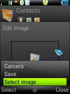
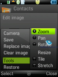
Photos, assigned to contacts in the phonebook can be tiled and stretched.
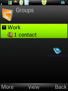
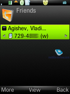
Contact groups allow sorting all entries by throwing them into one or several groups at once. You can send a message or email to the whole group.
Like any other phonebook, this one sports so-called white and black lists, which allow you to either enable or disable calls from certain numbers or groups of contacts.
Holding the numeric keys down activates search in the phonebook. Additionally, you can set up to 9 numbers for speed dialing, which will be followed by matching names and photos (if any) on the display. On top of that, not only can you set speed dial numbers, but also send quick messages to phone numbers listed in the speed dial menu, which is a welcome feat.
Back to the table of contents >>>
Messaging
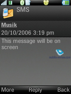
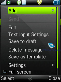
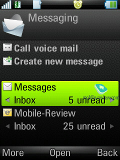
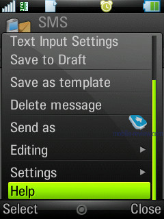
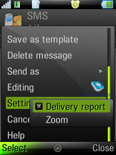
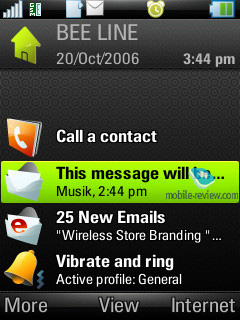
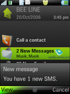
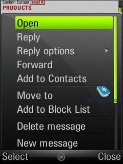
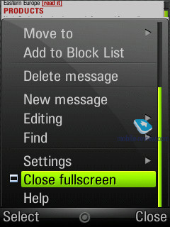
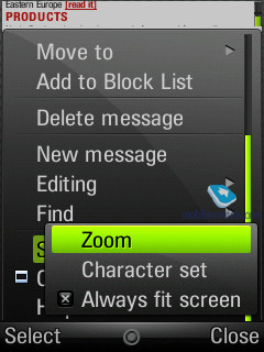
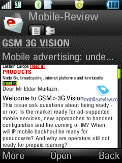
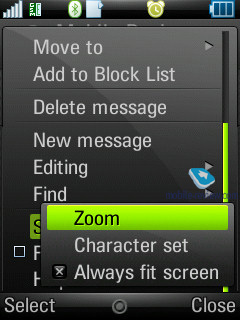
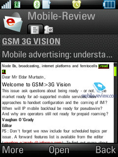
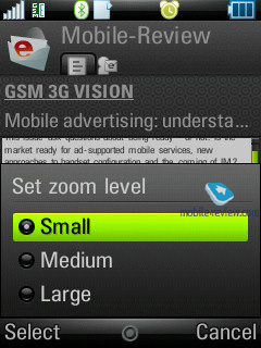
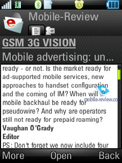
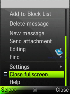
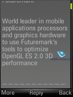
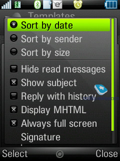
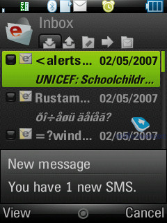
One of the Z10’s characteristic features is that you can view a message in full-screen mode; this option is now available for both SMS/MMS-messages and emails, whereas previously you could turn to it only in the browser. Delivery notification can be set up for every message manually, though you would be better off choosing this option in the SMS profile, so that all reports will be delivered automatically for all messages.
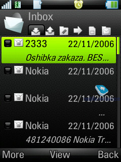
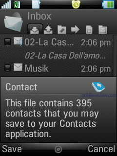
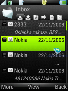
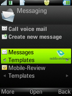
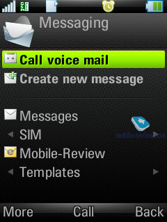
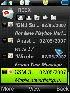
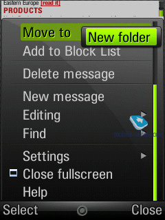
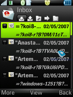
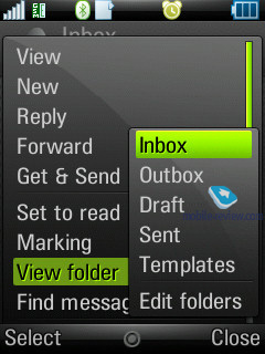
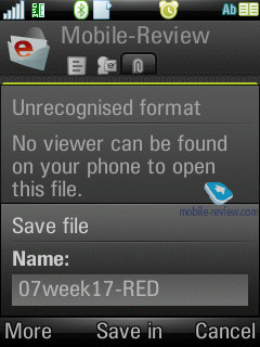
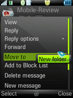
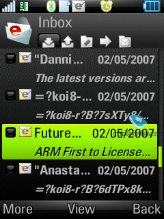
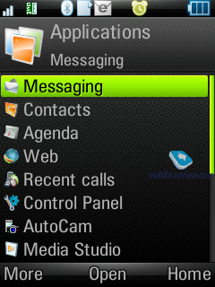
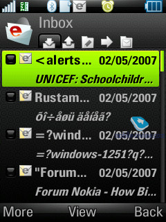
All incoming messages, saving for e-mails, are stored in one folder – Inbox. This also goes for the files, received through Bluetooth (the device supports all formats, even those it can’t recognize). The data, located in Inbox can be saved later on in any other folder – the handset ensures unlimited access to the file system (except for the system folders). In return, the user is at liberty to create their own folders and sort messages in them. When entering the Messaging menu, by default you’re shown the general folder, by using horizontal scrolling you will switch between files, and pressing OK key selects a particular folder and allows viewing the message list.
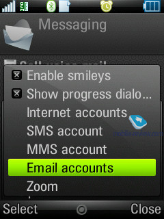
The root of the Messaging menu features the list of all mail accounts separately under the Inbox folder – e.g. if you have three of these, they will be displayed in order of appearance.
Inbox folder also offers each message type (SMS, MMS, Beam) – you see a respective image next to each item.
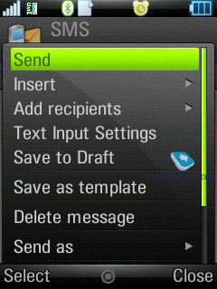
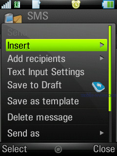
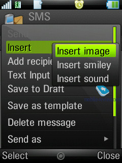
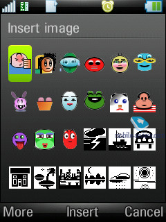
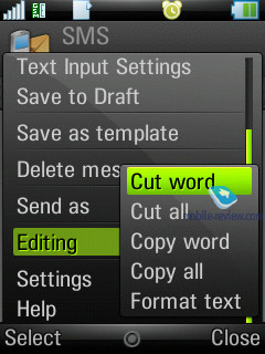
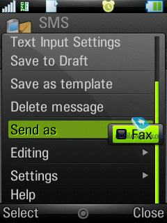
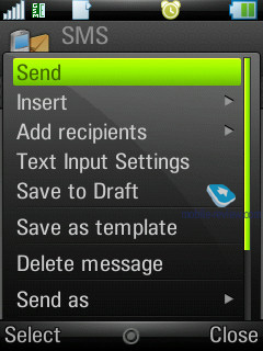
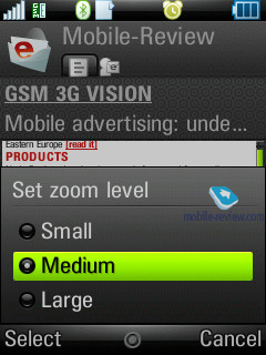
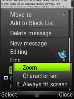
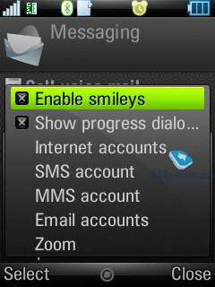
You can also call up creation of a new message option practically from any menu, which features a phone number –just choose the needed type (SMS/MMS) and start texting. Though under the name of SMS you will surprisingly discover EMS messages as well. As a matter of fact, the user is isolated from deciding which message type in particular he creates – if you type only text, the device will take this message for an SMS, and EMS is used in cases when you use not only smiles, but ring tones, images and formatted text (this doesn’t relate to Zoom function). This standard is fully supported in the handset, just like we have come to expect from it.
The concatenated messages are listed as one, when typing they are displayed in a standard manner e.g. 1/2. Also text smiles can be displayed as respective icons in text messages.
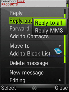
A message can be sent to multiple of contacts at once, all you need to do in this case is select the required entries or multiple numbers for a single contact. Bulk mailing can be performed for groups as well. When replying to a received message you can choose between SMS/MMS (the list doesn’t include the option to reply via email).
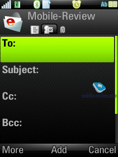
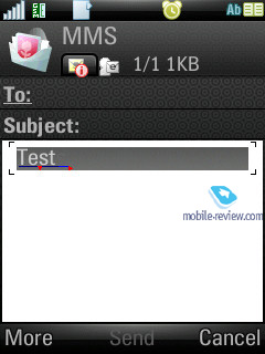
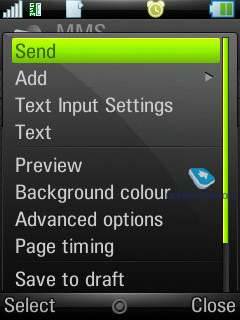
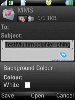
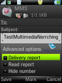
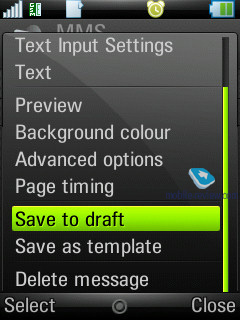
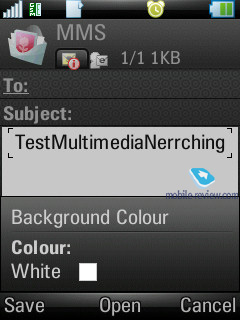
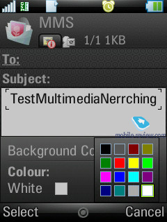
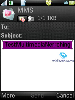
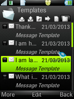
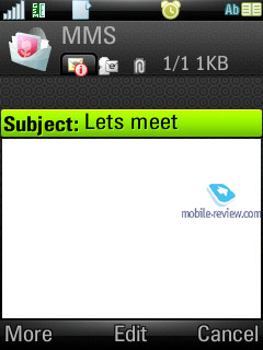
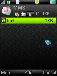
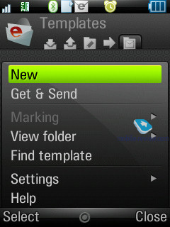
MMS-message creation - one of the best things about it is that several tabs are available here, through which you can choose the time-out between the pages and create templates of your own. The rest of the options are run-of-the-mill here – choosing contacts is similar to SMS-messages, though MMS also features a reading report in addition to the standard delivery report.
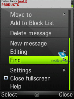
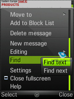
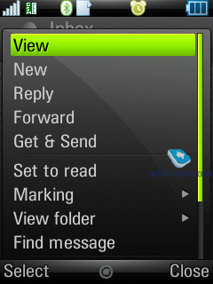
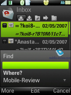
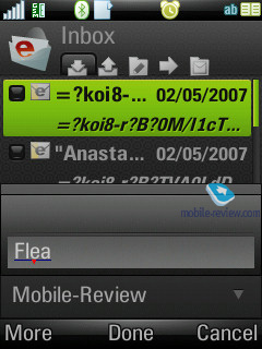
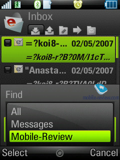
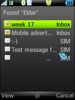
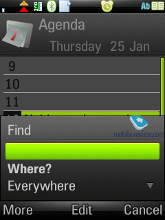
For all types of messages, including e-mail, you can perform a search using fragments of text – the window displays search results and provides for the possibility of switching to a certain message outright. We couldn’t find any limitations on a message’s size – these will be set by operators or the manufacturer, depending on the given region.
The handset provides full-fledged support for OTA reception of MMS settings, mail client, and GRPS. All received settings are saved in the relevant sections.
Back to the table of contents >>>
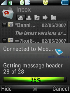
Email client
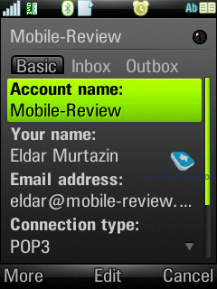
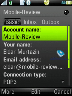
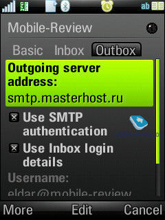
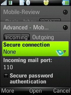
It has undergone no serious changes compared with the Sony Ericsson P990i. The Z10 can deal with several mail boxes, moreover UIQ is capable of working with practically all standards presented in today’s market. The following standards are supported by the OS:
- POP3
- IMAP (IMAP Idle, IMAP Remote folders)
- SMTP
- MIME
- MHTML
- Push mail
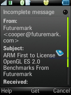
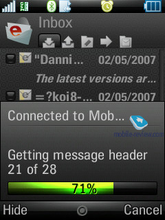
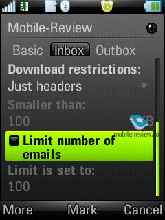
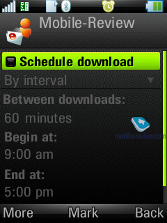
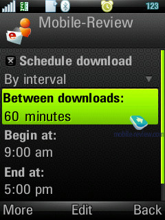
All the email settings are easy to adjust – you set whether it should download entire messages or only headlines (as an option it can download a certain part of messages, not exceeding a certain size, set in Kb). There is also the ability to set how many messages the Inbox folder can hold at any one time– once this number is reached, downloading will be paused automatically. There is also an option for checking mail boxes at certain times.
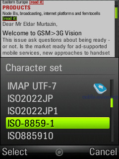
By default UIQ uses the Latin 1 character set; the user can set up preferred character sets for every letter manually.
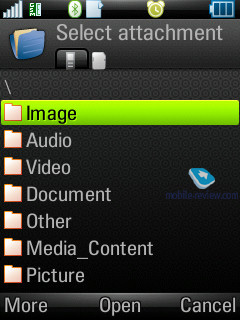
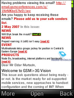
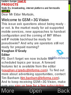
All attachments are handled by the mail client with ease– they can be downloaded and then saved. If an attachment uses a format, supported by the smartphone, it may be opened (and what is more the attachment receives a corresponding icon). There are no restrictions on file size – none that you should notice anyway.
Back to the table of contents >>>
Organizer
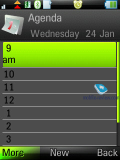
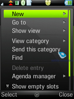
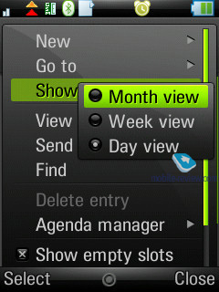
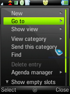
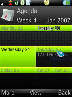
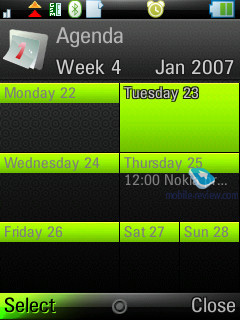
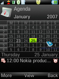
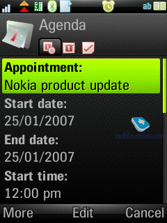
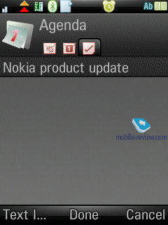
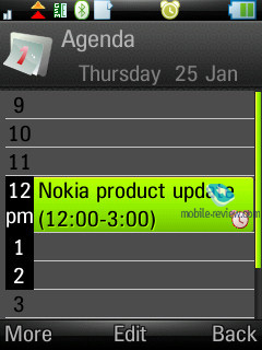
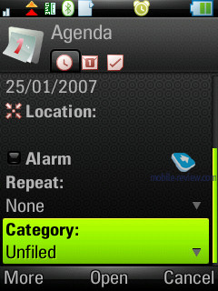
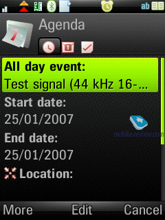
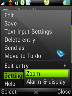
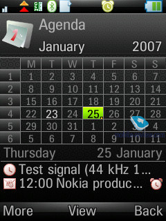
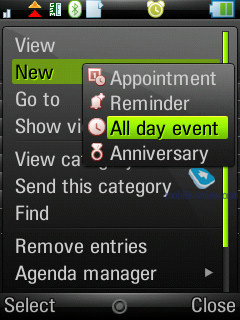
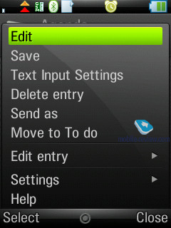
The calendar provides not only the conventional monthly and daily views, but also a weekly mode. In this mode a week is presented as two columns composed of the various days, where each square features scheduled events. This mode is rather handy and allows the user to quickly estimate how busy he is during the week to come. When the number of events for a particular day exceeds five not all of them get listed outright.
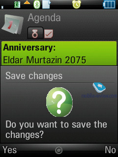
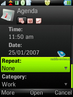
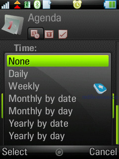
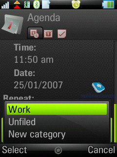
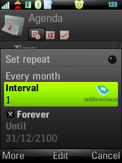
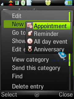
In the month-view all dates, for which there are scheduled events, are marked with corresponding icons to the right of the number. There are four types of events –appointments, reminders, anniversaries, and all-day events. All events can be set to be repeatable, and for each of them you can pick a specific alarm tone.
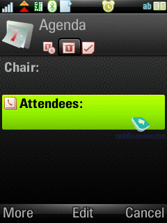
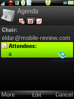
The organizer supports vCalendar, version 1.0, in that the developers have incorporated support for team work via iCalendar. In practical terms this offers the possibility of sending a request for a meeting using the mail client. The recipient may reply with a refusal, in case the date and time don’t suit him, or accept the appointment. In the latter case the message, saved in the Inbox folder is automatically redirected to the Oraganiser and shown in the calendar as a stand-alone event. You can also check the request status while the recipient is pondering over the message.
Among the standard functions, sending calendar’s event to other devices via Infrared or Bluetooth is available here. Naturally, the handset supports reception of such messages as well, which, after being looked through, are saved in the calendar.
Back to the table of contents >>>
Tasks
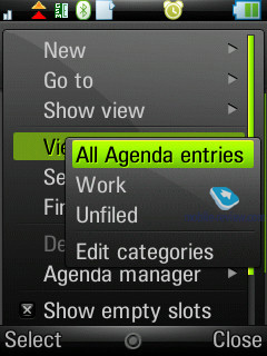
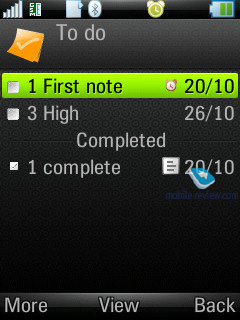
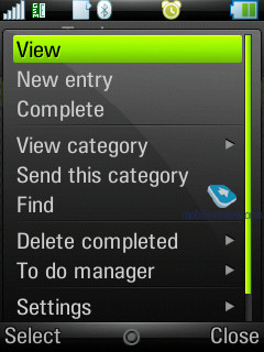
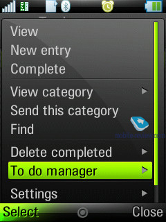
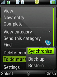
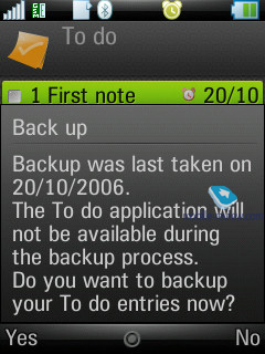
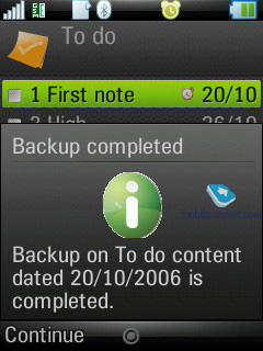
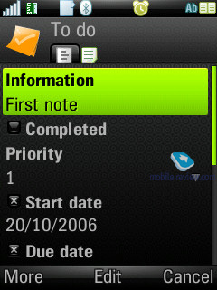
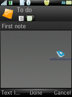
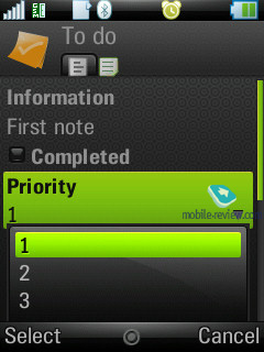
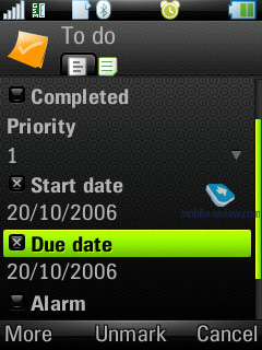
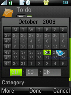
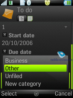
All entries in the Organizer and To-Do list are inter-transferable within the bounds of these two sections. Much like the Organizer, the user can create a backup copy of the To-Do list on the external memory card. You can create any number of categories, which are used to sort entries with. The priority may vary from 1 to 3 (low, normal, high), and you can also set start and end dates, and the alarm tone (tone choice is user defined).
You can sort the general list by categories, completion status (list of completed tasks may be hidden), due date and priority. The To-Do list supports SyncML amd synchronizes with MS Outlook without any hardships. The user can also send particular entries to any device using Bluetooth, as well as a standard message’s body.
Back to the table of contents >>>
Alarm clocks
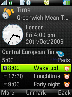
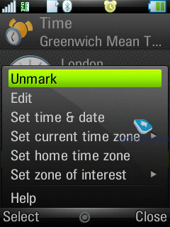
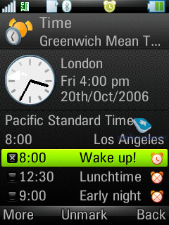
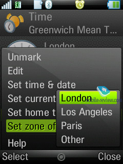
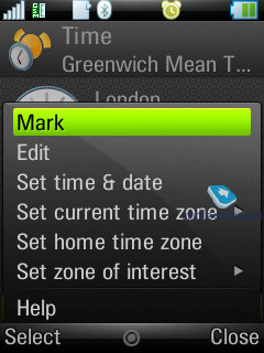
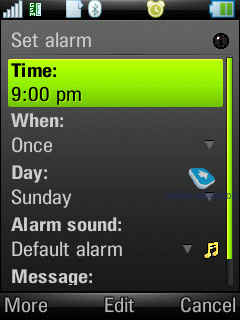
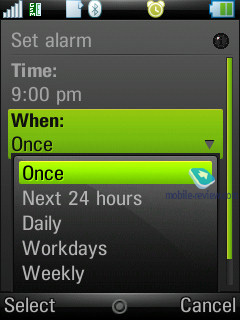
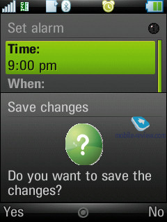
You are enabled to set up several alarm clocks to go off at different times, and you can set alarms to be repeatable for particular days and apply different ring alarm tones.
Back to the table of contents >>>
Flight Mode
Similar to other smartphones, the handset can function with the radio components disabled – in this mode Bluetooth is also unavailable. Unfortunately the handset does not work without a SIM card inserted.
Back to the table of contents >>>
Connection manager
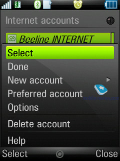
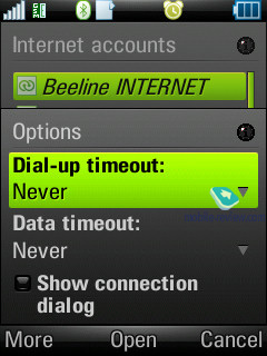
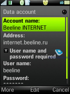
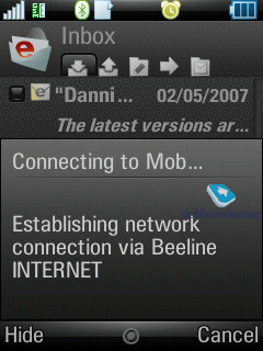
One of the things characterizing UIQ 3.0 is that the device can run several connections, requiring different network services, at once e.g. downloading of mail via an Internet account and a connection for sending and receiving MMS-messages. This capability was named “multi-homing”. The following standards are supported: GSM data call (CSD), GSM High Speed data call (HSCSD), Packet data (GPRS), Bluetooth, and WLAN.
From the menu (the line with an arrow in the status bar at the bottom) you can check connection time; the amount of incoming and outgoing data; current connection status; the number of running applications employing a particular connection at the given moment. You can also disconnect or initiate a connection from this menu.
Back to the table of contents >>>
Office applications
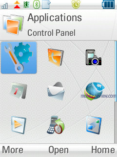
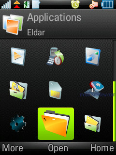
This section holds all the office applications; by default there are four of them (except for the organizer, which is a standard program).
The second application is PDF+, and as its title implies, it servers as a PDF reader. You can view these documents both in standard and landscape modes. Actually this application has been available for various operating systems, including S60, for several years now, and Nokia has installed this program on a number of its devices. On the whole PDF+ works pretty fast, and seamlessly deals with files both in English and documents written in various character sets (though as applied to pdf, the term “character set” feels out of place). This app retails for around 25 USD.
QuickOffice – another third-party application, which was selected by UIQ as a default app for the third edition and comes as part of the standard package (there is a version for the previous editions of UIQ, which sells for 50 USD). The program itself is an editor, which recognizes and is capable of opening and editing MS Word, Excel, and PowerPoint documents.
We won’t dwell on QuickOffice, though we will make a short note that the resources of any mobile device are strictly limited. Complicated types of formatting, used by desktop computers, are frequently not saved in files edited on smartphones (this goes not only for QuickOffice, but all devices powered by Windows Mobile as well).
Back to the table of contents >>>
Some Other Features, Themes, Web-browser
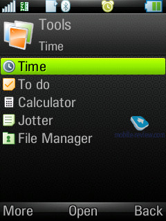
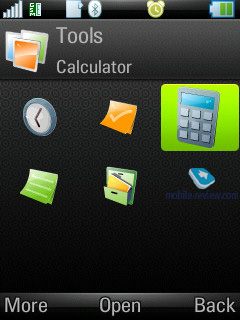
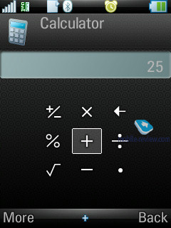
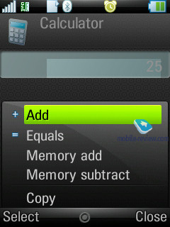
Calculator – self-explanatory application, nothing special in it.
Voice – A sound recorder, which allows making voice notes (only when in standby mode), and you can choose the format, which all recordings will be made in. This application offers a very handy and simple interface. The recording is limited by nothing save the amount of free memory left on the handset.
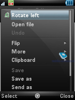
Picture editor – a simple editor, which allows performing basic operations with images.
Stopwatch – self-explanatory application.
Countdown – time is set in hours and minutes, and upon reaching the set time, the devices triggers a sound alarm.
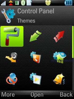
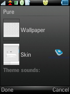
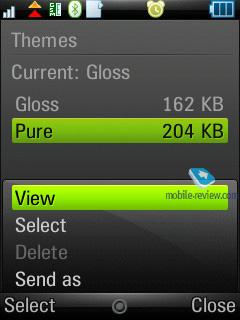
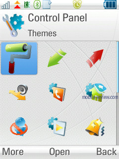
Themes are one of the major parts of the new UIQ –not only do they modify the appearance of windows and colours, but they also modify particular menus and icons, thus allowing for refinement of the interface. You can also change various sound effects for effects etc.
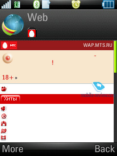
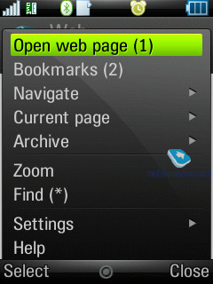
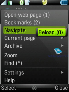
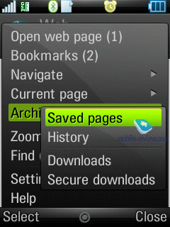
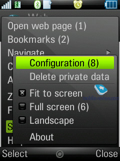
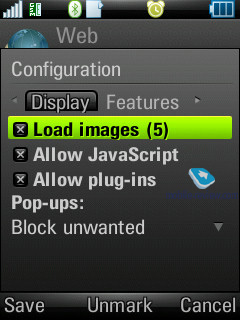
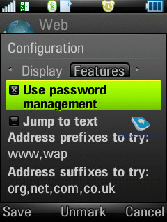
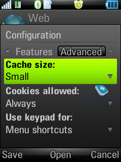
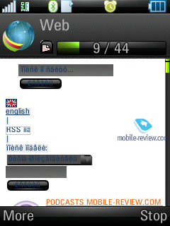
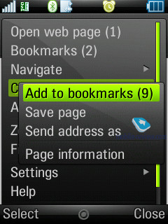
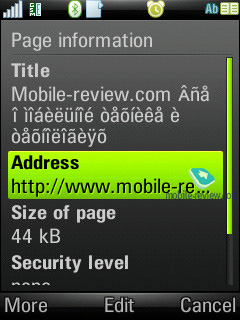
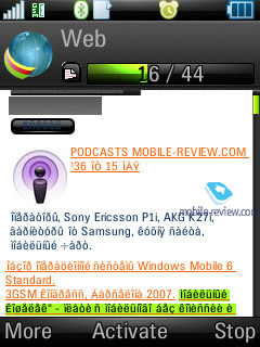
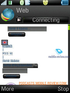
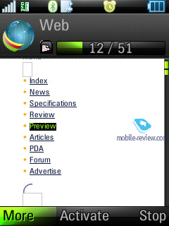
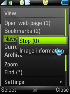
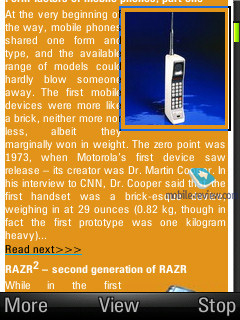
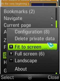
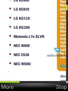
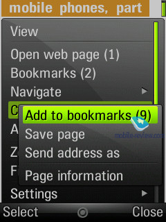
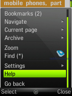
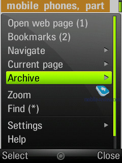
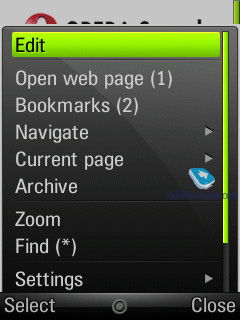
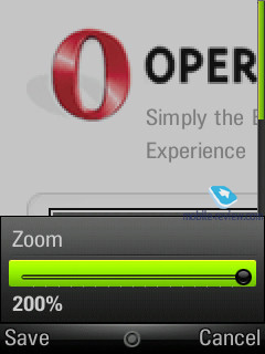
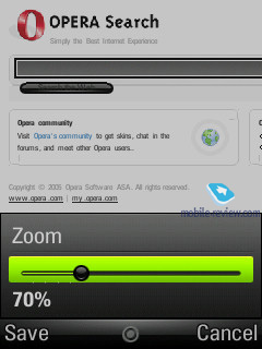
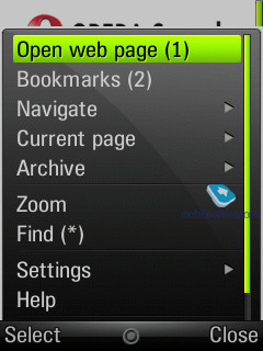
The handset comes equipped with Opera 8.5 for the default web-browser. At present this is the best browser available for this kind of device, the only challenger is S60’s browser version two. It can work in both portrait and landscape modes, supports cookies, and scales pages to fit them in the handset’s display, on top of that it features a password manager and a lot more.
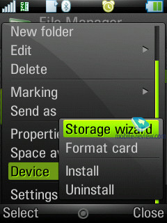
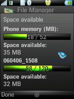
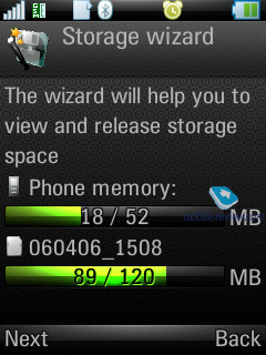
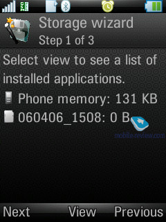
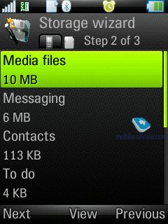
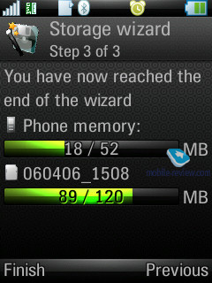
Storage Wizard - is a default application for UIQ 3.0, which offers an overview of the memory status.
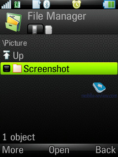
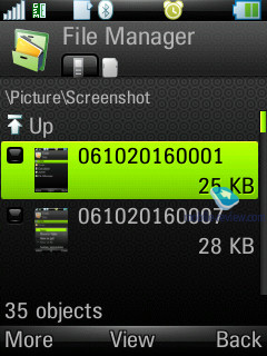
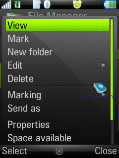
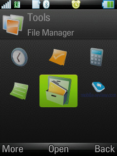
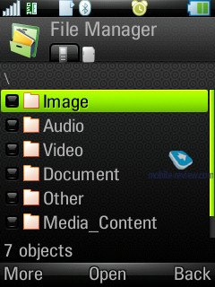
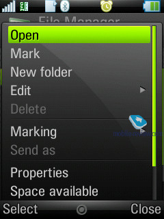
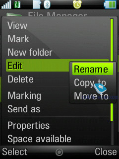
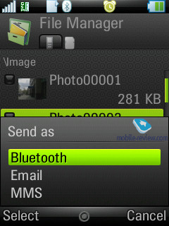
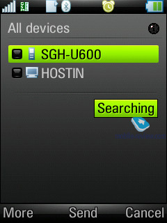
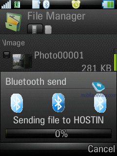
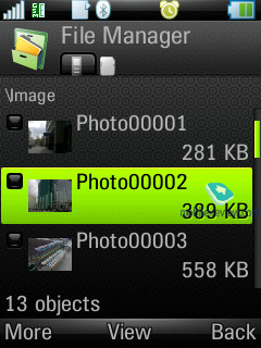
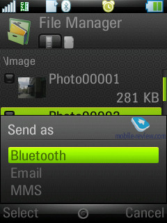
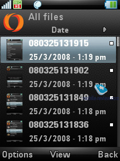
File manager - allows viewing folders on the handset. It supports multi-selection of files or folders as well as deletion and copying; you can also send a number of files to other devices via Bluetooth. The file manager’s capabilities are quite conventional and there really isn’t anything that stands out here.
Back to the table of contents >>>
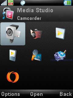
Photo and Video Editor
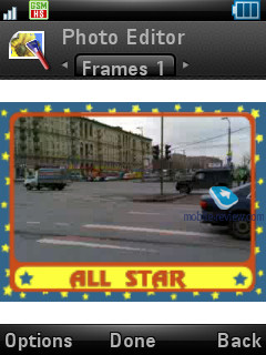
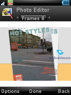
A pared-down version of this application (with the photo editor part thrown away) is available with Samsung’s S60-powered smartphones; this is a good example of what happens when you use third-party software – other players can also benefit from it. Although it is not a bad thing at all.
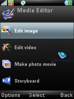
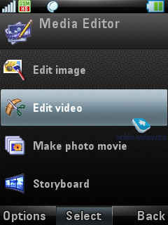
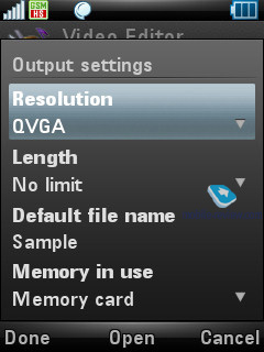
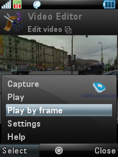
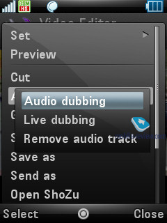
There are four modes available with this Video editor – the first and the least sophisticated one allows you to edit video clips (clip length, start time, sound track, sound recording etc).
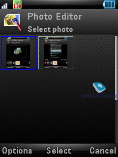
The second option is the photo editor – no bells and whistles here.
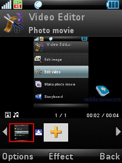
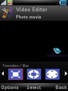
The third mode is more a valuable addition to the default functionality of the system. With a bunch of photos on your hands, you can create a CIF, QVGA or QCIF clip. In a word, you pick all photos you will need, set the background music and then tweak transition effects. There is a multitude of options available in this mode, but it doesn’t get too complicated – on the contrary, everything is pretty intuitive. Naturally, you will need some skills and taste for this, but it’s worth your time. And this is by no means a replacement for the slide-show mode, you just get a short video that can be shared right away.
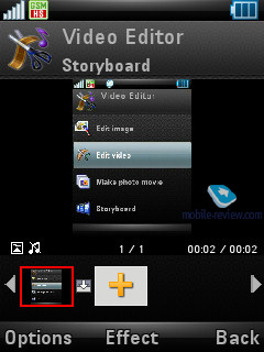
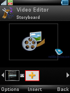
The last mode you can find in this Editor is ‘StoryBoard’, that is quite similar to the previous one, however here you can throw photos and video into your clip. All other settings have been left intact.
Back to the table of contents >>>
Shozu
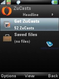
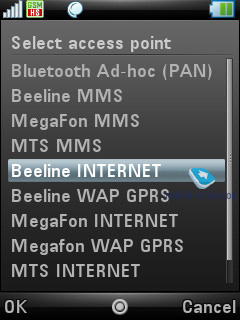
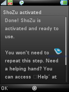
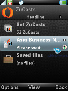
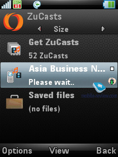
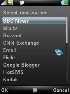
This utility allows subscribing to the channels offered by Shozu and its partners (audio, video, text), as well as uploading your own multimedia content to the most popular online resources like YouTube, BBC News, CNN, Flikr etc. There is nothing special about this app, but still we were pleased to know that the handset registered in this service automatically without needing us to fill in any forms.
Back to the table of contents >>>
Impressions
In terms of reception quality, the Z10 is a solid performer, although in view of its moderate ring tones volume occasionally you won’t hear it from your bag. At the same time, its vibro alert is pretty decent and we were generally happy with how powerful it was.
The phone’s sales kick off early in April at 500-550 USD, which is way too steep for the Z10. We wonder what the maker charges so much for? Form-factor? It would be very unreasonable of Motorola to do that – they need to take this new design to the mainstream with bargain prices otherwise it will never garner any following. Probably, these are extra applications for editing photo/video and beaming multimedia content straight to online blogs that add such a hefty premium? But the value of these feats is somewhat questionable. Or is it the upgraded camera module? I wonder. The thing is, the Z10 comes into the market already somewhat dated due to its exorbitant price – what looks appropriate for a 300-350 USD worth device, seems like a very bad deal in a handset that retails for twice as much. Even the Nokia N82 leaves the Z10 far behind on all fronts with its camera, GPS and a slew of free software available on the web. That’s why we feel bewildered about the Motorola Z10’s price tag. Unfortunately, with this pricing policy, it aims at a very narrow niche, specifically brand loyal consumers who want to support Motorola in this time of trouble.
Back to the table of contents >>>
Eldar Murtazin (eldar@mobile-review.com)
Translated by Oleg Kononosov (oleg.kononosov@mobile-review.com)
Published — 31 May 2007
Have something to add?! Write us... eldar@mobile-review.com
|
News:
[ 31-07 16:21 ]Sir Jony Ive: Apple Isn't In It For The Money
[ 31-07 13:34 ]Video: Nokia Designer Interviews
[ 31-07 13:10 ]RIM To Layoff 3,000 More Employees
[ 30-07 20:59 ]Video: iPhone 5 Housing Shown Off
[ 30-07 19:12 ]Android Fortunes Decline In U.S.
[ 25-07 16:18 ]Why Apple Is Suing Samsung?
[ 25-07 15:53 ]A Few Choice Quotes About Apple ... By Samsung
[ 23-07 20:25 ]Russian iOS Hacker Calls It A Day
[ 23-07 17:40 ]Video: It's Still Not Out, But Galaxy Note 10.1 Gets An Ad
[ 19-07 19:10 ]Another Loss For Nokia: $1 Billion Down In Q2
[ 19-07 17:22 ]British Judge Orders Apple To Run Ads Saying Samsung Did Not Copy Them
[ 19-07 16:57 ]iPhone 5 To Feature Nano-SIM Cards
[ 18-07 14:20 ]What The iPad Could Have Looked Like ...
[ 18-07 13:25 ]App Store Hack Is Still Going Strong Despite Apple's Best Efforts
[ 13-07 12:34 ]Infographic: The (Hypothetical) Sale Of RIM
[ 13-07 11:10 ]Video: iPhone Hacker Makes In-App Purchases Free
[ 12-07 19:50 ]iPhone 5 Images Leak Again
[ 12-07 17:51 ]Android Takes 50%+ Of U.S. And Europe
[ 11-07 16:02 ]Apple Involved In 60% Of Patent Suits
[ 11-07 13:14 ]Video: Kindle Fire Gets A Jelly Bean
Subscribe
|
