|
|
Review of GSM/UMTS-handset Motorola V6 MOTORAZR maxx
Live photos of Motorola V6 MOTORAZR maxx
Sales package:
- Handset
- Battery
- Charger
- Wired stereo-headset with pick up key
- USB data cable
- Disk with Mobile Phone Tools
- Memory card (size and availability vary by region, missing in the package for Russia)
- User Guide
I said it before and will say it again: muddle within a company makes for differently named products, which only confuses the end-users. The continuous shake-ups, when already introduced models all of a sudden get their indexes changed characterize Motorola in 2006. Should you take a closer look at the situation, you will see that the company has conditionally divided its solutions into several generations relative to its all-time bestseller Motorola RAZR V3. Employing the concept of the slim fold phone is good from a re-usability standpoint – the hype around the original model, thanks to ever-dropping price, grows from day to day, while similar models draw their own share of attention. Undoubtedly, there is some logic behind the new indexing system, but it is broken by a couple of relatively old solutions that just don’t fit in the concept. For convenience, let us look at the original RAZR V3 as a representative of the first generation within the bound of the revamped strategy (here we deal with only the flagships rather than the entire range), then the PEBL U6 comes from the second generation respectively. It would seem that all sorts of special editions, such as RAZR D&G, RAZR V3i, should be attributed to the second generation as well, but the manufacturer didn’t do that – on the contrary he put much of emphasis on similarity of these devices with their forefather. This is how come the second wave of flagships for Motorola is believed to contain “6”-labeled handsets, even though it is hasn’t been made official for consumers and rather remain a tip for specialists. In this regard Motorola V6 acts as a second generation device relative to the RAZR and has all the makings that allow it to claim this title – thankfully, the amount of changes is essentially large, in a nutshell, it is a totally different model.

The blow at the harmonious concept is delivered by the release of sliders featuring “3” in their indexes; specifically the Z3 is one of them. But the reason for such low positioning is not the real functionality of the products, but its being weighed upon from above by the revamped models, which the company couldn’t get to the market earlier. Nevertheless the launch of Motorola Z6 gets things in gear. If we examine the line of fashion-charged folders, the zero point marked with the K1 is somewhat difficult to explain, but on the other hand, thinking of almost instant evolution up to Motorola K3, and then straight to the K6, everything seems to be in order. In other words, in the year of 2007, till about July, Motorola’s offerings with “6” digit in index may be rightfully considered as the flagships in the types in terms of both functionality and chucked in technologies.
The next digit that will be identifying any model as a flagship will be by no means “8”, as some might have thought being deceived by Motorola Z8. In fact this solutions doesn’t have any counterparts in the company’s range, that is why is has been party taken out of the game and given a unit too low index, so as to present the same handset, with completely identical hardware but different positioning in Europe and dub it as the Z9. That is why late in 2007, in autumn, we might see three flagships boasting “9” in their indexes coming at a time – in the V, Z and K series. And should the Chinese market report success of the ROKR E6, then the Europe will see its release in 2008 under the name of E9 (eZx platform).


Being the current top of the RAZR line, the V6 maxx is in fact a late call – the competitors have already bombarded the market with numerous RAZR-esque phones and many of them have turned out to be pretty successful. If we were to quote an example here, it would be Samsung E780, as well as its UMTS-edition going by the name of Samsung Z540. Being released a tad earlier, Motorola V3x didn’t save the day, since it was lagging behind its competition in the sense of a sole, yet the most crucial aspect – casing thickness. The fate played a mean trick, since the company by persistently pushing the RAZR and setting the trend for slim solutions, it tripped up Motorola V3x, even though interface- and feature-pack-wise the handset was much more alluring than the original. The next incarnation of Motorola V3x is the MAXX, however the MOTORAZR sign in the model’s title brings along additional and often uncalled information that sometimes plays not into the hands of the company (no matter how sad it is, facts are facts – many don’t want to glance at the RAZR even, due to being all fed up).
The V6 is the marriage of the strengths found on the previous offerings and a big step forwards on top of all that. That tiny bit of attention this handset draws is not the thing it really deserves, since it retains some peculiar solutions, while some developments are way above average, no matter whether they seem somewhat leaked or not.


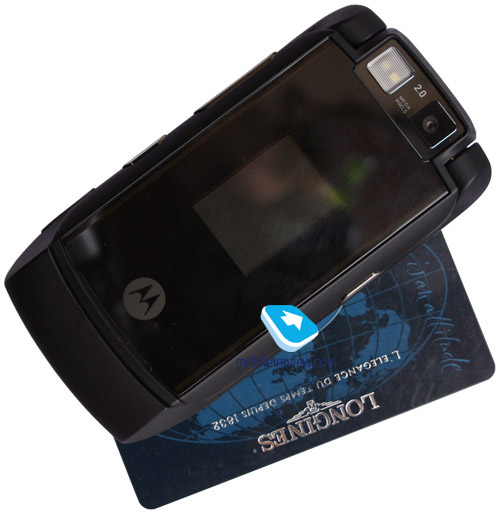
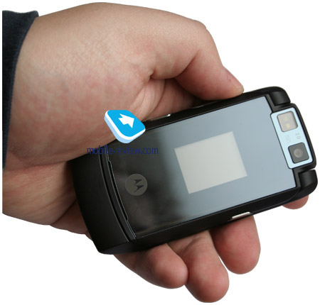
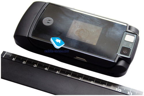
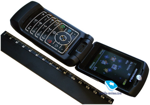
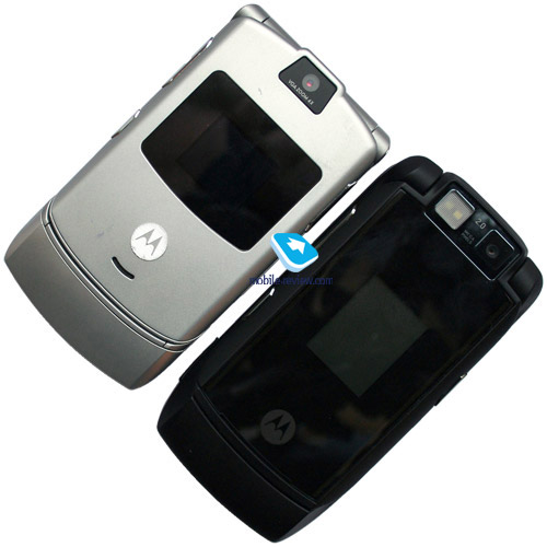
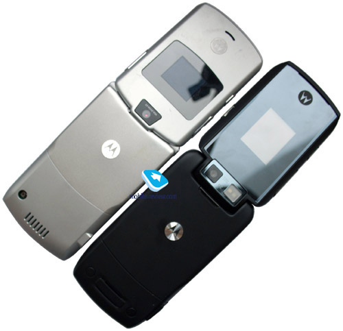
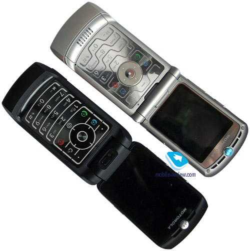
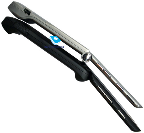
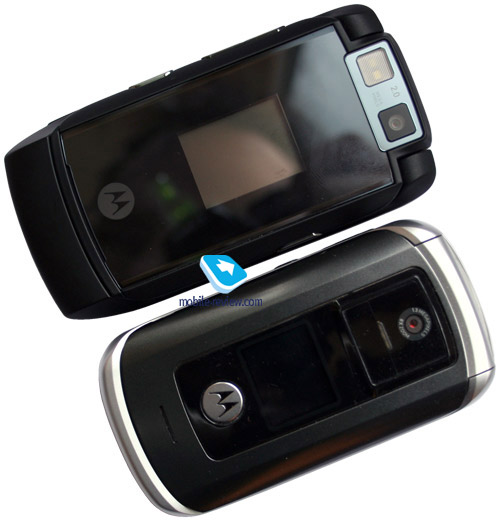
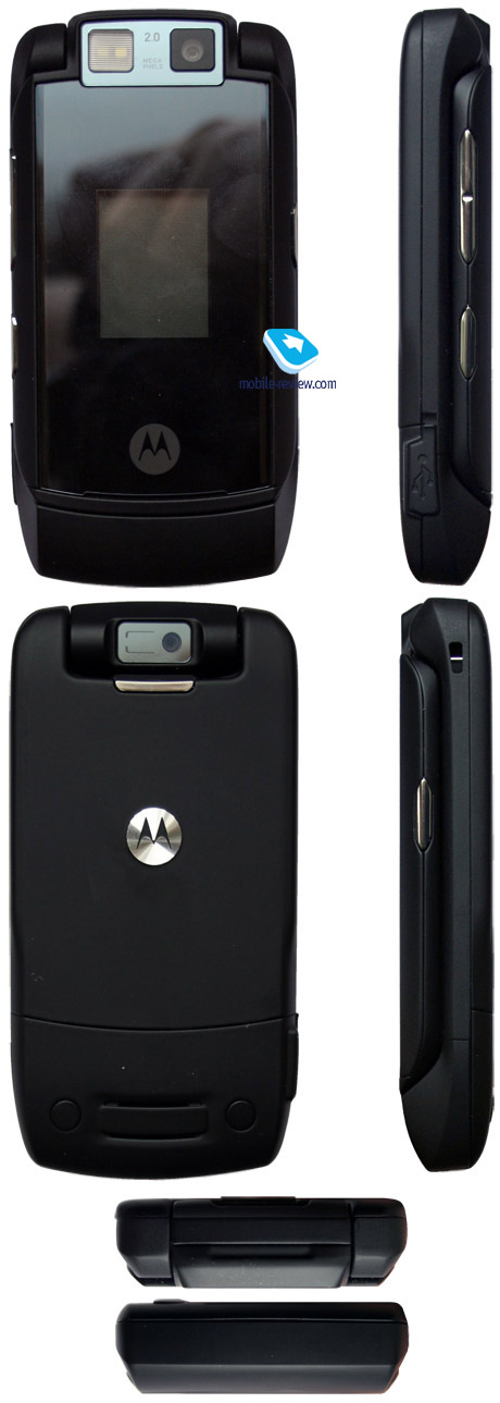
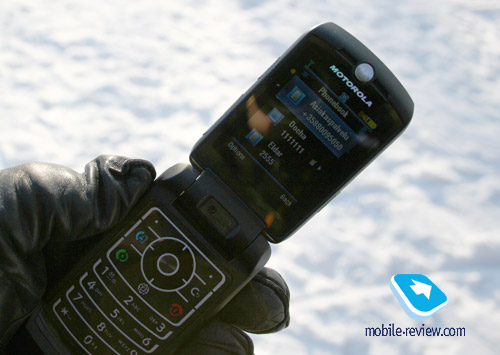
The handset’s design is much like that of the original RAZR, yet the MAXX is a tad thicker and wider – worry not, you won’t feel it during your hands-on experience (104.5х53х15.5 mm). The phone weighs in at 108 grams, being a thing that will readily slip into just about any pocket, so in terms of size the MAXX is everything, but a burden. From a design standpoint the handset is modeled after the latest trends, specifically the casing enjoys the soft touch finish of the metal chassis – to make sure of that, you can examine the battery cover. To put it simply, the manufacturer has deliberately disguised the metal in velvety plastic, which is an altogether interesting move in light of the fact that, as a rule, makers do whatever it takes to boast metal details in the casing, so the reverse is quite something.


The color schemes the model comes in differ only by the trim of the faceplate, which can be black, emerald, blue, you name it – basically more colors are more likely to hit the market in time. The mirror finish is identical to what we experience with the KRZR K1. Even though the maker claims it to be glass, and it does act like a glass, we believe it to be organic plastic resembling hardened glass in terms of its properties. Breaking the panel down is next to impossible; you won’t have much success in scratching it either. However it is prone to fingerprints and smudge, and this is the price to pay – wiping it clean is not an easy task.


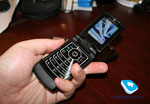
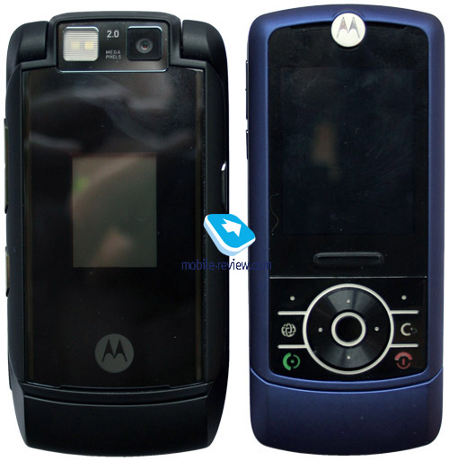
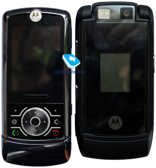
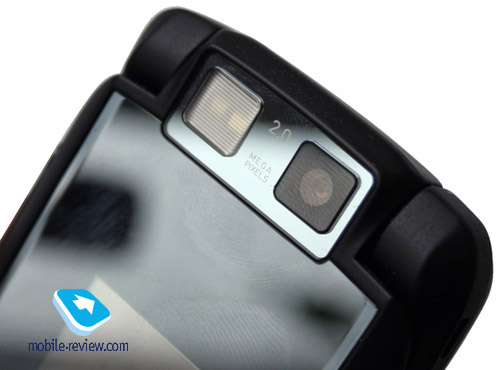
The design of the camera module on the MAXX is not something run-of-the-mill for Motorola, yet the market has already seen a number of handsets sporting the same layout. The camera is mounted on the hinge and with the clam closed stares at you, and once you flip the phone open it turns round and looks like any other clamshell-tailored unit. Shooting can be done with the phone either open or closed, thus a 2 Mpix camera module is most welcome, nonetheless it is a standard unit, typical for the company’s offerings (saving for the macro mode, which is missing, though the quality is comparable after all).

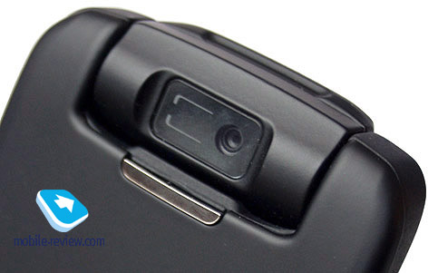
Turning the device round reveals another camera on the backside of the swiveling module, serving for video calls within 3G networks and sporting VGA resolution. With the clam opened up this very camera is positioned face-up.

All in all the build quality is nothing to complain about, nor does it somehow differ from other run-of-the-mill handsets, where camera always stares at you. The same design was utilized by the original RAZR; however the second camera was missing over there.
The front panel hides blue-colored LED underneath, matching the color Motorola’s logo lightens up with, on incoming call or any other event they come to life in a manner that is dependant on picked theme, yet the color is not the subject to change. The truth is these indicators look splendid and make up the feeling of a “living” handset. Regrettably, for most European lots the manufacturer has decided to leave this ability out, letting only the logo to glow with blue light. Moreover, the top right corner loses Bluetooth icon, which will no longer flash while active. These devices will be supplied to Russia, as well as to majority of other local markets. Today only limited editions have full-fledged illumination enabled, but in time it might go missing on them as well. To me, forgoing such an award-winning trinket is a big letdown – the handset gets to be less emotional, shaves a bit of its charm off. For most consumers it won’t be an irreplaceable loss, as they simply won’t even imagine how beautiful it could be, whereas it seems I will always be missing such backlighting. The sweet dreams of mine, and I believe it is not me alone, would come true with the same illumination system to what we saw on Motorola v80, embedded into a handset – I would really love to see it again.
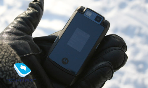
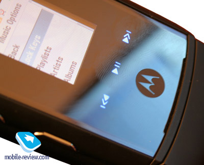
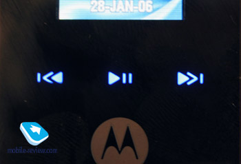
The external display measures 1.3 inches diagonally, sports a resolution of 120x160 pixels (20x26 mm) and shows up to 65 K colors (TFT). Thanks to the mirror finish the picture doesn’t look too over-brightened, on the contrary, it proves to be a bit dimmish. For the most part this doesn’t bring about any problems – caller’s name or assigned picture are prominent, as well as current track info. With the clam closed you can swap current call profile, which is typical for Motorola-branded handsets. On the face the MAXX shows off touch-sensitive button for music player management, but we are not dwelling on them here and will rather give them a close-up in the player-related paragraph.

 
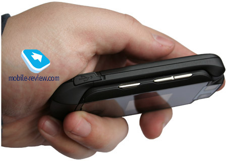
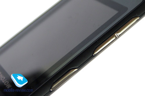
The side-mounted keys are nothing special within the company’s range – the left spine houses volume rocker key accompanied by the Smart-button serving for different purposes in applications and menus. On the right is the dedicated camera key as well as the holes for a carrying strap. The miniUSB port (placed on the left and covered by a rubber flap) is the sole port on the handset.


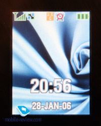
The rear side plays host to the loudspeaker playing back ring tones, no other places of interest on the backside, though. The MAXX can be seamlessly opened up single-handedly; doing so unveils a QVGA screen with a resolution of 240x320 pixels (34x48 mm, diagonal of 2.2 inches, up to 262 K colors, TFT). The picture quality put up by the screen is superb, which comes as no surprise, however, bearing in mind that it is a Motorola. The display accommodates up to 7 text and 3 service lines, the font size is large enough to be made out even by people with bad eyes. At the sun trial the display acts well – the picture doesn’t fade, information remains readable.


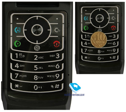
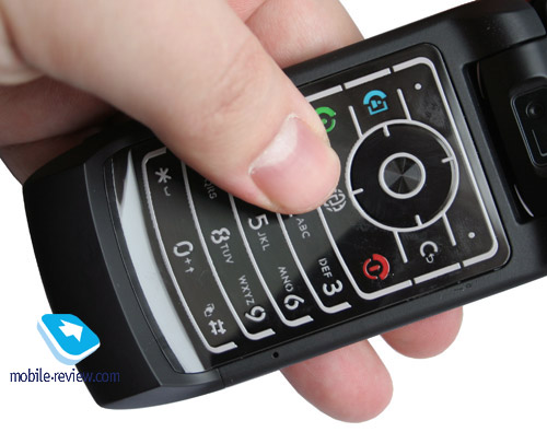
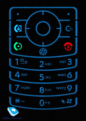
The RAZR-styled keypad is used on the MAXX – metal plate with rubber key padding, which makes for blindfolded text input, spacing them out pretty well. The buttons are easy to work with have noticeable click feedback. All keys are evenly lit in good-looking blue.


To remove the back cover, press the holder and pull it off. The cover lives up to what we have come expect from metal – no gap at all. The handset utilizes 970 mAh Li-Ion battery (BZ60). The company has seemingly gotten to like changing battery model for just about every own-branded handset, which makes phones incompatible in this regard. It is hard for me to tell you why this is so, but the fact is, the same thing is going on in other companies, for example in Nokia.
The lifetime for the MAXX is quoted at 375 hours standby time and 5 hours talk time. In conditions of Moscow networks the handset lasted about 3 days at average amount of calls (up to 20 minutes a day, a pair of messages a day and a little bit of music). At the same time heavy usage of the phone for calls (up to one hour a day) gets the lifetime down to 2 days. Overall, 2 days of battery life is the figure you can rely on at 1-2 hours of music playback and average amount of calls. It takes the phone a tad less than two hours to charge from empty to full.
The SIM card bed sits next to the battery, so that removing the SIM without detaching the battery is impossible, while putting it into the slot with the battery plugged in is not too hard. The microSD memory expansion slot is positioned nearby, hot swap feature and support for memory cards of any size are also on the handset’s spec sheet (we used a big 2 Gb card).
Menu
The handset has adopted most features found in Motorola V3x and later on in Motorola K1 RIZR. The MAXX carries 59.8 Mb of user-manageable memory onboard (at about 8 Mb taken up by default content), that can be expanded with a memory card, where all applications might end up as well. The limit on executable Java-application makes up 1 Mb (JAR-file size), whereas HEAP may be up to 2 Mb big. The phone makes no difference which memory type (internal or external) to work with, while handling files and other content stored on the phone (music, calls, snaps, and applications).
Memory for applications is distributed dynamically, 1000 contacts is an assured number of entries that can be saved in the phonebook. An organizer can store up to 500 events and up to 400 tasks (or any combination of them - not more than 900 entries in sum). An MMS is limited to 300 KB in size.
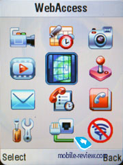
You can access the Main Menu by pressing the OK button. The main menu traditionally features 12 icons; each of them uses information bar at the display’s top for captions. You can switch the appearance of the main menu to the list mode and then everything will get arranged in plain lists. A half of the submenus is represented as lists and another half as icons (if you choose a corresponding menu appearance). There is no shortcut number navigation in the menu, though you can setup shortcuts for almost every menu item or function (including custom apps). For standby mode, the navigation key may call up various applications that are assigned by the user. Furthermore, you can play around with the options in order to make all icons disappear from the screen until the navi-pad is pressed. Two soft-keys can be bound to various actions as well, apart from the default ones. With such menu flexibility at your disposal the lack of the shortcut number navigation is not that crucial. Default software features for the MAXX now present you with the ability to assign the side-mounted key to own applications.

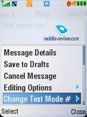
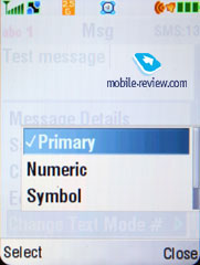
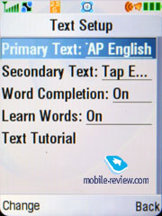
The device supports iTap-powered predictive text input. While typing, the screen displays submitted words, but hides symbols assigned to the keys.The device memorizes the variants of the words you picked and after that offers them automatically. That helps to avoid entering words into the dictionary as in case with the T9.
Those using two languages for typing SMS messages will be happy to find out that this option is very manageable on the MAXX. You can also setup which type of text input to use for every language - predictive or not. An interesting solution that extends possibilities for customization of your mobile phone even further. However, I would like to notice that only a small amount of them use more than two languages.
Media Finder. The major changes in Motorola maxx have been made to the way music, multimedia and other types of content are handled. Let us list these alterations first and then jump to less significant differences.
Since Motorola RAZR the handsets sporting this brand on their shells have had two MP3-players onboard – one materialized in the form of a Java-application, boasting smooth looks, and the other one lacked graphical interface, yet could be minimized. So the events took a very ironical turn – users could not get a good-looking player and decent functionality in one device, so that everyone had to make a choice what was more important. Three years later a few unsophisticated users are aware of the standard player and its capabilities – only the most curious and sharp consumers take advantage of its abilities. In fact, it took Motorola almost 2 years to change the things for the better, and more importantly, they wasted this much time because over at Motorola they had been waiting for a shift onto a new platform, which never came out, though. As a result they have lost much time and only today get to rectify the old mistakes – however to their credit, it is done in a very fast and effective way.
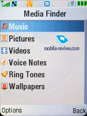
Within Media Finder section you will find a list containing such items as Music, Pictures, Video, Voice Notes, Ring Tones and Wallpapers – gathering all types of content under one roof is justified and can’t possibly be complained about. Let’s start with music management, due to it being the handset’s strongest spot.

Music. I can barely refrain from writing here “and this music will last forever” – words from a known song I listed to back when I was a student. The real values have been ignored by Motorola for far too long, attempts materialized in the form of the ROKR E1 released after the insanely successful Motorola E398 were nothing to shout about, efforts aimed at pushing iTunes haven’t brought anything but an army of disappointed users. Motorola E398 was the milestone after which the company took a wrong route, and today the ROKR E2 is only the first local attempt to turn the situation around. Taking account of a different interface and its abilities it was hard to believe that a decent player would actually make it to the mass products; however the example of MAXX proves us wrong now.


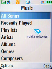
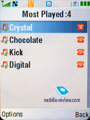
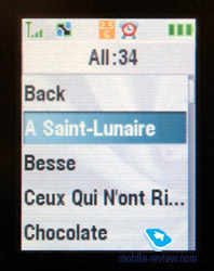
Categorization of music files is a logical move and is no different from what other manufacturers bring to the table – on the MAXX we see All Songs list (the handset automatically browses through contents of both the memory card and the handset’s built-in storage), Recently Played, Artists, Albums, Genres, Composers, Playlists. The Playlists item includes Most Played option, featuring tracks you have listed to most often.
You are free to add any track into a playlist, and on top of that it can be easily done from any menu or list – for example in Albums category you can go on and add a whole album or a couple of albums at a time (information from id3-tags is read correctly), and then switch to All Songs and pick up particular tracks. Those who had the experience of handling old lists will understand my feelings and appreciate the convenience delivered by the new layout.
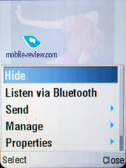
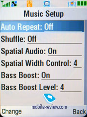
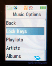
Lists always feature track title and storage place (a thumbnail of either memory card or handset). Supported music formats – mp3 (free of bitrate limitation, not more than 320 Kb/s is recommended though, VBR), AAC, eAAC, eAAC+, WAV, WMA. Browsing the music settings reveals such standard options as Repeat and Shuffle, which are par for the course for handsets made by any company. But what does catch our eyes is Bass Boost feature that can be adjusted on a 1 to 7 star scale – it really makes some difference in the sonic experience. The handset also plays host to a surround-sound system going by the name of Spatial Audio, which has a counterpart in the form of Stereo Widening offered by other manufacturers, but in this very case the counterpart is much simplified. For the time being stereo base is widened best by Spatial Audio (look up in the review on ROKR E2 for sound samples). This feature can be set up using a 1 to 7 bar as well. But this is the place where we should wrap up, since the manufacturer has cut off other sound effects, like equalizers, which are coming out with the next version of the music player.
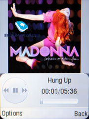
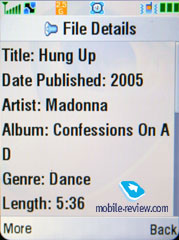
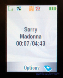
At a glance, the player’s home screen hasn’t undergone any changes – the same controls and time bar meet you there. The fundamental difference, though, lies in the fact that the handset now carries support for Album Arts –all you have to do is place a picture into a folder with music – on the picture you can see the art of Madonna’s album that was uploaded onto the handset via PC. The fact of the matter is that Album Art feature puts impending Motorola’s handsets on the same level with Walkman 2.0 (there is a number of limitations, though, and overall the solution is akin to Walkman 1.0, but it is much of a progress, the accessories are the only serious flaw), and also give them a cutting edge against Samsung’s devices. I should stress, though, that is not all about Album Art, but the menu navigation and player’s abilities.
Fast forward can be done by pressing and holding the corresponding key, at that first two seconds it proceeds at a pitch of 5 seconds and then jumps to 7 seconds pitch. While skipping a track forward, the screen doesn’t present you with current time within a track, which is a shortcoming – as for me, I would really like to see it there, because occasionally I need to find a certain snippet in, say, audio-book. However, using fast forward with audio-books in the MAXX might prove to be a real pain due to tiny pitches.
If you minimize the player during playback (not by pressing hang up key), then while at the standby screen you will be offered current track title, and shortcut buttons acting as dedicated music keys. Pushing the navi-pad left or right initiates rewinding or switches to another track, pressing it down calls up the player home screen – handy, isn’t it?
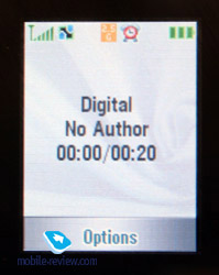
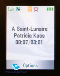
Now onto the external screen – while it is not capable of putting on Album Art, it still features track length, current time, track title and artist. With the help of the Smart-key you can unlock the touch-sensitive buttons located beneath the screen (pause, playback, and rewind buttons, doubling as track switchers). Should you not touch them for a couple of seconds the handset will turn their backlighting off and lock them. Basically, it makes sense, but I actually managed to start playback, put the phone in pocket and then have one of the touch-sensitive buttons pressed a couple of times – it is not inevitable, after all.


The external screen fully supports track lists, as well as categories; meaning that managing the player with the clam closed is a breeze – you don’t even need to open it up.
 
 
Sound quality achieved in the default earphones gets an “average” mark, which is not a surprise – the handset isn’t positioned as a music-heavy offering, therefore there was no point in equipping it with quality headphones. And it would be a real issue at all, if only the company had a miniUSB-3.5 mm audio jack adapter, but it is missing. It turns out that we have an odd, halved solution, when a good player is at our disposal, but we can’t say the same about a proper accessory. An attempt to find decent earphones employing miniUSB jack opened our eyes, for the market didn’t have any at all.
The only option left to us is making use of stereo Bluetooth headset, luckily the handset sports A2DP support. But being an active users of phones by other makers, I have small niggle with it – basically, the handset doesn’t start transferring music to the headset when it is already paired up, to make it do so you will have to pick a corresponding item in the player’s menu, which is a totally illogical and unnecessary action, whose reason is not evident to me.
Another letdown and this time around a really crucial one, concerns the fact that the handset handles in a convenient fashion only native Motorola-branded headsets, while third-party manufacturers get not a very warm welcome with the MAXX. For example, Sony Ericsson DS-970 which is the market’s best proposal in its class today occasionally lost connection with the handset, and regained it only after reset of the handset. Sometimes, while jogging, or just walking around, we experienced sound delays (the same holds true for Motorola BT820). Sound management and rewinding were fine, yet we got no notifications on which track was being played back – this information is not transferred by the handset. It is remarkable that while in the office (not walking or running around), when you just sit on one place the handset handles connection with a headset in the best possible way – no delays or connection breakups, everything works like a well-oiled machine.
On USB-connection in USB Mass Storage mode data transfer speed for the memory card makes up about 960 Kb/s, USB 2.0 support is claimed.
Summing everything up, we are sad to conclude that even though the music department on the MAXX does well and lives up to today’s benchmark, an unsophisticated user won’t be able to taste it for the lack of proper accessories, which is frustrating. It is one of the best example out there, when by saving 5-6 USD on quality headphones, with its own hands the company builds up a negative image for one of the model’s strongest aspects and casts a shadow on some of its advantages along the way.
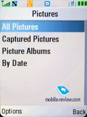
Pictures. Categorization has slipped its hands in here as well, and it is a good thing, as now you can view all images (4x4 grid), camera shots, albums (most viewed filter), by date (only for months with some photos). The last function is somewhat similar to the Timeline found in Sony Ericsson-labeled handsets, its Moto’s analogue is a tad less sophisticated.
 

Rounding out the feature set, the maker added Slide Show function, where you can set gap between the slides (4 seconds by default) and perform a right-angle turn clock- or anticlock-wise (for shots taken in landscape mode). A neat feature that stands strong among other up-to-date solutions.
Video. The same filters as those for pictures, full-screen playback is supported at up to 30 FPS, generally, nothing is wrong with video playback on the MAXX.
Voice notes. There are some filters as well – for all notes, recent ones and voice reminders.

Ring tone. You are at liberty to set up own files recorded via the sound recorder as ring tones, as well as music and the tunes the MAXX comes pre-installed with.
Wallpapers. Division into two camps: graphics and photos, no time grids or something that would make things more complicated.
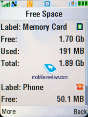
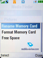
Via Options in Media Finder you can also re-name the memory card, format it, and check out available memory. The phone automatically creates file structure on the memory card, but you are free to store data in any desirable way, no limitations are put on that (for the root folder there are no restrictions set at all).
 
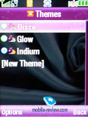
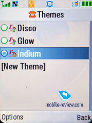
The Media item, apart from Media Finder features other sections as well, like Themes (Disco, Glow, Indium), affecting the color scheme but not the design of the menu icons.
 
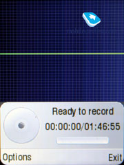
Sound Recorder. Clip may be recorded from the standby screen and during calls – the app records both ends. Maximum duration of a single clip is capped by nothing but amount of free memory you have. People on the other end will hear sound recorder’s signal – initially it is a buzzer and then “beep”s at regular intervals.
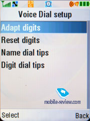
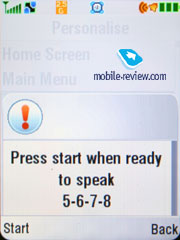
Voice commands, voice dial. The handset utilizes standard set of voice commands for all Motorola-branded handsets – you can train the handset by pronouncing digits, so that eventually voice dialing will get better. All in all the MAXX allows for dialing any contact stored in the phonebook with voice and picking number type (work, mobile, home) – the function performs pretty well. However there is only a pair of voice commands for accessing menu items.
 
Camera. With an integrated 2 Mpix CMOS module you can take photos of four resolutions - Large (2MP), Medium (1.2 MP), Small (480x640), X-Small (240x320). Three grades of compression are available. Other settings allow turning off the shutter sound, exposition from -2 to +2, selecting a lighting type (auto, sunny, cloudy, indoors, office). Self-timer feature is also enabled.
Best results are achieved in bright sun light, whereas in other cases color saturation is far from sufficient. A fetching peculiarity is that a photo is shown in full-screen mode when managing with the camera, while the tips are semitransparent. You can change lighting settings with vertical declinations of the navigation button, as well as select various effects (color, black and white, blue, old-like, red, green, and negative). Digital zoom (up to x8) is at your disposal.
Quality of taken photos is far inferior to that made by Motorola V3x, it would be even better to call it poor. This handset also makes use of NVidia GoForce 4800, that handled shots processing in the V3x. But here the accelerator isn’t applied for video rendering, and on top of that the camera has been replaced by Micron’s unit, which affects the quality of snaps in a negative way. Presence of a graphics accelerator, while the phone houses an entry-level camera, is something made for the appearance’s sake, at it’s used only in games. Being the worst in its class in the sense of photos quality, a KRZR-esque, the V6 MAXX, provides only a tiny share of snaps that can be demonstrated on PC.
 |
 |
(+)
maximize, 1200x1600, JPEG |
(+)
maximize, 1200x1600, JPEG |
 |
 |
(+)
maximize, 1200x1600, JPEG |
(+)
maximize, 1200x1600, JPEG |
 |
 |
(+)
maximize, 1200x1600, JPEG |
(+)
maximize, 1200x1600, JPEG |
 |
 |
(+)
maximize, 1200x1600, JPEG |
(+)
maximize, 1200x1600, JPEG |
 |
 |
(+)
maximize, 1200x1600, JPEG |
(+)
maximize, 1200x1600, JPEG |
 |
 |
(+)
maximize, 1200x1600, JPEG |
(+)
maximize, 1200x1600, JPEG |
Zoom in action.
Overlays applied.
 |
 |
(+)
maximize, 1200x1600, JPEG |
(+)
maximize, 1200x1600, JPEG |
 |
 |
(+)
maximize, 1200x1600, JPEG |
(+)
maximize, 1200x1600, JPEG |
 |
 |
(+)
maximize, 1200x1600, JPEG |
(+)
maximize, 1200x1600, JPEG |
 |
|
(+)
maximize, 1200x1600, JPEG |
|
Sample photos with and without flash – it doesn’t make any difference for the most part.
You can select the quality grade for video - good, better, the best. The maximum clip duration has no time boundaries. And it is curious that the interface for still images differs from the video capturing mode and calls up another menu item. Overall, the video quality is average; sound recording can be disabled for any given video clip. All clips are recorded at 15 frames per second.
Video sample 1 (3gp, 376 Kb)>>>
Video sample 2 (3gp, 140 Kb)>>>
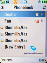
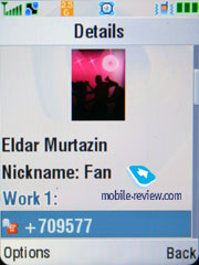
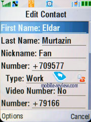
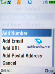
Phonebook. Not less than 1000 names can be saved in the phone's memory and for each entry you can store First Name and Last Name (two fields), Nickname, phone number (select its type in a list - home, work, mobile, fax and so on, available for videocalls or not). At entering a number you will get only one field, but be sure another one will get highlighted after you fill the given field. That means the phone offers step by step data entry, which seems quite logical. And the last but not the least, up to 7 numbers can be kept for a single contact, which is enough for the majority of users.


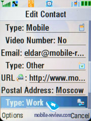
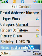
Apart from telephone numbers you can enter e-mail addresses (up to 2), URL, a postal address (two fields for street, city, state, area code, country). Also we should mention a text note, a personal ring tone, user groups (unlimited number, and each one can have a personal tune), and a birthday. Unfortunately, no reminder on birthday is scribed in the organizer automatically, no sound signals appear either. I consider it to be the next step in development of the phonebook.
The handset makes use of a speaker-independent voice recognition system, which means no voice tags are required (though they vary by region and selected menu language) – you can dial any contact or call up applications with voice right away.
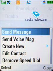
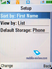
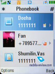
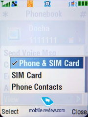
The general list shows names both from the phone memory and SIM (only one type is viewable at once). Search may be carried out by several letters and you can add until a word is complete. Three view modes of the list are available - only names with an icon of a default number; names and photos and the first phone number (a default one); names with a number. Fast scrolling with the help of horizontal presses is enabled on the MAXX. Any number can be added to the fast dial list, so that you can send a message or call a selected number via a pop-up menu.
The groups settings enable you to pick personal ring tones and images for them – the MAXX houses 4 groups by default, though this number can be easily extended by user. Support for mass message sending to group members is onboard.
A really appealing addition to the interface is filter by e-mail address (sorting of the general list) or recently used numbers (works for SMS as well) – in the latter case the list is topped by Recent Contacts.
You can retrieve contacts from other phones, which is an attractive capability. And if names coincide, two entries are created. If one of the entries has a Nickname field filled up, then the contact will be displayed under this nickname, rather than under the First Name and Last Name. In fact this is one of the first devices that can receive complete information on contact from another device (for example contacts beamed from Sony Ericsson K800i had assigned photos on the MAXX).
Even despite some possible distortions of encodings for Russian language, synchronization with MS Outlook brings about no problems. We failed in finding the reason why the support for Russian was so crude, though. However after a complete clean up of all entries and another synchronization, all entries were displayed in understandable Russian.
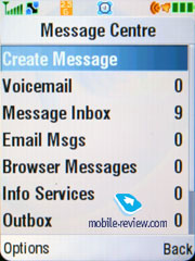
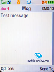
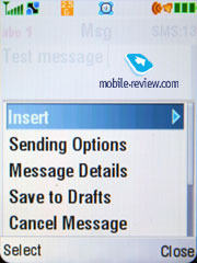
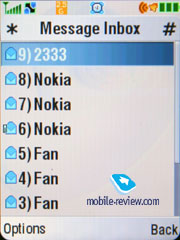
Messaging. The default memory capacity for 100 SMS is provided, which may also vary depending on the firmware version. As a rule, operators’ editions are capped to 70 messages. The device can handle EMS if such necessity arises. Automatic cleaning of the whole message list should be mentioned as an extra possibility, as well as a list of templates. Delivery report may be turned on permanently or switched on/off for a given message.


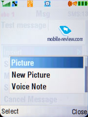
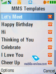
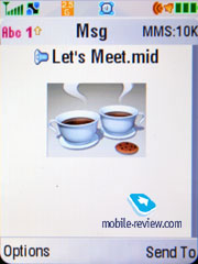
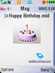
MMS management doesn't cause any inconvenience; everything is simple and easily understandable. The messages can be enhanced with pictures taken with the built-in camera and sound clips. The ten predefined templates are really great, be sure to check them out.


The phone has POP3/IMAP4 e-mail client, allowing watching the headers of the incoming mail and downloading their bodies as well. Only images, video, mp3 that do not exceed a certain size limit can be sent. In case you want to store some of the e-mails, you will have to use the dynamically spread memory, just like in case with MMS.
Opera 8 is the default browser, sporting cookie support, ability to fit viewed pages into the screen (and also full-screen mode), font settings, dynamic scaling, Javascript and loads of other options to choose from or adjust. The browser handles Russian encodings with ease – if we are to face off Opera 8 against other offerings, it does pretty good. The browser version for such device is far inferior to Opera 8.5 in terms of capabilities – for example the 8.5 is bundled in Motorola Z6.
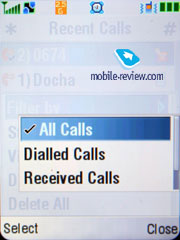
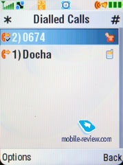
Recent calls. The handset retains a merged list of calls, which means there you will find both missed and dialed numbers. Special lists for 40 recent calls are also available. Not only the caller's name but the type of the number is shown, if it is kept in the phonebook. Everything is rather simple and traditional, nothing special at all. Each entry features the date and time as well as the duration.

Also this menu shows last calls, call duration and data connections.
Tools. This menu features a whole bunch of office applications such as the Calculator. It's convenient; the full digital keyboard is present on the screen, which reproduces the real keyboard perfectly. The menu features memory options and the unit converter.
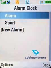
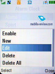
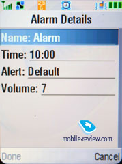
Alarm clock. You can set up several alarm clocks, choose custom ring tones, name and volume, type of reoccurrence (daily, single time) for each of them. This phone was designed for continuous use, that's why entering names and titles for the alarm clocks is required. Alarm clocks are activated in one touch, and a note really makes handling alarms a breeze.
 

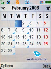
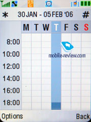
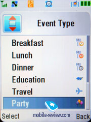
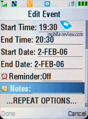
Organizer. You can view it monthly or weekly with breakdown for hours. You will see your appointments bound to a certain time of the day, it's convenient. Each entry can be assigned with a name, start time, length (measured in hours, the minimal amount of time - 30 minutes). Alert can be set up to trigger off before the event (user-manageable). Each entry can set to be recurrent, which is a major attraction. I also like a wide selection of various events and corresponding icons.


The To-Do list on the MAXX is not something I was greatly surprised with – all events can have one of three priority levels, due date and have a text note assigned. While viewing the general list you can take advantage of filters by concrete event types, which comes in handy sometimes.
SyncML support is enabled on the MAXX, which is aimed at enterprise users who are in great need of synchronization with data server (a kind of remote synchronization with Desktop PC, but this time the server must be located in the network).
Activation List – the handset boasts support for DRM 2.0, so that in the Activation list you can check out licenses, their status etc.
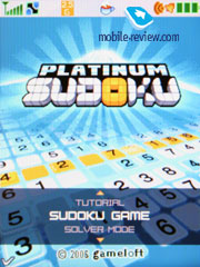
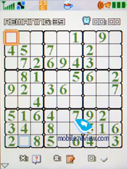
Games and applications. The phone supports Java MIDP 2.0; all applications that are located in this menu item are based on this technology. The number of games and their title depends on where the phone was bought. In most cases you will end up having only Sudoku and Block Breaker Deluxe onboard.
 
 
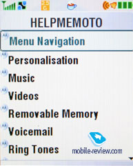
The standard suit of applications includes HELPME Moto, Motorola SETUP (set up GPRS, MMS and so on with it), Motorola TXT (saves your messages on a remote server), BACKUP (saves the phone book on a remote server), eBay Pocket Auction (allows for taking part in eBay’s auctions).
 
 
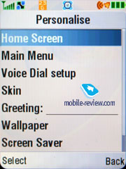
Settings. Here you can setup all Display settings including the color schemes.

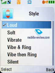
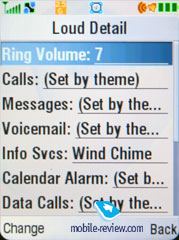
Ring tone type and notification mode (mixed mode, when the silent alert goes off at the same time with the ring tone) is here as well.
 
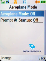
Here you can activate the Flight mode and set an alert on its activation.

Security settings have been expanded greatly. Now you can protect some functions with a password – be it the phonebook, messages, or some other phone’s sections
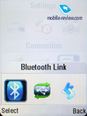
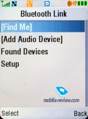
Bluetooth settings were slightly modified; Now, the Print option is available, printing is possible for a message, an organizer note or a phonebook entry.
 

The supported standard is 2; apart from the Print profile the handset now can provide Audio Profile (A2DP), which allows pairing up a stereo headset with it. Bluetooth data transfer speed tops out at nearly 25-30 Kb/s. Speaking of the highlights here, we should mention the ability to choose profile-based connection notification mode for every paired device!!! To put it simply, if you are sure that would like only to trade data back and forth with a concrete phone, then turn on No OBEX authorization and for other profiles leave “on demand”. A really fetching function that I have never encountered before (at least I couldn’t think of any counterparts in other phones).
Synchronization with PC. A full version of Mobile Phone Tools version 4.x is included into the package. The program capabilities cover the needs of the majority of users: they include synchronization with MS Outlook, making reserve copies on a PC, copying photos, tunes, drawing up messages on the PC. ActiveSync Exchange support is also onboard, though only remote synchronization is provided (with a mainframe via network).
Impressions
The model delivers good reception quality, typical for all modern devices. Ring tones’ volume is slightly above average, midi-tunes are played back via 64-chord polyphony module, which ensures fairly great sounding. The silent alert is nothing special on the MAXX – it’s somewhere between “average” and “slightly above average” strength-wise. The loudspeaker outputs enough volume during conversations for nearly all environments.
The device leaves solely positive impressions – the handset is easy to handle, convenient to hold, lacks any crucial omissions. At the same time, its music department has much potential, but in reality turns out to be one of the MAXX’s soft spots. Missing FM-radio in a device belonging to this class is more like a relic nowadays, as well as the design, which everyone has already been fed up with to some extent. The handset is just great when considered as a major patch-up job – it eliminates many letdowns of its predecessors and proves to be much handier in daily routine. The only serious limitation of this handset is the policy manufacturer sticks to – specifically over at Motorola they still think that the RAZR’s design is what sells their products, so a price premium won’t look out of place.
In Europe this model is retailed for 415-450 USD, while on the Russian market it goes for 530-550 USD and more, which is simply ridiculous for such handset. The MAXX sports neither groundbreaking functionality, nor top-notch design or some unique features (HSDPA is not among these – most consumers don’t even know what it is), thus the price isn’t backed up with something real. Personally, I failed to find the one and only weighty cutting edge of the model, saving for it being pleasant to play around with.
When it comes to design, this solution is rivaled not only by Motorola’s own range, but an assembly of Samsung-branded models, both that have already made it to the market (Samsung Z540, Samsung E780) and only will make it soon enough (Samsung E480, Samsung Z620). On top of that Samsung E480 was designed to compete with the original RAZR, and it has what it takes: maxx-esque looks, soft touch finish and a price of about 200 USD. Functionality-wise Samsung Z620 sports exactly the same specs and a bit more for a pretty much the same sum of money, being slotted for February, 2007. To clear the things up, Motorola V3x with identical feature-pack comes in at 300 USD. Almost twice as much money for a slightly revamped casing, a few touches upon the software and all this takes place against the background of close similarity of the handsets and missing fashion aspects (bring the backlighting back, please) – what is this all about? Taking account of Motorola Z6 launch, which is a slider showing off a different interface, in some ways better functions layout and more or less the same spec sheet, Motorola V6 maxx is not likely to end up a winner. There is no denial – this product is well-made and generally alluring, but at its today’s price it won’t be much of a competition. For the time being its real price can’t go over 450 USD and by March it should fall down to 320 USD to fill the market with considerable amount of these handsets. So, it is a pity that a technology-wise successful solution won’t be picked up by many due to the company’s mistakes in marketing.
SAR value for this model – 1.38 W/kg
Eldar Murtazin (eldar@mobile-review.com)
Translated by Oleg Kononosov (oleg.kononosov@mobile-review.com)
Published — 02 February 2007
Have something to add?! Write us... eldar@mobile-review.com
|
News:
[ 31-07 16:21 ]Sir Jony Ive: Apple Isn't In It For The Money
[ 31-07 13:34 ]Video: Nokia Designer Interviews
[ 31-07 13:10 ]RIM To Layoff 3,000 More Employees
[ 30-07 20:59 ]Video: iPhone 5 Housing Shown Off
[ 30-07 19:12 ]Android Fortunes Decline In U.S.
[ 25-07 16:18 ]Why Apple Is Suing Samsung?
[ 25-07 15:53 ]A Few Choice Quotes About Apple ... By Samsung
[ 23-07 20:25 ]Russian iOS Hacker Calls It A Day
[ 23-07 17:40 ]Video: It's Still Not Out, But Galaxy Note 10.1 Gets An Ad
[ 19-07 19:10 ]Another Loss For Nokia: $1 Billion Down In Q2
[ 19-07 17:22 ]British Judge Orders Apple To Run Ads Saying Samsung Did Not Copy Them
[ 19-07 16:57 ]iPhone 5 To Feature Nano-SIM Cards
[ 18-07 14:20 ]What The iPad Could Have Looked Like ...
[ 18-07 13:25 ]App Store Hack Is Still Going Strong Despite Apple's Best Efforts
[ 13-07 12:34 ]Infographic: The (Hypothetical) Sale Of RIM
[ 13-07 11:10 ]Video: iPhone Hacker Makes In-App Purchases Free
[ 12-07 19:50 ]iPhone 5 Images Leak Again
[ 12-07 17:51 ]Android Takes 50%+ Of U.S. And Europe
[ 11-07 16:02 ]Apple Involved In 60% Of Patent Suits
[ 11-07 13:14 ]Video: Kindle Fire Gets A Jelly Bean
Subscribe
|


