|
|
Review GSM phone Motorola V3i
The release of Motorola RAZR V3 started a new page in mobile phone history; it formed fashion for slim solutions. The majority of the manufacturers started creating their own copies of the RAZR, and some of the elements in the new models were similar to the V3. Its sales can be surely called record for this class, and due to it Motorola's position strengthened on many markets. Later the company introduced other colour solutions to prolong the model's life circle - the first one was black and a pink solution for women has appeared recently. Actively reduced price, the appearance of a model in a usual pasteboard box instead of aluminum, which caused a price gap of about 50 USD, allowed increasing the sales for more than a year. In the end of 2005 we see the device is morally tired, it got too wide-spread and mass. On the one hand that is only a design solution; on the other hand it is mass. And this discrepancy influences the future sales. Now the company's product line represents no leaders, only those devices that will suit people who did not buy the RAZR for some reason (for instance, the L7 SLVR is positioned this way). Everyone realized the necessity to create a leader, and Motorola V3i became the one. Due to some cosmetic changes it is improved as compared with the basic version. New capabilities in software are added, the body colour is renewed, a memory card and a megapixel camera appear. It seems all enough and to the fore for a modern device, and here is where the initial contradiction with the RAZR's primordial positioning and the V3i's one raises.

This fashion device distinguishes from the mass of phones on the market only in design. And like any consumer product, the phone has some consumer characteristics, and the design is only one of them. The perception of a trade mark plays an important role (fashionable, prestigious or not), average number of present functions and its price. Motorola's trade mark is well-treated on the market, however the presence of low-end phones prevents from playing a significant role in the high-end segment, the maker always reduces prices for its top models making them available. And this is the main difference from, for instance, Nokia, which can keep prices for its fashion solutions on the maximum level, however that doesn't cheapen them. High sales of Nokia are achieved by the middle-segment models; however fashion devices serve as some kind of an advertisement of the whole model line. It turns that high and stable price thought the whole life cycle automatically keeps the image of some solution on a high level.

Let's try to estimate what was happening to Motorola RAZR V3 and why it got so demanded. Functionally, the model copied existing company's solutions, for instance, Motorola v600, however offered a new unique design. We mean body materials, its thickness, and the whole appearance of the device. The market knew nothing alike, and as a result, the model's functionality moved to the background, it was bought for design and unusual appearance. This is the very same factor that has become the main for the RAZR's sale. And speaking about the V3i we can state no new impressions of the design, which is per se the same RAZR and it will be for the majority. Then the phone's functionality steps to the foreground, however here is loses to modern solutions by many makers. Thus a resulting groups consists of people who liked the RAZR, but the absent memory card prevented from buying the device. Such users are usually not very exigent to the realization of the functions, their presence is important per se. This group is not very numerous, and the main sales of Motorola V3i will fall on them.

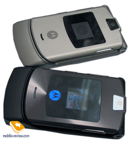
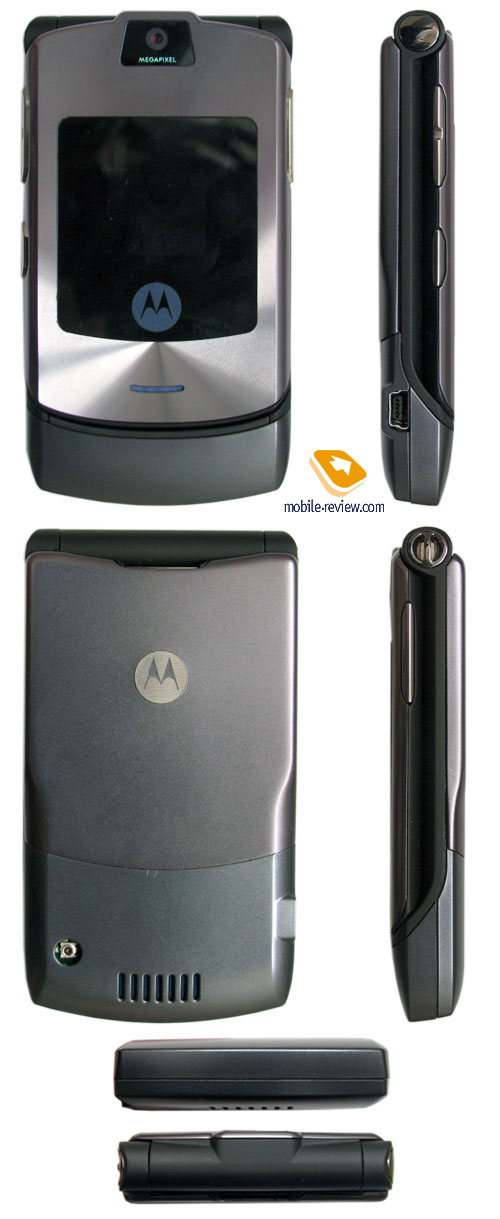
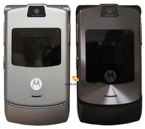
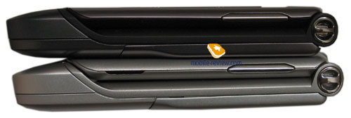
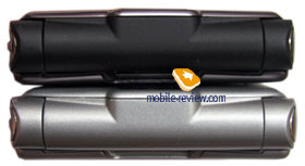
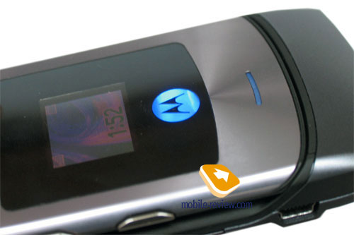
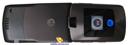
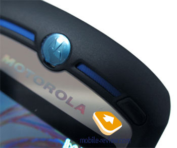
The first really striking thing in the renewed device is an insertion on the front panel; it got much larger and now includes a stylized company logo. The official name of the colour is Silver Blue, and really that is bluish black steel with a violet shimmer. This name is used to confuse the rivals. The body matching the dark insertion and the colours call up. The logo is semitransparent and has an integrated colour indicator, which can shimmer with blue at a call and Bluetooth work. A loudspeaker gap responsible for playing call melodies is under the insertion, now it got wider. At the same time side loudspeaker gaps are absent, which instantly told upon the call volume, it is lower. When the device lies on the table, the calls are almost comparable, very close, however in a pocket or in a case it is not as cheerful. If the handset leans against a jacket's pocket, the sound will get hardly perceptible. Its volume will not be enough due to the absence of the side gaps. This changes in construction happened due to expanding the phone's functionality, developers struggled for every millimeter of free space on the body. Phone's dimensions haven't changed and still form 98x53x13.9 mm, and the weight is 95 g.


The body material is anodized aluminum, but the developers applied micro engraving to avoid doubts in that. When you touch the body, you can feel it, since the surface is rough. When the light falls on the body, you can also see divergent circles, which is also the result of the engraving.

Now the external screen shows about 65K colors (STN), the resolution remained the same - 96x80 pixels. Considering that the external screen shows only callers' names as a rule, or their photos, then changing colours are not seen with a naked eye. The screen brightness grew though insignificantly. And still it fades in the sun.

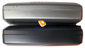
The camera is 1.23 MP, CMOS matrix corresponding with the one integrated into Motorola V635. The camera was chosen exclusively considering the module's thickness. That is why here we see an outdated solution of the previous generation. All side elements correspond with the same in the V3, a coupled volume button and a Smart one are placed on the left side. Voice functions are accessible by the button on the right side, and particularly, it is responsible for activating voice dialing or starting a dictaphone record. A miniUSB connector is placed on the left side of the phone.

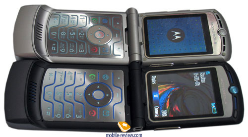
You will find it easy to open the phone with one hand. And inside you will discover a large screen. In characteristics it has no differences from the V3, the resolution remained the same - 176x220 pixels (34x46 mm), which allows about 8 text lines and a couple of service lines. And again talks about the support for QVGA resolution, which was also announced for the V3, remained only talks. The main problem for the company is it can't develop software for higher resolution, the interface can't be scaled. And that is why even considering the hardware capabilities; the screen remains the same with low resolution.

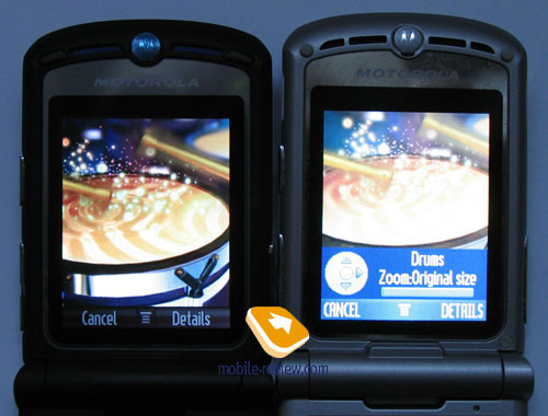
The screen shows up to 262K colors, the picture got brighter and much more vivid than in the V3. The reason is Sharp is a screen supplier for the V3i, while the V3 was equipped with Toshiba's matrixes. This TFT-screen behaves well in the sun, the picture can be made out, and the text is readable.


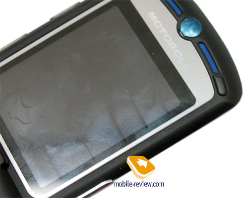
Small rubber compressors are placed above the screen; they prevent the screen surface from touching the keypad. They are larger in the V3i and have another shape; however that brought no desired result. And again key-shaped prints stay on the screen, which is especially noticeable on fingerprints (the screen gets dirty of touching a brush very fast).


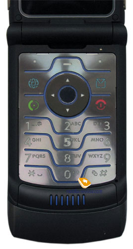
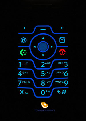
The keypad is of the same construction, the buttons have small motion, but are comfortable in work. The navi button is slightly changed, silicone insertions appeared, which correspond with various directions (arrows seen on the picture, they are lifted above the body). This allows carrying out navigation along the device without even a glance at the buttons. The blue backlighting of the keypad is well seen in various conditions.


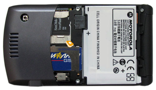
The back cover is of metal and hides a battery compartment. Unfortunately, the fastening was not changed, and you will have to get used to closing it correctly in order not to have chinks. Removing the cover, you see a battery, a SIM-card slot and a microSD connector aside (TransFlash). The device supports hot card change, but we can't consider this solution comfortable since you have to remove the cover first. At the same time the majority of users will rarely change memory cards.

This model is equipped with a 780-mAh Li-Ion battery. According to the manufacturer it is capable of working for up to 200 hours in the standby mode and up to 3.5 hours in the talk mode. In Moscow the device worked for about 2 days with about an hour of calls and up to 20 minutes of using other functions. Full recharging takes a little less than 2 hours. You can recharge it using a USB-cable.
Menu
The renewed model has software more corresponding with the latter company models like the SLVR L7, L6, Motorola U6, than the previous triplet generation. At the same time technical characteristics of the platform remained the same, they are low clock rate of the main processor, ATI solution of the first generation used as a 3D accelerator. In fact, the phone's productivity is enough in the main applications, no serious slow down. That is due to the fact that all software changes were tested on other models on the line and came optimized into the V3i.
A sort list of improvements looks this way:
- Voice commands, voice independent dialing, no preliminary training is necessary
• SCREEN3 - a screen headband technology, you can set up some channels, workability depends on the operator's support
- iTunes. You can upload music onto the memory card from a PC using a corresponding service. A special iTunes player equal to the one in Motorola ROKR E1 is integrated into the phone. There will be two versions available - with an integrated iTunes player and without it (a usual mp3 player on Java). Non iTunes versions will be the main on the markets, where this Apple's child is not represented, and Russia belongs to them. And a curious fact is that the company has no plans for expansion of its presence in our country. Here is its characteristic for Russia - "The Internet score is misleading--most users are probably spam and scam creators. The country's unstable political and economic situation make retail investments dicey".
- Special profile for a plane switching the radio part off
- Expanded phonebook with address fields similar to Motorola SLVR L7
- Support for Bluetooth Print Profile, a capability to send photos for printing and support for multi-user games via Bluetooth
- Expanded set of applications and games (three games and two applications, their certain names depend on the country, and on the development time, totally 24 variants)
- New capabilities for protecting separate applications; they are protected with a password
- Preset events appeared in the phone, types of events (no special graphical icons for them)
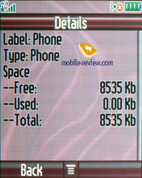
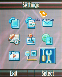
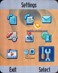
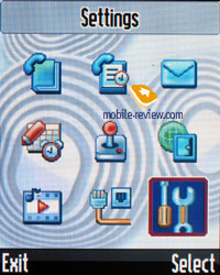
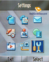
The dynamical memory capacity of 8.5 MB (it depends on the preinstalled software; at least 6.5 MB of free memory, and the maximum value is 10 MB). You can access the Main Menu by pressing the Menu key (or an Ok button as a variant) that is located under the screen right in the middle. The main menu is traditionally represented as 9 icons; each of them uses information bar for definitions. You can switch the appearance of the main menu to the list mode. Then everything will be represented as lists. Half of the submenus is represented as lists and half as icons (if you choose a corresponding menu appearance). A user may customize the order of the icons in the main menu (or the items in list view mode). The menu does not support fast number navigation, but you can setup shortcuts for almost every menu item or function. Two soft-keys can be bind to various actions as well, apart from the default ones. With such menu personalization flexibility the lack of the fast number navigation is not so noticeable.


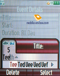
The device supports predictive text input iTap. The current word is shown while input (in the lower service line) and variants of a word to select. When the dictionary is off, all the characters assigned to the button are shown. The device remembers the variants of the words you choose and after that offers them automatically. That helps to avoid entering words into the dictionary as it is necessary in T9.
In case you use two input languages for your SMS or letters - you can choose the language from the special menu, or use a fast one touch switch. You can also setup which type of text input to use for every Language - predictive or not.
Working with memory card should be mentioned specially. When plugged in, the card is defined automatically. The device supports a special folder structure, and that's why you can create subfolders only in some folders, otherwise you take a risk of seeing no necessary data after. Each phone menu (pictures, sounds, and video) allows selecting a carrier, which is s memory type to display. Both memory types are not supported at the same time. At the same time any file can be copied from one memory type to another. Generally, working with memory cards is middling though enough for an unpretentious user.
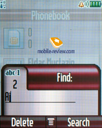
Phonebook. Pressing the buttons in the standby mode calls a search menu, here you can search by unlimited number of letters. Traditionally provided fast switch to a name by the position in the phone book.


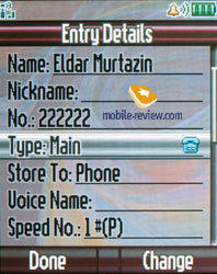
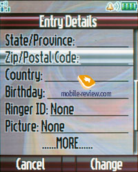
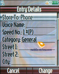
Up to 1000 entries may be saved in the phone book; a name goes with one number, e-mail address, personal photos and call melody. New fields are called Nickname (used in ICQ and similar programs and has no any straight use here), fields for entering a post address (two fields for a street, fields for a city, state, post index and a country), birthday (but there is no a memo here still).
Only one number can be assigned to each name. At the same time setting another order of entry representation in the phone book menu changes the phone book greatly. All the entries for a name are hidden behind the name in the general list. You are not limited in the number of fields and can keep several phone numbers, e-mail addresses. The matter is the representation you have chosen. The plus of the notion is you can select personal call and a picture that will be displayed during a call for each entry (for instance, one user but different numbers). In the general list each name with several numbers may be scrolled with horizontal pressures, icons signifying the type of the number will be changing. There are several users' groups the entries may be distributed among.
However I have noticed a small disadvantage - when you are deleting an entry from the phone book, you will have to delete each number assigned to it separately. It's impossible to delete them at once.
You are free to choose the style of displaying entries in the general list: either names with assigned images, or only names. Sorting by various characteristics is present (fast dial number, name, e-mail address).
The phone book is interesting in characteristics and no similar offers by other manufacturers exist now, all of them have restrictions (one photo for a total name, no photo assigned to separate names, the same for personal melodies). At the same time, the phone book cant' be called ideal in the absence of many fields and it needs investigating the structure.
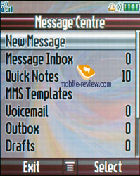
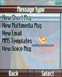
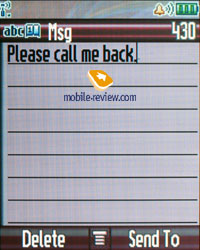
Messages. The default memory capacity for 100 SMS is provided; it may also vary depending on the software version. As a rule, operator versions are limited by 40 messages. The device works with EMS. Automatic cleaning of the whole message list should be mentioned as an extra possibility; there is a list of templates. Delivery report may be on permanently or switched on/off for a message.


The phone book list appears when sending a message, which is a difference from the previous models. At that you can tip several names and thus send a group message. And now starting with this model the function gets standard for all the Motorola's phones.
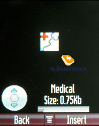
Working with MMS doesn't bring any inconvenience; everything is simple and easily understandable. The messages can be attached with pictures made by the built-in camera, sound files. The ten predefined templates are really great, be sure to check them out.


The phone has POP3/IMAP4 e-mail client, it allows watching the headers of the incoming mail and download their body as well. Only graphical files, video and mp3 files that do not exceed a certain size limit can be sent. In case you want to store some of the e-mails, you will have to use the dynamically spread memory, just like in case with MMS.
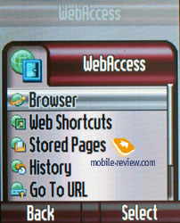
WAP. The phone has WAP-browser v2.0 and its possibilities are standard so nothing special can be said. GPRS (class 10) is present, the settings are rather simple, just follow your operator's instructions.

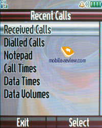
Call log. The phone has a list of received calls; it includes the missed ones as well, they may be distinguished by the absent tip. You can also see the list of the 10 last dialed numbers; you can access it by pressing the Call button. Everything is rather simple and traditional, nothing special at all. Each entry features the date and time as well as the duration.

Also this menu shows battery life, last calls, call duration and data connections.
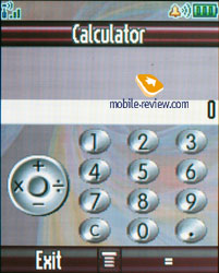
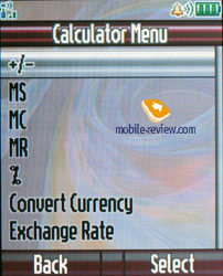
Office applications. This menu features a whole bunch of office applications such as the Calculator. It's convenient, the full digital keyboard is present on the screen, it reproduces the real keyboard perfectly. The menu features memory options and the unit converter.


Shortcuts are located in the same menu. You can create shortcuts not only for various menu sections, but for a definite wap-site as well.
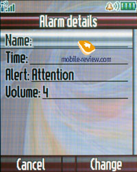
Alarm clock. You can create several alarm clocks and choose a custom ring tone, name and volume, type of reoccurrence (daily, single time) for each of them. This phone was designed for continuous, that's why entering names and titles for the alarm clocks is required. Alarm clocks are activated in one touch, and a note really eases work with them.

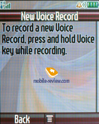
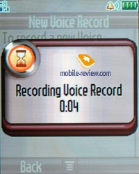
Dictaphone. You can create records from the stand by mode as well as during the talk. Dictaphone can record the whole dialogue. The maximum length for each entry - 60 seconds, however your interlocutor will hear the sounds (at first it's zoommer, followed by short beeps with a continuous interval). There is no possibility to keep more comments despite the dynamical memory present, only several records up to 60 seconds in duration (earlier the limit formed 120 seconds). The dictaphone is weak especially against a background of the rivals recording up to an hour of talks. In the listening mode a percent of the total time but not a reproduced time is shown, the discontinuity forms 5. That looks hardly comfortable since we all are used to representing record time and that seems logical.


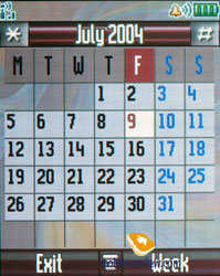
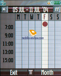
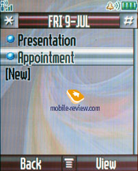
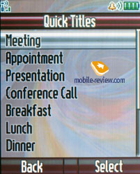
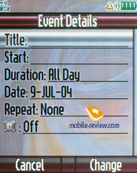
Organizer. You can view it monthly or weekly with breakdown for hours. You will see your appointments bind to a certain time of the day, it's convenient. Each entry can be assigned a name, start time, length (measured in hours, the minimal amount of time - 30 minutes). Various names of events are preinstalled into the phone; they are not specified with various icons in the list. Warning can be set in advance. Each entry can be reoccurred, this is a big plus.


SyncML support is present, it's made for corporative users who are in great need of synchronization with data server (something similar to remote synchronization with Desktop PC, but this time the server must be located in the network).
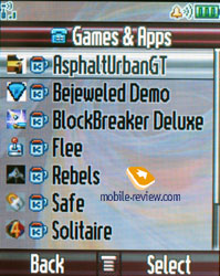
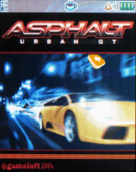
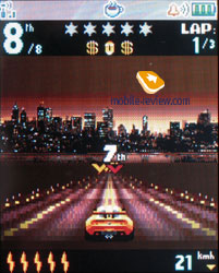
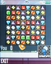
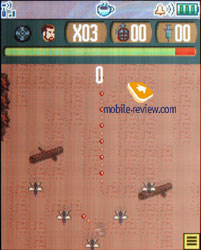
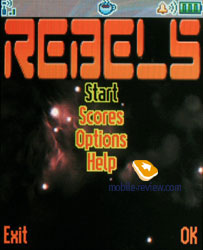
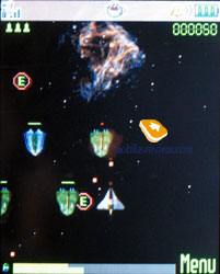
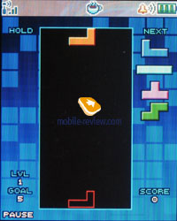
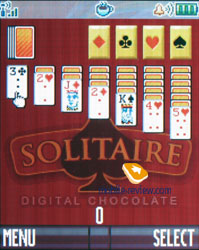
Games and applications. The phone supports Java MIDP 2.0; all applications that are located in this menu item are based on this technology. The number of games and their title depend on where the phone was bought. The most often to find are Rebels (a space shooter), AspaltUrbanGT (racing, I think we do not need to say more), BlockBreaker Deluxe (one of the best archanoids), Solitaire (patience), Flee (game for children).


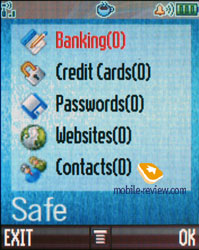
Applications now allow using the Safe program - once you set a password, and then can store confidential data about you bank account, passwords, addresses and so on. It resembles the ones in Sony Ericsson, Nokia, Siemens.


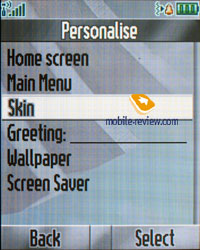
Multimedia. The phone supports themes. It's a set of wallpapers, color schemes for the menu, sounds and ring tone types. You can change the outlook of your phone almost instantly and this is really fun. New themes can be downloaded from Motorola's website.
The number of skins has changed, and got more. They not only change a colour menu representation but interface windows, the whole interface of the phone changes.


MotoMixer - original sound file editor that allows mixing the tracks. You can play with it from time to time; the results may come out rather unexpected and nice. However as the practice shows, these sound editors are nothing more than a toy for most of the users, only few of them take this tool seriously.
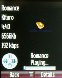
Sounds - information about all sound files located in the phone's memory is stored here. You can check out their size, info and even listen to them. The players is similar to other Motorola's phones, everything is clear and easy to understand. The great advantage of this very player is playing back in background. You can form your own play lists by the way.


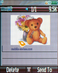
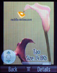
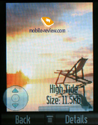
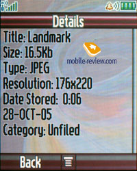
Pictures - list of all images located in the phone's memory. There's a special icon near the file name. Each picture can be set as the wallpaper or screensaver. Pictures can be sorted in categories; this will make the browsing easier. A special editor is present as well, it allows putting frames, changing color scheme and using special effects. The most convenient part is that after mocking the picture it can be stored with a new name. This means that both the original and the new picture will be available for use. This may come handy in case if you want to edit the photo, and not to ruin the original.


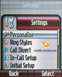
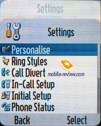
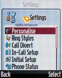
Settings. Here you can setup all Display settings including menu color schemes.
Ring tone type and notification mode (mixed mode, when the vibrating alert works at the same time with the ring tone is present) is here as well.
An aboard a plane mode is activated from this very menu, you can set notification at turn on. The absence of profiles disappoints, however aboard a plane one is the first step towards creating profiles.
Security settings were considerably expanded - now you can protect various functions with a password, it can be a phonebook, messages, or some menu items.
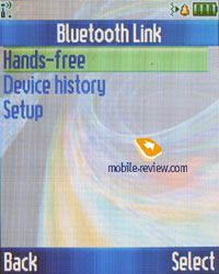
Bluetooth settings are the former; the device is seen only for 60 seconds, which is not enough sometimes. Now the Print option is available, printing is possible for a message, an organizer note or a phonebook entry. The supported standard is 1.2, though no other changes were made except for the Print profile. Unfortunately, the device supports no Audio Profile, which prevents from using stereo headset with it.


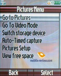
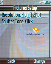
Camera. A 1.23 MP camera is integrated into the phone; it allows taking photos with the resolutions of 120x160, 240x320, 480x640 and 960x1280 pixels. The quality of saving images is the same and can't be changed from the menu. The possibility to switch off the shutter sound when shooting, set an exposure from -2 to +2, choose a lighting type (auto, sunny, cloudy, indoors, office) should be mentioned. There is a possibility to use a timer.


Maximum resolution photos may be saved only to the memory card and video is saved in the phone's memory. The quality of a CMOS-sensor is low, it gives up in bad lighting and photos are blurry and unclear. The best results are gained in the bright sun light and in other cases color saturation of the photo is not enough. Pleasantly, when working with the camera the picture is shown full-screen and tips are semi-transparent. Light settings may be changed with vertical presses of the navi button and it's also responsible for choosing effects (color, black and white, blue, old-like, red, green, and negative). There is an 8x digital zoom.
Motorola V3i
|
 |
 |
(+)
increase, 960x1280, JPEG |
(+)
increase, 960x1280, JPEG |
 |
 |
(+)
increase, 960x1280, JPEG |
(+)
increase, 960x1280, JPEG |
 |
 |
(+)
increase, 960x1280, JPEG |
(+)
increase, 960x1280, JPEG |
Video sample (3GP, 158 KB) - 1
Video sample (3GP, 150 KB) - 2
Video sample (3GP, 182 KB) - 3
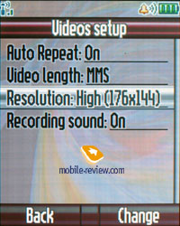
There are three quality kinds available for video - good, best, very best. The max duration is 10 minutes. What's curious is that the camera interface differs from the video recording one and that is another menu item. There is a fast settings change but the picture is shown on the part of the screen what is explained with the clip resolution (low - 128x96 pixels, high - 176x144 pixels). The quality of the video is average and sound may be turned off when recording.
Productivity. Traditionally, the JBenchmark package was used for testing phone's productivity. The device showed no principal differences from the results the triplet platform provided. The production improvement is minimal and may be left out on account of this. In general, the model really looses to the majority of the models on the market in the Java-machine operating speed.
|
V3i
|
| JBenchmark 1 |
1076
|
Details |
| Text |
333
|
| 2D Shapes |
272
|
| 3D Shapes |
119
|
| Fill Rate |
42
|
| Animation |
310
|
1.1.1 |
|
V3i
|
| Jbenchmark 2 |
32
|
Details |
| Image manipulation |
18 |
| Text |
143 |
| Sprites |
70 |
| 3d Transform |
4 |
| User Interface |
45 |
2.1.1 |
Synchronization with PC. A complete version of Mobile Phone Tools version 3 is included into the package. The program possibilities cover the needs of the majority of users; they include synchronization with MS Outlook, making reserve copies on the PC, copying photos, melodies, writing messages on the PC.
Impressions
The model has no problems with the connection quality being a typical modern device. The musical aspect is on the triplet's level, mp3 reproduction is present and limitations are not as strict. Signal volume is higher than average, Midi-files are played in the 24-tones polyphony that sound well also. The vibra is average or a bit more powerful. The loudspeaker volume is enough during a conversation almost always.
At the beginning of sales the phone will not support EDGE, however they promise to add the technology later (necessary chipsets are lacking).
The V3i is mostly a fashion solution, however not as unique as the RAZR at the launch moment. Someone may consider the camera a great advantage and will think of buying the model. But the price of 450-500 USD is rather too high, and the productivity is lower than of products with similar price. The release of the model is planned for December 2005 on the majority of markets, and in Russia we should expect it in the beginning of February. And considering the appearance of the series 40 interfaces by Nokia, Sony Ericsson's activity in this direction, Motorola's solution starts looking archaic. The main advantage of Motorola V3i is its design, but considering the popularity of the RAZR and its low price, this solution looks dubious at the current price. The company tries to prolong the model's life cycle for the maximum, but even today we face a problem that real changes in the interface development and the speed of adding new software functions. Now the company develops the capabilities of its phones very slowly, but in fact this requires no great work and high expenditures both in time and investments.
P.S. To tell the truth, I can hardly imagine an owner of the V3i that will constantly use the mp3 player. That is an untypical function for users of such devices.
Eldar Murtazin (eldar@mobile-review.com)
Translated by Maria Mitina (maria.mitina@mobile-review.com)
Published — 24 November 2005
Have something to add?! Write us... eldar@mobile-review.com
|
News:
[ 31-07 16:21 ]Sir Jony Ive: Apple Isn't In It For The Money
[ 31-07 13:34 ]Video: Nokia Designer Interviews
[ 31-07 13:10 ]RIM To Layoff 3,000 More Employees
[ 30-07 20:59 ]Video: iPhone 5 Housing Shown Off
[ 30-07 19:12 ]Android Fortunes Decline In U.S.
[ 25-07 16:18 ]Why Apple Is Suing Samsung?
[ 25-07 15:53 ]A Few Choice Quotes About Apple ... By Samsung
[ 23-07 20:25 ]Russian iOS Hacker Calls It A Day
[ 23-07 17:40 ]Video: It's Still Not Out, But Galaxy Note 10.1 Gets An Ad
[ 19-07 19:10 ]Another Loss For Nokia: $1 Billion Down In Q2
[ 19-07 17:22 ]British Judge Orders Apple To Run Ads Saying Samsung Did Not Copy Them
[ 19-07 16:57 ]iPhone 5 To Feature Nano-SIM Cards
[ 18-07 14:20 ]What The iPad Could Have Looked Like ...
[ 18-07 13:25 ]App Store Hack Is Still Going Strong Despite Apple's Best Efforts
[ 13-07 12:34 ]Infographic: The (Hypothetical) Sale Of RIM
[ 13-07 11:10 ]Video: iPhone Hacker Makes In-App Purchases Free
[ 12-07 19:50 ]iPhone 5 Images Leak Again
[ 12-07 17:51 ]Android Takes 50%+ Of U.S. And Europe
[ 11-07 16:02 ]Apple Involved In 60% Of Patent Suits
[ 11-07 13:14 ]Video: Kindle Fire Gets A Jelly Bean
Subscribe
|
