Review GSM phone Motorola v360
Motorola
V360. Live pictures
Package
- Handset
- Manual
- Disk with Mobile Phone Tools (complete version)
- Stereo-headset
- Charger
- USB-cable
The company of Motorola prolongs the life circle of its triplets first represented with Motorola v300, v500 and v600 by widening functionality, reducing the price, and leading into the new market segments. Motorola v360 is a typical example of this solution, that is a middle class model having all the features of the elder ones, and by the way has as internal antenna integrated (even Motorola
v635 comes equipped with an external one, which is nonsense for today). The other pleasant moments are increased external screen and loyalty to the monochrome tradition: a budgetary phone economizes on external colour screen, and thanks God, they did, since usual display is seen much better. However, let's talk it over in order.
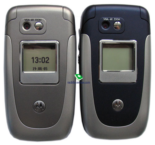
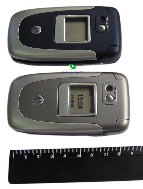
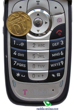
The model rather stands out of the triplet line with its quite another design and less roundish body. That is mainly an advantage - the handset has its own face distinguishing it not only from company products but also from other makers. Various colour solutions are at your disposal. The two main of them are blue and silvery. The prior for the Russian market is blue (this very colour is typical for many operator models), and silvery phones will belong to the minority. This solution is mainly aimed at distinguishing from other silvery clamshells on the counters.


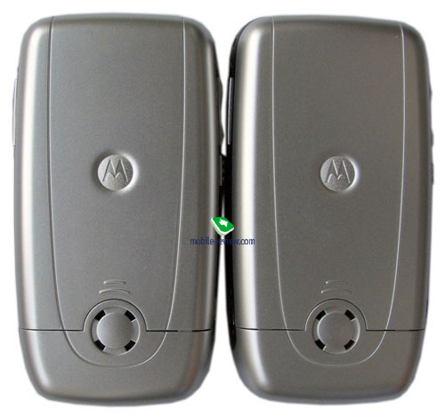
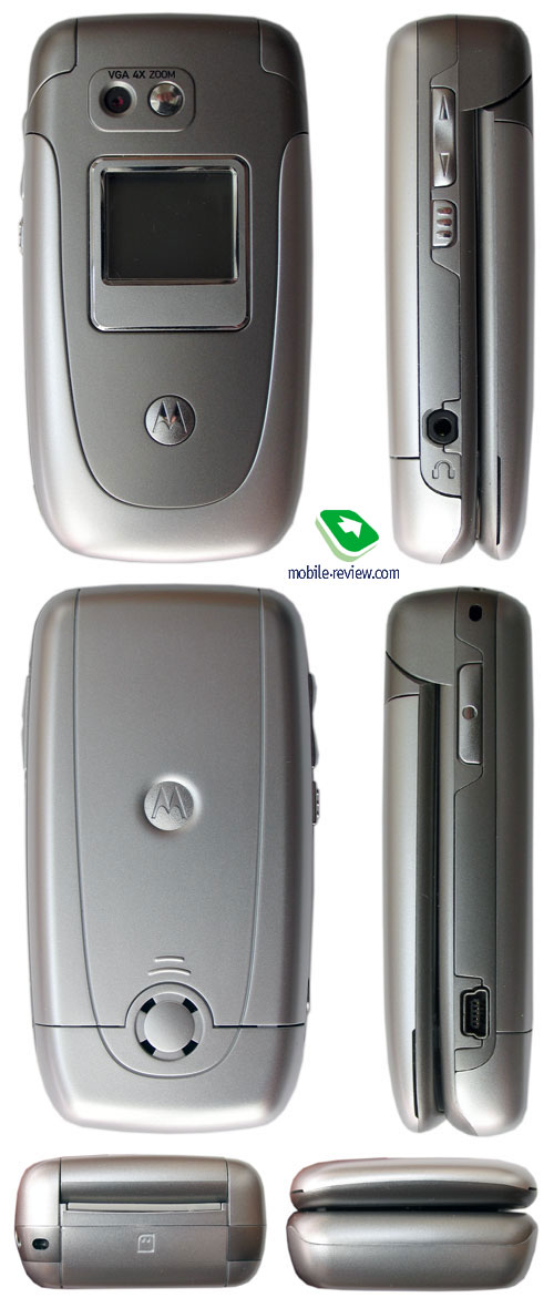
The phone size is a little more than average - 90x47x24 mm, which looks slightly thick. And this doesn't tell upon dealing with the device, the v360 is easy to carry as you like, no problems appear. The weight with a standard battery is 104, which is a bit more than average for such phones.

On the front panel you'll see a mirror and a VGA camera, which is alike the ones integrated into the previous Motorola's models. It is optional and gives not the best photos, though has quite optimal capabilities for its segment.
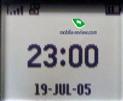
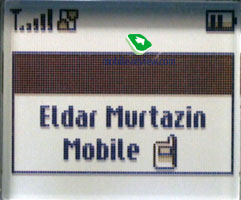
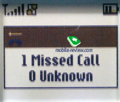
The external screen is 96x80 pixels with pastel backlighting and showing 4 scales of grey. Its great advantage is the information is made out easily even in a sunny day. On the other hand, it can't show graphics, photos assigned to contacts in the phonebook - only a caller's name and a type of the number are shown, but I think it'll become a stumbling block for little people.


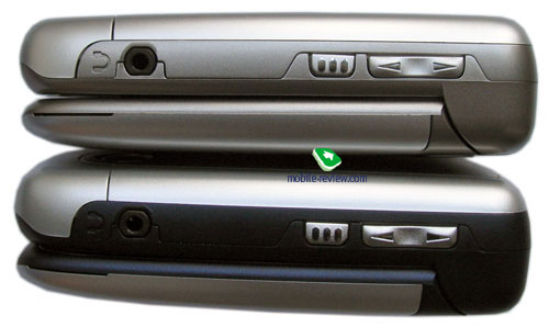
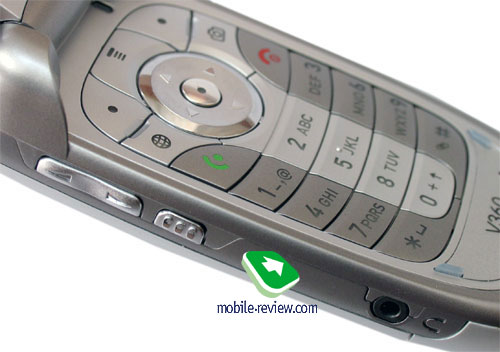
A coupled volume button is on the left-side surface, it allows changing profiles in the standby mode also. A little below, there is a special button changing its function depending on the menu item. In the standby mode it is responsible for Push to Talk. A standard headphones connector is placed on the same side. You can use non-original headset, even with no microphone, which is important when listening to music.
A miniUSB connector is on the right side, it helps recharging the phone. A separate button on the top calls a camera application. And a strap hole is on the same side.

No connectors are present on the bottom, and on the top you can see memory card signs. There is no sense in searching for the card outside; it is under the upper panel, which closes the battery module. The device supports hot TransFlash card change, so it's not quite clear why the gap is absent. It's not hard to remove and set the panel on, but extra actions are irritating. People good at tools can make the gap by their own, and thus they'll get hot change with no tiring and useless actions. The only disadvantage of the modified slot will be big deepening of the slot, you'll have to use small objects to help removing the card (it's fixed in the slot).
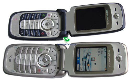
Opening the device is easy with one hand. Its internal screen shows 262K and has the resolution of 176x220 pixels (30x38 mm). The screen is the same as in Motorola v635, and other similar devices. It's still one of the best in its class, quite on the level of Sharp and Samsung. The TFT screen fades in the sun, though the picture is quite clear.

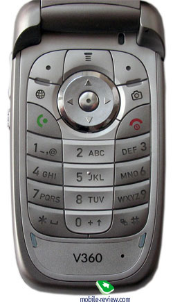
The majority of the device is taken by the keypad. In addition to the two soft-keys, one navi button with an OK key centered in it, a fast wap-browser button appeared, as well as a camera one (similar to the 635). The keypad is backlight in blue and has a lighting indicator (the backlighting turns on only in the dark). The characters are well seen in various conditions. The keys are average in size making no troubles while working.


Removing the back cover, you uncover a 810 mAh Li-Ion battery. The manufacturer claims it is capable of up to 140 hours in the standby model and up to 4 hours in the talk one. Averagely in Moscow networks the device worked for 3 days in case of one hour of talks and up to 20 minutes of using other functions. So, we think the average battery life is about 2-3 days. The battery is fully recharged in less than 2 hours. The manufacturer supposes the expanded battery will be available for the model (1010 mAh).
Menu
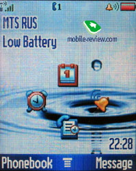
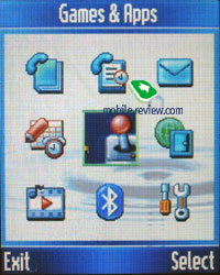
This device is mainly a copy of Motorola v635 with the dynamical memory capacity of 11 MB (it depends on the preinstalled software, at least 6.5 MB of free memory). You can access the Main Menu by pressing the Menu key (or an Ok button as a variant) that is located under the screen right in the middle. The main menu is traditionally represented as 9 icons; each of them uses information bar for definitions. You can switch the appearance of the main menu to the list mode. Then everything will be represented as lists. Half of the submenus is represented as lists and half as icons (if you choose a corresponding menu appearance). A user may customize the order of the icons in the main menu (or the items in list view mode). The menu does not support fast number navigation, but you can setup shortcuts for almost every menu item or function. Two soft-keys can be bind to various actions as well, apart from the default ones. With such menu personalization flexibility the lack of the fast number navigation is not so noticeable.


As we have already mentioned, the device supports predictive text input iTap. The current word is shown while input (in the lower service line) and variants of a word to select. When the dictionary is off, all the characters assigned to the button are shown. The device remembers the variants of the words you choose and after that offers them automatically. That helps to avoid entering words into the dictionary as it is necessary in T9.
In case you use two input languages for your SMS - you can choose the language from the special menu, or use a fast one touch switch. You can also setup which type of text input to use for every Language - predictive or not. An interesting solution that allows setting up your mobile even more customized. However, I would like to notice that the text input is related to the users and only a small amount of them use more than two languages.
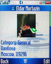
Phonebook. Pressing the buttons in the standby mode calls a search menu, here you can search by unlimited number of letters. Traditionally provided fast switch to a name by the position in the phone book.
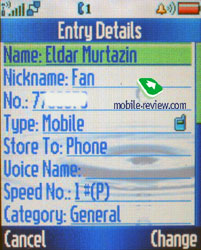
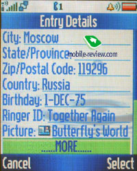
Up to 1000 entries may be saved in the phone book; a name goes with one number, e-mail address, personal photos and call melody. New fields are called Nickname (used in ICQ and similar programs and has no any straight use here), fields for entering a post address (two fields for a street, fields for a city, state, post index and a country), birthday (but there is no a memo here still).


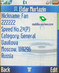
Only one number can be assigned to each. At the same time setting another order of entry representation in the phone book menu changes the phone book greatly. All the entries for a name are hidden behind the name in the general list. You are not limited in the number of fields and can keep several phone numbers, e-mail addresses. The matter is the representation you have chosen. The plus of the notion is you can select personal call and a picture that will be displayed during a call for each entry (for instance, one user but different numbers). In the general list each name with several numbers may be scrolled with horizontal pressures, icons signifying the type of the number will be changing. There are several users' groups the entries may be distributed among.
However I have noticed a small disadvantage - when you are deleting an entry from the phone book, you will have to delete each number assigned to it separately. It's impossible to delete them at once.
You are free to choose the style of displaying entries in the phone book: either names with assigned images, or only names, you can also personalize the entry sorting style (quick dial number, name, e-mail address). Voice dialing can be setup as well; it works fine in various conditions.
The phone book is interesting in characteristics and no similar offers by other manufacturers exist now, all of them have restrictions (one photo for a total name, no photo assigned to separate names, the same for personal melodies). At the same time, the phone book cant' be called ideal in the absence of many fields and it needs investigating the structure.
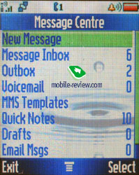
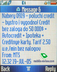
Messages. The default memory capacity for 100 SMS is provided; it may also vary depending on the software version. As a rule, operator versions are limited by 40 messages. The device works with EMS. Automatic cleaning of the whole message list should be mentioned as an extra possibility; there is a list of templates. Delivery report may be on permanently or switched on/off for a message.


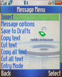
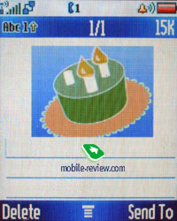
Working with MMS doesn't bring any inconvenience; everything is simple and easily understandable. The messages can be attached with pictures made by the built-in camera, sound files. The ten predefined templates are really great, be sure to check them out.

The phone has POP3/IMAP4 e-mail client, it allows watching the headers of the incoming mail and download their body as well. Only graphical files that do not exceed a certain size limit can be sent. In case you want to store some of the e-mails, you will have to use the dynamically spread memory, just like in case with MMS.
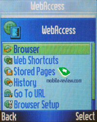
WAP. The phone has WAP-browser v2.0 and its possibilities are standard so nothing special can be said. GPRS (class 10) is present, the settings are rather simple, just follow your operator's instructions.

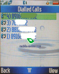
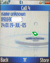
Call log. The phone has a list of received calls; it includes the missed ones as well, they may be distinguished by the absent tip. You can also see the list of the 10 last dialed numbers; you can access it by pressing the Call button. Everything is rather simple and traditional, nothing special at all. Each entry features the date and time as well as the duration.


Also this menu shows battery life, last calls, call duration and data connections.
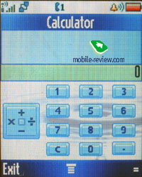
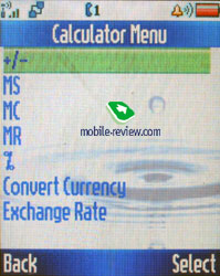
Office applications. This menu features a whole bunch of office applications such as the Calculator. It's convenient, the full digital keyboard is present on the screen, it reproduces the real keyboard perfectly. The menu features memory options and the unit converter.


Shortcuts are located in the same menu. You can create shortcuts not only for various menu sections, but for a definite wap-site as well.
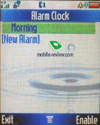
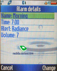
Alarm clock. You can create several alarm clocks and choose a custom ring tone, name and volume, type of reoccurrence (daily, single time) for each of them. This phone was designed for continuous, that's why entering names and titles for the alarm clocks is required. Alarm clocks are activated in one touch, and a note really eases work with them.


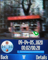
Dictaphone. You can create records from the stand by mode as well as during the talk. Dictaphone can record the whole dialogue. The maximum length for each entry - 60 seconds, however your interlocutor will hear the sounds (at first it's zoommer, followed by short beeps with a continuous interval). There is no possibility to keep more comments despite the dynamical memory present, only several records up to 60 seconds in duration (earlier the limit formed 120 seconds). The dictaphone is weak especially against a background of the rivals recording up to an hour of talks. In the listening mode a percent of the total time but not a reproduced time is shown, the discontinuity forms 5. That looks hardly comfortable since we all are used to representing record time and that seems logical.
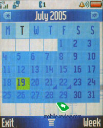
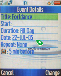
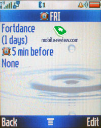
Organizer. You can view it monthly or weekly with breakdown for hours. You will see your appointments bind to a certain time of the day, it's convenient. Each entry can be assigned with a name, start time, length (measured in hours, the minimal amount of time - 30 minutes). Warning can be set in advance. Each entry can be reoccurred, this is a big plus.


SyncML support is present, it's made for corporative users who are in great need of synchronization with data server (something similar to remote synchronization with Desktop PC, but this time the server must be located in the network).
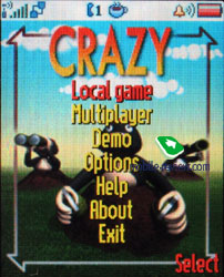
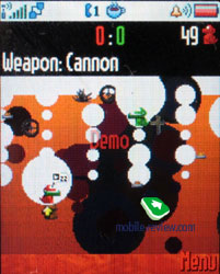
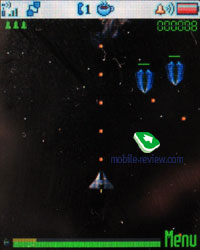
Games and applications. The phone supports Java MIDP 2.0, all applications that are located in this menu item are based on this technology. The number of games and their title depends on where the phone was bought. The most often to find are Rebels (a space shooter) and Crazy (plain Worms, not very interesting).


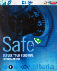
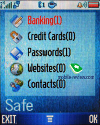
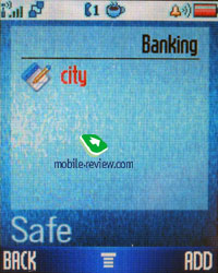
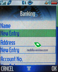
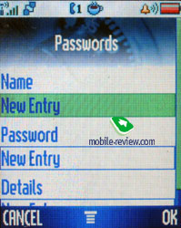
Applications now allow using the Safe program - once you set a password, and then can store confidential data about you bank account, passwords, addresses and so on. It resembles the ones in Sony Ericsson, Nokia, Siemens.


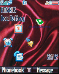
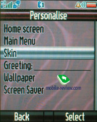
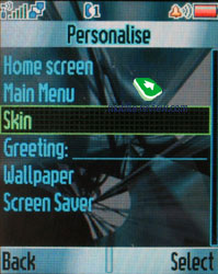
Multimedia. The phone supports themes. It's a set of wallpapers, color schemes for the menu, sounds and ring tone types. You can change the outlook of your phone almost instantly and this is really fun. New themes can be downloaded from Motorola's website.
The themes haven't changed; there are three of them - a standard, Techno, Scarlet. They not only change a colour menu representation but interface windows, the whole interface of the phone changes.


MotoMixer - original sound file editor that allows mixing the tracks. You can play with it from time to time; the results may come out rather unexpected and nice. However as the practice shows, these sound editors are nothing more than a toy for most of the users, only few of them take this tool seriously.
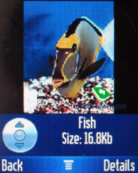
Sounds - information about all sound files located in the phone's memory is stored here. You can check out their size, info and even listen to them. The players is similar to other Motorola's phones, everything is clear and easy to understand.
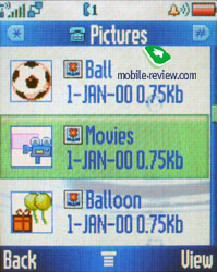
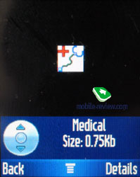
Pictures - list of all images located in the phone's memory. There's a special icon near the file name. Each picture can be set as the wallpaper or screensaver. Pictures can be sorted in categories; this will make the browsing easier. A special editor is present as well, it allows putting frames, changing color scheme and using special effects. The most convenient part is that after mocking the picture it can be stored with a new name. This means that both the original and the new picture will be available for use. This may come handy in case if you want to edit the photo, and not to ruin the original.


Settings. Here you can setup all Display settings including the color schemes.
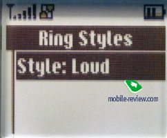
Ring tone type and notification mode (mixed mode, when the vibrating alert works at the same time with the ring tone is present) is here as well.
Network settings and security ones won't be highlighted, everything is plain and clear there.
Bluetooth settings are former, the device is seen only for 60 seconds, which is not enough sometimes.
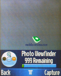
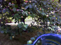
Camera. The device is equipped with a VGA-camera, which is a typical solution well known by all the triplets, no flash as well as any peculiarities. The camera is quite enough to take photos of people and use the photos in the phone book.

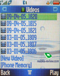
The camera allows not only taking photos but also recording video (3GP). The record may be called from the multimedia menu and then video. The duration of a record may be limited for a MMS or maximum (about 30 seconds). Two resolutions are supported 128x96 pixels and 176x144 pixels. Voice recording may be turned off. The quality of the video is average and the artifacts are seen on the screen. That was hard to expect the device will show any eminent features in recording video and it is typical and doesn't differ from other models. The time that saving the video takes almost equals that necessary for recording and that is a disadvantage.


Video sample 1
Video sample 2
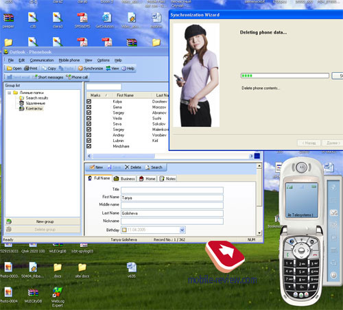
Synchronization with PC. A complete version of Mobile Phone Tools version 3 is included into the package. The program possibilities cover the needs of the majority of users; they include synchronization with MS Outlook, making reserve copies on the PC, copying photos, melodies, writing messages on the PC.

Impressions
The model has no problems with the connection quality being a typical modern device. Musical component is on the triplet's level, mp3 reproduction is present and limitations are not as strict. Signal volume is higher than average, Midi-files are played in the 24-tones polyphony that sound well also. The vibra is average or a bit more powerful. The loudspeaker volume is enough during a conversation almost always.


The handset mainly copies Motorola
v635, and the presence of the memory card really widens the functionality of the model, makes it interesting in its segment. There are little models equipped with memory cards in this form-factor, such phones will widely appear on the market in the middle of the autumn.
At the very beginning the company announced EDGE for Motorola v360, but probably the technology won't appear till the New Year. The explanation is the lack of corresponding chipsets, which are first taken for the elder models. Actually, no renewal will be provided, just plainly EDGE support will appear with no number change.
The device is to appear in the middle of September for 180-200 USD. That is a good balanced handset for this sum. A great advantage is a delivery kit, which finally includes fully-functional Mobile Phone Tools. The presence of miniUSB is also a good trifle which relieves from using Bluetooth connection.
The company plans to replace Motorola v360 with Motorola v220. As for me, the new model looks much more powerful and can become one of the most interesting offer in its segment. There are no actual problems with the platform worked out at many other devices, the phone is stable.
Eldar Murtazin (eldar@mobile-review.com)
Translated by Maria Mitina (maria.mitina@mobile-review.com)
Published — 11 August 2005
Have something to add?! Write us... eldar@mobile-review.com
|
