|
|
Review Maxon MX-7931

Maxon MX-7931, live pictures
Standard kit:
- Phone
- User's guide
- Charger
- Portable headset
In this life phones are divided on two big categories, some are made in the attempt to ideal, and the others are created by idealists. I'll explain, that the attempt to ideal is ineradicable, but constantly face with the lack of money, time, debugging, any other troubles, for example, the leading engineer goes on training and forgets the phone at home. Anything terrible doesn't occur in this case, are released the devices which satisfy the requirements of many users, they find their audience. It's quite another matte when a phone is created by the convinced idealists, even the rigid production cycle is not capable to stop them or to adopt the experience of other companies, and they follow the original way. Certainly, some times are released products, can be named revolutionary, but more often it is just the things rejected by the users. Fortunately or, unfortunately, phones from Maxon supplied to our market, are created by idealists, we'll try to understand, why it is so.
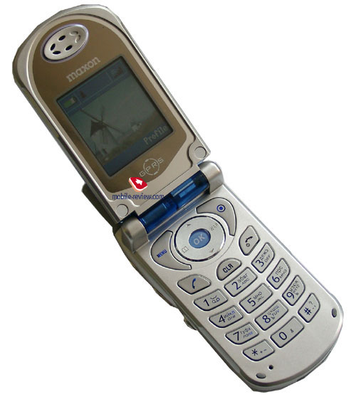
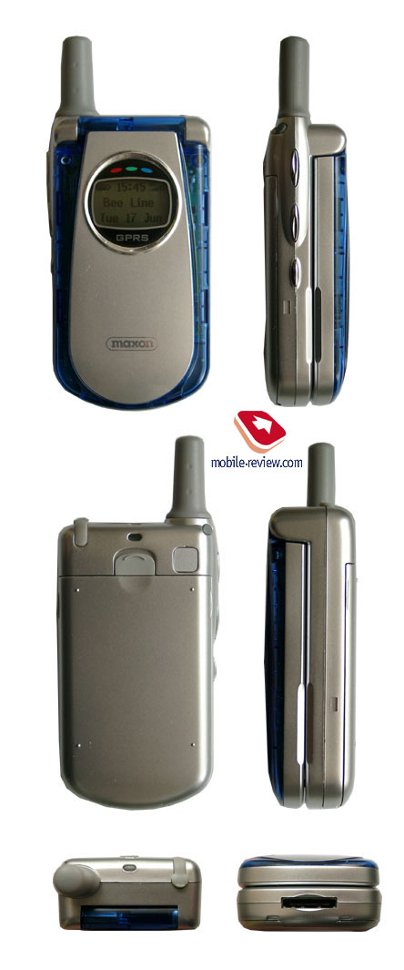
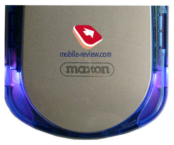
Maxon MX-7931 is a clamshell phone, at the first sight you will notice the basic difference from similar models - plastic inserts on the face of the case. The inserts can be made of translucent plastic of various color, in our case they were blue. With such inserts the device becomes similar to a children's toy. The plastic on the right side is silver, it's glossy, the other part of the case is matte. The color scale discord does not arise until while the phone starts calling, then the bottom translucent inserts start blinking blue and red. If till this moment the device was similar to its competitors from other manufacturers, after such illumination is created the original impression. It's the first device on my memory, which appearance is spoilt by the illumination, the phone would be better looked without it.

There's system connector on the bottom end face, on the top end face you can see handsfree connector (it's included into the standard kit), right there is aperture for the strap. In this model the battery is simultaneously the back cover, it has is small horizontal backlash, it does not affect the useability of the phone, you should not pay attention to it. The battery is lithium-ionic in capacity of 600 mAh. According to the manufacturer the device can operate up to 200 hours in standby mode and up to 3 hours in talk mode. In real conditions of Moscow MTS network the device worked about two days (20 minutes of talking, 10 of other functions using). The maximum achievable operating time of the device is about 3 days, thus it's advisable to limit the dialogue with it by maximum. The time of the full charge is about 1.5 hours.

There are 3 keys on the left lateral surface, two of them serve for the volume adjustment, the bottom one for fast enabling/disabling of vibration alert. Here shows the first demonstration of the engineers' idealism, having enabled vibration alert, you will see the phone blinking and vibrating. The disabling of the silent mode is accompanied by sound signal, but only if it's selected Normal profile, when is selected Silent profile there's no indication, including LED blinking. As grown wise with experience user I looked at the external screen. But I've been disappointed, there's no current mode indicator on the screen, it can be found only on the internal screen. So it's meant, that you have to open the phone to control the operation, it relates with two superfluous operations, there’s no logic in such decision.

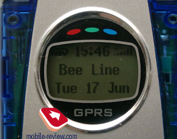
The external screen is rather small, it can display up to 2 text lines, 10 symbols each, plus service line. The LED backlight (green-yellow color) is poor, but in darkness it's enough for the screen, all the necessary information is visible. The font's size on the external screen is small, it's necessary to bring the phone to you.

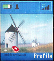
Let's open the phone, inside we'll see the screen surrounded by a mirror insert. According to the manufacturer the screen displays up to 65K colors, it's true. But you should remember, that in the device is installed not the best STN-matrix, by color rendering it's similar to old models from Samsung, LG. Subjectively the screen is similar to Samsung T100, the first clamshell phone with color matrix.

The screen can display up to 7 text lines and one service line. The size of the font is average, it's easily readable. On the screen fades on the sunlight, it's very difficult to information on it, it is necessary change view angle. When working backlight of the internal screen, the external screen is also backlighted, it is excessive and unnecessary expenditure of energy.
The keyboard is made of plastic, the numerical keys are average by size, they are sunk in the case and have small motion. It's rather difficult pressing them, when typing SMS-messages the fingers get tired quickly. The backlight of the keyboard is of dark blue color, the right line of keys is backlighted better than the left. Because of the small font size the text labels are visible hardly in conditions of average light or on the sun. The keyboard should be named inconvenient.
The sizes of the phone are 80х49х22 mm, the weight is 85 grammes. It allows carrying the device practically as you wish.
Menu
The dialogue with the menu of Maxon's phones causes a storm of various emotions. To become familiar with these devices is recommended to those, who had never used phones in general, or has the raised assiduity, and has got used to read user's guide from cover to cover. Just so the developers have imagined the potential consumers, just this thing speaks about their idealism, is it?!
 
To get in the main menu, it is necessary to press the left key under the screen. The main menu is realized by animated icons, the selected item is shown in the center with corresponding inscription. To move through the menu it is possible with the help of navigation key, to enter the menu you should press OK key. There's no fast navigation through the menu. All submenus are realized as lists, all is habitual. To exit the upper level you should pressing the right soft key, pressing of Release key or C won't result in anything. Now try to remember, how does realize the exit to the upper level in your device? The right soft key serves as duplicating, if at all it has similar function.
In standby mode the right soft key is used for fast profile change, it's interesting decision. But if to glance over the use of two keys it becomes clear, that the organization of their interaction in phones from other manufacturers is much better, but not so original.
How can you look through the call log? Intuitively clear answer is unique - pressing call send key. But developers from Maxon think differently, for them, it's more natural pressing navigating key down.
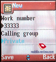
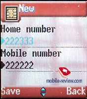
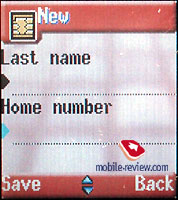
Phonebook. The phonebook is called by moving the navigation key to the left. You can store up to 250 entries in the memory, and for each name it is possible enter such information as Name, Surname, three phone numbers, postal address, postal code, city, and group. Input is possible both in English, and in Russian languages, the device supports predictive text input. And here we face with the most simple and obvious realization of input. Having highlighted the item necessary to you, for example, Surname field you cannot begin input at once, you need to confirm the action. And the same happens with each field, the functional rich of phonebook turns into mockery. In the numbers list there is search by letter, the simultaneous displaying of numbers fro Sim-card and from phone is impossible, you should switch between such types of displaying.


Messages, in general, are traditional, there are templates, you can edit them. But the height of comfort is that the written message for sending needs several actions. So you press ОК key, then you see your message, it's the preview. The following pressing on ОК calls number input, once again having confirmed the input, you will see the further menu. You will ask, whether you want to send the message, you should press the left key to send the message at last. It is not clear for whom has been developed such "convenience". The phone supports EMS.
 

Mobile Internet. Here is the wap-browser of version 1.2.1, it can be adjusted for work with GPRS.
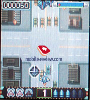
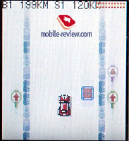
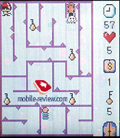
MaxFun. In this menu you can find three games, all games have the common volume control, enabling/disabling of vibration alert which accompanies games. The games are X-Ship, PushMan, Crazy Race. In the last game you drive a car, typical races. In the first game you have to bomb the fortifications of the opponent from the plane, nothing especial. In PushMan you have to run in labyrinth and dodge different creatures.
 

Settings. Here you can adjust date and time, choose menu language, all adjustments are standard.
MyPhone. In this menu are concentrated all opportunities for personification of the device, volume adjustment, melodies, various screen savers.
 
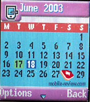
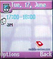
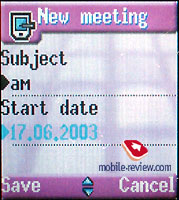
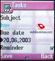
Organizer. The calendar allows seeing the current month, there is an opportunity of displaying events for current day. The phone has separated to do list.
 
 
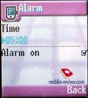
Alarm clock is single. There is also a calculator.
 
Impressions
Having spent some time on the phone, it began to seem me, that I have accustomed with its menu structure, I have understood some logic, but life had prepared surprises. The first surprise became the second call which I have received during talking. There were no text labels for soft keys on the screen, and to read about this in user's guide I have not guessed. By practical experience it was found out that it is possible to accept the second, having pressed send call key.
The second moment which has discouraged me, are popup windows with comments of actions. For example, after a call appears a window in which you can see its duration. You can't remove such windows, they are visible some seconds, you can press any keys you want, it is useless. So, having talked quickly you can't dial one more number, you have to wait for the disappearance of the call resume.
As it has became already clear, the ergonomics of the device doesn't stand up to criticism, but let's examine hardware. During talking the speaker gives out very big loudness, it's better to lower it by 50 percent. The speaker in this device is one of the most powerful, that I've heard. As side effects of high capacity of the speaker are extraneous noise, rattles, they do not irritate strongly, but present.
The loudness of 16-instrumental polyphonic ring tones is also high, it is audible well in the street and in rather noisy rooms. The melodies sound unusually, but you can’t tell, that they are unpleasant, more likely, the arrangement of well known melodies is unusual. The vibration alert is average.
The sensitivity is rather subjective characteristic and it is possible to estimate it. In my opinion, in this device all is good if you have the right SIM-card. This model has patrimonial illness of phones from Maxon, they don't work with some SIM-cards (BeeLine in my case). The defect shows simply, after the registration in network, passes 5 minutes, and then the device turns to emergency calls mode. This clinch can be solved only by switching it off and them on. Some users had similar effects with cards SIM card from MegaFon.
The opportunity of batch data transmission plays a role at wap-browsing, in other cases this function excessive, because it's difficult to find the cable for this device, and it has no IrDa
Now the price of this middle segment model is 260-270 dollars. There are many interesting models in the market for this money, Maxon MX-7931 not stands up to competition with them. Reasoning from the set of characteristics, their realization, the cost of this device cannot exceed 110-120 dollars. It is simple to count, as far as manufacturers and sellers have overestimated this model. Unfortunately, it was created by the idealists who have been torn off real life. It is very insulting, because the last models from Maxon, shown on CeBIT, look interestingly. In this case the company once again tries to realize old models in the growing Russian market, trying to take the advantage of ignorance of potential buyers. The verdict is simple and obvious, to buy the given model is impossible on no account, it is just the waste of money. But the choice is up to you.
Examples of ringing tones Варианты звонка (mp3, 285 Kb)
Eldar Murtazin ([email protected])
Translated by Andreas Von Horn ([email protected])
Published — 23 June 2003
Have something to add?! Write us... [email protected]
|
News:
[ 31-07 16:21 ]Sir Jony Ive: Apple Isn't In It For The Money
[ 31-07 13:34 ]Video: Nokia Designer Interviews
[ 31-07 13:10 ]RIM To Layoff 3,000 More Employees
[ 30-07 20:59 ]Video: iPhone 5 Housing Shown Off
[ 30-07 19:12 ]Android Fortunes Decline In U.S.
[ 25-07 16:18 ]Why Apple Is Suing Samsung?
[ 25-07 15:53 ]A Few Choice Quotes About Apple ... By Samsung
[ 23-07 20:25 ]Russian iOS Hacker Calls It A Day
[ 23-07 17:40 ]Video: It's Still Not Out, But Galaxy Note 10.1 Gets An Ad
[ 19-07 19:10 ]Another Loss For Nokia: $1 Billion Down In Q2
[ 19-07 17:22 ]British Judge Orders Apple To Run Ads Saying Samsung Did Not Copy Them
[ 19-07 16:57 ]iPhone 5 To Feature Nano-SIM Cards
[ 18-07 14:20 ]What The iPad Could Have Looked Like ...
[ 18-07 13:25 ]App Store Hack Is Still Going Strong Despite Apple's Best Efforts
[ 13-07 12:34 ]Infographic: The (Hypothetical) Sale Of RIM
[ 13-07 11:10 ]Video: iPhone Hacker Makes In-App Purchases Free
[ 12-07 19:50 ]iPhone 5 Images Leak Again
[ 12-07 17:51 ]Android Takes 50%+ Of U.S. And Europe
[ 11-07 16:02 ]Apple Involved In 60% Of Patent Suits
[ 11-07 13:14 ]Video: Kindle Fire Gets A Jelly Bean
Subscribe
|
