Review of UMTS-communicator Samsung i780
Part one – design, size, controls
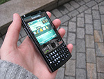
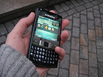
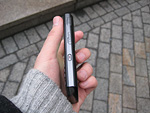
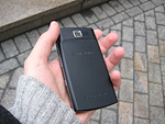
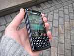
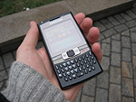
Live photos of Samsung i780
Table of contents:
- Positioning
- Design, size
- Controls
- Touchpad and
- Keyboard
- Display
- Battery life
- Roundup
Sales package (expected):
- Communicator
- Data cable
- Charger
- Wired stereo-headset
- Software CD
- User Guide
Positioning
So happens that the Samsung i780 is synonymous with the BlackJack II codename. More precisely, that was how the things stood until recently. And before moving on to our routine, we will need to take a closer look at this phone’s positioning and background.
It is impossible to doubt that the Samsung i780 has adopted a lot of design cues from the i600 (also known as the i607 stateside) – slim profile, thumbboard and even dimensions. That's why it is by no means surprising that many dubbed the i780 upon its debut as the successor to the Samsung i600, retailing as the BlackJack in the US and the Ultra Messaging in Europe. Curiously, while this guess was never commented by Samsung’s representatives, the web was buzzing with rumors of this kind, which kept getting approved and refuted by different individuals. So, until recently many had been very positive that the Samsung i780 was coming in as the BlackJack II.
Things got clear only a couple of months ago, when Samsung officially rolled out the next device in the line-up of Windows Mobile powered smartphones. Long story short, the family of thumbboard-enabled smartphones will get the Samsung i617 (European name), which is the phone that will retail as the next iteration of the i600, or, as you have already guessed, the BlackJack II.
Despite its physical resemblance to the smartphone range, the Samsung i780 is a pretty bog-standard WM-based communicator. While this model launches the line-up of QWERTY-equipped candybars with communicator functionality, it is still unclear whether it will grow beyond this single or not. The i780 is interesting not only for giving a birth to a new family, but also for being Samsung’s top-of-the-line communicator spec-wise, although, truth be told, there is not much to compare it with as far as Samsung-branded Window Mobile powered solutions are concerned – the Samsung i710 is a lower-class model.
The company positions this handset as a slender business-minded communicator for texting and messaging, but the same applies to pretty much any QWERTY-enabled device. We will definitely get back to the Samsung i780's positioning towards the end of the review, and for now let's look what technological talents it packs and what the Marvell PXA3xx platform brings for all new communicators.

Back to the table of contents >>>
Design, size
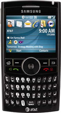
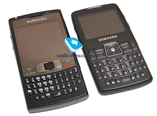
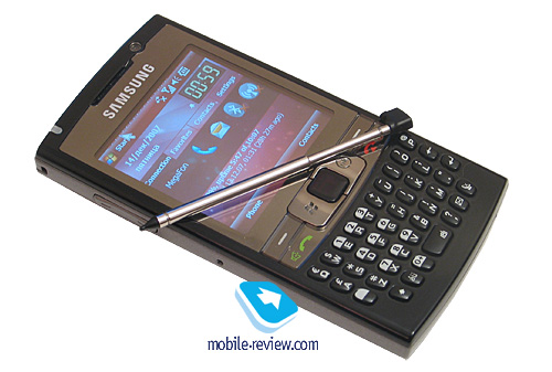
The i780 surely has some style – all thanks to the materials used and its overall dimensions, skinny profile. One of the newsworthy facts is that all photos picturing the device, especially those first shots leaked onto the Web, somewhat spoil its visual appearance - it looks much better up close. It is one of those cases when you need to have a hands-on session with the phone to really appreciate the i780’s design.
There is a couple of interesting touches to this device as well - the part of the front front fascia framing the display is chromed, and the display itself resides under a protective cover, occupying the entire top half of the i780's face. Thus, the screen here is not recessed into the casing and there are no edges and border you keep running into with other touch-sensitive displays. The first company to employ this design was HTC with its Touch, which then went on to develop it with the Touch Dual and the Touch Cruise.
And the i780 is Samsung’s first go at this display design, even though the very concept of finger-based device management was already exercised in the Samsung i710 – the i780 only finalizes it.

There are several types of plastic utilized in the communicator's casing - the face enjoys glossy black plastic that looks stellar and enhances the i780's visual appeal. More importantly, here, it won't give you the usual pack of needles and problems typical of this plastic type, as it is smudge- and scratch-resistant. The reason doesn't take a rocket scientist to figure out - this kind of plastic occupies only a tiny area on the face and you will barely touch it during your quality time with the i780.

All spines and edges are made of dark-grey plastic with silver finish. Over a week and a half of use, the i780 stayed in its pristine condition, since we found no scuffs or other types of damage on it. But still, we will reserve our final judgment on how well it will hold up to abuse - its spine finish may well start peeling off over time.


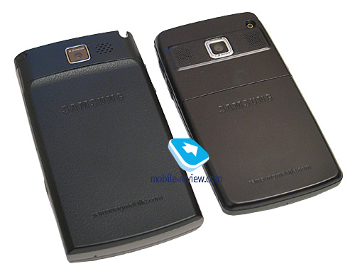
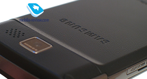
The rear makes use of textured leather-esque plastic - pretty much the same as that found on the Mio A702, even though the latter's surface is somewhat rougher. Another thing of note is that this coating will be applied on most Samsung's new offerings. The reason why this plastic has been chosen is in its usability merits – it doesn’t get all dirty and muddy right after you take it in your hands and isn't exposed to wear and tear. On the Samsung i780, the underside is color-keyed to the face. Owing to the rear's texture, the communicator delivers a great tactile feel and doesn't pick up fingerprints or grease from your hands.

Thanks to its well-picked set of materials, the casing has a lot of style going for it, and yet maintains the required level of comfort, which is not the thing you see on every corner these days. Of all parts of the casing, the most fingerprints-prone is the display, another insignificant letdown is that the chink between the display rim and the surface will always attract some dust, but that’s about it.
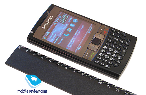
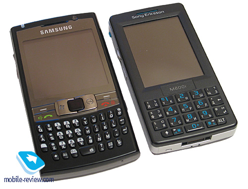
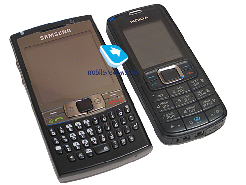
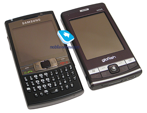
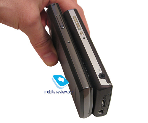
Now as for the i780’s dimensions. Keeping Samsung’s previous solutions in mind, we could well expect its latest and greatest to be fairly pocket-friendly in spite of being a mobile powerhouse. And the reality doesn’t disappoint us in this sense – the i780 is a quite pocketable device for a communicator, and its breadth is due to its thumbboard, rather than the platform’s traits or antenna’s placement.
Let’s see how it compares to some other QWERTY smartphones and communicators:
Samsung i780 – 116x62x15 mm, 120 g
Samsung i600 (BlackJack) – 113x59x13 mm, 105 g
HTC S620 (Excalibur) – 111x62x13 mm, 130 g
Nokia E61i – 117x70x14 mm, 150 g
Palm Treo 750 – 111x58x22 mm, 154 g


The i780 is in line with other smartphones and communicators size-wise, although being a fraction longer. And thanks to its thin profile, it doesn't feel big. It readily slips into just about any pocket or purse, except for breast pockets, where it may seem out of place due to being a tad too wide or heavy.
The handset’s build quality was never an issue, although it would have been strange to see something poorly assembled from Samsung. All parts sit very tight, no creaks, gaps between details, buttons or any other controls. The battery compartment cover is also pretty solid and can hardly be loosened, unless you are doing this on purpose, of course.
Back to the table of contents >>>
Controls
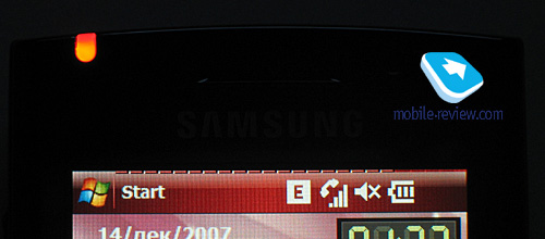
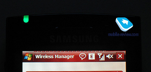
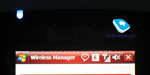
Sitting right atop of the display is the earpiece, recessed into the casing and hidden under a fine metal grill. On the left of the speaker is a LED indicator that starts blinking in blue when you enabled Bluetooth or Wi-Fi, and glows in green while in the default GSM/UMTS mode. All missed events make it go red, and on top of all that, this LED is also used for low battery, charging and PC connection notifications. Also flanking the earpiece is the VGA camera for video conferencing or occasional snaps.


The upper end houses the stylus silo, whose location will feel unusual at first, if you have some previous experience with other communicators, where styluses are mounted on the right side. But rest assured – you will get used to it eventually, and it won't seem any worse ergonomics-wise.


The stylus’s end has a discernible ledge which makes pulling it out of its nest so much easier by just hooking it with your nails. More importantly it won't slip out of the silo on its own.

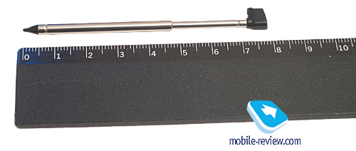
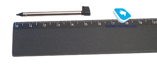
The stylus is telescopic, it is quite average size-wise when in the open position and rather short when retracted. PDA owners will have to spend some time getting used to it – it may seem a little too small to them, and others will fill right at home with it.


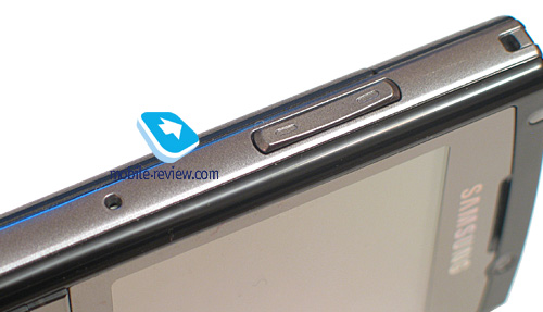
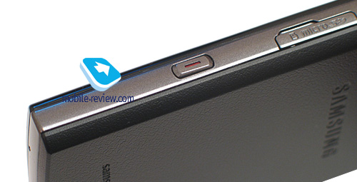
Next to the stylus silo is the lanyard eyelet, which is not the best place for it to be, but you probably won't have any problems with wearing the i780 around your neck. Sitting on the right side of the top edge is the power button (hold down) doubling as the display disabler (short press).

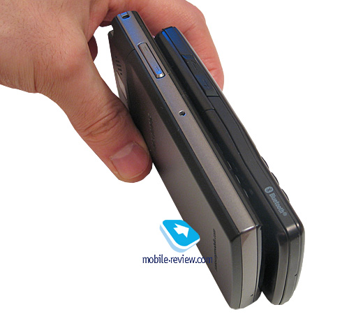
The volume rocker is mounted on the left-hand flank. It slightly protrudes from the casing, and very easy to locate by touch. A tad below this button is a sunken soft reset key.

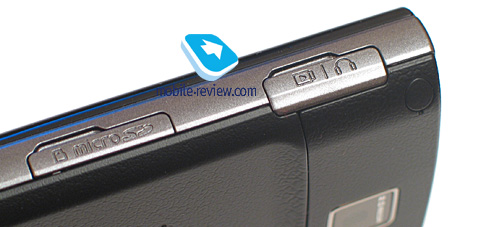
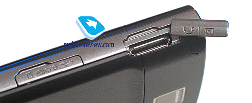
Flipping over to the right spine, you will find the proprietary slim charger/data cable/headset slot. The socket is covered with a flap linked up to the casing – this design was already employed in the Samsung i600, where it cracked into pieces fairly easily when the user was heavy on the bundled headset. So you should keep this mind and be careful when opening this socket to connect a cable or a headset.


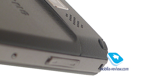
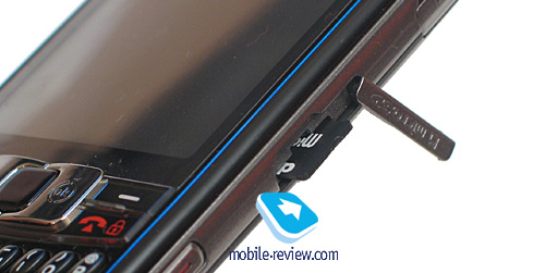
Below the proprietary socket is the microSD memory expansion slot, also hidden underneath a flap. Our unit didn’t support the SD 2.0 or microSDHC standards, although there is a chance that commercial units will retain these two. Positioned more towards the lower end of the handset is a blank programmable button, which can be customized so as to launch two applications - on long- and short-press respectively. By default there are the camera app (tap and hold) and the mini-player (click).


The bottom end houses no keys or jacks other than the microphone slot.
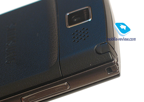
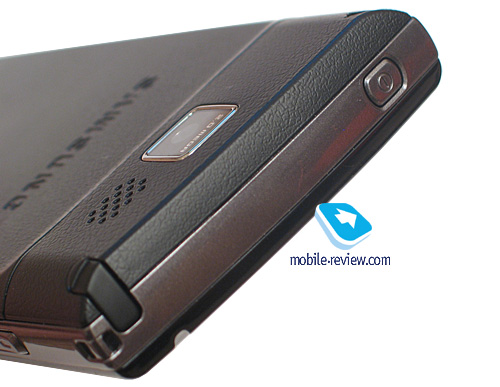
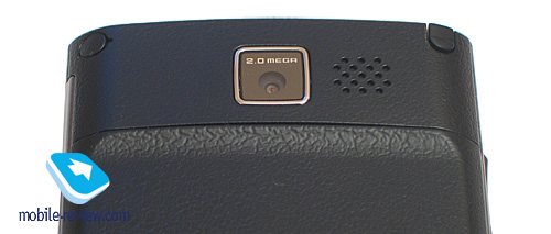
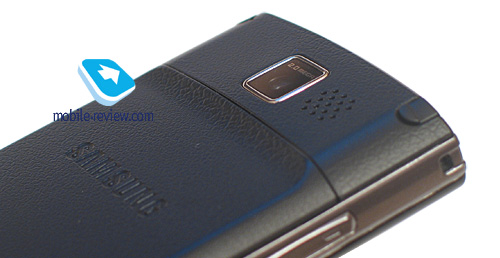
Let’s take a look at the i780’s rear – the battery compartment cover occupies most of its real estate. Topping the lid is the lens of a 2 Mpix camera hidden under a protective plastic layer, but since it sticks out of the otherwise flat surface, it will accumulate scratches and grease that, obviously, are to be removed before you start shooting. To the right of the camera is the loudspeaker grill.


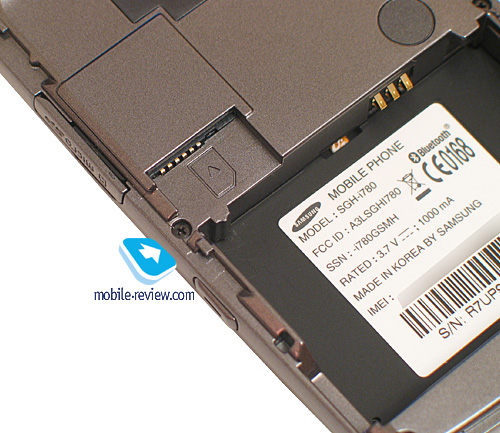
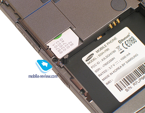
The SIM-card bed is mounted a tad above the battery slot. To remove the SIM card from its nest just pull it towards yourself.


Back to the table of contents >>>
Touchpad and
The Samsung i780 is probably the most flexible Windows Mobile device around, as far as controls are concerned. Usability-wise, it is unmatched even among feature phones or Symbian-powered smartphones of all kinds and editions.
The first way to move around your i780 is pretty much conventional and will seem familiar to everyone who has used WM-based communicators before - it is the stylus, which does the main job, and all other interactions are done with the hardware buttons. This is by far the oldest and the most reliable device control system, yet not without a pack of drawbacks, among which are your inability to manage the phone while walking or running and pretty much lofty display requirements for convenient navigation.
Another way to go is what Samsung has never used with its Windows Mobile solutions before - finger-based interface. Even though this feature is not the centerpiece of the device, the i780 in fact allows you to move about by using your fingers alone. And it is not only about the display mounted flush with the rest of the casing, its sensitivity also contributes much. Just like in the HTC Touch, it handles all presses in a rougher fashion than most communicators, but this is what makes for more precise finger taps.

The last two options available are even more interesting, for they are so rare, and only very few solutions sport them. To be more precise, they have much to do with the i780's touchpad, so familiar to many of you from notebooks. That’s the right moment to look back at the HP hx4700, which was a PDA also armed with a touch-sensitive pad, or the latest and greatest HTC Shift.
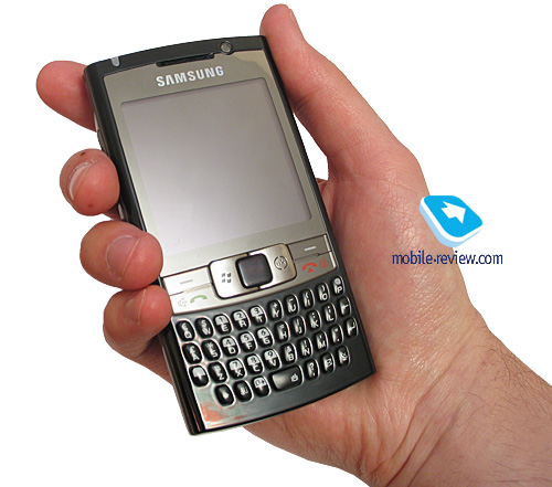
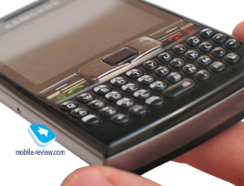
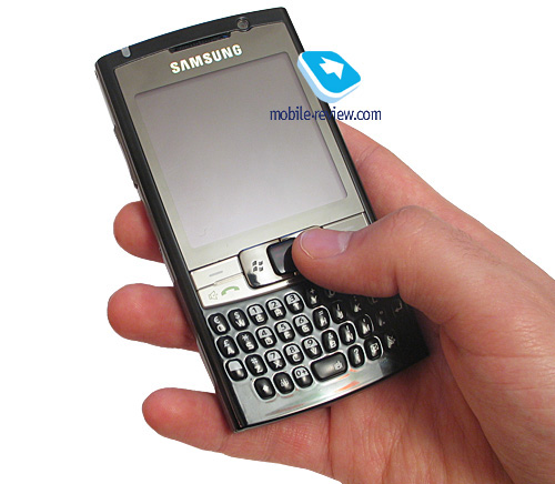
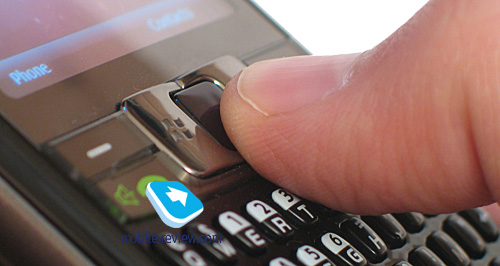
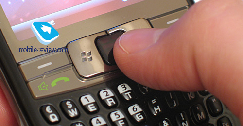
The Samsung i780's touchpad is a smallish square inside the navigation cluster. In fact, the entire device management system is centered around this pad, which measures a miniscule 8x8mm. Even in the HP hx4700 this element was much larger. Nevertheless, its very diminutive dimensions are well made up for with various software enhancements and a couple of modes for this control.

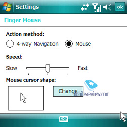
Now for the abovementioned two options available with the touchpad. The first, and the most conventional one at that, allows you to slide your finger around the touchpad and this move the pointer on the communicator's screen. In order to go the whole way across the display you will need to sweep your fingerpad across the touchpad around two times. On top of that, you can setup the pointer’s speed, so as to adjust the pad’s sensitivity to suit your taste.


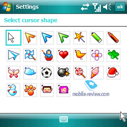
Also you can pick one of a multitude of pointer, even though many of them are a little bit too toyish.
The advantages of this control include the ability to handle the device while walking, even though it won't be a breeze. But more importantly, with the touchpad onboard, you can manage the i780 single-handedly. Among the negatives is that people with big fingers won't find it particularly convenient to move their fingerpads around the touchpad. Another letdown is the time you will need to spend on mastering it - no matter what a seasoned laptop touchpad veteran you are, you will need to get accustomed to the i780's control all over again.
Another scenario implies that the touchpad acts as a four-way navigation button. This scheme can be applied in the pointer settings, right where you pick pointer designs. And in this case, the whole controls system shapechanges dramatically – instead of moving your finger around, all you will need to do is slide fingers in the direction you need to move. In other words, sweeping your fingers across vertically will allow you to navigate the menu up and down.
Now, this is an easier control scheme to master, although, it is by no means close to a conventional navigation pad. The best way to employ this option, in our opinion, is when you are on the move or can't really use the stylus and don't think that handling the i780 with fingers will be a good idea. Whichever scenario you pick, pressing the touchpad does the same thing as any standard OK key.
The touchpad reacts to any kind of contact, and this trait has both positives and negatives to it. While it enables you to navigate your device in winter without taking the gloves off and still get precise responses from the i780, the sensor will also catch all other movements, be it a finger, a coin or any other object.

One thing you should keep in mind is that the touchpad can't replace a conventional navigation cluster - if you have only the experience of dealing with feature phones, then this touchpad will take a long time to master, or, you might never come to grips with this control. And while the Samsung i780’s touchpad is all good and masterable, there are still quite a lot of people not feeling good about this particular control. That's why this touchpad is more of a compromise between a classy touch and a convenient control for stylus-less device management. And looking back at the HTC P3300's navigation cluster, it seems that for most users quirky controls remain interesting regardless of what level of comfort they offer.
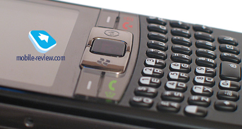
The touchpad is flanked by the pick up and hang up buttons, as well as the Start and OK keys. All of them are rather big and handy in use. It is a good thing that these keys sit right next to the touchpad, since it makes dealing with the i780 single-handedly so much easier - you don't need to move your finger off the touchpad, just shift it a few millimeters in any direction, push the button you want and that's about it.

Back to the table of contents >>>
Keyboard
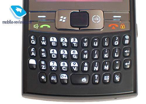
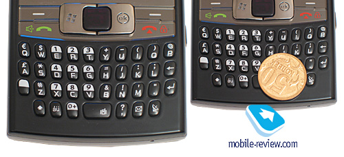
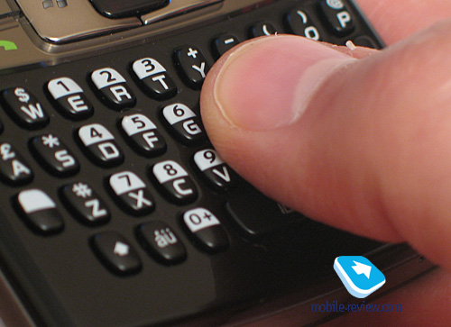
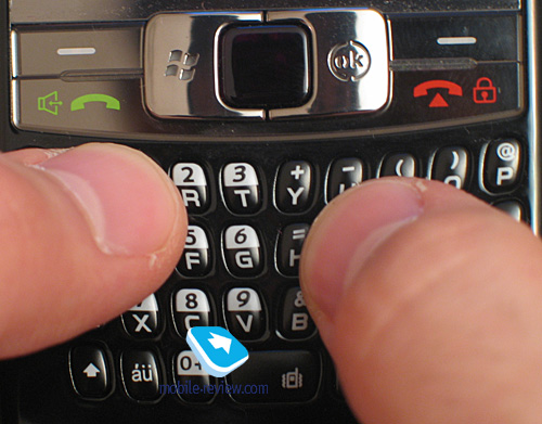
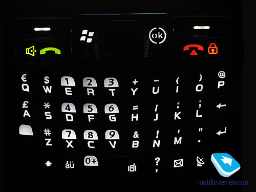
Not the least interesting, yet surely the more conventional control of the i780 is its thumbboard housed beneath the display and the navigation cluster. All in all it occupies around a third of the front fascia’s real estate. All buttons are a tad stretched-out, and that’s the reason why this thumbboard maintains a pretty convenient length. This QWERTY keyboard houses 37 keys, 3 rows 10 buttons in each, plus 7 extra keys at the bottom. All buttons, as well as rows, are well spaced-out with roughly 2 mm separating the. This keypad is convenient for texting in case you have relatively small fingers, otherwise, it will be a major pain.

You can type with either one or two hands, but again, in the latter case you will spend some time getting used to the i780. The keys go quite deep into the casing with each press to actually let you know that you have pressed the button, but at the same time they are reasonably stiff.

Let’s talk about the key caption, since there some quaint things about it, that have been carried over from the Samsung i600. Since all the keys are relatively narrow, they are marked vertically, meaning that all letters sit at the bottom, while all numbers – on the top. The original version of the device with the English alphabet engraved on the button is quite convenient - all symbols are laid out very well. But in localized version, naturally, there is another alphabet to be engraved, and that's the place where we run into a serious shortage of free space. This is simply no left-over space on the i780, and we have yet to see what way-out they will find for local editions of the communicator. The current version of the i780 offers very readable letters and symbols on the thumbboard.
All buttons are evenly lit in reasonably bright white, which is a cinch to work with.

With the help of the operating system’s default settings you can remap two buttons; on top of that, each one of them will have two things to do - for long and short presses respectively. To be more precise, these are: the button of the right-hand spine and the Messaging button. On top of that, there is a bunch of keys that act in a specific way on long-presses, yet can't be reprogrammed. The hang up button, when held down, locks the device, the space bar activates the vibro profile, while the OK brings up the task manager.
Back to the table of contents >>>
Display
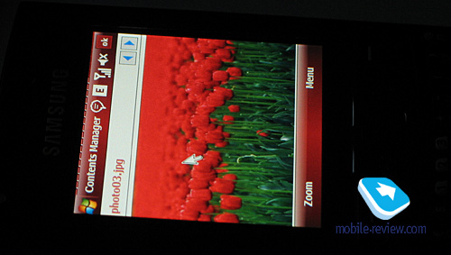
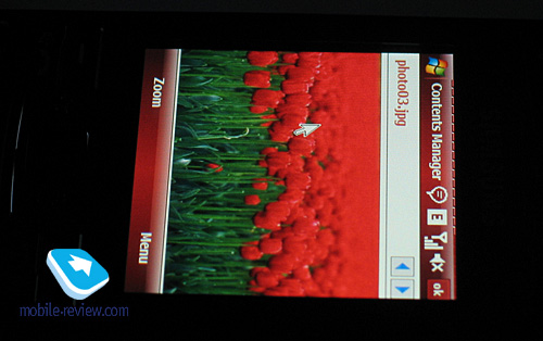
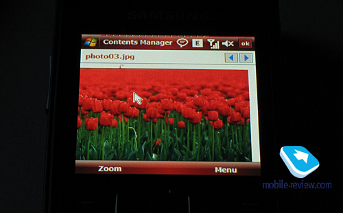
The display found in the Samsung i780 is another highlight of the device. The fact of the matter is that this is the first Windows Mobile 6 based solution to sport a 320x320-pixel screen. There is a couple of reasons why this resolution is somewhat unusual. Firstly, it makes a square display, which is not a common occasion on such devices, and secondly, all square-shaped displays before the i780 employed the resolution of 240x240 pixels. The 320x320 setup was added only in the sixth version of the OS - in many ways in order to support Palm, which tended to utilize square displays and happened to start rolling out WM-powered devices at the time of the WM 6's debut. However Palm itself never came up with a device boasting this particular resolution.
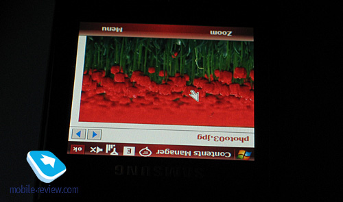
This TFT display measures 2,55” from corner to corner (46x46mm), sports a resolution of 320x320 pixels, and shows up to 262 K colors. This screen is quite different from what we are used to see from HTC-branded top-of-the-line solutions. In fact, Samsung can afford a top-notch matrix, so the i780’s display is notable not only for its decent color reproduction qualities, but also great viewing angles and being pretty much sun-resistant. And as far as the latter two aspects are concerned (viewing angles and the ability to handle sunlight), this display is easily the best we have seen on the Windows Mobile market.


The display’s brightness can be adjusted on a 1 to 5 scale, although the top level is way too bright - you will feel quite comfortable with 3 or 4 already. The lowest brightness settings will prove handy for reading, but they still could be softer.
The question that always bothers everyone’s minds is whether all applications are compatible with square-shaped displays. The Samsung i780 couldn’t avoid this issue either, nor did any other WM-based offering with a square screen. Nevertheless, all default applications and Samsung's proprietary software coming preinstalled with the device works flawlessly.
Most third-party applications have nothing against the i780's display setup either, however you will surely notice how stretched many logos and banners have become. But this isn't a crucial drawback, since minor visual defects don't really affect the way applications work.
However, things are not nearly as good in games. If it doesn't have a tweaked version for square displays, you won't be able to play it at all - the picture will get distorted, and touch-sensitive areas won't match what you will actually see on the display. Even provided that some game has been optimized for square displays, you might still experience certain problems with it (normally they are tuned to fit 240x240-pixel units). So the i780 doesn’t seem to be a great device for gaming after all.
Back to the table of contents >>>
Battery life
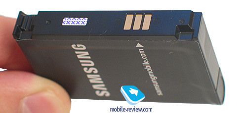
The communicator utilizes a detachable 1000 mAh Li-Ion battery. In Moscow it offered us around 2 days of operation with average use (up to 15 minutes of call a day, an hour of web surfing via GPRS, 30 minutes of WiFi), which is a pretty good result. If you are planning to listen to some tunes for 4-5 hours a day, the i780 will last only a day and a half.


We put the i780 through our standard battery test routine:
- Reading mode – the least power-hungry mode of all. Display backlighting level is set to the minimum that makes for comfortable reading, then we launch Haali Reader and activate auto-scrolling.
- MP3 mode – self-explanatory test. Display backlighting gets switched off (via standard tools or with the help of SPB Pocket Plus), volume level is set to the medium level, and then we link up the communicator with headphones and playback MP3-files with 128 Kbit/s bitrate via the default player.
- Maximum load – Display brightness is set to maximum, thereupon with start up Core Player and initiate playback of 320x240-pixel movies.

The i780 wasn’t a decent performer in the Video mode, however its figures in the Reading and MP3 modes were pretty much par for the course, being in one line with other communicators.
It takes the i780 around 2-2,5 hours to charge up.


Back to the table of contents >>>
Roundup
We will look how well the i780’s 2 Mpix camera fares in the second part of the review, as well as the platform’s specs and software. The handset’s hardware department is interesting for combining the Qualcomm platform and a latest-gen CPU - the Marvell PXA3xx. Also we will be covering the operating system’s abilities, bundled GPS and other bits and pieces.
Our first impressions from hands-on with the i780 are very positive - the communicator is palm-friendly, offering both QWERTY-powered input and the convenience of single-handed handling. Its design won't leave you indifferent, being in keeping with Samsung's finest traditions - top-notch materials and very sturdy feel.
However even with all these positives, it is already clear that the i780 won't be all the range in Russia, no matter what price/quality ratio it will offer. Why? Find out in the next installment.
Stay tuned!
Related links:
Specifications:
- Type: Windows Mobile-communicator
- Form-factor: QWERTY-enabled candybar
- Rivals: no direct rivals
- Position in the line-up: first of a kind
- Materials used: plastic
- Operating system: Windows Mobile 6 Professional
- CPU: Marvell PXA3xx (416-624 MHz)
- RAM: 128 Mb (78 Mb for applications)
- ROM: 256 Mb (150 Mb available to user)
- Connectivity: microSD, Bluetooth 2.0+EDR (A2DP), Wi-Fi (IEEE802.11b/g/e), proprietary socket for charging/PC sync/headset
- GSM: 900/1800/1900, EDGE/GPRS; WCDMA 2100/HSDPA
- Display: 2.55”, 320x320-pixel resolution, 65K colors
- Camera: 2 Mpix, 320x240-pixel video recording
- Extras: GPS, touchpad, display tweaked for finger-based navigation
- Battery: detachable Li-Ion
- Dimensions: 116x62x15 mm
- Weight: 120 g
Back to the table of contents >>>
Artem Lutfullin (artem.lutfullin@mobile-review.com)
Translated by Oleg Kononosov (oleg.kononosov@mobile-review.com)
Published — 25 December 2007
Have something to add?! Write us... eldar@mobile-review.com
|
