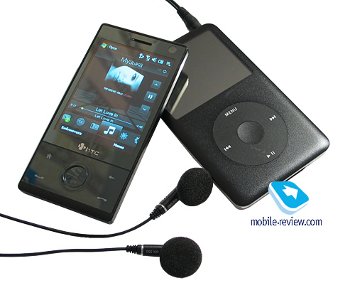
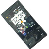
HTC Touch Diamond
Part two – TouchFLO 3D and software
Table of contents:
- TouchFLO 3D
- Add-ons to Windows Mobile
- Applications
- Data Input
- Extras
- Competition
- Conclusion
Picking up the story where we left off in the first installment of this review, we will touch upon the Diamond’s navigation department, as well as its bundled accelerometer and some extras. But first things first – TouchFLO 3D is, undoubtedly, this phone’s major highlight.
TouchFLO 3D
Exclusive user interfaces have been the trademark feature of HTC-branded solutions ever since the original Touch. The popularity the HTC Touch has garnered over this time is largely due to the plug-in that enhanced its home screen (hence the name – HTC Home) and also its famous three-facet user interface. While the statement that half of the Touch’s success has been brought about by its software may sound debatable, that's the way it is. As far as experienced users are concerned, software enhancements don’t make any difference at all, since these are hardware and operating system that they are after; but it’s quite the opposite for the mass-market, as most owners of the Touch employ the default software pack: HTC Home and TouchFLO user interface.
Before we get to the TouchFLO 3D there is a stipulation to be made. This new interface has been put together exclusively for the average Joe out there – HTC is looking to expand the potential audience for its product and for the most part this is the motif running through all quaint features of the HTC TouchFLO 3D and even some of its shortcomings.
And the last thing you should be aware of – the TouchFLO 3D has little to nothing to do with the original HTC Home or TouchFLO. You could say that over at HTC they have rethought the entire concept of user-friendly interface, so there is no real connection between these UIs.
The TouchFLO 3D starts up automatically once you have turned the Diamond on and entered your PIN. It takes the UI roughly 10-15 seconds to launch, but it doesn’t really matter since it has to go the full loading sequence only once, so it will be already in the phone’s memory whenever you put it on hold or switch the display off.
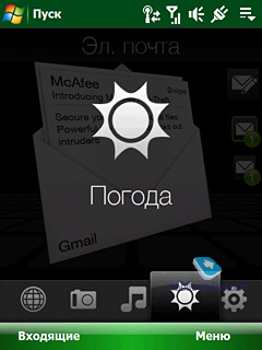
The entire interface is divided up into several screens (pages), each of which is housed in a tab running along the base of the screen. The TouchFLO 3D houses a total of ten tabs and you can opt for one of the three methods to jump between them.
First is via simple gestures. This way you can move between different screens by swiping your finger across the display. Then, and this is the easiest way, you can call up the screen you need by picking one of the thumbnails at the bottom. But the bad news is that the home screen can house no more than tabs like this at a tab, which means if you need to jump into, say, the 8th tab, then you will need to click on some icon that is closer to the end of the bar currently displayed on the Diamond’s screen to make it scroll forward.

Finally, there is another way – the most spectacular one, but the least convenient at that. To swap between screen all you need to do is tap and hold of the tabs at the bottom for a couple of seconds to bring a semi-transparent menu up to the main screen and then run your fingers across the bottom of the display to choose the panel you need.

On the downside, it takes the Diamond 2-3 seconds to render each tab – at first this lag may feel irritating, but then you get used to these freeze-ups. Although we’re still not fully satisfied with the speed the TouchFLO 3D switches between different panels.
Different panels available via the TouchFLO 3D
Let’s take a close look at each of these panels and the features they offer.
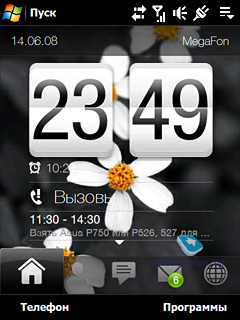
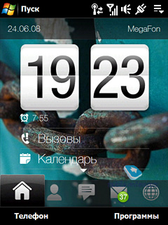
Home screen
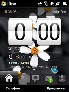
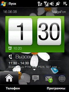
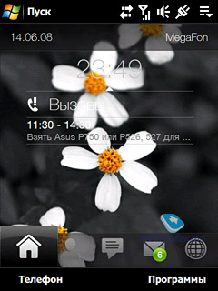
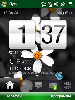
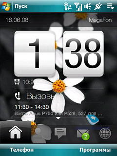
Apparently, this screen is the first thing you seen once the Diamond has loaded the user interface. The house-shaped icon will take you back to the phone’s home screen, most of whose real estate is occupied by a huge digital clock. Also this is the first place where you will encounter some classy visual enhancements – that is, here minutes and hours are flipped over just like calendar sheets.
Below the clock is the alarm clock icon, and further down are shortcuts to Call Log and Calendar. Interestingly, in case there is some upcoming events available in the calendar, they will be listed on the home screen instead of its shortcut.

Also you can start dialing a number or call up the application list right from the Home Screen – shortcuts to these two menus are mounted along the bottom of the display. Despite its obvious visual appeal, as far as customization and usability goes it’s not all that dazzling. The thing is, you can’t add new elements or widgets onto it, nor can you throw extra items onto other panels (bar Applications). So it turns out you will have to make do with the clock and calendar events alone, which aren’t very informative, to tell the truth. On the other hand, the average user should be pretty content with what this screen has to offer.
Video: The UI’s Home Screen (avi, 10,5 mb) >>>
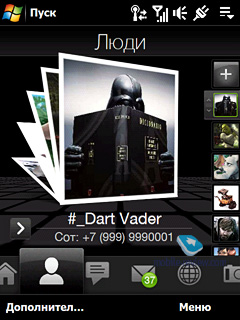
People
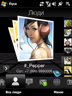
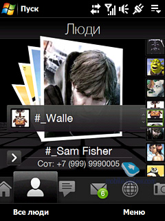
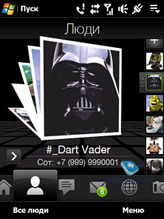
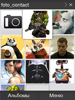
Behind this self-explanatory tab hides one of the Diamond’s most spectacular menus that is second to none, bar Weather. Positioned in the center of the screen here is a rotating menu with thumbnails (in fact these are images you’ve assigned to contacts) for 15 select entries from your phonebook (picked by you). If there is no image, the system will couple it with a default picture.
Perhaps most owners of Windows Mobile powered communicators have gotten used to the fact that Microsoft Outlook houses contact pictures (in case you have submitted some), so all it takes to get them onto a communicator or a smartphone is to synchronize it with your PC. But the twist with the HTC Touch Diamond is that while this scheme still works here too, entries placed on the People tab with images exported from Outlook will look somewhat bizarre, the reason being that Outlook compresses all photos and cuts their resolutions. So, with other WM-based devices you would barely notice the difference since all thumbnails are usually so small, but with the TouchFLO 3D all these flaws surface outright. Apparently, the best way to go in this case is to pick a group of contacts, tack them on the People panel and then assign pictures to them manually right on the phone to ensure best quality.

Sitting to the right of the central image (which you can switch with an easy flick of fingers) is a bar with thumbnail of all other entries available in the People panel. As soon as you pick one of these thumbnails the system will “page” through to the contact in question. Should you hover over this bar for a few seconds, you will see a pop-up window containing contact’s name and picture; this way, by moving your finger up and down you will be able to find exactly the entry you need.

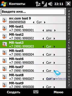
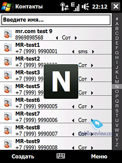
From the People tab you can also access the handset’s phonebook with the alphabet running along the right side that serves as a shortcut to entries that start with specific letters.
Basically, the People tab defines the idea behind the TouchFLO 3D very well – they have squeezed WOW-effects wherever they could but on some fronts this has affected usability. The thing is, even unsophisticated users will find it easier to just push the Call button, type in first two-three letters of the contact they are looking for and make a call. The only instance when the People panel really comes in handy is when you have 5-6 people you call all the time and you just enjoy looking at their photos. It gets immensely more difficult to navigate around a full list of 15 contacts in this tab, so, on balance it’s a fancy-looking panel that has had the bulk of its usability merits sacrificed for a sleek style.
Video: The People tab (avi, 14,0 mb) >>>
Messages
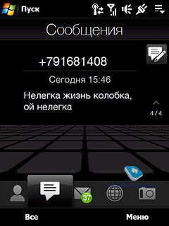
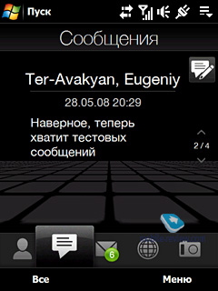
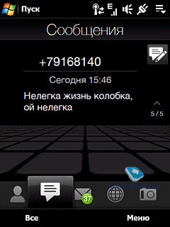
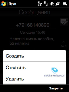
This panel enables viewing all incoming messages (both text and multimedia ones, although without graphical content); you can jump between messages either by swiping your fingers up and down or by clicking on the arrows on the right. And again, the transition effects pulled off by the phone are quite something. From this tab you can also start a new message, compose a reply, or jump into the Messaging menu of the OS.

Our main niggle with this panel is that it can’t handle long messages (two or more messages stitched into one) properly, to be more precise it simply doesn’t show full text, so that you will need to call up the standard messaging menu to read them, forgoing the TouchFLO 3D interface. But other than that, this tab is really useful, since the bulk of your messages are probably short texts or multimedia messages. The number of new unread messages is displayed right on the message buble icon in the tab bar at the bottom.
Email
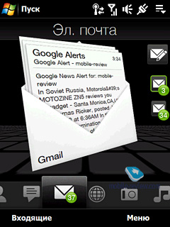
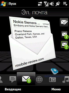
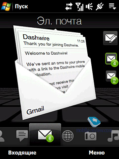
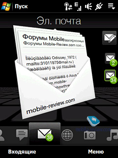
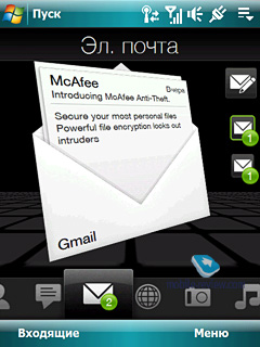
The Email panel features a classy looking white envelope and a couple of icons on the right which stand for your mail accounts and number of unread messages in them. The central envelope offers you the text of the last incoming email on selected account (you can scroll through them by brushing your fingers up and down).
The Email panel features a classy looking white envelope and a couple of icons on the right which stand for your mail accounts and number of unread messages in them. The central envelope offers you the text of the last incoming email on selected account (you can scroll through them by brushing your fingers up and down).

You can modify the font size of text and multimedia messages without entering the settings menu – to do that just slide your finger clockwise or counterclockwise on the touch-sensitive ring at the base of the phone, depending on what you effect you are trying to achieve.
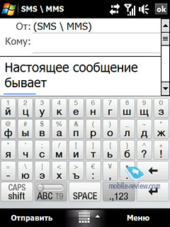
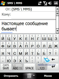
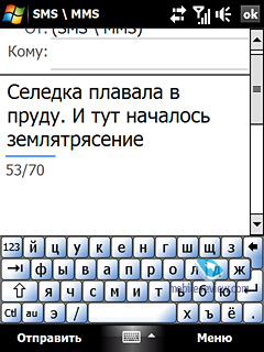
All in all, the Messaging tab is quite comfortable to use if we discount that problem we bumped into with some letters in Russian; this panel offers the user all basic tools for handling his mail, and we are happy with it.
Internet
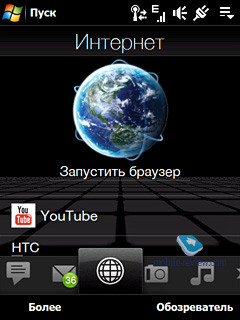
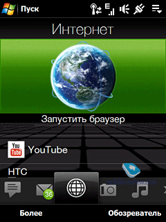
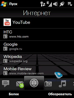
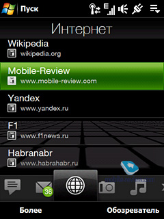
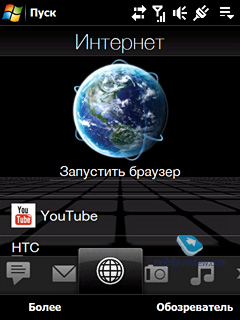
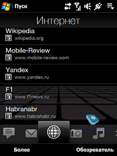
This is by far the most useless panel, but may come in handy for two things nonetheless. First of all, you can start up the Diamond’s browser with it (by clicking on the huge globe in the screen center), plus you can load one of your bookmarks. To call up the bookmark list you will need to pull the globe out of the screen by pushing it towards the top end of the screen with your fingers. Other than that, the Internet tab is of no real use.
We’ll cover the Diamond’s browser, Opera 9.5, later in the review.
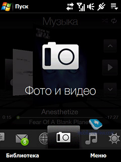
Photo and Video
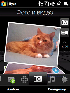
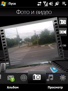
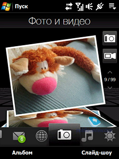
Using this menu you can start up the camera interface. Also pay attention to the fact that there is no other way to fire it up, since the HTC Touch Diamond doesn’t come with a dedicated camera button. The bulk of the tab’s real estate is occupied by the picture or video you shot last (scroll through them like in all other panels).
If you tap on the current image twice it will open in full-screen mode and again you can jump between different photos using simple gestures. Also this is the place where the Diamond’s bundled accelerometer comes into play – should you tilt the phone a bit or attempt to rotate it, the image on the display will follow.
But on balance the Photo and Video tab is only notable for its shortcuts to the camera interface, and viewing images or videos with it is pretty troublesome, since they are all slightly lopsided and small at that. What’s more transitions between thumbnails on this screen take quite a bit of time – at first you won’t notice these lags, but if you decide to show your friend a hundred of photos you made the other day, rest assured you will really want to switch to the full-screen mode after ten pictures or so.
Video: the Photo and Video tab (avi, 21,1 mb) >>>
Music
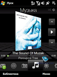
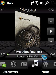
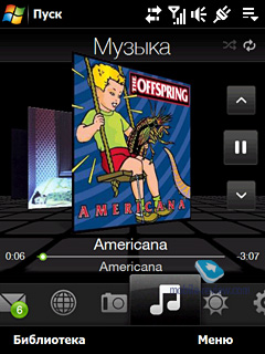
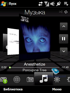
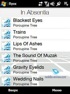
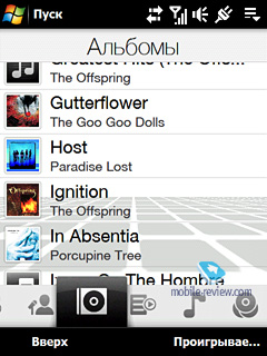
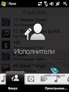
By and large, the Music tab is only the tip of the iceberg, as exclusively for the TouchFLO 3D HTC have built a software shell for playing and sorting music from the ground up. So, cutting to the chase, the Music panel shows album art, progress bar, play/pause and jump forward/back buttons. But switching to a different track can be done with a simple finger flick, just like the vast majority of interactions in this phone – all you need to do is swipe your fingers up or down. With the help of the pop-up menu you can setup the playback mode and some other options.

Regardless of whether you have one album playing or an assortment of tracks picked from various albums, the Diamond will show you corresponding album arts and change them on the fly if necessary.
There are two ways to skip forward/backward within tracks – you can either use the touch-sensitive ring at the base of the Diamond or click on the on-screen progress bar to jump right to selected moments.
One of the letdowns to this player, however, is that its volume changes only along with that of all system alerts and notifications (including new message alerts), bar the ringtone volume. So if you prefer quiet background music, you may well miss an SMS or some other event.
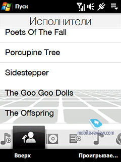
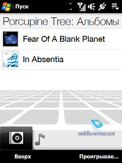
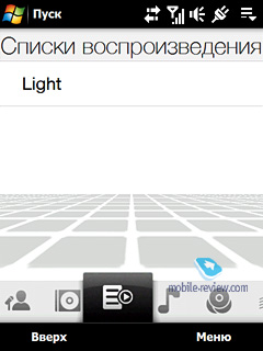
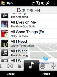
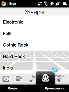
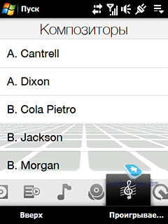
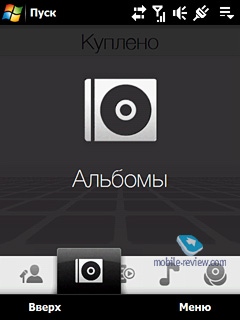
On the bright side, the music library of the HTC Touch Diamond makes this phone one of the strongest music playing solutions as far as Windows Mobile goes. It’d seem that there is a multitude of third-party music players available for this OS, but they don’t offer the same straightforwardness and usability as the Touch Diamond. All tracks may be sorted by one of the following criteria: artist, album, genre, composer, playlist. Lists of albums and tracks are accompanied by cover arts or a default no-image picture. On the downside, though, the Touch Diamond has no music search feature whatsoever, but most users should do just fine with its categorization tools. Inside the music library there is a home screen-esque shortcut bar that allows for quick navigation through various features of the library.
All in all, this music player and library can easily rival that of Nokia’s Symbian-based smartphones for functionality. On the other hand, most S60 solutions trump the Touch Diamond on audio quality, while losing to it in terms of visual appeal. At the same time, the Touch Diamond doesn’t offer any info on currently playing track on the main screen – it’s only available on the Music tab.
Video: The Music tab (avi, 26,0 mb) >>>
Weather
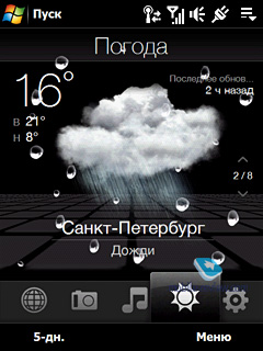
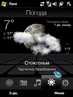
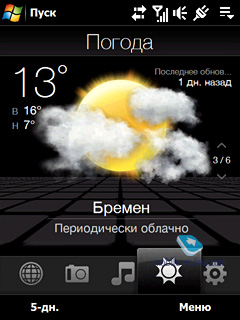
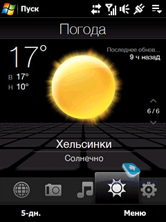
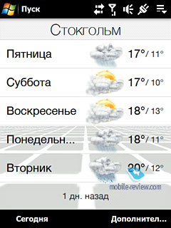
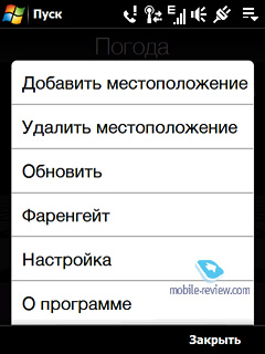
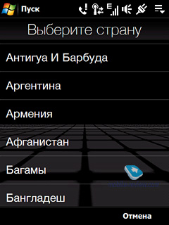
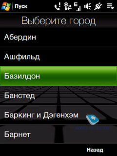
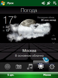
The Weather page allows viewing weather forecasts for today or for the next five days – in the former case all information is displayed right on the Touch Diamond’s display, and for the second mode to kick in you will need to call up the menu with detailed forecasts (bottom left corner). Overall you can track weather forecasts for ten cities at a time – to do that you’ll need to pick countries and cities first and then flick through them right on the screen (swiping your finger up and down, just like in all other tabs). All forecast are updated automatically in case you haven’t opened the Weather page for an hour or more.
But the thing is, the Weather page is the most beautiful part of the TouchFLO 3D shell; furthermore, no other mobile device can boast such an awesome visualization of weather. If it’s raining, then the screen gets flooded with rain drops that start trickling down and then removed by a windshield wiper. Clouds wrap around the whole screen and depending on how cloudy it is the view on the screen will change as well. Same goes for thunderstorms, snow and wind, which all look fascination on the Touch Diamond’s screen.
See for yourself – we have attached a short demo of the weather animations the Diamond has on offer.
Video: the Weather screen (avi, 21,7 mb) >>>
Settings
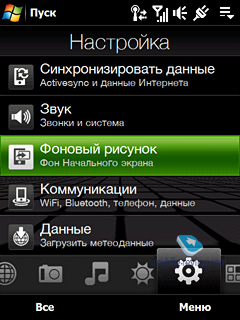
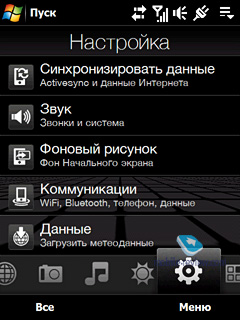
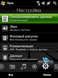
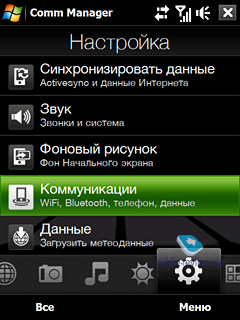
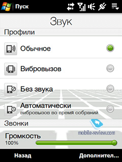
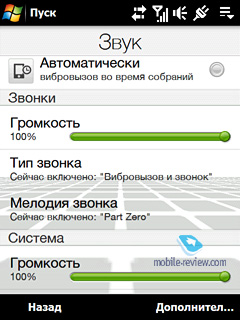
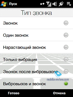
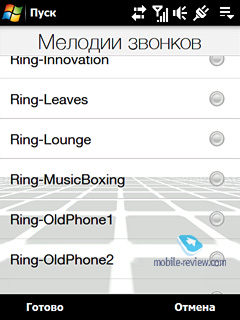
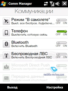
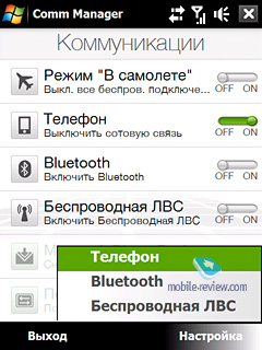
This page hosts all basic settings that will be used by the majority of the phone’s users – curiously, the whole setup processes is done within the TouchFLO 3D interface, meaning that the Touch Diamond won’t throw you back into the cumbersome UI of Windows Mobile to change call settings. Apart from call alert settings, this tab offers other options, such as current profile, wallpaper for the main screen and Comm Manager for handling the Diamond’s wireless connectivity.

Die-hard fans of the default Windows Mobile interface may jump right into the standard settings menu from this tab too.
Applications
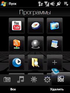
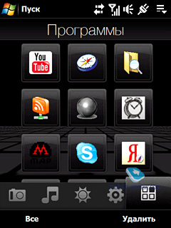
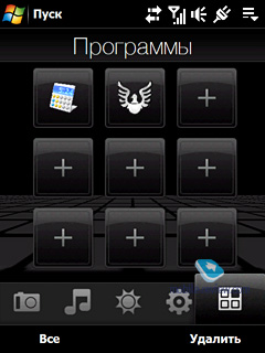
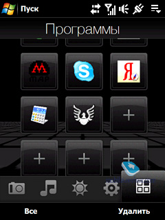
The last tab of the TouchFLO 3D interface features an 18-item grid that serves as a quick launch menu for any application. Nine shortcuts are displayed at a time; actually you don’t get access to all 18 shortcuts from the word go, as some of them are already occupied by preinstalled programs: YouTube, Google Maps.

But you can always opt to delete these shortcuts from the grid and give their places to some other applications. To move about the grid all you need to do (as always, though) is to flick your finger up or down. And should you find 18 shortcuts insufficient, you can always call up the list showing all installed applications (bottom left button).
Now that we are through the tabs offered by the TouchFLO 3D, it’s time for a roundup. While the new interface is far from perfect (although it was clear enough before the Diamond’s release), this UI offers a more straightforward and visually appealing setup. The latter factor is actually one of the Touch Diamond’s main selling points.
An important difference of the TouchFLO 3D from all previous offerings is that this UI actually supplants Windows Mobile’s default environment. In other words, the only places where you need to interact with that clumsy standard interface are calls, email and messaging; and this is really important. HTC has finally managed to roll out an elaborated UI that is more than just a skin-deep upgrade of the standard interface. Over my quality time with the Diamond a lot of people told me the following: “You know, I sort of like this Touch Diamond because it doesn’t smell like a standard WM fare”. All in all, this sums up HTC’s approach very well – now, having a more eye-candy and more importantly straightforward UI they will be able to address new audiences, which is really important if they are to survive on this market.
Video: TouchFLO 3D (avi, 22,8 mb) >>>
Back to the table of contents >>>
Add-ons to Windows Mobile
First add-ons and enhancements of default Windows Mobile tools came along in HTC’s phones around a year you. The release of the Touch Dual made it even more obvious that the maker was ready to polish some of this OS elements on its own by throwing in tons of new features and making it more ergonomically friendly along the way. Below is a breakdown of all software changes introduced in the HTC Touch Diamond.
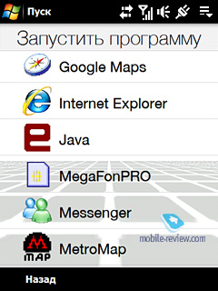
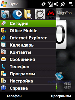
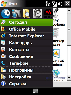
Start Menu. Now that they have made all items in this menu larger, it is so much easier to navigate it with bare fingers, although it’s nothing new – the Touch Dual employed a similar setup. Topping the start menu is an icon bar featuring all recently used applications (as you probably remember, the standard WM interface offered this bar only in the landscape setup)
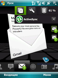
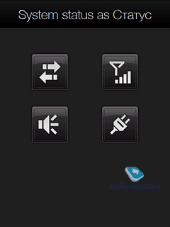
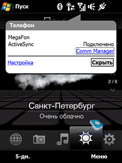
Service bar. This roster of icons housed in the top right corner used to be awkward to handle, since with the default WM interface to get more details on each particular indicator or icon you need to tap it with a stylus or finger to call up a pop-up window. However the Touch Dual introduced a nice way-out with a pop-up window featuring enlarged thumbnails, whereas the Touch Diamond has gone even further, offering a full-size window with huge icons for these purposes. Some might deem it superfluous (after all, this window takes some time to load), but it’s much easier to twiddle with sizable icons than a couple of pinhead-sized indicators
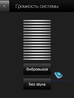
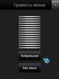
Volume. At last the prayers of all owners of Windows Mobile have been heard, as the HTC Diamond comes included with a bundled volume bar that is big enough to allow for seamless finger-based navigation; what’s more, you won’t need to precisely tap this indicator – it’s very accessible and ergonomically friendly now.
Auto screen lock. Right after the phone starts dialing a number, the system will turn the display off in order to avoid accidental taps on software keys during a call. While this issue doesn’t seem like much, a lot of users have experienced it with their touchscreen devices. This feature also triggers whenever you are receiving a call (once you pick up); on the downside, though, in the current firmware version it doesn’t kick in every time (it works like 7-8 times out of 10), so we really hope HTC will rectify this bug in the future.
Also, when you have reached someone the Diamond will vibrate for a moment just to let you know, which is really handy when you keep getting short beeps from the earpiece and about to give up, so you don’t want to keep the phone at your ear all the time.
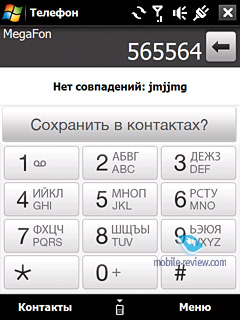
Contacts. It would seem all these tiny things are pretty much par for the course in today’s phones, but the Touch Diamond turns out to be the first phone to have them built on top of the OS. This way, whenever you are typing in a phone number, the system will try to match it with entries in the phonebook and should it find no matches it will offer you to create a new contact even before making a call.

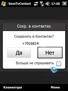
Also, – if you receive a call from someone who is not in your contact list, after hanging up you will see a prompt offering to save the unknown number in the phonebook.

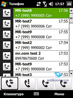
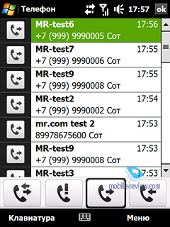
The Call History menu is styled after the UI’s main theme, just like in the Touch Dual; but other than that this menu has remained intact – same four tabs, each standing for one type of calls (all, incoming, outgoing, missed).
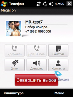
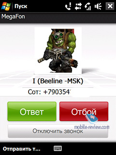
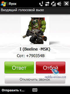
The dialing screen and the window you see when receiving a call, have nothing to do with WM’s default interface; they are closer to those of the Apple iPhone, down to the color scheme. But there is no shame in copying something so user-friendly – the dialing screen in the Diamond has all essential features right on top, including bulky buttons for holding a call, enabling the speakerphone mode and calling up the phonebook.

On incoming call the Diamond’s display features a 150x150-pixel picture of the caller, which isn’t all that big, but at least this is an improvement over that miniscule thumbnail offered by the default WM user interface.
Auto start-up. Whenever you take the stylus out of the silo, the Diamond will come to life, it’s as simple as that. Furthermore, if you do that while in a call the phone will fire up a note with info on the contact and allow you to make some notes. For instance, should you need to write down a new phone number, all you need to do is pull the stylus out and start typing.
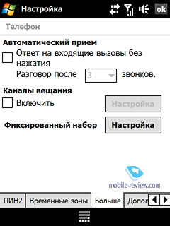
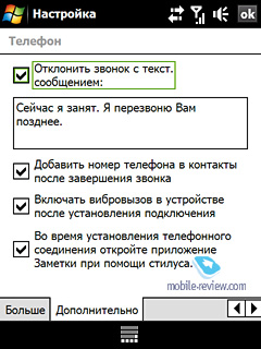
Extras. Apart from allowing the user to save unknown numbers in the contact list, with this menu’s help you can program the Touch Diamond to auto-answer calls after some time, setup auto-reply with SMS when you reject a call, and adjust some other useful settings.
Back to the table of contents >>>
Applications
Let’s see what applications you will be able to twiddle with in the HTC Touch Diamond.
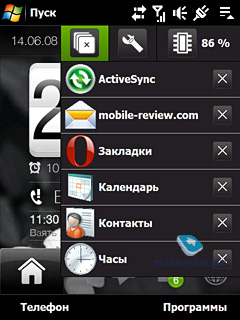
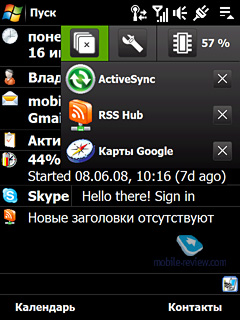
Task Manager. This application hasn’t changed since the previous Touch phones (although now all fields and thumbnails are bigger and allow for easier finger-based navigation). After picking it from the home screen you see a drop-out menu with currently running applications and large “Close” buttons positioned to the right of them. This menu’s top shows you how much RAM is in use, Close All and Settings buttons.
Tap on the percentage icon to jump to the Memory Settings menu.
Connection wizard – a very simple utility that offers to setup Internet and SMS profiles for you on starting the communicator for the first time. You are free to go back to it at any time, plus it automatically launches every time you swap SIM cards.
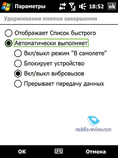
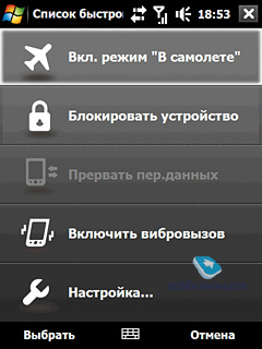
Quick menu. This small utility can be brought up by tapping and holding the hang up button. Basically, it’s one of those default applications that the developers still haven’t restyled to fit the color scheme of the Touch Diamond. You can reprogram thing key to, say, auto keypad lock or Vibro/Airplane modes.
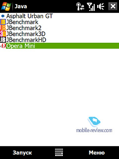
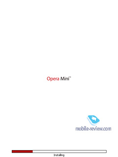
Java – emulator for applications written in Java. Its capabilities are very limited; in light of this fact 3D Java is not supported. In most cases support for Java-powered applications is not called-for on smartphones and communicators, since these days there are tons of applications for Windows Mobile out there. Some users make an exception for OperaMini as this app is simply the winner in the save-my-traffic contest. Another example - for Java-games addicts who badly need such an emulator. However, the default emulator does not support additional libraries used for the creation of Java applications for Nokia, Motorola-branded and some other handsets. Hence nobody guarantees these applications will launch and operate properly.

It is important to take account of the HTC Touch Diamond’s controls, which render Java applications nearly useless, it has no hardware buttons and hence no way to move about these apps.
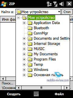
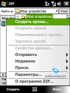
Zip – HTC’s very own utility for handling archived files – you can extract data from an archive, or add new data to an already existing compressed file.
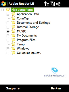
Adobe Reader LE – is the most widely adopted application for viewing PDF documents, and this is its mobile edition. Much like its elder brother, the application never seems to be in a hurry. Loading a page takes about 10-15 seconds, should the document contain a considerable number of schemes and pictures each page will take half a minute or even longer. It should be noted that as far as small files are concerned, the viewing capabilities this application provides, are more than sufficient.
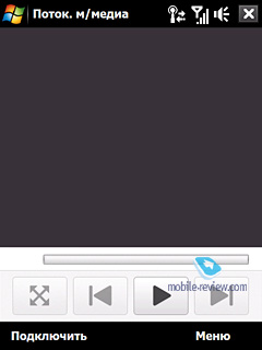
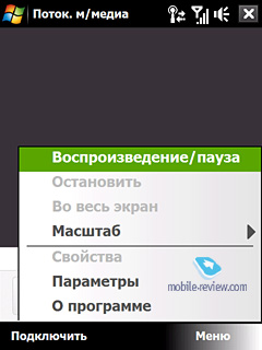
Streaming Media – used for playing streaming video and audio.
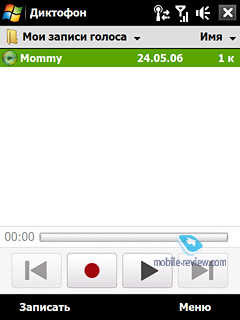
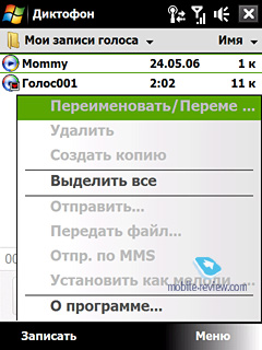
Voice recorder – the most basic application for recording voice clips; doubles as a player for playing back the recordings you made. All sound clips can be set as call alerts.
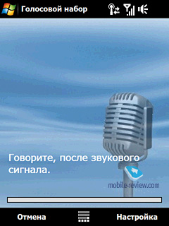
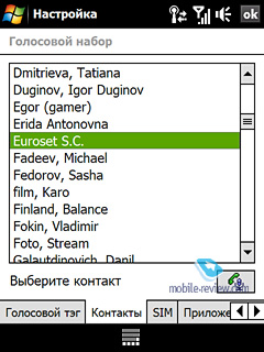
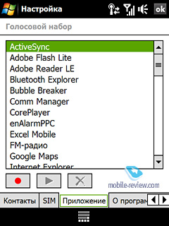
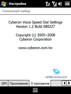
Voice dial – self-explanatory application. It requires voice training, in other words, voice tags for specific contacts. However it does a pretty decent job, so having dealt with its settings once, you will never have to set it up ever again. Much like most other Windows Mobile communicators, the HTC Touch Diamond employs Voice Speed Dial fromCyberon.
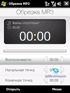
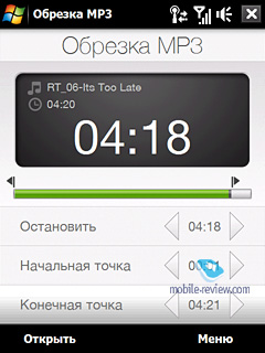
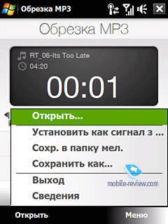
MP3 trimming. This utility used to be a part of HTC’s standard Audio Manager, however in the Touch Diamond the music player is actually integrated into the TouchFLO 3D, that’s why MP3 Trimming is now available in the Applications menu. Thankfully, its functionality hasn’t changed a bit – you still can trim songs using the progress bar and then set them as ring tones.

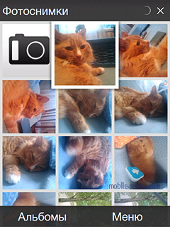
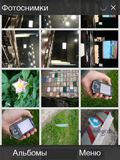
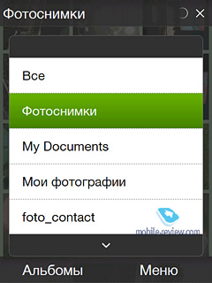
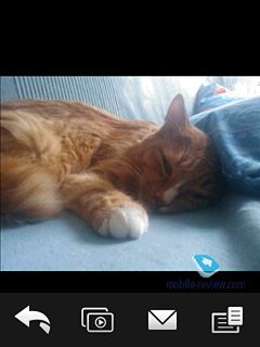
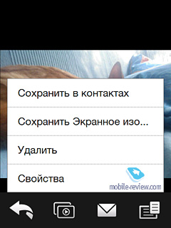
Album. You can access this application from the TouchFLO 3D when viewing images. Compared to its counterpart used in the HTC Touch Dual, this application’s functionality hasn’t changed much.
You can scroll through images with gestures, as well as zoom in/out and rotate them using the touch-sensitive pad at the base. The app’s main menu features a bunch of thumbnails which you can list through with a couple of finger flicks.

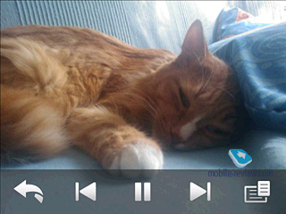
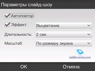
While in the fullscreen mode you can zoom in on images. Should you turn the phone clock- or counterclockwise, the picture will be realigned automatically all thanks to the bundled accelerometer. Also you can arrange a slide-show with the Diamond or send selected images via mail or in an MMS.


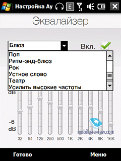
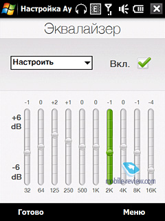
Audio setup – that’s what they call a 10-band equalizer in the Touch Diamond. You can opt for presets or setup the equalizer manually.

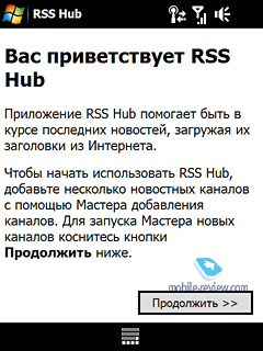
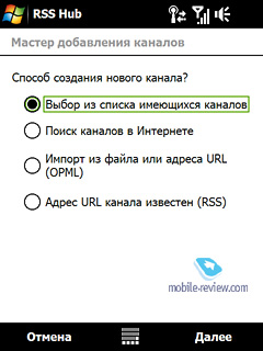
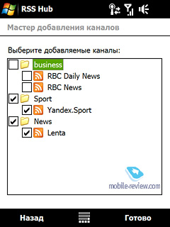
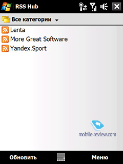
RSS Hub. In short, this is one sublime application for tracking RSS feeds. It brims with settings, such as separate news feeds, import of feed lists from *opml-files (with *xml extensions) and Google Reader as well as most other applications by extracting their feeds into a supported file type.
The application enables the user to setup key words for tracking all news items containing them. For example, you can submit “HTC” and assign it to some icon, after that all news posts with “HTC” in them will be marked with this icon. The utility offers a plug-in that enables notifications about new items in your feed (as well as the number of news containing the key words) on the Today screen, although it won’t show up in case you are using the TouchFLO 3D interface
The only letdown, or, let’s put it this way, awkward feature characterizing this type of applications – when attempting to read a news item, RSS Hub starts up the communicator’s browser for this purpose. On the bright side, though, in the audio settings menu you select a tune that will be played whenever RSS Hub picks up new headlines.
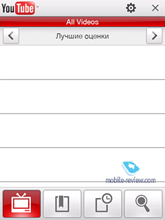
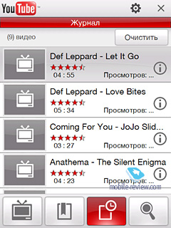
YouTube. As its name suggests, this application serves for playing back videos from YouTube.com, and in a nutshell, it’s the epitome of “the easier – the better” principle – right after the first launch you can setup the application, and the truth is, the only option here is preferred video resolution. With this app you can bookmark clips, view history containing all videos you’ve watched to date, and browse the most popular clips on YouTube. There is also a special Search tab that makes navigating through the labyrinths of YouTube so much more pleasant.
The application can work both via Wi-Fi and GPRS/EDGE data connections; in the latter case it won’t take a 3-4 minute video longer than 30 seconds to buffer in low quality (although the Diamond will keep uploading it during the playback)
Video: the YouTube application (avi, 18,7 mb) >>>
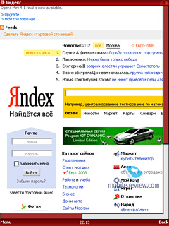
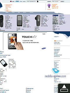
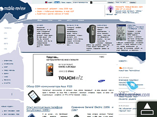
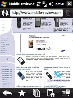
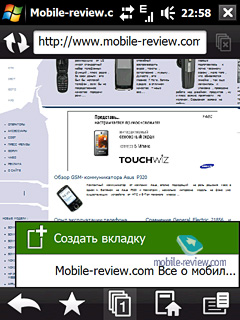
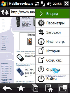
Opera 9.5. It’d make more sense to review this browser in a dedicated write-up, so here we are going to touch upon only its main feats and abilities. The Touch Diamond is the first device to come preinstalled with Opera 9.5, in fact all currently available builds of this application have been ripped from the Diamond. The browser’s interface is themed after the TouchFLO 3D color scheme, so that it doesn’t discord with the phone’s style.
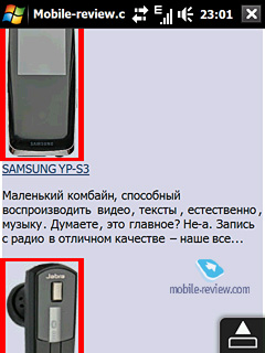
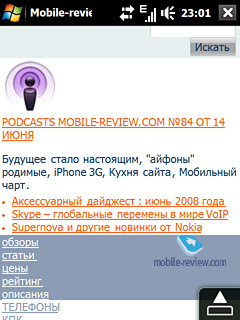
Much like the desktop version of the browser, the new mobile Opera comes with a tabbed interface, although you can’t have more than three tabs on screen at a time. Jumping between tabs is done via the button at the bottom. All pages are first loaded fullscree , but you can zoom in, what’s more, at the highest zoom level fonts become enormously huge.


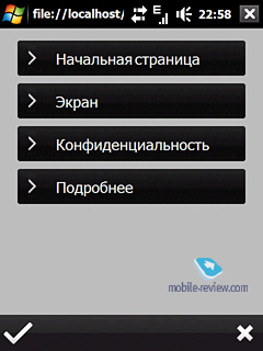
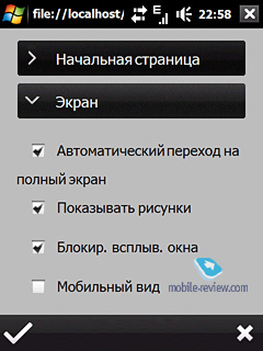
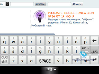
The Diamond will instantly realign the browser’s screen should you tilt the phone or rotate it (although it won’t adjust the screen when you turn it upside-down). We wish the browser had a little bit more settings, since it packs in only the most vital options, including the mobile mode (where all pages are scaled to fit in the screen size).
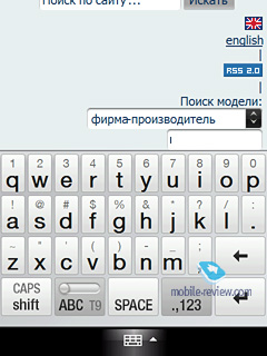
It was a pleasant surprise to see a full-size QWERTY-keyboard right inside the browser that works both in the portrait and landscape modes.


Not only does this new Opera browser blend with the TouchFLO 3D interface well, it has something more than just fancy looks to offer.
Video: Opera 9.5 in action (avi, 30,8 mb) >>>
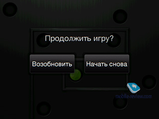
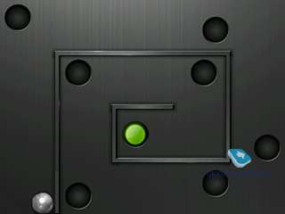
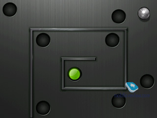
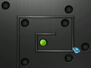
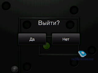
Teeter
This game makes a good use of the Diamond’s accelerometer; basically this is what its entire gameplay hinges on. There is a small grey ball and an area rigged with barriers and holes where this ball can fall in. So the goal is simple – you are to roll it into the green hole past all fake holes.


The twist that makes it such an addictive game is that the plane the ball rests on is bound with the Diamond’s current position, so by tilting the phone you will tilt the in-game maze as well, forcing the ball to move. But beware – once you've made it through the first level, you won't be able to stop playing Teeter until you beat the game’s final level.
Video: playing Teeter (avi, 11,9 mb) >>>
Back to the table of contents >>>
Data Input
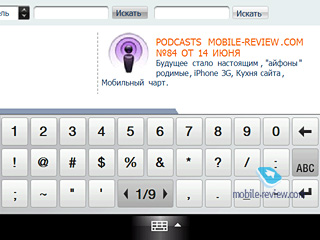
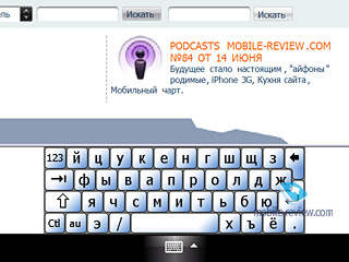
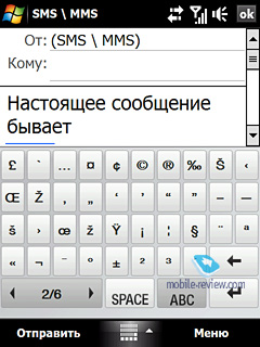
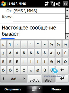
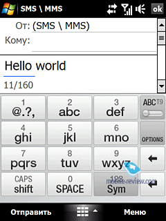
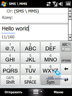
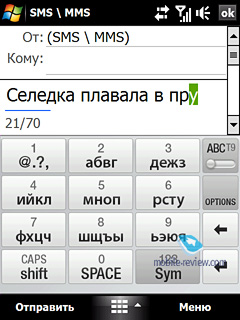
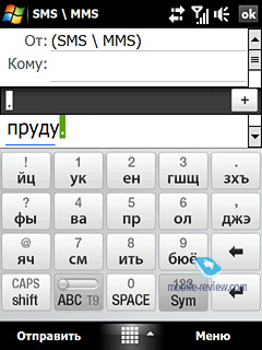
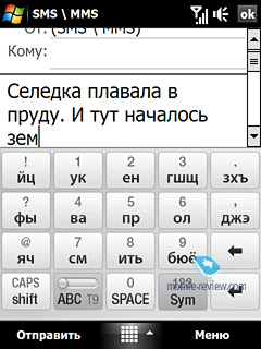
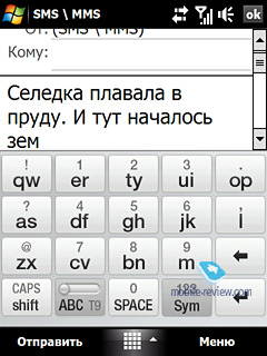
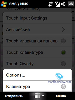
The HTC Touch Diamond enjoys all input methods that were previously employed by its predecessors in the Touch series. Although they have made a couple of nice changes in the way these keyboards look, so that now they are much more comfortable to type with.
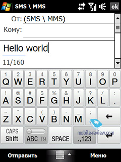
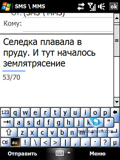
The full-size QWERTY-keyboard is one of the most convenient input methods in the Diamond, if you are good at managing your device with a stylus. While typing with fingers on this keypad won’t be a pain, you will need to spend some time getting used to it. To start typing with the grey symbols displayed on each key simply hold the button you need to a couple of seconds – needless to say how convenient this is when it comes to typing such symbols as @ and #, since you no longer need to jump between different layouts.

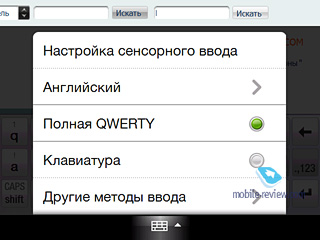
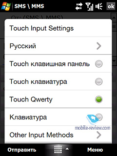
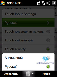
On the downside, this thumbboard becomes really awkward when it comes to swapping input languages – to do that you will need to call up a menu, then pick the Language item and only then select the language you need. All in all, it’s not what we expected from a seemingly handy keyboard.
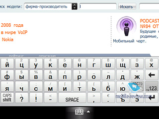
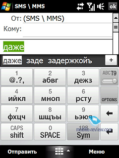
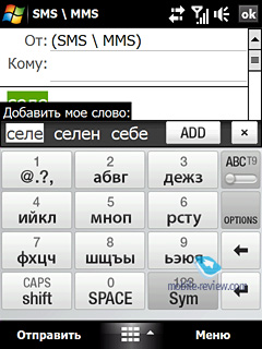
The 12- and 20-button keypads have always been around in the Touch phones, and the Diamond is no exception. You’ll probably spend some time coming to grips with them, but your efforts will be well worth it.

With every keypad you can opt for T9 predictive text input. When using it with the 12- and 20-button keypads, you will need to tap every button only once and then pick from a variety of words, whereas with the thumbboard the Diamond will simply offer you possible endings for words.
Back to the table of contents >>>
Extras
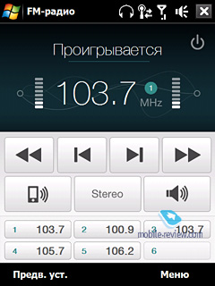
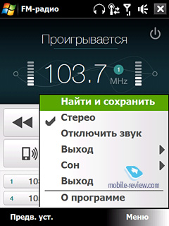
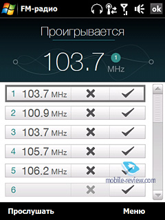
FM-radio. There are no bells and whistles in the Touch Diamond's radio application, bar its revamped interface, that looks a great deal more eye candy.
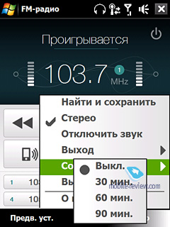
The Diamond allows storing up to 20 channels, which you can search either manually or via auto-tuning. It can play sound either via a pair of headphones or the loudspeaker. And while all these are pretty much standard features, there is actually one thing of note here – “Sleep mode” in which the radio application turns off after 30, 60 or 90 minutes. On the downside, you won’t be able to give custom names to radio channels, which is a pity, since it’s not always easy to navigate through 20 frequencies stored in the phone’s memory.

Navigation
Much like other Qualcomm-based phones, the HTC Touch Diamond employs a bundled chip for navigation. The technology itself is called gpsOne and combines two main ways of getting a GPS fix on your location (via satellites and your cellular network), and a couple of auxiliary ones. All in all, it’s little to no different from SirfStarIII-powered offerings in terms of precision – errors in the neighborhood of several meters aren’t crucial at all, especially since the Touch Diamond isn’t positioned as a navigation-centric device.
In our tests it took the Diamond around two minutes to get a GPS fix on our location from a cold start – after that it took the phone 30 seconds at worst to track us, standing still on a street. Basically, this result is pretty much in keeping with other contemporary GPS-enabled solutions.
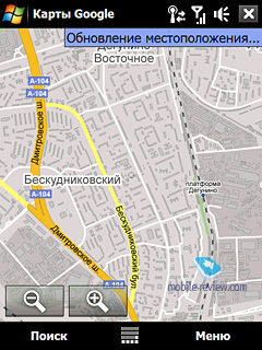
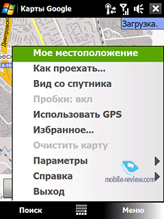
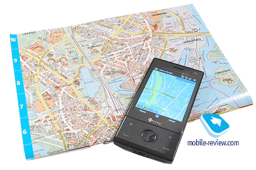
The phone doesn’t pack in any specialized applications for the purposes of navigation and runs with Google Maps instead, which is pretty unsophisticated – it allows calculating routes (although you won’t get any voice tips) and searching addresses. What Google Maps trumps most other more feature-packed counterparts with is that it uploads all maps from the Internet, thus you will have all maps of the world’s largest cities at your fingertips. However this is actually one of its main weaknesses – without a speedy data connection, Google Maps is practically useless.
Google Maps will hardly do for in-car navigation with the Touch Diamond, but it should do fine in other areas, such as pedestrian navigation and quick address searches.
Since the Touch Diamond lacks a memory card slot, it’s only logical to assume that no application that gets hardwired to a memory card (such as iGo) will work with it. All we can recommend you to do is find some other way to go – thankfully there are quite a few applications to choose from.

If you really can’t live without iGo, but there is no memory card slot, there is an old, fool-proof method to find your way in a big city…
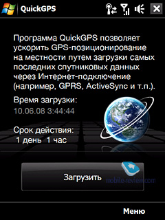
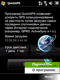
Apart from Google Maps the Diamond comes preinstalled with QucikGPS that updates satellite data over the Internet, which allows reducing the time the phone needs to locate available satellites.
Accelerometer
We have already covered the main applications of the bundled accelerometer, so here is a quick roundup. The Diamond’s accelerometer kicks in whenever you are browsing the web, viewing photos or playing Teeter. Thankfully, it’s pretty precise so don’t worry about the screen rotating in the opposite direction when you decide to go in the landscape mode.
Back to the table of contents >>>
Competition
Considering all the elements of the Touch Diamond, such as hardware, platform, software enhancements and price, it’s safe to say that the Diamond has no rivals at all. Fashion-savvy offerings from Asus and LG are not so feature-rich, whereas Sony Ericsson branded touchscreen solutions represent a completely different market segment. Nevertheless, we venture to face it off against its two potential rivals.
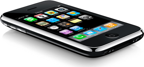
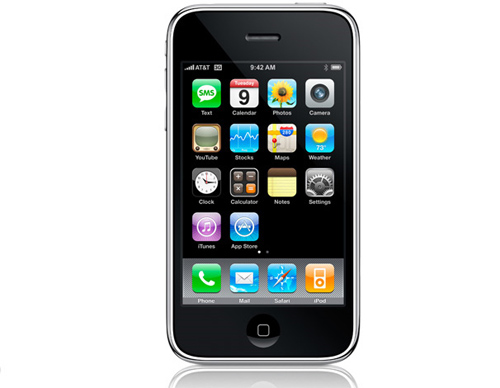
Apple iPhone 3G
After a small revamp, the iPhone is once again the talk of the town. GPS functionality and 3G (albeit without a forward-facing camera) have brought this handset back to the headlines. Interestingly, HTC and Apple are going in opposite directions with their top-notch offerings – the former is trying to relegate their Diamond to feature phones, whereas Steve Jobs is aiming to make everyone think of the iPhone as a communicator no matter what (indicative of that are support for MS Office documents, along with MS Exchange Server).

Distancing from all debates on whose design is more aesthetic, the big picture is as follows: going for the Apple iPhone are its huge display and overall size, plus a speedier interface, better music categorization options and sound quality. Probably another advantage of the iPhone’s is its battery time but not because it’s a really long-lasting phone – by no means. It’s just that the HTC Touch Diamond can’t stay online for longer than a day.
Now for the draws of the Diamond. First and foremost, it’s significantly smaller, and while its display is not as big as that of the iPhone, it’s VGA and that says it all – the iPhone’s sizable display has absolutely no shot against the Diamond’s brilliant resolution/diagonal ratio. Also, its already long in the tooth 3.2 Mpix camera is, as strange as it sounds, way better than the iPhone’s 2 Mpix unit. Plus the Diamond comes equipped with FM-radio and allows the user to install hundreds of thousands of third-party applications (many of which are free).

Also tipping the scales in favor of the Apple iPhone is its lower price (even accounting for the grey market it's going to generate).
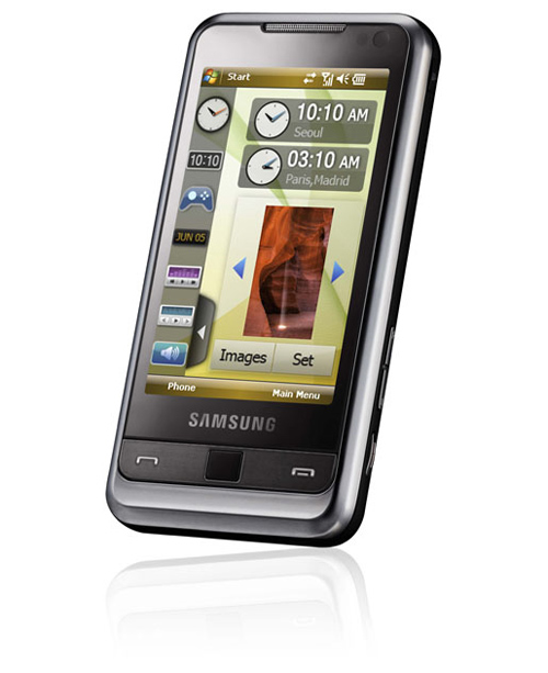
Samsung i900 Omnia
There is no point in comparing the i900 with the Touch Diamond feature by feature, simply because these two phones come from different categories. But based on their technical specifications alone (except the display resolution and size), the i900 ends up ahead of the Touch Diamond.

This phone is very likely to be just as good as all previous WM-based phones of the maker. On balance, the choice between the Samsung i900 and HTC Touch Diamond isn’t all that challenging at all – the first offers better hardware, camera, display diagonal and more memory, whereas the latter is a more pocket-friendly device with a sublime screen and a very intuitive user interface for all basic features. So all you need to do is decide where you priorities lie.
Back to the table of contents >>>
Conclusion
The Diamond’s reception quality is nothing to write home about – while it catches the signal wherever it’s only possible, it takes much longer (up to 30-50 seconds!) than normal to actually find a network. Its earpiece volume is just fine – 60-70% volume level should be enough to ensure a crystal clear conversation. As for the loudspeaker it’s nothing special, we even missed some calls with it in a noisy room.
So, what the HTC Touch Diamond really is? This phone’s debut ushers in a new era for the maker and the market altogether. To be honest, HTC has never made such huge leaps forward ever since they established a brand of their own. You could argue that it doesn’t pack in nothing new bar the display and TouchFLO 3D, but you’d be mistaken. With the Touch Diamond the company is changing the way Windows Mobile devices are perceived, this time – for real. The system’s default awkward interface and fiddly applications are now outshined by a straightforward and easy-to-use interface with intuitive applications and navigation. All these factors are exactly what other Windows Mobile based phones lack and that’s the only thing that has been setting back this segment so far.
The HTC Touch Diamond comes to being a user-friendly phone as close as its OS and hardware can only let it. And that’s the point where we come across the corner stone of this device – while it packs in the company’s latest and greatest interface along with a variety of software enhancements, its overall performance is hampered by a pretty dated type of display with insufficient diagonal. The thing is, this screen can’t process several taps simultaneously, so to make it more finger-friendly they have to go to great lengths and make up elaborate schemes and solutions. So it’d be only logical for HTC to ditch this type of screen on the next stage and go with multitouch displays that will have bigger diagonals. Will Windows Mobile 7 have the honor to enjoy these marvels? May be.
HTC have created an interesting and captivating product, probably the most brilliant phone they have ever made or even in the history of Windows Mobile altogether. It’s not without some glitches, but every one of them is outweighed by a bevy of surprising and fetching features. If the HTC Touch planted a spark in you, but you never really considered going for Windows Mobile phones, the Touch Diamond is probably your best chance to try them.
Technical specifications:
- Type: communicator
- Form-factor: candy-bar
- Position in the line-up: above the HTC Touch
- Competition: Samsung i900, Apple iPhone
- Materials used: plastic, metal, glass
- Operating system: Windows Mobile 6.1 Professional with TouchFLO 3D on top of it
- GSM Tri-band 900/1800/1900 Mhz, EDGE/GPRS, UMTS/HSDPA 900/2100
- CPU: 528 Mhz
- Platform: Qualcomm MSM7201A
- RAM: 192 Mb (113 Mb available)
- ROM: 256 Mb, 86 Mb available for storing personal data
- 4Gb of flash-memory
- Connectivity: Bluetooth 2.0+EDR (A2DP), Wi-Fi, proprietary ExtUSB (USB 2.0) socket for charging/synchronization and headsets
- Display: TFT 2.75” with a resolution of 640x480 pixels (VGA), capable of 65K colors, manual and auto brightness control
- Navigation: GPS powered by Qualcomm’s gpsOne, comes preinstalled with Google Maps
- Extras: FM-radio (RDS), accelerometer, magnetic stylus silo, touch-sensitive navi-wheel
- Battery: detachable 900 mAh Li-Ion
- Dimensions: 102 x 51.5 x 11.3 mm
- Weight: 110 g.
Related links:
Back to the table of contents >>>
Artem Lutfullin (artem.lutfullin@mobile-review.com)
Translated by Oleg Kononosov (oleg.kononosov@mobile-review.com)
Published — 20 July 2008
Have something to add?! Write us... eldar@mobile-review.com
|
