Windows Mobile 6.5
Beauty will save the world

Take a look at this delightful logo, depicting the very gist of Windows Mobile 6.5 (this particular version) - eye-candy design. While beauty might have a chance of saving the world, it can't help WM 6's affairs, no matter how hard Microsoft's designers and developers worked on the update. /p>
With that said, allow us to start a review of the latest-and-greatest Windows Mobile version - 6.5. But be warned, we have deviated from our standard structure of reviews in an effort to show you how Microsoft go about updating their operating system.
What's new
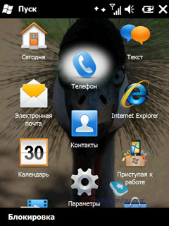
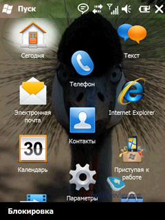
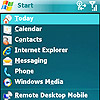
First and foremost - WM 6.5 brings a new menu design. Wave goodbye to the "Start" menu with a grid of icons, as now there is a colorful screen with new graphics and new layout.
A face-lift like this is definitely a great idea, although there is one thing that is impossible to overlook - it has been implemented and utilized by the likes of HTC, Samsung, Asus and Spb Software House (in fact, there are over 50 companies on the list, including software developers) for many months now.
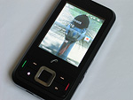
The standby screen has been refurbished as well, and I must say, for the better, however it hasn't become any more informative. On the left we have no new events, on the right there are two. But which ones? No way to find out.
When you answer a call from the standby screen, you'll see a pretty eye-candy menu, although once you press the "Unlock" button on the screen, the magic will disappear and you'll be stuck with the good old Windows Mobile 6 in-call screen.
The new style of pop-us is another positive thing about the revamped interface - now they are bigger and easier to tap with bare fingers. And again, HTC beat Microsoft to it by months …
Selection brackets have also become smoother, plus the scroll bar on the right has grown in size a bit and now boasts so-call pseudo-3D design, but in truth tacked on the old menus and applications it looks bizarre to say the least.
The screenshots above really show Microsoft's approach to updating their OS - they have rounded all edges and made all menus look eye-candy. Great. But why haven't they done anything about the-worst-virtual-keyboard-ever? By the way, there are reasons to believe that eventually they will roll out a new on-screen thumbboard for WM 6.5 however it wasn't presented in Barcelona (where they showcased the keypad ripped off the HTC Touch Diamond 2's UI) or anywhere else.

The "Close/Minimize" button has gotten bigger to the point when it's relatively easy to press it with fingers, which is a great achievement. By the way, the toolbar on the top has been revamped as well, although you might not even notice this.

This is Microsoft's second attempt to create an online application catalogue; so far it's still unclear whether they'll manage to do that this time around.

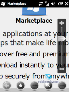
The thing that pleased me the most, by the way, is that the default browser now sports a really convenient zoom slider. Unfortunately, Opera, that comes preinstalled on most new WM-based devices these days, has had this bar for a very long time. Also now the browser supports tabs and a lot more "new" features.

Moving on to "Calculator" - just look at these vibrant and smooth buttons. Now the real question - do you also get a feeling that this is the application Microsoft worked day and night on for WM 6.5?
"Today" screen
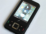
What all versions of Windows Mobile are famous for? Their flexible and easy-to-setup "Today" screens - a lot of developers still create special plug-ins for their applications in an effort to make them compatible with it. So, what have Microsoft done to enhance this part of their system? That's right, they removed the old screen and introduced a new smartphone-esque layout (thankfully, you can disable it and go back to the old version of "Today").

The new screen is more suitable for novices, as it puts all features at the user's fingertips. However, all today's WM-based devices from HTC, Samsung and Asus sport proprietary UI shells that are much more straightforward and eye-candy than this.
The cornerstone of Windows Mobile 6.5
Before:
After:
Conclusion
You could argue that we tested a very early prototype of the system; you could argue that it's merely a beta version and that Microsoft still have a lot of time to patch things up, or you could say that all their resources are focused on Windows Mobile 7. Maybe. But all this can't serve as an excuse for what Microsoft have released under the guise of an update to their OS.
Instead of mending crucial glitches and drawbacks of the system, they have tackled its UI problems. But the gist is the same - the core of WM hasn't changed, Microsoft has simply glammed it up and that's it. This isn't an update, not even a patch - WM 6.5 is merely a temporary fix that isn't called-for and few will actually find any use for it.
The only good thing about the new version of the OS is that now it's optimized for finger-based navigation, which is nothing to write home about, though. So I doubt HTC, Samsung or other phone makers will start employing WM 6.5 in their devices - after all, they already have UIs that are considerably superior to that found in the new operating system.
Related articles
Artem Lutfullin (artem.lutfullin@mobile-review.com)
Translated by Oleg Kononosov (oleg.kononosov@mobile-review.com)
Published — 15 May 2009
Have something to add?! Write us... eldar@mobile-review.com
|

