|
|
MWC2010. SPB Mobile Shell 5
By now you've already gotten worn out by the never-ending stories about pieces of hardware that this year's MWC is brimming with, plus the vast majority of them turn out to be not that appealing and sometimes even flat-out boring. So let's focus on software, especially since there is a good reason to do so - SPB have just presented their new interface version. For those of you who have never head about Mobile Shell, here is a short intro.
At some point in time, the eternally young inside, yet rapidly aging outside Windows Mobile was in dire need of a face-lift, on several developer teams decided to help it with a couple of user interface add-ons that offered their users a sleeker interface with a new feature or two, along with a bunch of shiny icons and sometimes even revamped menu structure. At present there are thousands of UI modifications that do all this and even more, but the most widely known are HTC's Sense and Mobile Shell from SPB. These two UIs have nothing in common, nor are they connected in any way - either one of them has got unique philosophy and goals. Furthermore, Sense can only be found in HTC's solutions (well, officially, that is - in reality you can install it on any other phone) , whereas Mobile Shell can be tacked on any communicator regardless of its maker, be it HTC, Samsung, Asus or someone else.
When most WM phone makers clued in on the fact that HTC was driving them out of the business with their top-notch Sense-equipped offerings (back then it was called TouchFLO 3D), they approached SPB for help, and that's why you now you can see their Mobile Shell on Toshiba's and E-Ten's latest and greatest communicators, even at the MWC.
The above is merely a preface that hopefully shows Mobile Shell's significance as one of the most cutting-edge user interfaces for WM.
SPB Mobile Shell 5
Now let's move straight to the UI itself. But first, I have to say something for the record: at this point in time Mobile Shell 5 is far from completion, and what I was shown at the MWC was its early version that can and probably will see numerous updates and changes, so I'll reserve my final judgment about it unit I get a more polished edition, and I hope you'll follow my example.
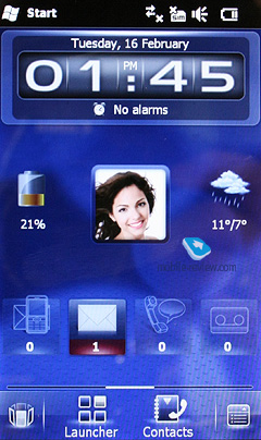
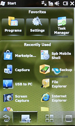
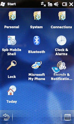
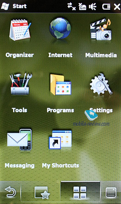
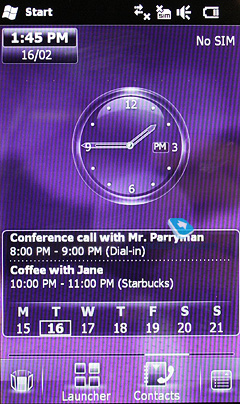
Mobile Shell's interface is based on the good-old tabbed UI concept - here you've got the home screen, music tab, contacts, applications and so on. The home screen plays host to the clock, a slew of shortcuts, missed events notifications, mail, and other essential information.

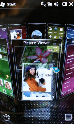
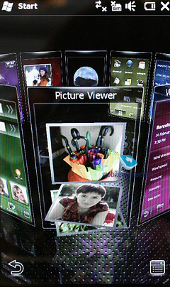
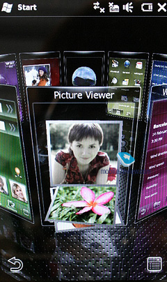
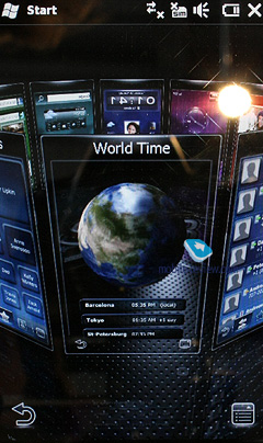
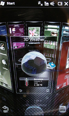
From that screen you can get to any other section of the phone by simply scrolling through the screen left and right, and should you find this method fiddly, you'll always be able to call up a rotating 3D circle menu to find the tab you need.

While this layout looks dazzling, I'm sure some will find it overly fancy, but to my taste it's fairly intuitive. Of course it'd be really great to see a grid view with thumbnails of respective screens, but the circle is very manageable as well.
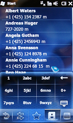
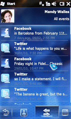
Mobile Shell 5 also comes with a customized phonebook, which is great news, given that it'll be released for Windows Mobile, Android и Symbian. SPB version employs the idea that HTC implemented a year ago - it basically implies that all the information about any given contact and his activities in social networks and services (like facebook or Twitter) are hosted on one page.
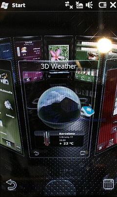
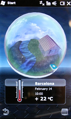
The app also features 3D globes for the weather and world time tabs, and the best thing about them is that the don't get flat when you call up the navigation circle.
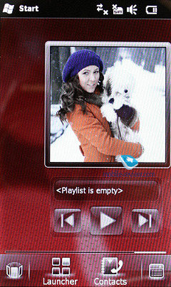
The fifth version of the interface will also sport a brand-new media player, as well as a utility for browsing images (with 3D effects), plus a handful of standard applications.

Here is a short demo clip we made exclusively for you.
Conclusion
Regardless of the fact that it's still a pretty early version of the UI, the new Mobile Shell 5 does leave a great aftertaste. It'll debut on three platforms simultaneously Windows Mobile, Android и Symbian, meaning that even Android users will be able to take advantage of a much sleeker and convenient interface. Although I can't say how happy Symbian users will be - I don't have much experience with this OS.
Artem Lutfullin (artem@mobile-review.com)
Published — 15 February 2010
Have something to add?! Write us... eldar@mobile-review.com
|
News:
[ 31-07 16:21 ]Sir Jony Ive: Apple Isn't In It For The Money
[ 31-07 13:34 ]Video: Nokia Designer Interviews
[ 31-07 13:10 ]RIM To Layoff 3,000 More Employees
[ 30-07 20:59 ]Video: iPhone 5 Housing Shown Off
[ 30-07 19:12 ]Android Fortunes Decline In U.S.
[ 25-07 16:18 ]Why Apple Is Suing Samsung?
[ 25-07 15:53 ]A Few Choice Quotes About Apple ... By Samsung
[ 23-07 20:25 ]Russian iOS Hacker Calls It A Day
[ 23-07 17:40 ]Video: It's Still Not Out, But Galaxy Note 10.1 Gets An Ad
[ 19-07 19:10 ]Another Loss For Nokia: $1 Billion Down In Q2
[ 19-07 17:22 ]British Judge Orders Apple To Run Ads Saying Samsung Did Not Copy Them
[ 19-07 16:57 ]iPhone 5 To Feature Nano-SIM Cards
[ 18-07 14:20 ]What The iPad Could Have Looked Like ...
[ 18-07 13:25 ]App Store Hack Is Still Going Strong Despite Apple's Best Efforts
[ 13-07 12:34 ]Infographic: The (Hypothetical) Sale Of RIM
[ 13-07 11:10 ]Video: iPhone Hacker Makes In-App Purchases Free
[ 12-07 19:50 ]iPhone 5 Images Leak Again
[ 12-07 17:51 ]Android Takes 50%+ Of U.S. And Europe
[ 11-07 16:02 ]Apple Involved In 60% Of Patent Suits
[ 11-07 13:14 ]Video: Kindle Fire Gets A Jelly Bean
Subscribe
|
