|
|
Spb Mobile Shell. Second edition
I get to hear rants on how Windows Mobile based devices are fiddly to manage very often – indeed, the system’s default UI, even in its latest and greatest version, doesn’t quite qualify as user friendly. That’s why all more or less advanced and savvy users have turned their eyes to the field of third-party software, where one of the most newsworthy recent releases is Spb Software House’s Mobile Shell. While the first version of the application appealed to many, just like any other new product it had an array of glitches, which the developers have tried to address with the new version. So our job is pretty easy this time – try to figure out how well they have coped with this task.
Spb Mobile Shell
Lately I’ve been stumbling upon a lot of topics on installing one application on a multitude of devices. The policy of Spb Software House in this matter seems to be the most reasonable – the registration key they issue once you purchase the product is not locked on your device ID or hardwired to it in any way, so you can still use the same Mobile Shell license even when you get a new WM device; on top of that updates to the current build are free, while the new version is available with a 50% rebate to all registered users. But that’s not all: if you upgrade to the new version in less than 90 days since the purchase of the previous application’s release, it is absolutely free. By the way, another approach to the problem of upgrading your software is exercised by Apple with its firmware updates for the iPod Touch (which are not free), and developers whose applications are locked on your device’s hardware identifier or something alone these lines. Sometimes transferring programs of the latter type can be done after getting in touch with the developer’s support service, but these cases are rather exceptions from the rule.

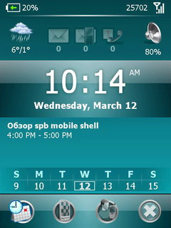
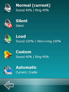
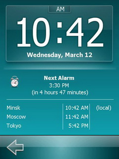
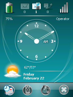
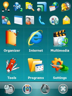
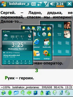
Now, cutting straight to the chase, the new version of Mobile Shell has undergone a major revamp for its Now screen. Basically, not only does it allow checking the status, it is used for managing the device. The Now screen is divided in a couple of active zones – lining the top of the screen is the weather forecast thumbnail, mail box status, call log and quick profiles (professional mode). The second zone features the clock (analog or digital), rounding out the interface is the part with current calendar events, notifications of upcoming meetings and affairs.
But the foremost improvement coming in the updated Now screen is the icon bar at the foot of the display that allows for one-touch access to the application list and settings (second button) and speed dial panel
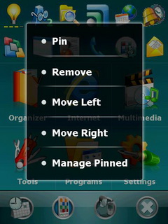
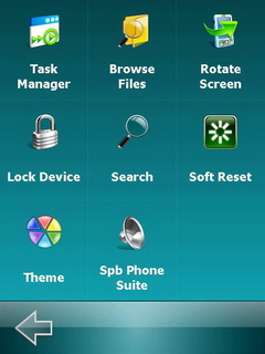
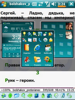
Tapping the second thumbnail brings up the list of most recent applications you used - while you can put them off the screen, you won’t be able to remove the display brightness icon which is hardwired into this menu. The application list displayed on this screen is carried over from the plugin for the Today screen, so in a nutshell the developers have included an application manager of some sort into their Now interface that allows launching applications without having to dig deep into other menus.
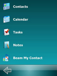
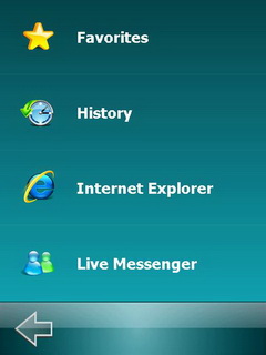
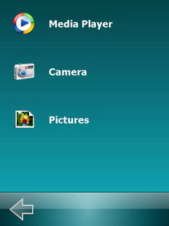
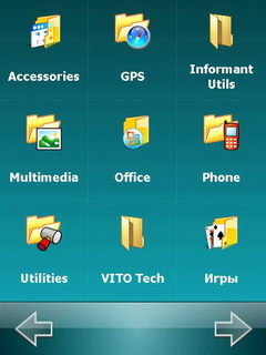
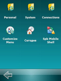
Below are six huge thumbnails leading to certain applications grouped up by type – they will take you to corresponding program pools available in your WM device with a welcome touch of animation along the way.
It is worth noting that all buttons and icon are tweaked for finger-based navigation, being just big enough, plus the screen driver has been optimized to read larger areas you tap with your finger.
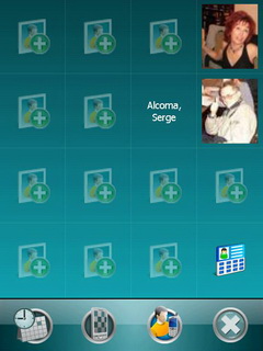
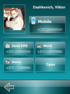
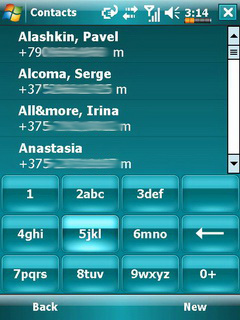
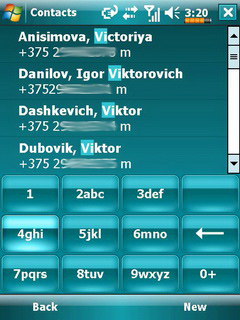
The speed dial panel enables the user to put up to 15 entries from the contact list on it, each marked by a sizable thumbnail. The icon in the bottom right corner calls up the on-screen keyboard for quick Smart Dial powered search – you tap in first letters of a contact’s name, while the application displays all matches and offers you a number of options (i.e. make a call, send a message etc).
Apart from refurbishing the Now screen the developers have tacked on an eye-candy way to bring the tabs from the Now screen to the display – while dealing with some application, just tap the status bar that runs along the top of the screen and then move the stylus (or finger for devices that don’t have their displays recessed into the casing) down. Now, moving the stylus right or left you can pick the panel you need without closing the application you are currently in.
Impressions
Spb Software House has been putting in a lot of hours rectifying the interface-related glitches of Windows Mobile – first, with its original Mobile Shell release, and now with the second version of this application. No doubt, when we installed this shell on our communicator, it is a huge relief, partly thanks to the fact that we didn’t have to take the stylus in hands too often, if ever; and when we had no other option, it was only in applications that weren’t optimized for finger-based navigation. On the plus side, this utility doesn’t require your mobile device to be a powerhouse and has almost no effect on the performance of fairly old or slow systems. We’d like to hope that he developers will not stop at this point and will continue pushing the capabilities of this undoubtedly useful tool even further, as, honestly, there are still some functions that we would like to have in there. For example, they could enhance the Now screen with a special tab for quick application launch (styled after the speed dial panel) – those 11 thumbnails you get with the application menu aren’t always enough. We would also welcome the ability to view currently running applications from the status bar at the top, which would make them even easier to navigate.
New methods of navigation, specifically gesture-based controls, allow making communicators so much easier to move about. I do hope this tendency to leave styluses out of work will reach not only software developers, but also the creators of the operating system itself. But for now, Spb Mobile Shell is a must-have application – it is that case when the products price is fully justified by what it packs under the hood.
Viktor Dashkevich (viktor.dashkevich@mobile-review.com)
Translated by Oleg Kononosov (oleg.kononosov@mobile-review.com)
Published — 31 March 2008
Have something to add?! Write us... eldar@mobile-review.com
|
News:
[ 31-07 16:21 ]Sir Jony Ive: Apple Isn't In It For The Money
[ 31-07 13:34 ]Video: Nokia Designer Interviews
[ 31-07 13:10 ]RIM To Layoff 3,000 More Employees
[ 30-07 20:59 ]Video: iPhone 5 Housing Shown Off
[ 30-07 19:12 ]Android Fortunes Decline In U.S.
[ 25-07 16:18 ]Why Apple Is Suing Samsung?
[ 25-07 15:53 ]A Few Choice Quotes About Apple ... By Samsung
[ 23-07 20:25 ]Russian iOS Hacker Calls It A Day
[ 23-07 17:40 ]Video: It's Still Not Out, But Galaxy Note 10.1 Gets An Ad
[ 19-07 19:10 ]Another Loss For Nokia: $1 Billion Down In Q2
[ 19-07 17:22 ]British Judge Orders Apple To Run Ads Saying Samsung Did Not Copy Them
[ 19-07 16:57 ]iPhone 5 To Feature Nano-SIM Cards
[ 18-07 14:20 ]What The iPad Could Have Looked Like ...
[ 18-07 13:25 ]App Store Hack Is Still Going Strong Despite Apple's Best Efforts
[ 13-07 12:34 ]Infographic: The (Hypothetical) Sale Of RIM
[ 13-07 11:10 ]Video: iPhone Hacker Makes In-App Purchases Free
[ 12-07 19:50 ]iPhone 5 Images Leak Again
[ 12-07 17:51 ]Android Takes 50%+ Of U.S. And Europe
[ 11-07 16:02 ]Apple Involved In 60% Of Patent Suits
[ 11-07 13:14 ]Video: Kindle Fire Gets A Jelly Bean
Subscribe
|
