|
|
Review GSM/UMTS-smartphone Sony Ericsson P990. Part II or UIQ
3.0 by the example of Р990
Review Sony
Ericsson P990. Part 1>>>
Review Sony
Ericsson P990. Part 3>>>
Sony Ericsson P990 will be the first device run by Symbian 9.1
with UIQ 3.0 on the market. As a pioneer in this field, it is doomed
to become a model for describing UIQ 3.0’s capabilities. Now let’s
consider the main features of the system, its new graphical shell,
and the changes in implementation or, to be more exact, the settings
for standard applications in the P990. Everything told below is
applicable to the majority of smartphones using UIQ 3.0 and equipped
with a touchscreen. In some point I will specially stress the differences
of the P990.

UIQ 3.0 in short. The reason why the new version
of UIQ appeared is a necessity of creating various devices based
on the same platform. Such devices can be controlled by keys, only
by a touchscreen (minimum of buttons), or by both keys and a touchscreen
simultaneously. You see, three various types of devices are described
– they differ in characteristics and functional capabilities. The
goal of the UIQ 3 is to allow developers creating such devices in
a standard media, spending the minimum efforts and time. Essentially,
the UIQ is a set of standards describing the way the device interacts
with the user, which is some kind of an interface. Any maker can
build devices he needs following it, add own unique traits (both
hardware, for instance, a camera, and software, like expanding functionality
of standard applications).
Besides the interface, the UIQ sets the minimal hardware requirements
for a smartphone, in particular, the screen resolution, RAM, CPU
clock rate. A great number of interfaces (do not confuse with a
user interface), for instance, concerning memory cards, it allows
integrating various types of memory.
In user’s eyes, the UIQ is a new graphical shell, which shows capabilities
of the device better, has some principal differences from the previous
versions, and also is completely different to platform 60 devices.
That would be interesting to compare the capabilities of Series
60 smartphones with the ones for the UIQ 3.0; however, it is impossible
within this material (it would get endless then). Besides the appearance,
the UIQ describes the main applications and their work on a device.
We can surely claim the UIQ forms 90 percents of the end-product,
and remained 10 percents are added by the manufacturer (as a rule,
these are slight improvements of the standard interface, own themes,
headbands and extra utilities).
The switch from the UIQ 2.1 to the 3 version can be compared with
changing Windows 3.11 for Windows 95. The potential put into Windows
95 is developed even today, we see a qualitative improvement of
this very product (experts on desktop OS can object to me now, note
I do not mean the program code, but a direction in ergonomics, appearance,
and design).
Operator Configuration Package (OCP) is the strength of the UIQ
3.0. This allows changing the product interface beyond recognition,
for instance, to correspond with the needs of some operator. Till
today none of the smartphones on the market possessed with such
a plain instrument for this accurate tuning. The maximum of possible
changes consisted of an operator’s logo changed, another colour,
maybe design, but the same interface and software filling. And a
short list of UIQ 3.0’s setting available for change can fill an
A4 page. And this let us suppose that special operator’s versions
will soon come up. I won’t be surprised to see an operator version
of the P990. And now the date of such an announcement if unknown,
since the UIQ 3.0 is the thing that needs development still. All
the troubles and delays of the device concern it.
Before passing to the story about the UIQ, I’d like to note it
is optimized for work with 16-bit images (65K colours, High Color).
The manufacturer can select another colour depth, for instance,
18, 24 or even 32 bits (this gives 16 million colours; here 24 bits
are given to the colour and 8 to transparency). Everything rests
not only on software, but a hardware part (a selected display).
The announced 262K colours in the P990 are true only in some applications;
in the whole the interface is drawn for 65K. At the same time wee
see some slight fall of the productivity (now it is visually observed,
however, by the commercial launch the smartphone will be optimized)
similarly to Nokia smartphones with great colour depth (remember
less productivity of Nokia 6680 as compared with Nokia 6630). Now
the UIQ 3.0 is rather row, and namely it concerns performance in
non-standard modes and switching between them, for instance, when
turning the camera interface on.
Work in open and close modes (with a flip and without it)
Unlike the previous P-series models the visible region of the P990
forms 90 percents of its height. This allowed realizing work with
all applications in this mode, and not with a limited number. With
a flip on, not all the views for some applications are available
(a good example is organizer, the whole monthly calendar is seen,
but not a list of events below). At the same time, all the preinstalled
applications and functions are comfortably shown on the P990’s display.
A giant leap of the interface is a capability to access any application
fast not opening the flip. Fast call icons help in this, and also
they are assigned to horizontal deviations of the navi button. In
this mode you can’t change preset applications for fast launch.
In contrast to the P910 and other similar models, the JogDial is
only responsible for volume control in the standby mode. Due to
the reorientation carried out, now the keypad is used more, and
namely navigation keys. As for me, in some way the device lost individuality
and got closer to the UIQ 3.0 specification. Though, it was not
a trouble at all for the developers to reserve the 5D JogDial and
add functionality of the P900/P910. However, this disadvantage will
be significant for those who used P-series smartphones before; they
will have to leave off the gained jerks. This new organization shouldn’t
influence new users negatively, and Sony Ericsson mainly targets
this model at them.


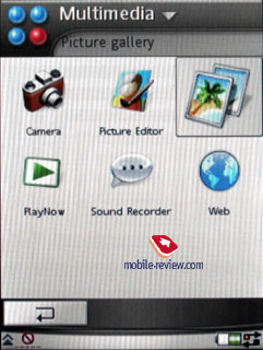
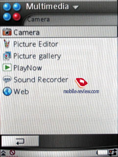
Both modes allow the menu shown either as lists or as a set of
icons. The icons are well drawn and impress pleasantly. So, you
can select the view you like.


With the flip off or removed completely, the interface appears
in all its beauty and uses the screen capabilities for 100%. Let’s
stop on several key points typical of the P990.
Activity Menu appeared in the menu like on the
analogy of Sony Ericsson K750i. This is typical only of the P990
and uses the same idea as a Today screen in Windows-smartphones.
And a similar application on a Symbian device was first introduced
by Nokia in its Nokia 6680 (and by the way, the name Active Standby
calls up with Activity Menu).
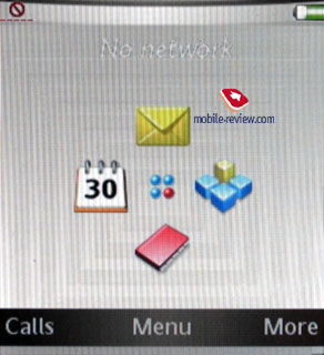
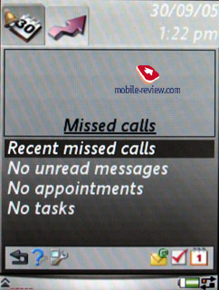
By default in open mode, the screen shows Activity Menu, the first
bookmark shows date and time, missed call list in a window on top
(if there are no such, you see an empty window), below you can find
the number of unread messages, organizer entries, and to-do list
entries as well. The menu bar provides help on this work mode, and
an icon for tuning this mode is nearby. Icons for fast launch are
moved to the right, they call such functions as creating a message,
organizer and to-do list entries. It’s funny, but the first bookmark
is called Today, that is an obvious and straight analogy with Windows-devices.

The second bookmark is used for tags assignable to almost any standard
function. And similarly to the K750, you can’t bind a tag to a file
or an application, since that can make problems, as the developers
considered. For instance, you remove the card with a file a tag
links to, and the smartphone will have to alert a mistake. And thus
a possibility of such mistakes is constrained primordially.
The settings allow specifying which panel will be shown by default,
that can be Today or your tags.
Status bar. The UIQ 3.0’s peculiarity is the status
bar is shown in all standard applications and menu. It represents
a part of the display and shows icons corresponding with the events
or work modes on. This is where an envelope signifying a new message
is shown (besides a pop-up alert, if it is possible in the current
application), and Bluetooth activity (due to the constant presence
of the bar, the developers refused a separate light indicator responsible
for Bluetooth by way of a light diode like in the P900/P910). There
number of variants described in the UIQ 3.0 and corresponding icons
is not great; however, they cover all the main events. Here is the
list of icons shown available through UIQ:
- Call and Internet connection status,
- Signal level, GPRS connection
- Battery level
- Bluetooth status
- IrDA status
- Missed calls (only a corresponding icon, not the number)
- Icons showing that incoming calls are restricted
- Reminder of SMS memory overfilling
- New message
- Mute mode indicator
- Virtual keypad indicator (for modes with text input available)
The left corner of the status bar shows an up arrow, it allows
a pop-up menu. As a rule, it shows the launch of standard applications.
They are hidden behind the New entry, and then you can select a
call, message, contact, meeting, task, note, sound record. This
is a comfortable way to launch a necessary application by two stylus
touches. Also here you can see time, adjust sound for all events
(both volume and select a melody). Finally, this very menu contains
all the connections, which are launched in one touch, and this is
undoubtedly a plus (now you do not need to call the control panel
and launch Bluetooth and IrDA from there).
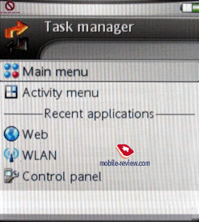
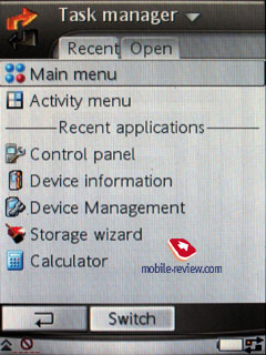
Task manager. Two arrows directed towards each
other are shown in a status bar to the right; this is a task manager
icon. Using old UIQ versions, previous models really lacked such
a capability, now you can call a list of last run applications and
run them again from here. The device uses preemptive multitasking.


Menu of the current application. Each application
has its own context menu, which is called by tipping the top part
of the screen with a stylus or a corresponding button on the QWERTY-keypad.
Everything is standard here, and really nothing special can be told
about this menu.
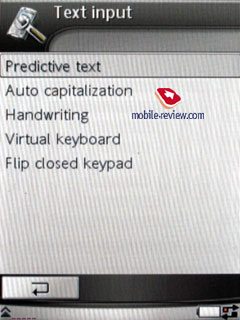
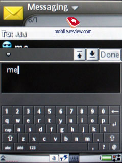
Text input and representation. The P990 provides
all possible ways to input text for today. Among them are hand input
recognition, entering with a usual number keypad with the flip closed,
the integrated QWERTY-keypad, and finally, virtual screen keypad.
Now a user can select the way to enter text to his/her liking. All
the means are described many times, and on our site as well. If
you are interested in their work, you can read the review of Sony
Ericsson P900.
Review Sony Ericsson
P900>>>


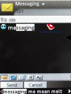
An important innovation of the P990 is its T9 input; this renewed
version allows not just entering words from the flip or integrated
keypad, but offers own variants of words to enter by the first letters.
Motorola’s products have used a similar system for several years,
and it proved its best. And obviously, Sony Ericsson P990 will become
the first device with a new version of T9 offering comparable functionality.
Pleasant trifles really gladden, the device will automatically
replace lower case letters with upper case in the beginning of the
sentence. However, you can switch this mode off. A similar function
is provided in Nokia’s phones, but there it can’t be off.
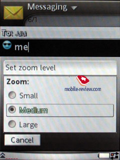
In each standard application, which allows working with text, you
are allowed to change font-size; by default you have middle size.
Reducing the size, you won’t get it too small, it still is well-read,
and the screen will then feature two more lines. And the same concerns
bigger size. You expect it greater increase, but the font will naturally
be read better, however, I found no principal difference from the
standard size.
And further let us discuss standard applications.
Contacts. The name list organization is rather
customary, you see names, and a line with the first number set by
default for a selected contact. The list doesn’t show contact entries
from a SIM/USIM-card, but you can work with them through the phonebook
menu, copy them both to the internal memory and to the card. However,
you will hardly need to keep contacts on the SIM/USIM-card, since
you can create an archive with all contacts on an external memory
card. And also consider the fact the structure of entries is broken
if storing on the SIM/USIM.


Search in the phonebook is carried out by the first letter or several
ones (a top bar is a fully functional search field). Bilingual entries
are sorted in a standard manner – first all English entries, then
in another language. So, you’d better keep the entries in the same
language for more comfortable search.
For a name you can keep unlimited amount of phone numbers, and
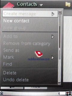
the first entered becomes a default number. You can add extra numbers
to the ones represented by the standard view through the menu. Using
horizontal scrolling, you can view separate numbers, and extra information
is shown just here (for instance, e-mail address and so on).


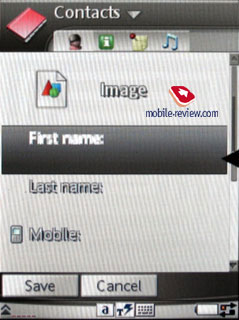
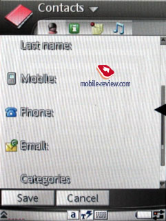
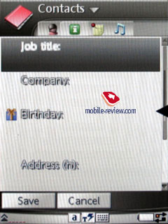
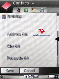
In contrast to the standard UIQ 3.0 realization, the Sony Ericsson’s
developers created four bookmarks for the contact editing mode instead
of three. The first one allows entering information about the phone
numbers, selecting a category or, if you like, a group. The peculiarity
is one name can refer to several groups simultaneously (useful for
working in groups, group messages). The second bookmark serves for
entering data on a birthday, position in the company, position name,
home address (several fields), and work address. And the third bookmark
is just a plain text note bound to the contact. The fourth bookmark
contains voice tags (assigned to phone numbers), allows selecting
a personal call signal (if a group melody is already assigned, it
is replaced with a personal one at incoming call, since the latter
one has higher priority). As we can see a bookmark with a text note
is not standard.
While viewing an entry, you can start writing a message to a selected
number with one pressure (in a pop-up window you will be asked to
select of SMS and MMS), if you select e-mail address, then integrated
mail client starts. Dealing with the phone got easier due to fast
dial distributed between three buttons (left, right, central).
The IM-client is integrated into Contacts; from here you can view
the interlocutor’s condition and switch to a necessary application
(that is not standard for UIQ). And in fact, third party developers
still have much to do; the interface is very flexible, full access
to Contacts is organized via corresponding APIs. Compared with the
UIQ 2.1, this version shows potential capabilities for creation,
and I think many additions to the standard phonebook will appear
in short time.
Using an integrated contact manager, you can send selected entries
(categories) to other devices via IrDA or Bluetooth. The smartphone
supports vCard 2.1 standard, and allows receiving entries from other
phones as well. Unfortunately, we still observe some problems with
sending contacts to some phones, and namely Sony Ericsson K750.
When sending all the contacts together, their phone numbers can
be mixed and reassigned to other names. However, we experienced
no problems when synchronizing with PC or PDA. If you send only
one entry, fields will correlate right. And to transfer your data
to usual phones, you will have to use MS Outlook as intermediate.
Using a fully functional realization of SyncML (with a new name
of OMA DataSync), you will be able to synchronize data with any
device compatible with the standard (a PC, a PDA or a phone).
You can apply various graphical transformations to the photos assigned
to contacts in the phonebook. They include tile and stretch. This
will allow you to show the picture qualitatively in various modes.
Also an integrated camera helps taking photos while creating an
entry. And the photos are stored in the internal memory then.
The phonebook is realized qualitatively and will satisfy even the
most demanding user. Due to almost maximal integration with installed
applications, the smartphone is very comfortable. You won’t feel
troubles when scrolling a list with one hand and the phone closed,
selecting a number from the view mode and dialing it. It seems no
differences from the previous models appeared, if only the JogDial
is slightly deepened.
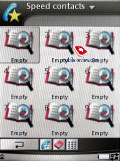
With the flip closed you can call search in the phonebook by pressing
and holding number keys, and by the way, you can search by several
letters. About 9 numbers for fast call can be set additionally;
a name and a photo (if assigned) are shown on the display for them.
To dial you have to select the digit (then a user’s name assigned
to the button appears) and press a call button. Switching between
such modes as dialing a number (by number keys) and fast call is
carried out by one touch of a corresponding icon in the standby
mode (full-screen mode).

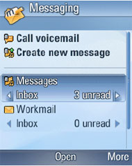
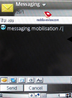
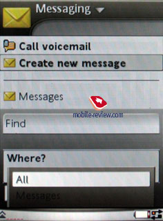
Messages. Due to the new version of the UIQ, the
Messages item was really reorganized. Now the one folder Incoming
is used for all messages, excluding e-mail. That also concerns files
received via IrDA and Bluetooth (all formats are supported, even
unreadable for the device). Then you can save the received file
into any of other folders, you have full access to the file system
(certainly, not to system folders). To please a user, the developers
allowed creating own folders and sorting messages in them. When
you enter the Message menu, you see the main folder by default,
using horizontal scrolling, it is possible to switch the folders,
and pressing OK you select the folder and view messages.


All e-mail accounts are displayed in the root of the Message item
under the Incoming folder. Having three of them, you will see them
all in the course you entered them into the device.
The type of each message is specified in the Incoming folder (SMS,
MMS, Beam), and you see a corresponding icon.
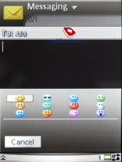
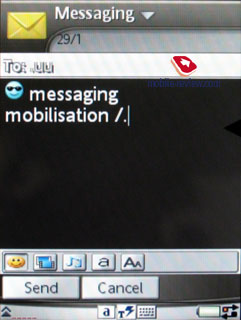
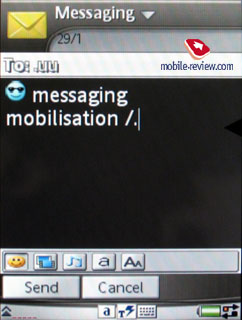
Practically from any phone menu where a phone number is present,
you can create a message. Select a message type (SMS/MMS) and start
writing. In fact, EMS stands behind the name SMS here. Now a user
doesn’t decide which type of a message to select, he just enters
the body and the system considers whether that is SMS (only text
input). If you select not only smiles, but melodies, pictures, format
text (I do not mean Zoom), then a message automatically turns into
EMS. No surprises are prepared here, the standard is fully supported.


Concatenated messages are shown as one in the general list, and
while entering the number of messages is shown in a standard manner
(for instance, 1/2). I would like to stress that a renewed version
of T9 picks entered words and offers their endings, which eases
life much (similarly to Motorola’s realization). One more advantage
is the phone remembers whole messages (they are stored in dynamical
memory, I stress this is not Drafts). If you start entering a word
present in the previous message, you are instantly provided with
all other words of that message, you will only have to either select
it or keep on entering. The first different word, and the rest of
the massage prompted disappears. That is ideal to store messages
temporarily if you do not want to keep them in Drafts. Automatic
change of the case is rather significant. The first letter of the
sentence is always in upper case, and the function can be turned
off. You can forbid transforming text smiles into their graphical
view for usual messages.
A message can be sent to numerous addresses, you only select them
at sending from the contact list, to do this you mark the names
or select separate numbers of the contact. Also mass mailing is
available for users’ groups. When answering a message you select
between SMS and MMS messages (the list forbids answering with e-mail).
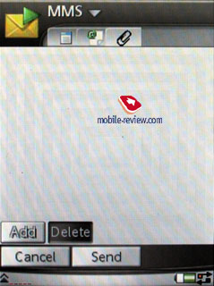
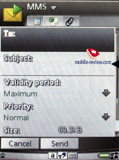
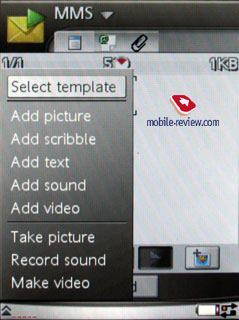
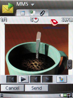
Creating MMS. It’s nice there are several bookmarks,
and you can select time out between the pages, create own templates.
There is a capability to attach own sketch made by hand on the touchscreen
(Scribble) besides standard files (graphics, video, photos, music
and so on). Everything is standard here, and when sending you have
a selection of contacts similar to SMS. By request you can ask not
for a plain delivery report, but a confirmation that your MMS was
read.


All types of messages (including e-mail) allow search by a text
fragment, the result window shows search results and allows fast
switch to a certain message. We failed finding a restriction for
a message size; they will probably be applied by an operator, or
a maker depending on the country (default settings, which allow
changing).

The smartphone understands MMS, e-mail client, GPRS and Internet
settings received over the air (OTA). Such settings are stored in
corresponding sections.
E-mail client. Several mail clients are supported,
and by the way, the UIQ can work with almost all represented today
standards (however, the standard realization doesn’t contain Push
Email, but it is possible using a corresponding API). Here are all
the standards supported by the OS:
- POP3
- IMAP (IMAP Idle, IMAP Remote folders)
- SMTP
- MIME
- MHTML
Mail client settings are very plain, particularly, you specify
if it loads the whole message or only its heading (or will read
messages not heavier than some KB). Now you can set the maximum
possible number of messages in the Incoming folder, when this number
is achieved, messages are not uploaded any longer. You can inquiry
the mail box in a time lag.
By default the UIQ uses character set Latin 1. However, the P990
uses Unicode thus becoming international. Also developers can add
own character sets, and Sony Ericsson will apply local ones for
various markets (1251 is included).
Fully supported attachments can be downloaded and then saved into
the phone’s memory or a memory card. If the type of the attachment
is known to the smartphone, you can open it (and a corresponding
icon of the type will be assigned). Size restrictions are absent
as such, however we noticed that the device interrupted loading
2MB (but that may be a problem of a local provider).
VPN support is preliminarily integrated into the P990, which allows
using it to access corporate mail boxed (a great advantage of the
device).
And now the main thing about the mail client. Any connection (including
WLAN) supporting data transmission can be used to download messages.
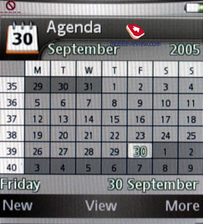
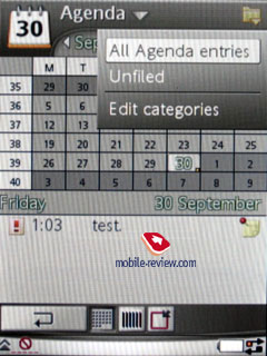
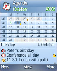
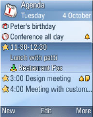
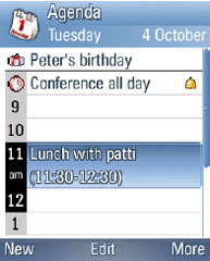
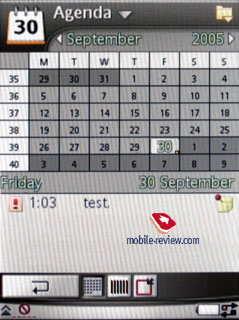
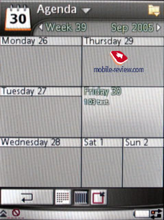
Organizer. Now besides a typical monthly view
and a list of events for a day, a weekly view appeared. Then a week
is represented as two columns with days and each cell contains current
events. This view is very comfortable and allows estimating the
week load. If you have more than five events for a day, they are
not shown all.


When the flip is closed and you view the calendar in a monthly
view, only a table with the month is shown. Opening the flip, you
see the first three events for a selected day (by default the current
day) and can switch to any event quickly. In a closed mode you will
have to press OK to view the events for a day. That is quite logical
and separates work modes.


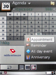
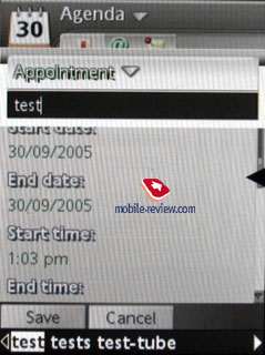
A monthly calendar indicates days with entries assigned using corresponding
marks to the right of the number. Four types of events are supposed
totally – appointments, reminders, anniversaries, all-day event.
They may be repetitive and have special alert signals.
The organizer supports vCalendar version 1.0, and also you can
work in groups using an iCalendar standard. In practice, that is
a capability to ask for an appointment using the mail client. Your
vis-a-vis can refuse or accept the meeting. If the answer is positive,
the message received will be automatically added to the organizer,
and a corresponding entry appears in the calendar. Before the answer
is received, you can view the condition of your inquiry.
Now this function seems exotic, however, in half a year it may
be demanded in small developers’ groups, among companies where the
P990 is standard, or it will get compatible with iCalendar on other
devices. This realization is pleasant and really expands the capabilities
of the organizer.
We really like a peculiar function, which allows reserve copying
organizer entries to the external memory card and their following
restoration to the phone’s memory (if necessary). The previous versions
of the UIQ lacked this capability, and the question was solved by
third party programs (often rather bad).
You can send calendar entries to other devices using IrDA and Bluetooth,
which is a standard function. Certainly, reception is also supported,
and after you view such messages they are transferred to the calendar
at once. Fully realized SyncML (a new name of OMA DataSync) allows
synchronizing data with any device compatible with the type (either
a PC, a PDA or a phone).
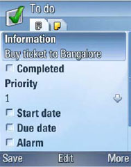
To-do list. You can exchange organizer entries
and to-do list ones. Similarly to the organizer, you can create
a reserve copy of the to-do list on the external memory card. It
is possible to create unlimited number of categories to sort entered
tasks by. You can set the priority from 1 to 3 (low, normal, high),
limit time for a task; set a signal (that is lo your liking – any
signal is possible).


You can sort entries by categories, a list of completed tasks (they
may be hidden), by expiry date and priority. SyncML is supported,
and synchronization with MS Outlook is correct. Using IrDA or Bluetooth,
you can send entries to any device. Such entries can be sent in
a message body as well.
The next part will tell about the rest standard applications and
their peculiarities. Some interesting facts and discoveries are
waiting for us. Do not miss the review!
Review Sony Ericsson
P990. Part 1>>>
Review Sony
Ericsson P990. Part 3>>>
Eldar Murtazin (eldar@mobile-review.com)
Translated by Maria Mitina (maria.mitina@mobile-review.com)
Published — 17 October 2005
Have something to add?! Write us... eldar@mobile-review.com
|
News:
[ 31-07 16:21 ]Sir Jony Ive: Apple Isn't In It For The Money
[ 31-07 13:34 ]Video: Nokia Designer Interviews
[ 31-07 13:10 ]RIM To Layoff 3,000 More Employees
[ 30-07 20:59 ]Video: iPhone 5 Housing Shown Off
[ 30-07 19:12 ]Android Fortunes Decline In U.S.
[ 25-07 16:18 ]Why Apple Is Suing Samsung?
[ 25-07 15:53 ]A Few Choice Quotes About Apple ... By Samsung
[ 23-07 20:25 ]Russian iOS Hacker Calls It A Day
[ 23-07 17:40 ]Video: It's Still Not Out, But Galaxy Note 10.1 Gets An Ad
[ 19-07 19:10 ]Another Loss For Nokia: $1 Billion Down In Q2
[ 19-07 17:22 ]British Judge Orders Apple To Run Ads Saying Samsung Did Not Copy Them
[ 19-07 16:57 ]iPhone 5 To Feature Nano-SIM Cards
[ 18-07 14:20 ]What The iPad Could Have Looked Like ...
[ 18-07 13:25 ]App Store Hack Is Still Going Strong Despite Apple's Best Efforts
[ 13-07 12:34 ]Infographic: The (Hypothetical) Sale Of RIM
[ 13-07 11:10 ]Video: iPhone Hacker Makes In-App Purchases Free
[ 12-07 19:50 ]iPhone 5 Images Leak Again
[ 12-07 17:51 ]Android Takes 50%+ Of U.S. And Europe
[ 11-07 16:02 ]Apple Involved In 60% Of Patent Suits
[ 11-07 13:14 ]Video: Kindle Fire Gets A Jelly Bean
Subscribe
|
