|
|
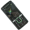
Sony Ericsson K850i – 5 Mpix camera performance
Table of contents:
- Design
- Cyber-Shot (SE v2.0) interface
- Bare facts about Sony Ericsson K850i camera
- Brief comparison with Sony Ericsson K800i
- Nokia N95 vs Sony Ericsson K850i
- Sony Ericsson K850i – shots in various environments
- Video recording
- Conclusion on Sony Ericsson K850i’s camera
The arrival of the Sony Ericsson K850i is highly anticipated by many in view of the handset’s top-notch functionality, as well as the 5 Mpix camera it retains, which is the top of the line solution in the Cyber-Shot range. Does this camera have something revolutionary to it and can it even have a claim for this title? To me, it is an evolution, when solutions previously experienced only with digital cameras are being carried over to handsets. In this model the manufacturer has focused on two major aspects: interface and ergonomics of the camera and also tweaked its performance in some modes. It wouldn’t be the right thing to expect this camera module to stand up to real digital cameras - lack of space for building in quality lenses is still the greatest barrier. If you are a perfectionist and demand superior quality, than conventional digital cameras are worth looking at, since handsets will always be lagging a step or even several generations behind. It is quite another matter, though, when you want to get the most out of your phone. If that's the case, then the Sony Ericsson K850i is the way to go.
Let’s take an overview of the handset’s imaging abilities and for this, we are putting it face to face with the Nokia N95. Deliberately or not, everyone will end up comparing these two phones when it comes to imaging departments. It was Nokia who came up with the first mass-market device sporting a 5 Mpix camera onboard. Even though there were others before it, only the Nokia N95 has managed to become a relatively mass-market product. While the Sony Ericsson K850i is looking to target the same market, in any event, it will be only a runner-up. The company has given up active attempts to struggle for the title of technology pioneer and now strives to hold its own with various technological talents.
Design
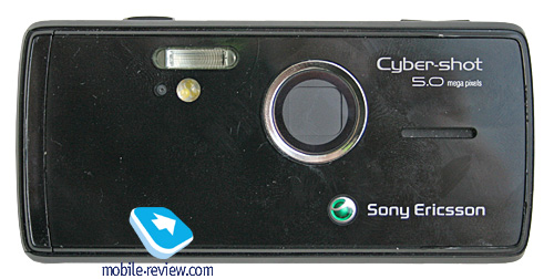
Sony Ericsson was the company to introduce the dual-face design in handsets. In other words, on the front fascia it looks like a normal phone, while the rear represents is similar to normal digital camera. One of the key traits was the shutter covering the lens - sliding it down brought up the camera mode automatically, which was pretty convenient. These solutions eventually got so popular that other makers had no options but to replicate them, and so today most of the top-notch solutions employ the dual-face design to a greater or lesser extent.
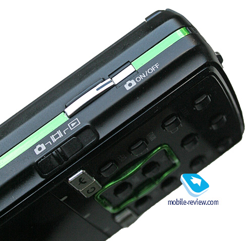
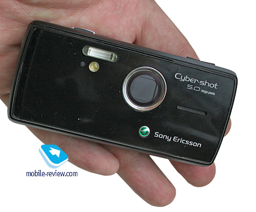
It would seem that the Sony Ericsson K850i is bound to utilize the solutions the company already has in this portfolio, but again, Sony Ericsson makes a sudden twist and modifies the design. The shutter, that many have fallen for is no more - instead, the lens is hidden under the glass, which is somewhat recessed relative to the rear face. Under this glass sits the shutter, which can be released only by launching the camera mode. Apparently, this has done nothing good to the design, and on the face of it, there is no reasonable explanation for that. But after questioning more than a couple of Sony Ericsson managers in different regions, we have managed to figure out what’s the catch here. There is a handful of motives, one of which is an attempt to design the handset to look very reminiscent of today’s digital cameras, that is, they have armed the K850i with a dedicated camera on/off key as well as a mode switch - these two are housed on the right-hand side. While shooting, this spine will be on top.

A shutter here would have made the mode selection key look out of place or it should have been made passive, which isn’t particularly handy either. The other, by no means a top-priority reason, was trimming some millimeters from the girth. That’s where things get interesting within the Cyber-Shot range - all top solutions will adopt the controls found in the Sony Ericsson K850i. At the same time, most of the mass-market Cyber-Shot offerings in the upper price bracket will come included with shutters. And all solutions outside the Cyber-Shot line, for example the Sony Ericsson T650i, will have to make do without any kind of shutter. By the way a counterpart of the Sony Ericsson T650i comes with a shutter. All solutions in the bottom price-bracket will be without a shutter. In terms of differentiation through functionality, there is nothing really bad in this - pay more to gain more. However when it comes to user experience, it is not so clear. Let’s imagine a real-life situation: for example, your humble servant here is bent on photography, therefore he needs a quality camera in his mobile phone, since he either doesn't have a camera on him or he doesn't always feel like taking a few snaps every time he has a digital camera at hand. After having my quality time with the Sony Ericsson K800i, and even before it, the Sony Ericsson K750i in my experience of handling such solutions has shaped up in this way? slide the shutter down, aim and take a picture. And it is a rare occasion when you have to setup the camera, as everything is pretty much automatic - get the phone, snap, put it back. Now I get a new product with enhanced image quality and functionality - the Sony Ericsson K850i, but my previous experience is worth nothing here. I can’t operate the camera by feel alone, and have to look for the button on the device, since it is sunk into the casing. For some occasions it is utterly awkward. On the other hand, for a mass consumer it is another sign of a hi-tech device.

And what do you do now? Consumers will be presented with a choice between less sophisticated shutter-equipped models, sporting the previous generation flagship functionality. It is neither bad nor good - this is how today’s market works. While its previous solutions were aiming for the mass market, but with an emphasis towards techie and niche audiences, this very phone is chiefly intended for the mass market.
Surprisingly, the Nokia N95 comes really close to the previous Sony Ericsson offerings user experience-wise. If I were in the shoes of the company’s developers and marketers, I would think and rethink this sudden twist in ergonomics many times. It is not for sure that after a few minutes of quality time with the handset in a shop, people will get used to the new camera controls and come to realize that it’s convenient and can be mastered in no time. This way, the user experience is broken, which is not always a good thing. Add missing hardware keys, new touch-sensitive buttons and a couple of other alterations provide an added learning curve for those used to previous handsets by Sony Ericsson. And, conversely, Nokia tries to maintain it. Everything on the market has mixed up so much - the only positive about this is that such twists will occur on a rare occasion, and for a few years to come the company’s top of the line products will build upon the concept found in this handset.
Every maker strives to make its products distinctive and familiar in use. The examples of the Nokia N93 and the Sony Ericsson K850i clearly explain this. So it is a seed for an article with a rundown on how the makers influence consumers and which trends they are forming.
Let’s delve deeper into the handset’s design. The top right of right-hand spine houses the digital zoom button (x16), to the right sits the protruding shutter key and the three-way camera mode switch, its first position stands for still shots, second - video, third - gallery. To the right of the shutter key is the camera on/off button. If you don’t shut it down after shooting, the camera will do it automatically after a few minutes.

The lens inside the glass is covered with a shutter, which is here in order to prevent the matrix from damage if you happen to leave the K850i in the sun. Despite being recessed, the glass is still prone to smudge, just as the entire rear face. Of course, you can not bother to wipe it, but the best shots come out when it is clean. Well, this is another serious drawback to the new design - the protective glass attracts grease and dirt with ease.

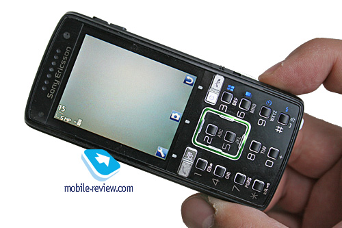
The upper row of the numeric keys has captions made in blue, which resembles the way the Sony Ericsson K810i has them. They have backlighting of their own, and each of these buttons is used for jumping between modes instantaneously.

This way, “3” switches between normal mode, BestPIC, panorama and frame, “6” adjusts scene, “9” - timer and the last one - flash. With the help of “0” you can bring up a tooltip, telling you that the navigation key doubles as a zoom key, when pushing it horizontally, and with up/down you can modify brightness. In the previous models the number pad also served for shifting image resolution and switching to macro mode. These options have been forgone not because of some miscalculation or an attempt to follow the fashion. The maker thinks that, generally, the vast majority of users shoot in one and the same resolution, so giving this option a shortcut makes a little sense. No macro switch is due to the fact that the handset's imaging department is tweaked to the extent when it properly handles both macro and infinite automatically in most cases, thus the consumer won't really need these functions in quick launch.
Around the lens is a light-emitting rim, which flares in blue upon camera startup. This is made only in an effort to let you know where the lens is. To the right sits the xenon flash, equal to that used in the previous models like the K800i power-wise. At the same time, right beneath it is a LED flash, which is here to improve quality of pictures taken during the night-time, when use of a xenon flash is not justified. This is the first occasion when two flash types go hand to hand in one device.
Back to the table of contents >>>
Cyber-Shot (SE v2.0) interface
Frankly, if over at Sony Ericsson they even have camera interface indexes, they don’t share them with anyone. In order not to confuse you with what features were available and what exactly the maker has enhanced, we introduce own Cyber-Shot range indexes. This way, the first version or the first generation is the Sony Ericsson K750i (albeit it is not attributed to this line-up, this device is where everything has started at), then the Sony Ericsson K790i/K800i. The Sony Ericsson K810i is a bridge between two generations, which is indicated by Photo Fix and also a row of shortcuts on the keypad (lit in blue as well) - so, we give it version 1.5. And naturally the revamped interface found in the Sony Ericsson K850i gets version 2.0.
The interface shares a lot of things with Sony’s very own T-series of digital cameras - now the K850i features thumbnails standing for shoot modes, which makes picking the right mode more intuitive. The settings menu has changed as well. That’s about it - no other serious changes have been introduced, apart from ISO settings. That said, we are moving on to the core settings.
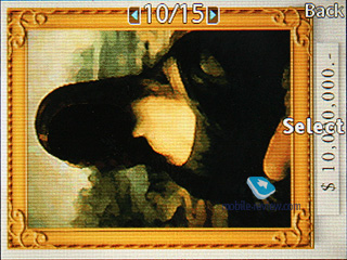
Shoot Mode - Normal (set by default), BestPic (Sony’s trademark technology), Panorama (stitches a batch of three photos together, no top resolution available), Frames (select various frames right on the screen). There is no Burst mode (several photos taken in rapid succession), since its alternative, BestPIC, is available in the K850i.


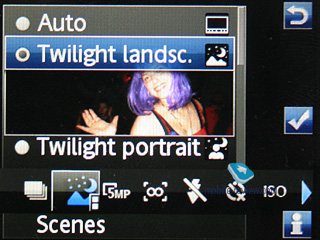
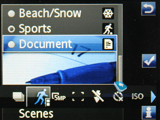
Scenes - Auto, Twilight landscape, Twilight portrait, Landscape, Portrait, Beach/Snow, Sports, Document. These settings become interesting only when the handset can’t give you what you are looking for in auto mode, as a rule, such occasions are very rare and these settings end up nearly useless.


Focus auto, macro, infinite, autofocus cannot be disabled.

Flash – Auto, red-eye reduction, disabled. You can’t make the flash trigger every time.

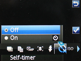
Timer - can be either enabled or disabled, time span is not adjustable.

ISO - Auto (in this mode the K850i, as a rule, works with settings up to ISO100), and also ISO100, ISO200, ISO400.

Effects – nothing out of the ordinary here: Black&White, Negative, Sepia, Solarize.

White balance – auto, Daylight, Cloudy, Fluorescent, Incandescent.

Metering mode – Normal or spot.

Settings – the menu has been revamped so as to resemble the today’s digital cameras. On the left are the options themselves, on the right – their values.


Picture quality –Fine, Normal
.
AF Light – Auto, can be disabled.
BestPIC – Fast, Slow (how fast this feature will work, a really interesting option).
Review – yes or no.
Stabilizer – on or off.
Save to – built-in memory or memory card.
Auto picture rotation – yes or no.
Shutter sound – five available, can be disabled at all.
Shot counter reset.
Back to the table of contents >>>
Bare facts about the Sony Ericsson K850i’s camera
Image resolution:
- 5 MP (2592x1944 pixels)
- 3MP (2048x1536 pixels)
- 1MP (1280x960 pixels)
- VGA (640x480 pixels)
Digital zoom - x16
Average file size (Fine quality) – from 1 to 1,5 Mb
Time to save a shot – 2-3 seconds
Camera startup time – 1,5-2 seconds
Matrix type: CMOS
Back to the table of contents >>>
Brief comparison with Sony Ericsson K800i
Many have craved for a full-fledged comparison of image quality with the Sony Ericsson K800i, since the new flagship comes in to replace this very device. In my opinion, such comparison is not without reason, but facing off all modes and settings is somewhat superfluous, so let’s take a look at the differences only on a couple of snaps, which will be enough to give you a rundown on this matter.
For the majority of pictures sharpness of particular details (auto mode) is pretty much the same. To me, the Sony Ericsson K800i does a more decent job on the color reproduction front - its colors are somewhat more saturated which is indicated by the hues of the sky on our shots.
But it turns out that single-color items are better processed with the Sony Ericsson K850i, which makes them look very natural.
Judging from our experience, in most cases the Sony Ericsson K850i outputs more natural-looking snaps, even though the slightly brighter pictures of the K800i look better. It is a matter of taste - thankfully, the difference is not so striking, and will remain unnoticed by most of the users.
Serving as proof of our words is the snap below - not only does the picture taken with the K850i look more natural in terms of colors, but also it seems more vibrant.
On close-ups it seems that the cameras are similar in quality, but if you take a closer look at the pictures, you will see that the Sony Ericsson K850i, all thanks to its superior resolution, catches a bit more detail than the K800. On the shots below, pay attention to the area surrounding the C button and the blossom dust. On the negative note, consumers won’t appreciate our investigations in this field, and in fact they will simply put the K800i and the K850i in the same boat. In view of higher image resolution provided by the Sony Ericsson K850i it is a pretty decent result. But in order not to give imaging aficionados a chance to blame me for something, I shall make a reservation that on some occasions the Sony Ericsson K800i takes fractionally better shots, but only provided that the light conditions are equal. Technically, the cameras in these two handsets are pretty much comparable in terms of image quality, bearing in mind the Sony Ericsson K850i’s more natural colors.
Back to the table of contents >>>
Nokia N95 vs Sony Ericsson K850i
Many, including me, deliberately or not, consider these two as direct and obvious competitors when it comes to image quality. And that’s why facing them off in real life was utterly interesting. Please, take note, that the shots marked as Nokia N95’s might have been taken with different units (firmware 11 and 12 respectively, but both are commercial units). That said, we are taking a plunge.
Took a snap of a red flower on the table, and that’s how it turned out.
The Nokia N95’s result is quite predictable - its trademark style boosts colors, making them more saturated and occasionally surreal, but something has to give, and so details are gone. At the same time the K850i provides smooth flower outlines with natural colors. So as to check the effect we are all familiar with from the face-off between the Sony Ericsson K800i and the Nokia N93, let’s snap another item. For example, let’s put a toy onto a stub.
The colors on the N95’s shot are not totally natural - processing them in such way, the handset has added a blink onto the toy face’s right side and given him flamboyant colors. Curiously, Nokia has done much better with the background, making it crisper (thanks to a corresponding filter) and more detailed. In contrast, the Sony Ericsson K850i, and we have seen it a lot of times, automatically figures out what item you are shooting, and the number of mistakes here is measly. It tries to pick the most fitting mode out of the preinstalled ones. How does it do that? - We are puzzled ourselves.
Now let’s see how the devices can focus on single-color items. Let’s compare the picture with a chamomile and a little spider sitting on it.
Both handsets did a decent job with processing the background - it is adequately blurry and serves exactly as a background to the flower. But what about the chamomile? The Nokia N95 shows it as if the flower was cut out of somewhere and then stuck onto the shot, being somewhat soft in its application (the effect is best seen at 25% scale). The same image processing mode kicks in here. In spite of being less sharp, the K850i displays the pattern of stamens, whereas the N95 presents them as a bright blurry spot. Thanks to its more natural color reproduction, the shot taken by the K850i looks better.
Again, we are going to focus on nature and put a few berries onto a leaf.
The picture was taken in the evening under the darkening sky. Better lighting and soft outlines – that’s what characterizes the K850i’s shot. Some leaves sticking out of the background produces an overall pleasant effect. Well, while I’m writing these lines I do realize that I have to find a picture where the Nokia N95 is the winner, otherwise, I’m going to get slated or they will ask me to check my eyesight, having spotted something different in the shots above.
The next picture was taken indoors, in a cafe, when I really don’t like having a cup of coffee or a meal. But sometimes I can’t avoid that. So, here is one of my players and the cafe’s sign.
Both snaps are by no means decent, but the one taken with the Nokia N95 doesn’t feature the web page, so is dimmer, and that’s because the handset’s gears failed to evaluate light conditions properly. The image is slightly on the fuzzy side, but it has such details as lamp reflections on the table, while long exposure time of the K850i has made it white. But in general the K850i’s shot is ahead.
That’s it, finally! I have found two shots taken indoors, which are nearly equal and many will claim that it is a draw.
The signs in the background can be readily overlooked - the K850i makes them pretty sharp, but in this very picture it is not that crucial.
Do you like cream in your coffee? That’s why I decided to take a picture like this - not the best cream around, but what we are looking for is the resulting image. The Nokia’s algorithm here has done a decent job - the picture is brighter, although the flares on the spoon are incredibly blurry, but this doesn’t spoil the impression. Obviously, Nokia looks like a winner with this shot
I feel obliged to share with you the way the Nokia’s algorithm performs, applied to objects with tiny specks - it makes them amusing to look at, even more than that. Here are two visions of one and the same stone. Apparently, Nokia has gone too far with ‘spangles?.
Now onto some general-view photos, where Nokia should have the upper hand, for its algorithm makes all colors more flamboyant. And it had, at Lubjanka - Nokia made the reality a tad more colorful. So its picture has more visual appeal, even though Sony Ericsson made a more natural image of the building.
Here is a museum, whose picture was taken from the same spot. That’s where the things get controversial - the snap now features tiny details. For example the second car with Y450CB tag - Nokia has made it much trickier to read. And the next car’s tag is impossible to read. The second banner on the background in Nokia’s vision has most of the information smeared. The museum itself doesn’t have such acid hue to it - but that’s what Nokia tells us. On balance, in terms of details the N95 is far inferior to the K850i.
On a rainy day both phones did equally well - the prize for quality doesn’t go either way, although the K850i makes all objects somewhat sharper, but this doesn’t enhance the image in any considerable way.
While I was shooting in the wild, I really loved the way the Nokia N95 processed the sky, making the snap looked better. It is not all about the details here - it is more important to convey the mood, and that’s where the Nokia N95 does better in this case. Although the colors are still unnatural, however, many people may simply overlook that fact.
But I find these shots much better when the K850i does the job.
Back the general-view photos - we compare the ways these two cameras see the bridge. Obviously, the K850i scores here - look at the poor details of the building on the background and, as it seems to me, lack of color saturation in the N95’s shot, and you will get it. Although the N95 makes it look more vivid. Generally speaking, it is still the matter of taste. The shot by Nokia N95 is 25% smaller, meaning that it contains fewer details.
The balcony photo is, no doubt, where the Nokia N95 has done well – good sharpness and crisp details.
The monastery looks good indeed, both photos are fine and I’m really puzzled which one to choose.
Close-ups in the night time (up to 3 meters) are obviously Nokia’s strong point, whereas the K850i’s shot is on the whitish side.
On short distances the xenon flash ensures fair number of details, but the background gets fuzzy. Personally, I prefer the photo taken with the Nokia N95, for it looks more appealing.
And the last, but not the least, a tower in the same monastery – the colors in the Nokia N95 have nothing to do with the sunset, it is the phone that has painted it in such way. Well, looks good, right?
We could go on and on with other samples, but thankfully we have over a thousand snaps with both phones. The conclusion can be made based on what we have already shown you. First up, the basics - macro mode. Few users shoot in this mode regularly, but some do find it interesting. This mode is where the Nokia N95 falls flat, providing poor details, which are vitally important here, and also some items have way too sharp outlines. Also we run into a problem - the Nokia N95 always required us to enable the Macro mode, otherwise its autofocus simply refused to kick in. The effective range for macro makes 10-12 cm, while for the Sony Ericsson K850i it is 7-8 cm. On top of that with the K850i you can forget about the hassle of switching into macro manually - the handset automatically identifies usage mode.
When it comes to general-view photos, it is by no means a draw - the Sony Ericsson K850i does better on the color reproduction front and gives you more details. However, in general, the Nokia N95’s images look more decent due to it being, let’s say, more artistic.
In my humble opinion, the flash found in the K850i will come in handy very rarely, only when you are going to take a close-up of someone. In all other cases, the Nokia N95 produces more vibrant images.
Indoors snaps can go either way quality wise, though the K850i is ahead by a tiny margin.
Now here is a small riddle for you. Where will snaps look better when printed out in 10x15? The answer is very controversial - what looks smooth on your PC screen might loose in quality when printed out. For example, the chamomile we mentioned above seems to have lost some of its colors. The outlines we blamed the Nokia N95 for got a tad sleeker. So the Nokia N95 forges into the lead. That’s why we left nothing to do but print all the samples and then compare these photos all over again. And it turned out that some pics by the N95 got more appealing, but after all, the K850i won the contest by the slimmest of margins (40 to 60). The images we called “artistic” after being printed became grotesque - their colors were too unnatural.
Thankfully, I can’t say the Sony Ericsson K850i’s camera is totally superior to the Nokia N95 - these products are pretty much in the same league for the end-users, especially if they are not going to print photos or view them on PC screens. And if they are, the K850i will have the upper hand in most situations and modes. I can’t say, though, that it wins by quite a margin, but it surely has some advantage. Technically, these two products are comparable, especially if you think that a camera built into a handset is there for entertainment purposes only. Although, the today’s camera phones can readily stand up to some average film compacts of 15 years ago.
Sony Ericsson K850i - shots in various environments
Examples of how the zoom feature works can be found in this file - zoom.zip
And now we are just presenting you with some shots taken in various environments with and without flash - I don’t think my comments are needed here.
 |
 |
| (+) maximize, 2592х1944, JPEG |
(+) maximize, 2592х1944, JPEG |
 |
 |
| (+) maximize, 2592х1944, JPEG |
(+) maximize, 2592х1944, JPEG |
 |
 |
| (+) maximize, 2592х1944, JPEG |
(+) maximize, 2592х1944, JPEG |
 |
 |
| (+) maximize, 2592х1944, JPEG |
(+) maximize, 2592х1944, JPEG |
 |
 |
| (+) maximize, 2592х1944, JPEG |
(+) maximize, 2592х1944, JPEG |
 |
 |
| (+) maximize, 2592х1944, JPEG |
(+) maximize, 2592х1944, JPEG |
 |
 |
| (+) maximize, 2592х1944, JPEG |
(+) maximize, 2592х1944, JPEG |
 |
 |
| (+) maximize, 2592х1944, JPEG |
(+) maximize, 2592х1944, JPEG |
 |
 |
| (+) maximize, 2592х1944, JPEG |
(+) maximize, 2592х1944, JPEG |
 |
 |
| (+) maximize, 2592х1944, JPEG |
(+) maximize, 2592х1944, JPEG |
 |
 |
| (+) maximize, 2592х1944, JPEG |
(+) maximize, 2592х1944, JPEG |
 |
 |
| (+) maximize, 2592х1944, JPEG |
(+) maximize, 2592х1944, JPEG |
 |
 |
| (+) maximize, 2592х1944, JPEG |
(+) maximize, 2592х1944, JPEG |
 |
 |
| (+) maximize, 2592х1944, JPEG |
(+) maximize, 2592х1944, JPEG |
 |
 |
| (+) maximize, 2592х1944, JPEG |
(+) maximize, 2592х1944, JPEG |
 |
 |
| (+) maximize, 2592х1944, JPEG |
(+) maximize, 2592х1944, JPEG |
Back to the table of contents >>>
Video recording
For the first time since the Sony Ericsson W900i, the company has made a step towards consumers in the video department. The K850i can shoot in 240x320-pixel resolution at 30 FPS for 2 hours straight with sound enabled. The microphone faces no problem with capturing your voice, but it blurs all outside sounds. By and large, the video recording quality is not stellar - still waiting for a video-heavy offering.
Video sample 1 (3gp, 0.9 Мб) >>>
Video sample 2 (3gp, 1.9 Мб) >>>
Video sample 3 (3gp, 0.8 Мб) >>>
Video sample 4 (3gp, 1.1 Мб) >>>
Video sample 5 (3gp, 1.0 Мб) >>>
Back to the table of contents >>>
Conclusion on Sony Ericsson K850i’s camera
Frankly speaking, I didn’t like the twist in ergonomics, missing shutter and these switches. But my experience of having taken a few thousands shots tells me that it is not a big deal. The handset is easy to master, so it looks quite adequate as a replacement for a real (wanted to write “handset” - Mr. Freud?) camera. If you value truly photographic quality of snaps - look no further, this model has no alternatives. In all conscience I have to admit that the Nokia N95 over the past 6 months has become the most popular 5 Mpix equipped device, but the Sony Ericsson K850i is not only on its heels, it also surpasses it in the imaging department (that’s our only focus now).
You can claim, screaming and kicking, that cameras in mobile phone were, are, and will be nonsense. But what I really recommend these people do is to take their 10-15 year old photo albums and compare the quality of images there with some samples given in this article. The revolution is already here - the Nokia N95, the Sony Ericsson K850i and some models still to come have brought it. A convergent device can ensure image quality that will seem adequate to most consumers.
This year sees another iteration of the Sony Ericsson K800i/Nokia N93 battle that took place last year. In the rivalry between the Nokia N95 and the Sony Ericsson K850i, the latter is ahead with some interesting features and abilities, as well as a more natural algorithm of image processing. Time has proven that both Nokia’s and Sony Ericsson’s offerings became sought-after and had their own followers. But after all, if you are looking for the best imaging department around - it's all in the Sony Ericsson K850i.
P.S. We haven’t reviewed slide-show, image editor and other extra features, which are all connected with the imaging department, but deserve a close examination. Therefore these will be our main focus in the next installment of the review.
Related links:
Back to the table of contents >>>
Eldar Murtazin (eldar@mobile-review.com)
Translated by Oleg Kononosov (oleg.kononosov@mobile-review.com)
Published — 19 July 2007
Have something to add?! Write us... eldar@mobile-review.com
|
News:
[ 31-07 16:21 ]Sir Jony Ive: Apple Isn't In It For The Money
[ 31-07 13:34 ]Video: Nokia Designer Interviews
[ 31-07 13:10 ]RIM To Layoff 3,000 More Employees
[ 30-07 20:59 ]Video: iPhone 5 Housing Shown Off
[ 30-07 19:12 ]Android Fortunes Decline In U.S.
[ 25-07 16:18 ]Why Apple Is Suing Samsung?
[ 25-07 15:53 ]A Few Choice Quotes About Apple ... By Samsung
[ 23-07 20:25 ]Russian iOS Hacker Calls It A Day
[ 23-07 17:40 ]Video: It's Still Not Out, But Galaxy Note 10.1 Gets An Ad
[ 19-07 19:10 ]Another Loss For Nokia: $1 Billion Down In Q2
[ 19-07 17:22 ]British Judge Orders Apple To Run Ads Saying Samsung Did Not Copy Them
[ 19-07 16:57 ]iPhone 5 To Feature Nano-SIM Cards
[ 18-07 14:20 ]What The iPad Could Have Looked Like ...
[ 18-07 13:25 ]App Store Hack Is Still Going Strong Despite Apple's Best Efforts
[ 13-07 12:34 ]Infographic: The (Hypothetical) Sale Of RIM
[ 13-07 11:10 ]Video: iPhone Hacker Makes In-App Purchases Free
[ 12-07 19:50 ]iPhone 5 Images Leak Again
[ 12-07 17:51 ]Android Takes 50%+ Of U.S. And Europe
[ 11-07 16:02 ]Apple Involved In 60% Of Patent Suits
[ 11-07 13:14 ]Video: Kindle Fire Gets A Jelly Bean
Subscribe
|

