|
|
Review of GSM/UMTS-handset Samsung U900 Soul
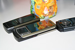
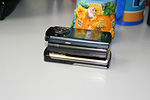
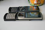
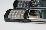
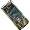
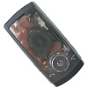
Live photos of Samsung U900 Soul
Table of contents:
- Positioning
- Design, size, controls
- Display
- Keypad, Touchscreen
- Battery
- Connectivity
- Memory, Memory Cards
- Performance
- Camera
- Menu, interface
- Phonebook
- Call log
- Messaging
- Organizer
- Multimedia
- MP3-player
- Entertainment
- WAP
- Applications
- Alarm clock
- File Manager (My files)
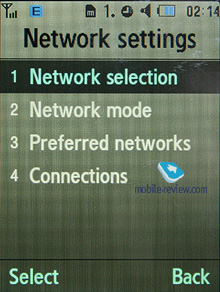
- Settings
- Impressions
Sales package:
- Handset
- Charger
- Wired stereo-headset
- Memory card (size and availability vary by region)
- User Guide
Positioning
Over the past couple of years Samsung has been loyal to the slider form-factor for its flagship handsets, which is not a bad thing given their brilliant track record with this design. The first brick they laid was the Samsung D500, then the D600 and a selection of handsets where slim was definitely in - the D900, U600, and U700. The underlying principle of these offerings has not been the number of features, thinness or megapixel count, but rather the price/quality ratio. In other words, they may not have even been at the cutting edge specs-wise – take their cameras for example, they have never been dazzling compared to the competition; the same goes for phonebooks etc. However, when you take into account the overall punch they pack, and the way all the features are integrated, it is very hard to find a credible alternative to Samsung’s flagships, and as far as sliders go, you won’t find any at all. That’s why anyone who is a fan of sliders doesn't have much of a choice – the top of their short-lists will invariably be overrun by Samsung-branded solutions. The truth is, such a position is hard to buy, it can only be earned with an array of successful models, history and loyalty, which, it just so happens, Samsung have.


The Samsung U900 comes from the new generation of the Ultra family, to be really specific it represents the third update to the series. Samsung hasn’t rolled out the other two products in an effort to focus all the attention on the U900 and avoid any unnecessary distractions; and once the U900 has debuted and everyone interested has wet their beaks, we'll see these two handsets released. They will have different form-factors, yet take design cues from the flagship and mirror its feature set. Actually, it is the first time in the history of the Ultra family when not only the flagship, but supporting offerings as well have a shot at the mass-market. As far as the second generation goes neither the Samsung U100 nor the Samsung U300 managed to make a strong impact largely due to their limited functionality, questionable design, and abundance of rivals.
The newcomer is dubbed “Soul”, and there is something more than just a regular meaning to it, “Soul” is also short for “The Spirit Of Ultra”, emphasizing that it stands above all models in the Ultra Edition range.

Since the U900 is Samsung's flagship they will extend its life span with new colors, which will guarantee it a place on the shop shelves for at least 1-1,5 years. For those who plan to stay with their new handsets for this long the U900 is an interesting proposal, as despite its price going down over time it won’t lose its charm and the hype that surrounds it. As far as Samsung's other handsets are concerned, normally they last 6-8 months, and after that they become obsolescent.
The U900 has no clear-cut target demographics (men or women) – it’s a unisex phone that will suit everyone. In the sense of age brackets, it looks to appeal 23-35 year olds in the first instance, and all other categories are secondary. Curiously there are no age barriers for the U900; it will fit perfectly in a teenager’s hands (although it won’t be quite right in terms of style) or a man in his sixties.
Back to the table of contents >>>
Design, size, controls
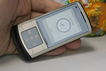
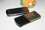
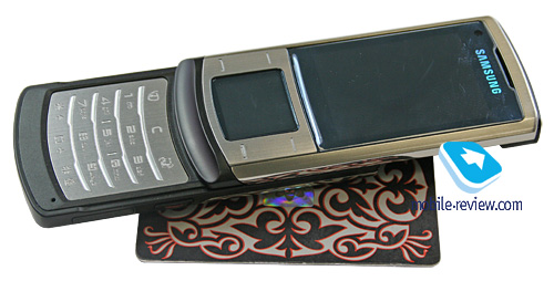
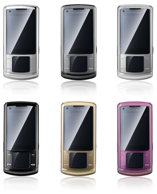
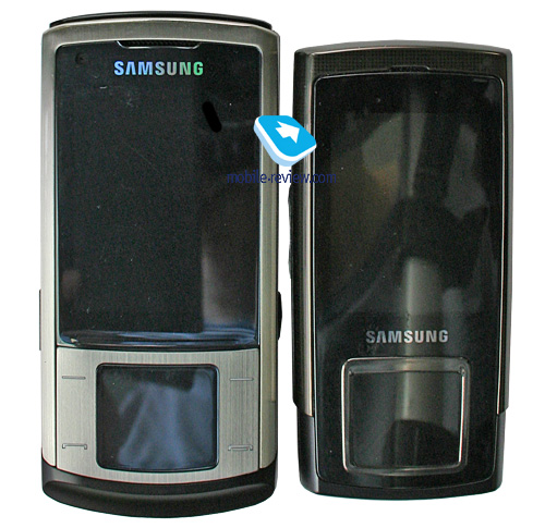
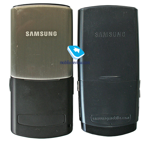
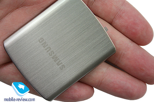
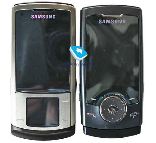
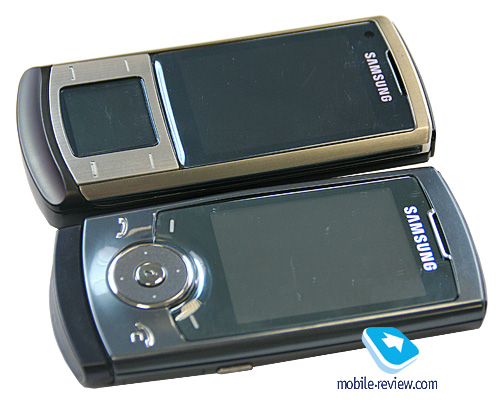
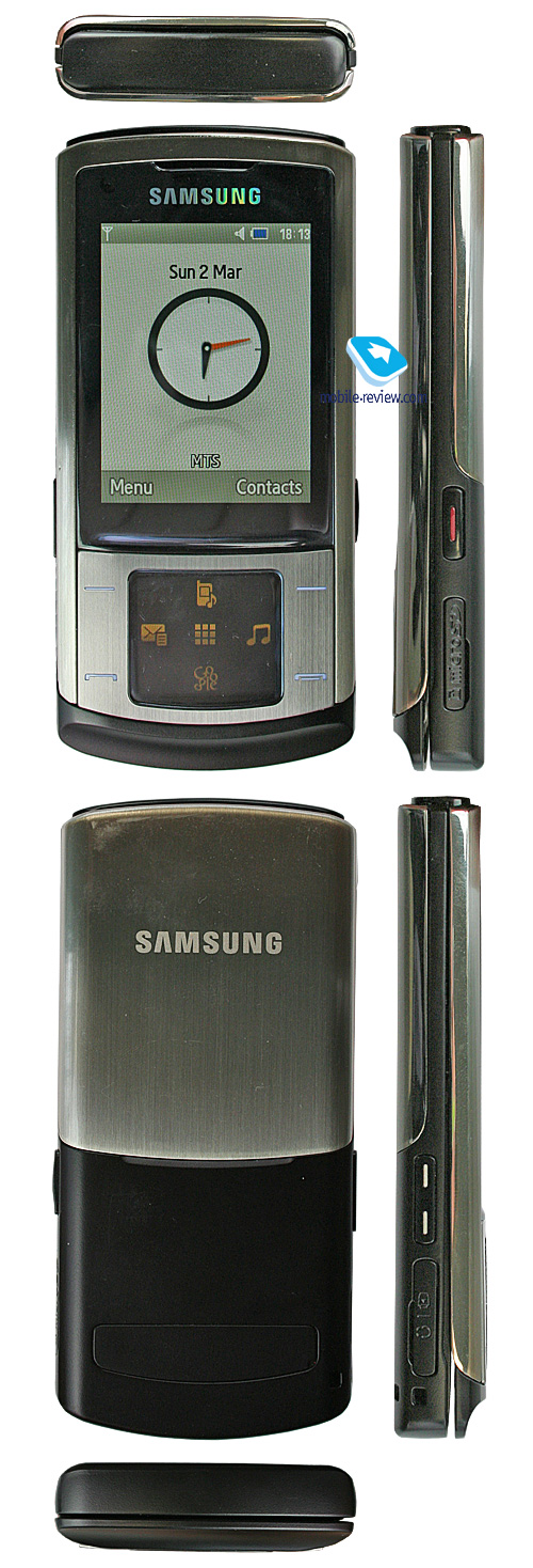
On its launch day the Samsung U900 Soul will come in a choice of two colors - Platinum Silver and Soul Gray. In either case you get the same color of metallic battery cover and display framing, while all the plastic details of the Soul will be finished in different colors. However, extra trims to come (Pink, Violet, Gold, Red) will have the metallic parts altered too, but don’t expect this update to happen any time soon, as we probably won't see it for 7-8 months.

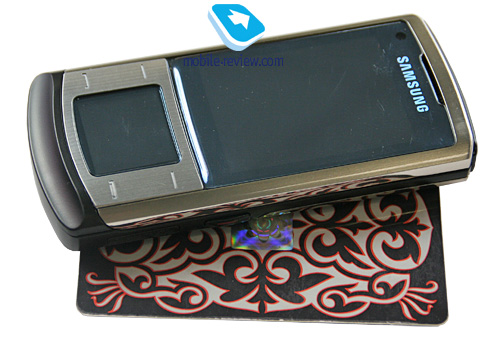
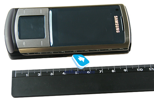
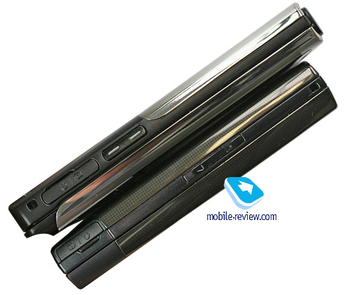
The handset measures up at a palm-friendly 105x49.5x12.9 mm and tips the scales at 113g. As far as the quality of materials is concerned, the U900 represents as major leap forward for Samsung – although their mobiles have never suffered from poor plastic quality or robustness, there were some unsightly exceptions, like extra color schemes for the U700 where the paint tended to peel off after several weeks. The Samsung U900 has seen a major upgrade in terms of the materials used; this way, the metallic parts in its design are now more discernible, but don’t think that its being partly metallic automatically promotes it to “high society”. Metal is not a signature feature of a luxurious mobile phone anymore – it may very well be utilized in entry-level solutions too. The reason is that phone makers can now employ new production methods, which allow metal to trickle down through their portfolios.

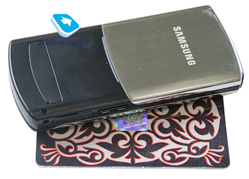
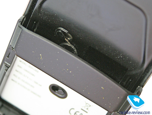
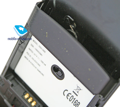
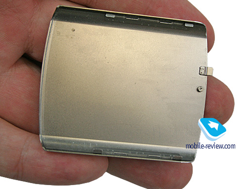
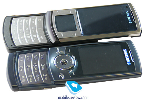
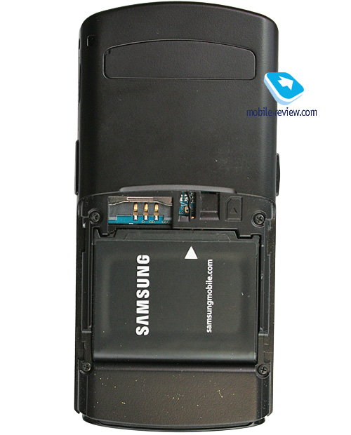
The U900 is a sturdily built and robust handset; curiously, the spring mechanism is exposed on the back (also visible with the battery detached). The slide mechanism operates smoothly, so the phone is easy to just flick open (or closed) single handedly. Also, following our routine, we need to mention that the U900 readily slips into just about any pocket, plus there is a lanyard eyelet at the base.


Based on our experience with some other models enjoying all-metal casings, we know that they tend to pick up scuffs and thus lose their pristine conditions very quickly, take for example the LG Shine. Several months into use its finishing was nowhere near the state we saw it out-of-the-box. Interestingly, the Samsung U900 is probably the second device (after the Samsung E950) to employ lacquered metallic parts, which is no rocket science – a protective layer makes its shine better and renders less vulnerable to scratches without defacing the design. The goldish shade of the U900’s casing is also all thanks to its lacquered surface.


If you think that this coating the cure-all and a perfect shield against scratches, then you are in for a rude awakening. It is merely an extra barrier, but that’s about it – the U900 is still exposed to wear and tear, although it is on the durable side.
Video - comparing size and outlook of handset. User Interface (wmv, 38,1 mb) >>>
For the most part, the back cover is the scratch-magnet of the U900, being the largest area decked out in metal, while the front faces isn’t that prone to scuffs and this type of damage. To be frank, durability and quality of materials is the topic I can talk about for hours. But I’m not going to waste any more time here and will rather point out an important detail – just like in the Samsung E950, this phone utilizes a touch-sensitive display instead of a navigation button. That’s why its protective glass is the toughest part of the handset and is very scratch and abuse resistant. With all due confidence we rate it 5 out of 5 for quality and reliability.


First shipments of the Samsung D900/D900i had a very irritating glitch – the display’s protective screen was too thin and people would literally squash displays. All it took was a bag jam-packed with stuff, where the handset got squeezed and its display matrix ended up under great pressure (consequently giving up the ghost). Basically, this was one of the most frequently encountered issues with the previous generation of phones and we never tired to draw the maker’s attention to it. And our efforts weren’t fruitless – the Samsung U600 boasted a considerably thicker cover that wasn’t vulnerable to scratches at that. So, they have resolved to carry over this time-proven design to the Samsung U900. I have no idea whether the U900 was supervised by a different team of engineers or they simply overlooked this detail in the Soul, but the outcome is pretty amusing. The plastic utilized in the Samsung U600/U700 for the display’s protective screen is slightly curved, which allows it to handle and survive harder impacts and stresses by distributing shocks across the entire surface, which is why it gets scratches or cracks so rarely. I’m positive some qualified engineers, who are definitely among our readers, will scorn me for describing the way it works in a such unprofessional manner – really, I’d be really glad to post here their reasoning, expressed in plain language of course, on how certain shapes help materials be more shock-resistant. I failed to do that, so for now this explanation will have to do.

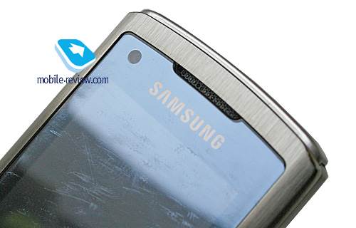
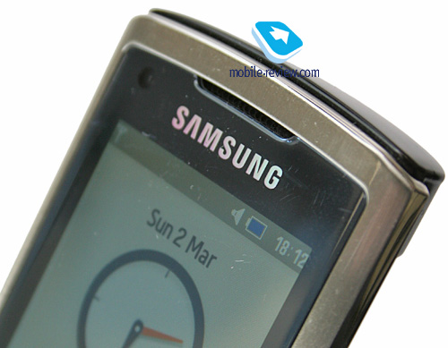
So, what this huge preface and high-flown words are all about? What I’ve been getting at is a simple and sad fact – the plastic that seemed so tough and durable in the Samsung U600/U700 turns out to be very soft and prone to scuffs with the Samsung U900 Soul in view of its flat form. First small scratches appear, then they start growing and the result is a very untidy sight. Among other missteps of Samsung’s engineers is the fact that the protective glass protrudes from the casing, sitting a hair above the display’s framing, but this proves to be just enough to make contact with convex surfaces (dashboards, etc), although on more or less flat surfaces the Soul rests on the ridge next to the touch-sensitive navigation button. Probably, another contributing factor is that few users actually ventured to put the U600/U700 face-down seeing its curved face. This is always a possibility – we haven’t researched this matter in detail because, well, it wasn’t worth the effort.


Should you treat your U900 with all due care, you won’t see any scratches or scuffs on it for quite a long while, probably never; but if you are more of an ordinary user, then you will run into this issue right after first days of use. I’d like to stress that this glitch isn’t fatal, yet quite discernible. Everything in this world is relative, and the U900 fares worse on this front compared to the competition, although if you don’t throw it around too often, it may well keep its pristine conditions for a while; you simply have a greater chance to see scratches on it than on other phones. Why have I said all this? Well, the reason is that some readers take everything literally.

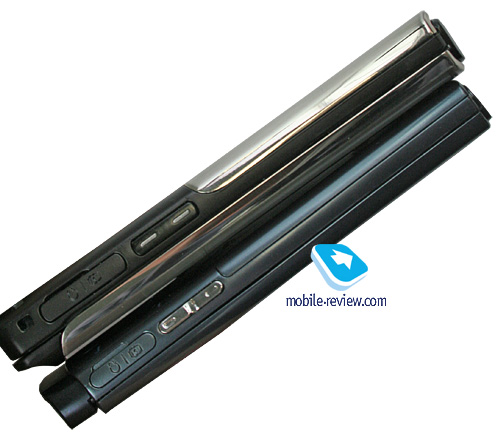
The left-hand side houses the volume rocker alongside the interface connector for charger or headset. Perched on the right are the camera shortcut key and the microSD memory expansion slot. Sitting right above the display is the forward-facing camera for videoconferencing.


Back to the table of contents >>>
Display
The handset makes use of a 2.2 inch TFT display (34x46 mm) with a resolution of 240x320 pixels showing up to 262 K colors. This is a decent unit as far as color reproduction goes, although its tinted glass slightly roughens its colors. Indoors the U900 outputs a bright, juicy image; overall, it is one of the market’s best offerings to day. And outdoors we found that the Soul's screen got washed out, was not as bright and occasionally we had to stare at it to read information.

The display accommodates up to 9 text and 3 service lines. All fonts are large and very readable; the same goes for SMS and dialing screen.
Back to the table of contents >>>
Keypad, Touchscreen
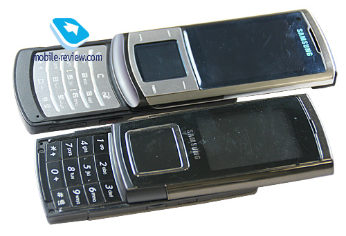
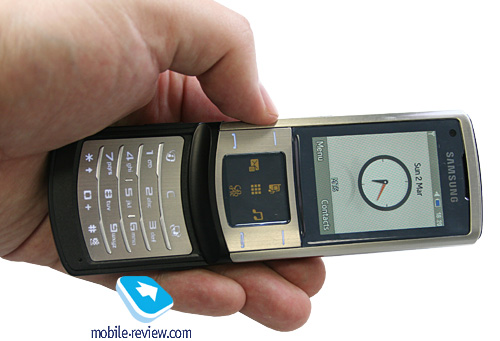
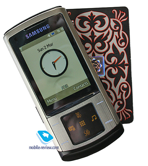
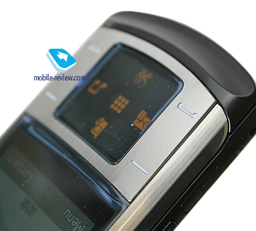
The lack of touch-sensitive buttons is a huge draw of the U900 – the fact is all its soft-keys are housed on a slim metallic slab and sink into the casing under you fingers, which is definitely a plus. The setups where all controls are touch-sensitive is more of a gimmick that mars the phone’s performance and so far nobody has ever managed to implement it properly and bring at least a comparable (with conventional controls) level of comfort. And installing touch pads just for the sake of it or in an effort to follow the latest trends in fashion is downright unwise.
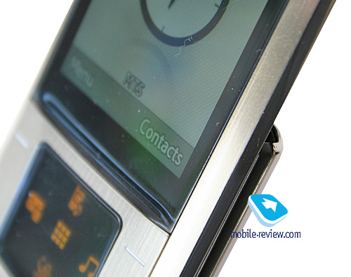
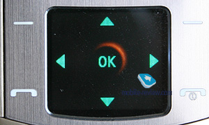
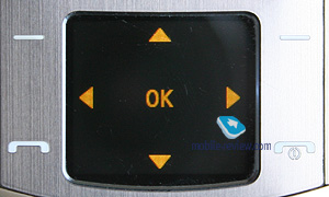
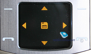
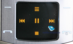
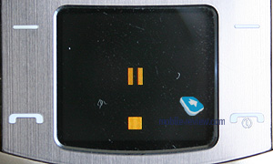
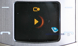
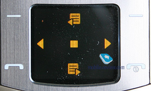
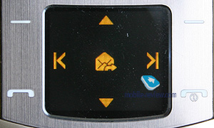
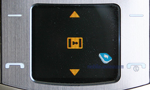
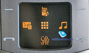
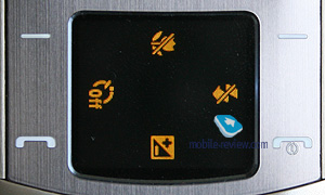
The U900 enjoys a touch-sensitive display instead of a navigation button, mimicking the Samsung E950 this way. Although, the latter never became widely adopted and on top of that its advertising campaign wasn’t well-funded either. Just like we guessed back then, this experiment has continued and this time around Samsung has put everything on the line and embedded this feature not in a key model, but its flagship offering. This is explained not only by what Samsung wants to do, but the situation it is in. Similar technologies are currently being put into use by Motorola, LG and a couple of other manufacturers, so for Samsung this handset is an important milestone and a chance to show the user their vision of interactive menus in today’s solutions.


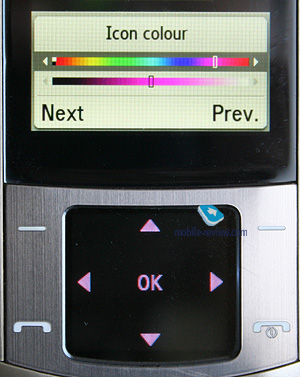
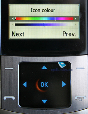
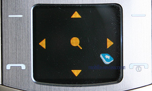
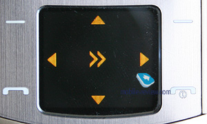
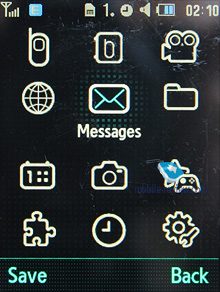
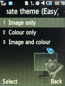
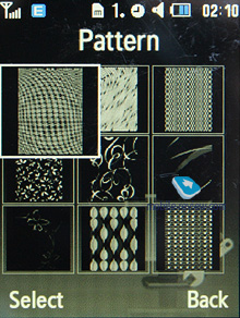
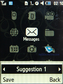
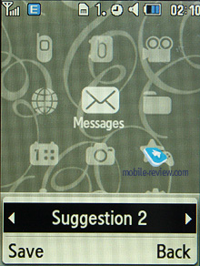
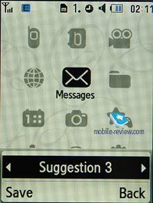
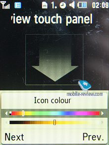
The display’s specs are nothing out of this world – it is a 1.14-inch OLED screen with a resolution of 128x112 pixels and capable of up to 65K colors. While the Samsung E950 couldn’t boast a rich palette, as it displayed only one main color, the U900 takes this concept to a whole new level, featuring a variety of colors and even the ability to display images and setup the color you would like to see all icons in. Using the themes wizard you can match up the main screen's theme to the navigation display and so on. This approach allows for rich personalization opportunities and is certainly a very nice feat to have.


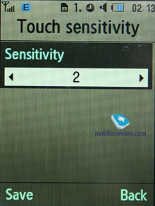
This screen enables you to create specific icons for every menu and swap them as you see fit, which is very intuitive and handy. Whenever you tap it, the icon you have just pressed gets highlighted and the casing ripples a little, giving you sort of feedback. The only letdown of this display is that it takes some getting used to, but that’s okay – you will master it in almost no time. What’s more, you can adjust the touch-screen’s feedback and its strength, plus the U900 distinguished between short and long presses, processing them differently.


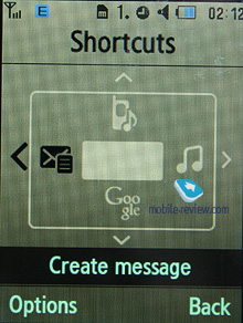
Another positive thing about having a touch-screen instead of a conventional key is that you can map own applications to it and literally see what you have assigned on it, which is impossible with mechanical buttons, clearly.


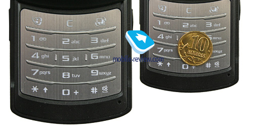
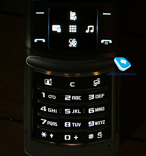
The numberpad is easy to use, the keys enjoy a moderate travel distance, and they are backlight in white, which is well-visible in various environments. All buttons are engraved on a metallic slab, which is the setup many of you have already gotten used to.


Back to the table of contents >>>
Battery
The handset utilizes a 880 mAh Li-Ion cell. The maker U900’s cell as being good for up to 250 hours of standby and 2.5 hours of talk time. Within European networks the phone lasted around 2.5 days (one hour of calls total and regular use of its alarm clock). At the same time, in Moscow it managed to stay online for 2 days at 1.5 hours of calls. That’s why the U900 will stay up and running for at least 2 days with average load, however under certain circumstances you might squeeze up to 3 days of operation out of it. It takes the handset 2 hours to charge from empty to full. No higher-capacity cells are available for this model.

We managed to get 12 hours of non-stop music from the U900 (radio module on) with the highest volume settings and bundled headset plugged in.
Back to the table of contents >>>
Connectivity
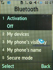
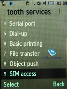
Bluetooth. The model supports various profiles, such as Headset, Handsfree, Serial Port, Dial Up Networking, File Transfer, Object Push, Basic Printing, A2DP, Dual Profile Bluetooth. EDR-enabled Bluetooth 2.0 is onboard. Headset management doesn’t allow us to have any quibbles with it, everything is standard here. The U900 is one of Samsung’s first offerings to beam sound to two headsets simultaneously.
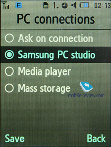
USB-connection. In the menu you may select one of three modes: Media, Mass Storage, Samsung PC Studio. When connected to a PC via USB, the U900 automatically recharges itself.
While in the USB Mass Storage mode, the U900 shows up on the desktop without requiring you to install any additional drivers, so right after plugging in it’s ready to work. Data connection speeds top out at 950 Kb/s.
You won’t be able to use the U900’s Bluetooth connectivity along with USB – it will require you to disable Bluetooth regardless of its status (connected and transferring data or not), which is very awkward.
There is also EDGE class 10 connectivity for GSM networks.
Back to the table of contents >>>
Memory, Memory Cards
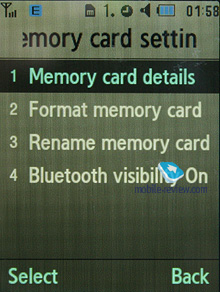
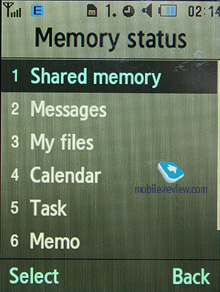
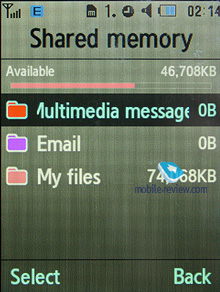
The phone ships with 18.5 Mb of onboard memory – this storage space, give or take, is available to the user right out of the box. The memory card (hot-swappable) is displayed as a separate section, so you can’t access both memory types at a time. The U900 also comes with a file manager, enabling you to copy files to/from the memory card. In our test the handset had no problems handling a 2 Gb microSD memory card, whereas a 4 Gb unit remained unidentified. Probably, support for higher-capacity cards will be added with new firmware versions.
Back to the table of contents >>>
Performance
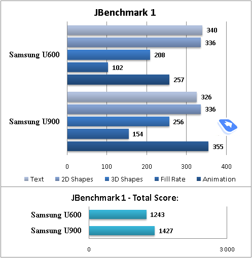
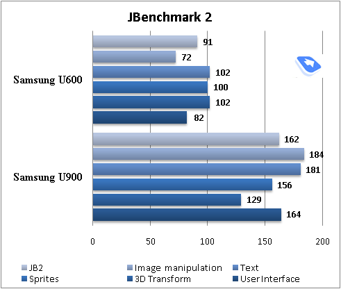
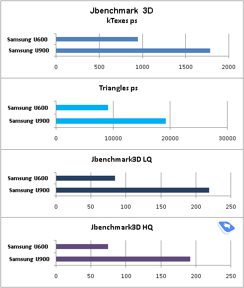
The U900’s performance is very typical as far as Samsung’s current device generation is concerned and is pretty moderate, although, on the other hand, we could hardly demand more from a product of this class. As it stands today, new applications can be uploaded only over the air (wap). Java apps can’t exceed 300 Kb in size.


Back to the table of contents >>>
Camera
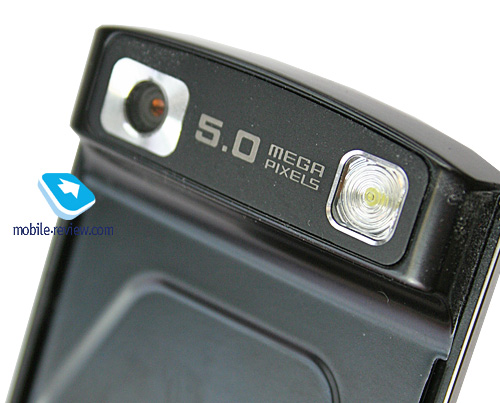
The handset employs a 5 Mpix CMOS camera which stands very close to that found in the Samsung G600, while packing in a lot of new settings. Its modified image processing algorithms make it a slightly worse performer compared to the G600, although the difference isn’t all that crucial. The camera sits on the underside of the top slide, so, clearly, to start shooting you will need to zip the U900 open first.

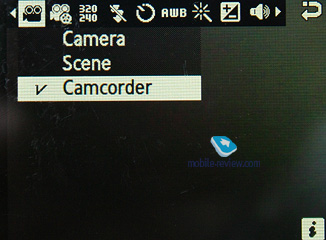
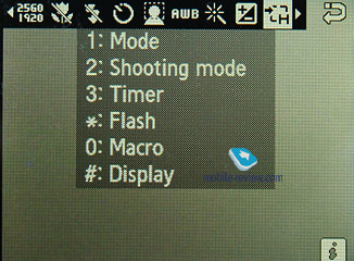
The camera application enjoys landscape layout, otherwise shooting with you would’ve been a pain. Various shortcuts pop up right on the navigation screen, including Macro Mode, Flash, Timer and Exposure. Since the numberpad is always exposed when shooting, you will be able to use the buttons over there as shortcuts too.


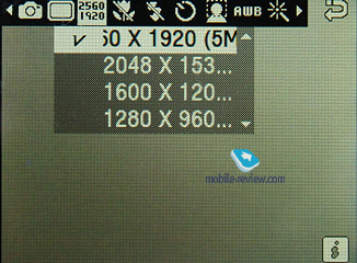
The camera supports the following resolutions:
- 2560x1920 (5M)
- 2048x1536 (3M)
- 1600x1200(2M)
- 1280x960(1.3M)
- 640x480 (0.3M)

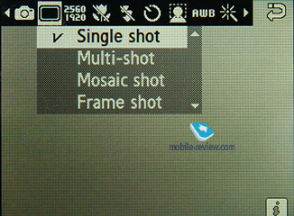
Several shooting modes are at your disposal:
- Single shot – default mode, the phone takes one shot at a time;
- Multi-shot – the phone takes a couple of shots in rapid succession (6, 9 or 15, two speeds, image resolution gets scaled down to VGA automatically);
- Mosaic shot – the U900 features a variety of mosaic shot types (image resolution gets scaled down to VGA automatically);
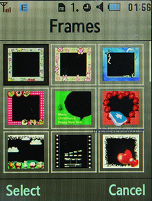
- Frame shot – the resolution drops, you get access to the set of preinstalled frames;
- Panorama shot – the device can stitche together all parts of panorama on its own.

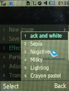
Other settings include special effects (Grey, Sepia, Negative, Antique, Water Colour), white balance, ISO (50, 100, 200, 400), timer (3, 5 or 10 seconds), antishake functionality (that kicks in very rarely, though), face recognition (which is what Samsung’s stand-alone digital cameras do), which works just fine, although fails at times when there are several people standing together. The macro mode is pretty good, just like on most other Samsung-branded devices.
The LED flash is not particularly bright, but it does the job. It is quite another matter, though that shots taken in the dark are far from decent, as the matrix obviously lacks sensitivity.
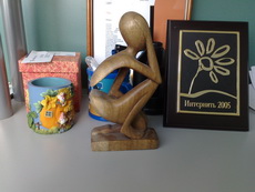
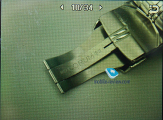
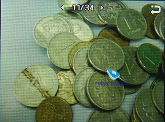
Speaking of the U900’s image quality, we have an interesting situation – like we’d expect from Samsung, this device offers quite average quality and is generally nothing to write home about. On the other hand, though, the market hasn’t seen a slider whose camera that can come close to that of the U900 yet, which puts it beyond and above the competition. Take a look at how the Samsung U900 fares against the Nokia N82 and Sony Ericsson G900. As I see it, the U900 is clearly behind the N82 in most shots.
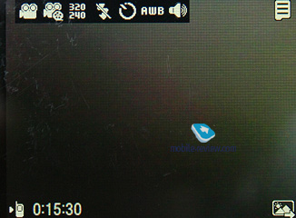
Video. For videos the U900 proposes exactly the same pool of effects as for the single shot mode, plus most settings are identical, bar the resolutions, there are only two available for the video mode: 320x240 pixels and 176x144 pixels (15 FPS). Maximum clip duration – up to 1 hour. Unfortunately, the U900 can’t shoot videos in VGA and in QVGA it does its job at a very marginal frame rate.
Video sample (3gp, 1,02 mb) >>>
Back to the table of contents >>>
Menu, interface
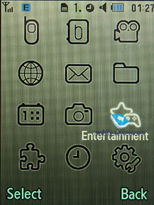
The main menu is viewed as a grid (3x4). All sub-menus have horizontal lists - in the case of there being a sub-menu, you will see a pop-up list on the right of the highlighted item. You see which items are stored underneath, and once you press OK button, you will get there. When you lean the navigation key either left or right, you will be able to access the corresponding item immediately. Ergonomics of such solution is unquestionable, as you will have to make at least one key-press less. Also you can disable this view mode, so then the U900’s menu becomes just like any other menu system.
While surfing the menus you can take advantage of last item memorization in every sub-menu and the main menu. The handset will “remember” which function you addressed last time, and will highlight it automatically next time you enter the same menu item. For example, if you had selected call list in main menu and done some operations in it, then the next time you enter main menu you will have it highlighted in first place. But that’s not all; once you access it again you will see that sub-menu item which was addressed last will be highlighted too. It seems to be a simple thing, but it is not present in handsets produced by any other manufacturer.
When hovering over one or another item in the list you will see it highlighted, and font size (which is big already) will be increased.
Shortcut number navigation is supported, but there are more ways to navigate the menu in the U900. You can bind four different applications from the list, offered by manufacturer (you will not be able to bind java applications). There is no quick launch menu available in the U900 (Living world).
A separate button is set to toggle between applications while at the standby screen – this doesn’t mean the U900 supports multitasking. That’s just because, like any other Samsung-branded 3G handset, the U900 provides one-touch access to messaging and calls.
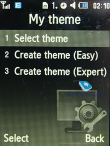
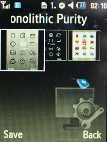
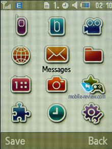
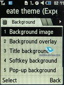
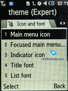
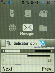
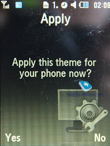
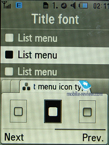
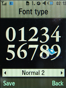
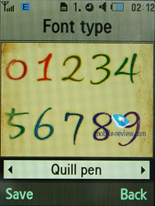
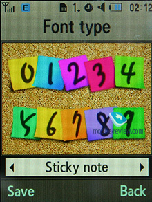
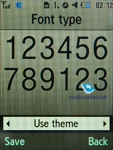
Themes. The U900 comes preinstalled with 3 themes, the default one meshes with the handset’s metallic details. Additionally the user can make used of the themes editor (available modes: basic and extended). In the former mode all you need to do is pick new wallpaper, tune some settings and voila, you have a new theme. But in the latter case, you will have the ability to adjust and modify every last thing, from icons color to fonts in specific menus, plus you get tips on how to make things look better in your personal theme.
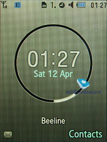
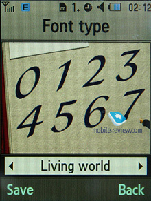
Living World. This is a selection of personal wallpapers for each country (major cities might get unique wallpapers in the future, though it is not quite evident). When you will be in Moscow you will see Kremlin wharf and triumphal arch in case you’re in Paris, as for London – house of parliaments, and so on. Besides graphical assignation manufacturer decided to modify wallpaper depending on time of day: in the morning you see sun, and in the evening you see blinding lights of Kremlin wharf, cars will have their headlights turned on.
Time is not the only event that can be morphed into graphics. For example network reception level: good signal – sky is blue, no signal or weak one – sky is covered with clouds. At first you don’t pay much attention to this tiny feature, but after a month you will look on the sky instead of the standard bar, information reads instantly.
For new messages, missed events, or alarm clocks there is a special way of displaying, and which is powered with standard, traditional pop-up window with text. In daytime, such events will be demonstrated with help of airplane that will fly through the sky, and in the evening that would be fireworks. Color will change according to event type. At a glance this system looks kind of complicated, especially during its description, but in reality it is crystal clear and understandable.
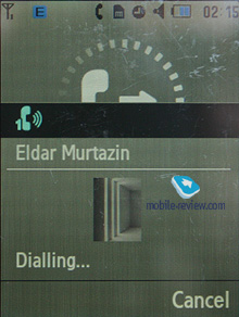
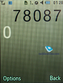
When dialing a number you will see a small image with main theme displayed and animation of the dialed number.
Back to the table of contents >>>
Phonebook
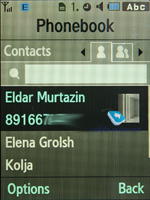
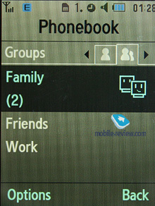
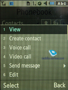
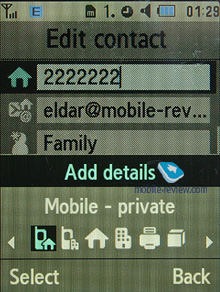
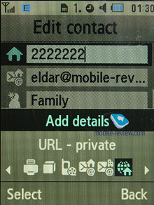
Contacts can be accessed by pressing right soft key; you will see a list that contains all entries from both SIM-card and phone’s memory. The second tab comprises contact groups, so that you can switch to them in no time. If there is an assigned image, its thumbnail will be shown in the list – when scrolling though your contact list, a thumbnail will be shown only for a currently selected entry, and if there is none set, the U900 will use a default smilie.
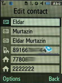
The field beneath the name is the default number, which can be picked manually from the list of submitted numbers for a particular contact. Quick name search by first letters is supported; there can be up to twenty of those, for any language. Once you press OK key you will go into detailed view of the selected entry. There you will see a thumbnail, if any. It can be an image, a photo or a video clip. Each entry can have up to 5 phone numbers of different types (mobile, office, home, fax other), one of them will be main number (by default it is the first one you entered). Fiels aren’t fixed, meaning that you can choose their type manually (for example, submit two mobile and two home numbers for some contact)
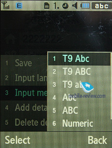
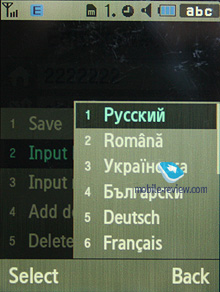
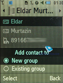
There are two lines for First Name and Last Name (search is performed only by the former), these fields get merged when displayed in the general list, and First Name comes first. For example Eldar Murtazin will be shown only in this order. Length of each field is 20 characters for any supported input language. You can also switch languages on the fly when entering a name.
All entries, regardless of language, are sorted out in the following way – all contacts with headings made in a local language (Russian, for example) go first and then those with names in English. This is rather convenient and handy list sorting system. Taking into account fast language switch option during the search, it’s clear that no language will spoil the experience of working with this phone. The list can’t be sorted by first or last name, which is a letdown, characterizing Gumi’s products.
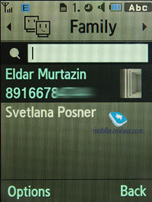
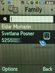
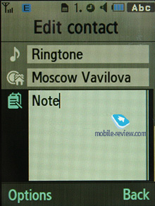
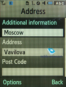
But let us return to the information entered for a contact. Apart from phone numbers, e-mail address (there may be several of them), a little text memo, address and other fields can be submitted on top of all that. Any music file (including MP3) can be picked as a ring tone for a contact. Three caller groups are provided by default with the possibility for creating any number of additional groups, setting a personal melody and image for each (by default there are three groups). SMS alerts are not customizable.
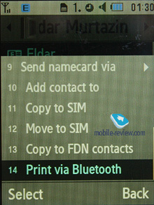
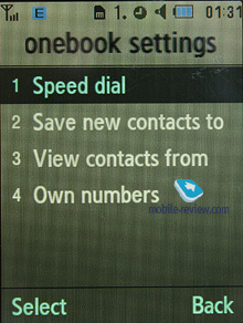
The phonebook is capable of holding up to 1000 contacts with filled in data fields. Even if all the available blanks are not used, the cap won’t get any bigger and will still make one thousand. It is possible to specify in the settings where all new numbers should be kept by default. There is also an option for moving entries from the SIM-card, although the reverse action is denied. According to the developers, PC (MS Outlook in particular) is best for data synchronization with the U900. Any contact in the form of SMS/MMS, mail message or other text file can be quickly sent through Bluetooth to another device. There are no problems with sending, and the phonebook entry gets beamed to another device, where it is read without any trouble.
The phonebook may contain a business card as well, though its structure copies all the fields found in a regular contact in the phone book.
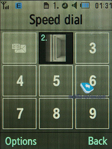
There can be up to eight numbers in the fast dial list; separate numbers tied up with a single contact may appear on this list as well. The chosen entry (not of the phone number type) is displayed on the buttons as the subtitle. In case the contact you have picked has an image attached to it, then you see the entry’s name, which may get annoying when you have two different numbers of one contact mapped.
You can create any number of caller groups, assign up to 20 contacts and customize them with a picture and tune.
On an incoming call, caller ID picture occupies not the entire screen, but only a part of it. However, it still takes up a considerable area. This isn’t great, given the display’s stellar specifications.

Back to the table of contents >>>
Call log
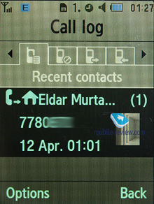
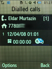
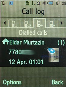
Each of the given lists contains up to 30 phone numbers. There is a combined list of all the last calls with an icon indicating call type. Pressing the navi-pad horizontally, you can switch quickly between the lists. The date and time of the calls with a special note on duration are displayed in the extended view for separate entries. Calls from/to one number are grouped up, so that the number standing next to the call specifies total number of calls made. In order to access duration data you will need to call up detailed information on desired item. As always, the overall time of the calls and their cost can be viewed in this menu (in the case that the service has been enabled).
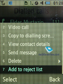
For individual numbers you can arrange a black list, which will reject all calls coming from these contacts.
Back to the table of contents >>>
Messaging
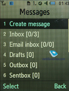
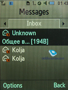
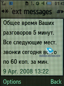
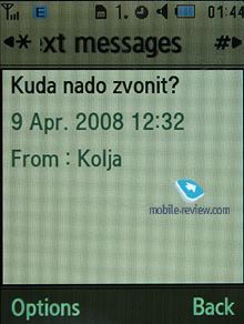
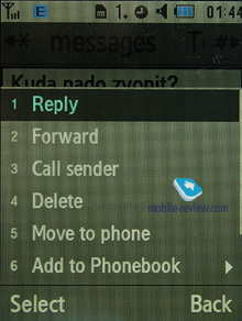
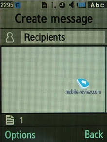
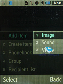
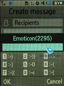
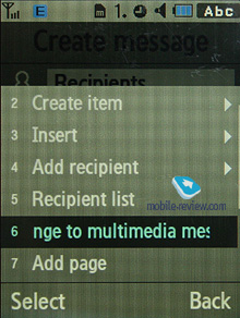
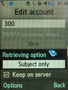
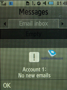
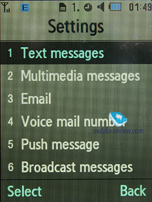
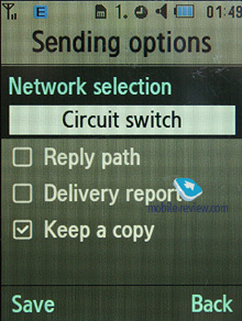
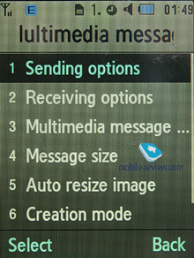
Much like other makers, over at Samsung they have forgone that artificial division into SMS-MMS types – you just start composing a message, and only then, depending on the contents, it is attributed to SMS or MMS. The menu still holds an option for switching message into MMS mode (for example when you need to send only text, but to an e-mail address, without calling up the bundled client).
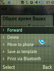
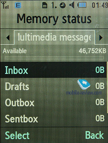
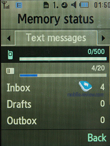
The phone memory can hold up to as many as 500 messages; the handset supports EMS standard compatible with Nokia Smart Messaging. T9 text input comes in handy and is easy to use. While choosing recipient, you can either select a telephone number from your contacts or pick one from the call lists or groups. All messages are manageable, this means you are at liberty to move a certain number to your black list, in order to make sure all messages coming from that phone number will be deleted automatically; possibility for moving messages to any own folder is also at your disposal. For e-mail you can move not only addresses to the blacklist, but unwanted subjects as well.
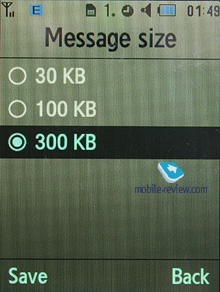
There are no size restrictions set on received messages, though an outgoing message’s size is limited to 295 KB. As for additional services available with the U900, message rejection and message retrieval type options are onboard. All messages are stored in general dynamic memory, the same goes for e-mails.
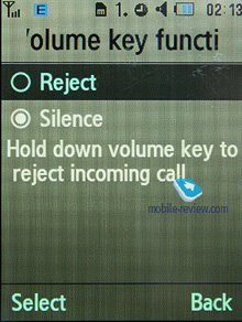
Also there is a useful function for sending SOS-messages – when activated, should you find yourself in an emergency, after pressing the volume key four times, the message «I am in emergency. Please help me» will be sent to contacts submitted earlier, all incoming calls from these numbers upon sending the emergency message will be picked up automatically. Recipients (not more than 5), as well as number of Repeats may be set up manually, while text of the SOS-message is not customizable.
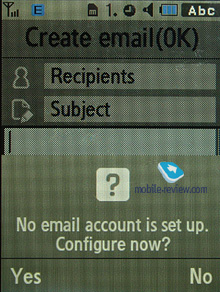
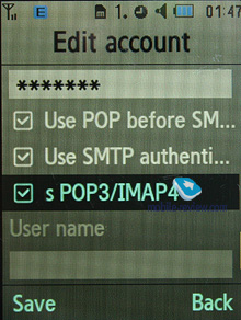
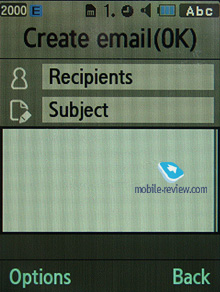
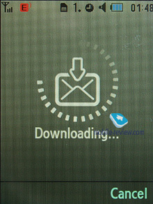
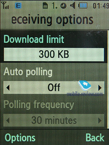
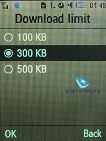
The bundled mail client is standard in all its components – 5 accounts and the maximum of 100 incoming messages; attachments are also handled by the phone, though there are also several caps – there’s no way you can receive a file more than 500 Kb big, or send one with size exceeding 300 kb. Received files can be viewed via the bundled browser. The U900 doesn't support html in emails, which breaks formatting of most letters you receive, so they become really awkward to read. The mail client found in Samsung-branded phones is now falling behind those embedded in Nokia’s and Sony Ericsson’s solutions.
Back to the table of contents >>>
Organizer
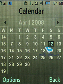
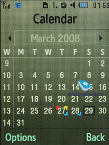
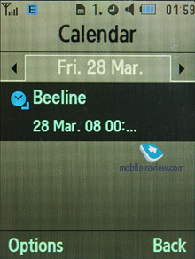
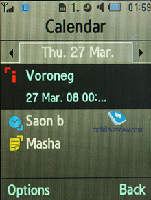
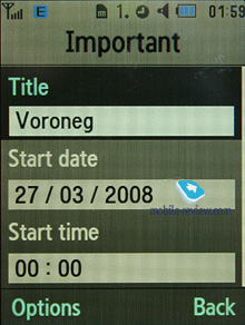
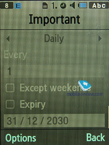
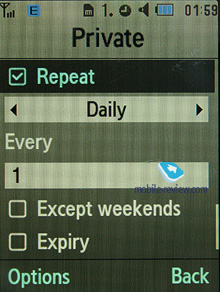
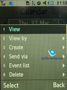
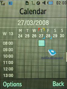
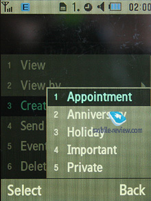
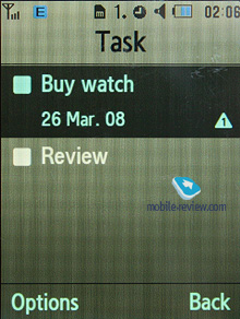
The phone’s memory can store as many as 100 events of one type – meeting. There are other event types as well, like anniversary and holiday, with the maximum capability of 50 events for each type. The U900 can also hold up to 20 high-priority events and the same number of private entries.
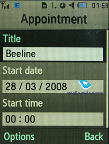
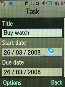
Day and time as well as end time of an event are indicated for each entry. Alert signal and its duration can be adjusted to your liking; repeatable events are available for setting up (repeat time is also manageable as well as the exceptions). The weekly and the monthly calendar views are very convenient with each type of the event having its own color.
Speaking of the organizer’s shortcomings, I cannot overlook the fact that when typing date and time for an event, the end time doesn’t change, which badly hurts its ease of use – other manufacturers make the due time shift automatically (by default any event takes one hour).
Back to the table of contents >>>
Multimedia

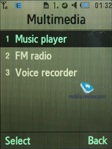
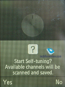
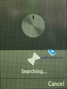
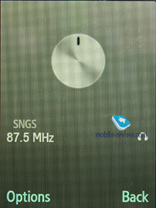
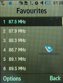
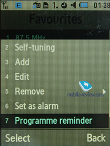
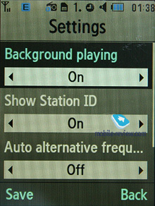
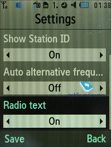
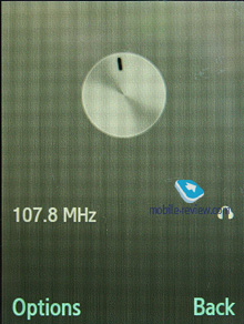
FM-radio. You can store up to 20 radio stations in the memory; the range of available frequencies is 87.5-108 MHz. Also, you can enjoy auto-tuning, but particular channels cannot have own names attached – they are always shown as the frequency numbers. The radio can work in handsfree mode, plus it enables you to set it up as an alarm clock, but regardless of how you are going to use it, a plugged-in headset is a must, since it doubles as an antenna. The radio implementation is fine, although it doesn’t pick up all stations equally well, but on balance, it is quite competent in comparison to other vendors’ offerings. The radio can be minimized.
RDS here displays only the station’s name in the general list, no advanced options available.
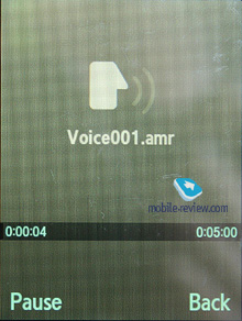
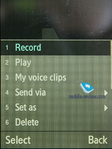
Voice recorder. You can record up to several hours of voice memos with the number of files being unlimited. Basically, limitations on recording duration are set by the user himself, though length of a single recording cannot exceed 1 hour. All the files are stored in a separate folder in the memory bank. The recorder performs well during lectures, conferences and presentations – I could even say that it is a partial substitute for a digital tape recorder.
Back to the table of contents >>>
MP3-player
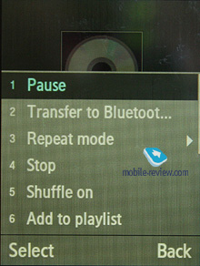
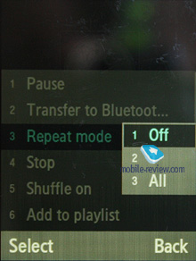
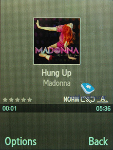
The integrated mp3 player, supporting random, sequential and cyclic playback, is available on the phone. Mp3 files can be uploaded onto the handset both directly over Bluetooth and through the synch application or Windows Media Player. There are no limitations placed on tags and names of music files. Bitrates are also not something that really matters – the handset easily deals with all available formats and supports WMA, AAC, eAAC, eAAC+.
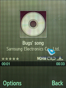
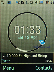
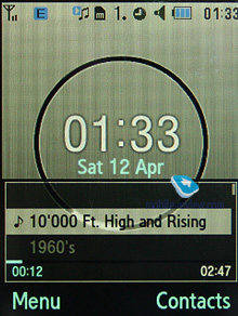
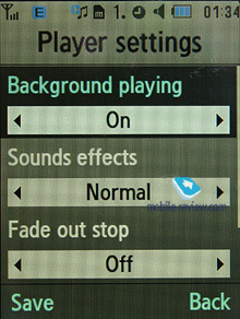
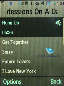
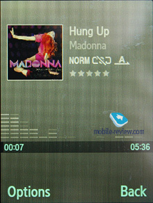
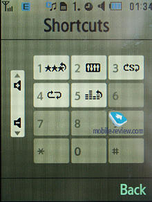
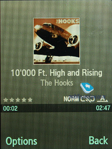
The title of the currently played back track is displayed as well as the number of the remaining tracks. The U900 also packs in a non-adjustable equalizer with 9 presets available. Among new additions is the Fade Out option, when towards the end of every track the sound will… well, fade out. Your tracks can be played through the stereo headset as well as the speakerphone. The volume bar has 10 scales on it. And of course the user can make up their own playlists. Player can work in minimized mode – in this case the display will show current track title and music controls, which is a good thing.
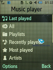
The player boasts the following filters: all tracks, recently players, most popular, artists, albums, genres and composers. The U900 also sports Album Arts support.
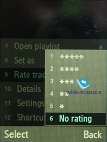
Speaking of new options, the player has obtained the rating system, enabling you to award any track with one to five stars. The maker has driven the integration with Windows Media Player as deep as it has never been before; actually, this manager also sports the rating system.
The bundled headset has a jack for plugging in own earphones and provides quite adequate sonic experience. Generally speaking, as a music-minded solution, the U900 comes close to Sony Ericsson’s Walkman range, especially as far as the first generation is concerned. Plus it holds its own against contemporary music-heavy phones, the U900’s sound quality is pretty decent, and it can well replace a dedicated device, especially if you are not an audiophile or tend to have music sessions in noisy environments.
Back to the table of contents >>>
Entertainment
Games – the handset comes preinstalled with three games, which are all demos (you will have to shell out for their full versions), these are: Aspalt2, Minigolf Las Vegas, Paris Hilton Diamond Quest. The memory volume assigned for Java-applications is unlimited, at that you can remove any of the pre-installed games and upload new over the air (via WAP). Heap size can’t exceed 2 Mb, while the application can’t go over 1 Mb.
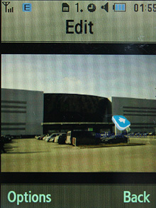
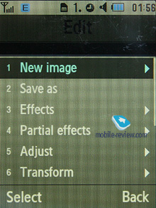
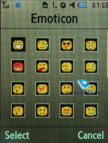
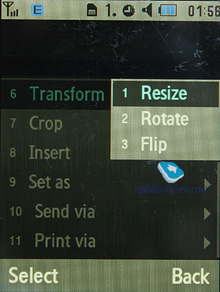
Image editor. A basic picture editor, which allows transforming images by using a variety of tools.
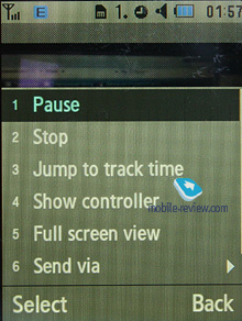
Video editor. Allows editing video clips and overlaying of sound tracks. The most basic of editors makes its first appearance with the U900.
Back to the table of contents >>>
Applications

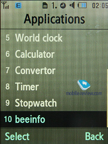
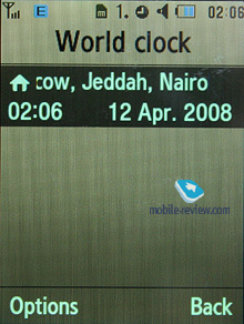
World time is displayed for two chosen cities.

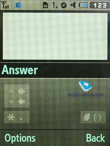
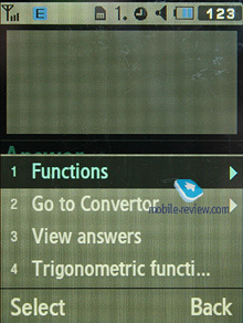
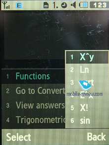
Calculator It divides, multiplies, subtracts and adds and does several more things – quite enough for a mobile calculator.
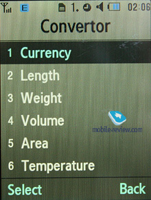
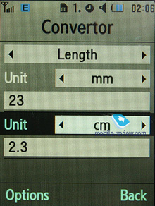
With the converter, you can operate with different units of measurements as well as with a number of currencies.

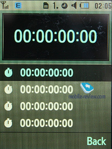
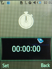
Countdown time and stopwatch have no bells and whistles.
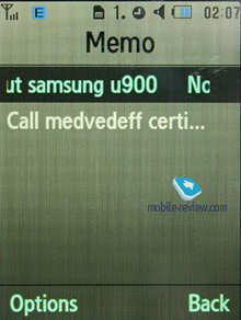
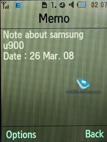
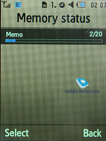
Memo – standard text notes.
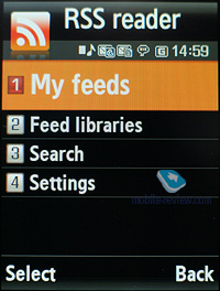
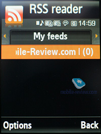
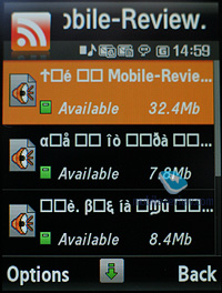
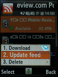
RSS Reader. This is a stand-alone utility for RSS feeds. However, it would make more sense if the RSS Reader was bound up with the web-browser, but this is not the case with the U900. This way, RSS links are not picked up by the browser, or sent directly to the application. You will need to manually submit a channel address in this app to subscribe, or enter a web address and let the application try to find an RSS channel on it.
While uploading your news feed, the U900 can upload text, as well as video and audio files, and it is up to you to set the size limit (by default – 5 Mb per file). Regrettably, there are no scheduled feed updates available, thus you will need to refresh the feed manually every time you need hot news.
Obviously with this application Samsung is having a first go at this field, and the truth is, it is not really functional or appealing the way it is in the U900. Similar solutions found in the phone from other makers pack more punch and are easier to manage.
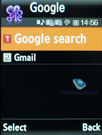
Google. A stand-alone menu item for accessing Google search and GMail. Generally, the same things are available with handsets from other manufacturers, except for a dedicated menu item. In my judgement, this is nothing more but a marketing trick, however I can’t see anyone shouting “I have Google in my phone!” Who might find this feature essential in a phone?!
Back to the table of contents >>>
WAP
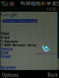
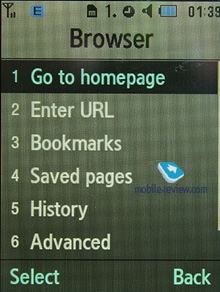
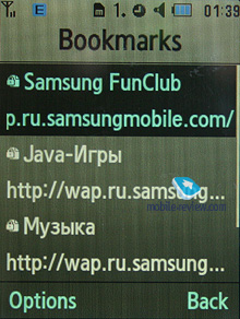
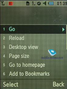
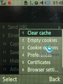
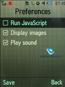
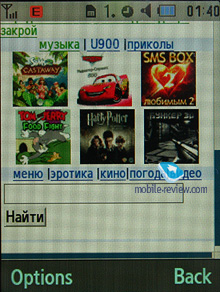
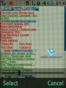
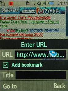
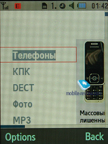
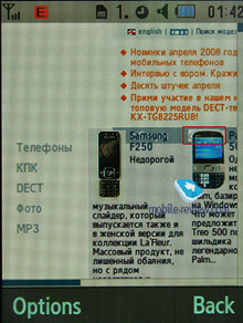
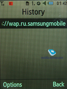
The handset comes with a wap-browser version 2.0 (NetFront 3.4), where apart from JavaScript support, fonts scaling (three types), Smart-Fit (single-column view), full-screen mode (all controls are hidden), page caching, they have embedded a new feature – on-screen ‘mouse’ pointer. Much like Nokia’s S60-powered handsets and Opera Mini, you can view pages with a tiny navigation window displayed. The browser itself packs a lot of goods under the hood and will be appreciated by most users.
Unlike the previous models, which used Picsel Viewer for browsing office documents, the U900 employs the bundled browser for these purposes. What we really like about it is that the user can perform local search within a document (any language). While it is a tad sluggish compared to Picsel Viewer, it is still pretty easy to handle. Personally, I couldn’t make up my mind on which solution I liked better – both of them have their strengths and weaknesses.
Back to the table of contents >>>
Alarm clock
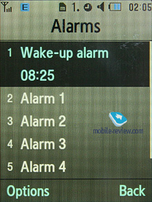
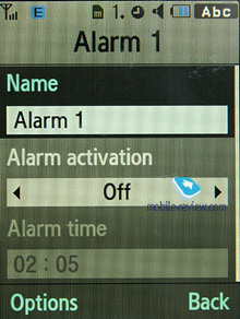
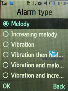
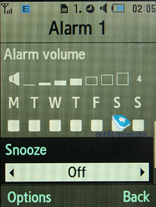
The handset comes equipped with four alarm clocks, each of them can go off on certain weekdays. You can also pick one of the five tunes, or turn to MP3 tracks. In settings it is possible to enable auto power-up when any event triggers.
Back to the table of contents >>>
File Manager (My files)
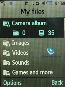
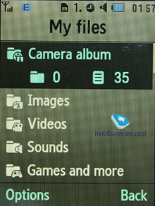
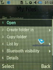
That’s the place to search for all files such as music, pictures, video and sounds. Any uploaded file gets stored here. The disadvantage is that files sometimes are not displayed in the list immediately - in that case you will need to leave the menu and enter it again.
Files and folders can be viewed either as a list or thumbnails. You can mark any number of files. The handset supports Move, Copy and Delete operations, as well as various types of sorting (by type, name or size).


Memory card’s file structure is a slightly different story, as it can be accessed through the main menu, where each item features “Memory card” option.
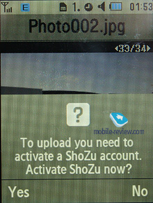
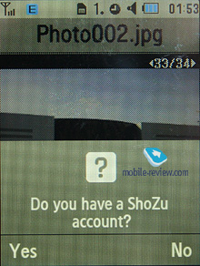
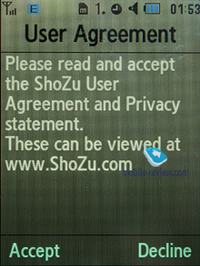
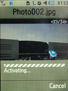
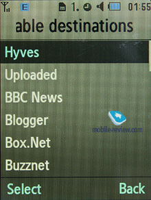
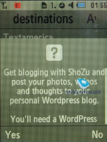
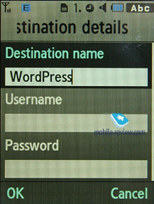
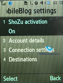
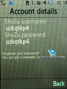
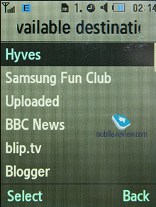
The U900’s new feature is support for ShoZu that allows uploading any type of multimedia content to blogs – all it requires you to do is submit your logins and passwords to the services you use and then the handset will do the rest, enabling you to release, say, videos or photos right to you personal blog.
Back to the table of contents >>>
Settings
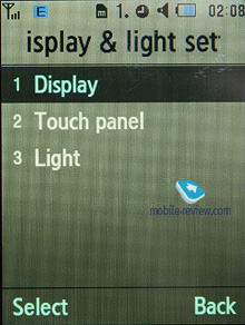
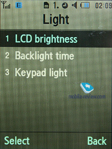
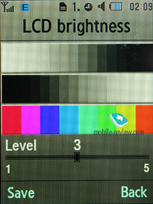
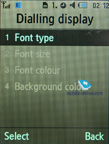
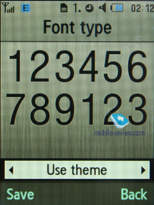
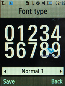
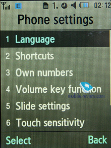
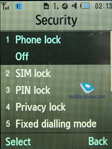
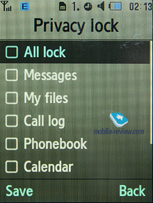
Traditionally this item boasts a standard set of options inside like password protection of selected sections (messages, short messages, organizer, etc.), backlighting duration and brightness, dialing display settings (no custom animations are available, one is assigned to the default theme – Living World).
Keypad light – there are three options at your disposal, one of them is Night mode, implying that backlighting will be active only between 5:00 PM and 9:00 AM and disabled during daytime. If you come to think of it, this feature is nothing more but an illusive replacement for ambient light indicator, which Motorola’s handsets are armed with.
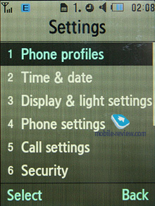
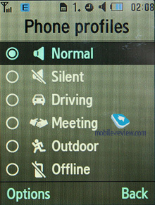
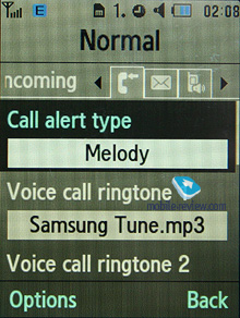
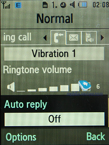
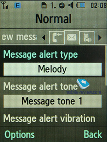
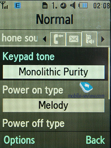
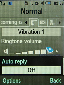
Profiles – the U900 comes with a fully functional system of profiles, including Flight Mode. Every profile is customizable – you can pick ring tone, incoming message alert and adjust the volume level.

Mobile Tracker – submit a phone number, where notifications will be sent to in case SIM-card was changed – that message will contain number of the SIM-card being used with the handset. This section is protected with password, so that no one other than you or someone else who knows the password could disable the Tracker. Should your device have the SIM-card switched once, the specified number will receive one message instantly, and one more each time a new card is plugged in. A fetching feature which can prove to be of much help in case the handset is lost or stolen.
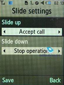
The Slide action settings item features options which can be assigned to opening and closing. In other words, they determine whether the slider is active or not.

Apart from the standard set of wallpapers for the standby screen, you can make up animated wallpapers of your own, and it doesn’t take a rocket scientist to create one. All you need are 9 snaps, then you adjust time spans between different frames and transition effects (there is a slew of them available, like Butterfly, Paper place etc). And the animation you get is pretty amusing; it will work on the standby screen as long as the display is on.
Back to the table of contents >>>
Impressions
The reception quality put up by the U900 is in line with other Samsung-branded devices. The ringtone volume is quite decent, as it can be heard in various environments. The silent alert is average strength-wise, no significant improvements have been made here.
Samsung’s flagships have always boasted a pretty decent price/quality ratio and never had direct competition in the field of slider-type phones. From this stems a very plain fact – no matter what drawbacks and omissions the Samsung U900 has in it, its sales will never slip below average. Although, it doesn’t have a whole lot of failings, we can’t overlook its display cover that is very prone to scratches, and its screen doesn’t handle direct sunlight in a convenient fashion. On the other hand, small scratches are smeared away by the U900’s working display and rather deface it when it is out of use.
The U900’s quaint touch-sensitive navigation screen has turned out to be a snap to use and definitely doesn’t disappoint. You’ll get used to it in a couple of hours and will never even notice that it is somewhat different from conventionally designed models in this department. Its mediocre camera still holds its own in this class of svelte and pocket-friendly solutions. And those seeking better image quality probably already have the Samsung G810 or Nokia N82 on their shortlists. Unfortunately, the U900’s video recording abilities aren’t stellar – we’d like to see better FPS and resolution next time around.
On balance, the U900 is a tidy offering that’s a breeze to operate and hard to part with – a milestone in its own right. Being the marriage of Samsung’s best software solutions, it complements them with great materials and decent proportions. Though its price tag of 450-500 Euro doesn’t make it the most affordable solution out there – it is a fashion-conscious phone and therefore as far as price goes, it can’t be faced off against, say, the Nokia N82. For such comparison to be credible, you will need to put the U900 up against another slider, but you will find none in this segment. All in all, the success of Samsung’s previous offerings will guarantee the U900 Soul cracking sales, make no mistake about that.
Related links:
Back to the table of contents >>>
Eldar Murtazin (eldar@mobile-review.com)
Translated by Oleg Kononosov (oleg.kononosov@mobile-review.com)
Published — 25 April 2008
Have something to add?! Write us... eldar@mobile-review.com
|
News:
[ 31-07 16:21 ]Sir Jony Ive: Apple Isn't In It For The Money
[ 31-07 13:34 ]Video: Nokia Designer Interviews
[ 31-07 13:10 ]RIM To Layoff 3,000 More Employees
[ 30-07 20:59 ]Video: iPhone 5 Housing Shown Off
[ 30-07 19:12 ]Android Fortunes Decline In U.S.
[ 25-07 16:18 ]Why Apple Is Suing Samsung?
[ 25-07 15:53 ]A Few Choice Quotes About Apple ... By Samsung
[ 23-07 20:25 ]Russian iOS Hacker Calls It A Day
[ 23-07 17:40 ]Video: It's Still Not Out, But Galaxy Note 10.1 Gets An Ad
[ 19-07 19:10 ]Another Loss For Nokia: $1 Billion Down In Q2
[ 19-07 17:22 ]British Judge Orders Apple To Run Ads Saying Samsung Did Not Copy Them
[ 19-07 16:57 ]iPhone 5 To Feature Nano-SIM Cards
[ 18-07 14:20 ]What The iPad Could Have Looked Like ...
[ 18-07 13:25 ]App Store Hack Is Still Going Strong Despite Apple's Best Efforts
[ 13-07 12:34 ]Infographic: The (Hypothetical) Sale Of RIM
[ 13-07 11:10 ]Video: iPhone Hacker Makes In-App Purchases Free
[ 12-07 19:50 ]iPhone 5 Images Leak Again
[ 12-07 17:51 ]Android Takes 50%+ Of U.S. And Europe
[ 11-07 16:02 ]Apple Involved In 60% Of Patent Suits
[ 11-07 13:14 ]Video: Kindle Fire Gets A Jelly Bean
Subscribe
|
