Review GSM/UMTS smartphone Nokia N90
Nokia N90.
Live pictures
Package:
- Handset
- Charger
- Adapter for the new charger from the old one
- Stereo headset
- RS-MMC card for 64 MB
- USB cable for synchronization
- Spcial duster for the screen
- Documentation
- Manual
Nokia N90 - 2MP camera capabilities >>>
The N90 takes an intermediate position in a new N-indexed smartphone line. For the moment the N70 starts the line and the N91 is a top model. To tell the truth the N90 differs from its fellow models greatly. It has a considerably redesigned 60th platform being the first representative of the new generation smartphones by Nokia. The main difference from the younger model is a higher screen resolution that made the developers to rework the software part. The elder model has the same screen but also comes equipped with a hard drive and a Nokia 8800-like metal body. That is mainly some kind of a musical combine. The Nokia N91 is a niche device standing apart from the main line like all the N-series devices today. On the other hand in the nearest future we'll see some 6000 and 3000 series solutions based on these models. The manufacturer has stressed the design on purpose to distinguish the models from the line and make the audience not to intersect with the business class one directly and only involving a part of them.

The Nokia N90's design quite logically developed from the Nokia 6260's idea. The company placed a smartphone into a clamshell body with a rotational upper part again. Concerning the form-factor the model has no rivals (here experiments like a Rover S2 smartphone are not considered), since no other company has a similar solution in its model line. But being unique doesn't always mean being comfortable for a user like it happened with the Nokia 6260. The main disadvantage of the device was a poorly thought over ergonomics - the functional keys were placed on the upper part while the number keypad remained on the bottom one. Thus you had to put your hands into another plane which was extremely troublesome. Also the device was heavy and the absence of an external screen really was a disadvantage, since you either had to turn off answering on open or rotate the screen to make it outside. The shortcomings were serious and the feedback was not pleasant, though the target group (glamour people, for instance) accepted the phone well.

In the N90's case we see the company rectifying the Nokia 6260's errors and the whole control reworked cardinally. The first innovation is placing a camera module separate from the main construction. The dimensions still remain the main limitary factor for all the companies, to integrate a bigger matrix with the best characteristics the thickness of the device should be sacrificed in the classic assembling. The module depth is a limitary factor here though the last developments in this field are quite promising and now we see the first examples, for instance the Sony
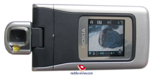
Ericsson K750. The Nokia N90 has a camera module put on the top end and rotational. If placing the phone vertically, you will be able to rotate the module 270 degrees and then it will get fixed. The module rotation allows having a changing viewing angle while shooting which is quite unusual. You don't need to move the device, just turn the camera. At the same time besides improvements some worsening appeared, now you can't work with the main screen in a folded mode. That is when your internal screen is turned up hiding the keypad like Nokia 6260 (you would be comfortable to read books in this mode and work with other applications). When taking the device in your hand for the first time you would place your finger exactly on the camera objective leaving a fingerprint there.


The camera though doesn't take the whole of the module, here is also a loudspeaker. Due to its top end disposition the volume is a bit higher than in the previous models.

When the device is closed the module is at the same level with the phone body, but open the device and it will get to the back plane turning into some kind of a rest. If putting the opened device on the table, you'll see it lying in a comfortable angle. It is convenient when using a Bluetooth keypad - you don't need an extra rest. When in hands the module is uncomfortable but still may be clasped in fingers.

The phone dimensions are small as compared with usual devices not smartphones (112x51x24 mm).
But when comparing with smartphones you'll surely see the Nokia N90 almost completely similar to
the Sony
Ericsson P900, P910, and having a bit bigger size than the Nokia
6680/6681. As different from the mentioned models the clamshell form-factor supposes opened condition and thus the models should be compared, since mostly we work with the phone this way. The device is very heavy and even its balancing can't help, entering messages with one hand is very difficult. Even men had to put it into another hand. Placed near your face the opened device looks giant, it is almost twice larger than standard today phones.


That's senseless arguing about the dimensions, one will consider them appropriate and one inadmissible. You just should understand it is the largest device on the market for today (not communicators, there are even larger models among them).
The external screen delivered from a complete rotation of the upper part of the phone, now it is opened only to one side and can't be placed so that the internal screen is outside, but we have mentioned this point above. Thus the device resembles a small video camera in appearance.

The external screen is comparable with Nokia
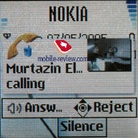
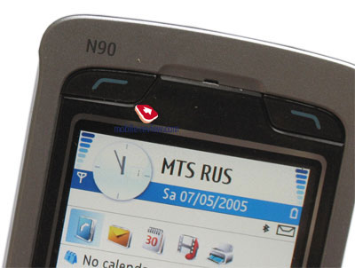
6230 in characteristics, 128x128 pixels (28x28 mm), up to 65K. But the picture quality differs from this model, it looks ruder and not so smooth. The TFT-matrix net is seen. The possibilities of the screen are impressing for this size and there are no comparable outer screens for the moment. It is readable in the sun which is an advantage. Traditionally, the developers tried to make users' lives easier by providing a possibility of using a camera without opening the device (only photo mode), you need to turn the module from you. Changing profiles, turning the device off, reading messages on the screen, viewing the missed calls and dialing them are possible. It's curious you can speak on the phone when closed, but the speakerphone is automatically on. Thus you either allow everybody hearing your conversation or open the device. Естественно, не забудем упомянуть вариант разговора по гарнитуре.


An On/Off button on the top end (to be more precise, on the camera module) is responsible for controlling the events on the external screen. The shutter button is on the right side, it activates voice dialing and voice control also. A 5D joystick mostly necessary for shooting is placed lower, though quite useful here. The button is quite comfortable and easy to work with. On the other hand placing the button here doesn't make dealing with the phone easier. You'll mostly have to hold the device in your right hand for your finger lay on the joystick, but due to the phone size and weight (173 grams) that's uncomfortable sometimes. Holding the N90 in your left hand you'll find difficult to use the joystick.


An RS-MMC slot is placed on the right side, hot change is provided. Naturally, it's impossible to use 3
W cards here like in the Nokia
6630 and later versions of the Dual Voltage cards, so only 1.8/3 ones.

A standard Pop-Port is placed on the right side and a charger connector is near. Differently from the previous models the slot has been seriously changed - it got thinner. There were no any presuppositions for changing the slot precisely in this model - the total body size allows placing a slot of almost any size. Another question is the company plans to introduce a line of thin and miniature models and an old connector will be inadequate in them. So the technological reequipment is mostly connected with it. Another reason might be a wish to renew some accessories, and precisely, chargers, since the company considers it a serious market volume. But the second reason is oblique, not the main. We'd like to point out an adapter is included into the kit. It allows using old chargers.

The commercial version has the backlash problems improved. The cover is still attached imperfectly, though the better quality is to the fore. To tell the truth, there will be no problems with the cover, though it won't get comfortable to open. The minus is you'll need to cope with the opening process, it is not smooth sometimes and you'll have to shake the cover out.
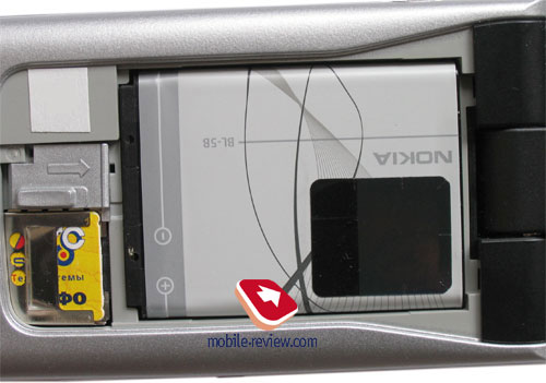
The SIM-card holder differs from the majority of the company's models; it is placed in an angle of 45 degrees and has a special fixing mechanism on the side. One may suppose the trigger pushes the card away from the holder, judging by the photo, but it's not right, it is a lock. The card may be plugged out when a special profile is on - the phone is not used and a radio block is off. And a possibility to plug the card out and put into another phone is foreseen for this profile. The developers thought a user should touch the main battery as seldom as possible and that seems quite logical.

Unfortunately, everything is not as smooth with the battery life. A standard Li-Ion BL-5B battery capacious of 760 mAh is used. For you to compare, the majority of today smartphones has a BL-5C capacious of 900 mAh. There are no original expanded capacity batteries for the N90 and they are unlikely to be provided. The claimed standby time is 240 hours and up to 4.5 hour of talking. In reality, the device worked for about a day in Moscow networks (about 18 hours, to be precise). Using all the functions actively and mainly shooting shortened the battery life to a half of a day (about 3-4 clips with the duration of 2 minutes each and up to 60 photos). The main charge is spent on the two screens, a louder call signal as compared with the previous models and mechanic rotations with one or another phone mode turning on after. And the entire mechanic enchanting spectacle is not traceless for the device. The most economical N90 users will keep it alive for a day and a half and then the device will remind of a charging necessity. One should account on the battery enough for a day in case of 40 minutes of talks and up to 30 minutes of using other functions. Using the device longer will seriously decrease the battery life which is a minus. The big weight of the device prevented from increasing the battery capacity to 1100 mAh or more. That is also a shortcoming.
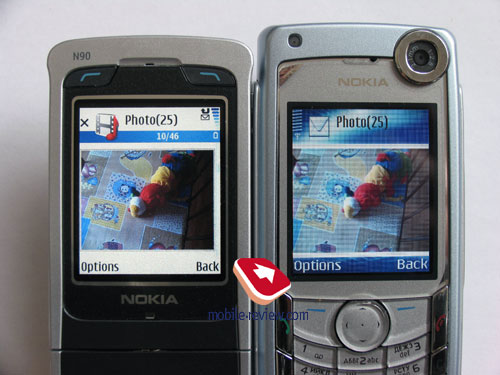
So, let's pass to the strengths from the weaknesses. The internal screen may be considered a plus. The TFT matrix resolution is 352x416 pixels with the physical size forming 36x42 mm (2,13"). This screen type gets standard for many Nokia's smartphones, it may be considered as intermediate between the QVGA and VGA resolutions. The picture quality is quite well due to the small pixel size and may be compared to the best Sharp models. There are no rivals to the screen among all the manufacturers for today. The screen is 262K which also makes it interesting.

That's curious the screen quality and its lower resolution as compared with the max photo resolution make even unclear photos look rather beautiful and perfect. A manual tuning of screen backlighting brightness is unordinary (about 32 positions!!!), this parameter was quite weak till today. The presence of a special sensor responsible for automatic backlighting adjustment is the second unordinary this about this phone. The technology allows working with the smartphone comfortably both in a bright day and in the dark. Both screens are well read in the sun and the inner one with a picture on it is seen well.


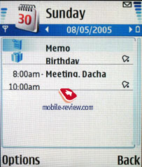
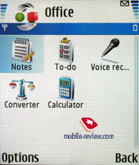
System fonts have been redrawn specially for the possibilities of the new screen, they got thinner and aerial. The perception of the fonts has improved and that is a serious step forward as compared with the previous models. On the other hand positioning relative to other design elements is sometimes incorrect (for instance, an underlying in organizer) which eats up part of the letters. See in the examples, the "Y" has turned into the "V". We should give the maker his due, they managed to correct font positioning by the commercial launch.

Special buttons for working in the camera mode are put around the screen, we won't tell about them here.

The keyboard is well-done, plastic button are backlit in white. A 4D navi button has an integrated OK button. Number keys are large due to the size of the device. It's hard to work with one hand and particularly enter messages, your hand will soon get tired due to the weight and the imbalance. I suggest holding the phone clasping the camera module with you finger.

Operating system, memory, processor, productivity, software
The device is run by Symbian version 8.1a which means using the EKA1 core being similar to the one used in Symbian versions 6.1, 7.0 (different to the EKA2 providing real-time multitasking). The model supports Feature Pack3 which means the presence of a scalable interface and fonts with changeable size. That is one of the most serious improvements in the smartphone. The second improvement concerns security. The Feature Pack development added:
- Locations API - the developers got a tool for using the location information, its representation and search.
- Wireless Messaging API 2.0 - creating MMS from Java-applications
- Scalable 2D Vector Graphics - JSR-226, mainly support for SVG
- Bluetooth v1.2
- MMF DRM API - third party programs may response to the DRM rights repository
- EXIF API - adding EXIF data to photos
- Find Item API - allows finding numbers, addresses, e-mail addresses, links in texts
- Some more APIs
Nokia offers developers a new tool for creating programs - Feature Pack 3. It would seem compatibility of old programs with a new Feature Pack should be provided. The test model we received several months ago showed great problems with compatibility, the lion's share of the programs failed starting at all. The commercial sample, on the contrary, has a very good compatibility. Even applications which refused working in Nokia 6680/6681 were possible to run here (an example is a test package SPMark). A stretching mechanism works for old programs. That is the program itself like sees the resolution of 176x208 pixels, and a smartphone stretches the image full-screen. Each point like generates four similar points on the screen. But things are still worse with Java applications which are showed in the top left corner with a post-card size. Nokia N90 has more compatibility with third party developers which is a great advantage. In fact, we didn't even expect any improvement, but it happened.
The N90 processor is similar to the one of the Nokia 6680 having the clock rate of 220 MHz, no improvements in productivity, even slower work. Subjectively, operating speed decreased insignificantly, from 5 to 10 percent in various modes. Slow photo drawing in the expanded Gallery is mostly connected not with the processor operating speed but more likely with transforming big photos into small icons.
About 31 MB of memory are provided for all the applications in the N90, and also consider the memory card space. The memory is shared dynamically including Java-applications, no restrictions on their size.
Unfortunately, the Nokia N90 failed to run the majority of the applications made for Nokia smartphones. The main problem was the screen resolution, every attempt to redraw an image for a high resolution resulted in smartphone restart. And correspondingly, the SPMark04 also failed. The situation with the software remains unclear, it's quite logically, the device has to run all the programs written before and the absence of plain compatibility causes the decrease of the phone attraction. On the other hand there are quite recent examples, when new smartphones even featuring the same Future Pack 2 did not work, no explanation is still found (including company engineers and developers). In a word, the question of software compatibility should be thoroughly studied at the launch moment, we really hope, the company will make the N90 compatible with those many programs present in the market again. But considering the fact the developers have already been offered a new tool, we can expect the opposite and all the troubles concerning program transfer might be heaped onto third party programmers' shoulders.
Here are JBenchmark test results, they allow estimating the Java machine producivity.
The tables below show the comparison а various smartphones. You shouldn't make conclusions reasoning on this very test, since it only shows the speed of this exact Java machine realization. Though, the smartphone Nokia N90 shows not the best results.

The SPmark test characterizes the smartphone work as rather good. Nevertheless, it shows no real speed, that is more a test on the old screen resolution. The new resolution of 356 x 416 pixels provides rather a lower speed. It doesn't fall times, but still the reduce is significant.

The software and standard applications coincide with those of the Nokia smartphone family, no significant differences. The main innovation is a voice recognition system independent from pronunciation. It needs no special bookmarks. That means you just need to activate dialing and name the user, the device will find it in the phone book and dial the number. Menu is navigated the same way. The system works well being also comfortable. The bookmark number that could be small in the previous devices not is not restricted here; any name in the phone memory may be a bookmark. The main functions also can be called using the system. Similar recognition systems are used in some smartphones run by Windows Mobile (third party solutions included into the package) while they are still a rarity for Symbian devices.
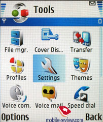
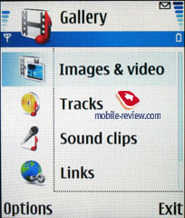
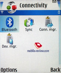
Extra screen shots of Nokia N90>>>


As for the sound possibilities the N90 is one of the best representatives of the 60th platform. The loudspeaker disposition is an advantage, it sounds louder than in other models. The polyphony is 64-tones, midi sounds well, though still lower than mp3 or AAC melodies. In addition to AAC an expanded version AAC+ is also supported and even eAAC+.
Impressions
As for the connection quality the device is a typical representative of Nokia smartphones with no serious problems. As compared with the Nokia 6680 the phone gained some significant advantages. Particularly, a voice recognition independent from the pronunciation appeared, no preliminary bookmarks are necessary. The screen is one of the best on the market and the best in its class. The external screen is the best in its class considering all the characteristics. The camera is on the level of the best ones though it's hard to find one to compare with, only the Sony Ericsson K750 that actually belongs to another class (all the photos are comparable excluding the macromode, the K750 looses here).


And now a fly in the ointment. Rather slow camera work is a minus. Small capacity of a standard battery, only one working day in the standby mode for the majority of cases. There is no vibracall, the developers were right to think little people will wear the phone. The next disadvantage is arguable, that is dimensions - they are comparable to existent smartphones though loosing to usual phones.
In the end we have an interesting device with some perfect components and some disadvantages. That is for one to decide whether the pluses will outweigh the minuses mentioned or not. There are no complains of the mechanic part of the Nokia N90, everything is perfect. You can read about the camera in a separate report, so we won't stop on it here.
Nokia N90 has been available in sale since the end of August. The current retails prices are too high - about 1500 USD (the FOB price forms 804 USD). The price is unwarrantably high, buying the model seems appropriate if the price falls at least twice.
Considering the fact almost all the interesting 2MP models of the year will be launched in autumn, the situations seem to be interesting, strong competition is expected. Some makers do already have smartphones with touchscreens and 3MP cameras, but they may decide on waiting for the Christmas sales instead of launching them shortly.
I advise to take a closer look at the N90 to those loving technologies and would overpay for them. A device with a similar filling and a more customary design will appear in the Nokia line in February 2006.
P.S. Why do you think the company has not integrated a camera with higher resolution and more capabilities into the N90's rotational module? An optical zoom could fit the room. May be the company is preparing Nokia N95 with 3MP camera and optical zoom?
Nokia N90 - capabilities of the 2MP camera >>>
Video:
The phone appearance and construction (4.39 MB)
The phone appearance and menu operating speed (13.8 MB)
Comparing the dimensions with other devices (3.22 MB)
Comparing the dimensions with other devices-2 (5.15 MB)
Comfort of using the device (3.58 MB)
Comfort of using the device (3.58 MB)and construction
(3.41 MB)
Incoming call (557 KB)
Menu fonts (3.09 MB)
Displays behaviour in the sun (3.24 MB)
Eldar Murtazin (eldar@mobile-review.com)
Translated by Maria Mitina (maria.mitina@mobile-review.com)
Published — 13 September 2005
Have something to add?! Write us... eldar@mobile-review.com
|


