Review of Nokia N9. Part II – Software
Contents:
- Interface and Apps
- Multitasking
- Contacts
- Search
- Web
- Messages
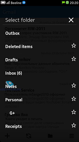
- Mail
- Calendar
- Clock
- Gallery
- Music
- Video
- Maps and Drive Navigation
- OVI Music, Store
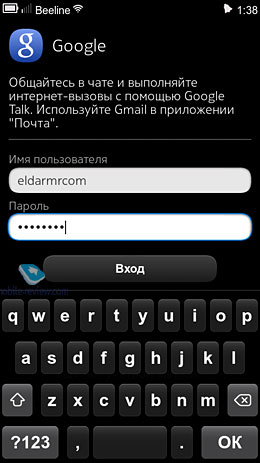
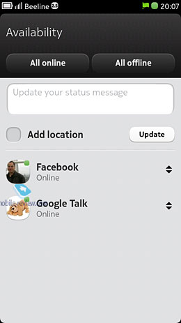
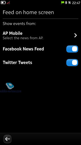
- Accounts, Facebook/Twitter
- Settings
- Application
- Games
- Conclusions
Interface and Apps
On their way from Maemo 5 to MeeGo the developers have given it a completely new look and it is in fact unique and I cannot think of anything similar to it. The interface is called Swipe UI, not a very good name – sounds just like the Swype keypad which, by the way, is available on N9 with the first firmware update. The basic concept of the design is that the phone has no hard buttons at all except for the lock button so all controls are on screen. Such a radical solution might be a result of the Apple iPhone influence and Nokia tried to outdo the competitor. But even Apple is finally getting that hard buttons are essential sor a number of situations like camera launch.
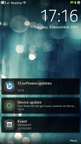
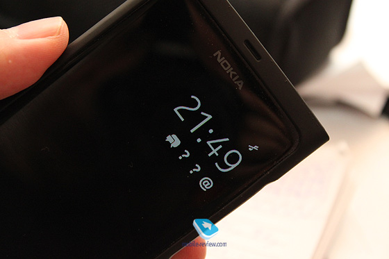
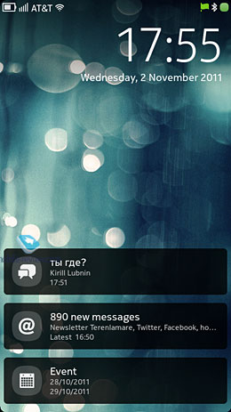
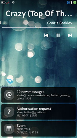
Anyway, no matter what Swipe UI had in mind it looks fresh and original. The locked screen displays time and a number of notification icons (more of them in the 1.1 update). Many users will be ecstatic for the lock screen clock and it is indeed a very useful feature as well as lock screen notifications.

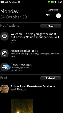
When you unlock the screen you see the home screen where you can see all your notifications (mail, calls, calendar notes etc.). The home screen gets filled with notification tiles as they come so often most of the home screen is empty. For some reason, unlike other menus the home screen is rather slow and often lags.

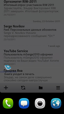
If you pull the screen up you will see a bar with four icons: dial, messages, camera and web. You can open this bar in practically any menu where vertical scrolling is not available. It comes in very handy sometimes but also is confusing sometimes as in some menus you will be just scrolling through and vice versa.

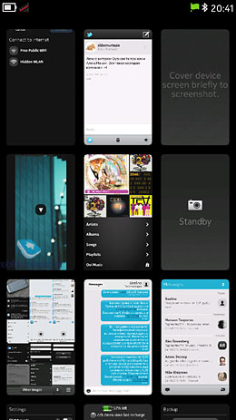
You can swipe to the left and to the right on the lock screen to see three types of screens which present the idea of the Swipe UI. One of the screens displays active apps as a list of tiles. Press and hold a tile to open the shutdown menu where you can stop either the selected app or all active apps. In the original firmware you could enable the gesture shutdown – pull the screen down while in an app to stop it. In MeeGo 1.1 this feature is enabled by default but you can disable it if you want to.
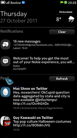
The second screen is not particularly interesting as it doubles the lock screen functionality – at the top you see messages and notifications as well as the weather forecast, below them the social accounts feed. This screen seems a bit redundant as it does provide any useful information and simply duplicates features available in other apps. Although, some statuses are shown only on certain screens which is completely senseless.
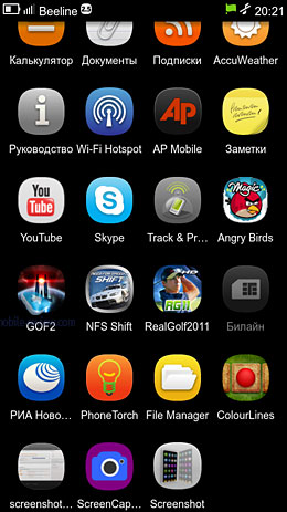
And, finally, the third screen – the main menu. It is a four by infinity matrix of icons. The icons take two screens out-of-box. There are many ways to organize them but you cannot create your own folders. You also cannot change the view of this menu. Since there are almost no apps for MeeGo all of them will take up three screens max (but I frankly don’t know how you can possibly get that many). This solution reminded me of Windows Phone 7 with its endless list of apps but WP7 at least can organize them by name and MeeGo cannot do that. Most phones organize apps into different screens and you can drag app icons to your desktops. MeeGo does not have shortcuts or desktops which were available for long time in Symbian. It is a major conceptual difference and is probably a result of the raw state of MeeGo – it isn’t a finished OS. On the one hand, Nokia tried to create a simple yet fast interface like in Windows Phone 7, on the other hand, the phone was supposed to have a lot of apps and be very advanced which contrary to the first idea. The problems could be solved by the interface evolution and the next OS version would have folders, widgets etc. But there won’t be next MeeGo and even the current one is only available on Nokia N9.

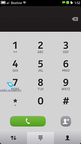
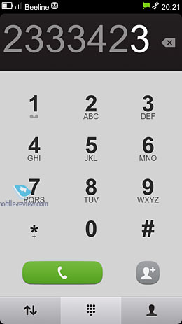
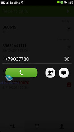
Nokia N900 was also very raw (even USSD requests were not available) and in Nokia N9 the developers failed again to include many basic features. Like speed dial – N9 never heard of it. Or phone prompting – as you enter a number you expect the phone to prompt you with existing phone numbers but there is no such feature here. There are a lot of tiny details this phone is missing and when you use N9 for some time the first impression of the slickness of the interface wears out very quickly.
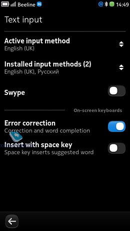
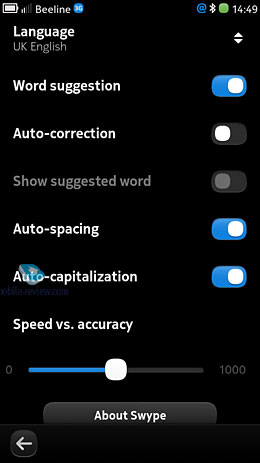
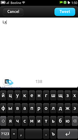
Text input and key pads work fine despite some bad heritage of older Nokia phones when you could not switch between languages in one action. The standard QWERTY key pad works both in the landscape and portrait orientations. In the settings you can select key pad’s active languages and swipe to switch between them. Although, sometimes instead of switching the active language the key pad types in characters so there is a certain rate of misprints due to software. The 1.1 firmware update has brought the Swype key pad and it is way better than Nokia’s one. I strongly recommend using it instead of the standard one even if you don’t use the Swype feature.
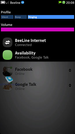
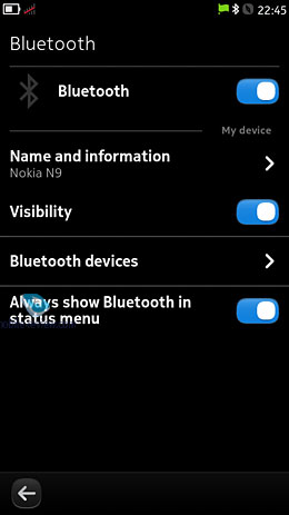
The last interface element worth mentioning is the status bar. It displays info on the battery charge, time and a number of other status notifications. You can switch between profiles (sound off, beep, sound on) by tapping the battery icon. From here you can turn off Bluetooth and Wi-Fi if they are active. On the whole, the status bar is pretty simplistic – there is nothing more in there. I suppose the developers simply did not have enough time to add more features to it.
Back to the table of contents >>>
Multitasking
N9 features preemptive multitasking which means you can use as many apps as you want and as soon as the phone decides there are one too many it will start killing them starting with the ones you haven’t addressed for the longest period of time (those that cannot stay idle and consume power).
Hypothetically this should work great but in practice N9 is so raw that multitasking works awfully. The phone cannot adequately assess how much free performance it needs and as you can see on the video the phone starts lagging after watching a movie and opening a document reboots the phone. This is all due to bad multitasking. And it’s not just about files, some bundled apps like the maps app crashes all the time if you do anything but simply view maps or the app is minimized for a while. You can see the problem on the video in the Maps chapter of this review.
The multitasking issues come from the general incompleteness of N9 and it is very unlikely it will ever receive all the necessary software fixes and updates. Some users recommend closing apps if you don’t need them anymore but users should not be burdened with remembering the system memory status and the number of active apps it’s the phone’s job after all.
Back to the table of contents >>>
Contacts
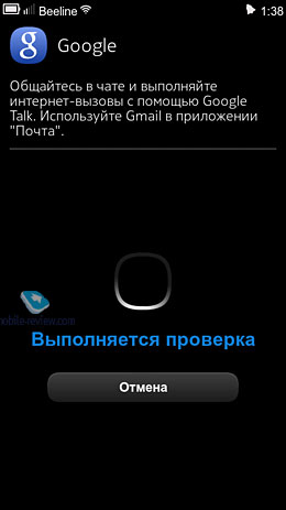
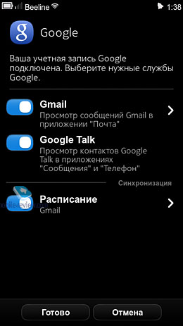
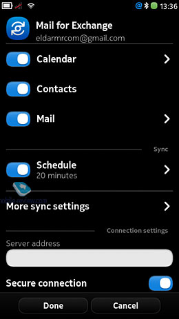
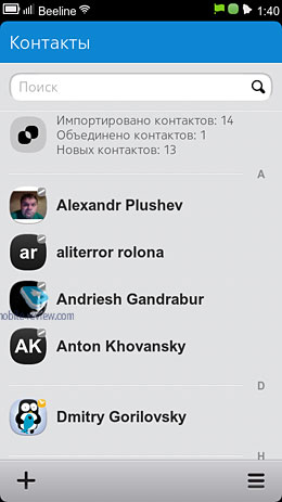
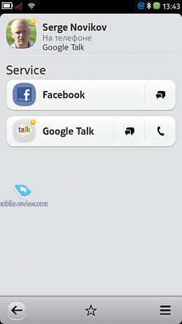
The phone book can display contacts from SIM and your social accounts like GTalk and Facebook. The phone prompts you to sync contacts from all social services but it is not an easy thing to do. If you store your contacts in MS Outlook you won’t be able to sync them with the phone and it is a huge disadvantage of the phone. The phone can sync with your Gmail account although there is a problem. By default, the phone imported my Google Talk contacts, the calendar, mail but missed the contacts. You can fix it by setting up Gmail in the MS Exchange profile then you will be able to import all your contacts. Why the developers did not set it up right in the first place is beyond my comprehension but you may feel proud for yourself for fixing this issue on your own.
Although some users reported issues with non-Latin contacts’ names but all my entries in Russian were imported correctly.
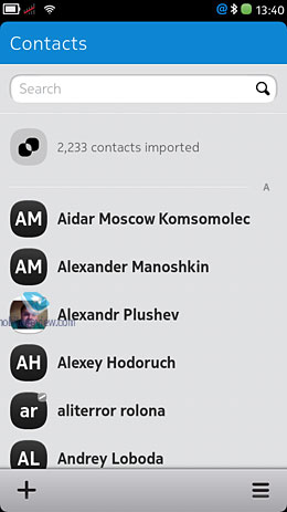
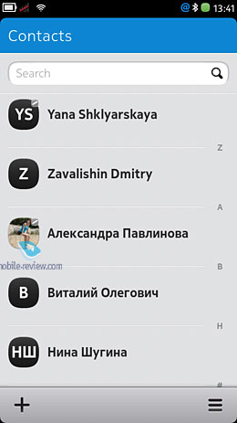
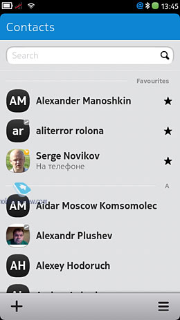
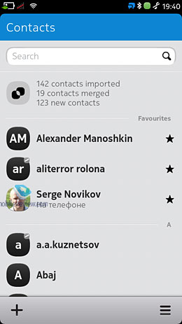
Contacts can be listed alphabetically or by availability which may be useful for social networks. Favorites can partly make up for speed dial – favorite numbers are always at the top of the list. I liked that next to the contact name there is a round icon with the contact photo or if there is none with his initials.
On the right side of the list there is the alphabet bar so you know when to stop scrolling. Contacts are also organized by the entry language so if your system language is English first will come contacts with names written in English and then in all the other languages. Simple and easy.
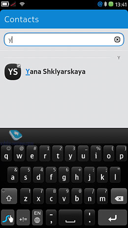
As usual, you can search for a contact by typing in his name in the search field.
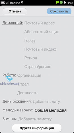
Each contact entry can have miscellaneous info like different numbers, home address, web site etc. You can assign individual ringtones to every contact. It is a pretty regular phone book.
You can save all your contacts to a single file and there is no other export options you can use. Although you could use MS Exchange to export contacts to Exchange servers but it might be very tricky.
Back to the table of contents >>>
Search
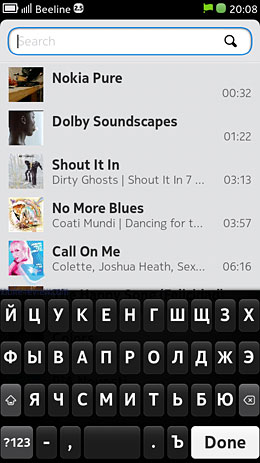
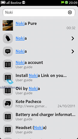
It is a very nice feature to search for virtually anything in the phone. By default, the search window displays the recent search results (not requests). The search works for all bundled apps except for the social networks clients like the Twitter app. The search even includes menu names, contacts etc. if the search results do not satisfy you can then search the web with Google.
Back to the table of contents >>>
Web
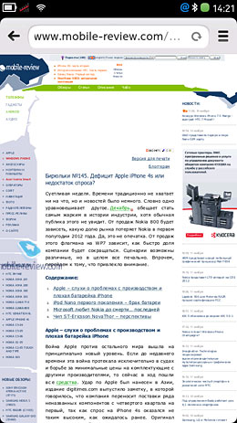
The default browser is based on Webkit2 and Nokia boasts of this fact although it has become the norm for the modern market and there is not an achievement. The first thing you notice about the browser is that there are no settings – you cannot customize anything. You get a browser and you can view web pages but you cannot change a single thing about it. I, for example, often switch off image download in browsers to speed up web surfing. But it’s impossible in Nokia N9 the browser works as is.it supports the following standards: HTML5, CSS 3, XHTML.
The phone does not support Flash. It depends on your needs whether it is an upside or a downer as Apple has successfully proven that Flash is not at all crucial.
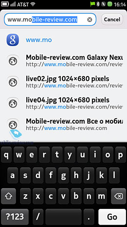
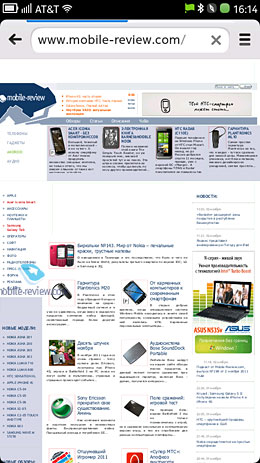
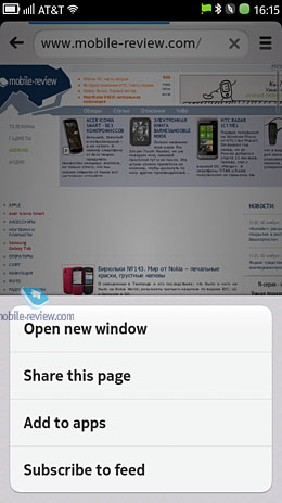
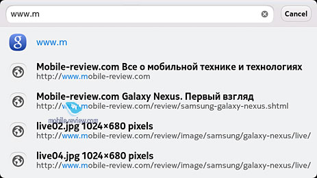
The URL bar prompts you with web addresses you have visited when you type in. Unfortunately, besides no Flash support the browser does not always displays web pages correctly. For example, the Mobile-Review.com heading lacks all the icons like the podcast icon, language selection and so on. But magically all these elements are back on the sites internal pages. All other mobile OS I have tested displayed our web site correctly until now.

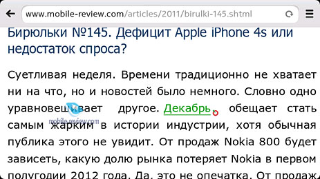
The screen is too small to view pages in the portrait orientation –text gets too tiny. A double tap fits a text column to the screen width but whether the text will be legible depends on how wide the column is. Like on Mobile-Review.com text is mostly readable while on some other site it is not.
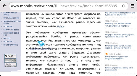
The landscape orientation works a lot better for this purpose. You can pinch to zoom in but it’s no good for texts as you will then have to scroll across a paragraph to read it.
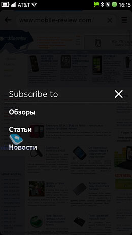
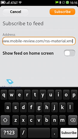
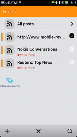
The browser supports RSS – it is a regular feed and it works fine.
There is not much I can add about the browser. There are no settings and its functionality is very basic. Sometimes it displays pages correctly and sometimes not then a page refresh might help. It cannot be compared with iOS or Android browsers. It’s like they are from different planets. Instead of a real browser N9 has a beta version of one that will never be finished. The browser’s most irritating downside is the lack of autofill and password remembering features.


Back to the table of contents >>>
Messages
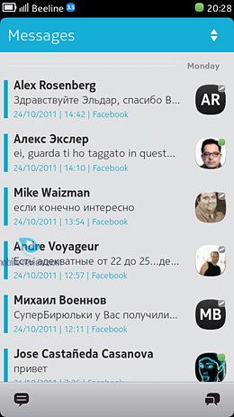
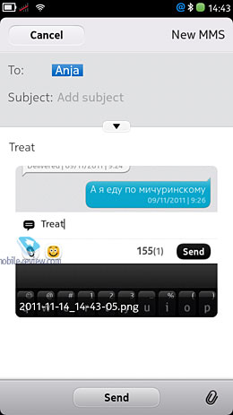
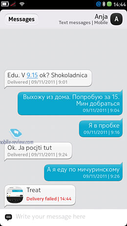
All your SMS/MMS and social networking messages are here. Correspondence has a chat view and you cannot change it. You can forward and copy messages. Adding images, sounds or videos to an SMS automatically makes it an MMS.
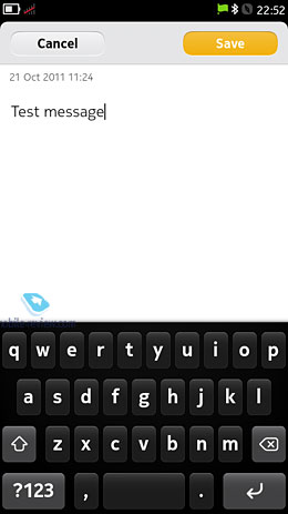
The chat icon in the list allows you to select the social service and text any contact. There are no templates or drafts. Again, the functionality is very basic but then most people don’t need more.
Back to the table of contents >>>
Mail
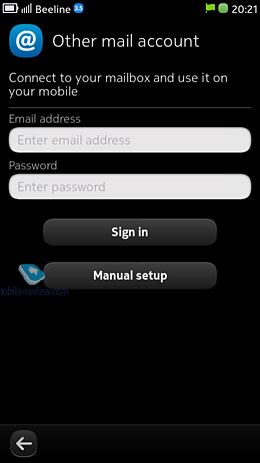
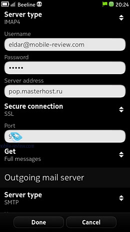
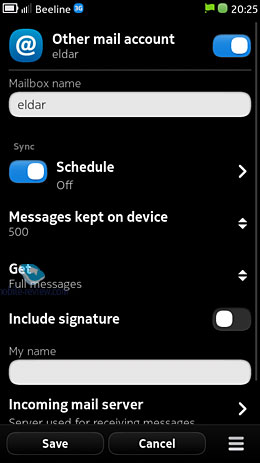
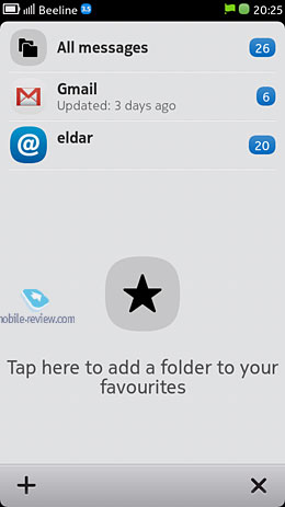
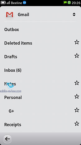
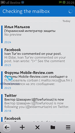
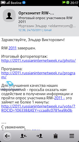
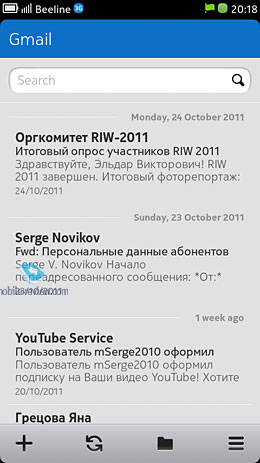
You can set up several mail accounts and there is a common folder that displays all mail from all your accounts. The standard mail client supports attachments for Gmail and other mail services. I have not had any problems with encoding – all in all, it is a basic mail client and it supports HTML in messages, POP3, IMAP and Mail for Exchange. It cannot display attachments in the message body you have to download them to view. It’s all enough to satisfy most users.
Back to the table of contents >>>
Calendar
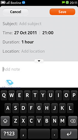
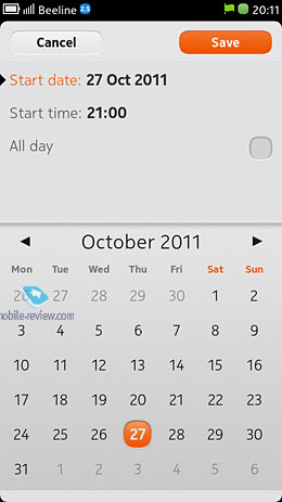
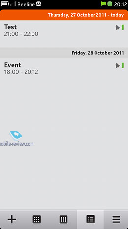
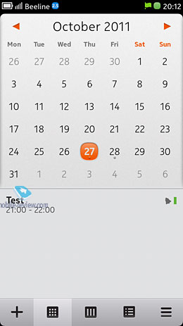
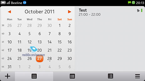
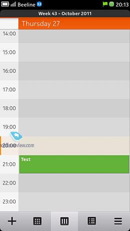
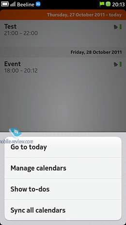
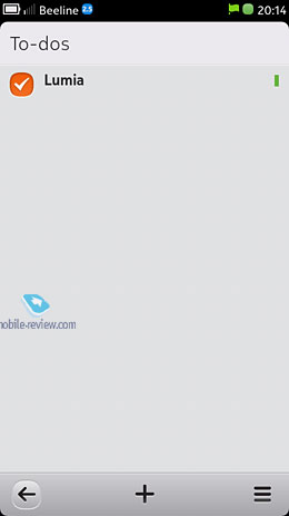
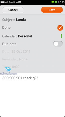
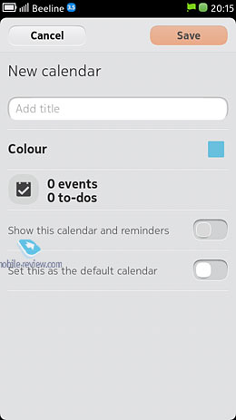
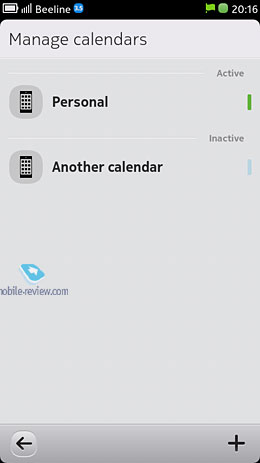
The Calendar app can include several calendars then imported calendars are marked with different colors. You can view events for one day, a week or a month. It is convenient and works nice. You can set events as repeating. You can also add contacts to an event who will then receive notifications. The downer here is that you may only import one calendar from Google or any other social service. I, for example, have a work and a home calendars in Google so this one calendar only restrictions really isn’t working for me.

Back to the table of contents >>>
Clock
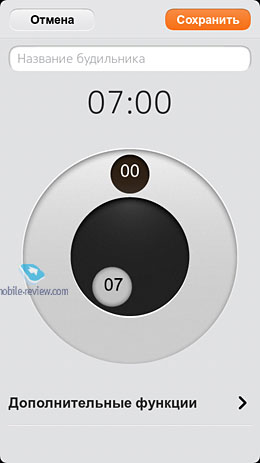
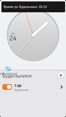
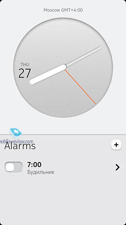
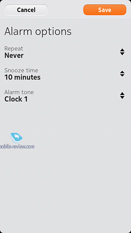
I like the way time setting for alarm clock works. Naturally, you can choose any tune for alarm clocks and set up the Snooze feature.
Back to the table of contents >>>
Gallery
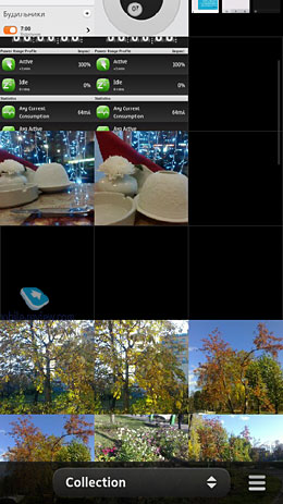
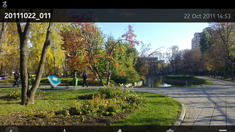
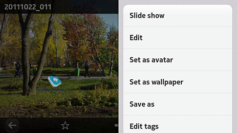
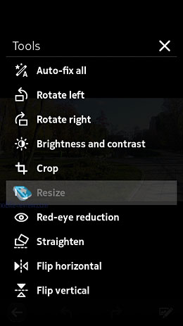
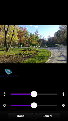
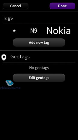
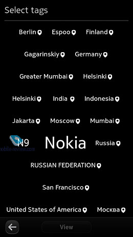
Images are displayed as tiles and there is a unique feature – you can sort images by geotags. Then images will be sorted according to the place name. You can also add your own tags and mark images as favorites. The bundled photo editor is very basic but once again its limited functionality will satisfy most users.


Back to the table of contents >>>
Music
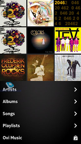
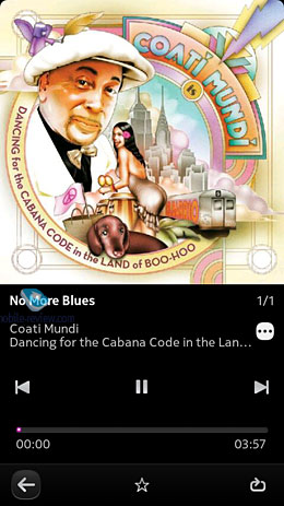
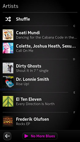
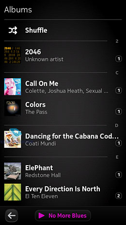
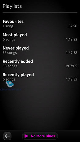
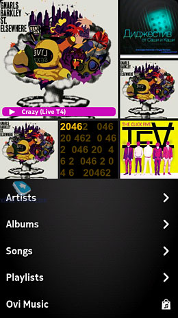
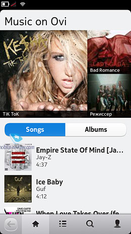
Good news for music lover – besides the standard mp3 (up to 320 Kb/s), AAC and wma the phone also supports FLAC. The full list of supported formats: MPEG-4 AAC, eAAC, eAAC+, MPEG-1 audio Layer2 (MP2), MPEG-1 audio Layer3 (MP3), WMA 9, WMA Voice 9, WMA Lossless 9, WMA Professional 9 and 10, Dolby Digital Plus (AC-3 & E-AC-3), FLAC. The player looks nice: the main menu displays up to 9 album thumbnails for quick start and you can also view your library sorted by artists, albums, titles, playlists (default playlists: favorite, most frequent, never played, recently added, recently played). The player is also a client for the OVI music store.
When listening to an album you can turn on repeat and when listening to a default playlist you can enable shuffle. Unlike Nokia N900 this phone does not support user playlist. But you can mark songs as favorites to add them into the Favorites playlist. Or assign tags to songs so the phone recognizes them as an album. You cannot play music by folders only by tags. The 1.1 update added player controls to the lock screen.
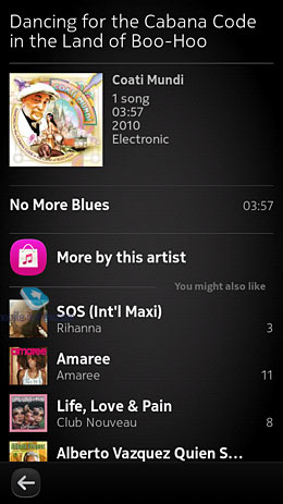
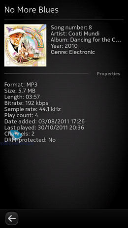
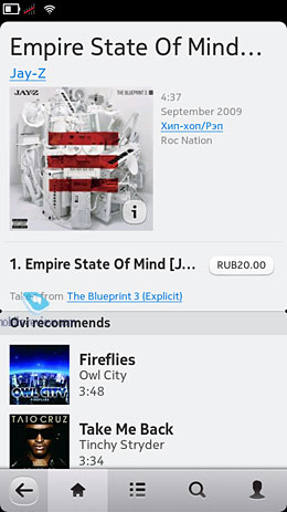
When listening to a track you can view info on the song and OVI Music will suggests similar songs (it actually works sometimes).
The sound quality is decent and better than on Android phones but not as good as on iPhone – it’s right in between them. The bundled earphones are no good as usual.
Back to the table of contents >>>
Video
The phone can manage non converted video like DVD rips. It supports the AVI container and the following codecs: H.263, MPEG4-SP and ASP, H.264 BP/MP, WMV9/VC-1 and Mkv (Matroska). Playback is great – no lagging or sound sync problems. But, alas, no settings you can change again. You cannot turn on subtitles or choose the audio track (the player always uses the first one).

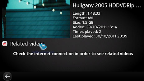
I don’t like the way this app views movies – the thumbnails are too big. But it’s nice that it shows in the list how much time is left to watch in every video. In the properties you can even see how many times a movie has been played. The player supports Dolby Mobile Plus for sound rendering but I could not see the difference as this feature is always on.
Despite the screen size it is pretty comfortable to use N9 for watching movies. It is not the best thing for this purpose but it does well. However, I have noticed the hardware artifacts during movie playback – pink lines near the edges of the picture. They are not very irritating and you only need to tap on the screen to make them go away.


Back to the table of contents >>>
Maps and Drive Navigation
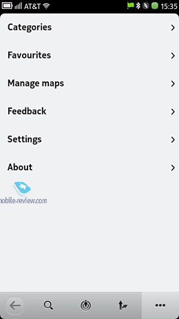
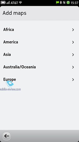
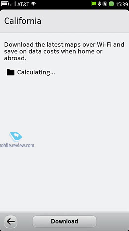
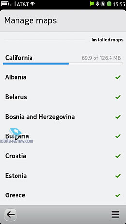
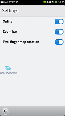
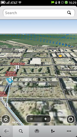
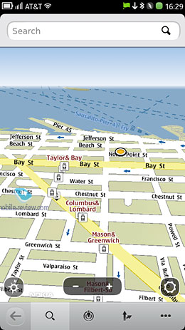
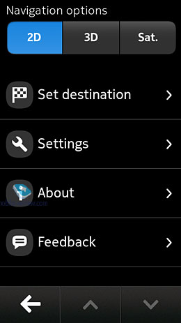
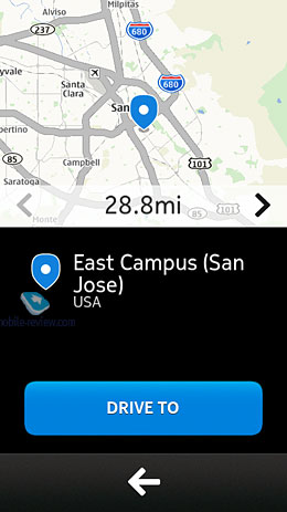
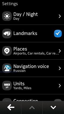
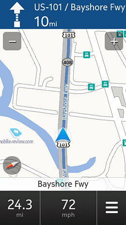
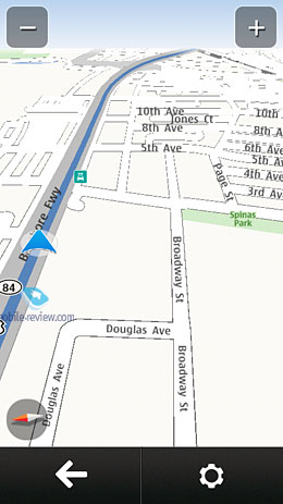
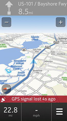
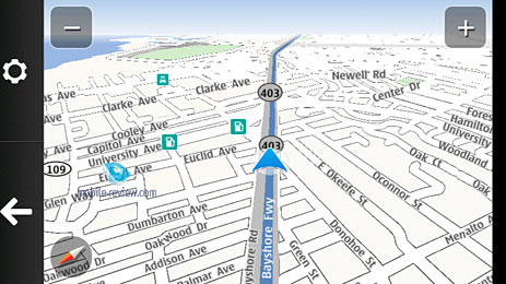
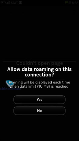
It’s clear that Nokia transferred Nokia Maps here from Symbian smartphones. In terms of coverage quality, number of countries and maps themselves I could not find any difference. You can download separate countries and whole continents. The phone comes equipped with appropriate country maps depending on sales areas.
As far as the maps were initially created for another OS there is a performance issue here. Multitasking uses the principle of replacement, but it is inefficient, especially with heavy apps and maps are not an exception. I think the lion’s share of freezing over incidents is connected with maps. When you are using Drive navigation you cannot open the browser or listen to the music without compromising the overall performance. Sometimes it simply stops or does not download maps. The next video pieces show it clearly well.
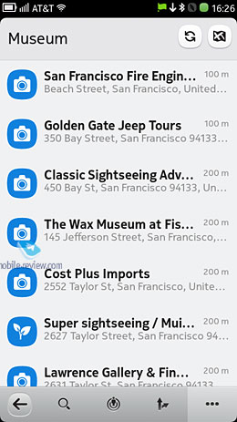
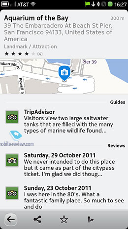
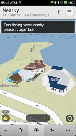
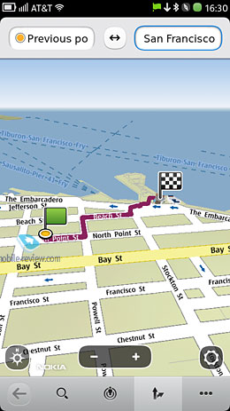
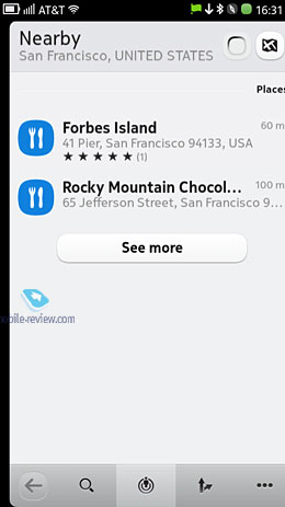
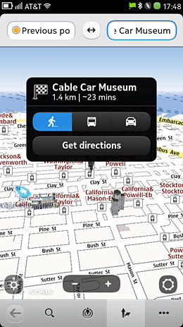
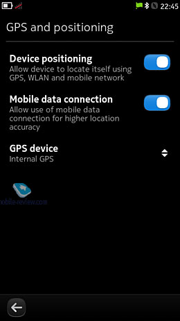
While travelling around San Francisco I used Nokia N9 (T-Mobile SIM-card) as the key navigation device. Cold start of A-GPS takes 5 minutes and then you can activate the system within 30 seconds. Accuracy of positioning is perfect and the same applies to maps themselves, but there is a big problem with POI. They are too numerous and not organized properly. In Google Maps I could find all museums near Pier 45 during several seconds, whereas in Nokia Maps I received a long and tedious list of museums many of which turned out to be small souvenirs stores, which is not convenient.
In general offline navigation on Nokia N9 leaves much to be desired. It is enough when travelling from А to B, but totally unacceptable if you need to find something in the area, which has more than one museum, restaurant, etc. Nokia has some catching up to do here.
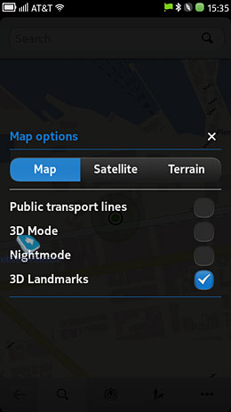
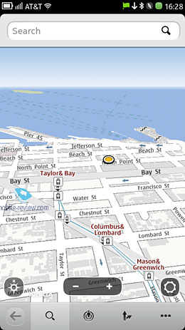
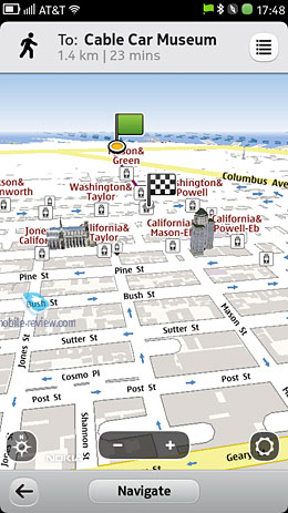
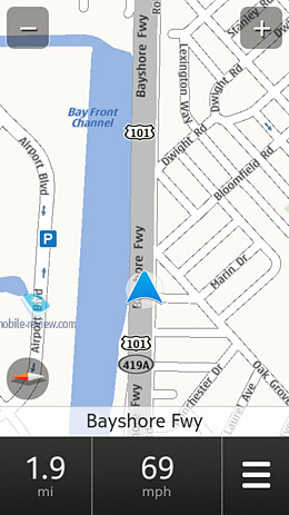
If you ignore the inconvenience of additional features then you may like the maps after all. For large cities they are on par with the majority of navigation services, offer 3G and satellite images. Navigation mode is not the best possible and I prefer other apps for that. The main disadvantage of maps is the instability of operation and the fact that you should always remember to empty the memory for adequate performance.

Back to the table of contents >>>
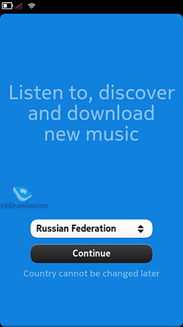
OVI Music
This is a music store from Nokia with standard performers and average prices. There is nothing special here.

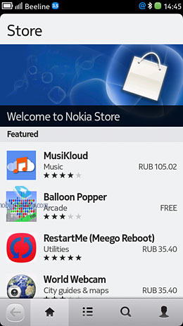
Store
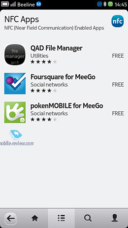
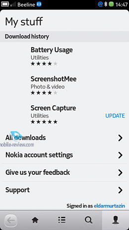
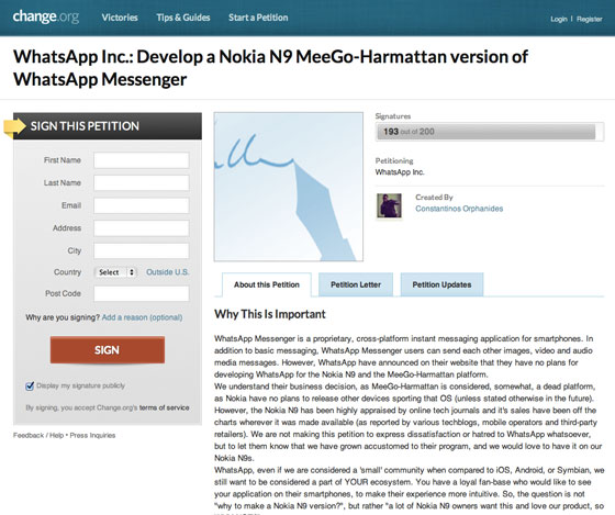
The OVI prefix was dropped, because the concept proved not very successful and Nokia services were not in demand even despite the staggering number of handsets in circulation. In the store you see all apps available for MeeGo, but they are very few. During one month and a half I failed to spot many new apps. It seems the current lineup was boosted only by 10 applications during the time. Owners of the model unite worldwide for developers to create a particular app for them. Read the desperate petition associated with Whats App. I have doubts that developers will start working on the Meego version when they see 200 signatures.

At the same time such documents show a true statistics about the number of people who purchased this phone. Developers have no interest in working for Meego unless they are interested in charity.
If someone promises that many apps will appear soon for Meego you can easily prove this person wrong. The entire history of Maemo is an endless wait for developers to create something for it. Unfortunately, you will be able to use only features from the box. Don’t expect anything else.
Back to the table of contents >>>
Accounts
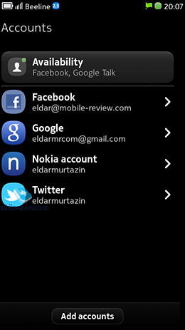
Here you can set up all accounts ranging from mail to social networks. The Facebook app asks for the password after every reload, which drives me crazy.
Facebook/Twitter
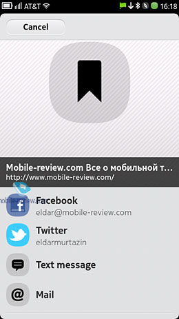
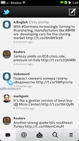
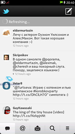
PR 1.1 update for Twitter added an opportunity to attach photos. Everything else stays the same. Both clients lose out to offerings from rival OS, which boast richer choice and convenience of use. Don’t look for any variety here.
Back to the table of contents >>>
Settings
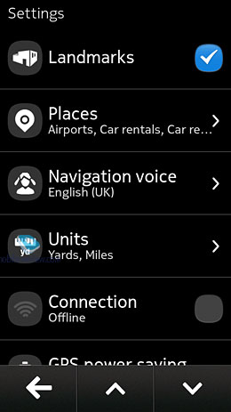
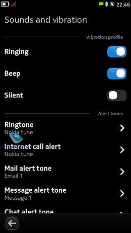
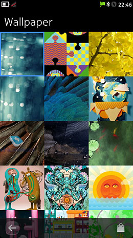
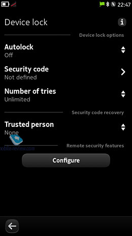
There is a flight mode and you can also change the screen brightness and check the battery charge. Profiles are not present as you can only customize sounds for events. The desktop only enjoys the wallpaper option. In the phone memory the back-up copy can be saved. I cannot mention anything special in this respect.
Back to the table of contents >>>
Calculator
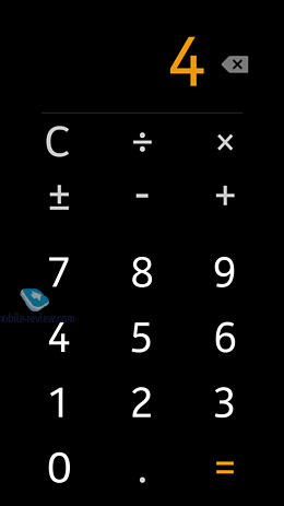
This simple app is pretty minimalistic.

Documents
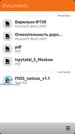
It is another underperforming application, which opens large MS Office or Adobe PDF files with occasional success. Documents can be viewed, but editing is not supported.

Weather
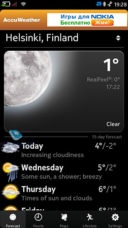
Surprisingly, but Nokia failed to purchase an ad-free version of AccuWeather. In Nokia N9 the app shows a banner in its top section.

User Guide
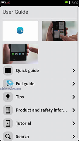
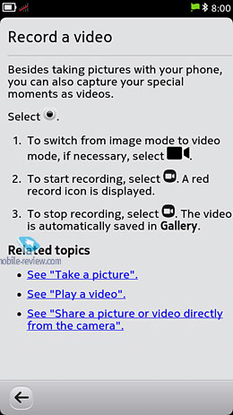
This manual explains how to use the phone’s features. Everything is simple here.
Wi-Fi Hotspot
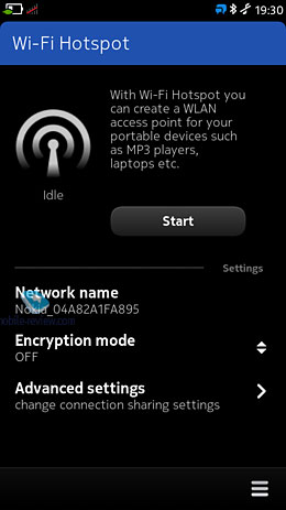
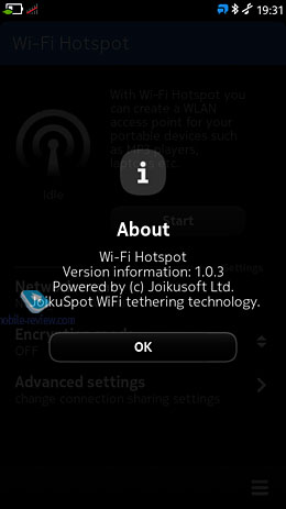
We remember JoikuSpot from Symbian as it was merely imported to Meego. Operation stability was not the best too and at times it affects the overall performance as well.
Notes
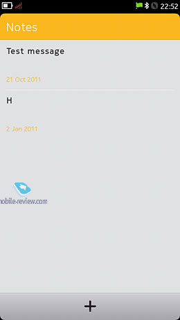
Simple text notes have nothing unusual.

Feeds
RSS subscription is simple without any updates. Featurewise it is an app from the previous decade.
Skype
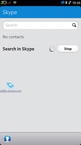
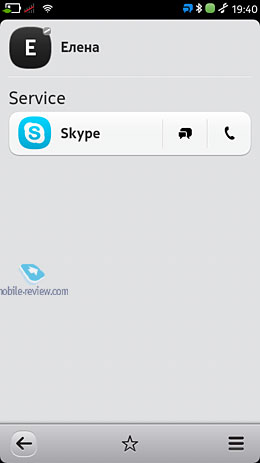
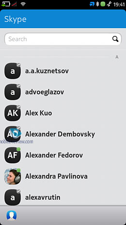
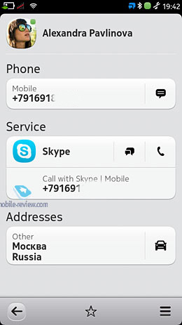
A standard Skype client is also simple, but does its job well. Sadly it can also cause the phone reload and influences the stability of the model. Contacts list is straightforward and names can be integrated into the phonebook.
Back to the table of contents >>>
Games
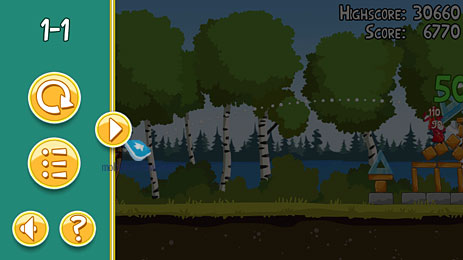
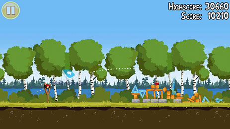
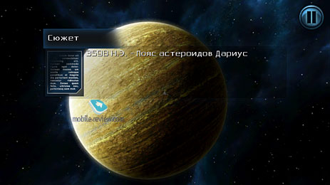
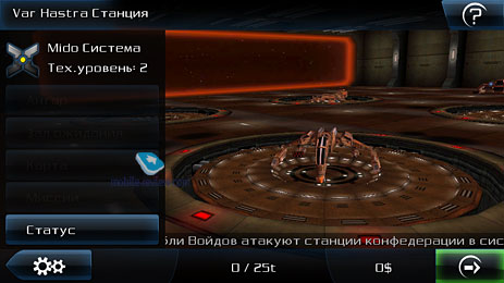
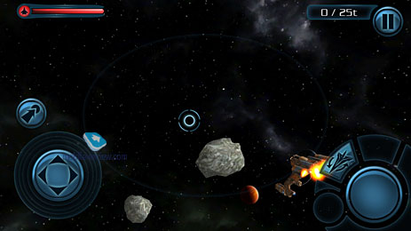
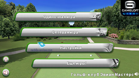
An ancient version of Angry Birds is complemented by, Galaxy on Fire 2, RealGolf 2011 and NFS Shift. The games were included here to showcase what could have been done for Meego, because in future we will not see games of the caliber under this OS. Developers are not planning to spend time and money on the tiny market share of Nokia N9 and the stillborn Meego.


Back to the table of contents >>>
Conclusions
Nokia models are getting exceedingly disappointing due to their instability and reloads. In this first and last Meego solution the company broke new anti records. The phone reloads and the only suggestion is to wait for the new firmware, which is turning into a new type of sport. You can keep waiting for months, but the next firmware is never perfect. Frankly speaking Nokia N9 is extremely attractive on the outside and Meego had a tremendous potential under certain conditions, but N9 is not a commercial product. Stability of software is not the phrase to describe this phone.
If you do not care whether your phone works chaotically or not and are prepared to empty the memory from apps on a regular basis then N9 is ideal solution. It will keep you busy for a long time. This handset is not a finished product, while its OS has no future.
A 16 GB version costs 55 Euros, whereas a 64 GB variety will set you 630 Euros off. The price is absolutely inappropriate for this kind of phone. One of the few advantages is the fact that you will get a rare model, which cost Nokia more than 1 billion Euros to create. It is a limited edition indeed to be purchased by very few people. Sales figures are slightly above those of N900 at the time courtesy of a powerful advertising campaign. Anyway, it is a commercial failure.
I am still perplexed how attractive design and decent hardware could have been totally spoiled by poor software. You will not have much trouble if your N9 will be used only for calls and SMS, but why buy a smartphone then. It is impossible to call N9 stable and ignore the mentioned drawbacks. Our videos were not made to show defects, but in real life they are even more numerous. If you are a diehard fan of Nokia and ready to buy weak products at inflated prices then you can ignore everything I said.
P.S. In November owners of Nokia N9 started turning to service centers, because their phones were losing contact with a SIM card. I have not verified the information, but one of my test phones suffered from the same malaise.
Do you want to talk about this? Please, go to our Forum and let your opinion be known to the author and everybody else.
Back to the table of contents >>>
Eldar Murtazin (eldar@mobile-review.com)
 Twitter Twitter
 Livejournal Livejournal
Translated by Maxim Antonenko (maxantonenko@ukr.net), Robert Mugattarov (mugattarov@gmail.com)
Published — 01 December 2011
Have something to add?! Write us... eldar@mobile-review.com
|
