Review of Nokia N900's Maemo5
Nokia's latest and greatest software platform, Maemo 5 didn't come out of the blue - it had been in the works for quite some time, but ahead of it lies an even longer journey. I'm not going to repeat what I said about its origins and philosophy - those of you who are not familiar with them yet should take a look at our previous article on the N900:
This write up will focus primarily on the software department of the N900, as well as its capabilities (by the way, another phone in this line-up, set to launch during summer 2010, won't differ from the N900 in terms of hardware). And the best way to break down an OS is to run through every feature an app it has got on board. So, here goes.
Table of Contents:
- Maemo5 User Interface
- Screen orientation
- Phonebook
- Dialing screen
- Messaging
- Calendar
- Office documents
- Gallery
- Browser
- Multimedia
- Maps
- Alarm Clocks
- Other screenshots
- Conclusion
Maemo 5 User Interface
Owners of the previous generations of Nokia's Internet Tablets (Nokia N800/N810) will find the N900 familiar to a certain extent, although its interface has undergone a whole plethora of minor, yet welcome enhancements. The first thing you come across is the absence of the Back button - to dismiss pop-ups (context menus) that are brought up by clicking on the screen, all you need to do is press on any area of the screen outside the menu. Needless to say, it's a very intuitive way of navigation, and what's more it works across all applications, or, I should say the vast majority of them, as I managed to find one place where it didn't.
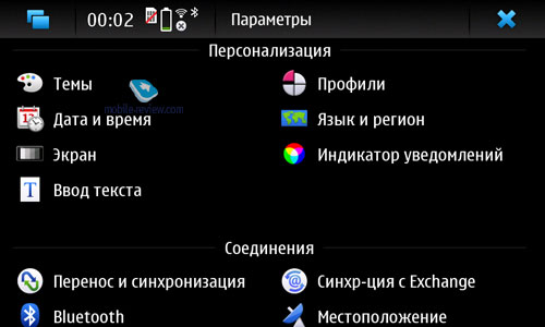
As far as the mass market is concerned, the Nokia N900 and its Maemo5 interface is in a league of its own. Although Maemo5 does employ some icons from S60's UI, as well as from the previous version of the OS (Hildon UI), this doesn't mean it offers even remotely similar experience. Being merely small gears in the user interface, these icons can change from theme to theme, along with wallpapers. Speaking of which, Maemo5 offers pretty flexible tools for setting up the user interface, in fact they are not much worse than those found in S60.
The N900 has 2Gb reserved for user applications (as opposed to 90Mb in earlier firmware versions).
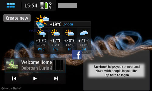
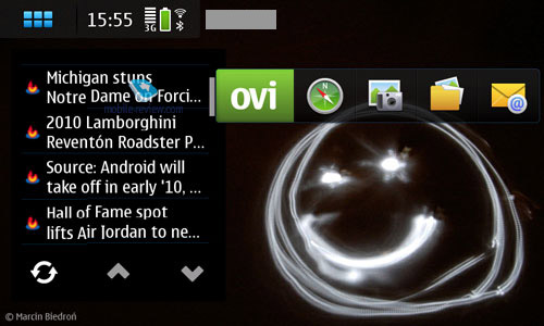
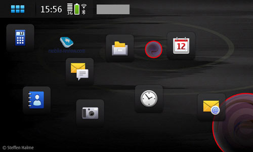
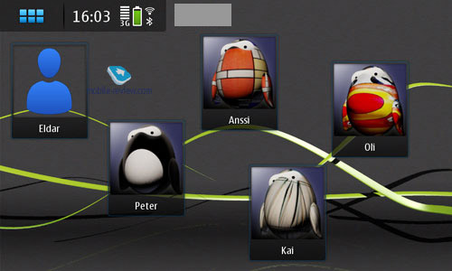
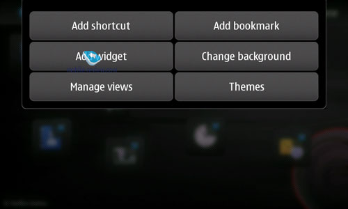
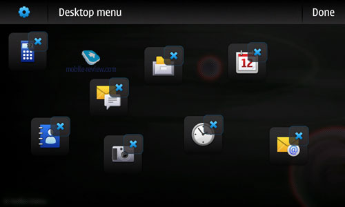
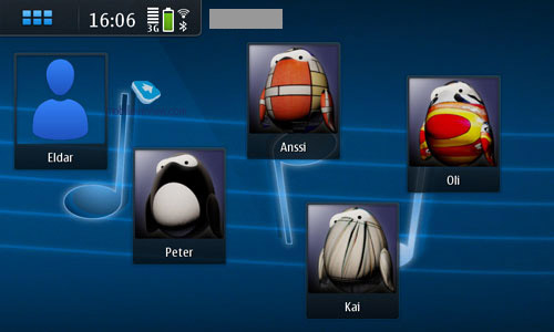
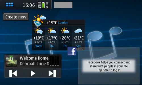
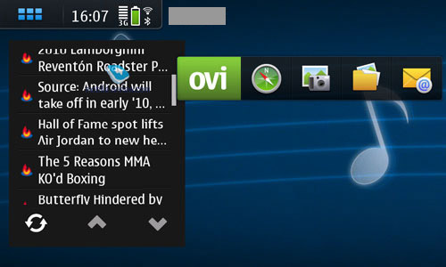
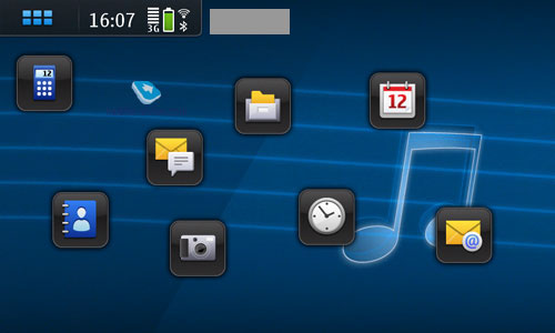
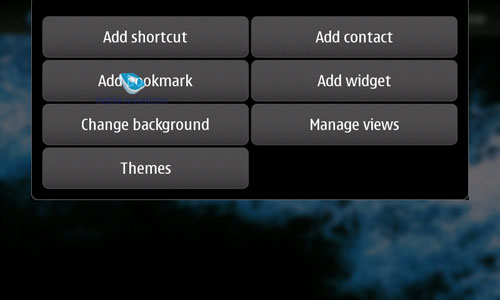
Home screen. Home screen is the first thing that meets the user's eye when he turns the N900 on, so it makes sense to run through what it's got to offer first. Maemo5 retains the graphical interface of the previous versions of the OS, combined with the ideas utilized in S60. The user is allowed to tack both custom shortcuts (contacts, applications, files etc) and widgets (showing, say, weather forecast in real time) onto the home screen. Unlike the Nokia N97 and S60 5th edition, there are no predefined slots for user-placed elements, letting you decide where to put them. While this feat can hardly be considered impressive, Maemo5 also gives you the ability to setup up to 4 home screens (to access the next screen swipe your fingers across the display), which is something we haven't seen before. Naturally, each of these home screens may be disabled, so that you'll have only several left in use.
Apparently, when speaking of this as a "novel" feature, we mean for Nokia. The truth is that HTC's proprietary UI add-on has had this multi-screen setup on offer for quite some time now, while Nokia only made a couple of modest steps in this direction with the N97 a couple of months back. Nevertheless, the upcoming S60 touchscreen phones will boast full-blown support for multiple home screens, rather that utilize the N97's setup, which allows only for screens with and without widgets. Maemo5, in turn, already lets you use any elements in any given home screen, which leaves more room for creativity; in this sense it's very similar to the implementation of widgets found in Samsung's handsets.


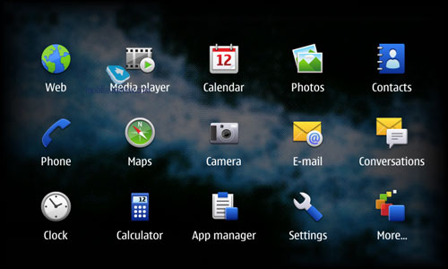
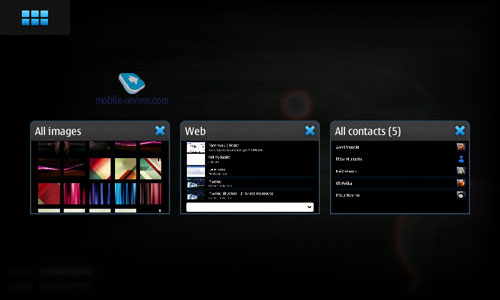
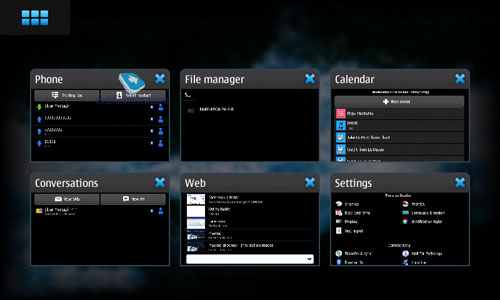
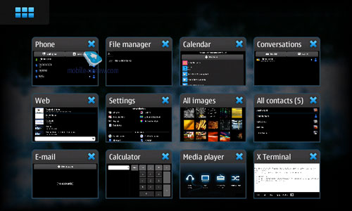
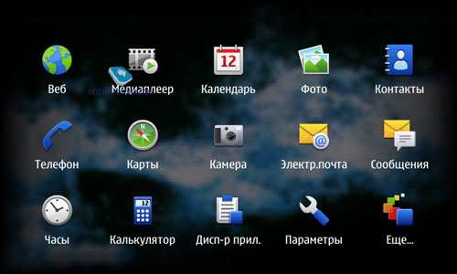
In order to get into the main menu, you'll need to press the button on the home screen, which also doubles as the task manager shortcut. For example, if you have 8 apps running in the background mode, tapping this button will call up the task manager first and only then - the main menu, which is not what most users have come to expect.


The N900's task manager supports live multitasking, meaning that not only does it allow for multiple apps to stick around in the background mode, they can also run simultaneously, for example it can play a video clip and at the same time show it as a thumbnail in the task manager. In many ways this functionality resembles what desktop operating systems are capable of, like Windows Vista or Windows 7. As always, the task manager enables the user to jump to the app he needs or close any of the currently running processes.


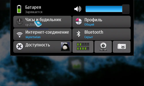
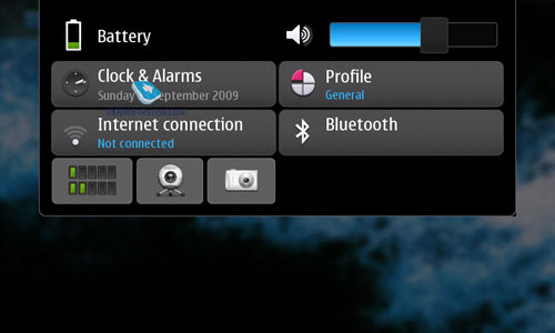
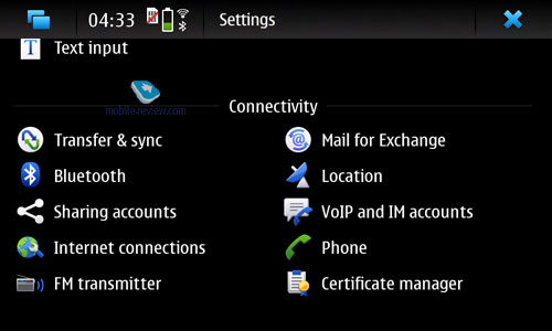
The N900's status bar shows signal strength, battery charge, Bluetooth status and other indicators that double as settings shortcuts, allowing the user to change settings on the fly. Unfortunately, the status bar is unavailable in some apps (although it doesn't go anywhere in any of the core applications).
Various effects are used for menu transitions and app windows, plus there is kinetic scrolling available in all lists; the best thing about it is that Nokia have managed to stuff into Maemo5 just the right amount of animation so that it won't be an eyesore.
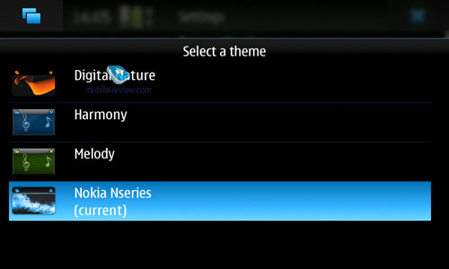
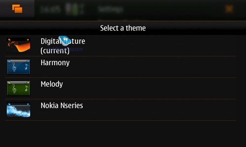
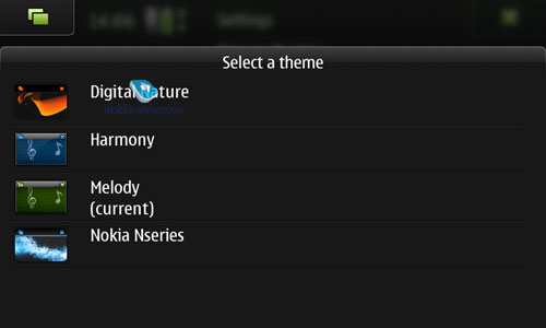
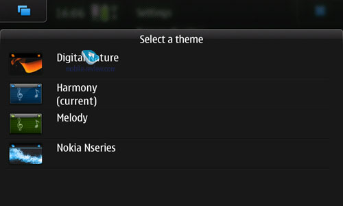
The phone comes bundled with 4 themes that look very much alike (apart from colors).


Localization. Maemo supports various languages packages right out of the box - for example, you can enable other languages (both for input and UI) on a device with English interface. Overall, the N900's localization quality is fairly good, although there are some hiccups here and there regarding translation of various terms, some are yet to be translated, but it's not much different from other phones in this sense. Even at this point in time it's pretty easy to find your way around a localized version of the interface, plus Nokia have plenty of time to work on this side of the operating system.


Back to the table of contents >>>
Screen Orientation
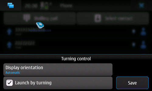
Maemo5 stems from Internet Tablets and this fact runs throughout the entire system. Examples abound: after many hardships, they have finally tacked on a vertically oriented dialing screen onto the OS, but this setup seems to be missing in all other apps. Basically, this is one of the greatest drawbacks of the system that can drive one crazy. They even had an answer to this question in Q&A brochures for employees at Nokia World 09 and it sounded like that - we tried to render Maemo5's experience as close to PCs as possible, so it's only natural, as that's exactly the layout used in PCs the vast majority of the time. But something doesn't feel right here - their first mobile computer, the N97, doesn't have any issues with any screen layout, why so? Fear not, Maemo5 will get this functionality down the road, the reason why it lacks it right now is that Nokia simply didn't have enough time to embed it into the phone. As of today, the portrait setup is available only for the dialing screen, contact list, home screen and gallery (when rotating images). And that's about it. All in all, this shortcoming definitely takes a lot of points off Maemo5's tab., plus it goes against Nokia's philosophy in other similar phones.
Another irritating thing that stems from the issues with screen orientation is that once you hang up, the screen doesn't snap out of portrait mode, even though the phone has to be used in landscape, which forces you to flick the phone open to make it re-configure.
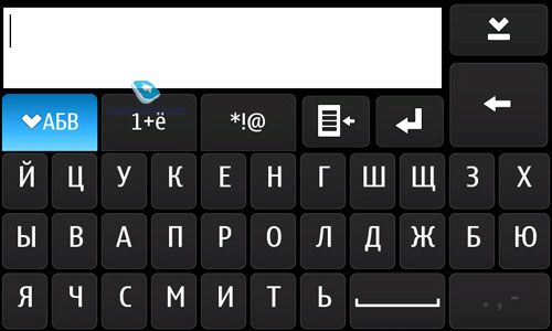
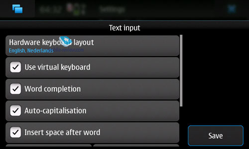
Text Input. The OS can work both with a hardware keyboard (isn't available in the N920) and on-screen thumbboard. While it takes only a couple of touches to change input language, Maemo5 still has some way to go compared to the Apple iPhone in terms of usability, but at the same time it's an improvement over S60 on this front. The user can also pick two input languages and switch between them while typing, and make use of two predictive input dictionaries respectively.


Back to the table of contents >>>
Phonebook
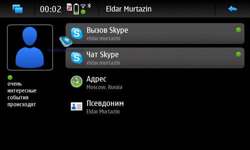
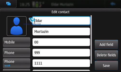
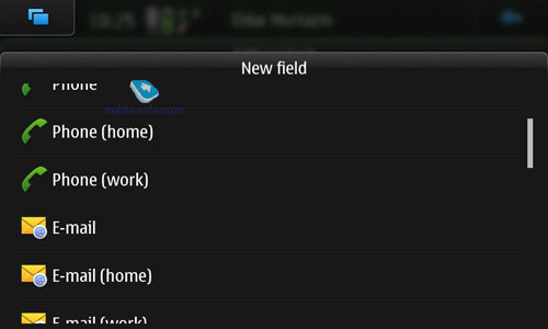
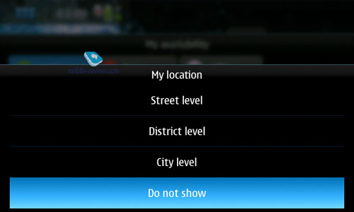
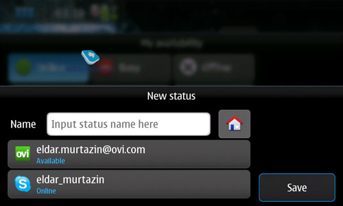
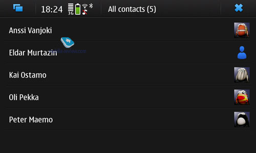
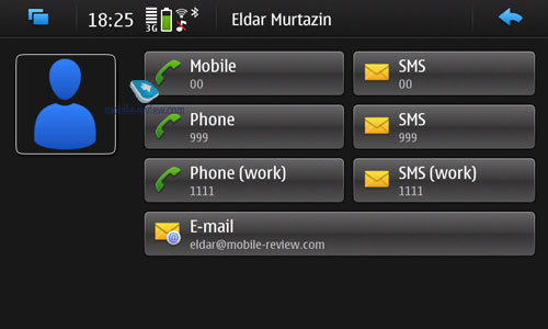
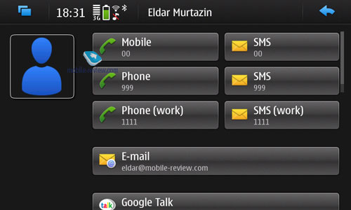
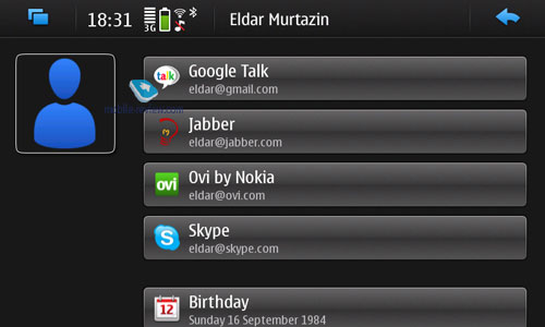
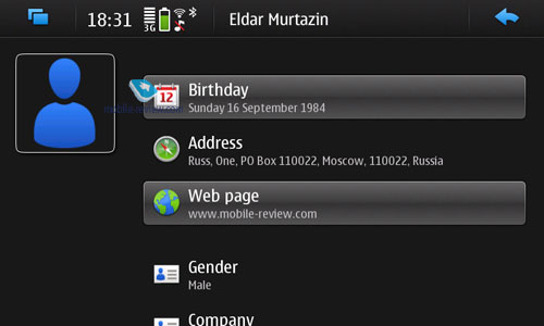
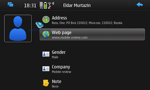
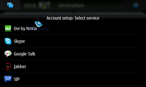
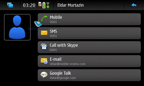
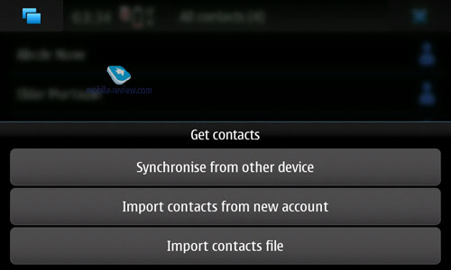
For each contact you can submit a plethora of fields: various phone numbers, several email addresses, extra fields (such as mail address, notes and so on). All in all, Maemo5 offers a very feature-rich phonebook that also allows binding entries with accounts in various online services like Jabber and Skype - all entries containing this data will sport contact's current status in these messaging services, thus allowing you to write a quick message or two. Same holds true for SMS messaging. In reality, though, they intended to present this functionality back when the Nokia N97 was announced, I remember writing about this back in December 2008, as I came across prototypes of a similar phonebook, but at the end of the day they didn't have enough time to implement it, so the Nokia N900 will be the first phone to benefit from it. But keep in mind that both S60 and S40 will acquire similar phonebook functionality in time.


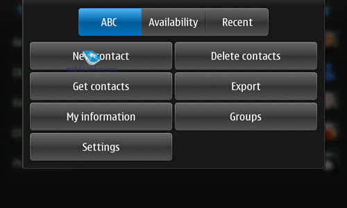
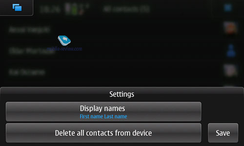
Contacts may be sorted by first and last names, plus there is an alphabet bar and a list of recently used contacts.
On balance, there is nothing to complain about with regards to Maemo5's phonebook - it's got everything that most users will ever need, plus integration with online services is a neat touch.


Back to the table of contents >>>
Dialing screen
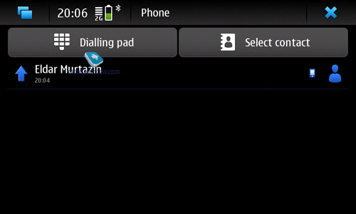
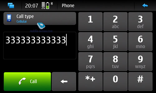
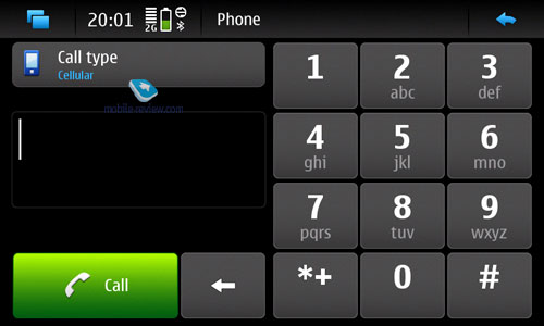
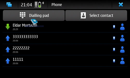
Maemo supports both portrait and landscape modes for the dialing screen. There is a list of recently dialed numbers with call and number types. One thing of note is that the general list shows not only calls made via cellular networks, but also VoIP calls.


Back to the table of contents >>>
Messaging
Another sign of Maemo5's PC past is that it lacks MMS. Ironically, the flaw so many chastised the iPhone for, has been found in a product from the market leader. One could argue whether it's really essential or not, but the simple fact is that you do expect to find MMS in a Nokia-branded device. The truth be told, however, it will become available down the line. Why not now? They didn't have time to implement it.
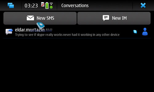
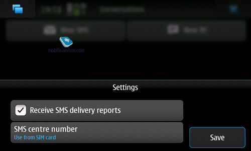
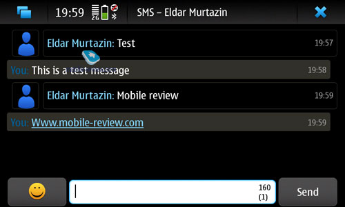
SMS messages are arranged in the form of a chat, which is a nice touch, although the standard list view is also available. Same holds true for IM messages.


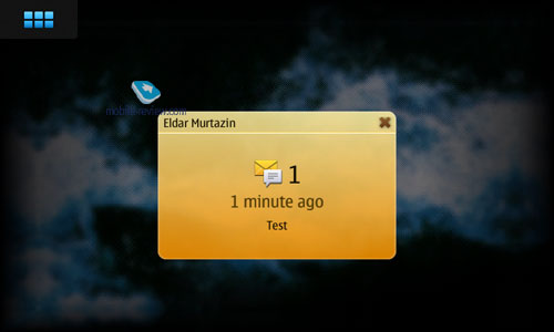
On the home screen messages are shown as yellow sheet-esque pop-ups, which is somewhat similar to SMS Preview utility available for S60.
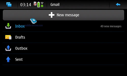
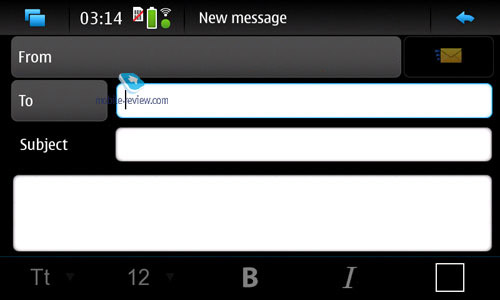
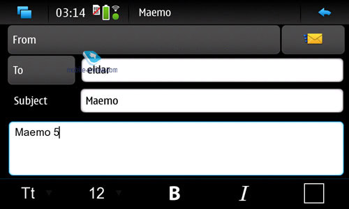
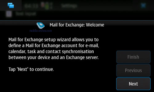
Maemo's email client can work with MS Exchange (without any hiccups) and boasts the auto-setup feature for mail services (OVI, Gmail and so on). All in all, I was pretty happy with how the messaging application worked in the N900, except for one thing - it tended to freeze up a little when the number of messages in the box exceeded a certain threshold (my mail box, for instance, contained several thousand letters, which is quite a challenge for any mobile device).


Back to the table of contents >>>
Calendar
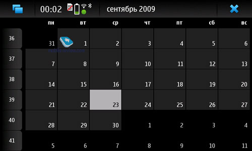
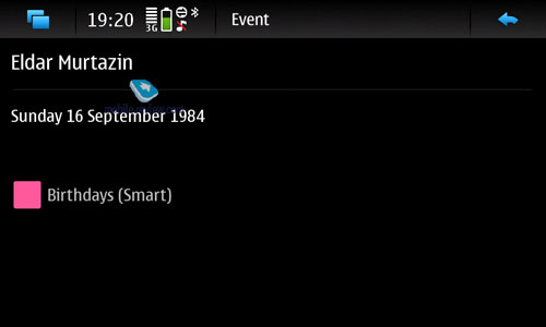
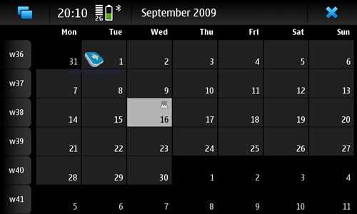
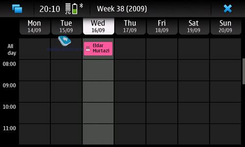
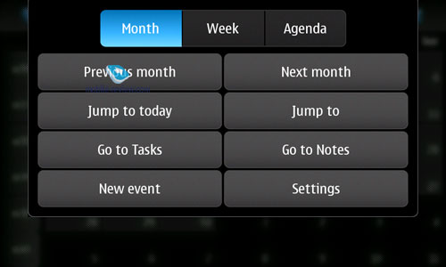
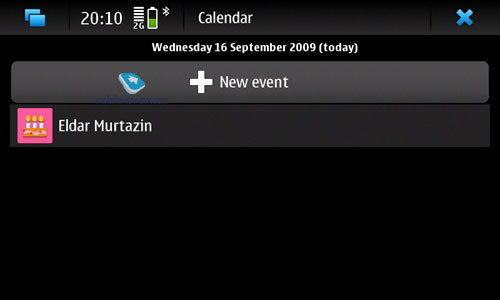
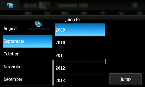
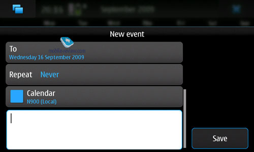
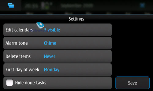
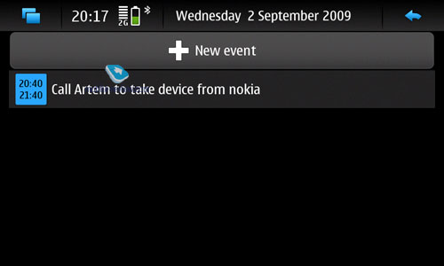
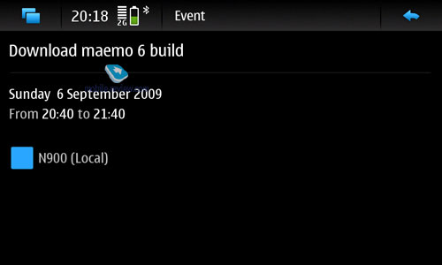
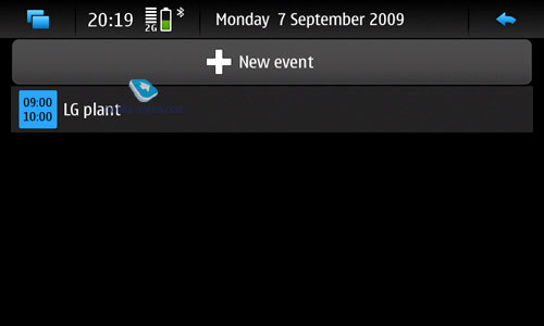
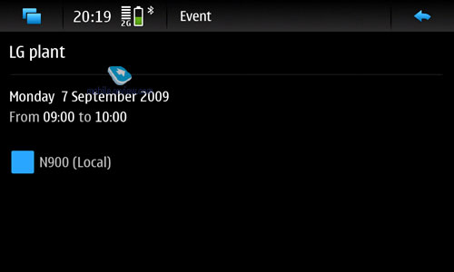
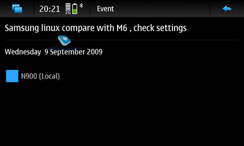
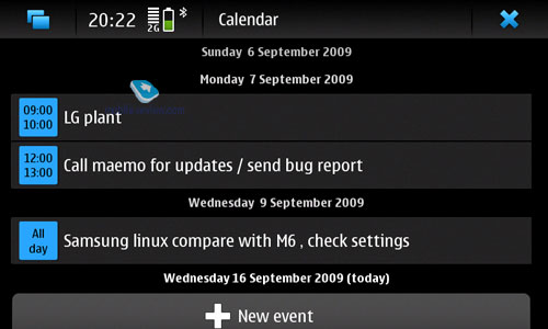
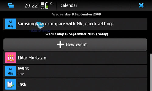
The centerpiece of Maemo's calendar is support for up to 8 sources of events, or, in other words, services (although Google Calendar is NOT allowed here) which you can synchronize your phone with - for example, you may opt to have it update events using your desktop PC calendar and OVI at the same time. Inside the system's own calendar entries from different sources will have corresponding colors. However I don't know whether this new feature will be sought-after or not - I, for one, find Palm's WebOS-powered organizer much more enticing and promising. Other than that, Maemo5's calendar has no bells and whistles.


Back to the table of contents >>>
Office Documents
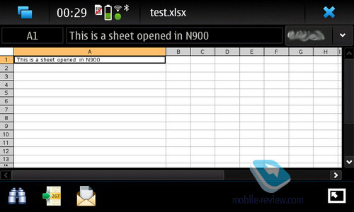
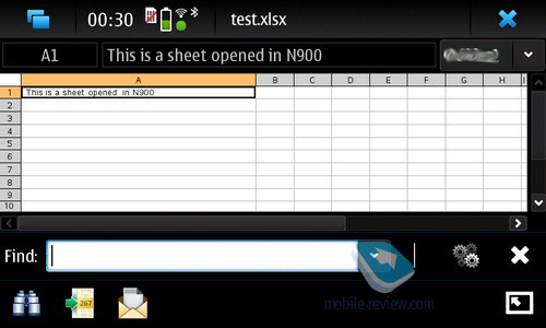
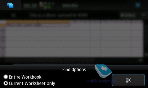
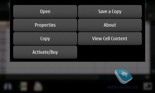
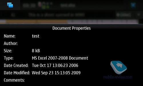
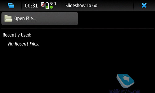
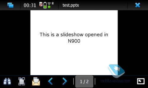
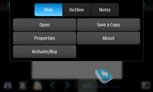
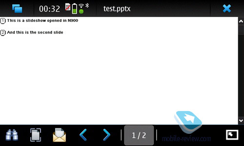
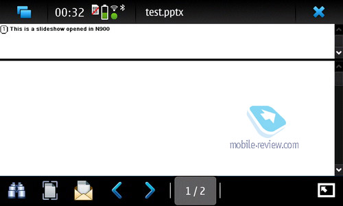
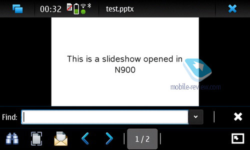
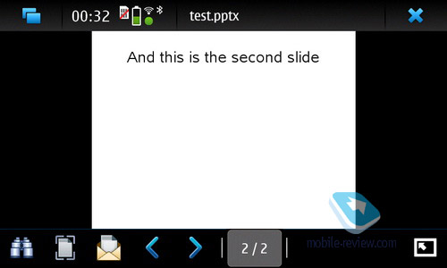
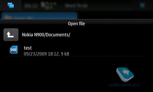
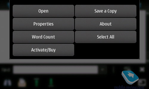
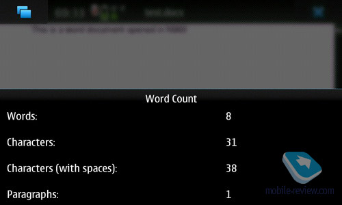
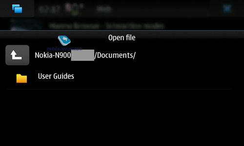
Maemo5 allows for read-only mode of viewing office documents (MS Word, Excel, PowerPoint) via a built-in application.


Gallery
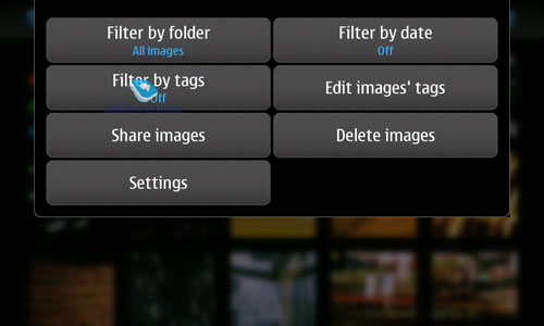
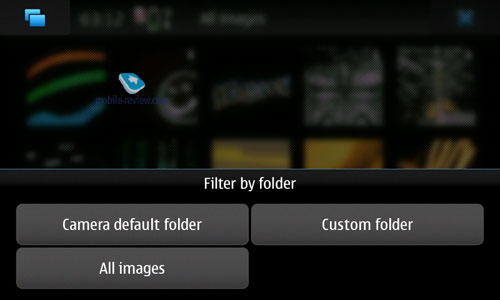
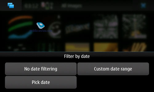
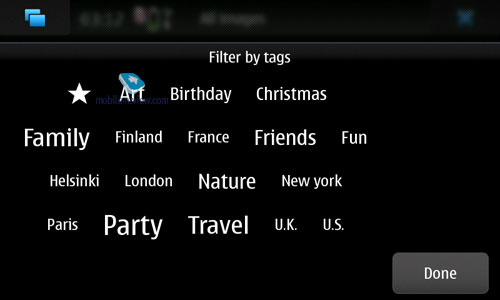
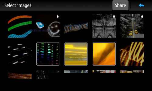
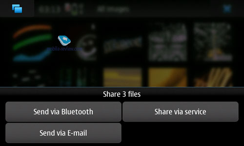
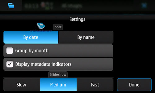
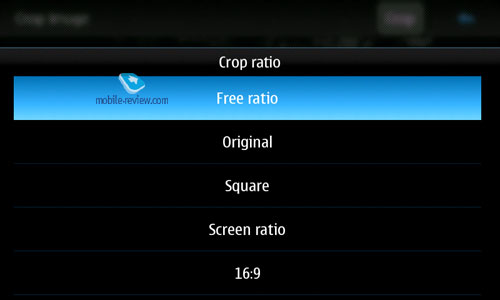
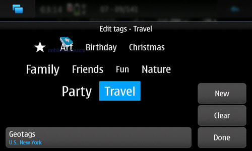
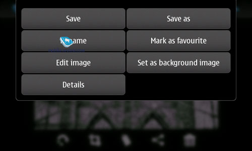
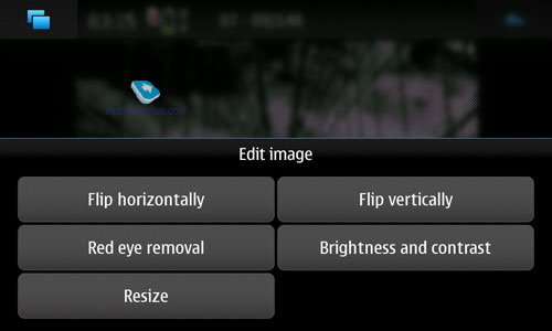
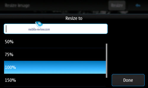
Much like the system's browser, Gallery supports zooming in/out via gestures - to zoom in, you need to draw a circle moving your finger clockwise, and to zoom out do the same, but counter-clockwise. Plus there is a bog-standard feature pack including automatic screen rotation, slide-show mode and a very basic picture editor. Maemo5 also supports tags and metadata (displayed by the default picture viewer).


Back to the table of contents >>>
Browser
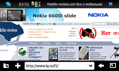
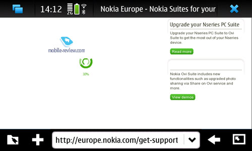
Nokia's previous tablets employed MicroB browser built on Mozilla's kernel - all tablet aficionados are familiar with it. But the old MicroB was neither speedy nor comfortable to use, and was miles behind the browser Apple's products came bundled with, even though it was more feature rich. The main reason for that were not flaws within the browser itself, but rather hardware limitations of the devices it was installed on - they never had enough memory or CPU speed, for that matter, so a full-blown Internet experience was pretty much impossible on them. Thus, to get rid of this daunting ghost of their past, Nokia have decided to rename the N900's browser, so, behold the brand-new "Maemo Browser", even though in reality it's merely an enhanced edition of MicroB, compared to the version found in the Diablo. All things considered, it's not much different from its predecessors - the fact that it's somewhat faster has a lot to do with the N900's updated hardware and slightly revamped code of the browser itself.
It's worth noting that Mozilla are developing their own mobile browser, codenamed Fennec - it's available for Nokia's previous tablet devices, but I doubt you'll want to use it, as it is depressingly slow, in fact it's even not as speedy as their native browser. But as far as philosophy goes, it's very close to MicroB and in truth some of the latter's features stem from Fennec. Same holds true for the new version, as all major items on Fennec's change list have already been implemented in Maemo Browser. And while in some synthetic tests, such as JavaScript speed, Mozilla's browser beats its rival by a landslide (6 times faster, in fact), who cares about these results? Most users crave for better browsing experience rather than blazing fast rendering of Java elements of web pages. Therefore it's not worth waiting for an update to Mozilla's Fennec, as Maemo Browser will remain the main browser for the N900, along with several other devices.
The browser boasts built-in support for Flash 9.4 as well as AJAX. It would seem not much has changed compared to the previous version, but in terms of philosophy Nokia have tried to deliver browsing experience as close to Apple's Safari as possible, since it's the effective benchmark on the market, that is still unreachable for many other phone makers. And Nokia with their Maemo Browser are not an exception.


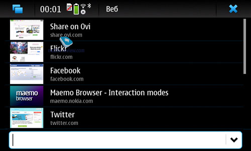
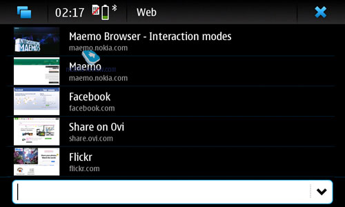
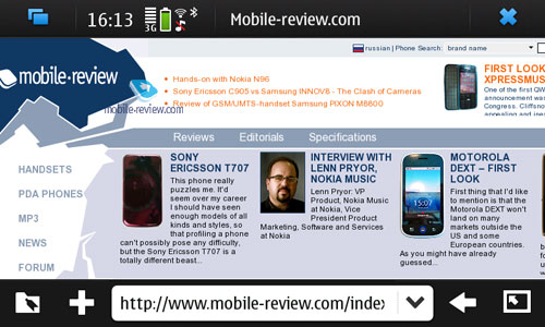
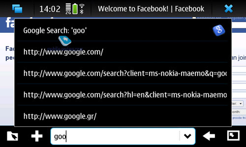
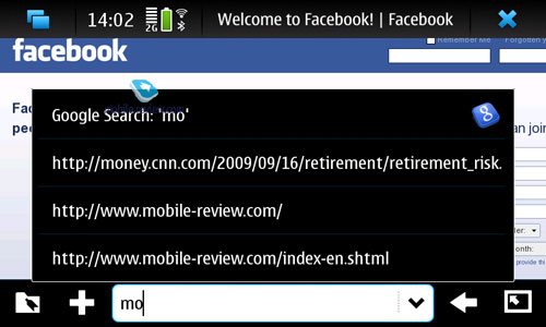
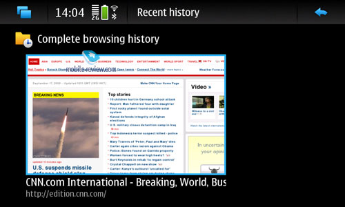
The N900's browser is fairly intuitive and easy to work with - you type in a web page address and the browser starts loading it, plus it supports PC-esque tags, that allow it to search web pages in your History and Bookmarks while you're typing.


But the first thing we need to find out about this browser is how quickly it renders pages. For reference, The Nokia N810, compared to any iPhone, ends up hopelessly behind Apple's smartphone. Being an owner of both devices, however, I must say that my bedside table has been occupied by the iPhone for quite a while now - the simple fact is that it is speedier and doesn't have as many flaws (it does crash occasionally, but in return its page rendering speed is phenomenal). That's why I had been really looking forward to the new N900 and its revamped browser, however after a month of quality time with it I reached an unfavorable conclusion - even though Maemo Browser is developing at a rapid pace, it hasn't caught up with the rest of the pack yet, as it still can't stand comparison to the browser application found in Android-based phones or Apple's iPhone (Safari WebKit). Why so? Perhaps there is not a whole lot of resources allocated to this department, although Maemo Browser still beats the application available in S60 devices.
The most noticeable improvement of the new Maemo Browser is the page rendering speed - it has got much to do with the browser's engine and the N900 definitely seems to be an improvement over its predecessors. Without any other applications running or anything else going on, the N900's browser soars through web pages - we tested its speed with help of a WiFi hotspot in an effort to mitigate all possible hiccups of a connection over cellular networks. Average load time for pages with a moderate number of images was around 3-5 seconds, which was a swell result.


However after first waves of my enthusiasm died down and I got back to my everyday routine, it turned out that much like the Nokia N810, the N900's browser speed hinges on the number of active applications and how long your phone has been idle (without rebooting). Over this month I've run into a situation (about 5 times!) when previously opened pages took around 10 seconds to reload, even though there was nothing wrong with my Internet connection. Also I've encountered several issues with loading videos in all flash players, especially on sites other than YouTube.
For comparison, on the Apple iPhone the browser's speed doesn't vary, no matter how many applications are running (although, the truth be told, it doesn't have true multitasking functionality). In order not to sound proofless, I took a stopwatch and decided to figure out once and for all how Maemo Browser fared against Apple's Safari - and the result was that in ideal conditions it was only 1-2 seconds slower. So, all things considered, Nokia have managed to come up with a fairly speedy browser that will suit most users. At least compared to S60, this browser is a huge leap forward in terms of feature-pack and overall usability. Now, let's move on to other options offered by Maemo Browser.
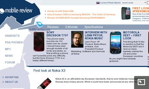
One of its trademark features is gesture control that allows you to zoom in and out by drawing a circle clockwise and couter-clockwise respectively. However, this feature is nothing new as it has been adopted from HTC's Windows Mobile devices (if I remember correctly it debuted in the HTC Touch Dual several years ago). As far as zooming speed goes, the N900 did just fine.
Another gesture you may use to interact with the browser allows you to scroll through the thumbnails of currently open pages - to do that just swipe your fingers across the display.
Copying and pasting text fragments here is considerably easier than in the Apple iPhone - all you need to do is select a fragment on the screen with your fingers and then use a combination of shortcuts on the keyboard to copy it.
To zoom in on a page you'll need to double tap the display, although unlike the iPhone, in the N900 this feature is quite simplistic, as it doesn't analyze page contents, nor does it take into the account the place you tapped on, while the iPhone does all that and scales pictures and text in a way that they fit the screen width. Feel the difference.
Speaking of features I do like in Maemo Browser is the "Mouse Over" mode, that can you save you some time, as with it on you don't have to waste time trying to select some element on a web page. You simply drag the mouse pointer to it and get a pop-up tip or any other kind of information or event programmed on the page.
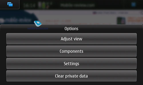
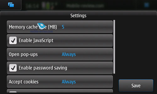
As far as settings are concerned, I can't overlook the ability to adjust memory cache size (up to 50 Mb) that is set to 5 Mb by default. Experienced users will be able to get the browser to work faster this way.


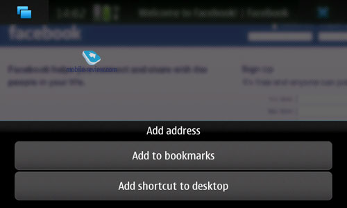
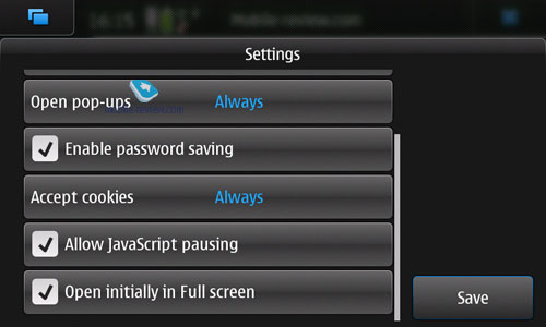
The browser can also save passwords and automatically fill in various forms - no bells and whistles here.
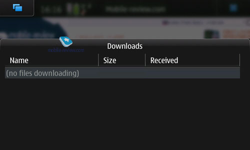
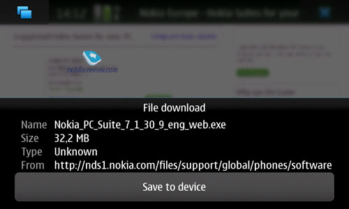
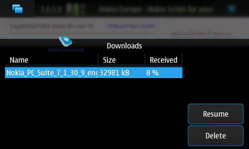
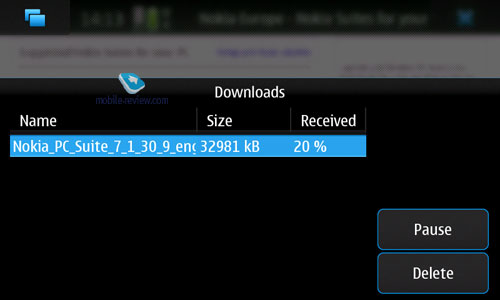
The download manager allows resuming downloads that got interrupted during previous sessions.


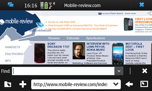
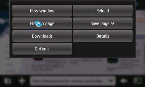
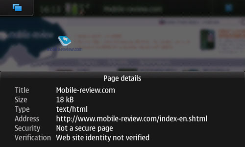
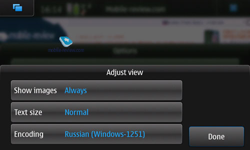
When browsing a page you can change its character encoding, save it, or search for specific words on it. Unfortunately, to bring up the search window you'll need to press a couple of shortcuts, which hurts the ergonomics a little; or, alternatively, you can make use of the thumbboard (in the N900).
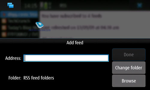
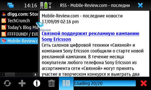
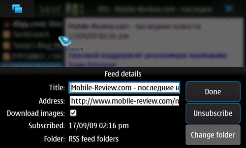
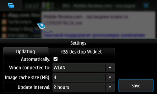
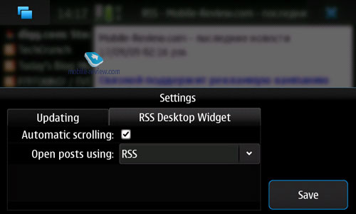
RSS feeds may be viewed right from the browser, which is another useful feat. Maemo Browser also allows subscribing to RSS on the go.


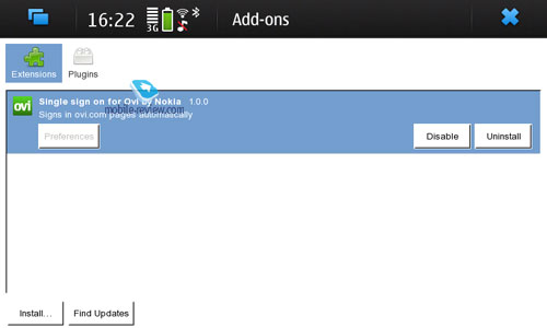
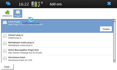
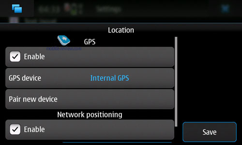
Plug-ins and extensions. This is one of the primary features that separates Maemo Browser from many other mobile devices and browsers, including Apple's Safari. Here plug-ins actually allow the user to add new functionality to the browser, which is a neat touch. For example there is a module that will automatically authorize you in all OVI services, or an extension that will get your device's whereabouts from the bundled GPS chip and allow developers to implement location-based services. But that's something we are yet to see.


The bottom line on Maemo Browser is this - for Nokia it's an enormous step forward, with it being the first truly ergonomically friendly and speedy browser with a lot of room for further customization thanks to the presence of various plug-ins and extensions. Unfortunately the fact that Internet Tablets developed more as mobile computers rather than cell phones didn't allow Nokia to implement the portrait screen setup for the vast majority of features and applications, including the browser and this is a huge drawback. Most mobile devices allow seamless screen rotation and gesture-based navigation, whereas Maemo can only offer landscape orientation, which isn't a bad thing in itself, but can easily make the browsing experience awkward at times. That's exactly why I said that as of today Maemo Browser has a lot of catching up to do, especially compared to Safari; but it still can make its way into this elite group of browsers provided that Nokia will fix all its leaks and enhance what it's already got in stock. All in all, it's Nokia's best browser to date, but by far not the best browser overall.
Back to the table of contents >>>
Multimedia
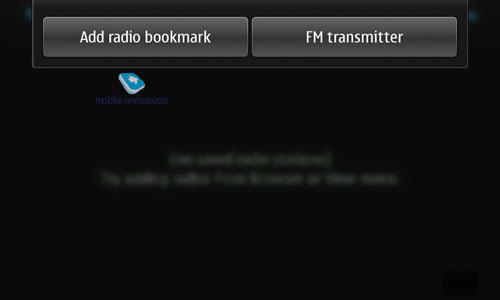
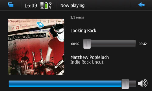
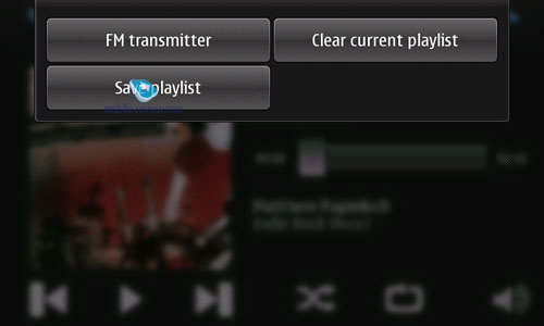
It makes very little sense to review this side of Maemo5 in isolation from the hardware department, so we'll try to focus on all aspects right here. The platform employed by the N900 (and Nokia aren't planning to ditch it any time soon) sports DAC33 audio chipset, identical to the one found in the Nokia N97, meaning that all phones running on this platform will have fairly good audio quality. But unfortunately music-related software has never been the top priority for Maemo, so what we can see in the N900 are merely first steps in the right direction, as its player doesn't even feature any equalizers yet. Another drawback we can't overlook are the on-screen volume controls that are way too small and fiddly to use - in most cases you'll be better off punching the volume rocker mounted on the casing. For some bizarre reason the handset doesn't have FM-radio, even though it does offer an FM-transmitter (that allows you to pick a frequency and broadcast some nonsense) whose quality is on par with other transmitters found in mobile devices - in other words, it leaves much to be desired.
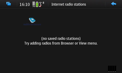
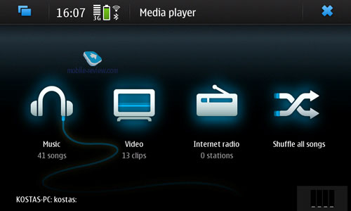
Internet Radio – allows tuning in to online radio stations (WiFi connection is strongly advised).


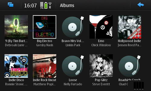
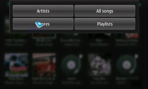
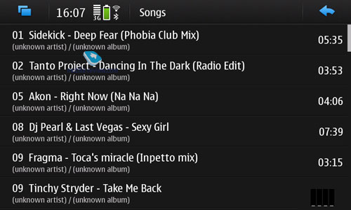
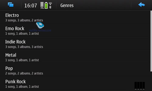
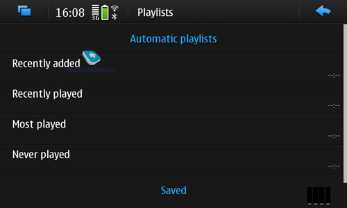
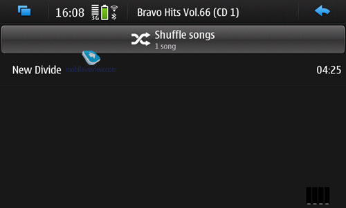
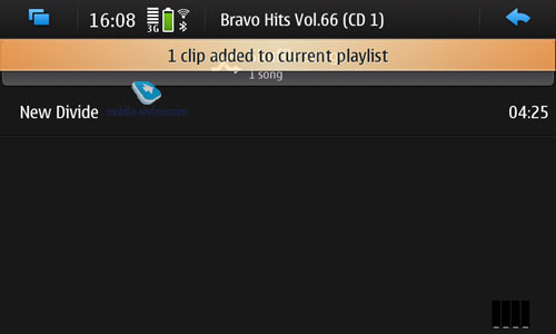
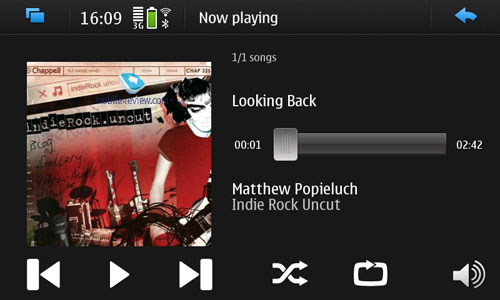
Music player sports a very detailed interface that is a breeze to use. Plus there is the playlist window on the right, as well as the option to skip forward/backward, and add new tracks to you playlist. But, that's about it - this player has nothing more to offer.


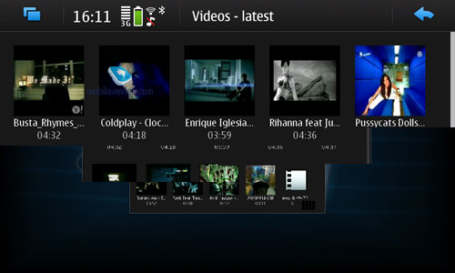
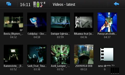
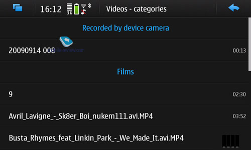
Video Maemo5 is capable of playing non-converted video clips, but regrettably Nokia's rush to release the OS affected this department as well - they didn't think about video stream buffering, so now during the first 10 seconds all videos look jerky. To avoid this issue, open the file you need, pause it for several seconds and then resume playback. All in all, this is the only unfortunate misstep in the video player - other than that, we didn't spot any flaws with regards to video playback quality.


Back to the table of contents >>>
Maps
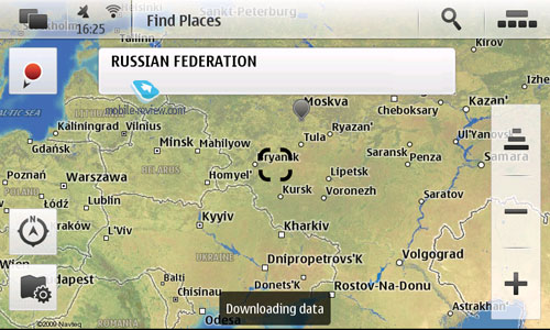
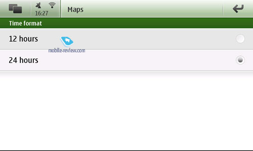
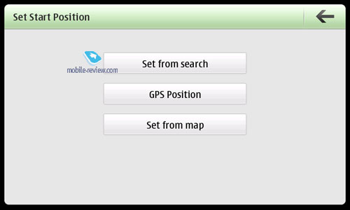
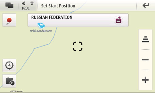
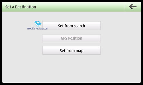
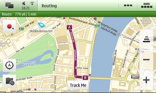
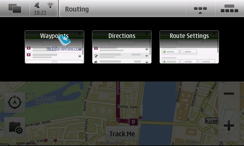
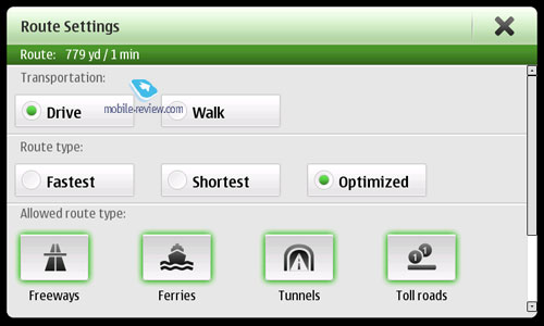
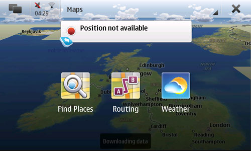
Maemo5 employs a standard set of maps, similar to those utilized in S60 and most users won't find any differences between them. But unfortunately, when it comes to speed, it's not nearly as good as the S60 Maps - Maemo's application is incredibly slow and tends to be pretty resource-hungry. I hope that after the New Year the next major software update will fix this issue somehow.


Back to the table of contents >>>
Alarm Clocks
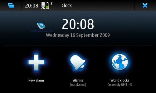
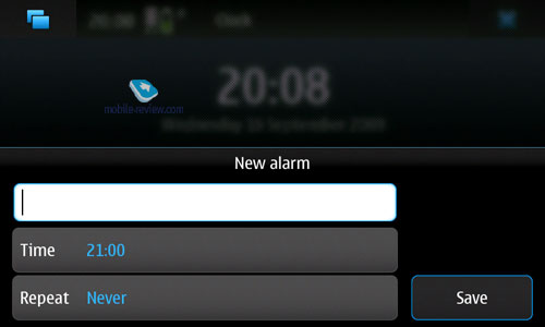
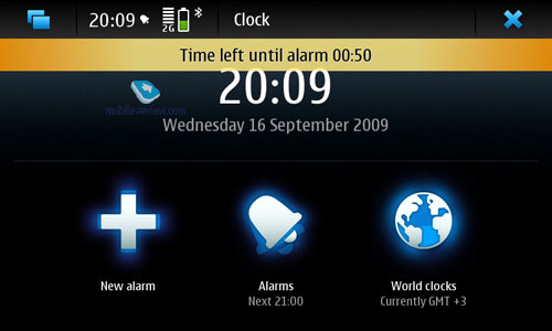
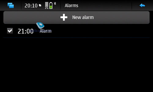
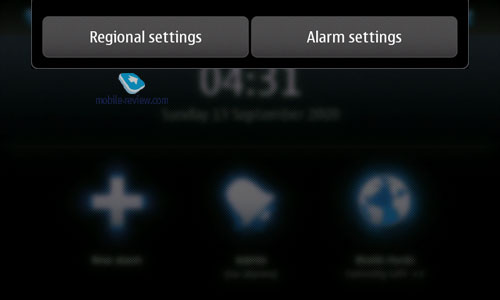
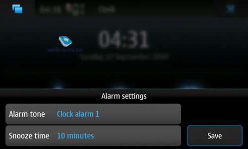
Nothing out of the ordinary here - several customizable alarms.


Back to the table of contents >>>
Other Screenshots
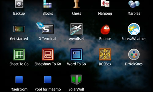
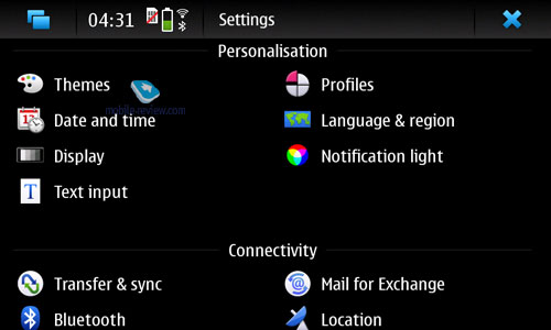
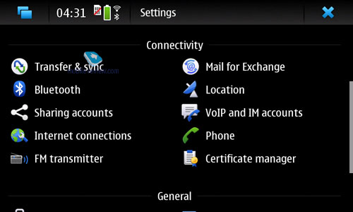
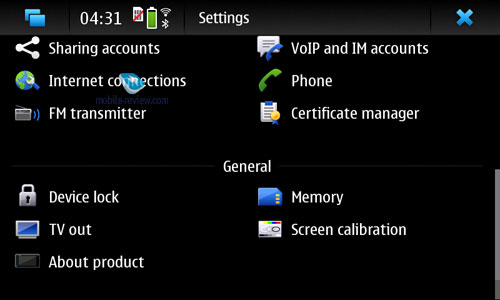
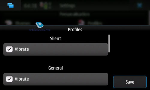
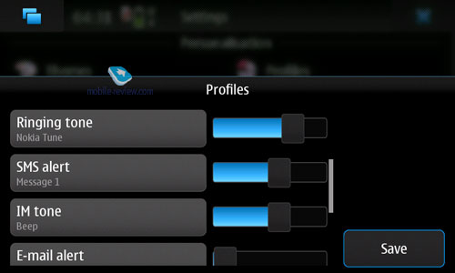
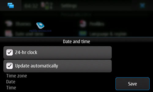
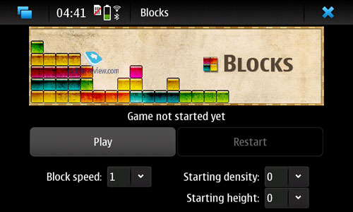
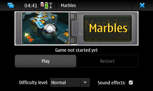
As far as screenshots go, we had a lot of leftovers that didn't fit into any of the sections - you can find most of them below.


Back to the table of contents >>>
Related links:
Eldar Murtazin (eldar@mobile-review.com)
Translated by Oleg Kononosov (oleg.kononosov@mobile-review.com)
Published — 26 September 2009
Have something to add?! Write us... eldar@mobile-review.com
|
