|
|
Review of GSM/UMTS-smartphone Nokia E71
Live photos of Nokia 7510 Supernova
Table of contents:
- Positioning
- Design, size, controls
- Display
- Keyboard
- Battery
- Memory
- Performance
- USB, Bluetooth
- Camera
- Software department
- Nokia E71 vs Nokia E61i
- GPS-navigation
- Music department
- Impressions
Sales package:
- Handset
- Battery (BP-4L)
- Charger (AC-5)
- USB data cable (CA-101)
- Wired stereo-headset (HS-47)
- Wrist strap
- Pouch
- Software CD, User Guide
- 2 Gb microSD memory card (size varies by region)
Positioning
Eventually, even Nokia has stumbled upon the problem of very modest sales of enterprise solutions. Probably it’d be better to put it this way – moderate sales of business-savvy mobile phones. It turned out their target audience does yearn for these phones but doesn’t really want to buy them. For instance, IT-companies that are normally enthusiastic about innovations have been very cautious about the ESeries and still see no real reason to adopt these phones just yet. Surprisingly, they are bent on feature phones, preferably with some business smarts inside, such as the Nokia 6233, Nokia 6300 and so on. This approach is not without merit, in light of the fact that in the corporate environment handsets are viewed more as a way to communicate and much less as devices for handling mail and viewing web-pages and other purposes. In a nutshell, these are all welcome features and abilities, but by no means obligatory.
The main glitch in every phone maker’s approach to corporate devices is that an ordinary clerk has a notebook he (or she) uses every day, at work or in transport; so why would he need some mobile phone with a miniscule display when they already have a bigger and more convenient laptop to assist them wit their routine? But the most important thing is that for the most part corporations are not as charitable as some imagine and normally they have a rule of thumb – the cheaper something is, the faster they buy it. That’s way a lot of managers in average European or American companies use phones worth around 150-250 Euro and very rarely, if ever, get more expensive solutions. And again, the same paradigm comes into play – since they already have notebooks, they don’t really need handsets that can well replace them. Furthermore, many cellular operators still have employees with feature phones in their offices, let alone less IT-savvy companies. Another argument that can’t be ignored is 15 millions of BlackBerry devices sold worldwide, which is nothing but a drop in the bucket, compared to a billion phones retailed every year. It gets even more amusing when you get to calculate the ratio between the number of employees in corporations and the number of enterprise handsets out there. According to a research carried out by Radicati Group back in October 2007, there were 1.2 billion mail accounts in the world, of which 516 millions were used by enterprises. Although it’s not very clear how they figured out who was a corporate user and who wasn’t (either it was everyone working for a large company or everyone with a certain level of income), these numbers clearly demonstrate what kind of niche enterprise-savvy phones occupy and explain the failings in their positioning.
That is, if there was one lesson Nokia learned from the sales of the original ESeries, it was that the enterprise segment was way overvalued. Basically, consumers seemed to prefer mass-market smartphones that weren’t positioned as corporate solutions, lacked some specialist applications, but still could get the job done. As a result they even cancelled the development of their own office suite, since it was clear all investments would end up in vain. Their first successful ESeries phone was the Nokia E65, which benefited from its positioning as a fashion-savvy and contemporary smartphone, rather than an enterprise solution.
Thumbboard-armed smartphones have always been in the league of their own within the ESeries line; while they targeted a really narrow niche, they turned out to be nearly flawless offerings. First the Nokia E61 then its update the E61i – having tried these handsets once, people would cling to them and refuse to part. Unfortunately for Nokia, though, the market for this type of phones was pretty measly.
So, what gear has clicked within Nokia and boosted the popularity of the ESeries devices? Most certainly, not their positioning towards some vaguely defined “enterprise user” and with all ensuing fuss. Effectively, they have designed a phone for the mass-market, but planted a couple of differences here and there, making it less of a business-savvy solution with a much more friendly face. All in all, it’s a good way to approach the problem from a different angle. Nokia failed to conquer the hearts of consumers in a head-on fashion, but they have found a way around the problem.
The Nokia E71 may well go down in textbooks as a great example of what a slightly different way of positioning can accomplish. They have pitched the E61’s huge display, trimmed the casing and the thumbboard, all in an effort to render the new handset more petite. Having sacrificed a little bit of the original device’s ergonomics they have made the E71 a whole lot more appealing to the average consumer. It’s also easy to draw parallels between this phone and IBM’s ThinkPad laptops that had been widely popular with corporate users before this division got sold off. While they were user-friendly and boasted quite long battery times, their aesthetic appeal was thin on the ground. They were deemed more as tools, like pens or staplers, where function should always be superior to design. But this didn’t hamper the ThinkPad-branded laptops in any way – they had their own audience that appreciated their spartan looks coupled decent functionality. However, the recent change of their design bodes no well to this line-up – while the maker’s motifs are understandable, they may well disrupt the original focus of the series, so the average consumers (whom this refurbishing is aimed at) won’t be able to tell “ThinkPads” from an array of laptops from other companies.

But Nokia has no such problem – it doesn’t have a vast army of ESeries fans, so in fact they are building up the image of the series from the ground up. The thing is, enterprise users are not going anywhere – their warm memories of the Nokia E61i are still there. But the E71 will attract more youth, including those who didn’t use the E61i. By the way the share of teenagers in the Nokia E61’s user base was phenomenally large; and the E71 stands to improve over its predecessor on this front.
This way, we have outlined the Nokia E71’s two major target audiences – enterprise users and teenagers. I would say the ratio between these two groups will revolve around 60 to 40.
Nevertheless, the E71 won’t have much of a shot at the US market, where BlackBerry runs the show - basically, that’s the way it is and there is very little chance that the situation will turn around. On the other hand Europe and Asia are Nokia’s turf, furthermore, there are no similar QWERTY-powered solutions available over there. Sony Ericsson don’t have enough resources or expertise to churn out E71-grade smartphones (although they will release some phones that come close to it down the road). So it turns out that much like its predecessor, the Nokia E71 will have no direct rivals.
Back to the table of contents >>>
Design, size, controls
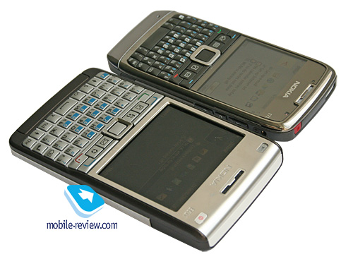
The major gripe of most consumers with the previous model was its size – the casing was way too wide and the handset itself didn’t seem particularly svelte.

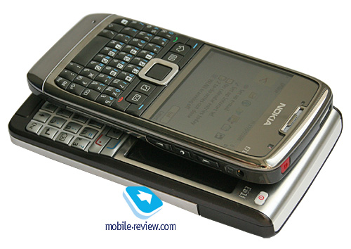
So, Nokia had a very contradictory task at hand – they needed to shrink the E71’s dimensions, but keep its thumbboard and ease of use intact. They started with working on the handset’s physical appearance and brought it in line with most contemporary solutions. The Nokia E71 does look broader than most phones out there, that’s a fact, but as far as its thickness goes, it isn’t much different from the Samsung U800, Nokia 6500 Classic and the likes.
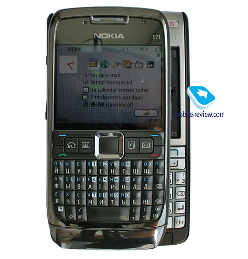
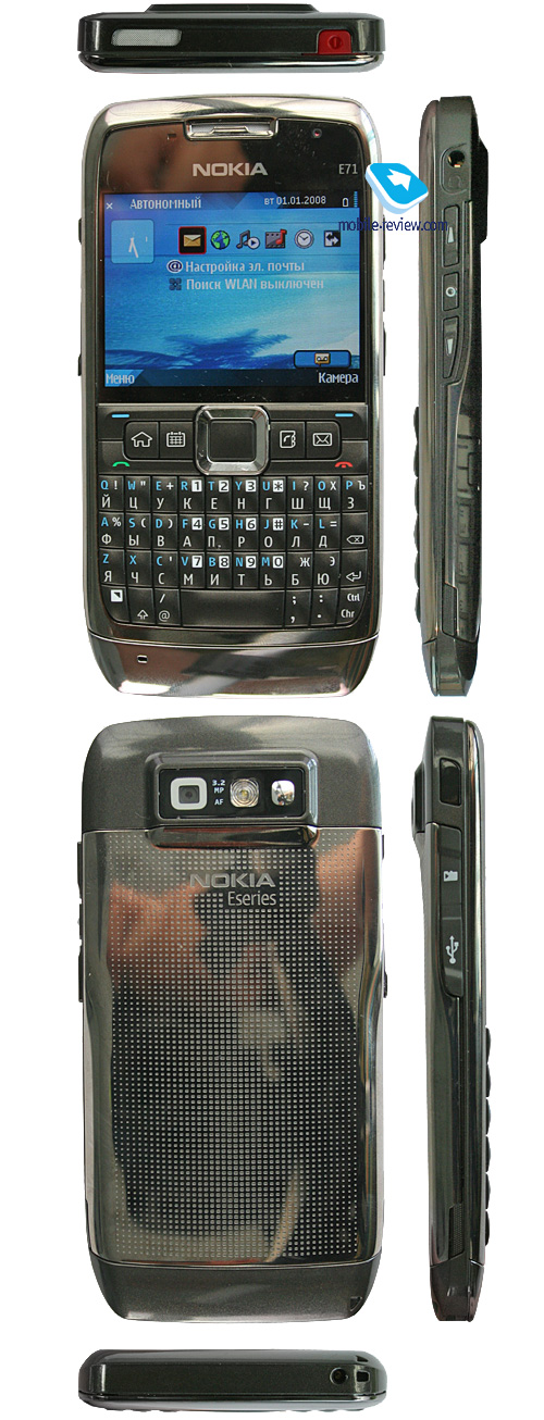
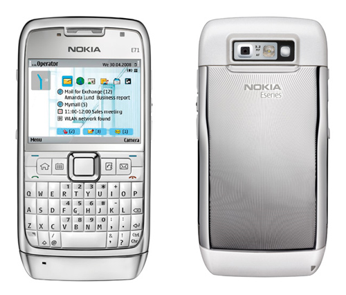
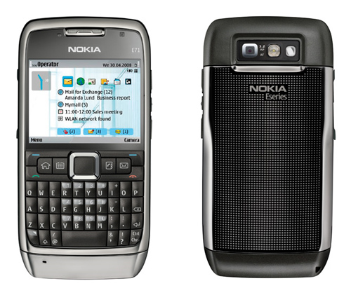
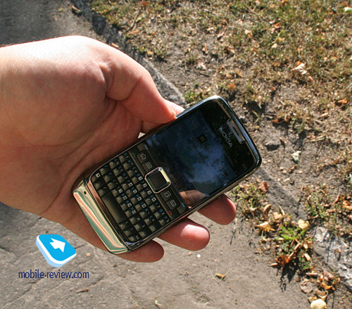
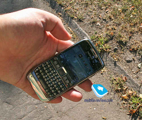
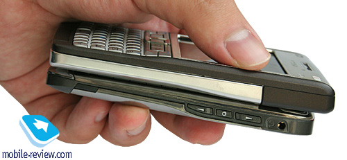
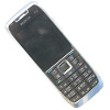
The phone measures up at 114x57x10 mm and tips our scales at 127 grams. That said, the E71 is an extremely pocket-friendly device that will readily slip into just about any pocket, let alone a bag or a purse. But the corner stone of the E71 are its materials – truly, the ESeries has always been known for the build quality and top-notch materials, since enterprise users have “sturdiness and the phone’s ability to handle stress” on top of their priority lists.
Video. Looks, dimensions (wmv, 30,8 мб) >>>
I suppose you got bewildered by that last sentence as well – I skimmed through a multitude of research papers but couldn’t get what “ability to handle stress” had to do with a business-savvy phone either. Eventually, some researcher told me that many businessmen, when stressed, tend to vent their bad mood on their phones by throwing them at walls and so on. Luckily such bad tempered respondents were significantly outnumbered (they made around 5 percent of all surveyed consumers) by their more discreet colleagues. Apparently, Nokia doesn’t aim to create extremely tough phones that can “handle” just about any mishap or stress situation their owners get into from time to time. But what really matters is that their enterprise solutions should be able to keep their pristine conditions for as long as possible – can you imagine a manager with a higher-than-average income, whose phone looks like it’s been in a war?
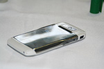
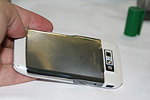
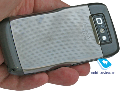
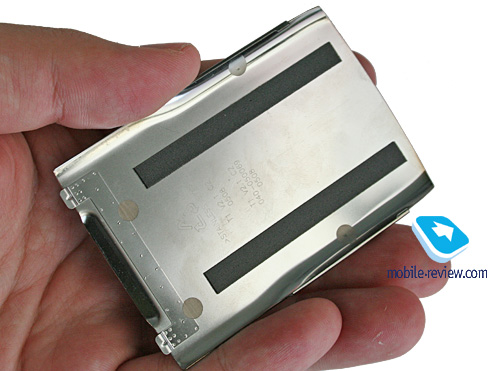
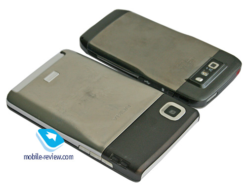
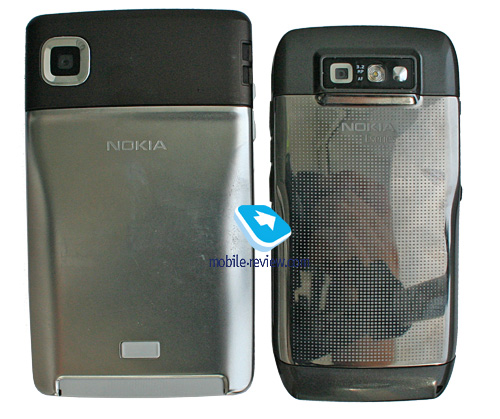
Thankfully the Nokia E71 isn’t exposed to wear and tear much, since its back cover is all metal, while the body is made of glossy plastic that won’t wear off with time. Combined they make for a very durable frame for the E71 that will look pretty good even after several years of use. Although there is one weak spot to it – we aren’t really sure whether the chrome-coated bezel on the front will wear off or not.
While the E71’s plastic is not completely scratch-proof, you won’t see any discernible scuffs at a glance; rest assured, nothing will disturb your eyes if you hold the phone at arm's length. Also, the dot-studded design of the battery compartment cover will prevent it from picking up deep scratches or scuffs.


As far as materials and build quality go, the E71 is in one league with the Apple iPhone, which is one robust phone; but the Nokia E71 has a removable battery cover, a thumbboard and a handful side keys, and it still feels very sturdy in the hand – Nokia’s engineers have done a great job, make no mistake about that.
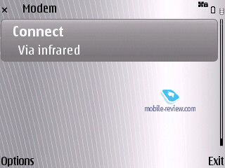
The left-hand side houses the Infrared port (the spirit of good old ESeries is all around this phone) along with the microSD memory card slot and microUSB connector (both sealed by rubber flaps). On the right there is a 2.5mm audio jack, further down is the volume rocker and Voice button that handles various voice-centric options (such as voice dial).
Perched at the base of the E71 is the lanyard eyelet and a standard 2mm charger socket. The top end of the handset is occupied by the power button and loudspeaker slit.

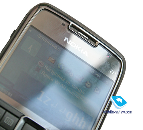
Unlike the Nokia E61i, here the display sits underneath a protective layer. Topping the display are the forward-facing camera for video conferencing and ambient light sensor (that handles the backlight levels of the phone’s keypad and display).


On the back there is a 3.2 Mpix camera lens along with a LED flash.
Another thing that sets the E71’s design apart from that of the E61i is that the service LED is now embedded into the navigation key’s framing, which is not as convenient as having it as a separate element on top of the screen.
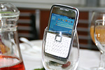
All we have left to do is say something about the colors the E71 is available in (white steel and grey steel). In the former variant both the keypad and all parts of the casing that are made of plastic are finished in white, lending the phone extra elegance that will certainly attract women. On the other hand, the black edition of the E71 sports a soot black keypad and plastic inserts; you may have noticed that in all official photos the back cover appears to be black, but in reality it's the same as that used by the white edition of the handset (the only difference is the way they are patterned).


Back to the table of contents >>>
Display
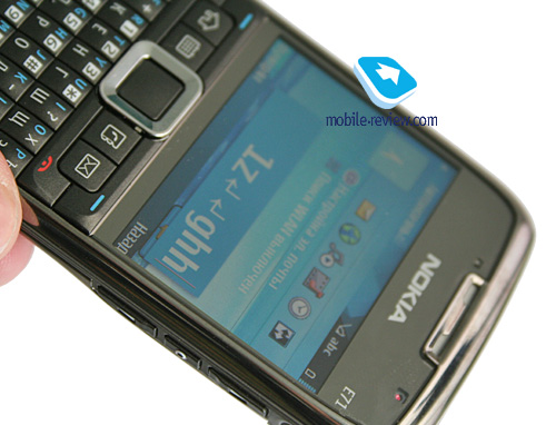
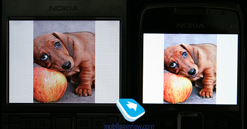
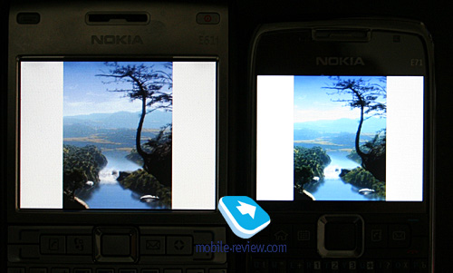
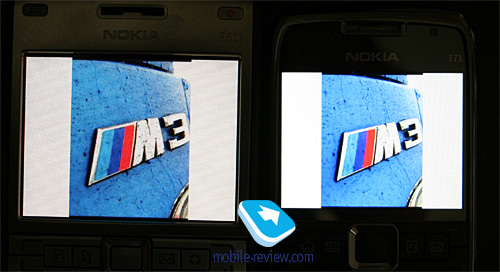
The E71 utilizes a 2.36-inch QVGA display (320x240 pixels, 48x36mm), capable of up to 16 million colors. It manages to output a pretty decent picture quality-wise that remains readable in various environments (it doesn’t fade away in the sun at that, all thanks to the mirror underlayer).


The E71’s display is significantly smaller than that of the Nokia E61i, basically it may be the turn-off feature for some. But in my opinion, it’s not that hard to get used to this screen, since it’s not touch-sensitive and after all, most other today’s phones boast similar diagonals and resolution.


On balance, the E71 packs in a likable display and we are pretty much content with it. It can accommodate up to 8 text and 3 service lines (with some modes allowing for up to 14 text lines).
Back to the table of contents >>>
Keyboard
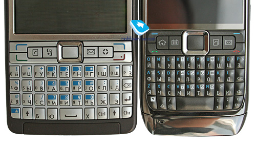
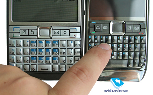
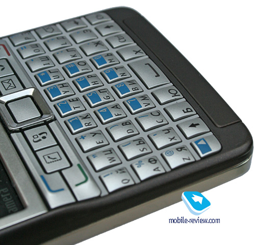
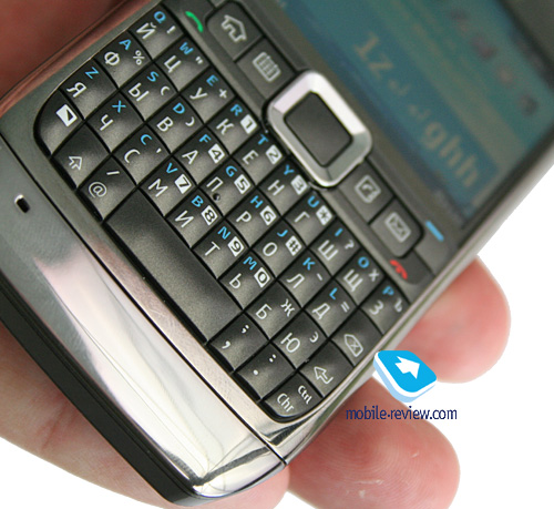
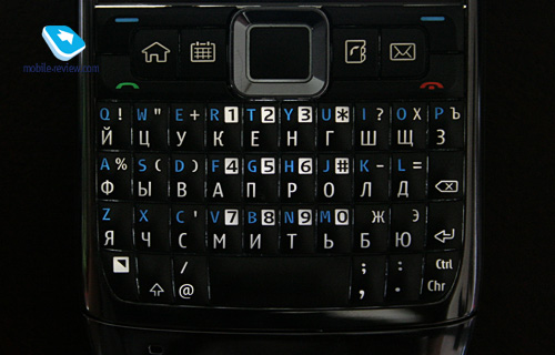
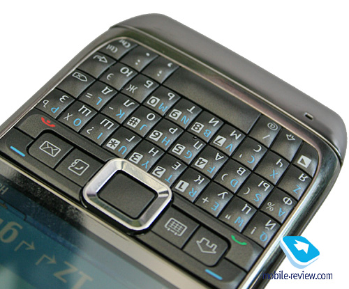
Since the E71 is a thumbboard-enabled device, its keyboard is what it’s all about – depending on its ergonomics it may be either the selling point of the phone or its major and most crucial letdown that will put people off. All official snapshots of the Nokia E71 out there outline its user-friendly setup that allows for single-handed text input. Indeed, they have trimmed a couple of millimeters off the phone’s waist, so that now every button on its thumbboard is within fingers reach. But is this setup all that essential? Basically, the users of the Nokia E61/E61i praised these phones for their sizable keyboards that enabled them to type with both hands. And on top of that, these two handsets weren’t meant for single-handed navigation – while the user could dial a number this way, entering text with only one hand was much more challenging.
What we are getting at is that should you start typing with Nokia E71 fast enough your fingers will get tired in no time. In fact all you will be able to type up without your fingers going numb are moderately long SMS and emails. The reason for that lies in the casing’s width. You can’t make one device that will serve both worlds well – if you’re making a QWERTY-phone for enterprise users, it should be broad and well spaced-out, otherwise it’ll be difficult to hold and text with. The Nokia E71 is one of the most diminutive thumbboard-equipped handsets out there, and not because of some Nokia's secret technologies, but simply the fact that they have sacrificed the original keyboard’s ergonomics, making it a secondary feature of the E71. It may sound awkward, but this is one of the first QWERTY handsets where design and size of the casing are above the phone’s defining feature – its keyboard.

Having cut one centimeter off the E71’s waistline, Nokia's engineers had to cram all buttons inside a smaller area, putting them right next to each other. Actually this will cause people with bigger fingers to tap neighboring keys all the time. On the other hand, the Nokia E61i didn’t have such problem, since its thumbboard was well spaced out and thus much easier to text with.

Another drawback stemming from this cramped layout is that you won’t be able to type without looking at the keyboard anymore.
All buttons on the E71’s thumbboard are made of plastic and have a domed design, but even that can't make up for their tiny size, so you will be better off punching these keys with your fingernails.


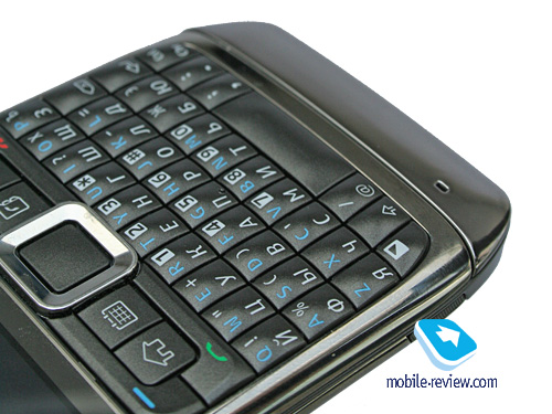
The E71’s trimmed keyboard has brought about some changes in terms of key markings too. On its predecessor, the E61, all symbols were arranged horizontally, meaning that Roman letters were perched on the left, whereas on the right were the symbols of any other local alphabet; on the Nokia E71, however, all letters and symbols are laid out vertically, with the local alphabet given higher priority and thus located at the bottom of every key.


Another factor that has harmed the thumbboard’s ergonomics is that some buttons have been merged in view of the cramped space reserved for the keyboard. This way, Ctrl and Chr now share one key (in the bottom right corner), meaning that you won’t be able to select and copy text in a flick of the Ctrl button – with the E71 you will have to switch the layout first, press the Ctrl key and only then copy a text fragment. Needless to say, the whole process feels somewhat awkward.

On the whole, the thumbboard’s layout has been reworked in a big way. The bottom row now features such frequently used keys as “.” and “,”, whereas previously you had to switch between keyboard setups to type them. Unfortunately all other symbols are now laid out in a different fashion (although a more logical one), so the owners of the E61 won’t be too happy to learn about this feature of the new E71.
All buttons are evenly lit in white that makes all key captions very readable in low light conditions.

In order to eliminate any sort of bias from our review, we decided to give the E71’s thumbboard a run for its money and put it face to face with a couple of other handsets: Nokia E61i, Apple iPhone (with its on-screen keyboard), Sony Ericsson P1i (full QWERTY keyboard with double-sided buttons) and Nokia’s very own E66.
Then we offered several people to type in this text fragment (in English):
«With mobile email penetration and access to wireless applications growing at a rapid rate, Nokia is well positioned».
Our focus-group comprised of five men, which was quite enough in our opinion. Unlike our previous tests, that time around we opted not to evaluate raw seconds, instead we determined each handset’s performance relative to the time it took the focus-group members to type the text fragment on a conventional keypad with the help of T9 (that’s why he had the Nokia E66 in the mix). Then we calculated ratios between every phone in question and the benchmark (the E66). For instance, if it took us a minute to type that snippet with the E66, and having the iPhone in our hands we managed to do the same thing in just 40 seconds, the iPhone’s score would be 66 percent; so the lower the percentage is - the better.
| Parameter |
E71 |
E61i |
E66 |
Se P1i |
Apple iPhone |
Typing speed (compared to the E66, %)
|
78 |
68 |
100 |
78 |
68 |
| Average number of errors (not corrected within the typed fragment) |
3 |
1 |
1 |
2 |
1 |
The most efficient devices, according to our tests, are the the Apple iPhone, which comes as no surprise since an on-screen keypad is always easier to deal with, and the Nokia E61i. In its turn, the Nokia E71 fares on par with the P1i with its quirky rocker-style buttons, which is still a pretty good result. And obviously all four handsets outrun the E66’s conventional keypad.
So the bottom line on the E71’s ergonomics is pretty obvious – the new phone doesn’t come close to its predecessor in terms of texting speed, but still can beat conventionally designed handsets on this front. By the way, this sort of compromise isn’t that bad at all – I’m positive many will appreciate it.
Also, the E71’s keypad is not particularly handy when typing in phone numbers, which is another drawback stemming from its cramped setup.
Now for the functional buttons. The E71’s trademark feature is a 4-button setup (including the Menu button) that allows for one-click access to the calendar, phonebook and mail applications. On top of that there are actually two ways to press each of these keys – long-press and a short click. This way, with a short press you will jump into the phonebook’s general list of entries, the mailbox or monthly view of calendar. However when you tap and hold these keys, you will be able to create a new contact, entry in calendar or email. Punching these keys one more time will get you back to the main menu.

Furthermore, you can even reprogram these buttons to access custom applications or features.
The E71’s navigation button is pretty comfortable to use; also it has a service LED built inside. The good thing about it is that it is fully customizable – you can setup event notifications and other options. Unfortunately there is no way to disable it during night time (since it glows a little too bright in the dark).
Back to the table of contents >>>
Battery
The handset utilizes a 1500 mAh Li-Pol battery (BP-4L), as opposed to the Nokia N82’s 1050 mAh cell. The E71 is rated for 10.5 hours of talk time (GSM) and 20 days of standby. Music time – up to 18 hours.


The handset’s battery life averaged 4 days in our tests, when we used the E71 for about two hours of calls, a dozen or two snaps, several minutes of video, and around an hour of music/radio. It takes the E71 around 1.5 hours to charge from empty to full.
If you forgo EDGE/GPRS data completely, the E71 will offer you even longer hours. Basically, with average use you will get a minimum 4 days use out of it. What else can we say – the E71 is unmatched on this front; what’s more, despite sharing the same battery type, the E71 improves upon the E61’s performance by 10-15 percent (not only thanks to its smaller display but also some software enhancements).
Below is our chart of battery times we managed to squeeze out of the E71:
- GPS-navigation – 5 hours
- Video playback – 6 hours 40 minutes
- WEB-surfing (EDGE) – 4.5 hours
- Music (in earphones) – 17 hours
- Wi-Fi (non-stop data upload) – 6 hours for non-stop data transfer, 166 hours of standby (according to Nokia)
Back to the table of contents >>>
Memory
The device comes equipped with 128 Mb of RAM, after first launch you will get around 70 Mb of free memory at your disposal, which is enough for running a dozen applications and browsing “heavy” web-pages – the word “slow-down” is definitely not in the E71’s vocabulary.
The user almost has 110 Mb of storage available, where any data can be stored.
The E71 deals with microSD memory cards (hot-swappable), the phone comes packaged with a 2Gb unit. There are no restrictions as far as memory card’s size is concerned – our handset easily identified a 8Gb card.
Back to the table of contents >>>
Performance
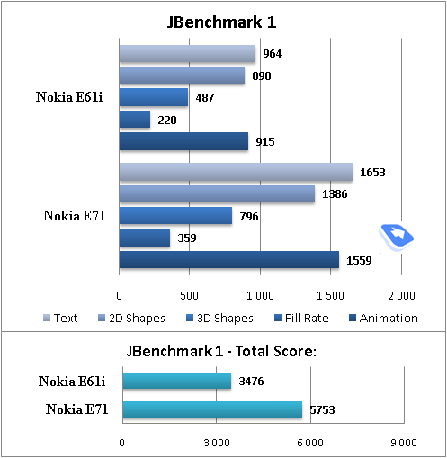
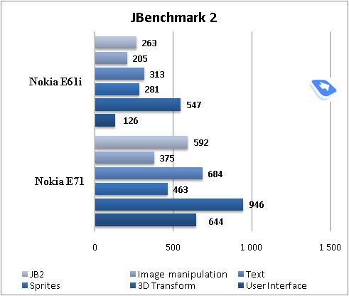
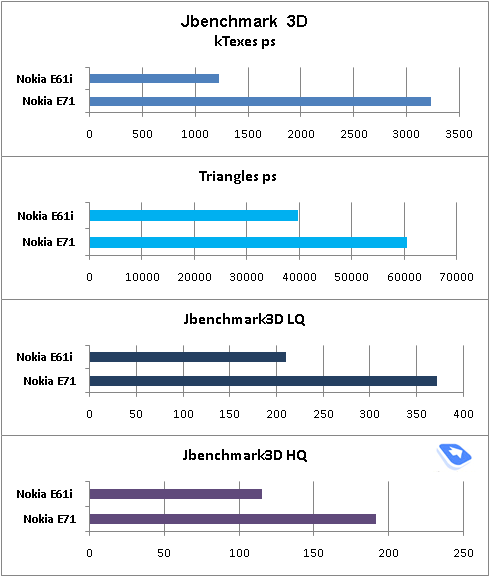
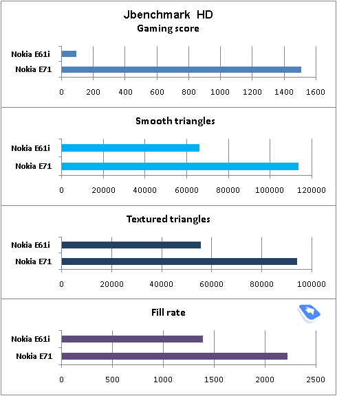
Thanks to its, beefed up memory and a faster CPU (ARM11 running at 369 Mhz, against the E61i’s ARM9 and its 220 Mhz), the E71’s performance has almost doubled compared to the E61i. You can literally soar through all applications and menusalso the handset can have more applications running in the background.


Back to the table of contents >>>
USB, Bluetooth
USB. Using the USB settings you can choose one of the following modes:
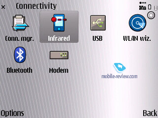
- Data Transfer (Mass Storage USB) - memory cards is available, no drivers required, as your OS identifies the handset automatically.
- PC Suite – used for device management via Nokia PC Suite, enables all features of the phone, data backup etc.
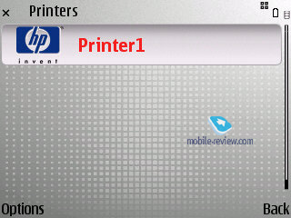
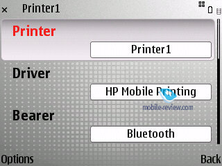
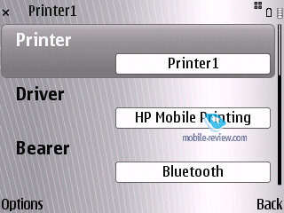
- Image Print – no explanation required.
The E71’s data transfer speeds top out at 2 Mb/s
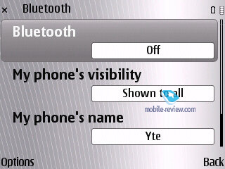
Bluetooth. The phone comes with Bluetooth v2.0, with support for EDR. The following profiles are supported:
- A2DP
- AVCRP
- BIP-ImagePush
- DUN-GW
- FT-Server
- HandsFree-AG (1.0)
- Headset-AG
- OBEX
- OPP-Client
- OPP-Server
- SIM Access-Server
The top speed you can get with the E71’s Bluetooth connection is around 100 Kb/s. We also tested its A2DP profile in pair with the Sony Ericsson DS970 headset, which worked just fine – we managed our play list, skipped within tracks and adjusted volume seamlessly, however we couldn’t make current track’s title show up on the E71’s display.
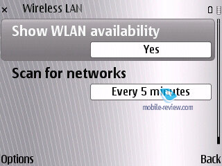
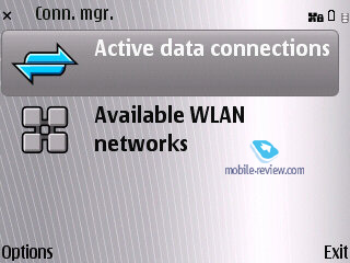
Wi-Fi. This handset comes armed with Wi-Fi (IEEE 802.11 g) support. All security standards are supported, including WEP , WPA , WPA 2, with other advanced settings available. Unlike the NSeries, the E71 doesn’t support Universal PnP (UPnP). Although, it boasts the WiFi Wizard, which can search and tap into available networks in the background mode.
The IrDA’s data transfer speed tops out at 115 Kb/s.
Back to the table of contents >>>
Camera
The E71 utilizes a 3.2 Mpix CMOS camera with auto-focus. Its User Guide reads that to focus on an object you will need to press the “T” button – we tried to do that but to no avail, as our shots didn’t benefit from that in any way. I shall say that the quality you get with the E71 is what you’d expect from this type of camera– it is fairly decent for a business-minded phone.
You can go for one of the following resolutions:
- Print 3M – Large
- Print 2M – Large
- Print/e-mail 1M – Small
- Multimedia message 0.3M
The maker doesn’t provide the real image resolutions, so we take this duty in our own hands. The following resolutions are utilized in the abovementioned modes: 2048x1536, 1600x1200, 1024x768, 640x480 pixels. The picture size averages 1 Mb, 600-700 Kb, 250-300 Kb and 75-100 Kb respectively. You can’t adjust the picture quality settings with the E71.
The handset utilizes the digital zoom feature topping out at x20, moreover, there are “normal” and “enhanced” zoom – the latter allows reaching the maximum magnification, yet some artifacts slip into your pictures. When using the standard digital zoom, though, these artifacts are not all that discernible. And since you can perform just the same zoom-in in any graphics editor, using it while shooting is probably not the best idea.
The shooting modes comprise a user-defined mode, auto and macro. Other options include portrait, landscape, night, night portrait, sport.
portrait, landscape, night, night portrait, sport.
The flash can be set to trigger automatically, turned off, or work in the red-eye reduction mode. The self-timer can be programmed to go off in 2, 10 and 20 seconds. The handset can take snaps in rapid successions (three at a time), which may come in handy should you work with fast moving objects. The function is intended to be Sony Ericsson’s Best Pic counterpart, yet as it stands now, it offers less flexibility.
Exposure compensation – this feature is interesting in some specific environments, when it will provide for better and sharper shots. It can be modified on a -2 - +2 scale with a 0.5 step.
White balance – Auto, Sunny, Cloudy, Incandescent, Fluorescent. Overlays available are Sepia, Black&White, Negative.
The ISO settings are set to Auto by default, while other options may be selected manually; much like some cameras, here the maker allows choosing ranges, rather than specific ISO values. In other words, when you choose the Low ISO setup, it includes a range of settings from 60 to 200 etc. This is all another step towards the mass market, an attempt to isolate the user from all technical nuances.
 |
 |
| (+) maximize, 2048x1536, JPEG |
(+) maximize, 2048x1536, JPEG |
 |
 |
| (+) maximize, 2048x1536, JPEG |
(+) maximize, 2048x1536, JPEG |
 |
 |
| (+) maximize, 2048x1536, JPEG |
(+) maximize, 2048x1536, JPEG |
 |
 |
| (+) maximize, 2048x1536, JPEG |
(+) maximize, 2048x1536, JPEG |
 |
 |
| (+) maximize, 2048x1536, JPEG |
(+) maximize, 2048x1536, JPEG |
 |
 |
| (+) maximize, 2048x1536, JPEG |
(+) maximize, 2048x1536, JPEG |
 |
 |
| (+) maximize, 2048x1536, JPEG |
(+) maximize, 2048x1536, JPEG |
 |
 |
| (+) maximize, 2048x1536, JPEG |
(+) maximize, 2048x1536, JPEG |
 |
 |
| (+) maximize, 2048x1536, JPEG |
(+) maximize, 2048x1536, JPEG |
 |
 |
| (+) maximize, 2048x1536, JPEG |
(+) maximize, 2048x1536, JPEG |
 |
 |
| (+) maximize, 2048x1536, JPEG |
(+) maximize, 2048x1536, JPEG |
Video recording. When recording video with E71, there are considerably fewer settings, than in the still image mode. There is a software image stabilizer that was first introduced in the Nokia N80. You can adjust the white balance, choosing from Automatic, Sun, Cloudy, Incandescent, Fluorescent. The overlay pool includes Sepia, Black&White, Negative. There are only two shooting modes – auto or night mode. Maximum resolution – 320x240 pixels (mpeg4), you can also mute sound, although there is no way you can adjust the E71’s FPS, which is locked at 15. The handset allows recording videos until you run out of free memory.
Back to the table of contents >>>
Software department
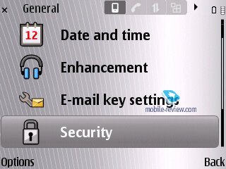
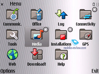
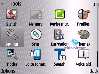
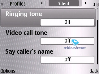
The ESeries devices have always been worlds apart from other S60-powered devices in the way of software. Some apps and options that were tested on these phones in the first place are now becoming par for the course in the rest of the company’s portfolio, but some still remain the trademark features of the ESeries. This way, the Nokia E71 sports a unique phonebook, calendar and some other features that are very different from those generic applications built into S60 3rd edition FP1. Let’s see what new feats and abilities the E71 brings to the table.
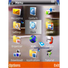
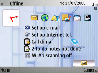
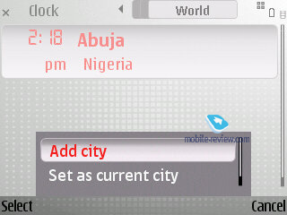
The desktop mode has been revamped a little – now at the bottom there are three icons standing for missed calls, messages and voice mail. If there are no events at hand, the corresponding icon will vanish. Clicking on each thumbnail will make a pop-up with extra information appear on the screen.
Video, phone menu (wmv, 30,8 мб) >>>
Mode. The E71 is the first Eseries-branded device ever to boast the Mode functionality. In a nutshell, it’s a mobile version of the latest PC craze – virtual desktops. That is, you make up a couple of screens, where various themes, pictures, applications, plug-ins and other essentials are housed/used. And then you can swap between them in one touch, so that it’s always easy to jump between your setup for work with mail and notifications brought up on the main screen and the home setup with a different theme applied (without your company’s logo or colors) and player controls lined up on the screen instead of email notifications. It takes the E71 around 6-7 seconds to jump between modes.


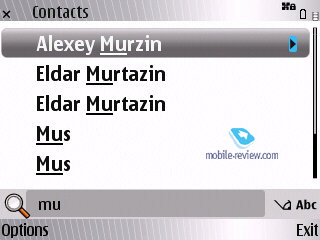
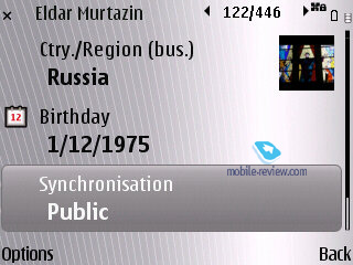
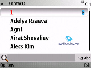
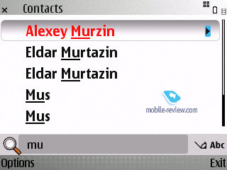
Phonebook. While at the standby screen you can type in any letter from the thumbboard and the phone will instantly look-up all contacts in the phonebook that have with this letter in either first or last names. Unfortunately, this kind of search works only for contacts in English (even in localized phones).
Contact groups have been given a major boost too – now you can submit a number for voice conferences, a password and also a PIN-code. Enterprise users, who use conference calls a lot, will surely appreciate this new ability. Plus you can select a ring tone for any contact group in the E71 (but not a picture, regrettably).


With groups you can also make use of “Call to many” feature, which will allow the E71 to set up a conference call on its own; on top of that the handset allows for bulk mailing.
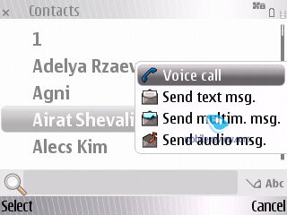
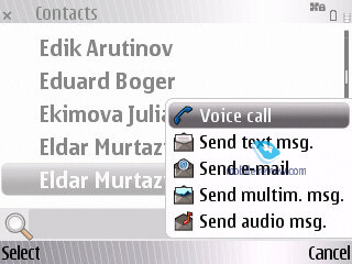
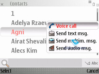
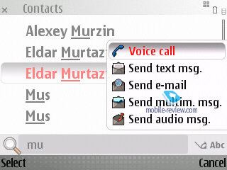
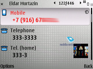
Regrettably, there are no other views available for the phonebook – for instance, you can’t make the E71 show contacts coupled with at least one phone number. At the same time it allows calling up a drop-out menu by selecting a contact and pressing the navigation button right – it’ll let you make a call or send a message without leaving the phonebook menu. On top of that this list is context-sensitive, meaning that its options will change depending on what types of phone numbers are available for the contact in question.
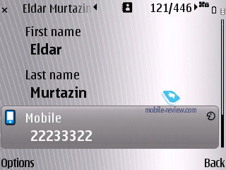
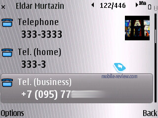
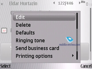
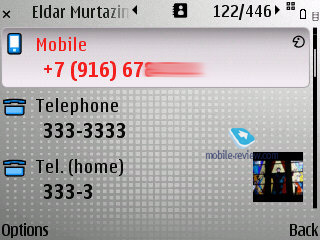
The roster of fields you get to fill when creating or editing a contact hasn’t changed much, but the E71 manages to offer a better address field setup and also BlackBerry PIN as a default option.


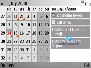
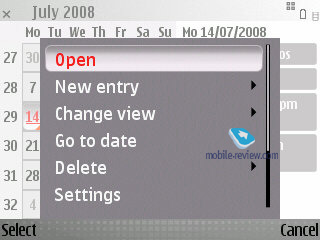
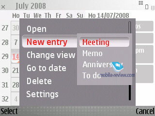
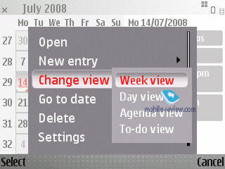
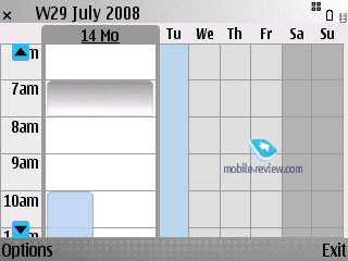
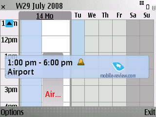
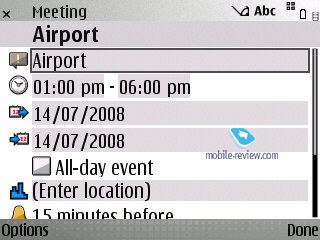
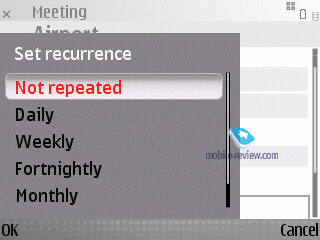
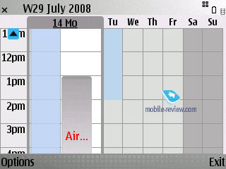
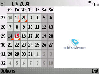
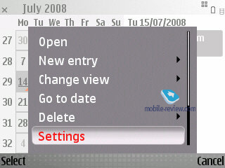
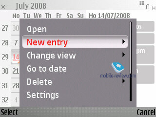
Calendar. The Calendar application hasn’t changed a bit since its last iteration; in fact the only thing that’s different is its layout, when the E71 shows both the calendar and events scheduled for the current day. In case there are too many entries, the E71 will show only their total number with no extra information. When using the weekly view of calendar, all events are displayed just like in MS Outlook, plus there are some pop-up tips scattered across the screen. All in all, while pleasant, none of these changes are groundbreaking.


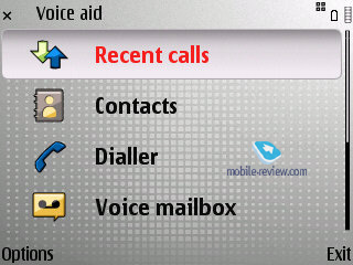
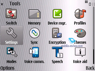
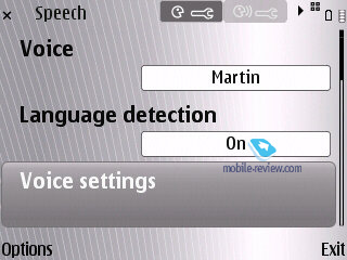
Voice Aid. While this feature’s name probably doesn’t say much, I find it pretty interesting and useful. For instance, it will allow you to handle the E71 when driving and so that you have only one free hand – simply assign this feat to one of the shortcut buttons, and there you go, you can either make the handset read out the call log, or pick an entry in the phonebook without even looking at it. In the latter case all entries get grouped up by the first letter of their names – by pressing the navi-key left or right you will switch between these categories (ABC, DEF, etc) and punching it up and down will scroll through the list, while the phone will be reading out all contacts you hover upon.

Message Reader is available with other S60 devices too – this application does pretty much what its name says, it reads messages aloud.
Clock – using this feature you will make the E71 tell you what time it is now.
Dialer – this application has been carried over from previous ESeries devices and basically it stems from handsfree car-kits – it allows you to scroll through a list with digits while the handset is reading them out aloud, so that you can dial a number without looking at the display at all.
Voice dial. There has been a lot of fuss around the E71’s official description on Nokia’s site, specifically around this line - Speaker dependent and speaker independent voice dialing (SDND, SIND). Someone suggested that the handset featured recordable voice tags, just like on old phones. But I have to disappoint him and everyone who believed in this – the E61 runs with the system that can adjust to your voice and keeps improving on the go. Although some think this intelligent system doesn’t really work (and the truth is, it almost never finds the right name at first), in fact it takes the E71 around a week to come to grips with your voice and pronunciation and reduce the number of errors.
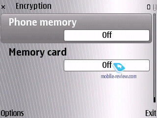
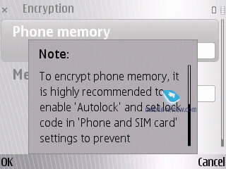
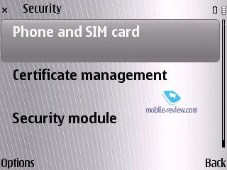
Data encyption. Another change of note – the E71’s ability to encrypt data both on the memory card (microSD of any size) and the handset’s internal memory. And this saves you a whole lot of trouble should you smartphone end up in some villain's hands, who does know how to break a standard password. On the other hand, if you forget the password yourself, you won’t be able to recover the data, which will be a pity, but all systems of this kind have this glitch.


Office tools. Enterprise users will surely appreciate the E71’s Intranet application, which comprises the settings of VPN-client.
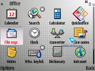
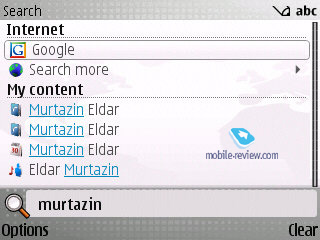
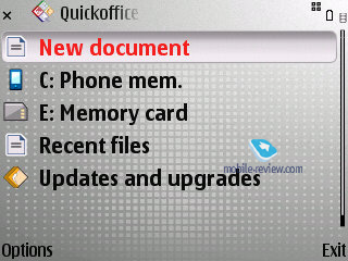
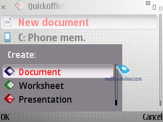
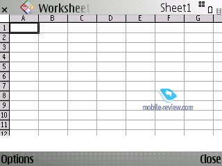
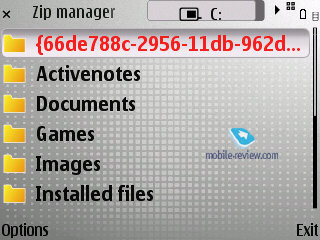
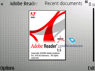
As far as office tools go, the E71 is no revolution – it has had its mail client improved, the phonebook has been tweaked here and there too, along with some other applications. Microsoft Office documents are still handled by QuickOffice, which is a pity (although many will be content with what it has to offer). Also there is a ZIP archiver and PDF reading tool. The Search 4.0 app can be linked directly on the main screen.


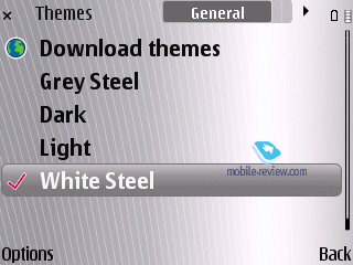
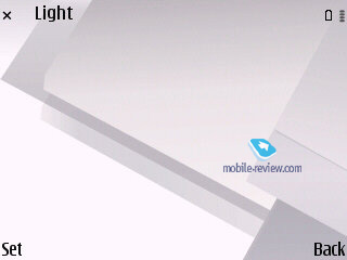
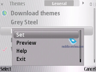
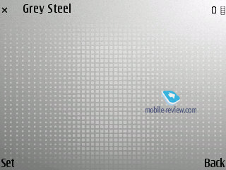
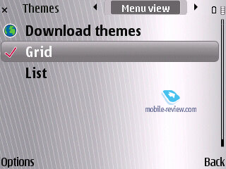
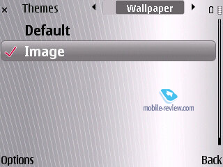
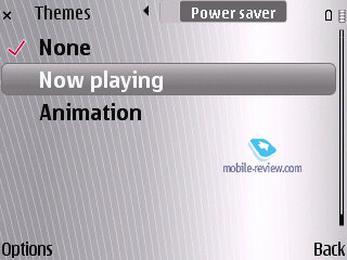
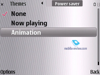
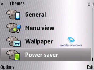
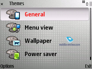
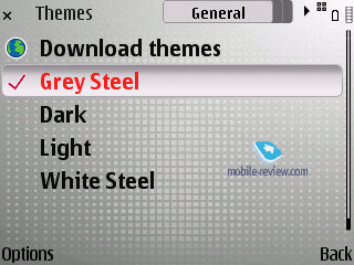
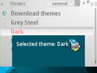
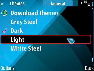
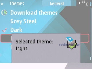
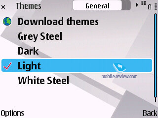
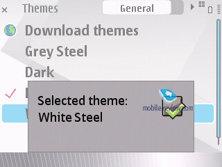
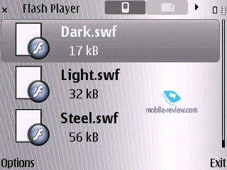
Themes – the E71 comes equipped with four themes. None of them is particularly flashy, which is good, but our only complain is about the way all icons and thumbnails look – they are quite bizarre, you’d be much better off replacing them with a custom pack.


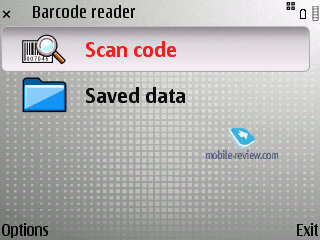
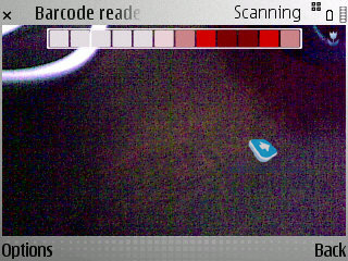
Bar code scanner – maybe it’ll come in handy some day.


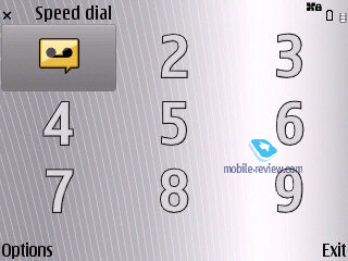
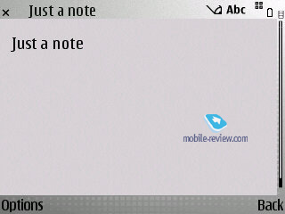
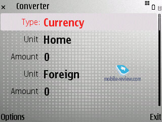
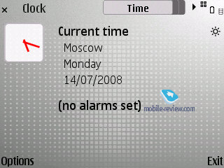
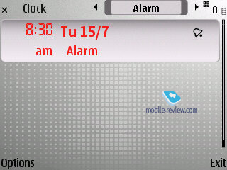
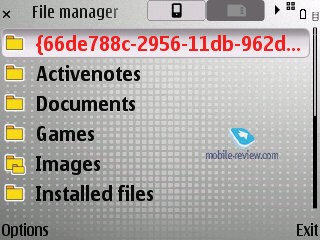
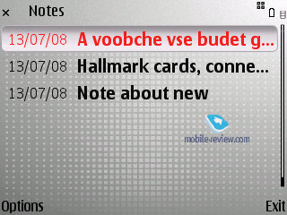
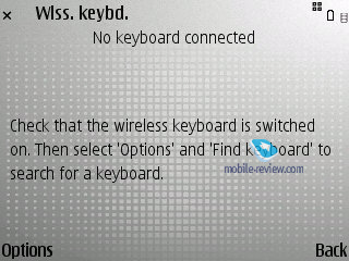
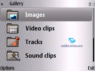
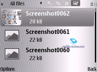
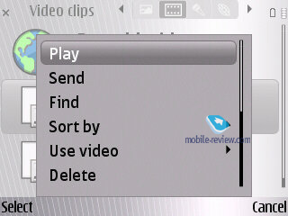
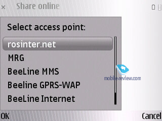
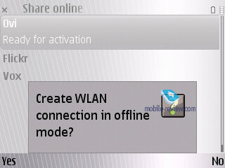
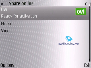
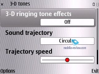
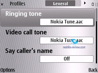
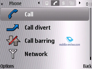
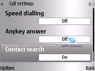
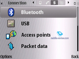
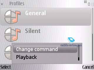
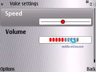
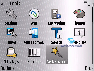
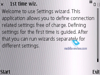
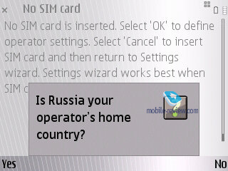
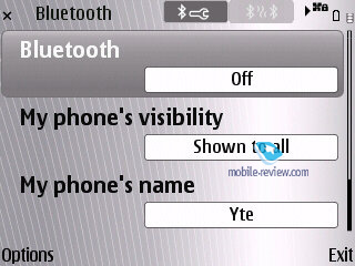
Screenshots


Back to the table of contents >>>
Nokia E71 vs Nokia E61i
Times have changed – the E71 now caters for the average user’s needs, whereas its predecessor was all business and nothing else. Not all changes in the E71 are good, however; but there are so many of them that in all honesty, the Nokia E71 is a completely new phone, rather than a revamp of an old concept. Let us give you a better idea of how different the E71 and the E61i really are:
| |
Nokia E71 |
Nokia E61i |
| Size, weight (mm, grams) |
114х57х10, 127 |
117х70х13.9, 150 |
| Display |
2.36 inches, TFT, 16 million colors, protective layer on top of it |
2.8 inches, TFT, 16 million colors, no protection |
| Battery |
Li-Pol, 1500 мАч |
Li-Pol, 1500 мАч |
| Memory |
128 Mb of RAM (70 Mb available), 110 Mb in the phone, microSD memory card (unlimited capacity) |
64 Mb of RAM (23 Mb available) , 600 Mb in the phone, microSD memory cards (up to 2Gb)
|
| CPU |
ARM 11, 369 МГц |
ARM 9, 220 МГц |
| Bluetooth |
2.0 |
1.2 |
| Camera |
3.2 Mpix |
2 Mpix |
| WiFi |
Yes |
Yes |
| S60 edition |
S60 3rd Edition FP1 |
S60 3rd Edition |
| Data encryption |
Yes |
Not available in the default package |
| Team application |
No |
Yes |
| Enhanced calendar and phonebook |
Yes |
Standard applications |
| GPS |
Yes |
No, only external devices |
| FM-radio |
Yes |
No |
| Nokia OSS Browser |
Yes |
No |
| HSDPA |
Yes |
No |
| Typing speed |
Almost a quarter slower |
Faster |


Back to the table of contents >>>
GPS-navigation
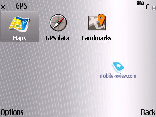
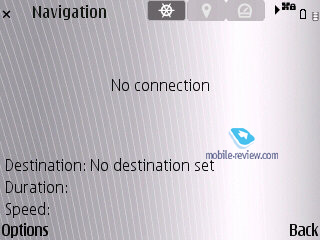
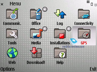
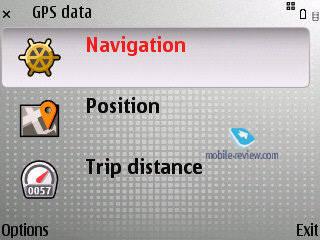
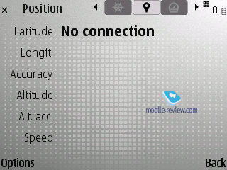
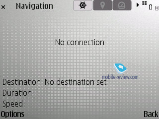
The major update to this department is the new version of Nokia Maps, which you can learn more about in our review of the FP2. Also, we would like to note that the application has become even speedier, the cold start time makes around 4-5 minutes, and we felt that the gears were spinning faster, so to speak. To my mind, the E71 is a tidy navigation-savvy solution, it does the job hands down. But, unfortunately, as far as battery life goes, the E71 doesn’t improve over the predecessors.


Back to the table of contents >>>
Music department
A lot of people keep asking me to write about the E71’s music department, which is, in fact, little to no different from what you can experience with other S60-powred devices. I really don’t know what else to add – the sound quality hasn’t improved much, the player interface is still the same. I imagine many S60 die-hard fans would like to hear something along these lines: “Wow, it’s the most advanced player in a non-music savvy phone ever, it’s audio quality is mind-blowing, and it can make coffee!” Not going to happen – for starters, because the E71’s 2.5 mm headset jack is not the best way to go when it comes to music. And if you are eager to learn more about the player’s default functionality – read our comprehensive review of this platform.
Back to the table of contents >>>
Impressions
Call quality was never an issue with the E71, as it easily lived up to our expectations of a Nokia-branded phone. Ring tones sounded quite loud and we were happy with them even in noisy environments. The vibro alter was of moderate strength.
As of today, no other device on the market can stand up to the Nokia E71, as, by and large, every QWERTY-enabled device these days is unique in its own way. So how do we assess the performance of such phones? In my opinion, the leading criteria should be the thumbboard quality and functionality. As far as the Nokia E71 goes, it retains a pretty mediocre keyboard that fares on par with other offerings out there; it’s quite another matter, though, that its close sibling, the Nokia E61i had an absolutely stellar thumbboard. But when it comes to functionality, the Nokia E71 is second to none in its price segment – no Windows Mobile device can put up a similar pack of applications and features, although some of them boast touch-sensitive displays.
It’s not a coincidence that Nokia has put the E66 and E71 in one line-up – in fact it’s one phone that comes in two designs, each retaining a different keypad and form-factor. The sliding E66 has just as many metallic accents in its casing, and a different display orientation. But given their identical price tags, both revolving around the level of 350 Euro, the choice is not all that clear-cut. Most consumers will definitely go for the E66, and its QWERTY-enabled iteration will enjoy much more modest sales; the ratio will float around 80 to 20 in favor of the E66. Being aware of this situation, in order to boost the E71’s sales Nokia has launched it before the E66.
The Nokia E71 is set to land in Russian early in August. Those of you who are expecting its price to soar down will be disappointed to learn that its price curve won’t see any sharp turns down the road. Later in August the market will see the E66’s release that will retail for around 60-70 USD more, which is well-justified, as it’s a truly decent phone that will outshine its predecessor, the E65, hands down.
The SAR value for the E71 is 1.33 W/kg
Related links:
Back to the table of contents >>>
Eldar Murtazin (eldar@mobile-review.com)
Translated by Oleg Kononosov (oleg.kononosov@mobile-review.com)
Published — 26 July 2008
Have something to add?! Write us... eldar@mobile-review.com
|
News:
[ 31-07 16:21 ]Sir Jony Ive: Apple Isn't In It For The Money
[ 31-07 13:34 ]Video: Nokia Designer Interviews
[ 31-07 13:10 ]RIM To Layoff 3,000 More Employees
[ 30-07 20:59 ]Video: iPhone 5 Housing Shown Off
[ 30-07 19:12 ]Android Fortunes Decline In U.S.
[ 25-07 16:18 ]Why Apple Is Suing Samsung?
[ 25-07 15:53 ]A Few Choice Quotes About Apple ... By Samsung
[ 23-07 20:25 ]Russian iOS Hacker Calls It A Day
[ 23-07 17:40 ]Video: It's Still Not Out, But Galaxy Note 10.1 Gets An Ad
[ 19-07 19:10 ]Another Loss For Nokia: $1 Billion Down In Q2
[ 19-07 17:22 ]British Judge Orders Apple To Run Ads Saying Samsung Did Not Copy Them
[ 19-07 16:57 ]iPhone 5 To Feature Nano-SIM Cards
[ 18-07 14:20 ]What The iPad Could Have Looked Like ...
[ 18-07 13:25 ]App Store Hack Is Still Going Strong Despite Apple's Best Efforts
[ 13-07 12:34 ]Infographic: The (Hypothetical) Sale Of RIM
[ 13-07 11:10 ]Video: iPhone Hacker Makes In-App Purchases Free
[ 12-07 19:50 ]iPhone 5 Images Leak Again
[ 12-07 17:51 ]Android Takes 50%+ Of U.S. And Europe
[ 11-07 16:02 ]Apple Involved In 60% Of Patent Suits
[ 11-07 13:14 ]Video: Kindle Fire Gets A Jelly Bean
Subscribe
|

