|
|
Review of GSM/UMTS-smartphone Nokia E70
Live photos of Nokia E70
Sales package:
- Smartphone
- 1150 mAh Li-Ion battery (BL-6C)
- Charger
- USB-cable
- MiniSD memory card (64 Mb)
- User Guide
- CD with software
- Mono-headset
Nokia E70 occupies a somewhat twofold spot in Nokia's range - on the one hand it’s a run-of-the-mill S60-ppwered smartphone, but its form-factor is what everything is about, as the E70 adopts shapes and curves of its S40 predecessors, like Nokia 6800, Nokia 6810, Nokia 6820/6822.

So what are the benefits of getting a fold-out thumbboard on a phone, with QWERTY layout keeping low profile with the clam closed? From the position of technology, such solution seems fetching due to putting fashion and functionality in one boat, and on top of all that, enabling users to run their E70s in a more common way. Particularly, techi couldn’t be happier. But let us dig a bit deeper into the market and find out who rules the roost in the QWERTY-armed phones segment. The first thing coming across you mind will be RIM’s very own BlackBerry, which is a kind of pioneer, speaking about this field. In the modern world, though, this title on the European market is coveted by communicators of every stripe, running on Windows Mobile, and HTC is at the leading edge here. The advent of QWERTY-equipped solutions powered by Symbian was a logical strike-back in response to rapid development of offerings utilizing WM as their OS and the customers’ needs brought about by this operating system. At that most makers have naturally forgotten that smartphones basing off Windows Mobile or BlackBerry solutions are highly tailored devices for accessing one or another service (to put it simply, mail or something). And a full-size thumbboard is welcome there – make no mistake about that, but it should be considered along with the rest of the device’s abilities, the meaning of its existence. The very concept of BlackBerry as it stands is easy and hassle-less access to mail anywhere, possibility to reply to your messages. Whereas for Windows Mobile the ultimate goal is not this obvious due to communicators having much more to offer, and in this regard a thumbboard adds a new dimension, if you like, to texting with such devices – it may take the form of mailing, but the same goes for other documents, like spreadsheet etc. That is why a keyboard for a vast majority of users constituting the target group, loses its initial importance, being knocked out of the limelight, as it might be called for occasionally, or left out at all. But while a thumbboard is literally is “must have” for BlackBerry’s, because should it go missing there, users will simply strike this device off their short-lists, Symbian-smartphones make use of a full-size keyboard in pretty much the same way as Windows Mobile powered solutions, in other words, it is more of a makeweight; Sony Ericsson P990i might by the best example out there, as this handset plays host to all known and popular text input systems – from touch screen to QWERTY setup, and all of them are of equal value, meaning that users might find themselves at loss: which one to choose? But in most cases they decide in favor of virtual on-screen keyboard.
All the above devices are more or less aiming at the enterprise-market and business-users – basically, we could hardly say that one goes for a BlackBerry or something just for the sake of fashion. Back when Nokia 6800 was launched, there actually were some disputes concerning its target group, as they though SMS addicts might pick the 6800 as well, but later on, it wasn’t an option even. What is the reason of cooling off towards this functionality? The answer may be found in low interest of users in proposals attuned to heavy SMS usage. Even among the target audience, which writes tons of short messages a day, specifically youth, such devices have never generated much hype. Clearing the thing out, we should remind you of Motorola’s communicators range, whose mediocre functionality came in at a very affordable price. But they ended up a failure due to the fact that the young people were not keen on having a phone developed to meet their needs, they would rather have a toy like those adults had, which would emphasize their status in that social group.

All these thoughts on the handset’s target audience started not from scratch – on the contrary we were forced to look into it after reading so many odd posts on our forum about Nokia E70. To me, this device has always been highly tailored, aimed at a very narrow audience. However, let us go on with the reasoning and enhance our conclusions with some real facts. Nokia 6800 and all its successors never had great sales; they didn’t live up to the status of “enterprise-solutions”, incorporated weak mail clients. But with all this said, their thumbboard was never an issue – it was OK for the majority of consumers. Functionality was what the handset lacked.
By the release of Nokia E70 the market hadn’t experienced any shortage of smartphones both by Nokia and other manufacturers, sporting grand mail clients and enhanced enterprise-aimed functionality. So who will go for this product? When looking at the enterprise market, specifically top and middle levels of management, the ultimate pick there would by Nokia’s range of communicators, Nokia 9300i in particular. Even though this solution is not widely spread, it sill has got its audience among the abovementioned group of people. It is the top line for this segment even, if you want, as more expensive solutions would do no harm; however they are not very fetching. Hence, Nokia E70 should have been positioned lower, which is the thing they actually did. The enterprise users are happy with all the advantages Eseries delivers to its users, a full-size thumbboard and the best display around, as well as a decent (for this class) camera. All this at a very affordable price. For the first S60-based smartphone packing its features in such form-factor, theE70 is pretty good, and those fold-out design lovers couldn’t be happier, actually. But at the same time the broad audience (on the enterprise market) is seemingly not so sure about the best choice. So, what is the problem with the handset’s positioning?


Leaving purchases made by corporations for their staff aside (as they don’t affect the state of affairs for the company much, and honestly, Nokia E70 didn’t have much to do with this market), we can come up with a profile of a typical consumer for the E70: a man with higher-than-average income, loyal to the brand with no prior experiences (he definitely doesn’t belong to techi). At the same time, the handset’s innards are on the contrary made specially for technology addicts – think of the display and Wi-Fi and the picture is complete. And there goes an evident discord, and among all other things, the ease of use, demanded by the target audience, is gone (as a rule they don’t have enough time to get into the labyrinth of settings). Other drawbacks include barely-there fashion charge of the E70, since its looks and the form-factor are not familiar to each and everyone. Against the background of oversaturated proposition (take even Nokia’s range for example) of typical smartphones, like Nseries (linking up a Bluetooth-keyboard is a breeze there) the E70 is lagging behind. As a matter of fact, the default applications set is no good on either end, so you will end up installing third-party software. So as it stands, the handsets positioning is rather odd.
Another fact, speaking in favor of this point of view is the sales curve for this device – at a reasonable price of 420-450 USD, Nokia E70 never had brilliant sales, while Nokia N80’s retail price is about 130-150 USD higher, it boasts solid sale rates – what is the matter with them? Hardware-wise these two models are quite similar (display, Wi-Fi), so facing them off wouldn’t be the wrong thing. Speaking about the Russian retail market, which is a good example of a free market, Nokia E70’s rate was on the level of 250 units per month (July, August), once an aggressive advertising campaign has started, it rocketed up to about 400 units sold monthly. But it’s country-wise rate, hence the E70 is not even a drop in the bucket, it’s nothing, zero – call it as you want. The N80 has figures 30 times better in July and August, in September – only 12 times. No comments needed I suppose. Another reason why Nokia N70 didn’t hit the mass market in the full sense of this word is that this offering is missing in retailer’s catalogues, while present on the shelves – the reason “why” is quite simple, though – the space in catalogues is very limited, so why would someone need to give it to an unpopular model? The retail will be better off having a well-known handset there instead, providing it with a kind of free advertising.
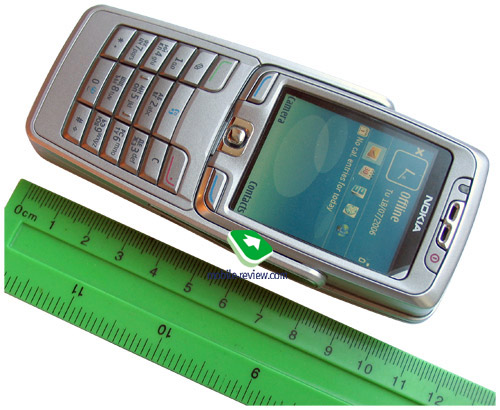
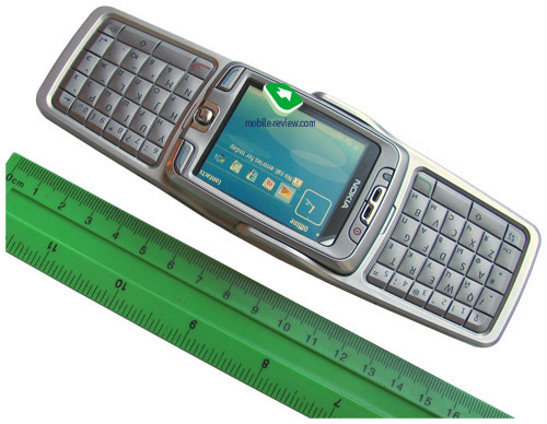
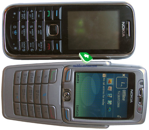
But enough of digging into the device’s positioning – it is about time to get down to its specifications, since the solutions Nokia E70 is equipped with are very interesting. Measuring up at 117x53x22 mm, it is close to the line-up’s first offspring – Nokia 6800 (119x55x23 mm). The smartphone weights 127 grams. Overall the E70 is neither very portable nor clumsy for its class; on top of that a full-size QWERTY-keyboard is a big plus. However you would be better off carrying it in a case, as this model is meant for men, I can’t think of a woman that would agree to have the E70 around.
Video, comparison of dimensions (wmv, 2.4 Mb)>>>


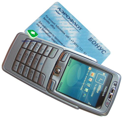
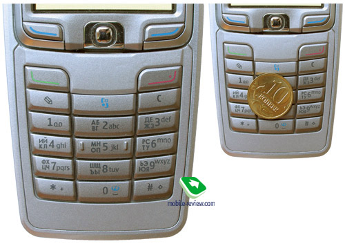
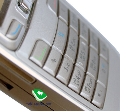
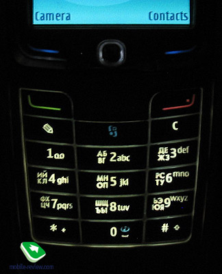
With the clam closed you see a usual numberpad, two soft-keys and a joystick, which is very easy to handle and keeps the rate of accident presses low enough. The numeric pad features only functional keys in the top row (dedicated menu, edit and C buttons), which is not convenient all the time, but eventually you get used to it and then don’t pay too much attention to that. All keys are lit in bright white, keys captions are well-visible in various environments, on top of that the E70 houses ambient light sensor for turning the backlighting on only in the dark or dusk. Putting the ergonomics delivered by the E70 hand to hand with ordinary phones, I would like to say it’s nothing special – “average” is the right word here.


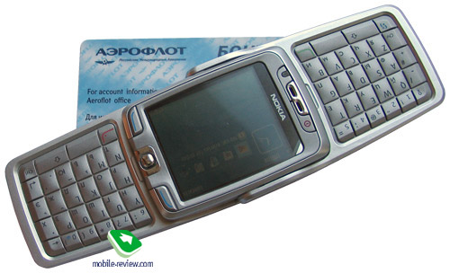
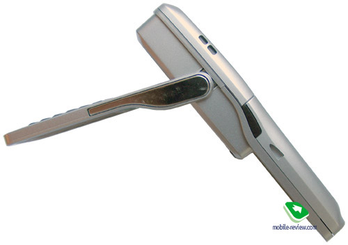
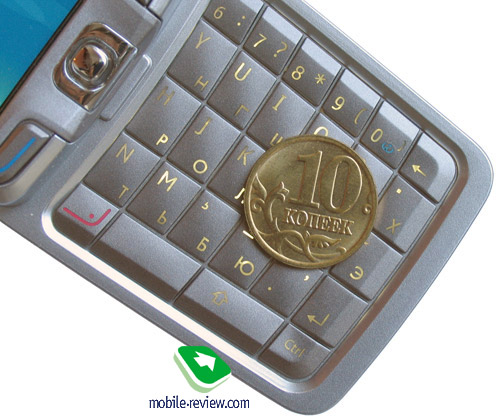
Folding out the thumbboard single-handedly is impossible due to the hinge being sprung hard enough, so that you will have to use both hand and a bit of an effort. By the way, it is not a problem, really, since you have to hold the thumbboard side-ways using two hands. Once you have opened the phone, the display layout automatically changes to landscape. The keyboard has two rows of symbols on it and the same white backlighting that can be switched on/off using a dedicated key. The quality and ergonomics provided by the QWERTY, thanks to its size and dual design, are very good – don’t even think of having a hard time with this thumbboard, it is just not possible. At present the market has seen only a couple of handsets sporting thumbboards this good, whereas the Symbian market doesn’t feature any rivals for the E70 at all, except for Nokia’s very own communicators. On the plus side, the phone has standard key combinations enabled, allowing users to copy and past text fragments in a way similar to the PC’s one (“Select All” is the only missing option). In standby mode typing a few letters automatically creates a new memo.


The E70’s screen boasts a 2.1” big diagonal and is in fact the same display as that found in Nokia N80, having a resolution of 352x416 pixels (34x41 mm). The colors are vivid and bright, as the maker claims it displays up to 16 mln of them. The screen accommodates up to 6 text and 3 service lines (phone mode). In the sun the E70’s display doesn’t get washed out or something – everything is fine about it. For the time being this is a sole smartphone making use of such brilliant display, so it is literally beyond competition here.
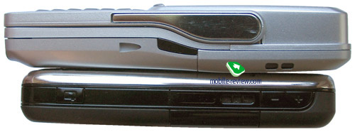
Getting back to the design of Nokia E70 I would like to note that the models comes in two trims – silver and black, while the latter looks more stylish, it has almost gone missing on the Russian market. I do realize that tastes differ when it comes to design, but, truly, the E70 has not much of aesthetic about it – the developers rather aimed at coming with a “tool for work” rather than a “beauty”. That is basically why the phone lack all those trinkets found on other models – it has only the most essential things on the casing, that’s all. But I can’t figure out why they have disposed of a volume rocket switch on the side. On the lift you will find a dedicated voice key, starting up the Voice recorder or Voice dialing. The Infra red windows sits on the right side.
Video, handset’s looks, handling (wmv, 9.2 Mb)>>>

The bottom end is occupied by a standard interface socket – Pop Port, as well as an old-fashioned charger slot (which is not slim). In the sense of the charger socket, the E70 seems to be somewhat out of place compared to other offerings launched pretty much at the same time.
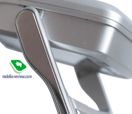
The hinge incorporates metal framings making the casing feel more solid, but the build quality was never a problem with the E70 in the first place, even though after some time of usage I found a back cover gap, which was not critical after all. But speaking of the paint applied here, I would rather give it “mediocre” mark for it does go off especially on the camera rim. If you are an active user, then expect the silver-coated surfaces to loose their attractiveness in one year’s time or so.

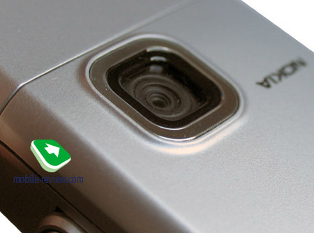
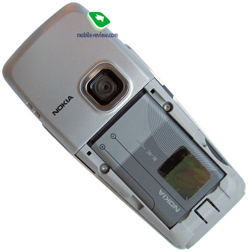
The rear would have been completely bald if there wasn’t a 2 Mpix camera lens, which is uncommon for Eseries, to tell the truth. Camera resolution-wise model E70 is the ultimate flagship among the company’s enterprise solutions.

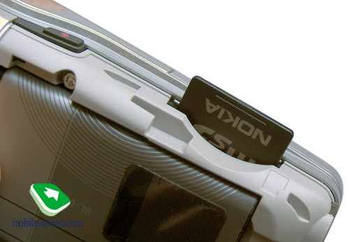
Beneath the battery you will find hot-swappable miniSD slot on the left. The handset utilizes a 1150 mAh Li-Ion battery (BL-6C). As the manufacturer claims it can keep the phone up and running for up to 7 hours in talk mode and up to 230 hours in standby. On average load (about 30 minutes of calls a day, a couple of minutes spent with other functions) the E70 remained “alive” for 3 days. Should you have Wi-Fi activated, get ready to have an empty battery in 3.5 hours of active usage. Taking account of the fact that retrieving mail does no good to the battery life either, so in the end 2 days is pretty reliable lifetime figure for the E70, which two times better than what Nokia N80 brings to the table – it is good, no doubt about that! It takes the phone about 2 hours and 15 minutes to charge from empty to full. The maker provides no batteries with higher capacity.


Highlights
Nokia E70 is a typical S60 3rd edition based smartphone, so dwelling upon its standard features would be a waste of time, below we are giving you the link to two dedicated articles, where you will be able to learn more about the Eseries capabilities and the functionality of the platform itself.
The E70 shows off 75 Mb of onboard memory, which is quite enough for most applications.
While carrying the handset in a pocket or bag with the key lock turned off, you might end up having the camera activated – I stumbled upon a case when a recorded clip was 40 Mb big, and furthermore, somehow it features (well, accidentally, to tell the truth) my conversations with friends and colleagues, so should I tell you how much I was surprised this in the phone’s memory? Completely black snaps weighting 142 Kb each sneak into the phone pretty much in the same manner. To make the things easier and less “dangerous” for you, I would recommend removing the shortcut to camera from the left soft-key.
The highlight found in the E70 that makes it somewhat different than other Eseries devices is that the menu item turning the display in landscape mode and back has gone missing, but it is something to shout about – when flipping the phone open, the screen rotates automatically, so that the developers considered image rotation in the phone mode a bit out of place, which eventually might be the right thing.
Extra applications include Adobe PDF, MailLauncher (Exchange-based mail), ZIP (handles corresponding archives), WorldMate (allows tracking weather, exchange rates, world time, the latest Vertu generation also features it onboard).
VoiceAid – the system reading out names of the items found in the menu and enabling users to dial numbers using their voice. Overall, nothing special here, compared to Nokia 5500 it’s an intermediate solution.
Covering the flaws of the bundled mail client, we should mention some milestones like impossibility to view a letter’s title and other fields on one screen, as they simply get shaved off the display. In fact it is a quite crucial hassle for many enterprise-users dealing with loads of mail daily.
Camera. Quality-wise the 2 Mpix matrix is not much different from that embedded in other Nokia-branded smartphones, but the thing is, thanks to the E70’s display both still images and video clips look pretty crisp, yet watching them on PC dissolves this “magic”.
Snaps can be taken in two resolutions - either 1600x1200 or 640x480 pixels – and three compression grades. Self-timer (10, 20 or 30 seconds) is also onboard along with night mode, multi-shot and three overlays – black-and-white, negative and sepia. So frankly there is not much to talk about as regards the camera – samples can be found below.
 |
 |
(+)
maximize, 1600x1200, JPEG |
(+)
maximize, 1600x1200, JPEG |
 |
 |
(+)
maximize, 1600x1200, JPEG |
(+)
maximize, 1600x1200, JPEG |
 |
 |
(+)
maximize, 1600x1200, JPEG |
(+)
maximize, 1600x1200, JPEG |
 |
 |
(+)
maximize, 1600x1200, JPEG |
(+)
maximize, 1600x1200, JPEG |
 |
|
(+)
maximize, 1600x1200, JPEG |
|
As for the E70’s video recording capabilities, it puts up three options – 352x288, 176x144 and 128x96 pixels. Sound may be turned off. In terms of quality the handset puts out moderate clips.
Video sample (mp4, 847 Kb)>>>
Impressions
This handset has no problems in terms of network reception quality, sound in loudspeaker is pretty good, person whom you’re speaking to will hear you well. The silent alert power is average, handset shakes in small trembling. The speaker produces enough of volume, but I can’t say it is any different from other single-speaker models.
Just like all 1G smartphones running off S60 3rd edition and having WiFi capabilities, the E70 couldn’t avoid an avalanche of software bugs leading to incorrect work of the file cache, application crashes and so on. Nevertheless most of them have been patched up within the first four months of sales, that’s why the handset seems much more stable now, but some shortcoming are still out there. Don’t bother too much about them, though.
Even though the handset is armed with a good thumbboard, its design will be the sticking point for many, which is confirmed with the sale rates – the mass market doesn’t need such feature-packed offerings, while the enterprise market doesn’t like it being spartan at a glance, and techi are not satisfied with how advance it is compared to Nokia N80, even though the latter costs more. I hear you ask about competition with the Eseries itself – it is non-existent at all, as its constituents target at different audiences that never overlap. Having relatively high price, the E70 makes the youth reconsider and pick cheaper solutions, but I really should mention that for the class this model originates from, it is retailed at a very justified price. Altogether this makes potential consumers overlook the idea of this device and look elsewhere. The share of those who will find the looks of Nokia E70 appealing and gladly accept is feature-packed interface as well as many illnesses of one of the first Eseries-labeled offerings, is not big – for a more solid proof check out its sales.
I really admire the persistence Nokia releases such niche-aimed solutions and segments the market even further with. Moreover, negative sales experience delivered by the prior models utilizing this form-factor has not made the company change its mind – don’t expect it to be left out in the future either, we are going to see more of fold-out thumbboards coming.
P.S. After having Nokia E70 for about three months as my main handset I have come to realize that the only thing I would like this phone to obtain is charisma. It simply doesn’t posses that attractiveness, even passion, no matter how strange it sounds. For example Nokia N91 has what it takes and thus we readily overlook some of its flaws, but as regards Nokia E70 – they have really got somewhat heavy looks to it over the edge.
Eldar Murtazin (eldar@mobile-review.com)
Translated by Oleg Kononosov (oleg.kononosov@mobile-review.com)
Published — 15 January 2007
Have something to add?! Write us... eldar@mobile-review.com
|
News:
[ 31-07 16:21 ]Sir Jony Ive: Apple Isn't In It For The Money
[ 31-07 13:34 ]Video: Nokia Designer Interviews
[ 31-07 13:10 ]RIM To Layoff 3,000 More Employees
[ 30-07 20:59 ]Video: iPhone 5 Housing Shown Off
[ 30-07 19:12 ]Android Fortunes Decline In U.S.
[ 25-07 16:18 ]Why Apple Is Suing Samsung?
[ 25-07 15:53 ]A Few Choice Quotes About Apple ... By Samsung
[ 23-07 20:25 ]Russian iOS Hacker Calls It A Day
[ 23-07 17:40 ]Video: It's Still Not Out, But Galaxy Note 10.1 Gets An Ad
[ 19-07 19:10 ]Another Loss For Nokia: $1 Billion Down In Q2
[ 19-07 17:22 ]British Judge Orders Apple To Run Ads Saying Samsung Did Not Copy Them
[ 19-07 16:57 ]iPhone 5 To Feature Nano-SIM Cards
[ 18-07 14:20 ]What The iPad Could Have Looked Like ...
[ 18-07 13:25 ]App Store Hack Is Still Going Strong Despite Apple's Best Efforts
[ 13-07 12:34 ]Infographic: The (Hypothetical) Sale Of RIM
[ 13-07 11:10 ]Video: iPhone Hacker Makes In-App Purchases Free
[ 12-07 19:50 ]iPhone 5 Images Leak Again
[ 12-07 17:51 ]Android Takes 50%+ Of U.S. And Europe
[ 11-07 16:02 ]Apple Involved In 60% Of Patent Suits
[ 11-07 13:14 ]Video: Kindle Fire Gets A Jelly Bean
Subscribe
|
