Review of Android 3.0 (Honeycomb)
Honeycomb was created as an OS for tablets and represents a particular branch of Android family. Historically, it appeared as an answer to Apple iPad, which offered an impressive benchmark for this segment. Google decided not to run tablets on older versions like 1.6 as the user experience was considerably inferior to that of iOS. As a result the version for tablets was being developed simultaneously with those for smartphones. It is a temporary solution and in future Android will have one OS for all devices. So far we have two Android branches: 3.0 and up for tablets and 2.x for smartphones.
Contents:
- Interface Organization
- Standard Applications
- Brief Conclusion
Interface Organization
The main difference between smartphones and tablets lies in the size and resolution of screens. With this in mind the interface was thoroughly reworked. Many typical actions of the "small" Android did not find its way into Honeycomb. To my mind the difference in user experience is not justified and it should have been avoided.
First example is the organization of desktops. There are five of them in the tablet. When you browse between desktops you see icons of apps and widgets. New widgets and icons are installed by pressing the icon + in the top right corner. The long pressing does not open the widgets menu, which is the first difference from a standard Android.
Widgets received 3G features and Google launched appropriate API for Android 3.0. For example, Books from Google is in 3G, but offers good usability. These are minor changes, which do not deserve much attention.
Another difference of Android 3.0 is the absence of hardware buttons. Everything should be done from the screen. I view it as a disadvantage. Hardware buttons are better at all times and the sole one in iPad is almost ideal.
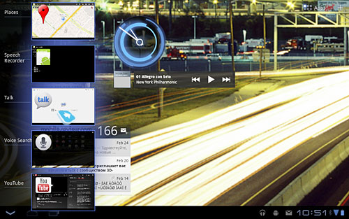
The left bottom hand corner in Honeycomb features three buttons: leftward arrow to return to the previous menu or exit; upward looking arrow for Home, while the last button is responsible for the menu with 5 recently launched apps (five windows in the left side of the screen).
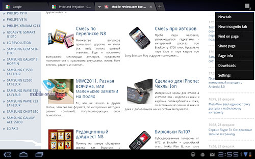
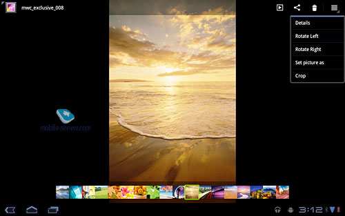
Android users with smartphone experience can ask where the menu button is. It disappeared and became context based. It appears if necessary in the top right corner where you can customize all settings for an app. It is not usual, but you can easily adapt.
All events like incoming mail and messages from apps are highlighted in the bottom right hand corner, but they stay there for several seconds only. You can activate them again by clicking the icon with the clock. An icon with the quick customization of several items pops up together with the settings menu. Below are shown all messages you received. It's up to you if it is convenient or not. Anyway, it is less irritating than Push messages in the middle of the screen in iOS.
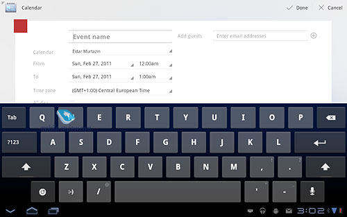
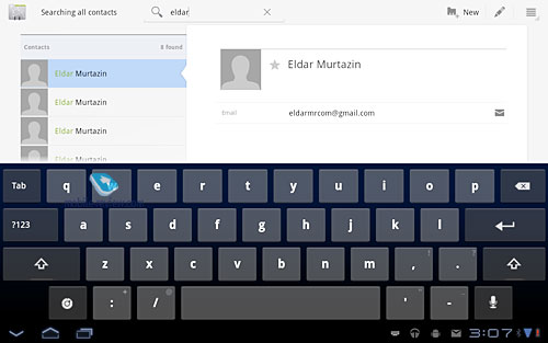
The keypad can be both horizontal and vertical. The copying of the text is supported. Click the text to highlight it and copy. Copying buttons are displayed in the top right hand corner. They would be more appropriate near the text.
You can learn everything you need about the new interface in Honeycomb within 20 minutes. There is nothing difficult here, but some solutions are not obvious. For example, in the gallery you can send a video to other devices, but you have to press and hold your finger on the video. In the context menu this option is absent.
The access to all apps is given if an appropriate button is pressed in the top right hand corner.
Back to the table of contents >>>
Standard Applications
Let's briefly mention apps in Honeycomb to avoid further repetition in future reviews.
Browser
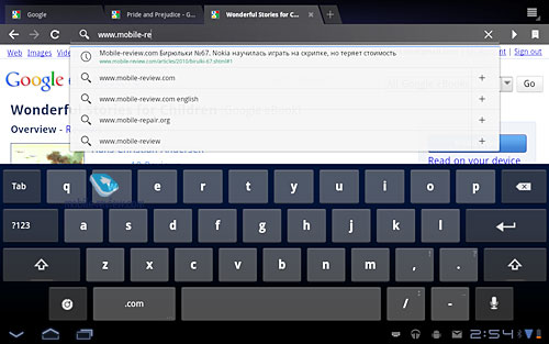
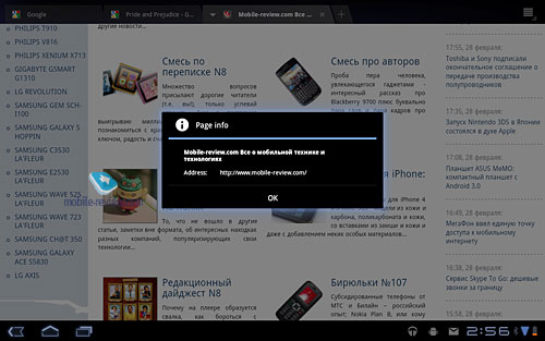
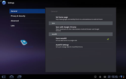
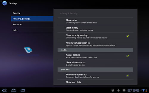
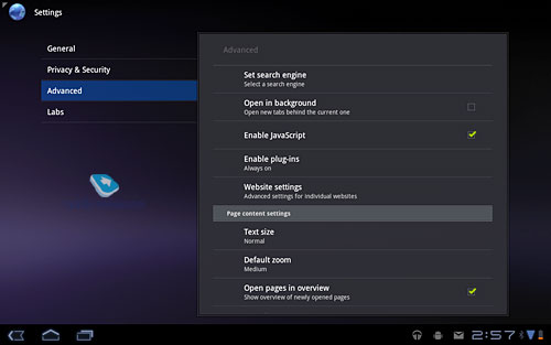
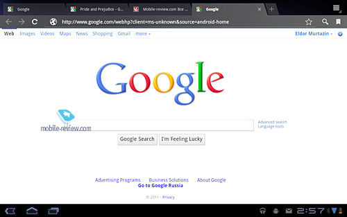
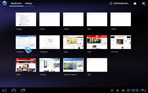
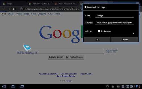
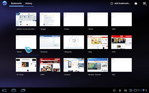
Taking into account the screen size in browsers Google tried to make the work with the browser as close to desktop PCs as possible. In the address bar you see Tabs. Click + to open a new window. The switch between windows takes no more than a second. The browser can automatically insert addresses, show history as miniatures and activate the Incognito mode. This fully fledged browser deserves considerable praise. Multitouch zooms the pictures and windows in and out.
As of the date of review the browser did not have Flash support (similarly to Motorola Xoom and Samsung Tab 10.1).
Calendar
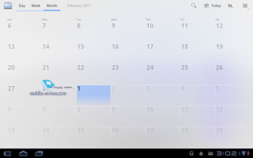
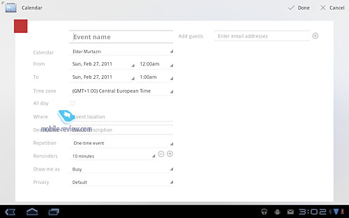
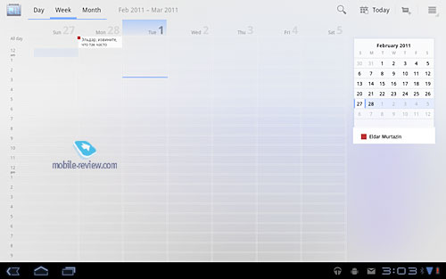
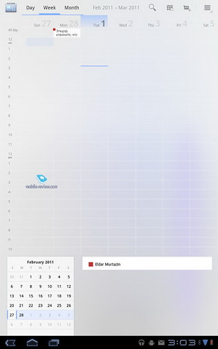
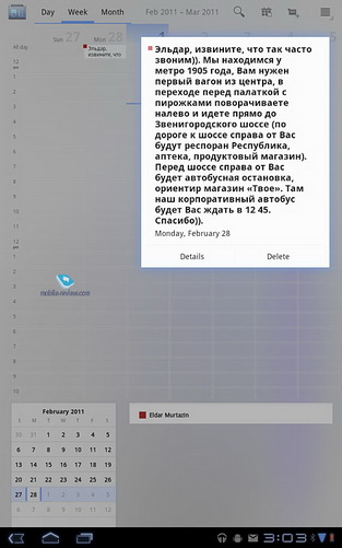
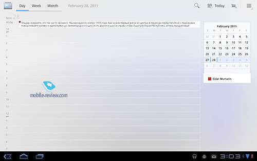
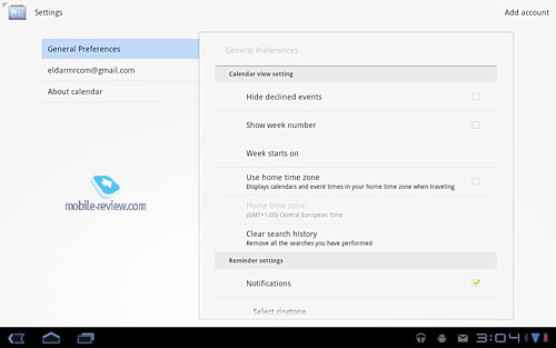
The traditional calendar is identical to the one in the standard Android. Big screen size turns the work with the calendar into a pleasant activity.
Calculator
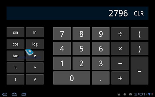
This usual calculator has a scientific mode as well.
Google Talk
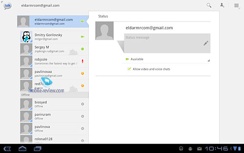
This app supports voice and video calls. Text chat is available too. This option looks fine in a tablet.
Clock
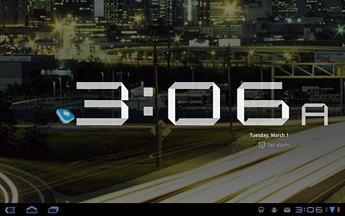
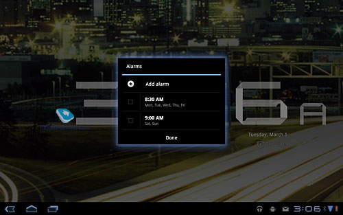
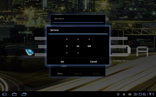
You can stretch the clock to occupy the entire screen. An alarm can also be used (with the repeat on particular week days).
Contacts
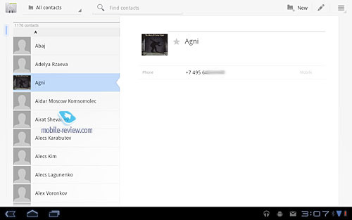
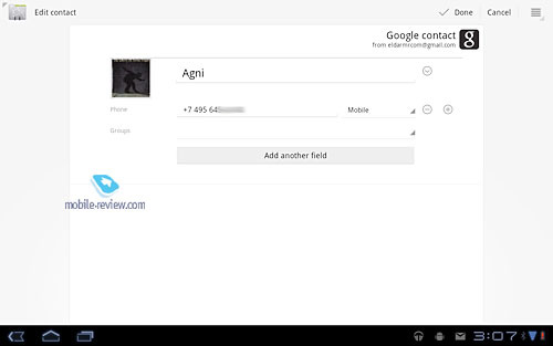
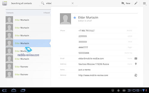
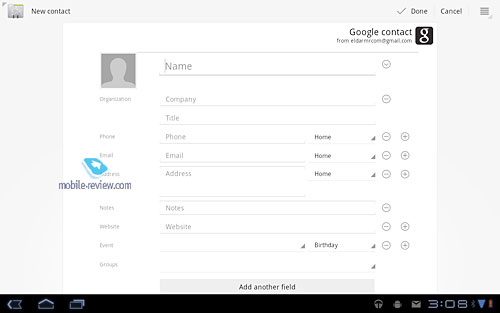
The list of Gmail contacts allows the addition of personal contacts, which are searchable. Everything is simple and predictable here.
Gallery
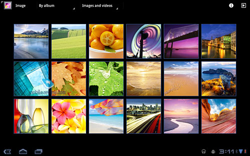
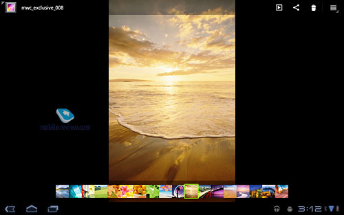
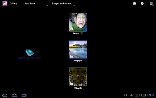
Photos are viewed as miniatures and there is a filter by albums. Multitouch can be used to scale pictures.
Music
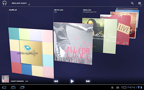
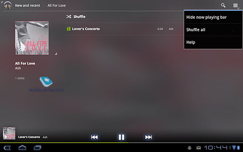
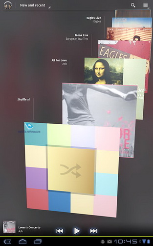
In this app the player got a facelift. By default albums covers are used in any screen orientation. When you open the album the track list is displayed. Filters are as simple as the app itself. There are no equalizers or additional features. This application can only play the music.
Gmail and Other Mail Capabilities
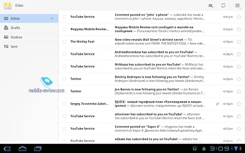
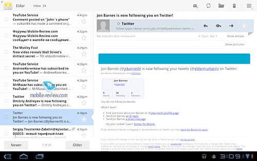
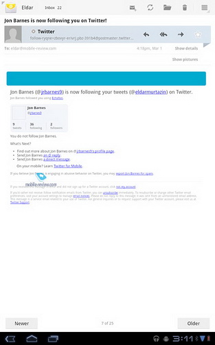
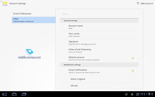
The interface of mail programs has not been changed. The desktop experience is retrained. You can judge yourself by the screenshots.
YouTube
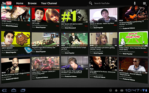
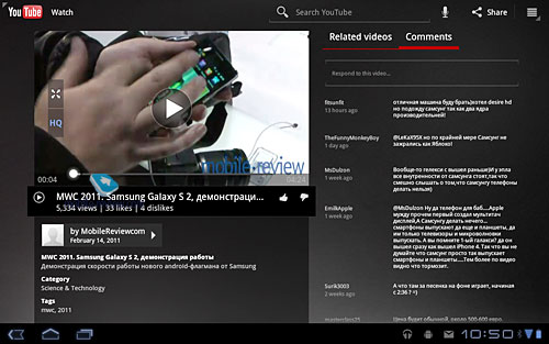
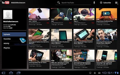
The window can host video miniatures from YouTube, but it is attractive only in the beginning.
Back to the table of contents >>>
Brief Conclusion
Immediately after the launch Honeycomb does not offer many multimedia features. All improvements are superficial. Let's take albums covers in the player. The absence of equalizers is a clear downside and other defects show that the OS was developed hastily and developers had no time to implement several features. It makes logical to launch 3.1 soon with other updates to follow. At least I would like to believe it.
Basic features of Honeycomb are comparable with iOS when Apple iPad was launched. On the other hand iOS has thousands of apps unavailable for Honeycomb. The absence of software is a downside for related tablets. New apps are appearing, but they are scarce and in the coming year their number will not be sufficient for Android 3.0. It is the main disadvantage of the OS now. The system is simple and easy to use, but it does not offer anything special.
Do you want to talk about this? Please, go to our Forum and let your opinion be known to the author and everybody else.
Back to the table of contents >>>
Eldar Murtazin (eldar@mobile-review.com)
 Twitter Twitter
 Livejournal Livejournal
Translated by Maxim Antonenko (maxantonenko@ukr.net)
Published — 10 March 2011
Have something to add?! Write us... eldar@mobile-review.com
|
