|
|
Comparative review of QWERTY-smartphones Samsung i600 and HTC S650
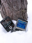
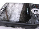
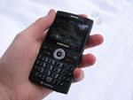
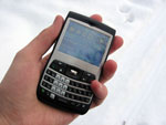
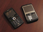
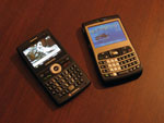
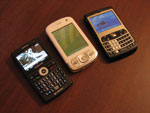
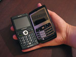
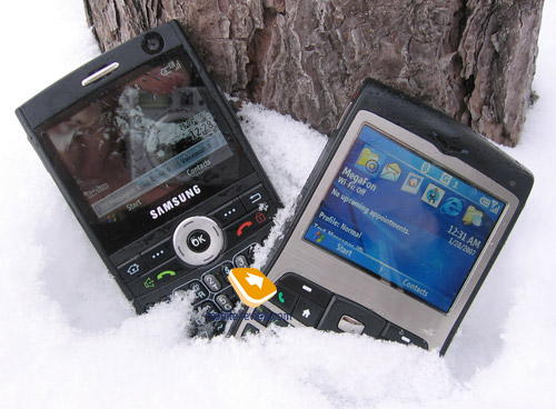
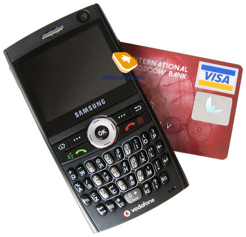
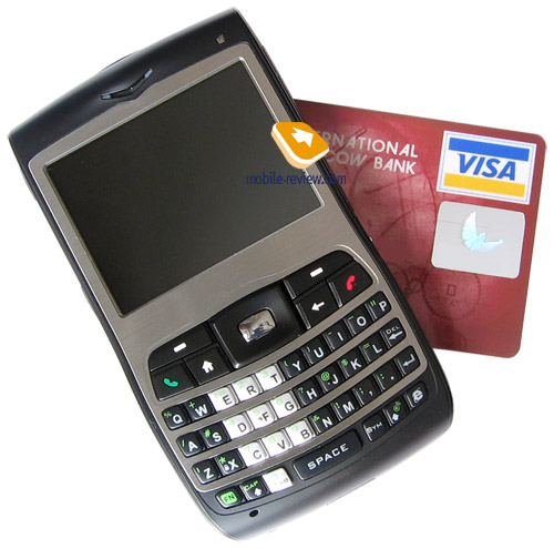
Live photos of Samsung i600 and HTC S65
Sales packages:
HTC S650 (Cavalier)
- Smartphone
- 1050 mAh battery
- User Guide
- Charger
- Pouch
- CD with software (ActiveSync and Outlook)
- Mini-USB data cable
- Stereo-headset
Samsung i600 (Ultra Messaging)
- Smartphone
- 1200 mAh battery
- User Guide
- Charger
- CD with software (ActiveSync and Outlook)
- Data cable
- Stereo-headset

It is not an ordinary occasion when HTC’s and Samsung’s paths cross on the market today. In case with the former, development and production of communicators and smartphones is what the company counts on – it is HTC’s field of expertise. And Samsung only gives this market a go, the Korean manufacturer is moving very deliberately, which enables him to avoid critical mistakes and blunders. The today’s review is dedicated to the face-off of two smartphones: HTC S650 (codenamed Cavalier) and Samsung i600. The company’s apply totally different approach to the development of QWERTY-equipped smartphones and we are eager to figure out how these vendors see the ways of this segment’s expansion.
In HTC’s case, they count on a more powerful CPU compared to the predecessor (HTC S620), which is crammed into a pretty much similar casing with the same controls onboard. And Samsung, on the contrary, has altered the hardware filling, yet doesn’t highlight that too much, since they have modified the design, and, more importantly, considerably enhanced the software as well. The latter deserves special attention – we have already talked about Samsung’s future on the Windows Mobile market, specifically, one of the Korean maker’s strengths is hunger for altering the operating system, expanding it with new constituents and even own applications. Particularly, this idea is well-materialized in the i600.
The flavor of both models is support for not only 3G networks (WCDMA), apart from GSM connectivity, but also HSDPA (High-Speed Downlink Packet Access). Taking account of the smartphones’ dimensions, such bevy of connectivity options does count for something – both manufacturers have managed to enable all these features for very pocketable casing, however for Russia all these technologies are not relevant, that is why we will confine ourselves to mentioning them only.
But first things should go first.
Design and controls
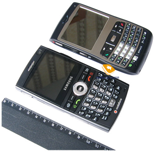
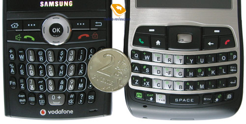
The devices are housed in the very conventional monoblock-style form-factor – both of them are on the wider side, especially HTC S650 – the thumbboard and landscape QVGA display make for such dimensions. The S650 (115x63x14 mm, 130 g.) is pretty bulky, but there is a very interesting peculiarity to it – the shapes, design and location of controls lend an overall pared-down feel to Samsung i600, which seems much narrower. In practice, however, the dimensions of the i600 (113x59x11.8 mm, 99 g.) are not too much different from those of HTC, saving for the fact that it is noticeably thinner. Either of the smartphones readily slips into just about any pocket, the only impediment one might encounter is HTC S650’s weight, but while in a trousers pocket, it is not too much of a burden. Speaking of Samsung i600 and its size, comparing it to ordinary phones makes some sense, if we overlook the width.

Looking at the design and controls found on these devices instantly reveals a whole lot of differences. It would even be better to say that the i600 and the S650 have only a few things in common, and for the rest prove to be totally diverse.
Design is one of the strengths for Samsung i600. For starters, the entire back and side panels are finished in soft-touch plastic – there has been much said on how effective this coating is, so we won’t dwell upon it here. In case with the i600, the plastic copes with its primary task and provides solely positive tactile feelings, making the smartphone pleasant to hold. Thanks to the plastic used, the casing is practically scratch-resistant and isn’t prone to smudge and soiling.

The i600 enjoys austere shapes, with the only exception of the bulge of the sides and ends, which provoke interest both among men and women. Combined, black color scheme and no-nonsense design leave a very positive impression – the phone doesn’t look bizarre even with its full-size thumbboard and numerous controls. The way girls and women react to this smartphone – unlike the S650, which is more dead than alive when it comes to appeal to women, the i600 catches their eyes outright. Basically, this fact clearly demonstrates all the benefits Samsung has gained from its slim fashion solutions. Application of this experience to the segment of smartphones and communicators will definitely boost popularity of the company’s solutions up owing to Samsung’s knack for designing good looking offerings.

At the same time for HTC S650 the design isn’t its centerpiece – here we deal with a consistent development of the S620; specifically the shapes has gotten rougher, previously smooth lines have transformed into edges. Dimensions-wise the model exceeds its predecessor, as well as its rival, Samsung i600. While the latter is reminiscent of a candy-bar on the face of it, the S650 is something more complicated. The shapes of the S650 dispose to serious work; I doubt someone would not figure out that it is a smartphone at a glimpse. As in case with the Excalibur, a metal inset frames the screen and fills up the space between the keys. The rest of the casing is made of standard black plastic, prone to scratches and worn spots, yet they can be easily gotten rid of by rubbing the smartphone’s surface. Forgoing of soft-touch finishing is something I can’t understand – if it was on here, the S650 would only gain some points in terms of tactile feelings.

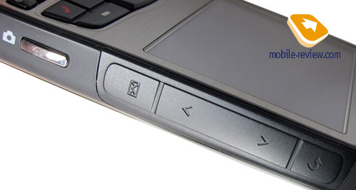
The layout of controls also differs much on the devices. Again, this is the place which reveals different approach applied by manufacturers, different points of view on what is the best way to manage a smartphone. By that we mean HTC’s trademark control – the JOGGR. This scroll bar made its first appearance with the S620, while in the S650 has implemented further development of this concept. Namely it has gotten bigger both length- and width-wise. Another alteration – while on the Excalibur it was angularly lining the immediate right side of the display, making navigation a bit easier, here it is located in the side-plate, square with the display. We can’t judge this change objectively, since for different people it will bring different meaning, on top of that, unique way of holding a device like this, each of us is used to, will make all the difference.
Similarly to the previous model, the JOGGR pad is separated into three parts – the main one, which is in the middle, allows scrolling up and down and selecting options. Using your right hand’s thumb, barely touch it and sweep your finger across horizontally or vertically, so that the currently opened list will be scrolled in a corresponding direction. If you do that twice and then tap and hold, scrolling will go on until you get your finger off. Two fast presses will select current item (for example detailed view of a contact, start up picked application or start playing back chosen track in the media player). This control also includes “Back” button and “Messages” menu shortcut – to make them work just short-press the corresponding button twice.
If so happens that you don’t need scrolling function assigned to the touch pad, it’s easy to turn it off and leave only volume control tied up with the JOGGR’s scroll bar. In settings you are able to adjust speed of double press and scrolling. If the worst comes to the worst, the JOGGR can be disabled completely, in case you keep pressing it accidentally – should you do that, the touch pad will be nothing more but a trinket on the S650’s casing. We are to note that the JOGGR proves to be handy only when you hold the S620 in right hand – in this case your thumb will be right over the scroll bar. Those, who have already gotten used to managing their devices in left hand, will need to a find way to learn again or forget about ever turning JOGGR on.

My personal impressions are as follows: despite the bar being smaller on the S620, it proves to be a tad more convenient to handle. Specifically, due to the way it is mounted, you don’t have to think about deflecting your thumb – it naturally fitted the bar. On the S650, however, you have to adjust the thumb in order to use the JOGGR effectively, which is not exactly handy for me, but I’m saying it again, these are nothing more but my personal preferences.
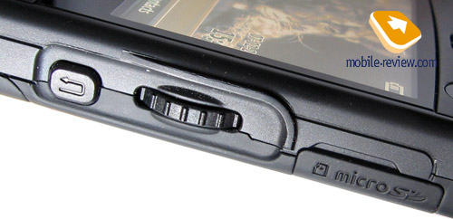
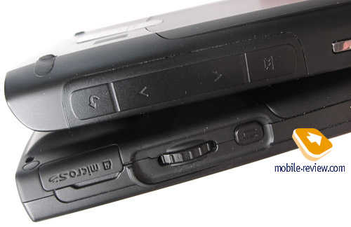
In Samsung i600 on the right-hand spine’s top sits the scroll wheel covered by a ledge and partly sunk into the casing. Overall, its placement is truly brilliant – you will never touch it when you don’t mean to. Using the wheel you can navigate through the menu (cyclic), scroll through texts, messages and so on. While at Today screen, holding the wheel for 2 seconds calls up fast side-menu – Samsung’s brand-new solution that we will look into as we go deeper into the review, specifically in the software part. Navigation through menu is done though pressing the wheel. All in all this control is pretty tough, so it takes some getting used, before you feel at ease with it. Further down, there is “Back” key for going one level up in the menu tree or bringing up the last used menu (if you are at the Today screen).

Putting these two controls face-to-face, one can draw an interesting conclusion. Saving for “Messages” menu shortcut found on HTC S650, the scroll wheel and the JOGGR perform identical functions. At that the scroll bar found on the S650 takes some getting used to, and there is always a chance that you will press the wrong button even after a month of playing around with the JOGGR. In Samsung i600 the scroll wheel is too tough right out of the box, but in a few weeks it gets more responsive, so that you never face this issue again. Another draw of the i600 is that when handling the scroll wheel you can actually feel it – this small trait in practice makes it far more tactile and easy to handle. The JOGGR on the S650 is way harder to master and not everyone will find himself at ease with it in the end, frequently because of the missing feedback. The classic wheel embedded in Samsung i600 is more conventional and thus its usage is more justified for the time being. But keep in mind that for HTC it is one of the first steps with this control and we should expect its enhanced version in future.

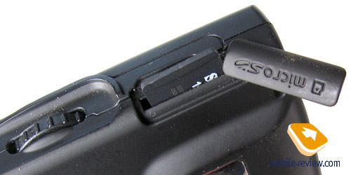
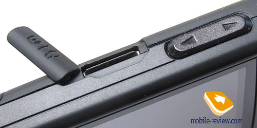
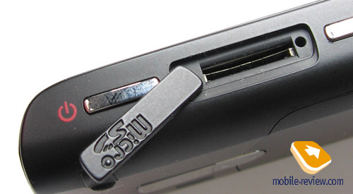
Apart from the scroll wheel, the right-hand side of Samsung i600 houses flap-covered MicroSD memory card slot, which is linked up with the casing, so that you will never end up losing it. The volume rocker is positioned more towards the top of the left spine, topping the flap-protected socket for charger and headset.


The bottom end of the device is completely bald, while on the top you will find the power button doubling as profile switcher, and the eyelet for a carrying strap, which will be a pain to attach since the holes are placed on the top end, while these straps are usually pretty short.
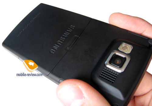
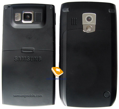
Turning the phone around reveals lens of a 1.3 Mpix camera, self-portrait mirror and a loudspeaker. Topping the display is VGA camera for video calls, which cannot be activated without making a video call.
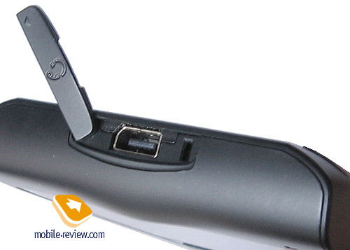
HTC S650’s right spine houses dedicated camera button (one short-press) located slightly below the JOGGR. The smartphone’s left-hand side features the following elements (in order from top to bottom): multifunctional button for power/lock/profile change, slot for MicroSD memory cards, Voice key. The memory expansion socket is covered by a flap, similar to that used in Samsung i600. On the top rim you will find sealed charger/headset socket, which is HTC’s proprietary ExtUSB slot. The issue with adapters for headphones seems like it is going to last forever, as the S650 doesn’t get the things look better and adapters for Motorola with its MiniUSB won’t work here either. For the time being ExtUSB adapters are produced by Brando, which is not providing supplies for Russia yet.


The rear of the S650 plays host to lens of a 2 Mpix camera module and a self-portrait mirror. The loudspeaker for ring tones is placed to the left of the camera. But that is not all about the back plate – at the bottom you will find rubber grommet covering an external antenna slot.
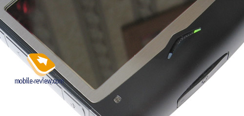
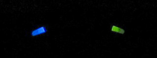
Located on the smartphone’s face next to the earpiece is a tiny eyelet, which is in fact the ambient light sensor, tuning the thumbboard backlighting on or off depending on current light conditions. And the earpiece itself comes integrated with two LEDs – the green one on the left displays status of the phone part, while the one to the right indicates status of wireless interfaces such as Bluetooth or Wi-Fi.


Summing up everything regarding the design, build quality, controls layout, etc. we shall note the following.
Looks-wise Samsung i600 proves to be a more universal solution, with its design playing one of the key roles, as the manufacturer has avoided flashy shapes and curves, yet made it remarkable. As a result the audience for the i600 might turn out to be broader than that of its counterpart. In HTC S650 the design is anywhere but in the spotlight, it lacks that “flavor” and thus leaves the foreground for the device’s functionality.
Unique features of the S650 include the JOGGR bar, which not everyone will be able to get used to – Samsung’s classic scroll wheel seems to be a winner here.
Presence of the eyelet for a carrying strap in the i600 is not a vital attraction, even though HTC S650 lacks this trinket. And in its turn the i600 doesn’t feature status indicators.
The ambient light sensor built into the S650 is more a positive feature, especially taking into account comparable batteries and higher brightness of HTC’s display – the sensor allows the system to marginally decrease energy consumption rate.
The build quality of both devices is equally high – we couldn’t find anything to complain about. Despite different ways of the battery cover mounting, in both cases it sits well in the slot and doesn’t know the word of “gap”.

Navigation controls, QWERTY-keyboard
Availability of a QWERTY-keyboard – the foremost attraction of either of the models. In facts, this aspect is the key point basing on which the companies have been building up positioning, developing design. And once again you can see how different the standpoints of these two vendors are – the thumbboards are not like each other at all, so let’s give them a close-up.
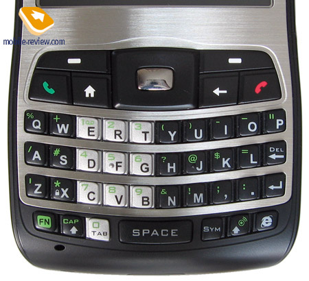
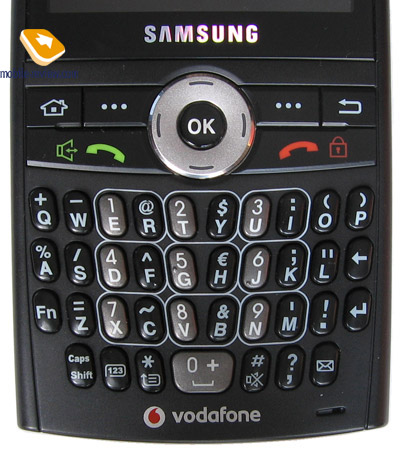
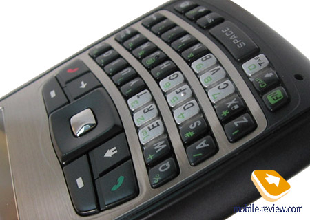
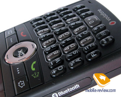
Both smartphone employ pretty much the same layout – all buttons are arranged in for rows (37 buttons in sum) with each of them being slightly curved (the S650’s thumbboard to a greater extent), which in theory makes for a better two-handed typing experience. But entering text or managing the devices single-handedly was never a problem. But that is all we can say about similarities. Now onto the differences.
First – keys marking. It comes as no surprise that every manufacturer makes use of an own marking, since this field (and even the ordinary handsets) is currently beyond standardization fever. All this was said in regard to the symbols, while the alphabetic layout is the same for either of the devices. The foremost difference here is layout of numeric buttons.
On HTC S650 the numberpad occupies a block placed on the left side of the thumbboard and is marked in light color (compared to the black-colored alphabetic keys), which brings about no problems with locating it. It does come in handy, since being arranged into a single block, the numeric buttons are easy to access.

Samsung i600 features a more specific approach to positioning of numeric keys. For a start, let’s look at their color, which is dark-grey, contrasting the black keyboard. However in the sun or poor light conditions, figuring out which is which might prove to be somewhat difficult – glares and glitter make it even harder. Another thing that should be highlighted - sparse placement of the buttons, meaning that the numberpad is arranged not in a single block, but in three columns separated with alphabetic rows, so that in the end it takes up the central part. Combined, these two peculiarities hamper managing the numberpad at the beginning, forcing you to go though another getting-used-to. Compared to the HTC’s solution, the novelty put in by the Koreans is somewhat out of place.

The alphabetic keyboard of the S650 is arranged in three cramped rows of square keys, measuring up at less than 5x5 mm. Pressing adjacent keys is sometimes a real struggle due to the inadequate space between them, but after some getting used to, the keyboard brings about no problems.
Samsung i600 plays host to vertically stretched well-spaced buttons (which are slightly bigger than the S650’s – 4x6,5 mm). Pressing adjacent keys proves to be a tad easier than with HTC S650, over and above, a small advantage of the i600’s thumbboard is the fact that all buttons raised above the surface of the phone a bit higher, which brings managing them a tad closer to the “breeze” state. And for the rest, both smartphones provide pretty much the same texting experience – having picked either of them, in a few days you will get used to its thumbboard and won’t pay any attention to the keys’ size or shape.


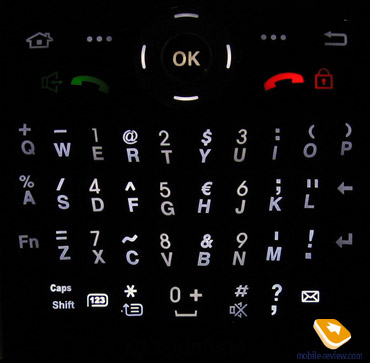
The smartphones share dim white backlighting in common. In fact, dim light coming from beneath has more of a plus in it, since presence of this many buttons brings about the need to put in a special way of backlighting, because if it is too bright, as in HTC S620 (Excalibur), readability of symbols decreases dramatically. With triple-marking (Roman, Cyrillic alphabets and extra symbols) on the keys, dim light is just the right thing. In Samsung i600 and HTC S650 backlighting brightness and evenness levels are pretty much the same.
Navigation controls traditionally separate the QWERTY-keyboard and the display – while the S650 and the i600 feature the same buttons over there, layout is what sets them apart.
On HTC S650 all keys are slightly raised above the display, which makes for easier usage. The navigational key with a rectangular silver key in it is a breeze to handle, thanks to the uplifted edges, enabling you to avoid wrong presses. The soft-keys flank the top of the navi-pad, while at the bottom you will find “Today” screen shortcut (on the left) and “Back” button (on the right), which means that pick/hang up keys are placed to the left/right of the abovementioned soft-keys. Being pretty bulky, the navigation block delivers no issues and leave a positive impression.

However Samsung i600’s navigation controls are a wholly different story – regrettably, a negative one. The buttons here are as big as those found on HTC S650, but they simply don’t manage to provide the same level of convenience. First, the entire block is mounted flush with the body of the device – even the navi-pad with OK button in the middle doesn’t stick out. As a result, pressing the keys is pretty challenging, especially the navigational pad, personally I just couldn’t stop touching the adjacent buttons when was trying to handle it. What is more, mastering it is next to impossible – anyhow you will have to be accurate and concentrated, otherwise you will end up having loads of wrong presses.

Display
These two models share screen resolution (QVGA, 320x240 pixels) in common and on top of that are both landscape-orientated, armed with TFT and capped to 65 K colors, which is the restriction put in by the OS.
Samsung i600’s display measures 2.3” (41x35 mm) diagonally and presents you with 5 levels of backlighting, however the third works great already. The horizontal viewing angles are really good – the image doesn’t get distorted even at maximum deviations. Nevertheless, the vertical angles are very mediocre and don’t ensure good-looking picture even at minimal angles. It is worth mentioning that HTC S650 does no better in this field, therefore in this very aspect these models are evenly matched.
The display found on HTC S650 boasts a 2.4-inch diagonal (50x37 mm) and regrettably lacks backlighting settings that would allow lowering its glow. Faced-off against the S620 (Excalibur), the S650 instantly comes out on top in terms of backlighting brightness – you will spot the difference outright. But it is not only the S620 that lags behind HTC S650 in the sense of brightness - Samsung i600 cannot put up the same level either.
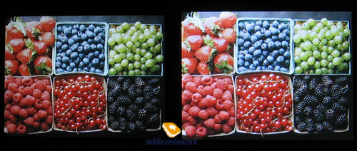
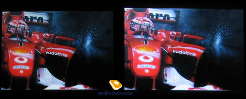
Due to being physically smaller at the same QVGA resolution, the Samsung i600’s display provides a sharper, less grained picture. But overall the screen on the S650 is a tad more vivid, crisp and its backlighting is superb, as mentioned above. On top of that the i600’s display cover is tinted, which makes the picture is bit dimmer and less crisp than that of the HTC S650.


Battery life
The rivals carry comparable batteries onboard – for Samsung i600 it is 1200 mAh Li-Ion, and for HTC S650 – 1050 mAh. In conditions of Moscow networks at 20-30 minutes of calls a day alone, the S650 lasted for 2,5 days, while the i600 managed to put up worse figures – 1,5-2 days.
When we got heavier on other functionalities, i.e. 30 minutes of Web surfing, 30 minutes of documents viewing, battery life of either of the smartphones gets cut in half, down to 1,5 and 1 day respectively. Judging by the outcome of this test, we have all the rights to claim that over at HTC they treat the issue of power consumption more carefully – even despite showing off far superior display brightness and more of the real estate compared to Samsung, HTC S650 lasts longer.
But we will reserve our final judgment until these devices actually hit the market, since the test versions of the smartphones do differ from the commercial units. That is why the battery life figures might change in future. If we will have a change to get our hands on commercial units, we will definitely update this review with results acquired on up-to-date versions of the S650 and the i600.
Camera
For such sort of devices camera is a mere formality, furthermore among enterprise users its absence might turn out to be crucial when deciding on which phone to for, as now more and more models regardless of positioning get equipped with camera modules. In the cases with the highlighted smartphones, the “camera boom” affected both Samsung i600 with its 1.3 MPix camera and HTC S650 where 2mpx camera is installed.
Camera of HTC S650
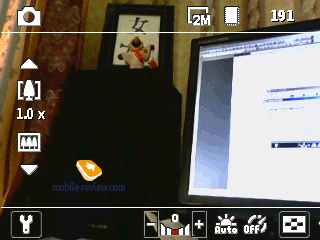
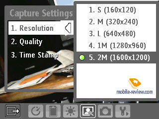
All recent HTC-branded solutions are characterized by a specific user interface: semitransparent menu laid on the viewfinder mode of the display. Generally speaking, it is quite comfortable but switching between menu items could be simpler. And now a few words about camera interface and settings (names of options and menus are given for the local version of the communicator). Current shooting resolution can be changed in Settings or by pressing key “2”. The following resolutions are available:
- 2M – 1600x1200 pixels
- 1M – 1280x960 pixels
- L – 640-480 pixels
- M – 340x240 pixels
- S – 160-120 pixels
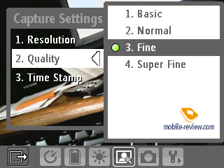
Picture quality (affects mainly size of an image):
- Super Fine
- Fine
- Normal
- Basic
White balance (can be changed by pressing “3”):
- Auto
- Daylight
- Night
- Incandescent
- Fluorescent
Effects:
- Grayscale
- Sepia
- Cool
- Negative
Values of Contrast, Saturation, Hue, Sharpness, Contrast can be altered as well (adjusted automatically by default). Advanced settings include self-timer, time stamp, shutter sound and some more.


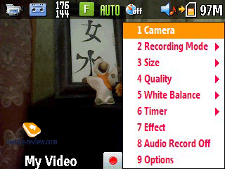
Using “1” key you can easily navigate through the shooting modes and get into video capturing, for example. The device records video in MPEG4, MotionJPEG, H.263 formats with a resolution of M (176x144) or S (128x96). All in all the settings for video copy those of still images, the differences include: sound recording (on/off), adjustable clip’s length and size limits. Quality, as well as resolution, of the video clips captured with the S650 is quite mediocre:
Sample video 1
Sample video 2
Apart from photo and video modes the S620’s camera has some more to offer – video for MMS, still image for a contact, sport and panoramic modes, which can be activated by pressing “1”. As regards “sport mode” – it’s a sequence of shots (up to 5) taken in rapid succession.
In panoramic mode the device “sticks” together taken snaps on its own. Because of that the final picture looks quite authentic. “Stuck” parts can be spotted only when viewing a picture on a PC screen. Picture quality leaves much to be desired, which is another way of saying that HTC hasn’t changed its attitude towards camera – it still plays a role of an add-on.
 |
 |
(+)
maximize, 1600x1200 |
(+)
maximize, 1600x1200 |
 |
 |
(+)
maximize, 1600x1200 |
(+)
maximize, 1600x1200 |
 |
 |
(+)
maximize, 1600x1200 |
(+)
maximize, 1600x1200 |
 |
 |
(+)
maximize, 1600x1200 |
(+)
maximize, 1600x1200 |
 |
 |
(+)
maximize, 1600x1200 |
(+)
maximize, 1600x1200 |
 |
 |
(+)
maximize, 1600x1200 |
(+)
maximize, 1600x1200 |
 |
 |
(+)
maximize, 1600x1200 |
(+)
maximize, 1600x1200 |
 |
(+)
maximize, 1408x480 |
Camera of Samsung i600
Samsung’s smartphone employs interface with pop up windows. To change shooting mode or other settings you should choose a menu item first and then you’ll see a menu with settings in the right part of the screen. And during all this time the screen doesn’t shift back from the viewfinder mode. With the help of “1” key you are able to switch between still image and video capture modes; a flick of “2” gives you an opportunity to change shooting mode and with “3” you change current resolution. Other numeric keys are also enabled for shortcut navigation; each of them alters set of effects or other settings. For still image mode the following resolutions are available:
- 1280x960 pixels
- 640x480 pixels
- 320x240 pixels
- 176x144 pixels
Picture quality:
- Super Fine
- Fine
- Normal
- Ecomomy
White balance (can be changed by pressing key “5”):
- Auto
- Daylight
- Cloudy
- Tungsten
- Fluorescent
Effects:
- Black & White
- Negative
- Sepia
Timer can also be set up. As for additional settings, autosave, turning the shutter sound on/off and some others are available.


Video is captured in 3gp format at a resolution of 176x144 or 320x240. On the whole, the settings in video recording mode are the similar to those for still images. Specific features include only sound on/off – and that’s about it for video capture settings.
Sample video
Apart from video capture and still image modes there are some others available: video for MMS, multi-shot and mosaic modes. Using key “2” you can switch between them. Picture quality proves to be average- for Samsung-branded devices the camera is quite typical and has got nothing that could distinguish from its counterparts.
 |
 |
(+)
maximize, 1280x960 |
(+)
maximize, 1280x960 |
 |
 |
(+)
maximize, 1280x960 |
(+)
maximize, 1280x960 |
 |
 |
(+)
maximize, 1280x960 |
(+)
maximize, 1280x960 |
 |
 |
(+)
maximize, 1280x960 |
(+)
maximize, 1280x960 |
 |
 |
(+)
maximize, 1280x960 |
(+)
maximize, 1280x960 |
 |
 |
(+)
maximize, 1280x960 |
(+)
maximize, 1280x960 |
 |
 |
(+)
maximize, 1280x960 |
(+)
maximize, 1280x960 |
Performance
Samsung i600 is powered by a 416 MHz Intel PXA272 CPU. Out of 64Mb of RAM a bit more than 48 Mb are user-manageable, which is enough for every last thing you might need, thus there is no sense in expanding memory volume today. The size of bundled flash-memory (55Mb) is enough for the most essential applications, for other cases there is the memory expansion slot available.
HTC S650 houses the flaming (as we found out during tests) 400MHz Samsung S3C2440 CPU. The user has access to 53 Mb out of 64 Mb or RAM, add to this 80Mb of flash-memory for downloaded applications and slot for microSD memory card and you all set.
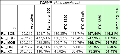
Testing was carried out with the help of TCPMP application.

As you can see, HTC S650 performance is a step above what its rivals manage to put up, even Samsung with its higher CPU clock rate is lagging behind. It is interesting that visually one could hardly tell the difference between these devices in terms of interface speed– both the i600 and the S650 are pretty speedy and a breeze to handle. The resulting gap the in smartphones’ performance rates can marginally influence the choice between two models, not more than that.
Connectivity
As mentioned above, the cellular module is one of the main highlights in both devices. The smartphones don’t make any difference which network to operate in – 2G (GSM 900/1800/1900 for i600 and GSM 850/900/1800/1900 for S650) and or 3G (HSDPA/UMTS). Both devices sport EDGE support.
There is no Infrared port in either of these models. Speaking of Samsung we can say that the company will probably cut off Infrared in its prime solutions and smartphones from this point onwards. And as regards the HTC, the company is not going to forgo this standard at all - we will keep stumbling upon it in some of the impending models.
The interface slots are standard for each company - in HTC S650 ExtUSB is used both for charger and headset. And in Samsung there is also a sole slot for charger, data cable and headset – the slim socket in the models coming from the top and mid price-brackets
Built in Bluetooth module (version 2.0) is carried by both smartphones. The list of supported Bluetooth profiles, which barely differs from that found on Excalibur, is pretty much the same for either of the offerings.
- A2DP-Source
- FTP
- AVRCP-Target
- BNEP
- FT-Client
- FT-Server
- GAP
- Generic Object Exchange
- HandsFree-AG
- Headset-AG
- HID profile
- OPP-Client
- OPP-Server
- PAN profile
- SAP-Server
- Serial Port profile
Wi-Fi version 802.11 b/g. The WM 5.0 upgraded with AKU 3.3 features enhanced setup of Wi-Fi and a stand-alone Wi-Fi-manager (look up in the dedicated AKU 3.3 review at out site). Everything works like a well-oiled machine; setting up Wi-Fi is everything but a hassle. For the time being, the suite of applications allowing you to use Wi-Fi to its fullest hasn’t changed a bit: Skype is one of a few apps (saving for Internet) where Wi-Fi is a must. The latest version of this program for smartphones has finally learned how to make voice calls.
Software
Both smartphones run on Windows Mobile 5.0 with installed AKU 3.3 service pack. You can get more information oo its standard capabilities in corresponding reviews at our portal.
The problem with SMS-messages tune mentioned in HTC S620 review has survived another update pack, so we are still looking forward to further improvements.
Review of Windows Mobile 5.0 for Smartphone>>>
Review of Windows Mobile AKU 3.0>>>
Now let’s turn our sights to the extra software, which really should be put in the spotlight when speaking of the i600 and the S650.
HTC S650
Set of additional programs of S650 can be compared with that of its predecessor, S620. Generally speaking we could not find any changes except one additional program.

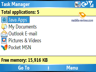
Task Manager. Enables managing currently running applications, clearing up RAM, check out system information.

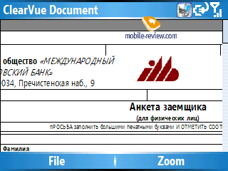
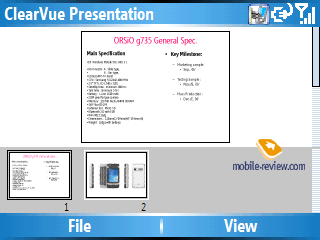
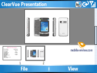
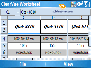
Clearvue Suite. A third-party software kit for browsing MS Office and Adobe PDF documents, which includes: Clearvue Document, Clearvue PDA, Clearvue Presentation, Clearvue Worksheet. Documents can be viewed only without a possibility to edit them.


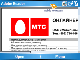
Adobe Reader LE is the most widespread program for viewing PDF documents, and this is its mobile edition. Much like its elder brother, the applications never seems to be in a hurry. Loading a page takes about 10-15 seconds, should the document contain a considerable number of schemes and pictures each page will load for half a minute or even longer. It should be noted that for small files, the viewing capabilities, this application provides, are more than sufficient..


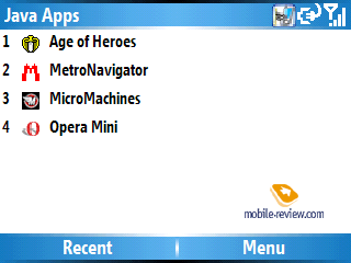
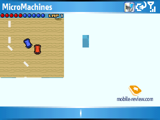
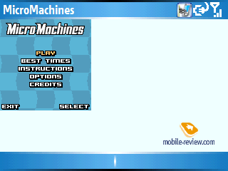
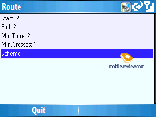
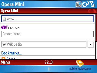
Java - emulator for applications written on Java. Its capabilities are very limited; in light of this fact 3D Java is not supported. In most cases support for Java-powered applications is not relevant on smartphones and communicators, today there are a tons of programs for Windows Mobile. Some users make an exception for OperaMini as this app is simply the winner in save-my-traffic contest. Another example - for Java-games addicts that need such emulator badly. However the regular emulator does not support additional libraries used for creation of Java applications for Nokia-, Motorola-branded and some other handsets. Hence nobody guarantees that these applications will launch and operate properly.

Some games can be launched this way:


And applications that way:

Although, most applications are fine:


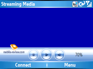
Streaming Media - an application playing streaming video and audio. Once you have stated the source in the corresponding field, the device starts data upload and content playback. As for the settings, Internet connection speed and buffer size are available.

This is the point where we wrap up the story on HTC S650 suite of applications. You shouldn’t be much surprised, though, as concerning additional software HTC sticks to proven solutions only.
Samsung i600
Production and scientific powers allow the company any initiative, one of which has affected the segment of Windows Mobile devices. The idea is neat and, apparently, will prove successful if Samsung will take on further development of the project. Here we are speaking about the development of extra software for Windows Mobile and inclusion of these apps into Samsung-branded devices. Also, doing so the company upgrades the OS as well – specifically the i600 with its revamped interface and some elements added. In our review we will put S in brackets so as to highlight applications introduced by the company itself.
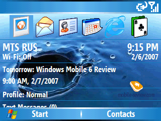
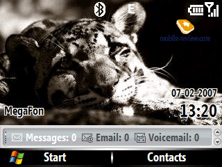
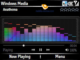
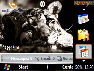
To round the things off Samsung has come up with its own screen “Today” theme known as “Black” and a skin for Windows Media Player. Also they have added more styles to pick from for “Today”. In this case everything is quite simple: the interface has been re-painted into black and dark-blue tones, which has allowed the company to achieve a newsworthy effect. Black stripes at the screen’s top and bottom blend with the display’s frame color (which is also black) in such way that it is quite difficult to tell where the screen ends and the frame begins. Quick menu, Samsung’s very own development, is also styled in black. New styles enable you to choose “Today” screen with watch, calendar or a bar with shortcut (can’t be set up) to various functions found at the bottom of the in the screen.


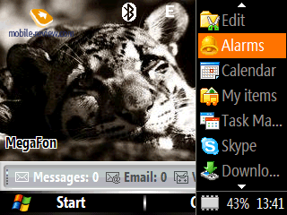
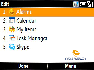
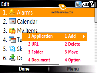
Quick Menu (S). Menu is brought up by holding scroll wheel for 3 seconds and appears on the screen’s right side. At its bottom are current time and volume of free RAM (%) indicators. The upper part of the panel contains vertically arranged applications – there can be more than 20 of them created, yet you can view only 3 at a time, while the others are available with jogging the wheel. You are at liberty to put on the list applications as well as links (URL), folders and specific documents. All items in the Quick Menu can be viewed as thumbnails without captions or small icons with captions on the right.
The Quick Menu is an interesting novelty – I would even say that it is something more than just another app added just for the sake of it. After using it a couple of times you get permanently addicted to the convenience it brings about.


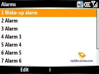
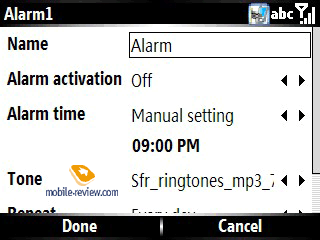
Alarms (S). Up to 9 alarms can be set up, specifically the following options are available: alarm name, alarm activation (time or a pre-defined interval after switch-on), tune, repeat mode and cyclic triggering, if ignored.


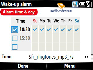
This menu also features Wake-up Alarm. This is an alarm with manageable schedule and three fields for different triggering times, at that you can manually set when the alarm will trigger on particular days. The only available Alarm tone works for all triggering times.

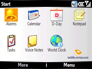
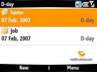
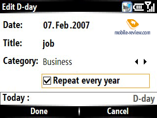
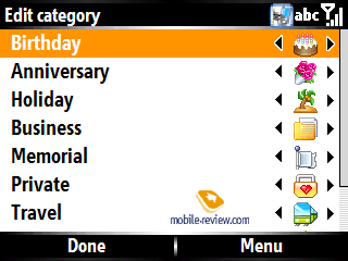
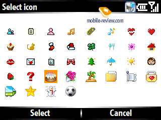
D-Day (S) is an application similar to the conventional “Tasks”. Events can be sorted by categories, date and name. You can rename each type or give it a personal icon. For a new event, apart from the type, you set name, repeat mode and date.


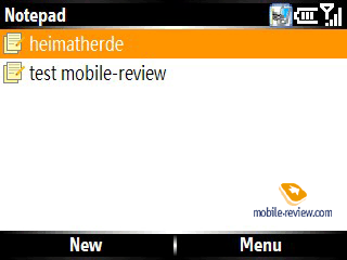
Notepad (S) – a very basic app for making notes. All memos can be sorted by name, date and size. No other specific features were spotted here, saving for the fact that it had been developed by the Korean developers as well.


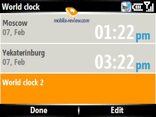
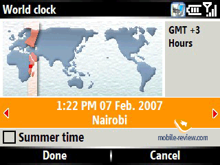
World Time (S) – this application shows current time in three cities you have chosen. While making a choice you see the world map on which you can pick the city you need.


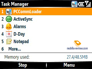
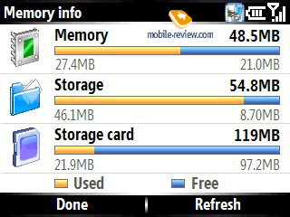
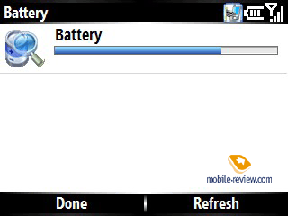
Task Manager (S) which is familiar to each and everyone allows viewing launched applications and terminating not used/required ones. Apart from viewing the applications list, memory and battery status bar is available.


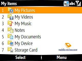
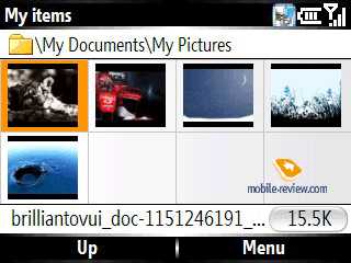
My items (S) - a counterpart of the standard explorer. Such highlights as view options (list or icons) setup, slideshow, file size display are enabled in the My items app. As for drawbacks, the program recognizes only music, video and documents and doesn’t allow for handling other file types.


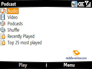
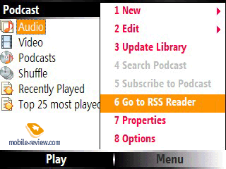
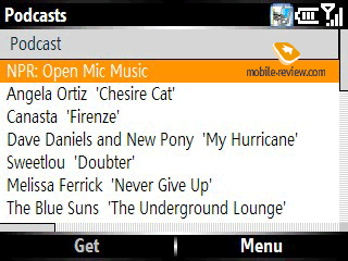
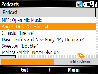
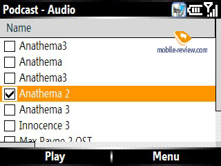
Podcast (S) – application for uploading podcasts and viewing multimedia (music and video) content of the smartphone. Usually downloading a podcast via GPRS-connection takes quite a while; this comes as no surprise, taking account of each podcast being several megabytes big on average. Loaded podcasts are shown in audio or video pack (depending on the type). Windows Media Player is used for playback here. The application also keeps track of the most popular podcasts and the recently played.


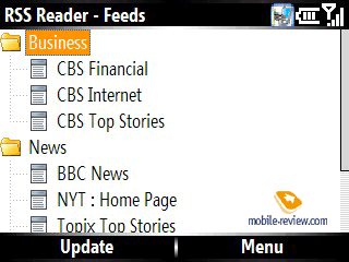
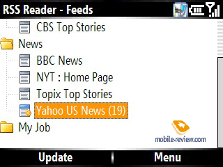
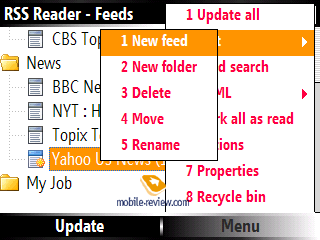
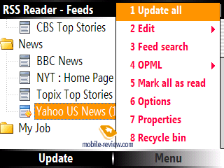
RSS Reader (S) – a tool for reading news, RSS-channels and RSS-feeds. This app makes a perfect match with the i600, and Samsung’s decision to create such application is worth respect. The app packs enough of punch to allow for easy checks of news feeds on the go. In each of the numerous folders you can create infinite number of RSS-channels. Should you have a set up news feed on PC you can import it to the application by selecting OPML file you need or citing the link to this line on the Web. For stand-alone channels you can set sorting type and view mode (with/without titles/description). Settings also include maximum number of uploaded news, manual or automatic updates.


While viewing specific news feed the display is divided into two horizontally laid out blocks. News headlines are placed on the top and at the bottom are the news item contents. Leaning the navigational key rightwards you jump into reading mode, with the field marked in yellow. Should you try to load a whole article the program will automatically give the web-browser the link.


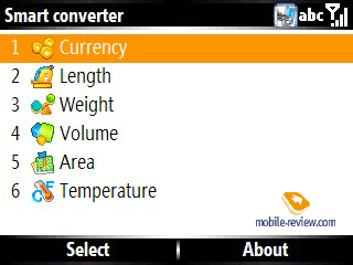
Smart Converter, Stopwatch, Search don’t need an in-depth explanation. These applications are quite simple and have nothing to shout about apart from their core functions.


Voice Assist is the application that helps to master voice dialing and voice commands. Voice control is speaker-independent, just as voice dialing is. All tags are created automatically and match names of contacts, applications and documents. So using voice you may launch all files, documents and programs.

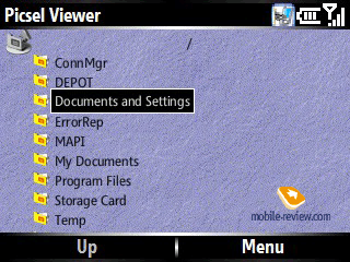
Picsel Viewer replaces the standard Microsoft programs for viewing PDF and Office documents. The application has been adopted by the i600 for ordinary Samsung-branded business handsets (D600, D830 and etc.).


Conclusion
Sound quality provided by the earpiece is pretty decent both in the i600 and the S650, which is something we have come to expect from Samsung and HTC offerings. Vibro alert in HTC S650 is a bit rougher and easier to feel, while the i600’s quiver is not a big deal to miss. In spite of the fact that the i600 and the S650 retain only one speaker for ring tones, its volume level is pretty high.
Samsung i600 arrives in the market in February, in Europe the device has already hit the shelves, while in Russia it is due out in summer or a bit earlier. The retail prices are still higher than the reasonable level – about 500 USD, but keep in mind that this offering is new to market, so in course of the following month the price drop down to the adequate level. Speaking about HTC S650 we should say that the company is not brining it to the Russian and even to European markets jut yet (perhaps they will reconsider, but it is what it is for the time being). Taking a glance back at Nokia E61’s and Excalibur’s prices (which have already been mentioned above) the things take a very intriguing turn. In any case the price for Samsung i600 and HTC S650 will include support for UMTS networks and HSDPA standard. And it is quite logical as these smartphones are the first devices on the market sporting high-speed data transfer support and their positioning s in Europe will certainly have something to do with these connectivity options.. In Russia the word “HSDPA” means nothing to the consumer and even an expert will remain indifferent as for Russia it is only a sweet dream up to date.
Thus, in either of the devices, performance is what everything is all about, and for the i600, the suite of pre-installed software is also worth mentioning. In this very case we see consistent continuation of the line-ups for both HTC and Samsung. But while Samsung has chosen the path of further development of its device (by enhancing performance, slimming down the design and coating it in soft touch plastic, updating software), HTC has decided to keep pushing on power, which has gone up greatly, making the smartphone the most powerful among its direct rivals (i320, i600) but in return we have gotten less sophisticated design (forgoing of non-standard plastic, increased bulk), over and above JOGGR pad has not changed a bit, meaning that you will occasionally have a hard time managing it. Instead of a successor to the Excalibur we got its contemporary armed with a new CPU, display and support for 3G – sadly, that’s about it.
Wrapping it all up, we could say that for Samsung update of the line-up has gone in a more consistent way, as the company has made steps that should back up further development of QWERY-smartphones, in spite of the this niche being quite tiny. The Taiwanese company has chosen the route of upgrading already available parts of its solution, but the company has done it somewhat selectively. As a result we have a lackluster offering lacking the flavor or some really strong highlights that could make it look more fetching even compared with HTC Excalibur.
Specifications:
HTC S650 (Cavalier)
- Type: Windows Mobile-based communicator;
- Form-factor: BlackBerry-esque monoblock;
- Position in the line-up: above S620 (Excalibur);
- Rivals: Samsung i600, Motorola Q;
- Materials used: plastic, metal;
- Operating system: Windows Mobile 5.0 for Smartphone AKU 3.3;
- GSM Quad-band 850/900/1800/1900 MHz, EDGE/GPRS class B, Multi-slot standard class 10, UMTS/HSDPA;
- CPU: Samsung S3C2440 400 MHz;
- RAM: 64 Mb (53.3 Mb available);
- ROM: 79.72 Mb of user-manageable memory for storing data and applications;
- Connectivity: microSD, Bluetooth 2.0, USB for charging/synchronization, Wi-Fi (IEEE802.11b/g), IrDA is missing;
- Display: TFT 2.46” (50x37 mm – active zone) with a resolution of 320x240 pixels, capable of up to 65 K colors, no backlighting settings;
- Battery: detachable 1050 mAh Li-Ion;
- Dimensions: 115x63x14 mm;
- Weight: 130 g.
Samsung i600 (Ultra Messaging)
- Type: Windows Mobile-based communicator;
- Form-factor: BlackBerry-esque monoblock;
- Position in the line-up: above i320;
- Rivals: HTC S650, Motorola Q;
- Materials used: soft-touch plastic;
- Operating system: Windows Mobile 5.0 for Smartphone AKU 3.3;
- GSM Tri-band 900/1800/1900 MHz, EDGE/GPRS class B, Multi-slot standard class 10, UMTS/HSDPA;
- CPU: Intel PXA272 416 MHz;
- RAM: 64 Mb (48.5 Mb available);
- ROM: 54.8 Mb of user-manageable memory for storing data and applications;
- Connectivity: microSD, Bluetooth 2.0, USB for charging/synchronization, Wi-Fi (IEEE802.11b/g), IrDA is missing;
- Display: TFT 2.3” (41x35 mm – active zone) with a resolution of 320x240 pixels, capable of up to 65 K colors, 5 levels of backlighting brightness;
- Battery: detachable 1200 mAh Li-Ion;
- Dimensions: 113x59x11.8 mm;
- Weight: 99 g.
Artem Lutfullin (artem.lutfullin@mobile-review.com)
Translated by Vera Paderina, Oleg Kononosov (oleg.kononosov@mobile-review.com)
Published — 20 February 2007
Have something to add?! Write us... eldar@mobile-review.com
|
News:
[ 31-07 16:21 ]Sir Jony Ive: Apple Isn't In It For The Money
[ 31-07 13:34 ]Video: Nokia Designer Interviews
[ 31-07 13:10 ]RIM To Layoff 3,000 More Employees
[ 30-07 20:59 ]Video: iPhone 5 Housing Shown Off
[ 30-07 19:12 ]Android Fortunes Decline In U.S.
[ 25-07 16:18 ]Why Apple Is Suing Samsung?
[ 25-07 15:53 ]A Few Choice Quotes About Apple ... By Samsung
[ 23-07 20:25 ]Russian iOS Hacker Calls It A Day
[ 23-07 17:40 ]Video: It's Still Not Out, But Galaxy Note 10.1 Gets An Ad
[ 19-07 19:10 ]Another Loss For Nokia: $1 Billion Down In Q2
[ 19-07 17:22 ]British Judge Orders Apple To Run Ads Saying Samsung Did Not Copy Them
[ 19-07 16:57 ]iPhone 5 To Feature Nano-SIM Cards
[ 18-07 14:20 ]What The iPad Could Have Looked Like ...
[ 18-07 13:25 ]App Store Hack Is Still Going Strong Despite Apple's Best Efforts
[ 13-07 12:34 ]Infographic: The (Hypothetical) Sale Of RIM
[ 13-07 11:10 ]Video: iPhone Hacker Makes In-App Purchases Free
[ 12-07 19:50 ]iPhone 5 Images Leak Again
[ 12-07 17:51 ]Android Takes 50%+ Of U.S. And Europe
[ 11-07 16:02 ]Apple Involved In 60% Of Patent Suits
[ 11-07 13:14 ]Video: Kindle Fire Gets A Jelly Bean
Subscribe
|

