Full review of Android 2.1 (Eclair)
Contents:
- Difference of 2.1 from the earlier versions
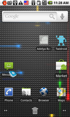
- Home screen
- Phone application
- Phonebook
- Data synchronization
- Calls alerts and profiles
- Screen keypads, text input
- Text messages
- E-mail
- Search
- Android Market
- Music Player
- Photo and Video
- YouTube
- Browser
- Calendar
- Calculator, Clock
- Facebook
- Voice Dial
- Navigation
- Conclusion
Difference of 2.1 from the earlier versions
Let's briefly name differences of 2.1 from the earlier versions for you to read about them straight away:
- Phone application – similar to Motorola Milestone/Droid
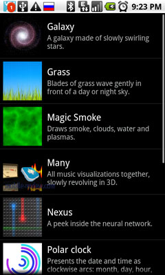
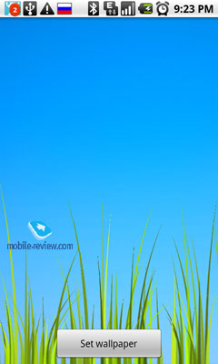
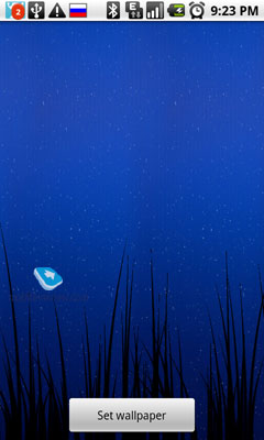
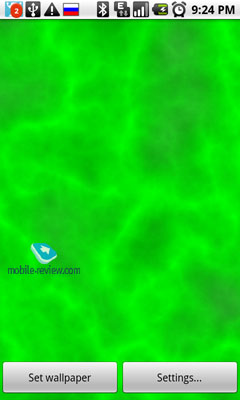
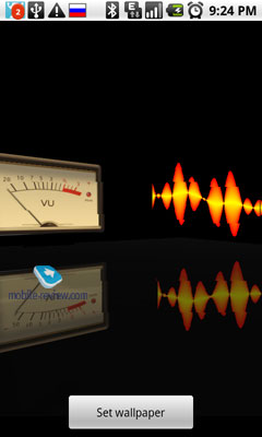
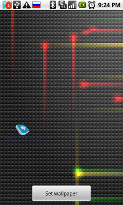
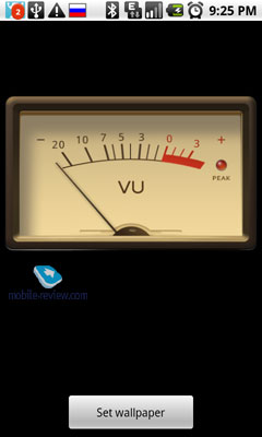
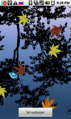
- "Live" wallpapers – animated wallpapers
- Home screen icons in the form of thumbnails
- Updated gallery – animation and geotags
- Turn-by-turn navigation for North America (starting from 2.0)
- Contacts line in context menus associated with users (starting from 2.0)
- The browser received HTML5 support and a number of API (starting from 2.0)
- The support of several accounts for the calendar and contacts (starting from 2.0)
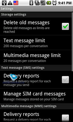
- The search for SMS/MMS messages, automatic deletion of messages depending on their date (starting from 2.0)
- MS Exchange support (starting from 2.0)
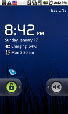
Initially the phone screen is disabled and when you press any hardware button it is activated and you see the lockup screen. To unblock the phone you have to swipe the finger against the appropriate elements; another option is to press the Menu button under the screen (it is available in all Android models) twice. First you activate the screen and then unblock the phone. This approach does not work for models with sensor buttons. Both variants to activate the screen are easy in use.

Back to the table of contents >>>
Home screen
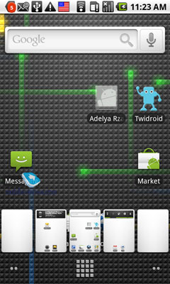
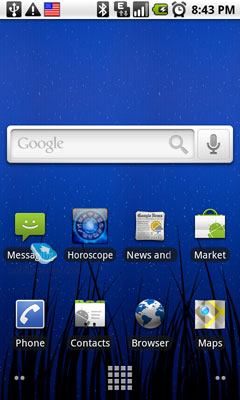
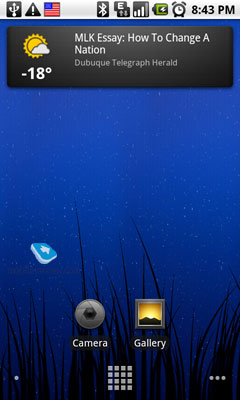
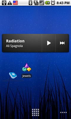
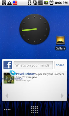
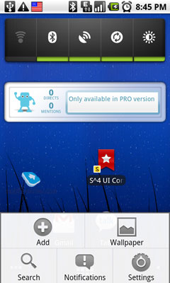
The workspace of Android OS is represented by five horizontal screens. Each screen is a separate home screen area where you can place different elements and these screens are connected by the common home screen picture and the function of screens switch.
To switch between the screens you should swipe the finger from left to right or vice versa. If the device has the trackball it can be used for the purpose as well. When you press "Home" you return to the main (central) part of the home screen. During the switch between the screens the user can see a symbol at the bottom of the display, which indicates the active screen relative to the central one.
If you press and hold this symbol the thumbnails for every screen will appear and enable you to quickly choose the necessary one.

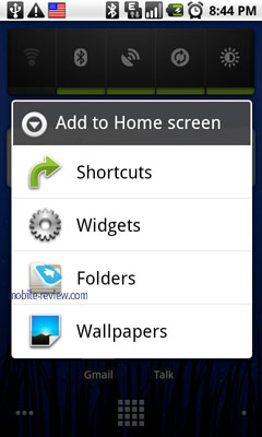
Now, let's look at the elements you place on the home screen. There are several types of basic elements:
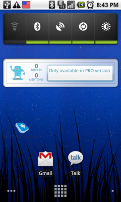
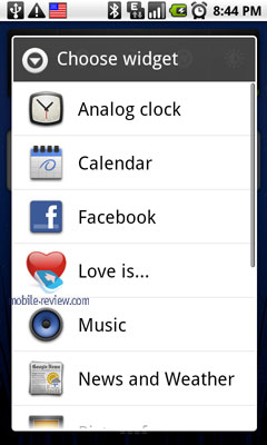
- Widgets – graphic modules with particular content, weather, time, photo albums and so on. The majority of users understand the nature of widgets pretty well and they are not surprised by widgets in Android. They have no fixed dimensions as there are full screen widgets and the ones as tiny as usual icons.
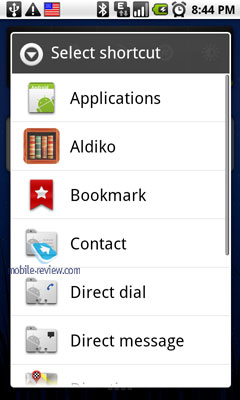
- Shortcuts – active links to applications, contacts, mailbox or bookmarks. A shortcut may be assigned not only to an application, but to a particular user as well. The icons of selected playlists also belong to this group. Application shortcuts can be easily dragged onto the screen from the menu or by selecting the option in the applications list.

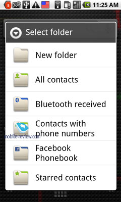
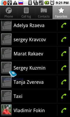
- Folders represent a particular type of content. Android has folders with contacts and bookmarked contacts. The difference from a simple contacts link is that when you press the contacts folder they are presented not in the full-sized mode, but in a popup semitransparent background window. Therefore, the contacts in this mode can only be browsed and opened without the access to the search options and settings. There is a folder for the files received via Bluetooth. Any folder may be given such a link.
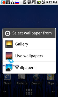
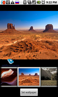
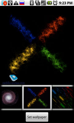
- Wallpapers – starting from 2.1 we have "live" wallpapers or the animation, which changes depending on the part of the day or when you touch the screen like water circles in Nexus One wallpapers.

The elements placed on the home screen can be dragged from one screen to another, you just have to press and hold the element, which will activate the interface for dragging/deleting.

Back to the table of contents >>>
Phone Application
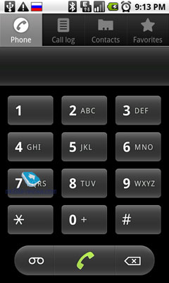
Phone activities in Android are carried out with the help of the application always located on the main screen. Some models do not have the hardware button responsible for the call start or end and you have to use this application only. Its screen is divided into four bookmarks.
Dialer is a usual numeric keypad, which allows making calls.

During the dialing and the income calls the user can see the picture of the contact you call
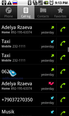
Calls history
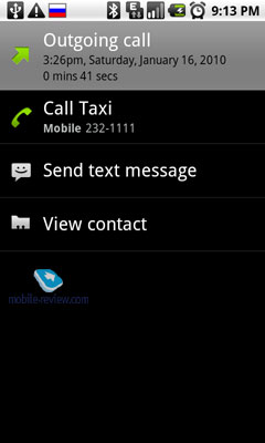
Calls history menu in Android is not the moist convenient. Different types of calls (outgoing, incoming and missed) are indicated by the icon in the right side of the contact thumbnail and all calls are given as the general list. Calls from one contact cannot be grouped together, so if you call somebody 10 times during the day you will have 10 fields with calls to this person. The same applies to incoming and missed calls. It is difficult to navigate in this chaos, which is slightly helped by an option to view all outgoing or incoming calls together, but it is not a cure all.
Missed calls display
If the screen is blocked, the missed calls information is available in the top status bar. When the phone is unblocked this information remains in the top bar and you can access it by dragging the panel down.
The status bar hosts the missed call icon and the number of missed calls.
Back to the table of contents >>>
Phonebook
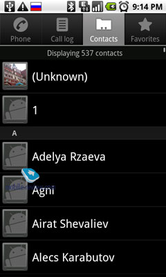
The contacts are represented in the list with the thumbnail (caller's picture) to the left and First Name and Family Name to the right. The phonebook allows for up to 24 symbols in First Name and Family Name line (including spaces). The downside here is that you cannot see the contact number under the name, so you have to open the contact bookmark. Also you cannot customize the display mode for First Name – Family Name order or vice versa.

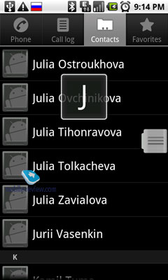
You can search in the Phonebook by the main field (First and Family Names) or just browse the contacts list by holding the finger in the right side of the screen, which launches the bar with the selected letter.

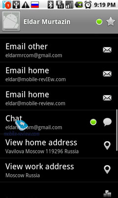
The size of the Phonebook is not limited (rather than by the phone memory) and each bookmark has main fields: phone number, e-mail, ringtone melody and picture. Other data can be added optionally in the additional data field: different types of phone numbers (office, home, fax, etc.), addresses (work, home), nicks in messaging services (MS Live, Skype, QQ and so on).
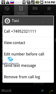
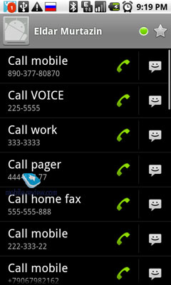
By clicking the contact icon you can launch the menu with selected types of communication with the particular contact. It contains all information you entered there before.
Any contact can be transferred to another person as vCard.
All contacts are automatically synchronized with Gmail account and you are free to choose the type of update in synchronization settings.

The problem with pictures resolution for contacts we described in HTC Hero also remains in Android 2.1. Contacts from Gmail address book are assigned low quality images and during the synchronization these images are transferred to the device and look untidy when you call such contacts. One way to solve the issue is to create on the memory card the folder with contacts photos and assign them from there. But after the first synchronization with Gmail these images will be also compressed and become as ugly as the rest.
Groups
You can create any number of groups in Android and the contacts are added by simple ticking the necessary contacts in the Phonebook. The main feature of groups in Android is an option to send mass text or e-mail messages to the members of one group and in certain situations this feature can be quite useful.
A group can be assigned a separate picture, but unfortunately it cannot be given a distinct melody.
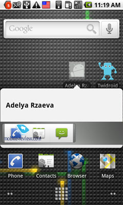
Contacts on the home screen
The contacts can be placed on the home screen as shortcuts. An activity icon is added to the screen. Once clicked it opens a contextual menu to make a call, send a message or carry out any selected activity, for example communicate via Skype.

Back to the table of contents >>>
Data synchronization
Logically, data synchronization for Android must be primarily performed as phone-Internet scheme, or Android services - Google. Obviously you can synchronize your phone with PC as well and the software is also available (HTC offers HTC Sync).
In this window the user chooses a type of synchronization: with Google services, ActiveSync or PC through the proprietary software (HTC Sync for HTC). We are interested in the first variant. If you already have Google profile and have entered it in the phone you will be asked to enter the password in the menu. If you do not have the profile you will need to enter the profile details. Then the system will prompt you to choose the account components to synchronize. Ideally, users choose all profiles (mail, calendar and contacts) and receive a ready environment, but only if Google account is used to store contacts details, create calendar events and maintain the Phonebook. By the way, even if you store all contacts locally, let's say, in Outlook, you can transfer the entire database to Gmail within 10 minutes. This is the amount of time I had to use and it took me one hour to check that the transfer was successful and to correct some conversion errors.
Synchronization with Google services is convenient because you can create events on PC or a laptop, edit them in the browser and all data are immediately transferred to Android phone. It is useful and when you create an event in Google Calendar it appears in the phone. It also works for contacts. When they are edited on the server information is updated on the phone. There is support of several calendars, which entries are united and presented in different colors.
Back to the table of contents >>>
Calls alerts and profiles
The system does not have profiles as such, but has volume control levels, the silent mode (followed by the minimum volume level) and vibro regime.
In the settings you can separately customize the volume for ringtones and multimedia (music, radio and video).

Back to the table of contents >>>
Screen keypads and text input
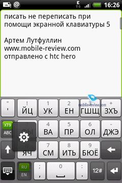
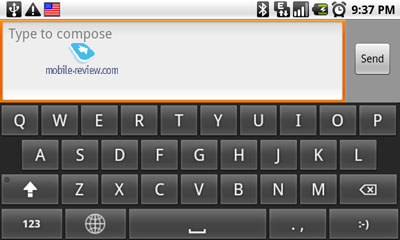
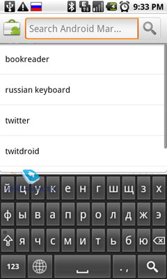
Android phones offer several types of screen keypads: full size QWERTY, compact QWERTY (not in standard Android suite, but for HTC) and traditional numeric keypad with 3-4 letters on every key. Keypad settings are activated by holding the language switch button.
When the letter is entered it is displayed in the popup field above the key, so even when you push letters you see what you enter. If the key has additional symbols you can hold it and in a second the popup menu will show this symbol and if they are numerous you will see the horizontal list of symbols associated with the key.

I liked that when you hold the key to switch to the additional symbols screen some of them are highlighted as the popup field. Without entering this screen you can enter one of the symbols and at times the popup list is enough and you do not have to go to the additional screen.
Every time you push the screen key the phone sends a light vibro signal, which helps to get used to touchscreen input easier as it is different from your experience of hardware buttons input.
Let's look at the compact keypad. It works only vertically and the figures are entered by holding the key, while for letters several taps are required. Additional symbols (!?., @') are entered without the additional keypad, but others require it.
The compact QWERTY features letters on 14 keys with 2-3 letters per button. It works only vertically and the abovementioned additional symbols can be accessed from the main keypad screen, while others need the symbols screen. This keypad type is different from the standard Android offering and is used by several manufacturers, for example, HTC.

These keypads are convenient because they have T9 switch key (only for HTC models). The full size QWERTY does not have this key.
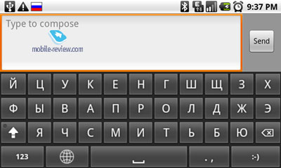
The full size QWERTY works both horizontally and vertically and in the horizontal mode any other keypad reverts to it once you place the phone accordingly.


T9 for Android performs considerably worse than in other OS and I do not have any explanation. In Russian we are offered rare and not the obvious words. You can easily spot a person, who uses this input as it produces many erroneous phrases. The phone adapts automatically and remembers the words you enter to offer them afterwards.
Back to the table of contents >>>
Text messaging
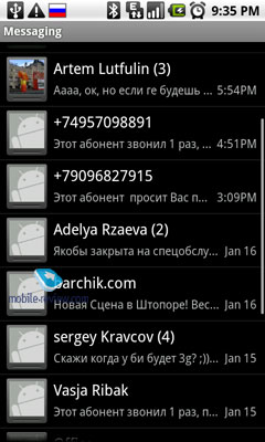
Text messages are shown in the list and the screen hosts several fields with messages, status and message bars, and the bar with the key to create a new message. In the message field you see its sender, the date and a piece of the text (around 35 symbols). New messages are indicated with the vertical green line in the left side of every message panel.
The messages from one contact are put into one line and in the list they are represented by one link to the latest message from the contact. Even in this case next to the contact name you can see the total number of messages in the thread (incoming and sent messages are taken into account together).
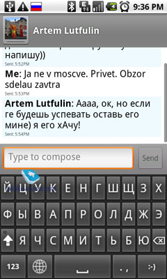
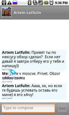
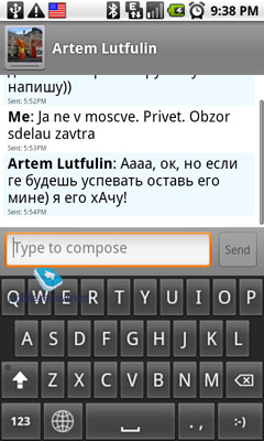
When you open the message you see its full text and the sender's name, the date and the sender's thumbnail. If the contact has no specific picture you will see a generic human head image. The messages are presented as chat (conversation). They are placed from top to bottom with the older ones on top. The chat is divided into blocks and one block means one conversation day. The blocks have separate colors and above show the day of the week, date, month and year. In the same window you create new messages for the contact. In this menu you can choose whether to input the text vertically or horizontally. When you turn the handset the display orientation and keypad are changed automatically.
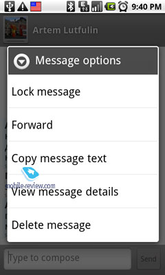
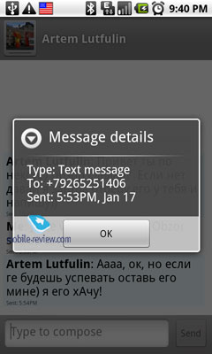
Separate messages in the conversation window can be deleted by holding them and choosing the appropriate menu item. You can similarly send separate messages as text, e-mail or multimedia message. Some users will find the key for the deletion of all messages in the thread quite handy.
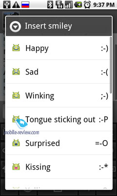
When you create a new message it starts as the text by default and automatically changes to the multimedia mode if you add a picture, melody or exceed the symbols limit for text messages. The user will see a notice in the popup window that the message type will be changed, so it will not come unnoticed.
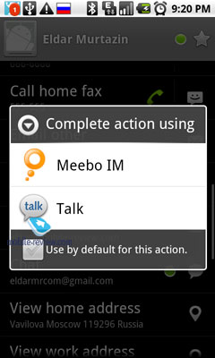
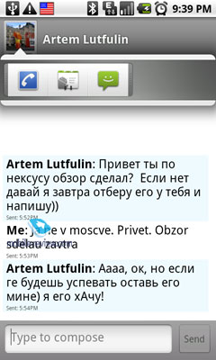
By clicking the contact icon/name you can choose the type of answer – call, text message, Gtalk, Skype and so on.
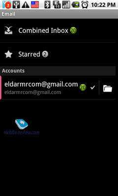
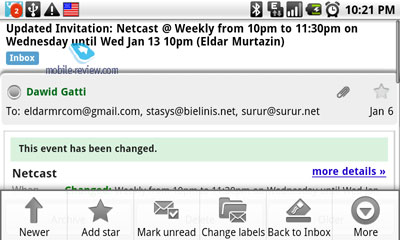
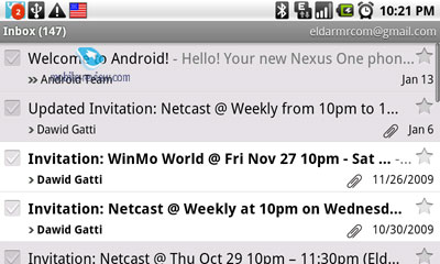
E-mail. By default, there are two e-mail clients in Android; at least there is a separate icon for Gmail in addition to the traditional Mail.

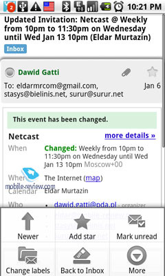
Gmail. The messages are presented as a list with a number of columns such as the subject (or feed name), sender, date received. On the left-hand side, you can find the selection box, on the right one – the Star mark that allows you to add messages to the favorites. If several messages are selected, the following group actions can be performed: delete all, archive or label using a user predefined set of tags (for instance, it can be Travel or something like that).
Attachments are denoted with a small icon and filename at the end of the message. In case the attached file is supported by some program, it will be denoted by the corresponding icon; otherwise, you won't be able to do anything about it, even to save it somewhere else, which I consider to be minor, but a disadvantage.


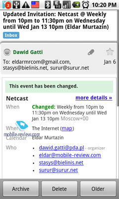
All tasks in the calendar format can be set to automatically appear in the corresponding application. The feature works for all e-mail accounts, which is handy.
Other e-mail accounts. Again, the messages are presented as a list, the new ones being marked with a vertical green bar on the right-hand side. The subject, sender and date received are displayed. The name of the account appears on the top of the screen; you can change it from there.
The messages can be deleted individually upon selection or as a group. One can also delete them all at once.
In the conversation screen, all your current correspondence is gathered. Each thread can be opened to reveal a vertical list of messages, which need to be opened separately. The total number of messages is displayed next to the name of the thread.
In the e-mail setup, one edit signatures for different accounts or enable the sound and vibration (can't work alone) notification. The notification sound is the same across all accounts.
The message download frequency can be selected from the following list:
- Never;
- 5 minutes;
- 10 minutes;
- 15 minutes;
- 30 minutes;
- 1 hour.
In earlier versions (before 2.0), the update frequency could also be selected as once every 4 hours or even once a day; which is not an option anymore. In addition, there is no limit on the message size now, all correspondence gets downloaded to the phone; the attachments (indicated in the message body) are processed on demand. The same is true for the pictures in HTML messages; the feature is turned off by default. This is a step towards the mass market where the customers don't pay attention to how large a message is on the average and how much traffic they need for it. The ability to download messages in discrete packages (e.g. 20, 50 or 100 messages) has been discarded, too. It is another advantage unless you receive an enormous amount of e-mail like I do.
Back to the table of contents >>>
E-mail Viewing Options
The inbuilt e-mail client(s) can display both the standard text and user created .html messages. In the latter case, the main text is justified in one column, which makes it easier to read regardless of the screen orientation. One can also disable pictures in such messages.
Back to the table of contents >>>
Search
There are two types of e-mail search available: the Gmail account search and other account search. Since all Gmail messages are automatically downloaded from the server (as opposed to some preset traffic limit), all of them are looked through when you use search. Moreover, if you are a Google Talk user, its data is taken into account, too. Once a keyword is input, the list of messages that have one either in their subject or body is presented. If it was mentioned in a Gtalk conversation, the whole thread would be brought up, too. In my opinion, the search capabilities are more than adequate for work, the only puzzling thing being the fact that you can't search within the body of a particular message.
As regards searching in other e-mail accounts, it is quite simple there. You can look for keywords in the subject and body of those messages that have been downloaded to the device.
Back to the table of contents >>>
Android Market
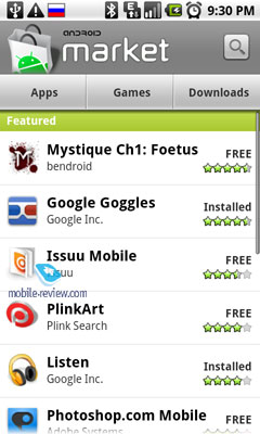
When the utility is launched, a panel with the most popular applications is presented, some sort of a top chart of various software titles. A simplified catalog is available below: Programs, Games, Search and My Downloads. If you select either the Programs or Games category, some more detailed classification will be at your disposal.

There are two tabs in each category: by popularity and by date. I believe there is no need to explain how they work. In my opinion, the utility lacks filtering options there; the above two are okay, but one would also like to see sorting by size, license type, or name.
For each application from the list, it is shown whether it is freeware or not, the latter option being quite rare on the Market so far. The program rating (up to 5 stars), name and developer are displayed, too. The list can be configured to include freeware or commercial software only.
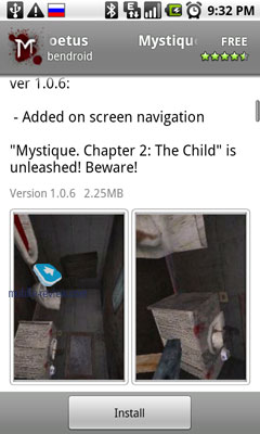
Upon selecting a program, the user can immediately see the number of its downloads, rating, brief (or not so brief) text description, current version and size. Below that, one can find some user comments and information about the developer. After you have downloaded and installed the program, you can rate it (1 through 5 stars) on the corresponding Market page.
The number of Android Market applications exceeds 16,000 and is constantly growing over time, with the majority of the software being offered for free.
Back to the table of contents >>>
Music Player
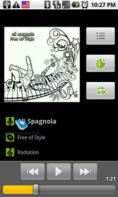
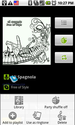
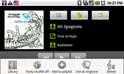
A library catalog of artists, albums, playlists or individual songs defines the core of the player. During the playback, the album picture, current and remaining track time, as well as its title and the artist's name are displayed (fullscreen mode). One can go back to the library or current playlist at any time. One can also look up the properties of the file or assign it as a ringer tone.
If the playlist consists of tracks from various albums or groups, they are displayed as a series of album pictures on the main screen, so that one can not only use the Previous/Next buttons but also scroll the pictures to the left or right to choose another track in the sequence. There is no equalizer in the player, though.

Back to the table of contents >>>
Photo and Video
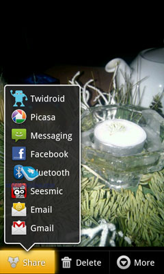
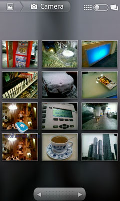
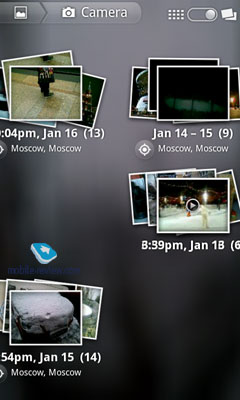
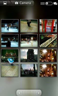
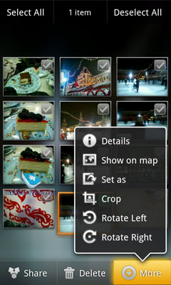
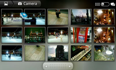
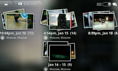
Both photos and videos are handled by one program called Albums (or Gallery, in case of no OS enhancements). It allows one to sort the content by date or using geo-tags (according to the place it was taken at). The gallery looks different in version 2.1; it is handier, more animated now. One has some image editing options (e.g. rotating, cropping) and can send the pictures to other devices or upload them to social networks.
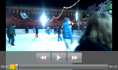
One can also watch movies in the Album. The latter functionality is restricted to the very basics, just the playback and rewind, though.


Back to the table of contents >>>
Browser
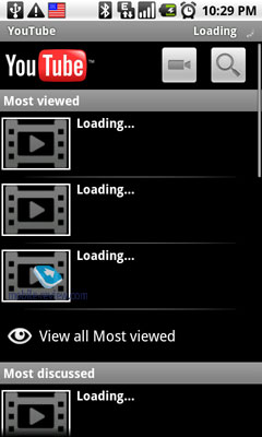
Everything looks familiar there. The application compiles the list of the most popular and watched video clips, allows one to look up new feeds using categories or the traditional search. During the playback, one can select the video quality (HD or regular), add the clip to the favorites or send it as a link via e-mail or to Twitter.

Back to the table of contents >>>
Browser
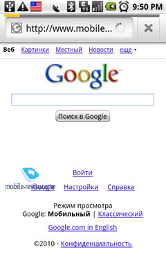
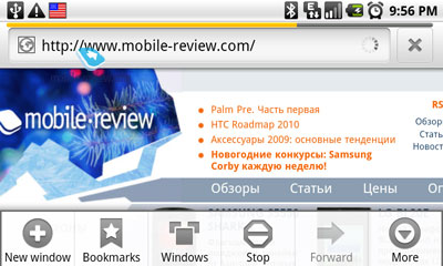
In the browser preferences you can setup your homepage; otherwise, the default one (usually, determined by the device manufacturer) will be opened on every run. One cannot select the connection type (i.e. GPRS/3G/Wi-Fi); the system chooses the most optimal one on its own.
HTC's latest devices have a dedicated hardware search button that brings up the Google search panel if pressed while in the browser.
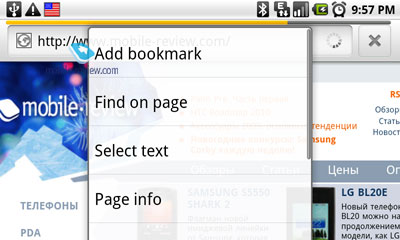
In addition, from version 1.5 on, Android allows one to perform full-text search. To do that, just tap and hold on the webpage and then choose the Find Text option from the pop-up menu.
The text search is real-time and starts as soon as the first few characters are typed. If the text appears several times on the page, then the first occurrence gets framed while the rest get highlighted in green. When searching, the only way to navigate around is using the arrow keys. If you try to scroll with your finger, the search results get discarded, which I consider a disadvantage. On the upside, you can look up word combinations and get feedback on how often your search phrase is matched.
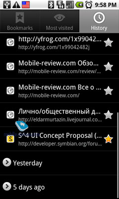
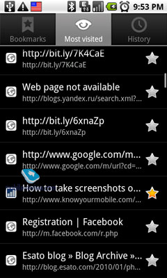
The browser allows one to store an unlimited number of bookmarks. To create one, it is enough to bring up the menu and choose the Create Bookmark option. When a bookmark is created, only its name and URL are stored. When displayed, you can enjoy a miniature image of the corresponding webpage. There is also a list of the most visited resources as well as the browsing history available.
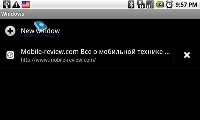
The browser supports up to 8 open tabs (windows) at once, you are simply not allowed to have more. To open a new one, you need to go to the windows menu and press the appropriate button. To switch between the opened windows, you can use a special menu that displays them as thumbnails.

Any link can be opened in the same or new window by simply clicking on it. Just tap and hold for a while, and then choose the desired option from the menu.

In the preferences, one can block pop-up windows or force all new windows to open in the background (you stay on the same page even if a link gets clicked).
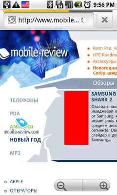
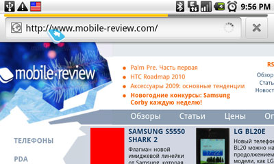
As in Opera Mobile, the Android browser has an excellent algorithm of text rendering regardless of the current page zoom level. While the page is being downloaded, the text gets scaled to the screen width. If you zoom in, it gets rescaled to the screen width again. It takes just a second and you can zoom in until the font size is okay for you. After that, the browser will automatically arrange the rescaled text into a single column for your comfy reading.
Text rescaling works for the whole page – i.e. done for one frame, it is then automatically applied everywhere. For example, on our website, such frames are the news column (on the right), the main text (in the centre), and the section list. While you are reading around one part of the website, the text gets rescaled anywhere else.


The maximal zoom level is redundant: you can zoom in so much that only a few words will fit into a line. The pictures are not affected by the zoom level, though.
Following links in the browser is not a problem mainly because of its zooming capabilities but also due to the fact that many Android devices have a trackball, which makes selecting links even easier.
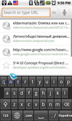
Inputting link addresses is assisted; the suggestions are based on your earlier input and browsing history, which form the top and bottom of the list, respectively.
The browser supports cookies, which allows one to store identification details for various websites, avoid entering passwords on every visit. Such information is automatically recorded upon input; the feature can be disabled and all the passwords and personal data can be wiped out in the preferences if necessary, though.
There is also a basic download manager in the browser. If you click on a link to some file, the system will try to determine its type and will let you download it even when unrecognized. At any moment, the download status can be observed in the browser section of the same name, which is quite handy.
There is no problem displaying various flash animations, banners included. As regards video-enabled websites, the browser capabilities are identical to those of the alternative solutions – i.e. the video won't play as it is, but you can still watch clips from youtube.com with the help of the standard Android player, that is, not in the browser itself.
Back to the table of contents >>>
Calendar
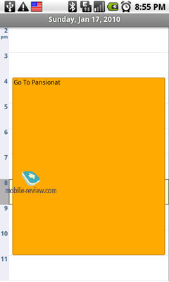
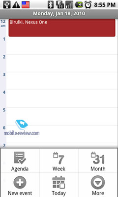
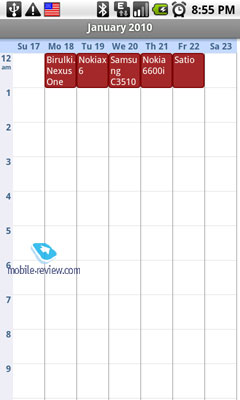
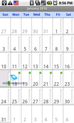
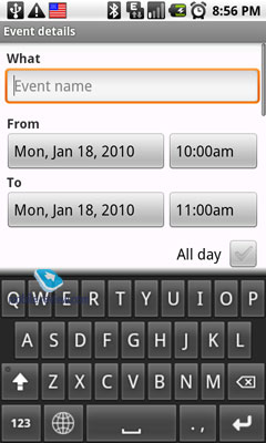
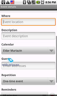
The usual calendar functionality to display your monthly, weekly or daily appointments has been expanded to allow one to send information about an upcoming event to several e-mail addresses and invite the recipients to attend. In the same way, the events you receive via e-mail automatically appear in your calendar. Several calendars are supported at once. Information from any combination of them can be merged into a single agenda using color coding to distinguish between the sources. The event setup options are trivial, that is, you can pick the time, duration, place, put a reminder, etc.
Back to the table of contents >>>
Calculator
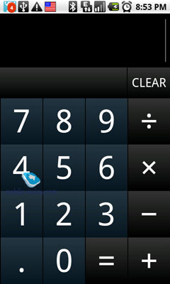
It's just a basic calculator; no extra features there.

Clock
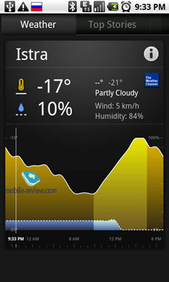
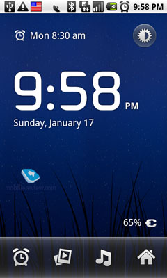
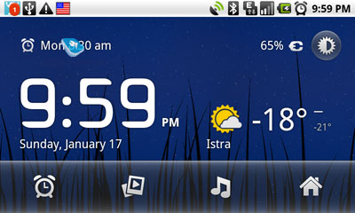
The clock application has been updated significantly in version 2.1, and is now very close to the one in the Motorola Milestone/Droid. The main screen contains information about the current time and date as well as the weather forecast for your location. You can setup an alarm, lower the display brightness and turn the phone into some sort of a clock. You can also run a slideshow (to make a small photo frame) or playback some music, such a nice program it is.


Back to the table of contents >>>
Facebook
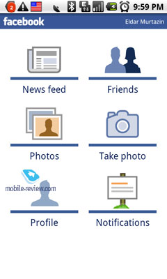
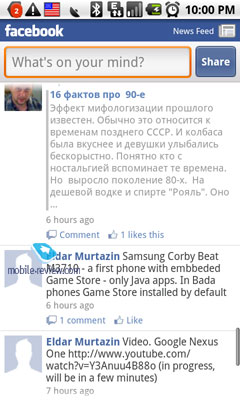
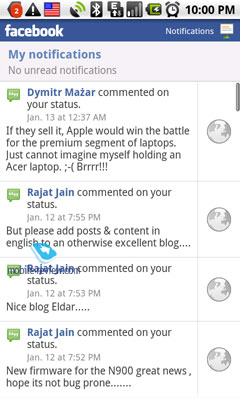
It is an inbuilt utility for the social network of the same name. All Facebook features supported, it is similar to the alternatives for other OS'.

Back to the table of contents >>>
Voice Dial
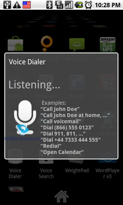
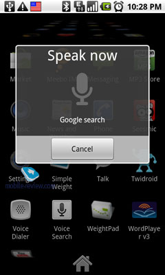
The phone has inbuilt voice dial; all you have to do is to press the necessary button and announce the command. For example, you can say "Call home", and the phone will do exactly that after the confirmation. You can also launch applications like that. The voice dial is trivial, there's nothing special about it.
Back to the table of contents >>>
Navigation
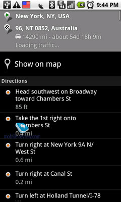
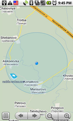
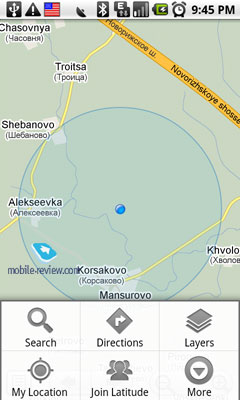
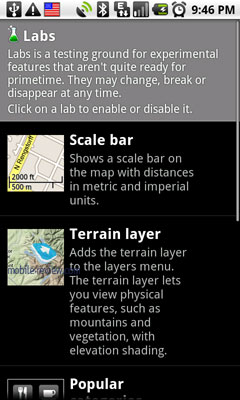
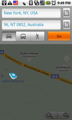
It's not hard to guess that Google Maps are in use. In the U.S., the application supports turn-by-turn navigation – i.e. the phone can lead the way by showing and announcing each and every turn to you. There is no need to further discuss the functionality of Google Maps here as it has been covered in many articles and is generally well known.

Back to the table of contents >>>
Conclusion
What makes Android 2.1 different from the earlier versions is a number of small yet significant improvements, both on the out- and inside. It can't be called a "grown-up" system yet; its maturity will begin with version 3.x likely to come out in late 2010. On the other hand, the current version cannot be called weak or incapable of meeting the market demands. It is a fairly up-to-date OS lacking some minor things that can be addressed using third-party software. It can be characterized by a nice interface, active development of new versions and potential ability for the older devices to upgrade.
Back to the table of contents >>>
Eldar Murtazin (eldar@mobile-review.com)
 Twitter Twitter
 Livejournal Livejournal
Translated by Maxim Antonenko (maxantonenko@ukr.net), Olexandr Nikolaychuk (meiam@inbox.com)
Published — 11 February 2010
Have something to add?! Write us... eldar@mobile-review.com
|
