|
|
Review of GSM/UMTS-handset Samsung S5600
Live photos of Samsung S5600
Table of contents:
- Positioning
- Design, Size, Controls
- Display
- Battery
- Connectivity
- Memory, Memory cards
- Camera
- Menu, User Interface
- Phonebook
- Call log
- Messaging
- Organizer
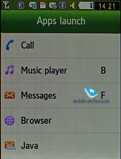
- Applications
- Alarm Clock
- File Manager (My files)
- Settings
- MP3-player
- Picsel Viewer
- Samsung S5600 vs Samsung S5230 and LG KP500
- Impressions
Sales package:
- Handset
- 1000 mAh Li-Ion battery
- Charger
- Wired headset
- USB data cable
- Software CD
- User Guide
Positioning
Over the next few years Samsung are planning to make their TouchWiz the main user interface for all touchscreen-enabled devices, be it Google Android, or S60 or Windows Mobile – they’ll employ it across all platforms, and it won’t be much different from what’s available today with Samsung’s proprietary operating system. In fact, this has been a growing trend lately – more phone makers start to treat user interface as an integral part of their solutions. LG, for example, have taken a very similar route, offering S-class UI for touchscreen-enabled devices, and Sony Ericsson are preparing a unique interface for their 2010-2011 line-up, whose prototype can be seen in the IDOU already today.


With the S5230 and S5600 Samsung are finally hitting the mass market with their touchscreen phones. While they have been selling the Omnia in droves, which is not surprising, considering that it’s one of the most popular products in its class, they haven’t had any affordable offerings of this kind in their portfolio. LG managed to take a substantial niche with the 300-dollar worth KP500, and the S5230, along with the S5600 are coming to challenge it. Honestly, at first I thought it’d be better to make two separate reviews, then I decided against it, but ultimately the scales tipped towards the original plan. And I believe that my hesitation is easy to understand – these two phones are positioned in exactly the same vein, have totally identical software, but are housed in somewhat different casings. Ultimately, after spending some quality time with both, I came to a conclusion that a unified review would create needless confusion, so here is the review of the Samsung S5600, that will be shortly followed by my take on the S5230.
Samsung S5600 vs Samsung S5230:


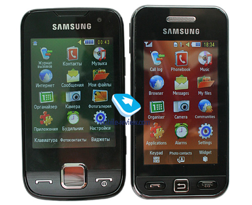
The Samsung S5600 was designed for 3G-friendly markets, and this is pretty much its core difference from the junior model. Another thing of note about the S5600 is that compared to the S5230 it’s display is somewhat smaller and less vibrant. But other than that (and a miniscule difference in price), they are totally identical and target the same audience. Although probably you won’t find both models on offer in your country – most markets will get only one of the two.

These phones are designed to be workhorses for those who, on the one hand, crave for a touch-sensitive display, and on other hand are reluctant to shell out too much just for the sheer fact that some phones comes equipped with one. Perhaps the most precise way to describe the S5600’s positioning is this: low-end touchscreen phone. Sony Ericsson used to stick to this way of positioning with their G700 as well, but due to certain problems within the company itself they never managed to make their touchscreen-enabled solutions really popular and they got lost among the wealth of other offerings out there. However, Samsung’s solutions are unlikely to be given short shrift, especially if they'll get proper advertising support and a blazing promotion campaign. Plus, them being very affordable solutions from a major phone market will definitely help the S5230 and S5600 gain a lot of attention. The defining factor when considering these two phones, is whether you really need a touch-sensitive screen or not.
Back to the table of contents>>>
Design, Size, Controls
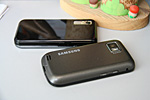
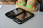
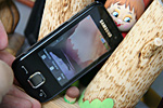
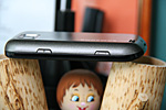
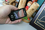
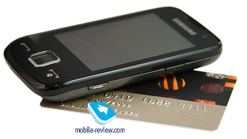
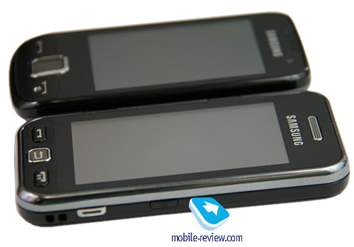
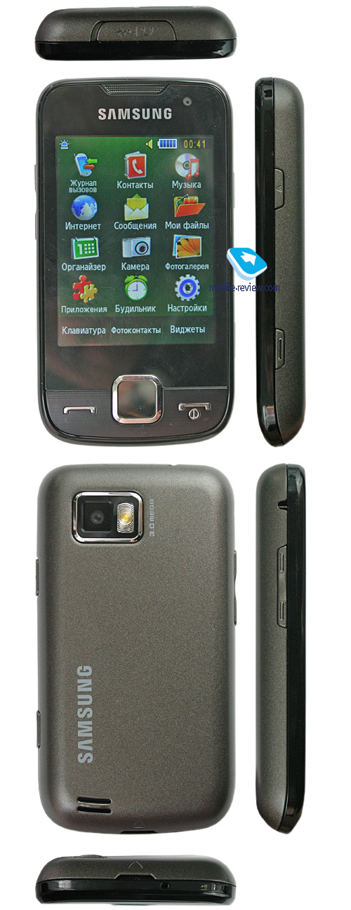
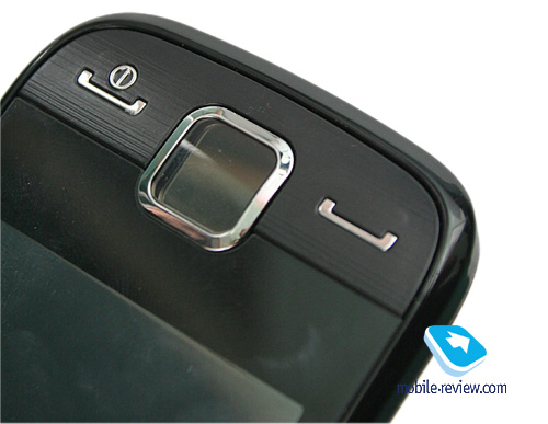
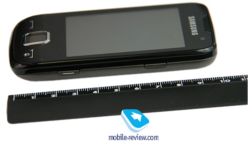
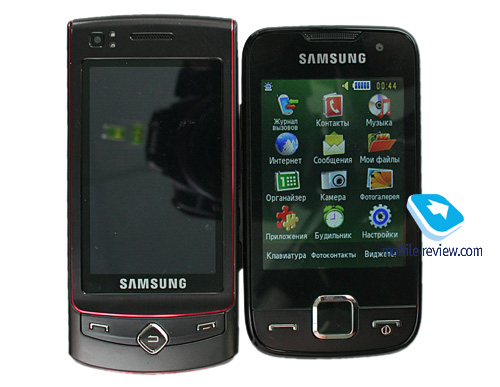
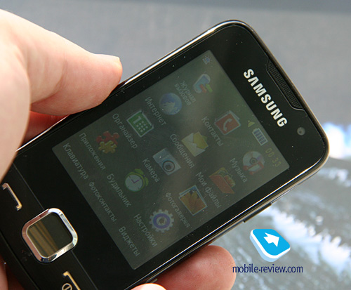
At a glance, the S5600 seems to bear some resemblance to HTC’s phones – there is definitely something in its streamlined casing, since many mistook it for another Touch-branded device and realized that they were deceived only after inspecting the phone’s casing. But in this particular case, the S5600 only benefits from this similarity, as HTC’s products are way more expensive. All in all, the phone sports a very unfussy design with a black front fascia and three hardware keys (Back, End, Call).


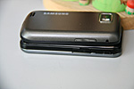
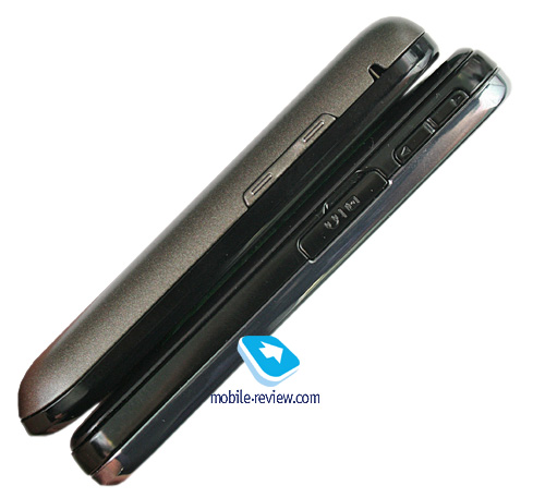
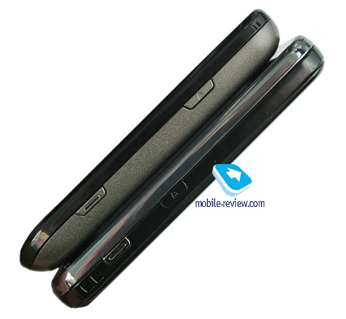
Topping the display is the phone’s forward-facing camera for videoconferencing. Housed on the left-hand spine are the volume rocker along with the lanyard eyelet. On the opposite side there are the dedicated camera button and display lock switch. The top end is occupied by the microUSB socket, also used for plugging in a headset.

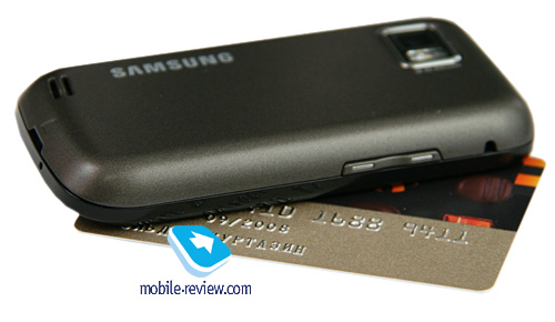
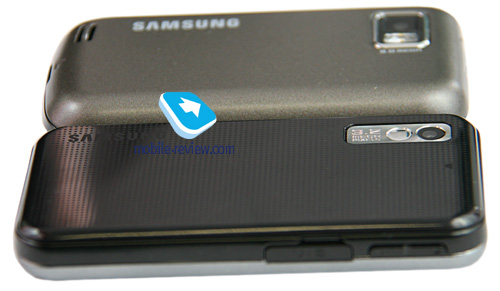
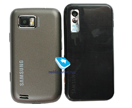
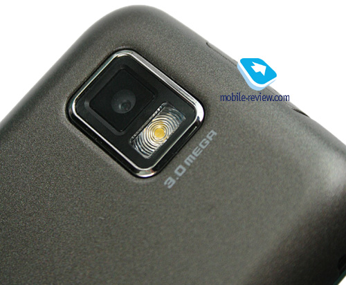
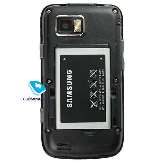
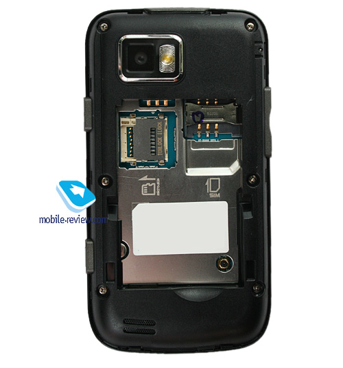
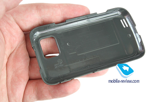
On the back panel you will find the S5600’s camera lens and LED flash. Another thing of note about it is that the color of the phone’s underside differs from that of the front plate. The plastic the back panel is decked out in is on the rough side, yet very pleasant to hold in the hand. The phone measures up at 102.8x54.8x12.9 mm and weights only 92 grams.

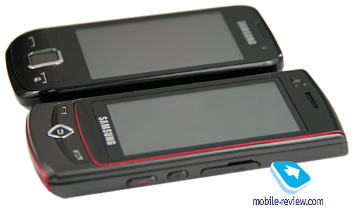
Samsung S5600 vs Samsung S8300 Ultra Touch:


Back to the table of contents>>>
Display
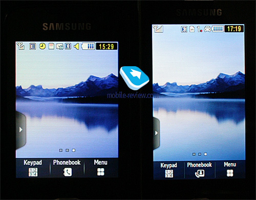
The phone utilizes the display some of you might already know from the Samsung F480 – it measures 2.8 inches from corner to corner (42x57 mm) and is capable of 16 million colors at 240x320 pixel resolution. While the F480’s screen was able to display only 262 K colors, the S5600’s 16 million colors don’t make that much of a difference.

All data input is done via this touch-sensitive display, running the Capacitive Touch Screen technology - in other words, unlike more conventional touch-screens, it packs no sensors and rather employs a special oxide layer on top of its screen, which reacts to touches of your fingers, basically, a stylus or any other sharp object won't do here. With a pair of gloves on, you will still be able to use the S5600's hardware buttons, while typing up a short message will prove to be impossible.
Among this technology's advantages is the display protection, be it plastic or glass, which provides a higher degree of safety than on standard touch-sensitive panels. Also with the S5600 it doesn't matter how dirty the screen's surface actually is - you will still get pretty decent reaction time and accuracy.
Samsung-branded offerings also employ the VibeZ feature so as to make the casing vibrate a little, confirming your actions, and we do mean "actions", since it gives you an unobtrusive buzz whenever you tap some action-related keys.
The display accommodates up to 8 text and 3 service lines, but you can cram as many as 16 lines into it when reading a message, depending on the font size you have picked. The volume rocker lets change the font size, from large to miniscule. It’s quite another matter, though, that that unlike most other offerings, the S5600 sports huge-ish font sizes, which are very readable from almost any distance.
On the downside, the M8800 gets extremely washed out under direct sunlight, which is probably our greatest niggle with this phone.
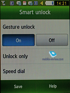
The phone comes armed with a motion sensor that allows rotating the screen and also scrolling through your galleries by tilting the handset in various directions. Another notable feature found in the S5600 is Gesture Lock, allowing the user to draw a specific letter while at the standby screen that serves as a shortcut to a phone number or an application (up to 9 programmable shortcuts).
Back to the table of contents>>>
Battery
The handset utilizes a 1000 mAh Li-Ion battery, rated for 250 hours of standby and 5 hours of talk time. In Moscow the S5600's battery time averaged around 2 days (a bit over one hour of calls, a couple of messages a day, very little email and up to two of radio). Those who are into mail and web, will be able to squeeze around a day of life time from the S5600. But in general, this handset can stay up and running for 1-2 days hands down. It takes the phone around 2 hours to charge up.
Wireless data transfers are by far the most power-hogging department of the S5600.


Back to the table of contents>>>
Connectivity
Bluetooth. The model supports various profiles, such as Headset, Handsfree, Serial Port, Dial Up Networking, File Transfer, Object Push, Basic Printing, A2DP. EDR-enabled Bluetooth 2.1 is onboard. Wireless headsets are handled by the S5600 with ease.
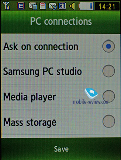
USB-connection. In the menu you may select one of three modes: Media, Mass Storage, Samsung PC Studio. When connected to a PC via USB, the S5600 automatically recharges itself. While there is no Modem mode, you can easily turn the S5600 into a wireless modem with the help of PC Studio.
While in the USB Mass Storage mode, the S5600 shows up on the desktop without requiring you to install any additional drivers, so right after plugging in it's ready to work. Data connection speeds top out 2 Mb /s.
You won't be able to use the S5600's Bluetooth connectivity along with USB - it will require you to disable Bluetooth regardless of its status (connected and transferring data or not), which is very awkward.
There is also EDGE class 10 connectivity for GSM networks.
Back to the table of contents>>>
Memory, Memory cards
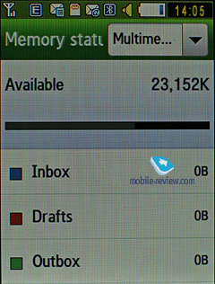
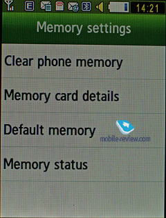
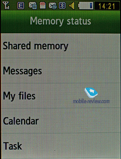
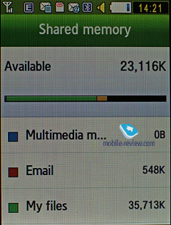
The phone ships with 65 Mb of onboard memory - this storage space, give or take, is available to the user right out of the box. The memory card is displayed as a separate section, but you can also view both memory card and internal storage at the same time. The S5600 also comes with a file manager, enabling you to copy files to/from the memory card. During our tests the handset experienced no problems with a 32 Gb microSD memory card.
Back to the table of contents>>>
Camera
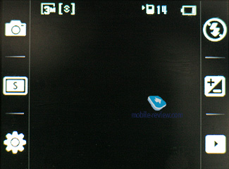
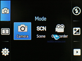
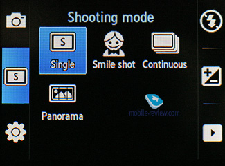
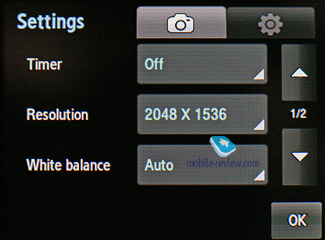
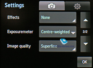
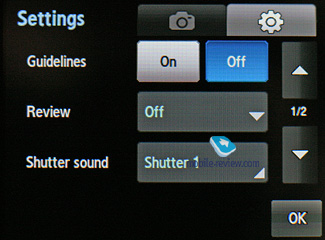
The S5600 comes equipped with a bog-standard 3 Mpix Fixed-focus camera module. The phone enjoys a landscape camera interface and allows the user to tweak all settings and change options on the fly by simply tapping on thumbnails you need right on the screen. Needless to say, this makes the phone’s camera app a breeze to work with.
We’ll talk more about Face Link mode when we get to the S5600’s Photo Browser.


Resolutions:
- 2048x1536
- 1600x1200
- 1280x960
- 640x480
Shooting modes:
- Single shot
- Multi-shot
- Panorama shot
- Smile shot
White balance:
- Auto
- Daylight
- Incandescent
- Fluorescent
- Cloudy
Effects:
- Black and white
- Sepia
- Negative
- Watercolour
 |
 |
| (+) enlarge, 2048x1536, JPEG |
(+) enlarge, 2048x1536, JPEG |
 |
 |
| (+) enlarge, 2048x1536, JPEG |
(+) enlarge, 2048x1536, JPEG |
 |
 |
| (+) enlarge, 2048x1536, JPEG |
(+) enlarge, 2048x1536, JPEG |
 |
 |
| (+) enlarge, 2048x1536, JPEG |
(+) enlarge, 2048x1536, JPEG |
 |
 |
| (+) enlarge, 2048x1536, JPEG |
(+) enlarge, 2048x1536, JPEG |
 |
 |
| (+) enlarge, 2048x1536, JPEG |
(+) enlarge, 2048x1536, JPEG |
 |
 |
| (+) enlarge, 2048x1536, JPEG |
(+) enlarge, 2048x1536, JPEG |
 |
 |
| (+) enlarge, 2048x1536, JPEG |
(+) enlarge, 2048x1536, JPEG |
 |
 |
| (+) enlarge, 2048x1536, JPEG |
(+) enlarge, 2048x1536, JPEG |
 |
 |
| (+) enlarge, 2048x1536, JPEG |
(+) enlarge, 2048x1536, JPEG |
 |
 |
| (+) enlarge, 2048x1536, JPEG |
(+) enlarge, 2048x1536, JPEG |
Video
The handset records video in mpeg4 format (also there is an option to disable the sound recording in the camera’s menu). All the settings here aren’t too much different from the single shot mode, except for new resolutions and a bunch of effects. Maximum resolution – 320x240 (15 FPS). Video quality wise the S5600 is an average performer by contemporary standards.
Video sample (mp4, 0,97 mb) >>>
Back to the table of contents>>>
Menu, User Interface
In many ways, the S5600 is similar to the Samsung M8800 Pixon/Samsung S8300 Ultra Touch, however some features are implemented in a somewhat different fashion. At the same time it’s totally identical to the S5230 software-wise
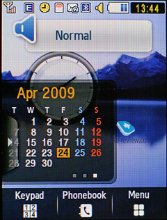
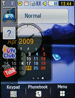
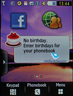
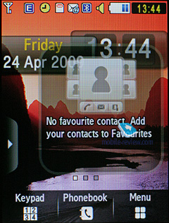
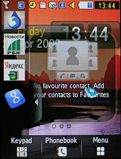
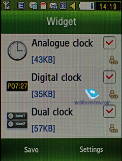
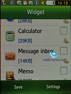
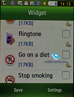
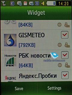
While at the standby screen, the display’s base is occupied by a bar containing three shortcuts to the dialing screen, phonebook and menu. On the left is an arrow, tapping which will expand the applications bar, allowing you to drag any Widgets to the screen (their layout is also adjustable). Obviously, the S5600 looks so much nicer with only a handful of windows tacked on, rather than a cacophony of widgets all around its real estate. Let’s take a look at what things you can be up on the screen:
- Carrier name
- Date and time
- Analog clock
- Digital clock
- World time (for any chosen city)
- Player controls
- Radio controls
- Album with thumbnails (you can also scroll through images with it)
- Games shortcut
- Events (missed calls, SMS)
- Birthday reminder
- Profile switcher
- Five favorite contacts – you can call them or send SMS, all in one touch
- Mirror – uses the forward-facing camera to show what’s going on right on the screen
- Google search
- Quick access to Samsung’s Fun Club
- Alarm Clocks
- AccuWeather forecast – somewhat similar to the visual effects found in HTC’s Touch Diamond
- Stop Smoking – counts how many days you haven’t smoked
- Stop diet – counts how many days you’ve been on a diet
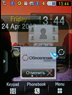
- Widget uploader
It’s easy to see that Samsung’s Widgets allow the user to tune and tailor the display’s layout to his/her own liking. Unfortunately, sooner or later you will run into the only real limitation of the S5600 in this department – physical size of the screen; naturally, we’d like to be able to cram more elements into it. But, it is what it is today, even in this state Widgets is the most flexible solution out there and it’s definitely ahead of Nokia’s Active Standby.
The S5600 boasts almost twenty widgets, along with a download manager that enables the user to upload new ones from Samsung’s web site. Needless to say that no other phone maker can offer anything even remotely as flexible as the S5600’s standby screen.
There are three screens available for filling in with widgets, which you can jump between by sweeping your fingers across the screen.
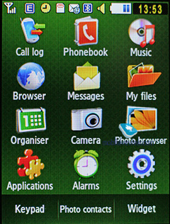
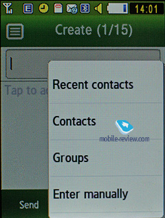
You can enter the main menu by pressing the icon at the bottomof the screen. The main menu is displayed as a 3x4 grid. The touch-sensitive display is easy to handle – you tap the item you need, then bring up a data input field by double-pressing it, since the first one will select it, and the next one will enabled the on-screen keypad. If the phone is slid open, the user is offered to used the hardware buttons, otherwise the only way to go is the S5600's on-screen keypad.

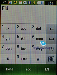
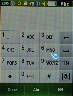
All texting is done via the on-screen keyboard, which is almost identical to that of conventional looking handsets – it houses twelve buttons with a batch of symbols attached to each, so in order to type some particular letter you will need to tap one of these buttons sequentially. While the Samsung S5230 sports a virtual thumbboard on top of that, the S5600’s smaller display makes it awkward to use, so they have opted to remove it from the standard package.

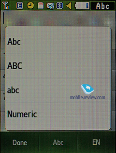
Another thing that has gone through a major revamp is the predictive input system T9. You can enable it both for the numberpad in one touch. The good thing about the S5600 is that it tries to predict what letters or words you will punch in next and therefore makes it a lot easier to pick word endings by simply tapping on them.
All applications feature a context-sensitive tool bar at the foot of the screen.
Another area where the S5600 improves over its predecessors is scrolling – sliding your finger down on the left will make lists scroll through much faster than if you were doing that on the right. In case the list you are browsing features names, you can always opt to jump straight to some particular letter, like in the gallery.
On the second screen the middle button serves as a shortcut to the list with the most frequently used contacts (image, name, phone number). And while its location is somewhat questionable, I like the way it look, although obviously, to fully appreciate it, you’ll need to assign photos to your favorite contacts.
Back to the table of contents>>>
Phonebook
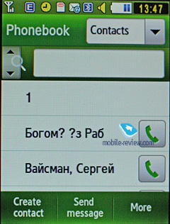
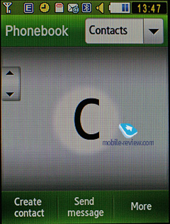
You can call up the phonebook by tapping the shortcut at the standby screen; you will see a list that contains all entries from both the SIM-card and phone’s memory. On the left there is a magnifier-shaped shortcut that allows scrolling all the way down to the letter you need. The drop-down list in the top right corner allows sorting the list by entry types – contacts, groups or favorites.
The only view available for the phonebook is a plain list with contact names – you won’t be able to browse assigned images or phone number right there, to do that you will have to enter the detailed view.
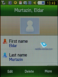
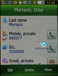
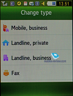
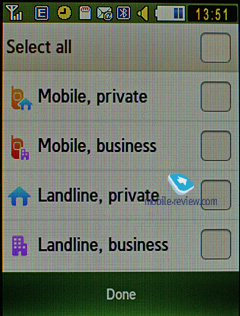
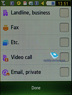
You can assign any image, photo or video clips as caller ID. Each entry can have up to 5 phone numbers of different types (mobile, office, home, fax, and other), one of them will be the main number (by default it is the first one you entered). All fields are customizable.
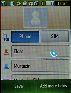
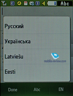
There are two lines for First Name and Last Name (search is performed only by the former), these fields get merged when displayed in the general list, and First Name comes first. For example Eldar Murtazin will be shown only in this order. The length of each field is 20 characters for any supported input language. You can also switch languages on the fly when entering a name.
All entries, regardless of language, are sorted out in the following way – all contacts with headings made in a local language (Russian, for example) go first and then those with names in English. This is a rather convenient and handy list sorting system. Taking into account fast language switch option during the search, it’s clear that no language will spoil the experience of working with this phone. The list can be sorted by first or last name.
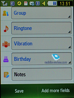
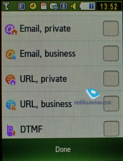
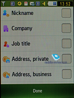
But let us return to the information entered for a contact. Apart from phone numbers, e-mail address (there may be several of them), a little text memo can be submitted on top of all that. Any music file (including MP3) can be picked as a ring tone for a contact. Three caller groups are provided by default with the possibility for creating any number of additional groups, setting a personal melody and image for each (by default there are three groups). SMS alerts are not customizable.
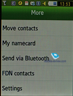
The phonebook is capable of holding up to 1000 contacts with filled in data fields. Even if all the available blanks are not used, the cap won’t get any bigger and will still make two thousands. It is possible to specify in the settings where all new numbers should be kept by default. There is also an option for moving entries from the SIM-card, although the reverse action is denied. According to the developers, PC (MS Outlook in particular) is best for data synchronization with the S5600. Any contact in the form of SMS/MMS, mail message or other text file can be quickly sent through Bluetooth to another device. There are no problems with sending, and the phonebook entry gets beamed to another device, where it is read without any trouble.
The phonebook may contain a business card as well, though its structure copies all the fields found in a regular contact in the phone book.
There can be up to twelve numbers in the fast dial list; separate numbers tied up with a single contact may appear on this list as well.
You can create any number of caller groups, assign up to 20 contacts and customize them with a picture and tune.
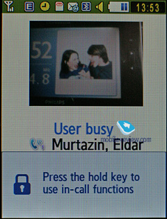
On an incoming call, the caller ID picture occupies half of the screen, but that doesn’t make indiscernible.
Back to the table of contents>>>
Call log
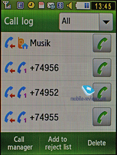
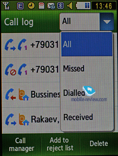
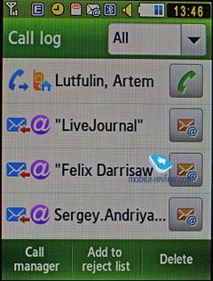
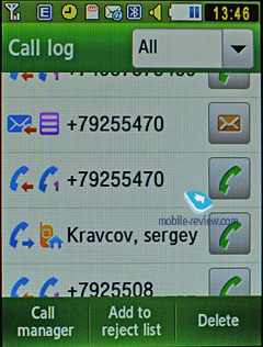
Every list contains up to 30 phone numbers, plus there is a combined list of last calls, SMS messages and emails (up to 90 entries total) with corresponding icons indicating event types. In my opinion, however, the addition of emails makes the list much harder to read if you get dozens of letters every hour, which push all other events to the bottom.
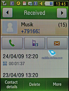
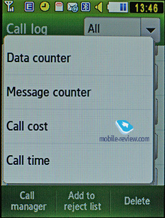
You can quickly switch between the lists. The date and time of any call can be seen in the extended view. Calls from/to one number are grouped up, so that the number standing next to the call specifies the total number of calls made. As always, the overall time of the calls and their cost can be viewed in this menu (if this service is enabled, that is).
For certain numbers you can arrange a black list that will reject all calls coming from these contacts.
Also there is a separate list for sent messages.
Back to the table of contents>>>
Messaging
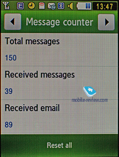
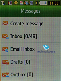
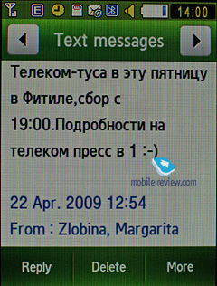
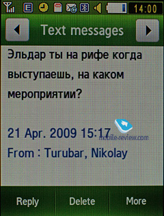
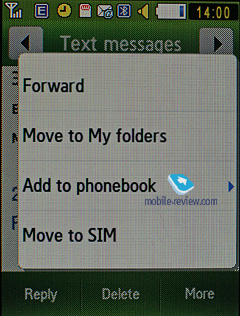
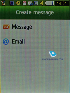
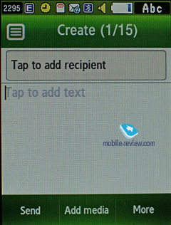
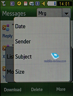
Much like other makers, over at Samsung they have forgone that artificial division into SMS-MMS types – you just start composing a message, and only then, depending on the contents, it is attributed to SMS or MMS. The menu still holds an option for switching message into MMS mode (for example when you need to send only text, but to an e-mail address, without calling up the bundled client).
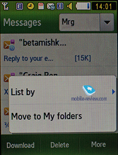
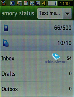
The phone memory can hold up to as many as 500 messages; the handset supports EMS standard compatible with Nokia Smart Messaging. While choosing recipient, you can either select a telephone number from your contacts, or pick one from the call lists or groups. All messages are manageable, this means you are at liberty to move a certain number to your black list, in order to make sure all messages coming from that phone number will be deleted automatically; possibility for moving messages to any folder of your own is also at your disposal. For e-mail, you can move not only addresses to the blacklist, but unwanted subjects as well.
There are no size restrictions as far as received messages go, though an outgoing message’s size is limited to 295 KB. As for additional services available with the S5600, message rejection and message retrieval type options are onboard. All messages are stored in general dynamic memory, the same goes for e-mails.
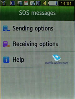
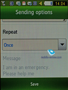
Also there is a useful function for sending SOS-messages – when activated, should you find yourself in an emergency, after pressing the volume key four times, the message «I am in emergency. Please help me» will be sent to contacts submitted earlier, all incoming calls from these numbers upon sending the emergency message will be picked up automatically. Recipients (not more than 5), as well as the number of Repeats may be set up manually, while the text of the SOS-message is not customizable.
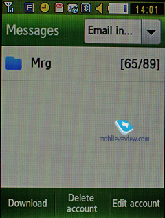
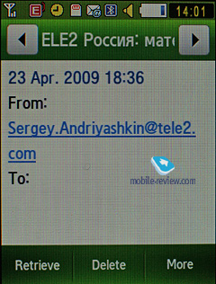
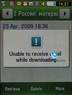
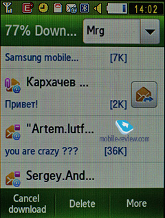
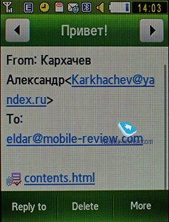
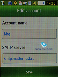
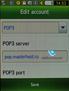
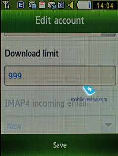
The bundled mail client is standard in all its components – 5 accounts and the maximum of 100 incoming messages; attachments are also handled by the phone, though there are also several caps – there’s no way you can receive a file more than 1 Mb big, or send one with size exceeding 1 Mb. Received files can be viewed via the bundled browser. The S5600 doesn't support HTML in e-mails, which breaks formatting of most letters you receive, so they become really awkward to read.
Also, the S5600 features a setup wizard for the mail application that will walk you through all essential options and settings.
Back to the table of contents>>>
Organizer
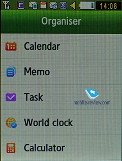
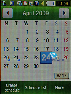
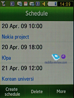
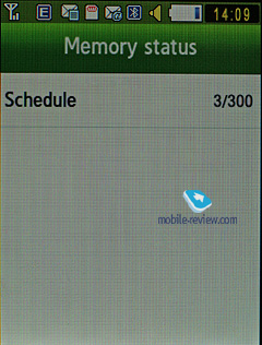
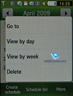
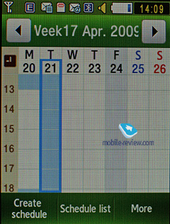
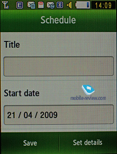
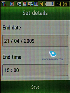
The phone’s memory can store as many as 300 events of one type – meeting. Day and time as well as end time of an event are indicated for each entry. Alert signal and its duration can be adjusted to your liking; repeatable events are available for setting up (repeat time is also manageable as well as the exceptions). The week and the month calendar views are very convenient with each type of the event having its own color.
Unfortunately, you can’t start setting up an even by tapping on some day in the Calendar; plus the S5600 doesn’t show three upcoming events for any selected day in the Month view because of its smaller diagonal.
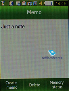
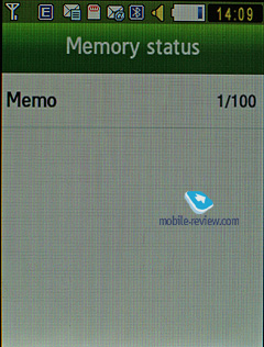
Memo – standard text notes.
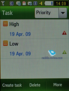
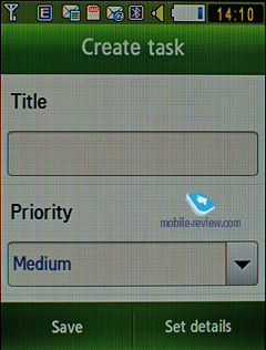
Tasks – a to-do list allowing you to set different priorities and adjust alarms for up to 100 tasks.
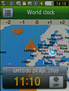
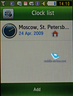
World time is displayed for two chosen cities.
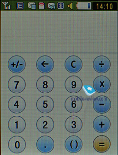
Calculator – It divides, multiplies, subtracts and adds and does several more things – quite enough for a mobile calculator.

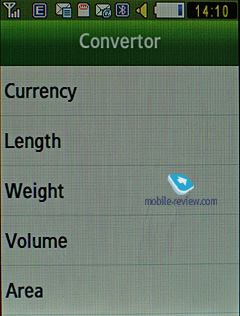
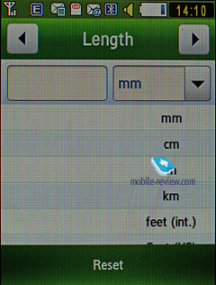
With the Converter you can operate with different units of measurements as well as with a number of currencies.
Back to the table of contents>>>
Applications
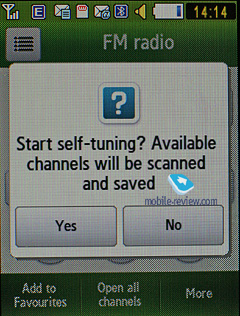
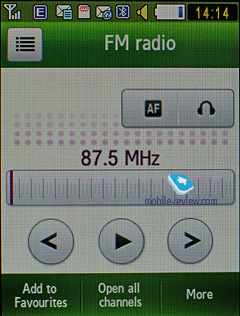
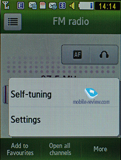
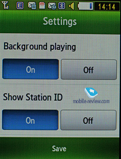
FM-radio. You can store up to 99 radio stations in the memory; the range of available frequencies is 87.5-108 MHz. Also, you can enjoy auto-tuning, but particular channels cannot have own names attached – they are always shown as frequencies. The radio implementation is fine, although it doesn’t pick up all stations equally well, but on balance, it is quite competent in comparison to other vendors’ offerings. The radio can be minimized.
RDS here displays only the station’s name in the general list, no advanced options available.
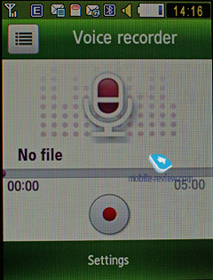
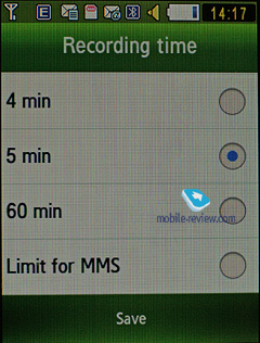
Voice recorder. You can record up to several hours of voice memos with the number of files being unlimited. Basically, limitations on recording duration are set by the user himself, though length of a single recording cannot exceed 1 hour. All the files are stored in a separate folder in the memory bank. The recorder performs well during lectures, conferences and presentations – I could even say that it is a partial substitute for a digital tape recorder.
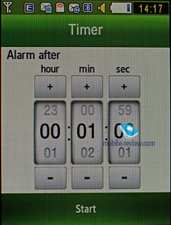
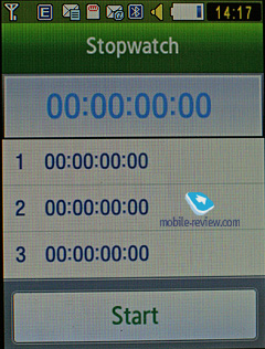
Countdown timer and Stopwatch have no bells and whistles.
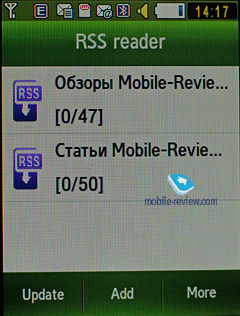
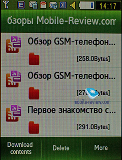
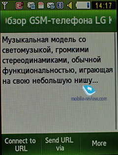
RSS Reader. This is a stand-alone utility for RSS feeds. However, it would make more sense if the RSS Reader was bound up with the web-browser, but this is not the case with the S5600. This way, RSS links are not picked up by the browser, or sent directly to the application. You will need to manually submit a channel address in this app to subscribe, or enter a web address and let the application try to find an RSS channel on it.
While uploading your news feed, the S5600 can upload text, as well as video and audio files, and it is up to you to set the size limit (by default – 5 Mb per file). Regrettably, there no scheduled feed updates are available, thus you will need to refresh the feed manually every time you need hot news.

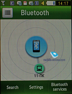
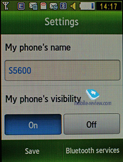
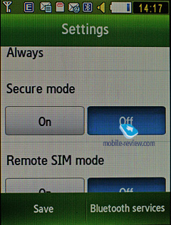
Bluetooth. As far as this app’s outfit goes, it has definitely been reworked thoroughly in the S5600 – now you can view the device map (like in some wireless managers on desktops) or opt to browser the standard version of device list. In terms of Bluetooth, the S5600 is a full-spec solution that won't let you down.

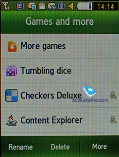
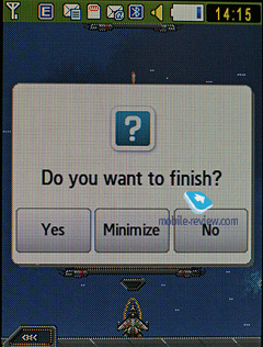
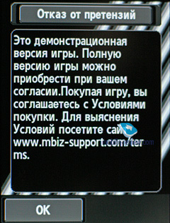
Games. The S5600 supports multitasking for Java applications, meaning that you can fire up a couple of programs, minimize them and bring them back to the top whenever you please. The games pool may vary by market.
Browser – read our lowdown on the browser below, in the section titled “Google”.
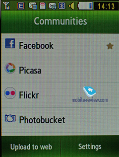
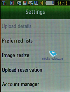
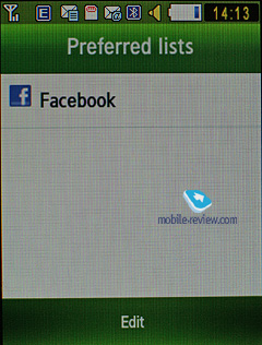
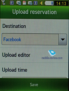
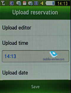
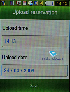
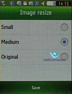
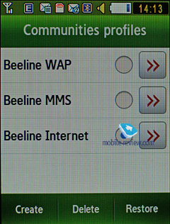
Community (formerly known as Share Pix) – this utility will soon become a part of the default feature pack in many Samsung-branded phones. It allows setting up an account with one of image-sharing services, so as to make the phone tag and send all your images there without your help. However, when there is no WiFi network to tap into, the S5600 will use your carrier’s data connection, which will result in quite hefty bills should you leave this feature enabled.
Google. This menu features Google search, Gmail and Google Maps applications. Let’s start with the latter – there are no bells and whistles in the S5600’s version of these maps, however its 3.2-inch diagonal does make scrolling through them a much more gratifying experience. On top of that you can jump between satellite and street views, although the satellite images seemed somewhat rough to me, compared to other phones with this feature onboard. But probably it’s more due to the fact that the S5600 boasts a sizable diagonal, but lacks in the way of resolution. The phone pinpointed our location via cellular networks without any problems, so all in all, we have no gripes with this department.


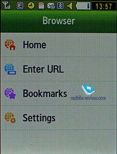
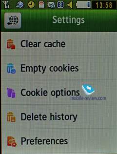
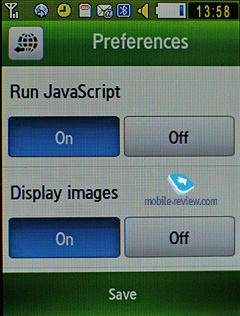
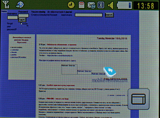
The phone comes preinstalled with NetFront 3.5 (WAP-browser ver. 2.0), sporting an improved page rendering algorithm that makes the whole process even smoother and faster. On the downside, unlike its Windows Mobile edition, this browser doesn’t have such a wealth of extra options and abilities.
Apart from JavaScript support, fonts scaling (three types), Smart-Fit (single-column view), full-screen mode (all controls are hidden), page caching, they have embedded a new feature – on-screen ‘mouse’ pointer. Much like Nokia’s S60-powered handsets and Opera Mini, you can view pages with a tiny navigation window displayed. The browser itself packs a lot of goods under the hood and will be appreciated by most users.
Back to the table of contents>>>
Alarm Clock
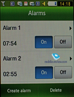
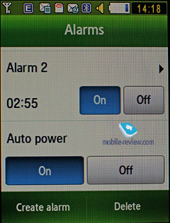
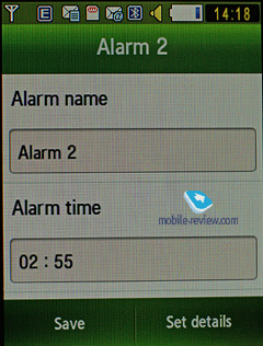
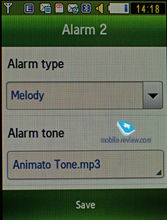
You can set up a number of alarm clocks in one touch or enable/disable the ones you have already created. Every alarm is fully customizable – you can pick any day you want and also use a custom tune.
Back to the table of contents>>>
File Manager (My files)
That’s the place to search for all files such as music, pictures, video and sounds. Any uploaded file gets stored here. The disadvantage is that files sometimes are not displayed in the list immediately - in that case you will need to leave the menu and enter it again.
Files and folders can be viewed either as a list or thumbnails. You can mark any number of files. The handset supports Move, Copy and Delete operations, as well as various types of sorting (by type, name or size).
Back to the table of contents>>>
Settings
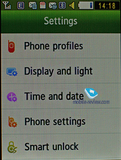
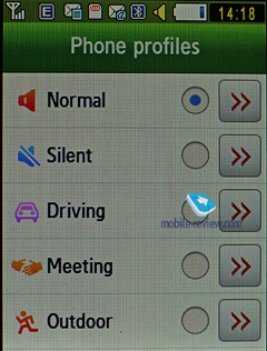
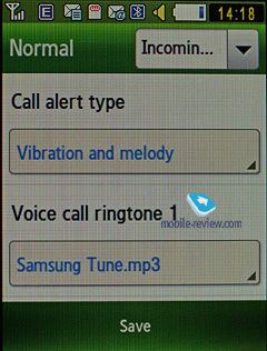
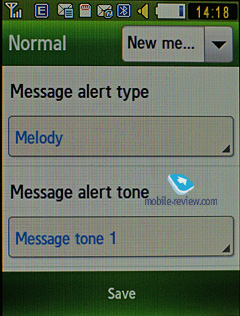
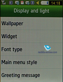
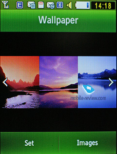
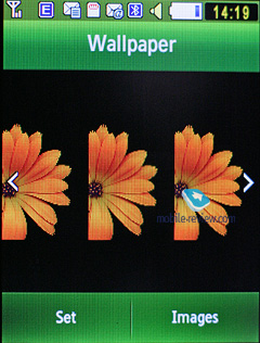
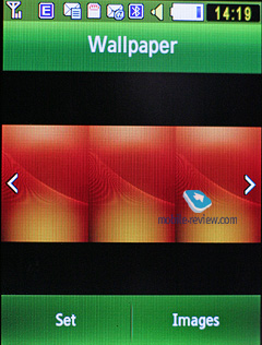
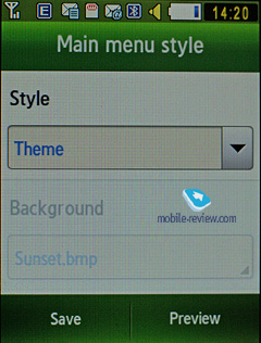
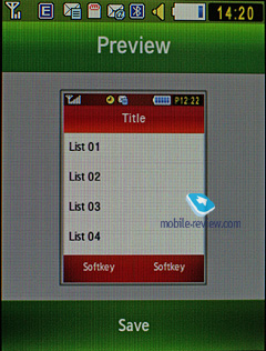
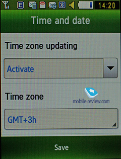
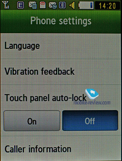
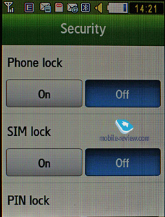
Traditionally this item boasts a standard set of options inside like password protection of selected sections. No special or quaint settings are available with the S5600. It only comes with an assortment of wallpapers and the ability to swap them randomly. The S5600 comes preloaded with profiles enabling the user to change the settings momentarily.
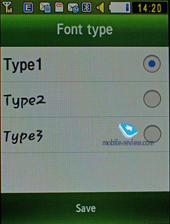
The font size, as well as its color and style are also adjustable.
The user can also modify vibration power for the VibeZ.
Mobile Tracker – submit a phone number, where notifications will be sent to in case SIM-card was changed - that message will contain number of the SIM-card being used with the handset. This section is protected with password, so that no one other than you or someone else who knows the password could disable the Tracker. Should your device have the SIM-card switched once, the specified number will receive one message instantly, and one more each time a new card is plugged in. A fetching feature which can prove to be of much help in case the handset is lost or stolen.
Back to the table of contents>>>
MP3-player
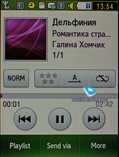
The S5600 comes with is a typical latest-gen Samsung player. The integrated mp3 player, supports random, sequential and cyclic playback. Mp3 files can be uploaded onto the handset both directly over Bluetooth and through the sync application or Windows Media Player. There are no limitations on tags and names of music files. Bitrates are not something that really matters either – the handset easily deals with all available formats and supports WMA, AAC, eAAC, eAAC+.
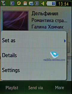
The title of the currently played back track is displayed as well as the number of the remaining tracks. There is an equalizer is embedded in the S5600, but no way to tune it. Your tracks can be played through the stereo headset as well as the speakerphone. The volume bar has 14 scales on it. And of course the user can make up their own playlists. The player can work in minimized mode – in this case the display will show current track title and music controls, which is a good thing.
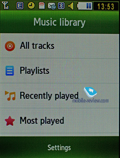
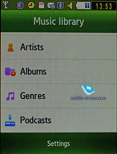
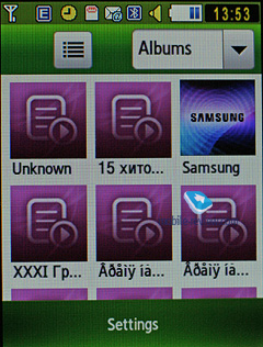
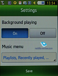
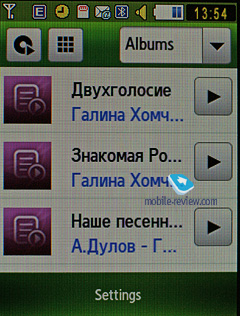
The player boasts the following filters: all tracks, recently played, most popular, artists, albums, genres and composers. Filters may be edited in the Settings menu (so that they’ll take account of some particular options). The S5600 also sports Album Arts support.
Speaking of new options, the player has obtained the rating system, enabling you to award any track with one to five stars. The maker has driven the integration with Windows Media Player as deep as it has never been before; actually, this manager also sports the rating system.
The bundled headset has a socket for plugging in custom earphones and ensures pretty good sound quality overall. Generally speaking, as a music-minded solution, the S5600 comes close to Sony Ericsson’s Walkman range, especially as far as the first generation is concerned. While at the standby screen, if you have the music player minimized, you will see its controls and current track title right on the display.
While in the speakerphone mode, the S5600 was not the best performer we had seen – it played somewhat distorted sound and obviously lacked power, even though the sound didn’t feel muffled.
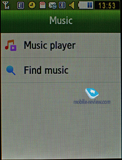
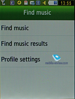
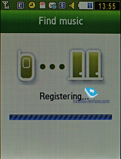
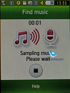
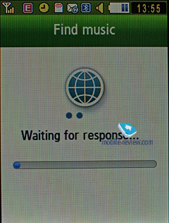
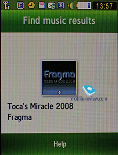
Find Music (formerly known as Music Recognition) – a mere alternative to Sony Ericsson’s Track ID service. The gist of this service is this: you record a short clip from some music track you fancy and then the phone finds you its title and artist.

Back to the table of contents>>>
Picsel Viewer
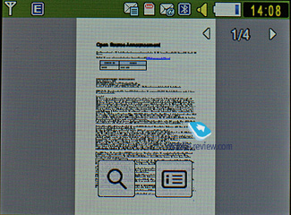
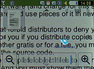
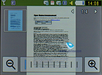
Putting it short, Picsel Viewer is an application that opens MS Office files (for instance, MS Word, Excel, PowerPoint), Adobe Acrobat (PDF), picture and video formats on the phone. The attraction of this technology is its speed, when a 20 MB PDF file takes a couple of seconds to open, then you can quickly page through it, zoom in/out and rotate pages. No editing abilities here, only viewing is available with the S8300, but that is pretty much enough already, especially considering there is no need in extra conversions.


Back to the table of contents>>>
Samsung S5600 vs Samsung S5230 and LG KP500
| |
Samsung S5600 |
Samsung S5230 |
LG KP500 |
| Size, weight |
102.8x54.8x12.9, 92 |
104x53x11.9, 94 |
106.5x55.4x11.9, 87 |
| Display |
2.8 inches, QVGA, 16M TFT |
3 inches, WQVGA, 16M TFT |
3 inches, 240x400 pixels, 262K TFT |
| Camera |
3 Mpix, fixed focus, LED flash |
3 Mpix, fixed focus, LED flash |
3 Mpix, fixed focus |
| 3G, video calls |
Yes, Yes |
No |
No |
| Battery |
Li-Ion, 1000 mAh |
Li-Ion, 1000 mAh |
Li-Ion, 900 mAh |
| Memory cards |
microSD up to 32 GB |
microSD up to 32 GB |
microSD up to 32 GB |
| On-screen QWERTY |
No |
Yes |
Yes |
| Stylus |
No |
No |
Yes |
| Handwriting text input |
No |
Yes |
No |
| FM-radio |
Yes |
Yes |
Yes |
| Widgets |
Yes |
Yes |
Yes |
| Price |
300 USD |
280 USD |
300 USD |
Surprisingly, the “junior” model, even without 3G connectivity offers handwriting text input, QWERTY-keyboard and a better display, while not falling flat on all other fronts, thus becoming a direct rival to the LG KP500. Even though the latter arrived to the market earlier, the Samsung S5230 is more likely to appeal to the broader audience for it sports smoother Bluetooth connectivity, a wider selection of widgets and a bit more interesting menu. But at the end of the day the KP500 and S5230 are in one league, and it’s very likely that the decision will come down to your brand preferences.
Also, take a look at how the images taken with the S5600 stack up agast the S5230's snaps.
| Samsung S5600 |
Samsung S5230 |
 |
 |
| (+) enlarge, 2048x1536, JPEG |
(+) enlarge, 2048x1536, JPEG |
 |
 |
| (+) enlarge, 2048x1536, JPEG |
(+) enlarge, 2048x1536, JPEG |
 |
 |
| (+) enlarge, 2048x1536, JPEG |
(+) enlarge, 2048x1536, JPEG |
 |
 |
| (+) enlarge, 2048x1536, JPEG |
(+) enlarge, 2048x1536, JPEG |
 |
 |
| (+) enlarge, 2048x1536, JPEG |
(+) enlarge, 2048x1536, JPEG |
 |
 |
| (+) enlarge, 2048x1536, JPEG |
(+) enlarge, 2048x1536, JPEG |
 |
 |
| (+) enlarge, 2048x1536, JPEG |
(+) enlarge, 2048x1536, JPEG |
Back to the table of contents>>>
Impressions
We were content with the S5600’s reception quality, although it wasn’t much different from other phones in this class. The ring tones volume was pretty average, and we even missed some calls when the phone was stuffed in a bag. The vibro alert was nothing to shout about either, as it hadn’t changed at all, compared the PIXON.
A year ago or so the market saw the arrival of the Samsung F480 that retailed for almost twice the price of the S5600 at launch. Now we have a cheaper, sleeker and overall more effective device, which I personally liked (especially its Gesture Lock feature). On balance, the S5600 is a no-frills phone that is reasonably comfortable to use. Like we said at the beginning of this write-up, it’s a solid workhorse for 3G networks. And in case you won’t have any use for its 3G connectivity, you’ll be better off going for the Samsung S5230.
It’s difficult to underestimate the importance of this breed of touchscreen-enabled handsets that will soon become the main money-makers for most manufacturers – they are relatively unsophisticated, easy to use and at the same time offer above-average functionality. All in all, the S5600 is a very good choice for its money.
Related links
Back to the table of contents>>>
Eldar Murtazin ([email protected])
Translated by Oleg Kononosov ([email protected])
Published — 05 June 2009
Have something to add?! Write us... [email protected]
|
News:
[ 31-07 16:21 ]Sir Jony Ive: Apple Isn't In It For The Money
[ 31-07 13:34 ]Video: Nokia Designer Interviews
[ 31-07 13:10 ]RIM To Layoff 3,000 More Employees
[ 30-07 20:59 ]Video: iPhone 5 Housing Shown Off
[ 30-07 19:12 ]Android Fortunes Decline In U.S.
[ 25-07 16:18 ]Why Apple Is Suing Samsung?
[ 25-07 15:53 ]A Few Choice Quotes About Apple ... By Samsung
[ 23-07 20:25 ]Russian iOS Hacker Calls It A Day
[ 23-07 17:40 ]Video: It's Still Not Out, But Galaxy Note 10.1 Gets An Ad
[ 19-07 19:10 ]Another Loss For Nokia: $1 Billion Down In Q2
[ 19-07 17:22 ]British Judge Orders Apple To Run Ads Saying Samsung Did Not Copy Them
[ 19-07 16:57 ]iPhone 5 To Feature Nano-SIM Cards
[ 18-07 14:20 ]What The iPad Could Have Looked Like ...
[ 18-07 13:25 ]App Store Hack Is Still Going Strong Despite Apple's Best Efforts
[ 13-07 12:34 ]Infographic: The (Hypothetical) Sale Of RIM
[ 13-07 11:10 ]Video: iPhone Hacker Makes In-App Purchases Free
[ 12-07 19:50 ]iPhone 5 Images Leak Again
[ 12-07 17:51 ]Android Takes 50%+ Of U.S. And Europe
[ 11-07 16:02 ]Apple Involved In 60% Of Patent Suits
[ 11-07 13:14 ]Video: Kindle Fire Gets A Jelly Bean
Subscribe
|
