Motorola v300. First impressions
Motorola has decided to offer several devices constructed on the same platform at the same time. V300 is the junior model and has no several features of superior models (no bluetooth): v500, v600. The main target group for this device is young people, hence rounded shape of the case and curious edging round the screen. Generally, Motorola V300 is the first camera phone of the company.
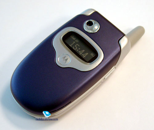
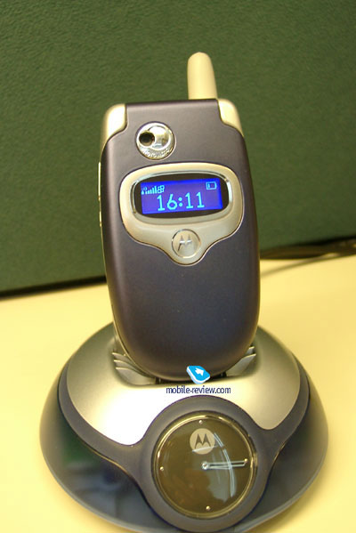
You can see camera’s lens and small mirror on phone’s external screen. Anyway, you can make photos only when the device is opened, that is not always convenient. The external screen is inversion; it displays icon line and current time. In case of different events, time is replaced by icon or data (caller’s id, for example). The screen has bright-blue backlight, which suits ideal to case color.
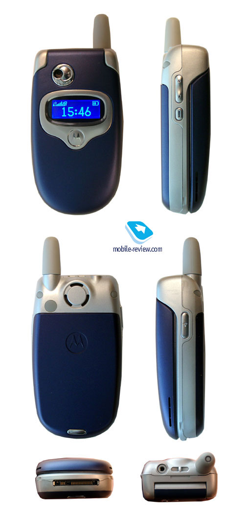
The original case color is blue, the plastic is velvety by touch and reminds SonyEricsson Z200. In general, these device are very similar to each other by target group, design and even material of case (for Z200 such color is name Velvet Blue). V300’s side faces are silver and the aerial is of grey color. Such color combination looks good and varies phone’s appearance. The presence of the aerial doesn’t seem entirely justified, modern clamshells receive built-in aerials. On the other hand, there will be only several models with built-in aerial on the market when this phone is released, so external aerial couldn’t be considered as a serious lack.
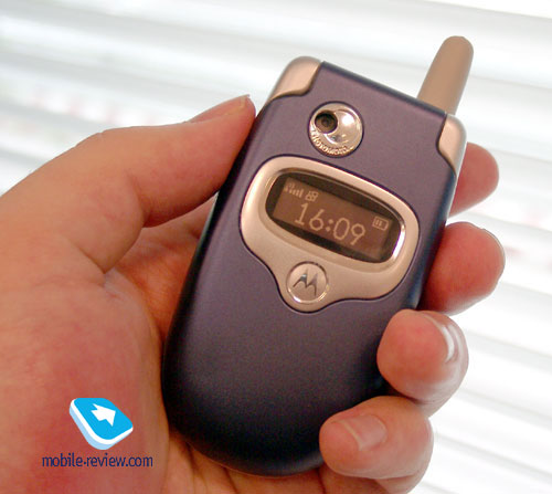
Phone’s dimensions are comfortable, so you can carry the device wherever you want: in pocket of a shirt, jacket or jeans (89x49x25mm, 95gr). The device lies well in hand due to its rounded design; it repeats palm’s form.
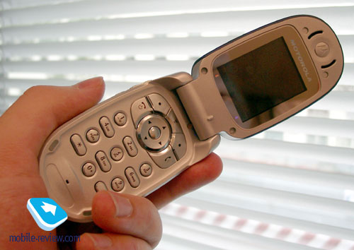
On the left lateral surface you can see volume key and Motorola’s special key – Smart. It is used, as a rule, to confirm one or another menu’s item. Therefore, the user receives alternative navigation solution in addition to standard one. On the right lateral surface is located only one key, which is used for activating voice functions: voice dial and dictaphone.
Headset connector (standard) and strap holder are located on the top butt-end. There’s standard interface connector on the bottom butt-end.
You can see 750 mAh lithium-ionic battery under the back panel (it has no backlash). According to the manufacturer, the device is capable providing up to 140 standby hours and up to 2 hours of talk time. In reality, the device has operated about 3 days, in case of 35-40 minutes of talking and minimal using of other functions. Time of full re-charging makes about 2 hours.
SIM-card holder is traditional. Everything is simple and reliable.
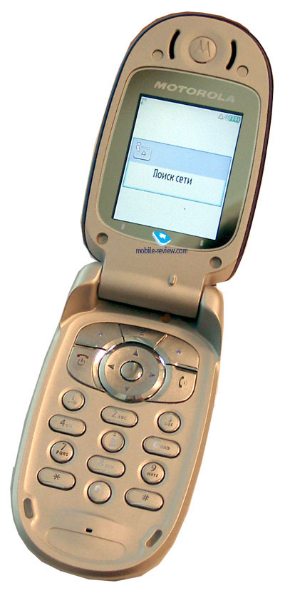
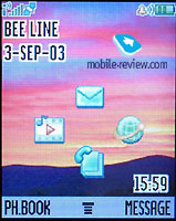
When you open the device you will see the internal screen, its resolution makes 176x220 pixels, that allows displaying up to 8 text lines, 2 system headers and one icon line. The screen is made under TFT technology that makes it readable on the sun, colors fade but the picture is discernible. Color saturation is average, the image looks not bad, neatly. However, Motorola V300 loses when it is compared with Korean devices, which display up to 65K colors as V300. On the other hand, the screen is qualitative and it is better than the European ones.
The keyboard is made of plastic; navigation block consists of 4-way key with built-in OK key. Two soft-keys are standard, there is Menu key between them, and it serves for item selection and for access to main menu. Alphanumerical keys has different design, ones of them are round, other – oval. This creates original effect, not only visual but also tactile. The keyboard is comfortable to use; you can dial a number blindly. The first impressions are left after touching keys, they are glossy and smooth. The backlight is of white color, it is not even, so the keys are not visible well in different conditions.
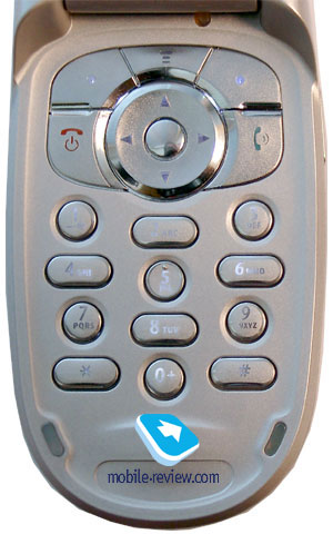
You can see rubber inserts under the keyboard, they guard internal screen from contiguity with the case.
There will be several modifications available on the market, in particular: Motorola V290 and V295. These are versions of V300, which differ by design and are intended for concrete cellular providers, they will no be available in retail. These models will have different menus (icons) in compliance with traditions of provider
Menu
In standby mode, you can see four icons related to joystick movements to corresponding ways. The user can choose most frequently used functions, similar menu’s organization is used in other phones from Motorola, T720 for example.
 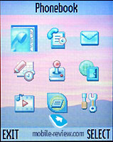
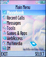 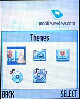
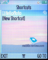
The main menu hides four rows of icons, which remind other models too. The main menu can be displayed as icon set or as list. Browsing in menu is realized by navigation key. You can also set up shortcuts for frequently used features, they are displayed in the corresponding menu.
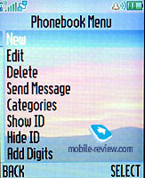
Phonebook. The phonebook allows entering several numbers for one name, but such entry is displayed separately in the main list. For example, we have two phone numbers of Smith, we create such name and enter two numbers – home and mobile. The main list will contain two Smiths with different icons. You can also store e-mail.
It’s possible to create displaying of several numbers under one name (Setup->Show Primary Contacts), so by default will be displayed the main number for this name.
The device support callers groups – business, personal, VIP etc.
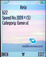 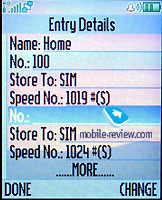
 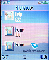
Search by first letter and voice labels feature are standard.
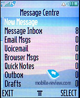
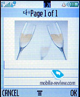
Messages. All is usual and simple. The phone supports MMS, EMS and it has built-in mail client (POP3/IMAP). The mail client doesn’t support the majority of attachments, except for graphic files, which have fixed size.
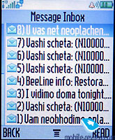 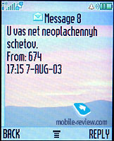
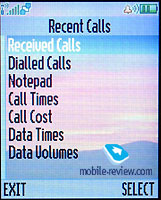
Call lists. All is standard and traditional, nothing interesting.
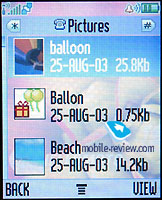
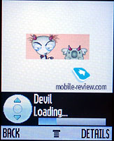
Multimedia. From this menu you receive access to general list of audio, video and graphic files. Preset melodies are good. I liked some pictures, which are preinstalled.
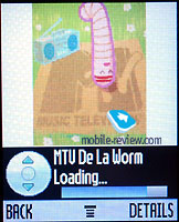 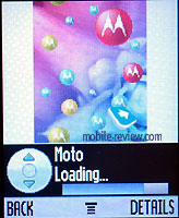
 

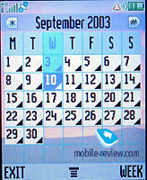
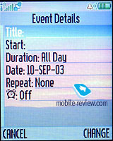
Office applications. Typical organizer from Motorola, you can watch calendar for a month, create events for chosen date and you can set up repeatable events.
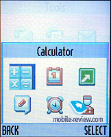 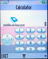
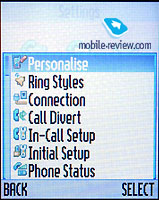
Settings. For those, who are familiar with last phones from Motorola this menu will be habitual. You can change color scheme that is a big plus. Preset schemes are quite good. At the same time, the device has Themes, so you can change wallpaper, sound events and other elements at once.
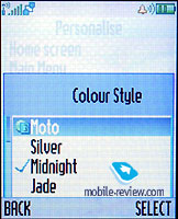 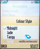
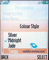 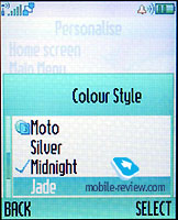
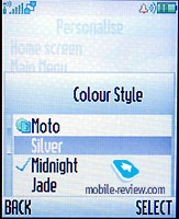
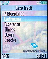
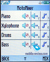
Here you can also find some parameters, related to phone’s functioning. Ring settings are available from main menu (separate item). The ring tone is polyphonic and you can use wav files. This device has melody editor, which allows editing up to four sound tracks at once. It is very simple using it, this applications is interesting as relaxation.
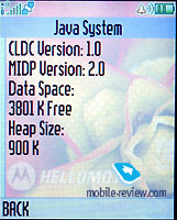
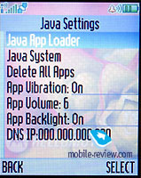
V300 supports Java (MIDP 2.0), the standard kit includes several preinstalled applications. General memory amount for user makes about 4 Mb.
Impressions
Motorola V300 has no problems with reception quality, it’s a typical re representative of Motorola’s family, the phone is comparable with any of rival devices. Vibration alert is average by force, ring tone volume is above average. On the whole, the device is typical, no problems and no extraordinary progress.
The device’s strengths are following: design, good function set, excellent menu’s appearance and good icons and sounds set. The phone creates pleasant impression due to this. V300 should be considered as fashion phone for young people. It’s not worth considering as business device as it has no IrDA, its a pure image.
The sales of this model begin in November (approximately), the price will make about 325-340$ for the first time. A rival for this model will be youth device SonyEricsson Z200, its strength is built-in aerial, changeable panels, IrDA and 40-chord poly. On the other hand, its screen is worse, memory amount is less and picture set also worse. In case of similar price, these two phones are deserved rivals; both are fashion solutions, that will allow them finding their audience.
The developers have managed to save functionality in chase of visual effects. Summing up all the aforesaid I want to notice Motorola v300 leaves quite pleasant impression, it’s a good image solution.
|


