Motorola R880 or a new thoughts about fashion phones
Originally Motorola produced very conservative, classically
styled phones aimed at business users. Later on, they switched
to the new clamshell phone casing in an attempt to gain new
users and increase their market share. Since then, the company
has never failed to find some new design touch in an attempt
to capture more of the fashion phone market, coming up with
ever more original designs as well as changing the form factor
often. The Motorola v70 was one of the next ideas; with its
unusual rotating fascia it gained functionality and certainly
had the “wow” factor. But those who were attracted by the
looks didn’t stay for the features, since the handset was
severely limited by modern standards, and the antiquated menu
from earlier models was passed directly on to this unit. The
handset was bought by the fashion conscious initially, but
even this angle was rocked by the unbalanced pricing policy
introduced by Motorola. When the phone was launched, it cost
around $600, but 4-5 months down the line we saw that price
slashed in half. If we compare this to the Nokia 8850, we
see that the initial high price point was maintained over
two years, ensuring prolonged popularity and stable sales.
Following the v70, Motorola’s next foray into the fashion
phone market was Motorola
v600. Bizarrely enough however, Motorola decided to market
this phone to the business sector exclusively. The handset
had some very advanced functionality (on a par with the Sony
Ericsson Z600) and showed the clear intentions of Motorola
in the fashion phone sector.
Whilst everyone remembers the v70’s stunning looks
and “wow” factor, phones with a similar rotating
mechanism have failed to hit the market (ignoring the asian
clone of the v70 which was almost completely unavailable to
end users). Following postponed launches of the Siemens
SX1 and SX2, Motorola were been able to jump ahead of
the pack and produce a new handset using the swivel form factor
– the v80 was born. The most striking design feature
of this phone was the screen which was placed on the rotating
part of the phone, rather than being crammed into the static
part like the v70. It was presumed that the phone was going
to have a 4096 colour screen, and some clever screen inverting
technology to ensure that the image always faced the right
way, despite the screen’s rotation. But this model was
cancelled at the beginning of 2003, due to a supposed lack
of interest from consumers.
Almost half a year went by with no information from Motorola
about any phone with a rotating mechanism. Then came rumours
of the R880, a new phone based around a rotating fascia, which
has now been confirmed for April 2004, and we’ve got
our hands on one early to give you the first in depth review.
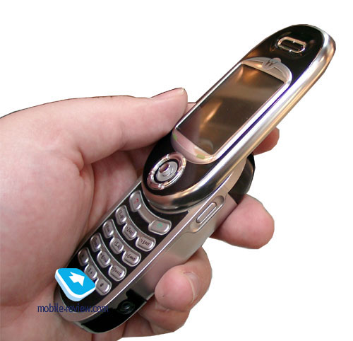
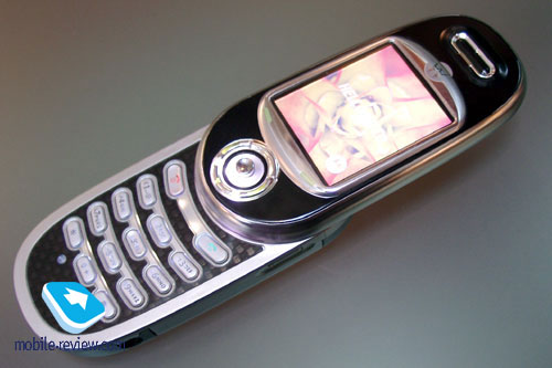
The r880 uses the Motorola v600 as it’s staring point,
with the major difference being the rotating fascia. In closed
mode, the phone’s size is 99x45x19.2 mm, and is comparable
with classic candybar phones. In open mode, the phone initially
looks massive and unwieldy, but thanks to the low weight (90
grams) this is soon forgotten. The unit is very comfortable
to use, it reaches the mouth whilst talking and provides excellent
quality of speech transmission. Judging by the styling, the
target market for this model will be the archetypal yuppie
trying to show his status.
An aggressive pricing policy is not planned by Motorola
for this model, who is hoping for the unit to become an aspirational
model. The dimensions for the model are conforming to the
new tendency for fashion phones – bigger is better.
With smartphones becoming more popular, consumers are turning
to the bigger, more ergonomic handsets, worrying less about
the premium of space.
The phone is produced in one colour only, a dark lacquered
plastic which resists marking pretty well. The sides and back
cover are made of anodized aluminium, and are their natural
silver colour. Whilst the metal casing gives the phone a good
robust feel, it doesn’t add noticeably to the weight.
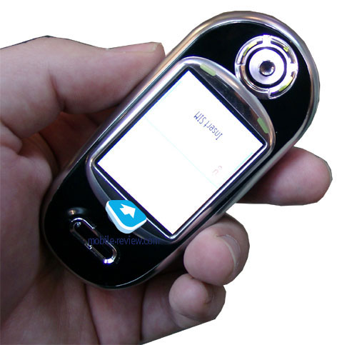
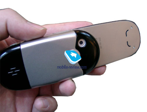
The screen is built into the upper part of the case, along
with the joystick and soft keys enabling users to operate
the phone in closed mode. The phone is opened from left to
right, using an assisted rotating mechanism. In this respect
it is similar to the Samsung D410, but with a better implementation
– you can quite easily close the phone with one hand
(unlike the Samsung).
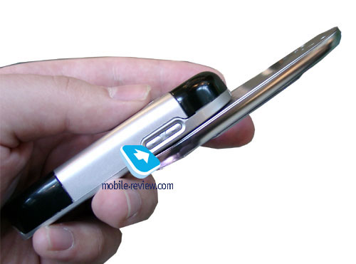
The phone also has an intermediate screen position, when
the upper section is rotated at 90 degrees to the body. The
picture on the screen is rotated, and the handset enters shooting
mode, automatically activating the camera..
Simply opening the phone is enough to accept a call. This
is guaranteed to impress many people in the vicinity at the
same time, a key feature of any fashion phone.
The phone is equipped with a 5-directional joystick (responding
to movement and pressure). It is quite large in comparison
to other phone (for example the T610) which adds to user comfort
when operating the handset.
The keypad is of average size and all of the keys are well
spaced and comfortable to use. The keys themselves have a
white backlight, with two luminodiodes placed in each row.
In complete darkness, the keys are fine, but in semi-darkness,
this leads to the characters in the two outermost rows being
invisible.
On the whole, the backlighting is impressive, and complements
the elegant and classy design perfectly. One other unusual
feature is the LED around the edge of the phone (where the
plastic changes to metal), which shimmers pink when there
is an incoming call (reminiscent of the Panasonic
GD87).
Looking round the handset, I tried to work out where the
light was coming from, but it is perfectly hidden underneath
the plastic, and is unnoticeable in everyday use.
The screen on the phone is similar to those used in the
v-series of handsets. The TFT screen is capable of displaying
up to 65,000 colours, at a resolution of 176x220 pixels. Up
to 8 lines of text and 2 services lines can be displayed.
The screen performs not well under very strong lighting conditions
however, and given that this phone will be competing with
Korean models equipped with 262k screens, the Motorola is
destined to be second best. Unfortunately, we doubt that there
will be any changes to the screen before production.
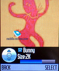
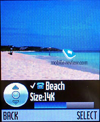
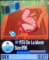
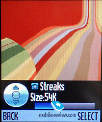
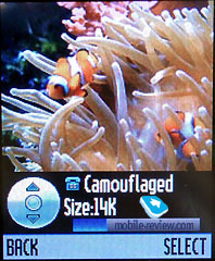
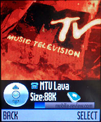
In the upper part of the phone is the hole for the loudspeaker.
When the phone is in closed mode, this is situated at the
bottom of the handset, and therefore you cannot accept or
make calls if the phone is closed. The phone supports 24-tone
polyphonic ringtones (22 KHz), and these are loud enough to
be heard without difficulty. (at the end of this preview we
have some samples of the ringtones)
On the left side of the phone are two volume keys whilst
the dedicated camera key and handsfree socket are on the right
side of the handset. The usual system / power connector is
on the bottom of the unit.
The digital VGA camera (640x480 pixels) resides on the
back cover of the phone. Motorola are waiting until 3Q 2004
before introducing the higher resolution 1 Megapixel cameras
into their phone line-up.
The R880 has a lithium-ion battery with a capacity of 750
mAh. Motorola claims that this can provide the phone with
78-145 hours of standby time and between 150-240 minutes of
talk time. A full recharge of the battery takes around 2 hours.
During our field testing (Vodafone network), the phone
worked for around 2 days (with 35 minutes of talk time and
up to 1 hour of other functions per day), but this is just
an early prototype.
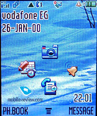
Menu
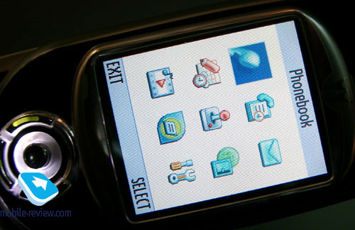
The phone has exactly the same functionality as the Motorola
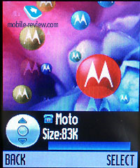
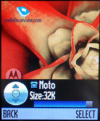
v600. In contrast to the v600 however, a new GUI has been
developed, as you can see in the photo below. There are also
user-configurable menu options available in just a few joystick
clicks.
The handset has 6Mb of memory in total, which is dynamically
shared between all applications and user files.
Phonebook. One can add different phone
number types, e-mail address, a photo or a graphical picture
to any entry in the phonebook. One name and several numbers
can be displayed, but by default the handset displays one
name and one phone number. In the main list, default numbers
are displayed next to the names, with SIM card numbers indicated
by an icon. From this list you can also search the phonebook.
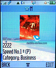 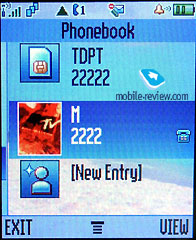
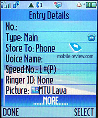 
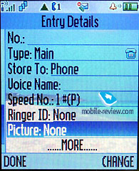 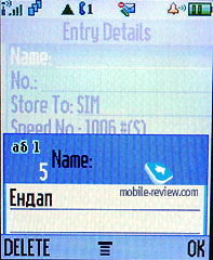
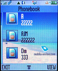
Any assigned pictures are displayed next to the name in
the main list. There are also groups available, but these
are rendered less useful as you can assign a specific ringtone
to a name. The phone also features voice dialling for any
number in the phonebook.
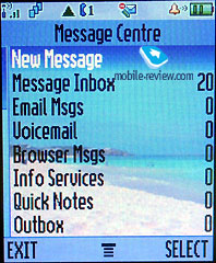
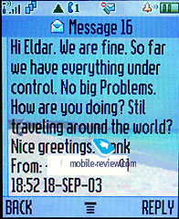
Messages. EMS is supported by the handset,
as is Nokia Smart Messaging, but the user may only store 20
messages, which are held on the SIM. The company have switched
the emphasis to MMS messages, which can be saved in the dynamic
phone memory. You can create several pages and add pictures
and sounds to your MMS messages with little fuss.
Instant Messaging (similar to ICQ) is supported in the
phone.
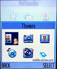
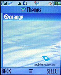
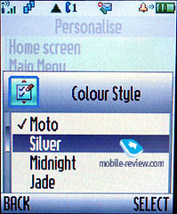
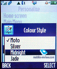
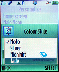
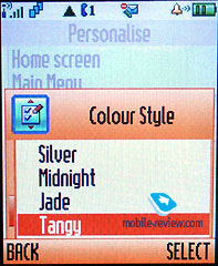
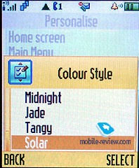
One of the other features of this phone is its theme implementation.
These allow users to change wallpapers, sounds, icons and
colour schemes, giving the phone a great sense of personality.
The Motorola r880 is a tri-band phone (GSM 900/1800/1900),
which has GPRS (class 10 4+2), bluetooth, USB-connection with
PC, wap 2.0, and SyncML. There is also a basic organizer in
the handset, and Java MIDP 2.0. is supported. Built-in games
are linked with the exterior lighting, in a system known as
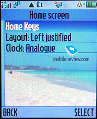
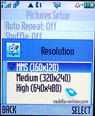
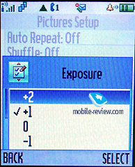
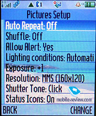
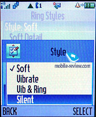
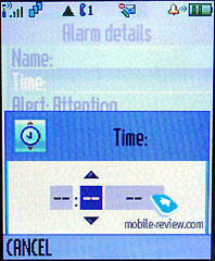
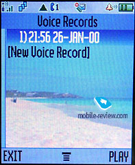
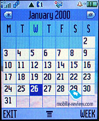
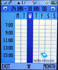
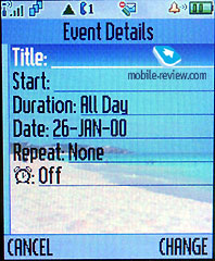
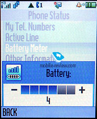
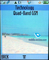
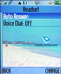
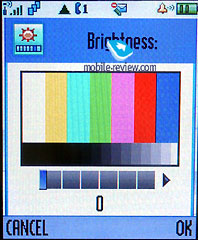
Haptics. Below you can see a few photos of the menu.
Impressions
Of course, we had no time to extensively test the phone
as we had it less than for one week. It is, however, a great
attention stealer – you only have to place it on a table
and people will start to flock around it. After it is officially
launched it will lose an amount of that individuality, but
it will always be an interesting phone to have. It does everything
you could want it to, has a stylish, bright design and fantastic
LED display. Its expected price is around 600-650 Euros.
The reception on the phone is excellent, with no noticeable
problems. The rotating mechanism is well manufactured, and
the construction of the phone feels solid and reliable. The
ringtones are nice and loud, but the vibrating alert is perhaps
a little weak.
In the end it is apparent that the company has as accurate
knowledge of the market for this model. It will hit consumers
with the “I want on – No, I NEED one” mentality
which is exactly what Motorola want.
In the near future we’ll publish some other exclusive
previews devoted to phones from other manufacturers. Stay
with us!
Sample
rintones, mp3
|


